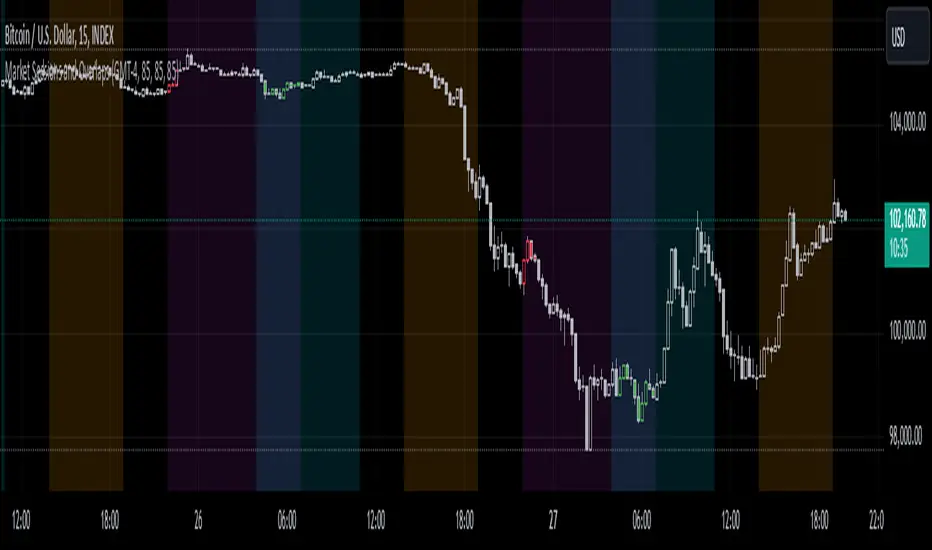
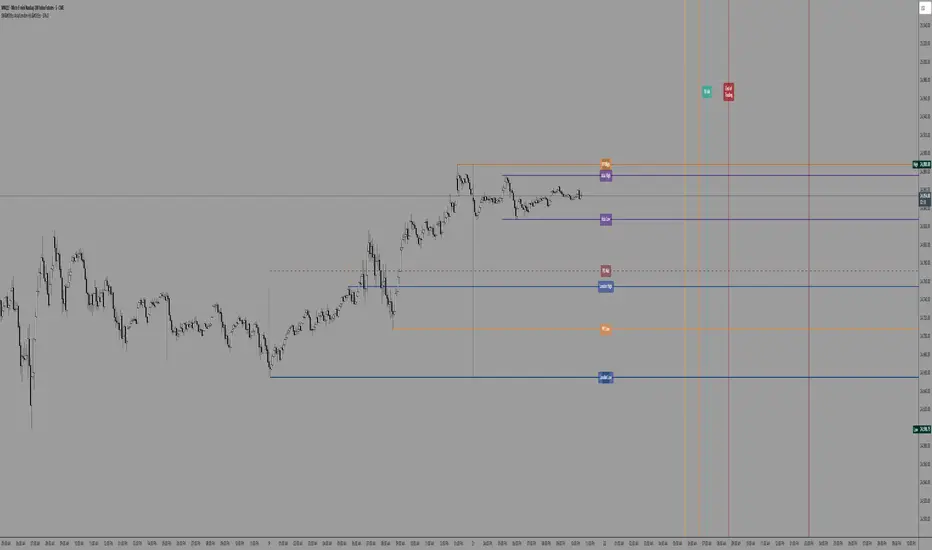
Trading Sessions Highs/Lows | InvrsROBINHOODTrading Sessions Highs/Lows | InvrsROBINHOOD
🚀 A powerful indicator for tracking key trading sessions and the highs and lows of each session!
📌 Description
The Trading Sessions Highs/Lows indicator visually marks the most critical trading sessions—Asia, London, and New York—using small colored dots at the bottom of the candle. It also tracks and plots the highs and lows of each session, along with the Daily Open and Weekly Open levels.
This tool is designed to help traders identify session-based liquidity zones, price reactions, and potential trade setups with minimal chart clutter.
Key Features:
✅ Session markers (Asia, London, NY AM, NY Lunch, NY PM) plotted as small dots
✅ Plots session highs and lows for market structure insights
✅ Daily Open line for intraday reference
✅ Weekly Open line for higher timeframe bias
✅ Alerts for session high/low breaks to capture momentum shifts
✅ User-defined UTC offset for global traders
✅ Customizable session colors for personal preference
📖 How to Use the Indicator
1️⃣ Understanding the Sessions
Asia Session (Yellow Dot) → Marks liquidity buildup & pre-London moves
London Session (Blue Dot) → Strong volatility, breakout opportunities
New York AM Session (Green Dot) → Major trends & institutional participation
New York Lunch (Red Dot) → Low volume, ranging market
New York PM Session (Dark Green Dot) → End-of-day movements & reversals
2️⃣ Session Highs & Lows for Market Structure
Session Highs can act as resistance or breakout points.
Session Lows can act as support or stop-hunt zones.
Break of a session high/low with volume may indicate continuation or reversal.
3️⃣ Using the Daily & Weekly Open
The Daily Open (Black Line) helps gauge the intraday trend.
Above Daily Open → Bearish Bias
Below Daily Open → Bullish Bias
The Weekly Open (Red Line) sets the higher timeframe directional bias.
4️⃣ Alerts for Breakouts
The indicator will trigger alerts when price breaks session highs or lows.
Useful for setting stop-losses, breakout trades, and risk management.
💡 Why This Indicator is Important for Beginners
1️⃣ Avoids Overtrading:
Many beginners trade in low-volume periods (NY Lunch, Asia session) and get stuck in choppy price action.
This indicator highlights when volatility is high so traders focus on better opportunities.
2️⃣ Session-Based Liquidity Traps:
Market makers often run stops at session highs/lows before reversing.
Watching session breaks prevents traders from falling into liquidity grabs.
3️⃣ Reduces Emotional Trading:
If price is above the Daily Open, a beginner shouldn’t look for shorts.
If price is below a key session low, it may signal a fake breakout.
4️⃣ Aligns with Institutional Trading:
Smart money traders use session highs/lows to set stop hunts & reversals.
Beginners can use this indicator to spot these zones before entering trades.
🛡️ How to Mitigate Risk with This Indicator
✅ Wait for Confirmations – Don’t trade blindly at session highs/lows. Look for wicks, rejections, or break/retests.
✅ Use Stop-Loss Above/Below Session Levels – If you’re going long, set SL below a session low. If short, set SL above a session high.
✅ Watch Volume & News Events – Breakouts without strong volume or news may be fake moves.
✅ Combine with Other Strategies – Use price action, trendlines, or EMAs with this indicator for higher probability trades.
✅ Use the Weekly Open for Trend Bias – If price stays below the Weekly Open, avoid bullish setups unless key support holds.
🎯 Who is This Indicator For?
📌 Beginners who need clear session-based trading levels.
📌 Day traders & scalpers looking to refine their intraday setups.
📌 Smart money traders using liquidity concepts.
📌 Swing traders tracking higher timeframe momentum shifts.
🚀 Final Thoughts
This indicator is an essential tool for traders who want to understand market structure, liquidity, and volatility cycles. Whether you’re trading forex, stocks, or crypto, it helps you stay on the right side of the market and avoid unnecessary risks.
🔹 Set it up, customize your colors, define your UTC offset, and start trading smarter today! 🏆📈
Pesquisar nos scripts por "session"

C|M Capital (Market Structure Pro)CM Capital (Market Structure Pro)
Overview:
The CM Capital (Market Structure Pro) Indicator is a groundbreaking tool for traders seeking a comprehensive market analysis. This closed-source script merges multiple facets of market dynamics into a single, user-friendly interface, designed to enhance decision-making by providing a multi-dimensional view of market behavior. By combining advanced market structure detection, liquidity event identification, Fair Value Gap analysis, and session-specific insights, this indicator offers traders a strategic advantage in navigating the complexities of financial markets.
Key Functionalities:
Market Structure Insights:
Break of Structure (BOS) and Market Structure Shifts (MSS):
Methodology: Our approach uses fractal analysis coupled with custom algorithms to dissect price movements, identifying pivotal moments where market structure breaks or shifts. The script evaluates candle patterns, volume data, and price momentum to flag these events.
Customization: Users can choose between candle close or wick confirmations and select from various line styles for visualization, tailoring the sensitivity to match their trading strategy, whether it's scalping or swing trading.
Utility: These markers act as early signals for trend changes, allowing traders to prepare for potential reversals or continuations, especially useful in volatile markets where timely decisions are crucial.
Structure Strength:
Highs and Lows Definition: The 'Structure Strength' setting in this indicator directly influences the identification of structure highs and lows. It's not just about detecting market structure; it's about defining what constitutes a significant high or low based on your trading horizon.
Swing vs. Internal Structure:
Lower Strength: Opting for a lower strength setting will highlight more extreme, swing-type structures. This means the indicator will mark out only the most pronounced highs and lows, which are ideal for traders focusing on broader market swings or longer-term trends.
Higher Strength: Conversely, increasing the strength level plots more internal structure levels. This setting is perfect for traders who want to dive into the market's micro-movements, offering insights into potential support and resistance within ongoing trends, essentially capturing more reactive and detailed price action.
Strategic Application: This adjustable parameter allows traders to zoom in or out on the market structure, aligning with their trading style or the specific market conditions they're navigating. Whether you're looking to catch significant market turns or to finesse entries and exits within a trend, the structure strength setting provides the granularity needed for nuanced market analysis.
Liquidity Sweeps:
Detection: Beyond traditional price action analysis, our indicator incorporates a unique method to spot liquidity sweeps. By analyzing price movements against historical support/resistance zones, it highlights instances where significant orders might have been absorbed, suggesting areas of potential price reversal or continuation.
Visualization: Liquidity sweeps are visually marked with customizable colors and an 'X' label, making them instantly recognizable. This feature is particularly beneficial for traders looking to enter or exit trades based on market inefficiencies or anticipated institutional activity.
Application: Traders can use these signals to anticipate where the market might react strongly, either as support for entries or as a caution for exits, enhancing trade precision.
Fair Value Gaps (FVGs):
Identification: Our proprietary FVG detection algorithm looks for price discrepancies over recent bars, signaling where the market could aim to rebalance. This is not merely about spotting gaps but understanding their context within the market's flow.
Enhanced Visualization: Users can extend FVGs across the chart, providing a clearer view of potential mean reversion points or continuation levels, aiding in setting targets or stop-losses.
Strategic Use: FVGs serve as dynamic levels where traders might expect price action to revisit, offering opportunities for mean reversion trades or confirming trend strength.
Session Visualization:
Session Markers: By delineating Asia, London, and New York session times, the indicator helps traders recognize session-specific volatility, trends, and liquidity conditions. Each session can be customized for color and duration, aligning with various trading strategies.
Timeframe Correlation: Integrating session analysis with structural and liquidity insights allows for a strategy where trades are timed not just by price action but by when in the global market cycle they occur, potentially increasing the effectiveness of entry and exit points.
Watermark Display:
Personalization: Add a personal touch or brand identity to your charts with customizable text and color options for the watermark, enhancing both the aesthetic and functional aspects of your trading setup.
Originality:
This script's originality lies in its holistic approach to market analysis. The integration of these diverse yet synergistic components provides a unique toolset:
Confluence of Signals: Each element enhances the others, creating a confluence where structural changes, liquidity events, and time-based market conditions are analyzed in concert, offering a more complete trading signal than isolated indicators.
Customization for Diverse Trading Styles: From high-frequency scalping to long-term trend following, the script's flexibility caters to a broad spectrum of trading strategies by allowing adjustments in sensitivity, visualization, and application.
How to Use:
Setup: Add the script to your chart and explore the settings in the input panel. Customize the visual and functional aspects to align with your trading style.
Strategy Application:
Use BOS/MSS for trend confirmation, liquidity sweeps for entry/exit precision, FVGs for mean reversion opportunities, and session markers to time your trades optimally.
Consider combining signals for stronger trade validation; for instance, a BOS during the London session might be more significant if it coincides with a liquidity sweep and an FVG from the Asian session.

GG - LevelsThe GG Levels indicator is a tool designed for day trading U.S. equity futures. It highlights key levels intraday, overnight, intermediate-swing levels that are relevant for intraday futures trading.
Terminology
RTH (Regular Trading Hours): Represents the New York session from 09:30 to 17:00 EST.
ON Session (Overnight Session): Represents the trading activity from 17:00 to 09:29 EST.
IB (Initial Balance): The first hour of the New York session, from 09:30 to 10:30 EST.
Open: The opening price of the RTH session.
YH (Yesterday's High): The highest price during the RTH session of the previous day.
YL (Yesterday's Low): The lowest price during the RTH session of the previous day.
YC (Yesterday's Close): The daily bar close which for futures gets updated to settlement.
IBH (Initial Balance High): The highest price during the IB session.
IBL (Initial Balance Low): The lowest price during the IB session.
ONH (Overnight High): The highest price during the ON session.
ONL (Overnight Low): The lowest price during the ON session.
VWAP (Volume-Weighted Average Price): The volume-weighted average price that resets each day.
Why is RTH Important?
Tracking the RTH session is important because often times the overnight session can be filled with "lies". It is thought that because the overnight session is lower volume price can be pushed or "manipulated" to extremes that would not happen during higher volume times.
Why is the ON Session Important Then?
Just because the ON session can be thought as a "lie" doesn't mean it is relevant to know. For example, if price is stuck inside the ON range then you can think of the market as rotational or range-bound. If price is above the ON range then it can be thought of as bullish. If price is below the ON range then it can be thought as bearish.
What is IB?
IB or initial balance is the first hour of the New York Session. Typically the market sets the tone for the day in the first hour. This tone is similarly a map like the ON session. If we are above the IBH then it is bullish and likely a trend day to the upside. If we are below the IBL then it is bearish and likely a trend day to the downside. If we are in IB then we want to avoid conducting business in the middle of IBH and IBL to avoid getting chopped up in a range bound market.
These levels are not a holy grail
You should use this indicator as guide or map for context about the instrument you are trading. You need to combine your own technical analysis with this indicator. You want as much context confirming your trade thesis in order to enter a trade. Simply buying or selling because we are above or below a level is not recommended in any circumstance. If it were that easy I would not publish this indicator.
Adjustments
In the indicator settings you can adjust the RTH, ON, and IB session-time settings. All of the times entered must be in EST (Eastern Standard Time). You may want to do this to apply the levels to a foreign market.
Examples

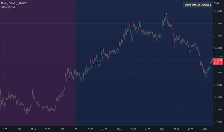
Bot Controller V1.1This script allows you to define various trading sessions with alerts for when the session starts and ends. This allows you to do things like switch your trading bots off while you are sleeping.
It starts with default settings for weekday daytime, evening, nighttime, and weekends
Setup recommendations:
Use the Timezone setting in the indicator to match your trading view timezone setting to have alerts triggered when you expect
Add alerts from a lower TF e.g 1min chart
Use once per bar for the alerts
Notes on alerts:
If you have a session stop then immediately have another starting with no time break in between the start/stop alerts may overlap/trigger at the same time so it's probably best just to use the stop or start alerts for each session.
Vola US Stock Market Sessions AlertVersion: 1.0
Author: Elwin Pietersz
Vola US Stock Market Sessions is a session-aware alert indicator designed to notify you exactly when the US equity market sessions open and close, with automatic daylight-saving time (DST) adjustment.
It supports Pre-Market, Regular Trading Hours (RTH), and After-Hours sessions for US stocks and ETFs listed on NYSE and NASDAQ.
All session times are anchored to America/New_York, so daylight saving time is handled automatically and no manual time changes are required.
Supported sessions (Eastern Time – ET):
Pre-Market: 04:00 – 09:30 ET
Regular Session (RTH): 09:30 – 16:00 ET
After-Hours: 16:00 – 20:00 ET
You can create alerts for any of the following events:
Pre-Market Open and Close
Regular Session Open and Close
After-Hours Open and Close
The indicator also includes a “Selected Session” mode.
You can choose Pre-Market, Regular, or After-Hours in the settings and create a single alert that follows your selected session automatically.
Alerts are triggered only when candles are printing.
This means there are no alerts on weekends, no alerts on full-market holidays, and no false alerts when the market is closed.
Key features:
Automatic daylight-saving time handling
Session-aware alerts based on real market activity
Works on any timeframe (1m or 5m recommended for alerts)
Optional activity filter to reduce alerts during extremely thin conditions
Clean and non-intrusive design (can be used purely as an alert engine)
Important notes:
To receive Pre-Market and After-Hours alerts, Extended Hours (ETH) must be enabled for the symbol in TradingView. Availability depends on the exchange and symbol.
On certain holidays (for example, the day after Thanksgiving), US markets may close early, typically at 1:00 PM ET. This indicator does not use a holiday calendar, so early closes should be handled manually if needed.
Recommended alert settings:
Interval: 1m or 5m
Trigger: Once per bar close
Expiration: Open-ended
This indicator is suitable for US stock and ETF traders, index traders (such as SPY, QQQ, DIA), options traders who need precise session timing, and international traders who want accurate US market alerts without timezone confusion.

PA Helper - SessionsPA Helper – Sessions is a session visualization and timing utility designed to give precise intraday context directly on your chart. It allows you to define up to four custom trading sessions with full control over time ranges, colors, fills, and timezone handling, making it suitable for any market or trading style.
The indicator draws clear session start and end markers and can optionally highlight the full session range on the chart. A key capability is that it does not limit itself to historical data only: it can project and display future session boundaries ahead of the current price, allowing you to see upcoming session starts and ends before they happen. This is especially useful for planning trades, managing exposure, and preparing for session-based volatility.
Candles outside active session hours can be visually muted or hidden using a separate color, helping you focus only on relevant trading periods. The script also supports real-time session detection, ensuring accuracy both in replay mode and live markets.
In addition, PA Helper – Sessions includes configurable alerts that can notify you a chosen number of minutes before a session starts or before it ends. These notifications work across all enabled sessions and are designed to trigger reliably without duplicate alerts, making them practical for active intraday traders.
Overall, this tool acts as a clean, precise session framework that combines past, present, and future session awareness, helping you align price action analysis with time-based market behavior.

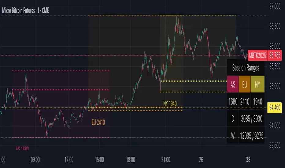
OiDeer (Session Map+Open+VWAP+PrevDay+VIX bands)Overview
Intraday context pack for NSE symbols that overlays Prev Close (official 15:30), Prev Day High/Low, Daily Open, 1st Candle Open, VWAP, an optional centered 100-point grid, and Expected High/Low bands derived from India VIX (Open).
It also computes remaining points to reach the expected bands for today (live) and for every historical session.
What it plots
Prev Close (yesterday 15:30 cash close) extended across today.
Prev Day High/Low extended across today.
Daily Open and Intraday 1st Candle Open (today only).
VWAP (session).
Expected High/Low from India VIX(Open) with optional √time intraday scaling.
Remaining points labels:
Today: points from today’s High → Exp High and today’s Low → Exp Low (also shown in Data Window).
Historical: for each completed day, points that were remaining from that day’s High/Low to its expected High/Low.
100-point centered grid (…00 levels by default; shift via Base Offset).
All labels are anchored at the session start bar (arrow on day boundary) with the label box rendered to the left so current candles stay unobstructed.
VIX math (expected move)
Daily σ: (VIX_open / 100) / √252.
Intraday option (today only): multiply by √(elapsed_minutes / 375).
Expected % move: k * daily_sigma * (√fraction if enabled).
Bands around reference S (choose Open, Prev Close, or Last):
ExpHigh = S + S * expected_pct
ExpLow = S - S * expected_pct
Historical sessions use that day’s VIX(Open) and reference S (no intraday scaling).
Inputs
Prev Close / PDH / PDL: show/hide, label toggles, colors, widths.
Daily/1st Candle Open, VWAP: show/hide; labels sit left of day start.
India VIX Bands: k (sigma), Reference Price (Open / Prev Close / Last), √time scaling toggle, colors, label toggles.
Remaining to Exp Bands: show labels, Clamp to 0 (no negatives), show in Data Window.
100-Point Grid: step, base offset, style, count above/below, color/width.
Label size control.
Data Window
Pts→Exp High (from Day High)
Pts→Exp Low (from Day Low)
Pts→Exp High (from Close)
Pts→Exp Low (from Close)
100pt lines ABOVE/BELOW (from current price)
Notes
Assumes NSE cash session 09:15–15:30 IST (375 min).
Prev Close uses official cash close at 15:30.
Designed for NSE symbols; India VIX source: NSE:INDIAVIX (Daily Open).
No alerts in this version.
Tips
Use k = 1.0 for ~1σ feel; try 1.5–2.0 for wider envelopes.
Open as reference is clean for intraday; Prev Close is gap-aware.
Turn on √time scaling if you prefer bands that widen through the day.
Disclaimer
For research and visualization only, not trading advice. Markets can exceed modeled ranges—use your own risk management.

NSE sessions Anchored by ltplevels.com📌 NSE Session Zones + Anchored VWAP Indicator
Designed specifically for Indian Equity & Index Traders
This indicator is a powerful, session-aware trading tool built exclusively around Indian market timings (NSE/BSE). It visually structures the trading day by clearly separating intraday sessions, helping traders understand market behavior, participation, and price acceptance within each time block.
The Indian market opens with a unique 15-minute opening session (09:15–09:30), followed by 30-minute rotational sessions until 15:30. This indicator accurately captures that structure by drawing vertical separators and zonal background highlights for every session, allowing traders to instantly identify where price is developing, consolidating, or breaking out.
Each session is further enhanced with a Session-Anchored VWAP, which automatically resets at the first candle of every new session, regardless of the chart timeframe. This provides a highly reliable fair value reference for intraday trading, scalping, and momentum strategies. Price behavior around the anchored VWAP often reveals institutional participation, acceptance zones, and intraday trend strength.
The alternating session colors improve visual clarity and reduce chart noise, while the optional vertical lines mark precise session boundaries without clutter. All features can be toggled directly from the settings panel, making the indicator lightweight, customizable, and trader-friendly.
This tool is ideal for:
Intraday equity traders
NIFTY / BANKNIFTY / FINNIFTY traders
VWAP-based strategies
Opening range & session-rotation traders
Built with non-repainting logic, clean Pine Script v5 structure, and professional branding, this indicator delivers clarity, discipline, and structure to the Indian intraday market.
📊 Trading Strategies Using Session Anchored VWAP
1️⃣ Basic VWAP Trend Strategy (Beginner Friendly)
Buy Setup
Price is above the Session Anchored VWAP
VWAP is sloping upward
A bullish candle closes above VWAP after a pullback
Enter above the high of the signal candle
Sell Setup
Price is below the Session Anchored VWAP
VWAP is sloping downward
A bearish candle closes below VWAP after a pullback
Enter below the low of the signal candle
Stop Loss
Below VWAP for buys
Above VWAP for sells
Best Use
Trending sessions
NIFTY / BANKNIFTY / FINNIFTY
2️⃣ RSI + VWAP Confirmation Strategy (High Probability)
Indicators Used
Session Anchored VWAP
RSI (14)
Buy Conditions
Price is above VWAP
RSI stays between 40–60 and breaks above 50
Bullish candle closes above VWAP
Sell Conditions
Price is below VWAP
RSI stays between 40–60 and breaks below 50
Bearish candle closes below VWAP
Why it Works
VWAP confirms price acceptance
RSI filters false breakouts
3️⃣ Volume + VWAP Institutional Strategy (Smart Money Style)
Buy Setup
Price holds above VWAP
A bullish candle forms with higher volume than previous 3–5 candles
No strong rejection wick at VWAP
Sell Setup
Price holds below VWAP
A bearish candle forms with volume expansion
No lower wick rejection
Key Insight
High volume near VWAP often signals institutional participation
4️⃣ Candlestick + VWAP Rejection Strategy (Precision Entries)
Bullish Rejection
Price dips into VWAP
Forms Hammer / Bullish Engulfing / Strong Bullish Close
Entry above the signal candle
Bearish Rejection
Price pulls back to VWAP
Forms Shooting Star / Bearish Engulfing
Entry below the signal candle
Stop Loss
Candle low (for buy)
Candle high (for sell)
5️⃣ Session Bias Rule (VERY IMPORTANT)
Trade only in the direction of VWAP
If price stays above VWAP for first 1–2 sessions → bullish bias
If price stays below VWAP → bearish bias
Avoid trades when price is chopping around VWAP
⏰ Best Time to Trade (Indian Market)
✅ 9:30 – 11:30 AM
✅ 1:45 – 3:00 PM
❌ Avoid low-volume mid-day chop (12:00 – 1:30 PM) or based on your analysis
⚠️ Risk Management Rules
Maximum 1–2 trades per session
Risk ≤1% per trade
No revenge trades near VWAP

ICT Finatic: Session Ranges & Macro Alerts (Cristian)This indicator is designed to assist ICT traders by automating the visualization of key session ranges and time-based macro events. It focuses on the Asia and London sessions and provides timely alerts for specific macro times.
Features:
Dynamic Session Ranges (Asia & London):
Instead of simple High/Low of the session, this script identifies Swing Highs and Swing Lows based on a 3-candle fractal pattern (High/Low of the central candle is higher/lower than its neighbors).
It calculates these swings using 15-minute timeframe data (via request.security), ensuring stability regardless of the chart timeframe used.
The lines extend dynamically and update only when a new, more significant swing is formed during the session.
Macro Time Vertical Lines:
The script monitors specific NY-time macros (09:45, 10:15, 10:45, 11:15, 11:45, 12:15).
Pre-warning System: 5 minutes before a macro time occurs (e.g., at 09:40 for the 09:45 macro), a temporary vertical line appears on the future time slot.
Auto-Cleanup: Once the macro time is reached, the vertical line is automatically removed to keep the chart clean. This feature is active on timeframes lower than 1 hour.
Bias Table:
Includes a customizable dashboard to manually input and visualize your directional bias for multiple timeframes (Daily to 5m).
How to use:
Add the indicator to your chart (works best on M1 or M5 timeframes).
Adjust the session times in the settings if needed (Default is NY time).
Use the dashboard to track your daily bias.
Watch for the orange vertical lines appearing 5 minutes before macro events to prepare for potential volatility.

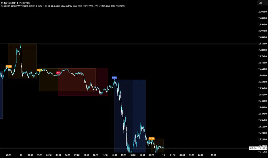
VX-Session-Boxes-(AM/PM Split)(Customizable) by Ikaru-s-VX-Session-Boxes-(AM/PM Split) is a session-based visualization tool for TradingView that highlights major market sessions directly on the chart using dotted range boxes and an optional AM/PM split.
The indicator allows traders to visually separate market behavior across different sessions while keeping the chart clean and readable.
🔹 Key Features
Custom Session Definitions
Define up to 4 independent sessions using TradingView’s session format (HHMM-HHMM + weekdays).
Timezone-Aware
All sessions are calculated using a user-defined timezone (IANA or UTC offset), ensuring accurate session alignment across markets.
Dotted Session Boxes
Each session is drawn as a dotted box based on the session’s high/low range, providing a clear view of volatility and price structure.
AM / PM Split Visualization
Sessions can be visually split into AM and PM parts:
Separate box shading for AM and PM
Optional dotted vertical split line at the AM → PM transition (12:00 in the selected timezone)
Session Labels
Optional labels at the start of each session for quick identification (e.g. Sydney, Tokyo, London, New York).
Fully Customizable Visuals
Adjustable opacity, border width, and visibility toggles for boxes, split lines, and labels.
🔹 Use Cases
Session-based market analysis (Asia / London / New York)
Identifying session ranges and volatility expansion
Observing price behavior differences between AM and PM
Studying session transitions and liquidity shifts
🔹 Notes
Session boxes are based on session high and low, not full chart height.
AM/PM split is based on 12:00 (noon) in the selected timezone.
Designed for clarity and performance on intraday timeframes.
🔹 Compatibility
Pine Script® v6
Works on all intraday timeframes
Overlay indicator (draws directly on the price chart)
Worstfx Fractal Sessions 🧩 Worstfx Fractal Sessions Public — Features & Purpose
✔️ Includes clean session structure • Simple confluence • Built-in guardrails for your psychology
Worstfx Fractal Sessions Public is a stripped-back, clean version of the full Worstfx framework.
It’s designed to give every trader the core advantages of the fractal system:
• clear session structure
• simple trend/confluence read
• context from Daily ATR
• basic order-flow sentiment
• an on-chart help panel so nobody gets lost
All without overwhelming settings or “indicator soup.”
Use it to see the day as a story: Asia range → London expansion → Pre-NY setup → NY confirmation or reversal.
⸻
⚙️ Main Features
1️⃣ Session Shading (Asia / London / Pre NY / NY)
What it does
• Colors each session with soft, transparent shading:
• Asia – yellow tone
• London – purple tone
• Pre NY – light blue
• NY – light blue (separate time block)
• You can customize the session times and colors.
• Includes a 6:00 pm ET divider line to mark the start of a new “trading day” in your framework.
Why it matters (psychology)
• Your brain stops seeing random candles and starts seeing chapters:
• Asia = range / setup
• London = expansion / fakeouts
• NY = continuation / reversal
• This reduces FOMO and impulsive entries because you naturally ask:
“Which session am I in?”
“What is this session supposed to be doing?”
• The 6pm divider helps you mentally reset each day instead of carrying emotional baggage from yesterday into today.
⸻
2️⃣ Time-Frame Confluence Panel (Weekly → 15m)
What it does
• Checks a simple model on multiple timeframes (W, D, 4H, 1H, 15m):
• Above or below the 50 EMA
• RSI above or below 50
• Converts that into a 0–100% confluence score per TF.
• Gives a %TOTAL score that blends all TFs into a single number.
• Two display modes:
• Strip — horizontal bar with W/D/4H/1H/15m + %TOTAL
• Table — vertical list showing bull% / bear% per TF
• Mobile mode shrinks everything for smaller screens.
Why it matters (psychology)
• Instead of arguing with yourself about “trend,” you get a simple question:
“Are the higher timeframes mostly aligned or mixed?”
• Green/high %TOTAL = “permission” to press your bias, not to over-trade.
• Red/low %TOTAL = natural brake: “This is not the clean trend day. Size down or stay out.”
• It pulls you away from 1-minute tunnel vision and forces you to respect bigger structure.
⸻
3️⃣ Daily ATR Panel (Last 4–12 days + Forecast)
What it does
• Tracks true daily range (High–Low) over recent days.
• Shows:
• Last few days’ range in ticks and $
• Optional 4-day average forecast (projected typical daily move)
• Option to show just last 4 days, or full 12-day history.
• Two modes:
• Table – labeled rows with “ticks / $” columns
• Macro – compact text summary like “FC: 2000t | $20.00”
Why it matters (psychology)
• You stop expecting 5000-tick moves on a 600-tick average day.
• When the forecast is small, you naturally:
• avoid chasing huge targets
• respect partials
• recognize “maybe today just isn’t the big runner”
• On big ATR days, you recognize that volatility is here, so:
• you give your targets breathing room
• you’re less likely to panic when price swings
• This keeps your expectations in line with reality, which reduces tilt, frustration, and revenge trades.
⸻
4️⃣ Order-Flow Sentiment Panel (Compact OF Read)
What it does
• Estimates buy vs sell volume on the current and previous candles.
• Shows:
• Sentiment row with Buy% / Sell%
• Buy/Sell volumes (with “k/m” formatting if enabled)
• Optional extra rows for prior candles.
• Highlights imbalances when one side hits your imbalance threshold (e.g., 70%).
Why it matters (psychology)
• Gives you a quick “who’s in control right now” view without staring at raw volume.
• Imbalance flashes create micro-alerts:
• “This might be a stop run or strong continuation, pay attention.”
• Prevents you from blindly shorting into heavy buy pressure or buying into stacked sell pressure just because of greed or fear.
• Makes your entries feel more validated, which calms you during the trade.
⸻
🧠 Overall Psychological Goal
Worstfx Fractal Sessions Public is not just a visual skin for your charts.
It’s a behavior framework.
It tries to quietly enforce:
• Patience → by tying you to sessions and key time behavior.
• Selectivity → by checking multi-TF trend alignment.
• Realistic expectations → via ATR context.
• Non-impulsive entries → via order-flow imbalance checks.
• Accountability → via clear explanations and structure, not vibes.
Instead of chasing every move, you’re guided into a loop:
“What session am I in? What is ATR saying? Are TFs aligned? Is order-flow confirming? If not, I wait.”
🔋 The risk is minimized by structure & The reward is maximized by timing🔋

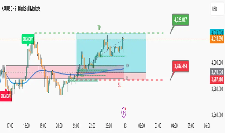
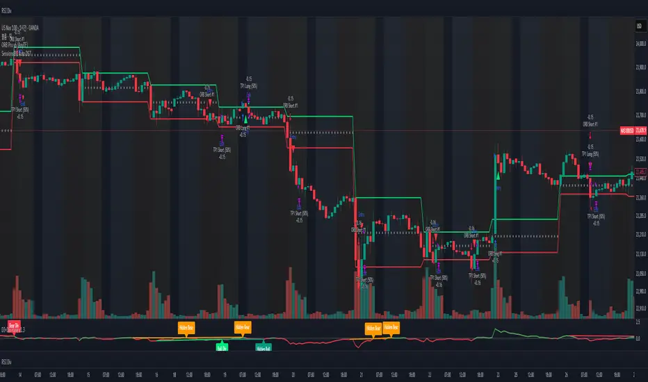
Opening Range & Session Liquidity [LTS]“Opening Range & Session Liquidity ” is an intraday planning tool that combines a configurable Opening Range box with session highs/lows and previous-day reference levels. It is designed to help you visualize where liquidity is likely to build up around the cash open and major global sessions, without making any forecasts or performance promises. It is designed with our signature attention to user customization and accessibility.
Opening Range & Bias
The script builds a configurable Opening Range (OR) in New York time (default 08:00–08:15 on a 15-minute basis), regardless of your chart timeframe (up to 1-hour). The high, low, and midline of this window are drawn as a transparent box and dashed midline that extend forward so you can see how the session trades around that range.
At a user-defined Bias Check Time (default 09:30–09:31 NY), the script classifies the OR as:
Bullish if price is above the OR high
Bearish if price is below the OR low
Neutral if price is still trading inside the OR
The box color updates to reflect the current bias if bias mode is enabled. All OR parameters (formation window, bias check, colors, maximum number of zones, etc.) are adjustable.
Entry Signal Logic
The indicator can optionally generate non-repainting visual signals when price interacts with the OR midline.
1. 9:30 Bias mode (trend-following)
A directional bias is locked in at the bias check time.
Signals trigger only when price trades through the OR midline inside the box, aligned with that bias:
Bullish bias → long signal when price touches the midline from below and closes inside the range.
Bearish bias → short signal when price touches the midline from above and closes inside the range.
Each “episode” can fire only once; signals are confirmed on the bar where the conditions first become true.
2. Entry Direction mode (reaction to first touch)
Instead of using a fixed 9:30 bias, the script detects from which side price first enters the OR (from above or from below).
That “entry direction” stays active until price fully exits and closes outside the OR again.
When price later touches the midline while the entry direction is defined, a single long or short signal is triggered based on the stored direction of entry.
In both modes, historical signals are plotted without using future data; only the real-time bar can change state until it closes.
Optional TP/SL Visualization
When a long or short signal appears, the script can draw simple take-profit/stop-loss boxes to illustrate a basic one-trade idea:
Stop-loss distance can be defined as:
A fixed number of points beyond the OR high/low, or
A percentage of ATR (configurable length and percent).
Take-profit is automatically placed at a user-defined risk-to-reward multiple of that stop distance.
The boxes extend forward bar by bar and stop updating once either TP or SL is touched, or when a new OR session resets the context.
These boxes are for visualization only and do not place or manage orders.
Session Liquidity & PDH/PDL
To help you map where liquidity frequently builds up, the script tracks three configurable intraday sessions in New York time:
Asian session (default 18:00–02:00)
London session (default 03:00–08:00)
New York session (default 09:30–16:00)
For each completed session, the indicator records the session high and low, then:
Draws solid horizontal lines and labels (e.g., “Asia Hi/Lo”, “London Hi/Lo”, “NY Hi/Lo”).
Extends these solid lines to the right as long as they remain untouched by price.
When price first trades through a level, the solid line is cut at that bar and replaced by a dashed line that extends only until the next session of the same type begins.
Older sessions are automatically removed according to the “Max Sessions to Display” setting to reduce chart clutter.
In addition, the indicator plots:
Previous Day High (PDH) & Previous Day Low (PDL)
Previous Day Point of Control (PDPoC) – an approximate volume-weighted price computed from intraday data using a simple binning approach on a user-chosen lower timeframe.
Like the session levels, PDH/PDL/PDPoC start as solid lines. After the first touch, each level switches to a dashed style and continues only until the following trading day, at which point the previous day’s dashed lines are stopped and new levels are created.
Info Table & Multi-Timeframe Logic
An optional on-chart info table summarizes the most recent Opening Range:
OR high, low, and midline
Current OR range in points
Active mode (9:30 Bias vs. Entry Direction)
Current bias or entry-direction status
Whether a signal is “Waiting”, “Armed”, or “Triggered”
Whether the OR was built from the chart timeframe or from a 15-minute higher-timeframe feed
If your chart timeframe is higher than the OR calculation timeframe, the script automatically uses multi-timeframe data to build a consistent OR, while enforcing a maximum chart timeframe of 1-hour for reliability.
How to Use This Tool
Use the OR box and bias to define your primary intraday context around the cash open.
Use session highs/lows and PDH/PDL/PDPoC as objective reference levels for where price may react or where stops and liquidity might cluster.
Treat the signal markers and TP/SL boxes as visual guides only. They can help you structure trade ideas, but they are not a trading system by themselves.
Always confirm levels and signals with your own analysis, risk management, and execution rules.
Limitations & Notes
The script is intended for intraday charts up to 1-hour. By the nature of the information being displayed, any time frame above that may result is undesirable visual clutter.
The POC calculation is an approximation based on lower timeframe bar-level volume and binning; it is not a tick-by-tick volume profile.
Signals and levels update in real time on the current forming bar. Once a bar closes, completed historical signals do not repaint, but the last live bar can change until it closes.
The indicator does not use lookahead or offset plotting into the past; it is not designed to predict the future or guarantee any particular trading result.
Always test settings on a demo environment first and manage risk according to your own plan.

Trading Sessions Low and HighVisualize and analyze different trading sessions (Tokyo, London, New York) on your charts.
Key Features:
Colored Session Zones: Displays colored rectangles to visually identify each active trading session
Smart High/Low Lines:
Draws horizontal lines at the highest and lowest points of each session
These lines automatically extend forward in time until a candle crosses them
Helps identify support/resistance levels created during each session
Detailed Session Information:
Range (difference between highest and lowest points)
Average price of the session
Open and close lines
Full Customization:
Choose the number of historical sessions to display (e.g., last 10, 20 sessions)
Line style and width for high/low lines
Enable/disable each element independently
Trading Benefits:
Identify liquidity zones created during each session
Spot key levels that continue to influence price after a session closes
Analyze volatility and price behavior across different sessions
Detect breakouts of important levels established during previous sessions

Alos Volume Profile Candles (SVP)ALOS Volume Profile Candles (SVP)
Summary
IMPORTANT: This indicator is designed to be used only with TradingView's 'Session Volume Profile' chart type. It will not work correctly with standard candle charts.
This indicator powerfully visualizes intra-session price action by dividing a single session profile into a specific number of equal-sized synthetic candles.
Instead of viewing a session as one single block, you can now break it down into parts (like quarters or thirds) to see how price behaved during each segment of the profile.
Key Features
Custom Session Slicing: Set "Candles per session" to 4 to see the session in quarters, 6 to see it in sixths, or any number you choose.
Full Session Control: Works perfectly with any custom session time, including complex overnight sessions (like '1800-1700' for CME crypto futures)
Accurate OHLC Calculation: Each synthetic candle correctly calculates and displays its own Open, High, Low, and Close for its specific time slice.
Clean Charting: Use the "Keep last sessions" input to control how many old sessions are drawn, preventing chart clutter and keeping your analysis focused on recent price action.
How to Use
On your TradingView chart, change the chart type to "Session Volume Profile".
Add the "ALOS Volume Profile Candles (SVP)" indicator to your chart.
Set your desired Session time in the indicator settings (or keep the default).
Choose the number of Candles per session you want to divide it into.
Adjust Keep last sessions to control how much history is displayed.
This tool is ideal for traders who want to analyze price behavior during the opening, middle, and closing parts of a session, or for breaking down long 24-hour crypto sessions into more manageable chunks.

Institutional Sessions Volume Order Flow [SumitQuants]Institutional Sessions Volume Order Flow
🔥 Institutional Sessions Volume Order Flow — The all-in-one Pine v6 toolkit that reveals institutional volume order blocks, session structure, VWAP bands and trend ribbon so you can trade with professional conviction.
🎯 See where smart money is active. Institutional Sessions Volume Order Flow surfaces high-volume order blocks, session boxes, VWAP bands, MA ribbon and Supertrend alerts — a single overlay that turns market noise into tradable structure. ⚡📈
✨ Key Features
📦 Institutional Volume Order Blocks: Detects bullish & bearish order blocks by aggregating volume around local highs/lows and plots filled zones with volume-percent labels.
🕒 Session Boxes & Timeline: Auto session boxes for Asia/ Europe / NewYork / Sydney with merge options, open/close lines, pip/% labels and optional candle coloring.
📉 VWAP with Bands: Multi-anchor VWAP (Session/Week/Month/Quarter/Year/Earnings/Dividends/Splits) plus up to 3 configurable bands (SD or % mode) and fills.
🧭 Moving Average Ribbon: 4-MA ribbon (SMA/EMA/SMMA/WMA/VWMA) for trend structure and dynamic S/R.
⚡ Supertrend Overlay: Optional Supertrend with conditional background fill and built-in trend-change alert hooks.
🔔 Prebuilt Alerts: Supertrend flips, session opens, session new highs/lows — ready for automation or notifications.
⚙️ Deep Customization: Colors, styles, lookback, merge behaviors, band multipliers, anchor periods, session times, label sizes, and more.
🛠 Pine v6 Optimized: Modern, overlay-ready Pine Script v6 implementation suitable for intraday and multi-timeframe use.
🧠 Why Traders Buy It
🔍 Institutional context: Volume-weighted order blocks reveal where large participants acted — crucial for high-probability trade planning.
✅ Stacked confirmation: Ribbon → VWAP → order block filters noise and aligns entries with institutional flow.
🌐 Session clarity: Quickly identify which market session is driving price and volatility.
📣 Actionable alerts: Be notified exactly when setups trigger so you don’t miss transitions.
🧩 Versatile: Great for scalpers, intraday momentum traders, swing traders, prop desks and system developers.
🚀 Quick Start (3 steps)
Add Institutional Sessions Volume Order Flow to your chart (Pine v6).
Enable Order Blocks + VWAP + Supertrend to begin.
Tune session times and band/MA settings for your instrument and timeframe. Use Supertrend + ribbon alignment + zone retest for higher-probability entries. 🎛️
🧾 Technical Notes & Compatibility
📜 Pine Script v6 — compatible with TradingView’s current scripting environment.
📌 Overlay indicator — draws directly on price chart.
🔔 Alerts use alertcondition hooks for TradingView notifications.
👤 Author: Created and maintained by SumitQuants.
⚠️ Risk Disclaimer
This tool provides context and signals — not guarantees. Backtest, paper trade, and use responsible risk management. Past performance is not indicative of future results. 📉
🛒 Call to Action (CTA)
Ready to trade with institutional clarity?
👉 Buy Institutional Sessions Volume Order Flow now — or message for a demo, custom tweaks, or a bundle including backtest/strategy code. Quick support and configuration help included. 💬
Reach out to the website and Buy This Indicator in the Courses Section www.ironmindtrader.com

Global Sessions by Back Ground ColorGlobal Sessions Background Color Indicator
This free TradingView tool visually highlights major global trading sessions directly on your chart using clean, professional color coding. It’s designed to help traders quickly identify periods of high liquidity and overlapping sessions, which often drive volatility and key price movements.
Features:
Session Highlights: Marks Asian, European (London), US (New York), and Overnight sessions with distinct background colors.
Overlap Detection: Special colors for overlapping sessions (e.g., London + New York).
Market Open/Close Alerts: Displays labels for major financial centers when they open or close.
Timezone-Aware: Automatically adjusts to Europe/Amsterdam (modifiable for your needs).
Clean Design: Uses a light, professional color palette for easy chart readability.
Why Use It?
Session timing is critical for spotting breakouts, reversals, and liquidity shifts. This indicator gives traders a clear visual edge without cluttering the chart—perfect for scalpers, day traders, and swing traders.
Completely free for the TradingView community – built by a trader, for traders.
How to Use the Global Sessions Indicator
This indicator automatically highlights major trading sessions on your chart using background colors. It helps you quickly identify when liquidity and volatility are likely to increase.
Color Guide:
Light Sky Blue → Asian Session (Tokyo, Sydney)
Active from 02:00 to 12:00 Amsterdam time. Often quieter but sets early trends.
Light Coral → European Session (London, Frankfurt)
Active from 09:00 to 17:30 Amsterdam time. Brings strong liquidity and trend continuation.
Light Green → US Session (New York, Chicago)
Active from 15:30 to 22:00 Amsterdam time. High volatility, major moves often occur here.
Gold/Yellow → Overnight/Wellington
Active from 23:00 to 02:00 Amsterdam time. Low liquidity, pre-Asia positioning.
Overlap Colors:
Orchid (Pinkish) → Asia + Europe Overlap
Indicates transition from Asia to London—watch for breakouts.
Light Salmon → Europe + US Overlap
The most volatile period of the day—ideal for intraday traders.
Extra Feature:
Labels show market open/close times for major financial centers (e.g., London Open, New York Close).
SW's Asia/London H/L'sAccurate Asia and London (with other session) High's and Low's. As well as NY Pre-market and opening bell, and end of day vertical lines. Also created 4 slots in UI to be able to set specific vertical lines with custom label options.
Elite Zone Master Pro - Advanced Multi-Session Trading System🚀 Elite Zone Master Pro - Advanced Multi-Session Trading System
🎯 ORIGINALITY & UNIQUE VALUE PROPOSITION
Elite Zone Master Pro is NOT a simple mashup of existing indicators. It's a proprietary trading system that combines three distinct methodologies into a unified, synergistic approach:
Multi-Session Zone Analysis - Original algorithm for tracking global market sessions
Dynamic Opening Range Breakout (ORB) - Enhanced ORB with bias-aware signal filtering
Advanced Fair Value Gap Detection - Proprietary FVG identification with smart mitigation tracking
🔧 Why This Combination Works
The power lies in how these components work together, not separately:
Session zones provide market context and volatility windows
ORB system identifies key breakout levels during optimal timeframes
FVG detection pinpoints precise entry locations within the ORB framework
Integrated bias system filters signals based on range direction momentum
🧠 DETAILED METHODOLOGY & CALCULATIONS
🌍 1. Multi-Session Zone Framework
What it does: Tracks and visualizes three major global trading sessions simultaneously.
How it works:
Dynamic zone tracking algorithm that calculates session highs/lows in real-time
Adaptive box rendering that expands/contracts based on actual price movement
Session overlap detection for identifying high-volatility periods
Time-weighted zone positioning using custom timezone calculations
Original concepts:
Simultaneous multi-session visualization (not found in standard session indicators)
Dynamic zone expansion based on volatility, not fixed time periods
Cross-session momentum analysis for bias determination
🎯 2. Enhanced Opening Range Breakout System
What it does: Identifies breakout opportunities from predefined session ranges with intelligent bias filtering.
How it works:
Multi-session ORB calculation: Supports US (16:30-16:45), EU (10:00-10:15), Asian (03:00-03:15), and custom sessions
Dynamic range establishment: Range is built in real-time during active session periods
Bias-aware signal filtering: Two-tier breakout system based on range midpoint momentum
Range direction analysis: Compares current range midpoint to previous session's midpoint
Original methodology:
Range Bias Calculation:
- If Current_Midpoint > Previous_Midpoint = Bullish Bias (+1)
- If Current_Midpoint < Previous_Midpoint = Bearish Bias (-1)
- If Current_Midpoint = Previous_Midpoint = Neutral Bias (0)
Signal Logic:
- Bullish Bias: Standard breakout above range high
- Bearish Bias: Enhanced breakout (range_high + 0.5 * range_width) for bullish signals
- Neutral Bias: Standard breakouts both directions
⚡ 3. Advanced Fair Value Gap (FVG) Detection
What it does: Identifies and tracks fair value gaps with automatic mitigation detection.
How it works:
Three-bar gap analysis: Compares current bar relationships to identify true gaps
Dynamic threshold calculation: Auto-adjusting sensitivity based on market volatility
Smart mitigation tracking: Automatically removes filled gaps from display
Directional bias integration: Color-codes gaps based on their directional implication
Proprietary algorithms:
Bullish FVG Criteria:
- Current_Low > High (gap condition)
- Close > High (confirmation)
- (Current_Low - High ) / High > Threshold (significance filter)
Bearish FVG Criteria:
- Current_High < Low (gap condition)
- Close < Low (confirmation)
- (Low - Current_High) / Current_High > Threshold (significance filter)
Mitigation Logic:
- Bullish FVG: Mitigated when Close < FVG_Low
- Bearish FVG: Mitigated when Close > FVG_High
📈 4. Session-Based Moving Average System
What it does: Calculates moving averages that reset and adapt to session boundaries.
How it works:
Session-aware length calculation: Effective length = min(bars_since_session_start, user_length)
Multiple MA types: EMA, SMA, RMA, WMA, VWMA with session-specific calculations
Dynamic smoothing: Adapts to session length for consistent signals across different session durations
🔄 INTEGRATED SYSTEM SYNERGY
🎯 How Components Work Together
Context Layer: Session zones provide market timing context
Setup Layer: ORB system identifies breakout opportunities within optimal timeframes
Entry Layer: FVG detection pinpoints precise entry levels
Filter Layer: Bias system ensures alignment with momentum direction
Confirmation Layer: Session MA provides trend confirmation
🧭 Signal Generation Process
Step 1: Session Analysis
- Identify active trading session
- Calculate session volatility metrics
- Establish range boundaries
Step 2: Range Bias Calculation
- Compare current vs previous range midpoints
- Assign directional bias (-1, 0, +1)
- Adjust breakout thresholds accordingly
Step 3: Breakout Detection
- Monitor price interaction with range boundaries
- Apply bias-specific breakout criteria
- Generate preliminary signals
Step 4: FVG Confirmation
- Scan for fair value gaps within range
- Validate gap significance using dynamic thresholds
- Provide entry refinement opportunities
Step 5: Signal Validation
- Cross-reference with session MA direction
- Ensure alignment with overall bias
- Output final trading signals
📊 PRACTICAL IMPLEMENTATION
🎯 Trading Strategy Framework
Setup Phase:
Configure session times for your timezone
Enable preferred sessions (US/EU/Asian)
Adjust FVG sensitivity based on instrument volatility
Execution Phase:
Wait for range establishment during active session
Monitor for bias-aligned breakouts
Look for FVG retest opportunities
Enter trades with ORB-based stop losses
Risk Management:
Stop loss placement: Outside ORB range boundaries
Position sizing: Based on range width volatility
Trade direction: Must align with calculated range bias
🎨 UNIQUE VISUAL IMPLEMENTATION
📊 Advanced Visualization Features
Multi-layered zone rendering with transparency controls
Dynamic range boxes that adapt to price movement
Smart label positioning to avoid chart clutter
Color-coded bias indication through range fills
Progressive FVG display with automatic cleanup
🔧 TECHNICAL SPECIFICATIONS
⚙️ Performance Optimizations
Efficient array management for FVG tracking
Memory optimization through historical data cleanup
Smart rendering to prevent chart overload
Error handling for edge cases and invalid timeframes
📈 Compatibility
All timeframes under 1 day
All instruments (Forex, Stocks, Crypto, Futures)
All chart types with overlay capability
Mobile and desktop platform support
🏆 WHAT MAKES THIS DIFFERENT FROM OTHER INDICATORS
❌ Standard ORB indicators: Only show basic range breakouts without bias consideration
❌ Basic FVG indicators: Don't integrate with session analysis or range systems
❌ Session indicators: Simply highlight time periods without actionable trading signals
❌ Moving average indicators: Don't adapt to session dynamics
✅ Elite Zone Master Pro: Combines all elements with proprietary logic for a complete trading system
📋 USE CASES & MARKET APPLICATION
🎯 Primary Applications
Forex day trading during major session overlaps
Index futures scalping using session-specific ranges
Cryptocurrency swing trading with 24/7 session analysis
Stock market opening range breakout strategies
📊 Performance Characteristics
Best performance: During high-volatility session transitions
Optimal timeframes: 1m to 4H for intraday trading
Risk-reward ratios: Typically 1:2 to 1:4 based on range width
Win rate: Higher probability when all components align
This indicator represents months of development combining institutional trading concepts with retail accessibility. It's not just another indicator - it's a complete trading methodology in one comprehensive tool.
Global Sessions Background (Auto DST) — US · EU · ASIA[by Irum]목적 & 정의 (KR/EN)
목적 (KR)
차트에 미국/유럽/아시아 주요 세션을 자동으로 음영 처리하여, 시세 흐름을 세션 맥락(개장/중첩/점심 휴장 등) 속에서 빠르게 파악하도록 돕습니다. DST(서머타임)를 IANA 타임존 기반으로 자동 반영합니다.
Definition (EN)
Shade the chart background for US/EU/ASIA sessions so you can instantly read price action in the right session context (open/overlap/lunch break). Daylight Saving Time is auto-handled via IANA time zones.
설정 메뉴 매뉴얼 (KR/EN)
1) 시각화 / Visualization
투명도 / Transparency (int 0~100, 기본 85)
KR: 배경 투명도. 0=진하게, 100=완전 투명.
EN: Background opacity. 0=solid, 100=fully transparent.
표시 우선순위 / Draw Priority (옵션)
KR: 세션 겹침 시 오른쪽 항목일수록 최종 표시. 예) US > EU > ASIA면 US가 최우선.
EN: When sessions overlap, the rightmost wins. E.g., US > EU > ASIA gives top priority to US.
세션 라벨 표시 / Show session labels (bool)
KR: 세션 시작봉에 “US/EU/ASIA” 라벨을 소형으로 표시.
EN: Drops a tiny “US/EU/ASIA” label at each session start bar.
2) 미국장 / US Session
미국장 배경 표시 / Show US session (bool)
KR: 미국장 음영 켬/끔.
EN: Toggle US shading.
미국 타임존 (IANA) / US Timezone (IANA) (string)
KR: 기본 America/New_York. IANA이므로 DST 자동 반영.
EN: Default America/New_York. IANA tz, DST auto-handled.
정규장(RTH) / Regular Trading Hours (session)
KR: 기본 0930-1600. 필요 시 수정.
EN: Default 0930-1600. Adjust as needed.
프리마켓·애프터 포함 / Include pre/after (bool)
KR: 프리마켓/애프터 시간도 함께 음영.
EN: Include pre-market and after-hours shading.
프리마켓 / Pre-market (session), 애프터마켓 / After-hours (session)
KR/EN: 세부 시간 개별 지정.
배경색 / Background color (color)
KR/EN: 미국장 음영 색상.
3) 유럽장 / Europe Session
유럽장 배경 표시 / Show EU session (bool)
유럽 타임존 (IANA) / Europe Timezone (IANA) (string) — 기본 Europe/London
정규장 / Regular Trading Hours (session) — 기본 0800-1630
배경색 / Background color (color)
(KR/EN 동일 의미. DST 자동 반영.)
4) 아시아장 / Asia Session
아시아장 배경 표시 / Show Asia session (bool)
아시아 타임존 (IANA) / Asia Timezone (IANA) (string) — 기본 Asia/Seoul
분할세션 사용(점심휴장) / Use split sessions (bool)
KR: 켜면 오전/오후(점심 휴장)로 분할 적용.
EN: If ON, use morning/afternoon split around lunch break.
연속 세션 / Continuous session (session) — 기본 0900-1530
오전 / Morning (session) — 기본 0900-1130
오후 / Afternoon (session) — 기본 1230-1530
배경색 / Background color (color)
IDKFAIDKFA - Advanced Order Blocks & Volume Profile with Market Structure Analysis
Why IDKFA?
Named after the legendary DOOM cheat code that gives players "all weapons and full ammo," IDKFA provides traders with a comprehensive arsenal of market analysis tools. Just as the cheat code arms players with everything needed for combat, this indicator equips traders with essential market structure tools: Order Blocks, Volume Profile, LVN/HVN areas, Fibonacci retracements, and intelligent buy/sell signals - all in one unified system.
Core Features
Order Blocks Detection
Automatically identifies institutional order blocks using pivot high/low analysis
Extends blocks dynamically until price interaction occurs
Bullish blocks (demand zones) and bearish blocks (supply zones)
Customizable opacity and extend functionality
Advanced Volume Profile
Real-time volume profile calculation for multiple session types
Point of Control (POC), Value Area High (VAH), and Value Area Low (VAL)
Mode 1: Side-by-side bull/bear volume display
Mode 2: Overlapped volume display with percentage analysis
Shows buying vs selling pressure at each price level
LVN/HVN Area Detection
Low Volume Nodes (LVN): Areas below VAL where price moves quickly
High Volume Nodes (HVN): Areas above VAH with strong resistance
NPOC (Naked Point of Control): Single print areas within Value Area
Volume-based gradient coloring shows relative activity levels
Smart Fibonacci Retracements
Auto-detects trend direction for proper fibonacci orientation
Dynamic color coding: Red levels in uptrends, Gold in downtrends
Special 88.6% level turns lime green in downtrends
Key levels: 23.6%, 38.2%, 50%, 61.8%, 65%, 78.6%, 88.6%
Intelligent Signal System
Works best on higher timeframes
Identifies high-probability reversal setups at key levels
Buy signals: Large bearish rejection followed by bullish reclaim
Sell signals: Large bullish rejection followed by bearish breakdown
Signals only trigger near significant support/resistance areas
Signal Analysis & Usage Guidelines
Buy Signal Mechanics
The buy signal triggers when:
Previous candle shows significant bearish movement (minimum ATR multiplier)
Current candle reclaims a configurable percentage of the previous candle's range
Price is near a key support level (order blocks, fibonacci, volume levels)
Sell Signal Mechanics
The sell signal triggers when:
Previous candle shows significant bullish movement (minimum ATR multiplier)
Current candle rejects below a configurable percentage of the previous candle's range
Price is near a key resistance level (order blocks, fibonacci, volume levels)
When to TAKE Signals
High Probability Buy Signals:
Signal appears AT or BELOW the VAL (Value Area Low)
Signal occurs at bullish order block confluence
Price is in LVN area below VAL (momentum acceleration zone)
Signal aligns with fibonacci 61.8% or 78.6% support
Multiple session POC levels provide support confluence
Previous session's VAL acting as current support
High Probability Sell Signals:
Signal appears AT or ABOVE the VAH (Value Area High)
Signal occurs at bearish order block confluence
Price is in HVN area above VAH (heavy resistance zone)
Signal aligns with fibonacci 61.8% or 78.6% resistance
Multiple session POC levels provide resistance confluence
Previous session's VAH acting as current resistance
When to AVOID Signals
Avoid Buy Signals When:
Signal appears ABOVE the VAH (buying into resistance)
Price is in HVN red zones (high volume resistance areas)
No clear support structure below current price
Volume profile shows heavy selling pressure (high bear percentages)
Signal occurs during low-volume periods between major sessions
Multiple bearish order blocks exist below current price
Avoid Sell Signals When:
Signal appears BELOW the VAL (selling into support)
Price is in LVN green zones (momentum could continue)
No clear resistance structure above current price
Volume profile shows heavy buying pressure (high bull percentages)
Signal occurs during Asian session ranges without clear direction
Multiple bullish order blocks exist above current price
Volume Profile Context for Signals
Understanding Bull/Bear Percentages:
70%+ Bull dominance at a level = Strong support expected
70%+ Bear dominance at a level = Strong resistance expected
50/50 Split = Neutral zone, less predictable
Use percentages to gauge conviction behind moves
POC (Point of Control) Interactions:
Signals above POC in uptrend = Higher probability
Signals below POC in downtrend = Higher probability
Signals against POC bias require extra confirmation
POC often acts as magnetic level for price return
Trading Strategies
Strategy 1: VAL/VAH Bounce Strategy
Wait for price to approach VAL (support) or VAH (resistance)
Look for signal confirmation at these critical levels
Enter with tight stops beyond the Value Area
Target opposite boundary or next session's levels
Strategy 2: Order Block + Volume Confluence
Identify order block alignment with VAL/VAH
Wait for signal within the confluence zone
Enter on signal with stop beyond order block
Use LVN areas as acceleration zones for targets
Strategy 3: LVN/HVN Strategy
LVN (Green) Areas: "Go Zones" - expect quick price movement through low volume
HVN (Red) Areas: "Stop Zones" - expect resistance and potential reversals
NPOC Areas: "Fill Zones" - price often returns to fill single print gaps
Strategy 4: Multi-Session Analysis
Use Daily/Weekly for major structure context
Use 4H for intermediate levels
Use 1H for precise entry timing
Ensure all timeframes align before taking signals
Strategy 5: Fibonacci + Volume Profile
Buy signals at 61.8% or 78.6% fibonacci near VAL
Sell signals at 61.8% or 78.6% fibonacci near VAH
Use 88.6% level as final support/resistance before major moves
50% level often aligns with POC for confluence
Signal Quality Assessment
Grade A Signals (Highest Probability):
Signal at VAL/VAH with order block confluence
Fibonacci level alignment (61.8%, 78.6%)
Volume profile shows 70%+ dominance in signal direction
Multiple timeframe structure alignment
Signal occurs during high-volume sessions (London/NY)
Grade B Signals (Moderate Probability):
Signal near POC with some confluence
Fibonacci 50% or 38.2% alignment
Mixed volume profile readings (50-70% dominance)
Some timeframe alignment present
Signal during overlap sessions
Grade C Signals (Lower Probability):
Signal with minimal confluence
Weak fibonacci alignment or none
Volume profile neutral or against signal
Conflicting timeframe signals
Signal during low-volume periods
Risk Management Guidelines
Position Sizing Based on Signal Quality:
Grade A: Standard position size
Grade B: Reduced position size (50-75%)
Grade C: Minimal position size (25%) or skip entirely
Stop Loss Placement:
Beyond order block boundaries
Outside Value Area (VAL/VAH)
Below/above fibonacci confluence levels
Account for session volatility ranges
Profit Targets:
First target: Opposite VAL/VAH boundary
Second target: Next session's key levels
Final target: Major order blocks or fibonacci extensions
Credits & Attribution
Original components derived from:
Market Sessions & Volume Profile by © Leviathan (Mozilla Public License 2.0)
Volume Profile elements inspired by @LonesomeTheBlue's volume profile script
Pivot Order Blocks by TradingWolf / © MensaTrader (Mozilla Public License 2.0)
Auto Fibonacci Retracement code (public domain)
Significant enhancements and modifications include:
Advanced LVN/HVN detection and visualization
Bull/Bear percentage analysis for Mode 2/3
Comprehensive alert system with market context
Integrated buy/sell signals at key levels
Performance optimizations and extended session support
Enhanced Mode 2/3 with percentage pressure analysis
Important Disclaimers
This indicator is a technical analysis tool designed for educational purposes. It does not provide financial advice, investment recommendations, or trading signals that guarantee profits. All trading involves substantial risk of loss, and past performance does not guarantee future results. Users should conduct their own research, understand the risks involved, and consider consulting with qualified financial advisors before making trading decisions. The signals and analysis provided are based on historical price patterns and volume data, which may not predict future market movements accurately.
Best Practices
Never trade signals blindly - always consider volume profile context
Wait for confluence between multiple tools before entering
Respect the Value Area - avoid buying above VAH or selling below VAL
Use session context - Asian ranges vs London/NY breakouts
Practice proper risk management - position size based on signal quality
Understand the bigger picture - use multiple timeframes for context
Remember: Like the IDKFA cheat code, having all the tools doesn't guarantee success. The key is learning to use them together effectively and understanding when NOT to take a signal is often more important than knowing when to take one.

STDZ - Global Trading Sessions📊 STDZ - Global Trading Sessions (GTS)
STDZ - Global Trading Sessions (GTS) is an indicator that overlays global market session data directly on your intraday charts. It visualizes trading sessions from different time zones, helping intraday traders quickly assess volatility, session ranges, and structural market behavior across global financial centers. The default setting is enough to cover all the major stock markets opening time including:
• Asia: Sydney, Tokyo, Hong Kong
• Europe: Frankfurt, London
• North America: New York
⸻
🚀 Features
• 🔹 Session Visualization: Up to 3 configurable trading sessions with customizable:
• Session time windows
• Time zones (IANA or GMT format)
• Colors
• Session labels
• 🔹 Session Metrics:
• Open, High, Low, and Average lines
• Session range measurement
• 🔹 Statistics Table:
• Live display of each session’s range
• Daily and Weekly True Range / ATR
• 🔹 Session Open Highlights: Vertical lines for weekly changes to contextualize price action
• 🔹 Dynamic Chart Objects: Lines, boxes, and labels update in real time as sessions progress
• 🔹 🕒 Timezone-aware session rendering (supports daylight saving)
Umesh BC IST 3:30 AM Session Tracker + 4H Candles📌 IST 3:30 AM Session Tracker + 4H Candle Marker
This indicator is designed for traders who follow Indian Standard Time (IST) and want precise session tracking and 4H candle insights.
🔧 Features:
🕒 Daily Session Start at 3:30 AM IST
Automatically detects and marks the beginning of each new trading day based on 3:30 AM IST, not midnight.
Displays session Open, High, and Low lines.
Background shading for each session.
Customizable alert when a new day starts.
🟧 4H Candle Start Markers (IST Time)
Identifies every new 4-hour candle that starts at:
3:30, 7:30, 11:30, 3:30 PM, 7:30 PM, 11:30 PM IST
Adds a vertical line and label ("🟧 4H") above the candle.
Plots a dynamic line for the 4H candle's opening price.
Includes optional alert for new 4H candles.
🔔 Alerts Included:
"🕒 New IST Day Start": Triggers at 3:30 AM IST.
"🟧 New 4H Candle": Triggers at each 4H candle start (IST).
✅ Best for:
Intraday, swing, and institutional traders using IST-based analysis.
Those wanting more accurate daily sessions and clear candle structuring.

Market Sessions and OverlapsMarket Sessions and Overlaps Indicator
This script, titled " Market Sessions and Overlaps ," provides a detailed visualization of major global trading sessions—Asia, Europe, and New York—along with the periods where these sessions overlap. It is designed to assist traders in understanding session timings and overlaps in their local time zone. Key features include:
Session Visualization: Highlights the Asia, Europe, and New York trading sessions directly on the chart with customizable colors and transparency for better clarity.
Overlap Identification: Marks the overlapping periods between Asia-Europe and Europe-New York sessions, where market activity often intensifies, with distinct candle colors.
Time Zone Support: The script allows users to select their local time zone, ensuring all session times are displayed accurately, no matter the user’s location.
Alerts for Key Events: Includes optional alerts to notify users of session openings, closings, and the start or end of overlap periods.
This indicator serves as a visual tool for tracking session-specific activity and liquidity. It is configurable to match individual preferences, enabling better alignment with trading strategies.
Disclaimer: This script is for informational purposes only and does not provide financial advice. Please consult a licensed financial advisor for personalized trading guidance.