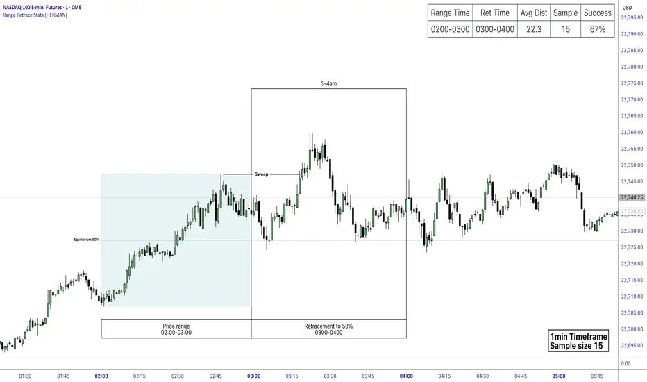
Price Range Retrace statisticks [HERMAN]📈 Price Range Retrace Stats
This indicator is designed to help traders quantify how often price retraces to a selected equilibrium level (e.g., 50%) after sweeping the high/low of a defined time-based range.
It is especially useful for modeling sessions such as the London Opening Range (e.g., 02:00–03:00 NY time), checking if price sweeps that range in a subsequent window (e.g., 03:00–04:00), and returns to its 50% level.
✅ What does it do?
Lets you define multiple time ranges (e.g. London, NY Open, custom ranges).
Draws the range box for the selected session time.
Calculates and plots the retracement level (default 50%).
Checks if price sweeps the high/low of the range before retracing.
Tracks success rate, average distance, sample size and displays these stats in a table.
⚙️ Key Features:
Fully customizable time windows (range box time and retracement check time).
-Configurable retracement % (default 50% equilibrium).
-Optional sweep condition (only count retracements if price sweeps the high/low first).
-Clean, theme-adaptive stats table with success rates and averages.
-Supports two independent levels (e.g. London and NY sessions).
📊 Why use it?
This tool turns session-based setups into statistical models:
Backtest session strategies over many days.
Quantify edge with % success over time.
Validate trading ideas with data.
Use probabilities instead of gut feeling.
Example insight you can track:
“Between 3–4 AM NY time, price swept the high/low of the 2–3 AM London Opening Range and returned to its 50% equilibrium level in 64% of 234 sessions.”
📌 Ideal for:
ICT concepts (Opening Range, Sweep, Equilibrium Return).
Algo developers wanting probabilities.
Anyone who wants data-driven confirmation for session range mean-reversion.
Instructions:
1️⃣ Enable the desired Price Range (1 or 2).
2️⃣ Set your Range Time (e.g. 02:00–03:00).
3️⃣ Set your Retracement Check Time (e.g. 03:00–04:00).
4️⃣ Choose retracement % (e.g. 50%).
5️⃣ Watch the box and retrace line plot on chart.
6️⃣ Review the success statistics in the table.
Pesquisar nos scripts por "session"
80% Rule Indicator (ETH Session + SVP Prior Session)I created this script to show the 80% opportunity on chart if setting lines up.
"80% rule: Open outside the vah or Val. Spend 30 mins outside there then break back inside spend 15 mins below or above depending which way u broke. Then come back and retest the vah/val and take it to the poc as a first target with the final target being the other Val/vah "
📌 Script Summary
The "80% Rule Indicator (ETH Session + SVP Prior Session)" overlays your chart with prior session value area levels (VAH, VAL, and POC) calculated from extended-hours 30-minute data. It tracks when the price reenters the value area and confirms 80% Rule setups during your chosen trading session. You can optionally trigger alerts, show/hide market sessions, and fine-tune line appearance for a clean, modular workflow.
⚙️ Options & Settings Breakdown
- Use 24-Hour Session (All Markets)
When checked, the indicator ignores time zones and tracks signals during a full 24-hour period (0000-0000), helpful if you're outside U.S. trading hours or want consistent behavior globally.
- Market Session
Dropdown to select one of three key market zones:
- New York (09:30–16:00 ET)
- London (08:00–16:30 local)
- Tokyo (09:00–15:00 local)
Used to gate entry signals during relevant hours unless you choose the 24-hour option.
- Show PD VAH/VAL/POC Lines
Toggle to show or hide prior day’s levels (based on the 30-min extended session). Turning this off removes both the lines and their white text labels.
- Extend Lines Right
When enabled, the VAH/VAL/POC lines extend into the current day’s session. If disabled, they appear only at their anchor point.
- Highlight Selected Session
Adds a soft blue background to help visualize the active session you selected.
- Enable Alert Conditions
Allows TradingView alerts to be created for long/short 80% Rule entries.
- Enable Audible Alerts
Plays an in-chart sound with a popup message (“80% Rule LONG” or “SHORT”) when signals trigger. Requires the chart to be active and sounds enabled in TradingView.

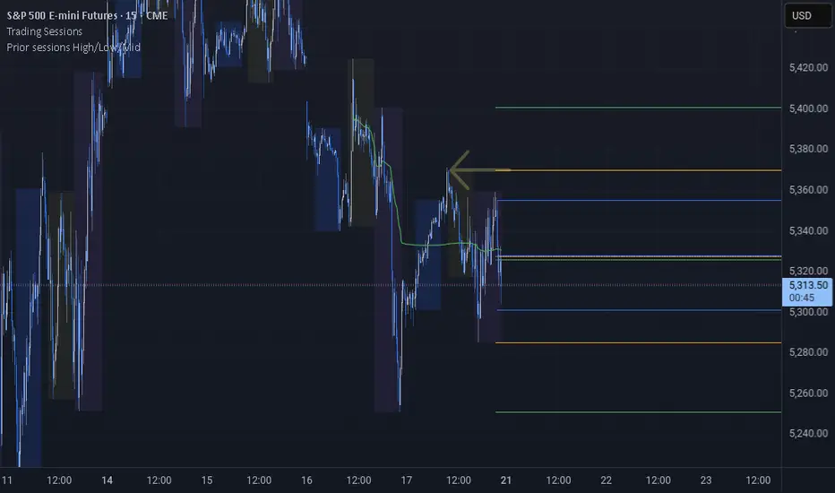
Prior sessions High/Low/MidThis indicator highlights the High, Low, and Midpoint of the most recently completed trading sessions. It helps traders visualize key price levels from the previous session that often act as support, resistance, or reaction zones.
It draws horizontal lines for the high and low of the last completed session, as well as the midpoint, which is calculated as the average of the high and low. These lines extend to the right side of the chart, remaining visible as reference levels throughout the day.
You can independently enable or disable the Tokyo, London, and New York sessions depending on your preferences. Each session has adjustable start and end times, as well as time zone settings, so you can align them accurately with your trading strategy.
This indicator is particularly useful for intraday and swing traders who use session-based levels to define market structure, bias, or areas of interest. Session highs and lows often align with institutional activity and can be key turning points in price action.
Please note that this script is designed to be used only on intraday timeframes such as 1-minute to 4-hour charts. It will not function on daily or higher timeframes.
Live SessionsLive sessions plots the highs and lows of the previous for sessions.
It also marks when these are broken by price.
Default Time Frames are:
London Session = "0000-0600", "UTC-4"
New York Session = "0830-1230", "UTC-4"
Asia Session = "1800-0000", "UTC-4"
New York Close Session = "1330-1630", "UTC-4"
Useful for highlighting when price has gone through a previous session high or low and quickly seeing where liquidity still lies.
Daily Open [Kintsugi Trading]Daily Open
The "Daily Open" indicator by Kintsugi Trading is designed to give traders clear and immediate access to daily open prices, enhancing their ability to spot key market levels and make informed trading decisions. The indicator dynamically changes the color of the plotted line based on the current price's relationship to the opening price of the regular market session. This visual aid helps traders quickly assess whether the current price is trading above or below the opening price of the session.
Key Features:
Daily Open Visualization: Automatically plots the daily open price on your chart, providing a clear reference point for daily price action.
Configurable Market Open Time: The indicator allows users to input the start time of the regular market session (default is set to 9:30 AM).
Color-Coded: The indicator dynamically adjusts the color of the daily open line and price labels based on whether the price is above or below the open, giving you quick visual cues about market sentiment.
Customization Options: Users can modify the line's appearance, including the color and style, to better fit their chart preferences.
Ideal For:
This indicator is particularly useful for day traders and those looking to closely monitor price action in relation to the market's opening level. It serves as a quick reference point for identifying potential bullish or bearish sentiment throughout the trading day.
Good luck with your trading!

A Multi 10 indicatorREAD NOTE BEFORE APPLYING or you may think indicator doesnt work.
This indicator is a revise of another i made and contains 10 Optional Indicators allowing you to load more then 3 indicators at once if you so choose and dont pay for the platform!
Hopefully someone will find use for this script besides me :) I dont suggest turning all on at once because it
will not look right. Alot will overlap if you wish but i only use the Session and trend bar at once in
conjuction with a Oscillator setting like MacD , RSI , Stoch , Aroon or CCI .
In the chart you see i only have a few indicators active ENJOY!!
---------- NOTE ----------- ( Everything is OFF by default and indicator SHOULD show up BLANK when loaded) ------------ NOTE -------------
(Can turn EVERYTHING on AND change any values in the format tab once indicator loads)
Indicators included are listed below
Sessions, including, NY session, Aussie session, Asian session, and Europe market sessions.
MacD Split Colored , aroon oscillator
CCI Oscillator , classic aroon
RSI Oscillator , Elliot wave
Stoch RSI Oscillator , ATR%
My own Trend bar
---------- NOTE ----------- ( Everything is OFF by default and indicator SHOULD show up BLANK when loaded) ------------ NOTE -------------
(Can turn EVERYTHING on AND change any values in the format tab once indicator loads) CODE probably looks messey but this is something i made for me so i didnt really care lol
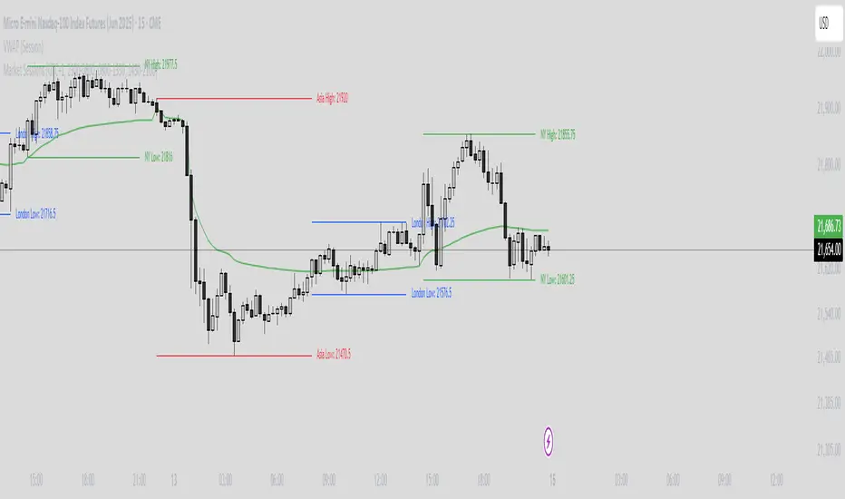
Asia Session + London ORB (NY Time)This TradingView indicator automatically identifies and marks key price levels from the **Asia trading session** and the **London Opening Range Breakout (ORB)** in **New York time (NY)**. It is designed for traders who want a clear visual reference for breakout and reversal strategies across major sessions.
**Features:**
1. **Asia Session High, Low, and Midpoint:**
* Automatically detects the high, low, and midpoint of the Asia session (default: 7:00 PM – 3:00 AM NY time).
* Draws a semi-transparent box to visualize the Asia session range.
* Extends levels forward for breakout or range-trading reference.
2. **London ORB High, Low, and Midpoint:**
* Marks the first 15-minute opening range of the London session (default: 3:00 AM – 3:15 AM NY time).
* Draws a semi-transparent box for the London ORB.
* Calculates midpoint and extends lines for easy breakout observation.
3. **Customizable Colors and Line Widths:**
* Users can set colors for session highs, lows, midpoints, and session boxes.
* Adjustable line width for better visibility on charts.
4. **Fully Automated:**
* No manual drawing required.
* Works for futures, forex, indices, or any market symbol.
**Use Case:**
* Identify breakout levels for **London session** relative to **Asia session range**.
* Spot potential reversals or continuation patterns at session highs/lows.
* Quick visual reference for high-probability intraday setups.
**Technical Notes:**
* Built in **Pine Script v6** for TradingView.
* Uses NY timezone by default but sessions can be customized.
* Compatible with intraday and higher timeframes.

Multi-Session Volume Profile [MarkitTick]💡 This comprehensive Multi-Session Volume Profile indicator offers a sophisticated, array-based approach to Auction Market Theory. By simultaneously processing Daily, Weekly, Monthly, and Custom Session profiles, it empowers traders to visualize the migration of value across multiple timeframes without the performance overhead of standard heavy profile scripts. It is designed to identify key liquidity nodes, support/resistance zones defined by volume, and the directional bias of the market through Point of Control (POC) shifts.
✨ Originality and Utility
● Multi-Dimensional Value Analysis
Unlike standard volume profiles that often restrict users to a single timeframe or require multiple instances of an indicator, this script consolidates four distinct profile calculations into a single, efficient tool. It leverages Pine Script® arrays and custom types (`VPSlot`, `VolumeProfile`) to dynamically calculate volume distribution, ensuring minimal lag while maintaining high data granularity.
● Dynamic POC Shift Tracking
A standout feature of this utility is the "Shift Analysis." The indicator does not merely plot the current Point of Control; it calculates the delta between the current session's POC and the previous session's POC. This provides immediate visual feedback on "Value Migration"—whether the market is accepting higher prices (Bullish Shift) or lower prices (Bearish Shift).
● Granular Control via Custom Types
The script utilizes a custom quantitative structure (`type VolumeProfile`) to manage raw volume, highs, lows, and volatility slots independently for each timeframe. This allows for precise "row" calculations, ensuring that the volume distribution accurately reflects price action within the specific session, rather than broad approximations.
🔬 Methodology and Concepts
● Array-Based Bucketing
The core engine relies on a "Row Size" input to divide the session's price range into horizontal buckets (slots). As new price bars form, the script distributes the bar's volume across these slots. If a bar spans multiple slots, volume is distributed proportionally; if a bar is contained within a single slot, the total volume accumulates there. This mimics a true TPO (Time Price Opportunity) calculation using volume as the weight.
● Statistical Value Area Calculation
The Value Area (VA) is determined using a standard deviation proxy. The script identifies the POC (the slot with the highest accumulated volume) and then iteratively adds the next highest volume slots above or below the POC until the total accumulated volume reaches the user-defined percentage (default 70%).
● Session Logic and Reset
The indicator employs state-logic variables (`isNewDay`, `isNewWeek`, `isNewMonth`) to detect session boundaries. Upon a boundary cross, the `reset()` method clears the arrays and initializes a new profile, while the `draw()` method finalizes the visualization of the completed session. This ensures that the lines on the chart always represent the developing or completed structure of the specific time period.
🎨 Visual Guide
The indicator renders up to four distinct profiles, each color-coded for rapid identification.
● Daily Profile (Default: Yellow)
Solid Yellow Line: Represents the Daily POC (Point of Control)—the price level with the most volume traded today.
Dashed/Dotted Yellow Lines: Represent the Value Area High (VAH) and Value Area Low (VAL).
Yellow Background Box: Highlights the 70% Value Area, showing where the bulk of the day's trading occurred.
● Weekly Profile (Default: Blue)
Solid Blue Line: The Weekly POC. Use this to gauge the medium-term trend direction.
Blue Background: Encapsulates the weekly value area. A breakout from this zone often signals a significant trend continuation.
● Monthly Profile (Default: Purple)
Solid Purple Line: The Monthly POC. This is a high-timeframe magnet level, often acting as major support or resistance.
Purple Background: Shows the macro acceptance zone for the asset.
● Custom Session Profile (Default: Cyan)
Solid Cyan Line: Tracks the POC for a specific time window (e.g., 09:30-16:00). Ideal for isolating RTH (Regular Trading Hours) from electronic sessions.
● Labels and Shift Arrows
Right-Side Labels: Display the exact price of the POC for each active profile.
Shift Indicators (▲ / ▼): Located inside the label. A "▲" indicates the current POC is higher than the previous session's POC (Value Migration Up), while "▼" indicates the opposite.
📖 How to Use
● Trend Confirmation via Value Migration
Observe the Shift Arrows in the labels. If the Daily and Weekly profiles both show "▲" (Up Shift), it confirms that value is migrating higher, suggesting a healthy uptrend. Do not short the market when value is migrating up unless price breaks below the VAL.
● Mean Reversion Trades
When price extends far away from the POC but fails to establish value (volume) at those new levels, it often reverts back to the POC. Use the POC lines as profit targets for mean reversion strategies.
● Breakout Validation
A breakout is considered valid if price closes outside the Value Area (Background Box) and volume begins to build at the new levels. If price spikes out of the VAH but quickly returns inside the box, it is a "Failed Auction," and a rotation to the VAL is probable.
● Confluence Zones
Look for price levels where the Daily POC and Weekly VAL/VAH overlap. These "clusters" of volume act as reinforced support or resistance levels.
⚙️ Inputs and Settings
● General Settings
Row Size: Determines the resolution of the profile. Higher numbers (e.g., 100) give smoother, more precise profiles but use more resources. Lower numbers (e.g., 24) are blockier but faster.
Value Area %: The percentage of total volume to include in the VA. Standard is 70.0.
Show POC Shift Analysis: Toggles the display of the ▲/▼ drift comparison.
● Profile Toggles (Daily, Weekly, Monthly, Session)
Each section has individual toggles for Show Profile , Show Value Area , and Show Background .
Start of Week Day: Allows you to define when the weekly profile resets (e.g., Sunday or Monday).
● Alert Settings
Approach Distance (Ticks): Defines how close price must get to a POC/VAH/VAL level to trigger an "Approaching" alert.
Enable Alerts: Master switch to turn on internal alert condition checks.
🔍 Deconstruction of the Underlying Scientific and Academic Framework
● Auction Market Theory (AMT)
The script is grounded in Auction Market Theory, which posits that the market's primary purpose is to facilitate trade. Price advertises opportunity, and Volume records the acceptance of that opportunity. The "Value Area" represents the fair value established by buyers and sellers, while the POC represents the price of maximum consensus.
● Gaussian Distribution Application
The calculation of the Value Area at 70% is derived from the statistical properties of a Normal (Gaussian) Distribution, where approximately 68.2% of data points typically fall within one standard deviation of the mean. In this script, the POC acts as the mode (peak frequency), and the Value Area represents that first standard deviation of transactional volume.
● Volume-Price Integration
By integrating volume into price buckets (`VPSlot`), the indicator transforms two-dimensional time/price data into three-dimensional data (Time, Price, Volume). This reveals the "texture" of the market structure, distinguishing between high-volume nodes (strong acceptance) and low-volume nodes (rejection or emotional trading).
⚠️ Disclaimer
All provided scripts and indicators are strictly for educational exploration and must not be interpreted as financial advice or a recommendation to execute trades. I expressly disclaim all liability for any financial losses or damages that may result, directly or indirectly, from the reliance on or application of these tools. Market participation carries inherent risk where past performance never guarantees future returns, leaving all investment decisions and due diligence solely at your own discretion.

ICT Killzones & Sessions Pro |MC|ICT Killzones & Sessions Pro |MC|
Credits go to LuxAlgo for the great work 👍
This indicator has been further developed and enhanced with additional features.
This indicator highlights key market sessions and killzones directly on your chart, helping traders identify high-probability trading periods.
💎 Key features include 💎
🔸Display of major market sessions such as Asia, London, and New York (AM/PM) with customizable times and colors.
🔸Transparent session highlighting for visual clarity without cluttering the chart.
🔸Configurable vertical border lines with adjustable style, width, and color.
🔸Timeframe-based display limits to hide killzones on higher timeframes.
🔸Fully adjustable label size for easy identification of sessions.
🔸Customizable UTC offset to align sessions with your preferred timezone.
Designed for day traders and scalpers, it visually separates market sessions for better trade planning and timing.
Happy Trading!

RiskCraft - Advanced Risk Management SystemRiskCraft – Risk Intelligence Dashboard
Trade like you actually respect risk
"I know the setup looks good… but how much am I actually risking right now?"
RiskCraft is an open-source Pine Script v6 indicator that keeps risk transparent directly on the chart. It is not a signal generator; it is a risk desk that calculates size, frames volatility, and reminds you when your behaviour drifts away from the plan.
Core utilities
Calculates professional-style position sizing in real time.
Reads volatility and market regime before position size is confirmed.
Adjusts risk based on the trader’s emotional state and confidence inputs.
Maps session risk across Asian, London, and New York hours.
Draws exactly one stop line and one target line in the preferred direction.
Provides rotating education tips plus contextual warnings when risk escalates.
It is intentionally conservative and keeps you in the game long enough for any separate entry logic to matter.
---
Chart layout checklist
Use a clean chart on a liquid symbol (e.g., AMEX:SPY or major FX pairs).
Main RiskCraft dashboard placed on the right edge.
Session Risk box on the left with UTC time visible.
Floating risk badge above price.
Stop/target guide lines enabled.
Education panel visible in the bottom-right corner.
---
1. On-chart components
Right-side dashboard : account risk %, position size/value, stop, target, risk/reward, regime, trend strength, emotional state, behavioural score, correlation, and preferred trade direction.
Session Risk box : highlights active session (Asian, London, NY), current UTC time, and risk label (High/Med/Low) per session.
Floating risk badge : keeps actual account risk percent visible with colour-coded wording from Ultra Cautious to Very Aggressive.
Stop/target lines : exactly one dashed stop and one dashed target aligned with the preferred bias.
Education panel : rotates core principles and AI-style warnings tied to volatility, risk %, and behaviour flags.
---
2. Volatility engine – ATR with context 📈
atr = ta.atr(atrLength)
atrPercent = (atr / close) * 100
atrSMA = ta.sma(atr, atrLength)
volatilityRatio = atr / atrSMA
isHighVol = volatilityRatio > volThreshold
ATR vs ATR SMA shows how wild price is relative to recent history.
Volatility ratio above the threshold flips isHighVol , which immediately trims risk.
An ATR percentile rank over the last 100 bars indicates calm versus chaotic regimes.
Daily ATR sampling via request.security() gives higher time-frame context for intraday sessions.
When volatility spikes the script dials position size down automatically instead of cheering for maximum exposure.
---
3. Market regime radar – Danger or Drift 🌊
ema20 = ta.ema(close, 20)
ema50 = ta.ema(close, 50)
ema200 = ta.ema(close, 200)
trendScore = (close > ema20 ? 1 : -1) +
(ema20 > ema50 ? 1 : -1) +
(ema50 > ema200 ? 1 : -1)
= ta.dmi(14, 14)
Regimes covered:
Danger : high volatility with weak trend.
Volatile : volatility elevated but structure still directional.
Choppy : low ADX and noisy action.
Trending : directional flows without extreme volatility.
Mixed : anything between.
Each regime maps to a 1–10 risk score and a multiplier that feeds the final position size. Danger and Choppy clamp size; Trending restores normal risk.
---
4. Behaviour engine – trader inputs matter 🧠
You provide:
Emotional state : Confident, Neutral, FOMO, Revenge, Fearful.
Confidence : slider from 1 to 10.
Toggle for behavioural adjustment on/off.
Behind the scenes:
Each state triggers an emotional multiplier .
Confidence produces a confidence multiplier .
Combined they form behavioralFactor and a 0–100 Behavioural Score .
High-risk emotions or low conviction clamp the final risk. Calm inputs allow normal size. The dashboard prints both fields to keep accountability on-screen.
---
5. Correlation guardrail – avoid stacking identical risk 📊
Optional correlation mode compares the active symbol to a reference (default AMEX:SPY ):
corrClose = request.security(correlationSymbol, timeframe.period, close)
priceReturn = ta.change(close) / close
corrReturn = ta.change(corrClose) / corrClose
correlation = calcCorrelation()
Absolute correlation above the threshold applies a correlation multiplier (< 1) to reduce size.
Dashboard row shows the live correlation and reference ticker.
When disabled, the row simply echoes the current symbol, keeping the table readable.
---
6. Position sizing engine – heart of the script 💰
baseRiskAmount = accountSize * (baseRiskPercent / 100)
adjustedRisk = baseRiskAmount * behavioralFactor *
regimeAdjustment * volAdjustment *
correlationAdjustment
finalRiskAmount = math.min(adjustedRisk,
accountSize * (maxRiskCap / 100))
stopDistance = atr * atrStopMultiplier
takeProfit = atr * atrTargetMultiplier
positionSize = stopDistance > 0 ? finalRiskAmount / stopDistance : 0
positionValue = positionSize * close
Outputs shown on the dashboard:
Position size in units and value in currency.
Actual risk % back on account after adjustments.
Risk/Reward derived from ATR-based stop and target.
---
7. Intelligent trade direction – bias without signals 🎯
Direction score ingredients:
EMA stack alignment.
Price versus EMA20.
RSI momentum relative to 50.
MACD line vs signal.
Directional Movement (DI+/DI–).
The resulting Trade Direction row prints LONG, SHORT, or NEUTRAL. No orders are generated—this is guidance so you only risk capital when the structure supports it.
---
8. Stop/target guide lines – two lines only ✂️
if showStopLines
if preferLong
// long stop below, target above
else if preferShort
// short stop above, target below
Lines refresh each bar to keep clutter low.
When the direction score is neutral, no lines appear.
Use them as visual anchors, not auto-orders.
---
9. Session Risk map – global volatility clock 🌍
Tracks Asian, London, and New York windows via UTC.
Computes average ATR per session versus global ATR SMA.
Labels each session High/Med/Low and colours the cells accordingly.
Top row shows the active session plus current UTC time so you always know the regime you are trading.
One glance tells you whether you are trading quiet drift or the part of the day that hunts stops.
---
10. Floating risk badge – honesty above price 🪪
Text ranges from Ultra Cautious through Very Aggressive.
Colour matches the risk palette inputs (High/Med/Low).
Updates on the last bar only, keeping historical clutter off the chart.
Account risk becomes impossible to ignore while you stare at price.
---
11. Education engine & warnings 📚
Rotates evergreen principles (risk 1–2%, journal trades, respect plan).
Triggers contextual warnings when volatility and risk % conflict.
Flags when emotional state = FOMO or Revenge.
Highlights sub-standard risk/reward setups.
When multiple danger flags stack, an AI-style warning overrides the tip text so you can course-correct before capital is exposed.
---
12. Alerts – hard guard rails 🚨
Excessive Risk Alert : actual risk % crosses custom threshold.
High Volatility Alert : ATR behaviour signals danger regime.
Emotional State Warning : FOMO or Revenge selected.
Poor Risk/Reward Alert : risk/reward drops below your standard.
All alerts reinforce discipline; none suggest entries or exits.
---
13. Multi-market behaviour 🕒
Intraday (1m–1h): session box and badge react quickly; ideal for scalpers needing constant risk context.
Higher time frames (1D–1W): dashboard shifts slowly, supporting swing planning.
Asset classes confirmed in validation: crypto majors, large-cap equities, indices, major FX pairs, and liquid commodities.
Risk logic is price-based, so it adapts across markets without bespoke tuning.
15. Key inputs & recommended defaults
Account Size : 10,000 (modify to match actual account; min 100).
Base Risk % : 1.0 with a Maximum Risk Cap of 2.5%.
ATR Period : 14, Stop Multiplier 2.0, Target Multiplier 3.0.
High Vol Threshold : 1.5 for ATR ratio.
Behavioural Adjustment : enabled by default; disable for fixed risk.
Correlation Check : optional; default symbol AMEX:SPY , threshold 0.7.
Display toggles : main dashboard, risk badge, session map, education panel, and stop lines can be individually disabled to reduce clutter.
16. Usage notes & limits
Indicator mode only; no automated entries or exits.
Trade history panel intentionally disabled (requires strategy context).
Correlation analysis depends on additional data requests and may lag slightly on illiquid symbols.
Session timing uses UTC; adjust expectations if you trade localized instruments.
HTF ATR sampling uses daily data, so bar replay on lower charts may show brief data gaps while HTF loads.
What does everyone think RISK really means?

The Machine – Session Map PRO (final)The Machine – Session Map
Overview
The Machine – Session Map is a session-based analytical indicator that divides the trading day into the three main global sessions — Asia, London, and New York — and maps their price behavior using structured logic. It’s designed for traders who study intraday cycles, session liquidity behavior, and inter-session relationships.
Core Logic
The indicator identifies the start and end times of each major trading session based on user-defined session times. For every session, it:
Captures session range by recording the high, low, and close between session start and end.
Stores previous session data and projects key levels (previous session high, low, and midpoint) into the next day as reference support/resistance zones.
Computes pip range and volatility metrics per session to measure strength and expansion.
Determines directional bias by comparing the session’s close relative to its open and prior session range (expansion above or below prior structure defines bias).
Detects accumulation and distribution zones using session overlap logic and range compression/expansion criteria.
Labels session structures with automatic annotations such as “Expansion,” “Retracement,” or “Reversal” when volatility or bias conditions are met.
Visual Elements
Session Boxes: Colored regions that visually segment the chart into the three sessions.
High/Low Lines: Dynamic lines showing real-time session highs and lows as price develops.
Previous Session Levels: Optional projection of previous highs/lows/midpoints as structural zones.
Bias Labels: Text markers summarizing session direction and volatility conditions.
Dashboard Panel: Displays current session time, range in pips, and directional bias summary.
Use Case
This tool is useful for identifying intraday structure shifts, comparing session volatility, and observing how price behaves relative to prior session levels. It can support strategies involving session-based liquidity cycles, accumulation/manipulation/distribution behavior, or time-based confluence.
Disclaimer
This indicator is designed for technical and educational analysis. It does not generate buy/sell signals or provide financial advice.

ICT Silver Bullet Zones (All Sessions, Custom Labels)CT Silver Bullet Zones
This indicator is designed for traders who follow the ICT *Silver Bullet* concept.
It automatically marks the **Silver Bullet window** (10:00–11:00 by default) across the **London, New York AM, New York PM, and Asia sessions**, with customizable settings for each session.
### Features:
* Separate adjustable time windows for **London, NY AM, NY PM, and Asia Silver Bullet sessions**.
* Colored session boxes with individual **opacity controls**.
* **Session labels placed at the top** of each zone, with customizable text size, color, and background opacity.
* Works on all timeframes and highlights only the Silver Bullet trading windows.
This tool is meant to help traders quickly identify ICT Silver Bullet opportunities in all major sessions without manual plotting.

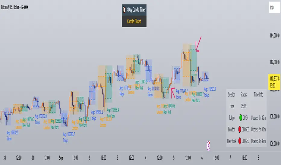
Trading Sessions with Holidays & Timer🌍 Trading Sessions Matter
Markets breathe in cycles. When Tokyo, London, or New York steps in, liquidity shifts and price often reacts fast.
Example: New York closed BTC at $110K, and when traders woke up, the price was already $113K. That gap says everything about overnight pressure and the next move.
⚡ Indicator Features
✅ Session boxes (Tokyo, London, NY) with custom colors & time zones
✅ Open/close lines → spot gaps & momentum
✅ Average price per session → see where pressure builds
✅ Tick range → quick volatility check
✅ 🏖 Holiday markers → avoid false quiet markets
✅ Live status table → session OPEN / CLOSED + countdown timer
🚀 How to Use
Works on intraday timeframes (1m–4h)
Watch session opens/closes → liquidity shift points
Compare ranges & averages between Tokyo, London, NY
Use the timer to prep before the next wave
This tool helps you visualize the heartbeat of global markets session by session.
🔖 #BTCUSDT #Forex #TradingSessions #Crypto #DayTrading
Time Range Marker By BCB ElevateThe Time Range Marker is a simple yet powerful visual tool for traders who want to focus on specific time intervals within the trading day. This indicator highlights a custom time range on your chart using a background color, helping you visually isolate key trading sessions or event windows such as:
Market open/close hours
News release periods
High-volatility trading zones
Personal strategy testing windows
⚙️ Key Features:
Customizable start and end time (hour & minute)
Works across all intraday timeframes
Adjustable highlight color to match your chart theme
Built using Pine Script v5 for speed and flexibility
🔧 Settings:
Start Hour / Minute – Set the beginning of the time range (in 24-hour format)
End Hour / Minute – Define when the range ends
Highlight Color – Choose the background color for better visibility
🕒 Timezone Note:
The indicator uses UTC time by default to ensure accuracy across markets. If your broker uses a different timezone (like EST, IST, etc.), the script can be adjusted to reflect your local market hours.
✅ How to Use the Time Range Marker Indicator
This indicator is used to visually highlight a specific time window each trading day, such as:
Market open or close sessions (e.g., NYSE, London, Tokyo)
High-impact news release periods
Custom time slots for strategy testing or scalping
🛠️ Installation Steps
Open TradingView and go to any chart.
Click on Pine Editor at the bottom of the screen.
Copy and paste the full Pine Script (shared above) into the editor.
Click the “Add to Chart” ▶️ button.
The indicator will appear on the chart with a highlighted background during the time range you set.
⚙️ How to Customize the Time Range
After adding the indicator:
Click the gear icon ⚙️ next to the indicator’s name on the chart.
Adjust the following settings:
Start Hour / Start Minute: The beginning of your time range (in 24-hour format).
End Hour / End Minute: When the highlight should stop.
Highlight Color: Pick a color and transparency for visual clarity.
Click OK to apply changes.
🕒 Timezone Consideration
By default, the indicator uses UTC (Coordinated Universal Time).
To match your broker’s timezone (e.g., EST, IST, etc.), you'll need to adjust the script by changing:
sessStart = timestamp("Etc/UTC", ...)
sessEnd = timestamp("Etc/UTC", ...)
to your correct timezone, like "Asia/Kolkata" for IST or "America/New_York" for EST.
Let me know your broker or local timezone, and I’ll update it for you.
📈 Tips for Traders
Combine this with volume, price action, or breakout indicators to focus your strategy on high-probability time windows.
Use multiple versions of this script if you want to highlight more than one time range in a day.

Market Sessions Indicator by NomadTradesCustomisable Market session indicator
This indicator visually marks the high and low price levels for the Asia, London, and New York trading sessions directly on the chart, using distinct horizontal lines and color-coding for each session. Each session’s high and low are labelled for easy identification, allowing traders to quickly assess key support and resistance levels established during major global market hours. The indicator is designed for clear session demarcation, helping users identify price reactions at these significant levels and supporting multi-session analysis for intraday and swing trading strategies
RH_Previous Session CloseRaghee Horner Previous Session Close (PSC)
The RH_PSC is an automated Previous Session Close (PSC) indicator to show, at a glance, general market sentiment -- whether the market is generally bullish, bearish or neutral --for the current trading session.
The PSC plots the previous session close from the Daily candle, with a customizable table of data to show the previous price, whether or not the current price is above or below that previous close and the percentage move above or below.
It includes the ability to enable only the last session or to plot for all previous sessions continuously.
The data table is configurable for bearish, bullish or sideways coloring and can be moved to different locations to suite users preferences and charts. It can also be fully disabled.
Defaults are to show all previous sessions in a continuous plot and the data table is disabled.
What is “sentiment”?
Market sentiment reflects investors’ overall attitude toward a symbol, influenced by news, economic reports, and perceptions. It can be bullish, bearish, or neutral and significantly affects trading behavior and price movements. Bullish sentiment typically drives prices up, while bearish sentiment can cause them to fall. Understanding market sentiment is key for trend follow-through.
Why does it matter?
Effectively using sentiment allows for quicker, smarter trading decisions. As an active trader, understanding market sentiment is vital for follow-through. It shows real-time investor feelings, affecting price movements. Gauging sentiment helps you:
Anticipate Breakouts.
Time Entries and Exits.
Increase Probability of Continuation.

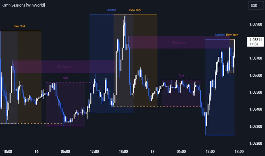
OmniSessions [WinWorld]The indicator shows the range of 4 most popular sessions (New York, Tokyo, London, Sydney). Sessions are used to identify zones with maximum volatility, as well as to find entry points. Session boundaries can act as POI no worse than OrderBlock.
In addition to sessions, you can use settings with KillZones - a range within a session that has potentially high volatility.
Silver Bullet is a more advanced range that allows you to identify the potential for maximum volatility. Excellent entry points can be obtained on the sweep of the range or from the nearest orderblock. We will explain it a bit deeply below.
Why use sessions?
During specific sessions big financial instutions from specific parts of the world enter the market, and this fact alone let us find the most "liquid" sessions in order to catch the best price movements. If talking about orderblocks, it is just a point of interest (more precisely, it is actually a zone of interest), which usually is a zone where the signficant amount of limit orders lies, and when price enter such zone, it immediately shows a strong reaction with either breakout from this zone or it bounces against this zone.
How is this indicator different from others?
There a lot of orderblocks indicator out here publicly available, but huge portion of them doesn't take into calculation important smart money concepts, such as valid pullbacks, for example. Valid pullbacks is a concept of price movement, which lets us indentify quite precisely price's impulses. Based on this impulses, we search our orderblocks. This approach allows to catch the most relevant and highly liquid orderblocks, which present traders with best trade entry opportunities, because usually, when entering with these orderblocks, you follow the moves of big money players, and that gives trader an edge in trading. None of open-source indicators uses such approach ( we've studied all of them ). Also an important notice: no public code is utilized in this indicato whatsoever. We've build our own flexible session mechanism, which allows you to quickly change between different type of sessions and also choose which session to use. And the big thing is our own alorithm to deal with asset, trading sessions of which are quite exotic (such as DAX and MEOX indexes, which close and open at different times of the day, which makes it hard for indicator to catch by default), so with indicator you can enjoy trading by sessions with no "bugs".
And the most user-desired and important thing: we've implemented feature to set winter and summer seasons for sessions, and this solves life-long struggle of traders to set correct trading session time, when forex exchanges switch trading hours, so now you don't need to info which our summer or winter is traded by, but just switch between seasons by one button in our indicator. And we can proudly state, no sesions indicator in the TradingView has such feature , so feel free to use it now on our indicator.
How orderblocks are built?
When London, New York or Asia ends, we find the closest orderblocks above and below closed session's high and low respectively. We do it by finding so called valid pullbacks ( was explained above ), then searching for valid fair value gap (FVG), that is inside of some valid pullbacks, and if we find it, then the orderblock is established and you will live orderblock and fair value gap (FVG) box ( both are colored in closed session's colour ).
How are orderblocks and FVG displayed on the chart?
Live orderblock and FVG are displayed as boxes on the chart, that are plolonged each bar if price didn't reach the orderblock.
Some important details:
When price touches FVG, FVG then is modified to reflect how much of untouched FVG is left. You will see it as decreasing of FVG box size in live mode. If price fully takes over FVG, FVG deletes;
When price touches orderblock, orderblock stops being prolonged and stays on the chart and is considered as worked-out.
These featues allow you to fully see live orderblocks and FVGs (if they exist) and already worked-out orderblocks to see how useful they were in the history.
Is that it?
No, because our indicator also shows sessions sweeps, which is historically a good indication that price grabbed the liquidity of previously closed sessions and now has enough "power" to do big movements, which is a good thing for traders, because it allows them to catch big movements and profit big.
Ok, we've covered the basics, now let's talk about what exactly this indicator can do.
OmnISessions is all-in-one sessions' indicator, that cointain:
Sessions (Automatic adaptation to your time zone)
Kill Zones
Silver Bullets
Session Sweeps
Order Blocks (Session, Killzone, SilverBullet)
Easily switch between summer and winter seasons
Now you don't need to look for opening and closing times of stock exchanges: the algorithm itself adjusts the session times according to your timezone. Just change the seasonality: winter/summer and the session times will be clearly displayed on your chart.
A quick view of the settings:
Show: Sessions, KillZones or SilverBullet
Season selection: Winter/Summer
Session Color Selection
Visuals:
Show/Hide session name - displays session name (ex.: London, New York, Silver Bullet and etc.) on the chart;
Show/Hide session box - displays session range as box with coloured background on the chart;
Show/Hide High/Low sessions - displays two horizontal lines for higher and lower borders of the session;
Show/Hide OrderBlocks - displays worked-out orderblocks in the history with live orderblocks and their fair value gaps (FVGs);
Show/Hide live Session High/Low - displays higher and lower border of the session as lines, that are prolonged each bar even after the session ends;
Show/Hide Session Sweeps - displays session sweeps of higher and lower border as dotted line;
Dividers (alternative session display):
Horizontal Divider
Backgrounder coloring
Customization: choose the display type: Sessions, Killzones or Silver Bullet.
The indicator displays orders that are above or below the previous session boundaries.
Below are Killzones with Order Blocks:
And this is Silver Bullet with Order Blocks:
Overall, you can clearly see that orderblocks, sessions sweeps and different type of sessions in one indicator allow you to fully utilize your time and mental energy, because finding orderblocks with valid pullbacks by hand is quite time-costly task, but finding them on different type of sessions, while not knowing trading hours of current trading session, is the true hell of work. OmniSessions indicator performs all of these calculations by itself, so you can focus on finding the best entries, while checking the situation on different sessions at the same time.
We hope that you will find great use of OmniSessions!
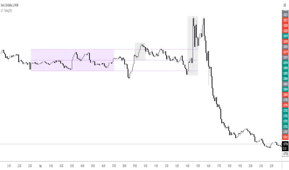
LIT - TimingIntroduction
This Script displays the Asia Session Range, the London Open Inducement Window, the NY Open Inducement Window, the Previous Week's high and low, the Previous Day's highs and lows, and the Day Open price in the cleanest way possible.
Description
The Indicator is based on UTC -7 timing but displays the Session Boxes automatically correct at your chart so you do not have to adjust any timings based on your Time Zone and don't have to do any calculations based on your UTC. It is already perfect.
You will see on default settings the purple Asia Box and 2 grey boxes, the first one is for the London Open Inducement Window (1 hour) and the second grey box is for the NY Open Inducement Window (also 1 hour)
Asia Range comes with default settings with the Asia Range high, low, and midline, you can remove these 3 lines in the settings "style" and untick the "Lines" box, that way you only will have the boxes displayed.
Special Feature
Most Timing-based Indicators have "bugged" boxes or don't show clean boxes at all and don't adjust at daylight savings times, we made sure that everything automatically gets adjusted so you don't have to! So the timings will always display at the correct time regarding the daylight savings times.
Combining Timing with Liquidity Zones the right way and in a clear, clean, and simple format.
Different than others this script also shows the "true" Asia range as it respects the "day open gap" which affects the Asia range in other scripts and it also covers the full 8 hours of Asia Session.
Additions
You can add in the settings menu the last week's high and low, the previous day's high and low, and also the day's open price by ticking the boxes in the settings menu
All colors of the boxes are fully adjustable and customizable for your personal preferences. Same for the previous weeks and day highs and lows. Just go to "Style" and you can adjust the Line types or colors to your preferred choice.
Recommended Use
The most beautiful display is on the M5 Timeframe as you have a clear overview of all sessions without losing the intraday view. You can also use it on the M1 for more details or the M15 for the bigger picture. The Template can hide on higher time frames starting from the H1 to not flood your chart with boxes.
How to use the Asia Session Range Box
Use the Asia Range Box as your intraday Guide, keep in mind that a Breakout of Asia high or low induces Liquidity and a common price behavior is a reversal after the fake breakout of that range.
How to use the London Open and NY Open Inducement Windows
Both grey boxes highlight the Open of either London Open or NY Open and you should keep an eye out for potential Liquditiy Graps or Mitigations during that times as this is when they introduce major Liquidity for the regarding Session.
How to use the Asia high, low and midline and day open price
After Asia Range got taken out in one direction, often price comes back to those levels to mitigate or bounce off, so you can imagine those zones as support and resistance on some occasions, recommended in combination with Imbalances.
How to use the previous day and week's highs and lows
Once added in the settings, you can display those price levels, you can use them either as Liquidity Targets or as Inducement Levels once they are taken out.
Enjoy!
All in one CR- gRiZzLyRoCKsThis script is exclusively for users in Central America Costa Rica and Nicaragua as it does not take any input parameters for the session timing (hours) more than the price explained later here.
Features:
1. It paints Tradingview´s background to start differenciating between London session candle sticks and New York session candle sticks, only those two session.
2. Also it paints Tradingview´s background chart to differenciate weekends to make vissually attrative when a new trading week is starting.
3. It also prints a line that will differenciate when London Open candle stick has been printed on chart as well for New York open and the New York Stock Exchange market open.
Also the script will be printing labels for each day of the week, and here you need to make sure to enter the right input, the only input require. It is a price level so the script knows the coordinates to display week days labels, to avoid displaying on the candle sticks, so write as input a price number that is above the candle sticks by far at least 30 pips away.
The script its customizable, so please feel free to customize the colors at your own taste.
You can always hide some of the scripts markups on the chart, by clicking its configuration and checking/unchecking each element, e.g London Open, NYSE Open lines as example, or the labels with the week days names.
Important to know:
For Costa Rica and Nicaragua users, please make sure you have UTC-6 time zone selected for your tradingview's session, hopefully it will work as well for Panama users, but I did not tested.
Any question or bug report, please communicate with gRiZzLyRoCKs via tradingview´s chat.
For Central America users, I will be updating the script for each time zone change affecting London or New York sessions time schedule, depending if it is winter or summer.
PST:
Another feature-similar script will be released soon with time input capabilities for the remaining people around each country.

FX SessionsForex Sessions Indicator
FX Sessions Indicator
This indicator is designed for high-precision Forex trading, focusing on the core liquidity windows of the global currency markets.
-Core Purpose: Tracks and visualizes the three major global trading sessions—Asia, London, and New York.
-Visual Style: Uses a clean, non-intrusive dotted-line box to define the high and low range of each session.
-Key Metric: Automatically calculates and displays the total Pip Range for each session, allowing for a quick assessment of volatility.
C-ustomization: Features a streamlined settings menu where you can toggle sessions on/off, adjust names, and modify time zones (defaulting to GMT-5).
-Lookback Logic: Optimized to maintain chart clarity by cleaning up historical data based on a user-defined lookback period.

[LJ] RSIM + ICT KillzonesIndicator Summary
This Pine Script indicator is a comprehensive, all-in-one toolkit designed for traders utilizing Inner Circle Trader (ICT) concepts. It visually maps out crucial time-based trading sessions, killzones, and key opening price levels directly on the chart. Alongside the time and price tools, it features a real-time "RSIM" (MTF RSI Monitor) dashboard to track market momentum across multiple timeframes, all while maintaining a lag-free chart through automated drawing cleanup.
Core Functionalities
ICT Killzones & Silver Bullets:
Visually demarcates specific high-probability trading windows—including the Asian, London, and New York (AM & PM) killzones, as well as the UK and US "Silver Bullet" times—using vertical lines and colored background highlights.
Key Opening Price Levels:
Automatically plots horizontal lines for significant opening prices, such as the New York Midnight Open (often used as true day open), CME Open, and NY AM/PM Opens. It also includes Higher Time Frame (HTF) levels for Weekly and Monthly opens.
Session High/Low Tracking:
Actively tracks and draws horizontal price levels for the High and Low of the current day, previous day, and individual Globex, Asian, London, and NY sessions.
Multi-Timeframe RSI Dashboard (RSIM):
An on-chart table that displays the current Relative Strength Index (RSI) values and a live countdown timer ("time to close") for the 5-minute, 15-minute, 1-hour, 4-hour, Daily, and Weekly timeframes.
Lunch "No-Trade-Zone":
Specifically highlights the New York Lunch period, visually warning traders of potential low-volume or erratic price action.
Automated Housekeeping:
A built-in memory management system that automatically deletes drawings (lines and labels) older than a user-defined number of days to prevent chart clutter and performance lag.
Built-in Debug Logger:
An optional on-chart logging table that tracks session triggers and script events, helping traders verify that times and levels are plotting correctly for their selected asset.

New Age Global Sessions ═════════════════════════════════════════════════════════════
New Age Global SESSIONS
Global Trading Sessions Overlay for Smarter Trading
═════════════════════════════════════════════════════════════
🔒 INVITE-ONLY ACCESS
This script requires an invitation to use.
To request access, please send me a private message.
═════════════════════════════════════════════════════════════
🎯 OVERVIEW
The New Age Sessions is a clean, professional session overlay indicator with a futuristic visual style featuring dynamic neon glow effects.
Designed for all 24/5 markets (Forex, Indices, Commodities, Metals) and 24/7 markets (Crypto).
Works on all timeframes with Regular Candles.
The indicator displays global trading sessions with color-coded backgrounds to help traders identify optimal trading windows.
💎 WHAT MAKES THIS UNIQUE
Unlike standard session indicators, this overlay combines:
- 5 Global Trading Sessions with distinct color backgrounds
- London + NY Overlap detection for high-volatility periods
- NY Afternoon and US Close warnings for reversal zones
- Emoji labels at session start for quick identification
- 12 Timezone Support - works correctly for traders worldwide
- BONUS: ORB Box with 3-layer Neon Glow visualization
This combination of session awareness and Visual Design is not available in standard session scripts.
Trade Smarter, not Harder.
📦 WHAT IS THIS INDICATOR?
This is a **visual overlay only** - it does NOT generate buy/sell signals.
**Sessions Overlay**
Displays color-coded backgrounds showing which global market session is currently active. Helps traders identify optimal trading windows and avoid low-liquidity periods.
⚡ KEY FEATURES
⏰ GLOBAL SESSIONS
- 🌙 Sydney - Purple - Range-bound, quiet
- 🗼 Tokyo - Pink - Trends may begin
- 🇨🇳 Hong Kong/Shanghai - Orange - China news, commodities
- 🇬🇧 London - Blue - Breakouts, stops Asia trends
- 🇺🇸 New York - Green - Volatility, news
- ⚡ London + NY Overlap - Yellow - Strongest moves
- ⚠️ NY Afternoon - Orange - Often reversal zone
- 🔴 US Close - Warning label
🏷️ SESSION LABELS
- Emoji labels appear at session start
- Quick visual identification of active session
- Toggle on/off in settings
🎁 BONUS: ORB BOX (9:30-9:45 NY)
- Captures High/Low of first 15 minutes US market open
- Dynamic color change based on price position
- 3-layer Neon Glow effect for high visibility
- Adjustable buffer and duration
- Use as support/resistance reference
- You can deactivate it per Checkbox
⚙️ SETTINGS
TIMEZONE
└── Your Timezone: Select from 12 global timezones
Available: UTC, New York, Chicago, Los Angeles, London, Berlin,
Zurich, Paris, Tokyo, Hong Kong, Singapore, Sydney
SESSIONS
├── Show Sydney: true/false
├── Show Tokyo: true/false
├── Show Hong Kong: true/false
├── Show London: true/false
├── Show New York: true/false
├── Show Overlap: true/false
└── Show Session Labels: true/false
SESSION COLORS
├── Sydney Color (Default: Purple)
├── Tokyo Color (Default: Pink)
├── Hong Kong Color (Default: Orange)
├── London Color (Default: Blue)
├── New York Color (Default: Green)
├── Overlap Color (Default: Yellow)
└── NY Afternoon Color (Default: Orange)
🎁 BONUS: ORB BOX
├── Show ORB Box: true/false
├── Neon Glow Effect: true/false
├── ORB Box Buffer: Points (+/-)
├── ORB Box Duration: 0.5 - 8 hours
├── Bullish Color: Default #00ffbb (Cyan)
└── Bearish Color: Default #ff1100 (Red)
📈 HOW TO USE
1. Apply to any chart (Forex, Crypto, Indices, Commodities)
2. Select your Timezone in settings
3. Toggle sessions you want to see
4. Use session backgrounds to identify:
→ High volatility windows (London, NY, Overlap)
→ Low volatility windows (Sydney, Lunch)
→ Reversal zones (NY Afternoon, US Close)
5. Combine with your own strategy for entries/exits
💡 BEST PRACTICES
- London Open often breaks Asia session ranges
- Overlap (14:00-17:00) has strongest moves and volume
- NY Afternoon (19:00+) often reverses the day's direction
- Avoid entries during Sydney (low liquidity)
- Watch for US Close (22:00) position squaring
📊 SUPPORTED MARKETS
- 24/5: Forex, Indices, Commodities, Metals
- 24/7: Crypto
⚠️ IMPORTANT NOTE
This is an **overlay indicator only**. It does NOT generate trading signals. Use it to visualize market sessions and plan your trading windows. Always combine with your own analysis and risk management.
📞 SUPPORT
Support is provided exclusively to users with active access.
Questions? Send me a private message.
═════════════════════════════════════════════════════════════
© AL_R4D1 - New Age Style Trading Tools
═════════════════════════════════════════════════════════════

Smart Session ProjectionsSmart Session Projections - Indicator Explanation
הסבר על אינדיקטור Smart Session Projections
English
What Does This Indicator Do?
Smart Session Projections is a multi-timeframe trading indicator that visualizes hierarchical market cycles and sessions on your chart. It helps traders identify market structure by displaying nested time periods with color-coded ranges.
Key Features:
1. Multi-Timeframe Cycle Display
The indicator adapts to your chart timeframe and displays the appropriate cycles:
1-Minute Chart: Shows 22.5-minute cycles (64 cycles per day)
5-Minute Chart: Shows 90-minute quarters (16 cycles per day)
15-Minute Chart: Shows 6-hour sessions (ASIA, LONDON, NY AM, NY PM)
1-Hour Chart: Shows daily cycles (Monday through Sunday)
2. Hierarchical Parent Frames
Each cycle can display up to 3 levels of "parent" frames that show the larger context:
Level 0: No parent frames (only main cycles)
Level 1: Immediate parent cycle
Level 2: Grandparent cycle
Level 3: Great-grandparent cycle
Example on 1-Minute Chart:
Main cycles: 22.5-minute quarters
Level 1: 90-minute sessions (e.g., "ASIA Q1")
Level 2: 6-hour sessions (e.g., "ASIA")
Level 3: Daily cycle (e.g., "Monday")
3. Trading Day Structure (Starts at 18:00 UTC)
All cycles align with the forex trading day that begins at 18:00 (6:00 PM) on Sunday:
Sunday 18:00 → Monday Trading Day Begins
├─ ASIA Session (18:00-00:00)
├─ LONDON Session (00:00-06:00)
├─ NY AM Session (06:00-12:00)
└─ NY PM Session (12:00-18:00)
Monday 18:00 → Tuesday Trading Day Begins
4. Color-Coded Sessions
Each quarter/session has its own color (customizable):
Q1/ASIA: Customizable color
Q2/LONDON: Customizable color
Q3/NY AM: Customizable color
Q4/NY PM: Customizable color
5. Customizable Parent Frames
Parent frames appear as thin outlined boxes with labels:
Adjustable opacity (0-100%)
Adjustable width (1-5 pixels)
Multiple border styles (Solid/Dashed/Dotted)
Labels positioned at top center with vertical offsets to prevent overlap
Settings:
Main Settings:
Price Source: Choose High/Low or Close for range calculation
Timezone: UTC offset or use exchange timezone
GMT Shift: Additional hour adjustment
Parent Frame Settings:
Parent Cycle Levels: 0-3 (how many parent levels to display)
Opacity: 0-100% transparency for frames
Width: 1-5 pixel border thickness
Style: Solid, Dashed, or Dotted lines
Show Labels: Toggle parent cycle labels on/off
Quarter/Session Colors:
Enable/disable each quarter independently
Customize colors for each session
Use Cases:
Intraday Structure: See how smaller cycles fit within larger sessions
Session Trading: Identify when specific market sessions (Asia, London, NY) are active
Cycle Analysis: Track repeating time-based patterns in the market
Multi-Timeframe Context: Understand your current position within larger cycles
עברית
מה עושה האינדיקטור הזה?
Smart Session Projections הוא אינדיקטור מסחר רב-מסגרות זמן המציג מחזורי שוק ומושבי מסחר היררכיים על הגרף שלך. הוא עוזר לסוחרים לזהות את מבנה השוק על ידי הצגת תקופות זמן מקוננות עם טווחים בקידוד צבעים.
תכונות עיקריות:
1. תצוגת מחזורים רב-מסגרות זמן
האינדיקטור מתאים את עצמו למסגרת הזמן של הגרף שלך ומציג את המחזורים המתאימים:
גרף דקה: מציג מחזורים של 22.5 דקות (64 מחזורים ביום)
גרף 5 דקות: מציג רבעונים של 90 דקות (16 מחזורים ביום)
גרף 15 דקות: מציג מושבים של 6 שעות (אסיה, לונדון, ניו יורק בוקר, ניו יורק אחה"צ)
גרף שעה: מציג מחזורים יומיים (ראשון עד שבת)
2. מסגרות הורה היררכיות
כל מחזור יכול להציג עד 3 רמות של מסגרות "הורה" המציגות את ההקשר הגדול יותר:
רמה 0: אין מסגרות הורה (רק המחזורים העיקריים)
רמה 1: מחזור הורה מיידי
רמה 2: מחזור סבא/סבתא
רמה 3: מחזור סבא רבא/סבתא רבתא
דוגמה בגרף דקה:
מחזורים עיקריים: רבעונים של 22.5 דקות
רמה 1: מושבים של 90 דקות (למשל, "ASIA Q1")
רמה 2: מושבים של 6 שעות (למשל, "ASIA")
רמה 3: מחזור יומי (למשל, "Monday")
3. מבנה יום המסחר (מתחיל ב-18:00 UTC)
כל המחזורים מיושרים עם יום המסחר בפורקס שמתחיל ב-18:00 (6:00 אחה"צ) ביום ראשון:
ראשון 18:00 → יום המסחר של יום שני מתחיל
├─ מושב אסיה (18:00-00:00)
├─ מושב לונדון (00:00-06:00)
├─ מושב ניו יורק בוקר (06:00-12:00)
└─ מושב ניו יורק אחה"צ (12:00-18:00)
שני 18:00 → יום המסחר של יום שלישי מתחיל
4. מושבים בקידוד צבעים
לכל רבעון/מושב יש צבע משלו (ניתן להתאמה אישית):
Q1/אסיה: צבע הניתן להתאמה אישית
Q2/לונדון: צבע הניתן להתאמה אישית
Q3/ניו יורק בוקר: צבע הניתן להתאמה אישית
Q4/ניו יורק אחה"צ: צבע הניתן להתאמה אישית
5. מסגרות הורה הניתנות להתאמה אישית
מסגרות ההורה מופיעות כקופסאות דקות עם קו מתאר ותוויות:
שקיפות ניתנת לכוונון (0-100%)
רוחב ניתן לכוונון (1-5 פיקסלים)
סגנונות גבול מרובים (מלא/מקווקו/מנוקד)
תוויות ממוקמות במרכז העליון עם היסטים אנכיים למניעת חפיפה
הגדרות:
הגדרות עיקריות:
מקור מחיר: בחר High/Low או Close לחישוב טווח
אזור זמן: היסט UTC או שימוש באזור זמן של הבורסה
היסט GMT: התאמת שעה נוספת
הגדרות מסגרת הורה:
רמות מחזור הורה: 0-3 (כמה רמות הורה להציג)
שקיפות: 0-100% שקיפות עבור מסגרות
רוחב: עובי גבול של 1-5 פיקסלים
סגנון: קווים מלאים, מקווקוים או מנוקדים
הצג תוויות: הפעל/כבה תוויות מחזור הורה
צבעי רבעון/מושב:
הפעל/כבה כל רבעון באופן עצמאי
התאם אישית צבעים עבור כל מושב
מקרי שימוש:
מבנה תוך-יומי: ראה איך מחזורים קטנים מתאימים בתוך מושבים גדולים יותר
מסחר במושבים: זהה מתי מושבי שוק ספציפיים (אסיה, לונדון, ניו יורק) פעילים
ניתוח מחזורי: עקוב אחרי דפוסים חוזרים מבוססי זמן בשוק
הקשר רב-מסגרות זמן: הבן את המיקום הנוכחי שלך בתוך מחזורים גדולים יותר
Complete Cycle Hierarchy / היררכיית מחזורים מלאה
1-Minute Chart / גרף דקה:
Level 3: Daily (Monday, Tuesday, etc.)
יומי (שני, שלישי, וכו')
↓
Level 2: 6-Hour Sessions (ASIA, LONDON, NY AM, NY PM)
מושבים של 6 שעות (אסיה, לונדון, ניו יורק בוקר, ניו יורק אחה"צ)
↓
Level 1: 90-Minute Quarters (ASIA Q1, ASIA Q2, etc.)
רבעונים של 90 דקות (אסיה Q1, אסיה Q2, וכו')
↓
Main: 22.5-Minute Cycles (64 per day)
מחזורים של 22.5 דקות (64 ליום)
5-Minute Chart / גרף 5 דקות:
Level 3: Weekly (Week 1, Week 2, Week 3, Week 4)
שבועי (שבוע 1, שבוע 2, שבוע 3, שבוע 4)
↓
Level 2: Daily (Monday, Tuesday, etc.)
יומי (שני, שלישי, וכו')
↓
Level 1: 6-Hour Sessions (ASIA, LONDON, NY AM, NY PM)
מושבים של 6 שעות (אסיה, לונדון, ניו יורק בוקר, ניו יורק אחה"צ)
↓
Main: 90-Minute Quarters (16 per day)
רבעונים של 90 דקות (16 ליום)
15-Minute Chart / גרף 15 דקות:
Level 2: Weekly (Week 1, Week 2, Week 3, Week 4)
שבועי (שבוע 1, שבוע 2, שבוע 3, שבוע 4)
↓
Level 1: Daily (Monday, Tuesday, etc.)
יומי (שני, שלישי, וכו')
↓
Main: 6-Hour Sessions (ASIA, LONDON, NY AM, NY PM)
מושבים של 6 שעות (אסיה, לונדון, ניו יורק בוקר, ניו יורק אחה"צ)
1-Hour Chart / גרף שעה:
Level 1: Weekly (Week 1, Week 2, Week 3, Week 4)
שבועי (שבוע 1, שבוע 2, שבוע 3, שבוע 4)
↓
Main: Daily Cycles (Monday through Sunday)
מחזורים יומיים (ראשון עד שבת)
Tips for Best Results / טיפים לתוצאות הטובות ביותר
English:
Start with Level 1 parent frames to see immediate context without clutter
Adjust opacity if frames are too prominent or too subtle
Use different colors for each quarter to quickly identify session transitions
Disable quarters you don't trade to reduce visual noise
Match your strategy timeframe - use 1M for scalping, 5M for intraday, 15M for swing context
עברית:
התחל עם רמה 1 של מסגרות הורה כדי לראות הקשר מיידי ללא עומס ויזואלי
התאם את השקיפות אם המסגרות בולטות מדי או עדינות מדי
השתמש בצבעים שונים לכל רבעון כדי לזהות במהירות מעברי מושבים
השבת רבעונים שבהם אתה לא סוחר כדי להפחית רעש ויזואלי
התאם את מסגרת הזמן לאסטרטגיה שלך - השתמש ב-1M לסקלפינג, 5M לתוך-יומי, 15M להקשר סווינג
