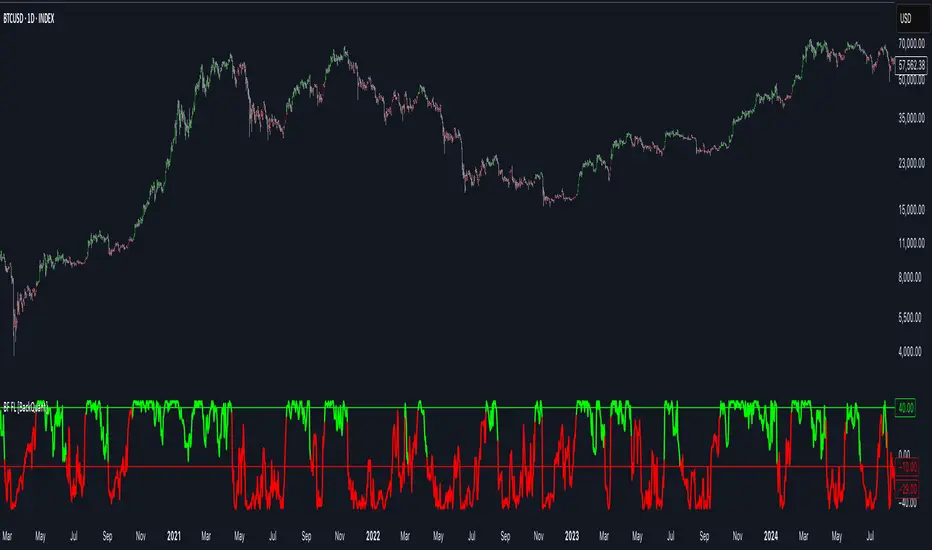
Bilateral Filter For Loop [BackQuant]Bilateral Filter For Loop
The Bilateral Filter For Loop is an advanced technical indicator designed to filter out market noise and smooth out price data, thus improving the identification of underlying market trends. It employs a bilateral filter, which is a sophisticated non-linear filter commonly used in image processing and price time series analysis. By considering both spatial and range differences between price points, this filter is highly effective at preserving significant trends while reducing random fluctuations, ultimately making it suitable for dynamic trend-following strategies.
Please take the time to read the following:
Key Features
1. Bilateral Filter Calculation:
The bilateral filter is the core of this indicator and works by applying a weight to each data point based on two factors: spatial distance and price range difference. This dual weighting process allows the filter to preserve important price movements while reducing the impact of less relevant fluctuations. The filter uses two primary parameters:
Spatial Sigma (σ_d): This parameter adjusts the weight applied based on the distance of each price point from the current price. A larger spatial sigma means more smoothing, as further away values will contribute more heavily to the result.
Range Sigma (σ_r): This parameter controls how much weight is applied based on the difference in price values. Larger price differences result in smaller weights, while similar price values result in larger weights, thereby preserving the trend while filtering out noise.
The output of this filter is a smoothed version of the original price series, which eliminates short-term fluctuations, helping traders focus on longer-term trends. The bilateral filter is applied over a rolling window, adjusting the level of smoothing dynamically based on both the distance between values and their relative price movements.
2. For Loop Calculation for Trend Scoring:
A for-loop is used to calculate the trend score based on the filtered price data. The loop compares the current value to previous values within the specified window, scoring the trend as follows:
+1 for upward movement (when the filtered value is greater than the previous value).
-1 for downward movement (when the filtered value is less than the previous value).
The cumulative result of this loop gives a continuous trend score, which serves as a directional indicator for the market's momentum. By summing the scores over the window period, the loop provides an aggregate value that reflects the overall trend strength. This score helps determine whether the market is experiencing a strong uptrend, downtrend, or sideways movement.
3. Long and Short Conditions:
Once the trend score has been calculated, it is compared against predefined threshold levels:
A long signal is generated when the trend score exceeds the upper threshold, indicating that the market is in a strong uptrend.
A short signal is generated when the trend score crosses below the lower threshold, signaling a potential downtrend or trend reversal.
These conditions provide clear signals for potential entry points, and the color-coding helps traders quickly identify market direction:
Long signals are displayed in green.
Short signals are displayed in red.
These signals are designed to provide high-confidence entries for trend-following strategies, helping traders capture profitable movements in the market.
4. Trend Background and Bar Coloring:
The script offers customizable visual settings to enhance the clarity of the trend signals. Traders can choose to:
Color the bars based on the trend direction: Bars are colored green for long signals and red for short signals.
Change the background color to provide additional context: The background will be shaded green for a bullish trend and red for a bearish trend. This visual feedback helps traders to stay aligned with the prevailing market sentiment.
These features offer a quick visual reference for understanding the market's direction, making it easier for traders to identify when to enter or exit positions.
5. Threshold Lines for Visual Feedback:
Threshold lines are plotted on the chart to represent the predefined long and short levels. These lines act as clear markers for when the market reaches a critical threshold, triggering a potential buy (long) or sell (short) signal. By showing these threshold lines on the chart, traders can quickly gauge the strength of the market and assess whether the trend is strong enough to warrant action.
These thresholds can be adjusted based on the trader's preferences, allowing them to fine-tune the indicator for different market conditions or asset behaviors.
6. Customizable Parameters for Flexibility:
The indicator offers several parameters that can be adjusted to suit individual trading preferences:
Window Period (Bilateral Filter): The window size determines how many past price values are used to calculate the bilateral filter. A larger window increases smoothing, while a smaller window results in more responsive, but noisier, data.
Spatial Sigma (σ_d) and Range Sigma (σ_r): These values control how sensitive the filter is to price changes and the distance between data points. Fine-tuning these parameters allows traders to adjust the degree of noise reduction applied to the price series.
Threshold Levels: The upper and lower thresholds determine when the trend score crosses into long or short territory. These levels can be customized to better match the trader's risk tolerance or asset characteristics.
Visual Settings: Traders can customize the appearance of the chart, including the line width of trend signals, bar colors, and background shading, to make the indicator more readable and aligned with their charting style.
7. Alerts for Trend Reversals:
The indicator includes alert conditions for real-time notifications when the market crosses the defined thresholds. Traders can set alerts to be notified when:
The trend score crosses the long threshold, signaling an uptrend.
The trend score crosses the short threshold, signaling a downtrend.
These alerts provide timely information, allowing traders to take immediate action when the market shows a significant change in direction.
Final Thoughts
The Bilateral Filter For Loop indicator is a robust tool for trend-following traders who wish to reduce market noise and focus on the underlying trend. By applying the bilateral filter and calculating trend scores, this indicator helps traders identify strong uptrends and downtrends, providing reliable entry signals with minimal market noise. The customizable parameters, visual feedback, and alerting system make it a versatile tool for traders seeking to improve their timing and capture profitable market movements.
Thus following all of the key points here are some sample backtests on the 1D Chart
Disclaimer: Backtests are based off past results, and are not indicative of the future.
INDEX:BTCUSD
INDEX:ETHUSD
CRYPTO:SOLUSD
Pesquisar nos scripts por "profitable"
Enhanced Seasonality Trade BacktestEnhanced Seasonality Trade Backtest
Overview
A comprehensive Pine Script indicator that backtests seasonal trading strategies by analyzing historical price performance during specific date ranges. The tool provides detailed statistics, visual markers, and election cycle filtering to identify profitable seasonal patterns.
Key Features
📊 Backtesting Engine
Tests up to 50 years of historical data
Configurable entry/exit dates (day/month)
Automatic holiday/weekend date adjustment
Separate analysis for long and short positions
🗳️ Election Cycle Filter
All Years: Test every year in the lookback period
Election Years: US presidential election years only (2024, 2020, 2016...)
Pre-Election Years: Years before elections (2023, 2019, 2015...)
Post-Election Years: Years after elections (2021, 2017, 2013...)
📈 Comprehensive Statistics
Win rate percentage
Total and average returns
Best/worst performing years
Detailed trade-by-trade breakdown
Years tested vs. years filtered
🎯 Visual Indicators
Entry/exit lines for all historical trades
Future trade date projections
Background highlighting during trade periods
Color-coded performance labels
⚙️ Customization Options
Toggle between long/short analysis
Show/hide price and date details
Adjustable table position
Future trade date visualization
Use Cases
Seasonal Trading: Identify recurring profitable periods (e.g., "Sell in May")
Election Cycle Analysis: Test how political cycles affect market performance
Strategy Validation: Backtest specific date-range strategies
Risk Assessment: Analyze worst-case scenarios and drawdowns
Perfect For
Swing traders looking for seasonal edges
Portfolio managers timing market entries/exits
Researchers studying market cyclicality
Anyone wanting to quantify seasonal market behavior
ONLY WORKS IN 1D TIME FRAME

RTI Shifting Band Oscillator | QuantMAC📊 RTI Shifting Band Oscillator | QuantMAC - Revolutionary Adaptive Trading Indicator
🎯 Overview
The RTI Shifting Band Oscillator represents a breakthrough in adaptive technical analysis, combining the innovative Range Transition Index (RTI) with dynamic volatility bands to create an oscillator that automatically adjusts to changing market conditions. This cutting-edge indicator goes beyond traditional static approaches by using RTI to dynamically shift band width based on market volatility transitions, providing superior signal accuracy across different market regimes.
🔧 Key Features
Revolutionary RTI Technology : Proprietary Range Transition Index that measures volatility transitions in real-time
Dynamic Adaptive Bands : Self-adjusting volatility bands that expand and contract based on RTI readings
Dual Trading Modes : Flexible Long/Short or Long/Cash strategies for different trading preferences
Advanced Performance Analytics : Comprehensive metrics including Sharpe, Sortino, and Omega ratios
Smart Visual System : Dynamic color coding with 9 professional color schemes
Precision Backtesting : Date range filtering with detailed historical performance analysis
Real-time Signal Generation : Clear entry/exit signals with customizable threshold sensitivity
Position Sizing Intelligence : Half Kelly criterion for optimal risk management
📈 How The RTI Technology Works
The Range Transition Index (RTI) is the heart of this indicator's innovation. Unlike traditional volatility measures, RTI analyzes the transitions between different volatility states, providing early warning signals for market regime changes.
RTI Calculation Process:
Calculate True Range for each period using high, low, and previous close
Compute Average True Range over the RTI Length period
Sum absolute differences between consecutive True Range values
Normalize by dividing by ATR to create the raw RTI
Apply smoothing to reduce noise and create the final RTI value
Use RTI to dynamically adjust standard deviation multipliers
The genius of RTI lies in its ability to detect when markets are transitioning between calm and volatile periods before traditional indicators catch up. This provides traders with a significant edge in timing entries and exits.
⚙️ Comprehensive Parameter Control
RTI Settings:
RTI Length : Controls the lookback period for volatility analysis (default: 25)
RTI Smoothing : Reduces noise in RTI calculations (default: 12)
Base MA Length : Foundation moving average for band calculations (default: 40)
Source : Price input selection (close, open, high, low, etc.)
Oscillator Settings:
Standard Deviation Length : Period for volatility measurement (default: 27)
SD Multiplier : Base band width adjustment (default: 1.5)
Oscillator Multiplier : Scaling factor for oscillator values (default: 100)
Signal Thresholds:
Long Threshold : Bullish signal trigger level (default: 82)
Short Threshold : Bearish signal trigger level (default: 55)
🎨 Advanced Visual System
Main Chart Elements:
Dynamic Shifting Bands : Upper and lower bands that automatically adjust width based on RTI
Adaptive Fill Zone : Color-coded area between bands showing current market state
Basis Line : Moving average foundation displayed as subtle reference points
Smart Bar Coloring : Candles change color based on oscillator state for instant visual feedback
Oscillator Pane:
Normalized RTI Oscillator : Main signal line centered around zero with dynamic coloring
Threshold Lines : Horizontal reference lines for entry/exit levels
Zero Line : Central reference for oscillator neutrality
Color State Indication : Line colors change based on bullish/bearish conditions
📊 Professional Performance Metrics
The built-in analytics suite provides institutional-grade performance measurement:
Net Profit % : Total strategy return percentage
Maximum Drawdown % : Worst peak-to-trough decline
Win Rate % : Percentage of profitable trades
Profit Factor : Ratio of gross profits to gross losses
Sharpe Ratio : Risk-adjusted return measurement
Sortino Ratio : Downside-focused risk adjustment
Omega Ratio : Probability-weighted performance ratio
Half Kelly % : Optimal position sizing recommendation
Total Trades : Complete transaction count
🎯 Strategic Trading Applications
Long/Short Mode: ⚡
Maximizes profit potential by capturing both upward and downward price movements. The RTI technology helps identify when trends are strengthening or weakening, allowing for optimal position switches between long and short.
Long/Cash Mode: 🛡️
Conservative approach ideal for retirement accounts or risk-averse traders. The indicator's adaptive nature helps identify the best times to be invested versus sitting in cash, protecting capital during adverse market conditions.
🚀 Unique Advantages
Traditional Indicators vs RTI Shifting Bands:
Static vs Dynamic : While most indicators use fixed parameters, RTI bands adapt in real-time
Lagging vs Leading : RTI detects volatility transitions before they fully manifest
One-Size vs Adaptive : The same settings work across different market conditions
Simple vs Intelligent : Advanced volatility analysis provides superior market insight
💡 Professional Setup Guide
For Day Trading (Short-term):
RTI Length: 15-20
RTI Smoothing: 8-10
Base MA Length: 20-30
Thresholds: Long 80, Short 60
For Swing Trading (Medium-term):
RTI Length: 25-35 (default range)
RTI Smoothing: 12-15
Base MA Length: 40-50
Thresholds: Long 83, Short 55 (defaults)
For Position Trading (Long-term):
RTI Length: 40-50
RTI Smoothing: 15-20
Base MA Length: 60-80
Thresholds: Long 85, Short 50
🧠 Advanced Trading Techniques
RTI Divergence Analysis:
Watch for divergences between price action and RTI readings. When price makes new highs/lows but RTI doesn't confirm, it often signals upcoming reversals.
Band Width Interpretation:
Expanding Bands : Increasing volatility, expect larger price moves
Contracting Bands : Decreasing volatility, prepare for potential breakouts
Band Touches : Price touching outer bands often signals reversal opportunities
Multi-Timeframe Analysis:
Use RTI on higher timeframes for trend direction and lower timeframes for precise entry timing.
⚠️ Important Risk Disclaimers
Past performance is not indicative of future results. This indicator represents advanced technical analysis but should never be used as the sole basis for trading decisions.
Critical Risk Factors:
Market Conditions : No indicator performs equally well in all market environments
Backtesting Limitations : Historical performance may not reflect future market behavior
Volatility Risk : Adaptive indicators can be sensitive to extreme market conditions
Parameter Sensitivity : Different settings may produce significantly different results
Capital Risk : Always use appropriate position sizing and stop-loss protection
📚 Educational Benefits
This indicator provides exceptional learning opportunities for understanding:
Advanced volatility analysis and measurement techniques
Adaptive indicator design and implementation
The relationship between volatility transitions and price movements
Professional risk management using Kelly Criterion principles
Modern oscillator interpretation and signal generation
🔍 Market Applications
The RTI Shifting Band Oscillator works across various markets:
Forex : Excellent for currency pair volatility analysis
Stocks : Individual equity and index trading
Commodities : Adaptive to commodity market volatility cycles
Cryptocurrencies : Handles extreme volatility variations effectively
Futures : Professional derivatives trading applications
🔧 Technical Innovation
The RTI Shifting Band Oscillator represents years of research into adaptive technical analysis. The proprietary RTI calculation method has been optimized for:
Computational Efficiency : Fast calculation even on high-frequency data
Noise Reduction : Advanced smoothing without excessive lag
Market Adaptability : Automatic adjustment to changing conditions
Signal Clarity : Clear, actionable trading signals
🔔 Updates and Evolution
The RTI Shifting Band Oscillator | QuantMAC continues to evolve with regular updates incorporating the latest research in adaptive technical analysis. The code is thoroughly documented for transparency and educational purposes.
Trading Notice: Financial markets involve substantial risk of loss. The RTI Shifting Band Oscillator is a sophisticated technical analysis tool designed to assist in trading decisions but cannot guarantee profitable outcomes. Always conduct thorough testing, implement proper risk management, and consider seeking advice from qualified financial professionals. Only trade with capital you can afford to lose.
---
Master The Markets With Adaptive Intelligence! 🎯📈

Metrics TJ
📘 Metrics TJ
Author: Trade Journey
Type: Market Metrics / Intraday
Timeframes:
Context: 1H
Entry Points: 15m
---
🎯 Core Idea
Metrics TJ is a powerful market metrics tool designed for intraday traders. It provides essential market data — including volume, ATR (Average True Range), and correlation with other assets — to help you make informed decisions. By combining multiple indicators into a unified view, this tool allows you to spot key trends, volatility, and relative strength within a single chart.
---
🔍 Strategy Logic
1. Context (1H)
Before making intraday decisions on smaller timeframes (such as the 15m chart), use the 1H timeframe to understand the broader market context:
Look at candle structure, levels, volume, and other signals to identify if the market is trending or consolidating.
Example: If the 1H chart shows rising volume and a series of higher highs and lows, it indicates an uptrend.
2. Core Metrics
Day Volume (DV): Total volume traded over the past 24 hours. A sharp increase may indicate increased market interest and potential for higher volatility.
Average Volume (AV): A smoothed average volume over a set period. Spikes in average volume can highlight unusual activity, signaling potential moves.
ATR (NATR): Measures the market's volatility. A high ATR means the market is moving more dynamically, often correlating with larger price moves.
Correlation (CR): Measures how strongly the asset is correlated with a reference pair, such as BTC. A strong positive or negative correlation could indicate an impending move or reversal.
3. Trade Filter
To improve the accuracy of the strategy:
Use Volume and ATR thresholds to filter out low-volatility or range-bound conditions.
Correlation with a reference asset helps identify when the market's behavior diverges from its usual pattern.
---
📈 Example of Entry Logic
1. On 1H: The market is in a confirmed uptrend, with rising volume and a series of higher highs.
2. On 15m: You observe an increase in Day Volume and Average Volume signaling potential for a breakout.
3. ATR is high, showing the market is volatile — indicating a good environment for intraday trading.
4. Correlation with BTC shows strong positive correlation, suggesting a price move in sync with the larger crypto market.
5. Trade Decision:
Enter long if the conditions are met: Volume spikes, ATR confirms volatility, and correlation supports the price direction.
Exit if volume decreases, ATR drops, or if the correlation weakens.
---
⚙️ Settings
(tradingview\.com/x/Y6PjccKy/)
---
📊 Why It Works
Day Volume and Average Volume help identify unusual activity, potentially signaling a price move.
ATR highlights periods of high volatility, which are crucial for intraday trading.
Correlation with major assets (like BTC) gives additional context on the market's broader movement, improving the probability of profitable trades.
Using a combination of volume and ATR reduces the likelihood of false signals, especially in choppy or low-volume environments.
---
🔔 Recommendations
Best used in strong trending markets where volume and volatility are in sync.
Avoid trading in range-bound conditions where price action lacks momentum.
Use this strategy as a supplement to other technical indicators or as part of a larger trading system.
---
✅ Conclusion
Metrics TJ provides a holistic view of the market, combining key metrics to help traders make smarter intraday decisions. By focusing on volume, volatility, and correlation, it can help you spot high-probability trades and avoid noise.
Try it on demo, adjust the settings to fit your trading style, and start identifying profitable opportunities!
---
📌 Important Note:
This indicator is best used in combination with higher timeframe analysis. Always consider the broader market context before making any trades.

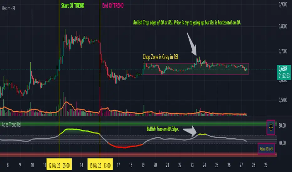
Atlas Trend RsiAtlas Trend RSI – User Guide
1. Indicator Purpose
Atlas Trend RSI combines a classic RSI oscillator on the average price with optional smoothing, color-coded zones, and automatic pivot signals. It highlights overbought/oversold extremes, neutral ranges, and divergence-based profit-taking points.
2. Inputs & Configuration
Timeframe: Select a higher or lower timeframe RSI to overlay on your chart. Leave blank to match the chart’s timeframe.
Period: The length of the RSI calculation (default 14). Shorter values increase sensitivity; longer values smooth the line.
MA Type (SMA/EMA/RMA/WMA/VWMA): When “Average” is enabled, this applies a moving average to the RSI to filter noise.
Show Average: Toggle on to plot the smoothed RSI line. Use in ranging markets to reduce false signals.
Show Divergence Line: Toggles drawing of a line connecting RSI pivot highs/lows to help you spot hidden or regular divergence.
3. Colored Zones & Interpretation
10–40 (Oversold Zone): Shade in red. Watch for bullish reversals when RSI turns up from this area.
40–60 (Neutral Zone): Light gray. Indicates consolidation—no strong trend.
60–90 (Overbought Zone): Shade in green. Watch for bearish reversals when RSI turns down from this area.
Mid-zone (50 line): A break above/below 50 can confirm a shift from bearish to bullish momentum or vice versa.
4. Signal Tables & Emojis
Top-right: Bull 🐂, Bear 🐻 or Scale ⚖️ emoji appears when RSI pivot conditions trigger:
🐂 when a profitable long-exit (RSI peaked and turned down above overbought).
🐻 when a profitable short-exit (RSI troughed and turned up below oversold).
⚖️ when no clear pivot.
Bottom-right: Displays the current RSI value in parentheses for at-a-glance monitoring.
5. Alert Conditions
Two built-in alerts are available:
Long Profit-Take: Fires when RSI turns down after reaching your overbought threshold.
Short Profit-Take: Fires when RSI turns up after reaching your oversold threshold.
To enable, open the Alerts dialog, select “Atlas Trend RSI,” then choose “Long Profit-Take” or “Short Profit-Take.”
6. Recommended Usage
Trend Confirmation: In a strong uptrend, use dips into the 40–60 zone as buy opportunities; exits when you see the 🐂 alert.
Range Trading: In sideways markets, buy near the 10–20 level and sell near the 80–90 level, using the average line to filter noise.
Divergence Spotting: Enable “Divergence Line” to draw lines between price swings and RSI swings—look for hidden divergence (supports trend) or regular divergence (signals reversal).
Multi-TF Analysis: Apply a 4-hour RSI on a 1-hour chart to see the higher-TF momentum context.
7. Disclaimers
For educational purposes only; not financial advice.
Past performance does not guarantee future results.
Use these explanations in your TradingView publish dialog under “How to use” or “Usage.” Traders will immediately understand what each colored zone, emoji, and alert means and how to apply Atlas Trend RSI in their strategies.
Uptrick: Portfolio Allocation DiversificationIntro
The Uptrick: Portfolio Allocation Diversification script is designed to help traders and investors manage multiple assets simultaneously. It generates signals based on various trading systems, allocates capital using different diversification methods, and displays real-time metrics and performance tables on the chart. The indicator compares active trading strategies with a separate long-term holding (HODL) simulation, allowing you to see how a systematic trading approach stacks up against a simple buy-and-hold strategy.
------------------------------------------------------------------------
Trading System Selection
1. No signals (none)
In this mode, the script does not produce bullish or bearish indicators; every asset stays in a neutral stance. This setup is useful if you prefer to observe how capital might be distributed based solely on the chosen diversification method, with no influence from directional signals.
2. rsi – neutral
This mode uses an index-based measure of whether an asset appears overbought or oversold. It generates a bearish signal if market conditions point to overbought territory, and a bullish signal if they indicate oversold territory. If neither extreme surfaces, it remains neutral. Some traders apply this in sideways or range-bound conditions, where overbought and oversold levels often hint at possible turning points. It does not specifically account for divergence patterns.
3. rsi – long only
In this setting, the system watches for instances where momentum readings strengthen even if the asset’s price is still under pressure or setting new lows. It also considers oversold levels as potential signals for a bullish setup. When such conditions emerge, the script flags a possible move to the upside, ignoring indications that might otherwise suggest a bearish trend. This approach is generally favored by those who want to concentrate exclusively on identifying price recoveries.
4. rsi – short only
Here, the script focuses on spotting signs of deteriorating momentum while an asset’s price remains relatively high or attempts further gains. It also checks whether the market is drifting into overbought territory, suggesting a potential decline. Under such conditions, it issues a bearish signal. It provides no bullish alerts, making it particularly suitable for traders who look to take advantage of overvalued scenarios or protect themselves against sudden downward moves.
5. Deviation from fair value
Under this system, the script judges how far the current price may have strayed from what is considered typical, taking into account normal fluctuations. If the asset appears to be trading at an unusually low level compared to that reference, it is flagged as bullish. If it seems abnormally high, a bearish signal is issued. This can be applied in various market environments to seek opportunities that arise from perceived mispricing.
6. Percentile channel valuation
In this mode, the script determines where an asset's price stands within a historical distribution, highlighting whether it has reached unusually high or low territory compared to its recent past. When the price reaches what is deemed an extreme reading, it may indicate that a reversal is more likely. This approach is often used by traders who watch for statistical outliers and potential reversion to a more typical trading range.
7. ATH valuation
This technique involves comparing an asset's current price with its previously recorded peak values. The script then interprets whether the price is positioned so far below the all-time high that it looks discounted, or so close to that high that it could be overextended. Such perspective is favored by market participants who want to see if an asset still has ample room to climb before matching historic extremes, or if it is nearing a possible ceiling.
8. Z-score system
Here, the script measures how far above or below a standard reference average an asset's price may be, translated into standardized units. Substantial negative readings can suggest a price that might be unusually weak, prompting a bullish indication, while large positive readings could signal overextension and lead to a bearish call. This method is useful for traders watching for abrupt deviations from a norm that often invite a reversion to more balanced levels.
RSI Divergence Period
This input is particularly relevant for the RSI - Long Only and RSI - Short Only modes. The period determines how many bars in the past you compare RSI values to detect any divergences.
------------------------------------------------------------------------
Diversification Method
Once the script has determined a bullish, bearish, or neutral stance for each asset, it then calculates how to distribute capital among all included assets. The diversification method sets the weighting logic.
1. None
Gives each asset an equal weight. For example, if you have five included assets, each might get 20 percent. This is a simple baseline.
2. Risk-Adjusted Expected Return Using Volatility Clustering
Emphasizes each asset’s average returns relative to its observed risk or volatility tendencies. Assets that exhibit good risk-adjusted returns combined with moderate or lower volatility may receive higher weights than more volatile or less appealing assets. This helps steer capital toward assets that have historically provided a better ratio of return to risk.
3. Relative Strength
Allocates more capital to assets that show stronger price strength compared to a reference (for example, price above a long-term moving average plus a higher RSI). Assets in clear uptrends may be given higher allocations.
4. Trend-Following Indicators
Examines trend-based signals, like positive momentum measurements or upward-trending strength indicators, to assign more weight to assets demonstrating strong directional moves. This suits those who prefer to latch onto trending markets.
5. Volatility-Adjusted Momentum
Looks for assets that have strong price momentum but relatively subdued volatility. The script tends to reward assets that are trending well yet are not too volatile, aiming for stable upward performance rather than massive swings.
6. Correlation-Based Risk Parity
Attempts to weight assets in such a way that the overall portfolio risk is more balanced. Although it is not an advanced correlation matrix approach in a strict sense, it conceptually scales each asset’s weight so no single outlier heavily dominates.
7. Omega Ratio Maximization
Gives preference to assets with higher omega ratios. This ratio can be interpreted as the probability-weighted gains versus losses. Assets with a favorable skew are given more capital.
8. Liquidity-Weighted Valuation
Considers each asset’s average trading liquidity, such as the combination of volume and price. More liquid assets typically receive a higher allocation because they can be entered or exited with lower slippage. If the trading system signals bullishness, that can further boost the allocation, and if it signals bearishness, the allocation might be set to zero or reduced drastically.
9. Drawdown-Controlled Allocation (DCA)
Examines each asset’s maximum drawdown over a recent window. Assets experiencing lighter drawdowns (thus indicating somewhat less downside volatility) receive higher allocations, aiming for a smoother overall equity curve.
------------------------------------------------------------------------
Portfolio and Allocation Settings
Portfolio Value
Defines how much total capital is available for the strategy-based investment portion. For example, if set to 10,000, then each asset’s monetary allocation is determined by the percentage weighting times 10,000.
Use Fixed Allocation
When enabled, the script calculates the initial allocation percentages after 50 bars of data have passed. It then locks those percentages for the remainder of the backtest or real-time session. This feature allows traders to test a static weighting scenario to see how it differs from recalculating weights at each bar.
------------------------------------------------------------------------
HODL Simulator
The script has a separate simulation that accumulates positions in an asset whenever it appears to be recovering from an undervalued state. This parallel tracking is intended to contrast a simple buy-and-hold approach with the more adaptive allocation methods used elsewhere in the script.
HODL Buy Quantity
Each time an asset transitions from an undervalued state to a recovery phase, the simulator executes a purchase of a predefined quantity. For example, if set to 0.5 units, the system will accumulate this amount whenever conditions indicate a shift away from undervaluation.
HODL Buy Threshold
This parameter determines the level at which the simulation identifies an asset as transitioning out of an undervalued state. When the asset moves above this threshold after previously being classified as undervalued, a buy order is triggered. Over time, the performance of these accumulated positions is tracked, allowing for a comparison between this passive accumulation method and the more dynamic allocation strategy.
------------------------------------------------------------------------
Asset Table and Display Settings
The script displays data in multiple tables directly on your chart. You can toggle these tables on or off and position them in various corners of your TradingView screen.
Asset Info Table Position
This table provides key details for each included asset, displaying:
Symbol – Identifies the trading pair being monitored. This helps users keep track of which assets are included in the portfolio allocation process.
Current Trading Signal – Indicates whether the asset is in a bullish, bearish, or neutral state based on the selected trading system. This assists in quickly identifying which assets are showing potential trade opportunities.
Volatility Approximation – Represents the asset’s historical price fluctuations. Higher volatility suggests greater price swings, which can impact risk management and position sizing.
Liquidity Estimate – Reflects the asset’s market liquidity, often based on trading volume and price activity. More liquid assets tend to have lower transaction costs and reduced slippage, making them more favorable for active strategies.
Risk-Adjusted Return Value – Measures the asset’s returns relative to its risk level. This helps in determining whether an asset is generating efficient returns for the level of volatility it experiences, which is useful when making allocation decisions.
2. Strategy Allocation Table Position
Displays how your selected diversification method converts each asset into an allocation percentage. It also shows how much capital is being invested per asset, the cumulative return, standard performance metrics (for example, Sharpe ratio), and the separate HODL return percentage.
Symbol – Displays the asset being analyzed, ensuring clarity in allocation distribution.
Allocation Percentage – Represents the proportion of total capital assigned to each asset. This value is determined by the selected diversification method and helps traders understand how funds are distributed within the portfolio.
Investment Amount – Converts the allocation percentage into a dollar value based on the total portfolio size. This shows the exact amount being invested in each asset.
Cumulative Return – Tracks the total return of each asset over time, reflecting how well it has performed since the strategy began.
Sharpe Ratio – Evaluates the asset’s return in relation to its risk by comparing excess returns to volatility. A higher Sharpe ratio suggests a more favorable risk-adjusted performance.
Sortino Ratio – Similar to the Sharpe ratio, but focuses only on downside risk, making it more relevant for traders who prioritize minimizing losses.
Omega Ratio – Compares the probability of achieving gains versus losses, helping to assess whether an asset provides an attractive risk-reward balance.
Maximum Drawdown – Measures the largest percentage decline from an asset’s peak value to its lowest point. This metric helps traders understand the worst-case loss scenario.
HODL Return Percentage – Displays the hypothetical return if the asset had been bought and held instead of traded actively, offering a direct comparison between passive accumulation and the active strategy.
3. Profit Table
If the Profit Table is activated, it provides a summary of the actual dollar-based gains or losses for each asset and calculates the overall profit of the system. This table includes separate columns for profit excluding HODL and the combined total when HODL gains are included. As seen in the image below, this allows users to compare the performance of the active strategy against a passive buy-and-hold approach. The HODL profit percentage is derived from the Portfolio Value input, ensuring a clear comparison of accumulated returns.
4. Best Performing Asset Table
Focuses on the single highest-returning or highest-profit asset at that moment. It highlights the symbol, the asset’s cumulative returns, risk metrics, and other relevant stats. This helps identify which asset is currently outperforming the rest.
5. Most Profitable Asset
A simpler table that underscores the asset producing the highest absolute dollar profit across the portfolio.
------------------------------------------------------------------------
Multi Asset Selection
You can include up to ten different assets (such as BTCUSDT, ETHUSDT, ADAUSDT, and so on) in this script. Each asset has two inputs: one to enable or disable its inclusion, and another to select its trading pair symbol. Once you enable an asset, the script requests the relevant market data from TradingView.
------------------------------------------------------------------------
Uniqness and Features
1. Multiple Data Fetches
Each asset is pulled from the chart’s timeframe, along with various metrics such as RSI, volatility approximations, and trend indicators.
2. Various Risk and Performance Metrics
The script internally keeps track of different measures, like Sharpe ratio (a measure of average return adjusted for risk), Sortino ratio (which focuses on downside volatility), Omega ratio, and maximum drawdown. These metrics feed into the strategy allocation table, helping you quickly assess the risk-and-return profile of each asset.
3. Real-Time Tables
Instead of having to set up complex spreadsheets or external dashboards, the script updates all tables on every new bar. The color schemes in these tables are designed to draw attention to bullish or bearish signals, positive or negative returns, and so forth.
4. HODL Comparison
You can visually compare the active strategy’s results to a separate continuous buy-on-dips accumulation strategy. This allows for insight into whether your dynamic approach truly beats a simpler, more patient method.
5. Locking Allocations
The Use Fixed Allocation input is convenient for those who want to see how holding a fixed distribution of capital performs over time. It helps in distinguishing between constant rebalancing vs a fixed, set-and-forget style.
------------------------------------------------------------------------
How to use
1. Add the Script to Your Chart
Once added, open the settings panel to configure your asset list, choose a trading system, and select the diversification approach.
2. Select Assets
Pick up to ten symbols to monitor. Disable any you do not want included. Each included asset is then handled for signals, diversification, and performance metrics.
3. Choose Trading System
Decide if you prefer RSI-based signals, a fair-value approach, or a percentile-based method, among others. The script will then flag assets as bullish, bearish, or neutral according to that selection.
4. Pick a Diversification Method
For example, you might choose Trend-Following Indicators if you believe momentum stocks or cryptocurrencies will continue their trends. Or you could use the Omega Ratio approach if you want to reward assets that have had a favorable upside probability.
5. Set Portfolio Value and HODL Parameters
Enter how much capital you want to allocate in total (for the dynamic strategy) and adjust HODL buy quantities and thresholds as desired. (HODL Profit % is calculated from the Portfolio Value)
6. Inspect the Tables
On the chart, the script can display multiple tables showing your allocations, returns, risk metrics, and which assets are leading or lagging. Monitor these to make decisions about capital distribution or see how the strategy evolves.
------------------------------------------------------------------------
Additional Remarks
This script aims to simplify multi-asset portfolio management in a single tool. It emphasizes user-friendliness by color-coding the data in tables, so you do not need extra spreadsheets. The script is also flexible in letting you lock allocations or compare dynamic updates.
Always remember that no script can guarantee profitable outcomes. Real markets involve unpredictability, and real trading includes fees, slippage, and liquidity constraints not fully accounted for here. The script uses real-time and historical data for demonstration and educational purposes, providing a testing environment for various systematic strategies.
Performance Considerations
Due to the complexity of this script, users may experience longer loading times, especially when handling multiple assets or using advanced allocation methods. In some cases, calculations may time out if too many settings are adjusted simultaneously. If this occurs, removing and reapplying the indicator to the chart can help reset the process. Additionally, it is recommended to configure inputs gradually instead of adjusting all parameters at once, as excessive changes can extend the script’s loading duration beyond TradingView’s processing limits.
------------------------------------------------------------------------
Originality
This script stands out by integrating multiple asset management techniques within a single indicator, eliminating the need for multiple scripts or external portfolio tools. Unlike traditional single-asset strategies, it simultaneously evaluates multiple assets, applies systematic allocation logic, and tracks risk-adjusted performance in real time. The script is designed to function within TradingView’s script limitations while still allowing for complex portfolio simulations, making it an efficient tool for traders managing diverse holdings. Additionally, its combination of systematic trading signals with allocation-based diversification provides a structured approach to balancing exposure across different market conditions. The dynamic interplay between adaptive trading strategies and passive accumulation further differentiates it from conventional strategy indicators that focus solely on directional signals without considering capital allocation.
Conclusion
Uptrick: Portfolio Allocation Diversification pulls multiple assets into one efficient workflow, where each asset’s signal, volatility, and performance is measured, then assigned a share of capital according to your selected diversification method. The script accommodates both dynamic rebalancing and a locked allocation style, plus an ongoing HODL simulation for passive accumulation comparison. It neatly visualizes the entire process through on-chart tables that are updated every bar.
Traders and investors looking for ways to manage multiple assets under one unified framework can explore the different modules within this script to find what suits their style. Users can quickly switch among trading systems, vary the allocation approach, or review side-by-side performance metrics to see which method aligns best with their risk tolerance and market perspective.

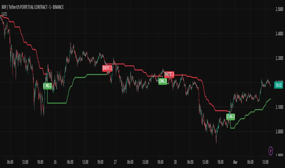
EMA Adaptive Trailing StopThe EMA Adaptive Trailing Stop Strategy is a versatile and comprehensive Pine Script designed for TradingView. This script provides an adaptive trailing stop mechanism that leverages the Exponential Moving Average (EMA) to adjust trailing stops based on market conditions. The strategy dynamically switches between trending and ranging markets by utilizing both Average True Range (ATR) and Average Directional Index (ADX) to detect market conditions.
Key Features:
EMA-Based Trailing Stop:
The script uses the EMA value to set trailing stops precisely. The EMA offers a more responsive calculation to price changes, ensuring closer and more accurate trailing stops that follow market movements effectively.
Market Condition Detection:
The script employs ATR and ADX to distinguish between trending and ranging markets. ATR measures market volatility, while ADX gauges trend strength. The combination of these two indicators provides a more accurate market condition detection.
Customizable Settings:
The script offers various flexible parameters to adjust EMA length, multipliers, and ATR length. Users can customize these settings according to their preferences and trading strategy.
Two Modes:
The script adapts to market conditions by providing two modes: trending mode and ranging mode. In trending mode, the trailing stop is tighter to follow price movements closely, whereas in ranging mode, the trailing stop is looser to accommodate lower volatility.
Entry and Exit Conditions:
The script detects market conditions to set buy and sell signals. These conditions include the calculations of EMA, ATR, and ADX to ensure the signals generated are valid and profitable.
Alerts:
The script provides buy and sell signals through alert conditions for efficient trade management. Users can enable these alerts to get real-time notifications when valid buy or sell signals are detected.
Suitable for Scalping and Swing Trading:
The script is well-suited for both scalping and swing trading strategies. Scalpers can benefit from the responsive and tighter trailing stops during trending conditions, while swing traders can take advantage of the adaptive and looser trailing stops during ranging conditions, allowing them to capture larger price movements.
Explanation of Mode 1 and Mode 2:
Mode 1: Trending Market:
In this mode, the market is identified as trending based on the ADX and ATR values.
LONG 1: This label indicates a buy signal in the trending market mode. It signifies that the trailing stop has been activated and a long position (buy) should be taken when the market is trending.
SHORT 1: This label indicates a sell signal in the trending market mode. It signifies that the trailing stop has been activated and a short position (sell) should be taken when the market is trending.
Mode 2: Ranging Market:
In this mode, the market is identified as ranging based on the ADX and ATR values.
LONG 2: This label indicates a buy signal in the ranging market mode. It signifies that the trailing stop has been activated and a long position (buy) should be taken with a looser trailing stop when the market is ranging.
SHORT 2: This label indicates a sell signal in the ranging market mode. It signifies that the trailing stop has been activated and a short position (sell) should be taken with a looser trailing stop when the market is ranging.
Technical Usage:
Variable Initialization:
The script initializes variables to store values such as trailing stop, long position status, and short position status.
Market Condition Detection:
The script calculates ATR and ADX values to detect whether the market is trending or ranging. This includes the use of f_adx function to calculate ADX values and determine market conditions.
EMA-Based Trailing Stop Calculation:
The script adjusts the trailing stop based on EMA values and ATR. The calculation involves customizable multipliers and parameters that influence the trailing stop's precision.
Plot Trailing Stop:
The script displays the trailing stop on the chart for clear visualization. This includes plotting the trailing stop line with appropriate colors to indicate long and short positions.
Entry and Exit Conditions:
The script determines the entry (buy) and exit (sell) conditions based on market condition detection and trailing stop settings. These conditions are crucial for generating valid buy or sell signals.
Plotshape and Alert:
The script provides plotshapes for buy and sell signals and sets up alert conditions for real-time notifications when a valid buy or sell signal is detected.
SMA Crossover with RSI ConfirmationThis is a sniper entry indicator that provides Buy and Sell signals using other Indicators to give the best possible Entries
Moving Average Crossovers:
The indicator uses two moving averages: a short-term SMA (Simple Moving Average) and a long-term SMA.
When the short-term SMA crosses above the long-term SMA, it generates a buy signal (indicating potential upward momentum).
When the short-term SMA crosses below the long-term SMA, it generates a sell signal (indicating potential downward momentum).
RSI Confirmation:
The indicator incorporates RSI (Relative Strength Index) to confirm the buy and sell signals generated by the moving average crossovers.
RSI is used to gauge the overbought and oversold conditions of the market.
A buy signal is confirmed if RSI is below a specified overbought level, indicating potential buying opportunity.
A sell signal is confirmed if RSI is above a specified oversold level, indicating potential selling opportunity.
Dynamic Take Profit and Stop Loss:
The indicator calculates dynamic take profit and stop loss levels based on the Average True Range (ATR).
ATR is used to gauge market volatility, and the take profit and stop loss levels are adjusted accordingly.
This feature helps traders to manage their risk effectively by setting appropriate profit targets and stop loss levels.
Combining the information provided by these, the indicator will provide an entry point with a provided take profit and stop loss. The indicator can be applied to different asset classes. Risk management must be applied when using this indicator as it is not 100% guaranteed to be profitable.

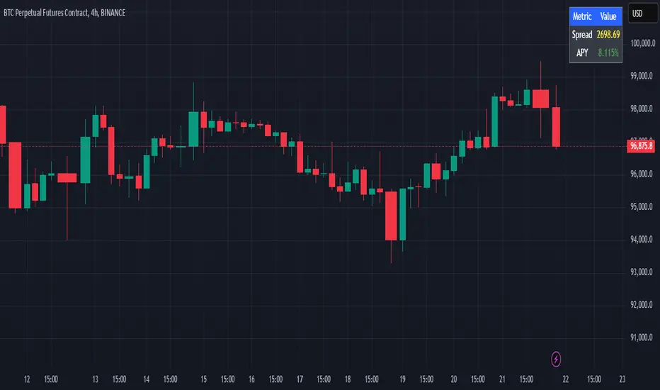
Cash And Carry Arbitrage BTC Compare Month 6 by SeoNo1Detailed Explanation of the BTC Cash and Carry Arbitrage Script
Script Title: BTC Cash And Carry Arbitrage Month 6 by SeoNo1
Short Title: BTC C&C ABT Month 6
Version: Pine Script v5
Overlay: True (The indicators are plotted directly on the price chart)
Purpose of the Script
This script is designed to help traders analyze and track arbitrage opportunities between the spot market and futures market for Bitcoin (BTC). Specifically, it calculates the spread and Annual Percentage Yield (APY) from a cash-and-carry arbitrage strategy until a specific expiry date (in this case, June 27, 2025).
The strategy helps identify profitable opportunities when the futures price of BTC is higher than the spot price. Traders can then buy BTC in the spot market and short BTC futures contracts to lock in a risk-free profit.
1. Input Settings
Spot Symbol: The real-time BTC spot price from Binance (BTCUSDT).
Futures Symbol: The BTC futures contract that expires in June 2025 (BTCUSDM2025).
Expiry Date: The expiration date of the futures contract, set to June 27, 2025.
These inputs allow users to adjust the symbols or expiry date according to their trading needs.
2. Price Data Retrieval
Spot Price: Fetches the latest closing price of BTC from the spot market.
Futures Price: Fetches the latest closing price of BTC futures.
Spread: The difference between the futures price and the spot price (futures_price - spot_price).
The spread indicates how much higher (or lower) the futures price is compared to the spot market.
3. Time to Maturity (TTM) and Annual Percentage Yield (APY) Calculation
Current Date: Gets the current timestamp.
Time to Maturity (TTM): The number of days left until the futures contract expires.
APY Calculation:
Formula:
APY = ( Spread / Spot Price ) x ( 365 / TTM Days ) x 100
This represents the annualized return from holding a cash-and-carry arbitrage position if the trader buys BTC at the spot price and sells BTC futures.
4. Display Information Table on the Chart
A table is created on the chart's top-right corner showing the following data:
Metric: Labels such as Spread and APY
Value: Displays the calculated spread and APY
The table automatically updates at the latest bar to display the most recent data.
5. Alert Condition
This sets an alert condition that triggers every time the script runs.
In practice, users can modify this alert to trigger based on specific conditions (e.g., APY exceeds a threshold).
6. Plotting the APY and Spread
APY Plot: Displays the annualized yield as a blue line on the chart.
Spread Plot: Visualizes the futures-spot spread as a red line.
This helps traders quickly identify arbitrage opportunities when the spread or APY reaches desirable levels.
How to Use the Script
Monitor Arbitrage Opportunities:
A positive spread indicates a potential cash-and-carry arbitrage opportunity.
The larger the APY, the more profitable the arbitrage opportunity could be.
Timing Trades:
Execute a buy on the BTC spot market and simultaneously sell BTC futures when the APY is attractive.
Close both positions upon futures contract expiry to realize profits.
Risk Management:
Ensure you have sufficient margin to hold both positions until expiry.
Monitor funding rates and volatility, which could affect returns.
Conclusion
This script is an essential tool for traders looking to exploit price discrepancies between the BTC spot market and futures market through a cash-and-carry arbitrage strategy. It provides real-time data on spreads, annualized returns (APY), and visual alerts, helping traders make informed decisions and maximize their profit potential.
Emergent Rays - NovaTheMachineEmergent Rays
An emergent ray is a refracted ray of light that exits a medium or channel. Emergent rays can be created when light passes through a prism, glass slab, or mirror
This visual indicator has been designed to aid in developing psychological understanding of price action. Many traders often struggle with developing strategy that they can act on, repeatedly. The difference between gambling and trading successfully comes down to following a plan, that you have tested and determined to be profitable over the long term.
Some traders experience anxiety when trading trends, trying to time a reversal, or entering a trade based on emotions and are unsure where they should place a stop - if they bother to place one at all.
I developed this indicator to help traders practice responsible trading practices and develop discipline. When applied to a chart an array of light rays will be plotted, similarly to those that are emitted from light passing through a medium such as a prism. These rays are a series of EMAs high & low values, filled with an assigned color.
The indicator does not suggest an entry or exit, it allows for freedom of user interpretation, however - when in a trending market you may notice that the rays are tested multiple times when the market is trending in the same direction. When trading trends it makes sense to enter at the discounted value (pullbacks) and exit on extensions. There are two main reasons for this; first is manage risk, second is to profit from a successful trade.
To practice discipline and remove emotions from trading, one must be willing to accept the outcome of a trade - regardless of whether it was profitable or not, based on their strategy.
The visual gradient of the rays signifies the pullback to stoploss risk. As price expands it is clear to see that the distance from red to blue rays increases, which means entering a trade on a touch of the red ray requires a larger stoploss than entering a pullback to the green or blue rays. When price closes on the opposite side of a ray from where it was trending - we accept the trend may have ended and must wait for the next trend cycle. If the price action is range bound we will notice the rays melting together to create a grey ray that signifies this is not the best place to be trading any type of trend following strategy.
Using this indicator in an uptrend (price expansion upwards), we look to enter long positions of retests (pullbacks) into the rays - with a stoploss set below the lowest rays; as we do not believe the uptrend is over until the trend has been broken.
Using this indicator in a downtrend (price expansion downwards), we look to enter short positions of retests (pullbacks) into the rays - with a stoploss set below the lowest rays; as we do not believe the uptrend is over until the trend has been broken.
When price is range bound or consolidating, we do not enter trades; wait for clear trend to be established.
By practicing discipline, we are able to overcome the emotions involved with trading, remove hesitation, and trade our plans more confidently through appropriate risk management and radical acceptance.
Bollinger Bands Reversal Strategy Analyzer█ OVERVIEW
The Bollinger Bands Reversal Overlay is a versatile trading tool designed to help traders identify potential reversal opportunities using Bollinger Bands. It provides visual signals, performance metrics, and a detailed table to analyze the effectiveness of reversal-based strategies over a user-defined lookback period.
█ KEY FEATURES
Bollinger Bands Calculation
The indicator calculates the standard Bollinger Bands, consisting of:
A middle band (basis) as the Simple Moving Average (SMA) of the closing price.
An upper band as the basis plus a multiple of the standard deviation.
A lower band as the basis minus a multiple of the standard deviation.
Users can customize the length of the Bollinger Bands and the multiplier for the standard deviation.
Reversal Signals
The indicator identifies potential reversal signals based on the interaction between the price and the Bollinger Bands.
Two entry strategies are available:
Revert Cross: Waits for the price to close back above the lower band (for longs) or below the upper band (for shorts) after crossing it.
Cross Threshold: Triggers a signal as soon as the price crosses the lower band (for longs) or the upper band (for shorts).
Trade Direction
Users can select a trade bias:
Long: Focuses on bullish reversal signals.
Short: Focuses on bearish reversal signals.
Performance Metrics
The indicator calculates and displays the performance of trades over a user-defined lookback period ( barLookback ).
Metrics include:
Win Rate: The percentage of trades that were profitable.
Mean Return: The average return across all trades.
Median Return: The median return across all trades.
These metrics are calculated for each bar in the lookback period, providing insights into the strategy's performance over time.
Visual Signals
The indicator plots buy and sell signals on the chart:
Buy Signals: Displayed as green triangles below the price bars.
Sell Signals: Displayed as red triangles above the price bars.
Performance Table
A customizable table is displayed on the chart, showing the performance metrics for each bar in the lookback period.
The table includes:
Win Rate: Highlighted with gradient colors (green for high win rates, red for low win rates).
Mean Return: Colored based on profitability (green for positive returns, red for negative returns).
Median Return: Colored similarly to the mean return.
Time Filtering
Users can define a specific time window for the indicator to analyze trades, ensuring that performance metrics are calculated only for the desired period.
Customizable Display
The table's font size can be adjusted to suit the user's preference, with options for "Auto," "Small," "Normal," and "Large."
█ PURPOSE
The Bollinger Bands Reversal Overlay is designed to:
Help traders identify high-probability reversal opportunities using Bollinger Bands.
Provide actionable insights into the performance of reversal-based strategies.
Enable users to backtest and optimize their trading strategies by analyzing historical performance metrics.
█ IDEAL USERS
Swing Traders: Looking for reversal opportunities within a trend.
Mean Reversion Traders: Interested in trading price reversals to the mean.
Strategy Developers: Seeking to backtest and refine Bollinger Bands-based strategies.
Performance Analysts: Wanting to evaluate the effectiveness of reversal signals over time.

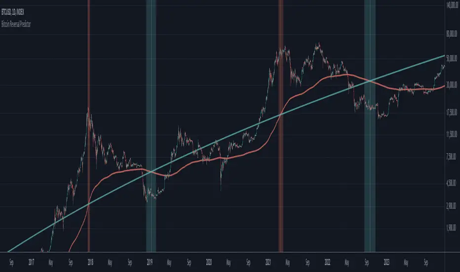
Bitcoin Reversal PredictorOverview
This indicator displays two lines that, when they cross, signal a potential reversal in Bitcoin's price trend. Historically, the high or low of a bull market cycle often occurs near the moment these lines intersect. The lines consist of an Exponential Moving Average (EMA) and a logarithmic regression line fitted to all of Bitcoin's historical data.
Inspiration
The inspiration for this indicator came from the PI Cycle Top indicator, which has accurately predicted past bull market peaks. However, I believe the PI Cycle Top indicator may not be as effective in the future. In that indicator, two lines cross to mark the top, but the extent of the cross has been diminishing over time. This was especially noticeable in the 2021 cycle, where the lines barely crossed. Because of this, I created a new indicator that I think will continue to provide reliable reversal signals in the future.
How It Works
The logarithmic regression line is fitted to the Bitcoin (BTCUSD) chart using two key factors: the 'a' factor (slope) and the 'b' factor (intercept). This results in a steadily decreasing line. The EMA oscillates above and below this regression line. Each time the two lines cross, a vertical colored bar appears, indicating that Bitcoin's price momentum is likely to reverse.
Use Cases
- Price Bottoming:
Bitcoin often bottoms out when the EMA crosses below the logarithmic regression line.
- Price Topping:
In contrast, Bitcoin often peaks when the EMA crosses above the logarithmic regression line.
- Profitable Strategy:
Trading at the crossovers of these lines can be a profitable strategy, as these moments often signal significant price reversals.
Bitcoin Logarithmic Regression BandsOverview
This indicator displays logarithmic regression bands for Bitcoin. Logarithmic regression is a statistical method used to model data where growth slows down over time. I initially created these bands in 2019 using a spreadsheet, and later coded them in TradingView in 2021. Over time, the bands proved effective at capturing Bitcoin's bull market peaks and bear market lows. In 2024, I decided to share this indicator because I believe these logarithmic regression bands offer the best fit for the Bitcoin chart.
How It Works
The logarithmic regression lines are fitted to the Bitcoin (BTCUSD) chart using two key factors: the 'a' factor (slope) and the 'b' factor (intercept). The two lines in the upper and lower bands share the same 'a' factor, but I adjust the 'b' factor by 0.2 to more accurately capture the bull market peaks and bear market lows. The formula for logaritmic regression is 10^((a * ln) - b).
How to Use the Logarithmic Regression Bands
1. Lower Band (Support Band):
The two lines in the lower band create a potential support area for Bitcoin’s price. Historically, Bitcoin’s price has always found its lows within this band during past market cycles. When the price is within the lower band, it suggests that Bitcoin is undervalued and could be set for a rebound.
2. Upper Band (Resistance Band):
The two lines in the upper band create a potential resistance area for Bitcoin’s price. Bitcoin has consistently reached its highs in this band during previous market cycles. If the price is within the upper band, it indicates that Bitcoin is overvalued, and a potential price correction may be imminent.
Use Cases
- Price Bottoming:
Bitcoin tends to bottom out at the lower band before entering a prolonged bull market or a period of sideways movement.
- Price Topping:
In reverse, Bitcoin tends to top out at the upper band before entering a bear market phase.
- Profitable Strategy:
Buying at the lower band and selling at the upper band can be a profitable trading strategy, as these bands often indicate key price levels for Bitcoin’s market cycles.

AlphaEdge Crypto Tracker [CHE]AlphaEdge Crypto Tracker
Efficiently Identify Top Performers and Underperformers Among 40 Crypto Assets at a Glance
In the fast-paced world of cryptocurrency trading, staying ahead requires the ability to quickly assess the performance of multiple assets simultaneously. AlphaEdge Crypto Tracker is an advanced Pine Script™ indicator designed for TradingView that empowers traders to effortlessly monitor and evaluate 40 different crypto assets in real-time.
This tool is my Christmas gift to all traders. I wish you all a Merry Christmas and successful trades in the coming year!
Why It’s Important to Identify Winners and Losers Among 40 Assets at a Glance:
1. Time Efficiency: Managing a diverse portfolio can be overwhelming. With AlphaEdge Crypto Tracker, traders can swiftly identify which assets are performing exceptionally well (winners) and which are underperforming (losers) without the need to analyze each asset individually.
2. Informed Decision-Making: By having a clear overview of top gainers and losers, traders can make strategic decisions such as reallocating investments, taking profits, or cutting losses, thereby optimizing their trading strategies.
3. Risk Management: Quickly spotting underperforming assets helps in mitigating potential losses and adjusting positions to maintain a balanced and profitable portfolio.
4. Opportunity Identification: Recognizing top-performing assets allows traders to capitalize on emerging trends and maximize their returns by focusing on the most promising opportunities.
Key Features of AlphaEdge Crypto Tracker :
- Comprehensive Asset Tracking: Monitors 40 crypto assets simultaneously, providing a broad view of the market landscape.
- Max Gain and Adjusted Max Loss Calculations: Utilizes a 14-bar (configurable) period to calculate the highest gains and the adjusted maximum losses for each asset, offering insights into potential profitability and risk.
- Dynamic Ranking: Automatically sorts and ranks assets based on their performance, highlighting the top 10 gainers and top 10 losers for easy comparison.
- Customizable Display:
- Table Settings: Adjust the size, position, and colors of the performance table to fit your chart layout.
- Interactive Tooltips: Hover over asset names to view detailed tooltips, enhancing usability and information accessibility.
- Visual Alerts: Changes in asset performance are visually indicated through background color updates, allowing for immediate recognition of significant shifts.
- User-Friendly Interface: Intuitive table layout with clear headers and organized data presentation, making it easy for traders of all levels to interpret the information.
How It Works:
1. Data Calculation: For each of the 40 tracked assets, AlphaEdge Crypto Tracker calculates the maximum gain and adjusted maximum loss over the defined trading period.
2. Sorting and Ranking: The assets are sorted based on their maximum gains and adjusted maximum losses, automatically updating to reflect the latest market movements.
3. Real-Time Display: The top 10 gainers and losers are displayed in a neatly organized table directly on your TradingView chart, providing immediate visual insights.
4. Customization: Users can tailor the tracking period, select specific assets to monitor, and adjust the table’s appearance to match their trading style and preferences.
Conclusion:
AlphaEdge Crypto Tracker is an essential tool for cryptocurrency traders seeking to enhance their market analysis and decision-making processes. By providing a comprehensive and customizable overview of multiple assets, it enables traders to efficiently identify profitable opportunities and manage risks effectively. Whether you’re a seasoned trader or just starting, AlphaEdge Crypto Tracker equips you with the insights needed to navigate the dynamic crypto market with confidence.
Get Started Today:
Integrate AlphaEdge Crypto Tracker into your TradingView setup and take control of your crypto trading strategy with unparalleled clarity and precision.
Disclaimer:
The content provided, including all code and materials, is strictly for educational and informational purposes only. It is not intended as, and should not be interpreted as, financial advice, a recommendation to buy or sell any financial instrument, or an offer of any financial product or service. All strategies, tools, and examples discussed are provided for illustrative purposes to demonstrate coding techniques and the functionality of Pine Script within a trading context.
Any results from strategies or tools provided are hypothetical, and past performance is not indicative of future results. Trading and investing involve high risk, including the potential loss of principal, and may not be suitable for all individuals. Before making any trading decisions, please consult with a qualified financial professional to understand the risks involved.
By using this script, you acknowledge and agree that any trading decisions are made solely at your discretion and risk.
License Information:
This Pine Script™ code is subject to the terms of the Mozilla Public License 2.0. You can view the full license (mozilla.org).
© chervolino

Stochastic Oscillator-Time & Frequency StatsThe Stochastic Oscillator Time & Frequency Statistics indicator is a tool designed to enhance your trading decisions by combining the traditional Stochastic Oscillator with additional metrics and visual aids. Although the Stochastic Oscillator is typically used to indicate trend direction and overbought/oversold conditions, the %K and %D lines can cross over and under multiple times while in the critical zones. The statistics added to this indicator allow traders to assess the probability of multiple crossover signals occurring on an asset or within various time frames. Signal levels and definitions of critical zones can be adjusted while the statistics are automatically updated to the relevant ticker, time frame and thresholds. Visual preferences such as colors and signal shapes can also be customized.
The Stochastic Oscillator is a commonly used momentum indicator developed by George Lane. It measures the position of the current closing price relative to the asset's recent high-low range over a set period. This advanced version calculates various probability and frequency statistics to better understand the oscillator’s behaviour and guide our strategies and risk management. Some key questions that this indicator intends to address are:
How long does the average momentum last in a trend?; How long does the oscillator remain in the critical zones?; How many times could one expect crossovers/unders' to occur in critical zones before momentum changes?; And, at what price does the candle need to close for the k & d lines to cross and signal a momentum shift?
Statistics & Probabilities:
The indicator calculates important time and frequency-based metrics that provide deeper insight into the behavior of the Stochastic Oscillator. These are displayed in a text box on the indicator panel, including:
Avg Long: The average number of bars between the last long signal before exiting the critical oversold zone and the next short signal in the overbought critical zone, including the standard deviation and the sample size within the relevant time frame.
Avg Short: The average number of bars between the last short signal in the overbought critical zone and the next long signal in the oversold critical zone, including the standard deviation and the sample size within the relevant time frame.
Time in Oversold: The average time (in bars/candle sticks) that the Stochastic Oscillator's %K & %D lines both spend in the oversold region (below the buy signal level) after entering and before departing the oversold region, along with the standard deviation.
Time in Overbought: The average time (in bars/candle sticks) that the Stochastic Oscillator's %K & %D lines both spend in the overbought region (above the sell signal level), after entering and before departing the overbought region, along with the standard deviation.
Signal Frequency: It calculates the percentage of long or short signals that occur consecutively within the critical zone before the opposing signal occurs (e.g., 1Long: 40.54%, 2 Long: 28.55%, 3Long: 17.4%, >3 Long: 13.51%, 1Short: 36.15%, 2Short: 30.41%, 3Short: 17.57%, >3Short: 15.88%). This is calculated for 1 through 6 consecutive occurrences and summarised for more than 6 consecutive signals
Key Features:
Oversold: Typically When the Stochastic Oscillator is below 20, it indicates that the asset may be oversold, potentially signalling a buying opportunity. The threshold for "overbought" and "oversold" extreme regions can be adjusted
Overbought: When the Stochastic Oscillator is above 80, it suggests the asset may be overbought, and a downturn might be near.
Stochastic Slope: The slope of the Stochastic Oscillator indicates the prominent trend direction within the selected time period.
Customizable Buy/Sell Signal Levels: The indicator allows customizable levels for detecting oversold (typically below 20-25) and overbought (typically above 75-80) conditions, helping one spot potential reversal zones for initiating long or short trades.
Crossover Alerts: The indicator tracks crossovers between the %K and %D lines, generating:
Long signals: When a crossover occurs below the buy signal level (indicating oversold conditions).
Short signals: when a crossunder occurs above the sell signal level (indicating overbought conditions).
The signals are visualized as labels on the chart:
- **L** for potential long (buy) signals: Marked below the bars when the %K line crosses above the %D line.
- **S** for potential short (sell) signals: Marked above the bars when the %K line crosses below the %D line.
Disclaimers:
No Guarantees: The indicator is provided "as-is" without any warranties or guarantees of accuracy, completeness, or fitness for a particular purpose. The outcomes or performance of trades executed using this indicator are not guaranteed to be successful or profitable.
User Responsibility: You are solely responsible for any trading decisions you make based on the use of this indicator. All trading and investment activities involve risk, and it is essential to conduct your own research, analysis, and due diligence before making any financial decisions.
No Liability: The creator of this indicator is not responsible for any financial losses, direct or indirect, incurred as a result of using this indicator. This includes, but is not limited to, loss of profits, loss of capital, or any other negative financial outcomes.
Market Risks: Markets are volatile, and prices may fluctuate significantly. Trading and investing carry inherent risks, and there is always the potential for loss. You should only trade with capital that you can afford to lose.
Independent Advice: This indicator and the content generated by its creator does not constitute financial advice and is for entertainment purposes only. It is strongly recommended that you seek independent financial advice from a qualified and licensed professional before making any trading or investment decisions based on the use of this indicator.
By using this indicator, you acknowledge that you fully understand and accept the risks involved, and you agree to indemnify and hold harmless the creator of this indicator from any claims, damages, or liabilities arising from its use.
The author of this script has made every effort to ensure that the code is an original interpretation and application of the open-source **Stochastic Oscillator**, as developed by George Lane. The script reflects a unique adaptation aimed at enhancing trading strategies through advanced statistical analysis and trade management features. The author does not claim any proprietary rights over the foundational concepts of the **Stochastic Oscillator** and does not intend to infringe upon any existing copyrights. Should any copyright infringement be identified, the author commits to removing the indicator immediately and forfeits any rights to further or intended financial gain from its use.
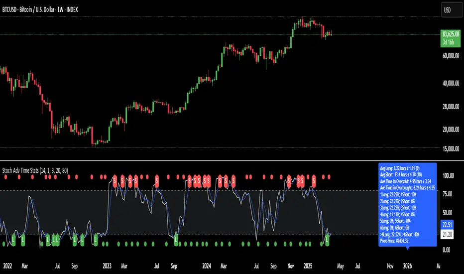
Supply and Demand Plus [tambangEA]The Supply and Demand Plus is an advanced version of the highly-regarded Supply and Demand indicator
Designed to offer additional functionality for professional traders. Building on the core features of the original script, the "Plus" version incorporates enhanced zone selection capabilities and multi-timeframe Exponential Moving Averages (EMAs). This makes it a versatile tool for those who seek to refine their trading strategies using supply and demand principles while integrating trend-following techniques.
🔹 New Capabilities in Supply and Demand Plus
1. Customizable Zone Selection:
Users can now choose which specific zones to display on the chart:
Continuation Trader
-Rally-Base-Rally (RBR): Bullish continuation zones.
-Drop-Base-Drop (DBD): Bearish continuation zones.
Contrarian Trader
-Drop-Base-Rally (DBR): Bullish reversal zones.
-Rally-Base-Drop (RBD): Bearish reversal zones.
This feature allows traders to filter the zones relevant to their strategy, reducing chart clutter and enhancing focus.
2. Multi-Timeframe EMAs:
🔹 The Meeting Zone: "Base"
-The meeting zone is where supply meets demand, often referred to as the equilibrium price range. In this range:
-Sellers are willing to sell at prices buyers are willing to pay.
-Trading volume is usually higher as transactions occur more frequently.
-On the candle chart, this area may appear as sideways movement (consolidation) or regions with balanced candle sizes and wicks, signaling relative agreement between buyers and sellers.
🔹 Key Observations in Candle Charts
-Breakouts: When prices break out of a meeting zone, they indicate that one side (buyers or sellers) has gained significant control. This can lead to new supply or demand zones.
-Retests: Often, prices return to test these zones (called pullbacks) before continuing in the dominant direction. Retests confirm the strength of a supply or demand zone.
-Volume Spikes: High trading volumes near these zones signify active participation and can validate the importance of the zone.
The indicator includes five Exponential Moving Averages (EMAs) that can be plotted across different timeframes simultaneously. This enables traders to:
Track trend strength and direction across multiple timeframes.
Identify dynamic support and resistance levels.
Combine EMA signals with supply and demand zones for confluence-based trading decisions.
EMA Settings:
Fully customizable periods (e.g., EMA 20, 50, 100, etc.).
Adjustable colors and thickness for each EMA.
Multi-timeframe capability to analyze higher or lower timeframes without changing the chart.
🔹 How It Works :
The script works through a series of processes:
1.Zone Identification:
-Uses historical price patterns and pivot levels to map out supply and demand zones.
-Zones dynamically adjust to reflect market conditions, staying relevant to current price action.
-The color of the Zone can be set individually
2.Volume and Market Context:
-Integrates volume analysis to filter out weaker zones.
-Highlights zones with confluence between high volume and price rejections, signaling areas of strong institutional interest.
3.Trend Integration:
-Employs proprietary logic to assess market trends, ensuring that traders only act on zones aligned with broader momentum.
-This feature minimizes counter-trend trades, which are inherently riskier.
4.User Customization:
-Fully customizable zone sensitivity, timeframe settings, and visual preferences allow traders to adapt the tool to their strategy.
Four EMAs in sequence from Chart EMAs to Daily EMA are indicators of a strong trend
The "Base" zone of RBR and DBD supported by Daily EMAs within the zone,
is a strong meeting of buyers and sellers in the past.
Zone can be calibrated how many percent comparison of open close candle to high low candle
the number of candles in Base can be set to the maximum number of candles
🔹 Utility for Traders
The indicator provides a clear roadmap for traders by:
-Identifying high-probability trade zones.
-Confirming entries with volume and trend data.
-Offering actionable insights in both trending and ranging markets.
🔹 Why It Stands Out
Unlike generic supply and demand indicators or trend-following tools, Supply and Demand Plus incorporates an original approach by:
-Seamlessly combining zone identification, volume analysis, and trend confirmation into a single cohesive tool.
-Adapting dynamically to changing market conditions.
-Supporting advanced traders with MTFA, while remaining accessible to beginners with its intuitive design.
Example : Continuation Trader + Retests
The idea is when the "Base" zone occurs, then there is a meeting between buyers and sellers with a large enough volume and will leave a trace in the past.
In accordance with one of the principles in Dow Theory, namely History Repeats Itself, the price will return to the "Base" zone, before continuing the trend
Before
After
🔹 Update and Versioning
This script is an evolution of previous Supply and Demand tools, incorporating valuable user feedback and innovative features. All future updates, including improvements and new functionalities, will be integrated within this script under the Update feature, ensuring continuity and ease of access for users.
🔹 Conclusion
We believe that success lies in the association of the user with the indicator, opposed to many traders who have the perspective that the indicator itself can make them become profitable. The reality is much more complicated than that.
The aim is to provide an indicator comprehensive, customizable, and intuitive enough that any trader can be led to understand this truth and develop an actionable perspective of technical indicators as support tools for decision making.
🔹 DISCLAIMER/RISK WARNING
Trading foreign exchange on margin carries a high level of risk, and may not be suitable for all investors.
All content, tools, scripts, articles, & education provided by are purely for informational & educational purposes only. Past performance does not guarantee future results.
Flashtrader´s Statistical BandwidthsThe vast majority of traders exclusively concern
themselves with trend-following in all its facets. Scoring
points with trends on a regular basis is a difficult task
since prices do not constantly move in one direction
or another. In the case of the DAX future, for example,
only about 30 per cent of all trading days in a year are
trend days. And of these, there are x percent long ones
and x per cent short ones. Catching the very days when
prices rise or fall from the opening to the close is a major
challenge for a trader who also needs to have previously
recognised the corresponding direction.
However, there are also other ways of profit-taking
every day – for example, by using the mean reversion
strategy. The idea behind this is the fact that prices reach
a high and a low every day – but very rarely close at the
high or the low. This means that prices always move
away from these extreme points and the closing price is
somewhere in between. A profitable trading strategy can
be developed out of this.
But how can you know where the high and the low
will be tomorrow? Is it possible for you to know this in
advance? No – because no one can predict the future. Or
can they? At least it can be statistically determined how
high or low prices could go tomorrow. There is a high
degree of probability that one of the two possibilities
will materialise. It will then be necessary to act.
Calculation
Classic pivot points for the following day are calculated
from the high, low and closing price. But does it really
make sense to use such a mix? I don’t think so and
use a different calculation for this strategy. In a first step,
only the differences between the start and the high or low
are calculated on a daily basis. To avoid being dependent
on individual days and outliers, it is advisable to calculate,
in a second step, the average of these differences over
the past five days. Finally, this average will then be added
at the opening price of the current trading day for the
upper statistical bandwidth and subtracted for the lower
bandwidth.
upper bandwidth = oSTB (violet dashed line in the chart)
lower bandwidth = uSTB (violet dashedline in the chart)
The second interesting question is, if the previous day's high has been exceeded, how much further can the price rise from a mathematical/statistical point of view?
These calculated previous day highs expansions are shown as red dashed lines
Previous day's high expansion = VTHA
Previous day's low expansion = VTTA
For further orientation, the previous day's high (VTH) and the previous day's low (VTT) are shown in light blue dashed lines
And as a supplement, the previous day's close in the DAX Future at 10:00 p.m. VTSA in violet solid lines and the previous day's close in the cash register at 5:30 p.m. VTSN in yellow solid lines
Reaching the calculated extreme values does not mean that the trend has to change immediately, but there is at least temporary exhaustion potential with which you can earn a few points every day in the area of scalping.
Example for cheap entry long:
Example for cheap entry short:
Deutsch:
Die Masse der Trader beschäftigt sich ausschließlich mit Trendfolge in all ihren Facetten. Mit Trends regelmäßig zu punkten ist ein schwieriges Unterfangen, da die Kurse nicht ständig in die eine oder andere Richtung laufen. Beim DAX-Future zum Beispiel sind von allen Börsentagen im Jahr lediglich zirka 30 Prozent Trendtage. Davon sind dann auch noch x Prozent Long und x Prozent Short. Hier genau die Tage abzupassen, an denen die Kurse von Börsenbeginn bis zum Schluss steigen beziehungsweise fallen, ist eine große Herausforderung – wobei der Trader zuvor noch die entsprechende Richtung erkannt haben muss. Es gibt jedoch auch noch andere Methoden täglich Gewinne mitzunehmen, zum Beispiel mit der Mean-Reversion-Strategie (Mittelwertumkehr).
Hintergrund ist die Tatsache, dass die Kurse jeden Tag ein Hoch und ein Tief erreichen – aber sehr selten am Hoch oder am Tief schließen. Das bedeutet, dass die Preise sich immer wie der von diesen Extrempunkten wegbewegen und der Schlusskurs irgendwo dazwischen liegt. Hieraus lässt sich eine profitable Handelsstrategie entwickeln. Aber woher kannst Du wissen, wo morgen das Hoch und das Tief sein wird? Kannst Du das vorher schon wissen? Nein – denn niemand kann die Zukunft vorhersagen. Oder doch? Statistisch lässt sich zumindest bestimmen, wie hoch und wie tief die Kurse morgen steigen oder fallen könnten. Eine Seite wird mit sehr hoher Wahrscheinlichkeit ein treffen. Dann gilt es zu handeln.
Berechnung Klassischer Pivot-Punkte für den folgenden Tag werden aus Hoch, Tief und Schlusskurs berechnet. Aber ist es wirklich sinnvoll, einen solchen Mix zu verwenden? Ich finde das nicht und verwenden für diese Strategie eine andere Berechnung. Im ersten Schritt werden täglich die Differenzen nur vom Start bis zum Hoch beziehungsweise Tief errechnet. Um nicht von einzelnen Tagen und Ausreißern abhängig zu sein, empfiehlt es sich, in einem zweiten Schritt den Durchschnitt dieser Differenzen über die letzten fünf Tage zu errechnen. Zuletzt wird dann dieser Durchschnitt zum Eröffnungskurs des aktuellen Handelstages für die obere statistische Bandbreite addiert und für die untere Bandbreite subtrahiert.
Obere statistische Bandbreite = oSTB (violette gestrichelte Linie im Chart)
Untere statistische Bandbreite = uSTB (violette gestrichelte Linie im Chart)
Die zweite interessante Frage ist, wenn das Vortageshoch überschritten wurde, wie weit kann der Kurs dann noch steigen aus mathematisch/statistischer Sicht?
Diese berechneten Vortagesextremausdehnungen sind als rote gestrichelte Linien dargestellt
Vortageshochausdehnung = VTHA
Vortagestiefausdehnung = VTTA
Für die weitere Orientierung sind die Vortageshochs (VTH) und die Vortagestiefs (VTT) als hellblaue gestrichelte Linien abgebildet.
Als Ergänzung wird noch der Vortages Schluss im Dax Future um 22:00 Uhr VTSA mit einer violetten durchgezogenen Linie und der Kassamarktschluss um 17:30 Uhr mit einer gelben durchgezogenen Linie gezeigt.
Das Erreichen der berechneten Extremwerte bedeutet nicht, das der Trend sofort drehen muss, aber es sind zumindest temporäre Erschöpfungspotentiale mit denen sich im Bereich scalping täglich einige Punkte verdienen lassen.
Beispiel für günstigen Einstieg Long:
Beispiel für günstigen Einstieg Short:

FibLevel Size CalculatorThis skript calculates position sizes and new take profits for sizing into an long or short position with 3 entrys defined at custom fibonacci retracement levels.
TP: -0,272
Entry1: 0.382
Entry2: 0.618
Entry3: 0.83
SL: 1.05
Expected RR per trade is 0.2 with a High Win rate definitly profitable.
Search for an established trend on the higher timeframe, drop to the smaller ones and look for correction waves. Once they break to the trenddirection of the higher timeframe take the fib from lowest to highes point. Draw a fib level on the chart and use the Indicator to define these Levels above. The calculator gives you the Margin to use in each position, and will check that you will not get liquidated an that you have enough margin. It tells you the new TP for Limit2 and Limit3 if they get hit so you can get out of the trade full TP with a small bounce.
Inputs:
Account Balance, Risk Percentage, and Leverage: These inputs are used to calculate the position size and risk.
Entry 1, Entry 2, Entry 3, Take Profit (TP), and Stop Loss (SL): These prices are used for calculating position sizes, risk, and profit for up to three entry points.
Calculations:
Risk Amount: Calculated based on the account balance and risk percentage.
Position Sizes (Qty): For each entry point, the position size is determined. The second and third entries have a multiplier (3x for Entry 2, 5x for Entry 3) compared to the first.
Stop Loss and Profit Calculation: The script calculates the potential profit and adjusts the TP levels based on the average entries for Limit 2 and Limit 3.
Margin Calculation: Margin requirements for each position are calculated based on leverage.
Output:
Table Display: A table shows key values like entry prices, position sizes, TP levels, potential profit, and margin requirements for each limit.
Warnings: It includes a liquidation warning and a check for whether the account is at risk of liquidation based on leverage.
Position Type: It automatically detects if the trade is a long or short based on the relationship between TP and SL.
Visualization:
Lines: It draws horizontal lines on the chart to visually represent the entry, TP, and SL levels.
Overall, this script is designed to help traders manage risk and calculate position sizes for multi-level entries using leverage.
Pls drop feedback in the comments.

Stoch RSI Time StatisticsThe “Stochastic RSI Time Statistics” is a comprehensive tool designed to enhance your trading decisions by combining the traditional Stochastic RSI with additional metrics and visual aids. This indicator can be used to detect overbought and oversold conditions, issue long and short alerts based on crossovers, and help you analyse market movements by providing detailed statistical insights.
The Stochastic RSI is an open source script that was developed by Tushar Chande and Stanley Kroll and introduced in their book "The New Technical Trader" in 1994. It combines two popular indicators: the “Relative Strength Index (RSI)” and the “Stochastic Oscillator”.
The “Stochastic RSI Time Statistics” uses the stochastic RSI calculations and additionally calculates various probability and frequency statistics to better understand the momentum oscillator’s behaviour and guide our strategies and risk management.
Statistics & Probabilities:
The indicator calculates important time and frequency-based metrics that provide deeper insight into the behaviour of the Stochastic RSI. These are displayed in a text box on the indicator panel, including:
Avg Long: The average number of bars between the last long signal before exiting the critical zone and the next short signal in the overbought critical zone, including the standard deviation and the sample size within the relevant time frame.
Avg Short: The average number of bars between the last short signal before exiting the critical zone and the next long signal in the oversold critical zone, including the standard deviation and the sample size within the relevant time frame.
Avg Consecutive Longs: The average number of consecutive long signals before the first proceeding short signal occurs, with standard deviation.
Avg Consecutive Shorts: The average number of consecutive short signals before the first proceeding long signal occurs, with standard deviation.
Time in Oversold: The average time (in bars/candle sticks) that the Stochastic RSI lines (K & D Lines both in critical zone) spends in the oversold region (below the buy signal level) after entering the oversold region and until both K & D lines depart from the oversold region, along with the standard deviation.
Time in Overbought: The average time (in bars/candle sticks) that the Stochastic RSI lines (K & D Lines both in critical zone) spends in the overbought region (above the sell signal level), after entering the overbought region and until both K & D lines depart from the overbought region, along with the standard deviation.
Signal Frequency: It calculates the percentage of a single, double, triple, and more than triple long or short signals that occur consecutively within the critical zone before the opposing signal occurs (e.g., 1Long: 40.54%, 2 Long:28.55%, 3Long 17.4%, >3 Long:13.51%, 1Short:36.15%, 2Short:30.41%, 3Short:17.57%, >3Short:15.88%).
Key Features:
Oversold: When the Stochastic RSI is below 20, it indicates that the RSI is in a low range, and the asset may be oversold, potentially signalling a buying opportunity.
Overbought: When the Stochastic RSI is above 80, it suggests the RSI is in a high range, meaning the asset may be overbought and a downturn might be near.
The Stochastic RSI Slope indicates the prominent trend direction within a relevant time period.
Customizable Buy Signal Level (typically below 20-25 percentile) to detect oversold conditions. Customizable Sell Signal Level (typically above 75-80 percentile) to detect overbought conditions. These levels help you spot potential reversal zones where long or short trades might be initiated.
Crossover Alerts:
The indicator tracks crossovers between the K and D lines, generating long signals when a crossover occurs below the buy signal level (indicating oversold conditions) and short signals when a cross under occurs above the sell signal level (indicating overbought conditions). The signals are visualized as labels on the chart:
**L** for potential long (buy) signals: Marked below the bars when the K line crosses above the D line.
**S** for potential short (sell) signals: Marked above the bars when the K line crosses below the D line.
Visual Alerts are generated based on these signals.
Risk Management
Although the Stochastic RSI is typically regarded as presenting trend direction and overbought and oversold conditions when in the extreme zones, the RSI can linger and cross over or under numerous times while in the critical zone. The statistics added to the Stochastic RSI indicator allows one to assess the statistical probability of numerous crossover signals occurring on an asset or at various time frames. Signal levels, or preferred definitions of the critical zones can be adjusted while the statistics are automatically updated to the relevant ticker or time frame. Colours and Signal shapes are adjustable to suite your visual preferences.
By using this indicator, you acknowledge and agree that:
No Guarantees: The indicator is provided "as-is" without any warranties or guarantees of accuracy, completeness, or fitness for a particular purpose. The outcomes or performance of trades executed using this indicator are not guaranteed to be successful or profitable.
User Responsibility: You are solely responsible for any trading decisions you make based on the use of this indicator. All trading and investment activities involve risk, and it is essential to conduct your own research, analysis, and due diligence before making any financial decisions.
No Liability: The creator of this indicator is not responsible for any financial losses, direct or indirect, incurred as a result of using this indicator. This includes, but is not limited to, loss of profits, loss of capital, or any other negative financial outcomes.
Market Risks: Markets are volatile, and prices may fluctuate significantly. Trading and investing carry inherent risks, and there is always the potential for loss. You should only trade with capital that you can afford to lose.
Independent Advice: It is strongly recommended that you seek independent financial advice from a qualified and licensed professional before making any trading or investment decisions based on the use of this indicator.
By using this indicator, you acknowledge that you fully understand and accept the risks involved, and you agree to indemnify and hold harmless the creator of this indicator from any claims, damages, or liabilities arising from its use.
The author of this script has made every effort to ensure that the code is an original interpretation and application of the open-source Stochastic RSI, as developed by the original authors, Tushar Chande and Stanley Kroll. The script reflects a unique adaptation aimed at enhancing trading strategies through advanced statistical analysis and trade management features. The author does not claim any proprietary rights over the foundational concepts of the Stochastic RSI and does not intend to infringe upon any existing copyrights. Should any copyright infringement be identified, the author commits to removing the indicator immediately and forfeits any rights to further or intended financial gain from its use.
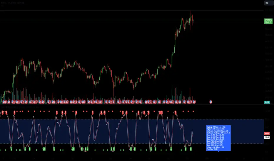
Grid Bot Parabolic [xxattaxx]🟩 The Grid Bot Parabolic, a continuation of the Grid Bot Simulator Series , enhances traditional gridbot theory by employing a dynamic parabolic curve to visualize potential support and resistance levels. This adaptability is particularly useful in volatile or trending markets, enabling traders to explore grid-based strategies and gain deeper market insights. The grids are divided into customizable trade zones that trigger signals as prices move into new zones, empowering traders to gain deeper insights into market dynamics and potential turning points.
While traditional grid bots excel in ranging markets, the Grid Bot Parabolic’s introduction of acceleration and curvature adds new dimensions, enabling its use in trending markets as well. It can function as a traditional grid bot with horizontal lines, a tilted grid bot with linear slopes, or a fully parabolic grid with curves. This dynamic nature allows the indicator to adapt to various market conditions, providing traders with a versatile tool for visualizing dynamic support and resistance levels.
🔑 KEY FEATURES 🔑
Adaptable Grid Structures (Horizontal, Linear, Curved)
Buy and Sell Signals with Multiple Trigger/Confirmation Conditions
Secondary Buy and Secondary Sell Signals
Projected Grid Lines
Customizable Grid Spacing and Zones
Acceleration and Curvature Control
Sensitivity Adjustments
📐 GRID STRUCTURES 📐
Beyond its core parabolic functionality, the Parabolic Grid Bot offers a range of grid configurations to suit different market conditions and trading preferences. By adjusting the "Acceleration" and "Curvature" parameters, you can transform the grid's structure:
Parabolic Grids
Setting both acceleration and curvature to non-zero values results in a parabolic grid.This configuration can be particularly useful for visualizing potential turning points and trend reversals. Example: Accel = 10, Curve = -10)
Linear Grids
With a non-zero acceleration and zero curvature, the grid tilts to represent a linear trend, aiding in identifying potential support and resistance levels during trending phases. Example: Accel =1.75, Curve = 0
Horizontal Grids
When both acceleration and curvature are set to zero, the indicator reverts to a traditional grid bot with horizontal lines, suitable for ranging markets. Example: Accel=0, Curve=0
⚙️ INITIAL SETUP ⚙️
1.Adding the Indicator to Your Chart
Locate a Starting Point: To begin, visually identify a price point on your chart where you want the grid to start.This point will anchor your grid.
2. Setting Up the Grid
Add the Grid Bot Parabolic Indicator to your chart. A “Start Time/Price” dialog will appear
CLICK on the chart at your chosen start point. This will anchor the start point and open a "Confirm Inputs" dialog box.
3. Configure Settings. In the dialog box, you can set the following:
Acceleration: Adjust how quickly the grid reacts to price changes.
Curve: Define the shape of the parabola.
Intervals: Determine the distance between grid levels.
If you choose to keep the default settings, with acceleration set to 0 and curve set to 0, the grid will display as traditional horizontal lines. The grid will align with your selected price point, and you can adjust the settings at any time through the indicator’s settings panel.
⚙️ CONFIGURATION AND SETTINGS ⚙️
Grid Settings
Accel (Acceleration): Controls how quickly the price reacts to changes over time.
Curve (Curvature): Defines the overall shape of the parabola.
Intervals (Grid Spacing): Determines the vertical spacing between the grid lines.
Sensitivity: Fine tunes the magnitude of Acceleration and Curve.
Buy Zones & Sell Zones: Define the number of grid levels used for potential buy and sell signals.
* Each zone is represented on the chart with different colors:
* Green: Buy Zones
* Red: Sell Zones
* Yellow: Overlap (Buy and Sell Zones intersect)
* Gray: Neutral areas
Trigger: Chooses which part of the candlestick is used to trigger a signal.
* `Wick`: Uses the high or low of the candlestick
* `Close`: Uses the closing price of the candlestick
* `Midpoint`: Uses the middle point between the high and low of the candlestick
* `SWMA`: Uses the Symmetrical Weighted Moving Average
Confirm: Specifies how a signal is confirmed.
* `Reverse`: The signal is confirmed if the price moves in the opposite direction of the initial trigger
* `Touch`: The signal is confirmed when the price touches the specified level or zone
Sentiment: Determines the market sentiment, which can influence signal generation.
* `Slope`: Sentiment is based on the direction of the curve, reflecting the current trend
* `Long`: Sentiment is bullish, favoring buy signals
* `Short`: Sentiment is bearish, favoring sell signals
* `Neutral`: Sentiment is neutral. No secondary signals will be generated
Show Signals: Toggles the display of buy and sell signals on the chart
Chart Settings
Grid Colors: These colors define the visual appearance of the grid lines
Projected: These colors define the visual appearance of the projected lines
Parabola/SWMA: Adjust colors as needed. These are disabled by default.
Time/Price
Start Time & Start Price: These set the starting point for the parabolic curve.
* These fields are automatically populated when you add the indicator to the chart and click on an initial location
* These can be adjusted manually in the settings panel, but he easiest way to change these is by directly interacting with the start point on the chart
Please note: Time and Price must be adjusted for each chart when switching assets. For example, a Start Price on BTCUSD of $60,000 will not work on an ETHUSD chart.
🤖 ALGORITHM AND CALCULATION 🤖
The Parabolic Function
At the core of the Parabolic Grid Bot lies the parabolic function, which calculates a dynamic curve that adapts to price action over time. This curve serves as the foundation for visualizing potential support and resistance levels.
The shape and behavior of the parabola are influenced by three key user-defined parameters:
Acceleration: This parameter controls the rate of change of the curve's slope, influencing its tilt or steepness. A higher acceleration value results in a more pronounced tilt, while a lower value leads to a gentler slope. This applies to both curved and linear grid configurations.
Curvature: This parameter introduces and controls the curvature or bend of the grid. A higher curvature value results in a more pronounced parabolic shape, while a lower value leads to a flatter curve or even a straight line (when set to zero).
Sensitivity: This setting fine-tunes the overall responsiveness of the grid, influencing how strongly the Acceleration and Curvature parameters affect its shape. Increasing sensitivity amplifies the impact of these parameters, making the grid more adaptable to price changes but potentially leading to more frequent adjustments. Decreasing sensitivity reduces their impact, resulting in a more stable grid structure with fewer adjustments. It may be necessary to adjust Sensitivity when switching between different assets or timeframes to ensure optimal scaling and responsiveness.
The parabolic function combines these parameters to generate a curve that visually represents the potential path of price movement. By understanding how these inputs influence the parabola's shape and behavior, traders can gain valuable insights into potential support and resistance areas, aiding in their decision-making process.
Sentiment
The Parabolic Grid Bot incorporates sentiment to enhance signal generation. The "Sentiment" input allows you to either:
Manually specify the market sentiment: Choose between 'Long' (bullish), 'Short' (bearish), or 'Neutral'.
Let the script determine sentiment based on the slope of the parabolic curve: If 'Slope' is selected, the sentiment will be considered 'Long' when the curve is sloping upwards, 'Short' when it's sloping downwards, and 'Neutral' when it's flat.
Buy and Sell Signals
The Parabolic Grid Bot generates buy and sell signals based on the interaction between the price and the grid levels.
Trigger: The "Trigger" input determines which part of the candlestick is used to trigger a signal (wick, close, midpoint, or SWMA).
Confirmation: The "Confirm" input specifies how a signal is confirmed ('Reverse' or 'Touch').
Zones: The number of "Buy Zones" and "Sell Zones" determines the areas on the grid where buy and sell signals can be generated.
When the trigger condition is met within a buy zone and the confirmation criteria are satisfied, a buy signal is generated. Similarly, a sell signal is generated when the trigger and confirmation occur within a sell zone.
Secondary Signals
Secondary signals are generated when a regular buy or sell signal contradicts the prevailing sentiment. For example:
A buy signal in a bearish market (Sentiment = 'Short') would be considered a "secondary buy" signal.
A sell signal in a bullish market (Sentiment = 'Long') would be considered a "secondary sell" signal.
These secondary signals are visually represented on the chart using hollow triangles, differentiating them from regular signals (filled triangles).
While they can be interpreted as potential contrarian trade opportunities, secondary signals can also serve other purposes within a grid trading strategy:
Exit Signals: A secondary signal can suggest a potential shift in market sentiment or a weakening trend. This could be a cue to consider exiting an existing position, even if it's currently profitable, to lock in gains before a potential reversal
Risk Management: In a strong trend, secondary signals might offer opportunities for cautious counter-trend trades with controlled risk. These trades could utilize smaller position sizes or tighter stop-losses to manage potential downside if the main trend continues
Dollar-Cost Averaging (DCA): During a prolonged trend, the parabolic curve might generate multiple secondary signals in the opposite direction. These signals could be used to implement a DCA strategy, gradually accumulating a position at potentially favorable prices as the market retraces or consolidates within the larger trend
Secondary signals should be interpreted with caution and considered in conjunction with other technical indicators and market context. They provide additional insights into potential market reversals or consolidation phases within a broader trend, aiding in adapting your grid trading strategy to the evolving market dynamics.
Examples
Trigger=Wick, Confirm=Touch. Signals are generated when the wick touches the next gridline.
Trigger=Close, Confirm=Touch. Signals require the close to touch the next gridline.
Trigger=SWMA, Confirm=Reverse. Signals are triggered when the Symmetrically Weighted Moving Average reverse crosses the next gridline.
🧠THEORY AND RATIONALE 🧠
The innovative approach of the Parabolic Grid Bot can be better understood by first examining the limitations of traditional grid trading strategies and exploring how this indicator addresses them by incorporating principles of market cycles and dynamic price behavior
Traditional Grid Bots: One-Dimensional and Static
Traditional grid bots operate on a simple premise: they divide the price chart into a series of equally spaced horizontal lines, creating a grid of trading zones. These bots excel in ranging markets where prices oscillate within a defined range. Buy and sell orders are placed at these grid levels, aiming to profit from mean reversion as prices bounce between the support and resistance zones.
However, traditional grid bots face challenges in trending markets. As the market moves in one direction, the bot continues to place orders in that direction, leading to a stacking of positions. If the market eventually reverses, these stacked trades can be profitable, amplifying gains. But the risk lies in the potential for the market to continue trending, leaving the trader with a series of losing trades on the wrong side of the market
The Parabolic Grid Bot: Adding Dimensions
The Parabolic Grid Bot addresses the limitations of traditional grid bots by introducing two additional dimensions:
Acceleration (Second Dimension): This parameter introduces a second dimension to the grid, allowing it to tilt upwards or downwards to align with the prevailing market trend. A positive acceleration creates an upward-sloping grid, suitable for uptrends, while a negative acceleration results in a downward-sloping grid, ideal for downtrends. The magnitude of acceleration controls the steepness of the tilt, enabling you to fine-tune the grid's responsiveness to the trend's strength
Curvature (Third Dimension): This parameter adds a third dimension to the grid by introducing a parabolic curve. The curve's shape, ranging from gentle bends to sharp turns, is controlled by the curvature value. This flexibility allows the grid to closely mirror the market's evolving structure, potentially identifying turning points and trend reversals.
Mean Reversion in Trending Markets
Even in trending markets, the Parabolic Grid Bot can help identify opportunities for mean reversion strategies. While the grid may be tilted to reflect the trend, the buy and sell zones can capture short-term price oscillations or consolidations within the broader trend. This allows traders to potentially pinpoint entry and exit points based on temporary pullbacks or reversals.
Visualize and Adapt
The Parabolic Grid Bot acts as a visual aid, enhancing your understanding of market dynamics. It allows you to "see the curve" by adapting the grid to the market's patterns. If the market shows a parabolic shape, like an upward curve followed by a peak and a downward turn (similar to a head and shoulders pattern), adjust the Accel and Curve to match. This highlights potential areas of interest for further analysis.
Beyond Straight Lines: Visualizing Market Cycle
Traditional technical analysis often employs straight lines, such as trend lines and support/resistance levels, to interpret market movements. However, many analysts, including Brian Millard, contend that these lines can be misleading. They propose that what might appear as a straight line could represent just a small part of a larger curve or cycle that's not fully visible on the chart.
Markets are inherently cyclical, marked by phases of expansion, contraction, and reversal. The Parabolic Grid Bot acknowledges this cyclical behavior by offering a dynamic, curved grid that adapts to these shifts. This approach helps traders move beyond the limitations of straight lines and visualize potential support and resistance levels in a way that better reflects the market's true nature
By capturing these cyclical patterns, whether subtle or pronounced, the Parabolic Grid Bot offers a nuanced understanding of market dynamics, potentially leading to more accurate interpretations of price action and informed trading decisions.
⚠️ DISCLAIMER⚠️
This indicator utilizes a parabolic curve fitting approach to visualize potential support and resistance levels. The mathematical formulas employed have been designed with adaptability and scalability in mind, aiming to accommodate various assets and price ranges. While the resulting curves may visually resemble parabolas, it's important to note that they might not strictly adhere to the precise mathematical definition of a parabola.
The indicator's calculations have been tested and generally produce reliable results. However, no guarantees are made regarding their absolute mathematical accuracy. Traders are encouraged to use this tool as part of their broader analysis and decision-making process, combining it with other technical indicators and market context.
Please remember that trading involves inherent risks, and past performance is not indicative of future results. It is always advisable to conduct your own research and exercise prudent risk management before making any trading decisions.
🧠 BEYOND THE CODE 🧠
The Parabolic Grid Bot, like the other grid bots in this series, is designed with education and community collaboration in mind. Its open-source nature encourages exploration, experimentation, and the development of new grid trading strategies. We hope this indicator serves as a framework and a starting point for future innovations in the field of grid trading.
Your comments, suggestions, and discussions are invaluable in shaping the future of this project. We welcome your feedback and look forward to seeing how you utilize and enhance the Parabolic Grid Bot.

Uptrick: Volume-Weighted EMA Signal### **Uptrick: Volume-Weighted EMA Signal (UVES) Indicator - Comprehensive Description**
#### **Overview**
The **Uptrick: Volume-Weighted EMA Signal (UVES)** is an advanced, multifaceted trading indicator meticulously designed to provide traders with a holistic view of market trends by integrating Exponential Moving Averages (EMA) with volume analysis. This indicator not only identifies the direction of market trends through dynamic EMAs but also evaluates the underlying strength of these trends using real-time volume data. UVES is a versatile tool suitable for various trading styles and markets, offering a high degree of customization to meet the specific needs of individual traders.
#### **Purpose**
The UVES indicator aims to enhance traditional trend-following strategies by incorporating a critical yet often overlooked component: volume. Volume is a powerful indicator of market strength, providing insights into the conviction behind price movements. By merging EMA-based trend signals with detailed volume analysis, UVES offers a more nuanced and reliable approach to identifying trading opportunities. This dual-layer analysis allows traders to differentiate between strong trends supported by significant volume and weaker trends that may be prone to reversals.
#### **Key Features and Functions**
1. **Dynamic Exponential Moving Average (EMA):**
- The core of the UVES indicator is its dynamic EMA, calculated over a customizable period. The EMA is a widely used technical indicator that smooths price data to identify the underlying trend. In UVES, the EMA is dynamically colored—green when the current EMA value is above the previous value, indicating an uptrend, and red when below, signaling a downtrend. This visual cue helps traders quickly assess the trend direction without manually calculating or interpreting raw data.
2. **Comprehensive Moving Average Customization:**
- While the EMA is the default moving average in UVES, traders can select from various other moving average types, including Simple Moving Average (SMA), Smoothed Moving Average (SMMA), Weighted Moving Average (WMA), and Volume-Weighted Moving Average (VWMA). Each type offers unique characteristics:
- **SMA:** Provides a simple average of prices over a specified period, suitable for identifying long-term trends.
- **EMA:** Gives more weight to recent prices, making it more responsive to recent market movements.
- **SMMA (RMA):** A slower-moving average that reduces noise, ideal for capturing smoother trends.
- **WMA:** Weighs prices based on their order in the dataset, making recent prices more influential.
- **VWMA:** Integrates volume data, emphasizing price movements that occur with higher volume, making it particularly useful in volume-sensitive markets.
3. **Signal Line for Trend Confirmation:**
- UVES includes an optional signal line, which applies a secondary moving average to the primary EMA. This signal line can be used to smooth out the EMA and confirm trend changes. The signal line’s color changes based on its slope—green for an upward slope and red for a downward slope—providing a clear visual confirmation of trend direction. Traders can adjust the length and type of this signal line, allowing them to tailor the indicator’s responsiveness to their trading strategy.
4. **Buy and Sell Signal Generation:**
- UVES generates explicit buy and sell signals based on the interaction between the EMA and the signal line. A **buy signal** is triggered when the EMA transitions from a red (downtrend) to a green (uptrend), indicating a potential entry point. Conversely, a **sell signal** is triggered when the EMA shifts from green to red, suggesting an exit or shorting opportunity. These signals are displayed directly on the chart as upward or downward arrows, making them easily identifiable even during fast market conditions.
5. **Volume Analysis with Real-Time Buy/Sell Volume Table:**
- One of the standout features of UVES is its integration of volume analysis, which calculates and displays the volume attributed to buying and selling activities. This analysis includes:
- **Buy Volume:** The portion of the total volume associated with price increases (close higher than open).
- **Sell Volume:** The portion of the total volume associated with price decreases (close lower than open).
- **Buy/Sell Ratio:** A ratio of buy volume to sell volume, providing a quick snapshot of market sentiment.
- These metrics are presented in a real-time table positioned in the top-right corner of the chart, with customizable colors and formatting. The table updates with each new bar, offering continuous feedback on the strength and direction of the market trend based on volume data.
6. **Customizable Settings and User Control:**
- **EMA Length and Source:** Traders can specify the lookback period for the EMA, adjusting its sensitivity to price changes. The source for EMA calculations can also be customized, with options such as close, open, high, low, or other custom price series.
- **Signal Line Customization:** The signal line’s length, type, and width can be adjusted to suit different trading strategies, allowing traders to optimize the balance between trend detection and noise reduction.
- **Offset Adjustment:** The offset feature allows users to shift the EMA and signal line forward or backward on the chart. This can help align the indicator with specific price action or adjust for latency in decision-making processes.
- **Volume Table Positioning and Formatting:** The position, size, and color scheme of the volume table are fully customizable, enabling traders to integrate the table seamlessly into their chart setup without cluttering the visual workspace.
7. **Versatility Across Markets and Trading Styles:**
- UVES is designed to be effective across a wide range of financial markets, including Forex, stocks, cryptocurrencies, commodities, and indices. Its adaptability to different markets is supported by its comprehensive customization options and the inclusion of volume analysis, which is particularly valuable in markets where volume plays a crucial role in price movement.
#### **How Different Traders Can Benefit from UVES**
1. **Trend Followers:**
- Trend-following traders will find UVES particularly beneficial for identifying and riding trends. The dynamic EMA and signal line provide clear visual cues for trend direction, while the volume analysis helps confirm the strength of these trends. This combination allows trend followers to stay in profitable trades longer and exit when the trend shows signs of weakening.
2. **Volume-Based Traders:**
- Traders who focus on volume as a key indicator of market strength can leverage the UVES volume table to gain insights into the buying and selling pressure behind price movements. By monitoring the buy/sell ratio, these traders can identify periods of strong conviction (high buy volume) or potential reversals (high sell volume) with greater accuracy.
3. **Scalpers and Day Traders:**
- For traders operating on shorter time frames, UVES provides quick and reliable signals that are essential for making rapid trading decisions. The ability to customize the EMA length and type allows scalpers to fine-tune the indicator for responsiveness, while the volume analysis offers an additional layer of confirmation to avoid false signals.
4. **Swing Traders:**
- Swing traders, who typically hold positions for several days to weeks, can use UVES to identify medium-term trends and potential entry and exit points. The indicator’s ability to filter out market noise through the signal line and volume analysis makes it ideal for capturing significant price movements without being misled by short-term volatility.
5. **Position Traders and Long-Term Investors:**
- Even long-term investors can benefit from UVES by using it to identify major trend reversals or confirm the strength of long-term trends. The flexibility to adjust the EMA and signal line to longer periods ensures that the indicator remains relevant for detecting shifts in market sentiment over extended time frames.
#### **Optimal Settings for Different Markets**
- **Forex Markets:**
- **EMA Length:** 9 to 14 periods.
- **Signal Line:** Use VWMA or WMA for the signal line to incorporate volume data, which is crucial in the highly liquid Forex markets.
- **Best Use:** Short-term trend following, with an emphasis on identifying rapid changes in market sentiment.
- **Stock Markets:**
- **EMA Length:** 20 to 50 periods.
- **Signal Line:** SMA or EMA with a slightly longer length (e.g., 50 periods) to capture broader market trends.
- **Best Use:** Medium to long-term trend identification, with volume analysis confirming the strength of institutional buying or selling.
- **Cryptocurrency Markets:**
- **EMA Length:** 9 to 12 periods, due to the high volatility in crypto markets.
- **Signal Line:** SMMA or EMA for smoothing out extreme price fluctuations.
- **Best Use:** Identifying entry and exit points in volatile markets, with the volume table providing insights into market manipulation or sudden shifts in trader sentiment.
- **Commodity Markets:**
- **EMA Length:** 14 to 21 periods.
- **Signal Line:** WMA or VWMA, considering the impact of trading volume on commodity prices.
- **Best Use:** Capturing medium-term price movements and confirming trend strength with volume data.
#### **Customization for Advanced Users**
- **Advanced Offset Usage:** Traders can experiment with different offset values to see how shifting the EMA and signal line impacts the timing of buy/sell signals. This can be particularly useful in markets with known latency or for strategies that require a delayed confirmation of trend changes.
- **Volume Table Integration:** The position, size, and colors of the volume table can be adjusted to fit seamlessly into any trading setup. For example, a trader might choose to position the table in the bottom-right corner and use a smaller size to keep the focus on price action while still having access to volume data.
- **Signal Filtering:** By combining the signal line with the primary EMA, traders can filter out false signals during periods of low volatility or when the market is range-bound. Adjusting the length of the signal line allows for greater control over the sensitivity of the trend detection.
#### **Conclusion**
The **Uptrick: Volume-Weighted EMA Signal (UVES)** is a powerful and adaptable indicator designed for traders who demand more from their technical analysis tools. By integrating dynamic EMA trend signals with real-time volume analysis, UVES offers a comprehensive view of market conditions, making it an invaluable resource for identifying trends, confirming signals, and understanding market sentiment. Whether you are a day trader, swing trader, or long-term investor, UVES provides the versatility, precision, and customization needed to make more informed and profitable trading decisions. With its ability to adapt to various markets and trading styles, UVES is not just an indicator but a complete trend analysis solution.

Mxwll OptAlgoIntroducing the Mxwll OptAlgo
Mxwll OptAlgo is a sophisticated algorithmic trading tool designed to identify potential long and short signals. It leverages an optimized combination of the M-Swift average, M-Smooth average, and M-RSI to fine-tune custom lengths and improve signal accuracy. The Mxwll OptAlgo provides long and short signals across various trading assets and timeframes. Additionally, it features optimized Take Profit (TP) and Stop Loss (SL) settings to help traders manage risk.
Key Features
Step-by-Step Complete Optimization: A systematic approach to optimize trading parameters.
Buy/Sell Signals: Clear indicators for long and short positions.
Easy to Use: User-friendly interface for seamless trading.
Predictive counter trend channels
Integrated trend following system and counter trend trading system
3-optimized strategies working cooperatively
Alerts and auto trading capabilities
How It Works
The Mxwll OptAlgo is comprised of three strategies:
Trend following using the OptAlgo
AI Reversal counter trend trading
Market crash shorting
Mxwll OptAlgo can be used for market analysis and trading similarly to any moving average.
The Mxwll OptAlgo MA is composed of two distinct moving averages to be used for trend following strategies.
M-Swift Average: The M-Swift Average accounts for volume and weights current price movement heavier than older price movement - allowing for improved responsiveness to current price movement. Volume is additionally weighted to the average to determine the significance of the price move and the resulting response of the M-Swift average. The M-Swift average consists of an HVWMA with OBV weighting. The HVWMA is used to create a moving average that adapts to volume, attempting to respond to significant price moves with high volume quicker and significant price moves with low volume slower - which might not be indicative of the start of a strong trend. To further reduce the M-Swift average’s responsiveness to weak volume price moves, the average is weighted with a normalized OBV. With this, the M-Swift moving average uses these two indicators to create a responsive moving average to significant price moves with high volume.
M-Smooth Average: The M-Smooth average consists of a McGinley average.
The McGinley Average is designed to address some of the limitations of traditional moving averages, such as the Simple Moving Average (SMA) or Exponential Moving Average (EMA), by reducing their lag and more accurately reflecting the market's true movements, especially during periods of volatility.
The McGinley Dynamic automatically adjusts its smoothing factor based on market speed. This means it responds more quickly to fast-moving markets and slows down during periods of consolidation, reducing the likelihood of false signals.
Unlike traditional moving averages that have a fixed period and can lag significantly behind fast-moving prices, the McGinley Dynamic adjusts dynamically, which helps to reduce lag and keeps the moving average closer to the price action.
The M-Smooth average uses bar low prices as a series during an uptrend - bar high prices as a series during a downtrend. A cross above the M-Smooth average indicates an uptrend, while a cross below the M-Smooth average indicates a downtrend. When this cross event occurs the M-Smooth average will “flip” from calculating on lows to highs, or highs to lows, contingent on the direction of the trend. The expectation is that a cross event of the M-Smooth average requires a substantial price move and, subsequent to this cross, price will continue to trend in the direction of the cross.
OptAlgo: The OptAlgo is simply the average of the M-Swift average and the M-smooth average.
By combining the M-Swift average and the M-Smooth average, the final output results in an average that slows during ranging markets and quickly adjusts to high volume breakouts and high volume reversals that initiate a trend. Due to the combination, the average will keep up quickly with a trend but remain at an appropriate distance from the current price - requiring a significant counter trend price move to change the direction of the OptAlgo average.
How does the OptAlgo follow trends?
The OptAlgo, comprising the two moving averages above, considers a cross event of the OptAlgo as a change in trend indication. The OptAlgo can be thought of as a moving average that significantly deviates from price. For price to cross the OptAlgo, a substantial price move must occur, and this event is treated as a "strong trend" or "new trend" indication.
M-RSI: The M-RSI is a fundamental component of the trend following strategy. Prior to a trend following “long” or “short” signal, the M-RSI must generate a signal in confluence with an OptAlgo cross event. When price crosses over the opt algo its color will change to green, indicating an uptrend. A buy signal will generate should the M-RSI provide a similar indication. The M-RSI portion of the trend following strategy is explained below. When price crosses under the opt algo its color will change to green, indicating a downtrend, and a sell signal becomes eligible. The foundational logic for using the Opt Algo as a trend following strategy is to treat crossovers/crossunders of the Opt Algo as strong trend indications, and trade them.
Steps to generate a trend following long signal:
1: M-RSI extends into oversold territory
2: Price crosses over the OptAlgo
Steps to generate a trend following short signal:
1: M-RSI extends into overbought territory
2: Price crosses under the OptAlgo
Our trend following strategy considers crossovers/crossunders at key market turning points as buy/sell opportunities. This strategy integrates the Mxwll RSI and Mxwll OptAlgo MA to determine entry points in anticipation of trend continuation.
The Mxwll RSI must move below/above the optimized OB/OS level prior to a cross event for a long/short signal to be considered. Entry points for this strategy are marked as "Long" or "Short".
At its core, the OptAlgo trend following strategy tries to enter a trend as close to the origin point as possible. As with any trend following strategy, price may not continue to move in the expected direction following entry, resulting in a losing trade.
AI Reversal Predictions
Our AI reversals strategy uses AI suggested turning points to capitalize on price reversions back towards the OptAlgo. These levels are considered by the AI on the selected days, and entry points at these levels are marked as "LLO" or "SLO".
How AI reversals work
Our AI reversals strategy attempts to trade price reversions back toward the Opt Algo.
These levels are calculated on specific days of the week, but can be traded any day. The internal algorithm determines which HTF highs/lows are most likely to function as tradable support/resistance levels. For instance, if Friday consists of heavy trading activity and high/low prices are tracked/recorded as causing significant support / resistance when tested in the future, the algorithm will consider support and resistance levels created on Friday as future tradable levels.
Additionally, if support/resistance levels created on Wednesday are recorded as weak or unpredictable when traded at in the future, the algorithm will not consider support/resistance levels generated on Thursday as tradable, and will not generate long or shit signals for these levels.
In the background, the AI reversals strategy is tracking success rates at multiple support and resistance levels. The best performers, if there are any, will be considered tradable. A “best performer” is calculated as the raw price move up to a threshold (i.e. 0.5%) that occurs subsequent to a test of the level.
Crash Short
The "Crash Short" strategy prioritizes short positions during retracements of a sell off. A simple yet effective strategy.
How Crash Short Works
The Crash Short strategy uses a customized momentum indicator (similar to ROC, MOM, etc.) to identify strong downside price moves. When our customized momentum indicator gives strong sell indications, the RSI is then referenced to identify an upside retracement. When the RSI exceeds a user-inputted level, a “Crash Short” signal is generated.
What is the customized momentum indicator?
The customized momentum indicator is the RoCR (Rate of Change Ratio). Instead of classic ROC, which is close - close , the RoCR divides the current close by a previous close. This formula creates a ratio that is more normalized than a simple price difference. This ratio is used to determine upside/downside momentum, with values greater than 1 indicating bullish momentum and values less than 1 indicating bearish momentum. The RoCR looks for deviating values to the downside (less than 1) to identify strong selling. From there, once the RSI crosses over an optimized level (such as 35), the indicator will print a sell signal titled "Crash Short".
Predictive Countertrend Channels
Our Predictive Countertrend Channel applies a two-stage recursive filter to smooth data using exponential decay and periodic adjustments for trend extraction. Our counter trend channels aren't directly used for signal processing; however, these channels provide useful visual cues for extended market moves.
Instructions for Optimization
Step 1: Optimize Mxwll OptAlgo
Begin by optimizing the M-Swift and M-Smooth averages for better signal accuracy.
This step simply finds better performing M-Swift and M-Smooth lookbacks. Again, if the strategy is unprofitable you will be notified and from there decide not to use the strategy.
Step 2: Optimize Mxwll RSI
Refine the Mxwll RSI settings to explore potential adjustments in smoothness and signal output. This step aims to evaluate whether these adjustments could improve the accuracy of the signals generated by Mxwll OptAlgo, while being mindful of any potential impacts.
Step 3: Optimize TP/SL
Consider adjusting the Take Profit and Stop Loss settings to potentially manage risk.
Step 4: Optimize Bars Between Trades
Set the number of bars between trades to regulate the frequency of trade executions. This adjustment may help in reducing the risk of overtrading and support a more disciplined trading strategy.
Step 5: Optimize Trade Flip
Adjust the trade flip parameters to potentially improve the management of transitions between long and short positions. This adjustment is intended to help achieve smoother trade executions, though outcomes may vary.
Step 6: Optimize RSI OB/OB Levels
Consider adjusting the overbought (OB) and oversold (OS) RSI levels to explore potential improvements in signal sensitivity. Careful calibration of these levels may help refine the accuracy of trend reversal signals, although results may depend on market conditions.
Finished!
From this point, consider setting alerts to make the most of the Mxwll Opt Algo's potential accuracy.
The effectiveness of the Opt Algo signal output can be evaluated using the "PF" table, which indicates the profit factor score for the strategy. A profit factor (PF) of less than or equal to 1 suggests that the strategy may not be profitable.
Disclaimer
No strategy works on any timeframe on any asset, so, if the Opt Algo underperforms for the asset/timeframe you're analyzing, the Opt Algo PF table lets you know it hasn't been generating accurate signals, in which case you can decide not to use it!
Optimization Disclaimer
Optimization can be tricky. It's helpful to test numerous strategies in aggregate to see if a strategy has potential. Despite this, optimization can cause overfitting. Overfitting occurs when a strategy is too closely fit to the data it's trading. Overfit backtests are deceptively phenomenal. While the historical performance looks great, the future expectancy of the strategy remains unpredictable - an overfit strategy will profit from periods of random price movement which, being random, are irreproducible and cannot be profited from other than their initial occurrence. When a strategy trades random price movement profitably, any and all profit earned can be reduced to chance. Keep this in mind when using the in-built optimization system. Optimization should be kept to a minimum, a tool to point you in the right direction, whether confirming potential or signifying a useless system.

Sniper Entry using RSI confirmationThis is a sniper entry indicator that provides Buy and Sell signals using other Indicators to give the best possible Entries (note: Entries will not be 100 percent accurate and analysis should be done to support an entry)
Moving Average Crossovers:
The indicator uses two moving averages: a short-term SMA (Simple Moving Average) and a long-term SMA.
When the short-term SMA crosses above the long-term SMA, it generates a buy signal (indicating potential upward momentum).
When the short-term SMA crosses below the long-term SMA, it generates a sell signal (indicating potential downward momentum).
RSI Confirmation:
The indicator incorporates RSI (Relative Strength Index) to confirm the buy and sell signals generated by the moving average crossovers.
RSI is used to gauge the overbought and oversold conditions of the market.
A buy signal is confirmed if RSI is below a specified overbought level, indicating potential buying opportunity.
A sell signal is confirmed if RSI is above a specified oversold level, indicating potential selling opportunity.
Dynamic Take Profit and Stop Loss:
The indicator calculates dynamic take profit and stop loss levels based on the Average True Range (ATR).
ATR is used to gauge market volatility, and the take profit and stop loss levels are adjusted accordingly.
This feature helps traders to manage their risk effectively by setting appropriate profit targets and stop loss levels.
Combining the information provided by these, the indicator will provide an entry point with a provided take profit and stop loss. The indicator can be applied to different asset classes. Risk management must be applied when using this indicator as it is not 100% guaranteed to be profitable.
Goodluck!