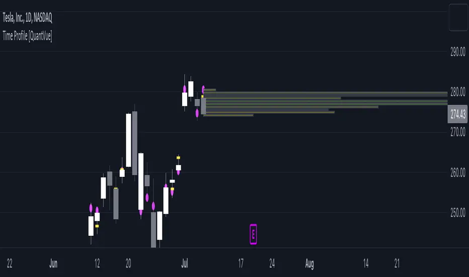
Time Profile [QuantVue]The Time Profile indicator provides traders with a comprehensive view of volume and time-based price activity. The indicator combines two essential components into one indicator: the volume profile and the time profile.
The volume profile represents the distribution of trading volume at different price levels over a specified period and is displayed as a circle on the chart.
It provides a visual representation of where the majority of trading volume occurred and often highlights significant support and resistance levels. The volume profile is calculated as the closing price of the highest volume intraday bar, based on the user selected lower time frame.
On the other hand, the time profile focuses on analyzing the time spent at certain price levels. The indicator divides the current bars range into 10 blocks and counts the number of user selected lower time frame closes within each time block.
The block with the most lower time frame closes in it is deemed the time point of control. Traders can use this information to identify time blocks where price movement was most significant.
The time profile is drawn on the Y axis of the current bar to allow for an easy visualization of where price spent most of its time. Historical time profiles are also noted on previous bars with a dash marking the level.
The Time Profile indicator offers several customization options. Traders can adjust the timeframe for the lower time frame data, decide whether to display the time profile, and customize colors for visual clarity.
Additionally, traders can choose to highlight instances where the Volume POC and Time POC align, indicating a strong concentration of volume and price activity.
Don't hesitate to reach out with any questions or concerns.
We hope you enjoy!
Cheers.
Pesquisar nos scripts por "poc"
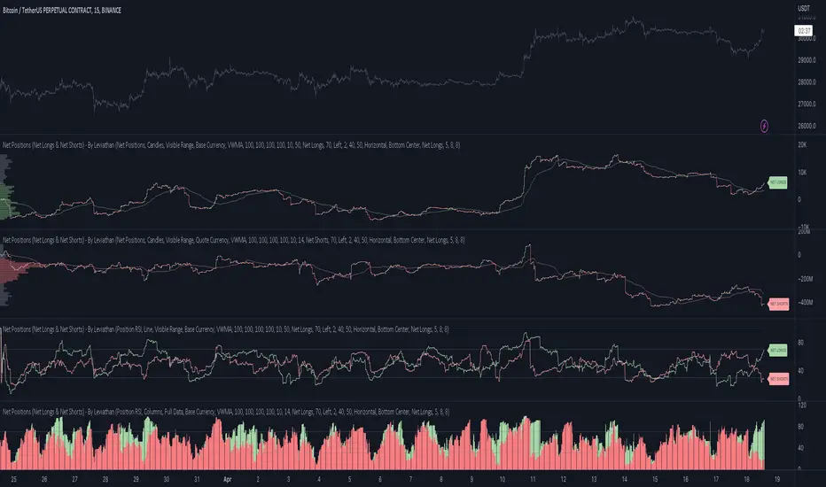
Net Positions (Net Longs & Net Shorts) - By LeviathanThis script is an experimental indicator that visualizes the entering and exiting of long and short positions in the market. It also includes other useful tools, such as NL/NS Profile, NL/NS Delta, NL/NS Ratio, Volume Heatmap, Divergence finder, Relative Strength Index of Net Longs and Net Shorts, EMAs and VWMAs and more.
To avoid misinterpretation, it's important to understand some basics. The “real” ratio between net long and net short positions in a given market is always 1:1. A futures contract is an agreement between two parties to buy or sell an underlying asset at an agreed-upon price. Each contract has a long side and a short side, with one party agreeing to buy (long) and the other party agreeing to sell (short) the asset at the agreed-upon price. The long position holder anticipates that the asset's price will rise, while the short position holder expects it to fall. Because every futures contract involves both a buyer and a seller, it is impossible to have more net longs than net shorts or vice versa (in terms of the net value). For every long position opened, there must be a corresponding short position taken by another market participant (and vice versa), thus maintaining the 1:1 ratio between longs and shorts. While there can be an imbalance in the number of traders/accounts holding long and short contracts, the net value of positions held on each side remains 1 to 1.
Open Interest (OI) is a metric that tracks the number of open (unsettled) contracts in a given market. For example, Open Interest of 100 BTC means that there are currently 100 BTC worth of longs and 100 BTC worth of shorts open in the market. There may be more traders on one side holding smaller positions, and fewer traders on the other side holding larger positions, but the net value of positions on one side is equal to the net value of positions on the other side → 100 BTC in longs and 100 BTC in shorts (1:1). Consider a scenario in which a trader decides to open a long position for 1 BTC at a price of HKEX:30 ,000. For this long order to be executed, a counterparty must take the opposite side of the contract by placing an order to short 1 BTC at the same price of HKEX:30 ,000. When both the long and short orders are matched and executed, the open interest increases by 1 BTC, reflecting the addition of this new contract to the market.
Changes in Open Interest essentially tell us 3 things:
- OI Increase - new positions entered the market (both longs and shorts!)
- OI Decrease - positions exited the market (both longs and shorts!)
- OI Flat - no change in open positions due to low activity or simply lots of transfers of contracts
However, different concepts can be used to analyze sentiment, aggressiveness, and activity in the market by analyzing data such as Open Interest, price, volume, etc. This indicator combines Open Interest data and price action to simplify the visualization of positions entering and exiting the market. It is based on the following concept:
Increase in Open Interest + Increase in price = Longs Opening
Decrease in Open Interest + Decrease in price = Longs Closing
Increase in Open Interest + Decrease in price = Shorts Opening
Decrease in Open Interest + Increase in price = Shorts Closing
When "Longs Opening" occurs, the OI Delta value is added to the running total of Net Longs, and when "Longs Closing" occurs, the OI Delta value is subtracted from the running total of Net Longs.
When "Shorts Opening" occurs, the OI Delta value is added to the running total of Net Shorts, and when "Shorts Closing" occurs, the OI Delta value is subtracted from the running total of Net Shorts.
To summarize:
Net Longs: Cumulative value of Longs Opening and Longs Closing (LO - LC)
Net Shorts: Cumulative value of Shorts Opening and Shorts Closing (SO - SC)
Net Delta: Net Longs - Net Shorts
Net Ratio: Net Longs / Net Shorts
This is the fundamental logic of how this script functions, but it also includes several other tools and options. Here is an overview of the settings:
Type:
- Net Positions (display values of Net Longs, Net Shorts, Net Delta, Net Ratio as described above)
- Relative Strength (display Net Longs, Net Shorts, Net Delta, Net Ratio in the form of a momentum oscillator that measures the speed and change of movements. Same logic as RSI for price)
Display as:
- Candles (display the data in the form of candlesticks)
- Lines (display the data in the form of candlesticks)
- Columns (display the data in the form of columns)
Cumulation:
- Visible Range (data is cumulated from the first visible bar on your chart)
- Full Data (data is cumulated from the beginning)
Quoted in:
- Base Currency (all data is presented in the pair’s base currency eg. BTC)
- Quote Currency (all data is presented in the pair’s quote currency eg USDT)
OI Sources
- Pick the sources from where the data is collected (if available).
Net Positions:
- NET LONGS (show/hide Net Longs plot, choose candle colors, choose line color)
- NET SHORTS (show/hide Net Shorts plot, choose candle colors, choose line color)
- NET DELTA (show/hide Net Delta plot, choose candle colors, choose line color)
- NET RATIO (show/hide Net Ratio plot, choose candle colors, choose line color)
Moving Averages:
- Type (choose between EMA and Volume Weighted Moving Average)
- NET LONGS (show/hide NL moving average plot, choose length, choose color)
- NET SHORTS (show/hide NS moving average plot, choose length, choose color)
- NET DELTA (show/hide ND moving average plot, choose length, choose color)
- NET RATIO (show/hide NR moving average plot, choose length, choose color)
Profile:
- Profile Data (choose the source data of the profile)
- Value Area % (set the percentage width of profile’s value area)
- Positions (set the position of the profile to left or right of the visible range)
- Node Size (set the relative size of nodes to make them appear smaller or larger)
- Rows (select the amount of rows displayed by the profile to control granularity)
- POC (show/hide POC- Point Of Control and select its color)
- VA (show/hide VA- Value Area and select its color)
Divergence finder
- Source (choose the source data used by the script to compare it with price pivot points)
- Maximum distance (the maximum distance between two divergent pivot points)
- Lookback Bars Left (the number of bars to the left of the current bar that the function will consider when looking for a pivot point)
- Lookback Bars Right (the number of bars to the right of the current bar that the function will consider when looking for a pivot point)
Stats:
- Show/Hide the Stats table
- Bars Back (choose the length of data analyzed for stats in number of bars)
- Position (choose the position of the Stats table)
- Select Data you want to display in the Stats table
Additional Settings:
- Volume Heatmap (show/hide volume heatmap and select its color)
- Label Offset (select how much the plot label is shifted to the right
- Position Relative Strength Length (select the length used in the calculation)
- Value Label (show/hide OI Delta values when candles are displayed)
- Plot Labels (show/hide the labels next to the plot)
- Wicks (show/hide wick when candles are displayed)
Code used for generating profiles is taken from @KioseffTrading's "Profile Any Indicator" script (used with author's permission)
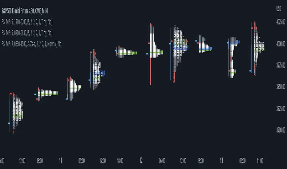
RS: Market ProfileA Market Profile (time price opportunity) implementation with an option to mark a point of control (POC) based on volume.
Config: Hide default candles. Select a session time using exchange timezone. Experiment with tick multiplier value to achieve desired level of detail. Choose the symbols of your choice, e.g. squares or A-Z chars. For multiple sessions you will have to add additional instances of this script with a different time configuration.
Limitations: TradingView has a hard limit for the number of characters (500), if it's reached, label rendering stops. Try increasing tick multiplier value to reduce the number of labels rendered or reduce the window size.
Features:
Use symbols or A-Z chars for TPOs
Mark POC
Calculate Value Area (volume or time based)
Highlight single prints (SP)
Highlight VWAP
Show daily bar
Highlight Open and Close
Highlight current price row (during live market)
Highlight initial balance (IB)
[potatoshop] Volume Profile lower timeframeThis script is a volume profile that displays the volume of transactions in price blocks over a recent period of time.
For a more detailed representation, OHCLV values on the time frame lower than the time zone on the chart were called and expressed.
Low time frames are adjustable.
You can adjust the number of blocks and the most recent time period that you want to view.
Although it cannot be compared to the volume indicators provided for paid users of Trading-View, it has functioned by displaying transactions that are difficult to find on open source.
Displays the amount traded in each block and the percentage of the total over a given period.
POC represents the middle value of the block with the highest transaction volume as a line.
TPOC represents the block that stayed the longest regardless of the volume of transaction.
The reversal line appears when you determine the trading advantage of the rising and falling closing on a block basis and then have a different value from the neighboring blocks.
(I didn't mean it much, but I just put it in for fun.)
It represents the total volume of transactions traded in each block, and there are also check boxes in the settings window that represent the volume of transactions that closed higher and closed lower.
You can specify the color of each block.
The highest and lowest values for the set period and the total sum of each block are displayed at the bottom of the box.
Because it was made using a lot of arrays, the total transaction volume was marked separately to check the value.
When expressing the price block according to the trading volume percentage, it was a pity that the minimum pixel was 1 bar, so it could not be expressed delicately.
Although set to bar_time in Box properties xloc, 1 bar was actually the minimum unit of the X-axis value.
The logic used to place the transaction volume for each block is as follows.
1. Divide the difference between the high and low values of 1 LTF bar by the transaction volume .
2. Find the percentage of this LTF bar within each block.
3. Multiply the ratio by the transaction volume again.
4. Store the value in each block cell.
Below are the codes of the people I referred to this time.
1. ‘Time & volume point of control (TPOC & VPOC)’ by quantifytools
2. ‘Volume Profile ’ by LuxAlgo
3. ‘Volume Profile and Volume Indicator by DGT’ by dgtrd
The script is for informational and educational purposes only.
이 스크립트는 최근 일정 기간동안의 거래량을 가격 블록단위로 표시해 주는 볼륨 프로화일입니다.
좀 더 자세한 표현을 위해 차트상의 시간대보다 낮은 시간 프레임상의 OHCLV 값들을 호출하여 표현하였습니다.
낮은 시간 프레임은 조절 가능합니다..
보고 싶은 최근 일정 기간과 블럭 갯수를 조절할 수 있습니다.
트뷰 유료 사용자들을 위해 제공하는 지표와는 비교할 수는 없지만, 오픈 소스상에서는 찾기 힘든 거래량을 표시해 기능을 넣었습니다.
각 블럭에서 거래되었던 양 과 주어진 기간 동안의 총량 대비 퍼센트를 표시해 줍니다.
POC는 거래량이 가장 많았던 블럭의 중간값을 라인으로 표현해 줍니다.
TPOC는 거래량에 상관없이 가장 오랜 시간 머물렸던 블럭을 표현해 줍니다.
반전선은 블럭 단위로 상승 마감과 하락 마감의 거래량 우세를 결정한 뒤, 이웃 블럭들하고 다른 값을 가질 때 나타납니다.
(어떤 뜻을 갖고 만든 건 아니고 그냥 재미로 넣어 보았습니다.)
각 블럭에서 거래되었던 총거래량을 표현해 주며, 또한 설정창에서 상승 마감한 거래량과 하락 마감한 거래량을 표현하는 체크 박스가 있습니다.
각 블럭의 색깔을 지정하실 수 있습니다.
설정된 기간 동안의 최고값과 최저값, 각 블럭을 합친 총량을 박스 하단에 표시해 두었습니다.
어레이를 많이 사용하여 만들었기 때문에 값의 확인을 위해 전체 거래량을 따로 표시하였습니다.
가격 블럭을 거래량 퍼센트에 따라 표현할 때, 최소 픽셀이 1bar 이어서 섬세하게 표현 할 수 없어 안타까웠습니다.
박스 속성을 xloc.bar_time 로 설정하였지만 실제로는 1 bar가 X축 값의 최소 단위였습니다.
각 블록 별로 거래량을 배치 할 때 쓰인 로직은 다음과 같습니다.
1. 1 LTF bar의 하이 와 로우 값의 차이를 거래량으로 나누어 줍니다.
2. 각 블록 안에서 이 LTF bar가 차지 하는 비율을 구합니다.
3. 그 비율에 다시 거래량을 곱해 줍니다.
4. 그 값을 각 블록 셀에 저장해 줍니다.
밑에 제가 이번에 참고한 분들의 코드들입니다.
1. ‘Time & volume point of control (TPOC & VPOC)’ by quantifytools
2. ‘Volume Profile ’ by LuxAlgo
3. ‘Volume Profile and Volume Indicator by DGT’ by dgtrd

Estimated Time At Price [Kioseff Trading]Hello!
This script uses the same formula as the recently released "Volume Delta" script to ascertain lower timeframe values.
Instead, this script looks to estimate the approximate time spent at price blocks; all time estimates are in minute.second format.
The image above shows functionality. Time spent at price levels/blocks are estimated in duration. The highest estimated block is the highlighted level and a POC line is extended right until violated. Colors, the presence of POC lines and whether they're removed subsequent violation are all configurable.
As show in the image above, the data is displayable in an additional format. When select the "non-classic" format shown above - precise price levels are calculated and the estimated time spent at those levels is summed and displayed right of the current bar. The off-colored level (yellow in the example) denotes the price level encompassing the highest *estimated* time spent.
You can deselect the neon effect and choose to have the script recalculate after any conceivable amount of time has passed.
The script can also calculate for the most current bar should you configure it to do so.
That's all! (for now). A quick/easy script building off an existing foundation.
If you've any ideas for features and ways to "spice up" this script please let me know (: I'll gladly incorporate requests.
Thank you!

TPO Market Profile [Kioseff Trading]REPOST; SCRIPT WORKS!!
Due to technical error, this script was republished! Thank you for your support (:
Hello!
This indicator comprises a real time TPO Market Profile!
The script works on any timeframe 1 second or greater - the script calculates relative to the timeframe selected for your chart.
The image above shows the 1-minute BTCUSD chart; 650 +/- tick levels are set.
To see the script in full functionality - try using bar replay on a cryptocurrency 1-minute chart (start at the beginning of a regular hours session). Be sure to adjust the tick spread if necessary (:
So far, the script's held up in real time - I've not had any array loop errors or timeouts. The TPO profile updates accordingly with changes in time / high and low prices. Letters are appended to the profile in real time.
The image above shows configurations for the indicator. I plan to update the indicator quite a bit over the coming days - more to come.
You can select the timeframe change the indicator accounts for. For instance, you can have set the indicator to reset every day, every 30 minutes, every 5 minutes, every week, month, etc.
In the image above, I configured the indicator to recalculate every 3 months. Consequently, the indicator will record a TPO profile for three consecutive, reset, then record a TPO profile for the next 3 months. This setting makes the indicator compatible with any timeframe greater than 1 minute.
You can also use a drag & drop time-start bar to modify the starting point for the market profile TPO calculation.
The indicator hosts an option to auto calculate the tick spread between levels. However, as you switch timeframes and assets, sometimes, you'll have to manually set the tick range (:
Thanks for checking it out; more to come!
Sep 4
Release Notes: UPDATE: The indicator can work on seconds-based charts.
The image above shows the indicator working on the 1-second chart.
(Screenshot is old; characters are now numbered instead of strange unicode)
Release Notes: Added value area + vah + val. Font update. Changed characters to numbered once the alphabet is exhausted. POC, VAH, and VAL label located left of the first bar of the interval. Initial balance range can be toggled. Spaced the characters (more legible). Quite a bit of aesthetic changes so check it out!
Soon, I'll release a version of the script that shows VAH, POC, VAL, and TPO letters from previous sessions. I coded this feature into this indicator; however, it was removed due to load time complications. This feature will be its own script (:
If the script has trouble loading please let me know (:

Magnifying Glass (LTF Candles) by SiddWolf█ OVERVIEW
This indicator displays The Lower TimeFrame Candles in current chart, Like Zooming in on the Candle to see it's Lower TimeFrame Structure. It plots intrabar OHLC data inside a Label along with the volume structure of LTF candle in an eloquent format.
█ QUICK GUIDE
Just apply it to the chart, Hover the mouse on the Label and ta-da you have a Lower Timeframe OHLC candles on your screen. Move the indicator to the top and shrink it all the way up, because all the useful data is inside the label.
Inside the label: The OHLC ltf candles are pretty straightforward. Volume strength of ltf candles is shown at bottom and Volume Profile on the left. Read the Details below for more information.
In the settings, you will find the option to change the UI and can play around with Lower TimeFrame Settings.
█ DETAILS
First of all, I would like to thank the @TradingView team for providing the function to get access to the lower timeframe data. It is because of them that this magical indicator came into existence.
Magnifying Glass indicator displays a Candle's Lower TimeFrame data in Higher timeframe chart. It displays the LTF candles inside a label. It also shows the Volume structure of the lower timeframe candles. Range percentage shown at the bottom is the percentage change between high and low of the current timeframe candle. LTF candle's timeframe is also shown at the bottom on the label.
This indicator is gonna be most useful to the price action traders, which is like every profitable trader.
How this indicator works:
I didn't find any better way to display ltf candles other than labels. Labels are not build for such a complex behaviour, it's a workaround to display this important information.
It gets the lower timeframe information of the candle and uses emojis to display information. The area that is shown, is the range of the current timeframe candle. Range is a difference between high and low of the candle. Range percentage is also shown at the bottom in the label.
I've divided the range area into 20 parts because there are limitation to display data in the labels. Then the code checks out, in what area does the ltf candle body or wick lies, then displays the information using emojis.
The code uses matrix elements for each block and relies heavily on string manipulation. But what I've found most difficult, is managing to fit everything correctly and beautifully so that the view doesn't break.
Volume Structure:
Strength of the Lower TimeFrame Candles is shown at the bottom inside the label. The Higher Volume is shown with the dark shade color and Lower Volume is shown with the light shade. The volume of candles are also ranked, with 1 being the highest volume, so you can see which candle have the maximum to minimum volume. This is pretty important to make a price action analysis of the lower timeframe candles.
Inside the label on the left side you will see the volume profile. As the volume on the bottom shows the strength of each ltf candles, Volume profile on the left shows strength in a particular zone. The Darker the color, the higher the volume in the zone. The Highest volume on the left represents Point of Control (Volume Profile POC) of the candle.
Lower TimeFrame Settings:
There is a limitation for the lowest timeframe you can show for a chart, because there is only so much data you can fit inside a label. A label can show upto 20 blocks of emojis (candle blocks) per row. Magnifying Glass utilizes this behaviour of labels. 16 blocks are used to display ltf candles, 1 for volume profile and two for Open and Close Highlighter.
So for any chart timeframe, ltf candles can be 16th part of htf candle. So 4 hours chart can show as low as 15 minutes of ltf data. I didn't provide the open settings for changing the lower timeframe, as it would give errors in a lot of ways. You can change the timeframe for each chart time from the settings provided.
Limitations:
Like I mentioned earlier, this indicator is a workaround to display ltf candles inside a label. This indicator does not work well on smaller screens. So if you are not able to see the label, zoom out on your browser a bit. Move the indicator to either top or bottom of all indicators and shrink it's space because all details are inside the label.
█ How I use MAGNIFYING GLASS:
This indicator provides you an edge, on top of your existing trading strategy. How you use Magnifying Glass is entirely dependent on your strategy.
I use this indicator to get a broad picture, before getting into a trade. For example I see a Doji or Engulfing or any other famous candlestick pattern on important levels, I hover the mouse on Magnifying Glass, to look for the price action the ltf candles have been through, to make that pattern. I also use it with my "Wick Pressure" indicator, to check price action at wick zones. Whenever I see price touching important supply and demand zones, I check last few candles to read chart like a beautiful price action story.
Also volume is pretty important too. This is what makes Magnifying Glass even better than actual lower timeframe candles. The increasing volume along with up/down trend price shows upward/downward momentum. The sudden burst (peak) in the volume suggests volume climax.
Volume profile on the left can be interpreted as the strength/weakness zones inside a candle. The low volume in a price zone suggests weakness and High volume suggests strength. The Highest volume on the left act as POC for that candle.
Before making any trade, I read the structure of last three or four candles to get the complete price action picture.
█ Conclusion
Magnifying Glass is a well crafted indicator that can be used to track lower timeframe price action. This indicator gives you an edge with the Multi Timeframe Analysis, which I believe is the most important aspect of profitable trading.
~ @SiddWolf

Heisenberg's Uncertainty BandsHeisenberg's Uncertainty Bands:
This is a volatility indicator to determine and visualize the uncertainty in a securities' price.
In quantum mechanics, the uncertainty principle (also known as Heisenberg's uncertainty principle) is any of a variety of mathematical inequalities asserting a fundamental limit to the accuracy with which the values for certain pairs of physical quantities of a particle, such as position, x, and momentum, p, can be predicted from initial conditions.
It plots a Kalman filter average of the bars inside a higher timeframe bar, to attempt to find the most frequent price in that bar's timespan. To plot what is effectively a MA using POC (IvanLabrie's code, credits to the author).
It derives momentum from relative momentum, yielding results more sensitive to changes.
Then it uses Heisenberg's uncertainty principle to find an uncertainty range, and uses it as the channel distance from the POC MA, meaning price is likely to fluctuate within that range.
Since uncertainty must be greater than h/2, adding fib levels will make it a useful indicator. Essentially they are pseudo-Fibonacci Bollinger Bands, which uses a different calculation.
Benefits:
Prices fluctuate, and it can be helpful to visualize price as a range, rather than a single point or line. This visualization can help in managing risk, determining entries and exits, and prevent losing one's position due to price fluctuations during a trend.
If we use a particle model, the uncertainty principle dictates that it is impossible to predict the price within a range. This is a good model for risk management!
Usage:
There are 5 Fibonacci ratio outer bands that can be turned on or off according to user's preference.
Recommended that the length inputs should be increased in higher timeframes, to visualize trends, shorter timeframes should have lower lengths.
GLHF
- DPT

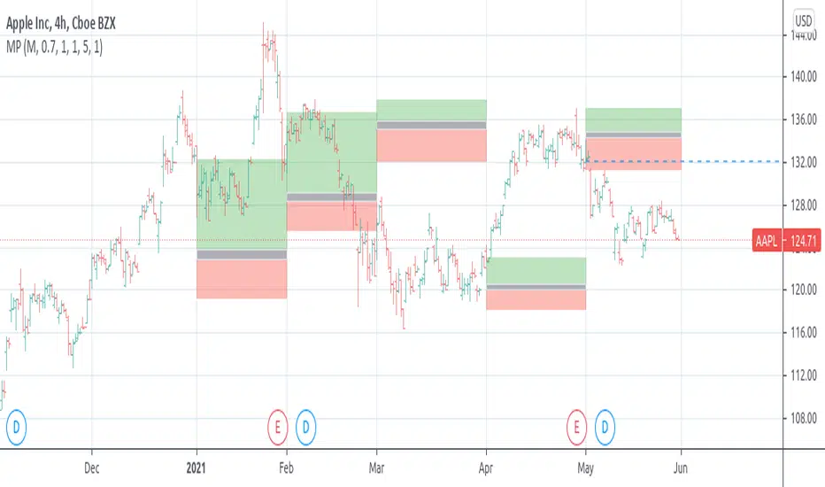
[RS]Market ProfileEXPERIMENTAL: this script is very crude and prone to errors..
Request for: FibTrader
instead of a POC line theres a POC area instead, since the script is checking a price area range for the frequency, its possible to average the values but this works as well.
Max. Liquidity & Delta Bias Profile @MaxMaserati 3.0MAX. LIQUIDITY & DELTA BIAS PROFILE @MAXMASERATI 3.0
═══════════════════════════════════════════════════════════════
OVERVIEW
────────
An advanced volume profile tool that analyzes market liquidity and order flow dynamics across different timeframes. This indicator helps traders identify key price levels where significant trading activity and directional bias converge.
DUAL PROFILE SYSTEM
───────────────────
🔷 LIQUIDITY PROFILE (Right Side)
Displays total volume traded at each price level, colored by market bias:
• Green nodes = Bullish dominance (buyers in control)
• Red nodes = Bearish dominance (sellers in control)
• Width represents volume concentration at that level
🔷 DELTA BIAS PROFILE (Left Side)
Shows net buying vs selling pressure at each price level:
• Blue nodes = Positive delta (buying pressure dominates)
• Purple nodes = Negative delta (selling pressure dominates)
• Width represents strength of the imbalance
KEY REFERENCE LEVELS
─────────────
📍 POC (Point of Control)
Yellow horizontal line marking the price with highest traded volume - represents the most accepted fair value during the period.
📍 MAX BULL Level
Green line highlighting the price with strongest bullish conviction - where buyers showed maximum aggression and commitment.
📍 MAX BEAR Level
Red line highlighting the price with strongest bearish conviction - where sellers demonstrated maximum pressure and control.
TOGGLE OFF EVERYTHING EXCEPT THE MAX LINES TO HAVE THIS SETUP
PROFILE STATUS INDICATORS
──────────────────────────
• ▶ ONGOING (Green) = Current developing profile
• ⬛ STOPPED (Red) = Completed profile, new period started
CUSTOMIZATION FEATURES
──────────────────────
✓ Multiple anchor periods (Auto/Session/Day/Week/Month/Quarter/Year)
✓ Independent toggles for each visual element
✓ Individual color and size controls for every label
✓ Adjustable profile width and transparency
✓ Customizable line widths and styles
TRADING APPLICATIONS
────────────────────
• Identify high-probability support/resistance zones
• Spot institutional accumulation/distribution levels
• Detect order flow imbalances before major moves
• Track intraday value areas and fair price zones
• Confirm trend strength through delta analysis
• Find optimal entry/exit levels based on volume
WHO THIS IS FOR
───────────────
Designed for active traders who:
• Trade futures, stocks, forex with volume data
• Use volume profile and market profile concepts
• Analyze order flow and institutional footprints
• Seek data-driven price level identification
• Want visual clarity on market structure
NOTES
─────
• Requires volume data to function properly
• Best used on liquid instruments with consistent volume
• Profiles reset based on selected anchor period
• All visual elements can be toggled independently
• Performance optimized for real-time analysis
⚠️ DISCLAIMER
Educational Tool Only - This indicator is for educational and informational purposes only and does not constitute financial, investment, or trading advice.
Risk Warning - Trading involves substantial risk of loss and is not suitable for all investors. Past performance does not guarantee future results. No representation is made that this indicator will achieve profits or prevent losses.
User Responsibility - All trading decisions are solely your responsibility. The developer and Max Maserati Model assume no liability for losses incurred from using this indicator. Conduct your own research and consult a qualified financial advisor before making investment decisions.
Data Dependency - Indicator accuracy depends on your TradingView plan's data availability and selected timeframe support.
By using this indicator, you acknowledge and agree to these terms.

SNIPER Trend Continuation V1TC SNIPER (Trend Continuation)
### When to Use
- Market is **OUT OF BALANCE** (trending, momentum)
- Clear **displacement** away from prior value
- **New York session** (AVOID London open fakeouts!)
- Strong directional moves with follow-through
### The Setup Sequence
```
1. IMPULSE DETECTED
└── Strong directional move (2× ATR+)
└── Multiple momentum bars
└── Price above/below fast EMA
2. LVN ZONE IDENTIFIED
└── 23.6% - 61.8% Fibonacci retracement
└── Low volume pullback area
3. PRICE PULLS BACK TO LVN
└── Retraces into the zone
└── Volume decreases (exhaustion)
4. AGGRESSION CONFIRMATION
└── Entry candle in trend direction
└── Volume spikes (1.3×+ average)
└── Fat body, minimal adverse wick
└── EMA alignment confirms trend
5. ENTRY → TARGET: PREV POC
```

Proactive Execution MachineProactive Execution Machine: Multi-State Momentum Engine
Overview
The Proactive Execution Machine is a comprehensive trading workspace designed to filter market noise and highlight high-probability execution windows. It combines Dynamic Supply/Demand Zones, Manual Level Proximity, and a proprietary Dual-Candle Momentum Scoring system to categorize the market into specific "States" in real-time.
Instead of a simple arrow, this script provides a System Status dashboard that tells you exactly what phase the market is in—whether it's "Level Absorption," a "Demand Vortex," or a "Tired Trend. "Core Components
1. The Momentum Gauge (Bottom Left)
This table provides a deep-dive into order flow by scoring the last two candles based on:
Close Location: Where price closed relative to its range (Upper, Middle, Lower).
Body-to-Wick Ratio: Measuring the "effort vs. result" of the move.
Range Relativity: Whether the current bar is an "Inside" or "Outside" bar relative to the previous candle.
Slope (Linear Regression): A real-time trendline of momentum strength to see if conviction is accelerating or decelerating.
2. Dynamic State Engine The script automatically identifies and colors the chart into three primary zones:
Supply Zone (Red): The upper 30% of the recent price discovery range.
Demand Zone (Green): The lower 30% of the recent price discovery range.
Proximity Zones: When price nears your Manual Levels (PDH, PDL, NY Open, etc.), the engine switches priority to monitor for "Breakouts" or "Level Attacks."
3. System Status (Bottom Right)The dynamic HUD changes size and color based on conviction levels. It will notify you of specific market conditions:
Supply/Demand Overrun: When momentum is so strong it is smashing through reversal zones. Level Absorption/Stalling: When price reaches a key level but momentum has "flattened," suggesting a potential reversal or high-volume churn.
Buy/Sell Now: High-conviction signals triggered only when Location (Zone) and Momentum (Score) align.
How to Trade with the "Machine"
For Trend Followers: Look for the status "TREND (ACTIVE)" combined with a Momentum Score of $\pm 4$ or higher.
For Reversion Traders: Watch for "WATCH LONGS/SHORTS" when price enters a Supply or Demand zone. Wait for the status to flip to "BUY/SELL NOW" as momentum begins to shift back toward the mean.
For Level Traders: Input your daily levels (VAH, VAL, POC) in the settings. The machine will automatically prioritize these levels, changing status to "AT LEVEL" the moment price enters your specified proximity.
Key Settings
Manual Levels: Input up to 5 custom price levels for the proximity engine.
Proximity Sensitivity: Adjust how close price must be to a level (in points/pips) to trigger an "At Level" state.
Aggression (1-5): Tuning the pivot detection. Lower numbers respond faster to micro-structure; higher numbers focus on major swing points.
Visual Coding
Candle bodies are colored to assist with single candle pattern detection:
Lime/Pink Bar Highlights: The script uses a custom color engine to highlight "Shaved" (Marubozu) bars.
Lime indicates aggressive bullish conviction, while Pink (Fuchsia) highlights aggressive bearish conviction.
Green indicates bull engulfing candle
Red indicates bear engulfing candle
Orange is an outside bar
Yellow an inside bar
Gray a Doji bar
Black all other bars
Dynamic Zones: The chart features two primary background areas:
Red Zone (Top): The Supply Zone, identifying where sellers historically reclaim control.
Green Zone (Bottom): The Demand Zone, identifying where buyers historically step in.
System Status HUD (Bottom Right): This is the "brain" of the machine. The text size is adjusted to attract the trader's attention when the slope of the momentum increases above 5 (bullish expansion) or greater than - 5 (Bearish expansion). The system status changes color based on the market state too:
HUD Coloring:
Aqua: Active Bullish Trend.
Gray: Bull trend tired.
Orange: Active Bearish Trend.
Gray: Bear trend tired.
Red: For sell now.
Green: For buy now.
Lime: Bull price level under attack.
Marron: Bear price level under attack.
Gray: Price level absorption.
Yellow: Price at level and stalling.
Maroon: An "Overrun" or "Vortex" where price is smashing through supply/demand with extreme momentum.
The text size serves as a "Volatility Alarm." * When the text is Small, the market is in a "sideways" or "absorbing" state. You should be cautious about entering new trend trades.
When the text is Large, the Machine has detected that "Aggressive" participants have entered the order flow. This is your cue that a "Level Attack" or a "Trend Breakout" is currently in progress.
The 1-Minute Tactical Setup Guide:
Proactive Execution Machine Operating on the 1-minute (1m) timeframe requires a balance between speed and noise filtration. Because the Proactive Execution Machine uses a "State Engine" logic, it is uniquely suited for the high-velocity environment of the NY Open.
I follow these three tactical steps to optimize the chart for the 1m timeframe:
Step 1: Calibrate the "Proximity Sensitivity" On a 1m chart, a "Level" isn't a single price—it's a zone.
Adjustment: In the script settings, set your Proximity Sensitivity to a value that represents the average "noise" of your instrument.
For ES (S&P 500 Futures): 1.5 to 2.5 points.
For NQ (Nasdaq Futures): 5 to 10 points.
For Forex (EURUSD): 1 to 2 pips.
The Goal: You want the "AT LEVEL" status to trigger just as price is "sniffing" the level, giving you time to prepare your order before the touch.
Step 2: Watch the "History" Column in the Momentum Gauge
The bottom-left table is your most important tool for the 1m chart. It shows you the momentum of the last three bars ($T-0$, $T-1$, $T-2$).
Momentum Sequence: Look for a "Sequence of Three." If you see $T-2$ (Neutral), $T-1$ (Long), and $T-0$ (STR Long), you have a momentum explosion.
The Trap: If you see STR LONG followed immediately by a NEUTRAL bar while in a Supply Zone, the "Machine" will shift to "SUPPLY STALLING." This is your signal to tighten your trailing stop or take profit—it means the bulls are hitting a wall of sell orders.
Step 3: The "Level Attack" Execution
The script features a unique state called "LEVEL ATTACK." This is designed specifically for breakout/breakdown traders.
The Setup: Price is approaching a Manual Level (like the NY Open or PDH).
The Signal: If the status changes to "LEVEL ATTACK (BULL)," it means the momentum score is high ($>3$) and the slope is positive while within the proximity of the level.
The Action: This is a "Proactive" entry. Instead of waiting for the candle to close above the level, you are entering as the "Machine" detects institutional pressure "attacking" the level.
Daily Routine for the "Machine"
1) 09:25 AM: Input your 5 manual levels (PDH, PDL, NY Open, VAH, VAL).
2) 09:30 AM: Wait for the first 5 minutes of volatility to settle.
3) The Window: Look for the System Status to move from "IDLE" to a colored state.
4) The Trigger: Never take a signal if the Momentum Gauge is in the "Neutral" (Yellow) zone. Only execute when the gauge shows LONG/SHORT or STR LONG/STR SHORT.

Gold Asia Session Highlighter [IST]Here is a polished description and guide for your Gold Asia Session Highlighter. You can use this text for a YouTube description, a Telegram post, or a PDF guide to explain the tool to others.
Gold Asia Session Highlighter (IST) | Visual Indicator
This is a custom TradingView indicator designed to simplify the Gold Asia Strategy. Instead of automating trades, this tool purely handles the visuals. It automatically highlights the correct Asia Session time window (adjusting for Winter/Summer hours) and marks the exact points where you should draw your Fixed Range Volume Profile (FRVP) tool.
Perfect for: Traders who prefer to draw their own FRVP levels manually but want to ensure they are using the exact, error-free time range every single day.
Features
✅ Automatic Time Zone: Strictly calculated using IST (Indian Standard Time), so you don't need to convert time zones manually.
✅ Smart Season Detection: Automatically switches between Winter Session (04:30 – 06:25) and Summer Session (03:30 – 05:25) based on the current month.
✅ Visual Guidance: Highlights the session background and places "START" and "END" labels on the exact candles.
✅ Zero Clutter: Clean visuals with no moving averages or strategy lines—just the session box.
How to Use It
Add to Chart: Apply the script to your Gold (XAUUSD) 5-minute chart. You will see a blue highlighted box appear during the Asia session.
Locate the Labels:
Look for the blue START label (bottom of the candle).
Look for the red END label (top of the candle).
Draw Your FRVP:
Select the Fixed Range Volume Profile tool from your TradingView toolbar.
Click exactly on the START candle.
Drag and release exactly on the END candle.
Trade: You now have the exact Value Area High (VAH), Value Area Low (VAL), and Point of Control (POC) for the day. Use your breakout strategy as usual!

ORB + FVG A+ PRO (All-in-One) [QQQ]Configurable ORB + FVG + filters (VIX, ORB range, relative volume) + A+ PRO (retest at the FVG edge + rejection) + anti-fakeout + orange reminder “CONFIRM POC/HVN (Volume Profile)” right when the A+ signal appears

VCAI Volume & Liquidity Map LiteVCAI Volume & Liquidity Map Lite visualises recent market participation using a horizontal liquidity/volume histogram plotted beside current price.
It shows where trading activity has clustered, where the chart is thin, and how much of that activity came from buying vs selling pressure.
This Lite edition keeps the tool simple and fast:
Yellow = buy-side volume (aggressive buyers / upward pressure)
Purple = sell-side volume (aggressive sellers / downward pressure)
Thicker sections = higher traded volume at that price
POC line (purple) marks the price with the highest volume concentration
Value Area lines (yellow dashed) mark where ~70% of volume has traded
Bars extend outward to the right of price for a clean, unobstructed chart
Lookback setting controls how many candles the map is built from
Use it to quickly identify:
high-interest price zones
low-liquidity areas where price can move fast
likely reaction levels
where momentum may slow, reverse, or break through
Designed as a lightweight, open-source tool for anyone wanting a clean liquidity/volume map without complex settings.
Part of the VCAI Lite Series.

MFI Volume Profile [Kodexius]The MFI Volume Profile indicator blends a classic volume profile with the Money Flow Index so you can see not only where volume traded, but also how strong the buying or selling pressure was at those prices. Instead of showing a simple horizontal histogram of volume, this tool adds a money flow dimension and turns the profile into a price volume momentum heat map.
The script scans a user controlled lookback window and builds a set of price levels between the lowest and highest price in that period. For every bar inside that window, its volume is distributed across the price levels that the bar actually touched, and that volume is combined with the bar’s MFI value. This creates a volume weighted average MFI for each price level, so every row of the profile knows both how much volume traded there and what the typical money flow condition was when that volume appeared.
On the chart, the indicator plots a stack of horizontal boxes to the right of current price. The length of each box represents the relative amount of volume at that price, while the color represents the average MFI there. Levels with stronger positive money flow will lean toward warmer shades, and levels with weaker or negative money flow will lean toward cooler or more neutral shades inside the configured MFI band. Each row is also labeled in the format Volume , so you can instantly read the exact volume and money flow value at that level instead of guessing.
This gives you a detailed map of where the market really cared about price, and whether that interest came with strong inflow or outflow. It can help you spot areas of accumulation, distribution, absorption, or exhaustion, and it does so in a compact visual that sits next to price without cluttering the candles themselves.
Features
Combined volume profile and MFI weighting
The indicator builds a volume profile over a user selected lookback and enriches each price row with a volume weighted average MFI. This lets you study both participation and money flow at the same price level.
Volume distributed across the bar price range
For every bar in the window, volume is not assigned to a single price. Instead, it is proportionally distributed across all price rows between the bar low and bar high. This creates a smoother and more realistic profile of where trading actually happened.
MFI based color gradient between 30 and 70
Each price row is colored according to its average MFI. The gradient is anchored between MFI values of 30 and 70, which covers typical oversold, neutral and overbought zones. This makes strong demand or distribution areas easier to spot visually.
Configurable structure resolution and depth
Main user inputs are the lookback length, the number of rows, the width of the profile in bars, and the label text size. You can quickly switch between coarse profiles for a big picture and higher resolution profiles for detailed structure.
Numeric labels with volume and MFI per row
Every box is labeled with the total volume at that level and the average MFI for that level, in the format Volume . This gives you exact values while still keeping the visual profile clean and compact.
Calculations
Money Flow Index calculation
currentMfi is calculated once using ta.mfi(hlc3, mfiLen) as usual,
Creation of the profileBins array
The script creates an array named profileBins that will hold one VPBin element per price row.
Each VPBin contains
volume which is the total volume accumulated at that price row
mfiProduct which is the sum of volume multiplied by MFI for that row
The loop;
for i = 0 to rowCount - 1 by 1
array.push(profileBins, VPBin.new(0.0, 0.0))
pre allocates a clean structure with zero values for all rows.
Finding highest and lowest price across the lookback
The script starts from the current bar high and low, then walks backward through the lookback window
for i = 0 to lookback - 1 by 1
highestPrice := math.max(highestPrice, high )
lowestPrice := math.min(lowestPrice, low )
After this loop, highestPrice and lowestPrice define the full price range covered by the chosen lookback.
Price range and step size for rows
The code computes
float rangePrice = highestPrice - lowestPrice
rangePrice := rangePrice == 0 ? syminfo.mintick : rangePrice
float step = rangePrice / rowCount
rangePrice is the total height of the profile in price terms. If the range is zero, the script replaces it with the minimum tick size for the symbol. Then step is the price height of each row. This step size is used to map any price into a row index.
Processing each bar in the lookback
For every bar index i inside the lookback, the script checks that currentMfi is not missing. If it is valid, it reads the bar high, low, volume and MFI
float barTop = high
float barBottom = low
float barVol = volume
float barMfi = currentMfi
Mapping bar prices to bin indices
The bar high and low are converted into row indices using the known lowestPrice and step
int indexTop = math.floor((barTop - lowestPrice) / step)
int indexBottom = math.floor((barBottom - lowestPrice) / step)
Then the indices are clamped into valid bounds so they stay between zero and rowCount - 1. This ensures that every bar contributes only inside the profile range
Splitting bar volume across all covered bins
Once the top and bottom indices are known, the script calculates how many rows the bar spans
int coveredBins = indexTop - indexBottom + 1
float volPerBin = barVol / coveredBins
float mfiPerBin = volPerBin * barMfi
Here the total bar volume is divided equally across all rows that the bar touches. For each of those rows, the same fraction of volume and volume times MFI is used.
Accumulating into each VPBin
Finally, a nested loop iterates from indexBottom to indexTop and updates the corresponding VPBin
for k = indexBottom to indexTop by 1
VPBin binData = array.get(profileBins, k)
binData.volume := binData.volume + volPerBin
binData.mfiProduct := binData.mfiProduct + mfiPerBin
Over all bars in the lookback window, each row builds up
total volume at that price range
total volume times MFI at that price range
Later, during the drawing stage, the script computes
avgMfi = bin.mfiProduct / bin.volume
for each row. This is the volume weighted average MFI used both for coloring the box and for the numeric MFI value shown in the label Volume .


BTC Energy + HR + Longs + M2
BTC Energy Ratio + Hashrate + Longs + M2
The #1 Bitcoin Macro Weapon on TradingView 🚀🔥
If you’re tired of getting chopped by fakeouts, ETF noise, and Twitter hopium — this is the one chart that finally puts you on the right side of every major move.
What you’re looking at:
Orange line → Bitcoin priced in real-world mining energy (Oil × Gas + Uranium × Coal) × 1000
→ The true fundamental floor of BTC
Blue line → Scaled hashrate trend (miner strength & capex lag)
Green line → Bitfinex longs EMA (leveraged bull sentiment)
Purple line → Global M2 money supply (US+EU+CN+JP) with 10-week lead (the liquidity wave BTC rides)
Why this indicator prints money:
Most tools react to price.
This one predicts where price is going based on energy, miners, leverage, and liquidity — the only four things that actually drive Bitcoin long-term.
It has nailed:
2022 bottom at ~924 📉
2024 breakout above 12,336 🚀
2025 top at 17,280 🏔️
And right now it’s flashing generational accumulation at ~11,500 (Nov 2025)
13 permanent levels with right-side labels — no guessing what anything means:
20,000 → 2021 Bull ATH
17,280 → 2025 ATH
15,000 → 2024 High Resist
14,000 → Overvalued Zone
13,000 → 2024 Breakout
12,336 → Bull/Bear Line (the most important level)
12,000 → 2024 Volume POC
10,930 → Key Support 2024
9,800 → Strong Buy Fib
8,000 → Deep Support 2023
6,000 → 2021 Mid-Cycle
4,500 → 2023 Accum Low
924 → 2022 Bear Low
Live dashboard tells you exactly what to do — no thinking required:
Current ratio (updates live)
Hashrate + 24H %
Longs trend
Risk Mode → Orange vs Hashrate (RISK ON / RISK OFF)
180-day correlation
RSI
13-tier Zone + SIGNAL (STRONG BUY / ACCUMULATE / HOLD / DISTRIBUTE / EXTREME SELL)
Dead-simple rules that actually work:
Weekly timeframe = cleanest view
Blue peaking + orange holding support → miner pain = next leg up
Green spiking + orange failing → overcrowded longs = trim
Purple rising → liquidity coming in = ride the wave
Risk Mode = RISK OFF → price is cheap vs miners → buy
Set these 3 alerts and walk away:
Ratio > 12,336 → Bull confirmed → add
Ratio > 14,000 → Start scaling out
Ratio < 9,800 → Generational buy → back up the truck
No repainting • Fully open-source • Forced daily data • Works on any TF
Energy is the only real backing Bitcoin has.
Hashrate lag is the best leading indicator.
Longs show greed.
M2 is the tide.
This chart combines all four — and right now it’s screaming ACCUMULATE.
Load it. Trust it.
Stop trading hope. Start trading reality.
DYOR • NFA • For entertainment purposes only 😎
#bitcoin #macro #energy #hashrate #m2 #cycle #riskon #riskoff

[CASH] Crypto And Stocks Helper (MultiPack w. Alerts)ATTENTION! I'm not a good scripter. I have just learned a little basics for this project, stolen code from other public scripts and modified it, and gotten help from AI LLM's.
If you want recognition from stolen code please tell me to give you the credit you deserve.
The script is not completely finished yet and contains alot of errors but my friends and family wants access so I made it public.
_________________________________________________________________________________
CASH has multiple indicators (a true all-in-one multipack), guides and alerts to help you make better trades/investments. It has:
- Bitcoin Bull Market Support Band
- Dollar Volume
- 5 SMA and 5 EMA
- HODL Trend (a.k.a SuperTrend) indicator
- RSI, Volume and Divergence indicators w. alerts
More to come as well, like Backburner and a POC line from Volume Profile.
Everything is fully customizable, appearance and off/on etc.
More information and explainations along with my guides you can find in settings under "Input" and "Style".

smaemarvwapClaireLibrary "smaemarvwapClaire"
repeat_character(count)
Parameters:
count (int)
f_1_k_line_width()
is_price_in_merge_range(p1, p2, label_merge_range)
Parameters:
p1 (float)
p2 (float)
label_merge_range (float)
get_pre_label_string(kc, t, is_every)
Parameters:
kc (VWAP_key_levels_draw_settings)
t (int)
is_every (bool)
f_is_new_period_from_str(str)
Parameters:
str (string)
total_for_time_when(source, days, ma_set)
Parameters:
source (float)
days (int)
ma_set (ma_setting)
f_calculate_sma_ema_rolling_vwap(src, length, ma_settings)
Parameters:
src (float)
length (simple int)
ma_settings (ma_setting)
f_calculate_sma_ema_rvwap(ma_settings)
Parameters:
ma_settings (ma_setting)
f_get_ma_pre_label(ma_settings, sma, ema, rolling_vwap)
Parameters:
ma_settings (ma_setting)
sma (float)
ema (float)
rolling_vwap (float)
f_smart_ma_calculation(ma_settings2)
Parameters:
ma_settings2 (ma_setting)
f_calculate_endpoint(start_time, kc, is_every, endp, extend1, extend2, line_label_extend_length)
Parameters:
start_time (int)
kc (VWAP_key_levels_draw_settings)
is_every (bool)
endp (int)
extend1 (bool)
extend2 (bool)
line_label_extend_length (int)
f_single_line_label_fatory(left_point, right_point, line_col, line_width, lines_style_select, labeltext_col, label_text_size, label_array, line_array, label_col, label_text, l1, label1)
根据两个点创建线段和/或标签,并将其添加到对应的数组中
Parameters:
left_point (chart.point) : 左侧起点坐标
right_point (chart.point) : 右侧终点坐标
line_col (color) : 线段颜色
line_width (int) : 线段宽度
lines_style_select (string) : 线段样式(实线、虚线等)
labeltext_col (color) : 标签文字颜色
label_text_size (string) : 标签文字大小
label_array (array) : 存储标签对象的数组
line_array (array) : 存储线段对象的数组
label_col (color) : 标签背景颜色(默认:半透明色)
label_text (string) : 标签文字内容(默认:空字符串)
l1 (bool) : 是否创建线段(默认:false)
label1 (bool) : 是否创建标签(默认:false)
Returns: void
f_line_and_label_merge_func(t, data, l_text, kc, is_every, endp, merge_str_map, label_array, line_array, extend1, extend2, line_label_extend_length, label_merge_control, line_width, lines_style_select, label_text_size)
Parameters:
t (int)
data (float)
l_text (string)
kc (VWAP_key_levels_draw_settings)
is_every (bool)
endp (int)
merge_str_map (map)
label_array (array)
line_array (array)
extend1 (bool)
extend2 (bool)
line_label_extend_length (int)
label_merge_control (bool)
line_width (int)
lines_style_select (string)
label_text_size (string)
plot_ohlc(kc, ohlc_data, extend1, extend2, merge_str_map, label_array, line_array, is_every, line_label_extend_length, label_merge_control, line_width, lines_style_select, label_text_size)
Parameters:
kc (VWAP_key_levels_draw_settings)
ohlc_data (bardata)
extend1 (bool)
extend2 (bool)
merge_str_map (map)
label_array (array)
line_array (array)
is_every (bool)
line_label_extend_length (int)
label_merge_control (bool)
line_width (int)
lines_style_select (string)
label_text_size (string)
plot_vwap_keylevels(kc, vwap_data, extend1, extend2, merge_str_map, label_array, line_array, is_every, line_label_extend_length, label_merge_control, line_width, lines_style_select, label_text_size)
Parameters:
kc (VWAP_key_levels_draw_settings)
vwap_data (vwap_snapshot)
extend1 (bool)
extend2 (bool)
merge_str_map (map)
label_array (array)
line_array (array)
is_every (bool)
line_label_extend_length (int)
label_merge_control (bool)
line_width (int)
lines_style_select (string)
label_text_size (string)
plot_vwap_bardata(kc, ohlc_data, vwap_data, extend1, extend2, merge_str_map, label_array, line_array, is_every, line_label_extend_length, label_merge_control, line_width, lines_style_select, label_text_size)
Parameters:
kc (VWAP_key_levels_draw_settings)
ohlc_data (bardata)
vwap_data (vwap_snapshot)
extend1 (bool)
extend2 (bool)
merge_str_map (map)
label_array (array)
line_array (array)
is_every (bool)
line_label_extend_length (int)
label_merge_control (bool)
line_width (int)
lines_style_select (string)
label_text_size (string)
f_start_end_total_min(session)
Parameters:
session (string)
f_get_vwap_array(anchor1, data_manager, is_historical)
Parameters:
anchor1 (string)
data_manager (data_manager)
is_historical (bool)
f_get_bardata_array(anchorh, data_manager, is_historical)
Parameters:
anchorh (string)
data_manager (data_manager)
is_historical (bool)
vwap_snapshot
Fields:
t (series int)
vwap (series float)
upper1 (series float)
lower1 (series float)
upper2 (series float)
lower2 (series float)
upper3 (series float)
lower3 (series float)
VWAP_key_levels_draw_settings
Fields:
enable (series bool)
index (series int)
anchor (series string)
session (series string)
vwap_col (series color)
bands_col (series color)
bg_color (series color)
text_color (series color)
val (series bool)
poc (series bool)
vah (series bool)
enable2x (series bool)
enable3x (series bool)
o_control (series bool)
h_control (series bool)
l_control (series bool)
c_control (series bool)
extend_control (series bool)
only_show_the_lastone_control (series bool)
bg_control (series bool)
line_col_labeltext_col (series color)
bardata
Fields:
o (series float)
h (series float)
l (series float)
c (series float)
v (series float)
start_time (series int)
end_time (series int)
ma_setting
Fields:
day_control (series bool)
kline_numbers (series int)
ma_color (series color)
ema_color (series color)
rvwap_color (series color)
ma_control (series bool)
ema_control (series bool)
rvwap_control (series bool)
session (series string)
merge_label_template
Fields:
left_point (chart.point)
right_point (chart.point)
label_text (series string)
p (series float)
label_color (series color)
merge_init_false (series bool)
anchor_snapshots
Fields:
vwap_current (array)
vwap_historical (array)
bardata_current (array)
bardata_historical (array)
data_manager
Fields:
snapshots_map (map)
draw_settings_map (map)

My Smart Volume Profile – Fixed
Title: 🔹 My Smart Volume Profile – Fixed
Description:
Lightweight custom Volume Profile showing POC, VAH, and VAL levels from recent bars. Highlights the value area, marks price touches, and supports optional alerts.
Developer Note:
Created with precision and simplicity by Magnergy
