MTF SuperTrends Nexus [DarkWaveAlgo]🧾 Description:
A nexus is a connection, link, or neuronal junction where signals and information are transmitted between different elements.
The MTF SuperTrends Nexus indicator serves as a nexus between MTF SuperTrends by facilitating the visualization of up to eight multi-timeframe SuperTrends, each with its own customizable timeframe, period, factor, and coloring customization. By combining these various SuperTrends, it helps you create a comprehensive view of MTF trend dynamics and cross-timeframe confluence according to the SuperTrend indicator.
It acts as a utility/control center that brings together multiple MTF SuperTrends and allows you to visualize the interactions between them with exceptional ease-of-use and customizability, helping to provide you with valuable insights into potential trend reversals, momentum shifts, and trading opportunities.
💡 Originality and Usefulness:
While there are other multi-timeframe SuperTrend indicators available, MTF SuperTrends Nexus' semi-transparent fills create a compounding opaqueness when SuperTrends from multiple timeframes coalesce - making visual assessment of cross-timeframe confluence extremely easy. We also believe it stands above the rest with its sheer quantity and quality of settings, features, and usability.
✔️ Re-Published to Avoid Misleading Values
This script has been re-published to ensure that it does not use `request.security()` calls using lookahead_on to access future data when referencing SuperTrend calculations from other timeframes. This decreases the likelihood that the indicator will provide deceiving values. This change has been made in accordance with the PineScript documentation: "Using barmerge.lookahead_on at timeframes higher than the chart's without offsetting the `expression` argument like in `close [ ]` will introduce future leak in scripts, as the function will then return the `close` price before it is actually known in the current context" and the Publishing Rule: "Do not use `request.security()` calls using lookahead to access future data". Historical and real-time values may differ when referencing timeframes other than the chart's.
💠 Features:
8 toggleable MTF SuperTrends with customizable timeframes, periods, and factors
Compounding filled areas for easy MTF SuperTrend confluence analysis
Aesthetic and flexible coloring and color theme styling options
End-of chart labels and options for ease-of-use and legibility
⚙️ Settings:
Use a Color Theme: When this setting is enabled, all manual 'Bullish and Bearish Colors' are overridden. All plots will use the colors from your selected Color Theme - excepting those plots set to use the 'Single Color' coloring method.
Color Theme: When 'Use a Color Theme' is enabled, this setting allows you to select the color theme you wish to use.
Fill SuperTrend Areas: When enabled, the area between any MTF SuperTrend and the price bars will be filled with semi-transparent coloring.
Hide SuperTrends on Timeframes Lower Than the Chart: When this setting is enabled, any MTF SuperTrend with a timeframe smaller than that of the chart the indicator is applied to will be hidden from view.
Enable: Show/hide a specific MTF SuperTrend.
Timeframe: Set the timeframe for a specific MTF SuperTrend.
Period: Set the lookback period for a specific MTF SuperTrend.
Factor: Set the multiplier factor used for a specific MTF SuperTrend's calculation.
Bullish Color: When 'Use a Color Theme' is disabled, this will set the 'bullish color' for this specific MTF SuperTrend.
Bearish Color: When 'Use a Color Theme' is disabled, this will set the 'bearish color' for this specific MTF SuperTrend.
Enable Label: When enabled, a label will show at the end of the chart displaying the timeframe, period, factor, and current price value of this specific MTF SuperTrend.
Size: Sets the font size of this specific MTF SuperTrend's label.
Label Offset (in Bars): Sets the distance from the latest bar, in bars, at which this specific MTF SuperTrend's label is displayed.
Show Label Line: When enabled, this specific MTF SuperTrend's label will be accommodated by a dashed line connecting it to its plot.
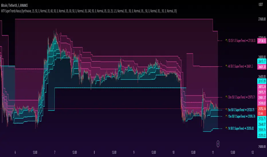
📈 Chart:
The chart shown in this original publication displays the 5 minute chart on BTCUSDT. Displayed on the chart are 6 MTF SuperTrends: the 5m 50-period/3-factor SuperTrend, 15m 50-period/3-factor SuperTrend, 30m 50-period/3-factor SuperTrend, 1h 50-period/3-factor SuperTrend, 4h 50-period/3-factor SuperTrend, and the 1D 25-period/1.5-factor SuperTrend - offering an exemplary view of how you can easily use these MTF SuperTrends to your advantage in analyzing SuperTrend relationships across multiple timeframes.
Pesquisar nos scripts por "mtf"
MTF Dashboard (Stoch,MACD,RSI) & Stochastic Signals
English Script Description:
Indicator Title: MTF Dashboard (Stoch,MACD,RSI) & Stochastic Signals
1. Overview
The "MTF Dashboard (Stoch,MACD,RSI) & Stochastic Signals" indicator is an advanced, multi-faceted analytical tool designed for comprehensive market analysis. It consolidates a detailed multi-timeframe (MTF) dashboard for Stochastic, MACD, and RSI, hierarchical Stochastic alignment signals (S3, S4, S5), PVSRA-based candle coloring, a customizable moving average, optional MA/VWAP filters for signals, and dynamic background coloring into a single, integrated Pine Script™ utility. This indicator aims to provide traders with a deeper market perspective by consolidating multiple layers of analysis onto the current chart.
2. Originality and Usefulness
This script’s originality stems from its comprehensive integration of several distinct analytical methodologies into a cohesive and highly customizable framework. While the core concept for the hierarchical Stochastic signals (S3-S5) was inspired by the work of f56eroon (ابو بتال - خطيرون), this indicator represents a significant original development by Saleh_ABO_RAED. Key original contributions include:
The specific implementation and extensive customization of the MTF dashboard displaying Stochastic, MACD, and RSI across five user-defined timeframes.
The seamless integration of PVSRA ( Volume) candle coloring, providing an immediate visual layer of volume confirmation.
The inclusion of a fully customizable general-purpose Moving Average.
The advanced and independent MA and VWAP filtering options for the S3-S5 Stochastic signals.
The overall script architecture that allows these diverse components to work synergistically.
Justification for Mashup:
This indicator is designed to provide a multi-dimensional view of the market, which is often necessary for robust trade decision-making. By combining:
MTF Analysis (Dashboard & Signals): To understand the broader context and identify signals aligning across multiple perspectives.
Momentum & Trend (Stoch, MACD, RSI, MA): To gauge the strength and direction of price movements.
Volume Analysis (PVSRA): To assess the conviction behind price action.
Signal Filtering (MA/VWAP): To enhance the reliability of generated signals.
This "mashup" is justified by its utility in helping traders identify higher-probability setups through the confluence of these varied analytical signals, all within a single tool, thus reducing chart clutter and streamlining the analytical process. The script is useful for traders who appreciate a detailed, layered approach to market analysis and seek to confirm signals from multiple non-correlated perspectives.
Practical Benefit for Traders:
This tool empowers traders to:
Quickly assess market conditions across multiple timeframes and key indicators.
Identify potential trade entries based on hierarchical Stochastic signals, confirmed by PVSRA and optional MA/VWAP filters.
Visually gauge market strength and conviction through PVSRA candle coloring.
Utilize a customizable MA for trend direction and dynamic support/resistance.
Make more informed decisions by considering a confluence of analytical factors.
3. Key Features
Multi-Timeframe Dashboard (Stochastic, MACD, RSI): Displays Stochastic (%K, %D, Status), MACD (Line, Signal, Status), and RSI (Value, SMA, Status) for up to five user-configurable timeframes (TF1 to TF5).
Hierarchical Stochastic Alignment Signals (S3, S4, S5): Generates signals based on a sequence of Stochastic confirmations across TF1-TF5, with user-defined K-level thresholds for initial crosses and subsequent confirmations.
PVSRA Candle Coloring: Integrates PVSRA logic to color candles based on volume and price action analysis (e.g., Bullish/Bearish 200% Volume, 150% Volume, Normal Volume candles). Option to override current symbol for PVSRA calculation.
Customizable Moving Average (MA): Plots a user-selectable MA (SMA or EMA) with configurable length, source, color, and width.
Dual Independent Optional Signal Filters (for S3-S5 signals):
MA Filter: Optionally filter S3-S5 signals using a separate configurable MA (SMA, EMA, WMA).
VWAP Filter: Optionally filter S3-S5 signals using VWAP with advanced anchoring options.
Customizable Background Coloring: Optionally colors the chart background when Stochastic indicators on TF3, TF4, and TF5 are in bullish or bearish alignment.
Extensive Customization: Configure all timeframes, all indicator parameters (Stoch, MACD, RSI, PVSRA colors, MA settings, VWAP settings), signal confirmation K-levels, table appearance, and alert conditions.
Alerts: Defines multiple alert conditions for S3, S4, and S5 Bullish/Bearish alignment signals, with alert messages indicating active filters.
4. How It Works
MTF Data & Dashboard: The script fetches and calculates Stochastic, MACD, and RSI data for each of the five user-defined timeframes using request.security with barmerge.lookahead_on to prevent future data leakage. This data populates the on-chart table.
PVSRA Candle Coloring: Analyzes each bar's volume and price range against historical averages (e.g., 10-period SMA of volume) to identify candles with significantly high volume (e.g., >=150% or >=200% of average) or high "value2" (volume * range), coloring them accordingly to denote strong buying or selling pressure.
Stochastic Signal Generation (S3-S5):
An initial Stochastic cross on TF1 (optionally filtered by K-level) serves as the trigger.
This cross is then confirmed sequentially by congruent Stochastic conditions (K above/below D, and K above/below user-defined confirmation levels) on TF2, TF3 (for an S3 signal), then TF4 (for S4), and finally TF5 (for S5).
MA & VWAP Signal Filtering: If enabled, generated S3-S5 signals are only plotted (and trigger alerts) if the price also satisfies the condition relative to the chosen MA (e.g., price > MA for longs) and/or VWAP. Both MA and VWAP lines can be plotted independently.
Background Coloring: Based on the consensus of Stochastic states (bullish/bearish) on TF3, TF4, and TF5.
5. How to Use
Configure Timeframes & Base Indicators: Set up your desired MTF levels (TF1-TF5) and the parameters for Stoch, MACD, and RSI via the script's "Settings/Inputs" dialogue.
Configure PVSRA & General MA: Enable/disable PVSRA candle coloring and the general MA plot; adjust their respective parameters (colors, lengths, types).
Set Stochastic Signal Parameters:
Adjust K-level thresholds for TF1 Stochastic crosses (set to 0 for bull/100 for bear to disable K-level entry filter).
Configure K-level confirmation thresholds for TF2-TF5.
Configure Optional MA/VWAP Signal Filters: Independently enable plotting and/or signal filtering for the MA and/or VWAP; choose their types, lengths, and anchor periods.
Interpret:
Dashboard: For an overview of market conditions.
PVSRA Candles: For volume confirmation of price movements.
S3-S5 Signals: As potential indications of strengthening multi-timeframe Stochastic alignment. The more filters a signal passes (MA, VWAP), the more confluent it might be considered.
MA/VWAP Lines: As dynamic support/resistance or trend indicators.
Background Color: For quick visual assessment of broader Stochastic momentum.
Setting Up Alerts: Add the indicator to your chart. Click the "Alert" button in TradingView, select this indicator under "Condition," and choose from the defined alert conditions (e.g., "Stoch TF3 Bullish Alignment"). Alert messages will indicate active filters.
6. Important Considerations / Disclaimer
This indicator provides analytical tools and potential signals; it is not a standalone trading system and does not guarantee profits.
Always use in conjunction with your trading strategy, risk management, and other analyses. Test thoroughly.
The effectiveness of filters and signals varies with market conditions and assets. Experimentation with settings is crucial.
This script is for educational/informational purposes only and is not financial advice. Trading involves substantial risk. The author, Saleh_ABO_RAED, is not responsible for any trading decisions based on this indicator.
7. Credits
The hierarchical Stochastic signal logic (S3-S5) and the initial strategic framework were inspired by the work of f56eroon (ابو بتال - خطيرون). This script, "MTF Dashboard (Stoch,MACD,RSI) & Stochastic Signals," represents an original development by Saleh_ABO_RAED, featuring the specific MTF dashboard implementation for Stochastic, MACD, and RSI, the integration of PVSRA candle coloring and a general Moving Average, advanced MA/VWAP signal filtering, background coloring, and the overall customizable script architecture.
Arabic Script Description (الوصف العربي للإسكريبت):
عنوان المؤشر: MTF Dashboard (Stoch,MACD,RSI) & Stochastic Signals
1. نظرة عامة
مؤشر "MTF Dashboard (Stoch,MACD,RSI) & Stochastic Signals" هو أداة تحليلية متقدمة ومتعددة الأوجه مصممة للتحليل الشامل للسوق. يدمج هذا المؤشر لوحة معلومات مفصلة متعددة الأطر الزمنية (MTF) لمؤشرات ستوكاستيك، الماكد (MACD)، ومؤشر القوة النسبية (RSI)، مع إشارات ستوكاستيك الهرمية التوافقية (S3, S4, S5)، وتلوين الشموع بناءً على PVSRA، ومتوسط متحرك قابل للتخصيص، وفلاتر اختيارية (MA و VWAP) للإشارات، وتلوين ديناميكي للخلفية، كل ذلك في أداة واحدة متكاملة مبرمجة بلغة Pine Script™. يهدف هذا المؤشر إلى تزويد المتداولين بمنظور أعمق للسوق من خلال دمج طبقات تحليل متعددة على الرسم البياني الحالي.
2. الأصالة والفائدة
تنبع أصالة هذا الإسكريبت من تكامله الشامل للعديد من المنهجيات التحليلية المتميزة ضمن إطار عمل متماسك وقابل للتخصيص بدرجة عالية. بينما المفهوم الأساسي لإشارات ستوكاستيك الهرمية (S3-S5) مستوحى من f56eroon (ابو بتال - خطيرون)، يمثل هذا المؤشر تطويراً أصيلاً وجوهرياً قام به Saleh_ABO_RAED. تشمل المساهمات الأصلية الرئيسية ما يلي:
التنفيذ المحدد والتخصيص الشامل للوحة معلومات MTF التي تعرض ستوكاستيك، الماكد، ومؤشر القوة النسبية عبر خمسة أطر زمنية يحددها المستخدم.
التكامل السلس لتلوين شموع PVSRA (، الحجم، )، مما يوفر طبقة تأكيد مرئية فورية للحجم.
إدراج متوسط متحرك عام قابل للتخصيص بالكامل.
خيارات التصفية المتقدمة والمستقلة باستخدام المتوسط المتحرك (MA) ومتوسط السعر المرجح بالحجم (VWAP) لإشارات ستوكاستيك S3-S5.
البنية البرمجية الشاملة التي تسمح لهذه المكونات المتنوعة بالعمل بشكل متآزر.
مبررات الدمج (Mashup Justification):
تم تصميم هذا المؤشر لتوفير رؤية متعددة الأبعاد للسوق، وهو أمر ضروري غالبًا لاتخاذ قرارات تداول قوية. من خلال الجمع بين:
تحليل MTF (لوحة المعلومات والإشارات): لفهم السياق الأوسع وتحديد الإشارات المتوافقة عبر وجهات نظر متعددة.
الزخم والاتجاه (ستوكاستيك، ماكد، RSI، المتوسط المتحرك): لقياس قوة واتجاه تحركات الأسعار.
تحليل الحجم (PVSRA): لتقييم قوة الاقتناع وراء حركة السعر.
تصفية الإشارات (MA/VWAP): لتعزيز موثوقية الإشارات المولدة.
هذا "الدمج" مبرر بفائدته في مساعدة المتداولين على تحديد إعدادات تداول ذات احتمالية أعلى من خلال التقاء هذه الإشارات التحليلية المتنوعة، كل ذلك ضمن أداة واحدة، مما يقلل من فوضى الرسم البياني ويبسط العملية التحليلية. الإسكريبت مفيد للمتداولين الذين يقدرون النهج التفصيلي متعدد الطبقات لتحليل السوق ويسعون لتأكيد الإشارات من وجهات نظر متعددة غير مترابطة.
الفائدة العملية للمتداولين:
تمكّن هذه الأداة المتداولين من:
تقييم ظروف السوق بسرعة عبر أطر زمنية متعددة ومؤشرات رئيسية.
تحديد إدخالات التداول المحتملة بناءً على إشارات ستوكاستيك الهرمية، المؤكدة بواسطة PVSRA وفلاتر MA/VWAP الاختيارية.
قياس قوة السوق والاقتناع بصريًا من خلال تلوين شموع PVSRA.
استخدام متوسط متحرك قابل للتخصيص لاتجاه الاتجاه والدعم والمقاومة الديناميكية.
اتخاذ قرارات أكثر استنارة من خلال النظر في التقاء العوامل التحليلية.
3. الميزات الرئيسية
لوحة معلومات متعددة الأطر الزمنية (ستوكاستيك، ماكد، RSI): تعرض قيم ستوكاستيك (K%, D%, الحالة)، الماكد (الخط، خط الإشارة، الحالة)، ومؤشر القوة النسبية (القيمة، المتوسط البسيط، الحالة) لما يصل إلى خمسة أطر زمنية قابلة للتخصيص (TF1 إلى TF5).
إشارات توافق ستوكاستيك الهرمية (S3, S4, S5): يتم إنشاء الإشارات بناءً على سلسلة من تأكيدات ستوكاستيك عبر الأطر TF1-TF5، مع عتبات مستوى K يحددها المستخدم للتقاطعات الأولية والتأكيدات اللاحقة.
تلوين شموع PVSRA: يدمج منطق PVSRA لتلوين الشموع بناءً على تحليل الحجم وحركة السعر (مثل شموع حجم صاعد/هابط 200%، حجم 150%، حجم عادي). خيار لتجاوز الرمز الحالي لحساب PVSRA.
متوسط متحرك قابل للتخصيص (MA): يرسم متوسطًا متحركًا (SMA أو EMA) يمكن للمستخدم اختياره مع طول ومصدر ولون وعرض قابل للتكوين.
فلتران اختياريان مستقلان للإشارات (لإشارات S3-S5):
فلتر MA: قم اختياريًا بتصفية إشارات S3-S5 باستخدام متوسط متحرك منفصل قابل للتكوين (SMA, EMA, WMA).
فلتر VWAP: قم اختياريًا بتصفية إشارات S3-S5 باستخدام VWAP مع خيارات إرساء متقدمة.
تلوين خلفية قابل للتخصيص: يقوم اختياريًا بتلوين خلفية الرسم البياني عندما تكون مؤشرات ستوكاستيك على الأطر TF3، TF4، و TF5 جميعها في توافق صاعد أو هابط.
تخصيص واسع النطاق: قم بتكوين جميع الأطر الزمنية، وجميع معلمات المؤشرات (ستوكاستيك، ماكد، RSI، ألوان PVSRA، إعدادات MA، إعدادات VWAP)، ومستويات تأكيد K للإشارات، ومظهر الجدول، وشروط التنبيه.
التنبيهات: يُعرّف المؤشر العديد من شروط التنبيه لتوافق إشارات S3 و S4 و S5 الصاعدة/الهابطة، مع إشارة رسائل التنبيه إلى الفلاتر النشطة.
4. كيف يعمل المؤشر
بيانات MTF ولوحة المعلومات: يقوم الإسكريبت بجلب وحساب بيانات ستوكاستيك، الماكد، و RSI لكل من الأطر الزمنية الخمسة التي يحددها المستخدم باستخدام request.security مع barmerge.lookahead_on لمنع تسرب البيانات المستقبلية. تملأ هذه البيانات الجدول على الرسم البياني.
تلوين شموع PVSRA: يحلل حجم كل شمعة ونطاق سعرها مقابل المتوسطات التاريخية (مثل متوسط متحرك بسيط لـ10 فترات للحجم) لتحديد الشموع ذات الحجم المرتفع بشكل كبير (مثل >=150% أو >=200% من المتوسط) أو "value2" مرتفعة (الحجم * النطاق)، وتلوينها وفقًا لذلك للدلالة على ضغط شراء أو بيع قوي.
توليد إشارات ستوكاستيك (S3-S5):
يعمل تقاطع ستوكاستيك أولي على TF1 (يمكن تصفيته اختياريًا بمستوى K) كمُشغِّل.
يتم بعد ذلك تأكيد هذا التقاطع بالتتابع بواسطة شروط ستوكاستيك متوافقة (K فوق/تحت D، و K فوق/تحت مستويات التأكيد المحددة من المستخدم) على TF2، ثم TF3 (لإشارة S3)، ثم TF4 (لـ S4)، وأخيرًا TF5 (لـ S5).
تصفية الإشارات بـ MA و VWAP: في حالة التمكين، لا يتم رسم إشارات S3-S5 المولدة (ولا تُطلق تنبيهات) إلا إذا كان السعر يستوفي أيضًا الشرط المتعلق بالمتوسط المتحرك المختار (مثال: السعر > MA للشراء) و/أو VWAP. يمكن رسم خطوط MA و VWAP بشكل مستقل.
تلوين الخلفية: بناءً على إجماع حالات ستوكاستيك (صاعدة/هابطة) على الأطر TF3، TF4، و TF5.
5. كيفية الاستخدام
تكوين الأطر الزمنية والمؤشرات الأساسية: قم بإعداد مستويات MTF المطلوبة (TF1-TF5) ومعلمات ستوكاستيك، الماكد، و RSI عبر مربع حوار "الإعدادات/المدخلات" الخاص بالإسكريبت.
تكوين PVSRA و MA العام: قم بتمكين/تعطيل تلوين شموع PVSRA ورسم المتوسط المتحرك العام؛ اضبط معلمات كل منهما (الألوان، الأطوال، الأنواع).
ضبط معلمات إشارة ستوكاستيك:
عدّل عتبات مستوى K لتقاطعات ستوكاستيك TF1 (اضبط على 0 للصاعد/100 للهابط لتعطيل فلتر دخول مستوى K).
قم بتكوين عتبات تأكيد مستوى K لـ TF2-TF5.
تكوين فلاتر MA/VWAP الاختيارية للإشارات: قم بتمكين الرسم و/أو تصفية الإشارات بشكل مستقل لـ MA و/أو VWAP؛ اختر أنواعها وأطوالها وفترات الإرساء.
التفسير:
لوحة المعلومات: للحصول على نظرة عامة على ظروف السوق.
شموع PVSRA: لقياس قوة الاقتناع وراء تحركات الأسعار.
إشارات S3-S5: كمؤشرات محتملة لتوافق ستوكاستيك متعدد الأطر يزداد قوة. كلما زاد عدد الفلاتر التي تجتازها الإشارة (MA, VWAP)، كلما أمكن اعتبارها أكثر قوة.
خطوط MA/VWAP: كدعم/مقاومة ديناميكية أو مؤشرات اتجاه.
لون الخلفية: لتقييم بصري سريع لزخم ستوكاستيك الأوسع.
إعداد التنبيهات: أضف المؤشر إلى الرسم البياني. انقر فوق زر "تنبيه" في TradingView، واختر هذا المؤشر ضمن "الشرط"، ثم اختر من شروط التنبيه المحددة (مثل "Stoch TF3 Bullish Alignment"). ستشير رسائل التنبيه إلى الفلاتر النشطة.
6. اعتبارات هامة / إخلاء مسؤولية
يوفر هذا المؤشر أدوات تحليلية وإشارات محتملة؛ إنه ليس نظام تداول قائم بذاته ولا يضمن الأرباح.
استخدمه دائمًا بالاقتران مع استراتيجية التداول الخاصة بك، إدارة المخاطر، والتحليلات الأخرى. اختبره جيدًا.
تختلف فعالية الفلاتر والإشارات باختلاف ظروف السوق والأصول. التجربة مع الإعدادات أمر بالغ الأهمية.
هذا الإسكريبت مخصص للأغراض التعليمية/المعلوماتية فقط وليس نصيحة مالية. ينطوي التداول على مخاطر كبيرة. المؤلف، Saleh_ABO_RAED، غير مسؤول عن أي قرارات تداول بناءً على هذا المؤشر.
7. الحقوق والتقدير
منطق إشارات ستوكاستيك الهرمية (S3-S5) والإطار الاستراتيجي الأولي مستوحيان من عمل f56eroon (ابو بتال - خطيرون). هذا الإسكريبت، "MTF Dashboard (Stoch,MACD,RSI) & Stochastic Signals"، يمثل تطويراً أصيلاً قام به Saleh_ABO_RAED، ويتميز بالتنفيذ المحدد للوحة معلومات MTF لمؤشرات ستوكاستيك، الماكد، و RSI، ودمج تلوين شموع PVSRA والمتوسط المتحرك العام، والتصفية المتقدمة للإشارات باستخدام MA/VWAP، وتلوين الخلفية، والبنية البرمجية الشاملة القابلة للتخصيص.
MTF Wave Screener [Cryptoheat]The "MTF Wave Screener" is a screener built to be able to scan the market quickly and easily in a very efficient way based on the "MTF Wave Stochastic RSI " function.
therefore it is basically an MTF wave stochastic scanner to monitor a wide scope of charts and know which to look deeper into using the "MTF Wave Stochastic RSI" itself. therefore it is recommended to be used with the other indicator and is considered an additional tool for those who use and master the "MTF Wave Stochastic RSI " indicator. if you do not know how it works, make sure to check it out here and read its description, which is a vital part for this one:
knowing how it works, you should be able to understand what it means for the chart to be Overbought, Oversold or having a Fake-out (mini-wave) on the MTF Wave Stochastic RSI, as well as the meaning of the values of K1, K2, K3 and the gap between K1 and K2. if not, please check it out by visiting the link attached earlier.
This table screener basically writes all the MTF data in a table showing mainly the chart's status as an option of (Oversold, Overbought, Fakeup or Fakedown) as well as the K1, K2, K3, Gap, value change from last candle data of all requested charts. Therefore acting as a market scanner for people who want to save the time needed to scan the whole market manually.
For example:
as you can see the table is showing 'GALA:USDT' pair as being oversold and having k1,k2 and k3 values of 0,0 and 9.76 respectively, therefore if you go check on the MTF Wave Stochastic RSI indicator, you will see that the current pair has a green highlight indicating oversold. and having the K1,K2 and K3 values as indicated on the indicator.
same goes for any other MTF status. Another example is when it shows a FAKEDOWN . Experienced MTF Wave Stoch RSI users know that this means that the MTF curves are formed in a bullish way showing that there is a retrace towards oversold only on the lowest time frame stochastic K1 while the normal time frame stochastic is still overbought. if you check the screener table you will see for example that 'QNTUSDT' pair is showing a FAKEDOWN the gap between K1 and K2 can be seen in the K1 and K2 values as well as the column named Gap val . with it you can determine the strength of that Fakedown. the bigger the Gap Val the higher the Fakeout and the bigger the expected bounce is should it play out.
checking on the QNTUSDT MTF Wave Stoch RSI you will see a clear fakedown between k1 and k2 (gray and blue curves), indicating a possible bounce incoming soon.
Overbought and Fakeup, each mean the opposite of Oversold and Fakedown respectively.
in short all the values contained on that screener table help you picture each chart's individual MTF Wave Stoch RSI of their own without having to check each one by itself. this is a very useful tool for traders who need to scan the market for the MTF data of each coin...
The screener comes with several options. in settings you can change the parameters for overbought, oversold , Fakeup and Fakedown in the settings according to the k1, k2, k3 values and differences. The table is made to screen 33 charts at the same time. to allow you to store more charts it is made in a way that you can choose not only those 33 but also 4 other x 33 watchlists and select the ones you want among them giving you the option to make your own 165 chart's watchlist and save it.
You must know that however, in the event that any of those default charts gets is not valid anymore, for example if a coin gets delisted of an exchange or a stock gets delisted the table will not work until you manually change that pair, even if it is in the alternative watchlists. in that case you will receive a warning message and a black indicator. in that event, please check for the pair that has been delisted and change it to another working pair and save as default.
MTF Smart Money ConceptsOverview
This indicator displays major elements of Smart Money Concepts and price action trading with multi-timeframes(MTF) and layered market structures with color visualization.
What is Smart Money Concepts?
Smart Money Concepts(SMC) is one of the methodologies to interpret how financial market moves and to analyze it and execute trades, focusing on liquidity and order flow of financial institutions.
Smart money means the funds invested by large financial institutions such as banks, institutional traders/investors, market makers, hedge funds etc. contrary to retail traders/investors' money.
It is important to note that there is no proof or evidence that those institutions move the market as described in Smart Money Concepts.
Personally speaking, it is one of the interpretation of the market and another angle to view the market just like other technical analysis methodologies such as Elliott Wave Principle, Gann Theory, Wyckoff Method and even traditional price action trading.
Importance of MTF Analysis
MTF analysis(a.k.a Topdown analysis) is the foundation to technically analyze charts and the most fundamental skill in trading because lower timeframes are always influenced by upper timeframes where large financial institutions operate.
How to use
This indicator is designed to help traders analyze how the market moves in terms of SMC and price action with multi-timeframes and color visualization of the market structures, which makes this indicator unique and different from other indicators.
There is two key settings that you can use based on your trading style.
1.Upper timeframe selection
You have two options to determine upper timeframe; Auto mode and Manual mode.
When Auto mode selected, upper timeframe will be determined based on chart timeframe as follows.
Chart timeframe => Upper timeframe
1M=>15M
5M/15M=>1H
30M/1H=>4H
4H=>D
D=>W
W=>M
If you select Manual mode, you can fix an upper timeframe.
2.High/low settings
This affects all other settings of the indicator and most importantly designs the market structure.
This is the key setting to determine how you view the market as price action trading is all about highs and lows and story of how highs and lows have been created with the market structure.
You can specify left bars and right bars to identify swing highs/lows and these highs/lows become the basis to design the market structure and determine how SMC elements are displayed.
Example:
Left bar&right bar: 10
You can see bigger wave(magenta line) in the market structure(stepped line).
(Magenta line is a drawn object by manual)
Left bar&right bar: 4
With this setting, you can see smaller wave in the market structure.
Since market moves like wave as there is a lot of wave theories in financial investment/trading industry such as Elliott wave, Wolf wave etc., users can define market structure with this setting depending on what degree of wave they aim to trade.
Functions:
MTF Order Block
Concept
Order block is a block of orders where buying orders and selling orders are accumulated. Order blocks are created when the institutions move the market up and down, temporality placing orders in an opposite direction to the way they want to move, in order to match their own orders with counter-orders.
Visualization by the indicator
The indicator displays both chart timeframe's order blocks and upper timeframe's order blocks(MTF).
You can also select from two options how to display order blocks;
1. Show all order blocks
2. Show strong order blocks only
Note: Strong order blocks mean order blocks created at strong highs/lows. See also strong high/low below.
Alerts can be set when prices reach strong order blocks.
MTF Fair Value Gap(FVG)/Imbalance
Concept
Fair Value Gap(FVG)(Imbalance) is a void generated among three consecutive candlesticks.
FVG(s) is created when the market moves so rapidly generating buy side or sell side order imbalances.
FVG(s) is characterized by price action that prices tend to come back to the area where FVG(s) exists, filling in the space among the candlesticks.
Visualization by the indicator
The indicator displays both chart timeframe's FVG and upper timeframe's FVG.
MTF Liquidity Grab
Concept
Liquidity grab is price action to sweep liquidity for the institutions to move the market.
This price action often happens because the size of their orders is so huge and they need a bunch of counter-orders to match their orders. This is why prices sometimes come to areas where liquidity rest and swipe them before the market goes up/down.
Liquidity visualization
Where does liquidity rest?
The answer is above highs(buy side liquidity) and below lows(sell side liquidity).
Among all highs and lows, swing highs and lows are where liquidity is accumulated the most because swing highs and lows can be created only by the institutions, therefore massive liquidity is indicated.
Visualization by the indicator
The indicator displays liquidity dots so that users can easily identify where liquidity rests and liquidity grab of both a chart timeframe and an upper timeframe.
Alerts can be set when liquidity grab happens.
MTF Strong High/Low
Concept
Strong high/low literally means strong highs and lows among all highs and lows including swing highs and lows.
There is a few different definitions of strong high/low in price action trading and the definition in this indicator is as follows.
Strong high
A high that that breaks higher low or lower low
Strong low
A low that breaks lower high or higher high
Visualization by the indicator
The indicator displays strong highs and lows of both a chart timeframe and an upper timeframe.
MTF Market Structure Visualization
Concept
Market structure is a series of price movement with highs and lows which outlines the way the market directs. It is a basis to see trend occurrence, trend reversal and sideways and analyzing the market structures in multi-timeframes is the most fundamental technical skill in trading/investment.
Visualization by the indicator
The indicator displays market structures of both a chart timeframe and an upper timeframe and provide color visualization depending on bullish and bearish market structures.
The definition of bullish and bearish market structure is as follows.
Bullish market structure
When a price breaks a Lower High or Higher High
Bearish market structure
When a price breaks a Higher Low or Lower Low
Settings
All the functions above, colors and line settings are parameterized and can be turned on/off depending on users’ needs.
———————————————————————————
概要
Smart Money Concepts(SMC)およびプライスアクショントレードにおける重要な要素をマルチタイムフレームで表示することのできるインジケーターです。
相場構造(Market structure)をマルチタイムフレームで表示し、相場構造の強弱を色で可視化することができます。
Smart Money Concepts(スマートマネーコンセプト)とは?
Smart Money Concepts(以下SMC) は金融市場がどのように動くかを解釈し、分析し、取引を執行するための相場理論の一つであり、Liquidity(リクイディティ)および機関投資家のオーダーフロー(注文の流れ)に焦点を置いていることが特徴です。
Smart Money(スマートマネー)とは、銀行や機関投資家、マーケットメーカー、ヘッジファンドといった金融機関が動かす資金を意味し、個人投資家の資金と対をなす概念です。
重要な点は、実際に上記の金融機関がSmart Money Conceptsで語られているような相場の動かし方をしているかどうかを証明する明確なエビデンスはないということです。
個人的には、エリオット波動理論やギャン理論、ワイコフ理論、伝統的なプライスアクショントレーディングの方法論と同様に、マーケットの動きを解釈するための一つの方法論であり、マーケットの動きを別の角度から見る枠組みと捉えています。
マルチタイムフレーム(MTF)分析の重要性
MTF分析はチャートをテクニカルに分析する上での基礎であり、トレードにおいて最も重要なスキルです。なぜなら下位のタイムフレームは上記のような金融機関が資金運用を行う上位のタイムフレームの影響を常に受けるためです。
使い方
このインジケーターは、SMCまたはプライスアクショントレードの観点から、トレーダーがマーケットをマルチタイムフレームで分析することを支援するために開発しています。
相場構造(Market structure/マーケットストラクチャー)を方向性に応じて色で可視化することができるため、視覚的に相場の構造を判断できることがこのインジケータのユニークな点であり、他のインジケーターと異なる点です。
ユーザーのトレードスタイルに応じて、以下の二つの設定を行うことができます。
1.上位足の決定方法
ユーザーは上位足のタイムフレームを決定するにあたり、AutoモードとManualモードを選択することができます。
Autoモードを選択した場合、上位足はチャートのタイムフレームに応じて以下のように決定されます。
チャートタイムフレーム => 上位足タイムフレーム
1M=>15M
5M/15M=>1H
30M/1H=>4H
4H=>D
D=>W
W=>M
Manualモードを選択すると上位足のタイムフレームを固定することができます。
2.High/low(高値/安値) 設定
当設定はインジケーターの他の全ての機能に影響し、また最も重要である相場構造の定義に影響します。
当設定はユーザーがマーケットをどのように見るか(=どの程度の粒度)を決定する重要な設定です。なぜならプライスアクショントレードは、高値、安値とそれらが相場構造をどのように構築してきたかの一連の流れを分析することが全てだからです。
ユーザーは相場構造を決定付けるスイングハイ·スイングローを特定するためのバーの本数を設定することができます。ここで設定した内容が、相場構造を定義し、以下で説明するSMCの要素の表示を決定することになります。
例:
Left bar&right bar(左右のバーの数): 10
この場合、ステップラインで示した相場構造の中に大きな波(マゼンタの波)を見ることができます。
(マゼンタのラインは手動で描いたオブジェクト)
Left bar&right bar: 4
この設定では、上記に比べて小さい波を描いていることが確認できます。
相場理論の中にエリオット波動理論やウォルフ波動といった数多くの波動理論があることからわかるように、相場は波として動きます。どの粒度の波を狙うかというトレーダーのスタイルに応じて、設定を変更することができます。
機能
MTFオーダーブロック
コンセプト
オーダーブロックとは買い注文と売り注文が一連となって蓄積されたオーダー(注文)のブロックのことです。
オーダーブロックは機関投資家が相場を動かす際に、本来意図する方向とは一時的に逆に動かすことで、彼ら自身の注文をマッチングさせるための反対注文を発生させることで形成されます。
インジケーターによる表示
インジケーターはチャートタイムフレームのオーダーブロックと上位足のオーダーブロックの両方を表示することができます。
また、オーダーブロックの表示オプションとして、
1.全てのオーダーブロックを表示
2.Strong(ストロング)オーダーブロックのみを表示
を選択することが可能です。
注: StrongオーダーブロックはStrong High/Lowで形成されるオーダーブロックを指します。(下記参照)
また、オーダーブロック到達でのアラート設定も可能です。
MTFフェアーバリューギャップ(FVG)/インバランス
コンセプト
フェアーバリューギャップ(FVG)/インバランスとは連続する3つのローソク足の間に形成される溝(Gap)のことです。
フェアーバリューギャップはマーケットが非常に早く動いたことにより、買いオーダーと売りオーダーの需給バランスが崩れることによって発生します。
フェアーバリューギャップには、価格がフェアーバリューギャップが発生したエリアまで戻ってくる傾向があるという特徴が存在します。
インジケーターによる表示
インジケーターはチャートタイムフレームのフェアーバリューギャップと上位足のフェアーバリューギャップの両方を表示することができます。
MTF Liquidity Grab(リクイディティ·グラブ)
コンセプト
Liquidity(リクイディティ)とはマネー、つまり注文です。
Liquidity Grab(リクイディティ·グラブ)とは、機関投資家がマーケットを動かす際にLiquidityを取得するプライスアクションのことを指します。
このプライスアクションは、機関投資家が処理する注文サイズが非常に大きいため、自身の注文を出す際に大量の反対注文を必要とすることからしばしば発生します。
これが、価格がLiquidity(注文)の集まっているエリアに接近し、それら注文をスワイプ(狩り取る)した後に上昇·下落する理由です。
Liquidityの可視化
一般的にLiquidityは高値の上(buy side liquidity)、安値の下(sell side liquidity)に存在します。
全ての高値·安値の中で、スイングハイ·ローがliquidityが最も蓄積されているエリアということができます。なぜならスイングハイ·ローは機関投資家の注文によってのみ形成されるからです。
インジケーターによる表示
ユーザーがLiquidityポイントを簡単に識別できるようにLiquidityをドット表示することが可能です。またチャートタイムフレームと上位足の両方のLiquidity Grabを表示することができます。
Liquidity Grab発生時にアラートも設定可能です。
MTF Strong High/Low(ストロングハイ·ロー)
コンセプト
Strong high/lowは文字通り、強い高値·安値のことを指します。
トレーダーの間でいくつかの異なる定義が存在しますが、当インジケーターでの定義は以下の通りです。
Strong high
Higher low(ハイアーロー) または Lower low(ロワーロー)をブレイクした高値
Strong low
Lower higher (ロワーハイ) または Higher High(ハイアーハイ)をブレイクした安値
インジケーターによる表示
チャートタイムフレーム、上位足のStrong High/Lowを表示することが可能です。
相場構造可視化
コンセプト
相場構造(Market structure/マーケットストラクチャー)とは、相場の流れを成り立たせる高値と安値を元にした一連の値動きです。建物における骨組みに該当します。
トレンドの発生、転換、レンジを見極めるための基礎であり、マルチタイムフレームで相場構造を分析することは、投資·トレードにおいて最も重要なテクニカルスキルです。
インジケーターによる表示
チャートタイムフレームと上位足タイムフレーム両方の相場構造を表示することができます。
また、相場構造が強気の状態か弱気の状態かを色で可視化するため、上位足含めた相場の流れを視覚的に判断することが可能です。
相場構造の強弱の定義は以下の通りです。
強気の相場構造(Bullish market structure)
価格がLower HighまたはHigher Highをブレイクしたとき
弱気の相場構造(Bearish market structure)
価格がHigher LowまたはLower Lowをブレイクしたとき
設定
上記の全ての機能は色やライン設定含めパラメーターで設定が可能です。またユーザの必要に応じて表示·非表示を切り替えることができます。
MTF CCI with timeframe control function and signal/alertJapanese below. / 日本語説明は下記
Summary
This indicator shows CCI of the current timeframe and another CCI from upper timeframe as MTF CCI with ability to show signals and set alerts when crossing upper/bottom bands.
For general use of CCI, please refer to the link below(by TradingView)
jp.tradingview.com
How is it different from other MTF CCI indicators?
Problems with other MTF CCI indicators are;
-If you set higher timeframe CCI(MTF CCI), it will also be shown on further higher time frames.
i.e. If you set 4hour chart’s CCI on 1 hour or lower time frame charts, it will also appear on daily and weekly chart, which is not necessary.
To tackle these problems, this indicator has incorporated functions below.
-To be able to control timeframes where MTF CCI is displayed to eliminate unnecessary information when you open higher time frame’s charts.
For example, if you select daily timeframe for MTF CCI, the CCI will be shown only on 4 hour or lower timeframes.
These are the values added on this indicator.
Specifications
-This indicator shows one CCI from the current timeframe and another CCI from another timeframe(MTF).
-For MTF CCI, you can select upper timeframe from monthly, weekly, daily, 4hour, 1hour, 30mins, 15mins, 5mins.
Again, if you select weekly for MTF, for instance, then MTF CCI will be displayed on daily or lower timeframes. Other timeframes work same.
-For both CCI(current timeframe) and CCI(MTF), signals will be shown when they cross over/under upper band and lower band, which you can control display on style tab of the indicator.
-Alert can be set same as signal conditions.
Please see the sample chart below.
Brown triangle is signal for CCI(current timeframe) and maroon signal is for MTF CCI.
--------------------------------------------------------------------------------------------------
現在時間軸のCCIと上位足のCCIを表示するマルチタイムフレームCCI(MTF CCI)インジケーターです。アッパーバンド、ロワーバンドと交差した時にシグナルを表示するとともに、アラートの設定も可能です。
CCIの一般的な使い方は以下のリンク(TradingView)を参照ください。
jp.tradingview.com
他のマルチタイムフレームCCIとの違い
他のマルチタイムフレームCCIのインジケーターでは、以下の問題に直面します。
・上位足のCCIを表示すると、さらに上位足でもそのCCIが表示され見にくくなる。
例: 4時間足のCCIを下位足で表示可能な様に設定すると、日足や週足でも表示され、チャートがノイズだらけに・・・
この問題に対して、このインジケーターでは、
・上位足のCCIを表示する時間軸を制御することで上位足で不必要な情報を表示させない。
という機能を加えることでこれらの問題を解決しています。
機能概要
・このインジケーターでは現在の時間軸のCCIと上位足から一つのCCIを表示します。
・上位足は月足、週足、日足、4時間足、1時間足、30分足、15分足、5分足から選択することが可能です。
・上位足のCCIは選択した時間軸未満の時間軸に表示されます。
例:
日足のCCI : 4時間足、1時間足、30分足、15分足、5分足、1分足チャートにのみ表示
4時間足のCCI : 1時間足、30分足、15分足、5分足、1分足チャートにのみ表示
・上位足のCCIは選択した時間軸未満の時間軸に表示されます。
・現在時間軸のCCI、MTF CCIともに、アッパーバンド/ロワーバンドと交差したタイミングでシグナルを表示することができます。(アッパーバンド/ロワーバンドそれぞれに対して上に交差、下に交差のタイミングで表示されます。不要なものはスタイル設定画面で非表示とすることができます。)
・シグナルは設定画面で表示・非表示の切り替えができます。
・シグナルと同じ条件でアラート通知の設定が可能です。
サンプルチャート
1時間足に4時間足のCCIを表示したものです。茶色の三角が現在時間軸のCCIのシグナル。赤の三角がMTF CCIのシグナルです。

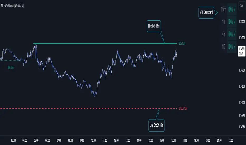
MTF Workbench [WinWorld]WHAT IS THIS?
This is MTF Workbench — an indicator, which is based on World Class SMC, but has one main feature — multi-timeframe analysis.
WHY MAKING MTF FEATURE AS A SEPARATE INDICATOR?
We weren't able to implement this feature in the World Class SMC itself due to huge size and complexity of the script, so we have re-written the entire script and optimized it to implement MTF and decided to make a separate script for MTF features in order to not make World Class SMC any heavier, because otherwise the script would probably not even load up on the chart.
WHAT ARE THE FEATURES?
MTF Workbench has two features for now: dashboard and structure mapping. But there will be more soon!
DASHBOARD
Dashboard gathers data from 4 different timeframes and visualize the results in the nice little table on the chart. It is useful to have a dashboard because it visualizes important data in a simple way.
The settings of the dashboard are:
- Position. this settings has 2 subsettings: vertical position (bottom, middle, top) and horizontal position (left, center, right). These subsettings allow you to place dashboard on any side of the chart;
- Text size. This settings defines size of the text in the dashboard, simple as that;
- Timeframe #1, #2, ..., #4. These four settings allow you to choose 4 different timeframes for the table to gather data from.
How to read the dashboard:
- The colour of the specific data cell is the current trend of selected timeframe;
- IDM ⧖ — price has not reached IDM yet;
- IDM ✓ — price grabbed IDM.
This is it for dashboard, now for structure mapping.
STRUCTURE MAPPING
By structure we mean IDM, BoS and ChoCh (if you don't what this means, refer to World Class SMC description to learn the terms, we won't explain it here). In our main indicator structure was only drawn for the timeframe you were currently using, but now you can choose whatever timeframe you want to get structure from!
Why do this matter? Well, this feature alone allows to perform so called intern-structure analysis, because now you will able to compare current timeframe's structure to a higher timeframe's structure and get an a sufficient amount of edge about what Smart Money are doing.
* And yes, this feature only works for analyzing higher timeframes!
The structure itself is plotted the same way as it is in our main indicator, but we also add timeframe to the specific structure event (event is when price reaches IDM, BoS or ChoCh lines) so you could differentiate internal-structure events from any other events.
Live structure is also available in this indicator.
WHY USE THIS INDICATOR?
Even though there a lot of structure mapping indicators with MTF features, they don't have what MTF Workbench has — the correct core structure-mapping algorithm. We took our core structure-mapping algorithm and put it into MTF Workbench to finally bring MTF analysis to life to work state-of-the-art structure-mapping algorithm, which gives any user a huge edge in the market by a very simple reason — this algorithm actually works. Our algorithm proved itself to be efficient and it helps map structure without human intervention, which is a huge leap in smart money trading. To this day we were not able to find an algorithm which would match the quality of our algo! Which why we think making an MTF version of our algorithm is a good thing to do, because now users can finally work with current timeframe and see information about structure from other timeframes using only ONE chart. If you are smart-money trader, you understand that this is a HUGE thing.
For PineScript moderators
We know the rule not publish slightly modifie version of some indicator as another indicator, but this is not a slightly different version. MTF Workbench was completely re-writtten from scratch and optimized so it could fint PineSript's code restrictions such as 500 max local scopes, which World Class SMC with MTF Workbench's features exceeded way too far.
Also, by referencing our World Class SMC indicator we don't promote it in any way. The reference is only made with purposes of
1) Informational reference to help users learn specific terms.
2) Informational reference to some of the World Class SMC features to give users a clue about what exactly MTF Workbench does.
We hope that you will find a great use from MTF Workbench as we did and it will help your level up your edge!
Sincerely, WinWorld Team.
Automating wealth creation since 2022.
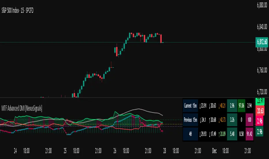
MTF Advanced DMI [NexusSignals]The MTF Advanced DMI is a multi-timeframe (MTF) enhancement of the classic Directional Movement Index (DMI) and Average Directional Index (ADX) indicator. It provides traders with insights into trend strength, direction, and momentum across multiple timeframes simultaneously. This version of DMI extends the single-timeframe analysis by incorporating two higher timeframes, allowing for better alignment of trends (e.g., confirming a short-term signal with longer-term context). It includes visual plots, a customizable data table showing MTF data, and expanded alert conditions for trend changes, consolidations, and reversals. Ideal for multi-timeframe strategies, trend confirmation, or avoiding false signals in volatile markets.
Key features include:
Multi-Timeframe Analysis: Displays DMI/ADX data for the current chart timeframe, plus two user-defined higher timeframes (e.g., 4H and 1D).
A trend strength metric that quantifies bullish/bearish dominance on each timeframe.
A dynamic table summarizing real-time MTF values, with color-coded signals, arrows, and buy/sell pressure percentages.
Visual fills and arrows for intuitive trend reading.
Built-in alerts for key events, including MTF-specific conditions (note: higher TF alerts may repaint due to live candle calculations via request.security).
How It Works
The indicator calculates DMI/ADX on three timeframes: the current chart TF, a mid-higher TF (default: 4H), and a highest TF (default: 1D).
For each:
+DI (Plus Directional Indicator): Upward movement strength.
-DI (Minus Directional Indicator): Downward movement strength.
ADX: Overall trend strength.
Trend Strength: ((+DI - -DI) / (+DI + -DI)) * ADX – positive for bullish, negative for bearish.
Buy/Sell %: Percentage of buyer/seller control in the candle based on HLC.
Plots focus on the current TF:
Strength Histogram: Color-coded (green bullish, red bearish).
ADX Line: White, with direction arrows.
+DI/-DI Lines: Green/red, with fills above 15 for strong trends.
Horizontal lines at 15 (consolidation) and 25 (strong trend).
The table (optional) shows data for the current timeframe candle, previous current timeframe candle, and the two higher TFs (if different from current), enabling quick cross-TF comparisons.
Inputs
General Settings:
DMI Length (default: 14): Period for +DI/-DI.
ADX Smoothing (default: 14): ADX period.
ADX Consolidation Threshold (default: 15): Low ADX suggests sideways.
ADX Stronger Trend Threshold (default: 25): High ADX indicates strong trends.
Higher Timeframe (default: 240/4H): Mid-level TF for MTF analysis.
Highest Timeframe (default: 1D): Top-level TF for broader context.
Threshold for Strong Bullish/Bearish DMI Strength (defaults: 10 / -10): For strength alerts.
Table Settings:
Show Table? (default: true): Toggle table visibility
Table Text Color, Header Color, Text Size (default: small)
Position (default: middle_right): Customize for your chart
Interpretation
Bullish Alignment: +DI > -DI across TFs, rising +DI (↑), Strength > 0 (green), Buy% > Sell%. Stronger if ADX > 25 on higher TFs.
Bearish Alignment: -DI > +DI, rising -DI (↑), Strength < 0 (red), Sell% > Buy%. Confirm with rising ADX on MTF.
Consolidation: +DI/-DI < 20 and ADX ≤ 15 (blue fill). Check if higher TFs show the same for range-bound confirmation.
Crossovers: +DI above -DI for bullish; reverse for bearish. MTF agreement reduces false signals.
Fills: Highlight dominant trends above 15 (green bullish, maroon bearish).
MTF Insight: Use the table to spot divergences (e.g., bullish current TF but bearish on daily) for potential reversals.
Combine with support/resistance or other momentum oscillators like macd, rsi, stochastic for robust strategies. Test on various assets and TFs to find the best settings that suit your trading style.
Alerts
Includes 20 alert conditions, with MTF extensions (higher TF alerts may repaint – use with caution for live trading):
Strength crossing 0 or bullish/bearish thresholds (on current and higher TFs).
+DI/-DI crossovers (bullish/bearish) on current TF.
ADX above strong threshold.
+DI/-DI above 25 or below 15.
Consolidation detection.
MTF-specific: Strength changes on higher TFs (e.g., "Strength Above Bullish Threshold on TF1").
Configure in TradingView by selecting from the alert dropdown.
Usage Tips
Select higher TFs that suit your strategy (e.g., 1H chart with 4H and Daily for day trading).
Use the table for at-a-glance MTF alignment without switching charts.
Customize appearance to avoid clutter on busy setups.
Backtest thoroughly, especially noting potential repainting on higher TFs.
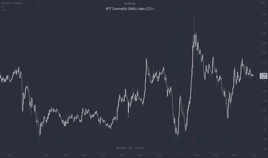
MTF Commodity Oddity Index (CCI+)MTF Commodity Oddity Index (CCI+)
This chart overlay indicator is based upon the Commodity Channel Index (CCI) and can signal multiple triple-timeframe CCI overbought and oversold confluences directly onto your chart, intended for use as a confluence either for reversal trade entries, or potential trade exits, indicating where price may be probable to reverse.
Features include:
- Primary set of fully configurable triple-timeframe overbought and oversold signals, indicating where 3 selected timeframes are all overbought or all oversold at the same time. Enabled by default.
- Secondary set of fully configurable triple-timeframe overbought and oversold signals, indicating where 3 selected timeframes are all overbought or all oversold at the same time. Enabled by default.
- Optional drawing of background colours and/or ribbon seen at bottom of the chart image.
- The default primary MTF #1 timeframes are set to 1 minute, 5 minute and 15 minute. These are highly suitable for low timeframe scalpers trading on < 5m charts, and can often pin point price reversals.
- The default Secondary MTF #2 timeframes are set to 15 minute, 30 minute and 120 minute. These are suitable for both low timeframe scalpers and considerably higher timeframe traders.
- Independent alerts for MTF #1 and MTF #2 triple-timeframe confluences, including options for alerting MTF overbought and MTF oversold individually, as well as an option for alerting either overbought or oversold in a single combined alert.
- Also includes standard configurable CCI options, including CC length and source type.
Note: The features listed above are accurate at the time of publishing but maybe updated or added to in future.
A similar MTF CCI indicator is also available as a panel indicator here .
This indicator is based upon the original MTF Fantastic Stochastic (FS+) available here .
What is the Commodity Channel Index (CCI)?
Investopedia has described the popular oscillator as follows:
“The Commodity Channel Index (CCI) is a momentum-based oscillator used to help determine when an investment vehicle is reaching a condition of being overbought or oversold.
Developed by Donald Lambert, this technical indicator assesses price trend direction and strength, allowing traders to determine if they want to enter or exit a trade, refrain from taking a trade, or add to an existing position. In this way, the indicator can be used to provide trade signals when it acts in a certain way.”
You can read more about the CCI , its use cases and calculations here .
How do traders use overbought and oversold levels in their trading?
The oversold level, that is traditionally when the CCI is above the 100 level is typically interpreted as being 'overbought', and below the -100 level is typically considered 'oversold'. Traders will often use the CCI at an overbought level as a confluence for entry into a short position, and the CCI at an oversold level as a confluence for an entry into a long position. These levels do not mean that price will necessarily reverse at those levels in a reliable way, however. This is why this version of the CCI employs the triple timeframe overbought and oversold confluence, in an attempt to add a more confluence and reliability to this usage of the CCI . While traditionally, the overbought and oversold levels are below -100 for oversold, and above 100 for overbought, the default threshold settings of this indicator have been increased to provide fewer, stronger signals, especially suited to the low timeframes and highly volatile assets.
MTF Fusion - SuperTrend [TradingIndicators]SuperTrend is undoubtedly one of the most popular and influential indicators ever developed, and by combining it with our MTF Fusion algorithm, we believe we have made it more useful and powerful than ever with MTF Fusion SuperTrend .
Let's start with a brief review of what the original SuperTrend indicator is and how it works.
What is SuperTrend?
The SuperTrend indicator is a popular technical analysis tool used in financial markets to identify the direction of a trend and potential entry and exit points for trading. It was developed by Olivier Seban, a French trader, and first introduced in his book "Tout le monde peut gagner en bourse" ("Everyone Can Win in the Stock Market") published in 2008.
SuperTrend is based on the concept of Average True Range (ATR) and uses two parameters: the multiplier and the period. The ATR measures the volatility of a financial instrument, and the SuperTrend indicator utilizes this information to plot a line above or below the price chart. It is an 'AITM' (Always In The Market) indicator, which, in its original form, is always 'long' or 'short' - and never 'flat'.
Here's a brief overview of how the SuperTrend indicator works:
Calculation of the ATR: The ATR is calculated using historical price data over a specified period. It measures the average range between high and low prices, reflecting the market's volatility.
Calculation of the upward (long/bullish) and downward (short/bearish) SuperTrend lines: The SuperTrend indicator multiplies the ATR by a specified multiplier (typically 2 or 3) and adds/subtracts the result from the current closing price. This calculation determines the upward and downward SuperTrend lines.
Plotting the Indicator: The SuperTrend indicator plots a line above the price chart when the price is trending upwards, and below the price chart when the price is trending downwards. The distance between the price and the indicator line provides insights into the strength of the trend.
Traders commonly use the SuperTrend indicator to identify potential buy or sell signals. For example, a buy signal may be generated when the price crosses above the indicator line, indicating an uptrend. Conversely, a sell signal may be triggered when the price crosses below the indicator line, signaling a downtrend.
What is MTF Fusion?
Multi-Timeframe (MTF) Fusion is the process of combining calculations from multiple timeframes higher than the chart's into one 'fused' value or indicator. It is based on the idea that integrating data from higher timeframes can help us to better identify short-term trading opportunities within the context of long-term market trends.
How does it work?
Let's use the context of this indicator, which calculates SuperTrend lines, as an example to explain how MTF Fusion works and how you can perform it yourself.
Step 1: Selecting Higher Timeframes
The first step is to determine the appropriate higher timeframes to use for the fusion calculation. These timeframes should typically be chosen based on their ability to provide meaningful price levels and action which actively affect the price action of the smaller timeframe you're focused on. For example, if you are trading the 5 minute chart, you might select the 15 minute, 30 minute, and hourly timeframe as the higher timeframes you want to fuse in order to give you a more holistic view of the trends and action affecting you on the 5 minute. In this indicator, four higher timeframes are automatically selected depending on the timeframe of the chart it is applied to.
Step 2: Gathering Data and Calculations
Once the higher timeframes are identified, the next step is to calculate the data from these higher timeframes that will be used to calculate your fused values. In this indicator, for example, the values of SuperTrend lines are calculated by determining the value of the SuperTrend indicator for all four higher timeframes.
Step 3: Fusing the Values From Higher Timeframes
The next step is to actually combine the values from these higher timeframes to obtain your 'fused' indicator values. The simplest approach to this is to simply average them. If you have calculated the value of a SuperTrend line from three higher timeframes, you can, for example, calculate your 'multi-timeframe fused level' as (HigherTF_SuperTrend_1 + HigherTF_SuperTrend_2 + HigherTF_SuperTrend_3) / 3.0.
Step 4: Visualization and Interpretation
Once the calculations are complete, the resulting fused indicator values are plotted on the chart. These values reflect the fusion of data from the multiple higher timeframes, giving a broader perspective on the market's behavior and potentially valuable insights without the need to manually consider values from each higher timeframe yourself.
What makes this script unique? Why is it closed source?
While the process described above is fairly unique and sounds simple, the truly important key lies in determining which higher timeframes to fuse together, and how to weight their values when calculating the fused end result in such a way that best leverages their relationship for useful TA.
This MTF Fusion indicator employs a smart, adaptive algorithm which automatically selects appropriate higher timeframes to use in fusion calculations depending on the timeframe of the chart it is applied to. It also uses a dynamic algorithm to adjust and weight the SuperTrend calculations depending on each higher timeframe's relationship to the chart timeframe. These algorithms are based on extensive testing and are the reason behind this script's closed source status.
Unlike in the original indicator, flat/'No Trend' areas exist in MTF Fusion SuperTrend!
MTF Fusion SuperTrend only shows a Fusion SuperTrend when the majority of SuperTrends from higher timeframes are in agreement and signaling the same trend direction . So, unlike the original SuperTrend indicator, MTF Fusion SuperTrend sometimes shows no SuperTrend line at all - typically in flat or indecisive areas, which we think is beneficial and helps to filter out noise on smaller timeframes.
Included Features
Fusion SuperTrend lines
Dynamic Multi-Timeframe SuperTrends
Filled zones to highlight trends
Full customization of SuperTrend parameters
Pre-built color stylings
Options
Fusion View: Show/hide the Fusion SuperTrends calculated from multiple higher timeframes
MTF View: Show/hide the SuperTrends from multiple higher timeframes used to calculate the Fusion SuperTrends
Fill Trending Zones: Show/hide the fill for 'trending zones' between price and the Fusion SuperTrends
Multiplier: Sets the multiplier for all SuperTrend calculations
ATR Period: Sets the ATR period for all SuperTrend calculations
Pre-Built Color Styles: Use a pre-built color styling (uncheck to use your own colors)
Manual Color Styles: When pre-built color styles are disabled, use these color inputs to define your own

MTF Stochastic ScannerThis Stochastic scanner can be use to identify overbought and oversold of 10 symbols over multiple timeframes
it will give you a quick overview which pair is more overbough or more oversold and also signals tops and bottoms in the AVG row
light red/green cell = weak bearish (Stoch = 30-20) / bullish (Stoch = 70-80)
medium red/green cell = bearish (Stoch = 20-10) / bullish (Stoch = 80-90)
dark red/green cell = strong bearish (Stoch <= 10) / bullish (Stoch >= 90)
gray cell = neutral (Stoch = 30-70)
Usage
If AVG (average of all 4 timeframes) falls below 20, the cell will get green, indicating a good time to enter long (buy)
If AVG (average of all 4 timeframes) rises above 80, the cell will get red, indicating a good time to enter short (sell)
Use the "MTF Stochastic Scanner" in combination with the " MTF RSI Scanner "
to find tops (RSI MTF avg >=70 AND Stochastic MTF avg >= 80)
or bottoms (RSI MTF avg <= 30 AND Stochastic MTF avg <= 20)
Here is how the two MTF scanners looked on Nov 08 2021 (ATH) »
and here how the MTF scanners looked on June 21 2022
use TradingViews Replay function to check how it would have worked in the past and when not.
As always… there NOT a single indicator that can show to the top & bottom 100% every single time. So use with caution, with other indicators and/or deeper understanding of technicals analysis ☝️☝️☝️
Settings
You can change the timeframes, symbols, Stochastic settings, overbought/oversold levels and colors to your liking
Drag the table onto the price chart, if you want to use it as an overlay.
NOTE:
Because of the 4x10 security requests, it can take up to 1 minute for changed settings to take effect! Please be patient 🙃
If you have any idea on how to optimise the code, please feel free to share 🙏
*** Inspired by "Binance CHOP Dashboard" from @Cazimiro and "RSI MTF Table" from @mobester16 ***

MTF 200 SMAMulti-Timeframe (MTF) 200 SMA: Your Universal Trend Guide
Tired of switching timeframes just to check the major moving averages?
The MTF 200 SMA indicator is a powerful, customizable tool designed to give you a clear, comprehensive view of the trend across multiple timeframes, all on a single chart. It's built on Pine Script v6 for stability and performance.
Key Features:
9 MTF Lines: Simultaneously plot the 200 Simple Moving Average (SMA) for 30m, 1h, 2h, 3h, 4h, 6h, 8h, Daily, and Weekly charts. Understand the overall market structure at a glance.
Single-Click Toggle: Use the 'Current Chart TF Only' checkbox to instantly switch from the crowded MTF view to showing only the standard 200 SMA for your current chart resolution. Perfect for focusing on immediate price action.
Dynamic Highlighting: The 'Highlight Current Chart TF' option (default ON) emphasizes the SMA corresponding to your current chart, making it stand out with a bright Aqua color and a thicker line when in MTF mode.
Full Customization: Easily adjust the SMA Length and the MTF SMA Line Color directly in the indicator settings.
How to Use It:
Trend Confirmation: When all MTF lines (especially the Daily and Weekly) are aligned and moving in the same direction, it provides high-confidence trend confirmation.
Dynamic S/R: The MTF SMAs often act as strong dynamic Support and Resistance levels, even when viewing a lower timeframe like the 5-minute chart.
Clean Analysis: Use the 'Current Chart TF Only' option when you need to declutter your chart and focus on the primary trend of your active trading session.
Elevate your trend analysis today with the MTF 200 SMA!

MTF RSI ScannerThis RSI scanner can be use to identify the relative strength of 10 symbols over multiple timeframes
it will give you a quick overview which pair is more bearish or more bullish and also signals tops and bottoms in the AVG row
light red/green cell = weak bearish (RSI = 45-35) / bullish (RSI = 55-65)
medium red/green cell = bearish (RSI = 35-25) / bullish (RSI = 65-75)
dark red/green cell = strong bearish (RSI <= 25) / bullish (RSI >= 75)
gray cell = neutral (RSI= 45-55)
Usage
If AVG (average of all 4 timeframes) falls below 30, the cell will get green, indicating a good time to enter long (buy)
If AVG (average of all 4 timeframes) rises above 70, the cell will get red, indicating a good time to enter short (sell)
Use the "MTF RSI Scanner" in combination with the "MTF Stochastic Scanner"
to find tops (RSI MTF avg >=70 AND Stochastic MTF avg >= 80)
or bottoms (RSI MTF avg <= 30 AND Stochastic MTF avg <= 20)
Here is how the two MTF scanners looked on Nov 08 2021 (ATH) »
and here how the MTF scanners looked on June 21 2022
use TradingViews Replay function to check how it would have worked in the past and when not.
As always… there NOT a single indicator that can show to the top & bottom 100% every single time. So use with caution, with other indicators and/or deeper understanding of technicals analysis ☝️☝️☝️
Settings
You can change the timeframes, symbols, RSI settings, overbought/oversold levels and colors to your liking
Drag the table onto the price chart, if you want to use it as an overlay.
NOTE:
Because of the 4x10 security requests, it can take up to 1 minute for changed settings to take effect! Please be patient 🙃
If you have any idea on how to optimise the code, please feel free to share 🙏
*** Inspired by "Binance CHOP Dashboard" from @Cazimiro and "RSI MTF Table" from @mobester16 ***

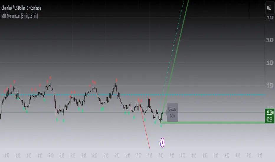
MTF MomentumUniqueness:
MTF Momentum is designed to provide true multiple-timeframe information at once on a single screen with as little clutter as possible. What makes MTF Momentum unique is the way it condenses the perspectives of our other internal models into a single bullish or bearish slope near the current candle, then automatically draws the same bullish or bearish momentum slopes of the next higher timeframes. The structure is engineered to highlight shifts in momentum as they happen on the current candle (angled lines), marking potential reversal points as they build (red and green diamonds), and provides a numerical Q-Score that draws a horizontal marker for elevated Q-Score exhaustion. The design avoids telling you when to buy or sell. Instead, it structures the raw inputs in a way that makes interpretation easier. That makes it useful whether you’re trading actively or simply learning to recognize how momentum flows across layers.
Usefulness:
This indicator is designed to work across multiple timeframes. Instead of juggling the same indicator on 3 different screens, you can see a unified picture that captures both the local momentum and higher timeframes that provide time-dimensional context. When short-term and higher-timeframe angles point in the same direction, MTF Momentum makes that visible in a straightforward way and may help highlight when momentum is consistent across multiple timeframes. When short-term layers push against a stronger higher timeframe, it signals that momentum may be shifting or exhausting. This indicator provides an efficient workflow and helps reduce clutter.
How It Works:
At its core, MTF Momentum is a blend of momentum readings from multiple sources — RSI slopes, EMA stacks, Gaussian smoothing, Fisher-style transforms, and MACD widening analysis built from the same shared core mathematical engines as our other indicators. The uniqueness of this indicator is not tied to any single formula as each component is well-known, but it is in the way they are layered, smoothed, and consolidated that entirely new readings are created.
The process begins with multiple RSI calculations, offset and averaged to reduce jitter. These are smoothed through EMA stacks of varying lengths, then run through Gaussian-style filters that emphasize directional change while filtering noise. The slope differences across these layers form the foundation of the momentum calculation. This momentum reading is then checked against MACD widening conditions. MACD gap expansion is treated as a momentum confirmation — widening gaps with price in agreement add weight, while narrowing gaps or misaligned candles reduce confidence. Additional derivative logic, including Fisher-style transforms, is applied to normalize the outputs and make them more stable across different assets.
Multi-timeframe integration comes from using request.security to pull higher timeframe versions of the same structures that are on the base chart. For example, you can see a one-minute chart overlaid with five-minute and fifteen-minute context. The blending is seamless — higher timeframe momentum is displayed alongside lower timeframe signals that help the user see where current timeframe momentum is in relation to higher timeframes.
How to Use the MTF Momentum Indicator:
Applying the MTF Momentum indicator is straightforward, but interpretation depends on your process.
To use, load the indicator on your preferred base timeframe. Use this general guideline to setup your indicators:
Base timeframe -> 1st HTF -> 2nd HTF
1min -> 5min -> 15min
5min -> 15min -> 1hr
15min -> 1hr -> 4hr
1hr -> 4hr -> 1day
4hr -> 1day -> Weekly
1day -> Weekly -> Monthly
Weekly -> Monthly -> Yearly
When used at base timeframes at 1 hour or lower, higher timeframe lines ARE drawn automatically.
When using a base timeframe above 1 hour (e.g., 4h, Daily), higher-timeframe slopes are NOT drawn automatically. To view them, switch to the higher-timeframe chart itself (for example, Daily or Weekly) and draw an arrow along the slope using TradingView’s drawing tools. Once placed, the arrow will remain visible when you return to your lower base timeframe chart, giving you the higher-timeframe context alongside your current view. This step is optional, purely for visual reference, and does not affect the indicator’s calculations.
These are your higher timeframe momentum angles that can help provide context to the automatically drawn angle on your current timeframe. You can even practice drawing these lines on the lower timeframes such as using a 5min base and 15min and 1hr HTF charts. You can compare your manually drawn angles with the automatic HTF lines by enabling them in the INPUTS tab of the MTF Momentum settings menu.
Q-SCORE:
The Q-Score label presents two values ranging from 0 to 100. These values are a numerical translation of the same momentum conditions our other indicators display visually. Higher values indicate stronger readings of exhaustion within the current trend model, while lower values indicate less. You can think of this as similar to a distribution curve, where some states occur less frequently at the extreme ends of the range and more frequently near the middle. Q-Score values are provided as contextual information only and do not predict reversals or guarantee outcomes.
Blue Dotted & Solid Horizontal line:
The aqua blue horizontal line is a visual representation of the Q-Score values. When one or both numerical values is below 85 the line stays dotted -- it is only when both numerical values exceed 85 that the line changes from dotted to solid.
Green & Red Diamonds:
Diamonds mark areas where the underlying model detects counter-trend behavior. They may flicker on the current candle during intrabar calculations but are locked in at candle close and never get altered or repainted.
Red diamonds highlight points where the model detects counter-trend pressure during a bullish phase. Green diamonds highlight counter-trend pressure during a bearish phase. These markers reflect where momentum conditions have shifted relative to the prevailing trend. They appear where short-term dynamics differ from the broader trend. Traders can interpret these areas in their own context; the diamonds themselves do not predict reversals or guarantee outcomes.
Example ways to use the MTF Momentum indicator:
Look for agreement -- when both your base timeframe and higher timeframe momentums are pointing in the same direction, it reflects stronger alignment. This may help identify areas of trend continuation.
Watch for divergence -- if your short-term momentum pushes opposite to the higher timeframe, it flags a potential transition.
Disclaimer:
This tool does not generate buy or sell signals. It is a framework for visualizing momentum across layers, allowing you to incorporate that information into your own decision-making. How you apply it depends entirely on your goals, timeframe, and risk tolerance. This indicator is provided for educational and informational purposes only. It does not constitute financial advice, trading advice, or investment recommendations. Trading involves risk, and you may lose some or all of your capital. Past performance is not a guarantee of future results. You are solely responsible for any decisions you make — always trade to the best of your own abilities and within your own risk tolerance.
Release Notes:
v1.0 (Initial Release)
MTF Volume Flow IndicatorThe MTF Volume Flow Indicator (MTF VFI) is an advanced and versatile tool that enhances market analysis by tracking the flow of volume across multiple timeframes. By integrating volume flow with multi-timeframe analysis, this indicator provides traders with a comprehensive understanding of market trends, momentum, and potential reversals.
Key Features
Multi-Timeframe Volume Flow Analysis: The MTF VFI computes the Volume Flow Indicator across various timeframes, ranging from 1 minute to 1 month. This multi-timeframe analysis enables traders to observe and compare volume flow dynamics across different time horizons, offering deeper insights into market behavior.
Customizable VFI Settings: The indicator includes configurable VFI parameters such as length, coefficient, and volume cutoff, allowing users to tailor the analysis to different market conditions and trading strategies. This flexibility ensures that the indicator remains relevant across diverse market environments.
Signal Line and Delta Calculations: The script features a signal line derived from the VFI and calculates the delta values (the difference between VFI and the signal line). These delta values are essential for identifying potential buy or sell signals and are presented as histograms for easy visual interpretation.
Cumulative Delta with Dynamic Bands: The indicator introduces cumulative delta, a powerful tool that combines average and median VFI values to provide a clearer picture of market sentiment. Two standard deviation bands are plotted around the cumulative delta, offering a range within which price movements are likely to remain. These bands are smoothed using a 21-period EMA, providing a more refined view of market volatility.
Multi-Timeframe and Analysis Tables: The MTF VFI includes optional tables that display VFI, signal line, and delta values across all selected timeframes. Additionally, an analysis table presents key statistical metrics such as the highest, lowest, average, standard deviation, range, and median VFI values. These tables provide a concise summary of market conditions, aiding in strategic decision-making.
Dynamic Display Options: The indicator offers extensive customization options, allowing traders to display or hide elements such as delta histograms, delta bands, and tables. This ensures that users can focus on the most relevant information for their trading strategy.
Neutral Candle Coloring Option: Traders can enable neutral candle colors, where bearish candles are gray and bullish candles are white. This feature helps to reduce noise and maintain focus on the overall trend and volume flow analysis.
How It Works
Volume Flow Indicator Calculation: The VFI is calculated using a combination of typical price, volume, and the standard deviation of price changes. The indicator smooths the VFI based on user preferences, allowing traders to adjust the sensitivity of the analysis to better match their trading style.
Multi-Timeframe Integration: The script pulls VFI calculations from multiple timeframes, providing a holistic view of market trends. By analyzing VFI across different timeframes, traders can detect alignments or divergences in volume flow that might indicate trend strength or weakness.
Cumulative Delta and Dynamic Bands: The cumulative delta is computed by combining the average and median VFI values. Dynamic two-standard-deviation bands are plotted around this cumulative delta, providing upper and lower bounds for expected price movements. These bands are further smoothed with a 21-period EMA, enhancing their effectiveness in volatile markets.
Delta Analysis and Histogram Display: The difference between the VFI and its signal line (delta) is calculated and displayed as histograms. This visual representation helps traders quickly assess momentum and identify potential reversals or trend continuations. The cumulative delta is color-coded dynamically based on its direction, adding an extra layer of visual clarity.
Alerts
VFI Crossover Alerts: The indicator includes customizable alerts that notify traders when the VFI crosses above or below its signal line. These alerts are crucial for catching potential trend reversals or continuation signals, even when the trader is not actively monitoring the chart.
Customizable Alert Conditions: Traders can tailor alert conditions to their preferred timeframes and VFI settings, ensuring that the notifications they receive are relevant and timely for their specific trading strategies.
Application
Trend Identification and Confirmation: The MTF VFI aids in identifying and confirming trends by analyzing volume flow across multiple timeframes. This capability is particularly useful for detecting trends that may not be visible on a single timeframe.
Momentum and Divergence Analysis: By comparing VFI and delta values across timeframes, and analyzing cumulative delta with dynamic bands, traders can gain insights into market momentum and potential divergences, which are often precursors to reversals.
Strategic Decision-Making: With its comprehensive multi-timeframe analysis, cumulative delta, and statistical summaries, the MTF VFI equips traders with the information needed to make informed trading decisions, whether for short-term trades or long-term investments.
Visual Clarity and Customization: The indicator’s dynamic display options and neutral candle coloring help traders maintain a clear and focused view of the market, customizing the visualization to match their specific needs.
The MTF Volume Flow Indicator (MTF VFI) by CryptoSea is an essential tool for traders who seek to gain a deeper understanding of market trends and volume dynamics across multiple timeframes. Its advanced features and customization options make it a valuable addition to any trader’s toolkit.
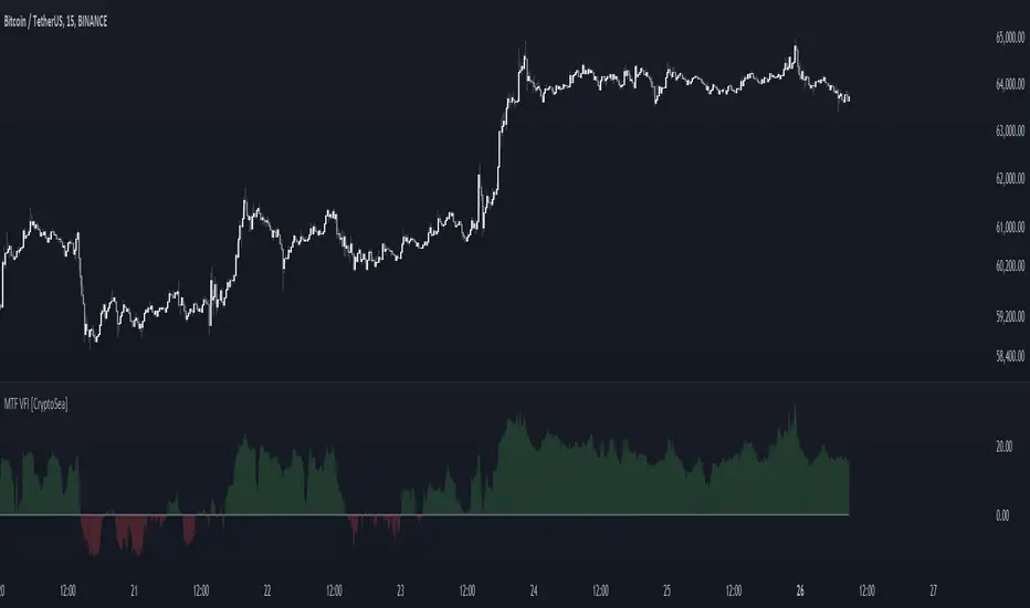
MTF Fusion - S/R Levels [TradingIndicators]MTF Fusion S/R Levels intelligently adapt to whatever timeframe you're trading - dynamically calculating pivot-based support and resistance levels combined from four appropriate higher timeframes to give you a much broader view of the market and an edge in your trading decisions. It is the second indicator in our MTF Fusion series, and leverages our MTF Fusion algorithm - only this time to visualize pivot-based S/R levels and zones.
These levels are not programmed to repaint - so you can use them in real-time just as they appeared historically.
What is MTF Fusion?
Multi-Timeframe (MTF) Fusion is the process of combining calculations from multiple timeframes higher than the chart's into one 'fused' value or indicator. It is based on the idea that integrating data from higher timeframes can help us to better identify short-term trading opportunities within the context of long-term market trends.
How does it work?
Let's use the context of this indicator, which calculates S/R Levels based on pivot points, as an example to explain how MTF Fusion works and how you can perform it yourself.
Step 1: Selecting Higher Timeframes
The first step is to determine the appropriate higher timeframes to use for the fusion calculation. These timeframes should typically be chosen based on their ability to provide meaningful price levels and action which actively affect the price action of the smaller timeframe you're focused on. For example, if you are trading the 5 minute chart, you might select the 15 minute, 30 minute, and hourly timeframe as the higher timeframes you want to fuse in order to give you a more holistic view of the trends and action affecting you on the 5 minute. In this indicator, four higher timeframes are automatically selected depending on the timeframe of the chart it is applied to.
Step 2: Gathering Data and Calculations
Once the higher timeframes are identified, the next step is to calculate the data from these higher timeframes that will be used to calculate your fused values. In this indicator, for example, the values of support and resistance levels are calculated by determining pivot points for all four higher timeframes.
Step 3: Fusing the Values From Higher Timeframes
The next step is to actually combine the values from these higher timeframes to obtain your 'fused' indicator values. The simplest approach to this is to simply average them. If you have calculated the value of a support level from three higher timeframes, you can, for example, calculate your 'multi-timeframe fused level' as (HigherTF_Support_Level_1 + HigherTF_Support_Level_2 + HigherTF_Support_Level_3) / 3.0.
Step 4: Visualization and Interpretation
Once the calculations are complete, the resulting fused indicator values are plotted on the chart. These values reflect the fusion of data from the multiple higher timeframes, giving a broader perspective on the market's behavior and potentially valuable insights without the need to manually consider values from each higher timeframe yourself.
What makes this script unique? Why is it closed source?
While the process described above is fairly unique and sounds simple, the truly important key lies in determining which higher timeframes to fuse together, and how to weight their values when calculating the fused end result in such a way that best leverages their relationship for useful TA.
This MTF Fusion indicator employs a smart, adaptive algorithm which automatically selects appropriate higher timeframes to use in fusion calculations depending on the timeframe of the chart it is applied to. It also uses a dynamic algorithm to adjust and weight the lookbacks used for pivot and S/R level calculations depending on each higher timeframe's relationship to the chart timeframe. These algorithms are based on extensive testing and are the reason behind this script's closed source status.
Included Features
Fusion Support and Resistance Levels
Dynamic Multi-Timeframe S/R Levels
Breakaway Zone fills to highlight breakouts and breakdowns from the Fusion S/R Levels
Customizable lookback approach
Pre-built color stylings
Options
Fusion View: Show/hide the Fusion S/R Levels calculated from multiple higher timeframes
MTF View: Show/hide the S?R levels from multiple higher timeframes used to calculate the Fusion S/R Levels
Breakaway Zones: Show/hide the fill for zones where price breaks away from the Fusion S/R Levels
Lookback: Select how you want your S/R Levels to be calculated (longer = long-term levels, shorter = short-term levels)
Pre-Built Color Styles: Use a pre-built color styling (uncheck to use your own colors)
Manual Color Styles: When pre-built color styles are disabled, use these color inputs to define your own
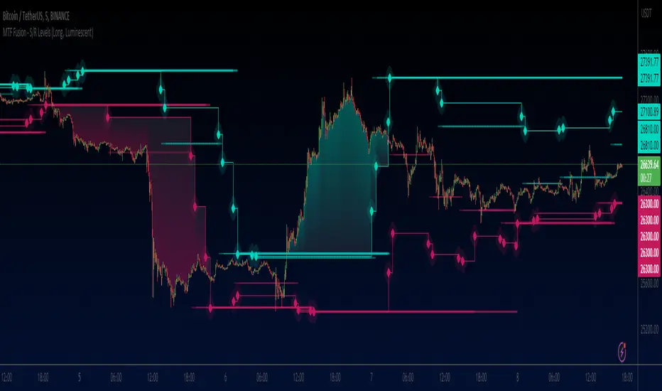
MTF K-Means Price Regimes [matteovesperi] ⚠️ The preview uses a custom example to identify support/resistance zones. due to the fact that this identifier clusterizes, this is possible. this example was set up "in a hurry", therefore it has a possible inaccuracy. When setting up the indicator, it is extremely important to select the correct parameters and double-check them on the selected history.
📊 OVERVIEW
Purpose
MTF K-Means Price Regimes is a TradingView indicator that automatically identifies and classifies the current market regime based on the K-Means machine learning algorithm. The indicator uses data from a higher timeframe (Multi-TimeFrame, MTF) to build stable classification and applies it to the working timeframe in real-time.
Key Features
✅ Automatic market regime detection — the algorithm finds clusters of similar market conditions
✅ Multi-timeframe (MTF) — clustering on higher TF, application on lower TF
✅ Adaptive — model recalculates when a new HTF bar appears with a rolling window
✅ Non-Repainting — classification is performed only on closed bars
✅ Visualization — bar coloring + information panel with cluster characteristics
✅ Flexible settings — from 2 to 10 clusters, customizable feature periods, HTF selection
━━━━━━━━━━━━━━━━━━━━━━━━━━━━━━━━━━━━━━━━━━━━━━━━━━━━━━━━━━━━━━━━━
🔬 TECHNICAL DETAILS
K-Means Clustering Algorithm
What is K-Means?
K-Means is one of the most popular clustering algorithms (unsupervised machine learning). It divides a dataset into K groups (clusters) so that similar elements are within each cluster, and different elements are between clusters.
Algorithm objective:
Minimize within-cluster variance (sum of squared distances from points to their cluster center).
How Does K-Means Work in Our Indicator?
Step 1: Data Collection
The indicator accumulates history from the higher timeframe (HTF):
RSI (Relative Strength Index) — overbought/oversold indicator
ATR% (Average True Range as % of price) — volatility indicator
ΔP% (Price Change in %) — trend strength and direction indicator
By default, 200 HTF bars are accumulated (clusterLookback parameter).
Step 2: Creating Feature Vectors
Each HTF bar is described by a three-dimensional vector:
Vector =
Step 3: Normalization (Z-Score)
All features are normalized to bring them to a common scale:
Normalized_Value = (Value - Mean) / StdDev
This is critically important, as RSI is in the range 0-100, while ATR% and ΔP% have different scales. Without normalization, one feature would dominate over others.
Step 4: K-Means++ Centroid Initialization
Instead of random selection of K initial centers, an improved K-Means++ method is used:
First centroid is randomly selected from the data
Each subsequent centroid is selected with probability proportional to the square of the distance to the nearest already selected centroid
This ensures better initial centroid distribution and faster convergence
Step 5: Iterative Optimization (Lloyd's Algorithm)
Repeat until convergence (or maxIterations):
1. Assignment step:
For each point find the nearest centroid and assign it to this cluster
2. Update step:
Recalculate centroids as the average of all points in each cluster
3. Convergence check:
If centroids shifted less than 0.001 → STOP
Euclidean distance in 3D space is used:
Distance = sqrt((RSI1 - RSI2)² + (ATR1 - ATR2)² + (ΔP1 - ΔP2)²)
Step 6: Adaptive Update
With each new HTF bar:
The oldest bar is removed from history (rolling window method)
New bar is added to history
K-Means algorithm is executed again on updated data
Model remains relevant for current market conditions
Real-Time Classification
After building the model (clusters + centroids), the indicator works in classification mode:
On each closed bar of the current timeframe, RSI, ATR%, ΔP% are calculated
Feature vector is normalized using HTF statistics (Mean/StdDev)
Distance to all K centroids is calculated
Bar is assigned to the cluster with minimum distance
Bar is colored with the corresponding cluster color
Important: Classification occurs only on a closed bar (barstate.isconfirmed), which guarantees no repainting .
Data Architecture
Persistent variables (var):
├── featureVectors - Normalized HTF feature vectors
├── centroids - Cluster center coordinates (K * 3 values)
├── assignments - Assignment of each HTF bar to a cluster
├── htfRsiHistory - History of RSI values from HTF
├── htfAtrHistory - History of ATR values from HTF
├── htfPcHistory - History of price changes from HTF
├── htfCloseHistory - History of close prices from HTF
├── htfRsiMean, htfRsiStd - Statistics for RSI normalization
├── htfAtrMean, htfAtrStd - Statistics for ATR normalization
├── htfPcMean, htfPcStd - Statistics for Price Change normalization
├── isCalculated - Model readiness flag
└── currentCluster - Current active cluster
All arrays are synchronized and updated atomically when a new HTF bar appears.
Computational Complexity
Data collection: O(1) per bar
K-Means (one pass):
- Assignment: O(N * K) where N = number of points, K = number of clusters
- Update: O(N * K)
- Total: O(N * K * I) where I = number of iterations (usually 5-20)
Example: With N=200 HTF bars, K=5 clusters, I=20 iterations:
200 * 5 * 20 = 20,000 operations (executes quickly)
━━━━━━━━━━━━━━━━━━━━━━━━━━━━━━━━━━━━━━━━━━━━━━━━━━━━━━━━━━━━━━━━━
📖 USER GUIDE
Quick Start
1. Adding the Indicator
TradingView → Indicators → Favorites → MTF K-Means Price Regimes
Or copy the code from mtf_kmeans_price_regimes.pine into Pine Editor.
2. First Launch
When adding the indicator to the chart, you'll see a table in the upper right corner:
┌─────────────────────────┐
│ Status │ Collecting HTF │
├─────────────────────────┤
│ Collected│ 15 / 50 │
└─────────────────────────┘
This means the indicator is accumulating history from the higher timeframe. Wait until the counter reaches the minimum (default 50 bars for K=5).
3. Active Operation
After data collection is complete, the main table with cluster information will appear:
┌────┬──────┬──────┬──────┬──────────────┬────────┐
│ ID │ RSI │ ATR% │ ΔP% │ Description │Current │
├────┼──────┼──────┼──────┼──────────────┼────────┤
│ 1 │ 68.5 │ 2.15 │ 1.2 │ High Vol,Bull│ │
│ 2 │ 52.3 │ 0.85 │ 0.1 │ Low Vol,Flat │ ► │
│ 3 │ 35.2 │ 1.95 │ -1.5 │ High Vol,Bear│ │
└────┴──────┴──────┴──────┴──────────────┴────────┘
The arrow ► indicates the current active regime. Chart bars are colored with the corresponding cluster color.
Customizing for Your Strategy
Choosing Higher Timeframe (HTF)
Rule: HTF should be at least 4 times higher than the working timeframe.
| Working TF | Recommended HTF |
|------------|-----------------|
| 1 min | 15 min - 1H |
| 5 min | 1H - 4H |
| 15 min | 4H - D |
| 1H | D - W |
| 4H | D - W |
| D | W - M |
HTF Selection Effect:
Lower HTF (closer to working TF): More sensitive, frequently changing classification
Higher HTF (much larger than working TF): More stable, long-term regime assessment
Number of Clusters (K)
K = 2-3: Rough division (e.g., "uptrend", "downtrend", "flat")
K = 4-5: Optimal for most cases (DEFAULT: 5)
K = 6-8: Detailed segmentation (requires more data)
K = 9-10: Very fine division (only for long-term analysis with large windows)
Important constraint:
clusterLookback ≥ numClusters * 10
I.e., for K=5 you need at least 50 HTF bars, for K=10 — at least 100 bars.
Clustering Depth (clusterLookback)
This is the rolling window size for building the model.
50-100 HTF bars: Fast adaptation to market changes
200 HTF bars: Optimal balance (DEFAULT)
500-1000 HTF bars: Long-term, stable model
If you get an "Insufficient data" error:
Decrease clusterLookback
Or select a lower HTF (e.g., "4H" instead of "D")
Or decrease numClusters
Color Scheme
Default 10 colors:
Red → Often: strong bearish, high volatility
Orange → Transition, medium volatility
Yellow → Neutral, decreasing activity
Green → Often: strong bullish, high volatility
Blue → Medium bullish, medium volatility
Purple → Oversold, possible reversal
Fuchsia → Overbought, possible reversal
Lime → Strong upward momentum
Aqua → Consolidation, low volatility
White → Undefined regime (rare)
Important: Cluster colors are assigned randomly at each model recalculation! Don't rely on "red = bearish". Instead, look at the description in the table (RSI, ATR%, ΔP%).
You can customize colors in the "Colors" settings section.
━━━━━━━━━━━━━━━━━━━━━━━━━━━━━━━━━━━━━━━━━━━━━━━━━━━━━━━━━━━━━━━━━
⚙️ INDICATOR PARAMETERS
Main Parameters
Higher Timeframe (htf)
Type: Timeframe selection
Default: "D" (daily)
Description: Timeframe on which the clustering model is built
Recommendation: At least 4 times larger than your working TF
Clustering Depth (clusterLookback)
Type: Integer
Range: 50 - 2000
Default: 200
Description: Number of HTF bars for building the model (rolling window size)
Recommendation:
- Increase for more stable long-term model
- Decrease for fast adaptation or if there's insufficient historical data
Number of Clusters (K) (numClusters)
Type: Integer
Range: 2 - 10
Default: 5
Description: Number of market regimes the algorithm will identify
Recommendation:
- K=3-4 for simple strategies (trending/ranging)
- K=5-6 for universal strategies
- K=7-10 only when clusterLookback ≥ 100*K
Max K-Means Iterations (maxIterations)
Type: Integer
Range: 5 - 50
Default: 20
Description: Maximum number of algorithm iterations
Recommendation:
- 10-20 is sufficient for most cases
- Increase to 30-50 if using K > 7
Feature Parameters
RSI Period (rsiLength)
Type: Integer
Default: 14
Description: Period for RSI calculation (overbought/oversold feature)
Recommendation:
- 14 — standard
- 7-10 — more sensitive
- 20-25 — more smoothed
ATR Period (atrLength)
Type: Integer
Default: 14
Description: Period for ATR calculation (volatility feature)
Recommendation: Usually kept equal to rsiLength
Price Change Period (pcLength)
Type: Integer
Default: 5
Description: Period for percentage price change calculation (trend feature)
Recommendation:
- 3-5 — short-term trend
- 10-20 — medium-term trend
Visualization
Show Info Panel (showDashboard)
Type: Checkbox
Default: true
Description: Enables/disables the information table on the chart
Cluster Color 1-10
Type: Color selection
Description: Customize colors for visual cluster distinction
Recommendation: Use contrasting colors for better readability
━━━━━━━━━━━━━━━━━━━━━━━━━━━━━━━━━━━━━━━━━━━━━━━━━━━━━━━━━━━━━━━━━
📊 INTERPRETING RESULTS
Reading the Information Table
┌────┬──────┬──────┬──────┬──────────────┬────────┐
│ ID │ RSI │ ATR% │ ΔP% │ Description │Current │
├────┼──────┼──────┼──────┼──────────────┼────────┤
│ 1 │ 68.5 │ 2.15 │ 1.2 │ High Vol,Bull│ │
│ 2 │ 52.3 │ 0.85 │ 0.1 │ Low Vol,Flat │ ► │
│ 3 │ 35.2 │ 1.95 │ -1.5 │ High Vol,Bear│ │
│ 4 │ 45.0 │ 1.20 │ -0.3 │ Low Vol,Bear │ │
│ 5 │ 72.1 │ 3.05 │ 2.8 │ High Vol,Bull│ │
└────┴──────┴──────┴──────┴──────────────┴────────┘
"ID" Column
Cluster number (1-K). Order doesn't matter.
"RSI" Column
Average RSI value in the cluster (0-100):
< 30: Oversold zone
30-45: Bearish sentiment
45-55: Neutral zone
55-70: Bullish sentiment
> 70: Overbought zone
"ATR%" Column
Average volatility in the cluster (as % of price):
< 1%: Low volatility (consolidation, narrow range)
1-2%: Normal volatility
2-3%: Elevated volatility
> 3%: High volatility (strong movements, impulses)
Compared to the average volatility across all clusters to determine "High Vol" or "Low Vol".
"ΔP%" Column
Average price change in the cluster (in % over pcLength period):
> +0.05%: Bullish regime
-0.05% ... +0.05%: Flat (sideways movement)
< -0.05%: Bearish regime
"Description" Column
Automatic interpretation:
"High Vol, Bull" → Strong upward momentum, high activity
"Low Vol, Flat" → Consolidation, narrow range, uncertainty
"High Vol, Bear" → Strong decline, panic, high activity
"Low Vol, Bull" → Slow growth, low activity
"Low Vol, Bear" → Slow decline, low activity
"Current" Column
Arrow ► shows which cluster the last closed bar of your working timeframe is in.
Typical Cluster Patterns
Example 1: Trend/Flat Division (K=3)
Cluster 1: RSI=65, ATR%=2.5, ΔP%=+1.5 → Bullish trend
Cluster 2: RSI=50, ATR%=0.8, ΔP%=0.0 → Flat/Consolidation
Cluster 3: RSI=35, ATR%=2.3, ΔP%=-1.4 → Bearish trend
Strategy: Open positions when regime changes Flat → Trend, avoid flat.
Example 2: Volatility Breakdown (K=5)
Cluster 1: RSI=72, ATR%=3.5, ΔP%=+2.5 → Strong bullish impulse (high risk)
Cluster 2: RSI=60, ATR%=1.5, ΔP%=+0.8 → Moderate bullish (optimal entry point)
Cluster 3: RSI=50, ATR%=0.7, ΔP%=0.0 → Flat
Cluster 4: RSI=40, ATR%=1.4, ΔP%=-0.7 → Moderate bearish
Cluster 5: RSI=28, ATR%=3.2, ΔP%=-2.3 → Strong bearish impulse (panic)
Strategy: Enter in Cluster 2 or 4, avoid extremes (1, 5).
Example 3: Mixed Regimes (K=7+)
With large K, clusters can represent condition combinations:
High RSI + Low volatility → "Quiet overbought"
Neutral RSI + High volatility → "Uncertainty with high activity"
Etc.
Requires individual analysis of each cluster.
Regime Changes
Important signal: Transition from one cluster to another!
Trading situation examples:
Flat → Bullish trend → Buy signal
Bullish trend → Flat → Take profit, close longs
Flat → Bearish trend → Sell signal
Bearish trend → Flat → Close shorts, wait
You can build a trading system based on the current active cluster and transitions between them.
━━━━━━━━━━━━━━━━━━━━━━━━━━━━━━━━━━━━━━━━━━━━━━━━━━━━━━━━━━━━━━━━━
💡 USAGE EXAMPLES
Example 1: Scalping with HTF Filter
Task: Scalping on 5-minute charts, but only enter in the direction of the daily regime.
Settings:
Working TF: 5 min
HTF: D (daily)
K: 3 (simple division)
clusterLookback: 100
Logic:
IF current cluster = "Bullish" (ΔP% > 0.5)
→ Look for long entry points on 5M
IF current cluster = "Bearish" (ΔP% < -0.5)
→ Look for short entry points on 5M
IF current cluster = "Flat"
→ Don't trade / reduce risk
Example 2: Swing Trading with Volatility Filtering
Task: Swing trading on 4H, enter only in regimes with medium volatility.
Settings:
Working TF: 4H
HTF: D (daily)
K: 5
clusterLookback: 200
Logic:
Allowed clusters for entry:
- ATR% from 1.5% to 2.5% (not too quiet, not too chaotic)
- ΔP% with clear direction (|ΔP%| > 0.5)
Prohibited clusters:
- ATR% > 3% → Too risky (possible gaps, sharp reversals)
- ATR% < 1% → Too quiet (small movements, commissions eat profit)
Example 3: Portfolio Rotation
Task: Managing a portfolio of multiple assets, allocate capital depending on regimes.
Settings:
Working TF: D (daily)
HTF: W (weekly)
K: 4
clusterLookback: 100
Logic:
For each asset in portfolio:
IF regime = "Strong trend + Low volatility"
→ Increase asset weight in portfolio (40-50%)
IF regime = "Medium trend + Medium volatility"
→ Standard weight (20-30%)
IF regime = "Flat" or "High volatility without trend"
→ Minimum weight or exclude (0-10%)
Example 4: Combining with Other Indicators
MTF K-Means as a filter:
Main strategy: MA Crossover
Filter: MTF K-Means on higher TF
Rule:
IF MA_fast > MA_slow AND Cluster = "Bullish regime"
→ LONG
IF MA_fast < MA_slow AND Cluster = "Bearish regime"
→ SHORT
ELSE
→ Don't trade (regime doesn't confirm signal)
This dramatically reduces false signals in unsuitable market conditions.
━━━━━━━━━━━━━━━━━━━━━━━━━━━━━━━━━━━━━━━━━━━━━━━━━━━━━━━━━━━━━━━━━
📈 OPTIMIZATION RECOMMENDATIONS
Optimal Settings for Different Styles
Day Trading
Working TF: 5M - 15M
HTF: 1H - 4H
numClusters: 4-5
clusterLookback: 100-150
Swing Trading
Working TF: 1H - 4H
HTF: D
numClusters: 5-6
clusterLookback: 150-250
Position Trading
Working TF: D
HTF: W - M
numClusters: 4-5
clusterLookback: 100-200
Scalping
Working TF: 1M - 5M
HTF: 15M - 1H
numClusters: 3-4
clusterLookback: 50-100
Backtesting
To evaluate effectiveness:
Load historical data (minimum 2x clusterLookback HTF bars)
Apply the indicator with your settings
Study cluster change history:
- Do changes coincide with actual trend transitions?
- How often do false signals occur?
Optimize parameters:
- If too much noise → increase HTF or clusterLookback
- If reaction too slow → decrease HTF or increase numClusters
Combining with Other Techniques
Regime-Based Approach:
MTF K-Means (regime identification)
↓
+---+---+---+
| | | |
v v v v
Trend Flat High_Vol Low_Vol
↓ ↓ ↓ ↓
Strategy_A Strategy_B Don't_trade
Examples:
Trend: Use trend-following strategies (MA crossover, Breakout)
Flat: Use mean-reversion strategies (RSI, Bollinger Bands)
High volatility: Reduce position sizes, widen stops
Low volatility: Expect breakout, don't open positions inside range
━━━━━━━━━━━━━━━━━━━━━━━━━━━━━━━━━━━━━━━━━━━━━━━━━━━━━━━━━━━━━━━━━
📞 SUPPORT
Report an Issue
If you found a bug or have a suggestion for improvement:
Describe the problem in as much detail as possible
Specify your indicator settings
Attach a screenshot (if possible)
Specify the asset and timeframe where the problem is observed

MTF Fusion - PSAR [TradingIndicators]MTF Fusion PSAR intelligently adapts to whatever timeframe you're trading - dynamically calculating Parabolic SAR (Stop and Reverse) levels combined from four appropriate higher timeframes to give you a much broader view of the market and an edge in your trading decisions. It is the third indicator in our MTF Fusion series, and leverages our MTF Fusion algorithm - only this time to visualize J. Welles Wilder Jr.'s famous Parabolic SAR indicator.
What is MTF Fusion?
Multi-Timeframe (MTF) Fusion is the process of combining calculations from multiple timeframes higher than the chart's into one 'fused' value or indicator. It is based on the idea that integrating data from higher timeframes can help us to better identify short-term trading opportunities within the context of long-term market trends.
How does it work?
Let's use the context of this indicator, which calculates PSAR levels, as an example to explain how MTF Fusion works and how you can perform it yourself.
Step 1: Selecting Higher Timeframes
The first step is to determine the appropriate higher timeframes to use for the fusion calculation. These timeframes should typically be chosen based on their ability to provide meaningful price levels and action which actively affect the price action of the smaller timeframe you're focused on. For example, if you are trading the 5 minute chart, you might select the 15 minute, 30 minute, and hourly timeframe as the higher timeframes you want to fuse in order to give you a more holistic view of the trends and action affecting you on the 5 minute. In this indicator, four higher timeframes are automatically selected depending on the timeframe of the chart it is applied to.
Step 2: Gathering Data and Calculations
Once the higher timeframes are identified, the next step is to calculate the data from these higher timeframes that will be used to calculate your fused values. In this indicator, for example, the values of PSAR levels are calculated by determining the value of the PSAR indicator for all four higher timeframes.
Step 3: Fusing the Values From Higher Timeframes
The next step is to actually combine the values from these higher timeframes to obtain your 'fused' indicator values. The simplest approach to this is to simply average them. If you have calculated the value of a PSAR level from three higher timeframes, you can, for example, calculate your 'multi-timeframe fused level' as (HigherTF_PSAR_Level_1 + HigherTF_PSAR_Level_2 + HigherTF_PSAR_Level_3) / 3.0.
Step 4: Visualization and Interpretation
Once the calculations are complete, the resulting fused indicator values are plotted on the chart. These values reflect the fusion of data from the multiple higher timeframes, giving a broader perspective on the market's behavior and potentially valuable insights without the need to manually consider values from each higher timeframe yourself.
What makes this script unique? Why is it closed source?
While the process described above is fairly unique and sounds simple, the truly important key lies in determining which higher timeframes to fuse together, and how to weight their values when calculating the fused end result in such a way that best leverages their relationship for useful TA.
This MTF Fusion indicator employs a smart, adaptive algorithm which automatically selects appropriate higher timeframes to use in fusion calculations depending on the timeframe of the chart it is applied to. It also uses a dynamic algorithm to adjust and weight the PSAR calculations depending on each higher timeframe's relationship to the chart timeframe. These algorithms are based on extensive testing and are the reason behind this script's closed source status.
What is the PSAR indicator?
The Parabolic SAR (Stop and Reverse) indicator is a technical analysis tool that helps identify potential trend reversals in price movements. It was developed by J. Welles Wilder Jr. and is widely used by traders to determine entry and exit points in the market. It consists of levels that are plotted above or below current price. The position of these plots relative to the price provides valuable information about the prevailing trend and potential reversal points.
Here's how the original PSAR indicator works:
Upward Trend: When the Parabolic SAR level is plotted below the price, it indicates an upward trend in the market. The level generally moves closer to the price as the trend progresses. This creates a parabolic curve that rises with time. Traders typically interpret this as a bullish signal, suggesting that it may be a good time to buy or hold positions.
Downward Trend: Conversely, when the Parabolic SAR level is plotted above the price, it indicates a downward trend in the market. The plot generally moves closer to the price as the trend continues, forming a parabolic curve that declines with time. This is considered a bearish signal, suggesting that it may be a suitable time to sell or avoid taking long positions.
Reversal Points: The primary purpose of the Parabolic SAR indicator is to identify potential trend reversals. When the price crosses above or below the Parabolic SAR level, it indicates a possible reversal in the trend.
The Parabolic SAR indicator is versatile and can be used in various market conditions and timeframes. It is particularly useful in trending markets, where it helps traders ride the trend and capture potential profits. However, it's important to note that the Parabolic SAR may generate false signals or provide delayed indications in sideways or choppy markets.
Included Features
Fusion PSAR levels
Filled zones to highlight trends
Full customization of PSAR parameters
Pre-built color stylings
Options
Fusion View: Show/hide the Fusion PSAR levels calculated from multiple higher timeframes
Fill Trending Zones: Show/hide the fill for 'trending zones' between price and the Fusion PSAR levels
Start: Defines the rate at which the PSAR levels move closer to the price during the initial stages of a trend (higher = faster convergence, lower = slower convergence)
Increment: Controls the rate at which the acceleration factor increases or decreases as the trend continues (higher = faster convergence, lower = slower convergence)
Max: Sets a limit on the maximum value that the acceleration factor can reach
Pre-Built Color Styles: Use a pre-built color styling (uncheck to use your own colors)
Manual Color Styles: When pre-built color styles are disabled, use these color inputs to define your own
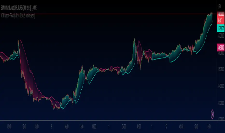
MTF seconds values - JDAdd MTF capabilities to "seconds" timeframes!!
This script is not intended to be used as an indicator but gives you a workaround to solve the missing seconds MTF capabilities.
The "resolution" function in Pinescript doesn't allow for seconds values to be put in MTF
So I wrote a little helper code with arrays to get MTF on seconds timeframes.
If you want to add MTF in minutes, hours,... you can always add ' resolution = "" ' to the study line of the script
With these arrays of MTF values you can perform various calculations.
As an example I plotted the sma from the MTF values on the chart, but you can add anything you want that you can calculate from the array values.
Have fun with it !
Gr, JD.

MTF Support & Resistance📌 Multi-Timeframe Support & Resistance (MTF S&R) Indicator
🔎 Overview:
The MTF Support & Resistance Indicator is a powerful tool designed to help traders identify critical price levels where the market is likely to react. This indicator automatically detects support and resistance zones based on a user-defined lookback period and extends these levels dynamically on the chart. Additionally, it provides multi-timeframe (MTF) support and resistance zones, allowing traders to view higher timeframe key levels alongside their current timeframe.
Support and resistance levels are crucial for traders as they help in determining potential reversal points, breakout zones, and trend continuation signals. By incorporating multi-timeframe analysis, this indicator enhances decision-making by providing a broader perspective of price action.
✨ Key Features & Benefits:
✅ Automatic Support & Resistance Detection – No need to manually plot levels; the indicator calculates them dynamically based on historical price action.
✅ Multi-Timeframe (MTF) Levels – Enables traders to see higher timeframe S&R levels on their current chart for better trend confirmation.
✅ Customizable Lookback Period – Adjust sensitivity by modifying the number of historical bars considered when calculating support and resistance.
✅ Color-Coded Visualization –
Green Line → Support on the current timeframe
Red Line → Resistance on the current timeframe
Dashed Blue Line → Higher timeframe support
Dashed Orange Line → Higher timeframe resistance
✅ Dynamic Extension of Levels – Levels extend left and right for better visibility across multiple bars.
✅ Real-Time Updates – Automatically refreshes as new price data comes in.
✅ Non-Repainting – Ensures reliable support and resistance levels that do not change after the bar closes.
📈 How to Use the Indicator:
Identify Key Price Levels:
The green line represents support, where price may bounce.
The red line represents resistance, where price may reject.
The blue dashed line represents support on a higher timeframe, making it a stronger level.
The orange dashed line represents higher timeframe resistance, helping identify major breakout zones.
Trend Trading:
Look for price action around these levels to confirm breakouts or reversals.
Combine with trend indicators (like moving averages) to validate trade entries.
Range Trading:
If the price is bouncing between support and resistance, consider range trading strategies (buying at support, selling at resistance).
Breakout Trading:
If the price breaks above resistance, it could indicate a bullish trend continuation.
If the price breaks below support, it could signal a bearish trend continuation.
⚙️ Indicator Settings:
Lookback Period: Determines the number of historical bars used to calculate support and resistance.
Show Higher Timeframe Levels (MTF): Enable/disable MTF support and resistance levels.
Extend Bars: Extends the drawn lines for better visualization.
Support/Resistance Colors: Allows users to customize the appearance of the lines.
⚠️ Important Notes:
This indicator does NOT generate buy/sell signals—it serves as a technical tool to improve trading analysis.
Best Used With Other Indicators: Consider combining it with volume, moving averages, RSI, or price action strategies for more reliable trade setups.
Works on Any Market & Timeframe: Forex, stocks, commodities, indices, and cryptocurrencies.
Use Higher Timeframe Levels for Stronger Confirmations: If a higher timeframe support/resistance level aligns with a lower timeframe level, it may indicate a stronger price reaction.
🎯 Who Should Use This Indicator?
📌 Scalpers & Day Traders – Identify short-term support and resistance levels for quick trades.
📌 Swing Traders – Utilize higher timeframe levels for position entries and exits.
📌 Trend Traders – Confirm breakout zones and key price levels for trend-following strategies.
📌 Reversal Traders – Spot potential reversal zones at significant S&R levels.
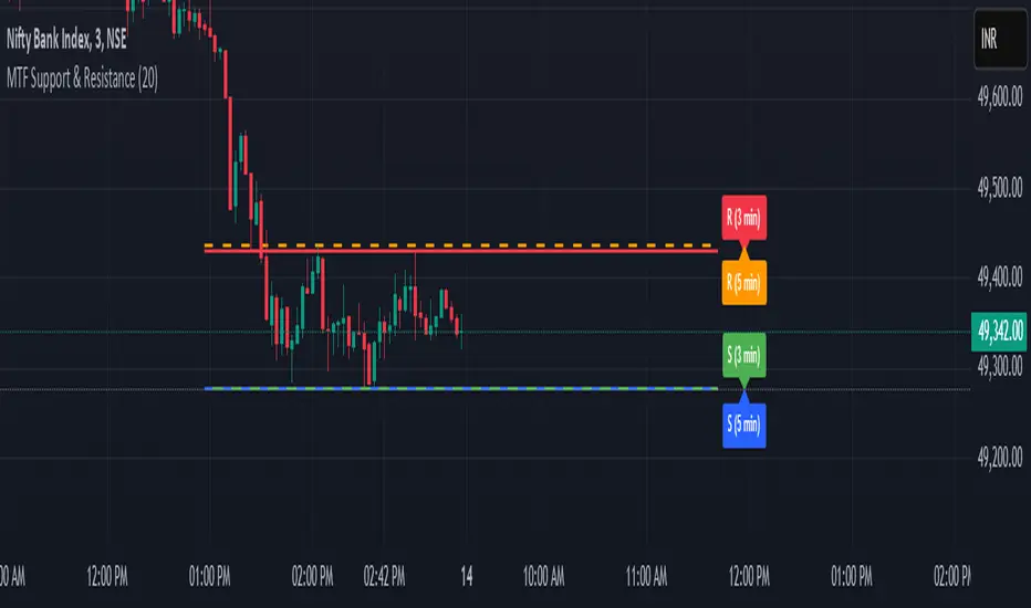
MTF Squeeze Analyzer - [tradeviZion]MTF Squeeze Analyzer
Multi-Timeframe Squeeze Pro Analyzer Tool
Overview:
The MTF Squeeze Analyzer is a comprehensive tool designed to help traders monitor the TTM Squeeze indicator across multiple timeframes in a streamlined and efficient manner. Built with Pine Script™ version 5, this indicator enhances your market analysis by providing detailed insights into squeeze conditions and momentum shifts, enabling you to make more informed trading decisions.
Key Features:
1. Multi-Timeframe Monitoring:
Comprehensive Coverage: Track squeeze conditions across multiple timeframes, including 1-minute, 5-minute, 15-minute, 30-minute, 1-hour, 2-hour, 4-hour, and daily charts.
Squeeze Counts: Keep count of the number of consecutive bars the price has been within each squeeze level (low, mid, high), helping you assess the strength and duration of consolidation periods.
2. Dynamic Table Display:
Customizable Appearance: Adjust table position, text size, and colors to suit your preferences.
Color-Coded Indicators: Easily identify squeeze levels and momentum shifts with intuitive color schemes.
Message Integration: Features rotating messages to keep you engaged and informed.
3. Alerts for Key Market Events:
Squeeze Start and Fire Alerts: Receive notifications when a squeeze starts or fires on your selected timeframes.
Custom Squeeze Count Alerts: Set thresholds for squeeze counts and get alerted when these levels are reached, allowing you to anticipate potential breakouts.
Fully Customizable: Choose which alerts you want to receive and tailor them to your trading strategy.
4. Momentum Analysis:
Momentum Oscillator: Visualize momentum using a histogram that changes color based on momentum shifts.
Detailed Insights: Determine whether momentum is increasing or decreasing to make more strategic trading decisions.
How It Works:
The indicator is based on the TTM Squeeze concept, which identifies periods of low volatility where the market is "squeezing" before a potential breakout. It analyzes the relationship between Bollinger Bands and Keltner Channels to determine squeeze conditions and uses linear regression to calculate momentum.
1. Squeeze Levels:
No Squeeze (Green): Market is not in a squeeze.
Low Compression Squeeze (Gray): Mild consolidation, potential for a breakout.
Mid Compression Squeeze (Red): Moderate consolidation, higher breakout potential.
High Compression Squeeze (Orange): Strong consolidation, significant breakout potential.
2. Squeeze Counts:
Tracks the number of consecutive bars in each squeeze condition.
Helps identify how long the market has been consolidating, providing clues about potential breakout timing.
3. Momentum Histogram:
Upward Momentum: Shown in aqua or blue, indicating increasing or decreasing upward momentum.
Downward Momentum: Displayed in red or yellow, representing increasing or decreasing downward momentum.
Using Alerts:
Stay ahead of market movements with customizable alerts:
1. Enable Alerts in Settings:
Squeeze Start Alert: Get notified when a new squeeze begins.
Squeeze Fire Alert: Be alerted when a squeeze ends, signaling a potential breakout.
Squeeze Count Alert: Set a specific number of bars for a squeeze condition, and receive an alert when this count is reached.
2. Set Up Alerts on Your Chart:
Click on the indicator name and select " Add Alert on MTF Squeeze Analyzer ".
Choose your desired alert conditions and customize the notification settings.
Click " Create " to activate the alerts.
How to Set It Up:
1. Add the Indicator to Your Chart:
Search for " MTF Squeeze Analyzer " in the TradingView Indicators library.
Add it to your chart.
2. Customize Your Settings:
Table Display:
Choose whether to show the table and select its position on the chart.
Adjust text size and colors to enhance readability.
Timeframe Selection:
Select the timeframes you want to monitor.
Enable or disable specific timeframes based on your trading strategy.
Colors & Styles:
Customize colors for different squeeze levels and momentum shifts.
Adjust header and text colors to match your chart theme.
Alert Settings:
Enable alerts for squeeze start, squeeze fire, and squeeze counts.
Set your preferred squeeze type and count threshold for alerts.
3. Interpret the Data:
Table Information:
The table displays the squeeze status and counts for each selected timeframe.
Colors indicate the type of squeeze, making it easy to assess market conditions at a glance.
Momentum Histogram:
Use the histogram to gauge the strength and direction of market momentum.
Observe color changes to identify shifts in momentum.
Why Use MTF Squeeze Analyzer ?
Enhanced Market Insight:
Gain a deeper understanding of market dynamics by monitoring multiple timeframes simultaneously.
Identify potential breakout opportunities by analyzing squeeze durations and momentum shifts.
Customizable and User-Friendly:
Tailor the indicator to fit your trading style and preferences.
Easily adjust settings without needing to delve into the code.
Time-Efficient:
Save time by viewing all relevant squeeze information in one place.
Reduce the need to switch between different charts and timeframes.
Stay Informed with Alerts:
Never miss a critical market movement with fully customizable alerts.
Focus on other tasks while the indicator monitors the market for you.
Acknowledgment:
This tool builds upon the foundational work of John Carter , who developed the TTM Squeeze concept. It also incorporates enhancements from LazyBear and Makit0 , providing a more versatile and powerful indicator. MTF Squeeze Analyzer extends these concepts by adding multi-timeframe analysis, squeeze counting, and advanced alerting features, offering traders a comprehensive solution for market analysis.
Note: Always practice proper risk management and test the indicator thoroughly to ensure it aligns with your trading strategy. Past performance is not indicative of future results.
Trade smarter with TradeVizion—unlock your trading potential today!

MTF Fusion - High Volume Expansion Channel [TradingIndicators]Exceptionally high volume and rapid price expansion are key markers of powerful moves, especially when they occur during a breakout or breakdown. The High Volume Expansion Channel (HVEC) uses our multi-timeframe fusion and price compression/expansion algorithms to look for high volume and rapid expansion from multiple higher timeframes at once. It uses this info to determine a high volume and expansion 'grade', and then encodes this result into a colored channel. This channel coloring varies in intensity based on how exceptionally high volume is and how rapidly price is expanding in either direction.
What is MTF Fusion?
Multi-Timeframe (MTF) Fusion is the process of combining calculations from multiple timeframes higher than the chart's into one 'fused' value or indicator. It is based on the idea that integrating data from higher timeframes can help us to better identify short-term trading opportunities within the context of long-term market trends.
How does it work?
Let's use the context of this indicator, which calculates a 'high volume and expansion grade' (let's call it HVEG), as an example to explain how MTF Fusion works and how you can perform it yourself.
Step 1: Selecting Higher Timeframes
The first step is to determine the appropriate higher timeframes to use for the fusion calculation. These timeframes should typically be chosen based on their ability to provide meaningful data and action which actively affect the price action of the smaller timeframe you're focused on. For example, if you are trading the 5 minute chart, you might select the 15 minute, 30 minute, and hourly timeframe as the higher timeframes you want to fuse in order to give you a more holistic view of the trends and action affecting you on the 5 minute. In this indicator, four higher timeframes are automatically selected depending on the timeframe of the chart it is applied to.
Step 2: Gathering Data and Calculations
Once the higher timeframes are identified, the next step is to calculate the data from these higher timeframes that will be used to calculate your fused values. In this indicator, for example, the HVEG value is calculated by determining the HVEG for all four higher timeframes.
Step 3: Fusing the Values From Higher Timeframes
The next step is to actually combine the values from these higher timeframes to obtain your 'fused' indicator values. The simplest approach to this is to simply average them. If you have calculated the HVEG value from three higher timeframes, you can, for example, calculate your 'multi-timeframe fused HVEG' as (HigherTF_HVEG_1 + HigherTF_HVEG_2 + HigherTF_HVEG_3) / 3.0.
Step 4: Visualization and Interpretation
Once the calculations are complete, the resulting fused indicator values are plotted on the chart. These values reflect the fusion of data from the multiple higher timeframes, giving a broader perspective on the market's behavior and potentially valuable insights without the need to manually consider values from each higher timeframe yourself.
What makes this script unique? Why is it closed source?
While the process described above is fairly unique and sounds simple, the truly important key lies in determining which higher timeframes to fuse together, and how to weight their values when calculating the fused end result in such a way that best leverages their relationship for useful TA.
This MTF Fusion indicator employs a smart, adaptive algorithm which automatically selects appropriate higher timeframes to use in fusion calculations depending on the timeframe of the chart it is applied to. It also uses a dynamic algorithm to adjust and weight the high volume and price expansion grade calculations depending on each higher timeframe's relationship to the chart timeframe. These algorithms are based on extensive testing and are the reason behind this script's closed source status.
Included Features
MTF Fusion high volume and expansion coloring
MTF Fusion ATR-based channel for visual effect
Channel width customization and explanatory labels
Pre-built color stylings
Options
Show Channel Lines: Show/hide the upper and lower lines of the channel
Fill Channel: Fill the channel with coloring depicting the current degree of high volume and rapid price expansion
Channel Width Multiplier: Sets the width of the ATR-based channel
Explanatory Labels: Show/hide explanatory labels describing the visuals
Lookback: Select how you want the degree of high volume expansion to be calculated (longer = long-term high volume and expansion, shorter = short-term high volume and expansion)
Pre-Built Color Styles: Use a pre-built color styling (uncheck to use your own colors)
Manual Color Styles: When pre-built color styles are disabled, use these color inputs to define your own
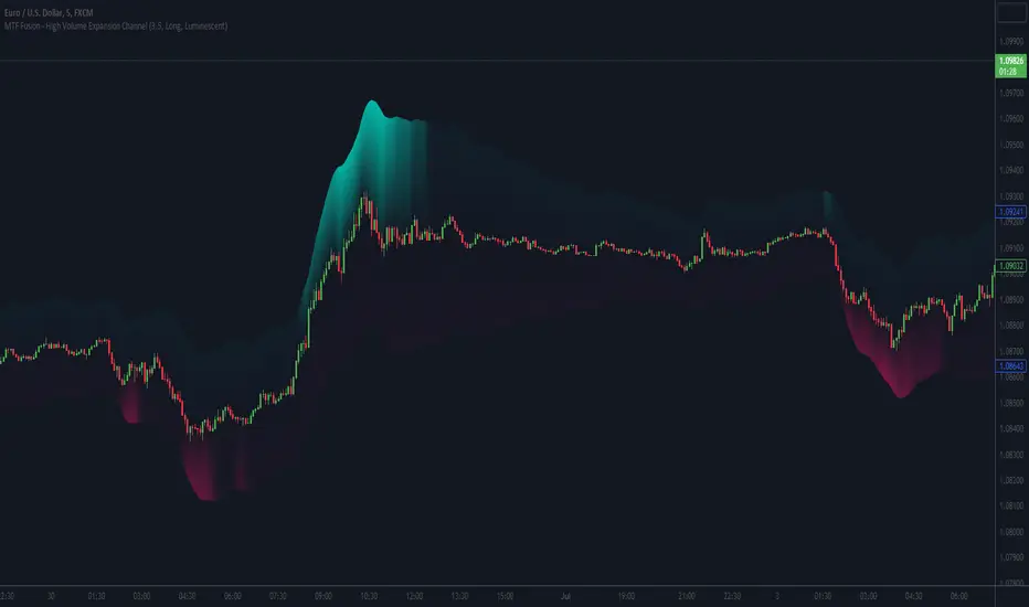
MTF Fusion - S/R Trendlines [TradingIndicators]MTF Fusion S/R Trendlines intelligently adapt to whatever timeframe you're trading - dynamically calculating support and resistance trendline levels combined from four appropriate higher timeframes to give you a much broader view of the market and an edge in your trading decisions.
These trendlines are not programmed to repaint - so you can use them in real-time just as they appeared historically.
What is MTF Fusion?
Multi-Timeframe (MTF) Fusion is the process of combining calculations from multiple timeframes higher than the chart's into one 'fused' value or indicator. It is based on the idea that integrating data from higher timeframes can help us to better identify short-term trading opportunities within the context of long-term market trends.
How does it work?
Let's use the context of this indicator, which calculates S/R Trendlines, as an example to explain how MTF Fusion works and how you can perform it yourself.
Step 1: Selecting Higher Timeframes
The first step is to determine the appropriate higher timeframes to use for the fusion calculation. These timeframes should typically be chosen based on their ability to provide meaningful price levels and action which actively affect the price action of the smaller timeframe you're focused on. For example, if you are trading the 5 minute chart, you might select the 15 minute, 30 minute, and hourly timeframe as the higher timeframes you want to fuse in order to give you a more holistic view of the trends and action affecting you on the 5 minute. In this indicator, four higher timeframes are automatically selected depending on the timeframe of the chart it is applied to.
Step 2: Gathering Data and Calculations
Once the higher timeframes are identified, the next step is to calculate the data from these higher timeframes that will be used to calculate your fused values. In this indicator, for example, the values of support and resistance trendlines are calculated for all four higher timeframes.
Step 3: Fusing the Values From Higher Timeframes
The next step is to actually combine the values from these higher timeframes to obtain your 'fused' indicator values. The simplest approach to this is to simply average them. If you have calculated the value of a support trendline from three higher timeframes, you can, for example, calculate your 'multi-timeframe fused trendline' as (HigherTF_Support_Trendline_1 + HigherTF_Support_Trendline_2 + HigherTF_Support_Trendline_3) / 3.0.
Step 4: Visualization and Interpretation
Once the calculations are complete, the resulting fused indicator values are plotted on the chart. These values reflect the fusion of data from the multiple higher timeframes, giving a broader perspective on the market's behavior and potentially valuable insights without the need to manually consider values from each higher timeframe yourself.
What makes this script unique? Why is it closed source?
While the process described above is fairly unique and sounds simple, the truly important key lies in determining which higher timeframes to fuse together, and how to weight their values when calculating the fused end result in such a way that best leverages their relationship for useful TA.
This MTF Fusion indicator employs a smart, adaptive algorithm which automatically selects appropriate higher timeframes to use in fusion calculations depending on the timeframe of the chart it is applied to. It also uses a dynamic algorithm to adjust and weight the lookbacks used for trendline calculations depending on each higher timeframe's relationship to the chart timeframe. These algorithms are based on extensive testing and are the reason behind this script's closed source status.
Included Features
Fusion Support and Resistance Trendlines
Dynamic Multi-Timeframe Trendlines
Breakaway Zone fills to highlight breakouts and breakdowns from the Fusion trendlines
Customizable lookback approach
Pre-built color stylings
Options
Fusion View: Show/hide the Fusion trendlines calculated from multiple higher timeframes
MTF View: Show/hide the trendlines from multiple higher timeframes used to calculate the Fusion trendlines
Breakaway Zones: Show/hide the fill for zones where price breaks away from the Fusion trendlines
Lookback: Select how you want your trendlines to be calculated (longer = long-term trendlines, shorter = short-term trendlines)
Pre-Built Color Styles: Use a pre-built color styling (uncheck to use your own colors)
Manual Color Styles: When pre-built color styles are disabled, use these color inputs to define your own

MTF EMA Trading SystemHere's a comprehensive description and usage guide for publishing your MTF EMA Trading System indicator on TradingView:
MTF EMA Trading System - Pro Edition
📊 Indicator Overview
The MTF EMA Trading System is an advanced multi-timeframe exponential moving average indicator designed for traders seeking high-probability setups with multiple confirmations. Unlike simple EMA crossover systems, this indicator combines trend alignment, momentum, volume analysis, and previous day confluence to generate reliable long and short signals with optimal risk-reward ratios.
✨ Key Features
1. Multi-Timeframe EMA Analysis
Configure 5 independent EMAs (default: 9, 21, 50, 100, 200)
Each EMA can pull data from ANY timeframe (5m, 15m, 1H, 4H, 1D, etc.)
Color-coded lines with customizable widths
End-of-line labels showing EMA period and timeframe (e.g., "EMA200 ")
Perfect for analyzing higher timeframe trends on lower timeframe charts
2. Advanced Signal Generation (Beyond Simple Crosses)
The system requires MULTIPLE confirmations before generating a signal:
LONG Signals Require:
✅ Price action trigger (EMA cross, bounce from key EMA, or pullback setup)
✅ Bullish EMA alignment (EMAs in proper ascending order)
✅ Volume spike confirmation (configurable threshold)
✅ RSI momentum confirmation (bullish but not overbought)
✅ Sufficient EMA separation (avoids choppy/whipsaw conditions)
✅ Price above previous day's low (confluence with support)
SHORT Signals Require:
✅ Price action trigger (EMA cross, rejection from key EMA, or pullback setup)
✅ Bearish EMA alignment (EMAs in proper descending order)
✅ Volume spike confirmation
✅ RSI momentum confirmation (bearish but not oversold)
✅ Sufficient EMA separation
✅ Price below previous day's high (confluence with resistance)
3. Real-Time Dashboard
Displays critical market conditions at a glance:
Overall trend direction (Bullish/Bearish/Neutral)
Price position relative to all EMAs
Volume status (spike or normal)
RSI momentum reading
EMA confluence strength
EMA separation quality
Current ATR value
Previous day high/low levels
Current signal status (LONG/SHORT/WAIT)
Risk-reward ratio
4. Clean Visual Design
Large, clear trade signal markers (green triangles for LONG, red triangles for SHORT)
No chart clutter - only essential information displayed
Customizable signal sizes
Professional color-coded dashboard
5. Built-In Risk Management
ATR-based calculations for stop loss placement
1:2 risk-reward ratio by default
All levels displayed in dashboard for easy reference
🎯 How to Use This Indicator
Step 1: Initial Setup
Add the indicator to your TradingView chart
Configure your preferred timeframes for each EMA:
EMA 9: Leave blank (uses chart timeframe) - Fast reaction to price
EMA 21: Leave blank or set to 15m - Key pivot level
EMA 50: Set to 1H - Intermediate trend
EMA 100: Set to 4H - Major trend filter
EMA 200: Set to 1D - Overall market bias
Adjust signal settings based on your trading style:
Conservative: Keep all confirmations enabled
Aggressive: Disable volume or momentum requirements
Scalping: Reduce min EMA separation to 0.2-0.3%
Step 2: Reading the Dashboard
Before taking any trade, check the dashboard:
Trend: Only take LONG signals in bullish trends, SHORT signals in bearish trends
Position: Confirm price is on the correct side of EMAs
Volume: Green spike = strong confirmation
RSI: Avoid extremes (>70 or <30)
Confluence: "Strong" = high probability setup
Separation: "Good" = trending market, avoid "Low" separation
Step 3: Trade Entry
For LONG Trades:
Wait for green triangle to appear below price
Verify dashboard shows:
Bullish or Neutral trend
Volume spike (preferred)
RSI between 50-70
Good separation
Enter at market or on next bar
Set stop loss at: Entry - (ATR × 2)
Set target at: Entry + (ATR × 4)
For SHORT Trades:
Wait for red triangle to appear above price
Verify dashboard shows:
Bearish or Neutral trend
Volume spike (preferred)
RSI between 30-50
Good separation
Enter at market or on next bar
Set stop loss at: Entry + (ATR × 2)
Set target at: Entry - (ATR × 4)
Step 4: Trade Management
Use the ATR values from dashboard for position sizing
Trail stops using the fastest EMA (EMA 9) as price moves in your favor
Exit partial position at 1:1 risk-reward, let remainder run to target
Exit immediately if dashboard trend changes against your position
💡 Best Practices
Timeframe Recommendations:
Scalping: 1m-5m chart with 5m, 15m, 1H, 4H, 1D EMAs
Day Trading: 5m-15m chart with 15m, 1H, 4H, 1D EMAs
Swing Trading: 1H-4H chart with 4H, 1D, 1W EMAs
Position Trading: 1D chart with 1D, 1W, 1M EMAs
Market Conditions:
Best in: Trending markets with clear direction
Avoid: Tight consolidation, low volume periods, major news events
Filter trades: Only take signals aligned with higher timeframe trend
Risk Management:
Never risk more than 1-2% per trade
Use ATR from dashboard to calculate position size
Respect the stop loss levels
Don't force trades when dashboard shows weak conditions
⚙️ Customization Options
EMA Settings (for each of 5 EMAs):
Length (period)
Timeframe (multi-timeframe capability)
Color
Line width
Show/hide toggle
Signal Settings:
Volume confirmation (on/off)
Volume spike threshold (1.0-3.0x)
Momentum confirmation (on/off)
RSI overbought/oversold levels
Minimum EMA separation percentage
ATR period and stop multiplier
Display Settings:
Show/hide EMA labels
Show/hide trade signals
Signal marker size (tiny/small/normal/large)
Show/hide dashboard
🔔 Alert Setup
The indicator includes 4 alert conditions:
LONG Signal - Fires when all long confirmations are met
SHORT Signal - Fires when all short confirmations are met
Bullish Setup - Early warning when trend aligns bullish with volume
Bearish Setup - Early warning when trend aligns bearish with volume
To set up alerts:
Right-click on chart → Add Alert
Select "MTF EMA Trading System"
Choose your desired alert condition
Configure notification method (popup, email, SMS, webhook)
📈 Performance Tips
Increase Win Rate:
Only trade in direction of higher timeframe trend
Wait for volume spike confirmation
Avoid trades during first 30 minutes and last 15 minutes of session
Skip trades when separation is "Low"
Reduce False Signals:
Increase minimum EMA separation to 0.7-1.0%
Enable all confirmation requirements
Only trade when confluence shows "Strong"
Combine with support/resistance levels
Optimize for Your Market:
Stocks: Use 9, 21, 50, 100, 200 EMAs
Forex: Consider 8, 13, 21, 55, 89 EMAs (Fibonacci)
Crypto: May need wider ATR multiplier (2.5-3.0x) for volatility
⚠️ Important Notes
This indicator is designed to reduce false signals by requiring multiple confirmations
No indicator is 100% accurate - always use proper risk management
Backtesting recommended before live trading
Market conditions change - adjust settings as needed
Works best in liquid markets with clear price action
🎓 Conclusion
The MTF EMA Trading System transforms simple moving average analysis into a sophisticated, multi-confirmation trading strategy. By combining trend alignment, momentum, volume, and confluence, it helps traders identify high-probability setups while filtering out noise and false signals. The clean interface and comprehensive dashboard make it suitable for both beginners and experienced traders across all markets and timeframes.
