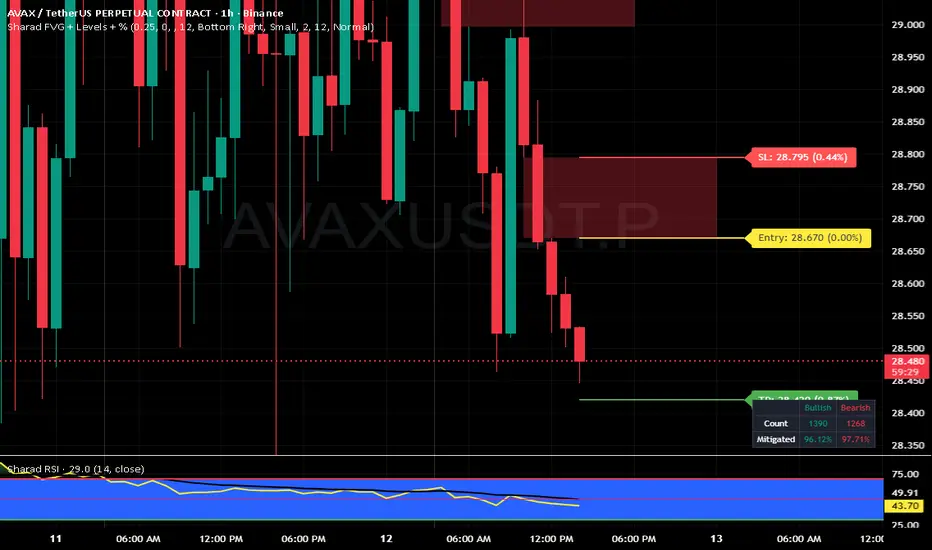
Sharad FVG (Last FVG SL/TP + Entry + % + Label Size)Sharad Fair Value Gap — Last FVG Entry, SL & TP (with % Labels)
What it is
A streamlined Fair Value Gap (FVG) tool that plots exact trading levels for the latest unmitigated FVG only:
Entry (yellow)
Stop-Loss (red)
Target (green) computed from a configurable Risk:Reward
Price and percentage distance printed on the right of each line
Optional dashboard and optional visualization of recent unmitigated/mitigated FVGs
The goal is simple: find the newest valid imbalance and give you just three actionable levels—no clutter.
How it detects FVGs
The script uses the standard 3-candle FVG logic (inspired by LuxAlgo’s implementation):
Bullish FVG forms when:
low > high and close > high and the gap size exceeds the Threshold filter.
The bullish gap is between high (lower bound) and low (upper bound).
Bearish FVG forms when:
high < low and close < low and the gap size exceeds the Threshold filter.
The bearish gap is between low (lower bound) and high (upper bound).
Threshold % filters small/weak gaps. You can also enable Auto, which estimates a dynamic threshold from recent candle ranges, so tiny imbalances don’t spam your chart in low-volatility regimes.
You may set Timeframe to detect FVGs on the chart timeframe or any higher/lower TF via request.security.
“Latest FVG only” levels (the core feature)
From the most recent unmitigated FVG (bullish or bearish), the script draws:
Entry
Bullish FVG → Entry = higher side of the gap (the gap max)
Bearish FVG → Entry = lower side of the gap (the gap min)
Stop-Loss (SL) = the opposite side of that same gap
Target (TP) = Entry + (Risk × R:R) for bulls, Entry − (Risk × R:R) for bears
where Risk = |Entry − SL| and R:R is your input (default 1:2)
Each line shows the price and its absolute % distance from Entry in parentheses—like TradingView’s long/short tool.
Alerts included
These are carried over from the base logic so you can build workflows:
Bullish FVG – when a new bullish gap is detected
Bearish FVG – when a new bearish gap is detected
Bullish FVG Mitigation – when a bullish gap is filled
Bearish FVG Mitigation – when a bearish gap is filled
Credits & License
Inspiration & base logic: LuxAlgo’s “Fair Value Gap ”.
This script: modified and extended by Sharad (Entry/SL/TP for latest FVG, price/% labels, label sizing, decluttered drawing).
License: This derivative keeps the original CC BY-NC-SA 4.0 license.
Attribution: Credit LuxAlgo for the original FVG approach and detection logic.
Non-Commercial: You may not use this for commercial purposes.
Share-Alike: If you remix/redistribute, you must use the same license and provide attribution.
Disclaimer:
Educational use only. Nothing in this script or its description is financial advice or a recommendation to buy/sell any asset. Markets involve substantial risk. Past performance and historical fill rates do not guarantee future results. You are solely responsible for your trading decisions and risk management. Data feeds, broker routing, spreads, slippage, and TradingView’s real-time behavior (especially with MTF) can affect outcomes. Test thoroughly on a demo account and consider multiple forms of confirmation before risking capital.
Pesquisar nos scripts por "imbalance"
FVG TrackerThis indicator automatically detects and tracks Fair Value Gaps (FVGs) on your chart, helping you quickly spot imbalances in price action.
Key Features:
📍 Identifies FVGs larger than 3 contracts
📐 Draws each valid FVG as a rectangle directly on the chart
⏳ Removes FVGs once they are fully filled
🔟 Keeps track of only the 10 most recent FVGs for clarity
⚡ Lightweight and optimized for real-time charting
This tool is ideal for traders who use FVGs as part of Smart Money Concepts (SMC) or imbalance-based strategies. By visually highlighting only meaningful gaps and clearing them once filled, it ensures a clean and actionable charting experience.

Spot Overlapping FVG - [FNDSFT]🧠 Overview
This script plots Higher Timeframe Fair Value Gaps (FVGs) with full visibility and precise placement on lower timeframe charts. Each timeframe (1D–12M) has its own independent toggle, custom label, and box styling, allowing traders to analyze broader market structures across swing and long-term horizons.
🎯 Features
✅ Identifies Fair Value Gaps using a 3-candle logic (candle 1 high vs candle 3 low, and vice versa).
✅ Plots HTF FVG boxes aligned to lower timeframes for comprehensive multi-timeframe analysis.
✅ Supports custom timeframes: 1D to 12M, with individual toggles.
✅ Full visual customization: border color, bullish/bearish box opacity, label font size and color.
✅ Modular inputs to enable or disable specific timeframes for performance.
✅ Uses barstate.isconfirmed logic for stable, non-repainting plots.
⚙️ How It Works
The script requests higher timeframe data via request.security. For each confirmed bar, it checks for FVGs based on:
Bullish FVG: low >= high
Bearish FVG: low >= high
If a gap is detected, a box is plotted between candle 1 and candle 3 using box.new().
Timeframe toggles ensure calculations remain within the limit of 40 request.security calls.
📈 Use Cases
Swing traders analyzing daily to monthly imbalances for medium-term strategies.
Position traders seeking to identify long-term imbalance zones for entries or exits.
ICT methodology practitioners visualizing higher timeframe displacement and inefficiencies.
Traders layering multiple HTF FVGs to build confluence-based trading decisions.
Smart Money Index Intraday (by CapitalCore)This indicator identifies imbalance zones (Fair Value Gaps) — key levels where price demonstrates significant gaps between supply and demand. It is designed for intraday trading and helps determine precise entry levels, as well as stop-loss and take-profit levels.
Key Features:
Automatic identification of bullish and bearish imbalances based on gap analysis in candle extremes
Volume-based signal filtering for improved accuracy (with customizable on/off parameters)
Display of specific entry levels (long entry / short entry) with price
Calculation and visualization of stop-loss and take-profit levels with customizable stop size
Integration with TradingView alert system for timely trading signal notifications
Compact indicator display directly on the chart without overlapping candles — histogram below the chart
Target Audience: The indicator is suitable for traders working on intraday timeframes (1m, 5m, 15m) who want to improve entry precision using Smart Money zones and volume filters.

FVG Candle TYHE42This indicator highlights potential Fair Value Gaps (FVGs) directly on the relevant candle by changing its body color.
The logic is simple yet effective:
A bullish FVG is detected when the current low is above the high from two candles back.
A bearish FVG is detected when the current high is below the low from two candles back.
When such a gap is detected, the previous candle is colored (default: yellow) to provide a clean, unobtrusive visual cue. This helps traders quickly identify price imbalances without cluttering the chart with shapes or labels.
Users can customize the highlight color from the settings to better suit their chart theme or personal preference.
This indicator is especially useful for traders using Smart Money Concepts (SMC), ICT, or other price imbalance-based strategies.

MA Thrust Processor | QuantEdgeB⚡MA Thrust Processor | QuantEdgeB
🔭 What is the MA Thrust Processor?
The MA Thrust Processor (MTP) is a dynamic and modular market momentum engine that specializes in thrust-based signal analysis derived from smoothed moving averages. It’s engineered to model directional commitment, detect signal imbalances, and visualize structural momentum in a range of market conditions.
🧬 Think of MTP as a precision-engineered motion sensor — decoding strength, follow-through, and structural imbalance in real time — it detects force, direction, velocity, and alignment, adapting based on your preferred calculation model (Wave, Thrust, Z-Score, or Normalized) and signal mode (Impulse, Trend, or HA Candles).
_______________________
1. 🔧 System Core: Customizability and Processing Engine
📊 Moving Average Types
MA Thrust Processor supports a rich menu of 13+ moving average styles:
• Standard: SMA, EMA, WMA
• Advanced: HMA, LSMA, ALMA, JMA, TEMA, DEMA, SMMA
• Volume-Based: VWMA
• Adaptive Models: VIDYA (3 modes), FRAMA
💡 Each MA type acts as the backbone for signal smoothing and thrust deviation modeling, giving the user tight control over behavior and lag tradeoffs.
⚙️ Calculation Methods (MA Derivatives)
You choose how the core value is calculated:
1️⃣ 𝓦𝓪𝓿𝓮
• Sine-wave modeled oscillator
• Combines MA distance with standard deviation normalization
• Ideal for detecting divergences and cyclical structure
• Output includes center, smoothed line , and histogram.
2️⃣ 𝓣𝓱𝓻𝓾𝓼𝓽
• Calculates MA deviation vs. price and midpoint
• Captures aggressive directional pushes relative to range center
• Excellent for breakout/trend force analysis
3️⃣ 𝓩-𝓢𝓬𝓸𝓻𝓮
• Mean-reverting z-score over MA
• Expresses statistical distance from norm
• Used in reversion or probabilistic strategies
4️⃣ 𝓝𝓸𝓻𝓶𝓪𝓵𝓲𝔃𝓮𝓭
• Scales MA output to 0–1 (centered at 0.5)
• Tracks where the signal lies in its own relative range
• Great for flat vs. trending recognition
_______________________
2. 🧨 SIGNAL MODES – The Behavioral Core
The system supports 3 powerful signal modes that define how the thrust logic is interpreted and visualized.
1️⃣ 𝓘𝓶𝓹𝓾𝓵𝓼𝓮 Mode
🔥 Use Case: Breakouts, aggressive reversals, divergences
🔍 Logic:
• In Wave mode: compares Wave O (oscillator) and S (smoothed)
• In Thrust/Z-Score/Normalized: applies thresholds (static, SD, or percentile)
• Detects sharp departures or rejections from bounds
🎯 Ideal for:
• Scalp or event trades
• High-velocity moves
• Leading edge of trend or compression breaks
2️⃣ 𝓣𝓻𝓮𝓷𝓭 Mode
🧭 Use Case: Stable continuation and trend following
🔍 Logic:
• Signal triggers when value crosses a calculated midline or long-term average
• Thresholds: midline or 365-SMA of smoothed value
• Acts as a stable “bias direction” for trades
🎯 Ideal for:
• Swing trading
• Portfolio allocations
• Holding directional exposure longer
3️⃣ 𝓗𝓐 𝓒𝓪𝓷𝓭𝓵𝓮𝓼 Mode
🎨 Use Case: Visual clarity + phase detection
🔍 Logic:
• Converts signal to Heikin-Ashi candles
• Adds logic for momentum, reversal, continuation, or chop
• Highly discretionary and pattern-oriented
🎯 Ideal for:
• Visual traders
• Phase-based strategies
• Avoiding false positives in chop
_______________________
3. 📊 System Sensor Table (Strength Meter)
MA Thrust Processor includes a sophisticated sensor display with multi-layered insights.
🔁 Signal State
• Long ⟹ bullish conviction or thrust
• Short ⟹ bearish dominance or rejection
• Cash ⟹ neutrality or low conviction
Dynamically generated by logic mode and indicator thresholds.
📊 Strength Bars: Conviction + Potential
Strength output is never binary — instead, it’s expressed via:
1️⃣ Conviction Strength (when signal is active):
• Score from 0% to 100%
• Based on:
o Momentum velocity (Rate of Change)
o Distance from key thresholds
o Divergence signal (Wave mode)
o Flat signal detection (for Normalized)
2️⃣ Potential Strength (when signal = neutral):
• Displays both Bullish and Bearish readiness
• Interprets which side is loading pressure
• Helps traders spot “who has the edge” before breakout
👀 In Wave Mode, potential is calculated from oscillator vs. smoothed
👀 In Impulse/Trend, it blends distance + RoC + signal stability
🔸 HA Candle Phase (HA Mode Only)
When HA mode is active, strength bars are replaced with a live phase classifier:
• Momentum Up/Down: price above/below threshold + same color trend
• Reversal Up/Down: price above/below bounds, opposite signal color
• Continuation Up/Down: following a breakout/confirmation
• Chop: indecision zone
• Neutral: no clear trend
This turns HA mode into a narrative engine, expressing what’s happening, why, and what might come next.
_______________________
4. 🧠 Smart Auto-Configuration
Enabling Use Recommended Settings triggers optimized configurations:
• Pre-set thresholds (static, percentile, SD)
• Ideal lengths for each logic type
• Proper bounds scaling
• MA selections that match the logic
For example:
• Impulse + Thrust ⇒ shorter length + SD
• Trend + Z-Score ⇒ long mean-based
• Wave ⇒ balanced smoothing + SD blend
_______________________
5. 🧪 Summary of Use Cases
Each mode and calculation method within the MA Thrust Processor is tailored for specific trading styles and market conditions. Here’s how to think about their best applications:
🔹 Signal Modes
Impulse Mode is designed for speed and responsiveness. It excels in fast markets where breakouts or sharp reversals happen quickly. Ideal for scalpers, intraday traders, or anyone looking to catch momentum just as it ignites. It’s particularly effective around high-impact events like economic reports or news catalysts, as it picks up directional shifts rapidly.
Trend Mode focuses on longer-term, stable price action. It identifies directional bias using midline or average-based thresholds, making it best for swing traders and trend followers. Because of its stability, it filters out minor fluctuations and helps you stay in trades longer when the directional move is sustained.
HA Candles Mode is for traders who prefer a visual, phase-based approach. It smooths data using Heikin-Ashi logic and adds interpretive layers like "Momentum," "Reversal," or "Chop" to describe what’s happening structurally. This is excellent for discretionary traders, those who use price rhythm or structure, and those seeking cleaner entry points in noisy environments.
🔹 Calculation Methods
Wave is an oscillator-based model. It detects momentum swings and divergence between price and the smoothed oscillator. Great for spotting early reversals, pullback continuations, or cyclical rhythm patterns. In Impulse mode, it shows histogram shifts that reflect internal thrust dynamics.
Thrust quantifies directional pressure by comparing the signal’s distance from both the midpoint of price range and an SMA. This method is powerful when you want to assess how much true force is behind a move — especially useful during breakout scenarios or strong directional pushes.
Z-Score mode normalizes the signal to its statistical distance from the mean. This makes it ideal for mean reversion strategies or situations where price has deviated too far from historical behavior. Traders can look for exhaustion zones or pullback opportunities with greater confidence.
Normalized rescales the signal within a 0–1 range (centered at 0.5), helping traders understand where the price sits within its own context — whether it’s relatively extended or compressed. It’s great for range traders, flat market identification, or mapping gradual bias accumulation.
_______________________
Each mode and method has been thoughtfully designed to align with different strategy frameworks — and switching between them completely reconfigures the way the system operates, giving traders unmatched flexibility across timeframes and asset classes
_______________________
🧭 Conclusion
MA Thrust Processor isn’t just a tool - it’s a precision-calibrated thrust engine that gives market context form. It lets you define your logic, style, and MA behavior while delivering rich visual output and conviction-based strength insight.
Whether you're reading momentum waves, modeling thrust deviation, or interpreting candle structure, MTP adapts to your strategy.
🚀 From short-term scalps to long-term rotations, MTP delivers signal clarity with the quantitative conviction needed in modern markets.
📌 Trade with Statistical Precision | Powered by QuantEdgeB
🔹 Disclaimer: Past performance is not indicative of future results.
🔹 Strategic Advice: Always backtest, optimize, and align parameters with your trading objectives and risk tolerance before live trading.

SMT Divergence ICT 02 [TradingFinder] Smart Money Technique SMC🔵 Introduction
SMT Divergence (Smart Money Technique Divergence) is a price action-based trading concept that detects discrepancies in market behavior between two assets that are generally expected to move in the same direction. Rooted in ICT (Inner Circle Trader) methodology, this approach helps traders recognize subtle signs of market manipulation or imbalance, often ahead of traditional indicators.
The core idea behind SMT divergence is simple: when two correlated instruments—such as currency pairs, indices, or assets from the same sector—start forming different swing points (highs or lows), this can reveal a lack of confirmation in the trend. Such divergence is often a precursor to a price reversal or pause in momentum.
This technique works effectively across various markets including Forex, stocks, and cryptocurrencies. It’s particularly valuable when used alongside concepts like liquidity sweeps, market structure breaks (MSBs), or order block identification.
In advanced use cases, Sequential SMT helps uncover patterns of alternating divergences across sessions, often signaling engineered liquidity traps before price reacts.
When combined with the Quarterly Theory—which segments market behavior into Accumulation, Manipulation, Distribution, and Continuation/Reversal phases—traders gain insight not only into where divergence happens, but when it's most likely to be significant within the market cycle.
Bullish SMT :
Bullish SMT Divergence occurs when one asset prints a higher low while the correlated asset forms a lower low. This asymmetry often suggests that the downside move is losing strength, hinting at a potential bullish shift.
Bearish SMT :
Bearish SMT Divergence is formed when one asset creates a higher high, while the second asset fails to confirm by printing a lower high. This typically signals weakening bullish pressure and the possibility of a reversal to the downside.
🔵 How to Use
The SMT Divergence indicator is designed to detect imbalances between two positively correlated assets—such as major currency pairs, indices, or commodities. These divergences often indicate early signs of market inefficiency or smart money manipulation and can help traders anticipate trend shifts with higher precision.
Unlike traditional divergence indicators or earlier versions of this script, this upgraded version does not rely solely on consecutive pivot comparisons. Instead, it dynamically scans all available pivots within the chart to identify divergences at any structural level—major or minor—across the price action. This broader detection method increases the reliability and frequency of meaningful SMT signals.
Moreover, when integrated with Sequential SMT logic, the indicator is capable of identifying multiple divergence sequences across sessions. These sequences often signal engineered liquidity traps and can be mapped within the Quarterly Theory framework, allowing traders to pinpoint not just the presence of divergence but also the phase of the market cycle it appears in (Accumulation, Manipulation, Distribution, or Continuation).
🟣 Bullish SMT Divergence
This signal occurs when the primary asset forms a higher low, while the correlated asset forms a lower low. This pattern implies weakening bearish momentum and a potential shift to the upside.
If the correlated asset breaks its previous low but the primary asset does not, this divergence suggests absorption of selling pressure and possible accumulation by smart money—making it a strong bullish signal, especially when aligned with a favorable market phase (e.g., the end of a manipulation phase in Q2).
🟣 Bearish SMT Divergence
This signal occurs when the primary asset creates a higher high, while the correlated asset forms a lower high. This mismatch indicates fading bullish momentum and a potential reversal to the downside.
If the correlated asset fails to confirm a breakout made by the main asset, the divergence may point to distribution or exhaustion. When seen within Q3 or Q4 phases of the Quarterly Theory, this pattern often precedes sharp declines or fake-outs engineered by smart money
🔵 Settings
⚙️ Logical Settings
Symbol : Choose the secondary asset to compare with the main chart asset (e.g., XAUUSD, US100, GBPUSD).
Pivot Period : Sets the sensitivity of the pivot detection algorithm. A smaller value increases responsiveness to price swings.
Activate Max Pivot Back : When enabled, limits the maximum number of past pivots to be considered for divergence detection.
Max Pivot Back Length : Defines how many past pivots can be used (if the above toggle is active).
Pivot Sync Threshold : The maximum allowed difference (in bars) between pivots of the two assets for them to be compared.
Validity Pivot Length : Defines the time window (in bars) during which a divergence remains valid before it's considered outdated.
🎨 Display Settings
Show Bullish SMT Line : Draws a line connecting the bullish divergence points.
Show Bullish SMT Label : Displays a label on the chart when a bullish divergence is detected.
Bullish Color : Sets the color for bullish SMT markers (label, shape, and line).
Show Bearish SMT Line : Draws a line for bearish divergence.
Show Bearish SMT Label : Displays a label when a bearish SMT divergence is found.
Bearish Color : Sets the color for bearish SMT visual elements.
🔔 Alert Settings
Alert Name : Custom name for the alert messages (used in TradingView’s alert system).
Message Frequency :
All : Every signal triggers an alert.
Once Per Bar : Alerts once per bar regardless of how many signals occur.
Per Bar Close : Only triggers when the bar closes and the signal still exists.
Time Zone Display : Choose the time zone in which alert timestamps are displayed (e.g., UTC).
Bullish SMT Divergence Alert : Enable/disable alerts specifically for bullish signals.
Bearish SMT Divergence Alert : Enable/disable alerts specifically for bearish signals
🔵Conclusion
The SMT Plus indicator offers a refined and powerful approach to detecting smart money behavior through divergence analysis between correlated assets. By removing the limitations of consecutive pivot comparisons and allowing for broader structural detection, it captures more accurate and timely signals that often precede major market moves.
When paired with frameworks like Sequential SMT and the Quarterly Theory, the indicator not only highlights where divergence occurs, but also when in the market cycle it's most likely to matter. Its flexible settings, customizable visuals, and integrated alert system make it suitable for intraday scalpers, swing traders, and even long-term macro analysts.
Whether you're using it as a standalone decision-making tool or combining it with other ICT concepts, SMT Plus gives you an edge in recognizing manipulation, timing reversals, and staying in sync with the real market narrative—not just the chart.

Gap Fill DetectorThe Gap Fill Detector is a visual tool designed to highlight potential price imbalances caused by sudden, sharp movements following periods of low volatility or indecision. These events can often result in "gaps" or "voids" in price action that may later attract a return move — commonly referred to as a gap fill.
This indicator helps traders visually identify these unique conditions and monitor whether price revisits the origin of the move. It does so by marking the location of the price gap and providing a clean, color-coded interface to track price interaction with that level over time.
🔧 Key Features
🔸 Highlight Zones
When the script detects a potential gap-forming move, the background of the triggering candle is highlighted. These areas represent potential moments of price imbalance or sudden breakout behavior.
🔸 Gap Fill Line
A horizontal line is drawn from the close of the candle before the spike (representing the likely gap origin). This line acts as a reference for tracking whether price returns to "fill" the gap. The line is persistent but will automatically hide once price intersects it, or if another gap signal occurs.
🔸 Intelligent Auto-Hide Logic
Once the gap line has been touched by price or interrupted by a new spike event, it is removed from view. This keeps the chart clean and avoids clutter from outdated signals.
🔸 Dynamic Fill Shading
The area between the current price and the gap line is filled with a color-coded visual cue:
🟩 Green Fill: When price is above the gap line — a possible bullish continuation.
🟪 Purple Fill: When price is below the gap line — a potential retracement or bearish correction. Fill transparency is customizable to blend with your chart style.
🔸 Stability Zones (Optional)
Users can optionally enable shaded background zones to mark extended periods of price stagnation. These zones may help identify moments where the market is "winding up" before releasing energy in the form of a fast move.
⚙️ Customization Options
Base highlight color & transparency
Enable/disable stability zone highlighting
Adjustable gap fill area transparency
✅ Use Cases
This tool is ideal for:
Intraday traders seeking gap fills or mean reversion setups
Swing traders identifying sudden breakouts for future re-entry
Visual traders who want a clean, automated way to spot and manage price dislocations

CLS Patterns + Price Action Levels📌 Key Features:
✅ CLS Candle Patterns Detection:
CLS Type 1 (Sweeps & Closes Opposite) – Confirms liquidity sweeps with opposite direction close.
CLS Type 2 (Sweeps but No Opposite Close) – Identifies liquidity traps without full reversal.
CLS Type 3 (Engulfing Candles) – Strong momentum shifts with engulfing price action.
CLS Type 4 (Order Block Reversals) – Institutional order flow recognition.
✅ Institutional & Price Action Levels:
250 Pip Institutional Levels – Major S&R zones for Forex & Indices.
Minor Quarter Points (25 Pips) – Intraday precision for refined entries.
✅ Liquidity Imbalance & Order Flow Gaps:
Detects early impulse moves & liquidity voids
Highlights areas of market inefficiency & potential reversals
✅ Higher Timeframe EMA for Trend Confirmation:
Customizable Weekly 3 EMA Overlay
Dynamic color change based on price action
✅ Built-in Alerts for CLS Patterns:
Real-time alerts for CLS buy/sell signals
Configurable notifications for trade execution
🎯 How to Use:
1️⃣ Enable CLS Pattern Signals to spot liquidity sweep candles with directional confirmation.
2️⃣ Use Institutional & QP Levels to identify key areas where price is likely to react.
3️⃣ Monitor Liquidity Imbalances to detect inefficient price moves that may fill.
4️⃣ Confirm Trend with HTF EMA to trade with momentum.
5️⃣ Set Alerts for CLS patterns and key price levels to stay ahead of the market.
This indicator is ideal for Forex, Indices, and Crypto traders looking to refine their entries with precise price action confirmations.
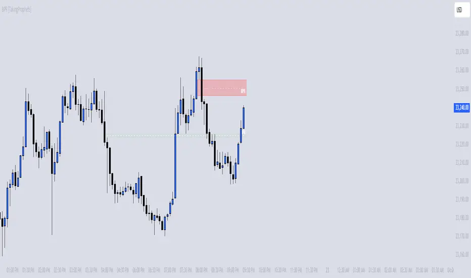
BPR [TakingProphets]The BPR (Balanced Price Range) Indicator by Taking Prophets is built for traders who follow ICT (Inner Circle Trader) concepts and smart money strategies. In ICT methodology, a Balanced Price Range (BPR) occurs when price rapidly moves in one direction, creating an imbalance that often gets revisited before price continues its trend. These areas represent inefficiencies in the market where liquidity was not properly distributed, making them key zones for potential retracements and trade setups.
How the Indicator Works:
🔹 Automatically Detects BPRs – No need to manually mark imbalances; the indicator highlights them for you.
🔹 Helps Identify Smart Money Footprints – Spot areas where price is likely to retrace and rebalance liquidity.
🔹 Customizable Sensitivity – Adjust detection parameters based on your preferred trading style.
🔹 Works Across All Markets – Apply it to Forex, Futures, Crypto, and Stocks on TradingView.
🔹 Clean and Intuitive Interface – Designed to be simple yet powerful for both new and experienced traders.
Crodl Market StructureCrodl Market Structure | FVG | MFI | EMA
The Crodl Market Structure indicator is a powerful trading tool designed to help traders identify key price movements, trend direction, and potential liquidity zones. It combines Fair Value Gaps (FVGs), Money Flow Index (MFI) Trend Filters, and Exponential Moving Averages (EMAs) to provide a structured market view.
Features:
Exponential Moving Averages (EMAs) – Trend Confirmation
Tracks EMA 20, EMA 50, and EMA 200 to identify trend direction.
EMAs change color dynamically based on price action.
Helps traders determine uptrends, downtrends, and potential reversals.
Money Flow Index (MFI) – Trend Strength & Exhaustion
Uses MFI to detect overbought (80) and oversold (20) levels.
Confirms trend exhaustion and highlights potential reversals.
Works with EMAs to generate high-confidence entry signals.
Fair Value Gap (FVG) – Liquidity & Price Imbalance
Identifies Fair Value Gaps (price imbalances) based on 3 consecutive bullish or bearish candles.
Marks liquidity zones where price may return for mitigation.
Toggle ON/OFF to show/hide Fair Value Gaps on the chart.
Smart Buy & Sell Signals
🔺 Bullish Entry Signal: Price crosses above EMA 20 after oversold MFI & downtrend.
🔻 Bearish Entry Signal: Price crosses below EMA 20 after overbought MFI & uptrend.
Helps confirm trend continuation or reversal opportunities.
🔹 How to Use:
1️⃣ Trend Analysis – Check EMAs alignment to identify the overall trend.
2️⃣ Momentum Confirmation – Use MFI to spot trend exhaustion before price reverses.
3️⃣ Liquidity Gaps – Watch for Fair Value Gaps (FVGs) to anticipate price retracements.
🔹 Settings:
EMA Settings: Enable/Disable EMAs, adjust lengths (20, 50, 200).
MFI Trend Filter: Enable/Disable trend signals, customize MFI levels.
Fair Value Gaps: Show/Hide FVGs, adjust extension & colors.

Liquidity Trap Detector (LTD)The Liquidity Trap Detector is an advanced trading tool designed to identify liquidity zones and potential traps set by institutional players. It provides traders with a comprehensive framework to align with smart money movements, helping them avoid common retail pitfalls such as bull and bear traps.
The indicator focuses on detecting liquidity sweeps, breaker blocks, and areas of institutional accumulation/distribution. It integrates multiple technical analysis methods to offer high-probability signals and insights into how liquidity dynamics unfold in the market.
Note : This indicator is not designed for beginners; it is intended for traders who already have a solid understanding of trading fundamentals. It is tailored for individuals who are familiar with concepts like liquidity, order blocks, and traps. Traders with at least 6 months to 1 year of trading experience will fully appreciate the power and potential of this indicator, as they will have the necessary knowledge to leverage its features effectively. Beginners may find it challenging to grasp the advanced concepts embedded in this tool.
Why Combine These Elements?
The components of the Liquidity Trap Detector are carefully chosen to address the core challenges of identifying institutional activity and liquidity traps. Here’s why each element is included and how they work together:
1. Order Blocks:
• Purpose: Identify zones where large institutional players accumulate or distribute positions.
• Role in the Indicator: These zones act as primary liquidity areas, where price is likely to reverse or consolidate due to significant order flow.
2. Breaker Blocks:
• Purpose: Highlight areas where liquidity has been swept, leading to potential price reversals or continuations.
• Role in the Indicator: Confirms whether a liquidity trap has occurred and provides actionable levels for entry or exit.
3. ATR-Based Volatility Zones:
• Purpose: Filter signals based on market volatility to ensure trades align with statistically significant price movements.
• Role in the Indicator: Defines dynamic support and resistance zones, improving the accuracy of signal generation.
4. Volume Delta:
• Purpose: Measure the imbalance between aggressive buyers and sellers, often indicating institutional activity.
• Role in the Indicator: Validates whether a liquidity trap is backed by smart money absorption or retail-driven momentum.
5. Trend Confirmation (EMA):
• Purpose: Align liquidity trap signals with the broader market trend, reducing false positives.
• Role in the Indicator: Ensures trades are executed in the direction of the prevailing trend.
What Makes It Unique?
1. Gen 1 Liquidity Zones and Traps:
• The indicator identifies Gen 1 Liquidity Zones, which represent the first areas where liquidity is accumulated or swept. While these zones often lead to reversals, they can sometimes fail, resulting in continuation moves. The indicator highlights these scenarios, helping traders adapt.
• For example, a bull trap identified in a Gen 1 Zone may see price move higher after an initial red candle, completing a secondary liquidity sweep before reversing.
2. Multi-Layer Signal Validation:
• Signals are only generated when liquidity, volume, trend, and volatility align. This ensures high-probability setups and reduces noise in choppy markets.
3. Dynamic Adaptability:
• ATR-based zones and volume delta filtering allow the indicator to adapt to different market conditions, from trending to range-bound environments.
4. Institutional Insights:
• By focusing on liquidity sweeps, order blocks, and volume imbalances, the indicator helps traders align with institutional strategies rather than retail behavior.
How It Works
The Liquidity Trap Detector uses a step-by-step process to identify and validate liquidity traps:
1. Identifying Liquidity Zones:
• Order Blocks: Mark key zones of institutional activity where price is likely to reverse.
• Breaker Blocks: Highlight areas where liquidity sweeps have occurred, signaling potential traps.
2. Filtering with Volatility (ATR):
• ATR defines dynamic support and resistance zones, ensuring signals are only generated near significant price levels.
3. Validating Traps with Volume Delta:
• Volume delta shows whether liquidity sweeps are backed by aggressive buying/selling from institutions, confirming the trap’s validity.
4. Aligning with Market Trends:
• EMA ensures signals align with the broader trend to reduce false positives.
5. Monitoring Gen 1 Liquidity Zones:
• The indicator highlights Gen 1 Liquidity Zones where price may initially reverse or sweep further before a true reversal. Traders are alerted to potential continuation scenarios if volume or momentum suggests unmet liquidity above/below the zone.
How to Use It
Buy Signal:
• Triggered when:
• Price sweeps below an order block and forms a breaker block, indicating a liquidity trap.
• Volume delta confirms aggressive selling absorption.
• ATR volatility zone supports the reversal.
• EMA confirms a bullish trend.
• Action: Enter a Buy trade and set:
• Stop Loss (SL): Below the order block.
• Take Profit (TP): Near the next resistance or liquidity zone.
Sell Signal:
• Triggered when:
• Price sweeps above an order block and forms a breaker block, indicating a liquidity trap.
• Volume delta confirms aggressive buying absorption.
• ATR volatility zone supports the reversal.
• EMA confirms a bearish trend.
• Action: Enter a Sell trade and set:
• SL: Above the order block.
• TP: Near the next support or liquidity zone.
Timeframes:
• Best suited for scalping and intraday trading on lower timeframes (5m, 15m, 1H).
• Can also be applied to swing trading on higher timeframes.
Example Scenarios:
1. Bull Trap in a Gen 1 Zone:
• Price sweeps above a resistance order block, forms a breaker block, and reverses sharply. However, if momentum persists, price may continue higher after a minor pullback. The indicator helps traders anticipate this by monitoring volume and trend shifts.
2. Bear Trap with Secondary Sweep:
• Price sweeps below a support order block but fails to reverse immediately, instead forming a secondary liquidity sweep before turning bullish. The indicator highlights both scenarios, allowing for flexible trade management.
Why Use It?
The Liquidity Trap Detector offers:
1. Precision: Combines multiple filters to identify institutional liquidity traps with high accuracy.
2. Adaptability: Works across trending and range-bound markets.
3. Smart Money Alignment: Helps traders avoid retail traps by focusing on liquidity sweeps and institutional behavior.
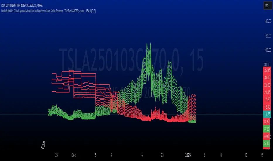
Venta's DikFat Spread Visualizer & Dynamic Options Chain
**Venta's DikFat Spread Visualizer and Options Chain Strike Scanner** is a powerful trading tool designed to give users an immediate view of the nearest options strikes relative to the current price of the underlying asset. This script dynamically displays a selected number of call and put options strikes from the **options chain**, visualizing them directly on the chart for better decision-making.
By default, the script shows options strikes for the current chart’s price, but users have the flexibility to extend the view to include strikes on the opposite side of the market. The available options allow you to show either 3, 6, or 9 strikes on either side of the current price level.
This tool is essential for options traders who want to track strike prices in relation to the underlying asset's price movements. It provides key visual clues such as strike price distributions, volatility, and potential areas of market basing—all in a customizable and user-friendly interface.
---
█ CONCEPTS
This script pulls real-time **options strikes** directly from the **options chain**, providing traders with the ability to see call and put strikes as dynamic price markers on their chart. The concept revolves around understanding the proximity and distribution of strikes based on the current price and market conditions.
Key Features
**Dynamic Options Strike Display**: The script automatically identifies and displays the options strikes closest to the current market price of the underlying asset.
**Customizable Strike Range**: Choose between 3, 6, or 9 strikes on either side of the current price, giving flexibility in visualizing different strike ranges.
**Current Chart Focused by Default**: When added to the chart, the script focuses on the strikes closest to the current price. However, users can opt to include strikes on the opposite side of the market for a broader view.
**Instant Market Context**: The displayed
strikes offer a snapshot of the options market and how the current price relates to potential option expiration levels, helping traders understand key zones.
**Visual Clues on Spreads & Volatility**: This script not only displays the strikes but also provides instant visual clues that reflect the volatility and spread of the options market.
---
█ HOW IT WORKS
The script operates by accessing the **options chain** for the underlying asset, identifying the nearest call and put strikes, and plotting them as visual markers on the chart. This real-time strike data is dynamic, adjusting automatically as the market price moves.
Strike Calculation
The script uses the current price of the underlying asset as a base point and calculates the nearby **options strikes** from the **options chain**.
Depending on the user's settings, the script will plot up to 9 strikes on either side of the price level.
This calculation is performed using live market data, making sure the plotted strikes always reflect the most current market conditions.
Visual Clues
**Spreads**: The space between the plotted call and put options strikes provides immediate insights into the current bid/ask spreads. If the spread between strike prices is wide, it suggests increased volatility or a higher level of uncertainty in the market. Conversely, narrow spreads often indicate market stability or a lack of price movement.
**Market Basing**: When options strikes form a concentrated group near a certain price level, it can indicate that the market is building up or basing at a key level. This might signal the potential for a breakout or a reversal.
**Volatility Insights**: Wider gaps between strikes, particularly on the call side versus the put side (or vice versa), can indicate an imbalance in options trading activity, often a reflection of higher volatility expectations. This visual clue can help traders assess when the market is pricing in significant movements.
Customization and User Settings
**Number of Strikes**: The number of options strikes shown is fully customizable, allowing users to display 3, 6, or 9 strikes on either side.
**Show Opposite Strikes**: By default, the script shows strikes on the current side of the market, but users can enable the option to show strikes on the opposite side to gain a more complete view of the market's options landscape.
**Strike Colors & Width**: Customize the visual appearance of the plotted strikes by adjusting the color and line width for better clarity and chart aesthetics.
---
█ POTENTIAL USE CASES
This indicator is especially valuable for **options traders**, **market analysts**, and anyone interested in gaining insights into the underlying options market. Here are some of the key use cases:
**Options Traders**: Quickly identify the nearest strike prices and understand the risk/reward potential for options positions. The ability to customize the number of strikes shown allows traders to focus on the most relevant price levels.
**Volatility Monitoring**: Use the visual clues from the spread between strike prices to assess the level of volatility in the options market. A wider spread suggests that options traders are expecting more significant price moves, while a narrow spread indicates less expected movement.
**Support and Resistance Identification**: The clustering of strike prices on one side of the market can indicate a potential support or resistance level. By monitoring these levels, traders can get a sense of where the market may reverse or consolidate.
**Market Sentiment Analysis**: A large concentration of call strikes above the current price level, or put strikes below, can be an indication of market sentiment, such as whether traders are generally bullish or bearish.
**Risk Management**: By tracking nearby options strikes, traders can adjust their strategies to minimize risk, especially when market price levels approach significant strike points.
---
█ FEATURES
**Real-Time Data**: The script pulls data from the **options chain**, ensuring that the plotted strikes are always up-to-date with the current market price.
**User-Friendly Interface**: Clear and customizable inputs allow users to easily adjust the number of strikes displayed and control visual settings such as colors and line widths.
**Visual Strike Indicators**: Instantly spot volatility, market basing, and spread imbalances through visual clues from the plotted strikes, enhancing your market analysis.
---
█ LIMITATIONS
**Accuracy Depends on Market Data**: This indicator relies on the available **options chain** data. While the data is updated in real-time, its accuracy may depend on the liquidity and availability of options contracts in the market.
**Not Suitable for Non-Options Traders**: If you don’t trade options, the relevance of this indicator may be limited as it is designed specifically to provide insight into the options market.
**Data Delays**: In fast-moving markets, there may be a slight delay in the updating of strike prices, depending on the data feed.
---
█ HOW TO USE
**Load the Script**: Add the **Venta's DikFat Spread Visualizer and Options Chain Strike Scanner** script to your TradingView chart.
**Adjust Settings**: Use the input options to select the number of strikes you want to display (3, 6, or 9). You can also choose whether to display only the current chart’s strikes or include strikes from the opposite side.
**Interpret the Strikes**: Look at the plotted strikes to gain insights into where the market is currently pricing options and where major strike prices are located. Pay attention to the spreads, concentrations, and volatility signals.
**Monitor the Market**: As the market moves, watch how the strikes shift and cluster, providing you with real-time information about market sentiment and potential volatility.
---
█ THANKS
We would like to extend our gratitude to the PineCoders community for their ongoing support and contributions to the TradingView Pine Script ecosystem. Special thanks to The Options Team.
CandelaCharts - Fair Value Gap (FVG) 📝 Overview
A Fair Value Gap is a three-candle pattern where an unfilled area exists between the high of the first candle and the low of the third candle. This Fair Value Gap represents a price imbalance and often serves as a level of support or resistance on the price chart.
A Bullish FVG occurs when the high of the first candle is below the low of the third candle, creating a gap in price between them.
A Bearish FVG happens when the low of the first candle is above the high of the third candle, also resulting in a price gap.
The indicator is designed to allow traders to precisely and accurately identify Fair Value Gaps (FVGs) across any chosen time frame. Automatically detecting these price imbalances, highlights potential areas where prices may retrace, providing valuable insights into market support and resistance levels. This capability enables traders to make informed decisions based on the presence of FVGs, enhancing their strategies for entry and exit points across different market conditions and time frames.
📦 Features
MTF
Mitigation
Consequent Encroachment
Threshold
Hide Overlap
Advanced Styling
⚙️ Settings
Show: Controls whether FVGs are displayed on the chart.
Show Last: Sets the number of FVGs you want to display.
Length: Determines the length of each FVG.
Mitigation: Highlights when an FVG has been touched, using a different color without marking it as invalid.
Timeframe: Specifies the timeframe used to detect FVGs.
Threshold: Sets the minimum gap size required for FVG detection on the chart.
Show Mid-Line: Configures the midpoint line's width and style within the FVG. (Consequent Encroachment - CE)
Show Border: Defines the border width and line style of the FVG.
Hide Overlap: Removes overlapping FVGs from view.
Extend: Extends the FVG length to the current candle.
Elongate: Fully extends the FVG length to the right side of the chart.
⚡️ Showcase
Simple
Mitigated
Bordered
Consequent Encroachment
Extended
🚨 Alerts
This script provides alert options for all signals.
Bearish Signal
A bearish signal is triggered when the price moves back into a bearish inversion zone and then reverses downward.
Bullish Signal
A bullish signal is triggered when the price returns to a bullish inversion zone and then breaks upward out of the top.
⚠️ Disclaimer
Trading involves significant risk, and many participants may incur losses. The content on this site is not intended as financial advice and should not be interpreted as such. Decisions to buy, sell, hold, or trade securities, commodities, or other financial instruments carry inherent risks and are best made with guidance from qualified financial professionals. Past performance is not indicative of future results.

Silver Bullet ICT Strategy [TradingFinder] 10-11 AM NY Time +FVG🔵 Introduction
The ICT Silver Bullet trading strategy is a precise, time-based algorithmic approach that relies on Fair Value Gaps and Liquidity to identify high-probability trade setups. The strategy primarily focuses on the New York AM Session from 10:00 AM to 11:00 AM, leveraging heightened market activity within this critical window to capture short-term trading opportunities.
As an intraday strategy, it is most effective on lower timeframes, with ICT recommending a 15-minute chart or lower. While experienced traders often utilize 1-minute to 5-minute charts, beginners may find the 1-minute timeframe more manageable for applying this strategy.
This approach specifically targets quick trades, designed to take advantage of market movements within tight one-hour windows. By narrowing its focus, the Silver Bullet offers a streamlined and efficient method for traders to capitalize on liquidity shifts and price imbalances with precision.
In the fast-paced world of forex trading, the ability to identify market manipulation and false price movements is crucial for traders aiming to stay ahead of the curve. The Silver Bullet Indicator simplifies this process by integrating ICT principles such as liquidity traps, Order Blocks, and Fair Value Gaps (FVG).
These concepts form the foundation of a tool designed to mimic the strategies of institutional players, empowering traders to align their trades with the "smart money." By transforming complex market dynamics into actionable insights, the Silver Bullet Indicator provides a powerful framework for short-term trading success
Silver Bullet Bullish Setup :
Silver Bullet Bearish Setup :
🔵 How to Use
The Silver Bullet Indicator is a specialized tool that operates within the critical time windows of 9:00-10:00 and 10:00-11:00 in the forex market. Its design incorporates key principles from ICT (Inner Circle Trader) methodology, focusing on concepts such as liquidity traps, CISD Levels, Order Blocks, and Fair Value Gaps (FVG) to provide precise and actionable trade setups.
🟣 Bullish Setup
In a bullish setup, the indicator starts by marking the high and low of the session, serving as critical reference points for liquidity. A typical sequence involves a liquidity grab below the low, where the price manipulates retail traders into selling positions by breaching a key support level.
This movement is often orchestrated by smart money to accumulate buy orders. Following this liquidity grab, a market structure shift (MSS) occurs, signaled by the price breaking the CISD Level—a confirmation of bullish intent. The indicator then highlights an Order Block near the CISD Level, representing the zone where institutional buying is concentrated.
Additionally, it identifies a Fair Value Gap, which acts as a high-probability area for price retracement and trade entry. Traders can confidently take long positions when the price revisits these zones, targeting the next significant liquidity pool or resistance level.
Bullish Setup in CAPITALCOM:US100 :
🟣 Bearish Setup
Conversely, in a bearish setup, the price manipulates liquidity by creating a false breakout above the high of the session. This move entices retail traders into long positions, allowing institutional players to enter sell orders.
Once the price reverses direction and breaches the CISD Level to the downside, a change of character (CHOCH) becomes evident, confirming a bearish market structure. The indicator highlights an Order Block near this level, indicating the origin of the institutional sell orders, along with an associated FVG, which represents an imbalance zone likely to be revisited before the price continues downward.
By entering short positions when the price retraces to these levels, traders align their strategies with the anticipated continuation of bearish momentum, targeting nearby liquidity voids or support zones.
Bearish Setup in OANDA:XAUUSD :
🔵 Settings
Refine Order Block : Enables finer adjustments to Order Block levels for more accurate price responses.
Mitigation Level OB : Allows users to set specific reaction points within an Order Block, including: Proximal: Closest level to the current price. 50% OB: Midpoint of the Order Block. Distal: Farthest level from the current price.
FVG Filter : The Judas Swing indicator includes a filter for Fair Value Gap (FVG), allowing different filtering based on FVG width: FVG Filter Type: Can be set to "Very Aggressive," "Aggressive," "Defensive," or "Very Defensive." Higher defensiveness narrows the FVG width, focusing on narrower gaps.
Mitigation Level FVG : Like the Order Block, you can set price reaction levels for FVG with options such as Proximal, 50% OB, and Distal.
CISD : The Bar Back Check option enables traders to specify the number of past candles checked for identifying the CISD Level, enhancing CISD Level accuracy on the chart.
🔵 Conclusion
The Silver Bullet Indicator is a cutting-edge tool designed specifically for forex traders who aim to leverage market dynamics during critical liquidity windows. By focusing on the highly active 9:00-10:00 and 10:00-11:00 timeframes, the indicator simplifies complex market concepts such as liquidity traps, Order Blocks, Fair Value Gaps (FVG), and CISD Levels, transforming them into actionable insights.
What sets the Silver Bullet Indicator apart is its precision in detecting false breakouts and market structure shifts (MSS), enabling traders to align their strategies with institutional activity. The visual clarity of its signals, including color-coded zones and directional arrows, ensures that both novice and experienced traders can easily interpret and apply its findings in real-time.
By integrating ICT principles, the indicator empowers traders to identify high-probability entry and exit points, minimize risk, and optimize trade execution. Whether you are capturing short-term price movements or navigating complex market conditions, the Silver Bullet Indicator offers a robust framework to enhance your trading performance.
Ultimately, this tool is more than just an indicator; it is a strategic ally for traders who seek to decode the movements of smart money and capitalize on institutional strategies. With the Silver Bullet Indicator, traders can approach the market with greater confidence, precision, and profitability.

FVG Order Blocks [BigBeluga]This indicator is an advanced tool designed to detect and visualize market FVGs with order blocks, where the price action has created gaps due to strong buying or selling pressure. These FVG often act as critical support and resistance levels, giving traders strategic points for potential entries and exits. The indicator not only identifies these imbalances but also displays their relative strength by size %, helping traders prioritize order blocks that are more likely to hold or break.
The indicator works on various pairs and stocks, it also works on charts that do not provide volume data
Forex (JPY/USD):
Stocks (NVDA):
🔵 KEY FEATURES & USAGE
● FVGs Detection and Visualization:
The indicator detects bullish and bearish FVGs. Bullish FVG occur when there is significant buying, and order block is plotted below the FVG zone:
Conversely, bearish FVG are plotted with an order block above the zone, indicating potential resistance.
Traders can use these order blocks to anticipate price reactions when the market revisits these areas, making them ideal for setting up trades.
● FVG Filtering:
The indicator includes a FVG % filter that allows traders to only display strong order blocks. This ensures that only significant FVG order blocks are shown, reducing noise and focusing on the most impactful areas.
● Highlighting Broken Levels:
When an imbalance level is broken—either breached by price action or no longer relevant—the indicator can either delete the level or mark it with a gray color areas. This provides a clear visual cue that the level has been compromised, allowing traders to adjust their strategies accordingly.
● Order Blocks Signals:
When price retest the blocks, indicator display potential sell or buy signals. Which can be an opportunity for trades
🔵 CUSTOMIZATION
● FVG Filter:
Adjust the strength filter to control which FVGs are displayed based on their percentage size. This filter helps in focusing only on significant blocks that are likely to impact price action.
● Order Blocks Amount Displayed:
Set the maximum number of Order Blocks to be displayed on the chart. This customization helps keep the chart clean and ensures that only the most important blocks are in view.
● Broken Order Blocks Display:
Choose whether to display order blocks that have been broken by the price. This feature helps in maintaining a focus on blocks that are still valid while filtering out those that are no longer relevant.
● Color Customization:
You can customize the colors for bullish and bearish Order Blocks to match your chart's overall color scheme. Additionally, strength bars can be color-coded based on their percentage to quickly identify high-priority order blocks.
Traders who are confident in the settings of the indicator can confidently use it on various types of markets
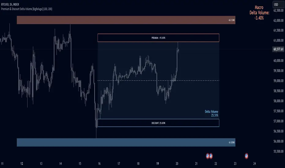
Premium & Discount Delta Volume [BigBeluga]Premium & Discount Delta Volume is an advanced volume-based tool that helps traders identify zones of market imbalances by using the concepts of premium and discount pricing, commonly taught by ICT trader. It calculates and highlights periods where the market is trading at a premium (selling pressure is stronger) or a discount (buying pressure is stronger) and dynamically plots these zones over time. The indicator also calculates delta volume between buying and selling within these zones, showing shifts in market sentiment and potential areas for reversals or continuations.
🔵 IDEA
The Premium & Discount Delta Volume indicator is rooted in the ICT (Inner Circle Trader) concept of premium and discount zones. This concept divides the price action into two key zones:
Premium Zone : This area is where the market is trading at a level where sellers dominate, leading to more selling pressure. The idea is that the price is overvalued, and a potential drop could occur as the market reverts to a balanced state.
Discount Zone : This area is where the market is undervalued, with buyers dominating and applying upward pressure. Prices in this area often indicate opportunities to buy into strength as the market moves back to equilibrium.
At the core of the indicator is the delta volume, which measures the difference between buying and selling pressure within the premium and discount zones. When the delta volume is negative, it signals a downtrend with more selling pressure, while a positive delta volume signals an uptrend with more buying pressure. These zones and their associated delta values update dynamically, providing traders with real-time insights into market strength and potential price reversals.
The equilibrium in the middle of the premium and discount zones represents the balance point between buyers and sellers. When price moves away from equilibrium, it either enters the premium zone (potentially overbought) or the discount zone (potentially oversold), helping traders make more informed decisions based on volume and price structure.
🔵 KEY FEATURES & USAGE
Premium & Discount Zones:
The indicator automatically identifies and plots premium and discount zones on the chart. Premium zones count only negative (selling) volume, while discount zones count only positive (buying) volume. These zones are key areas of interest for identifying potential price reversals or continuations based on volume pressure.
Dynamic Delta Volume Calculation:
The indicator calculates delta volume between the premium and discount zones, showing the imbalance between buyers and sellers. A positive delta volume inside the discount zone suggests strong buying pressure, while a negative delta inside the premium zone suggests strong selling pressure. This helps traders quickly identify trends or market exhaustion.
Up Trend:
Down Trend:
Real-time Updates & Equilibrium Line:
The zones update dynamically every 100 bars or after price crosses them, ensuring that traders always have the most relevant market data. The equilibrium line in the middle of the zones helps traders gauge whether the market is balanced or moving into overbought (premium) or oversold (discount) territory.
Macro and Local Period Calculations:
The indicator allows traders to customize two different periods for analysis: a smaller lookback period (e.g., 50 bars) for short-term price action and a macro period (e.g., 200 bars) for larger trends. Each period has its own premium and discount zones, allowing for a multi-timeframe view of market strength.
Macro:
Both:
Color-coded background for Volume Pressure:
The background color of the smaller period premium and discount box changes based on delta volume. A positive delta turns the background blue, indicating higher buy pressure, while a negative delta turns the background red, signaling higher sell pressure.
🔵 CUSTOMIZATION
Toggle Premium & Discount: Traders can choose to display support and resistance levels based on the high and low points of the premium and discount zones.
Premium & Discount Lookback Period: Traders can adjust the lookback period to define the length of price action to be analyzed for premium and discount zones. A shorter period focuses on more recent market activity, while a longer period provides a broader view of trends.
Macro Highs/Lows Period: The indicator also offers a macro lookback period for identifying larger market trends and key levels of buying or selling volume.
Toggle Macro Levels: Macro levels help identify long-term price extremes, and traders can toggle this feature on or off as needed.
Precise Gap FinderPrecise Gap Finder
This indicator identifies Fair Value Gaps (FVGs) in price action and it is perfect for traders looking to exploit price imbalances and capitalize on trading opportunities.
How It Works:
The Precise Gap Finder detects Fair Value Gaps by analyzing three consecutive candles. A gap is identified when the middle candle’s price range (open to close) is not overlapped by the high and low prices of the surrounding candles. This indicates a price imbalance, which can be a strong signal for potential market moves.
How to Use for Trading:
Identify Entry Points: Use the highlighted Fair Value Gaps to spot potential entry points. An upward FVG can indicate a potential buying opportunity, while a downward FVG can signal a potential selling opportunity.
Confirm Trends: Combine the FVG signals with other technical indicators to confirm trends and enhance the accuracy of your trades.
Risk Management: Use FVGs to identify potential stop-loss and take-profit levels. Gaps can serve as natural support and resistance levels.
Backtesting: Analyze historical data to understand how FVGs have impacted price movements in the past, helping you refine your trading strategy

Volume Footprint Voids [BigBeluga]Volume Footprint Voids is a unique tool that uses lower timeframe calculation to plot different styles of single candle POC.
This indicator is very powerful for scalping and finding very precise entry and exits, spotting potential trapped traders, and more.
Unlike many other volume profiles, this aims to plot single candle profiles as well as their own footprints.
🔶 FEATURES
The script includes the following settings:
Windows: Plotting style and calculations
Coloring modes
Display modes
lower-timeframe calculations
🔶 CALCULATION
In the image above we can see how the script calculates each level position that will serve as a calculation process to see how much volume/closes there are within the levels.
In the image above, we can have a more clear example of how we count each candle close.
We use the prior screenshot as an example, after setting each level we will use the lower-timeframe input to measure the amount of closes within the ranges.
Depending on the lot size, the box will be larger or smaller, usually the POC will always have the highest box size.
NOTE: Size is the starting point, always from the low of the candle.
To find more voids, select a closer LTF to the current one you're using.
To find fewer voids, select a timeframe away from your current one.
Due to Pine Script limitations, we are only able to plot a certain amount of footprints, and we can't plot the whole history chart.
POC will be the largest block displayed, indicating the time point of control
Gray areas are closes above the average
Black are Void or imbalance that price will fill in the future, like FVG
The image above shows an incorrect size input that will lead to bad calculations, while on the other side, a correct size input that will lead to a clear vision and better calculation.
🔶 WINDOWS
The "▲▼" Mode will display delta buyers and delta sellers coloring with voids as black.
It also offers a gradient mode for a beautier visualization
The "Total Volume" mode will display the net volume within the lot size (closes within the levels).
This is useful to spot possible highest net volume within the same highest lot size.
The "POC + Gaps" will show both POC and Gaps as the highest block while all the rest will be considered as the smaller block.
This is useful to see where the highest lot were and if there are higher or lower imbalances within the candle
The last option "Gaps" will simply display the gaps as the highest block, while the POC as the lowest block.
This is useful to have a better view of the gaps areas
🔶 EXAMPLE
This is one of the most basic examples of how this script can be used. POC at the bottom creating a strong support area as price holds and creates higher voids gap that price fills while rising.
🔶 SETTINGS
Users have full control over the script, from colors to choosing the lower-timeframe inputs to disabling the lot size.

itradesize /\ Model x RTH Gap
I’m happy to announce my model and sharing it with you as an indicator.
About the model
The model is based on a range from 18:00 until 1:30. If you are keen you probably know that it's something that based on a bit of Daye's Theory. As Daily Q4 is from 18:00 until 0:00 and I've added a 90's Q1 to it as well that's why it ended up at 1:30.
It's an accumulation range and where we are looking for some opportunities above or below it when the algo is trying to fake the traders as the high and the low of the range are both important zones for liquidity pools. This model works on almost every pair but I've been mostly focusing on indices, especially on ES, NQ, and EUR/USD.
Do not trade before 1:30 AM and do not trade this model after 6:00 AM. So any tradable setup must be valid until 6:00 AM.
*All the mentioned times are based on America/NewYork timezone.
A simple sell setup
∆ If it takes the high of the model, then look for short opportunities.
∆ The best reliable scenario is when a high is taken while retracing back to an HTF PD Array so it will end up in a failure swing, Judas swing, you name it.
∆ When a high is taken you should wait for a market structure shift then it should give a nice displacement where it should retrace.
∆ The imbalance after the shift can be on every timeframe, based on your trade idea.
∆ If there are more imbalances, your decision on which to go with (as if there is a BPR, Breaker, OB, etc.. - can change the view of an FVG).
The same story goes for a buy setup.
∆ The first target is always the EQ of the model's range.
∆ The second target could be liquidity inside the EQ and the other side of the model (optional).
∆ The third target is the other side of the model.
∆ You can always leave a runner there if you eyeing some levels outside the model.
Additional information
∆ You can use silver bullet range as an extra confirmation when you looking for the actual displacement.
∆ An RTH range is also added to the indicator (starts drawing at 9:30 when the futures market opens) as it can be used to trade in the NY session and it is a must-have thing when trading indices.
∆ The colors of every label are switched automatically based on your chart's coloring.

Open Interest Profile [Fixed Range] - By LeviathanThis script generates an aggregated Open Interest profile for any user-selected range and provides several other features and tools, such as OI Delta Profile, Positive Delta Levels, OI Heatmap, Range Levels, OIWAP, POC and much more.
The indicator will help you find levels of interest based on where other market participants are opening and closing their positions. This provides a deeper insight into market activity and serves as a foundation for various different trading strategies (trapped traders, supply and demand, support and resistance, liquidity gaps, imbalances,liquidation levels, etc). Additionally, this indicator can be used in conjunction with other tools such as Volume Profile.
Open Interest (OI) is a key metric in derivatives markets that refers to the total number of unsettled or open contracts. A contract is a mutual agreement between two parties to buy or sell an underlying asset at a predetermined price. Each contract consists of a long side and a short side, with one party consenting to buy (long) and the other agreeing to sell (short). The party holding the long position will profit from an increase in the asset's price, while the one holding the short position will profit from the price decline. Every long position opened requires a corresponding short position by another market participant, and vice versa. Although there might be an imbalance in the number of accounts or traders holding long and short contracts, the net value of positions held on each side remains balanced at a 1:1 ratio. For instance, an Open Interest of 100 BTC implies that there are currently 100 BTC worth of longs and 100 BTC worth of shorts open in the market. There might be more traders on one side holding smaller positions, and fewer on the other side with larger positions, but the net value of positions on both sides is equivalent - 100 BTC in longs and 100 BTC in shorts (1:1). Consider a scenario where a trader decides to open a long position for 1 BTC at a price of $30k. For this long order to be executed, a counterparty must take the opposite side of the contract by placing a short order for 1 BTC at the same price of $30k. When both long and short orders are matched and executed, the Open Interest increases by 1 BTC, indicating the introduction of this new contract to the market.
The meaning of fluctuations in Open Interest:
- OI Increase - signifies new positions entering the market (both longs and shorts).
- OI Decrease - indicates positions exiting the market (both longs and shorts).
- OI Flat - represents no change in open positions due to low activity or a large number of contract transfers (contracts changing hands instead of being closed).
Typically, we monitor Open Interest in the form of its running value, either on a chart or through OI Delta histograms that depict the net change in OI for each price bar. This indicator enhances Open Interest analysis by illustrating the distribution of changes in OI on the price axis rather than the time axis (akin to Volume Profiles). While Volume Profile displays the volume that occurred at a given price level, the Open Interest Profile offers insight into where traders were opening and closing their positions.
How to use the indicator?
1. Add the script to your chart
2. A prompt will appear, asking you to select the “Start Time” (start of the range) and the “End Time” (end of the range) by clicking anywhere on your chart.
3. Within a few seconds, a profile will be generated. If you wish to alter the selected range, you can drag the "Start Time" and "End Time" markers accordingly.
4. Enjoy the script and feel free to explore all the settings.
To learn more about each input in indicator settings, please read the provided tooltips. These can be accessed by hovering over or clicking on the ( i ) symbol next to the input.
Vector Candle Zones/Cloud MTF X4Description:
This indicator employs Price, Volume, Support, Resistance Analysis (PVSRA), a trading strategy that analyzes price movements, volume, support, and resistance levels to identify potential trading opportunities. It detects large, volatile moves with significant activity in specific zones on the chart, which the market tends to revisit due to the high transaction volume in these areas. The primary purpose of this indicator is to draw these high probability areas where the market is likely to return.
The PVSRA algorithm used in this indicator:
Detects climactic situations: The algorithm identifies climactic situations by looking at bars where the volume is at least 200% of the average volume of the previous 10 bars. Additionally, it checks if the product of the candle spread, and candle volume is greater than or equal to the highest value for the previous 10 bars. In these situations, if the bar is bullish (closing price is higher than the opening price), it is colored green; if it's bearish (closing price is lower than the opening price), it is colored red.
Detects above-average volume situations: The algorithm looks for bars with a volume that is at least 150% of the average volume of the previous 10 bars. In these cases, if the bar is bullish, it is colored blue; if it's bearish, it is colored violet.
If the bar does not fall into climactic and above-average situations: The bar is colored with shades of gray depending on whether it's bullish or bearish, and is not considered a vector (aka. vector zone of interest).
The algorithm calculations can adapt to show the above information also from higher time-frames.
Using the indicator:
Utilize this indicator to trade towards and away from vector areas, and watch for reversals when these zones are recovered. While there are no certainties in trading, only probabilities, the vector candles on the chart represent high probability areas the market often revisits. Additionally, zones recovered between 50% - 100% signal high probability points where the market might change direction. The likelihood of market direction change increases as more vectors are recovered in succession. Although there is no set rule for when these vectors are recovered, monitoring candle colors (green, blue, red, purple) can help gauge the speed of a move to and from a zone. To use this indicator more effectively, establish a trend using other preferred indicators or even a simple EMA. Spend time studying how these zones are recovered for each specific asset.
Main Features:
High volume candles are detected and marked with colors, indicating high probability areas the market may revisit.
The indicator shows the percentage of a zone's recovery with labels for clear visibility.
If ghosting is enabled, fully recovered past candles (also called vectors) are highlighted to signal potential reversal points.
Imbalance Weighted Average (IWA) can be activated to display the point of attraction (mid/high/low) on high interest zones.
Fair Value Gaps can be displayed alongside PVSRA candles, as both represent imbalances in the chart.
The indicator supports showing 3x-4x higher timeframe PVSRA zones on a lower timeframe for convenience.

RedK EVEREX - Effort Versus Results ExplorerRedK EVEREX is an experimental indicator that explores "Volume Price Analysis" basic concepts and Wyckoff law "Effort versus Result" - by inspecting the relative volume (effort) and the associated (relative) price action (result) for each bar - showing the analysis as an easy to read "stacked bands" visual. From that analysis, we calculate a "Relative Rate of Flow" - an easy to use +100/-100 oscilator that can be used to trigger a signal when a bullish or bearish mode is detected for a certain user-selected length of bars.
Basic Concepts of VPA
-------------------------------
(The topics of VPA & Wyckoff Effort vs Results law are too comprehensive to cover here - So here's just a very basic summary - please review these topics in detail in various sources available here in TradingView or on the web)
* Volume Price Analysis (VPA) is the examination of the number of shares or contracts of a security that have been traded in a given period, and the associated price movement. By analyzing trends in volume in conjunction with price movements, traders can determine the significance of changes in price and what may unfold in the near future.
* Oftentimes, high volumes of trading can infer a lot about investors’ outlook on a market or security. A significant price increase along with a significant volume increase, for example, could be a credible sign of a continued bullish trend or a bullish reversal. Adversely, a significant price decrease with a significant volume increase can point to a continued bearish trend or a bearish trend reversal.
* Incorporating volume into a trading decision can help an investor to have a more balanced view of all the broad market factors that could be influencing a security’s price, which helps an investor to make a more informed decision.
* Wyckoff's law "Effort versus results" dictates that large effort is expected to be accompanied with big results - which means that we should expect to see a big price move (result) associated with a large relative volume (effort) for a certain trading period (bar).
* The way traders use this concept in chart analysis is to mainly look for imbalances or invalidation. for example, when we observe a large relative volume that is associated with very limited price change - that should trigger an early flag/warning sign that the current price trend is facing challenges and may be an early sign of "reversal" - this applies in both bearish and bullish conditions. on the other hand, when price starts to trend in a certain direction and that's associated with increasing volume, that can act as kind of validation, or a confirmation that the market supports that move.
How does EVEREX work
---------------------------------
* EVEREX inspects each bar and calculates a relative value for volume (effort) and "strength of price movement" (result) compared to a specified lookback period. The results are then visualized as stacked bands - the lower band represents the relative volume, the upper band represents the relative price strength - with clear color coding for easier analysis.
* The scale of the band is initially set to 100 (each band can occupy up to 50) - and that can be changed in the settings to 200 or 400 - mainly to allow a "zoom in" on the bands.
* Reading the resulting stacked bands makes it easier to see "balanced" volume/price action (where both bands are either equally strong, or equally weak), or when there's imbalance between volume and price (for example, a compression bar will show with high volume band and very small/tiny price action band) - another favorite pattern in VPA is the "Ease of Move", which will show as a relatively small volume band associated with a large "price action band" (either bullish or bearish) .. and so on.
* a bit of a techie piece: why the use of a custom "Normalize()" function to calculate "relative" values in EVEREX?
When we evaluate a certain value against an average (for example, volume) we need a mechanism to deal with "super high" values that largely exceed that average - I also needed a mechanism that mimics how a trader looks at a volume bar and decides that this volume value is super low, low, average, above average, high or super high -- the issue with using a stoch() function, which is the usual technique for comparing a data point against a lookback average, is that this function will produce a "zero" for low values, and cause a large distortion of the next few "ratios" when super large values occur in the data series - i researched multiple techniques here and decided to use the custom Normalize() function - and what i found is, as long as we're applying the same formula consistently to the data series, since it's all relative to itself, we can confidently use the result. Please feel free to play around with this part further if you like - the code is commented for those who would like to research this further.
* Overall, the hope is to make the bar-by-bar analysis easier and faster for traders who apply VPA concepts in their trading
What is RROF?
--------------------------
* Once we have the values of relative volume and relative price strength, it's easy from there to combine these values into a moving index that can be used to track overall strength and detect reversals in market direction - if you think about it this a very similar concept to a volume-weighted RSI. I call that index the "Relative Rate of Flow" - or RROF (cause we're not using the direct volume and price values in the calculation, but rather relative values that we calculated with the proprietary "Normalize" function in the script.
* You can show RROF as a single or double-period - and you can customize it in terms of smoothing, and signal line - and also utilize the basic alerts to get notified when a change in strength from one side to the other (bullish vs bearish) is detected
* In the chart above, you can see how the RROF was able to detect change in market condition from Bearsh to Bullish - then from Bullish to Bearish for TSLA with good accuracy.
Other Usage Options in EVEREX
------------------------------------
* I wrote EVEREX with a lot of flexibility and utilization in mind, while focusing on a clean and easy to use visual - EVEREX should work with any time frame and any instrument - in instruments with no volume data, only price data will be used.
* You can completely hide the "EVEREX bands" and use EVEREX as a single or dual period strength indicator (by exposing the Bias/Sentiment plot which is hidden by default) -
here's how this setup would look like - in this mode, you will basically be using EVEREX the same way you're using a volume-weighted RSI
* or you can hide the bias/sentiment, and expose the Bulls & Bears plots (using the indicator's "Style" tab), and trade it like a Bull/Bear Pressure Index like this
* you can choose Moving Average type for most plot elements in EVEREX, including how to deal with the Lookback averaging
* you can set EVEREX to a different time frame than the chart
* did i mention basic alerts in this v1.0 ?? There's room to add more VPA-specific alerts in future version (for example, when Ease-of-Move or Compression bars are detected...etc) - let me know if the comments what you want to see
Final Thoughts
--------------------
* EVEREX can be used for bar-by-bar VPA analysis - There are so much literature out there about VPA and it's highly recommended that traders read more about what VPA is and how it works - as it adds an interesting (and critical) dimension to technical analysis and will improve decision making
* RROF is a "strength indicator" - it does not track price values (levels) or momentum - as you will see when you use it, the price can be moving up, while the RROF signal line starts moving down, reflecting decreasing strength (or otherwise, increasing bear strength) - So if you incorporate EVEREX in your trading you will need to use it alongside other momentum and price value indicators (like MACD, MA's, Trend Channels, Support & Resistance Lines, Fib / Donchian..etc) - to use for trade confirmation
