Trading Macro Windows by BW v2
Trading Macros by BW: Integrating ICT Concepts for Session Analysis
This indicator combines two key Inner Circle Trader (ICT) concepts—Change in State of Delivery (CISD) or Inverted Fair Value Gap (IFVG) signals with Macro Time Windows—to provide a unified tool for analyzing intraday price action, particularly during Pacific Time (PT) sessions. Rather than simply merging existing scripts, this integration creates a cohesive visual framework that highlights how macro consolidation periods interact with potential reversal or continuation signals like CISD or IFVG. By overlaying macro candle styling and borders on the chart alongside selectable signal lines, traders can better contextualize setups within ICT's macro narrative, where price often manipulates liquidity during these windows before displacing toward higher-timeframe objectives.
Core Components and How They Work Together:
Macro Time Windows (Inspired by ICT's Macro Periods):
ICT emphasizes "macro" as 30-minute windows (e.g., 06:45–07:15 PT, 07:45–08:15 PT, up to 11:45–12:15 PT) where price tends to consolidate, sweep liquidity, or form key structures like Fair Value Gaps (FVGs). These periods set the stage for the session's directional bias.
The indicator styles candles within these windows using a user-defined color for wicks, borders, and bodies (translucent for visibility). This visual emphasis helps traders focus on activity inside macros, where reversals or continuations often originate.
Borders are drawn as vertical lines at the start and end of each window (with a +5 minute buffer to capture related activity), using a dotted style by default. This creates a "study zone" that encapsulates macro events, allowing traders to assess if price is respecting or violating these zones in alignment with broader ICT models like the Power of 3 (AMD cycle).
Toggle: "Macro Candles Enabled" (default: true) – Turn off to disable styling and borders if focusing solely on signals.
CISD or IFVG Signals (Selectable Mode):
Mode Selection: Choose between "Change in the State of Delivery" (CISD) or "IFVG" (default: IFVG). Both detect shifts in market delivery during specific 30-minute slices (15–45 or 17–45 minutes past the hour in PT sessions).
CISD Mode: Based on ICT's definition of a sudden directional shift, this identifies aggressive displacements after sweeping recent highs/lows. It uses a rolling reference high/low over 6 bars, checks for sweeps (penetrating by at least 2 ticks in the last 2-3 bars), reclamation (closing beyond the reference with at least 50% body), and displacement (50% of prior range or an immediate FVG of 6+ ticks). Signals plot a horizontal line from the close, extending 24 bars right, labeled "CISD."
IFVG Mode: Focuses on Inverted Fair Value Gaps, where a bullish FVG (low > high by 13+ ticks) forms but is inverted (closed below) in the same slice, signaling bearish intent (or vice versa). This targets violations against opposing liquidity, often leading to raids on external ranges. Signals plot similarly, labeled "IFVG."
Shared Logic: Both modes enforce a 55-bar cooldown to prevent clustering, operate only during PT sessions (06:30–13:00), and use tick-based thresholds for precision across instruments. The integration with macros allows traders to see if signals occur within or at the edges of macro windows, enhancing confirmation—for example, a CISD inside a macro might indicate a manipulated reversal toward the session's true objective.
Toggle: "Signals Enabled" (default: true) – Turn off to hide all signal lines and labels, isolating the macro visualization.
How Components Interact:
Macro windows provide the "narrative context" (consolidation/manipulation), while CISD/IFVG signals detect the "delivery shift" (displacement). Together, they form a mashup that justifies publication: isolated signals can be noisy, but when filtered by macro periods, they align with ICT's session model. For instance, an IFVG inversion during a macro might confirm a liquidity sweep before targeting PD arrays or order blocks.
No external dependencies; all calculations are self-contained using Pine's built-in functions like ta.highest/lowest for references and time-based sessions for windows.
Usage Guidelines:
Apply to intraday charts (e.g., 1-5 min) or stocks during PT hours.
Look for confluence: A bull IFVG signal post-macro low sweep might target the next macro high or daily bias.
Customize colors/styles for signals (solid/dashed/dotted lines) and macros to suit your chart.
Backtest in replay mode to observe how macros frame signals—e.g., price often respects macro borders as S/R.
Limitations: Timezone-fixed to PT (America/Los_Angeles); signals are directional hints, not trade entries. Combine with ICT tools like order blocks or liquidity pools for full setups.
This script draws from community ICT implementations but refines them into a single, purpose-built tool for macro-driven trading, reducing chart clutter while emphasizing interconnected concepts. Feedback welcome!
Pesquisar nos scripts por "ict"
Midnight Range Standard DeviationsCredit to Lex Fx for the basic framework of this script
This indicator is designed to assist traders in identifying potential trading opportunities based on the Intraday Concurrency Technique (ICT) concepts, specifically the midnight range deviations and their relationship to Fibonacci levels. It builds upon the work of Lex-FX, whom we gratefully acknowledge for the original concept and inspiration for this indicator.
Core Concept: ICT Midnight Range
The core of this indicator revolves around the concept of the midnight range. According to ICT, the high and low formed in a specific time window (typically the first 30 minutes after midnight, New York Time) can serve as a key reference point for intraday price action. The indicator identifies this range and projects potential support and resistance levels based on deviations from this range, combined with Fibonacci ratios.
How ICT Uses Midnight Range Deviations
ICT methodology often involves looking for price to move away from the initial midnight range, then return to it, or deviate beyond it, as key areas for potential entries.
Range Identification: The indicator automatically identifies the high and low of the midnight range (00:00 - 00:30 NY Time).
Deviation Levels: The indicator calculates and displays deviation levels based on multiples of the initial midnight range. These levels are often used to identify potential areas of support and resistance, as well as potential targets for price movement. These levels can be set in the additional fib levels section, which can be configured in increments of .5 deviations all the way up to 12 deviations.
Fibonacci Confluence: ICT often emphasizes the confluence of multiple factors. This indicator adds Fibonacci levels to the midnight range deviations. This allows traders to identify areas where Fibonacci retracements or extensions align with the deviation levels, potentially creating stronger areas of support or resistance.
Looking for Sweeps: ICT often uses these levels to look for times that the high and low are swept as potential areas of liquidity, indicating the start of potential continuations.
Time-Based Analysis: The time at which price interacts with these levels can also be significant in ICT. The indicator provides options to extend the range lines to specific times (e.g., 3 hours, 6 hours, 10 hours, 12 hours, or a custom defined time) after midnight, allowing traders to focus on specific periods of the trading day.
Indicator Settings Explained:
Time Zone (TZ): Defines the time zone used for calculating the midnight range. The default is "America/New_York".
Range High Color, Range Low Color, Range Mid Color: Customize the colors of the high, low, and mid-range lines.
Range Fill Color: Sets the fill color for the area between the range high and low.
Line Style: Choose the style of the range lines (solid, dashed, dotted).
Range Line Thickness: Adjust the thickness of the range lines for better visibility.
Show Fibonacci Levels: Enable or disable the display of Fibonacci deviation levels.
Fib Up Color, Fib Down Color: Customize the colors of the Fibonacci levels above (up) and below (down) the midnight range.
Show Trendline: Enables a trendline that plots the close price, colored according to whether the price is above the high, below the low, or within the midnight range.
Show Range Lines, Show Range Labels: Toggles the visibility of the range lines and their associated labels.
Label Size: Adjust the size of the labels for better readability.
Hide Prices: Option to display only the deviation values on labels, hiding price values.
Place Fibonacci Labels on Left Side: Option to switch label position from right side to left side.
Extend Range To (Hours from Midnight): This section gives you a wide variety of options on how far you want to extend the range to, you can do 3,6,10,12, and 23 hours. Alternatively, you can select the "Use Custom Length" and set a specific time in hours.
Additional Fib Levels: This section allows the trader to set additional deviation points in increments of .5 deviations from .5 all the way up to 12 deviations
TradingView Community Guidelines Compliance:
This indicator description adheres to the TradingView community guidelines by:
Being educational: It explains the ICT methodology and how the indicator can be used in trading.
Being transparent: It clearly describes all the indicator's settings and their purpose.
Providing credit: It acknowledges Lex-FX as the original author of the concept.
Avoiding misleading claims: It does not guarantee profits or imply that the indicator is a "holy grail."
Disclaimer: Usage of this indicator and the information provided is at your own risk. The author is not responsible for any losses incurred as a result of using this indicator.
Important Considerations:
This indicator is intended for educational purposes and to assist in applying the ICT methodology.
It should not be used as a standalone trading system.
Always combine this indicator with other forms of technical analysis and risk management techniques.
Backtest thoroughly on your chosen market and timeframe before using in live trading.
Trading involves risk. Only trade with capital you can afford to lose.

ATR/ADR MTF Projection ArrayATR/ADR MTF Projection Array
Overview
A powerful predictive tool that projects ATR (Average True Range) and ADR (Average Daily Range) levels as clean support and resistance arrays on your chart. Designed for traders who want to anticipate the high and low of the day using volatility-based projections with multi-timeframe confluence.
This indicator combines traditional ATR analysis with ICT-style ADR methodology, giving you institutional-grade level projections from a single, customizable tool.
Key Features
🎯 Dual Volatility Metrics
ATR Projections — Classic volatility-based levels with full multi-timeframe support
ADR Projections (ICT Style) — Average Daily Range levels using Inner Circle Trader methodology
Enable/disable each independently based on your trading preference
📊 Multi-Timeframe ATR Analysis
Plot ATR levels from up to 3 timeframes simultaneously (Daily, Weekly, Monthly or custom)
Each timeframe displays with distinct styling for easy identification
Perfect for confluence trading across multiple time horizons
⚡ ICT ADR Methodology
NY Midnight calculation mode (ICT standard) or Classic Daily
Key ICT levels built-in:
1/3 ADR (Judas Swing) — Critical manipulation level where fake moves often terminate
1/2 ADR — Mid-range reference
2/3 ADR — Trending day continuation target
100% ADR — Full daily range completion
150% ADR — Extension target for expansion days
Two projection modes: Static (from anchor) or Dynamic (from session high/low)
🔧 Flexible Anchor Points
Previous Close (default)
Daily Open
Weekly Open
Monthly Open
Session Open
📈 Range Completion Tracking
Real-time display of how much of the expected daily range has been consumed
Visual status indicator helps identify when the day's move may be exhausted
How To Use
For Bias Confirmation:
Establish your directional bias using your preferred method (trigger day, market structure, etc.)
Monitor the 1/3 ADR level during London/NY open for potential Judas Swing (manipulation move)
Target 2/3 to 100% ADR for your HOD/LOD objective
For Target Setting:
Use ATR levels as volatility-based profit targets
ADR 100% level often marks session extremes
When Range Used reaches 100%+, expect consolidation or reversal
For Multi-Timeframe Confluence:
Enable Weekly/Monthly ATR levels alongside Daily
Look for clustering of levels across timeframes for high-probability zones
Settings Guide
Master Controls — Toggle ATR/ADR systems and bull/bear levels independently
ATR Settings — Configure period, multiplier, anchor point, and select which timeframes to display
ATR Level Multipliers — Choose which projection levels to show (0.5x, 0.75x, 1.0x, 1.25x, 1.5x)
ADR Settings (ICT Style) — Select calculation mode (NY Midnight recommended), period (5 days is ICT standard), and projection mode
ADR Level Selection — Toggle individual ICT levels (1/3, 1/2, 2/3, 100%, 150%)
Visual Settings — Customize colors, line styles, labels, and info table position
Alerts Included
ATR 1.0x Bull/Bear Cross
ADR 1/3 Judas Swing Zone (Bull/Bear)
ADR 100% Range Completion (Bull/Bear)

Sunmool's Next Day Model FVG AlertNY Killzone FVG Alert - ICT Fair Value Gap Detection Indicator
This comprehensive Pine Script indicator is specifically designed for traders following ICT (Inner Circle Trader) methodology and Smart Money Concepts. The indicator automatically detects Fair Value Gaps (FVG) that occur during the New York Killzone session, providing real-time alerts when these critical market imbalances are identified.
Key Features:
🎯 Fair Value Gap Detection
Automatically identifies bullish and bearish Fair Value Gaps using the classic 3-candle pattern
Filters gaps based on customizable minimum size thresholds to avoid insignificant imbalances
Provides visual representation through colored boxes and labels for easy identification
⏰ New York Killzone Focus
Specifically monitors the NY Killzone session (default: 7:00 AM - 10:00 AM EST)
Fully customizable session times to accommodate different trading preferences
Only detects FVGs when all three candles forming the gap occur within the killzone timeframe
📅 ICT Next Day Model Compliance
Automatically excludes Mondays from FVG detection as per ICT Next Day Model principles
Optional Monday exclusion can be toggled on/off based on trading strategy
Ensures alignment with professional ICT trading methodologies
🔔 Advanced Alert System
Three distinct alert conditions: Bullish FVG, Bearish FVG, and Combined alerts
Customizable alert messages for different notification preferences
Compatible with TradingView's full alert system including email, SMS, and webhook notifications
🎨 Visual Customization
Adjustable colors for bullish and bearish FVG boxes
Configurable box extension length for better visualization
Optional background highlighting during killzone sessions
Clean, professional chart presentation that doesn't clutter your analysis
📊 Technical Specifications
Works on all timeframes, though most effective on intraday charts (1m, 5m, 15m)
Timezone-aware calculations ensure accurate session detection globally
Efficient code structure minimizes processing load and chart lag
Compatible with other indicators and doesn't interfere with existing chart setups
🎯 Ideal For:
ICT methodology traders seeking automated FVG detection
Smart Money Concepts practitioners
Scalpers and day traders focusing on NY session
Traders looking to identify high-probability entry zones
Anyone interested in market structure and liquidity concepts
📈 Trading Applications:
Fair Value Gaps often serve as areas where price may return to "fill" the imbalance, making them excellent zones for:
Potential reversal areas
Take profit targets
Stop loss placement reference points
Market structure analysis
Confluence with other ICT concepts
⚙️ Customizable Parameters:
FVG minimum size filter
Killzone session start/end times
Visual display options
Alert preferences
Color schemes and styling options
This indicator brings institutional trading concepts to retail traders, helping identify the same market inefficiencies that smart money targets. By focusing specifically on the New York Killzone - one of the most liquid and volatile trading sessions - it provides high-quality signals during optimal market conditions.
Whether you're new to ICT concepts or an experienced trader looking to automate your FVG detection, this indicator provides the precision and reliability needed for professional trading analysis.

One for AllOne for All (OFA) - Complete ICT Analysis Suite
Version 3.3.0 by theCodeman
📊 Overview
One for All (OFA) is a comprehensive TradingView indicator designed for traders who follow Inner Circle Trader (ICT) concepts. This all-in-one tool combines essential ICT analysis features—sessions, kill zones, previous period levels, and higher timeframe candles with Fair Value Gaps (FVGs) and Volume Imbalances (VIs)—into a single, highly customizable indicator. Whether you're a beginner learning ICT concepts or an experienced trader refining your edge, OFA provides the visual structure needed for precise market analysis and execution.
✨ Key Features
- 🏷️ Customizable Watermark**: Display your trading identity with customizable titles, subtitles, symbol info, and full style control
- 🌍 Trading Sessions**: Visualize Asian, London, and New York sessions with high/low lines, range boxes, and open/close markers
- 🎯 Kill Zones**: Highlight 5 critical ICT kill zones with precise timing and visual boxes
- 📈 Previous Period H/L**: Track Daily, Weekly, and Monthly highs/lows with customizable styles and lookback periods
- 🕐 Higher Timeframe Candles**: Display up to 5 HTF timeframes with OHLC trace lines, timers, and interval labels
- 🔍 FVG & VI Detection**: Automatically detect and visualize Fair Value Gaps and Volume Imbalances on HTF candles
- ⚙️ Universal Timezone Support**: Works globally with GMT-12 to GMT+14 timezone selection
- 🎨 Full Customization**: Control colors, styles, visibility, and layout for every feature
🚀 How to Use
Watermark Setup
The watermark overlay helps you identify your charts and maintain focus on your trading principles:
1. Enable/disable watermark via "Show Watermark" toggle
2. Customize the title (default: "Name") to display your trading name or account identifier
3. Set up to 3 subtitles (default: "Patience", "Confidence", "Execution") as trading reminders
4. Choose position (9 locations available), size, color, and transparency
5. Toggle symbol and timeframe display as needed
Use Case: Display your trading principles or account name for multi-monitor setups or content creation.
Trading Sessions Analysis
Sessions define market character and liquidity availability:
1. Enable "Show All Sessions" to visualize all three sessions
2. Adjust timezone to match your local market (default: UTC-5 for EST)
3. Customize session times if needed (defaults cover standard hours)
4. Enable session range boxes to see consolidation zones
5. Use session high/low lines to identify key levels for the current session
6. Enable open/close markers to track session transitions
Use Case: Identify which session you're trading in, track session highs/lows for liquidity, and anticipate session transition volatility.
Kill Zones Trading
Kill zones are ICT's high-probability trading windows:
1. Enable individual kill zones or use "Show All Kill Zones"
2. **Asian Kill Zone** (2000-0000 GMT): Early positioning and smart money accumulation
3. **London Kill Zone** (0300-0500 GMT): European market opening volatility
4. **NY AM Kill Zone** (0930-1100 EST): Post-NYSE open expansion
5. **NY Lunch Kill Zone** (1200-1300 EST): Midday consolidation or manipulation
6. **NY PM Kill Zone** (1330-1600 EST): Afternoon positioning and closes
7. Customize colors and times to match your trading style
8. Set max days display to control historical visibility (default: 30 days)
Use Case: Focus entries during high-probability windows. Watch for liquidity sweeps at kill zone openings and institutional positioning.
Previous Period High/Low Levels
Previous period levels act as magnetic price targets and support/resistance:
1. Enable Daily (PDH/PDL), Weekly (PWH/PWL), or Monthly (PMH/PML) levels individually
2. Set lookback period (how many previous periods to display)
3. Choose line style: Solid (current emphasis), Dashed (standard), or Dotted (subtle)
4. Customize colors per timeframe for visual hierarchy
5. Adjust line width (1-5) for visibility preference
6. Enable gradient effect to fade older periods
7. Position labels left or right based on chart layout
8. Customize label text for your preferred notation
Use Case: Identify key levels where price is likely to react. Daily levels work on intraday timeframes, Weekly on daily charts, Monthly for swing trading.
Higher Timeframe (HTF) Candles
HTF candles reveal the larger market context while trading lower timeframes:
1. Enable up to 5 HTF slots simultaneously (default: 5m, 15m, 1H, 4H, Daily)
2. Choose display mode: "Below Chart" (stacked rows) or "Right Side" (compact column)
3. Customize timeframe, colors (bull/bear), and titles for each slot
4. **OHLC Trace Lines**: Visual lines connecting HTF candle levels to chart bars
5. **HTF Timer**: Countdown showing time remaining until HTF candle close
6. **Interval Labels**: Display day of week (Daily+) or time (intraday) on each candle
7. For Daily candles: Choose open time (Midnight, 8:30, 9:30) to match your market structure preference
Use Case: Trade lower timeframes while respecting higher timeframe structure. Watch for HTF candle closes to confirm directional bias.
FVG & VI Detection
Fair Value Gaps and Volume Imbalances highlight inefficiencies that price often revisits:
1. **Fair Value Gaps (FVGs)**: Detected when HTF candle wicks don't overlap between 3 consecutive candles
- Bullish FVG: Gap between candle 1 high and candle 3 low (green box by default)
- Bearish FVG: Gap between candle 1 low and candle 3 high (red box by default)
2. **Volume Imbalances (VIs)**: Similar detection but focuses on body gaps
- Bullish VI: Gap between candle 1 close and candle 3 open
- Bearish VI: Gap between candle 1 open and candle 3 close
3. Enable FVG/VI detection per HTF slot individually
4. Customize colors and transparency for each imbalance type
5. Boxes appear on chart at formation and remain visible as retracement targets
**Use Case**: Identify high-probability retracement zones. Price often returns to fill FVGs and VIs before continuing the trend. Use as entry zones or profit targets.
🎨 Customization
OFA is built for flexibility. Every feature includes extensive customization options:
Visual Customization
- **Colors**: Independent color control for every element (sessions, kill zones, lines, labels, FVGs, VIs)
- **Transparency**: Adjust box and label transparency (0-100%) for clean charts
- **Line Styles**: Choose Solid, Dashed, or Dotted for previous period lines
- **Sizes**: Control text size, line width, and box borders
- **Positions**: Place watermark in 9 positions, labels left/right
Layout Control
- **HTF Display Mode**: "Below Chart" for detailed analysis, "Right Side" for space efficiency
- **Drawing Limits**: Set max days for sessions/kill zones to manage chart clutter
- **Lookback Periods**: Control how many previous periods to display (1-10)
- **Gradient Effects**: Enable fading for older previous period lines
Timing Adjustments
- **Timezone**: Universal GMT offset selector (-12 to +14) for global markets
- **Session Times**: Customize each session's start/end times
- **Kill Zone Times**: Adjust kill zone windows to match your market's characteristics
- **Daily Open**: Choose Midnight, 8:30, or 9:30 for Daily HTF candle open time
💡 Best Practices
1. Start Simple: Enable one feature at a time to learn how each element affects your analysis
2. Match Your Timeframe: Use Daily levels on intraday charts, Weekly on daily charts, HTF candles one or two levels above your trading timeframe
3. Kill Zone Focus: Concentrate your trading activity during kill zones for higher probability setups
4. HTF Confirmation: Wait for HTF candle closes before committing to directional bias
5. FVG/VI Entries: Look for price to return to unfilled FVGs/VIs for entry opportunities with favorable risk/reward
6. Customize Colors: Use a consistent color scheme that matches your chart theme and reduces visual fatigue
7. Reduce Clutter: Disable features you're not actively using in your current trading plan
8. Session Context: Understand which session controls the market—trade with session direction or anticipate reversals at session transitions
⚙️ Settings Guide
OFA organizes settings into logical groups for easy navigation:
- **═══ WATERMARK ═══**: Title, subtitles, position, style, symbol/timeframe display
- **═══ SESSIONS ═══**: Enable/disable sessions, times, colors, high/low lines, boxes, markers
- **═══ KILL ZONES ═══**: Individual kill zone toggles, times, colors, max days display
- **═══ PREVIOUS H/L - DAILY ═══**: Daily high/low lines, style, color, lookback, labels
- **═══ PREVIOUS H/L - WEEKLY ═══**: Weekly high/low lines, style, color, lookback, labels
- **═══ PREVIOUS H/L - MONTHLY ═══**: Monthly high/low lines, style, color, lookback, labels
- **═══ HTF CANDLES ═══**: Global display mode, layout settings
- **═══ HTF SLOT 1-5 ═══**: Individual HTF configuration (timeframe, colors, title, FVG/VI detection, trace lines, timer, interval labels)
Each setting includes tooltips explaining its function. Hover over any input for detailed guidance.
📝 Final Notes
One for All (OFA) represents a complete ICT analysis toolkit in a single indicator. By combining watermark customization, session visualization, kill zone highlighting, previous period levels, and higher timeframe candles with FVG/VI detection, OFA eliminates the need for multiple indicators cluttering your chart.
**Version**: 3.3.0
**Author**: theCodeman
**Pine Script**: v6
**License**: Mozilla Public License 2.0
Start with default settings to learn the indicator's structure, then customize extensively to match your personal trading style. Remember: tools provide information, but your edge comes from disciplined execution of a proven strategy.
Happy Trading! 📈

coinbot_ICT_Unicorn(AUTOTRADE)1. 🎯 핵심 기능: 자동매매 신호 전송 (Webhook)
이 스크립트는 매매 신호가 발생할 때마다, 사용자가 '자동매매 설정(Autotrade Settings)'에 입력한 값들을 조합하여 구체적인 JSON 메시지를 생성하고 alert() 함수를 통해 웹훅으로 전송합니다.
입력 설정: user_id, exchange(거래소), leverage(레버리지), capital_percent(투입 시드 %), sl_percent(손절 %), 그리고 3단계 분할 익절(tp1_price_percent, tp1_qty_percent 등) 설정을 입력받습니다.
신호 종류:
ENTRY (진입): 매수(buy) 또는 매도(sell) 신호가 발생하면, 위 모든 설정값을 포함한 진입 명령을 보냅니다.
CLOSE (손절): 전략의 내부 로직에 의해 손절가에 도달하면(slAlertTick), 포지션을 종료하라는 신호를 보냅니다.
TAKE_PROFIT (익절): 목표가에 도달하면(tpAlertTick), 설정된 물량만큼 익절하라는 신호를 보냅니다.
2. 📈 작동 원리: "ICT 유니콘" 매매 전략
이 스크립트의 진입 로직은 ICT(Inner Circle Trader) 개념 중 하나인 **'유니콘 모델'**을 따릅니다.
구성 요소 식별:
Breaker Block (BB): '브레이커 블록'을 식별합니다. 이는 특정 고점/저점을 만든 후 그 방향으로 가지 못하고 반대 방향으로 돌파(Break)된 오더 블록(Order Block)입니다.
Fair Value Gap (FVG): '공정 가치 갭' (가격 불균형 영역)을 식별합니다.
핵심 진입 신호 (Unicorn): 이 전략의 핵심 진입 조건은 **Breaker Block(BB)과 Fair Value Gap(FVG)이 중첩(Overlap)**되는, 소위 '유니콘'이라 불리는 강력한 지지/저항 영역이 발생하는 것입니다.
Long (매수) 진입:
가격이 하락하며 **'하락형 브레이커 블록(Bearish Breaker Block)'**을 만듭니다.
이후 가격이 상승 돌파하며 이 브레이커 블록 영역과 중첩되는 **'상승형 FVG(Bullish FVG)'**를 생성합니다.
이 중첩 영역(FVG-BB Overlap)이 바로 매수 진입의 근거가 됩니다. (코드가 dbgRequireRetracement 설정에 따라 FVG로의 되돌림을 기다리거나 즉시 진입 신호를 보냅니다.)
Short (매도) 진입:
가격이 상승하며 **'상승형 브레이커 블록(Bullish Breaker Block)'**을 만듭니다.
이후 가격이 하락 돌파하며 이 브레이커 블록 영역과 중첩되는 **'하락형 FVG(Bearish FVG)'**를 생성합니다.
이 중첩 영역이 매도 진입의 근거가 됩니다.
3. 📊 부가 기능
시각화: 차트 상에 FVG 영역과 Breaker Block 영역을 박스로 그려주어(설정에 따라 표시/숨김 가능) 매매 근거를 시각적으로 확인할 수 있게 합니다.
백테스팅 대시보드: 차트 우측 상단(기본값)에 이 전략의 누적 성과(총 진입 횟수, 승/패, 승률, 총수익률)를 보여주는 대시보드를 표시합니다.
요약
이 스크립트는 **"Breaker Block과 FVG의 중첩(유니콘 모델)"**을 유일한 진입 조건으로 사용하는 매우 구체적인 ICT 전략입니다. 이 조건이 충족되면, 사용자가 미리 설정한 상세한 리스크 관리 값들을 담아 자동매매 봇으로 즉시 실행 가능한 주문 신호를 전송하는 '올인원(All-in-One)' 전략 스크립트입니다.
요청하신 대로, 해당 지표 요약본을 영어로 번역하여 제공합니다.
This script is an automated trading (Autotrade) strategy signal generator based on the ICT "Unicorn" trading model.
As the "AUTOTRADE" in its name implies, the core purpose of this indicator is to detect specific conditions on the chart and send JSON-formatted order signals (webhooks) to an external automated trading bot.
Here are the core mechanics and features of this script:
1. 🎯 Core Feature: Automated Signal Transmission (Webhook)
Whenever a trade signal occurs, this script generates a specific JSON message by combining the values entered by the user in the "Autotrade Settings" and sends it via webhook using the alert() function.
Input Settings: It takes inputs for user_id, exchange, leverage, capital_percent (equity %), sl_percent (stop loss %), and settings for 3-stage split take-profits (e.g., tp1_price_percent, tp1_qty_percent).
Signal Types:
ENTRY: When a "buy" or "sell" signal occurs, it sends an entry command including all the settings above.
CLOSE (Stop-Loss): If the price hits the stop loss according to the strategy's internal logic (slAlertTick), it sends a signal to close the position.
TAKE_PROFIT: When a profit target is reached (tpAlertTick), it sends a signal to take profit on the specified quantity.
2. 📈 How It Works: The "ICT Unicorn" Strategy
The script's entry logic follows the "Unicorn Model," one of the concepts from ICT (Inner Circle Trader).
Identifying Components:
Breaker Block (BB): It identifies a "Breaker Block." This is an Order Block that, after creating a specific high/low, fails to continue in that direction and is instead broken through in the opposite direction.
Fair Value Gap (FVG): It identifies a "Fair Value Gap" (a price imbalance area).
Core Entry Signal (The Unicorn): The core entry condition for this strategy is the overlap of a Breaker Block (BB) and a Fair Value Gap (FVG), which creates a powerful support/resistance zone known as the "Unicorn."
Long Entry:
Price moves down, creating a "Bearish Breaker Block."
Subsequently, price breaks upward, creating a "Bullish FVG" that overlaps with this Breaker Block area.
This overlapping area (FVG-BB Overlap) becomes the basis for the long entry. (Depending on the dbgRequireRetracement setting, the code either waits for a retracement to the FVG or sends an immediate entry signal.)
Short Entry:
Price moves up, creating a "Bullish Breaker Block."
Subsequently, price breaks downward, creating a "Bearish FVG" that overlaps with this Breaker Block area.
This overlapping area becomes the basis for the short entry.
3. 📊 Additional Features
Visualization: It draws the FVG and Breaker Block zones as boxes on the chart (can be toggled in settings), allowing for visual confirmation of the trade setup.
Backtesting Dashboard: It displays a dashboard in the top-right corner (by default) showing the strategy's cumulative performance (total entries, wins/losses, win rate, total profit).
Summary
This script is a highly specific ICT strategy that uses the "overlap of a Breaker Block and an FVG (the Unicorn Model)" as its sole entry condition. When this condition is met, it transmits an immediately executable order signal to an automated trading bot, complete with all the detailed risk management values preset by the user. It is an "all-in-one" strategy script.

HTF Rejection Block [TakingProphets]Overview
The HTF Rejection Block indicator is designed to help traders identify and visualize Higher Timeframe Rejection Blocks—price zones where liquidity grabs often result in aggressive rejections. These areas can serve as high-probability decision points when combined with other ICT-based tools and concepts.
Unlike simple support/resistance markers, this indicator automates the detection of Rejection Blocks, maps them across up to four custom higher timeframes, and updates them in real time as price evolves. It provides traders with a structured framework for analyzing institutional price behavior without supplying direct buy/sell signals.
Concept & Background
The idea of Rejection Blocks was popularized by Powell, a respected educator within the ICT trading community. He highlighted how aggressive wicks—where price sweeps liquidity and sharply rejects—often reveal institutional activity and can hint at future directional bias.
This script builds upon that foundation by integrating several ICT-aligned concepts into a single, cohesive tool:
Liquidity Sweep Recognition → Identifies where price aggressively moves beyond a key level before snapping back.
Rejection Block Mapping → Highlights the candle bodies representing institutional rejection zones.
Multi-Timeframe Context → Lets you monitor rejection zones from higher timeframes while operating on your execution timeframe.
Equilibrium-Based Planning → Optional midpoint plotting offers a precise way to evaluate premium/discount within each block.
By combining these elements, the indicator makes it easier to see where liquidity events may influence price and how they relate to broader ICT-based setups.
How It Works
Detection Logic
A Rejection Block forms when price runs liquidity past a prior high/low but fails to hold and closes back inside the range.
These setups are detected automatically and marked as bullish or bearish zones.
Multi-Timeframe Analysis
Monitor up to four higher timeframes at once (e.g., 1H, 4H, 1D, 1W) while trading on your preferred execution timeframe.
Each block is clearly labeled and color-coded for visual clarity.
50% Equilibrium Levels
Optionally plot the midpoint of each rejection block, commonly used by ICT traders as a precision-based entry or target zone.
Auto-Mitigated Zones
When price fully trades through a rejection block, the zone is automatically removed to keep your chart clean.
Info Box for Context
An optional information panel displays the symbol, timeframe, and relevant data, helping you stay organized during active trading sessions.
Practical Usage
Select Higher Timeframes
Configure up to four HTFs based on your strategy (e.g., 1H, 4H, 1D, Weekly).
Identify Rejection Blocks
Watch for new blocks forming after liquidity sweeps beyond significant highs or lows.
Combine With Other ICT Concepts
Use alongside STDV, displacement, SMT divergence, or OTE retracements for confirmation and added confluence.
Plan Entry Zones
Leverage the 50% midpoint or body extremes of each block to build structured trade setups.
Why It’s Useful
This tool doesn’t generate trading signals or claim accuracy. Instead, it provides a visual framework for applying ICT’s Rejection Block methodology systematically across multiple timeframes.
Its value lies in helping traders:
Recognize where institutional activity may leave footprints.
Map key liquidity-based zones without manual marking.
Stay aligned with higher timeframe narratives while executing on lower timeframes.

IME's Community First Presented FVGsIME's Community First Presented FVGs v1.5 - Advanced Implementation
ORIGINALITY & INNOVATION
This indicator advances beyond basic Fair Value Gap detection by implementing a sophisticated 24-hour FVG lifecycle management system aligned with institutional trading patterns. While many FVG indicators simply detect gaps and extend them indefinitely, this implementation introduces temporal intelligence that mirrors how institutional algorithms actually manage these inefficiencies.
Key Innovations that set this apart:
- 24-Hour Lifecycle Management: FVGs extend dynamically until 16:59, then freeze until removal at 17:00 next day
- Institutional Day Alignment: Recognizes 18:00-16:59 trading cycles vs standard calendar days
- Multi-Session Detection: Simultaneous monitoring of Midnight, London, NY AM, and NY PM sessions
- Advanced Classification System: A.FVG detection with volume imbalance analysis vs classic FVG patterns
- Volatility Settlement Logic: Blocks contamination from opening mechanics (3:01+, 0:01+, 13:31+ rules)
- Visual Enhancement System: C.E. lines, contamination warnings, dark mode support with proper transparency handling
BASED ON ICT CONCEPTS
This indicator implements First Presented Fair Value Gap methodology taught by ICT (Inner Circle Trader). The original F.P. FVG concepts, timing rules, and session-based detection are credited to ICT's educational material. This implementation extends those foundational concepts with advanced lifecycle management and institutional alignment features.
ICT's Core F.P. FVG Rules Implemented:
- First clean FVG after session opening (avoids opening contamination)
- 3-candle pattern requirement for valid detection
- Session-specific timing windows and volatility settlement
- Consequent Encroachment level identification
IME's Advanced Enhancements:
- Automated lifecycle management with institutional day recognition
- Multi-session simultaneous monitoring with proper isolation
- Advanced visual system with transparency states for aged FVGs
- A.FVG classification with volume imbalance detection algorithms
HOW IT WORKS
Core Detection Engine
The indicator monitors four key institutional sessions using precise timing windows:
- Midnight Session: 00:01-00:30 (blocks 00:00 contamination)
- London Session: 03:01-03:30 (blocks 03:00 contamination)
- NY AM Session: 09:30-10:00 (configurable 9:30 detection)
- NY PM Session: 13:31-14:00 (blocks 13:30 contamination)
During each session window, the algorithm scans for the first valid FVG pattern using ICT's 3-candle rule while applying volatility settlement principles to avoid false signals from opening mechanics.
Advanced Classification System
Classic FVG Detection:
Standard 3-candle wick-to-wick gap where candle 1 and 3 don't overlap, creating an inefficiency that institutions must eventually fill.
A.FVG (Advanced FVG) Detection:
Enhanced pattern recognition that includes volume imbalance analysis (deadpool detection) to identify more significant institutional inefficiencies. A.FVGs incorporate both the basic gap plus additional price imbalances between candle bodies, creating larger, more significant levels.
24-Hour Lifecycle Management
Phase 1 - Dynamic Extension (Creation Day):
From detection until 16:59 of creation day, FVGs extend in real-time as new bars form, maintaining their relevance as potential support/resistance levels.
Phase 2 - Freeze Period (Next Day):
At 16:59, FVGs stop extending and "freeze" at their final size, remaining visible as reference levels but no longer growing. This prevents outdated levels from contaminating fresh analysis.
Phase 3 - Cleanup (17:00 Next Day):
Exactly 24+ hours after creation, FVGs are automatically removed to maintain chart clarity. This timing aligns with institutional trading cycle completion.
Institutional Day Logic
The algorithm recognizes that institutional trading days run from 18:00-16:59 (not midnight-midnight). This alignment ensures FVGs are managed according to institutional timeframes rather than arbitrary calendar boundaries.
Contamination Avoidance System
Volatility Settlement Principle:
Opening mechanics create artificial volatility that can produce false FVG signals. The indicator automatically blocks detection during exact session opening times (X:00) and requires settlement time (X:01+) before identifying clean institutional inefficiencies.
Special NY AM Handling:
Provides configurable 9:30 detection for advanced users who want to capture potential opening range FVGs, with clear visual warnings about contamination risk.
VISUAL SYSTEM
Color Intelligence
- Current Day FVGs: Full opacity with session-specific colors
- Previous Day FVGs: 70% transparency for historical reference
- Special Timing (9:30): Dedicated warning color with alert labels
- Dark Mode Support: Automatic text/line color adaptation
Enhanced Visual Elements
C.E. (Consequent Encroachment) Lines:
Automatically calculated 50% levels within each FVG, representing the most likely fill point based on institutional behavior patterns. These levels extend and freeze with their parent FVG.
Contamination Warnings:
Visual alerts when FVGs are detected during potentially contaminated timing, helping traders understand signal quality.
Session Identification:
Clear labeling system showing FVG type (FVG/A.FVG), session origin (NY AM, London, etc.), and creation date for easy reference.
HOW TO USE
Basic Setup
1. Session Selection: Enable/disable specific sessions based on your trading strategy
2. FVG Type: Choose between Classic FVGs or A.FVGs depending on your analysis preference
3. Visual Preferences: Adjust colors, text size, and enable dark mode if needed
Trading Applications
Intraday Reference Levels:
Use current day FVGs as potential support/resistance for price action analysis. The dynamic extension ensures levels remain relevant throughout the trading session.
Multi-Session Analysis:
Monitor how price interacts with FVGs from different sessions to understand institutional flow and market structure.
C.E. Level Trading:
Focus on the 50% consequent encroachment levels for high-probability entry points when price approaches FVG zones.
Historical Context:
Previous day FVGs (shown with transparency) provide context for understanding market structure evolution across multiple trading days.
Advanced Features
9:30 Special Detection:
For experienced traders, enable 9:30 FVG detection to capture opening range inefficiencies, but understand the contamination risks indicated by warning labels.
A.FVG vs Classic Toggle:
Switch between detection modes based on market conditions - A.FVGs for trending environments, Classic FVGs for ranging conditions.
Best Practices
- Use on 1-minute to 15-minute timeframes for optimal session detection
- Combine with other institutional concepts (order blocks, liquidity levels) for comprehensive analysis
- Pay attention to transparency states - current day FVGs are more actionable than previous day references
- Consider C.E. levels as primary targets rather than full FVG fills
TECHNICAL SPECIFICATIONS
Platform: Pine Script v6 for optimal performance and reliability
Timeframe Compatibility: All timeframes (optimized for 1M-15M)
Market Compatibility: 24-hour markets (Forex, Crypto, Futures)
Session Management: Automatic trading day detection with weekend handling
Memory Management: Intelligent capacity limits with automatic cleanup
Performance: Optimized algorithms for smooth real-time operation
CLOSED SOURCE JUSTIFICATION
This indicator is published as closed source to protect the proprietary algorithms that enable:
- Precise 24-hour lifecycle timing calculations with institutional day alignment
- Advanced A.FVG classification with sophisticated volume imbalance detection
- Complex multi-session coordination with contamination filtering
- Optimized memory management preventing performance degradation
- Specialized visual state management for transparency and extension logic
The combination of these advanced systems creates a unique implementation that goes far beyond basic FVG detection, warranting protection of the underlying computational methods while providing full transparency about functionality and usage.
PERFORMANCE CHARACTERISTICS
Real-Time Operation: Smooth performance with minimal resource usage
Accuracy: Precise session detection with timezone consistency
Reliability: Robust error handling and edge case management
Scalability: Supports multiple simultaneous FVGs without performance impact
This advanced implementation represents significant evolution beyond basic FVG indicators, providing institutional-grade analysis tools for serious traders while maintaining the clean visual presentation essential for effective technical analysis.
IMPORTANT DISCLAIMERS
Past performance does not guarantee future results. This indicator is an educational tool based on ICT's Fair Value Gap concepts and should be used as part of a comprehensive trading strategy. Users should understand the risks involved in trading and consider their risk tolerance before making trading decisions. The indicator identifies potential support/resistance levels but does not predict market direction with certainty.
2 days ago
Release Notes
IME's Community First Presented FVGs v1.5.2 - Critical Bug Fixes
Bug Fixes:
v1.5.1 - Fixed 9:30 Contamination Blocking:
Issue: When 9:30 detection toggle was OFF, script still detected 9:30 candles as F.P. FVGs
Fix: Added proper contamination blocking logic that prevents 9:30 middle candle detection when toggle is OFF
Result: Toggle OFF now correctly shows clean F.P. FVGs at 9:31+ (proper ICT volatility settlement)
v1.5.2 - Fixed A.FVG Box Calculation Accuracy:
Issue: A.FVG boxes incorrectly included ALL body levels even when no actual deadpool existed between specific candles
Fix: Implemented selective body level inclusion - only adds body prices where actual volume imbalances exist
Result: A.FVG boxes now accurately represent only areas with real institutional volume imbalances
Impact:
More Accurate Detection: 9:30 contamination properly blocked when disabled
Precise A.FVG Zones: Boxes only include levels with actual deadpools/volume imbalances
Institutional Accuracy: Both fixes align detection with true institutional trading principles
Technical Details:
Enhanced contamination blocking checks middle candle timing in normal mode
A.FVG calculation now selectively includes body levels based on individual deadpool existence
Maintains backward compatibility with all existing features and settings
These fixes ensure the indicator provides institutionally accurate FVG detection and sizing for professional trading analysis.

Custom V2 KillZone US / FVG / EMAThis indicator is designed for traders looking to analyze liquidity levels, opportunity zones, and the underlying trend across different trading sessions. Inspired by the ICT methodology, this tool combines analysis of Exponential Moving Averages (EMA), session management, and Fair Value Gap (FVG) detection to provide a structured and disciplined approach to trading effectively.
Indicator Features
Identifying the Underlying Trend with Two EMAs
The indicator uses two EMAs on different, customizable timeframes to define the underlying trend:
EMA1 (default set to a daily timeframe): Represents the primary underlying trend.
EMA2 (default set to a 4-hour timeframe): Helps identify secondary corrections or impulses within the main trend.
These two EMAs allow traders to stay aligned with the market trend by prioritizing trades in the direction of the moving averages. For example, if prices are above both EMAs, the trend is bullish, and long trades are favored.
Analysis of Market Sessions
The indicator divides the day into key trading sessions:
Asian Session
London Session
US Pre-Open Session
Liquidity Kill Session
US Kill Zone Session
Each session is represented by high and low zones as well as mid-lines, allowing traders to visualize liquidity levels reached during these periods. Tracking the price levels in different sessions helps determine whether liquidity levels have been "swept" (taken) or not, which is essential for ICT methodology.
Liquidity Signal ("OK" or "STOP")
A specific signal appears at the end of the "Liquidity Kill" session (just before the "US Kill Zone" session):
"OK" Signal: Indicates that liquidity conditions are favorable for trading the "US Kill Zone" session. This means that liquidity levels have been swept in previous sessions (Asian, London, US Pre-Open), and the market is ready for an opportunity.
"STOP" Signal: Indicates that it is not favorable to trade the "US Kill Zone" session, as certain liquidity conditions have not been met.
The "OK" or "STOP" signal is based on an analysis of the high and low levels from previous sessions, allowing traders to ensure that significant liquidity zones have been reached before considering positions in the "Kill Zone".
Detection of Fair Value Gaps (FVG) in the US Kill Zone Session
When an "OK" signal is displayed, the indicator identifies Fair Value Gaps (FVG) during the "US Kill Zone" session. These FVGs are areas where price may return to fill an "imbalance" in the market, making them potential entry points.
Bullish FVG: Detected when there is a bullish imbalance, providing a buying opportunity if conditions align with the underlying trend.
Bearish FVG: Detected when there is a bearish imbalance, providing a selling opportunity in the trend direction.
FVG detection aligns with the ICT Silver Bullet methodology, where these imbalance zones serve as probable entry points during the "US Kill Zone".
How to Use This Indicator
Check the Underlying Trend
Before trading, observe the two EMAs (daily and 4-hour) to understand the general market trend. Trades will be prioritized in the direction indicated by these EMAs.
Monitor Liquidity Signals After the Asian, London, and US Pre-Open Sessions
The high and low levels of each session help determine if liquidity has already been swept in these areas. At the end of the "Liquidity Kill" session, an "OK" or "STOP" label will appear:
"OK" means you can look for trading opportunities in the "US Kill Zone" session.
"STOP" means it is preferable not to take trades in the "US Kill Zone" session.
Look for Opportunities in the US Kill Zone if the Signal is "OK"
When the "OK" label is present, focus on the "US Kill Zone" session. Use the Fair Value Gaps (FVG) as potential entry points for trades based on the ICT methodology. The identified FVGs will appear as colored boxes (bullish or bearish) during this session.
Use ICT Methodology to Manage Your Trades
Follow the FVGs as potential reversal zones in the direction of the trend, and manage your positions according to your personal strategy and the rules of the ICT Silver Bullet method.
Customizable Settings
The indicator includes several customization options to suit the trader's preferences:
EMA: Length, source (close, open, etc.), and timeframe.
Market Sessions: Ability to enable or disable each session, with color and line width settings.
Liquidity Signals: Customization of colors for the "OK" and "STOP" labels.
FVG: Option to display FVGs or not, with customizable colors for bullish and bearish FVGs, and the number of bars for FVG extension.
-------------------------------------------------------------------------------------------------------------
Cet indicateur est conçu pour les traders souhaitant analyser les niveaux de liquidité, les zones d’opportunité, et la tendance de fond à travers différentes sessions de trading. Inspiré de la méthodologie ICT, cet outil combine l'analyse des moyennes mobiles exponentielles (EMA), la gestion des sessions de marché, et la détection des Fair Value Gaps (FVG), afin de fournir une approche structurée et disciplinée pour trader efficacement.

Smart Money Decoded [GOLD]Title: Smart Money Decoded
Description:
Introduction
Smart Money Decoded is a comprehensive, institutional-grade visualization suite designed to simplify the complex world of Smart Money Concepts (SMC). While many indicators flood the chart with noise, this tool focuses on clarity, precision, and high-probability structure.
This script is built for traders who follow the "Inner Circle Trader" (ICT) methodologies but struggle to identify valid Zones, Displacement, and Liquidity Sweeps in real-time.
💎 Key Features & Logic
1. Refined Market Structure (BOS & CHoCH)
Instead of marking every minor pivot, this script uses a filtered Swing High/Low detection system.
HH/LL/LH/HL Labels: Only significant structure points are mapped.
BOS (Break of Structure): Marks trend continuations in the direction of the bias.
CHoCH (Change of Character): Marks potential trend reversals.
2. Advanced Order Blocks (with "Strict Mode")
Not all down-candles before an up-move are Order Blocks. This script separates the weak from the strong.
Standard OBs: Visualized with standard transparency.
⚡ SWEEP OBs (High Probability): Order Blocks that explicitly swept liquidity (Stop Hunt) before the reversal are highlighted with a thicker border, brighter color, and a ⚡ symbol. These are your high-probability "Turtle Soup" entries.
Strict Mode Toggle: In the settings, you can choose to hide all weak OBs and only see the ones that swept liquidity.
3. Dynamic Breaker Blocks
A true ICT Breaker is a failed Order Block that trapped liquidity.
This script automatically detects when a valid OB is mitigated (broken through) and projects it forward as a Breaker Block.
This ensures you are trading off valid flipped zones (Support becomes Resistance, Resistance becomes Support).
4. Fair Value Gaps (FVG)
Automatically detects Imbalances (Imbalance/Inefficiency).
Includes an ATR Filter to ignore tiny, insignificant gaps, keeping your chart clean.
Option to show the Consequent Encroachment (50% CE) level for precision entries.
5. Liquidity Zones (BSL / SSL)
Automatically plots Buy Side Liquidity (BSL) and Sell Side Liquidity (SSL) at key swing points.
Once price sweeps these levels, the zone is removed or marked as "Swept," helping you identify when the draw on liquidity has been met.
6. Institutional Data Panel
A dashboard in the top right corner displays:
Market Bias: Bullish/Bearish/Neutral based on structure.
Premium/Discount: Tells you if price is in the expensive (Premium) or cheap (Discount) part of the current dealing range.
Active Zones: Counts of current open arrays.
⚙️ How To Use This Indicator
Identify Bias: Look at the Structure Labels (HH/LL) and the Panel. Are we making Higher Highs?
Wait for the Trap: Look for a Liquidity Sweep (BSL/SSL taken) or a ⚡ Sweep OB.
Entry Confirmation: Watch for a return to a Fair Value Gap (FVG) or a retest of a Breaker Block (BRK).
Manage Risk: Use the visuals to place stops above/below invalidation points.
Customization:
Go to the settings to toggle "Strict Mode" for Order Blocks, change colors to match your theme, or adjust the lookback periods to fit your specific asset (Forex, Crypto, or Indices).
📚 Credits & Acknowledgments
This script is an educational tool based on the public teachings of Michael J. Huddleston (The Inner Circle Trader - ICT).
Concepts used: Order Blocks, Breakers, FVGs, Market Structure, Liquidity Pools.
Credit is fully given to ICT for originating these concepts and sharing them with the world.
⚠️ Disclaimer
This script is NOT affiliated with, endorsed by, or connected to Michael J. Huddleston (ICT) in any way. It is an independent coding project intended for educational purposes and visual assistance.
Trading involves substantial risk. This indicator does not guarantee profits. Always use proper risk management. Trust your analysis first, and use indicators as confluence.
#Smart Money Concepts, #SMC, #ICT,#Liquidity, #Market Structure, #Trend, #Price Action.

BifaneiroSinaleiro V3 ULTIMATEBifaneiroSinaleiro V3 ULTIMATE - Complete ICT Analysis System & Signal Generator
This isn't just an indicator - it's your 24/7 ICT analyst that does the manual work for you.
━━━━━━━━━━━━━━━━━━━━━━━━━━━━━━━━━━━━━━
🔥 WHAT IT DOES FOR YOU:
━━━━━━━━━━━━━━━━━━━━━━━━━━━━━━━━━━━━━━
✅ Marks ALL ICT Concepts Automatically:
- Fair Value Gaps (LTF + HTF with priority)
- Market Structure (BOS/CHoCH in real-time)
- Breaker Blocks (validated with volume + killzone)
- Liquidity Sweeps (Asian High/Low runs)
- Premium/Discount Arrays + OTE Zones
- Institutional Sessions (London, NY Silver Bullets)
✅ Advanced Pattern Recognition:
- Turtle Soup (sweep + reversal)
- Unicorn Model (sweep → BOS → FVG)
- SMT Divergences (monitors correlated pairs)
- PO3/AMD Phases (Accumulation → Manipulation → Distribution)
✅ Intelligent Scoring System:
- 12+ confluence factors analyzed
- Minimum score 12 for signals (configurable)
- Score 20+ = EXTREME (enables 2nd trade in session)
- Visual score display on every signal
✅ Professional Trade Management:
- 1 trade per session (London, NY AM, NY PM) = max 3/day
- EXTREME mode: 2 trades per session = max 6/day
- Automatic stop loss (session range-based)
- Dynamic take profit (score-adjusted multiplier)
- Auto breakeven after 2.5x move
- EOD close (23:59) with P&L label
- Weekend close (Fri 23:55) with P&L label
✅ 100% ICT Pure Methodology:
- NO EMAs, NO ATR, NO lagging indicators
- Pure price action: High/Low/Range only
- HTF confirmation via Premium/Discount (not EMAs!)
- Stop loss via Asian Range (not ATR!)
━━━━━━━━━━━━━━━━━━━━━━━━━━━━━━━━━━━━━━
⚡ WHY IT'S DIFFERENT:
━━━━━━━━━━━━━━━━━━━━━━━━━━━━━━━━━━━━━━
Traditional indicators show 1-2 concepts. This shows 10+ simultaneously.
Manual ICT takes 2-3 hours per session. This does it in milliseconds.
Other systems guess. This scores with objective confluence.
You save hours daily. You trade better. You profit more consistently.
━━━━━━━━━━━━━━━━━━━━━━━━━━━━━━━━━━━━━━
📊 WHAT YOU GET:
━━━━━━━━━━━━━━━━━━━━━━━━━━━━━━━━━━━━━━
- Real-time dashboard (scores, confluences, structure)
- Precision signals (only in killzones, only with confluences)
- Trade tracking (win rate, RR, P&L by session)
- Multi-timeframe analysis (automatic)
- News block filter (configurable)
- Full customization (colors, thresholds, sessions)
- Comprehensive alerts (8+ types)
Works on: Forex, Indices, Commodities, Crypto
Best on: 1m-5m for execution, 15m+ for swing
Timezone: Configured for CET (UTC+1), easily adjustable
⚠️ This is a professional tool requiring ICT/SMC understanding.
Not magic - it's methodology, automated.
🚀 Stop drawing. Start trading. Add to chart now.

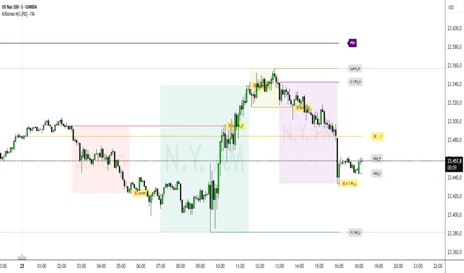
Killzones High/Low [FD] - ITADESCRIPTION ENGLISH - ITALIAN
Killzones High/Low - ITA - Indicator Description
Advanced Pine Script v5 indicator designed for ICT (Inner Circle Trader) strategies that identifies trading killzones, key support/resistance levels and midnight prices with granular controls for every element.
SETTINGS
General controls that affect all indicator elements:
Session Drawings Limit (1): Determines how many historical sessions to keep on chart for each element type. Higher values show more history but may slow performance
Timeframe Limit (30): Drawings disappear on timeframes equal or higher to avoid visual overload
Time Zone: Select reference timezone for sessions. America/New_York automatically adjusts for daylight saving, GMT options are fixed
Label Size: Controls global size of all labels (from Tiny to Huge)
Drawings Cutoff Time: Stops extension of all pivots at specified time (useful for end of trading day)
KILLZONES
Manages critical trading sessions with colored boxes and pivot lines:
General Controls
Show Boxes/Text: Enables visualization and texts in session boxes
Transparency: Controls opacity of boxes and text (0=opaque, 100=transparent)
Available Sessions
Five configurable sessions with individual controls for enabling, custom text, times and colors:
Asia (18:00-00:00): Blue by default
London (02:30-05:30): Red by default
N.Y. AM (07:00-11:30): Green by default
Lunch (11:30-13:00): Golden yellow, enabled by default
N.Y. PM (13:00-16:00): Purple by default
PDH / PDL
Manages Previous Day High and Previous Day Low levels:
Show PDH/PDL: Enables previous day's maximum/minimum
Extension: "Until Mitigation" (stops when broken) or "Most Recent Candle" (continues always)
Colors/Thickness: Visual customization of lines (dark purple by default, 1px thickness)
Labels: Shows "PDH"/"PDL" texts with customizable color (white by default)
PWH / PWL
Manages Previous Week High and Previous Week Low levels:
Show PWH/PWL: Enables previous week's maximum/minimum
Extension: Independent control of line extension
Colors/Thickness: Orange by default for both, 2px thickness
Labels: Configurable "PWH"/"PWL" texts
PMH / PML
Manages Previous Month High and Previous Month Low levels:
Show PMH/PML: Enables previous month's maximum/minimum using security()
Extension: Independent control like other systems
Colors/Thickness: Blue by default for both, 1px thickness
Labels: Customizable "PMH"/"PML" texts
MIDNIGHT PRICE LEVEL
Advanced system for multiple midnight prices:
Base Controls
Show Midnight Price: Enables line at pre-00:00 closing price (ICT strategy)
Midnight -2/-3 Days: Extends system to 2 and 3 days prior
Extension/Mitigation: "Until Mitigation" or "Most Recent Candle" with "Once" or "Multiple" mode
Customization
Separate Colors: D-1, D-2, D-3 with progressive transparency (gold by default)
Style/Thickness: Customizable lines (Solid, Dotted, Dashed)
Labels: Configurable texts (🌙1, 🌙2, 🌙3) with customizable background/text colors
Alerts: Alerts when mitigated during active killzones
KILLZONE LEVEL
Controls pivot lines and killzone labels:
Line Controls
Show Lines: Enables horizontal lines on killzone highs/lows
Break Alerts: Alerts when pivots are exceeded
Midpoints: Dashed lines at range center with stop option after mitigation
Label Offset: Moves labels ahead by 5 candles (0-20 configurable), rejoining when mitigated
Label Controls
Text Customization: Configurable labels for each session (Asia_H/L, London_H/L, etc.)
Background/Colors: Transparent or visible labels with customizable colors
Broken Labels: Additional text (❌ by default) and special colors when pivots mitigated
Extension: "Until Mitigation" or "Beyond Mitigation" with session filter ("Most Recent" or "All")
LABEL STYLES
Four dedicated sections to customize label graphic shapes:
Killzone Line Label Styles: Separate controls for killzone High/Low
PDH/PDL Label Styles: Customizable shapes for Previous Day levels
PWH/PWL Label Styles: Customizable shapes for Previous Week levels
PMH/PML Label Styles: Customizable shapes for Previous Month levels
Each section offers 15+ shape options (Arrows, Center, Circle, Square, Diamond, Triangles, Crosses, Flags, etc.)
MIDNIGHT LINES
System for vertical lines at 00:00:
Show Lines/Labels: Vertical lines with upward arrow labels
Customization: Color (gray by default), style, thickness of vertical lines
Labels: Configurable text ("00:00" by default) with customizable text color (black by default)
Label Offset: Percentage control (-10000% to +10000%) for vertical positioning
Extension: Configurable directions (None, Above, Below, Both)
Limit: Maximum number of lines maintained (4 by default, max 50)
The indicator offers granular control over every visual and functional aspect, making it possible to adapt it to any ICT trading strategy or personal setup.
---ITALIANO---
Killzones High/L ow - ITA
Indicatore avanzato per Pine Script v5 progettato per strategie ICT (Inner Circle Trader) che identifica killzones di trading, livelli chiave di supporto/resistenza e prezzi di mezzanotte con controlli granulari per ogni elemento.
IMPOSTAZIONI
Controlli generali che influenzano tutti gli elementi dell'indicatore:
-Limite Disegni Sessione (1): Determina quante sessioni storiche mantenere sul grafico per ogni tipo di elemento. Valori più alti mostrano più cronologia ma possono rallentare le prestazioni
-Limite Timeframe (30): I disegni scompaiono su timeframe uguali o superiori per evitare sovraccarico visivo
-Fuso Orario: Seleziona il fuso di riferimento per le sessioni. America/New_York si regola automaticamente per l'ora legale, le opzioni GMT sono fisse
-Dimensione Etichette: Controlla la dimensione globale di tutte le etichette (da Minuscola a Enorme)
-Orario Limite Disegni: Ferma l'estensione di tutti i pivot all'orario specificato (utile per fine giornata di trading)
KILLZONES
Gestisce le sessioni di trading critiche con riquadri colorati e linee pivot:
Controlli Generali
-Mostra Riquadri/Testo: Abilita visualizzazione e testi nei riquadri delle sessioni
-Trasparenza: Controlla opacità di riquadri e testo (0=opaco, 100=trasparente)
Sessioni Disponibili
Cinque sessioni configurabili con controlli individuali per abilitazione, testo personalizzato, orari e colori:
Asia (18:00-00:00): Blu di default
London (02:30-05:30): Rosso di default
N.Y. AM (07:00-11:30): Verde di default
Lunch (11:30-13:00): Giallo dorato, abilitata di default
N.Y. PM (13:00-16:00): Viola di default
PDH / PDL
Gestisce i livelli Previous Day High e Previous Day Low:
-Mostra PDH/PDL: Abilita massimo/minimo del giorno precedente
-Estensione: "Fino a Mitigazione" (si ferma quando rotto) o "Candela Più Recente" (continua sempre)
-Colori/Spessore: Personalizzazione visiva delle linee (viola scuro di default, spessore 1px)
-Etichette: Mostra testi "PDH"/"PDL" con colore personalizzabile (bianco di default)
PWH / PWL
Gestisce i livelli Previous Week High e Previous Week Low:
-Mostra PWH/PWL: Abilita massimo/minimo della settimana precedente
-Estensione: Controllo indipendente dell'estensione delle linee
-Colori/Spessore: Arancione di default per entrambi, spessore 2px
-Etichette: Testi "PWH"/"PWL" configurabili
PMH / PML
Gestisce i livelli Previous Month High e Previous Month Low:
-Mostra PMH/PML: Abilita massimo/minimo del mese precedente utilizzando security()
-Estensione: Controllo indipendente come gli altri sistemi
-Colori/Spessore: Blu di default per entrambi, spessore 1px
-Etichette: Testi "PMH"/"PML" personalizzabili
MIDNIGHT PRICE LEVEL
Sistema avanzato per prezzi di mezzanotte multipli:
Controlli Base
-Mostra Midnight Price: Abilita linea al prezzo di chiusura pre-00:00 (strategia ICT)
-Midnight -2/-3 Giorni: Estende il sistema a 2 e 3 giorni precedenti
-Estensione/Mitigazione: "Fino a Mitigazione" o "Candela Più Recente" con modalità "Una Volta" o "Multipla"
Personalizzazione
-Colori separati: D-1, D-2, D-3 con trasparenza progressiva (giallo oro di default)
-Stile/Spessore: Linee personalizzabili (Solida, Punteggiata, Tratteggiata)
-Etichette: Testi configurabili (🌙1, 🌙2, 🌙3) con colori sfondo/testo personalizzabili
-Avvisi: Alert quando mitigati durante killzones attive
KILLZONE LEVEL
Controlla linee pivot e etichette delle killzones:
Controlli Linee
-Mostra Linee: Abilita linee orizzontali sui massimi/minimi delle killzones
-Avvisi Rottura: Alert quando pivot vengono superati
-Punti Medi: Linee tratteggiate al centro del range con opzione di stop dopo mitigazione
-Offset Etichette: Sposta etichette avanti di 5 candele (0-20 configurabile), ricongiungendole quando mitigate
Controlli Etichette
-Personalizzazione Testi: Etichette configurabili per ogni sessione (Asia_H/L, London_H/L, ecc.)
-Sfondo/Colori: Etichette trasparenti o visibili con colori personalizzabili
-Etichette Rotte: Testo aggiuntivo (❌ di default) e colori speciali quando pivot mitigati
-Estensione: "Fino a Mitigazione" o "Oltre Mitigazione" con filtro sessioni ("Più Recente" o "Tutte")
STILI ETICHETTE
Tre sezioni dedicate per personalizzare la forma grafica delle etichette:
-Stili Etichette Linee Killzones: Controlli separati per High/Low delle killzones
-Stili Etichette PDH/PDL: Forme personalizzabili per Previous Day levels
-Stili Etichette PWH/PWL: Forme personalizzabili per Previous Week levels
-Stili Etichette PMH/PML: Forme personalizzabili per Previous Month levels
Ogni sezione offre 15+ opzioni di forma (Frecce, Centro, Cerchio, Quadrato, Diamante, Triangoli, Croci, Bandiere, ecc.)
LINEE MEZZANOTTE
Sistema per linee verticali alle ore 00:00:
-Mostra Linee/Etichette: Linee verticali con etichette freccia verso l'alto
-Personalizzazione: Colore (grigio di default), stile, spessore delle linee verticali
-Etichette: Testo configurabile ("00:00" di default) con colore testo personalizzabile (nero di default)
-Offset Etichette: Controllo percentuale (-10000% a +10000%) per posizionamento verticale
-Estensione: Direzioni configurabili (Nessuna, Sopra, Sotto, Entrambe)
-Limite: Numero massimo linee mantenute (4 di default, max 50)
L'indicatore offre controllo granulare su ogni aspetto visivo e funzionale, rendendo possibile adattarlo a qualsiasi strategia di trading ICT o setup personale.
[TA] Breaker BlocksDescription:
The Breaker Blocks Finder is a sophisticated tool designed for traders who seek to identify key market structures algorithmically. This indicator meticulously scans for both bullish and bearish breaker blocks, visually delineating them on the chart for easy identification.
Exploring ICT Breaker Blocks: Enhancing Your Trading with Precision
Understanding ICT Breaker Blocks: ICT Breaker Blocks are a nuanced trading concept that leverages market liquidity and manipulation to identify potential breakout points. This strategy is particularly effective in pinpointing moments where the market is poised for a significant directional move.
Mechanics of ICT Breaker Blocks: The essence of this strategy lies in detecting manipulation phases where liquidity is being accumulated, typically around critical market highs or lows. This setup leads to a Stop Hunt, a tactical move to trigger stop orders and fuel a breakout in the opposite direction.
Detailed Breakdown of Breaker Block Types:
Bullish Breaker Blocks:
• Bullish Order Block: The precursor to a bullish breakout, setting the stage for a potential upward move.
• Bullish Breaker Candle: An upward-closing candle that forms just before breaking past an old low, signaling a bullish reversal.
• Confirmation: Achieved when the price dips below the prior low and subsequently rises above the high of the swing, solidifying the bullish breakout.
• Identification: Look for a failed bearish order block, indicated by an initial drop in prices that ultimately reverses, hinting at a bullish shift.
• Key Elements: Monitor the pattern of lows and highs (low, high, lower low, higher high), which suggests an emerging bullish trend.
Bearish Breaker Blocks:
• Bearish Breaker Candle: A downward-closing candle that appears right before an old high is surpassed, indicating a bearish reversal.
• Confirmation: Occurs when prices climb above the previous high and then descend below the swing's low, confirming the bearish move.
• Identification: Initiate by identifying a failed bullish order block, where initial upward price momentum falters and reverses, signaling bearish potential.
• Key Elements: Focus on the sequence of highs and lows (high, low, higher high, lower low), which may denote a looming bearish trend.
Spotting High Probability Breaker Blocks: To enhance the reliability of breaker block identification, incorporate patterns that exhibit a Fair Value Gap (FVG), which typically indicates a stronger likelihood of a successful breakout.
Leveraging ICT Breaker Blocks in Trading: Our Inner Circle Trading mentorship delves into these concepts and more, providing you with comprehensive education and weekly market insights.
By mastering ICT Breaker Blocks, you're equipped with a powerful tool to navigate the intricacies of the market, making informed and strategic trading decisions.
This channel provides you with comprehensive education and weekly market insights. If you enjoyed this thread, like, share, and follow. Join us for an in-depth exploration of advanced trading strategies, and elevate your trading proficiency.
Still confused about Breaker Blocks?
Follow these steps for Bullish Breaker Blocks and reverse them for Bearish Breaker Blocks.
Think:
Bullish BB = Low, High, Lower Low, then Higher High
Bearish BB = High, Low, Higher High, then Lower Low
While this tool is a powerful addition to your trading strategy, it's important to note that it is not an autotrader. Traders should use this indicator as part of a comprehensive trading plan, considering other market factors and personal risk tolerance.
Risk Disclaimer:
Trading financial markets involves significant risk and can result in the loss of your invested capital. You should not invest more than you can afford to lose and should ensure that you fully understand the risks involved. Before trading, please take into consideration your level of experience, investment objectives, and seek independent financial advice if necessary. This indicator is provided as-is without any guarantees or warranty. Use of this indicator is at your own risk, and the creator is not responsible for any financial losses or damages.

VB-MainLiteVB-MainLite – v1.0 Initial Release
Overview
VB-MainLite is a consolidated market-structure and execution framework designed to streamline decision-making into a single chart-level view. The script combines multi-timeframe trend, volatility, volume, and liquidity signals into one cohesive visual layer, reducing indicator clutter while preserving depth of information for active traders.
Core Architecture
Trend Backbone – EMA 200
Dedicated EMA 200 acts as the primary trend filter and higher-timeframe bias reference.
Serves as the “spine” of the system for contextualizing all secondary signals (swings, reversals, volume events, etc.).
Custom MA Suite (Envelope Ready)
Four configurable moving averages with flexible source, length, and smoothing.
Default configuration (preset idea: “8/89 Envelope”):
MA #1: EMA 8 on high
MA #2: EMA 8 on low
MA #3: EMA 89 on high
MA #4: EMA 89 on low
All four are disabled by default to keep the chart minimal. Users can toggle them on from the Custom MAs group for envelope or cloud-style configurations.
Nadaraya–Watson Smoother (Swing Framework)
Gaussian-kernel Nadaraya–Watson regression applied to price (hl2) to build a smooth synthetic curve.
Two layers of functionality:
Swing labels (▲ / ▼) at inflection points in the smoothed curve.
Optional curve line that visually tracks the turning structure over the last ~500 bars.
Designed to surface early swing potential before standard MAs react.
Hull Moving Average (Trend Overlay)
Optional Hull MA (HMA) for faster trend visualization.
Color-coded by slope (buy/sell bias).
Default: off to prevent overloading the chart; can be enabled under Hull MA settings.
Momentum, Exhaustion & Pattern Engine
CCI-Based Bar Coloring
CCI applied to close with configurable thresholds.
Overbought / oversold CCI zones map directly into candle coloring to visually highlight short-term momentum extremes.
RSI Top / Bottom Exhaustion Finder
RSI logic applied separately to high-driven (tops) and low-driven (bottoms) sequences.
Plots:
Top arrows where high-side RSI stretches into high-risk territory.
Bottom arrows where low-side RSI indicates exhaustion on the downside.
Useful as confluence around the Nadaraya swing turns and EMA 200 regime.
Engulfing + MA Trend Engine (“Fat Bull / Fat Bear”)
Detects bullish and bearish engulfing patterns, then combines them with MA trend cross logic.
Only when both pattern and MA regime align does the engine flag:
Fat Bull (Engulf + MA aligned long)
Fat Bear (Engulf + MA aligned short)
Candles are marked via conditional barcolor to highlight strong, structured shifts in control.
Fat Finger Detection (Wick Spikes / Stop Runs)
Identifies abnormal wick extensions relative to the prior bar’s body range with configurable tolerance.
Supports detection of potential liquidity grabs, stop runs, or “excess” that may precede reversals or mean-reversion behavior.
Volume & Liquidity Intelligence
Bull Snort (Aggressive Buy Spikes)
Flags events where:
Volume is significantly above the 50-period average, and
Price closes in the upper portion of the bar and above prior close.
Plots a labeled marker below the bar to indicate aggressive upside initiative by buyers.
Pocket Pivots (Accumulation Flags)
Compares current volume vs prior 10 sessions with a filter on prior “up” days.
Highlights pocket pivot days where current green candle volume outclasses recent down-day volumes, suggesting stealth accumulation.
Delta Volume Core (Directional Volume by Price)
Internal volume-by-price style engine over a user-defined lookback.
Splits volume into up-close and down-close buckets across dynamic price bins.
Feeds into S&R and ICT zone logic to quantify where buying vs selling pressure built up.
Structural Context: S&R and ICT Zones
S&R Power Channel
Computes local high/low band over a configurable lookback window.
Renders:
Upper and lower S&R channel lines.
Shaded support / resistance zones using boxes.
Adds Buy Power / Sell Power metrics based on the ratio of up vs down bars inside the window, displayed directly in the zone overlays.
Drops ◈ markers where price interacts dynamically with the top or bottom band, highlighting reaction points.
ICT-Style Premium / Discount & Macro Zones
Two tiered structures:
Local Premium / Discount zones over a shorter SR window.
Macro Premium / Discount zones over a longer macro window.
Each zone:
Uses underlying directional volume to annotate accumulation vs distribution bias.
Provides Delta Volume Bias shading in the mid-band region, visually encoding whether local power flows are net-buying or net-selling.
Enables traders to quickly see whether current trade location is in a local/macro discount or premium context while still respecting volume profile.
Positioning Intelligence: PCD (Stocks)
Position Cost Distribution (PCD) – Stocks Only
Available for stock symbols on intraday up to daily timeframe (≤ 1D).
Uses:
TOTAL_SHARES_OUTSTANDING fundamentals,
Daily OHLCV snapshot, and
A bucketed distribution engine
to approximate cost basis distribution across price.
Outputs:
Horizontal “PCD bars” to the right of current price, density-scaled by estimated share concentration.
Color-coding by profitability relative to current price (profitable vs unprofitable positions).
Labels for:
Current price
Average cost
Profit ratio (share % below current price)
90% cost range
70% cost range
Range overlap as a measure of clustering / concentration.
Multi-Timeframe Trend: Two-Pole Gaussian Dashboard
Two-Pole Gaussian Filter (Line + Cloud)
Smooths a user-selected source (default: close) using a two-pole Gaussian filter with tunable alpha.
Plots:
A thin Gaussian trend line, and
A thick Gaussian “cloud” line with transparency, colored by slope vs past (offsetG).
Functions as a responsive trend backbone that is more sensitive than EMA 200 but less noisy than raw price.
Multi-Timeframe Gaussian Dashboard
Evaluates Gaussian trend direction across up to six timeframes (e.g., 1H / 2H / 4H / Daily / Weekly).
Renders a compact bottom-right table:
Header: symbol + overall bias arrow (up / down) based on average trend alignment.
Row of colored cells per timeframe (green for uptrend, magenta for downtrend) with human-readable TF labels (e.g., “60M”, “4H”, “1D”).
Gives an immediate read on whether intraday, swing, and higher-timeframe flows are aligned or fragmented.
Default Configuration & Usage Guidance
Default state after adding the script:
Enabled by default:
EMA 200 trend backbone
Nadaraya–Watson swing labels and curve
CCI bar coloring
RSI top/bottom arrows
Fat Bull / Fat Bear engine
Bull Snort & Pocket Pivots
S&R Power Channel
ICT Local + Macro zones
Two-pole Gaussian line + cloud + dashboard
PCD engine for stocks (auto-active where data is available)
Disabled by default (opt-in):
Custom MA suite (4x MAs, preset as EMA 8/8/89/89)
Hull MA overlay
How traders can use VB-MainLite in practice:
Use EMA 200 + Gaussian dashboard to define top-down directional bias and avoid trading directly against multi-TF trend.
Use Nadaraya swing labels, RSI exhaustion arrows, and CCI bar colors to time entries within that higher-timeframe bias.
Use Fat Bull / Fat Bear events as structured confirmation that both pattern and MA regime have flipped in the same direction.
Use Bull Snort, Pocket Pivots, and S&R / ICT zones to align execution with liquidity, volume, and location (premium vs discount).
On stocks, use PCD as a positioning map to understand trapped supply, support zones near crowded cost basis, and where profit-taking is likely.

Macros+AMD [NW]Macros + AMD - Daily & Weekly Time-Based Analysis
Multi-timeframe AMD (Accumulation, Manipulation, Distribution) visualization with ICT Macro timing windows for time-based market analysis.
Overview
This indicator visualizes the AMD (Accumulation, Manipulation, Distribution) framework on both daily and weekly timeframes, combined with ICT Macro timing windows. It is designed as an educational tool to help traders study time-based market structure and algorithmic price delivery concepts.
The AMD model is based on the idea that markets move through distinct phases within each trading period:
Accumulation (A) - Initial range formation, liquidity building
Manipulation (M) - False moves to trap traders, liquidity sweeps
Distribution (D) - True directional move, price delivery to targets
What This Indicator Displays
Daily AMD Phases
Displays the intraday AMD cycle based on New York trading hours:
A Phase (Blue): 4:00 AM - 8:35 AM EST — Morning accumulation, Asian/London overlap
M Phase (Red): 8:35 AM - 11:25 AM EST — NY session manipulation, news events
D Phase (Green): 11:25 AM - 4:00 PM EST — Afternoon distribution and price delivery
Weekly AMD Phases
Displays the weekly AMD cycle from Monday to Monday:
A Phase: Monday 00:00 - Tuesday 21:56 EST — Weekly high/low formation begins
M Phase: Tuesday 21:56 - Thursday 02:04 EST — Mid-week reversal zone
D Phase: Thursday 02:04 - Monday 00:00 EST — Weekly price delivery
Inner M Phase Fibs
When enabled, subdivides the M (Manipulation) phase using Fibonacci levels:
0.382 level — Inner accumulation ends
0.500 level — Mid-point of manipulation
0.618 level — Inner distribution begins
This helps identify potential reversal points within the manipulation phase.
ICT Macro Windows
Horizontal lines marking the XX:42 to XX:15 macro periods (33-minute windows):
2:42 - 3:15 AM
3:42 - 4:15 AM (London)
7:42 - 8:15 AM
8:42 - 9:15 AM
9:42 - 10:15 AM (Prime AM session)
10:42 - 11:15 AM
11:42 - 12:15 PM
12:42 - 1:15 PM
1:42 - 2:15 PM
2:42 - 3:15 PM
These windows represent times when algorithmic price delivery is more likely to occur.
How To Use
Understanding the AMD Framework
During the A Phase:
Observe range formation and initial liquidity pools
Note the high and low established during this phase
Wait for manipulation before committing to direction
During the M Phase:
Watch for false breakouts and stop hunts
Look for reversal patterns after liquidity sweeps
The inner fibs (0.382, 0.5, 0.618) can help time entries within this phase
Mid-week (Wednesday) often sees key reversals on weekly AMD
During the D Phase:
This is typically when the true move occurs
Price tends to deliver toward draw on liquidity targets
The direction is often opposite to the manipulation move
Using the Macro Windows
The XX:42 to XX:15 windows are times to pay attention to price action:
These 33-minute periods often see increased algorithmic activity
Look for displacement, fair value gaps, or order blocks forming
The 9:42-10:15 AM window is considered particularly significant for NY session
Weekly Day Labels
Monday/Tuesday: "H/L of Week" — Watch for weekly high or low formation
Wednesday: "Reversal Day" — Mid-week reversal probability increases
Thursday/Friday: "Reversal Day" — Continuation or secondary reversal
Settings Guide
Main Settings
Timezone: Set to your broker's timezone or preferred timezone
Macros On Top: Toggle macro lines above or below AMD boxes
Show All Text Labels: Master toggle for all text (turn off for clean charts on HTF)
Daily/Weekly AMD
Show: Enable/disable the AMD visualization
Opacity: Adjust transparency of the phase boxes (higher = more transparent)
AMD Colors
Customize colors for each phase (A, M, D)
Default: Blue (A), Red (M), Green (D)
Inner M Style
Customize the inner M phase fib lines and text colors
Default: Black lines for clean visibility
Macro Settings
Adjust macro line color and thickness
Toggle individual macro windows on/off
Important Notes
This indicator is for educational purposes and time-based analysis
It does not provide buy/sell signals
Always use in conjunction with proper price action analysis
Past price behavior during these time windows does not guarantee future results
The AMD framework is one lens for viewing market structure — use it as part of a complete methodology
Credits
This indicator is based on concepts taught by ICT (Inner Circle Trader) and the broader Smart Money Concepts community. The AMD framework, macro timing windows, and weekly profile concepts are derived from this educational methodology.
Timeframe Recommendations
Best viewed on 1-minute to 15-minute charts
Text labels automatically hide on 9-minute and higher timeframes for cleaner visualization
Indicator hides completely on 1-hour and higher timeframes
Changelog
v1.0 - Initial release
Daily AMD phases (4am-4pm EST)
Weekly AMD phases (Monday-Monday)
Inner M phase Fibonacci subdivisions
10 ICT Macro timing windows
Full customization options
Automatic 9-day cleanup

Venom Model [#]ICT Concepts by shulktrades
Advanced Concept
Venom Model — Deferred Turtle Soup Entry Concept Identifier
Description:
The Venom Model is a closed‑source indicator that identifies a specific advanced liquidity‑sweep signature taught by the ICT framework (often referenced as a “Deferred Turtle Soup”). It highlights the exact candle or candles that penetrate a liquidity pool (above or below a defined zone) then confirms when price closes back outside that pool. This visual marker allows traders to spot the precise algorithmic “poison fang” moment without relying on raw signals.
This indicator does not issue automatic entry alerts or trade triggers. It is strictly a visual tool for confluence and study, meant to be used in conjunction with your own structure, execution and risk‑management framework.
How It Works (Conceptually)
Liquidity Pool Definition
The script identifies zones where liquidity is pooled—often at relative equal highs/lows or around established session structure. These zones act as the target for algorithmic sweeps.
Sweep Candle Highlighting
When a candle (or consecutive candles) penetrate into or through the defined liquidity pool, those candle(s) are marked as the “sweep”. The indicator uses precise tracking of the candle(s) that first break the zone.
Confirmation via Close Outside Zone
After the sweep candle(s), the script watches for price to close back outside the liquidity pool boundary. Once that happens, a confirmed Venom event is marked visually. This indicates the liquidity‑raid and ensuing directional bias shift.
Visual Representation
The exact candle(s) of the sweep are highlighted (e.g., coloured bar or marker).
The liquidity pool boundaries are drawn for context.
A persistent marker or box remains until the user‑defined expiration or invalidation, which helps track the event across the chart.
Unique Implementation Features
The Venom Model differs from many generic liquidity or sweep indicators by virtue of:
Exact Candle Focus
Rather than highlighting broad zones, this tool pinpoints the specific candle(s) that executed the sweep—giving traders a sharp visual of the “fang” moment.
Deferred Turtle Soup Logic
It implements the ICT‑style “Turtle Soup” liquidity reversal logic (a false breakout, stop‐hunt, then return), but via deferred confirmation: first the sweep candle(s), then the close back outside. This layered confirmation adds structural algorithmic precision.
Higher‑Timeframe & Session Context
While you may select your working timeframe, the logic accounts for session structure (e.g., early NY open) and higher timeframe liquidity zones to align sweep recognition with institutional flow rather than purely local price moves.
Adaptive Visual Persistence
Once identified, the sweep marker stays in view until you choose to clear or until a set number of bars/candles later, which you can define in the settings. This avoids clutter and preserves the event for reference, not as a trigger.
How to Use It
Apply the indicator to view your preferred chart and timeframe; use it as a contextual overlay, not a standalone trade system.
When you see a highlighted candle(s), interpret this as a liquidity raid event: price targeted the pool, triggered retail stops, and reversed.
Use this marker alongside your own structure: e.g., order blocks, fair value gaps, market structure shifts, session bias.
Use the user settings to define box expiry or number of candles to display the event marker, according to your analysis depth.
Originality and Purpose
This indicator is original and justifies closed‑source publication because:
It focuses solely on the specific candle(s) that executed the sweep rather than drawing every penetration or “possible” sweep zone.
It uses deferred confirmation (penetration then close back outside) which adds robustness over naive sweep detectors.
It aligns to ICT’s advanced Deferred Turtle Soup signature, not just generic stop‑hunt or breakout models.
It offers visual clarity and persistence tailored for confluence, avoiding base‑level indicator clutter or ambiguous signals.
Because of these factors, the logic, confirmation criteria and precise rendering go beyond simple replication of open‑source liquidity sweep tools.
Important Notes
For visual analysis and educational use only.
Does not generate alerts, buy/sell signals, or automatic entries.
Most effective when used by traders familiar with ICT liquidity, order‑flow and market structure concepts.
Always apply your own risk management, trade validation and execution rules.
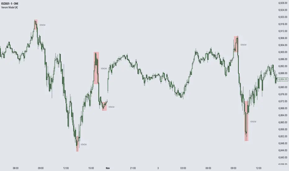
IRONBULL FX AMD📌 Power Of 3 ICT 01 – AMD ICT & SMC Accumulations
Overview:
The Power Of 3 ICT 01 indicator by TradingFinder is designed to visually map out the classic Accumulation–Manipulation–Distribution (AMD) phases of price behavior, based on ICT (Inner Circle Trader) and Smart Money Concepts (SMC) principles. It helps traders recognize the underlying structure of the trading day using session-based detection aligned to the New York timezone.
🔍 Core Logic:
This script divides each trading day into three logical phases:
Accumulation (19:00–01:00 EST)
The period when institutions quietly build positions within a tight range.
Manipulation (01:00–07:00 EST)
False moves designed to induce retail participation in the wrong direction.
Distribution (07:00–13:00 EST)
The actual directional move after trapping liquidity.
These zones are visually marked on the chart using colored transparent boxes, with labels for clear identification.
🛠️ Key Features:
Session-Based Detection:
Uses Pine Script’s time() function to identify when the chart time falls within each of the defined AMD sessions.
Automatic High/Low Range Detection:
For each phase, the indicator tracks the highest high and lowest low within the session window to draw a price range box.
Visual Markers:
Distinct labels and shaded boxes are plotted for each zone:
🔹 Accumulation → Blue
🔸 Manipulation → Orange
🟢 Distribution → Cyan
Fully Customizable Settings:
Each phase’s visibility, session time, and color can be adjusted from the input panel.
📈 Ideal Use Case:
For traders following ICT/SMC methodology
For intraday structure mapping
To combine with other tools like Order Blocks, FVGs, or session breakouts
⚙️ Customization Options:
✅ Toggle visibility for each phase independently
🕒 Modify session start/end times
🎨 Choose custom colors for phase boxes and labels
⚠️ Note: Best used on intraday timeframes (60 min or lower). The indicator is optimized for charts set to the America/New_York timezone.

Previous Cycle Range + SMTs [bilal x shpat]Inspired by ICT (Inner Circle Trader) concepts
Description made by ChatGPT
Thank you shpat.a for making the SMT option
📝 Overview
The Previous Cycle Range + SMTs indicator is a multi-timeframe tool designed to visualize key market structure levels derived from the previous trading cycle’s range — a concept heavily utilized in ICT-style analysis.
In addition to the traditional range levels, this indicator adds Smart Money Tool (SMT) detection, allowing traders to identify bullish or bearish divergences across multiple correlated assets, giving an edge in spotting potential turning points and liquidity imbalances.
It helps traders identify equilibrium levels, liquidity zones, and potential premium/discount areas based on the prior day (or any chosen period) high and low — now with intermarket divergence insights.
⚙️ Features
Custom Cycle Length: Define your own cycle in minutes (e.g., 1440 = 1 day, 10080 = 1 week).
Previous High/Low: Automatically plots the previous cycle’s high and low levels.
Equilibrium (EQ): Optional 50% midpoint line to highlight the market’s equilibrium.
Quarter Levels: Adds 25% and 75% range lines for refined premium/discount analysis.
Extended Ranges: Optional extended levels (e.g., -100%, +200%) to identify continuation or retracement targets.
Fib Levels (1.272 & 1.618): Adds ICT-style Fibonacci extension levels for confluence zones.
Smart Money Tool (SMT) Detection:
Detects bullish or bearish divergences between your main asset and up to two comparison symbols.
Highlights potential SMT zones with optional text labels for quick visualization.
Optional SMT summary table displays divergence status for all three assets.
Custom Styling: Full control over colors, line width, label style, and extension distance.
💡 How It Helps
This indicator aligns with ICT principles by making the previous day’s range visible and actionable, now with SMT divergence insights:
The previous day’s high/low often act as liquidity pools.
The equilibrium (EQ) represents fair value — useful for spotting premium/discount zones.
Quarter levels and Fibonacci extensions add precision when mapping market structure and potential reaction points.
SMT detection helps traders identify early divergence signals that may indicate upcoming bullish or bearish moves across correlated markets.
🔍 Example Uses
Identify where price is trading relative to the previous session’s range.
Use EQ and quarter levels to gauge premium vs. discount conditions.
Spot intermarket divergences using SMTs to anticipate potential reversal or continuation points.
Combine with other ICT-based tools (e.g., PD arrays, dealing ranges, or kill zones) for refined trade setups.

Price Action Analyst [OmegaTools]Price Action Analyst (PAA) is an advanced trading tool designed to assist traders in identifying key price action structures such as order blocks, market structure shifts, liquidity grabs, and imbalances. With its fully customizable settings, the script offers both novice and experienced traders insights into potential market movements by visually highlighting premium/discount zones, breakout signals, and significant price levels.
This script utilizes complex logic to determine significant price action patterns and provides dynamic tools to spot strong market trends, liquidity pools, and imbalances across different timeframes. It also integrates an internal backtesting function to evaluate win rates based on price interactions with supply and demand zones.
The script combines multiple analysis techniques, including market structure shifts, order block detection, fair value gaps (FVG), and ICT bias detection, to provide a comprehensive and holistic market view.
Key Features:
Order Block Detection: Automatically detects order blocks based on price action and strength analysis, highlighting potential support/resistance zones.
Market Structure Analysis: Tracks internal and external market structure changes with gradient color-coded visuals.
Liquidity Grabs & Breakouts: Detects potential liquidity grab and breakout areas with volume confirmation.
Fair Value Gaps (FVG): Identifies bullish and bearish FVGs based on historical price action and threshold calculations.
ICT Bias: Integrates ICT bias analysis, dynamically adjusting based on higher-timeframe analysis.
Supply and Demand Zones: Highlights supply and demand zones using customizable colors and thresholds, adjusting dynamically based on market conditions.
Trend Lines: Automatically draws trend lines based on significant price pivots, extending them dynamically over time.
Backtesting: Internal backtesting engine to calculate the win rate of signals generated within supply and demand zones.
Percentile-Based Pricing: Plots key percentile price levels to visualize premium, fair, and discount pricing zones.
High Customizability: Offers extensive user input options for adjusting zone detection, color schemes, and structure analysis.
User Guide:
Order Blocks: Order blocks are significant support or resistance zones where strong buyers or sellers previously entered the market. These zones are detected based on pivot points and engulfing price action. The strength of each block is determined by momentum, volume, and liquidity confirmations.
Demand Zones: Displayed in shades of blue based on their strength. The darker the color, the stronger the zone.
Supply Zones: Displayed in shades of red based on their strength. These zones highlight potential resistance areas.
The zones will dynamically extend as long as they remain valid. Users can set a maximum number of order blocks to be displayed.
Market Structure: Market structure is classified into internal and external shifts. A bullish or bearish market structure break (MSB) occurs when the price moves past a previous high or low. This script tracks these breaks and plots them using a gradient color scheme:
Internal Structure: Short-term market structure, highlighting smaller movements.
External Structure: Long-term market shifts, typically more significant.
Users can choose how they want the structure to be visualized through the "Market Structure" setting, choosing from different visual methods.
Liquidity Grabs: The script identifies liquidity grabs (false breakouts designed to trap traders) by monitoring price action around highs and lows of previous bars. These are represented by diamond shapes:
Liquidity Buy: Displayed below bars when a liquidity grab occurs near a low.
Liquidity Sell: Displayed above bars when a liquidity grab occurs near a high.
Breakouts: Breakouts are detected based on strong price momentum beyond key levels:
Breakout Buy: Triggered when the price closes above the highest point of the past 20 bars with confirmation from volume and range expansion.
Breakout Sell: Triggered when the price closes below the lowest point of the past 20 bars, again with volume and range confirmation.
Fair Value Gaps (FVG): Fair value gaps (FVGs) are periods where the price moves too quickly, leaving an unbalanced market condition. The script identifies these gaps:
Bullish FVG: When there is a gap between the low of two previous bars and the high of a recent bar.
Bearish FVG: When a gap occurs between the high of two previous bars and the low of the recent bar.
FVGs are color-coded and can be filtered by their size to focus on more significant gaps.
ICT Bias: The script integrates the ICT methodology by offering an auto-calculated higher-timeframe bias:
Long Bias: Suggests the market is in an uptrend based on higher timeframe analysis.
Short Bias: Indicates a downtrend.
Neutral Bias: Suggests no clear directional bias.
Trend Lines: Automatic trend lines are drawn based on significant pivot highs and lows. These lines will dynamically adjust based on price movement. Users can control the number of trend lines displayed and extend them over time to track developing trends.
Percentile Pricing: The script also plots the 25th percentile (discount zone), 75th percentile (premium zone), and a fair value price. This helps identify whether the current price is overbought (premium) or oversold (discount).
Customization:
Zone Strength Filter: Users can set a minimum strength threshold for order blocks to be displayed.
Color Customization: Users can choose colors for demand and supply zones, market structure, breakouts, and FVGs.
Dynamic Zone Management: The script allows zones to be deleted after a certain number of bars or dynamically adjusts zones based on recent price action.
Max Zone Count: Limits the number of supply and demand zones shown on the chart to maintain clarity.
Backtesting & Win Rate: The script includes a backtesting engine to calculate the percentage of respect on the interaction between price and demand/supply zones. Results are displayed in a table at the bottom of the chart, showing the percentage rating for both long and short zones. Please note that this is not a win rate of a simulated strategy, it simply is a measure to understand if the current assets tends to respect more supply or demand zones.
How to Use:
Load the script onto your chart. The default settings are optimized for identifying key price action zones and structure on intraday charts of liquid assets.
Customize the settings according to your strategy. For example, adjust the "Max Orderblocks" and "Strength Filter" to focus on more significant price action areas.
Monitor the liquidity grabs, breakouts, and FVGs for potential trade opportunities.
Use the bias and market structure analysis to align your trades with the prevailing market trend.
Refer to the backtesting win rates to evaluate the effectiveness of the zones in your trading.
Terms & Conditions:
By using this script, you agree to the following terms:
Educational Purposes Only: This script is provided for informational and educational purposes and does not constitute financial advice. Use at your own risk.
No Warranty: The script is provided "as-is" without any guarantees or warranties regarding its accuracy or completeness. The creator is not responsible for any losses incurred from the use of this tool.
Open-Source License: This script is open-source and may be modified or redistributed in accordance with the TradingView open-source license. Proper credit to the original creator, OmegaTools, must be maintained in any derivative works.

Macro Range HighlighterThis Pine Script indicator creates visual boxes that highlight specific time-based price ranges throughout the trading day, operating in New York Eastern Time. It offers two distinct modes: a standard hourly range mode and a classic ICT (Inner Circle Trader) Macro mode.
Two Operating Modes
Mode 1: Standard Hourly 50-09 Ranges (Default)
This mode identifies and highlights the price range during the final 10 minutes of each hour (xx:50) through the first 9 minutes of the next hour (xx:09).
Examples of captured ranges:
08:50 - 09:09
09:50 - 10:09
10:50 - 11:09
11:50 - 12:09
12:50 - 13:09
13:50 - 14:09
14:50 - 15:09
And continues for each hour...
Excluded Time Periods:
The indicator excludes certain periods that cross into or occur during market close and the daily reset:
02:50 - 03:09 (excluded to avoid interference with overnight session)
15:50 - 18:09 (excluded to avoid end-of-regular-hours and the 18:00 ET trading day reset)
This means you will NOT see boxes during the 16:00 or 17:00 hours, as these fall within the excluded window.
Mode 2: Classic ICT Macro Times
When enabled, this mode shows ONLY four specific time windows that are significant in ICT methodology:
02:33 - 02:59 (London Midnight Macro)
04:03 - 04:29 (London Open Macro)
13:10 - 13:39 (New York Lunch Macro)
15:15 - 15:44 (New York Close Macro)
When this mode is active, all standard hourly ranges are disabled, including the 02:50-03:09 range.
Green Line - Open Price
Represents the open price of the first candle when the range begins
This line is static once set - it shows where price opened when entering the time window
Extends horizontally across the entire duration of the box
Example: If the range starts at 08:50 and that candle opens at 18,500, the green line will be drawn at 18,500
Blue Line - Evolving Midpoint
Represents the dynamic midpoint between the range high and range low
This line continuously recalculates as new highs or lows are made within the time window
Calculation: Midpoint = (Range High + Range Low) / 2
Evolution example:
At 08:50, range is 18,480 (low) to 18,520 (high), midpoint = 18,500
At 08:55, price makes new high of 18,540, midpoint updates to 18,510
At 09:02, price makes new low of 18,470, midpoint updates to 18,505
The line visually adjusts up and down as the range expands
Extension: The line extends horizontally from the start of the range to the current bar (or end of range)
This gives traders a visual reference for the "fair value" or equilibrium point of the range
Red Line - Close Price
Represents the close price of the most recent candle within the time window
This line updates continuously with each new bar's close price
Extends horizontally across the range
When the range completes (exits the time window), it shows the final close price of the last bar in the range
Example: As price moves from 08:50 to 09:09, the red line will track the close of each candle: 18,505 → 18,510 → 18,508 → 18,515, etc.
This indicator provides a sophisticated visual framework for analyzing specific time-based price behavior. The evolving midpoint (blue line and optional yellow plot) is particularly powerful because it gives you real-time feedback on where the "fair value" of the range is as it develops, allowing you to make informed decisions about whether price is extended or returning to equilibrium. The three-line system (open/mid/close) creates a complete picture of price action within each critical time window, whether you're using standard hourly analysis or focusing on ICT's specific macro times.

MP Universal FVG Detector🇺🇸 English Description
MP Universal FVG Detector
A clean and powerful indicator that automatically detects classic ICT 3-candle Fair Value Gaps on any market and any timeframe.
It highlights bullish and bearish imbalances with clear colored boxes, helping you quickly spot inefficient price zones where liquidity is likely to return.
Perfect for:
• Smart Money Concepts
• ICT/Inner Circle Trader setups
• Breaker / OB / Displacement traders
• Scalpers, day traders, swing traders
The indicator works with all assets: crypto, forex, stocks, indices, commodities — and on all timeframes.
🇺🇦 Опис українською
MP Universal FVG Detector
Чистий і потужний індикатор, який автоматично визначає класичні 3-свічкові Fair Value Gap (FVG) у стилі ICT на будь-якому ринку та будь-якому таймфреймі.
Він підсвічує бичачі та ведмежі дисбаланси кольоровими боксами, щоб ти легко бачив неефективні зони ціни, куди з великою ймовірністю повернеться ліквідність.
Підходить для:
• Smart Money Concepts
• ICT/Inner Circle Trader структур
• Breaker / Order Block / Displacement трейдерів
• Скальпінгу, внутрідеяльної та свінг-торгівлі
Працює з усіма активами: крипта, форекс, акції, індекси, товари — і на всіх таймфреймах.

FVG and OB🧠 Concept Behind the “FVG and OB” Indicator
This indicator merges two core ICT (Inner Circle Trader) concepts — Fair Value Gaps (FVGs) and Order Blocks (OBs) — into one clean, dynamic visualization tool.
It is designed for professional price-action traders who want to track institutional imbalances and smart money footprints directly on the chart.
🟩 FAIR VALUE GAP (FVG)
An FVG represents an imbalance in price caused by aggressive buying or selling where the market fails to offer two-way liquidity.
It’s typically created when a strong candle leaves a visible “gap” between the previous candle’s high and the next candle’s low (for bullish FVG), or vice versa (for bearish FVG).
In this indicator:
🟢 Bullish FVGs are drawn when low > high
🔴 Bearish FVGs are drawn when high < low
Each gap box dynamically extends to the right until it is mitigated (partially or fully filled).
You can choose between two mitigation modes:
Boundary Touch (default): The FVG is considered mitigated once price touches the gap boundary.
Full Fill: The FVG remains active until the entire gap range is filled.
This gives you real-time awareness of whether liquidity has been rebalanced — a key ICT concept in identifying market turning points.
🟥 ORDER BLOCK (OB)
An Order Block represents the last opposing candle before a strong impulsive move.
It is where institutional traders likely executed large block orders, creating supply or demand zones that price often revisits.
In this script, an OB is automatically drawn:
🟥 Bearish OBs form after a strong down move (usually following a bearish FVG).
🟩 Bullish OBs form after a strong up move (usually following a bullish FVG).
Key features:
The indicator can detect OBs in two ways:
Only FVG’s First Candle: A stricter mode aligning OB formation directly with FVG events.
Classic (Last Opposite Color): A more traditional ICT-style detection that finds the last candle of the opposite color within a defined lookback range.
OBs auto-expand with the next candle’s wick, so any extra high/low beyond the original OB is included by default.
Each OB remains extended until mitigated — when price revisits and closes the imbalance.
⚙️ CONTROL & CUSTOMIZATION
You can control the entire behavior and visualization through the settings panel:
Display Mode: Show only FVGs, only OBs, or both simultaneously.
Mitigation Mode: Choose how strict the FVG closure logic should be.
Body-Only Option: Restrict OB calculation to candle bodies instead of wicks for cleaner structure.
Individual Color Settings: Customize border and fill colors for each block type.
Lookback Depth: Define how far back the system searches for valid OB structures.
The result is a clean, layered representation of institutional footprints — with automatic cleanup logic that prevents chart clutter and keeps only active zones visible.
📊 PRACTICAL APPLICATION
Use this indicator to:
Identify imbalances left by aggressive moves (potential retracement targets).
Confirm confluences between FVGs and OBs — the overlap areas often mark powerful reaction zones.
Track mitigation progress as price revisits those zones.
Refine entry timing when price reacts to unmitigated OBs or fills the last untested FVG.
🧩 TECHNICAL DESIGN
Built in Pine Script v5 with fully modular code architecture.
FVG and OB modules can be toggled or used independently.
Uses arrays for efficient management of multiple boxes.
Auto-updates in real-time and mitigates per-bar to minimize lag.
Designed for multi-timeframe backtesting compatibility.
💡 Summary
This tool visually bridges two of the most powerful Smart Money Concepts —
FVG = imbalance zones and OB = institutional origin blocks.
Together, they help traders map out liquidity flows, identify premium/discount zones, and anticipate where price is likely to react next.
🧑💻 Credits
Based on ICT & Smart Money Concepts, rewritten in modular PineScript with precision mitigation logic.
# For educational and analytical purposes only.

OSOK AMERICANA [TakingProphets]OVERVIEW
OSOK is an ICT-inspired execution framework designed to help traders map the interaction between Higher-Timeframe (HTF) liquidity sweeps, qualifying Order Blocks, and Current-Timeframe (CTF) confirmation signals — all within a single, structured workflow.
By sequencing an HTF CRT → Order Block → CTF CRT model and integrating IPDA 20 equilibrium context, this tool provides traders with a visual framework for aligning intraday execution decisions with higher-timeframe intent. All plotted elements — sweeps, blocks, open prices, and equilibrium levels — update continuously in real time.
-----------------------------------------------------------------------------------------------
Core Concepts (ICT-Based)
-----------------------------------------------------------------------------------------------
Candle Range Transition (CRT) Sweeps
Bullish CRT → The second candle runs below the first candle’s low and closes back inside its range.
Bearish CRT → The second candle runs above the first candle’s high and closes back inside its range.
These patterns are frequently associated with liquidity grabs and potential directional shifts.
HTF → CTF Alignment
-Detects valid HTF CRTs (e.g., Daily CRTs derived from H4 or Weekly CRTs derived from Daily).
-Locates a qualifying Order Block within HTF Candle-2 to identify areas of potential interest.
-Waits for a modified CRT confirmation on the current timeframe before signaling possible directional bias.
IPDA 20 Equilibrium
-Plots the midpoint of the daily highest and lowest prices over the last 20 periods.
-Provides a visual reference for premium and discount pricing zones.
-----------------------------------------------------------------------------------------------
How OSOK Works
-----------------------------------------------------------------------------------------------
Step 1 — HTF CRT Check
On each new HTF candle, the script scans for a clean CRT formation on the higher aggregation (e.g., H4 → D or D → W).
If found, it tags the candles as C1, C2, and C3 and optionally shades their backgrounds for clear visual parsing.
Step 2 — HTF Order Block Identification
Searches within HTF Candle-2 for a qualifying Order Block using a compact pattern filter.
Draws a persistent OB level with clear labeling for context.
Step 3 — CTF Confirmation (Modified CRT)
Monitors your current chart timeframe for a modified CRT in alignment with the HTF setup:
For bullish setups → waits for a bullish modified CRT and close above C1’s high zone.
For bearish setups → expects a bearish modified CRT and close below C1’s low zone.
Step 4 — Real-Time Maintenance
All labels, lines, and background spans update intrabar.
If the setup invalidates — for example, if implied targets are exceeded before entry — the layout resets and waits for the next valid sequence.
-----------------------------------------------------------------------------------------------
KEY FEATURES
-----------------------------------------------------------------------------------------------
HTF CRT Visualization
-Optional “×” markers on Daily/Weekly CRT sweeps.
-Independent background shading for C1, C2, and C3.
Order Block + Open Price Context
-Draws HTF Order Block levels and plots C3 Open Price (DOP) for additional directional reference.
CTF CRT Execution Cue
-Displays a modified CRT on your current timeframe when conditions align with the HTF narrative.
IPDA 20 Line + Label
-Plots a dynamic midpoint level with an optional label for quick premium/discount context.
Optimized Drawing Engine
-Lightweight, efficient use of chart objects ensures smooth performance without visual clutter.
INPUTS
-Higher Timeframe Settings
-Toggle markers for Daily/Weekly CRT sweeps.
-Enable and color C1, C2, and C3 background spans.
-IPDA Display Options
-Control visibility, color, and line style for IPDA 20 equilibrium levels.
-Sweep, OB, and Open Price Styles
-Per-element customization for colors, widths, and labels.
-----------------------------------------------------------------------------------------------
BEST PRACTICES
-----------------------------------------------------------------------------------------------
Start on H4 or Daily to identify valid HTF CRT formations.
Confirm a qualifying OB inside Candle-2.
Drop to your execution timeframe and wait for the modified CTF CRT confirmation before acting.
Use IPDA 20 equilibrium as a reference for premium vs. discount zones.
Combine with your ICT session bias and overall market context for optimal decision-making.
-----------------------------------------------------------------------------------------------
Important Notes
-----------------------------------------------------------------------------------------------
OSOK is not a buy/sell signal provider. It’s a visual framework for understanding ICT-based execution models.
All objects reset automatically when new HTF candles form or setups invalidate.
Works on any symbol and timeframe by default, with HTF mapping set to H4 → D and D → W.
