High Low Differential MeterYet another trend follower that is based on a very simple principle: Take the highest high and lowest low from a user defined bars back period, do an average between them and smooth them up with 3 possible moving averages, VIDYA, EMA and SMA, while VIDYA is the default.
What is VIDYA ?
Variable Index Dynamic Average (VIDYA) is similar to the Exponential Moving Average (EMA), but automatically adjusts the smoothing weight based on price volatility.
How to use:
GREEN : Up trending
LIGHT GREEN : Up trend reversal might occur.
RED : Down trending
LIGHT RED : Down trend reversal might occur.
NOTE: BAR COLORS are set to TRUE by default!
Follow for more indicators: www.tradingview.com
Pesquisar nos scripts por "high low"

High-Low BandsThis is a simple but powerful indicator. It calculates (selectable) moving averages separately from high , low and close .
It can be used as support-resistance, trend or volatility indicator.

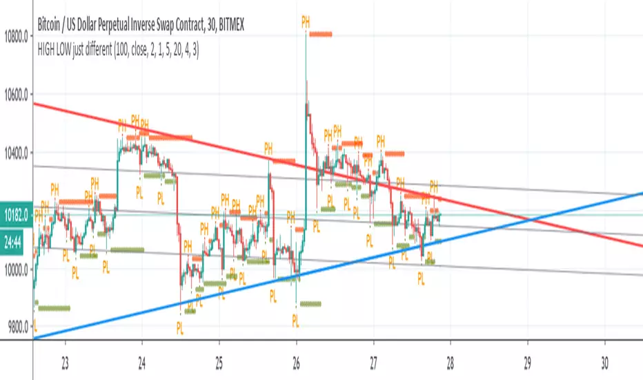
HIGH LOW just differentSo lets make more fun with discovering trends
here I put high pivot and low pivot and from it we make our lines based on them
look cool:)
HLC Banded Quadratic RegressionHigh/Low/Close Banded Quadratic Regression is now available through this implementation, free for all to use. It's simple purpose is to plot multiple independent parabolic curvatures using a matrix equation that best fits the non-linear data sets of high, low, and close. Features include an available dark background disabled by default for the overlay chart, adjustable regression period, and a banding lines width adjustment. If you have any comments regarding this indicator, I will consider your thoughts and ideas presented below.


High/Low LabelsThis simple Version 6 script labels each bar on the chart with Green labels noting HH for higher highs and HL for higher lows. And Red labels noting LH for lower highs and LL for lower lows. Works on any Trading View chart and any time frame. Any comments or suggestions, please do!

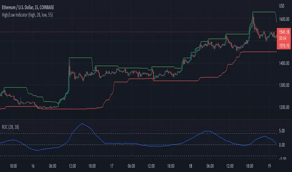
High/Low X Bars AgoThis indicator will plot a line on your chart that shows the highest high point between two previous points on the chart. It does this by reporting the highest point of X number of candles, and begins the look-back X number of candles ago.
Default candle group size is 50, and default look-back begins 50 candles back.
With these settings, the script will essentially plot the highest high point between the candle that printed 100 candles ago, and the candle that printed 50 candles ago.
Options are available for looking for the highest point, or lowest point, with configurable distances in the look-back and candle group ranges.
This script was custom built by Pine-Labs for a user who requested it.
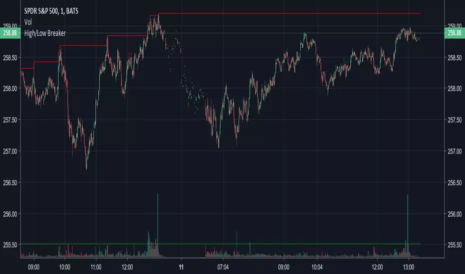
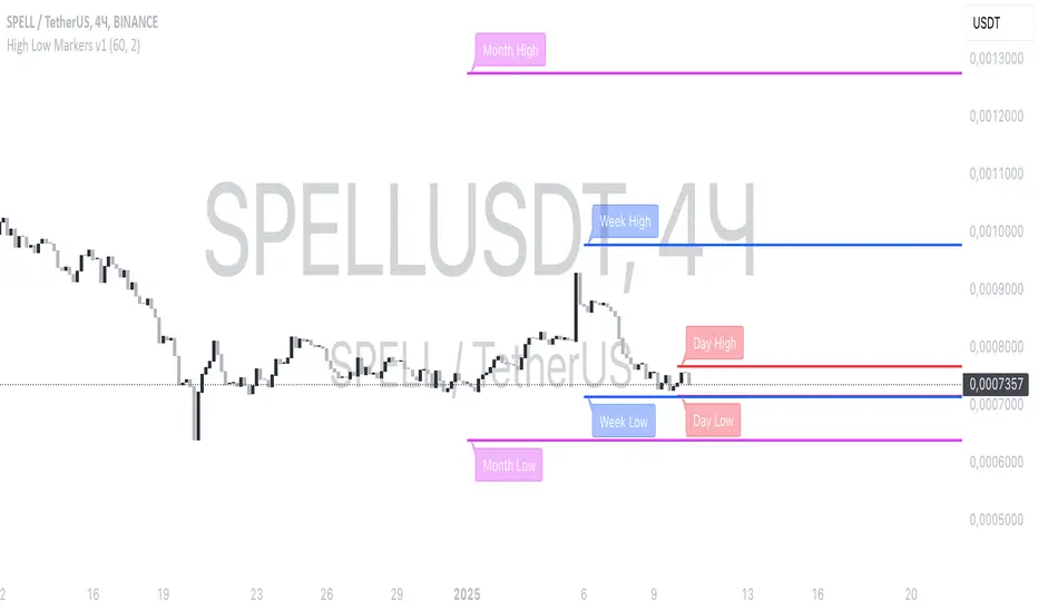
High Low Markers v1Retrieves the previous day’s high using request.security(...), so it works on any timeframe, even intraday.
Creates a single label (stored in a var variable) at that previous day high.
Places the text on the right of the anchor point by using label.style_label_right.
Updates the label’s position each bar (or only on a new day, if desired) so it always reflects the most recent previous day’s high.
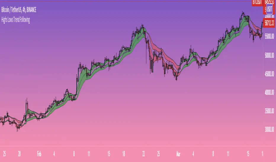
Highs-Lows Bands Trend FollowingTwo bands formed by moving averages of highs and lows.
The lower band should provide zone of support in uptrends while the upper band should provide zone of resistance during downtrends.
Bands that turn green in bullish trends should provide buy signals while bands that turn red in bearish trends should provide sell signals.
High/Low bandsGives good idea about trend.
In last 100 days the lowest price was this.
In last 100 days the highest price was this.
Price makes new 100 days high! (uptrend)

High Low priceThis indicator automatically shows the close price on the chart.
The highest and lowest close prices for the last 20 days are set by default but can be changed.


Highs Lows (with offset) + Median with ATR bandsScript shows Highest and Lowest values (default 10) for given bars back with possible offset on time assis (default 3) with their Median Line + ATR bands around it (no offset here).


High/Low Support FilterPreliminary version of a long support filter for use in future strategies.
V28: Release

