Pesquisar nos scripts por "gann"
Fast ROI checker 50% Gann RetracementThis script is based on the Gann's 50% Retracement rule.
First, the ATH (All Time High) and ATL (All Time Low) are calculated; then, the 50% retracement level is found.
With this 50% level, we'll calculate the maximum price entry to keep a ROI which is set in the parameters.
For exemple, I only want to buy assets which can make a x16 before the 50% retracement , the script will calculate the maximum entry to respect this ROI .
If the Max entry price is above the ATL , the line will be green; if not, the line will be red.
To faster the search in the watchlist, when the price is between the Max Entry line and the ATL line, the background is painted in green.
It's not an investment strategy, you have to find your proper indicators to make purchases.
Enjoy !

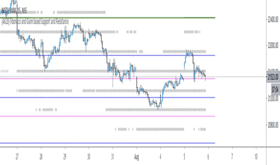
[A618] Fibonacci and Gann based Support and ResistanceThe scripts plots,
Gann and Fibonacci Levels onto the charts taking into account the price action of past 1 year,
The plots are plotted dynamically
Enjoy !
MG Support Resistance barriers with Gann and Moving Avg V1This script has multiple indicators:-
1. It uses past 3 days highs and lows to prediction critical support and resistance zones. - the zone is Green and red are the areas where one can observe that retrace happens and ones there is a breakout then gone up or down.
2. It also has a Gann line which gives a trend signal
3. Based on Moving averages it optionally plots the high low channel (haven't seen much use of it for most stocks I tried so far.
4. It also have EMA fast and slow to show the additional trend
5. Also can plot alligator trend. gives a good trend for FX trading at 2 or 3 mins intervals.
This is version 1 based on many existing scripts combined in 1 with some improvements.
RVC-Weekly-Pivots-GANN-LevelsPurpose:
Weekly - Fibonacci pivot levels and Gann levels calculation and marking on Chart automatically.
Mainly expected to use for trading on NIFTY and BankNifty
Kindly share your comments and suggestions to improve

Price Angles & Gann Star By Se7s - V1 An indicator to draw :-
1-price angles given the cycle start point, cycle type ( bullish / bearish ) , spacing
and shape (Circle,StrightLine,Triangle,Square,Pentagon )
shapes (Hexagon, Heptagon, Octagon, Nonagon, Decagon ) will be added later .
2-time levels .
3-Draw Price Channel .
4-Draw Gann Star .
you can customize all colors and text positions.
you can offset the time-levels start point .
--------------------------
The script is free !!
just add it to your favorite and start using it .
your suggestions and feedback are very appreciated .
-Shapes (Hexagon, Heptagon, Octagon, Nonagon, Decagon ) Have been Added .
-Multi-time frame feature Added .


Multi Signal RSI MACD Gann buy ans sell signal zwith RSI, zerollagMacd and highLow Gann and & indicator Macd head band Bollinger & SMA

CM_Gann_Swing_HighLowCustom Indicator - Gann Swing High Low
Uses New Plot Types
Inputs Tab Options:
Use Up/Down Arrows - Or Circles!
Turn Up/Down Arrows at Top and Bottom of Screen On/Off
New Top/Bottom of Screen Plot Types
New Up/Down Arrow Plot Types
Full Credit Goes to Glaz for Creating Code.
Created By Request for @dvk1970

ORB PSAR MTFThis is an adaptation of the inbuilt PSAR function in a Multi Time Frame .
When MTF enabled It will plot two timeframe simultaneously as follows:-
1 Min with 5 Min (HTF)
5 Min with 15 Min(HTF)
15 Min with 1H(HTF)
1H with 4H(HTF)
4H with Daily(HTF)
Daily with Weekly(HTF)
Weekly with Monthly(HTF)
The higher timeframe(HTF) will get plotted in bigger circled lines.
By enabling plotting of all levels, you can see all current levels of all TF( M1 ,M5,M15,H,4H,D,W,M) on the same screen as "X" on the right side.
Alerts allow you to get alerts when these crossover happens.
Concept Credits: Deishma (Nimblr)

ORB Inner Planet Ingress/Retrograde 2020-22(G-Tropical)In astrology, "planetary ingress" refers to the moment a planet enters a new astrological sign or house.
These planetary ingress brings in directional change in scripts.
This scripts also plots Retrograde Planets which also changes trends of stocks on most occasions.
This scripts will work for the period 2020 to 2022.

ORB Aspect-Nodes 2020-22(G-T)In astrology, the Moon's Node refers to the two points where the Moon's orbit intersects the ecliptic (the plane of the Earth's orbit around the Sun). The North Node, or Rahu, is the ascending point of the Moon's orbit whle the South Node, or Ketu, is the descending point of the Moon's orbit.
Whenever a planet hits these Nodes, extreme volatility is seen in stocks and temporary tops and bottoms are observed.
This indicator plots these periods and also shows upcoming dates if it falls in the next 7 days.
This indicator is for the period 2020-22.

ORB Aspect-Nodes 2023-25(G-T)In astrology, the Moon's Node refers to the two points where the Moon's orbit intersects the ecliptic (the plane of the Earth's orbit around the Sun). The North Node, or Rahu, is the ascending point of the Moon's orbit whle the South Node, or Ketu, is the descending point of the Moon's orbit.
Whenever a planet hits these Nodes, extreme volatility is seen in stocks and temporary tops and bottoms are observed.
This indicator plots these periods and also shows upcoming dates if it falls in the next 7 days.
This indicator is for the period 2023-25.

ORB PSAR MTF Screener+ 1.0The parabolic SAR is a technical indicator used to determine the price direction of an asset, as well as draw attention to when the price direction is changing.
Sometimes known as the "stop and reversal system," the parabolic SAR was developed by J. Welles Wilder Jr., creator of the relative strength index (RSI).
PSAR can itself prove to be great trading strategy if it is used on a multiple timeframe.
This indicator contains the followings:
1. A Screener to process multiple stocks at one go to show possible trades
2. MTF plotting of trading signals for individual stocks as well as list of stocks
3. Alert system to inform you of possible trade setups
4. Auto selection of best MTF for trades
5. Strength Candle markings.
6. Configurable options to customise as per your need.
The indicator works on the 1 Min, 5Min, 30Min, 1Hr, 4Hr, Daily, Monthly setups.
Due to TradingView restrictions and MTF usages, the screener can process a list of only 14 symbols. However , you can use the alerts option to define multiple lists of 14 stocks.
Enjoy!

ORB Moon Planetary Aspect
Moon is a very fascinating celestial body which is referred in Astrology as a planet.
The effect of the moon on earth is proven when we see it's affect on the tides.
The moon also represents the mind, which also makes it an interesting barometer of human thought.
The moon being the nearest and smallest 'planet', affects stock prices often causing short term trend changes. This indicator allows you to plot various aspects of the moon in relation to Nodes, Mercury, Venus, Mars, Jupiter and Saturn.
Of the various combinations, the Aspects of the Moon with the Lunar nodes(also called Rahu-Ketu) are used by Financial astrologers in trading in a big way. Lunar Nodes are one of the most versatile points in Zodiac which affect stock prices. In the short term trading space, Lunar Nodes in aspects with the Moon often indicated short term trend change and volatility (+/- 1 trading day).
A lunar node is either of the two orbital nodes of the Moon, that is, the two points at which the orbit of the Moon intersects the ecliptic. The ascending (or north) node is where the Moon moves into the northern ecliptic hemisphere, while the descending (or south) node is where the Moon enters the southern ecliptic hemisphere.
You can apply the indicator on the indexes or stocks to find out the best combination which works. Use the Daily TF.
This indicator also plots the Full moon and the New Moon on the charts.
You can also set alerts reminding you of upcoming combinations.
Due to TradingView restrictions plotting is possible only for the period 2020 to 2023 in this indicator.

ORB Parabolic SAR Multi Time Frame (PSAR MTF)
This is an adaptation of the inbuilt PSAR function in a Multi Time Frame .
When MTF enabled It will plot two timeframe simultaneously as follows:-
1 Min with 5 Min (HTF)
5 Min with 15 Min(HTF)
15 Min with 1H(HTF)
1H with 4H(HTF)
4H with Daily(HTF)
Daily with Weekly(HTF)
Weekly with Monthly(HTF)
The higher timeframe(HTF) will get plotted in bigger circled lines.
By enabling plotting of all levels, you can see all current levels of all TF( M1 ,M5,M15,H,4H,D,W,M) on the same screen as "X" on the right side.
Alerts allow you to get alerts when these crossover happens.

KesslerBandMade this to save indicator space. 3 moving averages, 1 ema moving average. Enjoy!
S/O to Kessler Syndrome

Time/Date Digital Root Indicator | InvrsROBINHOODTime/Date Digital Root Indicator | InvrsROBINHOOD
Uncover the hidden numerical rhythm of the markets with the Time/Date Digital Root Indicator. This unique tool is designed for traders who look beyond standard price and volume, exploring the cyclical and vibrational nature of time itself. It translates the essence of any time and/or date into a single-digit number from 1 to 9—its "Digital Root"—providing a novel layer of analysis for your charts.
How It Works
The indicator analyzes the market's timeline, converting user-selected components of the date (Year, Month, Day) and time (Hour, Minute, Second) into a foundational Digital Root number. This number represents the "vibrational signature" of that moment, which is then plotted visually on your chart.
Key Features
Flexible Calculation Engine: Choose your source for the calculation. Analyze the rhythm of the Time, the Date, or a powerful combination of Date & Time.
Granular Control: Fine-tune the calculation by including or excluding individual components. Want to see the rhythm of just the hour and minute? Or the full energy of the year, month, and day combined? You have complete control.
Rich Visualizations:
Background Coloring: Instantly identify market "regimes" as the chart background changes color based on the prevailing Digital Root of each bar.
Vertical Lines: Pinpoint key moments of transition by displaying a vertical line whenever the Digital Root changes from one number to the next.
Dual-Mode Info Panel: A powerful on-chart table displays both the "Live Digital Root" (updating in real-time with every tick of the clock) and the "Current Bar Digital Root" (reflecting the static value from the bar's open). This allows you to compare the immediate, live "energy" to the established "energy" of the current timeframe.
How a Trader Can Use This Indicator
This tool is not a standalone signal generator but a unique lens to enhance your market perspective. Here are a few ways traders can incorporate it:
Identify Market Regimes: Use the background colors to spot zones of influence. You might notice that price trends strongly when the Digital Root is a "4" (Green), but ranges or reverses when it shifts to a "7" (Purple). This can help you adapt your strategy to the current market "theme."
Pinpoint Potential Pivots: The vertical lines highlight a change in the numerical rhythm. A shift in the Digital Root can often precede or coincide with a shift in price momentum. Pay close attention to price action around these lines, as they can flag potential turning points.
Find Confluence: Use a Digital Root change as a confirmation signal for your existing strategy. For example, if you see a bullish divergence on the RSI that aligns with a vertical line marking a Digital Root shift, it could add significant weight to your trade idea.
Analyze Live vs. Static Energy: The info panel offers a sophisticated view. If the "Current Bar Digital Root" is a stable "5" but the "Live Digital Root" is rapidly fluctuating between "8" and "9", it could suggest that underlying pressure is building for a volatile move, even if the current bar looks calm.

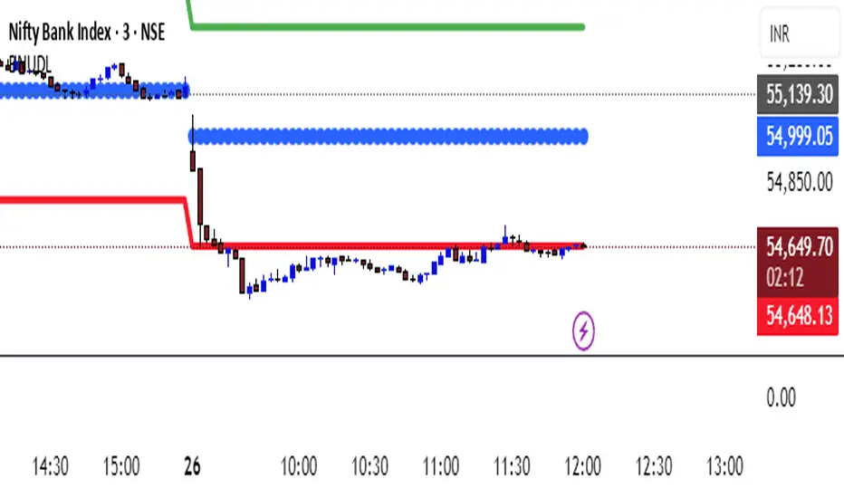
KATIK BankNifty Upside/Downside LevelsThe KATIK BankNifty Upside/Downside Levels (BNUDL) indicator plots key daily reference levels for BankNifty based on its opening price. Using a predefined daily move percentage, it calculates potential upside and downside levels from the open. The script displays:
Up Level (Green): Potential bullish threshold above the open
Down Level (Red): Potential bearish threshold below the open
Open Price (Blue Circles): Daily BankNifty opening level
This tool helps traders quickly identify intraday directional bias and potential support/resistance zones around the opening price.
PyraTime Harmonic 369Concept and Methodology PyraTime Harmonic 369 is a quantitative time-projection tool designed to apply Modular Arithmetic to market analysis. Unlike linear time indicators, this tool projects non-linear integer sequences derived from Digital Root Summation (Base-9 Reduction).
The core logic utilizes the mathematical progression of the 3-6-9 constants. By anchoring to a user-defined "Origin Pivot," the script projects three distinct harmonic triads to identify potential Temporal Confluence—moments where mathematical time cycles align with price action.
Technical Features This script focuses on the Standard Scalar (1x) projection of the Digital Root sequence:
The Root-3 Triad (Red): Projects intervals of 174, 285, 396. (Mathematical Sum: 1+7+4=12→3)
The Root-6 Triad (Green): Projects intervals of 417, 528, 639. (Mathematical Sum: 4+1+7=12→3, inverted)
The Root-9 Triad (Blue): Projects intervals of 741, 852, 963. (Mathematical Sum: 7+4+1=12→3... completion to 9)
How to Use
Set Anchor: Input the time of a significant High or Low in the settings.
Select Resolution: This tool is optimized for 1-minute (Micro-Harmonics) and 15-minute (Intraday Harmonics) charts.
Analyze Clusters: The vertical lines represent calculated harmonic intervals. Traders look for "Clusters" where a Root-3 and Root-9 cycle land on adjacent bars, indicating a high-probability pivot.
System Architecture & Version Comparison This script represents the foundational layer of the PyraTime ecosystem.
This Script (PyraTime Harmonic 369):
Scalar: Standard 1x Multiplier only.
Focus: Intraday & Micro-structure (1m, 15m).
Engine: Core Digital Root Integers.
PyraTime Harmonic Matrix (Advanced Edition):
Scalar Engine: Unlocks Quad-Fractal (4x), Tri-Fractal (3x), and Bi-Fractal (2x) multipliers for institutional cycle analysis.
Apex Logic: Auto-detection of the "963" Completion Sequence (Gold Highlight).
Event Horizon: Includes a live Predictive Dashboard that calculates the time-delta to the next harmonic event across all scalar groups.
Disclaimer This tool is for the educational analysis of Number Theory in financial markets. It projects time intervals and does not predict price direction. Past performance does not guarantee future results.


PyraTime Harmonic Matrix [Quad Horizon]Concept and Architecture
The PyraTime Harmonic Matrix is the quantitative engine of the PyraTime ecosystem. It is a multi-dimensional time projection tool that applies Digital Root Mathematics across a variable scalar grid.
While standard time analysis focuses on linear cycles, the Harmonic Matrix calculates Non-Linear Digital Roots (174, 285, 396...) and projects them through a proprietary "Event Horizon" logic. This allows the system to identify deep-structure market turning points that exist far beyond the current price action.
Technical Features
The Quad-Horizon Engine This script features a variable "Horizon Depth" setting, allowing traders to loop the harmonic sequence into the future to identify macro-scale pivots:
Standard Horizon: Projects the base Digital Root sequence (1x).
Double Horizon: Projects the sequence a second time (+999 intervals).
Triple/Quad Horizon: Extends the calculation up to 4x the standard length, identifying "Grand Cycle" completions on higher timeframes.
The Apex Sequence (963) The script mathematically identifies the completion of the Digital Root sum (The 963 Interval).
Visual Logic: These vectors are rendered in Gold with a lightning symbol (⚡), indicating a Cycle Termination point.
Event Horizon Dashboard To manage the complexity of multi-timeframe analysis, the script includes a live Head-Up Display (HUD).
Function: It scans all enabled timeframes (from 1m to Weekly) and calculates the exact time remaining to the single nearest future harmonic event.
Confluence Strategy (The Ecosystem) The Harmonic Matrix provides the "Time" (X-Axis). For a complete structural analysis, it is designed to be overlayed with our specific momentum and exhaustion tools:
Momentum Trigger: Use the Harmonic Sniper Trigger to identify entry signals when price hits a Matrix line:
Exhaustion Filter: Use the Sequential Exhaustion 9/13 to confirm trend fatigue at Matrix intervals:
Disclaimer This tool is for quantitative time analysis. It projects mathematical intervals and does not predict price direction. Past performance is not indicative of future results.
