[ADOL_]EasyTradingENG) EasyTrading Indicator(ET)
Introduce)
This is the result of long research and trial and error. This indicator is an indicator that marks the signal on the chart.
Short-term, mid-term, and long-term points are analyzed, and signals leading to long-term trends are marked with a background color.
Indicates oversold and overbought, and modified Ichimoku equilibrium. Indicates the criteria for the new TD.
It is the latest version of the signal indicator that complements the limitations of existing indicators.
Noise cancellation is the key to overcoming limitations.
Alerts are included in the signal notation, allowing integration with bots that utilize alerts.
So that even beginners can use it easily, we exclude miscellaneous functions and focus only on whether it is long or short.
principle)
Principle of Moving Average: Various moving averages (SMA, EMA, WMA, HMA, RMA, SWMA, VWMA) can be used. Simply using only moving averages cannot overcome the existing problems.
The problems that arise from existing signal indicators include structural problems in which entry and exit do not appear properly due to lagging and delay of indicators, and frequent overuse of RBIs.
In order to compensate for these limitations, BNF's disparate rate trading method was referred to. I did not use the existing moving average as it is, but I optimized the formula by reflecting my experience, so the existing moving average
It is characterized by the fact that it cannot be implemented according to the signal of the indicator.
The principle of oversold and overbought: implemented using RSI.
Short-term signal: The principle of the TD indicator has been utilized and modified. The setup principle of the TD indicator,
which compares the current candlestick and the four previous candlesticks and indicates numbers from 1 to 9, was modified by applying it to the moving average.
Intermediate Signal: Moving averages and Ichimoku balance have been modified. We applied the breakthrough of clouds (positive and negative) created in Ichimok balance.
Long-term signal: The principle of moving averages was used.
comparison with existing indicators)
Compared to Supertrends:
The top is the ET indicator, and the bottom is the supertrend indicator. Supertrend is set to 14,3, which is commonly used.
Looking at the background color representing the long-term signal of ET while the super trend repeatedly displays buy and sell and sees loss of intervals
ET does not see section loss as no signal appears in the middle after one entry.
The same goes for other sports.
Compared to the moving average (sma):
Even when compared to the golden cross and dead cross conditions that break through the moving average line, the moving average line accumulates losses due to frequent entries and exits in the section that moves sideways.
ET, which compensates for the limitations, continues the trend without noise.
Comparison with Ichimoku:
ET has less noise than entering a trade using Ichimoku's red cloud and green cloud.
Necessity)
In order to work with the bot, the key is to accurately implement the hitting point and remove noise. It is a basic approach to trading even if it is not linked to a bot.
In the setting of most indicators, if you increase the period, you can see the long-term trend, but the entry point is delayed, and if you decrease the period, the entry point becomes frequent and enters a place where you shouldn't enter.
ET catches the entry point and noise removal, and helps you approach the entry point correctly even if you don't trade often.
Catching the two rabbits was the most difficult. how many years...
chart)
Notation of background color:
Long-term signals are displayed in the background color so that trends can be grasped at a glance.
Long term signal:
It is indicated by an arrow on the chart.
Mid term signal:
The decline is indicated by a black gradient on the candle and a red circle above the candle.
The rise is indicated by a white gradient on the candle and a green circle below the candle.
short-term signal:
On the chart, the candlesticks are numbered from 1 to 9.
Oversold/Overbought:
Oversold conditions are indicated by yellow diamonds (◆).
Overbought is indicated by a blue diamond (◆).
Determine the TP on the first oversold or overbought bar. Split profit start.
timeframes and alerts)
It can be applied to all time frames, and the standard time at the center is 1h.
You can adjust the dot while viewing the 15-minute bar and the 1-hour bar together.
multi time frame. It is recommended to observe multiple times at the same time using the split screen.
Note)
This indicator is not a guarantee of absolute returns, and you are solely responsible for any trading decisions you make.
How to use)
It is set to be used by invited users only.
If you receive an invitation, tap Add indicator to favorites at the bottom of the indicator.
If you go to the chart screen and press the indicator at the top, there is a Favorites tab on the left tab.
Add an indicator by clicking on the indicator name in the Favorites tab (or Invite Only).
If a study error occurs when adding an indicator even though permission has been granted
You may be able to fix the problem by turning off all charts and restarting.
KOR) EasyTrading 지표(ET)
소개)
이것은 오랜 연구와 시행착오의 결과물입니다. 해당 지표는 차트에 시그널을 표기해주는 지표입니다.
단기, 중기, 장기 타점을 분석하며, 장기트렌드를 이끄는 시그널은 배경색으로 표기됩니다.
과매도와 과매수를 표시하며, 변형된 일목균형을 표시합니다. 새로운 TD의 기준을 표시합니다.
기존의 지표들이 가지는 한계를 보완한 시그널 지표의 가장 최신 버전입니다.
한계를 극복하는데는 노이즈 제거가 핵심이라고 볼 수 있습니다.
시그널 표기에는 얼러트가 포함되어, 얼러트를 활용하는 봇과 연동이 가능합니다.
초보자도 쉽게 활용할 수 있도록 잡다한 기능은 빼고, 롱이냐 숏이냐에만 집중합니다.
원리)
이동평균선의 원리 : 여러가지 이동평균선(SMA, EMA, WMA, HMA, RMA, SWMA, VWMA) 을 활용할 수 있습니다. 단순히 이동평균선만 활용하는 것으로는 기존의 문제점을 뛰어넘을 수 없습니다.
기존의 시그널 지표에서 발생하는 문제점은, 기본적으로 지표가 가지는 후행성과 지연으로 인해, 진입과 청산의 자리가 제대로 나오지 않는 구조적인 문제, 잦은 타점 남발 등이 있습니다.
이러한 한계를 보완하기 위해서 BNF의 괴리율 매매법을 참고하였습니다. 기존의 이평선을 그대로 쓰는 것이 아니라 저의 경험을 반영해 수식을 최적화하였기 때문에 기존의 이평선으로는
해당 지표의 시그널을 따라 구현할 수 없다는 것이 특징입니다.
과매도, 과매수의 원리 : RSI를 활용하여 구현하였습니다.
단기시그널 : TD 지표의 원리를 활용 및 변형하였습니다. 현재 캔들과 4개이전의 캔들을 비교해 1~9까지 숫자로 표기하는 TD 지표의 setup 원리를 이평선에 적용하여 변형하였습니다.
중기시그널 : 이평선 및 일목균형을 변형하였습니다. 일목균형에서 만들어지는 구름(양운과 음운)의 돌파를 응용하였습니다.
장기시그널 : 이평선의 원리를 활용하였습니다.
기존의 지표들과 비교)
슈퍼트렌드와 비교 :
상단은 ET지표, 하단은 슈퍼트렌드 지표입니다. 슈퍼트렌드는 일반적으로 많이 쓰는 14,3 으로 세팅하였습니다.
슈퍼트렌드가 buy와 sell을 반복적으로 띄우며 구간손실을 보는동안, ET의 장기시그널을 나타내는 배경색을 보면
ET는 한번의 진입후 중간에 시그널이 출현하지 않으면서 구간손실을 보지 않고 있습니다.
다른 종목에서도 마찬가지입니다.
이동평균선(sma)과 비교 :
이동평균선을 돌파하는 골든크로스와 데드크로스 조건과 비교해도 횡보하는 구간에서 이동평균선은 잦은 진입과 청산으로 손실을 누적하지만
한계를 보완한 ET는 노이즈 없이 추세를 이어나갑니다.
일목균형과 비교 :
일목균형의 양운과 음운을 활용하여 타점을 진입하는 것보다 노이즈가 적습니다.
필요성)
봇과 연동하기 위해서는 타점을 정확하게 구현하는 것과 노이즈의 제거가 핵심입니다. 봇과 연동하지 않더라도 매매의 기본적인 접근입니다.
대부분의 지표의 설정에서 기간을 늘리면 장기추세를 볼 수 있으나 진입점이 늦어지고, 기간을 줄이면 진입점이 잦아 들어가지 말아야 할 곳에 들어가게 됩니다.
ET는 진입점과 노이즈 제거 두마리 토끼를 잡아, 자주 매매하지 않더라도 바르게 진입점에 접근할 수 있도록 도와줍니다.
두마리 토끼를 잡는 것이 가장 어려웠습니다. 몇년의 시간..
차트로 설명)
배경색의 표기 :
장기시그널을 배경색으로 표기하여 트렌드를 한눈에 파악할 수 있도록 하였습니다.
장기시그널 :
차트상에서 화살표로 표기됩니다.
중기 시그널 :
하락은 캔들의 검정색 그라데이션과 캔들 위 빨간색 원으로 표시됩니다.
상승은 캔들의 하얀색 그라데이션과 캔들 아래 초록색 원으로 표시됩니다.
단기시그널 :
차트상에서 캔들에 1~9까지 숫자로 표시됩니다.
과매도/과매수 :
과매도는 노란색 다이아몬드(◆)로 표시됩니다.
과매수는 파란색 다이아몬드(◆)로 표시됩니다.
과매도, 과매수가 처음 발생하는 봉에서 TP를 결정합니다. 분할익절 시작.
타임프레임 및 얼러트)
모든 시간프레임에 적용 가능하며, 중심이 되는 기준시간은 1h 입니다.
15분봉과 1시간봉을 같이 보면서 타점을 조절할 수 있습니다.
멀티타임프레임. 화면분할을 활용하여 여러 시간을 동시에 관찰하는 것을 추천합니다.
참고사항)
해당지표는 절대수익을 보장하는 지표가 아니며, 귀하가 내리는 모든 거래 결정은 전적으로 귀하의 책임입니다.
사용방법 )
초대된 사용자만 사용할 수 있도록 설정이 되어있습니다.
초대를 받을 경우, 지표 하단의 즐겨찾기에 인디케이터 넣기를 누릅니다.
차트화면으로가서 상단에 지표를 눌러 왼쪽탭에 보면 즐겨찾기 탭이 있습니다.
즐겨찾기 탭 (또는, 인바이트 온리) 에서 지표이름을 눌러서 지표를 추가합니다.
권한이 부여됐음에도 지표추가시 study error가 발생할 경우
차트를 모두 끄고 재시작함으로써 문제점을 해결할 수 있습니다.
Pesquisar nos scripts por "entry"

FomoDots®FomoDots® reversal timing indicator.
Comprehensive and easy to understand tool for timing entries, taking profit and managing risk.
Works on all timeframes and a brilliant compliment to any existing trading strategy.
Instructions:
Short Entry: When candle hits FomoDots® from underneath and the candle closes under the FomoDots® level. Stop loss at most recent high.
Long Entry: When candle hits FomoDots® from above and the candle closes above the FomoDots® level. Stop loss at most recent low.

DoubleRSI fast/slow signal buy/sell with alert Relative StrengthA combination of two Relative strength index. One fast and one slow line. In a system, this indicator can serve as an additional confirmation.
For example, for a long entry:
slow RSI cross above 50 level and fast RSI cross above 70 level. then check volume and use another indicator such as a MACD for extra confirmation
For example, for a short entry:
slow RSI cross below 50 and fast RSI cross below 30 level. then check volume and use another indicator such as a MACD for confirmation
An alarm function has also been added.
the following settings are possible:
- Source
- Length
- Color
I do not recommend to use this indicator alone.
have fun using this simple and helpful tool.

TAS Boxes + TAS Vega + TAS Compass [TASMarketProfile]This bundle of 3 TAS Market Profile indicators provides a shaded background that reveals directional bias, colored price bars show clearly when breakout conditions are bullish (green) or bearish (red) as well as 3 real-time dotted lines that show developing commercial balance areas known as “value areas.” These TAS Boxes 3 lines are calculated in real-time and leveraged to identify trade entry zones, trailing stops and targets. The 3 indicators can be activated and applied to a chart simultaneously (as shown) or individually in the Inputs settings tab. This description contains descriptions for all 3 indicators in the order of TAS Boxes, TAS Vega and TAS Compass so you’ll need to scroll below to get to the one you want insight.
∟ ABOUT TAS BOXES:
TAS Boxes (also known as TAS Dynamic Profile) offers a dynamic representation of developing commercial balance areas known as “value areas” and are depicted with 3 colored horizontal dotted lines. Note that the thickness of the dotted lines may be adjusted in the Style settings.
Red Line- Supply / High Value Area (HVA) / Resistance
Cyan Line- Point of Control (POC)
Green Line- Demand / Low Value Area (LVA) / Support
The TAS Boxes calculate and display in real-time intrabar and are finalized at the close of the bar. The levels may dynamically update intrabar and move and this is viewed as foreshadowing of where new value areas may be attempting to appear next. When the market is between the top and bottom lines, the market is considered “in value” or “in balance.” When the market closes outside the top or bottom lines, the market is considered out of value/unbalanced and in breakout mode in that direction.
INPUT SETTINGS FOR TAS BOXES:
There are 3 inputs for TAS Boxes and below you’ll find the default settings:
MinSignal_123: 2 (only options are 1, 2, or 3)
Length: 7
MapLength: 7
MinSignal_123 -- Measures how established the commercial interest creating the balance area must be to create a new TAS Box. In other words, this input is a measure of the strength of the box.
Length –- Takes into consideration the relative “momentum” behind the move and how extended the move must be before the formation of new TAS Box levels.
MapLength –- Specifies the number of bars of data used to create the parameters of the TAS Box.
In summary, the first two inputs determine how often a new TAS Box will appear. The higher the input numbers the less often and harder it is to establish a new TAS Box, and vice versa. The last input simply determines how much data is included in the calculation of the new TAS Box.
While we recommend the default 2-7-7 as standard inputs for most traders as they work well with any tradable instrument with sufficient liquidity, other input combinations can be explored per the user’s preferences for varying sensitivity to market conditions and how recent of market conditions. Other settings to consider are 2-14-7 or 3-4-50. We invite the user to explore the cause and effect of changing the settings but doing so only after they have mastered an understanding of the strategy deployment with the defaults. The vast majority of users do not change the default settings.
WHAT MARKETS AND TIMEFRAMES CAN BE TRADED?
TAS Boxes can be displayed on Stocks, ETFs, futures, Forex and digital currencies. TAS Boxes can be applied to a chart of any time frame (e.g. 1-minute, 5-minute, 20-minute, daily, weekly, etc.) and will also function with many other style charts such as Range and Renko. Boxes displayed on longer time frames designate more significant balance areas and can be used to locate higher probability entries. Boxes on shorter time frames can be used to identify if the tradable instrument is currently in balance or breaking out, and pinpoint entries accordingly.
INTERPRETATION AND BASIC RULES:
HEIGHT OF BOXES: The height of the TAS Boxes from top line to bottom line is a measure of volatility. When taller Boxes are present and subsequent Boxes expand, this means the volatility of the market has increased. When the height of the Boxes is smaller or contracting, then we are experiencing a market in decreasing volatility or consolidating.
WIDTH OF BOXES: The width of the TAS Boxes are a measure of significance. The longer TAS Boxes have remained at the same levels, the higher the impact they will generally have as support or resistance levels, and in the instances they are breached the market may experience fast and vertical movement.
The TAS Boxes are used to identify high-probability zones for trading both inside the range of the Boxes and also when in breakout mode outside the Boxes:
>>> When price is trading within the boundaries of a normal to wide range commercial
balance area, we can consider trades within the range of the Boxes and should look for entries around the support (green line) or resistance (red line) areas with profit targets around the POC (cyan line) or opposite boundary.
>>> When taking trades near both the upper and lower boundaries, we like to see the POC
near the middle of the box’s range. This is known as a “symmetrical box” as pictured below.
>>> If the POC is plotted tightly close to or at the same price level as the green or red line, we refer to this as forming a “wall” or "plywood" and anticipate stronger commercial interest providing support or resistance in those areas.
>>> When trading above or below the current box, price is said to be in breakout/breakdown mode. During these modes, one should be getting out of any opposing positions that are not in the direction of the breakout. Not all breakout/breakdowns are created equal. Moves outside of TAS Boxes when the vertical distance from Top to Bottom is minimal will tend to have more powerful moves, especially in instances when there are recent long-range bars in the direction of the break.
>>> When markets are breaking out or down outside of Boxes, if there is sizeable space before you encounter recent historal TAS Boxes levels that is favorable for good follow through of the move. Prior TAS Boxes levels do serve as as areas the market may encounter friction and go sideways for a period of time.
MANAGING RISK WITH STOP LOSSES:
We highly recommend the use of stop losses when trading. You can place stop losses outside of the 3 lines of TAS Boxes and trail them behind the market as new Boxes appear in the direction of the trade. You may also move trailing stops among the 3 levels to suit your risk tolerance (e.g. when market is in breakout mode, trailing it from out the Boxes to outside the POC level or opposing level). You can start your initial stop outside the opposite of all 3 lines or on the other side of the POC for lower risk.
∟ ABOUT TAS VEGA:
TAS Vega changes the coloring of the price bars to provide a more meaningful interpretation of when markets are in balance (based on TAS Boxes) or in bullish/bearish breakout mode. There are four colors generated for TAS Vega:
GREEN – Bullish breakout / Don’t be short
RED – Bearish breakdown / Don’t be long
ORANGE – 1st bar back inside TAS Boxes after prior move outside.
GRAY – Balanced, each subsequent bar after the 1st bar closes inside Boxes.
INTERPRETATION AND BASIC RULES:
WHEN VEGA IS GREEN:
Don’t be short.
Consider longs only or retain existing long positions.
Entering on the bar close above the Boxes is higher probability than intrabar entry.
Many consecutive bar closes above Boxes increases probability of eventual move higher.
WHEN VEGA IS RED:
Don’t be long.
Consider shorts only or retain existing short positions.
Entering on the bar close below the Boxes is higher probability than intrabar entry.
Many consecutive bar closes below Boxes increases probability of eventual move lower.
WHEN VEGA IS ORANGE:
If orange due to closing back inside Boxes of your initial entry Box, hold.
If orange due to closing inside a new Box appearing in the direction of your trade (higher Boxes for longs, lower Boxes for short) consider this a potential 1st tier profit-taking opportunity for multi-lot/shares positions. If single units, exit is at the trader's discretion contingent on the extent of the move.
It is prudent risk management to also use the appearance of orange closed bars as a reminder to trail your stop loss behind the new TAS Boxes levels.
Many times you may see many orange bars over a series of bars (not consecutive, however) and this means the market continues to explore both sides of TAS Boxes and is indecisive about intentions. Be cautious at these times.
WHEN VEGA IS GRAY:
Gray bars simply means the bar has closed in balance within the value area of TAS Boxes.
Gray bars are not a cue to exit a position necessarily. It is just a visual that the bar has closed in the value area. Often a trending move will have many periods that the market closes back inside new Boxes that are appearing in the direction of the trend and your largest trades will require that you simply adjust your trailing stop rather than exit with gray bars.
It is prudent risk management to also use the appearance of orange closed bars as a reminder to trail your stop loss behind the new TAS Boxes levels.
Many times you may see many orange bars over a series of bars (not consecutive, however) and this means the market continues to explore both sides of TAS Boxes and is indecisive about intentions. Be cautious at these times.
The user can adjust the coloring of the TAS Vega bars in Style settings.
∟ ABOUT TAS COMPASS:
TAS Compass changes the background color of the chart to reveal the directional bias of the market. It may be applied to charts in any timeframe for stocks, ETFs, futures, Forex and digital currencies.
There are two colors generated for TAS Compass:
GREEN – Bullish directional bias
RED – Bearish directional bias
INTERPRETATION AND BASIC RULES:
The directional bias is established (or changes) when a bar closes outside of TAS Boxes levels. When a market closes above the TAS Boxes, it will establish a bullish bias (green background) and this will remain intact until there is a close below the TAS Boxes. At the time there is a bar close below the TAS Boxes, then the TAS Compass bias changes to bearish bias (red background). This sequence continues back and forth indefinitely. When using TAS Compass, one should still follow the prudent rules and best practices of TAS Boxes as there may be opportunities to exit a losing position sooner by doing so even in the instance a TAS Compass directional bias has not changed.
TAS Compass can be used as a stand-alone visual cue on a chart, but will have accentuated value when used in conjunction with TAS Boxes and TAS Vega indicators included within this bundle.
Below is an example showing TAS Compass with TAS Boxes in order to show how the closes outside of TAS Boxes is the trigger to the background color change logic.
Trade Well My Friends,

Easy Backtester PROWHAT IS EasyBacktester ?
EasyBacktester is a tool that helps you backtest trading strategies built by yourself with an included strategy builder and a multitude of options.
From within the parameters of the tool, you can specifically pick your entry settings across 12 most common indicators, such as "RSI", "MACD", "Moving Averages" etc... Then you can immediately visualise your setup's Stop-loss & Take Profit, your expected Profits & Loss and a lot of other statistics for your entry strategy. Once you are satisfied with your entry strategy, you are given a set of tools to optimize your setup using stop-loss rules, take profits rules, partial profits, trailing-stops, entry timing...
WHY IS THIS TOOL DIFFERENT ?
EasyBacktester is a backtesting engine with no coding skills required. TradingView allows for "Strategy Scripting" using PineScript, which is not an option for non-coder audience. EasyBacktester fills this gap and allow non-coders to get an idea of how their trading strategies may perform using mouse clicks only.
Some similar attempts have been made on TradingView, allowing some limited options, but none have the same capabilities EasyBacktester offers, for instance, as of April 2022 these features have not been seen in any other TradingView tools:
- partial take profits
- leverage simulation
- a multitude of trailing stop-loss possibilities including trail triggers and trail parameters
- visualisation of entries including stop-loss, take profits, partial take profits, and trailing stops. One can now visualize such complex setups.
- visualisation of Profits & Loss
- time in trade
- wait strategy after a signal: for example, when RSI is oversold, "WAIT until price retraces 100% of the original signal" amongst other possibilities
QUICK START GUIDE:
STEP 1: DEFINE YOUR SIGNAL STRATEGY
From the settings of the tool, find the "SIGNALS STRATEGY" section.
Select a type of entry you wish to simulate, for example "LONGs", and activate the checkbox right before "Simulate".
Right below, you will find 4 signal builder for you to play with and pick your strategy accordingly.
For example, to simulate a signal when RSI is oversold, follow these steps:
- On the 1st multiple choice box, select "RSI"
- On the 2nd multiple choice box, select "is below..."
- On the 3rd multiple choice box, select "OverSold level"
Don't forget to activate this rule by checking the checkbox in front of it.
After this first step, one should immediately see the chart affected with some plots. The dots represents the signal entry defined by the rule we just created, and the red/green boxes visually represent trades that could have been taken with this signal which, in this example, occurs "when RSI is below oversold level". Note that all specific parameters for RSI including its specific "oversold level" is customisable at the end of the tools settings along with all other indicators settings.
STEP 2: STATISTICS
By default, the "APPEARANCE" section only plots potential entry signals (materialized by dots) and actual entry boxes (materialized by red/green boxes).
But the user can easily add other precious statistics to the chart, and obviously the most important one for backtesting: Profits & Loss (P&L).
In the "STATISTICS" section please check the "P&L" box to see appear a chart of the simulated P&L for our example. You should immediately see a new graph below the chart representing the evolution of the P&L after each entry.
Other statistics are available to the user, including: Equity, Number of Trades, Time in Position, Number of trades Won, Number of trades Lost, Number of trades Stopped.
Play around with those to see them plotted on your chart.
STEP 3: OPTIMIZE YOUR ENTRY
Under the "ENTRY STRATEGY" section, one can pick how to enter AFTER the signal, which provides the user with an extensive flexibility to pick its timing.
Here there are a various set of choices offered, ranging from the default "Market Order at Next Candle Open", to "Limit Order: at signal's candle open" or even "Stop-Buy: at break of last candle high". As its name suggests, this option allows you to actually wait before randomly enter in trade.
It is important to also note that the user can totally prevent entry if the conditions are not filled after a customizable number of candles represented in "Max bars to wait for entry" (default being 1, meaning the engine will wait the condition to be filled during only 1 candle)
STEP 4: MANAGE YOUR RISK
Under the "RISK MANAGEMENT" section, the user is given a series of options to set the amount (s)he would like to risk.
This is extremely important to set, and is the result of a combination of customizable options including:
- the Initial Capital of the account
- the amount to risk per trade, and HOW to risk it: some fixed % the initial equity or adjust the stop-loss to the desired risk ?
- use of leverage or not
- initial stop-loss, as well as minimum and maximum
- trailing stop-loss: what should trigger the trailing ? and by how much should the engine trail ?
STEP 5: HAVE AN EXIT PLAN
Under the "EXIT STRATEGY", the user can define how to exit the trade.
For instance, here again a lot of options are given:
- Take Profit: exit at some level of profits defined by a multiple of the stop-loss, or a multiple of the ATR, or some % or points
- Partial Profit taking before exit
- Panic close position after some time spent on the trade
STEP 6: FURTHER OPTIMIZATIONS
Under the sections "Commissions" & "Calendar & Sessions", one can simulate real trading conditions by including commissions fees as well as filtering actual dates and trading sessions. These sections are straightforward for any user to use.
SETP 7: INDICATORS SETTINGS
Since EasyBacktester uses a predefined set of indicators to get started, those indicators are also customizable in the last section of the settings. Here, one can easily customize RSI periodicity, MACD lengths, Moving averages types & lengths, ATR, etc...
STEP 8: GOING FURTHER
This is only a start to give users an overview of how various options affect their trading performance. But of course, each trader has its special recipe and specific detailed setup that is not possible to embed in a single tool. For advanced simulation, EasyBacktester provides plug & play connectors for advanced users. Namely, there are 3 connectors:
- signal connector
- trail trigger connector
- exit connector
Each of these connectors are an opportunity to customize the engine signals, trail trigger and exit choices with the user's own options. This case does require a little bit of coding, but it can easily be implemented by copy-pasting existing resources or with a slight help of a professional. In fact, the only conditions to build a proper connector is to export a plot with the numbers 1 (for signals), 2 (for trigger trails) and 3 (for exits). Here is an example of custom SIGNAL connector compatible with EasyBacktester, to produce a signal when last RSI was below 30 and current RSI reads above 30:
============================================================
//@version=5
indicator("My custom RSI signal")
// when previous RSI 14 was below 30 and current RSI 14 is above 30, set "custom_signal" to 1, otherwise set "custom_signal" to 0
custom_signal = ta.rsi(close, 14) < 30 and ta.rsi(close, 14) > 30 ? 1 : 0
// Export a plot of "custom_signal", but do not display it
plot(custom_signal, title="my signal", display=display.none)
============================================================
Once this indicator has been built, the user only needs to connect it with EasyBacktester as follow:
1. Open a desired chart, and add both EasyBacktester indicator as well as the custom "My custom signal" we just created above.
2. Open EasyBacktester's settings, and in the first option, there is "Connect signals source" which by default is set to "close". In the multiple choices, find your custom signal which should be named something like "My custom RSI signal: my signal", generally speaking the name is built like this " : ".
3. Now the custom code is connected to EasyBacktester, but we need to indicate the engine we actually want to use it as custom signal.
4. Under the "SIGNALS STRATEGY" section, where we generally build signals rules, there is special rule for this specific connection named "Use external source as entry signal". Just check the checkbox to activate it and see how the chart took our custom signal into consideration.
That's it for the overview of EasyBacktester. Thank you for reading and happy trading :)
[ADOL_]MASTER_KEY_v1----------------------------------------------------------------------------------------------------------------------------------------------------------------------------------------------------------------
ENG) MASTER_KEY_v1
Introduce :
This indicator is a multi-signal indicator. Long and short are marked in an optimized position, and you can easily turn on/off the preferred index group according to the user with one check.
indicator group included in AMK1; Trading volume that distinguishes buy/sell volume, criteria for convergence and divergence, criteria for overbought/oversold,
turning points of rise and fall, and increase/decrease in intensity;
Candle Pattern, Trend Line, AMA Moving Average and Bollinger Bands (AMA stands for ADOL_Moving Average)
All signal notations include an alert.
principle :
the principle of trading volume; We averaged the volume, created a zero baseline with the oscillator, and separated the buy/sell volume.
Principles of Convergence and Divergence; We created amplitude through the difference between high and low, and defined convergence and divergence as the magnitude of the amplitude.
criteria for overbought/oversold; High and low prices were used.
ups and downs turning points and increases or decreases in intensity; The moving average was defined and the increase or decrease was judged according to the slope of the moving average.
candle pattern ; Basically, 4 indicators are superimposed and expressed as one signal through the syntax of A and not B and C and D, and reflects the understanding of the candle pattern
among published ideas (actual part).
Trend Line ; The difference between high and low values forms a basic line.
AMA Moving Average and Bollinger Bands; It utilizes the concept of differentiation to remove the noise of the existing moving average. Through the smoothing process,
the reaction to the movement of the candle is sensitively taken,
We have created a new moving average line to keep the trend going. It becomes an important feature.
Principle Example 1:
1. Best Candle and Best Candle precedent (first occurrence)
2. Comparing the characteristics of AMA with other MAs
Principle example 2 and trading method:
1. Example of how to use trading volume
It is used as an inflection point according to the ratio of trading volume.
2. Example of combining Trend Line and Signal
If you look at the chart as an example, you trade only in the square section and wait without trading in the center section of the circle.
3. Trade with individual use of each signal
3-1. Example of short direction
Entry: short signal, loss cut: high point of downtrend
3-2. Example of long direction
Entry: long signal, loss cut: the bottom of the uptrend
Ideas for prior learning to help you use indicators:
Timeframes and Alerts:
It is applicable to all time frames, and the central standard time is 15 minutes.
Recommended time zone: 3m. 15m. 1h. 4h. 12h. 1d.
All signal notations can be set to an alert.
Example of 15-minute candle
Example of 1 hour stick candle
Timeframe and noise are correlated. The more time passes, the more noise increase.
This opens the door to a better position. As the number of noise increases, noise is generated.
An appropriate compromise is found, and the standard trading time is 15 minutes.
Note :
It is not an indicator that guarantees absolute returns. You are solely responsible for any trading decisions you make.
How to use :
It is set so that only invited users can use it.
When invited, tap Add Indicator to Favorites at the bottom of the indicator.
Go to the chart screen, press the indicator at the top, and on the left tab there is a Favorites tab.
Add an indicator by clicking the indicator name in the Favorites tab (or Invite Only).
Even if permission is granted, if a study error occurs when adding an indicator, turn off all charts and restart.
----------------------------------------------------------------------------------------------------------------------------------------------------------------------------------------------------------------
KOR) MASTER_KEY_v1
소개 :
해당 지표는 다중 시그널 지표입니다. 롱과 숏을 최적화된 위치에서 표기해주며, 사용자에 따라 선호하는 지표군을 체크 한번으로 손쉽게 On/Off 하여 사용할 수 있습니다.
AMK1에 포함된 지표군 ; 매수/매도 볼륨을 구분하는 거래량, 수렴과 발산에 대한 기준, 과매수/과매도에 대한 기준, 상승과 하락의 전환점 및 강도의 증감,
캔들패턴, Trend Line, AMA 이평선 및 볼린저밴드(AMA는 ADOL_Moving Average 의 줄임말입니다)
모든 시그널 표기에는 얼러트가 포함됩니다.
원리 :
거래량의 원리; 볼륨의 평균값을 구하고 오실레이터로 0 기준선을 만든 다음 매수/매도 볼륨을 구분하였습니다.
수렴과 발산에 대한 원리 ; 고가와 저가의 차이를 통해 진폭을 만들고 진폭의 크기로 수렴과 발산을 정의하였습니다.
과매수/과매도에 대한 기준 ; 고가와 저가를 활용하였습니다.
상승과 하락의 전환점 및 강도의 증감 ; 이평선을 정의하고 이평선의 기울기에 따라 증감을 판단하였습니다.
캔들패턴 ; A and not B and C and D 형식의 구문을 통해 기본적으로 4개의 지표가 중첩되어 하나의 시그널로 표기되며, 퍼블리쉬 된 아이디어 중 캔들패턴의 이해(실전편) 내용을 반영합니다.
Trend Line ; 고저값의 차이를 통해 기본 라인을 형성합니다.
AMA 이평선 및 볼린저밴드 ; 기존 이평선의 노이즈를 제거하기 위해 미분의 개념을 활용합니다. 평활화 과정을 거쳐 캔들의 움직임에 대한 반응은 민감하게 가져가면서도,
추세를 이어갈 수 있도록 이동평균선을 새롭게 만들었습니다. 중요한 기능이 됩니다.
원리예시 1 :
1. 베스트 캔들 및 베스트캔들의 선행(먼저 발생)
2. AMA 의 특징을 다른 MA와 비교
원리 예시 2 및 매매방법 :
1. 거래량을 활용하는 방법 예시
거래량의 비율에 따라 변곡점으로 활용합니다.
2. Trend Line과 시그널과 결합하는 예시
차트를 예시로 보면, 네모구간에서만 매매하고 동그라미 중심영역 구간에서는 매매를 하지 않고 기다립니다.
3. 각 시그널의 개별 사용으로 매매합니다
3-1. 숏방향의 예시
진입 : 숏시그널, 로스컷 : 하락흐름의 고점
3-2. 롱방향의 예시
진입 : 롱시그널, 로스컷 : 상승흐름의 저점
지표활용에 도움이 되는 선행학습 아이디어 :
타임프레임 및 얼러트 :
모든 시간프레임에 적용 가능하며, 중심이 되는 기준시간은 15분봉입니다.
추천시간대 : 3m. 15m. 1h. 4h. 12h. 1d.
모든 시그널 표기군은 얼러트를 설정할 수 있습니다.
15분봉 타점 예시
1시간봉 타점 예시
시간프레임과 타점은 상관관계를 갖습니다. 시간을 나눌수록 타점이 늘어나며
이로 인해 더 좋은 위치를 선점할 가능성이 생깁니다. 타점이 늘어나면 노이즈가 발생하므로,
적절한 타협의 시간대를 찾으며, 표준이 되는 매매기준 시간은 15분봉이 됩니다.
참고사항 :
절대수익을 보장하는 지표가 아닙니다. 귀하가 내리는 모든 거래 결정은 전적으로 귀하의 책임입니다.
사용방법 :
초대된 사용자만 사용할 수 있도록 설정이 되어있습니다.
초대를 받을 경우, 지표 하단의 즐겨찾기에 인디케이터 넣기를 누릅니다.
차트화면으로가서 상단에 지표를 눌러 왼쪽탭에 보면 즐겨찾기 탭이 있습니다.
즐겨찾기 탭 (또는, 인바이트 온리) 에서 지표이름을 눌러서 지표를 추가합니다.
권한이 부여됐음에도 지표추가시 study error가 발생할 경우 차트를 모두 끄고 재시작합니다.

Auto Harmonic Pattern - UltimateX [Trendoscope]IMPORTANT NOTE: (Read this before looking at any other thing on this indicator)
This indicator is created to supersede existing Auto-Harmonic-Pattern-Ultimate-Trendoscope invite only script. The script deviates a lot from the original Auto Harmonic Patterns Ultimate script in terms of number of available patterns, trading type and few other things. Hence, instead of updating the existing script, we have just decided to release as new script. Few FAQs in this regard are as below
What it means for users of AHPU and new users?
▶ Subscription of this script is not sold separately, but will be offered along with existing AHPU script. Meaning, there will be single subscription for both scripts together.
▶ All existing subscribers of AHPU will also get access to this script for the duration of their subscription term. Will start adding access to users starting from lifetime subscribers first.
▶ Any new subscriptions to AHPU will also get access to both the scripts together. We will eventually look to phase out existing AHPU once users are accustomed to new script and any possible bugs are resolved.
▶ Any trial requests will also get access to both scripts. You can request trial even if you have recently requested trial for AHPU.
Why did we create new script instead of updating the existing one?
▶ As mentioned before, this script deviates a lot from the original AHPU. Hence, it is released as new version to make sure smoother transition of users. If anyone is not comfortable using the new version, they can continue using the existing AHPU script until things settle down.
▶ Since the script is new implementation, it may also have initial bugs. It will help us resolve it in more streamlined way.
What are the main differences between these scripts?
▶ Uses single zigzag instead of multi as algorithm is further improved to detect almost everything using single zigzag.
▶ More number of patterns added. But, new patterns are disabled by default as some of them have very wide PRZ. Users can enable it via settings.
▶ Trading type with trailing entry - With wide PRZs, we also had to implement different method for calculating entry/stop. This is explained later in the script.
▶ Matrix implementation and enhanced stats - Entire implementation is redesigned to use matrix data structure instead of arrays. This allows lots of possibilities including enhanced closed trade stats.
▶ Support/Resistance widget is removed as it is proving to be bit of overhead. Users can make use of Support Resistance widget script which is a free to use script instead.
Let's get to the details of indicator now.
🎲 Indicator Components
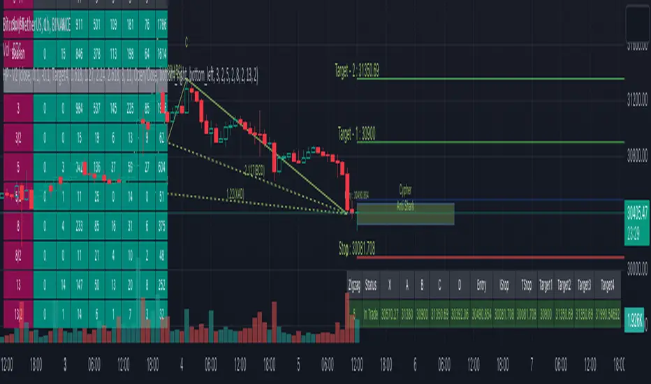
🎯 Patterns Covered
● Classic Patterns
Gartley
Bat
Butterfly
Crab
Deep Crab
Cypher
Shark
Nenstar
● Anti/Alternate Patterns
Anti Nenstar
Anti Shark
Anti Cypher
Anti Crab
Anti Butterfly
Anti Bat
Anti Gartley
Navarro200
● Non-Standard Patterns (Disabled by default)
Five Zero
Three Drives
White Swan
Black Swan
Sea Pony
Leonardo
121
Snorm
Total
Below is a quick snapshot of indicator components.
Now, lets look at some of the individual components:
🎯 Open trade stats helps recognise trades in motion.
Apart from regular stats, it also contain different types of risk reward ratios.
Regular RR : RR calculated from entry to reach target with initial stop for risk consideration
Trailing RR : This is RR calculated for price to reach from one target to next target considering trailing stop for calculating risk
Live RR : This is calculated based on current price as entry and with given targets and stop levels. Live RR will be blank for targets which are already reached.
Targets are calculated only when entry is made. Hence, target details are not shown for patterns where it is still awaiting entry.
🎯 Closed trade stats helps understand historical performance of patterns.
By default closed stats are displayed in Compact mode. Which means, only total stats are shown. But, users can change this to show detailed stats via settings. Detailed stats take up entire screen most of the time. So, keep them only if it is required.
Closed stats present average Risk Reward, Trailing Risk Reward, Average Win Rate, and Average Trailing Win Rate for all the possible levels. As discussed before.
Regular RR : RR calculated from entry to reach target with initial stop for risk consideration
Trailing RR : This is RR calculated for price to reach from one target to next target considering trailing stop for calculating risk
Win Rate : Simple win rate calculation based on number of patterns reached target and number of valid patterns.
Trailing Win Rate : This is win rate calculated based on previous target to current target.
For example, if there are 48 valid patterns and out of which 24 patterns reach target1 and 12 patterns out of 24 reach target 2
Target1 WR : 50% (24/48)
Target1 TWR : Not applicable as there is no target before Target1
Target2 WR : 25% (12/48)
Target2 TWR : 50% (12/24)
🎲 Settings
Tooltips are provided to help with each and every settings. And they are as below.
🎲 Fully Customisable Alerts - Placeholders
Alerts are created via alert() method of pine. Hence, users will not see message box for alert template on alert widget.
Instead alerts widget look something like this:
To overcome this issue, script provides alert template placeholders as part of settings. In settings, you can already see Alert section where you can enable/disable alerts for different events.
▶ New Pattern Detection
▶ Entry Reached
▶ Target1-4 Reached
▶ Stop price reached
▶ Trade Complete - either by stop or reaching target 4
You can use following placeholders in the given text boxes to create your own alert template.
🎯 Common placeholders which are applicable for all alerts
{type} - Alert Type
- New Harmonic Pattern
- Harmonic Pattern Status Update
- Harmonic Pattern Trade Closure
{id} - Pattern Id. This is not fully unique id. But, this will be unique for all open trades. Once trade is closed, Ids are reused whenever feasible.
{ticker} - Ticker information
{timeframe} - Timeframe information
{price} - Current close price
{patterns} - Possible patterns for the projections or PRZ.
{direction} - Trade direction - Bullish or bearish
{entry} - Calculated entry for pattern
{stop} - Calculated stop for pattern
{tstop} - Trailing stop for the pattern in trade
{target1} - Target1 for pattern in trade
{target2} - Target2 for pattern in trade
{target3} - Target3 for pattern in trade
{target4} - Target4 for pattern in trade
🎯 There are few specific placeholders, which are applicable for some alert types.
Harmonic Pattern Status Update
{status} - Status of the Pattern in trade
{laststatus} - Previous status of the Pattern in trade
Harmonic Pattern Trade Closure
{result} - Trade result upon closure
Script pago
The One Trader Toolkit - Open AccessThis script is the open version of my existing invite-only script of the same name and has been opened for access to the community to use, but not modify or clone in any way.
This has been done as the invite-only script cannot be changed back to a public script and vice-versa, keeping in line with Tradingview House Rules.
The code is based on a full strategy that has been explained in detail as follows:
// Step 1:
// We will consider the 200ema a standard to assess the average price over the longer term.
// If the current price on the daily chart is seen above the 200ema, we will consider that the stock is in a long term uptrend.
// If the current price on the daily chart is seen below the 200ema, we will consider that the stock is in a long term downtrend.
// In order to assess the long term trend, a band is plotted between the CLOSE (Average price), HIGH (Average High Price), LOW (Average Low Price) of the last 200 days.
// This band has been color coded for easy visual recognition. Green fill between ema close and ema high. Red fill between ema close and ema low.
// The methodology explains that the trader should have a long bias when the price is above the green part of the band and a short bias while price is below the red part of the band.
// Step 2:
// Now we come to a lower timeframe analysis with the 200ema moving average on the hourly timeframe.
// This is marked by a very distinct solid blue line which cannot be missed.
// If the price is still above this moving average and correlates with the higher timeframe trend in step 1, then we will continue our analysis.
// Otherwise, the stock is not ready to be filtered down and we will move to another stock.
// Step 3:
// On the same hourly timeframe, we will continue further analysing the position of a red 50ema line as compared to the same blue 200ema line or a separetely plotted gray 200ema line.
// If the 50ema is above the blue or the gray 200ema line (and in correlation with trend in steps 1-3), then the stock is believed to be bullish.
// If the 50ema is below the blue or the gray 200ema line (and in correlation with trend in steps 1-3), then the stock is believed to be bearish.
// Step 4:
// After multiple confirmation of a continuing trend, we will try to ascertain a good entry point.
// On the one hour timeframe, we will apply the Phase Changer.
// Phase Changer configuration is derived from a common setup which includes the 8ema and 20ema lines.
// I have implemented it in the Indian stock market setup with an added theory that we ignore the Phase Changer position on any timeframe higher than hourly timeframe.
// So the Phase Changer is not only an indication of the continuing trend, but also a great indicator of what the price is trying to achieve through its interaction with the lines.
// If 8ema is above the 20ema on the hourly chart, then the stock is believed to be bullish.
// If 8ema is below the 20ema on the hourly chart, then the stock is believed to be bearish.
// The same will be done on 15 minutes timeframe.
// In either setup, if there is a pullback and price is touching any of the two ema lines and eventually gets rejected towards the continuing trend, then it is an indication of a good entry at the failure of the pullback.
// Step 5:
// After confirmation through Daily, Hourly and 15 minutes timeframes, we will now come to the execution (5 Minute) timeframe.
// Apply the breakfast range. This is the range formed during the first hour of trading.
// The high of the first hour and the low of the first hour form the breakfast breakout.
// This method is also widely known as Open Range Breakout (ORB).
// The breakfast range is commonly used for stock indices only on a Monday morning, we use it for all days of the week and mostly on stocks.
// If the breakout is consistent with the trend that we have been confirming since step 1, we will enter the trade.
// Step 6:
// An additional daily range has been plotted for those who would like to trade the breakout of the daily range.
// This is the sum of the open price of the day the range of the previous day.
// The green line is used as resistance and the red line is used as support.
// Any breakout of those lines will be considered a strong continuation of the trend, mostly until the end of the trading session.
// Miscellaneous
// The first hour of the trading day is marked yellow with a black solid bar marked at the end of the first hour.
// All trades will be taken only after 10:20am.
// Stoploss Settings
// We will be calculating stoploss with the help of the ATR values.
// I have defined two stop loss levels, one for safe traders and the other for aggressive traders.
// Safe traders will select the safe option in a long trade or short trade respectively and mark the stoploss indicated at the time of taking the breakout entry.
// Aggressive traders on the other hand will select the aggressive stop loss option in long or short trades respectively and mark the stoploss indicated at the time of taking the breakout entry.
TridentI call this strategy "Trident", as it uses three different, modified, customizable indicators:
50 Exponential Moving Average (Trend)
Relative Strength Index (Momentum)
Average Directional Index (Volatility)
Strategy will be improved with future updates. You alone decide when to enter and when to exit a trade. PRICE ACTION IS KING and the TREND IS YOUR FRIEND
What do these three indicators tell us
Exponential Moving Average:
Trend
Price < EMA = downtrend
Price > EMA = uptrend
trend direction and reducing noise
Average Directional Index:
Volatility
direction of market movement when there is a sharp increase in volatility
Relative Strength Index:
Momentum
Strength
Possible shift in momentum
How this strategy works
As I mentioned above, this strategy uses uses three different, modified, customizable indicators:
Exponential Moving Average (50) (Trend): When price closes above or below the 50 period EMA, then the first condition is met. I know some people use multiple EMAs as dynamic support and resistance levels. Therefore, I also added a 21 and a 200 period EMA, but this strategy uses specifically the 50 period EMA as one of three conditions. All EMAs can be adjusted, turned on and off.
Relative Strength Index (80, 20, 3) (Momentum): In his video, TSM uses a 3 period RSI and 80 and 20 bands. If price is above 80, it`s overbought and if it`s below 20, then it`s oversold. Two out of three conditions are met.
Average Directional Index (5, 5) (Volatility): TSM uses the ADX to measure the volatility. Both ADX Smoothing and DI Length are set to 5. If this indicator moves above 30, then the third contidion is met.
Rules to enter the trade
Long Entry:
50 EMA < Price
RSI < 20
ADX > 30
Enter trade at breakout of high of the green candle, which is the candle that pulls the RSI from oversold conditions back inside.
Short Entry:
50 EMA > Price
RSI > 80
ADX > 30
Enter trade at breakout of low of the red candle, which is the candle that pulls the RSI from overbought conditions back inside.
Risk:Reward and Timeframe
Use a 1:1 to 1:1.5
Set your S/L below key levels (-> 2nd point @ Tips), or twice the length of the signal candle
Preferably 5 Minute Time Frame, but at the end you decide
Tips
Avoid periods of consolidation
Trade from support/resistance-levels, supply/demand-levels, pivot points-levels, Fibonacci-levels, swing high/low-levels
Trade during market hours, for example London and New York Session
Trade narrow spreads, if you scalp
Use Price Action
Trade with the trade, not against
The further away the price moves from the EMA the stronger the trend
The long the price doesn't touch the EMA the stronger the trend
RSI + ADX: Confirm when the market is turning and pick a good entry point
ADX + 50 EMA: Filters trades when there is not much activity in the market
I mentioned above that the code of this strategy is still under development. You can not only rely on this strategy alone as it might give you false signals. I coded this, because it makes it easier to visualize were all three conditions are met.
Use your brain, use price action, use these tips, use this strategy.
Frequently Asked Questions
Does it only work for scalping? - No, but try it out yourself
Does it only work for Forex? - No, but try it out yourself
Does only work on the 5 Minute Timeframe? - No, but try it out yourself
Good Luck!

FY Forex ScalperFy Forex Scalper Indicator:
A powerful indicator that you can use to scalp forex markets, it helps you identify the trend and direction of the market in both long term and short term time frames. The Arrows give you entry points. Read the detailed explanation below and if you have any questions feel free to message.
How does it work:
Fy Forex Scalper has two main aspects one is candles and the other is band both are color coded and works independently. As we all know, markets are not always trending and often move in a tight range. The Fy Forex Scalper indicator assists you in identifying trading opportunities by displaying trading zones and non-trading zones by painting the candles in three different colors: red, yellow, and green. When the candles are red, the script is in the selling zone, when the candles are green, the script is in the buying zone, and when the candles are yellow, the script is non trading zone. The band mainly works as support and resistance and gives you overall trend direction, If the band is red the trend direction is down and if band is in green the trend is up. So both candles and band give you the trend direction how to enter the trade explained below.
How to enter the trade:
Long Entry: Enter the trade when you get the up arrow near the band and make sure the band color is green. When you get the up arrow and band is red you can consider it as false signal.
Short Entry: Enter the trade when you get a down arrow near the band and make sure the band color is also red. When you get the down arrow and the band is in green color you can consider it as a false signal.
What markets it work:
Mainly use it for Forex, Crypto or scripts that move faster.
What time frame is best:
Use 5 mins when the market is moving (like Asian or London opening) use one min when the market isn’t moving.
Can we use it for Swing Trading:
Though it works , but the primary purpose of this indicator is for scalping so better use it on shorter time frames.
How to get access:
This is invite only script so to get access message me.

Vgnomics ScalperVGNOMICS Scalper is a tool to help you find great scalping opportunities. There is great variety of ways to use this indicator to get amazing results. The VGNOMICS Scalper is a new trading indicator that can be used in any market. The technique we combine with this indicator is easy to learn and apply to your trades, but practice makes perfect. This indicator is based on a mathematical calculation that always occurs, no matter which time-frame, market, asset, option, stock or crypto.
How does it work?
The script determines whether we have a bullish or bearish trend based on a combination of price action and moving averages.
When the price crosses this trend, a buy or sell signal is placed (green or red arrow). The indicator will then draw 5 colored dots extended with 5 colored lines. Every line or dot represents a possible entry / exit position. These values are chosen based of a mathematical formula on the previous price movements.
The distance between the red en the black line is calculated from the price action from the current and previous candle.
If there was a big price movement, the distance between the black and the red line will be much greater than when the price action is much smaller.
The distance between the blue and the black line is always the same distance as the distance between the red and the black line.
The yellow line will always represent the high or the low, depending on whether there's a short or a long signal.
These lines tend to be key levels between which the price will bounce.
There are many ways to use and interpret these levels.
How to trade with this indicator?
We have allot of different strategies that can be implemented for this indicator.
But we will explain 3 working strategies that work for us.
Scalp trading is one of the most profitable forms of trading. They can lead to very high profits but are very hard to achieve. In this tutorial we will show you how the VGNOMICS Scalper indicator can assist you with locating great scalp opportunities.
The tutorial below is just one example of how this indicator can be used. Every line represents a key price level at which scalping opportunities can take place.
Strategy 1
Long position:
1) A green arrow at the bottom of the screen indicates a potential long position.
2) Wait for the candle to close. (The signal is only confirmed when the candle closes)
3) Candle closed.
4) Place a limit order for a long position at the yellow line. (Entry)
5) Place a take profit order at the orange line. (Exit)
6) Order is filled. (Long position)
7) Take profit at the orange line. (Exit)
8) Yellow line (entry) gets respected most of the time.
Short position:
1) A red arrow at the bottom of the screen indicates a potential short position.
2) Wait for the candle to close. (The signal is only confirmed when the candle closes)
3) Candle closed.
4) Place a limit order for a short position at the yellow line. (Entry)
5) Place a take profit order at the orange line. (Exit)
6) Order is filled. (Short position)
7) Take profit at the orange line. (Exit)
This strategy does not include a stoploss. It's up to you to implement this indicator in your own strategy. Stoploss orders could be placed at the lines (Key price levels) below / above your entry.
For example:
The stoploss order could have been placed on the black line, or alternatively, we could have placed a second long order on the black line and exit at the yellow line while we place a stoploss order on the blue line. (see strategy 2)
The price tends to swing between these key levels and can be used in various ways.
Strategy 2
Long position (same strategy for short postion but for a red arrow):
1) A green arrow at the bottom of the screen indicates a potential long position.
2) Wait for the candle to close. (The signal is only confirmed when the candle closes)
3) Candle closed.
4) Place a limit order for a long position at the yellow line. (Entry)
5) Place a take profit order at the orange line. (Exit)
6) Order is filled. (Long position)
7) Price did not reach our profit target orange line. (Exit)
8) Place a second limit order with the same size for a long position at the black line. (Entry)
9) Order is filled. (Long position)
10) Place a take profit order at the yellow line. (Exit)
11) Take profit at the yellow line and break even order for the first position. (Exit)
Strategy 3
Long position (same strategy for short postion but for a red arrow):
1) A green arrow at the bottom of the screen indicates a potential long position.
2) Wait for the candle to close. (The signal is only confirmed when the candle closes)
3) Candle closed.
4) Place a limit order for a long position at the black line. (Entry)
5) Order is filled. (Long position)
6) Place take profit orders at the yellow/orange/red line. (Exit)
7) Take profit. (Exit)
You want to use this indicator?
Go to the VGNOMICS website.

Auto Harmonic Patterns - V2Hello traders. After getting good response to my earlier Harmonic patterns scripts, decided to deep dive a bit and make it bit more interesting and detailed.
Before I explain further on the script, few important things to note:
The script is very intensive and may often timeout or give memory error. If that happens, just reload the script. It may not work on smaller timeframes due to same reason. At this point, we cannot do much about it.
This should not be considered as strategy - but as a tool to make your harmonic based trades. Options are available to set your entry, stop and target levels based on your trading methods.
If there is timeout - try reducing the scope by disabling few zigzags and reducing Max depth from the settings.
Script does not show historical patterns. It will only show patterns which are currently in trade. This is done to reduce errors due to number of lines and labels. To track past patterns, you can either replay previous bars or use stats table.
After lots of deliberation, this script is released as protected script instead of invite only. Use it well :)
OVERVIEW
This script combines earlier two scripts defined on harmonic patterns:
Multi-ZigZag-Harmonic-Patterns
Multi-Level-ZigZag-Harmonic-Patterns
Merging these two the present script allows up to 4 Zigzags to be used and each zigzag comes with one multi level Zigzag. Logic of deriving multi level zigzag is described here: Multi-Level-Zigzag
On top of that each combination scans last 11 pivots (Max Depth) with all permutation combinations to come up with better pattern recognition. So, the complexity of the scan is 8 * (MaxDepth-4)!/2
In order to speed up the execution, you can chose to enable only the zigzags you are looking to trade instead of allowing all 4. Multi level zigzags cannot be enabled/disabled separately at this point.
INPUT PARAMETERS
Target and Stops
Entry Ratio : Minimal retracement from AD or CD (whichever is max) to enter into order
Stop Ratio : Retracement or extension from AC or AD (whichever is max) to stop or invalidate the trade. Negative values mean that stops are placed beyond D away from A/C whereas positive valus mean stops are placed between A/C and D. Please note Stop Ratio should be lesser than Entry Ratio. Wider the better for longevity of trade.
Target Ratios: Different points where profits can be taken. This is not optimized for strategy or pattern. To be used as per individual trading method.
Trailing Start Stage: This tells after what stage to start trailing stop loss. Trail will be based on difference between past subsequent levels. For example, if instrument is trading beyond Target 4, trail distance will be target4-target3
Pattern detection settings
Error Percent : Error threshold to be allowed for pattern recognition
Max Depth : Number of last pivots to consider for scanning patterns with m X n permutation. Increased numbers show more patterns but also slows down the script and may even lead to timeout.
Wait For Confirmation : Pattern recognition only happens on confirmed zigzags. Stats will show higher success rates and lesser patterns if this option is selected. That is because, there will be lag in identifying the patterns as confirming zigzags takes few bars.
Ignore if Entry Crossed : Only effective when Wait For Confirmation is enabled. If price has gone beyond entry when pattern has formed, system will ignore the pattern and do not try to plot it on charts.
Stats and Display
Show Trade Stats, Open Trades Stat Position, Closed Trades Stat Position can be used to display trade statistics and set different positions for tables display
Show Targets : Display/Hide target and stop levels
Show XABCD : Display/Hide XABCD marking on patterns
Show Ratios : Display/Hide harmonic ratios used for pattern recognition
Zigzags ( 1 - 4 )
L1 Length is primary zigzag length.
L2 Length is for deriving multi level zigzag based on L1
Patterns
Allows enabling and disabling several patterns. List includes:
Classic Patterns
Gartley
Bat
Butterfly
Crab
Deep Crab
Cypher
Shark
NenStar
Anti Patterns
Anti NenStar
Anti Shark
Anti Cypher
Anti Shark
Anti Crab
Anti Butterfly
Anti Bat
Anti Gartley
Navarro 200
Comprehensive list of patterns are listed here: Complete List of Harmonic Pattern Ratios
TRADE STATISTICS
Open Trade Stats consists of following fields
Zigzag - Zigzag length and level 2 length
Status - Current status of the trade. This includes - Awaiting Entry, In Trade, Target<1-4> Reached
X, A, B, C, D - price levels of X, A, B, C, D
Entry, Stop and Target Levels - These are same as what is shown on chart for present trades but presented in tabular way for better readability in case there are more number of trades.
Rows will have green background on bullish trades and red background color for bearish trades. Bullish and bearish colors can be set in Generic Color input settings. Text Color will be same as Zigzag line color which can be set in settings.
Closed Trade Stats consists of following fields
Overridden - these are patterns which are formed but overridden by other pattern based on the same XABC but with different D with better risk reward. Pattern is overridden only if entry/stop is not reached
Failed - These are the patterns which are successfully formed. But, price failed to hit entry before hitting stop. Hence, these signals are not taken as trade.
Stopped - These are the signals where price successfully hit Entry. But, failed to reach any of the targets before hitting Stop or Trailing Stop (If Trail Start Stage is set to Entry)
Target(1-4) - These numbers imply number of trades which successfully hit the respective target level but failed to hit next target level (Except target 4 which is the last target level)
Close stats show numbers based on Bullish and Bearish signals generated. It also shows numbers based on the zigzag length and level 2 length.
Status Symbol HUD***THIS IS NOT A TECHNICAL INDICATOR*****
***THIS IS A HUD (HEADS UP DISPLAY)*******
***TV MADE ME CHOOSE AN INDICATOR CATEGORY****
This is a Status HUD designed to be overlaid your live chart to help you keep track of important information regarding your current position as well as provide 'quick-glimpse' tools and information to help you make quicker, more informed decisions in the moment.
The HUD consist of a small label plotted to the right side of price action keeping your viewing area clean and clear.
The following inputs allow you to customize the information to suit your needs;
AE
This is the Average Entry of your trade. It is assumed that you have calculated this out on your own using external methods. If this is for a single buy-in/buy-out trade, this will just be your entry price
R
This is the percentage of your balance that you currently have in the open trade. This number also needs to be computed using external sources. If you are only interested in keeping track of the status of a single position as an isolated trade apart from your entire balance, you would enter 1 here.
AX
If you are scaling or laddering in and out of a position, this is how you would keep track of your average exit price, This also needs to be calculated externally.
BAL
Input your total balance here if this trade is used against your larger portfolio, this allows for live %PNL calculations on your balance as a whole.
SL
This the real price % you are comfortable allowing price to drop before exiting the position. Currently, the HUD does not calculate SL for you so you will need to calculate your own SL based on your portfolio risk and enter that number here. Future versions will have this baked in, however.
Fees
This is assumed to be a 'one-way' fee. For my personal use I am normally the taker, and my fees are relatively constant. Put in the one-way fee here and the HUD will double that number when necessary to account for 'round-trip' break even points and more accurate SL and target plots.
SPEC
The HUD also has a small selection of 'speculative' tools that can assist in quick information gathering and decision making. By selecting the first check box, this will show or hide the spec dialogue. This spec information appears in the same label as the main info.
Adjusted Average Entry Projection
One powerful feature of the HUD is that by inputting the amount of your next buy-in, you can see a live indicator showing the approximate location that your new average entry will be. This can be very helpful when trying to decide if it is worth employing DCA strategies or if you should simply cut and run.
STEP is a variable that plots the small grey lines above your entry. These are 5 targets, evenly spaced according to this variable. The default is 50, which means the grey target lines show you the price points equivalent to $50, $100, $150, $200, and $250 profit. These targets are fairly accurate when accounting for fees as well, meaning that the $50 target painted here is a REAL $50 with all fees covered!
By selecting the Spec SL box you will show/hide the speculative stop loss projection. This is a small black cross that prints under the current price. This represents your described SL as a function of current price. In other words, if you were to take a new trade at the current price, it shows you where your desired stop will be. This projection is an estimate and does NOT account for fees. It also will NOT work with DCA strategies. It is currently ONLY for new trades. Once you have entered a trade, it is better to turn this off. Future updates will include dynamic projections that account for fees. ;)
HUD Offset is the number of candles forward you wish to displace the HUD interface. If set to 0, the info box will be directly over the current candle.
The info that is on the HUD is as follows;
% = total %the trade has moved since your entry
PNL = Your personal PNL on balance
PNL (line 2) = Your personal PNL as real dollars
---------
MU = the makeup required for a negative trade. This calculates how far UP price must travel to make up the current lost percent. Because the makeup % is not always intuitively related to the loss percent, this can sometimes be handy. For instance, if price is down 20% from entry, you will need almost 26% increase from current price to reach your break even point.
Visual Tools that are plotted are as follows;
Green line = Trade Entry
Red line = SL
Purple Line = Break-even point for fees
Grey lines = profit targets based on 'STEP' increment
The CryptoPlayground FrameworkThe CryptoPlayground Framework & Built-in Strategy Analysis
CryptoPlayground’s Framework provides the community an “executive assistant” that teaches traders how to trade The CryptoPlayground Framework ‘LIVE’. Producing a structured approach with a built in Strategy where traders to learn the method as the trade pans out.
Cryptoplayground’s Framework pays close attentions to fundamental as well as technical analysis . In this publication we will be breaking down the simplicity of what makes the framework “tick”.
Traders take notice how the price moves between the double blue sets of lines marked #cpf, these are some of the most important aspects of the CryptoPlayground Framework. Let’s jump in and explain.. The built-in Fibonacci Retraction add+ tool is the method we use to frame up our technical analysis . Helping CryptoPlayground traders define support and resistance levels of extreme relevance and more importantly defining #cpf Optimal Trade Entries. Traders trading from these blue lines produce high probability low risk trade ideas and opportunities.
How it’s done: Drawn using (plot) the high and low of a particular time-frame (depicted by your chart settings, or set using custom time settings in the indicator settings itself). These high and low points have many names and can be defined in many ways. as basic as it comes these are knows as pivot points . Using these points, Cryptoplayground Framework draws levels respecting Fibonacci ratios. Reminder that CryptoPlayground is a framework to structure trades, these levels are supposed to change. Using a time series to do so allows traders to define their style of trading, whether intra, daily or swing.
When the CryptoPlayground Framework is “about to change” we call this a liquidity event and most commonly in crypto it’s some sort of purge in the direction that traders are willing to buy up to or sell to.
🤖 Technicals in the code:
// Fibonacci Retraction
Length(x)
Source( close)
Out = fib retract
High(close, x)
Low(close, x)
plot(…
Plotshape (fib = high - low within time series multiples by ratio)
Alert condition(
crossunder(close, x)…. ; candle close below x indicating our liquidity event)
Plot ( purge
Plotshape (purge
CryptoPlayground Framework traders have the added improvement of RSI add+ , as a further confirmation, defining whether bulls are in control, bears are in control or when defining overbought or oversold thresholds. Represented by the larger blue and grey dotted channel, traders are able to use this visual tool and add it to their analysis.
🤖 Technicals in the code:
//RSI+
Based on in-build RSI , where RSI is (rsiSource, rsilength)
RSI = close
Legth = x
Condition = x
Condition = x
plot ( plot as size 2 dotted lines on the chart )
CryptoPlaygound “Helper Tool” is an Exponential Moving Average function to determine bullish and bearish conditions, we are able to remain emotionless through the trade. As well as, when to book profit and the sign of a possible reversal. Backtested for optimal crypto conditions, the degree of weighted decrease provides observations faster for a volatile market. CryptoFramework makes these calculations available on all time frames or customisable for the style of trader. CryptoPlayground used a time settings (constant) that makes traders pay themselves first.
🤖 Technicals in the code:
// bullish . bearish
Length = ( x )
Source( close )
Out = ( ema )
High ( close, x )
Low ( close, x )
Last = ( high , x )
Last = ( low , x )
Bearish = cross ( close , x )
Bullish = cross ( close , x )
Plotshape ( bullish , style
Plotshape ( bearish , style
// Long.short exit
Ema = x
SMA = x
EMA ( close, x )
SMA ( close , x )
RSI (close , x )
Using the CryptoPlayground Framework, the description below will describe, How to trade a “Fake Out - Purge Event“, also known as “Purge and Revert”
Set alert: Purge Event (This way you will get notified, this type of trade can be ruined with emotions and therefor it is best traded with structure)
Purge Events indicate one of 3 things, a breakout/liquidity run or raid, a reach for liquidity or a possible fake-out. Purge Events are represented by the label “Purge”.
In this example, CryptoPlayground Framework has structured a trade example during a “Fakeout - Purge Event” to the sell side.
Further visual description provided.
On chart elaboration and description on how to trade
1. Set Alert Condition - Liquidity Purge Alert
(using TradingView alert settings)
2. Set entry at #cpf Entry 1 :
This is a level 2 entry.
Scaling down chart time-frame will create a further "Optimal Trade Entry
".
3. Pay yourself, book profit, move your stop loss up or to break even.
The trade is now risk free and you’ve made a successful trade.
The rest is just added bonus.
4. Opportunity to consider re-enter, add partials previously taken signified by bullish Label and Rejection of Fibonacci ratios.
5. Trade is complete, you paid yourself, lowered risk, added more into a trade and entered hopefully using a limit order :)
Blue horizontal lines marked #cpf are your long and short optimal trade entry location, where trading from these regions carry less risk. These blue lines are what the Cryptoplayground Framework refers to as Optimal Trade Entries.
In the opposition's corner we have a mirrored x2 blue horizontal lines marked #cpf these are your targets. Traders are made aware of a "liquidity Event" at these levels when bulls or bears are in control.
White "time to book profit" labels are there to remind traders to pay themselves first. Having Entered from #cpf a CryptoPlayground Trader would at this point take profit and move stop loss into profit or break even. Using this method further reduces downside and removes the risk from your original entry position. Leaving the CryptoPlayground Framework Trader with a "Risk Free Trade".
White "exit trade" indicates extreme limits of oversold and overbought conditions where it is likely that a reversal will take place as buyers or sellers increase in the respected direction.
Grey horizontal dotted lines indicate levels at which price action is likely to respect. In that regard, price action will make moves from these levels and to these levels.
If you have any questions please reach out, the script is invite-only.
If you wish to have access please reach out.
Hope you enjoy, please comment or message! 🙏

RSI Moving Average with Signal LineDefault values:
RSI = white
RSI Prime ( RSI of RSI ) = yellow
EMA 34 = blue
EMA 55 = red
They are listed in order of reactiveness to price changes. Think of them like the Williams Alligator...
White and yellow work the fastest, with WHITE being signal and YELLOW being trigger. Great for LTF
Blue and red work the slowest, with BLUE being frequently testing RED as support/resistance. Great for HTF
Long Entry:
RSIs both > SMAS (signal)
RSI > RSI Prime (confirmation)
Long Exit:
RSI < RSI Prime (signal)
RSIs both < SMAs (confirmation)
Short Entry:
RSIs both < SMAS (signal)
RSI < RSI Prime (confirmation)
Short Exit:
RSI > RSI Prime (signal)
RSIs both > SMAS (confirmation)

Sumon Pal Momentum and Volume StrategyThis is a momentum and volume based strategy.
1. Barcolor is GREEN -> When Momentum is in green region and Volume is also in green region
2. Barcolor is RED -> When Momentum is in red region and Volume is in red region.
3. Barcolor is YELLOW -> Volume and Momentum is not going in same direction. Staying away from trading is good in this scenario.
Blue Star -> Long signal when Volume and Momentum both turns green.
Entry -> Closing (as per your desired timeframe) above High + 50% range of the signal bar.
Initial StopLoss -> As marked in the chart (ATR based SL)
Exit --> Two Approaches. Also check the 4th point in "Word of Caution"
1. Approach 1
a) 50% position can be liquidated at Target 1. Rest Stop Loss at entry price
b) 50% of rest position t target 2. Rest stop loss at target 3
c) Book all at target 3
2. Approach 2
a) Trail previous bar Trailing Stop Loss as marked in the chart.
As per your timeframe, you can follow ATR based trailing method
Red Star -> Short signal when Volume and Momentum both turns red.
Entry -> Closing (as per your desired timeframe) below Low - 50% range of the signal bar.
Initial StopLoss -> As marked in the chart (ATR based SL)
Exit --> Two Approaches. Also check the 4th point in "Word of Caution"
1. Approach 1
a) 50% position can be liquidated at Target 1. Rest Stop Loss at entry price
b) 50% of rest position t target 2. Rest stop loss at target 3
c) Book all at target 3
2. Approach 2
a) Trail previous bar Trailing Stop Loss as marked in the chart.
As per your timeframe, you can follow ATR based trailing method
Targets plotted in the chart are projected target only based on signal bar ATR. There is no guarantee that target will be met. Exit is more important than entry. In real time, we need to find out which one is best to exit if trade goes in our favor. In a rangebound market, we can consider booking profit near major previous swing, previous day high/low etc. In a trending market we can simply trail. So, exiting is more dependent on the market structure rather than labels plotted on the chart.
To make the chart net & clean, historical signal's entry/exit levels are not marked, only the recent entry/exit labels are plotted.
Fine tuning the entry->
a) You can use momentum and volume osc to check if the current signal is being supported by the momentum & volume osc or not.
b) If any positive divergence is observed in oversold region and signal is generated, don't miss the trade. Similar is applicable in overbought region.
c) If the signal/entry is around price range breakout level followed by volume and momentum support, probability of success is higher.
Word of Caution->
1. Be extra cautious on long in momentum indicator overbought zone.
2. Be extra cautious on short in momentum indicator oversold zone.
3. Ignore signals when Volume & Momentum Osc are flat and not showing any direction
4. Whipsaws could be there in rangebound market. To avoid that I follow the below process:
a) No fresh buy in first 15m (if timeframe is below 5m)
b) after 15m, mark the high low of first 15m min, ignore signals within the first 15m range
c) after 30m, mark the high low of first 30m min, ignore signals within the first 30m range
d) after 60m, mark the high low of first 30m min, ignore signals within the first 60m range
e) if price is within first hour opening range then any sell signal near opening range high can be traded subject to confirmation from volume and momentum. Target
can be near opening hour low. Same for buy signal. But this kind of trade is RISKY and advisable to avoid.
5. Refer only intraday signals for timeframe below 1hr. If signal was generated previous day and gets confirmed today, then do not trade.
6. Look for divergences in momentum osc and manage your current position accordingly.
7. On expiry day(NIFTY/BANKNIFTY), I avoid this strategy because on expiry day generally volatility is high and entry/stop loss is sometime far away.
Lastly, wait for the closing above/below the entry price along with momentum and volume confirmation and follow stop loss religiously.
Disclaimer: Trading in equity is risky. Asses your risk profile before trading. Asses your risk profile and trade by managing proper risk. Backtest this strategy before putting real money in this strategy.
HAPPY TRADING.
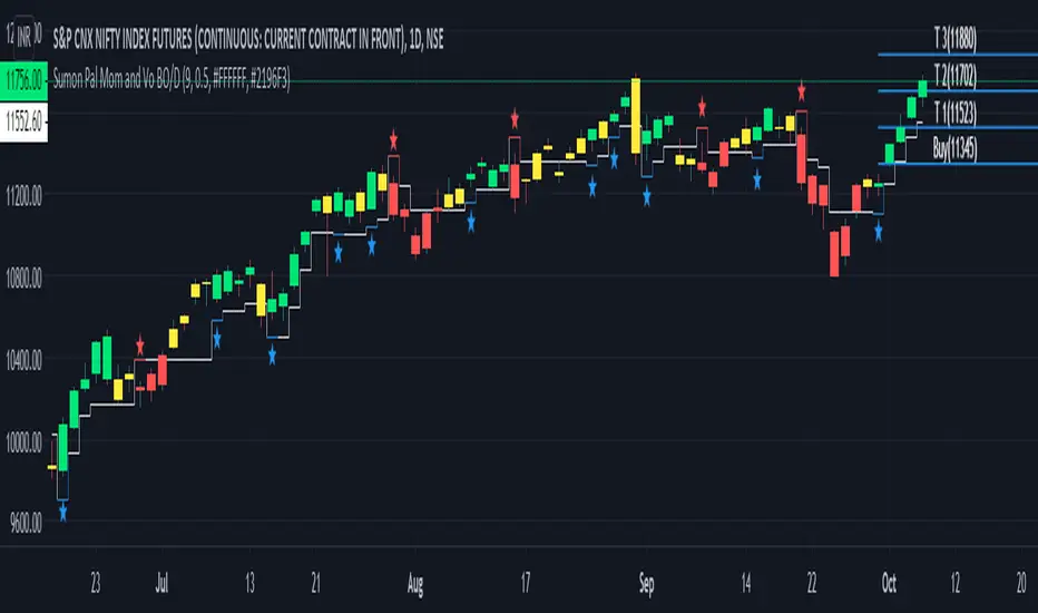
WR Robo Level 1FCPO trading robot alert is based on one of the popular WR Level 1 Technique strategy.
This alert is suitable to used by personal who are understand WR Level 1 Technique.
The script will identify candle that is touch SMA line and trend candle (in direction of Long or Short) to determine either to go with Long or Short entry.
Once entry is confirm, script will popup one label with detail of Long Entry Condition or Short Entry Condition.
This is an example of Long Entry Condition :
This is an example of Short Entry Condition :
Recommended Chart Settings:
Asset Class: FCPO Active Contract
Time Frame: 15 Minute
Long Entry Conditions:
a) Green Label with information of Buy Stop value, Take Profit Value and Stop Loss Value
b) Buy Stop value will be plot with Black Circle symbol on the chart
b) Take Profit value will be plot with Orange Cross symbol on the chart
b) Stop Loss value will be plot with Red Cross symbol on the chart
Short Entry Conditions:
a) Red Label with information of Sell Stop value, Take Profit Value and Stop Loss Value
b) Sell Stop value will be plot with Black Circle symbol on the chart
b) Take Profit value will be plot with Orange Cross symbol on the chart
b) Stop Loss value will be plot with Red Cross symbol on the chart
The entry label will appear once WR Level 1 Technique is valid.
Exit Conditions:
a) Stop loss level is hit
b) Take profit level is hit
c) Last candle at the end of the day (at 17:59:45 or earlier)
Default Robot Settings:
Simple Moving Average ( SMA ) : 50
Disclaimer:
This is a FCPO trading strategy that involves high risk of equity loss, You agree to use this script at your own risk.
If you have any suggestions, comments or interested to use this script, kindly PM us to obtain an access.

PSAR-risk strategyThis indicator is a tool to know at all times at what price to close a trade, using entry and exit SAR values as hard limits, to protect profits or to not risk more than expected.
Parameters:
Source: a PSAR source with calibrated parameters to use as entry and hard exit. Be it the TradingView's official one or TradingView's legacy SAR ported by me (Legacy PSAR).
Commission: broker/exchange commission to account for when executing buy/sell orders.
Risk: a statistically determined risk of how much loss to tolerate with the current SAR parameters. This doesn't account for commission, it's just a raw loss below entry price. A stop-limit sale is suggested at this price.
Milestone #: when reaching a certain percentage above entry, what is the new exit criteria (M# exit). Each milestone must be of a higher value than the previous one, in order to be considered.
M# exit: negative values don't account for commission and are raw losses below entry price. Values greater than or equal to zero represent the percentage of the peak profit, with commission accounted for, to sell at. A value of zero means recouping the original investement.
Alerts:
Entry condition: SAR-signaled entry. Market price entry or a pre-programmed stop-loss buy at the previous SAR value is suggested.
Soft exit condition: this tool's exit. Limit price exit at this tool's current value or a pre-programmed stop-limit sale at the latest available value is suggested.
Hard exit condition: SAR-signaled exit. Market price exit or a pre-programmed stop-loss sale at the previous SAR value is suggested
Case study
Let's assume a commission of 0.1%, a studied risk of -5% with the current SAR parameters (you have observed that most good entries don't need to come near 5% down before starting an upside swing), only one programmed milestone at 3% securing a profit of 25% of the peak profit reached.
Let's say that we have an entry executed at $100 with the current SAR value 3% below the current candle. Since -3% > -5% programmed risk, the exit will be marked at the SAR value. If in that candle or in a future one, we reach $103 (3% milestone met) the current peak profit is ~2.8% (($103/$100) * (1 - 0.001)^2) so an exit will be marked at 25% of 2.8%, meaning 0.7% or an exit price of $100.9, if that's higher than the current SAR. The greater value between the current SAR or this indicator calculated value is the current exit price.
Master000 automation trade indicatorIndicator description:
The Master000 indicator is four indicators built into one. They work together to provide trading insights including trend and momentum, reversal points, potential entry points, and projections of future reversal or breakout levels.
Trend power
Shows strength of trend and a change in momentum
Red: The trend has been determined and is short
Lime: The trend has been determined and is long
Aqua: Continuation of the down trend, but showing down trend is in weakness.
Fuchsia: Continuation of the up trend, but showing up trend is in weakness
Yellow: Trend is reversing or trend is missing direction
Zig Zag Trend Lines (Major/Minor )
Major
The trend is graphed based on changes in price. The major trend should be used in deciding which way to enter the trade.
Min or
The minor trend is similar to the major but it is used to determine your entry point. It is easy to spot higher highs or lower lows. Take not when the minor trend fails to set a new high or a new low.
Channels
These dotted lines are provided as a quick guide to determine where the trend is headed. They show if price is getting squeezed and we should look for a break out using a flag or pennant pattern or is there an ever widening channel creating a broadening wedge. Look for hesitation or a reversal near the channel lines.
Entry Signals
Should be taken as a suggestion and not taken everyone. Do your research before entering any trade. There could also be many profitable trades even when an entry signal was not given.
Not good now, just reference for you.
Strategies for using the indicator
Major and minor trendlines: Once major trendline has been set look for a pullback for an entry. Look for a reversal in the major trendline when the minor trendline fails to create a higher high or lower low.
Trend Power: Look for an optimal entry point when the trend power turns teal. This mean the trend is reversing and should be an optimal place for an entry going against the previous trend.
Indicator Explain video at YouTube:
youtu.be
Anyone can apply to use it, you will get two weeks for testing it. [/b
Just click 'like', when I get the message, I will add you as 'invite only' indicator.
NCTA Profit Flow OscillatorProfit Flow Oscillator
The Profit Flow Oscillator is one of two technical pattern indicators that are part of the Profit Flow Analytics.
New Cycle Trading and Analytics is a group of traders creating market analytics for traders. The objective is to take complex combinations of multiple technical pattern indicators and present to the trader a simple, single signal entry.
The Profit Flow Oscillator is excellent in short 1, 3, and 5 minute timeframes for futures traders and short term options traders. Longer timeframes such as the 5, 10, and 30 minute timeframes work well for options traders.
The Profit Flow Oscillator consists of a simple, single entry indicator designed to provide an entry very close to the shift on the intra-day cycle. It is designed to filter out false signals and provide the trader with an optimum timing of an entry.
HOW TO USE: Go long when a blue bar appears and go short when a red bar appears. These prints very closely identify the beginning of a new cycle
The Profit Flow Oscillator, which is part of the Profit Flow Analytics set of indicators, is traded in a live trading room every market day, hosted by our friends at Options Money Maker.
To learn more and to get a free trial of the Profit Flow Oscillator, use the following link:
www.newcycletrading.com
NQU2019
SP:SPX
Liquidity Structure Screener [Z-Score Sniper] "Stop guessing where value is. Start seeing the structure."
This indicator is an institutional-grade screener designed to visualize Liquidity Structure across up to 30 tickers simultaneously. It moves beyond standard support and resistance by using Auto-Anchored VWAPs and Volume Nodes to identify exactly where "Smart Money" is defending, trapped, or exhausted.
Core Concepts
This screener builds a dynamic "Liquidity Geometry" for every ticker on your watchlist based on the last 60 days (adjustable) of price action:
The "Whale" Level: Automatically detects the single highest-volume day in the lookback period and anchors a VWAP from that exact candle. This is the "Line in the Sand" for the market's biggest participant.
Market Structure Anchors:
Shorts (High Anchor): VWAP anchored from the highest high. Represents the average entry of short sellers (Resistance).
Longs (Low Anchor): VWAP anchored from the lowest low. Represents the average entry of buyers (Support).
Z-Score Sniper: Calculates how far price has stretched from the Short Anchor using ATR-normalized Standard Deviations. This detects extreme "rubber band" extensions for mean reversion plays.
How to Read the Signals
The screener processes this complex data into a simple SIGNAL column with actionable color-coded states:
🔵 DEFENSE LONG (The Fortress): Price is in the "Whale Zone" or "Squeeze" AND holding near the Long Anchor support (within 5% buffer). This indicates relative strength and active institutional defense.
🟢 BUY RETEST: Price has broken out above the Short Anchor (Resistance) and is dipping back to retest it. A classic "Resistance-to-Support Flip" entry.
🟠 COIL (The Pinch): Volatility is dead. Price is trapped tightly between the Whale Level and the Short Anchor (< 0.5% distance). A massive expansion move is imminent.
🟣 OVERSOLD: Price is in a breakdown but has stretched to an extreme statistical deviation (Z-Score < -3.0σ). Sellers are exhausted, signaling a potential "Dead Cat Bounce" or reversal.
🔴 AVOID: Structure is broken (below Long Anchor) with no statistical exhaustion. The floor is gone—do not catch the falling knife.
Key Features
30-Ticker Watchlist: Monitor your entire portfolio in one panel.
Smart Deduplication: Automatically cleans duplicate tickers from your inputs.
Customizable Lookback: Adjust the "Anchor Memory" to fit your trading style (Swing vs. Position).
Visual Heatmap: Color-coded zones for instant readability of market health.
Disclaimer: This tool provides structural analysis, not financial advice. Always use proper risk management.

Dual EMA Trend Crossover IndicatorOverview The Dual EMA Trend Crossover is a classic trend-following indicator designed to identify shifts in market momentum and trend direction. By utilizing two Exponential Moving Averages (EMAs) with different periods, this script helps traders visualize the prevailing trend and spot potential entry points through crossover signals.
This tool is highly effective for capturing medium to long-term trends in trending assets like Index Futures, Commodities, and Crypto.
How It Works The strategy relies on the interaction between a Fast EMA (shorter period) and a Slow EMA (longer period):
Bullish Trend: When the Fast EMA is above the Slow EMA, the background/cloud is highlighted (typically Green) to indicate an uptrend.
Bearish Trend: When the Fast EMA is below the Slow EMA, the background/cloud is highlighted (typically Red) to indicate a downtrend.
Signals: Crossovers serve as the trigger points. A "Golden Cross" signals a potential long entry, while a "Death Cross" signals a potential short entry.
Trading Logic
Long Signal (Buy): Triggered when the Fast EMA crosses over the Slow EMA.
Short Signal (Sell): Triggered when the Fast EMA crosses under the Slow EMA.
Trend Filter: The gap between the two EMAs serves as a visual "Trend Cloud," helping traders avoid choppy markets when the lines are flat or frequently crossing.
Default Settings
Fast EMA Length: 12 (Adjustable)
Slow EMA Length: 26 (Adjustable)
Source: Close price
Disclaimer This indicator is for educational purposes. Moving average crossovers are lagging indicators and work best in strong trending markets. Whipsaws may occur in sideways or ranging markets. Please combine with other indicators or price action analysis for best results.

S50 Complete Hedge & Trade SystemTFEX:S501!
คู่มือการเทรด CALENDAR SPREAD
1. กลยุทธ์หลัก: MEAN REVERSION SPREAD TRADING
หลักการ:
- Spread ระหว่าง series จะมีค่าเฉลี่ย (Mean) และแกว่งไปมารอบๆ ค่าเฉลี่ยนี้
- เมื่อ Spread เบี่ยงเบนไปจาก Mean มากเกินไป จะกลับมาหาค่าเฉลี่ย (Mean Reversion)
2. INDICATORS ที่ใช้
A. Z-Score
Z-Score = (Spread ปัจจุบัน - Spread เฉลี่ย) / Standard Deviation
การตีความ:
- Z > +2.0 → Spread แพงเกินไป → SHORT spread
- Z < -2.0 → Spread ถูกเกินไป → LONG spread
- Z ≈ 0 → Spread อยู่ที่ค่าเฉลี่ย → EXIT
B. Correlation
Correlation > 0.9 = ดีมาก (เคลื่อนไหวพร้อมกัน 90%+)
Correlation > 0.7 = ดี (ใช้ได้)
Correlation < 0.7 = ไม่แนะนำ (Hedge ไม่มีประสิทธิภาพ)
C. Beta & Hedge Ratio
Beta = Cov(S1, S2) / Var(S2)→ บอกว่า S1 เคลื่อนไหวเท่าไหร่เมื่อ S2 เคลื่อนไหว 1 หน่วย
Hedge Ratio = Beta→ ใช้คำนวณจำนวน contract ที่ต้อง hedge
3. วิธีการเทรด SPREAD (ทีละขั้นตอน)
STEP 1: หาโอกาส
เงื่อนไข Entry:
1. |Z-Score| >= 2.0
2. Correlation > 0.7
3. Signal = "SHORT SPREAD" หรือ "LONG SPREAD"
STEP 2: คำนวณ Position Size
ตัวอย่าง:
- Account Size = 1,000,000 บาท
- Risk Per Trade = 2% = 20,000 บาท
- Spread Std Dev = 15 จุด
- Stop Loss = 1.0x Std Dev = 15 จุด
- S50 มูลค่า = 5 บาท/จุด
Position Size = Risk Amount / (SL Distance × Point Value)
= 20,000 / (15 × 5)
= 20,000 / 75
= 266 contracts (ปัดเป็น 26 สัญญา)
STEP 3: คำนวณ Hedge Ratio
สมมติ: Beta (S1:S2) = 1.05
ถ้าเทรด SHORT S2-S1 spread:
- Sell S2: 26 contracts
- Buy S1: 26 × 1.05 = 27.3 → ปัดเป็น 27 contracts
Portfolio Delta ≈ 0 (Market Neutral)
4. ตัวอย่างการเทรดจริง
SCENARIO A: SHORT SPREAD (Z-Score = +2.5)
สถานการณ์:
- S2-S1 Spread = 50 จุด
- Spread MA = 35 จุด
- Spread Std Dev = 6 จุด
- Z-Score = (50-35)/6 = +2.5 ⚠️ แพงเกินไป
- Correlation = 0.92 ✅
- Beta = 1.05
TRADE PLAN:
1. SELL S2: 10 contracts @ 1,200
2. BUY S1: 10 × 1.05 = 10.5 → 11 contracts @ 1,150
Initial Spread = 50 จุด
Take Profit (TP):
- Target Spread = MA = 35 จุด
- TP Distance = 50 - 35 = 15 จุด
- Profit = 15 × 5 = 75 บาท/spread
- Total Profit = 75 × 10 = 750 บาท
Stop Loss (SL):
- SL Spread = MA + (1.5 × Std Dev) = 35 + 9 = 44 จุด
- SL Distance = 50 - 44 = 6 จุด (ผิดพลาด - ควรเป็น 50 + 6 = 56)
- Loss = 6 × 5 × 10 = 300 บาท
Risk:Reward = 300:750 = 1:2.5
SCENARIO B: LONG SPREAD (Z-Score = -2.3)
สถานการณ์:
- S3-S2 Spread = 20 จุด
- Spread MA = 35 จุด
- Spread Std Dev = 6.5 จุด
- Z-Score = (20-35)/6.5 = -2.3 ⚠️ ถูกเกินไป
- Correlation = 0.88 ✅
- Beta = 1.03
TRADE PLAN:
1. BUY S3: 10 contracts @ 1,230
2. SELL S2: 10 × 1.03 = 10.3 → 10 contracts @ 1,210
Initial Spread = 20 จุด
Take Profit:
- Target Spread = 35 จุด
- Profit = (35-20) × 5 × 10 = 750 บาท
Stop Loss:
- SL Spread = MA - (1.5 × Std Dev) = 35 - 9.75 = 25.25 จุด
- SL = 20 - (20-25.25) = 14 จุด
- Loss = 6 × 5 × 10 = 300 บาท
5. RISK MANAGEMENT
A. Position Sizing Rules
1. อย่าเสี่ยงเกิน 2-3% ต่อการเทรด
2. ใช้ Beta Hedge Ratio เสมอ
3. ตรวจสอบ Margin requirement
B. Stop Loss Strategy
วิธีที่ 1: Fixed Std Dev
- SL = Entry ± (1.0-1.5x Std Dev)
วิธีที่ 2: ATR-based
- SL = Entry ± (1.5x ATR)
วิธีที่ 3: Time-based
- ปิดภายใน 3-5 วัน ถ้าไม่ได้กำไร
C. Take Profit Strategy
วิธีที่ 1: Target MA
- TP เมื่อ Spread กลับมาที่ MA
วิธีที่ 2: Partial Profit
- ปิด 50% เมื่อได้ 1x Std Dev
- ปิดอีก 50% เมื่อ Z-Score = 0
วิธีที่ 3: Trailing Stop
- Trailing SL = 0.5x Std Dev
6. สูตรคำนวณสำคัญ
1. Position Size
position_size = (account_size × risk_pct) / (sl_distance × point_value)
2. Hedge Contracts
hedge_contracts = position_size × beta
3. Profit/Loss Calculation
pnl = (exit_spread - entry_spread) × contracts × point_value
4. Risk:Reward Ratio
risk = sl_distance × contracts × point_value
reward = tp_distance × contracts × point_value
rr_ratio = reward / risk // ควร >= 2:1
5. Spread Value
spread_value = price_far - price_near
7. CHECKLIST ก่อนเทรด
☐ Z-Score >= ±2.0
☐ Correlation > 0.7
☐ Beta Hedge Ratio คำนวณแล้ว
☐ Position Size ไม่เกิน 2-3% risk
☐ TP/SL กำหนดชัดเจน
☐ Risk:Reward >= 2:1
☐ Margin เพียงพอ
☐ ตรวจสอบ Expiry Date ทั้ง 2 series
8. เทคนิคขั้นสูง
A. Calendar Roll Strategy
เมื่อ Near series ใกล้หมดอายุ:
1. ปิด Near leg
2. เปิด Next series leg ใหม่
3. รักษา Spread position ต่อไป
B. Butterfly Spread
ใช้ 3 series พร้อมกัน:
- Buy S1
- Sell 2×S2
- Buy S3
เหมาะกับตลาดไซด์เวย์
C. Dynamic Hedging
ปรับ Hedge Ratio ตาม:
- Beta ที่เปลี่ยนแปลง
- Volatility
- Time to Expiry