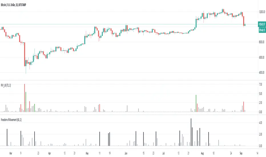
Freedom of MovementFreedom of Movement Indicator
---------------------------------------------------------
In “Evidence-Based Support & Resistance” article, author Melvin Dickover introduces two new indicators to help traders note support and resistance areas by identifying supply and demand pools. Here you can find the support-resistance technical indicator called "Freedom of Movement".
The indicator takes into account price-volume behavior in order to detect points where movement of price is suddenly restricted, the possible supply and demand pools. These points are also marked by Defended Price Lines (DPLs).
DPLs are horizontal lines that run across the chart at levels defined by following conditions:
* Overlapping bars: If the indicator spike (i.e., indicator is above 2.0 or a custom value) corresponds to a price bar overlapping the previous one, the previous close can be used as the DPL value.
* Very large bars: If the indicator spike corresponds to a price bar of a large size, use its close price as the DPL value.
* Gapping bars: If the indicator spike corresponds to a price bar gapping from the previous bar, the DPL value will depend on the gap size. Small gaps can be ignored: the author suggests using the previous close as the DPL value. When the gap is big, the close of the latter bar is used instead.
* Clustering spikes: If the indicator spikes come in clusters, use the extreme close or open price of the bar corresponding to the last or next to last spike in cluster.
DPLs can be used as support and resistance levels. In order confirm and refine them, FoM (Freedom of Movement) is used along with the Relative Volume Indicator (RVI), which you can find here:
Clustering spikes provide the strongest DPLs while isolated spikes can be used to confirm and refine those provided by the RVI. Coincidence of spikes of the two indicator can be considered a sign of greater strength of the DPL.
More info:
S&C magazine, April 2014.
Pesquisar nos scripts por "demand"
Trading Psychology - Fear & Greed Index by DGTPsychology of a Market Cycle - Where are we in the cycle?
Before proceeding with the question "where", let's first have a quick look at "What is market psychology?"
Market psychology is the idea that the movements of a market reflect the emotional state of its participants. It is one of the main topics of behavioral economics - an interdisciplinary field that investigates the various factors that precede economic decisions. Many believe that emotions are the main driving force behind the shifts of financial markets and that the overall fluctuating investor sentiment is what creates the so-called psychological market cycles - which is also dynamic.
Stages of Investor Emotions:
* Optimism – A positive outlook encourages us about the future, leading us to buy stocks.
* Excitement – Having seen some of our initial ideas work, we begin considering what our market success could allow us to accomplish.
* Thrill – At this point we investors cannot believe our success and begin to comment on how smart we are.
* Euphoria – This marks the point of maximum financial risk. Having seen every decision result in quick, easy profits, we begin to ignore risk and expect every trade to become profitable.
* Anxiety – For the first time the market moves against us. Having never stared at unrealized losses, we tell ourselves we are long-term investors and that all our ideas will eventually work.
* Denial – When markets have not rebounded, yet we do not know how to respond, we begin denying either that we made poor choices or that things will not improve shortly.
* Fear – The market realities become confusing. We believe the stocks we own will never move in our favor.
* Desperation – Not knowing how to act, we grasp at any idea that will allow us to get back to breakeven.
* Panic – Having exhausted all ideas, we are at a loss for what to do next.
* Capitulation – Deciding our portfolio will never increase again, we sell all our stocks to avoid any future losses.
* Despondency – After exiting the markets we do not want to buy stocks ever again. This often marks the moment of greatest financial opportunity.
* Depression – Not knowing how we could be so foolish, we are left trying to understand our actions.
* Hope – Eventually we return to the realization that markets move in cycles, and we begin looking for our next opportunity.
* Relief – Having bought a stock that turned profitable, we renew our faith that there is a future in investing.
It's hard to predict with certainty where we exactly are in the market cycle, we can only make an educated guess as to the rough stage based on data available. And here comes the study "Trading Psychology - Fear & Greed Index"
Factors taken into account in this study include:
1-Price Momentum : Price Divergence/Convergence versus its Slow Moving Average
2-Strenght : Rate of Return (RoR) also called Return on Investment (ROI) is a performance measure used to evaluate the efficiency of an investment, net gain or loss of an investment over a specified time period, the rate of change in price movement over a period of time to help investors determine the strength
3-Money Flow : Chaikin Money Flow (CMF) is a technical analysis indicator used to measure Money Flow Volume over a set period of time. CMF can be used as a way to further quantify changes in buying and selling pressure and can help to anticipate future changes and therefore trading opportunities. CMF calculations is based on Accumulation/Distribution
4-Market Volatility : CBOE Volatility Index (VIX), the Volatility Index, or VIX, is a real-time market index that represents the market's expectation of 30-day forward-looking volatility. Derived from the price inputs of the S&P 500 index options, it provides a measure of market risk and investors' sentiments. It is also known by other names like "Fear Gauge" or "Fear Index." Investors, research analysts and portfolio managers look to VIX values as a way to measure market risk, fear and stress before they take investment decisions
5-Safe Haven Demand : in this study GOLD demand is assumed
What to look for :
*Fear and Greed Index as explained above,
*Divergencies
Tool tip of the label displayed provides details of references
Conclusion:
As investors, we always get caught up in the day to day price movements, and lose sight of the bigger picture. The biggest crashes happen not when investors are cautious and fearful, it's when they're euphoric and expecting financial instruments to continue going higher. So as we continue investing, don’t forget to stop and ask yourself, where in the chart do you think we are right now? The Market Psychology Cycle shines light on how emotions evolve, fear and greed index can come in handy, provided that it is not the only tool used to make investment decisions. It is easy to look back at market cycles and recognize how the overall psychology changed. Analyzing previous data makes it obvious what actions and decisions would have been the most profitable. However, it is much harder to understand how the market is changing as it goes - and even harder to predict what comes next. Many investors use technical analysis (TA) to attempt to anticipate where the market is likely to go. Investors are advised to keep tabs on fear for potential buying the dips opportunities and view periods of greed as a potential indicator that financial instruments might be overvalued.
Warren Buffett's quote, buy when others are fearful, and sell when others are greedy
Trading success is all about following your trading strategy and the indicators should fit within your trading strategy, and not to be traded upon solely
Disclaimer : The script is for informational and educational purposes only. Use of the script does not constitute professional and/or financial advice. You alone have the sole responsibility of evaluating the script output and risks associated with the use of the script. In exchange for using the script, you agree not to hold dgtrd TradingView user liable for any possible claim for damages arising from any decision you make based on use of the script
RedK_AvgMoneyFlow Oscillator v1This is a compact & simple study that tracks the short-term average price change and the (average) volume associated with it, to generate a very clear signal when a change of buying/selling flow is detected. these buy/sell cycles can happen within a longer "demand / trend-up" or "supply / trend down" phases as we know.
this concept is a bit different from MFI or CMF. The math we use here is simpler, and more "relative" and short-term focused, deliberately.
how does it work
===============
once the average price change and the average volumes are calculated for the specified length, we then turn that into a +100/-100 oscillator format - using the stoch() function - which helps to generate a clearly identifiable unambiguous signal (crossing the zero line up or down) that help traders (mainly with entries)
-- the stoch() function also makes the oscillator "relative" to the specified period length, meaning, we can be in a uptrend (demand mode) and the MFO is showing flow "out" (negative) - that's specific to the short-term period - and that's exactly what i was trying to see
- the thinking here is that the best spot to go long is when the existing selling has been depleted and no more supply exists (during an uptrend), and vice verca.
- other stuff: i use WMA() throughout the script -- and we apply a smoothing for the final plot. keep smoothing to a minimum to avoid unnecessary lag in the signals
- the signal should be considered *after* a bar is fully closed.
Suggested Use
==============
i suggest you use this in combination with other indicators that can show the overall short-term and long-term bias (for example, i use the Ribbon here for that) - and take only entry signals in the same direction - a signal to go long, for example, would be when the bias / trend is up *and* the MFO crosses the zero line *going up* .. you may need to wait for that setup to show before you hit the trigger.
another benefit here, is that MFO will also detect strengths and weaknesses - when we see diversion with price movement. this shows couple of times in the example below
Please Note
============
i do not do short-term trading / scalping - those who do, i hope may find this useful - if you decide to use it and you do find it useful, please post feedback here for the common learning
Good luck!

Gap driven intraday trade (better in 15 Min chart)// Based on yesterday's High, Low, today's open, and Bollinger Band (20) in current minute chart,
// Defined intraday Trading opportunity: Stop, Entry, T0, Target (S.E.T.T)
// Back test in 60, 30, 15, 5 Min charts with SPY, QQQ, XOP, AAPL, TSLA, NVDA, UAL
// In 60 and 30 min chart, the stop and target are too big. 5 min is too small.
// 15 min Chart is the best time frame for this strategy;
// -------------------------------------------------------------------------------
// There will be Four lines in this study:
// 1. Entry Line,
// 1.1 Green Color line to Buy, If today's open price above Yesterday's High, and current price below BB upper line.
// 1.2 Red Color line to Short, if today's open price below Yesterday's Low, and current above BB Lower line.
//
// 2. Black line to show initial stop, one ATR in current min chart;
//
// 3. Blue Line (T0) to show where trader can move stop to make even, one ATR in current min chart;
//
// 4. Orange Line to show initial target, Three ATR in current min chart;
//
// Trading opportunity:
// If Entry line is green color, Set stop buy order at today's Open;
// Whenever price is below the green line, Prepare to buy;
//
// If Entry line is Red color, Set Stop short at today's Open;
// Whenever price is above the red line, Prepare to short;
//
// Initial Stop: One ATR in min chart;
// Initial T0: One ATR in min chart;
// Initial Target: Three ATR in min chart;
// Initial RRR: Reward Risk Ratio = 3:1;
//
// Maintain: Once the position moves to T0, Move stop to "Make even + Lunch (such as, Entry + $0.10)";
// Allow to move target bigger, such as, next demand/supply zone;
// When near target or demand/supply zone or near Market close, move stop tightly;
//
// Close position: Limit order filled, or near Market Close, or trendline break;
//
// Key Step: Move stop to "Make even" after T0, Do not turn winner to loser;
// Willing to "in and out" many times in one day, and trade the same direction, same price again and again.
//
// Basic trading platform requests:
// To use this strategy, user needs to:
// 1. Scan Stocks Before market open:
// Prepare a watch list for top 10 ETF and Top 90 stocks which are most actively traded.
// Stock might be limited by price range, Beta, optionable, ...
// Before market open, Run a scan for these stocks, find which has GAP and inside BB;
// create watch list for that day.
//
// 2. Attach OSO and OCO orders:
// User needs to Send Entry, Stop (loss), and limit (target) orders at one time;
// Order Send order ( OSO ): Entry order sends Stop order and limit order;
// Order Cancel order ( OCO ): Stop order and limit order, when one is filled, it will cancel the other instantly;
Dynamic Support and ResistanceSupport is a price level where a downtrend can be expected to pause due to a concentration of demand or buying interest. As the price of assets or securities drops, demand for the shares increases, thus forming the support line.
Meanwhile, resistance zones arise due to selling interest when prices have increased.s their name implies, dynamic support and resistance levels change their level with each new price-tick.To draw dynamic support and resistance levels, traders usually use moving averages which are automatically drawn by your trading platform. The 200-day exponential moving average (EMA), 100-day EMA, and 20-30-40-50-day EMA are very popular dynamic support and resistance levels.also in some references Williams Fractal level used for dynamic support and resistance levels. and it also includes other support and resistance levels that are projected based on the pivot point calculation. All these levels help traders see where the price could experience support or resistance. Similarly, if the price moves through these levels it lets the trader know the price is trending in that direction.

VPT and Heiken Ashi Candles MTFThe volume price trend indicator is used to determine the balance between a security’s demand and supply. The percentage change in the share price trend shows the relative supply or demand of a particular security, while volume indicates the force behind the trend. The VPT indicator is similar to the on-balance volume (OBV) indicator in that it measures cumulative volume and provides traders with information about a security’s money flow
So we put the VPT and add HA candles with non repainting MTF , the crossing up or down of the VPT over candles create the signals
since VPT tend to overshoot you can smooth it with Leni..(just give the smoothing of the length this stupid name:) )
alerts inside
just example of play with MTF and the smooth of VPT
SMA Cross + Adaptive Q MA + AMA Channel
📘 OPERATIONAL MANUAL: Adaptive Trend & SR Breakout SystemThis system combines non-parametric regression, volatility channels, and automated price action structures to identify high-probability entries.
1. Core IndicatorsAdaptive Q (KAMA): The primary trend line.
Green = Bullish;
Red = Bearish.
AMA Channel: An ATR-based envelope ($1.5 \times ATR$) that defines the "Value Area".
SMA 50 Filter: Global trend filter. Trade Long only above; Short only below.
SR Zones: Automatic boxes marking historical Support
(Blue/Green) and Resistance (Red).Shutterstock
2. Entry Rules
🟢 LONG SETUP:Price is above SMA 50.Large Lime Triangle appears (Channel Cross).Adaptive Q line is Green.Best entry: Price bounces off a Support Box.
🔴 SHORT SETUP:Price is below SMA 50.Large Red Triangle appears (Channel Cross).Adaptive Q line is Red.Best entry: Price rejects a Resistance Box.
3. Risk Management
Stop Loss: Set at $1.5 \times ATR$ or behind the nearest SR Box.
Take Profit: Target the next opposite SR Zone or exit if the Adaptive Q changes color.
4. LegendLarge Triangles: High-conviction volatility signals.
Small Triangles: Standard SMA Cross (early warning).
Red/Green Boxes: Supply and Demand zones for structural confirmation.

RSI PVSRA PRO Edition# 📑 MASTER OPERATING MANUAL: Full Institutional Ecosystem (v3.0)
**Integrated Suite:** PVSRA Dashboard + SR Boxes + Order Spikes + CVD-100 + RSI PRO
---
## 1. SYSTEM HIERARCHY
This ecosystem provides a 360-degree view of the market, eliminating subjective interpretation:
1. **Bias (Dashboard):** Global market direction (Sentiment).
2. **Context (SR Boxes):** Institutional supply and demand zones (The "Where").
3. **Internal Force (CVD-100):** Aggressive money flow (The "Fuel").
4. **Momentum & Divergence (RSI PRO):** Speedometer and early-warning system for reversals.
---
## 2. COMPONENT DICTIONARY
### **A. RSI PRO (Divergences & Confluence)**
* **Bullish Divergence (Green Label):** Price makes a Lower Low, but RSI makes a Higher Low. Indicates hidden institutional accumulation.
* **Bearish Divergence (Red Label):** Price makes a Higher High, but RSI makes a Lower High. Indicates institutional distribution (unloading).
* **Safety Thresholds:** * *Safe Buy Zone (< 65):* Prevents buying into overextended markets.
* *Safe Sell Zone (> 35):* Prevents selling at absolute bottoms.
### **B. CVD-100 (Aggressive Pressure)**
* **Above 80:** Buyer exhaustion. **Below 20:** Seller exhaustion.
* **Slope:** A Lime color indicates buyers are hitting the Ask; Red indicates sellers are hitting the Bid.
### **C. PVSRA & Spikes (The Trigger)**
* **Climax Candles (Green/Magenta):** Marks the peak of professional activity.
* **Triangles (▲/▼):** Statistical confirmation of a massive order execution.
---
## 3. INTEGRATED TRADING STRATEGIES
### **Strategy A: The "Golden Pocket" Reversal (High Accuracy)**
1. **Zone:** Price enters a **Teal SR Box** (Support).
2. **Momentum:** **RSI PRO** displays a **Bullish Divergence** (Green Label).
3. **Volume:** A **Magenta Climax Candle** (PVSRA) appears.
4. **Flow:** **CVD-100** crosses above the 20 level.
5. **Trigger:** A **Buy Spike (▲)** or a **Diamond (◆)** appears.
* *Target:* Next Red Box or Dashed Recovery Line.
### **Strategy B: Momentum Breakout (Trend Following)**
1. **Bias:** Dashboard shows "STRONG BUY" + Price above SMA 200.
2. **RSI Filter:** RSI is below 65 (not yet in extreme overbought territory).
3. **Action:** Price breaks through a **Red SR Box** (Resistance) with force.
4. **Confirmation:** **CVD-100** is Lime (Buying pressure) + **RSI SMA** points upward.
* *Entry:* Close of the breakout candle.
---
## 4. ULTIMATE CONFLUENCE CHECKLIST (MANDATORY)
| Priority | Indicator | Trade Requirement |
| :--- | :--- | :--- |
| **1. Bias** | Dashboard | Must be "STRONG" in the trade direction |
| **2. Context**| SR Boxes | Price must be near a Box (Teal/Red) |
| **3. Momentum**| RSI PRO | Presence of Divergence OR RSI within thresholds (65/35) |
| **4. Internal** | CVD-100 | Slope must be aligned with the trade direction |
| **5. Trigger** | Spike Det. | Presence of Triangle (▲/▼) or Diamond (◆) |
---
## 5. RECOMMENDED TECHNICAL SETTINGS
| Indicator | Parameter | Suggested Value |
| :--- | :--- | :--- |
| **RSI PRO** | Length | 14 |
| **RSI PRO** | Confluence | 65 (Max Buy) / 35 (Min Sell) |
| **CVD-100** | Normalization| 50 (Stochastic Mode) |
| **PVSRA** | Climax Factor | 2.7 |
---
## 6. PRO TIPS & RISK MANAGEMENT
* ⚠️ **The Divergence Rule:** An RSI divergence occurring inside an **SR Box** is 3x more powerful than a divergence in a vacuum.
* ⚠️ **RSI + CVD Synergy:** If the RSI shows a bullish divergence AND the CVD-100 is rising from the 20 level, you have identified a massive institutional "floor."
* ⚠️ **Smoothing MA:** If the yellow RSI line is flat, the market is ranging. Wait for a clear slope before acting.
---
*Document created for Quantitative Trading Operations*

CVD Normalizzato (0-100)# 📑 MASTER OPERATING MANUAL: Institutional Order Flow Ecosystem (v2.0)
**Integrated Suite:** PVSRA Dashboard PRO + SR High Volume Boxes + Massive Order Spike Detector + CVD-100
---
## 1. SYSTEM HIERARCHY
This trading ecosystem is designed to decode "Smart Money" footprints. It filters retail noise to identify where institutional participants are placing massive orders.
1. **Bias (Dashboard):** Determines the overall market direction (Sentiment).
2. **Context (SR Boxes):** Identifies the price "Battlefields" (Supply & Demand).
3. **Internal Force (CVD-100):** Reveals aggressive buying/selling pressure (Market Delta).
4. **Trigger (PVSRA & Spikes):** Signals the exact moment of execution.
---
## 2. COMPONENT DICTIONARY
### A. CVD-100 (The Internal Engine)
*Reveals the aggressive pressure of buyers/sellers.*
- **Values > 80:** Aggressive buyers are dominant (Extreme Overbought).
- **Values < 20:** Aggressive sellers are dominant (Extreme Oversold).
- **Green Slope:** Aggressive buyers are increasing pressure.
- **Red Slope:** Aggressive sellers are increasing pressure.
### B. PVSRA Candles (Market Climax)
- 🟢 **Bright Green:** Bull Climax (Highest institutional activity).
- 🟣 **Magenta:** Bear Climax (Panic selling or Institutional offloading).
- 🔵 **Blue/Red:** Rising volume (Professional participation).
### C. SR Boxes & Spikes (The Execution Zones)
- **Teal/Red Boxes:** Areas where significant volume was stored.
- **Triangles (▲/▼):** "Massive Order Spike". Confirms statistical anomaly.
- **Diamonds (◆):** Confirms a level (Box) is successfully holding the price.
---
## 3. INTEGRATED STRATEGIES
### **Strategy A: Institutional Trend Follower**
- **Bias:** Dashboard shows "STRONG BUY" + Price is above SMA 200.
- **Setup:** Price breaks above a **Red Box** (Resistance).
- **Confirmation:** **CVD-100** is sloping up (Green) and a **Massive Buy Spike** (▲) appears.
- **Entry:** On the close of the breakout candle.
### **Strategy B: The Climax Reversal (The Sniper)**
- **Bias:** Price reaches a **Teal Box** (Support) after an extended drop.
- **Setup:** **CVD-100** is below 20 (Deep Oversold/Exhaustion).
- **Trigger:** A **Magenta Climax Candle** (PVSRA) appears, followed immediately by a **Green Diamond (◆)**.
- **Entry:** Long when price breaks the high of the Climax candle.
---
## 4. THE ULTIMATE CONFLUENCE CHECKLIST
| Priority | Confirmation | Indicator Tool |
| :--- | :--- | :--- |
| **1. Bias** | Is the Dashboard "STRONG" in the trade direction? | PVSRA Dashboard |
| **2. Level** | Is the price at/inside a Teal or Red Box? | SR Boxes |
| **3. Volume** | Is the candle Climax or Rising color? | PVSRA Candles |
| **4. Delta** | Is CVD-100 aligned with your direction? | CVD-100 |
| **5. Trigger**| Has a Triangle (Spike) or Diamond (Hold) appeared? | Spike Detector |
---
## 5. TECHNICAL CONFIGURATION
| Setting | Value | Goal |
| :--- | :--- | :--- |
| **PVSRA Climax Factor** | 2.7 | Filter for institutional impact only. |
| **Spike Multiplier** | 4.0 | Isolate statistical extreme volume. |
| **CVD Normalization** | 50 (Stoch) | Standardize delta for clear overbought/sold. |
| **SMA Bias** | 200 | Institutional trend filter. |
---
## 6. PRO TIPS & RISK NOTES
- ⚠️ **Divergence:** If Price makes a new high but **CVD-100** makes a lower high, the trend is exhausted. Prepare for a reversal.
- ⚠️ **News Filter:** High-impact news causes "Spikes" but invalidates "Boxes". Wait 15 mins for the market to stabilize.
- ⚠️ **Absorption:** A Climax candle with a tiny body inside a Box is "Absorption". Institutions are soaking up orders. Wait for the box breakout.
---
*Created for: Professional Trading Operations*

PVSRA Dashboard PRO [Customized]# 📘 OPERATING MANUAL: Institutional Volume Suite (v1.0)
**Integrated Systems:** PVSRA Dashboard PRO + SR High Volume Boxes + Massive Order Spike Detector
---
## 1. SYSTEM PHILOSOPHY
This ecosystem tracks **Institutional Order Flow**. The core principle is that "Smart Money" leaves undeniable footprints through abnormal volume (Spikes) and specific price zones (High Volume Boxes). The system filters retail noise to identify where "Whales" are accumulating or distributing positions.
---
## 2. VISUAL DICTIONARY & SIGNALS
### A. PVSRA & Candles (Institutional Sentiment)
| Candle Color | Signal Type | Operational Meaning |
| :--- | :--- | :--- |
| 🟢 **Bright Green** | **Bull Climax** | Maximum Volume. Strong institutional buying or "Blow-off top". |
| 🟣 **Magenta** | **Bear Climax** | Maximum Volume. Strong institutional selling or "Selling climax". |
| 🔵 **Blue** | **Bull Rising** | Above-average volume. Professional buying interest. |
| 🔴 **Red/Orange** | **Bear Rising** | Above-average volume. Professional selling interest. |
| ⚪ **Grey** | **Normal** | Retail volume. Low institutional participation. |
### B. SR Boxes & Spike Detector (The Triggers)
* **Teal Boxes:** High Volume Support (Demand Zone).
* **Red Boxes:** High Volume Resistance (Supply Zone).
* **Triangles (▲/▼):** "Massive Order Spike". Statistical confirmation of heavy entry.
* **Diamonds (◆):** Real-time confirmation that a level (Box) is "Holding."
---
## 3. THE PRO DASHBOARD (Confluence Matrix)
Always consult the top-right dashboard before executing a trade:
1. **Momentum (9/20):** Short-term direction (Green Cloud = Long, Red = Short).
2. **Trend (20/50):** Health of the intermediate trend.
3. **Inst. Trend (200):** The master filter. Above SMA 200, look for Longs only; below, Shorts only.
4. **Delta Pressure:** Shows if the actual money flow is positive (BUY) or negative (SELL).
5. **CONFLUENCE PRO:** The final verdict. "STRONG BUY/SELL" means all parameters are aligned.
---
## 4. OPERATIONAL PROTOCOL (STRATEGY)
### **Phase 1: Zone Identification**
Identify where the price is relative to the **High Volume Boxes**.
- *Long Setup:* Price enters a Teal Box or tests a dashed "Support-Flip" line.
- *Short Setup:* Price enters a Red Box or tests a dashed "Resistance-Flip" line.
### **Phase 2: The Trigger (Action)**
Wait for the coordinated appearance of signals:
1. **PVSRA Color:** The candle must turn Climax (Green/Magenta).
2. **Order Spike:** The Triangle confirmation must appear.
3. **Level Confirmation:** The Diamond (◆) appears, indicating a bounce/rejection from the zone.
### **Phase 3: Execution**
- **ENTRY:** Enter when the Dashboard shows "STRONG BUY/SELL" coinciding with Phase 2 signals.
- **STOP LOSS:** Placed behind the opposite limit of the Box or the Climax candle wick.
- **TAKE PROFIT:** Use the **Dashed Recovery Lines** or the opposite High Volume Box.
---
## 5. RECOMMENDED TECHNICAL CONFIGURATION
| Parameter | Value | Notes |
| :--- | :--- | :--- |
| **PVSRA Climax** | 2.7 | Captures only the most significant institutional moves. |
| **Spike Multiplier** | 4.0 | Filters out statistical noise. |
| **Inst. SMA** | 200 | Blue (

Professional Grid & Reversal Bot v10 (Binance Style)Professional Grid & Reversal Bot v10 (Binance Style) – Open Source & Educational
About this Script:
This script is an advanced Grid Trading & Smart Reversal strategy, inspired by professional Binance-style execution. It is designed as an educational, open-source tool for traders who want to understand market dynamics, grid logic, and risk management.
How it Works:
1️⃣ Grid Execution:
• Divides the price range between the high and low into multiple levels (Grids).
• Opens Buy orders in the lower half and Sell orders in the upper half.
• Levels are calculated dynamically based on the highest and lowest prices over a selected lookback period.
2️⃣ Smart Reversal System:
• Detects price touches on the high or low range boundaries to identify potential reversal points.
• Opens Buy orders at the lows and Sell orders at the highs using a configurable confirmation percentage (revPct).
• Helps traders capture short-term price swings effectively.
3️⃣ Risk & Size Management:
• Position sizing based on USD amount and leverage.
• Automatic Take Profit (TP) and Stop Loss (SL) for every trade.
• Controls overtrading via the "pyramiding" parameter (max open trades).
4️⃣ Advanced Visualization:
• Plots the grid range with high/low levels and fills the background for clear context.
• Highlights potential Supply and Demand Zones.
• Displays a dynamic "Binance-style" Order Book table showing Side, Price, Quantity, and PnL.
5️⃣ Key Counters & Indicators:
• levelsArr → Stores all grid levels for execution and plotting.
• touchedHigh / touchedLow → Monitors range touches to trigger reversals.
• strategy.openprofit → Displays live open trade PnL directly on the chart.
Additional Features:
• Supports both English and Arabic languages.
• Dark Theme optimized for readability.
• Dynamic control panel updates on every bar.
• Flexible settings for Auto or Manual grid range updates.
User Guidance:
• This script is for educational purposes only; it does not guarantee profits.
• We recommend adjusting Grid Levels, Reversal Percentage, and Trade Size to experiment with different strategies.
Community Engagement:
• Suggestions and improvements are welcome! 💡
• If you have ideas for new features, let's develop them together to enhance learning.
• Please support the script with a Like & Boost if you find it useful.
• Encourages knowledge sharing to improve collective performance.
License:
Creative Commons Attribution-NonCommercial 4.0 International (CC BY-NC 4.0)
Free for educational use only. Please give credit to the author when sharing or modifying the script.

Global Sovereign Spread MonitorIn the summer of 2011, the yield on Italian government bonds rose dramatically while German Bund yields fell to historic lows. This divergence, measured as the BTP-Bund spread, reached nearly 550 basis points in November of that year, signaling what would become the most severe test of the European monetary union since its inception. Portfolio managers who monitored this spread had days, sometimes weeks, of advance warning before equity markets crashed. Those who ignored it suffered significant losses.
The Global Sovereign Spread Monitor is built on a simple but powerful observation that has been validated repeatedly in academic literature: sovereign bond spreads contain forward-looking information about systemic risk that is not fully reflected in equity prices (Longstaff et al., 2011). When investors demand higher yields to hold peripheral government debt relative to safe-haven bonds, they are expressing a view about credit risk, liquidity conditions, and the probability of systemic stress. This information, when properly analyzed, provides actionable signals for traders across all asset classes.
The Science of Sovereign Spreads
The academic study of government bond yield differentials began in earnest following the creation of the European Monetary Union. Codogno, Favero and Missale (2003) published what remains one of the foundational papers in this field, examining why yields on government bonds within a currency union should differ at all. Their analysis, published in Economic Policy, identified two primary drivers: credit risk and liquidity. Countries with higher debt-to-GDP ratios and weaker fiscal positions commanded higher yields, but importantly, these spreads widened dramatically during periods of market stress even when fundamentals had not changed significantly.
This observation led to a crucial insight that Favero, Pagano and von Thadden (2010) explored in depth in the Journal of Financial and Quantitative Analysis. They found that liquidity effects can amplify credit risk during stress periods, creating a feedback loop where rising spreads reduce liquidity, which in turn pushes spreads even higher. This dynamic explains why sovereign spreads often move in non-linear fashion, remaining stable for extended periods before suddenly widening rapidly.
Longstaff, Pan, Pedersen and Singleton (2011) extended this research in their American Economic Review paper by examining the relationship between sovereign credit default swap spreads and bond spreads across multiple countries. Their key finding was that a significant portion of sovereign credit risk is driven by global factors rather than country-specific fundamentals. This means that when spreads widen in Italy, it often reflects broader risk aversion that will eventually affect other asset classes including equities and corporate bonds.
The practical implication of this research is clear: sovereign spreads function as a leading indicator for systemic risk. Aizenman, Hutchison and Jinjarak (2013) confirmed this in their analysis of European sovereign debt default probabilities, finding that spread movements preceded rating downgrades and provided earlier warning signals than traditional fundamental analysis.
How the Indicator Works
The Global Sovereign Spread Monitor translates these academic findings into a systematic framework for monitoring credit conditions. The indicator calculates yield differentials between peripheral government bonds and German Bunds, which serve as the benchmark safe-haven asset in European markets. Italian ten-year yields minus German ten-year yields produce the BTP-Bund spread, the single most important metric for Eurozone stress. Spanish yields minus German yields produce the Bonos-Bund spread, providing a secondary confirmation signal. The transatlantic US-Bund spread captures divergence between the two major safe-haven markets.
Raw spreads are converted to Z-scores, which measure how many standard deviations the current spread is from its historical average over the lookback period. This normalization is essential because absolute spread levels vary over time with interest rate cycles and structural changes in sovereign debt markets. A spread of 150 basis points might have been concerning in 2007 but entirely normal in 2023 following the European debt crisis and subsequent ECB interventions.
The composite index combines these individual Z-scores using weights that reflect the relative importance of each spread for global risk assessment. Italy receives the highest weight because it represents the third-largest sovereign bond market globally and any Italian debt crisis would have systemic implications for the entire Eurozone. Spain provides confirmation of peripheral stress, while the US-Bund spread captures flight-to-quality dynamics between the two primary safe-haven markets.
Regime classification transforms the continuous Z-score into discrete states that correspond to different market environments. The Stress regime indicates that spreads have widened to levels historically associated with crisis periods. The Elevated regime signals rising risk aversion that warrants increased attention. Normal conditions represent typical spread behavior, while the Calm regime may actually signal complacency and potential mean-reversion opportunities.
Retail Trader Applications
For individual traders without access to institutional research teams, the Global Sovereign Spread Monitor provides a window into the macro environment that typically remains opaque. The most immediate application is risk management for equity positions.
Consider a trader holding a diversified portfolio of European stocks. When the composite Z-score rises above 1.0 and enters the Elevated regime, historical data suggests an increased probability of equity market drawdowns in the coming days to weeks. This does not mean the trader must immediately liquidate all positions, but it does suggest reducing position sizes, tightening stop-losses, or adding hedges such as put options or inverse ETFs.
The BTP-Bund spread specifically provides actionable information for anyone trading EUR/USD or European equity indices. Research by De Grauwe and Ji (2013) demonstrated that sovereign spreads and currency movements are closely linked during stress periods. When the BTP-Bund spread widens sharply, the Euro typically weakens against the Dollar as investors question the sustainability of the monetary union. A retail forex trader can use the indicator to time entries into EUR/USD short positions or to exit long positions before spread-driven selloffs occur.
The regime classification system simplifies decision-making for traders who cannot constantly monitor multiple data feeds. When the dashboard displays Stress, it is time to adopt a defensive posture regardless of what individual stock charts might suggest. When it displays Calm, the trader knows that risk appetite is elevated across institutional markets, which typically supports equity prices but also means that any negative catalyst could trigger a sharp reversal.
Mean-reversion signals provide opportunities for more active traders. When spreads reach extreme levels in either direction, they tend to revert toward their historical average. A Z-score above 2.0 that begins declining suggests professional investors are starting to buy peripheral debt again, which historically precedes broader risk-on behavior. A Z-score below minus 1.0 that starts rising may indicate that complacency is ending and risk-off positioning is beginning.
The key for retail traders is to use the indicator as a filter rather than a primary signal generator. If technical analysis suggests a long entry in European stocks, check the sovereign spread regime first. If spreads are elevated or rising, the technical setup becomes higher risk. If spreads are stable or compressing, the technical signal has a higher probability of success.
Professional Applications
Institutional investors use sovereign spread analysis in more sophisticated ways that go beyond simple risk filtering. Systematic macro funds incorporate spread data into quantitative models that generate trading signals across multiple asset classes simultaneously.
Portfolio managers at large asset allocators use sovereign spreads to make strategic allocation decisions. When the composite Z-score trends higher over several weeks, they reduce exposure to peripheral European equities and bonds while increasing allocations to German Bunds, US Treasuries, and other safe-haven assets. This rotation often happens before explicit risk-off signals appear in equity markets, giving these investors a performance advantage.
Fixed income specialists at banks and hedge funds use sovereign spreads for relative value trades. When the BTP-Bund spread widens to historically elevated levels but fundamentals have not deteriorated proportionally, they may go long Italian government bonds and short German Bunds, betting on mean reversion. These trades require careful risk management because spreads can widen further before reversing, but when properly sized they offer attractive risk-adjusted returns.
Risk managers at financial institutions use sovereign spread monitoring as an input to Value-at-Risk models and stress testing frameworks. Elevated spreads indicate higher correlation among risk assets, which means diversification benefits are reduced precisely when they are needed most. This information feeds into position sizing decisions across the entire trading book.
Currency traders at proprietary trading firms incorporate sovereign spreads into their EUR/USD and EUR/CHF models. The relationship between the BTP-Bund spread and EUR weakness is well-documented in academic literature and provides a systematic edge when combined with other factors such as interest rate differentials and positioning data.
Central bank watchers use sovereign spreads to anticipate policy responses. The European Central Bank has demonstrated repeatedly that it will intervene when spreads reach levels that threaten financial stability, most notably through the Outright Monetary Transactions program announced in 2012 and the Transmission Protection Instrument introduced in 2022. Understanding spread dynamics helps investors anticipate these interventions and position accordingly.
Interpreting the Dashboard
The statistics panel provides real-time information that supports both quick assessments and deeper analysis. The composite Z-score is the primary metric, representing the weighted average of all spread Z-scores. Values above zero indicate spreads are wider than their historical average, while values below zero indicate compression. The magnitude matters: a reading of 0.5 suggests modestly elevated stress, while 2.0 or higher indicates conditions similar to historical crisis periods.
The regime classification translates the Z-score into actionable categories. Stress should trigger immediate review of risk exposure and consideration of hedges. Elevated warrants increased vigilance and potentially reduced position sizes. Normal indicates no immediate concerns from sovereign markets. Calm suggests risk appetite may be elevated, which supports risk assets but also creates potential for sharp reversals if sentiment changes.
The percentile ranking provides historical context by showing where the current Z-score falls within its distribution over the lookback period. A reading of 90 percent means spreads are wider than they have been 90 percent of the time over the past year, which is significant even if the absolute Z-score is not extreme. This metric helps identify when spreads are creeping higher before they reach official stress thresholds.
Momentum indicates whether spreads are widening or compressing. Rising momentum during elevated spread conditions is particularly concerning because it suggests stress is accelerating. Falling momentum during stress suggests the worst may be past and mean reversion could be beginning.
Individual spread readings allow traders to identify which component is driving the composite signal. If the BTP-Bund spread is elevated but Bonos-Bund remains normal, the stress may be Italy-specific rather than systemic. If all spreads are widening together, the signal reflects broader flight-to-quality that affects all risk assets.
The bias indicator provides a simple summary for traders who need quick guidance. Risk-Off means spreads indicate defensive positioning is appropriate. Risk-On means spread conditions support risk-taking. Neutral means spreads provide no clear directional signal.
Limitations and Risk Factors
No indicator provides perfect signals, and sovereign spread analysis has specific limitations that users must understand. The European Central Bank has demonstrated its willingness to intervene in sovereign bond markets when spreads threaten financial stability. The Transmission Protection Instrument announced in 2022 specifically targets situations where spreads widen beyond levels justified by fundamentals. This creates a floor under peripheral bond prices and means that extremely elevated spreads may not persist as long as historical patterns would suggest.
Political events can cause sudden spread movements that are impossible to anticipate. Elections, government formation crises, and policy announcements can move spreads by 50 basis points or more in a single session. The indicator will reflect these moves but cannot predict them.
Liquidity conditions in sovereign bond markets can temporarily distort spread readings, particularly around quarter-end and year-end when banks adjust their balance sheets. These technical factors can cause spread widening or compression that does not reflect fundamental credit risk.
The relationship between sovereign spreads and other asset classes is not constant over time. During some periods, spread movements lead equity moves by several days. During others, both markets move simultaneously. The indicator provides valuable information about credit conditions, but users should not expect mechanical relationships between spread signals and subsequent price moves in other markets.
Conclusion
The Global Sovereign Spread Monitor represents a systematic application of academic research on sovereign credit risk to practical trading decisions. The indicator monitors yield differentials between peripheral and safe-haven government bonds, normalizes these spreads using statistical methods, and classifies market conditions into regimes that correspond to different risk environments.
For retail traders, the indicator provides risk management information that was previously available only to institutional investors with access to Bloomberg terminals and dedicated research teams. By checking the sovereign spread regime before executing trades, individual investors can avoid taking excessive risk during periods of elevated credit stress.
For professional investors, the indicator offers a standardized framework for monitoring sovereign credit conditions that can be integrated into broader macro models and risk management systems. The real-time calculation of Z-scores, regime classifications, and component spreads provides the inputs needed for systematic trading strategies.
The academic foundation is robust, built on peer-reviewed research published in top finance and economics journals over the past two decades. The practical applications have been validated through multiple market cycles including the European debt crisis of 2011-2012, the COVID-19 shock of 2020, and the rate normalization stress of 2022.
Sovereign spreads will continue to provide valuable forward-looking information about systemic risk for as long as credit conditions vary across countries and investors respond rationally to changes in default probabilities. The Global Sovereign Spread Monitor makes this information accessible and actionable for traders at all levels of sophistication.
References
Aizenman, J., Hutchison, M. and Jinjarak, Y. (2013) What is the Risk of European Sovereign Debt Defaults? Fiscal Space, CDS Spreads and Market Pricing of Risk. Journal of International Money and Finance, 34, pp. 37-59.
Codogno, L., Favero, C. and Missale, A. (2003) Yield Spreads on EMU Government Bonds. Economic Policy, 18(37), pp. 503-532.
De Grauwe, P. and Ji, Y. (2013) Self-Fulfilling Crises in the Eurozone: An Empirical Test. Journal of International Money and Finance, 34, pp. 15-36.
Favero, C., Pagano, M. and von Thadden, E.L. (2010) How Does Liquidity Affect Government Bond Yields? Journal of Financial and Quantitative Analysis, 45(1), pp. 107-134.
Longstaff, F.A., Pan, J., Pedersen, L.H. and Singleton, K.J. (2011) How Sovereign Is Sovereign Credit Risk? American Economic Review, 101(6), pp. 2191-2212.
Manganelli, S. and Wolswijk, G. (2009) What Drives Spreads in the Euro Area Government Bond Market? Economic Policy, 24(58), pp. 191-240.
Arghyrou, M.G. and Kontonikas, A. (2012) The EMU Sovereign-Debt Crisis: Fundamentals, Expectations and Contagion. Journal of International Financial Markets, Institutions and Money, 22(4), pp. 658-677.

BB37BB37
WHAT IS SUPPORT AND RESISTANT ?
Support and resistance are fundamental concepts in technical analysis used to identify price levels on charts that are likely to act as barriers, preventing the price from moving in a certain direction.
Support:
Definition: Support refers to a price level at which an asset tends to stop falling because demand is strong enough to prevent further declines. It acts as a "floor" for the price, where buyers step in to buy the asset, causing the price to rebound or stabilize.
Example: If a stock is trading at $50 and repeatedly fails to drop below that level, $50 would be considered a support level.
Resistance:
Definition: Resistance is the opposite of support. It refers to a price level at which selling pressure is strong enough to prevent the price from rising further. It acts as a "ceiling," where sellers are more willing to sell, causing the price to reverse or consolidate.
Example: If the price of an asset repeatedly fails to rise above $100, $100 would be considered a resistance level.
In Practice:
Support and resistance levels are used by traders to make decisions about buying and selling. If the price approaches support, traders may see it as a potential buying opportunity. If the price approaches resistance, they may consider selling or shorting the asset.
If price breaks through a support or resistance level, it can signal a significant price movement. For example, a price moving above resistance may indicate an uptrend, while a price falling below support could indicate a downtrend.
These levels are not always exact and may vary slightly, often being identified as areas rather than precise lines on a chart. They are key tools for understanding market psychology and price behavior.

Support and Resistance Breakout Signals [MarkitTick]💡 This indicator provides a comprehensive, automated system for identifying, tracking, and trading Support and Resistance (S/R) breakouts. By synthesizing classic Swing High and Swing Low pivot analysis with Multi-Timeframe (HTF) capabilities and Volume confirmation, it transforms raw price action into actionable structural data. It is designed to declutter charts by automatically managing active levels and highlighting significant market structure shifts (Higher Highs, Lower Lows) alongside verified breakout signals.
✨ Originality and Utility
While many indicators draw static pivot points, this tool distinguishes itself through "State Management." It treats Support and Resistance not just as historical markers, but as active zones that evolve.
Dynamic Level Management: Instead of flooding the chart with infinite lines, the script uses arrays to store a specific number of recent levels. As price action progresses, invalid or broken levels are removed or updated, keeping the analysis focused on current relevance.
Multi-Timeframe Confluence: Uniquely, it allows you to overlay higher timeframe support and resistance levels (e.g., Daily levels on a 4-hours chart) without changing your chart view, enabling top-down analysis instantly.
Market Structure Labeling: It automatically tags pivot points with Dow Theory labels (HH, LH, LL, HL), aiding traders in instantly recognizing trend direction without manual charting.
🔬 Methodology and Concepts
The script operates on three core technical pillars:
● Swing Pivot Detection
The foundation is the detection of local extrema using a "Left/Right" bar lookback mechanism. A Swing High is identified when a high is greater than the L bars preceding it and the R bars following it. This confirms a fractal peak or valley.
Note on Confirmation: Because the script waits for R bars to close to confirm a pivot, the lines appear retroactively. However, the extension of these lines and subsequent breakout signals occur in real-time.
● Breakout Logic with Volume Integration
A breakout is triggered when the Close price crosses an active S/R line.
Resistance Break: Current Close > Resistance Level (and Previous Close ≤ Level).
Support Break: Current Close < Support Level (and Previous Close ≥ Level).
Volume Confirmation: An optional filter requires the breakout bar's volume to exceed a Moving Average of volume, ensuring momentum backs the move.
● Time Decay
To mimic the reduced relevance of stale levels, the script includes a "Time Decay" feature. If a level is not interacted with for a user-defined number of bars, it is automatically purged from the system, ensuring the chart reflects only fresh interest levels.
🎨 Visual Guide
The indicator uses a specific color-coding and labeling system to convey information quickly:
● Support & Resistance Lines
Red Lines (Thin): Represent active Resistance levels on the current timeframe.
Green Lines (Thin): Represent active Support levels on the current timeframe.
Fuchsia Lines (Thick): Represent Higher Timeframe (HTF) Resistance levels.
Aqua Lines (Thick): Represent Higher Timeframe (HTF) Support levels.
● Market Structure Labels
Located at the pivot points, these text labels define the trend structure:
HH / LH: Higher High / Lower High (Red Text).
LL / HL: Lower Low / Higher Low (Green/Aqua Text).
HTF-R / HTF-S: Indicates major structural pivots from the higher timeframe.
● Breakout Signals
When a valid break occurs, a label appears above or below the bar:
Blue Triangle Up (▲): Bullish breakout through resistance.
Blue Triangle Down (▼): Bearish breakout through support.
Number in Label: Indicates the cumulative count of breaks for that specific trend sequence (e.g., "1" is the first break, "2" is the second).
The breakout count represents the intensity of the move. A reading greater than 1 signals exceptional market strength, indicating the penetration of multiple Key Levels (Support or Resistance) within a single candle.
📖 How to Use
Trend Continuation: In an uptrend (sequence of HH/HL), wait for a Blue Triangle Up (▲) occurring at a Red Resistance line. This signals the continuation of the trend.
Trend Reversal: Watch for a "Structure Break." If price is making Higher Highs, but then breaks a Green Support line (generating a ▼ signal) and forms a Lower Low (LL), the trend may be reversing.
HTF "Bounce" Plays: Use the thick Fuchsia/Aqua lines as major zones. If price approaches a thick Aqua line (HTF Support) and fails to break it, look for LTF bullish structure (HH/HL) to form for an entry.
Volume Filtering: Enable the "Volume Confirmation" setting to filter out "fakeouts" (breaks on low volume).
⚙️ Inputs and Settings
● Swing Settings
Left/Right Bars: Determines the sensitivity of the pivot detection. Higher numbers = fewer, more significant pivots.
Max Stored Levels: How many S/R lines to keep in memory at once.
Max Break Labels: Limits visual clutter by capping the number of signal labels.
● Usability & HTF
Enable Time Decay: If true, deletes lines that are older than "Decay Period" bars.
Enable HTF Levels: Toggles the display of higher timeframe pivots.
HTF Timeframe: Select the specific timeframe for the macro view (e.g., "D" for Daily).
● Analysis
Volume Confirmation: Toggles the requirement for volume to be above its average for a signal to fire.
Show Market Structure: Toggles the HH/LL text labels.
🔍 Deconstruction of the Underlying Scientific and Academic Framework
The script's logic is rooted in Fractal Geometry and Auction Market Theory .
● Mandelbrot's Fractals: The use of `leftBars` and `rightBars` is a direct application of identifying market fractals. Markets are self-similar across timeframes; a pivot on a 5-minute chart is structurally identical to one on a Weekly chart. This script exploits this property by allowing nested timeframe analysis (LTF inside HTF).
● Memory of Price (Behavioral Finance): Support and resistance lines represent zones where market participants have previously established value (Price Memory). The "Breakout" signal is mathematically significant because it represents a shift in the supply/demand equilibrium. When price closes beyond a stored array value (the pivot price), it signifies that the aggressive limit orders that created the pivot have been exhausted or withdrawn, validating a new search for value.
⚠️ Disclaimer
All provided scripts and indicators are strictly for educational exploration and must not be interpreted as financial advice or a recommendation to execute trades. I expressly disclaim all liability for any financial losses or damages that may result, directly or indirectly, from the reliance on or application of these tools. Market participation carries inherent risk where past performance never guarantees future returns, leaving all investment decisions and due diligence solely at your own discretion.

Dynamic Supports + Volume Profile (Smart Time Selector)This indicator is an "All-in-One" tool designed to simplify Market Structure and Volume analysis on higher timeframes (especially Daily charts).
Its main innovation is the **Unique Period Selector**, which automatically adjusts 5 internal parameters (tolerance, pivot sensitivity, resolution, and historical depth) with a single click.
**🛠️ MAIN FEATURES:**
1. **Automatic Engine (1-5 Years):**
* Forget about manually setting pivot lengths or "Lookback".
* Select **"1 Year"**: The script scans for fast pivots and recent volume for *Swing Trading*.
* Select **"5 Years"**: The script filters noise and shows only "Rock-Solid" structures (Historical S/R) for *Long Term Investing*.
2. **"Merged" Support & Resistance (S/R):**
* The script detects Pivot Highs/Lows.
* **Fusion Logic:** If price bounces multiple times in the same zone (within calculated tolerance), the script updates the existing line instead of drawing a new one. It extends the line and counts the touches (e.g., "S (4)" means a Support validated 4 times).
* **Clean Chart:** Avoids visual noise.
3. **Lateral Volume Profile (VP):**
* Displays volume distribution to the right of the current price.
* **Orange POC (Point of Control):** Marks the exact price level with the highest trading volume in the selected period.
**🚀 HOW TO USE (STRATEGY):**
Best used on the **Daily Timeframe (1D)**:
* **Scenario 1: Mean Reversion**
* If price moves far from the **Orange POC**, look for it to act as a magnet.
* Enter when price touches a **Green Line (Support)** that aligns with a high volume node.
* **Scenario 2: Breakout**
* If price breaks a **Red Line (Resistance)** aggressively and the volume above is thin (low volume nodes), the move tends to be fast due to lack of friction.
* **Scenario 3: Multi-Timeframe Analysis**
* Use "5 Years" to mark your long-term zones.
* Switch to "1 Year" for tactical entries.
**🎨 VISUAL SETTINGS:**
* **Green Lines:** Demand Zones (Supports).
* **Red Lines:** Supply Zones (Resistances).
* **Dotted Orange Line:** POC (Fair Value).
* **Blue Bars:** Volume Profile.
**Disclaimer / Descargo:**
This script is designed for educational and analytical purposes on the daily timeframe. Use it to identify zones of interest, not as automatic buy/sell signals.

Smart Money Flow Oscillator [MarkitTick]💡This script introduces a sophisticated method for analyzing market liquidity and institutional order flow. Unlike traditional volume indicators that treat all market activity equally, the Smart Money Flow Oscillator (SMFO) employs a Logic Flow Architecture (LFA) to filter out market noise and "churn," focusing exclusively on high-impact, high-efficiency price movements. By synthesizing price action, volume, and relative efficiency, this tool aims to visualize the accumulation and distribution activities that are often attributed to "smart money" participants.
✨ Originality and Utility
Standard indicators like On-Balance Volume (OBV) or Money Flow Index (MFI) often suffer from noise because they aggregate volume based simply on the close price relative to the previous close, regardless of the quality of the move. This script differentiates itself by introducing an "Efficiency Multiplier" and a "Momentum Threshold." It only registers volume flow when a price move is considered statistically significant and structurally efficient. This creates a cleaner signal that highlights genuine supply and demand imbalances while ignoring indecisive trading ranges. It combines the trend-following nature of cumulative delta with the mean-reverting insights of an In/Out ratio, offering a dual-mode perspective on market dynamics.
🔬 Methodology
The underlying calculation of the SMFO relies on several distinct quantitative layers:
• Efficiency Analysis
The script calculates a "Relative Efficiency" ratio for every candle. This compares the current price displacement (body size) per unit of volume against the historical average.
If price moves significantly with relatively low volume, or proportional volume, it is deemed "efficient."
If significant volume occurs with little price movement (churn/absorption), the efficiency score drops.
This score is clamped between a user-defined minimum and maximum (Efficiency Cap) to prevent outliers from distorting the data.
• Momentum Thresholding
Before adding any data to the flow, the script checks if the current price change exceeds a volatility threshold derived from the previous candle's open-close range. This acts as a gatekeeper, ensuring that only "strong" moves contribute to the oscillator.
• Variable Flow Calculation
If a move passes the threshold, the script calculates the flow value by multiplying the Typical Price and Volume (Money Flow) by the calculated Efficiency Multiplier.
Bullish Flow: Strong upward movement adds to the positive delta.
Bearish Flow: Strong downward movement adds to the negative delta.
Neutral: Bars that fail the momentum threshold contribute zero flow, effectively flattening the line during consolidation.
• Calculation Modes
Cumulative Delta Flow (CDF): Sums the flow values over a rolling period. This creates a trend-following oscillator similar to OBV but smoother and more responsive to real momentum.
In/Out Ratio: Calculates the percentage of bullish inflow relative to the total absolute flow over the period. This oscillates between 0 and 100, useful for identifying overextended conditions.
📖 How to Use
Traders can utilize this oscillator to identify trend strength and potential reversals through the following signals:
• Signal Line Crossovers
The indicator plots the main Flow line (colored gradient) and a Signal line (grey).
Bullish (Green Cloud): When the Flow line crosses above the Signal line, it suggests rising buying pressure and efficient upward movement.
Bearish (Red Cloud): When the Flow line crosses below the Signal line, it suggests dominating selling pressure.
• Divergences
The script automatically detects and plots divergences between price and the oscillator:
Regular Divergence (Solid Lines): Suggests a potential trend reversal (e.g., Price makes a Lower Low while Oscillator makes a Higher Low).
Hidden Divergence (Dashed Lines): Suggests a potential trend continuation (e.g., Price makes a Higher Low while Oscillator makes a Lower Low).
"R" labels denote Regular, and "H" labels denote Hidden divergences.
• Dashboard
A dashboard table is displayed on the chart, providing real-time metrics including the current Efficiency Multiplier, Net Flow value, and the active mode status.
• In/Out Ratio Levels
When using the Ratio mode:
Values above 50 indicate net buying pressure.
Values below 50 indicate net selling pressure.
Approaching 70 or 30 can indicate overbought or oversold conditions involving volume exhaustion.
⚙️ Inputs and Settings
Calculation Mode: Choose between "Cumulative Delta Flow" (Trend focus) or "In/Out Ratio" (Oscillator focus).
Auto-Adjust Period: If enabled, automatically sets the lookback period based on the chart timeframe (e.g., 21 for Daily, 52 for Weekly).
Manual Period: The rolling lookback length for calculations if Auto-Adjust is disabled.
Efficiency Length: The period used to calculate the average body and volume for the efficiency baseline.
Eff. Min/Max Cap: Limits the impact of the efficiency multiplier to prevent extreme skewing during anomaly candles.
Momentum Threshold: A factor determining how much price must move relative to the previous candle to be considered a "strong" move.
Show Dashboard/Divergences: Toggles for visual elements.
🔍 Deconstruction of the Underlying Scientific and Academic Framework
This indicator represents a hybrid synthesis of academic Market Microstructure theory and classical technical analysis. It utilizes an advanced algorithm to quantify "Price Impact," leveraging the following theoretical frameworks:
• 1. The Amihud Illiquidity Ratio (2002)
The core logic (calculating body / volume) functions as a dynamic implementation of Yakov Amihud’s Illiquidity Ratio. It measures price displacement per unit of volume. A high efficiency score indicates that "Smart Money" has moved the price significantly with minimal resistance, effectively highlighting liquidity gaps or institutional control.
• 2. Kyle’s Lambda (1985) & Market Depth
Drawing from Albert Kyle’s research on market microstructure, the indicator approximates Kyle's Lambda to measure the elasticity of price in response to order flow. By analyzing the "efficiency" of a move, it identifies asymmetries—specifically where price reacts disproportionately to low volume—signaling potential manipulation or specific Market Maker activity.
• 3. Wyckoff’s Law of Effort vs. Result
From a classical perspective, the algorithm codifies Richard Wyckoff’s "Effort vs. Result" logic. It acts as an oscillator that detects anomalies where "Effort" (Volume) diverges from the "Result" (Price Range), predicting potential reversals.
• 4. Quantitative Advantage: Efficiency-Weighted Volume
Unlike linear indicators such as OBV or Chaikin Money Flow—which treat all volume equally—this indicator (LFA) utilizes Efficiency-Weighted Volume. By applying the efficiency_mult factor, the algorithm filters out market noise and assigns higher weight to volume that drives structural price changes, adopting a modern quantitative approach to flow analysis.
● Disclaimer
All provided scripts and indicators are strictly for educational exploration and must not be interpreted as financial advice or a recommendation to execute trades. I expressly disclaim all liability for any financial losses or damages that may result, directly or indirectly, from the reliance on or application of these tools. Market participation carries inherent risk where past performance never guarantees future returns, leaving all investment decisions and due diligence solely at your own discretion.

WoAlgo Premium v3.0
WoAlgo Premium v3.0 - Smart Money Analysis
Overview
** WoAlgo Premium v3.0 ** is an advanced technical analysis indicator designed for educational purposes. This tool combines Smart Money Concepts with multi-factor confluence analysis to help traders identify potential market opportunities across multiple timeframes.
The indicator integrates market structure analysis, order flow concepts, and technical momentum indicators into a comprehensive dashboard system. It is designed to assist traders in understanding institutional trading patterns and market dynamics through visual analysis tools.
### What It Does
This indicator provides:
**1. Smart Money Concepts Analysis**
- Market structure identification (Break of Structure and Change of Character patterns)
- Order block detection with volume confirmation
- Fair value gap recognition
- Liquidity zone mapping (equal highs and lows)
- Premium and discount zone calculations
**2. Multi-Factor Confluence Scoring**
The indicator calculates a proprietary confluence score (0-100) based on five key components:
- Price action analysis (30% weight)
- Volume confirmation (20% weight)
- Momentum indicators (25% weight)
- Trend strength measurement (15% weight)
- Money flow analysis (10% weight)
**3. Multi-Timeframe Analysis**
- Scans 5 different timeframes (5M, 15M, 1H, 4H, Daily)
- Calculates alignment percentage across timeframes
- Displays trend and structure status for each period
**4. Visual Dashboard System**
- Comprehensive main dashboard with 13 metrics
- Real-time screener table with 10 data columns
- Multi-timeframe scanner
- Performance tracking panel
### How It Works
**Market Structure Detection**
The indicator identifies key structural changes in price action:
- **BOS (Break of Structure)**: Indicates trend continuation when price breaks previous swing points
- **CHoCH (Change of Character)**: Signals potential trend reversal when market structure shifts
**Order Block Identification**
Order blocks are detected when:
- Significant volume appears at swing points
- Price shows strong directional movement from these levels
- Enhanced detection with extreme volume confirmation (OB++ markers)
**Fair Value Gap Recognition**
Gaps between candles are identified when:
- Price leaves inefficiencies in the market
- Three consecutive candles create a gap pattern
- Gap size exceeds minimum threshold based on ATR
**Confluence Calculation**
The system evaluates multiple technical factors:
1. **Price Position**: Relative to moving averages (EMA 20, 50, 200)
2. **Volume Analysis**: Standard deviation-based volume spikes
3. **Momentum**: RSI, MACD, Stochastic indicators
4. **Trend Strength**: ADX measurements
5. **Money Flow**: MFI indicator readings
Each factor contributes weighted points to create an overall confluence score that helps assess signal strength.
### Signal Types
**Confirmation Signals (▲ / ▼)**
Generated when:
- EMA crossovers occur (20/50 cross)
- Volume confirmation is present
- RSI is in appropriate zone
- Confluence score exceeds 50%
**Strong Signals (▲+ / ▼+)**
Higher-confidence signals requiring:
- Confluence score above 70%
- Extreme volume confirmation
- Alignment with 200 EMA trend
- MACD confirmation
- Bullish or bearish market structure
**Contrarian Signals (⚡)**
Reversal indicators appearing when:
- RSI reaches extreme levels (<30 or >70)
- Stochastic shows oversold/overbought conditions
- Price touches Bollinger Band extremes
- Potential divergence patterns emerge
**Reversal Zones**
Visual boxes highlighting areas where:
- Market structure conflicts with momentum
- High probability of directional change
- Key support/resistance levels interact
**Smart Trail**
Dynamic stop-loss indicator that:
- Adjusts based on ATR (Average True Range)
- Follows trend direction
- Updates automatically as price moves
- Provides risk management reference points
### Dashboard Components
**Main Dashboard (13 Metrics)**
1. **Confluence Score**: Current bull/bear percentage (0-100)
2. **Market Regime**: Trend classification (Strong Up/Down, Range, Squeeze)
3. **Signal Status**: Active buy/sell signal indication
4. **Structure State**: Current market structure (Bullish/Bearish/Neutral)
5. **Trend Strength**: ADX-based measurement
6. **RSI Level**: Momentum indicator with overbought/oversold zones
7. **MACD Direction**: Trend momentum confirmation
8. **Money Flow Index**: Smart money sentiment
9. **Volume Status**: Current volume relative to average
10. **Volatility Rating**: ATR percentage measurement
11. **ATR Value**: Average true range for position sizing
12. **MTF Alignment**: Multi-timeframe agreement percentage
**Screener Table (10 Columns)**
- Current symbol and timeframe
- Real-time price and percentage change
- Quality rating (star system)
- Active signal type
- Smart trail status
- Market structure state
- MACD direction
- Trend strength percentage
- Bollinger Band squeeze detection
**MTF Scanner (5 Timeframes)**
Displays for each timeframe:
- Trend direction indicator
- Market structure classification
- Visual confirmation with color coding
**Performance Metrics**
- Win rate percentage (simplified calculation)
- Total signals generated
- Current confluence score
- MTF alignment status
- Volatility level
### Settings and Customization
**Preset Styles**
Choose from predefined configurations:
- **Conservative**: Fewer, higher-quality signals
- **Moderate**: Balanced approach (recommended)
- **Aggressive**: More frequent signals
- **Scalper**: Short-term focused
- **Swing**: Longer-term oriented
- **Custom**: Full manual control
**Smart Money Concepts Controls**
- Toggle each feature independently
- Adjust swing length (3-50 periods)
- Enable/disable internal structure
- Control order block display
- Manage breaker block visibility
- Show/hide fair value gaps
- Display liquidity zones
- Premium/discount zone visualization
**Signal Configuration**
- Enable/disable confirmation signals
- Toggle strong signal markers
- Control contrarian signal display
- Show/hide reversal zones
- Smart trail activation
- Sensitivity adjustment (5-50)
**Visual Customization**
- Moving average display options
- MA period adjustments (Fast: 20, Slow: 50, Trend: 200)
- Support/resistance line toggle
- Dynamic S/R lookback period
- Candle coloring based on trend
- Color scheme customization
- Dashboard size options (Small/Normal/Large)
- Position placement (4 corners)
### How to Use
**Step 1: Initial Setup**
1. Add indicator to chart
2. Select appropriate preset or use Custom
3. Adjust timeframe to match trading style
4. Configure dashboard visibility preferences
**Step 2: Analysis Workflow**
1. Check MTF Scanner for timeframe alignment
2. Review Main Dashboard confluence score
3. Observe Market Regime classification
4. Identify active signals on chart
5. Confirm with Smart Money Concepts (order blocks, FVG, structure)
**Step 3: Trade Consideration**
Strong signals (▲+ / ▼+) require:
- Confluence score >70%
- MTF alignment >60%
- Confirmation from multiple dashboard metrics
- Support from Smart Money Concepts
- Appropriate volume levels
**Step 4: Risk Management**
- Use Smart Trail as dynamic stop-loss reference
- Consider ATR for position sizing
- Monitor volatility rating
- Respect support/resistance levels
- Combine with personal risk parameters
### Best Practices
**For Scalping (1M-5M timeframes)**
- Use Scalper preset
- Reduce swing length to 5-7
- Focus on strong signals only
- Monitor MTF alignment closely
- Quick entries near order blocks
**For Intraday Trading (15M-1H timeframes)**
- Use Moderate preset (recommended)
- Default swing length (10)
- Combine confirmation and strong signals
- Check MTF scanner before entry
- Use fair value gaps for entries
**For Swing Trading (4H-D timeframes)**
- Use Swing preset
- Increase swing length to 15-20
- Focus on strong signals
- Require high MTF alignment
- Patient approach with major structure levels
### Technical Specifications
**Indicators Used**
- Exponential Moving Averages (20, 50, 200)
- Hull Moving Average
- Relative Strength Index (14)
- MACD (12, 26, 9)
- Money Flow Index (14)
- Stochastic Oscillator (14, 3)
- ADX / DMI (14)
- Bollinger Bands (20, 2)
- ATR (14)
- Volume Analysis (SMA 20 with standard deviation)
**Calculation Methods**
- Swing detection using pivot high/low functions
- Volume confirmation via statistical analysis
- Multi-factor scoring with weighted components
- Dynamic support/resistance using highest/lowest functions
- Real-time MTF data via security() function
### Limitations and Considerations
**Important Notes**
1. This indicator is designed for educational and analytical purposes only
2. Historical performance does not guarantee future results
3. Signals should be confirmed with additional analysis
4. Market conditions vary and affect indicator performance
5. Not all signals will be profitable
6. Risk management is essential for all trading
**Known Limitations**
- Confluence scoring is algorithmic and not predictive
- MTF analysis requires sufficient historical data
- Effectiveness varies across different market conditions
- Sideways markets may produce conflicting signals
- High volatility can affect signal reliability
- Backtesting results shown are simplified calculations
**Not Suitable For**
- Automated trading without human oversight
- Sole basis for trading decisions
- Guaranteed profit expectations
- Inexperienced traders without proper education
- Trading without risk management plans
### Market Applicability
**Effective On**
- Trending markets (any direction)
- Clear structure formation periods
- Liquid instruments with consistent volume
- Multiple asset classes (forex, stocks, crypto, commodities)
- Various timeframes with appropriate settings
**Less Effective During**
- Extended ranging/choppy conditions
- Extremely low volume periods
- Major news events causing gaps
- Early market open with high spread
- Illiquid instruments with erratic price action
### Risk Disclaimer
**⚠️ IMPORTANT NOTICE**
This indicator is provided for **educational and informational purposes only**. It does not constitute financial advice, investment recommendations, or trading signals.
**Key Risk Factors:**
- Trading financial instruments involves substantial risk of loss
- Past performance does not indicate future results
- No indicator can predict market movements with certainty
- Users should conduct independent research and analysis
- Professional financial advice should be sought when appropriate
- Risk management and position sizing are critical to successful trading
- Users are solely responsible for their trading decisions
**Responsible Usage:**
- Combine with comprehensive market analysis
- Use appropriate stop-loss orders
- Never risk more than you can afford to lose
- Maintain realistic expectations
- Continue education on technical analysis principles
- Test thoroughly on demo accounts before live trading
- Understand all indicator features before using
### Educational Resources
**Understanding Smart Money Concepts**
Smart Money Concepts analyze how institutional traders and large market participants operate. Key principles include:
- Institutional order flow patterns
- Market structure changes
- Liquidity manipulation
- Supply and demand imbalances
- Order block formations
**Multi-Timeframe Analysis Theory**
Analyzing multiple timeframes helps:
- Identify overall market direction
- Improve entry timing
- Confirm trend strength
- Recognize consolidation periods
- Reduce conflicting signals
**Confluence Trading Approach**
Using multiple confirming factors:
- Increases signal reliability
- Reduces false signals
- Provides conviction for trades
- Helps with position sizing
- Improves risk-reward ratios
### Version History
**v3.0 (Current)**
- Multi-factor confluence scoring system
- Complete Smart Money Concepts implementation
- Real-time multi-timeframe analysis
- Four professional dashboard panels
- Enhanced order block detection
- Breaker block identification
- Premium/discount zone calculations
- Smart trail stop-loss system
- Customizable preset configurations
- Performance tracking metrics
**Development Philosophy**
This indicator was developed with focus on:
- Educational value for traders
- Transparent methodology
- Comprehensive feature set
- User-friendly interface
- Flexible customization options
### Technical Support
**For Questions About:**
- Indicator functionality
- Parameter optimization
- Signal interpretation
- Dashboard metrics
- Best practice recommendations
Please use TradingView's comment section below. The developer monitors comments and provides assistance to users learning to use the indicator effectively.
### Acknowledgments
This indicator implements concepts from:
- Smart Money Concepts trading methodology
- Multi-timeframe analysis techniques
- Technical indicator theory
- Market structure analysis principles
- Institutional order flow concepts
All implementations are original code and calculations based on established technical analysis principles.
---
## ADDITIONAL INFORMATION SECTION
**Category**: Indicators
**Type**: Market Structure / Multi-Timeframe Analysis
**Complexity**: Intermediate to Advanced
**Open Source**: Code visible for transparency and education
**Pine Script Version**: v6
**Chart Overlay**: Yes
**Maximum Objects**: 500 boxes, 500 lines, 500 labels

Tahir's Dual MTF order blocks Order Blocks + Swing Levels (Dual MTF, Fixed, Extended, NoAutoClose)
This tool combines smart orderblock detection with swinghigh / swinglow validation, designed for traders who want precise, rulebased zone plotting without repainting tricks or automatic deletion of historical levels.
🔥 What this indicator does
1️⃣ Detects Order Blocks Across Multiple Timeframes
It automatically finds bullish & bearish order blocks using three layers:
Current timeframe OBs
Higher Timeframe 1 (custom selectable)
Higher Timeframe 2 (custom selectable)
Each layer is colorcoded so you instantly know where institutional zones exist.
Order blocks remain extended forward until price fills them, giving a realistic market structure map.
2️⃣ Keeps Zones Until They Are Truly Filled
Unlike many scripts that autodelete boxes, this version:
✔️ Extends zones to the right
✔️ Tracks “active” vs. “filled” OBs
✔️ Prevents unnecessary removal
This allows proper backtesting and historical reference.
3️⃣ SwingHigh & SwingLow Confirmation
The script overlays SWL/SWH labels to identify pivot turning points.
An order block becomes a validated zone when:
Bullish OB + Swing Low (SWL)
Bearish OB + Swing High (SWH)
Validated zones are highlighted with special colors:
🟩 Lime = Valid Bullish OB
🟪 Fuchsia = Valid Bearish OB
This filters out weak zones and highlights only strong price bases.
4️⃣ DualTimeframe Logic
You can enable/disable each timeframe independently:
HTF1 (e.g., 1H)
HTF2 (e.g., 4H)
Current chart timeframe
This gives flexibility for scalpers, swing traders, and position traders.
5️⃣ Optimized & Debugged
The script has:
Memory controls (limits stored boxes)
Stable boxextension logic
No repainting structure logic
Clearly separated and readable functions
Everything is optimized to avoid lag while handling many OB zones.
⚙️ Key Inputs
Show Long / Short OBs
Enable HTF1 & HTF2
Custom timeframes
Swing detection length
Memory limit for stored zones
📌 UseCases
Institutional trading models
Smartmoney concepts
Supply & demand zone trading
Confluence with entries (FVG, BOS, RSI, etc.)
This indicator is a visual decisionsupport tool — not a buy/sell signal system.
⚠️ Disclaimer
This script does not repaint, but trading always carries risk.
Use alongside price action and risk management.

Order Block Indicatoruses consolidation to determine supply and demand areas.
Uses the lowest candle to determine the initiating candle for the order block.

Cody Order Block FinderCody Order Block Finder
Free Telegram Trading Community t.me
Overview
A professional order block detection indicator that identifies institutional supply and demand zones on any timeframe. This tool helps traders spot key reversal areas where institutional orders are likely placed, providing strategic levels for limit order entries.
Key Features
🔍 Smart Order Block Detection
Bullish Order Blocks: Identifies the last bearish candle before consecutive bullish candles
Bearish Order Blocks: Identifies the last bullish candle before consecutive bearish candles
Configurable Sensitivity: Adjust the number of consecutive candles required (1-50 periods)
Minimum Move Filter: Set percentage threshold to filter only significant moves
🎨 Visual Customization
Multiple Color Schemes: Choose from DARK, BRIGHT, or NEON themes
Customizable Display: Show/hide bullish/bearish channels
Line Extension: Extend OB lines to current bar for better visibility
Historical View: Toggle between showing all historical OBs or only the latest ones
📊 Advanced Filtering
OB Size Filter: Set minimum and maximum order block size as percentage of price
ATR Filter: Filter OBs based on Average True Range multiples
OB Strength Indicator: Color-coded OBs based on subsequent price move strength
Wick/Body Selection: Choose to mark OBs using whole candle range or body only
🔔 Alert System
Real-time Alerts: Get notified immediately when new order blocks form
Customizable Messages: Set your own alert messages
Once-per-OB Option: Prevent alert spam with single alert per OB
📈 Display Features
Three-Line Channels: Shows high, low, and average levels for each OB
Visual Shapes: Clear triangle markers above/below candles
Info Panel: Displays latest OB statistics in a clean table format
Data Window Info: View OB levels in TradingView's data window
How to Use
Setup
Add indicator to your chart
Configure periods (default: 5) - higher values = fewer but stronger OBs
Set minimum % move (default: 0%) to filter significant moves
Choose color scheme for your preference
Trading Applications
Limit Order Placement: Place buy limits at bullish OB lows, sell limits at bearish OB highs
Stop Loss Reference: Set stops beyond OB extremes
Reversal Confirmation: Use OBs as confluence with other indicators
Support/Resistance: OB levels often act as future support/resistance
Advanced Tips
Combine with volume profile for higher probability zones
Use on higher timeframes (4H, Daily) for more significant levels
Look for OBs at key Fibonacci levels for added confluence
Monitor price reactions when revisiting OBs
Technical Details
Programming Language: Pine Script v6
Overlay: Yes (draws directly on price chart)
Max Lines: 500 (prevents chart clutter)
Timeframe Compatibility: All timeframes (1min to Monthly)
Market Compatibility: Forex, Stocks, Crypto, Futures
Input Parameters
Basic Settings
Relevant Periods: Number of consecutive candles required (1-50)
Min. Percent move: Minimum % move to validate OB (0.0-100.0)
Color Scheme: DARK, BRIGHT, or NEON color themes
Display Options
Show latest Bullish/Bearish Channel: Toggle channel display
Extend OB lines to right: Extend lines to current bar
Show all historical OBs: Display all OBs or only latest
Use whole range: Use High/Low or Open/Close for OB marking
Advanced Filters
Min/Max OB size (%): Filter by order block size
Use ATR filter: Filter based on volatility
Show OB Strength: Color code by subsequent move strength
Alert Configuration
Create alerts directly from the indicator by clicking "Create Alert" button on chart:
Bullish OB alerts when green triangle appears
Bearish OB alerts when red triangle appears
Includes price and OB level information
Best Practices
Higher Timeframes First: Start on daily/4H to identify major levels
Multiple Confluence: Combine with trend lines, Fibonacci, or moving averages
Patience: Wait for price to return to OB levels for entries
Risk Management: Always use appropriate position sizing and stops
Support & Updates
For updates and support, visit the script page. The indicator is regularly maintained for optimal performance across all markets and timeframes.
Perfect for: Swing traders, position traders, institutional traders, and anyone looking to trade with the "smart money" flow using order flow concepts.
Trading Styles: Works with all styles - scalping, day trading, swing trading, and investing.
Experience Level: Suitable for beginners to advanced traders with clear visual cues and customizable settings.

Multi-KI-Agenten Strategie FINAL-PROMulti-AI agent trading system, including EMA 50, 100 & 200, Fibonacci retracement, supply and demand, RSI, and much more. Simply add the data, set alerts, and you're ready to go.
Please use this system solely to confirm your own analyses. It should never be used as a 100% reference.

Friendly IT Algo System_2026Friendly IT Algo System V1 is a comprehensive trend-following system that combines SMC (Smart Money Concepts) order blocks with powerful volume filters.
🧠 Key Features:
Smart Trend Signals: EMA 7/20 crossover filtered by market energy.
SMC Order Blocks: Automated key supply/demand zones.
Regular Divergence: RSI-based trend reversal tracking.
Auto Fib & Pivot: Displays 0.618 golden level and pivot S/R.
Sideways Filter: ADX-based gray background to avoid choppy markets.

Swiss Army Knife Multi-ToolMulti-Tools is a comprehensive trading indicator suite designed to streamline your chart analysis by combining six essential tools into one powerful, customizable package. Whether you're day trading futures, swing trading stocks, or scalping forex, this indicator provides the key reference points and signals you need—all without cluttering your chart.
🎯 Included Tools
1. Big Round Numbers (BRN)
Automatically plots psychological price levels that institutions and retail traders alike tend to watch. These levels often act as magnets for price or create support/resistance zones.
Customizable increment spacing (100, 50, 25, etc.)
Half and quarter level options
Adjustable number of levels displayed
2. HTF Moving Averages
A complete multi-period moving average suite with trend alignment detection.
5 customizable periods (default: 9, 21, 50, 100, 200)
Multiple MA types: EMA, SMA, WMA, VWMA, HMA, DEMA
Visual ribbon fill option
Golden/Death cross signals
Real-time alignment status in dashboard
3. Stop Finder
Intelligent stop loss calculation using two methodologies:
ATR-Based Stops: Dynamic stops that adapt to current volatility
Swing-Based Stops: Stops placed below recent swing lows (longs) or above swing highs (shorts)
Customizable ATR period and multiplier
4. Target Finder
Risk:Reward-based take profit levels calculated from your stop distance.
Three customizable R:R targets (default: 1R, 2R, 3R)
Visual plot options (circles, lines, step lines)
Real-time calculations in the dashboard
5. Uni Zones (Supply/Demand)
Identifies consolidation zones and potential breakout opportunities.
Basing bar detection based on body-to-range ratio
Breakout signals when price exits the zone
Background highlighting during active basing periods
6. Money Flow Index (MFI)
Volume-weighted momentum oscillator to identify potential exhaustion points.
Overbought/Oversold highlighting
Customizable threshold levels
Background color alerts for extreme readings
📊 Information Dashboard
A clean, customizable dashboard displays real-time values:
MA trend alignment status
Price position relative to 200 MA
Nearest round number and distance
Current ATR value in price and ticks
Suggested stop loss and take profit levels
MFI status and value
Active basing zone detection
