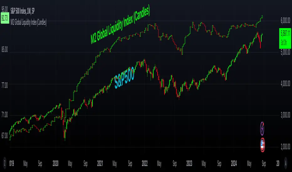
M2 Global Liquidity Index (Candles)M2 Global Liquidity Index (Candles)
In this enhanced version of the original M2 Global Liquidity Index script by Mik3Christ3ns3n , I've taken the foundational concept and expanded its capabilities for more in-depth analysis and user flexibility. This updated script aggregates M2 money supply data from major global economies—China, the U.S., the Eurozone, Japan, and the U.K.—adjusted by their respective exchange rates, into a customizable global liquidity index.
Key Enhancements:
Candlestick Visualization:
• Instead of a simple line chart, I've implemented a candlestick chart, providing a more detailed representation of liquidity trends with open, high, low, and close values for each period. This allows traders to analyze the index with the same technical tools used for price charts.
Customizable Components:
• Users can now select which components (M2 data and exchange rates) to include in the index calculation, giving you the flexibility to tailor the index to specific economic factors or regions of interest.
Dynamic Color Coding:
• Candles are color-coded based on their performance (bullish or bearish), with customized wick and border colors to enhance visual clarity, making it easier to spot liquidity trends at a glance.
Overlay Option:
• This script is designed to be an overlay, allowing you to plot the Global Liquidity Index directly on your price charts, facilitating comparison between liquidity trends and asset prices.
This enhanced script is ideal for traders and analysts who want a deeper understanding of global liquidity trends and their impact on financial markets.
Pesquisar nos scripts por "deep股票代码"
Forex Session Tracker [MacroGlide]Forex Session Tracker is a tool designed to track and visualize trading activity across the four key Forex market sessions: New York, London, Tokyo, and Sydney. The indicator helps traders see the time intervals of each session, their impact on price movements, and analyze volatility within these sessions.
Key Features:
• Session Visualization: The indicator highlights price ranges during the New York, London, Tokyo, and Sydney sessions using different colors, making data easier to visually interpret and analyze. Users can customize the color scheme for each session.
• Price Change Analysis: The indicator tracks the opening prices of each session and calculates the price changes by the session's close. This allows traders to assess market dynamics within each session and make informed trading decisions.
• Average Price Changes: The average price change for a specified number of sessions is calculated for each session, helping to identify trends and volatility levels.
• Time Zone Support: The indicator takes into account time zones, allowing users to adjust the display according to their location or use the market's time zone.
• Interactive Dashboard: The built-in dashboard shows the status of each session in real-time (active or inactive), recent price changes, and average changes, providing quick access to key information directly on the chart.
How to Use:
• Add the indicator to your chart and configure the displayed sessions according to your needs.
• Use color differentiation to easily identify active trading sessions and assess their impact on price movements.
• Monitor price changes in each session and analyze averages for a deeper understanding of market trends.
Methodology:
The indicator uses the time intervals of each trading session to calculate and display opening prices, price ranges, and price changes for the session. Based on this data, the Forex Session Tracker visualizes the session's high and low prices and calculates the average price change over the last several sessions. All data is displayed in real-time, considering the user's time zone settings or the market's time zone.
Originality and Usefulness:
Forex Session Tracker stands out for its ability to combine price change information from several key trading sessions into one indicator, providing traders with a simple and clear way to analyze market activity across different time zones.
Charts:
The indicator displays clean and clear charts, where each trading session is highlighted with its own color, making visual interpretation easier. The charts focus only on essential information for analysis: opening prices, session ranges, and price changes. The integrated dashboard provides quick access to key session metrics, such as activity status, recent price changes, and average values for the selected period. These features make the charts highly useful for rapid analysis and trading decision-making.
Enjoy the game!

[1] Dynamic Support and Resistance with breakout [Dr Future]This script appears to be designed to identify and visualize dynamic support and resistance levels on a price chart, along with potential breakout signals.
Key Components & Functionality (Inferred):
Dynamic Support and Resistance: The script likely employs algorithms to calculate and plot support and resistance levels that adjust in real-time as price action evolves.
Breakout Detection: The script probably incorporates logic to recognize when the price breaks out of these dynamic support or resistance zones. This could trigger alerts or visual cues on the chart.
Dr Future's Approach: It's worth noting the " " tag, suggesting the script might be based on specific methodologies or insights associated with a trader or analyst known as "Dr Future." Without more context on their strategies, it's difficult to pinpoint the exact techniques used.
Potential Benefits:
Adaptive Levels: Dynamic support and resistance can offer a more responsive approach compared to static levels, as they account for changing market conditions.
Breakout Opportunities: Identifying breakouts can help traders spot potential entry or exit points.
Visual Clarity: Plotting these levels directly on the chart can provide a clearer picture of the current market structure and potential turning points.
Caveats:
False Signals: Like any technical tool, dynamic support and resistance can generate false signals. Breakouts might not always lead to sustained trends.
Parameter Sensitivity: The script's effectiveness likely depends on how its parameters are configured. Fine-tuning might be required to suit different markets or timeframes.
"Dr Future" Factor: The script's performance could be tied to the specific strategies of "Dr Future," which might not be universally applicable.
Important Note:
Without access to the actual code and a deeper understanding of "Dr Future's" methods, this description is based on inference and general knowledge of technical analysis.
Recommendation:
If you're considering using this script, it would be prudent to:
Backtest Thoroughly: Test the script on historical data to assess its performance and identify potential pitfalls.
Understand the Parameters: Familiarize yourself with the script's settings and how they impact the plotted levels and breakout signals.
Combine with Other Tools: Use this script in conjunction with other technical indicators and risk management strategies for a more holistic trading approach.

Price Action Smart Money Concepts [BigBeluga]THE SMART MONEY CONCEPTS Toolkit
The Smart Money Concepts [ BigBeluga ] is a comprehensive toolkit built around the principles of "smart money" behavior, which refers to the actions and strategies of institutional investors.
The Smart Money Concepts Toolkit brings together a suite of advanced indicators that are all interconnected and built around a unified concept: understanding and trading like institutional investors, or "smart money." These indicators are not just randomly chosen tools; they are features of a single overarching framework, which is why having them all in one place creates such a powerful system.
This all-in-one toolkit provides the user with a unique experience by automating most of the basic and advanced concepts on the chart, saving them time and improving their trading ideas.
Real-time market structure analysis simplifies complex trends by pinpointing key support, resistance, and breakout levels.
Advanced order block analysis leverages detailed volume data to pinpoint high-demand zones, revealing internal market sentiment and predicting potential reversals. This analysis utilizes bid/ask zones to provide supply/demand insights, empowering informed trading decisions.
Imbalance Concepts (FVG and Breakers) allows traders to identify potential market weaknesses and areas where price might be attracted to fill the gap, creating opportunities for entry and exit.
Swing failure patterns help traders identify potential entry points and rejection zones based on price swings.
Liquidity Concepts, our advanced liquidity algorithm, pinpoints high-impact events, allowing you to predict market shifts, strong price reactions, and potential stop-loss hunting zones. This gives traders an edge to make informed trading decisions based on liquidity dynamics.
🔵 FEATURES
The indicator has quite a lot of features that are provided below:
Swing market structure
Internal market structure
Mapping structure
Adjustable market structure
Strong/Weak H&L
Sweep
Volumetric Order block / Breakers
Fair Value Gaps / Breakers (multi-timeframe)
Swing Failure Patterns (multi-timeframe)
Deviation area
Equal H&L
Liquidity Prints
Buyside & Sellside
Sweep Area
Highs and Lows (multi-timeframe)
🔵 BASIC DEMONSTRATION OF ALL FEATURES
1. MARKET STRUCTURE
The preceding image illustrates the market structure functionality within the Smart Money Concepts indicator.
➤ Solid lines: These represent the core indicator's internal structure, forming the foundation for most other components. They visually depict the overall market direction and identify major reversal points marked by significant price movements (denoted as 'x').
➤ Internal Structure: These represent an alternative internal structure with the potential to drive more rapid market shifts. This is particularly relevant when a significant gap exists in the established swing structure, specifically between the Break of Structure (BOS) and the most recent Change of High/Low (CHoCH). Identifying these formations can offer opportunities for quicker entries and potential short-term reversals.
➤ Sweeps (x): These signify potential turning points in the market where liquidity is removed from the structure. This suggests a possible trend reversal and presents crucial entry opportunities. Sweeps are identified within both swing and internal structures, providing valuable insights for informed trading decisions.
➤ Mapping structure: A tool that automatically identifies and connects significant price highs and lows, creating a zig-zag pattern. It visualizes market structure, highlights trends, support/resistance levels, and potential breakouts. Helps traders quickly grasp price action patterns and make informed decisions.
➤ Color-coded candles based on market structure: These colors visually represent the underlying market structure, making it easier for traders to quickly identify trends.
➤ Extreme H&L: It visualizes market structure with extreme high and lows, which gives perspective for macro Market Structure.
2. VOLUMETRIC ORDER BLOCKS
Order blocks are specific areas on a financial chart where significant buying or selling activity has occurred. These are not just simple zones; they contain valuable information about market dynamics. Within each of these order blocks, volume bars represent the actual buying and selling activity that took place. These volume bars offer deeper insights into the strength of the order block by showing how much buying or selling power is concentrated in that specific zone.
Additionally, these order blocks can be transformed into Breaker Blocks. When an order block fails—meaning the price breaks through this zone without reversing—it becomes a breaker block. Breaker blocks are particularly useful for trading breakouts, as they signal that the market has shifted beyond a previously established zone, offering opportunities for traders to enter in the direction of the breakout.
Here's a breakdown:
➤ Bear Order Blocks (Red): These are zones where a lot of selling happened. Traders see these areas as places where sellers were strong, pushing the price down. When the price returns to these zones, it might face resistance and drop again.
➤ Bull Order Blocks (Green): These are zones where a lot of buying happened. Traders see these areas as places where buyers were strong, pushing the price up. When the price returns to these zones, it might find support and rise again.
These Order Blocks help traders identify potential areas for entering or exiting trades based on past market activity. The volume bars inside blocks show the amount of trading activity that occurred in these blocks, giving an idea of the strength of buying or selling pressure.
➤ Breaker Block: When an order block fails, meaning the price breaks through this zone without reversing, it becomes a breaker block. This indicates a significant shift in market liquidity and structure.
➤ A bearish breaker block occurs after a bullish order block fails. This typically happens when there's an upward trend, and a certain level that was expected to support the market's rise instead gives way, leading to a sharp decline. This decline indicates that sellers have overcome the buyers, absorbing liquidity and shifting the sentiment from bullish to bearish.
Conversely, a bullish breaker block is formed from the failure of a bearish order block. In a downtrend, when a level that was expected to act as resistance is breached, and the price shoots up, it signifies that buyers have taken control, overpowering the sellers.
3. FAIR VALUE GAPS:
A fair value gap (FVG), also referred to as an imbalance, is an essential concept in Smart Money trading. It highlights the supply and demand dynamics. This gap arises when there's a notable difference between the volume of buy and sell orders. FVGs can be found across various asset classes, including forex, commodities, stocks, and cryptocurrencies.
FVGs in this toolkit have the ability to detect raids of FVG which helps to identify potential price reversals.
Mitigation option helps to change from what source FVGs will be identified: Close, Wicks or AVG.
4. SWING FAILURE PATTERN (SFP):
The Swing Failure Pattern is a liquidity engineering pattern, generally used to fill large orders. This means, the SFP generally occurs when larger players push the price into liquidity pockets with the sole objective of filling their own positions.
SFP is a technical analysis tool designed to identify potential market reversals. It works by detecting instances where the price briefly breaks a previous high or low but fails to maintain that breakout, quickly reversing direction.
How it works:
Pattern Detection: The indicator scans for price movements that breach recent highs or lows.
Reversal Confirmation: If the price quickly reverses after breaching these levels, it's identified as an SFP.
➤ SFP Display:
Bullish SFP: Marked with a green symbol when price drops below a recent low before reversing upwards.
Bearish SFP: Marked with a red symbol when price rises above a recent high before reversing downwards.
➤ Deviation Levels: After detecting an SFP, the indicator projects white lines showing potential price deviation:
For bullish SFPs, the deviation line appears above the current price.
For bearish SFPs, the deviation line appears below the current price.
These deviation levels can serve as a potential trading opportunity or areas where the reversal might lose momentum.
With Volume Threshold and Filtering of SFP traders can adjust their trading style:
Volume Threshold: This setting allows traders to filter SFPs based on the volume of the reversal candle. By setting a higher volume threshold, traders can focus on potentially more significant reversals that are backed by higher trading activity.
SFP Filtering: This feature enables traders to filter SFP detection. It includes parameters such as:
5. LIQUIDITY CONCEPTS:
➤ Equal Lows (EQL) and Equal Highs (EQH) are important concepts in liquidity-based trading.
EQL: A series of two or more swing lows that occur at approximately the same price level.
EQH: A series of two or more swing highs that occur at approximately the same price level.
EQLs and EQHs are seen as potential liquidity pools where a large number of stop loss orders or limit orders may be clustered. They can be used as potential reverse points for trades.
This multi-period feature allows traders to select less and more significant EQL and EQH:
➤ Liquidity wicks:
Liquidity wicks are a minor representation of a stop-loss hunt during the retracement of a pivot point:
➤ Buy and Sell side liquidity:
The buy side liquidity represents a concentration of potential buy orders below the current price level. When price moves into this area, it can lead to increased buying pressure due to the execution of these orders.
The sell side liquidity indicates a pool of potential sell orders below the current price level. Price movement into this area can result in increased selling pressure as these orders are executed.
➤ Sweep Liquidation Zones:
Sweep Liquidation Zones are crucial for understanding market structure and potential future price movements. They provide insights into areas where significant market participants have been forced out of their positions, potentially setting up new trading opportunities.
🔵 USAGE & EXAMPLES
The core principle behind the success of this toolkit lies in identifying "confluence." This refers to the convergence of multiple trading indicators all signaling the same information at a specific point or area. By seeking such alignment, traders can significantly enhance the likelihood of successful trades.
MS + OBs
The chart illustrates a highly bullish setup where the price is rejecting from a bullish order block (POC), while simultaneously forming a bullish Swing Failure Pattern (SFP). This occurs after an internal structure change, marked by a bullish Change of Character (CHoCH). The price broke through a bearish order block, transforming it into a breaker block, further confirming the bullish momentum.
The combination of these elements—bullish order blocks, SFP, and CHoCH—creates a powerful bullish signal, reinforcing the potential for upward movement in the market.
SFP + Bear OB
This chart above displays a bearish setup with a high probability of a price move lower. The price is currently rejecting from a bear order block, which represents a key resistance area where significant selling pressure has previously occurred. A Swing Failure Pattern (SFP) has also formed near this bear order block, indicating that the price briefly attempted to break above a recent high but failed to sustain that upward movement. This failure suggests that buyers are losing momentum, and the market could be preparing for a move to the downside.
Additionally, we can toggle on the Deviation Area in the SFP section to highlight potential levels where price deviation might occur. These deviation areas represent zones where the price is likely to react after the Swing Failure Pattern:
BUY – SELL sides + EQL
The chart showcases a bullish setup with a high probability of price breaking out of the current sell-side resistance level. The market structure indicates a formation of Equal Lows (EQL), which often suggests a build-up of liquidity that could drive the price higher.
The presence of strong buy-side pressure (69%), indicated by the green zone at the bottom, reinforces this bullish outlook. This area represents a key support zone where buyers are outpacing sellers, providing the foundation for a potential upward breakout.
EQL + Bull ChoCh
This chart illustrates a potential bullish setup, driven by the formation of Equal Lows (EQL) followed by a bullish Change of Character (CHoCH). The presence of Equal Lows often signals a liquidity build-up, which can lead to a reversal when combined with additional bullish signals.
Liquidity grab + Bull ChoCh + FVGs
This chart demonstrates a strong bullish scenario, where several important market dynamics are at play. The price begins its upward momentum from Liquidity grab following a bullish Change of Character (CHoCH), signaling the transition from a bearish phase to a bullish one.
As the price progresses, it performs liquidity grabs, which serve to gather the necessary fuel for further movement. These liquidity grabs often occur before significant price surges, as large market participants exploit these areas to accumulate positions before pushing the price higher.
The chart also highlights a market imbalance area, showing strong momentum as the price moves swiftly through this zone.
In this examples, we see how the combination of multiple “smart money” tools helps identify a potential trade opportunities. This is just one of the many scenarios that traders can spot using this toolkit. Other combinations—such as order blocks, liquidity grabs, fair value gaps, and Swing Failure Patterns (SFPs)—can also be layered on top of these concepts to further refine your trading strategy.
🔵 SETTINGS
Window: limit calculation period
Swing: limit drawing function
Mapping structure: show structural points
Algorithmic Logic: (Extreme-Adjusted) Use max high/low or pivot point calculation
Algorithmic loopback: pivot point look back
Show Last: Amount of Order block to display
Hide Overlap: hide overlapping order blocks
Construction: Size of the order blocks
Fair value gaps: Choose between normal FVG or Breaker FVG
Mitigation: (close - wick - avg) point to mitigate the order block/imbalance
SFP lookback: find a higher / lower point to improve accuracy
Threshold: remove less relevant SFP
Equal H&L: (short-mid-long term) display longer term
Liquidity Prints: Shows wicks of candles where liquidity was grabbed
Sweep Area: Identify Sweep Liquidation areas
By combining these indicators in one toolkit, traders are equipped with a comprehensive suite of tools that address every angle of the Smart Money Concept. Instead of relying on disparate tools spread across various platforms, having them integrated into a single, cohesive system allows traders to easily see confluence and make more informed trading decisions.

ICT NWOG/NDOG Gaps [TradingFinder] New Opening Gaps🔵 Introduction
🟣 Understanding ICT Opening Gaps
In the realm of technical analysis, mastering the art of recognizing market behavior and pinpointing key price levels is vital for making sound trading decisions. Among the array of tools available, the concept of opening gaps stands out for its ability to provide crucial insights.
The ICT (Inner Circle Trader) methodology offers a distinctive approach to understanding the importance of New Day Opening Gaps (NDOG), New Week Opening Gaps (NWOG), and New Monthly Opening Gaps (NMOG).
These gaps, representing the price differences between the close of a previous period and the open of the next, serve as key reference points that can greatly impact price movements.
The ICT trading approach highlights these gaps as potential zones of support and resistance. Prices often respond to these areas, either bouncing off or passing through and then retesting them. Within these gaps, significant levels such as the high and low are particularly important.
Additionally, the Event Horizon PD Array (EHPDA) concept, which is an intermediate level calculated from the average of neighboring NWOGs or NDOGs, adds another layer to this analysis.
This guide delves into ICT's New Daily, Weekly, and Monthly Opening Ranges, showing how these gaps can be effectively utilized in trading. By grasping the nuances of these gaps, traders can better forecast market behavior, identify key support and resistance levels, and refine their trading strategies.
🟣 The Gaps
1. New Week Opening Gap (NWOG) : The NWOG is the price gap between Friday's closing price and Sunday's opening price. This gap is particularly crucial for traders who monitor weekly trends. Depending on the direction of the gap, the NWOG often serves as a pivotal support or resistance level.
2. New Day Opening Gap (NDOG) : The NDOG signifies the price difference between the closing price of the previous day and the opening price of the current day. Much like the NWOG, the NDOG is a key reference point for intraday traders.
Prices typically react to these levels, either reversing or continuing through the gap after a retest. NDOGs are instrumental in identifying short-term support and resistance levels, aiding traders in making decisions based on daily price movements.
3. New Monthly Opening Gap (NMOG) : The NMOG represents the gap between the closing price of the previous month and the opening price of the current month.
This gap is especially valuable for traders focusing on long-term trends and macroeconomic factors. As with NWOGs and NDOGs, the NMOG can act as a significant support or resistance level.
🔵 How to Use
Identifying Support and Resistance : Opening gaps often indicate potential zones where prices might reverse or find support/resistance. For example, if a new day opens below the previous day’s close (creating a NDOG), this gap could act as resistance, prompting traders to consider short positions if the price retests this level without breaking through.
Conversely, if the price opens above the previous day’s close, the gap might serve as support, offering a potential entry point for long trades.
Gap Fill Strategy : A popular strategy associated with opening gaps is the "gap fill" approach, where traders anticipate that the price will eventually return to fill the gap.
For instance, if there’s a significant NDOG at market open, a trader might expect the price to retrace back to the previous day’s close, effectively "filling" the gap. This strategy is particularly effective in markets that exhibit mean-reverting behavior.
Combining Gaps with Other Indicators : Traders often enhance their analysis of NDOG, NWOG, and NMOG by integrating other technical indicators. Aligning gap levels with tools such as Fibonacci retracements, moving averages, or existing support and resistance zones can provide additional confirmation for trade entries and exits.
🔵 Setting
Show and Color : You can control the display or non-display of the range as well as the color of the range.
Max Opening Range Update Method : You can control the number of ranges that are updated. If it is "All", all ranges that are not mitigated will be displayed. If "Custom", the ranges will be updated based on the number you specify.
Max Opening Range Update : The number of ranges to update.
🔵 Conclusion
The ICT New Daily, Weekly, and Monthly Opening Ranges provide traders with a systematic approach to understanding market dynamics and identifying critical support and resistance levels.
By analyzing these gaps, traders can gain deeper insights into potential price movements, spot high-probability trade setups, and strengthen their overall trading strategy. Whether you are focused on short-term day trading or long-term market trends, incorporating NDOG, NWOG, and NMOG analysis into your trading plan can be a powerful addition to your toolkit.

Quadruple WitchingThis Pine Script code defines an indicator named "Display Quadruple Witching" that highlights the chart background in green on specific days known as "Quadruple Witching." Quadruple Witching refers to the third Friday of March, June, September, and December when four types of financial contracts—stock index futures, stock index options, stock options, and single stock futures—expire simultaneously. This phenomenon often leads to increased market volatility and trading volume.
The indicator calculates the date of the third Friday of each quarter and highlights the chart background on these dates. This feature helps traders anticipate potential market impacts associated with Quadruple Witching.
Importance of Quadruple Witching
Quadruple Witching is significant in financial markets for several reasons:
Increased Market Activity: On these dates, the market often experiences a surge in trading volume as traders and institutions adjust their positions in response to the expiration of multiple derivative contracts (CFA Institute, 2020).
Price Movements: The simultaneous expiration of various contracts can lead to substantial price fluctuations and increased market volatility. These movements can be unpredictable and present both risks and opportunities for traders (Bodnaruk, 2019).
Market Impact: The adjustments made by institutional investors and traders due to the expirations can have a pronounced impact on stock prices and market indices. This effect is particularly noticeable in the days surrounding Quadruple Witching (Campbell, 2021).
References
CFA Institute. (2020). The Impact of Quadruple Witching on Financial Markets. CFA Institute Research Foundation. Retrieved from CFA Institute.
Bodnaruk, A. (2019). The Effect of Option Expiration on Stock Prices. Journal of Financial Economics, 131(1), 45-64. doi:10.1016/j.jfineco.2018.08.004
Campbell, J. Y. (2021). The Behaviour of Stock Prices Around Expiration Dates. Journal of Financial Economics, 141(2), 577-600. doi:10.1016/j.jfineco.2021.01.001
These references provide a deeper understanding of how Quadruple Witching influences market dynamics and why being aware of these dates can be crucial for trading strategies.

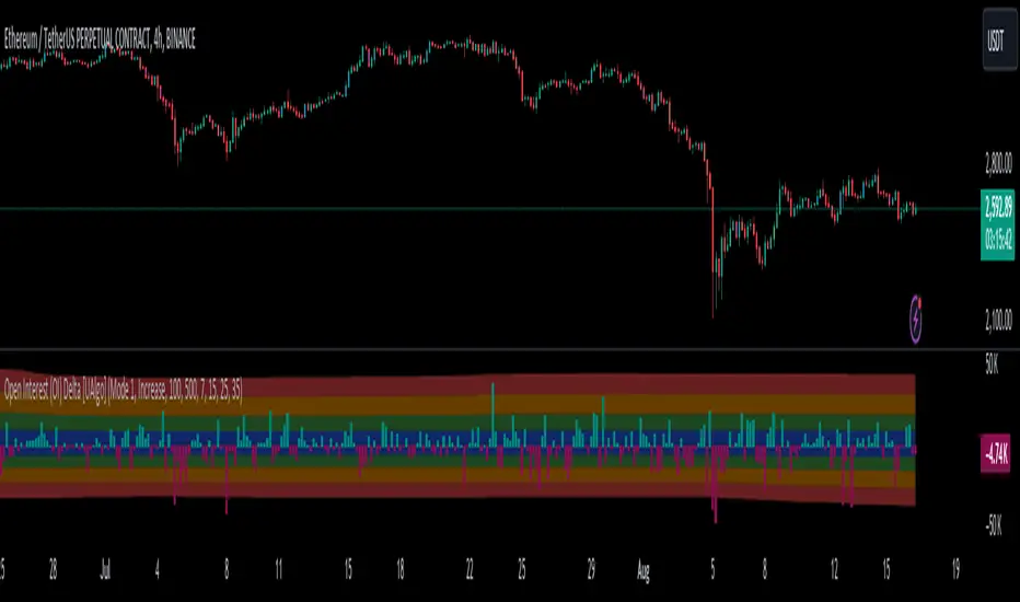
Open Interest (OI) Delta [UAlgo]The Open Interest (OI) Delta indicator is a tool designed to provide insights into the dynamics of Open Interest changes within the futures market. Open Interest (OI) refers to the total number of outstanding derivative contracts, such as options or futures, that have not been settled. The OI Delta measures the change in Open Interest over a specified period, allowing traders to assess whether new money is entering the market or existing positions are being closed.
This indicator offers two distinct display modes to visualize OI Delta, along with customizable levels that help in categorizing the magnitude of OI changes. Additionally, it provides the option to color-code the bars on the price chart based on the intensity and direction of OI Delta, making it easier for traders to interpret market sentiment and potential future price movements.
🔶 Key Features
Two Display Modes: Choose between two different modes for visualizing OI Delta, depending on your analysis preferences:
Mode 1: Displays the OI Delta directly as positive or negative values.
Mode 2: Separates positive and negative OI Delta values, displaying them as absolute values for easier comparison.
Customizable Levels: Set up to four levels of OI Delta magnitude, each with customizable thresholds and colors. These levels help categorize the OI changes into Normal, Medium, Large, and Extreme ranges, allowing for a more nuanced interpretation of market activity.
MA Length and Standard Deviation Period: Adjust the moving average length and standard deviation period for OI Delta, which smooths out the data and helps in identifying significant deviations from the norm.
Color-Coded Bar Chart: Optionally color the price bars on your chart based on the OI Delta levels, helping to visually correlate price action with changes in Open Interest.
Heatmap Display: Toggle the display of OI Delta levels on the chart, with the option to fill the areas between these levels for a more visually intuitive understanding of the data.
🔶 Interpreting Indicator
Positive vs. Negative OI Delta:
A positive OI Delta indicates that the Open Interest is increasing, suggesting that new contracts are being created, which could imply fresh capital entering the market.
A negative OI Delta suggests that Open Interest is decreasing, indicating that contracts are being closed out or settled, which might reflect profit-taking or a reduction in market interest.
Magnitude Levels:
Level 1 (Normal OI Δ): Represents typical, less significant changes in OI. If the OI Delta stays within this range, it may indicate routine market activity without any substantial shift in sentiment.
Level 2 (Medium OI Δ): Reflects a more significant change in OI, suggesting increased market interest and possibly the beginning of a new trend or phase of market participation.
Level 3 (Large OI Δ): Indicates a strong change in OI, often associated with a decisive move in the market. This could signify strong conviction among market participants, either bullish or bearish.
Level 4 (Extreme OI Δ): The highest level of OI change, often preceding major market moves. Extreme OI Δ can be a signal of potential market reversals or the final phase of a strong trend.
Color-Coded Bars:
When enabled, the color of the price bars will reflect the magnitude and direction of the OI Delta. This visual aid helps in quickly assessing the correlation between price movements and changes in market sentiment as indicated by OI.
This indicator is particularly useful for futures traders looking to gauge the strength and direction of market sentiment by analyzing changes in Open Interest. By combining this with price action, traders can gain a deeper understanding of market dynamics and make more informed trading decisions
🔶 Disclaimer
Use with Caution: This indicator is provided for educational and informational purposes only and should not be considered as financial advice. Users should exercise caution and perform their own analysis before making trading decisions based on the indicator's signals.
Not Financial Advice: The information provided by this indicator does not constitute financial advice, and the creator (UAlgo) shall not be held responsible for any trading losses incurred as a result of using this indicator.
Backtesting Recommended: Traders are encouraged to backtest the indicator thoroughly on historical data before using it in live trading to assess its performance and suitability for their trading strategies.
Risk Management: Trading involves inherent risks, and users should implement proper risk management strategies, including but not limited to stop-loss orders and position sizing, to mitigate potential losses.
No Guarantees: The accuracy and reliability of the indicator's signals cannot be guaranteed, as they are based on historical price data and past performance may not be indicative of future results.
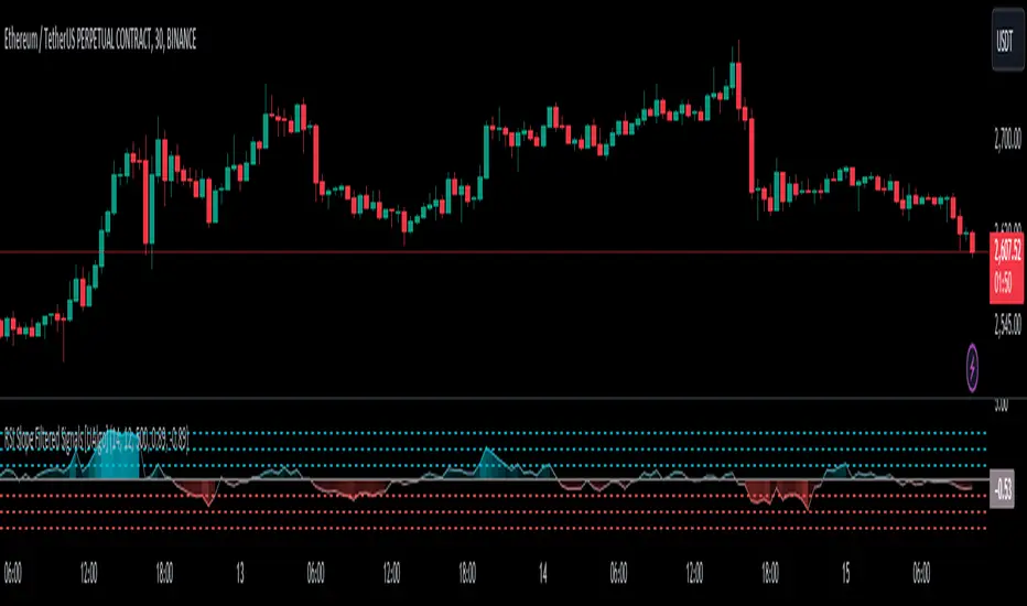
RSI Slope Filtered Signals [UAlgo]The "RSI Slope Filtered Signals " is a technical analysis tool designed to enhance the accuracy of RSI (Relative Strength Index) signals by incorporating slope analysis. This indicator not only considers the RSI value but also analyzes the slope of the RSI over a specified number of bars, providing a more refined signal that accounts for the momentum and trend strength. By utilizing both positive and negative slope arrays, the indicator dynamically adjusts its thresholds, ensuring that signals are responsive to changing market conditions. This tool is particularly useful for traders looking to identify overbought and oversold conditions with a higher degree of precision, filtering out noise and providing clear visual cues for potential market reversals.
🔶 Key Features
Dynamic Slope Analysis: Measures the slope of RSI over a customizable number of bars, offering insights into the momentum and trend direction.
Adaptive Thresholds: Uses historical slope data to calculate dynamic thresholds, adjusting signal sensitivity based on market conditions.
Normalized Slope Calculation: Normalizes the slope values to provide a consistent measure across different market conditions, making the indicator more versatile.
Clear Signal Visualization: The indicator plots both positive and negative normalized slopes with color gradients, visually representing the strength of the trend.
Overbought and Oversold Signals: Plots overbought and oversold signals directly on the chart when the calculated value reaches the user-specified threshold, helping traders identify potential reversal points.
Customizable Settings: Allows users to adjust the RSI length, slope measurement bars, and lookback periods, providing flexibility to tailor the indicator to different trading strategies.
🔶 Interpreting the Indicator
The "RSI Slope Filtered Signals " indicator is designed to be easy to interpret. Here's how you can use it:
Normalized Slope: The indicator plots the normalized slope of the RSI, with values above zero indicating positive momentum and values below zero indicating negative momentum. A higher positive slope suggests a strong upward trend, while a deeper negative slope indicates a strong downward trend.
Reversal Signals: The indicator plots several horizontal lines at different thresholds (+3, +2, +1, 0, -1, -2, -3). These levels are used to gauge the strength of the momentum based on the normalized slope. For example, a normalized slope crossing above the +2 threshold may indicate a strong bullish trend, while crossing below the -2 threshold may suggest a strong bearish trend. These thresholds help in understanding the intensity of the current trend and provide context for interpreting the indicator's signals.
This indicator generates overbought and oversold signals not solely based on the RSI entering extreme levels (above 70 for overbought and below 30 for oversold), but also by considering the behavior of the normalized slope relative to specific thresholds. Specifically, the Overbought Signal (🔽) is triggered when the RSI is above 70 and the normalized slope from the previous bar is greater than or equal to the upper threshold, with the current slope being lower than the previous slope, indicating a potential bearish reversal as momentum may be slowing down.
Similarly, the Oversold Signal (🔼) is generated when the RSI is below 30 and the normalized slope from the previous bar is less than or equal to the lower threshold, with the current slope being higher than the previous slope, signaling a potential bullish reversal as the downward momentum may be weakening.
Area Plots: The indicator also plots the positive and negative slopes as filled areas, providing a quick visual cue for the strength and direction of the trend. Green areas represent positive slopes (upward momentum), while red areas represent negative slopes (downward momentum).
By combining these elements, the "RSI Slope Filtered Signals " provides a comprehensive view of the market's momentum, helping traders make more informed decisions by filtering out false signals and focusing on the significant trends.
🔶 Disclaimer
Use with Caution: This indicator is provided for educational and informational purposes only and should not be considered as financial advice. Users should exercise caution and perform their own analysis before making trading decisions based on the indicator's signals.
Not Financial Advice: The information provided by this indicator does not constitute financial advice, and the creator (UAlgo) shall not be held responsible for any trading losses incurred as a result of using this indicator.
Backtesting Recommended: Traders are encouraged to backtest the indicator thoroughly on historical data before using it in live trading to assess its performance and suitability for their trading strategies.
Risk Management: Trading involves inherent risks, and users should implement proper risk management strategies, including but not limited to stop-loss orders and position sizing, to mitigate potential losses.
No Guarantees: The accuracy and reliability of the indicator's signals cannot be guaranteed, as they are based on historical price data and past performance may not be indicative of future results.
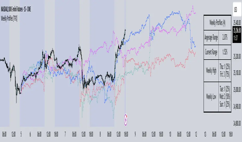
Weekly Profiles [TFO]This Weekly Profiles indicator was built to overlay historical data to show how prior weeks of price action have unfolded under specified input conditions.
When "Show Historical Weekly Profiles" is enabled, the indicator draws out how prior weeks have traded. This is done by tracking weekly price movements, measuring the percent change from each week's respective weekly open price, and translating that percent change to the current week's open price to visually describe how price fluctuated in those previous weeks.
With "Show Weekly Profile Table" enabled, we can observe some basic statistics on the weekly profiles that have been collected, such as the average range and which days have made the high/low of the week from the given dataset.
There are also options to refine the dataset by specifying which days have made the high/low of the week, which will only show profiles that meet said criteria. For instance, by enabling "Low of Week" and selecting "Monday", the indicator will show every weekly profile that made its low on a Monday. In the following chart, we can again use the table to observe that we currently have 14 such weeks on NQ1! (from the data available on our current chart timeframe and TradingView plan), whose average range is 3.65% from the week's low to the week's high, and from those 14 weeks, the high of the week was made on a Friday 10 times or 71% of the time.
The "Profile Resolution" option specifies the interval at which to show changes in price (given that it is greater than or equal to the current chart timeframe). In the below chart, the Profile Resolution is set to 4 hours. As such, it simplifies the profiles by tracking the close price of each 4 hour candle (again as a percent change from each profile's respective open price). The larger Profile Resolution can make it easier to observe commonalities between profiles, such as the below chart of NQ1! that highlights a noticeable price decrease during the New York morning session across several of the available weekly profiles.
There is also an option to "Highlight Closest Profiles" which does exactly that. Essentially, all weekly profiles are given a score according to how close the current week's price action is matching each profile up until the current point in time. For example, if one were observing this indicator on a Wednesday afternoon, each profile would be scored according to how close price is to each profile, starting from the weekly open, up until the Wednesday afternoon of each profile. Everything after that point in time is disregarded since it hasn't happened yet and can't be measured. With this in mind, profiles with greater similarity to the current week are highlighted with deeper colors, and profiles with lesser similarity are given lighter, more transparent colors.
The "Randomize Colors" option will use various colors for the weekly profiles for easier visual differentiation (especially where there are several profiles crowding each other), as opposed to otherwise having one color for all profiles. Lastly, there are basic styling options to control the table position, table size, and the line width of all weekly profiles.
[KVA] KMACDKMACD Indicator: Advanced Market Analysis Through Central Tendency Metrics
The KMACD (KAMVIA Moving Average Convergence Divergence) indicator is an advanced, multi-dimensional tool designed to provide traders and analysts with a deeper understanding of market dynamics. By integrating the classical MACD framework with statistical measures of central tendency, KMACD offers a sophisticated approach to identifying trends, reversals, and potential trading opportunities.
Key Features of the KMACD Indicator:
1. Enhanced MACD Calculation :
- The KMACD employs dual moving averages (fast and slow) of user-defined types (SMA, EMA, WMA) to calculate the MACD line, which represents the difference between these moving averages. This traditional approach is further enhanced by customizable signal smoothing, allowing users to fine-tune the sensitivity of the indicator.
2. Central Tendency Metrics :
- The indicator integrates additional statistical measures, such as Mean, Median, Mode, Standard Deviation, and Variance, calculated over a rolling window. These metrics provide insights into the central tendencies of the MACD values, helping traders understand the overall trend direction and the dispersion of price movements around the trend.
3. RSI-Like Oscillator :
- A unique RSI-like value derived from the MACD line is included to highlight overbought and oversold conditions. This offers a dual-layered perspective, combining the power of MACD and RSI methodologies, to signal potential market extremes with greater precision.
4. Customizable Visual Elements :
- KMACD allows users to toggle the visibility of the MACD line, Signal line, and Histogram, providing flexibility in how the data is presented. The histogram dynamically changes color—green when above zero, indicating bullish momentum, and red when below zero, indicating bearish momentum.
5. Horizontal Line Customization :
- The indicator includes customizable horizontal lines for the zero level, overbought, and oversold thresholds. These lines serve as visual cues to identify key price levels and market conditions.
6. Adaptive to Various Market Conditions :
- KMACD's comprehensive features make it adaptable to various market conditions, from trending markets to sideways consolidations. Whether you're looking to capture momentum shifts or identify potential reversal points, KMACD provides the analytical power needed to make informed trading decisions.
How to Use KMACD:
- Trend Identification : Use the MACD line in conjunction with central tendency measures (Mean, Median, Mode) to gauge the overall market trend and its strength. A rising MACD line, supported by higher mean and median values, typically indicates an uptrend.
- Momentum Analysis : The histogram and RSI-like value help in identifying the momentum behind price movements. Positive histogram bars suggest increasing bullish momentum, while negative bars suggest increasing bearish momentum.
- Overbought/Oversold Conditions : Monitor the RSI-like oscillator and the overbought/oversold levels to detect when the market may be poised for a reversal.
- Divergence Detection : Look for divergences between the MACD line and price action, supported by the central tendency measures, to spot potential reversal points.
Conclusion
The KMACD indicator is more than just a traditional MACD; it’s a comprehensive tool designed to cater to both novice and experienced traders. By incorporating central tendency metrics and customizable features, KMACD stands out as a versatile and powerful indicator that enhances market analysis and trading strategies. Whether you're navigating volatile markets or steady trends, KMACD offers the precision and depth needed to stay ahead.

Pivot Market StructureThis Indicator helps identify the current market structure.
The Swing Market Structure is identified based on thresholds (either on percentages or absolute values) to tell if a pullback is value (=deep enough). If a level is broken, the furthest opposite point becomes the new low/high, respectively.
For the active movement (identified high + low), various retracement levels can be configured and shown.
As most granular structure, the Fractal Market Structure helps identify strong structure breaks within the most recent bars.
Note: If certain timeframes don´t show a market structure breakdown, reduce the threshold until valid pullbacks can be found.

Visible Range Volume Profile Heatmap [MyTradingCoder]The Visible Range Volume Profile Heatmap indicator offers a visually striking and insightful way to analyze trading volume within the visible price range of your chart. This tool goes beyond traditional volume profiles by displaying volume distribution as a heatmap, where color intensity represents the volume traded at each price level.
Key Features:
Dynamic Heatmap: Displays volume concentration using a color gradient, making it easy to spot areas of high and low trading activity.
Customizable Grid: Choose between auto-scaling or manual grid configuration to suit your analysis needs.
Flexible Color Schemes: Select from tri-tone or two-tone color palettes to represent bullish and bearish volume.
Point of Control (POC) Overlay: Highlights the price level with the highest trading volume, a critical reference point for traders.
Adjustable Transparency: Fine-tune the visibility of the heatmap to balance it with other chart elements.
Lookback Period: Customize the number of bars used for volume profile calculation.
How to Use the Visible Range Volume Profile Heatmap:
The Visible Range Volume Profile Heatmap is a powerful tool that can significantly enhance your market analysis when used effectively. To get the most out of this indicator, start by observing the overall pattern of the heatmap. Areas with darker colors represent higher volume concentration, indicating price levels where significant trading activity has occurred. These areas often serve as important support or resistance levels, as they represent prices where many traders have established positions.
Pay close attention to the Point of Control (POC), represented by a line running through the heatmap. This line marks the price level with the highest trading volume and often acts as a magnet for price action. Price tends to gravitate towards the POC, making it a crucial reference point for potential reversals or continuations.
When analyzing potential trades, consider how the current price relates to the volume distribution shown in the heatmap. If the price is approaching a high-volume area from below, it might face resistance; conversely, if it's approaching from above, that area might provide support. Breakouts beyond significant volume nodes can be particularly noteworthy, as they may signal a shift in market sentiment.
Use the heatmap in conjunction with your existing trading strategies. For example, if you're a trend follower, you might look for breakouts beyond major volume areas as confirmation of trend continuation. If you're a mean reversion trader, you might consider entries when price moves away from high-volume nodes, anticipating a return to these heavily traded levels.
The indicator can also help in identifying potential profit targets. As price moves away from one volume node, it often continues until it reaches the next significant volume area. These areas can serve as logical places to consider taking profits or adjusting your position.
For longer-term analysis, observe how the volume profile changes over time. Shifts in the distribution of volume can indicate evolving market dynamics. A broadening of the high-volume area might suggest increasing uncertainty, while a narrowing could indicate building consensus about price.
Settings Explained:
Auto Grid Configuration:
The "Auto Scale" option automatically adjusts the grid size based on the visible chart area. This ensures optimal visualization regardless of your chart's dimensions or zoom level.
Auto Scale Grid Size: Determines the total number of cells in the heatmap. A higher number provides more granular detail but may increase calculation time.
Auto Scale Grid Ratio: Adjusts the aspect ratio of the grid cells. A higher ratio creates wider, more rectangular cells, while a lower ratio results in more square-shaped cells. Experiment to find the best visual representation for your analysis.
Lookback Period:
The lookback setting determines how many columns (bars) of historical data the indicator uses to calculate the volume profile. A larger lookback will provide a more comprehensive view of historical volume distribution but may be slower to react to recent changes. A smaller lookback will be more responsive to recent volume patterns but may miss longer-term trends.
Manual Grid Configuration:
If you prefer more control over the grid layout, you can switch to manual configuration:
Column Width: Sets the number of price bars each column of the heatmap represents. A wider column aggregates more data, smoothing out the profile.
Number of Rows: Determines the vertical resolution of the heatmap. More rows provide finer price level detail but may make the overall pattern less distinct.
Tips for Optimization:
For short-term trading, use a smaller lookback and finer grid settings to capture recent market dynamics.
For longer-term analysis, increase the lookback and use wider columns to identify persistent volume patterns.
If the heatmap appears too blocky, increase the number of rows or decrease the column width.
If the heatmap is too granular, making patterns hard to discern, do the opposite.
Remember, the ideal settings often depend on your specific trading timeframe, the asset you're analyzing, and your personal analytical preferences. Don't hesitate to experiment with different configurations to find what works best for your trading style.
Conclusion
The Visible Range Volume Profile Heatmap is more than just an indicator—it's a versatile tool that enhances your ability to analyze and interpret market data. By transforming volume profiles into an intuitive, color-coded heatmap, this indicator allows you to quickly identify critical price levels where significant trading activity has occurred. Whether you're a day trader focused on short-term moves or a swing trader analyzing longer-term trends, the customizable settings of this tool provide the flexibility needed to adapt to various market conditions.
The ability to configure the grid layout, adjust the lookback period, and fine-tune the color and transparency settings ensures that the heatmap can be tailored to your specific trading strategy. By highlighting key areas of support and resistance, identifying potential breakouts, and pinpointing the Point of Control (POC), the heatmap gives you actionable insights that can enhance your decision-making process.
Incorporate the Visible Range Volume Profile Heatmap into your trading routine to gain a deeper understanding of market dynamics and to spot opportunities that might otherwise go unnoticed. Remember to experiment with the settings to find the configuration that best suits your analysis style, and use this powerful indicator in conjunction with your existing strategies for optimal results. With the right approach, this tool can become an indispensable part of your trading toolkit, helping you navigate the markets with greater confidence and precision.

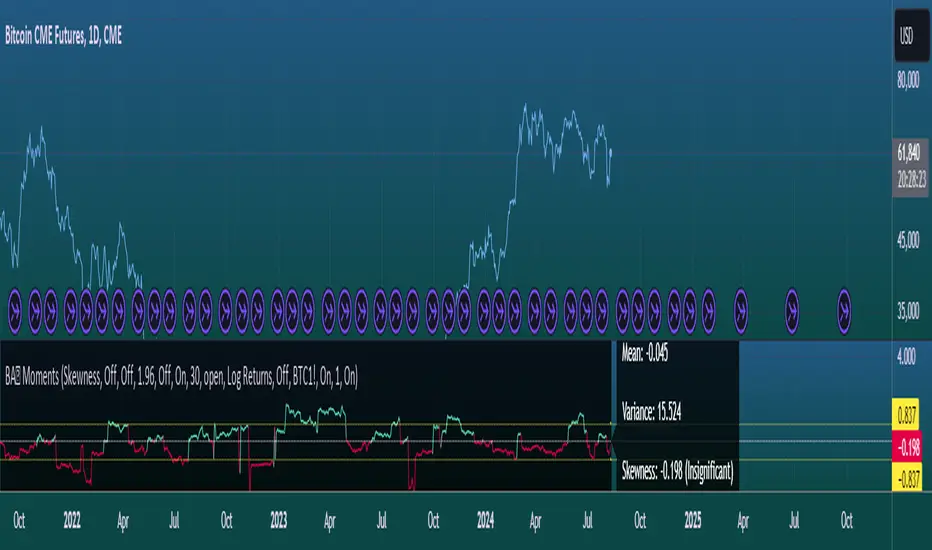
Moments Functions
This script is a TradingView Pine Script (version 5) for calculating and plotting statistical moments of a financial series. Here's a breakdown of what it does:
Script Overview
Purpose:
The script calculates and visualizes moments such as Mean, Variance, Skewness, and Kurtosis of a price series.
It also provides the option to display log returns and various statistical bands.
Inputs:
Moments Selection: Choose from Mean, Variance, Skewness, or Excess Kurtosis.
Source Settings: Define the lookback period and source data (e.g., closing price or log returns).
Plot Settings: Control visibility and styling of plots, bands, and information panels.
Colors Settings: Customize colors for different plot elements.
Functions:
f_va(): Computes sample variance.
f_sd(): Computes sample standard deviation.
f_skew(): Computes sample skewness.
f_kurt(): Computes sample kurtosis.
seskew(): Calculates the standard error of skewness.
sekurt(): Calculates the standard error of kurtosis.
skewcv(): Computes critical values for skewness.
kurtcv(): Computes critical values for kurtosis.
Outputs:
Plots:
Moment values (Mean, Variance, Skewness, Kurtosis).
Log Returns (if selected).
Standard Deviation Bands (if selected).
Critical Values for Skewness and Kurtosis (if selected).
Information Panel: Displays current statistical values and their significance.
Customization:
Users can customize appearance and behavior of the script through various input options, including colors, line thickness, and background settings.
Key Variables and Constants
Constants:
zscoreS and zscoreL: Z-scores for confidence intervals based on sample size.
skewrv and kurtrv: Reference values for skewness and excess kurtosis.
Sample Functions:
f_va() and f_sd(): Custom functions to calculate sample variance and standard deviation.
f_skew() and f_kurt(): Custom functions to calculate skewness and kurtosis.
Critical Values:
Functions skewcv() and kurtcv() calculate critical values used to assess statistical significance of skewness and kurtosis.
Plotting
Plot Types:
Mean, variance, skewness, and excess kurtosis are plotted based on user selection.
Log returns are plotted if enabled.
Standard deviation bands and critical values are plotted if enabled.
Labels:
Information panel labels display mean, variance/standard deviation, skewness, and kurtosis values along with their significance.
Example Usage
To use this script:
Add it to a TradingView chart.
Adjust inputs to configure which statistical moments to display, the source data, and the appearance of the plots.
Review the plotted data and labels to analyze the statistical properties of the selected price series.
This script is useful for traders and analysts looking to perform advanced statistical analysis on financial data directly within TradingView.
When comparing two stock prices over a period of time, the statistical moments—mean, variance, skewness, and kurtosis—can provide a deep insight into the behavior of the stock prices and their distributions. Here’s what each moment signifies in this context:
1. Mean
Definition: The mean (or average) is the sum of the stock prices over the period divided by the number of data points. It represents the central value of the price series.
Interpretation: When comparing two stocks, the mean tells you the average price level of each stock over the period. A higher mean indicates that, on average, the stock price is higher compared to another stock with a lower mean.
Comparison Insight: If Stock A has a higher mean price than Stock B, it implies that Stock A's prices are generally higher than those of Stock B over the given period.
2. Variance
Definition: Variance measures the dispersion or spread of the stock prices around the mean. It is the average of the squared differences from the mean.
Interpretation: A higher variance indicates that the stock prices fluctuate more widely from the mean, implying greater volatility. Conversely, a lower variance indicates more stable and predictable prices.
Comparison Insight: Comparing the variances of two stocks helps in assessing which stock has more price volatility. If Stock A has a higher variance than Stock B, it means Stock A's prices are more volatile and less predictable compared to Stock B.
3. Skewness
Definition: Skewness measures the asymmetry of the distribution of stock prices around the mean. It can be positive, negative, or zero:
Positive Skewness: The distribution has a long right tail, with more frequent small returns and fewer large positive returns.
Negative Skewness: The distribution has a long left tail, with more frequent small returns and fewer large negative returns.
Zero Skewness: The distribution is symmetric around the mean.
Interpretation: Skewness tells you about the direction of outliers in the stock price distribution. Positive skewness means a higher probability of large positive returns, while negative skewness means a higher probability of large negative returns.
Comparison Insight: By comparing skewness, you can understand the nature of extreme returns for two stocks. For example, if Stock A has positive skewness and Stock B has negative skewness, Stock A might have more frequent large gains, whereas Stock B might have more frequent large losses.
4. Kurtosis
Definition: Kurtosis measures the "tailedness" of the distribution of stock prices. It indicates how much of the distribution is in the tails versus the center. High kurtosis means more outliers (extreme returns), while low kurtosis means fewer outliers.
Interpretation:
High Kurtosis: Indicates a higher likelihood of extreme price movements (both high and low) compared to a normal distribution.
Low Kurtosis: Indicates that extreme price movements are less common.
Comparison Insight: Comparing kurtosis between two stocks shows which stock has more extreme returns. If Stock A has higher kurtosis than Stock B, it means Stock A has more frequent extreme price changes, suggesting more risk or opportunities for large gains or losses.
Summary
Mean: Compares average price levels.
Variance: Compares price volatility.
Skewness: Compares the asymmetry of price movements.
Kurtosis: Compares the likelihood of extreme price changes.
By analyzing these statistical moments, you can gain a comprehensive view of how the two stocks behave relative to each other, which can inform investment decisions based on risk, return expectations, and the nature of price movements.
BTC - Power Law OscillatorDescription:
The BTC - Power Law Oscillator is a technical analysis tool designed to help traders and investors identify potential overbought and oversold conditions in the Bitcoin market. This oscillator is based on a power law model that approximates Bitcoin's historical price trajectory, providing a framework for understanding deviations from this trajectory over time.
Key Features:
Exponential Model: The oscillator uses an exponential model that represents Bitcoin's price growth over time since its inception on January 3, 2009. This model is mathematically expressed as:
price=exp(5.71×ln(days since inception)−38.16)
This captures the long-term growth trend of Bitcoin, allowing for the analysis of deviations from this model.
Deviation Analysis: The Power Law Oscillator measures the percentage deviation of Bitcoin's closing price from the model price. This deviation is expressed as a percentage to illustrate how far the current price is from the expected model trajectory.
Normalization: The oscillator values are normalized to a 0-100 range. A quadratic transformation is applied to enhance sensitivity to higher values, allowing for better visualization and interpretation of extreme conditions.
Bands and Zones:
Upper Band (50): Indicates the 20% threshold. Values above this band suggest overbought conditions, where Bitcoin's price may be significantly above the expected trajectory.
Lower Band (15): Indicates the 5% threshold. Values below this band suggest oversold conditions, where Bitcoin's price may be significantly below the expected trajectory.
Top Zone: The area above the upper band is shaded red, highlighting potential sell or caution areas.
Bottom Zone: The area below the lower band is shaded green, highlighting potential buy or accumulation areas.
Benefits:
Trend Analysis: Helps identify long-term trends and potential reversals by analyzing price deviations from a theoretical model based on historical growth.
Market Timing: Assists in market timing decisions by indicating overbought and oversold conditions with visual bands and zones.
Enhanced Sensitivity: The quadratic normalization enhances sensitivity to changes in the oscillator, providing clearer signals for traders.
Usage Tips:
Complementary Tool: Use this oscillator in conjunction with other technical indicators and fundamental analysis for more comprehensive market insights.
Risk Management: Always employ sound risk management strategies when trading, as no single indicator can guarantee accurate predictions.
Market Context: Consider the broader market context, as Bitcoin's volatility can lead to significant short-term fluctuations.
The BTC - Power Law Oscillator provides a unique perspective on Bitcoin's price movements by leveraging a mathematical model to understand historical growth trends and deviations. Use this tool to gain deeper insights into market dynamics and enhance your trading strategy.

BTC Hash Rate to Price RatioDescription:
The BTC Hash Rate to Price Ratio indicator is a sophisticated tool designed to assist traders in identifying potential market turning points for Bitcoin by combining network health, market sentiment, and valuation metrics. This indicator integrates three key components—Hash Rate, RSI (Relative Strength Index), and MVRV (Market Value to Realized Value)—to provide a comprehensive analysis of Bitcoin's market dynamics.
Key Features:
Hash Rate Analysis: Assesses the computational power of the Bitcoin network, reflecting network health and miner confidence. Changes in the hash rate can signal shifts in market sentiment.
RSI (Relative Strength Index): A momentum oscillator that measures the speed and change of price movements, identifying overbought or oversold conditions. Smoothed RSI provides clearer insights into market momentum.
MVRV (Market Value to Realized Value): A valuation metric comparing Bitcoin's market value to its realized value, offering insights into whether Bitcoin is overvalued or undervalued. Smoothed MVRV enhances signal accuracy.
How It Works:
Red Zones (Sell Signals): Highlighted when both the MVRV and RSI are above the hash rate, indicating potential market tops.
Green Zones (Buy Signals): Highlighted when both the MVRV and RSI are below the hash rate and MVRV is under 15, suggesting potential market bottoms.
Customizable Parameters: Allows traders to adjust smoothing periods and signal thresholds, tailoring the indicator to different trading strategies and market conditions.
Visual Aids: Includes dotted lines at key RSI levels (15 and 75) for quick reference to potential overbought and oversold conditions.
Benefits:
Comprehensive Analysis: Combines technical, fundamental, and network metrics to offer a well-rounded perspective on market conditions.
Early Warning Signals: Aims to provide early indications of potential market reversals, helping traders make informed decisions.
Flexibility: Suitable for both short-term and long-term trading strategies, allowing for adaptation to various market environments.
Usage Tips:
Use this indicator in conjunction with other technical analysis tools and fundamental insights for best results.
Consider the broader market context and macroeconomic factors when interpreting signals.
Practice sound risk management techniques to optimize trading performance.
Unlock the potential of your Bitcoin trading strategy with the BTC Hash Rate to Price Ratio indicator, and gain deeper insights into market dynamics to make more informed trading decisions.

Market Structure Oscillator [LuxAlgo]The Market Structure Oscillator indicator analyzes and synthesizes short-term, intermediate-term, and long-term market structure shifts and breaks, visualizing the output as oscillators and graphical representations of real-time market structures on the main price chart.
The oscillator presentation of the detected market structures helps traders visualize trend momentum and strength, identifying potential trend reversals, and providing different perspectives to enhance the analysis of classic market structures.
🔶 USAGE
A market structure shift signals a potential change in market sentiment or direction, while a break of structure indicates a continuation of the current trend. Detecting these events in real-time helps traders recognize both trend changes and continuations. The market structure oscillator translates these concepts visually, offering deeper insights into market momentum and strength. It aids traders in identifying overbought or oversold conditions, potential trend reversals, and confirming trend direction.
Oscillators often generate signals based on crossing certain thresholds or diverging from price movements, providing cues for traders to enter or exit positions.
The weights determine the influence of each period (short-term, intermediate-term, long-term) on the final oscillator value. By changing the weights, traders can emphasize or de-emphasize the importance of each period. Higher weights increase their respective market structure's influence on the oscillator value. For example, if the weight for the short-term period is set to 0, the final value of the oscillator will be calculated using only the intermediate-term and long-term market structures.
The indicator features a Cycle Oscillator component, which uses the market structure oscillator values to generate a histogram and provide further insights into market cycles and potential signals. The Cycle Oscillator aids in timing by allowing traders to more easily see the median length of an oscillation around the average point, helping them identify both favorable prices and favorable moments for trading.
Users can also display detected market structures on the price chart by enabling the corresponding market structure toggle from the "Market Structures on Chart" settings group.
🔶 DETAILS
The script initiates its analysis by detecting swing levels, which form the fundamental basis for its operations. It begins by identifying short-term swing points, automatically detected solely based on market movements without any reliance on user-defined input. Short-Term Swing Highs (STH) are peaks in price surrounded by lower highs on both sides, while Short-Term Swing Lows (STL) are troughs surrounded by higher lows.
To identify intermediate-term and long-term swing points, the script uses previously detected short-term swing points as reference points. It examines these points to determine intermediate-term swings and further analyzes intermediate-term swings to identify long-term swing points. This method ensures a thorough and unbiased evaluation of market dynamics, providing traders with reliable insights into market structures.
Once swing levels are detected, the process continues with the analysis of Market Structure Shifts (MSS) and Breaks of Structure (BoS). A Market Structure Shift, also known as a Change of Character (CHoCH), is a critical event in price action analysis that suggests a potential shift in market sentiment or direction. It occurs when the price reverses from an established trend, indicating that the current trend may be losing momentum and a reversal could be imminent.
On the other hand, a Break of Structure signifies the continuation of the existing market trend. This event occurs when the price decisively moves beyond a previous swing high or low, confirming the strength and persistence of the prevailing trend.
The indicator analyzes price patterns using a pure price action approach and identifies market structures for short-term, intermediate-term, and long-term periods. The collected data is then normalized and combined using specified weights to calculate the final Market Structure Oscillator value.
🔶 SETTINGS
The indicator incorporates user-defined settings, allowing users to tailor it according to their preferences and trading strategies.
🔹 Market Structure Oscillator
Market Structure Oscillator: Toggles the visibility of the market structures oscillator.
Short Term Weight: Defines the weight for the short-term market structure.
Intermediate Term Weight: Defines the weight for the intermediate-term market structure.
Long Term Weight: Defines the weight for the long-term market structure.
Oscillator Smoothing: Determines the smoothing factor for the oscillator.
Gradient Colors: Allows customization of bullish and bearish gradient colors.
Market Structure Oscillator Crosses: Provides signals based on market structure oscillator equilibrium level crosses.
🔹 Cycle Oscillator
Cycle Oscillator - Histogram: Toggles the visibility of the cycle oscillator.
Cycle Signal Length: Defines the length of the cycle signal.
Cycle Oscillator Crosses: Provides signals based on cycle oscillator crosses.
🔹 Market Structures on Chart
Market Structures: Allows plotting of market structures (short, intermediate, and long term) on the chart.
Line, Label, and Color: Options to display lines and labels for different market structures with customizable colors.
🔹 Oscillator Components
Oscillators: Separately plots short-term, intermediate-term, and long-term oscillators. Provides options to display these oscillators with customizable colors.
🔶 RELATED SCRIPTS
Market-Structures-(Intrabar)

Moving Average Ratio [InvestorUnknown]Overview
The "Moving Average Ratio" (MAR) indicator is a versatile tool designed for valuation, mean-reversion, and long-term trend analysis. This indicator provides multiple display modes to cater to different analytical needs, allowing traders and investors to gain deeper insights into the market dynamics.
Features
1. Moving Average Ratio (MAR):
Calculates the ratio of the chosen source (close, open, ohlc4, hl2 …) to a longer-term moving average of choice (SMA, EMA, HMA, WMA, DEMA)
Useful for identifying overbought or oversold conditions, aiding in mean-reversion strategies and valuation of assets.
For some high beta asset classes, like cryptocurrencies, you might want to use logarithmic scale for the raw MAR, below you can see the visual difference of using Linear and Logarithmic scale on BTC
2. MAR Z-Score:
Computes the Z-Score of the MAR to standardize the ratio over chosen time period, making it easier to identify extreme values relative to the historical mean.
Helps in detecting significant deviations from the mean, which can indicate potential reversal points and buying/selling opportunities
3. MAR Trend Analysis:
Uses a combination of short-term (default 1, raw MAR) and long-term moving averages of the MAR to identify trend changes.
Provides a visual representation of bullish and bearish trends based on moving average crossings.
Using Logarithmic scale can improve the visuals for some asset classes.
4. MAR Momentum:
Measures the momentum of the MAR by calculating the difference over a specified period.
Useful for detecting changes in the market momentum and potential trend reversals.
5. MAR Rate of Change (ROC):
Calculates the rate of change of the MAR to assess the speed and direction of price movements.
Helps in identifying accelerating or decelerating trends.
MAR Momentum and Rate of Change are very similar, the only difference is that the Momentum is expressed in units of the MAR change and ROC is expressed as % change of MAR over chosen time period.
Customizable Settings
General Settings:
Display Mode: Select the display mode from MAR, MAR Z-Score, MAR Trend, MAR Momentum, or MAR ROC.
Color Bars: Option to color the bars based on the current display mode.
Wait for Bar Close: Toggle to wait for the bar to close before updating the MAR value.
MAR Settings:
Length: Period for the moving average calculation.
Source: Data source for the moving average calculation.
Moving Average Type: Select the type of moving average (SMA, EMA, WMA, HMA, DEMA).
Z-Score Settings:
Z-Score Length: Period for the Z-Score calculation.
Trend Analysis Settings:
Moving Average Type: Select the type of moving average for trend analysis (SMA, EMA).
Longer Moving Average: Period for the longer moving average.
Shorter Moving Average: Period for the shorter moving average.
Momentum Settings:
Momentum Length: Period for the momentum calculation.
Rate of Change Settings:
ROC Length: Period for the rate of change calculation.
Calculation and Plotting
Moving Average Ratio (MAR):
Calculates the ratio of the price to the selected moving average type and length.
Plots the MAR with a gradient color based on its Z-Score, aiding in visual identification of extreme values.
// Moving Average Ratio (MAR)
ma_main = switch ma_main_type
"SMA" => ta.sma(src, len)
"EMA" => ta.ema(src, len)
"WMA" => ta.wma(src, len)
"HMA" => ta.hma(src, len)
"DEMA" => ta.dema(src, len)
mar = (waitforclose ? src : src) / ma_main
z_col = color.from_gradient(z, -2.5, 2.5, color.green, color.red)
plot(disp_mode.mar ? mar : na, color = z_col, histbase = 1, style = plot.style_columns)
barcolor(color_bars ? (disp_mode.mar ? (z_col) : na) : na)
MAR Z-Score:
Computes the Z-Score of the MAR and plots it with a color gradient indicating the magnitude of deviation from the mean.
// MAR Z-Score
mean = ta.sma(math.log(mar), z_len)
stdev = ta.stdev(math.log(mar),z_len)
z = (math.log(mar) - mean) / stdev
plot(disp_mode.mar_z ? z : na, color = z_col, histbase = 0, style = plot.style_columns)
plot(disp_mode.mar_z ? 1 : na, color = color.new(color.red,70))
plot(disp_mode.mar_z ? 2 : na, color = color.new(color.red,50))
plot(disp_mode.mar_z ? 3 : na, color = color.new(color.red,30))
plot(disp_mode.mar_z ? -1 : na, color = color.new(color.green,70))
plot(disp_mode.mar_z ? -2 : na, color = color.new(color.green,50))
plot(disp_mode.mar_z ? -3 : na, color = color.new(color.green,30))
barcolor(color_bars ? (disp_mode.mar_z ? (z_col) : na) : na)
MAR Trend:
Plots the MAR along with its short-term and long-term moving averages.
Uses color changes to indicate bullish or bearish trends based on moving average crossings.
// MAR Trend - Moving Average Crossing
mar_ma_long = switch ma_trend_type
"SMA" => ta.sma(mar, len_trend_long)
"EMA" => ta.ema(mar, len_trend_long)
mar_ma_short = switch ma_trend_type
"SMA" => ta.sma(mar, len_trend_short)
"EMA" => ta.ema(mar, len_trend_short)
plot(disp_mode.mar_t ? mar : na, color = mar_ma_long < mar_ma_short ? color.new(color.green,50) : color.new(color.red,50), histbase = 1, style = plot.style_columns)
plot(disp_mode.mar_t ? mar_ma_long : na, color = mar_ma_long < mar_ma_short ? color.green : color.red, linewidth = 4)
plot(disp_mode.mar_t ? mar_ma_short : na, color = mar_ma_long < mar_ma_short ? color.green : color.red, linewidth = 2)
barcolor(color_bars ? (disp_mode.mar_t ? (mar_ma_long < mar_ma_short ? color.green : color.red) : na) : na)
MAR Momentum:
Plots the momentum of the MAR, coloring the bars to indicate increasing or decreasing momentum.
// MAR Momentum
mar_mom = mar - mar
// MAR Momentum
mom_col = mar_mom > 0 ? (mar_mom > mar_mom ? color.new(color.green,0): color.new(color.green,30)) : (mar_mom < mar_mom ? color.new(color.red,0): color.new(color.red,30))
plot(disp_mode.mar_m ? mar_mom : na, color = mom_col, histbase = 0, style = plot.style_columns)
MAR Rate of Change (ROC):
Plots the ROC of the MAR, using color changes to show the direction and strength of the rate of change.
// MAR Rate of Change
mar_roc = ta.roc(mar,len_roc)
// MAR ROC
roc_col = mar_roc > 0 ? (mar_roc > mar_roc ? color.new(color.green,0): color.new(color.green,30)) : (mar_roc < mar_roc ? color.new(color.red,0): color.new(color.red,30))
plot(disp_mode.mar_r ? mar_roc : na, color = roc_col, histbase = 0, style = plot.style_columns)
Summary:
This multi-purpose indicator provides a comprehensive toolset for various trading strategies, including valuation, mean-reversion, and trend analysis. By offering multiple display modes and customizable settings, it allows users to tailor the indicator to their specific analytical needs and market conditions.

Premarket Std Dev BandsOverview
The Premarket Std Dev Bands indicator is a powerful Pine Script tool designed to help traders gain deeper insights into the premarket session's price movements. This indicator calculates and displays the standard deviation bands for premarket trading, providing valuable information on price volatility and potential support and resistance levels during the premarket hours.
Key Features
Premarket Focus: Specifically designed to analyze price movements during the premarket session, offering unique insights not available with traditional indicators.
Customizable Length: Users can adjust the averaging period for calculating the standard deviation, allowing for tailored analysis based on their trading strategy.
Standard Deviation Bands: Displays both 1 and 2 standard deviation bands, helping traders identify significant price movements and potential reversal points.
Real-Time Updates: Continuously updates the premarket open and close prices, ensuring the bands are accurate and reflective of current market conditions.
How It Works
Premarket Session Identification: The script identifies when the current bar is within the premarket session.
Track Premarket Prices: It tracks the open and close prices during the premarket session.
Calculate Premarket Moves: Once the premarket session ends, it calculates the price movement and stores it in an array.
Compute Averages and Standard Deviation: The script calculates the simple moving average (SMA) and standard deviation of the premarket moves over a specified period.
Plot Standard Deviation Bands: Based on the calculated standard deviation, it plots the 1 and 2 standard deviation bands around the premarket open price.
Usage
To utilize the Premarket Std Dev Bands indicator:
Add the script to your TradingView chart.
Adjust the Length input to set the averaging period for calculating the standard deviation.
Observe the plotted standard deviation bands during the premarket session to identify potential trading opportunities.
Benefits
Enhanced Volatility Analysis: Understand price volatility during the premarket session, which can be crucial for making informed trading decisions.
Support and Resistance Levels: Use the standard deviation bands to identify key support and resistance levels, aiding in better entry and exit points.
Customizable and Flexible: Tailor the averaging period to match your trading style and strategy, making this indicator versatile for various market conditions.
Portfolio Index Generator [By MUQWISHI]▋ INTRODUCTION:
The “Portfolio Index Generator” simplifies the process of building a custom portfolio management index, allowing investors to input a list of preferred holdings from global securities and customize the initial investment weight of each security. Furthermore, it includes an option for rebalancing by adjusting the weights of assets to maintain a desired level of asset allocation. The tool serves as a comprehensive approach for tracking portfolio performance, conducting research, and analyzing specific aspects of portfolio investment. The output includes an index value, a table of holdings, and chart plotting, providing a deeper understanding of the portfolio's historical movement.
_______________________
▋ OVERVIEW:
The image can be taken as an example of building a custom portfolio index. I created this index and named it “My Portfolio Performance”, which comprises several global companies and crypto assets.
_______________________
▋ OUTPUTS:
The output can be divided into 4 sections:
1. Portfolio Index Title (Name & Value).
2. Portfolio Specifications.
3. Portfolio Holdings.
4. Portfolio Index Chart.
1. Portfolio Index Title, displays the index name at the top, and at the bottom, it shows the index value, along with the chart timeframe, e.g., daily change in points and percentage.
2. Portfolio Specifications, displays the essential information on portfolio performance, including the investment date range, initial capital, returns, assets, and equity.
3. Portfolio Holdings, a list of the holding securities inside a table that contains the ticker, average entry price, last price, return percentage of the portfolio's initial capital, and customized weighted percentage of the portfolio. Additionally, a tooltip appears when the user passes the cursor over a ticker's cell, showing brief information about the company, such as the company's name, exchange market, country, sector, and industry.
4. Index Chart, display a plot of the historical movement of the index in the form of a bar, candle, or line chart.
_______________________
▋ INDICATOR SETTINGS:
Section(1): Style Settings
(1) Naming the index.
(2) Table location on the chart and cell size.
(3) Sorting Holdings Table. By securities’ {Return(%) Portfolio, Weight(%) Portfolio, or Ticker Alphabetical} order.
(4) Choose the type of index: {Equity or Return (%)}, and the plot type for the index: {Candle, Bar, or Line}.
(5) Positive/Negative colors.
(6) Table Colors (Title, Cell, and Text).
(7) To show/hide any indicator’s components.
Section(2): Performance Settings
(1) Calculation window period: from DateTime to DateTime.
(2) Initial Capital and specifying currency.
(3) Option to enable portfolio rebalancing in {Monthly, Quarterly, or Yearly} intervals.
Section(3): Portfolio Holdings
(1) Enable and count security in the investment portfolio.
(2) Initial weight of security. For example, if the initial capital is $100,000 and the weight of XYZ stock is 4%, the initial value of the shares would be $4,000.
(3) Select and add up to 30 symbols that interested in.
Please let me know if you have any questions.

Oscillator Scatterplot Analysis [Trendoscope®]In this indicator, we demonstrate how to plot oscillator behavior of oversold-overbought against price movements in the form of scatterplots and perform analysis. Scatterplots are drawn on a graph containing x and y-axis, where x represent one measure whereas y represents another. We use the library Graph to collect the data and plot it as scatterplot.
Pictorial explanation of components is defined in the chart below.
🎲 This indicator performs following tasks
Calculate and plot oscillator
Identify oversold and overbought areas based on various methods
Measure the price and bar movement from overbought to oversold and vice versa and plot them on the chart.
In our example,
The x-axis represents price movement. The plots found on the right side of the graph has positive price movements, whereas the plots found on the left side of the graph has negative price movements.
The y-axis represents the number of bars it took for reaching overbought to oversold and/or oversold to overbought. Positive bars mean we are measuring oversold to overbought, whereas negative bars are a measure of overbought to oversold.
🎲 Graph is divided into 4 equal quadrants
Quadrant 1 is the top right portion of the graph. Plots in this quadrant represent the instances where positive price movement is observed when the oscillator moved from oversold to overbought
Quadrant 2 is the top left portion of the graph. Plots in this quadrant represent the instances where negative price movement is observed when the oscillator moved from oversold to overbought.
Quadrant 3 is the bottom left portion of the chart. Plots in this quadrant represent the instances where negative price movement is observed when the oscillator moved from overbought to oversold.
Quadrant 4 is the bottom right portion of the chart. Plots in this quadrant represent the instances where positive price movement is observed when the oscillator moved from overbought to oversold.
🎲 Indicator components in Detail
Let's dive deep into the indicator.
🎯 Oscillator Selection
Select the Oscillator and define the overbought oversold conditions through input settings
Indicator - Oscillator base used for performing analysis
Length - Loopback length on which the oscillator is calculated
OB/OS Method - We use Bollinger Bands, Keltener Channel and Donchian channel to calculate dynamic overbought and oversold levels instead of static 80-10. This is also useful as other type of indicators may not be within 0-100 range.
Length and Multiplier are used for the bands for calculating Overbought/Oversold boundaries.
🎯 Define Graph Properties
Select different graph properties from the input settings that will instruct how to display the scatterplot.
Type - this can be either scatterplot or heatmap. Scatterplot will display plots with specific transparency to indicate the data, whereas heatmap will display background with different transparencies.
Plot Color - this is the color in which the scatterplot or heatmap is drawn
Plot Size - applicable mainly for scatterplot. Since the character we use for scatterplot is very tiny, the large at present looks optimal. But, based on the user's screen size, we may need to select different sizes so that it will render properly.
Rows and Columns - Number of rows and columns allocated per quadrant. This means, the total size of the chart is 2X rows and 2X columns. Data sets are divided into buckets based on the number of available rows and columns. Hence, changing this can change the appearance of the overall chart, even though they are representing the same data. Also, please note that tables can have max 10000 cells. If we increase the rows and columns by too much, we may get runtime errors.
Outliers - this is used to exclude the extreme data. 20% outlier means, the chart will ignore bottom 20% and top 20% when defining the chart boundaries. However, the extreme data is still added to the boundaries.

Market Sentiment Fear and Greed [AlgoAlpha]Unleash the power of sentiment analysis with the Market Sentiment Fear and Greed Indicator! 📈💡 This tool provides insights into market sentiment, helping you make informed trading decisions. Let's dive into its key features and how it works. 🚀✨
Key Features 🎯
🧠 Sentiment Analysis : Calculates market sentiment using volume and price data. 📊
📅 Customizable Lookback Window : Adjust the lookback period to fine-tune sensitivity. 🔧
🎨 Bullish and Bearish Colors : Visualize trends with customizable colors. 🟢🔴
🚀 Impulse Detection : Identifies bullish and bearish impulses for trend confirmation. 🔍
📉 Normalized Sentiment Index : Offers a normalized view of market sentiment. 📊
🔔 Alerts : Set alerts for key sentiment changes and trend impulses. 🚨
🟢🔴 Table Visualization : Displays sentiment strength using a gradient color table. 🗂️
How to Use 📖
Maximize your trading potential with this indicator by following these steps:
🔍 Add the Indicator : Search for "Market Sentiment Fear and Greed " in TradingView's Indicators & Strategies. Customize settings like the lookback window and trend breakout threshold to suit your trading strategy.
📊 Monitor Sentiment : Watch the sentiment gauge and plot changes to detect market sentiment shifts. Use the Normalized Sentiment Index for a more balanced view.
🚨 Set Alerts : Enable alerts for sentiment flips and trend impulses to stay ahead of market movements.
How It Works ⚙️
The indicator calculates market sentiment by averaging the volume and closing prices over a user-defined lookback period, creating a sentiment score. It differentiates between bullish and bearish sentiment by evaluating whether the closing price is higher or lower than the opening price, summing the respective volumes. The true sentiment is determined by comparing these summed values, with a positive score indicating bullish sentiment and a negative score indicating bearish sentiment. The indicator further normalizes this sentiment score by dividing it by the EMA of the highest high minus the lowest low over double the lookback period, ensuring values are constrained between -1 and 1. Bullish and bearish impulses are identified using Hull Moving Averages (HMA) of the positive and negative sentiments, respectively. When these impulses exceed a calculated threshold based on the standard deviation of the sentiment, it indicates a significant trend change. The script also includes a gradient color table to visually represent the strength of sentiment, and customizable alerts to notify users of key sentiment changes and trend impulses.
Unlock deeper insights into market sentiment and elevate your trading strategy with the Market Sentiment Fear and Greed Indicator! 📈✨
Stef's Money Supply IndicatorI have been fascinated by the growth in the Money Supply. Well, I think we ALL have been fascinated by this and the corresponding inflation that followed. That's why I created my Money Supply Indicator because I always wanted to chart and analyze my symbols based on the Money Supply. This indicator gives you that capability in a way that no other indicator in this field currently offers. Let me explain:
How does the indicator work?
Chart any symbol, turn on this indicator, and instantly it will factor in the M2 money supply on the asset's underlying price. Essentially, you are seeing the price of the asset normalized for the corresponding rise in the money supply. In some ways, this is a rather unique inflation-adjusted view of a symbol's price.
More importantly, you can compare and contrast the symbol's price adjusted for the rise in the Money Supply vs. the symbol's price without that adjustment by indexing all lines to 100. This is essential for understanding if the asset is at all-time highs, lows, or possibly undervalued or overvalued based on the current money supply situation.
Why does this matter?
This tool provides a deeper understanding of how the overall money supply influences the value of assets over time. By adjusting asset prices for changes in the money supply, traders can see the true value of assets relative to the amount of money in circulation.
What features can you access with this indicator?
The ability to normalize all lines to a starting point of 100 allows traders to compare the performance of the Money Supply, the symbol price, and the symbol price adjusted for the money supply all on one readable chart. This feature is particularly useful for spotting divergences and understanding relative performance over time with a rising or falling Money Supply.
What else can you do?
This is just version 1, and so I'll be adding more features rather soon, but there are two other important features in the settings menu including the following:
• Get the capability to quickly spot the highest and lowest points on the Money Supply adjusted price of your asset.
• Get the capability to change the gradient colors of the line when going up or down.
• Turn on the Brrrrrrr printer text as a reminder of our Fed Overlord Jerome Powell... lol
• Drag this indicator onto your main chart to combine it with your candlesticks or other charting techniques.
Stef's Money Supply Indicator! I look forward to hearing your feedback.

HTF OverlayThe "HTF Overlay" indicator provides a fully customizable higher timeframe (HTF) candle overlay on your current chart, designed to enhance your analysis and trading strategies. This tool is particularly useful for traders utilizing ICT's AMD power of three strategies, focusing on key candle OHLC/OLHC expansions, or those who need a quick reference to a higher timeframe without switching charts.
Originality and Usefulness:
The "HTF Overlay" script stands out due to its seamless integration of HTF candles onto lower timeframe charts. It ensures the current developing candle is left untouched, preserving the clarity of ongoing market activity. This feature is crucial for traders who need to analyze market structure on a smaller timeframe within the context of a larger timeframe candle.
Functionality:
Dynamic HTF Candle Display:
The script overlays HTF candles, updating them in real-time as new HTF candles form. This allows traders to see historical price behavior and trends alongside the current price action.
Visual Customization:
Users can adjust various aspects of the HTF candles, including the number of candles displayed, body colors, wick colors, wick thickness, and transparency levels for both body and wick. This ensures the overlay fits seamlessly with any chart setup.
Real-time Updates:
The indicator updates dynamically, ensuring that the HTF candles remain relevant to the current market conditions without affecting the developing candle.
How It Works:
Data Retrieval: The script uses the request.security function to fetch HTF data, including open, high, low, close, time, and time close values.
Candle Overlay: It calculates the visual parameters for the HTF candles (body and wick positions, colors, and transparency) and overlays them on the chart.
Update Mechanism: The script differentiates between new and ongoing candles, updating the current candle in real-time without disrupting its development.
How to Use:
Setup:
Select the higher timeframe you want to overlay (e.g., 240 minutes for 4-hour candles).
Specify the number of HTF candles to display.
Customize the appearance of the HTF candles, including colors and transparency settings for both the body and wicks.
Interpretation:
Use the HTF overlay to validate trading decisions by analyzing price action from a broader perspective.
Identify key support and resistance levels, trend directions, and potential reversal points by comparing current price action with HTF structures.
Integration:
Combine this indicator with other tools your strategy may use for a more comprehensive analysis.
Use it in conjunction with the first and last candle highlight feature to quickly identify key reference points and enhance your trading strategy.
Conclusion:
The "HTF Overlay" indicator is a versatile and essential tool for traders who need to incorporate higher timeframe analysis into their trading strategies. Its customizable features and real-time updates provide a deeper insight into market dynamics, helping traders make more informed decisions. Whether used for trend confirmation, breakout identification, or support/resistance analysis, this indicator enhances your ability to navigate the markets effectively.
