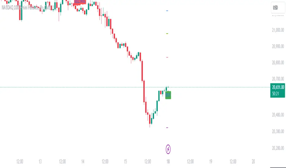
Daily Pivot Breakout Strategy IndicatorTagline:
A pivot-based breakout system that identifies confirmed daily breakouts with momentum and volume filters, with precise entry timing across all timeframes.
How It Works:
This indicator detects strict pivot high breakouts on daily data, filtered by Rate of Change (ROC ≥30%) and Relative Volume (RVOL >1). It displays both the breakout confirmation signal and the next-day entry signal directly on your chart, regardless of timeframe.
Visual Signals:
Orange Pivot Line: The most recent confirmed pivot high (within 250-day lookback)
Day-0 Label (Teal): Appears on the breakout confirmation day (when price closes above daily pivot with filters met)
Entry Banner (Green): Appears on the next trading day at market open - your actual entry point
Cross-Timeframe Consistency:
Daily Chart: View the big picture - Day-0 on breakout bar, Entry on next bar
Any Timeframe: Logic remains consistent to daily pivots and data, signals adapt to show at the correct time
Built-in Alert Conditions:
5PivotBreakout_Scan (Day-0): Fires when breakout is confirmed. Use this for after-hours scanning to build watchlists of confirmed breakouts
5PivotBreakout_Strategy (Next): Fires at market open the next day. Use this to automate entries on confirmed breakouts
Typical Workflow:
Set up Day-0 alerts on your watchlist to catch breakouts as they happen
Review confirmed breakouts each evening
Set up Entry alerts on selected tickers to automate next-day execution (fires at market open)
Optional: Convert to strategy() for backtesting with custom exits (20% trail is good)
Key Features:
Strict pivot detection: No ties allowed - center must be highest point
Momentum filter: 100-day ROC ensures trending strength
Volume confirmation: 20-day RVOL validates participation
No repainting: Uses lookahead_off for realistic, tradeable signals
Customizable Inputs:
Pivot strength parameters (left/right bars)
Pivot lookback period
ROC period and minimum threshold
RVOL period
Toggle visibility of pivot line and labels
Note: This indicator is for educational purposes only and does not constitute financial advice. Past performance does not guarantee future results. Always test thoroughly before live trading.
Pesquisar nos scripts por "daily"

Daily/Weekly Wick (Shadow) Range📈 Detailed Guide to the Daily/Weekly Wick (Shadow) Range Indicator
This indicator is a powerful visualization tool designed to map the key price levels established during the previous trading period (either the previous day or the previous week). Instead of just showing a single line for the high and low, it highlights the entire range of the upper and lower wicks (shadows), representing the "battleground" where buyers and sellers were most active.
How It Works
The Wick (Shadow) Range indicator fetches the Open, High, Low, and Close data from the last completed daily or weekly candle and projects those levels onto your current chart. This creates two distinct colored zones.
Upper Wick (Green Zone): This area spans from the Previous High down to the top of the Previous Candle's Body. It visually represents the territory where sellers successfully pushed the price down from its peak. This entire zone can be considered a resistance area.
Lower Wick (Red Zone): This area spans from the bottom of the Previous Candle's Body down to the Previous Low. It shows where buyers stepped in to defend a price level and push it back up. This entire zone can be considered a support area.
How to Use It in Your Trading
This indicator isn't meant to give direct buy or sell signals on its own. Instead, it provides crucial context about market structure. Here are several ways to incorporate it into your strategy:
1. Identifying Key Support & Resistance
This is the indicator's primary function. The most significant levels are:
Key Resistance: The top edge of the green zone (the previous period's high).
Key Support: The bottom edge of the red zone (the previous period's low).
Look for the current price to react when it approaches these boundaries. These are high-probability areas for price to pause or reverse.
2. Watching for Price Rejection (Reversal Trading)
The colored zones are perfect for spotting rejection signals.
Bearish Rejection 📉: If the current price enters the green zone but fails to stay there, closing back below it (often forming a new wick), it's a strong sign that sellers are still in control at that level. This can be an excellent entry signal for a short position.
Bullish Rejection 📈: If the current price dips into the red zone and is quickly bought back up, it shows that buyers are actively defending that area. This can be a great entry signal for a long position.
3. Confirming Breakouts (Trend Trading)
The zones also help validate breakouts.
Bullish Breakout: If the price pushes decisively through the entire green zone and closes above the previous high, it signals that the previous resistance has been broken and the trend may continue upward.
Bearish Breakdown: If the price falls decisively through the entire red zone and closes below the previous low, it confirms that support has failed and the price may continue downward.
4. Setting Context with Timeframes
Weekly Setting: Use the "Weekly" option to identify major, significant support and resistance levels that can influence the market for the entire week. These are powerful levels for swing trading.
Daily Setting: Use the "Daily" option for intraday trading. The previous day's high and low are critical pivot points that many day traders watch.
⚙️ Indicator Settings
The indicator has one simple setting, which you can access by clicking the gear icon ⚙️ next to its name on the chart.
Select Wick Timeframe: This dropdown menu allows you to switch the indicator's calculation between the Daily and Weekly timeframe instantly.

Daily Signal Alert**📄 English Description (English version)**
**Indicator Name:** Daily Signal Alert + Multi-Indicator Dashboard & Volume Profile
This all-in-one indicator combines multiple technical analysis tools into a single dashboard to help you read market movements easily and make better trading decisions.
It provides technical signals, key support/resistance levels, and a basic volume profile, along with a smart alert system.
**Included Indicators:**
1. **Exponential Moving Averages (EMA 9/20/50):**
* Shows current trend by comparing EMA9 & EMA20 with EMA50.
* Generates bullish and bearish crossover signals.
2. **MACD (12/26/9):**
* Generates bullish and bearish crossovers between MACD line and Signal line.
3. **Relative Strength Index (RSI 14):**
* Detects overbought (RSI > 70) and oversold (RSI < 30) conditions.
4. **Average Directional Index (ADX 14):**
* Measures trend strength and indicates if the trend is bullish or bearish.
5. **Candle Behavior (Squeeze):**
* Compares the current candle size with the previous one to detect momentum squeeze/expansion.
6. **Relative Volume (RVOL):**
* Shows if current volume is above or below average.
7. **Traditional Pivot Levels (Daily / Weekly / Monthly / Auto):**
* Displays key support and resistance levels.
8. **Approximate Volume Profile (POC / VAH / VAL):**
* Identifies Point of Control (POC) and Value Area range.
**Features:**
* Option to display all signals or only the latest one (removing old ones).
* Dashboard table summarizing indicator states with automatic coloring.
* Automatic alerts when any signal appears.
* Auto mode for pivot timeframe selection.
* Basic volume profile to highlight accumulation/distribution zones.
**How to Use:**
* Enable or disable “Show All Signals” depending on your trading style.
* Monitor the dashboard to quickly check indicator states.
* Use Pivot Levels & Volume Profile for key market zones.
* Enable alerts to get notified immediately after a candle closes.
**📄 Arabic Description (الوصف العربي)**
**اسم المؤشر:** Daily Signal Alert + Multi-Indicator Dashboard & Volume Profile
هذا المؤشر المتكامل يجمع بين عدة أدوات تحليل فني في لوحة واحدة، ليساعدك على قراءة حركة السوق بسهولة واتخاذ قرارات تداول أفضل.
المؤشر يعرض إشارات فنية، مستويات دعم ومقاومة، وجانب من تحليل حجم التداول، بالإضافة إلى نظام تنبيه ذكي.
**المؤشرات المدمجة:**
1. **المتوسطات المتحركة الأسية (EMA 9/20/50):**
* يعرض الاتجاه الحالي عبر مقارنة EMA9 و EMA20 مع EMA50.
* إشارات تقاطع صاعدة وهابطة.
2. **مؤشر الماكد (MACD 12/26/9):**
* يعطي إشارات تقاطع صاعدة وهابطة بين خط الماكد وخط الإشارة.
3. **مؤشر القوة النسبية (RSI 14):**
* يحدد حالات التشبع الشرائي (RSI > 70) والتشبع البيعي (RSI < 30).
4. **مؤشر الاتجاه المتوسط (ADX 14):**
* يقيس قوة الاتجاه مع تحديد إذا كان صاعداً أو هابطاً.
5. **سلوك الشموع (Squeeze):**
* يقارن حجم الشمعة الحالية مع السابقة لتحديد ضغط أو انفراج الحركة.
6. **حجم التداول النسبي (RVOL):**
* يحدد إذا كان حجم التداول أعلى أو أقل من المتوسط.
7. **مستويات Pivot التقليدية (Daily / Weekly / Monthly / Auto):**
* تعرض نقاط الدعم والمقاومة الرئيسية.
8. **بروفايل الحجم التقريبي (POC / VAH / VAL):**
* يحدد نقطة التحكم (POC) ومنطقة القيمة.
**المزايا:**
* عرض جميع الإشارات أو آخر إشارة فقط (مع حذف الإشارات القديمة).
* جدول ملخص لحالة كل مؤشر مع تلوين تلقائي.
* تنبيهات تلقائية عند ظهور أي إشارة فنية.
* دعم الوضع التلقائي لاختيار إطار مستويات الـ Pivot.
* عرض بروفايل حجم تداول تقريبي لمناطق التجميع/التوزيع.
**طريقة الاستخدام:**
* فعّل أو عطّل عرض جميع الإشارات حسب أسلوبك.
* راقب الجدول لمعرفة حالة المؤشرات لحظياً.
* استخدم مستويات الـ Pivot والبروفايل لتحديد مناطق الدعم والمقاومة.
* فعّل التنبيهات لتصلك الإشارات فور إغلاق الشمعة.

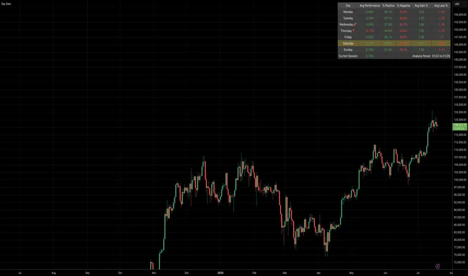
Daily Gain/Loss Statistics by Day of WeekDaily Gain/Loss Statistics by Day of Week
Overview
This Pine Script indicator analyzes historical price data to provide comprehensive day-of-week performance statistics, helping traders identify patterns and optimize their trading strategies based on which days historically perform better or worse.
Key Features
📊 Day-of-Week Analysis
7-day breakdown showing Monday through Sunday statistics
Average Gain % - Average percentage gains on winning days for each day of the week
Average Loss % - Average percentage losses on losing days (displayed with minus sign)
Median High % - Typical percentage move from open to daily high
Median Low % - Typical percentage move from open to daily low
🎯 Visual Performance Indicators
🚀 Rocket symbol - Marks the best performing day (highest average gains)
🔻 Red triangle down - Marks the worst performing day (lowest average gains)
Current day highlighting - Today's row highlighted in yellow (#ffdd444b)
⚡ Real-Time Session Tracking
Current Session row - Shows today's performance percentage in real-time
Color-coded gains/losses - Green for positive, red for negative
🎨 Professional Themes
⚙️ Customization Options
Date range selection - Choose specific time periods for analysis
Table positioning - 9 different screen positions
Table sizing - 6 size options from tiny to huge
Timeframe protection - Works only on 1D timeframe with user-friendly warnings
How It Works
Data Collection - Analyzes daily OHLC data within your selected date range
Day Classification - Categorizes each trading day by day of the week
Statistical Calculation - Computes averages and medians for each day type
Performance Ranking - Identifies best and worst performing days
Real-Time Display - Shows current session performance vs historical patterns
Trading Applications
Entry/Exit Timing - Identify optimal days for opening/closing positions
Risk Management - Avoid trading on historically poor-performing days
Strategy Optimization - Align trading strategies with day-of-week patterns
Market Timing - Understand weekly market cycles and seasonality
This indicator transforms raw price data into actionable intelligence, helping traders make more informed decisions based on proven historical day-of-week performance patterns.
Daily ADR TableDaily ADR Table Indicator
The Daily Average Daily Range (ADR) Table displays real-time volatility statistics directly on your chart. It shows both the current day's range and the historical average daily range as percentages of the current price, providing essential volatility metrics for trading decisions.
The indicator tracks today's range in real-time throughout the trading session using session-based calculations to ensure accuracy. It compares this against a customizable historical average (default 20 days, adjustable from 1-500 days) to help traders assess whether current volatility is above or below normal levels.
All values are displayed as percentages for easy comparison across different price levels and formatted to two decimal places for precision. The table position, text size, alignment, and colors are fully customizable with nine position options and professional default styling optimized for readability.
This indicator is valuable for day traders, swing traders, and market analysts who need to quickly assess current market volatility relative to historical norms. It assists in position sizing decisions, setting stop losses, and identifying potential breakout or consolidation scenarios based on range expansion or contraction.

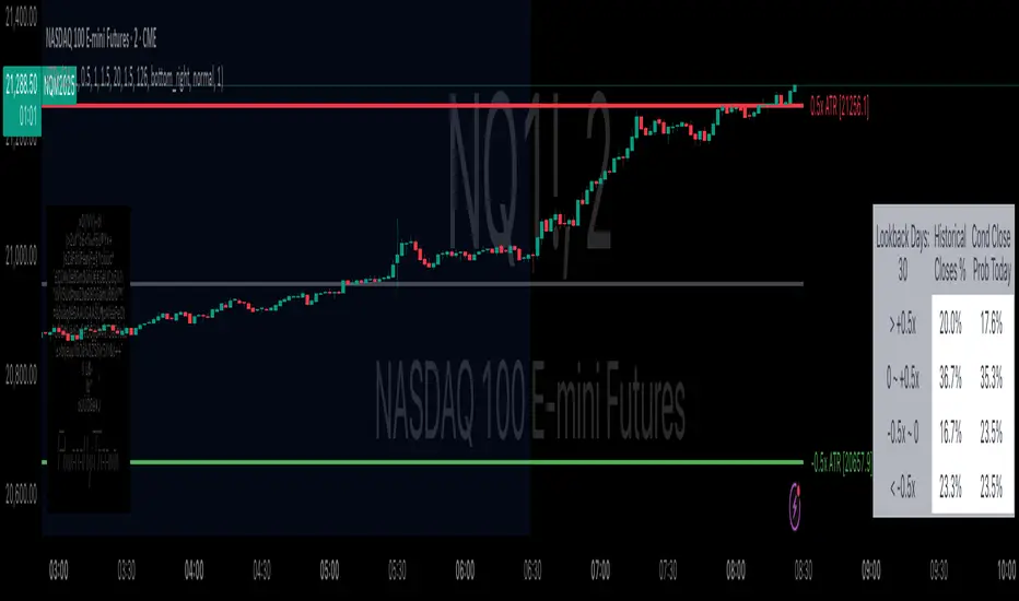
Daily ATR Bonanza: Expected Moves - Tr33man Daily ATR Bonanza: Expected Moves
Overview 🤷♂️
The Daily ATR Bonanza script is a powerful trading tool designed to help traders visualize and understand potential price movements using the Average True Range (ATR). It provides daily and weekly ATR levels, historical statistics, and conditional probability analysis to give traders actionable insights. The script also plots the daily Keltner channel. This script is ideal for traders who want to gauge volatility, identify key levels, and make data-driven decisions.
b]Key Features:
📈 1. Daily and Weekly ATR Levels
🔵ATR Levels: The script calculates and displays ATR-based levels for the day and week. These levels are derived from the previous day's or week's close price and are adjusted using customizable multipliers (0.5x, 1x, and 1.5x by default).
🔵You can choose the number of ATR levels (1, 2, or 3) and adjust the multipliers to suit your trading strategy.
🌐 2. ATR Bands (Keltner Channels)
🔵The script includes an option to display ATR Bands, which are volatility-based envelopes around a moving average. These bands help identify overbought and oversold conditions.
🔵You can adjust the ATR multiplier and the length of the moving average used for the bands.
🧮 3. Historical Statistics and Conditional Probability
🔵 Historical Analysis: The script analyzes historical price movements to calculate the likelihood of closing at certain ATR levels.
🔵 Conditional Probability: This feature shows the probability of the price reaching specific ATR levels given the current market conditions. The conditional matches historical data by an open in the same opening ATR bucket, as well as the current price bucket having been visited in the historical case. Conditional probabilities are just statistics, and do not predict anything.
Data Table: 📚
🔵 Historical Close Probability: The percentage of days the price closed within each ATR level.
🔵 Conditional Close Probability: The likelihood of the price closing within each ATR level today.
❓ What is Conditional Probability? ❓
Conditional probability is a statistical measure that calculates the likelihood of an event occurring given that another event has already occurred. In this script, it is used to determine the probability of the price reaching specific ATR levels based on the current opening range as well as current ATR distance from the previous close.
For example:
If the market opens near the lower end of the first ATR level, the script calculates the likelihood of the price reaching the upper end of the first, second, or third ATR level.
This analysis is based on historical data, making it a powerful tool for understanding potential price movements.
🌟 Understanding the Levels
🔵Daily Levels: These are based on the previous day's close price and ATR. They are updated at the start of each new day.
🔵Weekly Levels: These are based on the previous week's close price and ATR. They are updated at the start of each new week.
🔵ATR Bands: These are dynamic levels that adjust with market volatility.
🔬 Analyze the Statistics (Daily only for now, no weekly yet)
🔵Use the interactive table to understand historical probabilities and conditional probabilities.
🔵Focus on the current opening range and the likelihood of reaching specific levels.
🧠 Make Trading Decisions
🔵Use the ATR levels and bands to identify key support and resistance levels.
🔵Use the conditional probability table to gauge the likelihood of reaching specific targets.
🔵Adjust your strategy based on the historical performance of the market.
Example Use Cases
1. Day Trading
Use the daily ATR levels to set intraday targets and stop-loss levels.
Monitor the conditional probability table to adjust your expectations based on the opening range.
2. Swing Trading
Use the weekly ATR levels to identify longer-term support and resistance levels.
3. Scalping
Use the ATR bands to identify overbought and oversold conditions.
Use the conditional probability table to quickly assess the likelihood of price movements.
Daily Levels & Stats Pro - [Aspect] v4.0# Description of the "Daily Levels & Stats Pro - v4.0" Indicator
This indicator is a powerful tool for market analysis through the lens of key daily levels and statistical price movement indicators. It allows you to display important trading session opening levels, daily statistical movements, and high volatility zones on the price chart.
## Main Indicator Functions:
### Key Time Levels:
- **Daily Open (DO)** - daily trading session opening level at 02:00
- **NY Midnight (NYM)** - New York session opening level at 06:00
- **Trade Open (TO)** - active trading opening level at 10:00
### Analysis Zones:
- **Previous Close Zone (PCZ)** - previous day's closing zone (displayed on M5 timeframe)
- **Open Day Zone (ODZ)** - current day's opening zone (displayed on M5 timeframe)
### Statistical Price Movement Levels:
- **Min** - minimum statistical movement from DO
- **Max** - maximum statistical movement from DO
- **Aver** - average statistical movement from DO
- **Dev-** - lower deviation of movement from DO
- **Dev+** - upper deviation of movement from DO
### TO Impulse Movement Statistical Levels:
- **Aver TO** - average statistical movement from TO
- **Dev+ TO** - upper deviation of movement from TO
- **Max TO** - maximum statistical movement from TO
## Indicator Features:
- Complete customization of colors, styles, and line widths for all levels
- Ability to select time for each main level
- Adjustment of the number of bars for level display
- Automatic calculation of level values relative to DO and TO
- Visual display of TO-levels starts 3 bars before the actual TO point, providing better visual perception
- Ability to enable/disable individual levels and zones
- Automatic updates and resets when the day changes
- Adaptive text labels to mark levels
This indicator is excellent for traders who use statistical data and daily support/resistance levels in their trading strategy. It is particularly useful for DAX40 and other highly liquid instruments where daily trading statistics are important for making trading decisions.

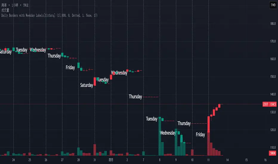
Daily Borders with Weekday Labels[fitfatq]Indicator Overview
This indicator displays daily vertical border lines and the previous day’s weekday label on intraday charts (i.e., charts with a timeframe lower than Daily). It draws a vertical line at the start of each new trading day and places a label displaying the previous day’s weekday (e.g., Monday) at the horizontal midpoint between the previous and the current day. Users can customize various visual aspects such as the separator line style and width, label style, text color, and text size. Additionally, the indicator offers an option to fix the label’s Y coordinate at a specified price level to prevent it from being overlapped by candlesticks.
Parameter Details
Use Fixed Weekday Label Y Coordinate
Type: Boolean
Default: false
Description: When enabled, the weekday label’s vertical position will be fixed at a specified price level (see next parameter). Otherwise, the label’s Y position is determined dynamically (typically based on the current bar’s low minus 3 ticks).
Fixed Weekday Label Y Coordinate (price)
Type: Float
Default: 130.0
Description:
This parameter sets the fixed price level at which the weekday label will be displayed if the "Use Fixed Weekday Label Y Coordinate" option is enabled. Please input a value that corresponds to your chart’s price scale (e.g., 130.50). Note: In charts with high price levels (for example, stocks trading at 3000 or above), it is recommended to set this value to 3000 or above. The higher the value, the closer the label will appear to the candlesticks.
Separator Line Style
Type: String (Options: "Solid", "Dotted", "Dashed")
Default: "Dotted"
Description: Specifies the style of the vertical separator line drawn at the start of each new day. "Solid" displays a continuous line, "Dotted" shows a dotted line, and "Dashed" provides a dashed line.
Separator Line Width
Type: Integer
Default: 1
Description: Determines the thickness of the separator line. A higher number results in a thicker line; the minimum value is 1.
Label Style
Type: String (Options: "None", "Label Up", "Label Down", "Label Left", "Label Right", "Label Center")
Default: "None"
Description: Sets the built-in style for the weekday label. "None" means no background or border (plain text only), while other options apply predefined visual effects.
Text Color
Type: Color
Default: Black
Description: Determines the text color of the weekday label.
Label Text Size
Type: String (Options: "Tiny", "Small", "Normal", "Large", "Huge")
Default: "Normal"
Description: Specifies the text size of the weekday label. Adjust according to preference to ensure the label is readable.
Usage Summary
How It Works:
The indicator detects the start of a new trading day using a change in the daily timeframe (via ta.change(time("D"))). When a new day begins, it draws a vertical separator line at the first bar of that day. If previous day data is available, the indicator calculates the horizontal midpoint between the start of the previous day and the current day and displays the previous day’s weekday label at that position. If the fixed Y coordinate option is enabled, the label is drawn at the specified price level; otherwise, it is positioned relative to the current bar’s low.
Customization:
Users can adjust all visual aspects, including the line style and width as well as the label style, text color, and text size. The fixed Y coordinate option allows the label’s vertical position to remain constant, which helps prevent overlapping with price bars.
Chart Requirement:
This indicator only operates on intraday charts (timeframes lower than Daily) and will not display on Daily or higher timeframe charts.
License
This indicator is released under the Mozilla Public License 2.0. Please credit the original author (fitfatq) when using or sharing this script.
Daily Volatility Range (DVR) [GIF]VIX as a Volatility Indicator:
The VIX is a measure of the market's expectation of volatility in the S&P 500 over the next 30 days, based on the prices of S&P 500 options.
The Rule of 16:
A VIX of 16 implies that the market expects the SPX to move up or down by roughly 1% on any given day.
If the VIX is 24, the expected daily move is around 1.5%, and with a VIX of 32, the expected move is around 2%.
The rationale for the rule is that the square root of the number of trading days in a year (approximately 252) is roughly 16.
Example:
If the VIX is at 20, the rule suggests that the SPX might see daily moves of around 1.25%.
Practical Application:
The rule of 16 can be used as a quick and easy way to estimate the potential daily volatility of the S&P 500 based on the VIX.
The Daily Volatility Range:
This indicator cross references the ticker on the chart with it's own volatility index (assuming it has one). Below are the indexes and stocks that have their own volatility index:
S&P 500
Nasdaq 100
Russell 2000
Dow Jones
TLT
Bitcoin
Gold
Crude Oil
Apple
Amazon
Google
IBM
Goldman Sachs
How I use the DVR:
Historic probabilities show that you will close the day within the DVR. However, there are times when those probabilities diminish greatly. One of those times is when you open in the RTH session outside of the DVR. If you open outside the DVR, you can look for the DVR to becomes support/resistance and stay extended outside the DVR. These days can often become muted as most of the most has happened before the market open. However, if we open outside the DVR and break back into range, it is highly probable that we will not break back into those extended ranges.
Indicator Options:
There are 2x and 3x DVR levels that can be plotted. During times of extreme volatility, it will become important to have these plotted.
There is the option to plot calculated pivot points. These are fib ranges that have historically been areas of consolidation or trend reversal. These are projections based on my own research and are not as important as the DVR levels themselves.
There is also an option to color the candles a specific color if the candle closes outside the DVR. This is to highlight the fact that price action has exceeded the range and caution should be taken.
If you have suggestions how to make this indicator better, please let me know in the comments and I will look into it. Thank you!

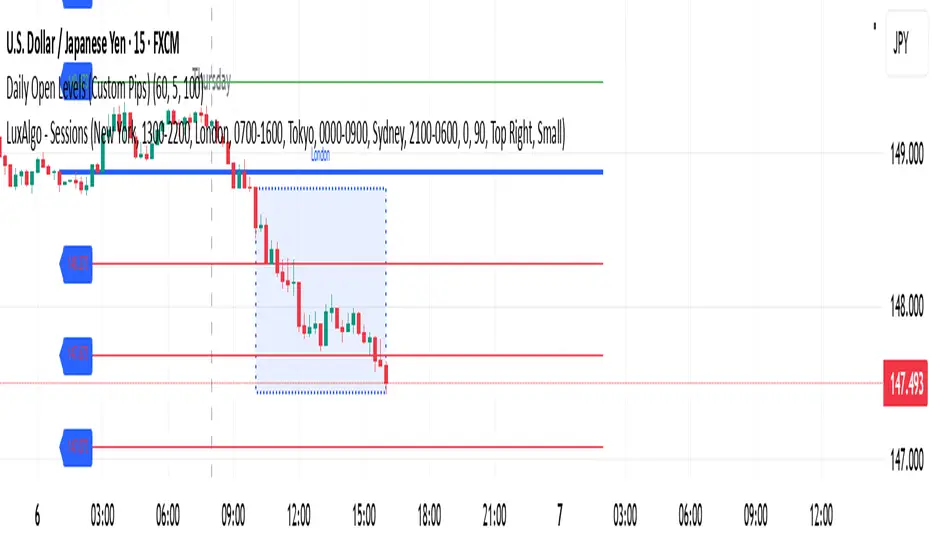
Daily Open Levels (Custom Pips)Daily Open Levels Indicator
Overview: The Daily Open Levels indicator is a simple but powerful tool designed for intraday traders who focus on the daily open price and pip-based levels for decision-making. This indicator helps you visualize key price levels based on the daily opening price, with configurable upper and lower levels calculated in pips. It is especially useful for tracking price movements relative to the previous day’s open and can help traders identify breakout zones, potential support/resistance, and key entry/exit points.
eatures:
Daily Open Price: The indicator automatically calculates and plots the daily open of the current trading day.
Upper and Lower Levels: Configurable upper and lower levels based on a user-defined pip interval. These levels can act as potential resistance or support zones.
Adjustable Pip Interval: You can customize the pip distance for the upper and lower levels to suit different trading styles and volatility.
Works for All Pairs: Option to automatically detect JPY pairs with a different pip value (0.1), or you can manually select your pair setting.
Color Customization: You can choose different colors for the daily open line, upper levels, and lower levels for easy visualization.
Immediate Visual Feedback: The indicator immediately draws the lines on the chart when added, without waiting for any market data.
How It Works:
The daily open price is retrieved from the current trading day, and horizontal lines are drawn at this price level, as well as at pip-based distances above and below it.
The pip distance is calculated using the Pip Interval setting and can be adjusted for any pair. For example, a 225-pip interval would create lines at 225 pips above and below the daily open.
The indicator dynamically updates every minute to reflect new daily opens and adjustments for each trading day.
Lines are drawn using the HLine (horizontal line) objects in MetaTrader 5, making them easy to spot and follow.
Parameters:
Pip Interval: Defines the pip distance for upper and lower levels (e.g., 225 pips). This affects how far above and below the daily open the levels are drawn.
Number of Levels: Sets how many upper and lower levels are drawn.
JPY Pairs: An option to adjust the pip value for JPY pairs (0.1 pip for JPY pairs vs. 0.01 pip for others).
Line Colors: Customize the colors for the daily open, upper levels, and lower levels.
Style & Width: Adjust the style (solid/dashed) and width of the lines to match your preferences.
Daily ProtractorDaily Protractor Indicator
Overview
The Daily Protractor is a visually intuitive tool designed for traders who want to analyze price action through angular measurements on a 5-minute chart. By overlaying a protractor on the chart, this indicator helps identify potential support, resistance, and trend directions based on angular relationships from the first 5-minute candle of each day. It’s particularly useful for intraday traders looking to incorporate geometric analysis into their strategies for spot or strike charts.
Key Features
Dynamic Protractor Overlay: Draws a protractor centered on the low of the first 5-minute candle of each day, with customizable radius in both bars (horizontal) and price units (vertical).
Angular Measurements: Displays angles in 5-degree increments, covering a full 360° circle or a 105° to -105° (91° to 269°) half-circle, depending on user preference.
Customizable Display:
Adjust the number of days to display protractors (up to 5 days).
Customize line colors for different angle ranges (0° to 180°, 180° to 360°, and 0° specifically).
Modify line thickness, label size, and label colors for better visibility.
Center Point Highlight: Marks the center of each protractor with a labeled point for easy reference.
Efficient Design:
Optimized with max_lines_count, max_labels_count, and max_bars_back to ensure smooth performance on TradingView.
How It Works
The indicator identifies the first 5-minute candle of each day and uses its low price as the center point for a protractor. It then draws lines at 5-degree intervals, radiating from the center, with each line representing an angle from 0° to 360°. Labels at the end of each line display the angle in degrees, with negative values shown for angles between 195° and 345° (e.g., 270° is displayed as -90°). The protractor’s radius can be adjusted in both time (bars) and price units, allowing traders to scale the tool to their chart’s characteristics.
Usage Instructions
Add to Chart:
Apply the indicator to a 5-minute chart of your chosen instrument (e.g., spot or strike charts).
Interpret the Protractor:
Use the angular lines to identify potential price levels or trend directions.
The 0° line (horizontal) can act as a reference for horizontal support/resistance.
Angles between 0° and 180° (upper half) and 180° and 360° (lower half) are color-coded for quick identification.
Customize Settings:
Toggle the Show 105° to -105° option to display a half-circle (91° to 269°) instead of a full 360° protractor.
Adjust the Radius in Bars and Radius in Price Units to scale the protractor to your chart.
Set the Maximum Days to Display to control how many daily protractors are shown.
Modify line thickness, colors, and label settings to suit your visual preferences.
Customization Options
Protractor Settings:
Show 105° to -105° (91° to 269°): Toggle between a full circle or a half-circle protractor.
Radius in Bars: Set the horizontal span of the protractor (default: 75 bars).
Radius in Price Units: Set the vertical span in price units (default: 1000.0).
Maximum Days to Display: Limit the number of protractors shown (default: 5 days).
Line Settings:
Line Thickness: Adjust the thickness of the protractor lines (1 or 2).
Line Color (0° to 180°): Color for the upper half (default: light blue).
Line Color (180° to 360°): Color for the lower half (default: light red).
Line Color (0°): Color for the 0° line (default: black).
Label Settings:
Label Size: Choose between small, normal, or large labels.
Label Color (0° to 180°): Color for labels in the upper half (default: red).
Label Color (180° to 360°): Color for labels in the lower half (default: green).
Notes
The indicator was designed with the help of Grok3 for use on 5-minute charts only, as it relies on the first 5-minute candle of the day to set the protractor’s center.
For best results, adjust the radius settings to match the volatility and price scale of your instrument. However, where the price is in single digits it is advised to switch off the labels or I would suggest not to use the same.
The protractor can be used alongside other technical tools to confirm trends, reversals, or key price levels.
Limitations: This cannot be used on instruments that trade for more than 75 candles with a timeframe of 5 minutes as the angles would not cover the entire trading window. I am working coming up with a script to address this limitation.
Feedback
I’d love to hear your thoughts! If you find the Daily Protractor helpful or have suggestions for improvements, please leave a comment or reach out. Happy trading!

Daily separator, Open, HTF candlesScript Overview
This TradingView script is designed to enhance market structure analysis by providing a clear visual representation of key trading elements. It integrates multiple technical features that help traders assess price action, trend direction, and potential trade setups efficiently.
Main Features & Functionality
1. Daily Separator
• A vertical line is plotted to clearly mark the start of each trading day.
• Helps traders visually differentiate daily sessions, making it easier to analyze price action over different periods.
2. Exponential Moving Average (EMA) with EMA Continuity Table
• The script calculates an EMA of choice and displays whether the price is above or below it across five customizable timeframes.
• Use Case:
• Identifies if the price is in a retracement or a trend continuation phase.
• Helps determine trend strength—if price is consistently above the EMA across multiple timeframes, the trend is bullish; if below, it’s bearish.
• Aids in making trading decisions such as whether to go long or short.
3. Higher Timeframe (HTF) Candles
• Plots candles from a higher timeframe (HTF) onto the current chart.
• Use Case:
• Provides a macro view of price action while trading on a lower timeframe.
• Helps traders see if the price is interacting with HTF support/resistance levels.
• Useful for confirming entries/exits based on the HTF trend.
4. Opening Line
• Draws a daily opening price level, allowing traders to track price movement relative to the open.
• Use Case:
• Useful for intraday traders who analyze whether price is holding above or below the daily open.
• Helps in identifying key price behaviors, such as breakouts, fakeouts, or potential reversals.
Additional Considerations
• Customization: The script allows traders to adjust key parameters such as the EMA length, timeframes for EMA continuity, and HTF candle settings.
• Market Structure & Decision Making: By combining EMAs, HTF analysis, and the daily open, the script assists traders in determining whether price action aligns with their trade thesis.
• Potential Enhancements:
• Adding alerts for EMA crossovers or when price crosses the daily open.
• Incorporating color coding for the EMA table to improve readability.
Use Case Summary
This script is particularly beneficial for trend-following traders, intraday traders, and swing traders who want to:
1. Confirm market direction with EMA-based trend analysis.
2. Monitor HTF price action while trading on lower timeframes.
3. Track intraday price movement relative to the daily open.
4. Differentiate trading sessions for better structure analysis.

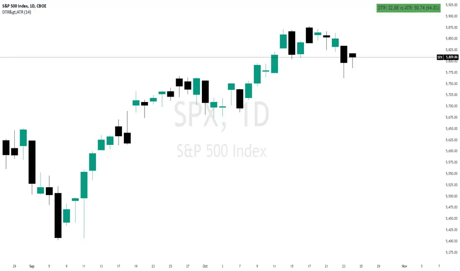
Daily True Range (DTR) vs Average True Range (ATR)Overview
The "DTR vs ATR with Color-Coded Percentage" indicator is a powerful volatility analysis tool designed for traders who want to understand daily price movements in the context of historical volatility. It calculates the Daily True Range (DTR)—the raw measure of a single day’s volatility—and compares it to the Average True Range (ATR), which smooths volatility over a user-defined period (default 14 days). The indicator presents this data in an intuitive table, featuring a color-coded percentage that visually represents how the current day’s move (DTR) stacks up against the average volatility (ATR). This helps traders quickly assess whether the current day’s price action is unusually volatile, average, or subdued relative to recent history.
Purpose
Volatility Comparison: Visualize how the current day’s price range (DTR) relates to the average range (ATR) over a specified period.
Decision Support: Identify days with exceptional movement (e.g., breakouts or reversals) versus normal or quiet days, aiding in trade entry/exit decisions.
Risk Management: Gauge daily volatility to adjust position sizing or stop-loss levels based on whether the market is exceeding or falling short of typical movement.
Features
Daily True Range (DTR) Calculation:
Computes the True Range for the current day as the greatest of:
Current day’s High - Low
High - Previous Close
Low - Previous Close
Aggregates data on any timeframe to ensure accurate daily values.
Average True Range (ATR):
Calculates the smoothed average of DTR over a customizable period (default 14 days) using Wilder’s smoothing method.
Updates in real-time as the day progresses.
Timeframe Flexibility: Works on any chart timeframe (e.g., 1-minute, 1-hour) while always calculating DTR and ATR based on daily data.
Color-Coded Display in either compact or table mode
The percentage value is color-coded in the table based on configurable thresholds:
Safe (default 75): Normal range, within typical volatility
Warning: (default 75-125): Above-average volatility.
Danger (default 125): Exceptionally high volatility
Daily Open @Alpha PipsOverview
The Daily Open @Alpha Pips indicator displays the daily opening price as a reference line on the chart. This level is widely used by traders to gauge market sentiment, potential support/resistance zones, and price reactions throughout the trading session.
How It Works
The line color is red with a 30% transparency level, ensuring visibility without overwhelming the chart.
The line width is set to 2 for clear visualization.
Use Cases
Identify potential intraday support/resistance at the daily open.
Observe price reactions around the daily open level to refine entries and exits.
Use in conjunction with price action, order flow, or smart money concepts for enhanced decision-making.
Additional Information
Works on any timeframe but is best suited for intraday trading strategies.
The script is fully transparent, ensuring traders can easily understand its function.
It does not repaint, providing reliable and stable levels throughout the session.

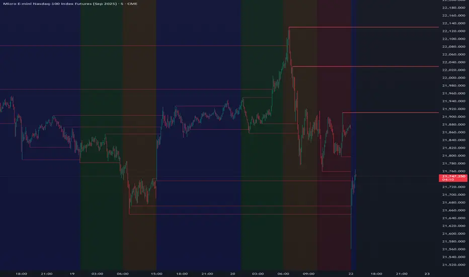
[Daily] CRT with OHLC Reference Here’s a breakdown of Daily CRT:
1. What is Daily CRT?
Daily CRT focuses on the price action of daily candles, treating them as ranges that can be broken or manipulated.
The theory suggests that certain candles on the daily chart form ranges that act as key levels for price expansion or reversal.
These ranges are not just simple support and resistance levels but are tied to the concept of liquidity draws, where price is likely to move towards areas where liquidity is concentrated (e.g., highs, lows, or key levels).
2. Key Components of Daily CRT
Ranging Candle: The first candle in the CRT setup establishes the range. This candle’s high and low become the key levels to watch.
Manipulation Candle: The second candle often manipulates the range by either breaking it or testing it. This is where turtle soup (false breakouts) can occur.
Distribution Candle: The third candle is where the price either confirms the breakout or reverses, leading to a potential expansion in the opposite direction.
3. How to Use Daily CRT
Identify the Range: On the daily chart, identify a candle that forms a clear range (high and low). This is your Ranging Candle.
Watch for Manipulation: The next candle (Manipulation Candle) will often test or break the range. If it breaks the range but then reverses back inside, it’s a turtle soup (false breakout), indicating a potential reversal.
Trade the Distribution: The third candle (Distribution Candle) is where you look for confirmation. If the price breaks the range and continues in the same direction, it’s a true breakout. If it reverses, it’s a false breakout, and you can trade the reversal.
4. Daily CRT and Key Levels
Daily CRT works best when combined with higher timeframe key levels (e.g., weekly or monthly highs/lows, order blocks, fair value gaps, etc.).
The daily candle ranges often align with these key levels, providing confluence for potential reversals or expansions.
5. Time Alignment in Daily CRT
Time is a critical factor in CRT. The PDF emphasizes that the highest probability CRT setups occur at specific times of the day or week.
For example, the purge (breakout or reversal) of a daily CRT often happens during key trading sessions (e.g., London open, New York open).
6. Practical Steps for Daily CRT
Determine the Draw on Liquidity: Use higher timeframe analysis (weekly or monthly) to identify where price is likely to move (e.g., towards a key level or liquidity pool).
Identify the Daily Range: On the daily chart, mark the high and low of the ranging candle.
Watch for Manipulation: Observe the next candle to see if it breaks the range or tests it. Look for signs of turtle soup (false breakouts).
Trade the Distribution: Once the third candle confirms the direction (either breakout or reversal), enter the trade with proper risk management.
7. Example of Daily CRT
Ranging Candle: On Monday, a daily candle forms a range between 1.1000 (low) and 1.1100 (high).
Manipulation Candle: On Tuesday, the price breaks below 1.1000 but then reverses back above it, forming a turtle soup (false breakout).
Distribution Candle: On Wednesday, the price confirms the reversal by breaking above 1.1100, signaling a potential bullish expansion.
8. Integration with Other Concepts
Daily CRT should not be used in isolation. It works best when combined with other ICT concepts like:
Market Profiles: Understanding whether the market is in a ranging, expansion, or reversal phase.
Orderflow: Identifying bullish or bearish orderflow to confirm the direction of the CRT.
Key Levels: Using higher timeframe key levels to add confluence to the CRT setup.
Time: Aligning the CRT with key times (e.g., London open, New York open) for higher probability setups.
9. Risk Management in Daily CRT
Always use proper risk management when trading CRT setups. The PDF suggests risking no more than 0.5% of your account per trade.
Use stop-losses and position sizing to protect your capital, especially since CRT setups can involve false breakouts (turtle soups).
10. Summary
Daily CRT is a powerful tool for identifying key levels and potential price expansions or reversals on the daily chart.
It involves analyzing three key candles: the Ranging Candle, the Manipulation Candle, and the Distribution Candle.
The theory is most effective when combined with higher timeframe key levels, market profiles, orderflow, and proper time alignment.
By mastering Daily CRT, you can improve your ability to predict market movements and frame high-probability trades.
Daily Weekly Monthly Highs & Lows - Alerts !
1. Purpose
The script helps traders:
• Visualize the high and low levels for the previous daily, weekly, and monthly periods.
• Receive alerts when the current price crosses these levels.
• Identify key support and resistance zones based on historical highs and lows.
2. Key Features
User Inputs
The script offers customization options through input parameters:
• Daily Levels:
• Enable/disable displaying daily levels (Show Daily Levels).
• Customize the color for daily level lines (Daily Line Color).
• Weekly Levels:
• Enable/disable displaying weekly levels (Show Weekly Levels).
• Customize the color for weekly level lines (Weekly Line Color).
• Monthly Levels:
• Enable/disable displaying monthly levels (Show Monthly Levels).
• Customize the color for monthly level lines (Monthly Line Color).
3. Core Functionality
Level Calculations
The script retrieves the previous daily, weekly, and monthly highs and lows using the request.security() function:
• Daily High/Low: Taken from the previous day’s high and low.
• Weekly High/Low: Taken from the previous week’s high and low.
• Monthly High/Low: Taken from the previous month’s high and low.
Price Crossing Detection
For each level (daily, weekly, monthly), the script checks if the current high or low price has crossed:
• The previous high (triggering a “High Reached” alert).
• The previous low (triggering a “Low Reached” alert).
4. Visual Features
The script plots lines to represent the previous highs and lows:
• Daily Levels:
• Dashed lines for the previous daily high and low.
• Configurable color (Daily Line Color).
• Weekly Levels:
• Dashed lines for the previous weekly high and low.
• Configurable color (Weekly Line Color).
• Monthly Levels:
• Dashed lines for the previous monthly high and low.
• Configurable color (Monthly Line Color).
These lines extend forward by one bar for better visibility on the chart.
5. Alert Features
The script provides alerts for when the price crosses these levels:
• Daily Alerts:
• “Daily High Reached” when the current price crosses the previous daily high.
• “Daily Low Reached” when the current price crosses the previous daily low.
• Weekly Alerts:
• “Weekly High Reached” when the current price crosses the previous weekly high.
• “Weekly Low Reached” when the current price crosses the previous weekly low.
• Monthly Alerts:
• “Monthly High Reached” when the current price crosses the previous monthly high.
• “Monthly Low Reached” when the current price crosses the previous monthly low.
6. Practical Use Case
This script is ideal for traders who:
• Use support and resistance levels from daily, weekly, and monthly timeframes as part of their strategy.
• Want to monitor price interactions with these levels in real-time.
• Need automatic alerts for key price movements without continuously monitoring the chart.
7. Limitations
• Max Line Count: TradingView limits the number of lines that can be drawn on the chart to max_lines_count = 500.
• No Historical Levels: The script only tracks the most recent daily, weekly, and monthly levels and does not display historical levels.
DAILY ATR LEVELS AND EXPECTED MOVE LEVELSThis Pine Script code is designed to visualize ATR (Average True Range) levels and expected move levels on a chart. It provides useful inputs for customizing how these levels are displayed, such as line width, style, and color. The script is divided into several sections, each focused on a different feature:
1. User Inputs for Customization:
- Line Width and Style: Users can customize the line width, style (solid, dotted, or dashed), and color for various levels.
- Offset for Line Placement: The rightOffset input controls how far in the future the lines extend (measured in minutes).
- Show Labels: Labels can be toggled on/off for ATR levels and expected move lines, with customizable text colors.
2. ATR Levels and ATR Settings:
- The ATR length (atrLength) and the multiplier (atrMultiplier) control the calculation of ATR levels.
- The script plots ATR levels based on the daily open price, including key levels like ATR +25%, ATR +50%, etc., for both positive and negative movements.
- Line Drawing: The script dynamically creates lines for each ATR level, and the lines are customized according to the user's inputs. For each level, the line.new function is used to plot a line from the start of the day (daily open) to a point offset in the future.
- Labels: Labels are added near each ATR level to make them more identifiable, such as "ATR +25%" or "Daily Open."
3. Expected Move Calculation and Logic:
- The script calculates the expected move for the next trading session based on the previous close price and the volatility derived from the VIX (Volatility Index).
- The expected move is calculated as a percentage of the previous close and is added and subtracted from the previous close price to generate upper and lower levels.
- Volatility Adjustment: The VIX value is adjusted by the square root of 252 (the number of average trading days in a year) to calculate the daily volatility.
- Upper and Lower Lines: Lines are drawn for the expected move's upper and lower bounds, showing the potential price movement based on volatility.
4. Customizable Expected Move Lines:
- Line Style and Color: The upper and lower expected move lines can be customized in terms of width, style, and color, as specified by the user.
- Labels for Expected Move Levels: Labels are added for the upper and lower expected move lines, such as "Expected Move Upper" and "Expected Move Lower."
5. Logic for Drawing Lines:
- The script continuously evaluates whether the levels should be displayed based on the user's preferences.
- If showATRLevels or showLineEM is enabled, the script will draw the respective lines and labels on the chart.
- It uses line.new to draw the lines and label.new to position the labels at the correct levels on the chart.
6. Handling Time and Line Deletion:
- The script handles the dynamic nature of the chart by deleting previous lines (using line.delete) to avoid cluttering the chart with outdated lines.
- The time for the lines is set dynamically using the startTime and endTime variables, ensuring that lines are drawn within the correct timeframe.
Summary of Key Features:
- ATR Levels: Plots key levels of ATR, such as daily open, ATR +25%, ATR -25%, etc., with customizable colors and line styles.
- Expected Move Levels: Calculates and plots the upper and lower bounds of the expected move based on the VIX and previous close price.
- Customization Options: Users can control the appearance (line width, style, color) and whether to show labels for the ATR and expected move levels.
- Dynamic Updates: The lines and labels update dynamically throughout the trading day, adjusting based on market conditions.
Overall, this script is designed to help traders visualize volatility and potential price movement on a daily chart by providing ATR-based levels and expected move projections. It offers a high degree of customization to suit different charting preferences.

DAILY ATR LEVELSThis script is a custom technical indicator for use in TradingView, designed to display daily Average True Range (ATR) levels on the chart, along with the daily opening price. It provides a customizable way to track price levels relative to the daily ATR, which can be useful for traders looking for volatility-based price targets or ranges.
///////////////////////////////////////////////////////////////////////////////////////////////////////////////////////////////////////////////////////
Customization Options:
- Line Width: Determines the thickness of the plotted lines for the ATR levels and daily open line, ranging from 1 to 10.
- Right Offset (minutes): A time offset (in minutes) that shifts the end of the daily opening price line to the right for visual clarity.
- Line Style: The user can choose between solid, dashed, or dotted lines for all the plotted levels.
- Display Options: Users can toggle the visibility of the daily opening price line (showDayLevel), labels (showLabels), and ATR levels (showATRLevels).
- Colors: Customizable colors for the daily opening price line (dayLevelColor), labels (labelTextColor), and the ATR levels for both positive and negative values (atrLevelPlusColor and atrLevelMinusColor).
ATR Settings:
- ATR Length: Defines the number of periods (bars) to use when calculating the ATR. The default is 180, which corresponds to the ATR calculated on the daily chart using the last 180 bars.
- ATR Multiplier: Allows the user to scale the ATR levels by a multiplier (from 0.1 to 5.0), adjusting the sensitivity of the levels.
- ATR Levels: Users can toggle visibility for several predefined ATR levels, such as +25%, +50%, +75%, +100%, -25%, -50%, -75%, and -100%. These levels represent price points above or below the daily open based on the ATR.
///////////////////////////////////////////////////////////////////////////////////////////////////////////////////////////////////////////////////////
ATR Levels Calculation:
- The ATR is calculated based on the daily chart using the ta.atr() function with the specified ATR length, default is set at 180.
- The script computes multiple ATR levels above and below the daily open price, adjusting each level by 25%, 50%, 75%, and 100% of the ATR value (scaled by the ATR multiplier).
ATR Level Plotting:
- For each ATR level (positive and negative), a line is drawn across the chart at the corresponding price level.
- The color, line style, and width of these lines can be customized.
- Each ATR level also has an optional label showing the percentage level (e.g., "ATR +25%") at the specified price, which is positioned at the end of the line.
- The labels are removed from the previous bars to avoid clutter.
Workflow:
- The script first calculates the daily opening price using the request.security() function to pull the open price from the daily chart.
- It then calculates the ATR based on the selected length and multiplier.
- The start time for the daily open line is determined by the bar's timestamp at the start of the day, and the end time is adjusted using the user-defined right offset.
- After determining the relevant price levels (for the opening price and ATR levels), the script plots these levels on the chart as lines. It handles the drawing and deletion of lines to ensure that the chart remains updated in real time.
- If labels are enabled, text labels are displayed next to the ATR levels and the daily open line, providing clear markers for the user.
Practical Use:
- Volatility Analysis: This indicator is useful for identifying key price levels based on daily volatility (ATR). Traders can use it to set potential targets or support/resistance levels that are adjusted for volatility.
- Day Trading or Swing Trading: The daily opening price line helps traders quickly see where the price opened for the day, and the ATR levels give a dynamic range for the day's potential price movement.
Overall, this script is designed to provide a clear, customizable view of daily price levels in relation to the ATR, helping traders make informed decisions based on volatility and price action.

Daily High/Low Levels with mitigationThis Pine Script script defines a TradingView indicator named "Daily High/Low Levels" designed to track and display the daily high and low levels of a trading session, with added functionality for marking levels as mitigated when certain conditions are met. Here's a breakdown of its functionality:
Key Features
Session Start Time: The script allows you to specify a custom session start time in 24-hour format. This ensures the levels align with your trading session preferences.
Daily Highs and Lows:
Tracks the high and low levels for each session.
Retains the highs and lows for a configurable number of previous days.
Visualization:
Creates horizontal lines for each session's high and low levels.
Supports customization of line colors and styles.
Mitigation Tracking:
Monitors whether a high or low level has been "mitigated" (touched or exceeded by subsequent price action).
Changes the line style and color to indicate mitigation.
Provides an alert when mitigation occurs.
Configurable Extensions:
Lines can be extended beyond mitigation or stopped at the bar index where mitigation occurs, depending on user preference.
Efficient Array Management:
Uses arrays to manage daily highs, lows, their respective indices, and lines.
Ensures the size of stored data does not exceed the configured limit (daysToTrack).
Alerts:
Sends alerts when high or low levels are mitigated, which can be used for trading decisions.
Inputs
Session Start Hour/Minute: Defines when a new session starts.
Days to Track: Sets the number of previous days to display high/low levels.
Colors: Allows customization of line colors for unmitigated and mitigated levels.
Extend Lines: Toggles whether lines should extend past the mitigation point.
Code Highlights
New Session Detection: The script detects the start of a new session based on the configured session start time and resets daily highs/lows.
Line Management: Horizontal rays are created for highs and lows, and mitigated lines are updated with a dashed style and faded color.
Mitigation Logic: The script checks whether current price action exceeds stored high or low levels and updates their status and appearance accordingly.
Memory Management: Ensures the size of the arrays (highs, lows, lines) does not exceed the configured daysToTrack, deleting the oldest elements as necessary.
This indicator is highly customizable and useful for traders who want to track and analyze daily support and resistance levels, incorporating mitigation as a dynamic feature.
Daily MAs on Intraday ChartsThis is a very simple, yet powerful indicator, for intraday and swing traders.
The indicator plots price levels of key daily moving averages as horizontal lines onto intraday charts.
The key daily moving averages being:
5-day EMA
10-day EMA
21-day EMA
50-day SMA
100-day SMA
200-day SMA
The moving averages above can be toggled on and off to the users liking and different colours selected to show the locations of daily moving average price levels on intraday charts.
Below is a chart of the SPY on the 30-minute timeframe. The black line represents the price level of the SPY's 10-day EMA, and the blue line represents the price level of the SPY's 21-day EMA.
Key daily moving averages like those mentioned above can be areas of support or resistance for major indexes, ETFs, and individual stocks. Therefore, when using multiple timeframe analysis combining daily charts and intraday charts, it's useful to be aware of these key daily moving average levels for potential reversals.
This indicator clearly shows where the key daily moving average price levels are on intraday charts for the chosen ticker symbol, thus helping traders to identify potential points of interest for trading ideas - i.e., going long or pullbacks into key daily moving averages, or short on rallies into key daily moving averages subject to the trader's thoughts at the time.
By using the 'Daily MAs on Intraday Charts' the trader can now have a multi-chart layout and be easily aware of key price levels from daily moving averages when looking at various intraday timeframe charts such as the 1-minute, 5-minute, 15-minute, 30-minute, 1-hour etc. This can be essential information for opening long and short trading ideas.

Daily Manipulation and Distribution Levels with Buy/Sell SignalsIndicator Summary:
This indicator is designed for intraday traders, highlighting key price levels and providing simple buy/sell signals based on price manipulation and distribution concepts.
Key Features:
Core Levels:
Manipulation Plus/Minus: Derived from the daily open and a portion of the daily range (e.g., 25%).
Distribution Levels: Daily high and low serve as ultimate targets or resistance/support levels.
Buy and Sell Signals:
Buy Signal: Triggered when the price crosses above the Manipulation Plus level. A green "BUY" label marks the entry.
Sell Signal: Triggered when the price crosses below the Manipulation Minus level. A red "SELL" label marks the entry.
Clean Chart Design:
Hides unnecessary clutter, showing only relevant key levels and labeled signals for clarity.
How to Use:
Entry Points:
Buy Entry: When a green "BUY" label appears after the price breaks above the Manipulation Plus level.
Sell Entry: When a red "SELL" label appears after the price breaks below the Manipulation Minus level.
Exit Strategy:
Take Profit: Use the Distribution Levels (daily high/low) as take-profit zones.
Stop Loss: Set just above/below the Manipulation Levels to manage risk effectively.
One to Two Trades per Session: Focus on high-probability moves to ensure clarity and reduce overtrading.
Who It’s For:
This indicator is ideal for traders seeking a structured and visual approach to intraday trading, with clear entry/exit criteria based on price manipulation and distribution theory. It simplifies decision-making and ensures clean chart setups without overwhelming visuals.
Daily BreadWhat it does:
This script uses specific multiple true ranges from a 30 EMA baseline to plot lines that represent 10% buying increments. Although the common period for ATR is 14, this script employs a period of 20 for smoothing that I have determined is more effective when used with a daily candle chart. It includes onscreen trend signals to identify an uptrend or downtrend when the 50 EMA crosses the 90 EMA and will also display a coloured directional signal at each candle beyond an EMA cross to identify the current trend.
The script plots a scale of percentage labels at the end of each line to identify the percent of an account intended to be in short or longer term trades.
How it does it:
The script uses a 30 EMA baseline and then multiplies ATR increments of +1, +2, +4 and -1 through -7. These ATR multiples and the EMA are plotted as 11 lines, 10 of which make up the range of 10% increments from 10% to 100% with the 11th line being the High Band representing the extreme high or expected sale of any holdings. The percentage label scale uses variable declarations to position and colour match a percentage label to each line.
Intended use:
It is intended to be used for short term trading or long term investing with a daily market index chart such as SPY and multiple exchange traded funds that track said market index. A different ETF is purchased when a daily SPY candle reaches a lower buy band using 10% of a total account value. The sale of any ETFs is at the discretion of the trader and dependent on investment strategy (short term trading or long term inventing) and the trend. When short term trading in a downtrend or when daily candles are below the 50 EMA, selling would be done every 2 to 3 bands above a buy to mitigate the risk of a significant portion of an account getting caught in a downtrend. In an uptrend the High Band would be used to sell any holdings.

Daily Range Position Sizer// ENGLISH, GERMAN BELOW
Daily Range Position Sizer
A versatile indicator that helps traders calculate position sizes based on daily high/low levels with flexible session handling.
Features:
- Displays daily high and low levels with broken line style for clear visibility
- Calculates position sizes for both long and short setups based on your defined risk amount
- Flexible session dealing with optional pre-market inclusion
- Real-time position size updates based on current price
- Clearly visible info box showing position sizes
Settings:
- Risk Amount ($): Define your desired risk amount in dollars
- Include Pre-market: Toggle between regular session only (9:30-16:00 ET) or full day including pre-market
- X-Offset: Adjust the horizontal position of the info box
Usage:
1. Set your desired risk amount
2. Choose whether to include pre-market data
3. Monitor daily ranges and corresponding position sizes
4. Use the automatically calculated position sizes for your trades
Note: This indicator is for educational and informational purposes only. Always verify calculations and manage your risk appropriately.
Contributions and feedback are welcome!
// GERMAN
Tageshoch/-Tief & Positionsgröße
Ein vielseitiger Indikator, der Tradern bei der Berechnung von Positionsgrößen auf der Basis von Tageshochs und -tiefs hilft und eine flexible Handhabung der Sitzungen ermöglicht.
Eigenschaften:
- Zeigt tägliche Höchst- und Tiefststände mit gestrichelten Linien für eine klare Sichtbarkeit an
- Berechnet Positionsgrößen für Long- und Short-Setups auf der Grundlage des von Ihnen definierten Risikobetrags
- Flexibles Session-Handling mit optionaler Einbeziehung des vorbörslichen Handels
- Aktualisierung der Positionsgröße in Echtzeit auf Basis des aktuellen Kurses
- Deutlich sichtbare Infobox mit Positionsgrößen
Einstellungen:
- Risikobetrag ($): Definieren Sie Ihren gewünschten Risikobetrag in Dollar
- Vorbörslich einbeziehen: Schalten Sie um zwischen nur regulärer Sitzung (9:30-16:00 ET) oder ganztägig einschließlich Vormarkt
- X-Absatz: Passen Sie die horizontale Position der Infobox an
Verwendung:
1. Legen Sie den gewünschten Risikobetrag fest
2. Wählen Sie, ob vorbörsliche Daten einbezogen werden sollen
3. Überwachen Sie die täglichen Bandbreiten und die entsprechenden Positionsgrößen
4. Verwenden Sie die automatisch berechneten Positionsgrößen für Ihre Trades
Hinweis: Dieser Indikator ist nur für Lehr- und Informationszwecke gedacht. Überprüfen Sie stets die Berechnungen und steuern Sie Ihr Risiko angemessen.
Beiträge und Feedback sind willkommen!
