Daily OpenUses provided unix time functions to print daily open (0000 UTC) lines and optionally an additional extension to it from the previous day.
Pesquisar nos scripts por "daily"
Daily Weekly Monthly Yearly OpensThis script plots the current daily, weekly and monthly opens (all enabled by default).
Here are some additional info about the drawing behavior:
Daily open is shown only on intraday timeframes
Weekly open is shown only on timeframes < weekly
Monthly open is shown only on timeframes < monthly
Daily Support/Resistance with Auto Divergence ScannerThis Script Displays the Daily High and Low. This is to be used on lower Timeframes.
Also includes Auto Divergence Scanner

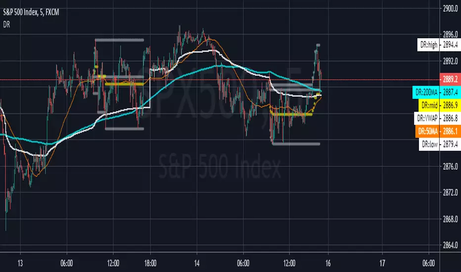
Daily Range -af v1.0Plots horizontal lines on the current daily open, high, low, midpoint; valid during regular trading hours only 9 am to 4:30 pm EST Monday - Friday.
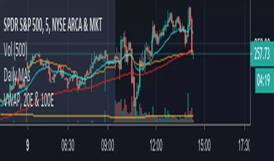
Daily MAs & LevelsThis script includes the 200 (green), 100 (purple) and 50 (yellow) SMAs and the 20 EMA (blue) from the daily calculated from the close. It is coded so the studies change at midnight ET on the charts to the next day's value.
The script also include the 252 day high ( bright green dashed) and low ( bright red dashed).

Daily Moving Averages OscillatorThis is the best way I've found so far for gauging directional bias (i.e. overall trend) at-a-glance. It shows current price in black along with the 20, 50 & 100 daily MAs, all of which are visible at all times, and from all timeframes. No wondering where the 100MA is cause it's now showing on the chart. I also find this good for keeping my charts visually cleaner. Having the undulating lines moved underneath makes it easier for me to see support/resistance and other imporant stuff,
The trend is your friend and this helps to make sure you're on the right side of a trade.
Daily Moving Averages(10,20,50,200)This is a simple script displaying the common daily moving averages I use:
the 10dma, 50dma, 200dma, and an optional 20dma.

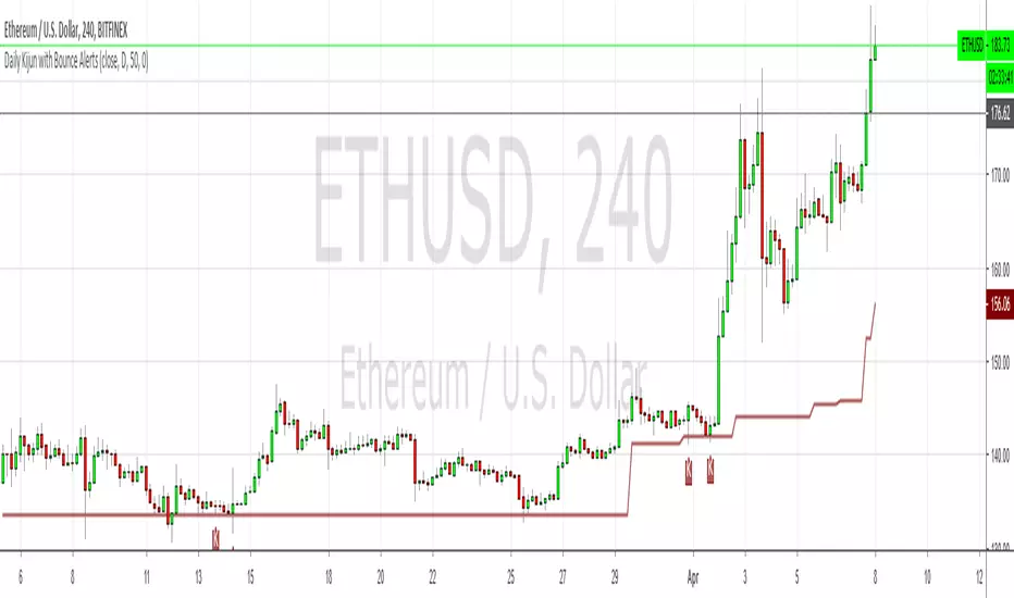
Daily Kijun with Bounce AlertsShows the daily Kijun on all timeframes using a period of 50, which makes it into a dynamic 50% fib of sorts, especially when it's flat. Also shows Kijun bounces labeled with Ks, and allows you to set alerts for bullish, bearish or bi-directional bounces.
It doesn't show any of the other Ichimoku components.
Pivot Points Daily - bitcoin by Simon-RoseDaily Version:
I have written 3 Indicators because i couldn't find what i was looking for in the library, so you can turn each one on and off individually for better visibility.
This are Daily, Weekly and Monthly Pivot Points with their Resistance and Support Points
and also on the Daily with the range between them.
I will also publish some Ideas to show you how to use them if you are not familiar with the traditional pivot points strategy already.
Unlike the usually 3 support & resistances i added 4 of them, specifically for trading bitcoin (on traditional markets this level of volatility usually never gets touched)
Here you can see which lines are what for reference, as the Feature to label lines is missing in Pinescript (if you have a workaround pls tell me ;) )
This is the basic calculation used :
PP = (xHigh+xLow+xClose) / 3
R1 = vPP+(vPP-Low)
R2 = vPP + (High - Low)
R3 = xHigh + 2 * (vPP - Low)
R4 = xHigh + 3 * (vPP - Low)
S1 = vPP-(High - vPP)
S2 = vPP - (High - Low)
S3 = xLow - 2 * (High - PP)
S4 = xLow - 3 * (High - PP)
If you have any questions or suggestions pls write me :)
Happy trading
Cheers
Weekly Version:
Monthly Version:

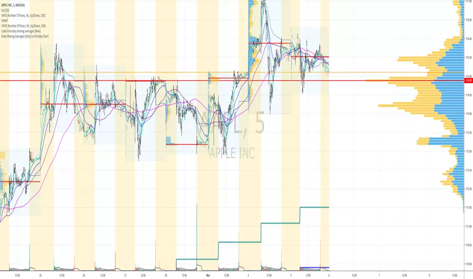
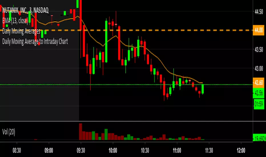
Daily Moving Averages (EMAs + SMAs) to Intraday Chart200 SMA, 100 SMA, 50 EMA, and 20 EMA daily averages to intraday chart
Daily, Monthly & Weekly Clouds (use on day chart)This indicator offers Ichimoku clouds for periods 1, 7, and 30. When used on the DAILY chart these correspond to the D, W & M time frames respectively.
The indicator just has the clouds right now because that's all I use. It doesn't have tenken, kijun or anything right now.


Daily Close MarkersAs the name suggests, marks the daily close on your chart. The chart you are viewing should of course be of a lower time frame. You can change it from daily (D) to any other time frames e.g. weekly (W) or 4H (240). Orange diamond appears instead of arrow if there is absolutely no change (Open == Close).

Daily Moving Averages - 20EMA, 100SMA and 200SMAThis prints the daily 20EMA, 100SMA and 200SMA onto any time frame you want.
Daily Simplistic Moving Average Strategy 10/22Indicates crossing over or under of the 10 and 22 SMA
Best used on the daily chart for crypto assets such as BTC & ETH
Daily OHLPlots the daily open high low for any chart on any market.
Work very well for all crypto exchanges.
When using for Traditional markets, please use data from Forex.com due to various exchanges running on different time zones.

Daily Moving Average to Intraday ChartThis is going to include the 20EMA, 100SMA and 200SMA automatically into your intraday charts.

Daily Triple Moving AveragesDisplays triple moving average (SMA calculation method) intended for use daily time frames. Equivalent to 7,30, & 50 on weekly time frame.
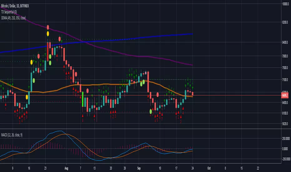
Orange = 49
Purple = 210
Blue = 350