Composite Trend Oscillator [ChartPrime]CODE DUELLO:
Have you ever stopped to wonder what the underlying filters contained within complex algorithms are actually providing for you? Wouldn't it be nice to actually visually inspect for that? Those would require some kind of wild west styled quick draw duel or some comparison method as a proper 'code duello'. Then it can be determined which filter can 'draw' the quickest from it's computational holster with the least amount of lag and smoothness.
In Pine we can do so, discovering how beneficial that would be. This can be accomplished by quickly switching from one filter to another by input() back and forth, requiring visual memory. A better way could be done by placing two indicators added to the chart and then eventually placed into one indicator pane on top of each other.
By adding a filter() helper function that calls other moving average functions chosen for comparison, it can put to the test which moving average is the best drawing filter suited to our expected needs. PhiSmoother was formerly debuted and now it is utilized in a more complex environment in a multitude of ways along side other commonly utilized filters. Now, you the reader, get to judge for yourself...
FILTER VERSATILITY:
Having the capability to adjust between various smoothing methods such as PhiSmoother, TEMA, DEMA, WMA, EMA, and SMA on historical market data within the code provides an advantage. Each of these filter methods offers distinct advantages and hinderances. PhiSmoother stands out often by having superb noise rejection, while also being able to manipulate the fine-tuning of the phase or lag of the indicator, enhancing responsiveness to price movements.
The following are more well-known classic filters. TEMA (Triple Exponential Moving Average) and DEMA (Double Exponential Moving Average) offer reduced transient response times to price changes fluctuations. WMA (Weighted Moving Average) assigns more weight to recent data points, making it particularly useful for reduced lag. EMA (Exponential Moving Average) strikes a balance between responsiveness and computational efficiency, making it a popular choice. SMA (Simple Moving Average) provides a straightforward calculation based on the arithmetic mean of the data. VWMA and RMA have both been excluded for varying reasons, both being unworthy of having explanation here.
By allowing for adjustment refinements between these filter methods, traders may garner the flexibility to adapt their analysis to different market dynamics, optimizing their algorithms for improved decision-making and performance on demand.
INDICATOR INTRODUCTION:
ChartPrime's Composite Trend Oscillator operates as an oscillator based on the concept of a moving average ribbon. It utilizes up to 32 filters with progressively longer periods to assess trend direction and strength. Embedded within this indicator is an alternative view that utilizes the separation of the ribbon filaments to assess volatility. Both versions are excellent candidates for trend and momentum, both offering visualization of polarity, directional coloring, and filter crossings. Anyone who has former experience using RSI or stochastics may have ease of understanding applying this to their chart.
COMPOSITE CLUSTER MODES EXPLAINED:
In Trend Strength mode, the oscillator behavior signifies market direction and movement strength. When the oscillator is rising and above zero, the market is within a bullish phase, and visa versa. If the signal filter crosses the composite trend, this indicates a potential dynamic shift signaling a possible reversal. When the oscillator is teetering on its extremities, the market is more inclined to reverse later.
With Volatility mode, the oscillator undergoes a transformation, displaying an unbounded oscillator driven by market volatility. While it still employs the same scoring mechanism, it is now scaled according to the strength of the market move. This can aid with identification of ranging scenarios. However, one side effect is that the oscillator no longer has minimum or maximum boundaries. This can still be advantageous when considering divergences.
NOTEWORTHY SETTINGS FEATURES:
The following input settings described offer comprehensive control over the indicator's behavior and visualization.
Common Controls:
Price Source Selection - The indicator offers flexibility in choosing the price source for analysis. Traders can select from multiple options.
Composite Cluster Mode - Choose between "Trend Strength" and "Volatility" modes, providing insights into trend directionality or volatility weighting.
Cluster Filter and Length - Selects a filter for the cluster composition. This includes a length parameter adjustment.
Cluster Options:
Cluster Dispersion - Users can adjust the separation between moving averages in the cluster, influencing the sensitivity of the analysis.
Cluster Trimming - By modifying upper and lower trim parameters, traders can adjust the sensitivity of the moving averages within the cluster, enhancing its adaptability.
PostSmooth Filter and Length - Choose a filter to refine the composite cluster's post-smoothing with a length parameter adjustment.
Signal Filter and Length - Users can select a filter for the lagging signal plot, also having a length parameter adjustment.
Transition Easing - Sensitivity adjustment to influence the transition between bullish and bearish colors.
Enjoy
Pesquisar nos scripts por "chart"

Monte Carlo Future Moves [ChartPrime]ORIGINS AND HISTORICAL BACKGROUND:
Prior to the the advent of the Monte Carlo method, examining well-understood deterministic problems via simulation generally utilized statistical sampling to gauge uncertainty estimations. The Monte Carlo (MC) approach inverts this paradigm by modeling with probabilistic metaheuristics to address deterministic problems. Addressing Buffon's needle problem, an early form of the Monte Carlo method estimated π (3.14159) by dropping needles on a floor. Later, the modern MC inception primarily began when Stanislaw Ulam was playing solitaire games while experiencing illness and recovery.
Ulam further developed, applied, and ascribed "Monte Carlo" as a classified code name to maintain a level of secrecy for the modern method applications during collaborative investigations on neutron diffusion and collision intricacies with John von Neumann. Despite having relevant data, physicist's conventional deterministic mathematical methods were unable to solve mysterious "neutronion problems". Monte Carlo filled in the gaps necessary to resolve this perplexing neutron problem with innovative statistics, and the resilient MC continues onward to have diverse application in many fields of science. MC also extends into the realm of relevance within finance.
APPLICATION IN FINANCE:
Building on its historical roots, the Monte Carlo method's transition into finance opened new avenues for risk assessment and predictive analysis. In financial markets, characterized by uncertainty and complex variables, this method offers a powerful tool for simulating a wide range of scenarios and assessing probabilities of different outcomes. By employing probabilistic models to predict price movements, the Monte Carlo method helps in creating more resilient and informed trading strategies. This approach is particularly valuable in options pricing, portfolio management, and risk assessment, where understanding the range of potential outcomes is crucial for making sound investment decisions. Our indicator utilizes this methodology, blending traditional financial analysis with advanced statistical techniques.
THE INDICATOR:
The Monte Carlo Future Moves (ChartPrime) indicator is designed to predict future price movements. It simulates various possible price paths, showing the likelihood of different outcomes. We have designed it to be simple to use and understand by displaying lines indicating the most likely bullish and bearish outcomes. The arrows point to these areas making it intuitive to understand. Also included is extreme price levels shown in blue and yellow. This is the most likely extreme range that the price will move to. The outcome distribution is there to show you the range of outcomes along with a visual representation of the possible future outcomes. To make things more user friendly we have also included a representation of this distribution as a background heatmap. The brighter the price level, the more likely the price will end at that level. Finally, we have also included a market bias indication on the side that shows you the general bullish/bearish probabilities.
HOW TO USE:
To use this indicator you want to first assess the market bias. From there you want to target the most likely polar outcome. You can use the range of outcomes to assess your risk and set a stop within a reasonable range of the desired target. By default the indicator projects 10 steps into the future, however this can be easily adjusted in the settings. Generally this indicator excels at mid-term estimations and may yield inconclusive results if the prediction period is too short or too long. You can change the granularity of the outcomes to give you a more or less detailed view of the future. That being said, a lower resolution can make the predictions less useful while a higher resolution can give you a less useful picture. If you decide to use a higher resolution we have included an option to smooth the final result. This is intended to reduce the uncertainty and noise in the predicted outcomes. It is advised to use the minimum level of smoothing possible as a high level of smoothing will greatly reduce the accuracy.
INPUT SECTION:
Derivative Source changes how the indicator sees the price movements. When you set this to Candle it will use the difference between the open and close of each candle. If set to Move, it will use the difference between closing prices. If you are in a market with gaps, you might want to use Candle as this will prevent the indicator from seeing gaps.
Number of Simulations is a crucial setting as it is the core of this indicator. This determines the number of simulations the indicator will use to get its final result. By default it is set to 1000 as we feel like that is around the minimum number of simulations required to get a reasonable output while maintaining stability. In tests the maximum number of simulations we have been able to consistently achieve is 2000.
Lookback is the number of historical candles to account for. A lookback that is too short will not have enough data to accurately assess the likelihood of a price movement, while a period that is too large can make the data less relevant. By default this is set to 1000 as we feel like this is a reasonable tradeoff between volume of data and relevance.
Steps Into Future is the prediction period. By default we have picked a period of 10 steps as this has a good balance between accuracy and usability. The more steps into the future you go, the more uncertain the future outcome will be.
Outcome Granularity controls the precision of the simulated outcomes. By default this is set to 40 as its a good balance between resolution and accuracy.
Outcome Smoothing allows you to smooth the outcome distribution. By default this is set to 0 as it is generally not needed for lower resolutions. Smoothing levels beyond 2 are not recommended as it will negatively impact the output.
Returns Granularity controls the level of definition in the collected price movements. This directly impacts indicator performance and is set to 50 by default because its a good balance between fidelity and usability. When this number is too small, the simulations will be less accurate while numbers too large will negatively impact the probabilities of the movements.
Drift is the trend component in the simulation. This adds the directionality of the simulations by biasing the movements in the current direction of the market. We have included both the standard formula for drift and linear regression. Both methods are well suited for simulating future price movements and have their own advantages. The drift period is set to 100 by default as its a good balance between current and historical directionality. You may want to increase or decrease this number depending on the current market conditions but it is advised to use a period that isn't too small. If your period is too small it can skew the outcomes too much resulting in poor performance. When this is set to 0 it will use the same period as your lookback.
Volatility Adjust , adjusts the simulation to include current volatility. This makes sure that the price movements in the simulation reflects the current market conditions better by making sure that each price move is at least a minimum size.
Returns Style allows you to pick between using percent moves and log returns. We have opted to make percent move the default as it is more intuitive for beginners however both settings yield similar results. Log returns can be less cpu intensive so it might be desirable for longer term predictions.
Precision adjusts the rounding of used when collecting the frequency of price movement sizes. By default this is set to 4 as its is fairly accurate without impacting performance too much. A larger number will make the indicator more precise but at the cost of cpu time. Precision levels that are too small can greatly reduce the accuracy of the simulation and even break the indicator all together.
Update Every Bar allows you to recalculate the prediction every bar and is there for you if you want to strictly use the market bias. It is not recommended to enable this feature but it is there for flexibility.
Side of Chart allows you to pick what side of the price action you want the visuals to be on. When its set to the right everything will be to the right of the starting point and when its set to Left it will position everything to the left of the starting point.
Move Visualization is there to give you an arrow to the most likely bullish and bearish moves. It is meant as a visual aid and visualization tool. The color of these arrows use the same colors as the distribution.
Most Likely Move is a horizontal line that indicates the most likely move. It is positioned in the same location as the Move Visualization.
Standard Deviation is horizontal lines at the extremities of the simulated price action. These represent the most likely range of the future outcomes. You can adjust the multiplier of the standard deviation but by default it is set to 2.
Most Likely Direction is a vertical bar that shows you the sum of the up and down probabilities. It is there to show you the bias of the outcomes and guide you in decision making.
Max Probability Zone is a horizontal line that highlights the location of the highest probability move. You can think of it almost like the POC in a volume distribution but in this case it is the "most likely" single outcome.
Outcome Distribution allows you to toggle the distribution on or off. This is the distribution of all of the simulated outcomes. You can toggle the scale width of the distribution to fit your visual style.
Distribution Text toggles the probability text inside of the distribution bars. When you have a large number for the outcome granularity this text may not be visible and you may want to disable this feature.
Background is a heatmap of the outcome distribution. This allows you to visualize the underlying distribution without the need for the distribution histogram. The brighter the color, the more likely the outcome is for that level. It can be useful for visualizing the range of possible outcomes.
Starting Line is simply a horizontal line indicating the starting point of the simulation. It just the opening price for the starting position.
Extend Lines allows you to extend the lines and background past the prediction period.
CONCLUSION:
With its intuitive visuals and flexible settings, the Monte Carlo Future Moves (ChartPrime) indicator is practice and easy to use. It brings clarity to price movement predictions, helping you to build confidence in your strategies. This indicator not only reflects the evolution of technical analysis but also touches on data-driven insights.
Enjoy

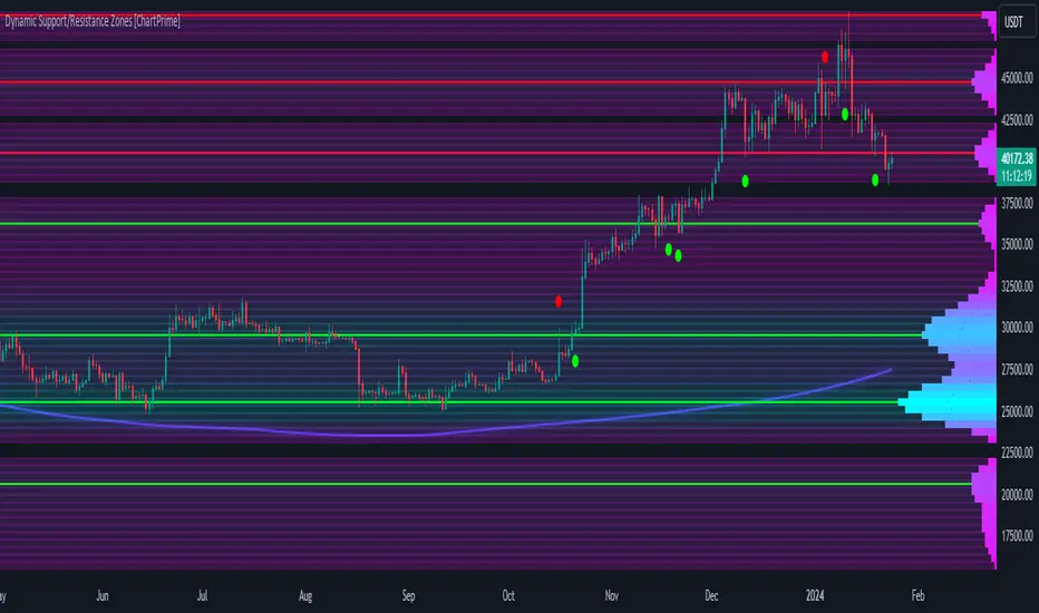
Dynamic Support/Resistance Zones [ChartPrime]Dynamic Support/Resistance Zones is a new way to visualize key support and resistance levels by analyzing pivot points. It aggregates these points into bins and uses different scoring methods to determine the strength of the zone. The Linear method treats every pivot the same, Time gives more importance to recent pivots, and Volume scores pivots based on trading activity.
It visually represents the strength of price zones using either a visual distribution or an overlay of colors. Areas with many aggregated pivots are marked using the High Color, indicating strong support or resistance. Fewer pivots are shown in Low Color, suggesting weaker levels. Users can also see the score using the distribution mode to more accurately determine the strength of these areas.
The indicator also includes a special moving average line, calculated from pivot prices and their weights. This gives a central pivot level, allowing you to see the average pivot position. We have also provided some smoothing for this line to make it easer to use.
We have included various options to tailor your analysis. These include selecting the scoring method for pivots and adjusting the number of pivots to consider, along with many visual aids. Traders can also set the level of filtering for the distribution of pivots. By default the filter isn't enabled but when it is enabled it allows for a less noisy experience at the expense of precision.
We have included four pivot periods that you can modify and toggle. The idea is that longer period pivots will enhance the strength of the shorter period ones providing a natural way to weight pivot levels. You can also specify whether you want to use pivot high, pivot low, or both in your analysis.
Here are some details on the key inputs:
Weighting Style: Choose how to score pivot points. Options include: Linear: Treats each pivot equally. Time: Gives more importance to recent pivots. Volume: Scores pivots based on trading volume.
Number of Pivots: Set the number of pivots to consider in the calculation. Both pivot highs and lows are treated separately.
Filtering: Adjust the level of filtering applied to the distribution of pivots. A higher value smooths the distribution, providing a cleaner visual representation at the cost of some precision. This setting is crucial for managing the trade-off between clarity and detail in the visualization of support and resistance zones.
Distribution Scale: Determines the scale of the distribution on the screen. It influences both the visual aspect and the precision of the calculations, allowing for a balance between visibility and analytical accuracy.
Manual Precision: Manually set the number of divisions within the range. This setting offers control over the granularity.
Auto Precision: When enabled, it automatically adjusts the precision based on the average range of a candle, ensuring a minimum level of detail in the visualization.
Show Distribution: Toggle the visibility of the distribution of pivot points. When activated, it provides a detailed visual representation of where pivots are concentrated.
Show Score in Distribution: Opt to display the actual score within the distribution. This feature adds a quantitative element to the visual representation, offering a clearer understanding of the pivot point concentration.
Distribution Overlay: Activate a heat map overlay to visualize the distribution of pivots. You can also adjusting the transparency of this overlay, providing a balanced view that does not obstruct the underlying price chart.
Show Support/Resistance: Enable lines that indicate identified support and resistance levels based on the aggregated pivots. This feature provides a clear, actionable insight directly on the chart.
S/R Zone Visibility: Choose to display the support/resistance zones and set their transparency. It offers an extended visual cue about the potential breadth of support or resistance areas.
Pivot Level Average: Introduce a moving average line that's calculated based on the weighted pivot levels. You can also adjust the smoothness of this line.
Dynamic Support/Resistance Zones is an intuitive and versatile trading indicator that offers a novel approach to identifying support and resistance levels by analyzing pivot points. It blends a variety of scoring methods, customizable visual representations, and a unique moving average line. With its customizable settings for pivot analysis, visual clarity, and precision, it's an nifty tool for traders looking to enhance their decision making with detailed and actionable insights.
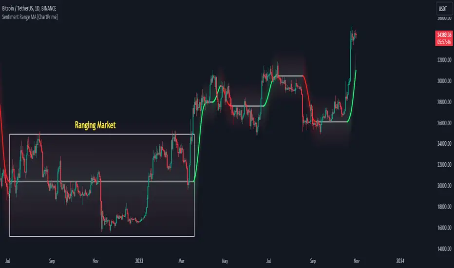
Sentiment Range MA [ChartPrime]The "Sentiment Range MA" provides traders with a dynamic perspective on market activity, emphasizing both stability in chop zones and quick adaptability outside of them.
Key Features:
Chop Zone Stability: In choppy markets, this indicator remains consistent, filtering out the noise to provide a clear view.
Quick Adaptability: Should the price break out of these zones, the indicator recalibrates promptly.
Dynamic Support and Resistance: Adapts based on the latest price action, serving as an evolving reference point.
Emphasis on Recent Levels: The tool factors in the latest notable market levels to stay relevant and timely.
Configurations:
Data Source: Choose your desired metric, though many default to the closing price.
Output Smoothing: Adjust the SR MA's response to market movements.
Trigger Smoothing: Refine boundary definitions based on your market insights.
ATR Period: Set the period for the ATR, influencing the surrounding boundary's width.
Range Multiplier: Control the ATR's effect on the range.
Range Switch: Flip between high-low and open-close values for range determination.
Visuals
Sentiment Range MA Line:
- This is the flowing line that transitions between green and red.
- When it's green, it indicates bullish momentum in the market. This suggests a prevailing upward trend and can be an entry cue for traders who trade with the trend.
- When it turns red, bearish sentiments dominate. It indicates the potential beginning of a downtrend or a continued downtrend. Traders might interpret this as a signal to be cautious, to short the market, or to exit long positions.
The Chop Zone:
- This is the space between the price candles and the Sentiment Range MA line. It represents a region where the price is considered to be moving sideways or without a clear direction. Price movements within the chop zone might not be substantial enough to warrant a trading decision. Only when the price breaks out of this zone do we see the Sentiment Range MA line change color, signaling a potential trading opportunity.
By interpreting these visuals, traders can make more informed decisions based on the prevailing market sentiment and trend. The chart becomes a tool, providing both an overview of the market condition and potential entry or exit points based on the Sentiment Range MA indicator's readings.
Detailed Settings Overview
Understanding the settings of the Sentiment Range MA Indicator can greatly enhance its utility in your trading strategy. Let's dive deeper into each:
Output Smoothing:
Purpose: It refines the SR MA to provide a clearer trend perspective.
Functionality:
- At `0`, it ensures the indicator responds immediately to price deviations from the chop zone.
- At higher values, it transforms the indicator into a volatility-adjusted moving average.
Filtering Modes:
- Single Filtering: Prioritizes speed.
- Double Filtering: Emphasizes stability.
Trigger Smoothing:
Purpose: Used for the range break detection.
Functionality: It dampens the indicator's sensitivity to sudden market volatility, preventing unnecessary triggers.
ATR Length:
Purpose: Governs the retrospective period for the chop zone.
Functionality:
- Higher values offer a more consistent and broad range size, capturing more historical data.
- Lower values allow for a more adaptive and responsive range.
Range Multiplier:
Purpose: Modifies the breadth of the range around the SR MA.
Functionality: Increasing the multiplier will extend the range, giving more leeway before triggering, while decreasing it will narrow the range, making the indicator more responsive to price changes.
Range Style:
Purpose: Decides which candlestick data is factored into the true range calculations.
Options:
- Body: Uses the open and close values.
- Wick: Accounts for the high and low values.
Functionality: Switching between styles lets you prioritize either the overall volatility (Wick) or just the concluded price action for a period (Body).
By fine-tuning these settings, traders can tailor the Sentiment Range MA Indicator to various market conditions and personal trading styles, ensuring optimal decision-making.
Quick Start
Based on the provided chart, here's a brief explanation of the default settings for the Sentiment Range MA Indicator:
Length: Set at ` 20 `.
- This determines the base moving average period. A standard setting, it calculates the average price over the last 20 periods, providing traders with a clear perspective of short-term trends.
ATR Length: Set at ` 200 `.
- This adjusts the lookback period for the Average True Range (ATR), which in turn influences the chop zone calculation. At a setting of 200, it offers a comprehensive view, considering a longer stretch of historical data.
Range Multiplier: Set at ` 6 `.
- This multiplies the ATR value, widening or narrowing the band around the SR MA. A setting of 6 means the range around the SR MA is determined by multiplying the ATR by 6, offering a broader fluctuation zone.
On the chart, the green line represents the bullish sentiment and the red represents the bearish sentiment. Price movements above and below these lines can be used as potential buy or sell signals respectively. Fine-tuning these settings can cater the Sentiment Range MA Indicator to your specific trading strategy and market condition preferences.
Alternative Settings
For traders looking to adapt to faster market conditions or prefer a more agile analysis, here's a brief description of the alternative settings for the Sentiment Range MA Indicator:
Length: Set at ` 3 `.
- This highly responsive setting calculates the average price over the last 3 periods. Ideal for quick market movements, it offers traders insights into very short-term price trends and potentially swift trade opportunities.
ATR Length: Set at ` 50 `.
- This shorter lookback period for the Average True Range (ATR) focuses on more recent market volatility, providing a tighter and more current chop zone calculation. It's suitable for those wanting to respond to recent market shifts.
Range Multiplier: Set at ` 4 `.
- Multiplying the ATR by 4 narrows down the buffer around the SR MA. This creates a tighter sentiment range, possibly resulting in more frequent crossovers and trading signals.
In the provided chart, the green line still denotes bullish momentum while the red symbolizes bearish sentiment. These alternative settings might generate more frequent signals, so traders should ensure their strategy is aligned with this heightened sensitivity.
Wrapping Up
The Sentiment Range MA melds stability and agility, making it a valuable tool in your trading toolkit. As always, before integrating new indicators, take the time to understand its nuances and potential impacts on your strategy.
Liquidity Hunter [ChartPrime]The Liquidity Hunter helps traders identify areas in the market where reversals may occur by analyzing candle formations and structures.
█ Wick-to-Body Analysis:
The Liquidity Hunter analyses each candlestick to identify those with distinctive wick-to-body ratios. By focusing on candles with significant wick imbalances, it can reveal potential liquidity absorption zones that may influence market behavior. Users can fine-tune this ratio to their preferences through customizable body% and wick% inputs, allowing for tailored analysis.
█ Body Size Significance:
To ensure the relevance and impact of its findings, this indicator evaluates the size of the candle body.
Only candles with bodies meeting a certain size threshold are considered, eliminating noise and highlighting candles of significance.
█ Dynamic Target Setting:
The Liquidity Hunter employs the Average True Range (ATR) as a foundation for target calculation. Users can adjust their trading targets by specifying a multiplier, offering flexibility in capturing potential profit or managing risk. Customizable target inputs ensure adaptability to your trading strategy.
█ Stop Loss Protection:
In addition to setting your profit targets, the Liquidity Hunter incorporates stop loss levels, safeguarding your investments from excessive risk. By implementing a well-balanced risk-reward ratio, users may be better at navigating market fluctuations.
█ Market Character Labels:
The Liquidity Hunter Indicator goes beyond basic analysis by detecting changes in market character. It identifies shifts in sentiment providing traders with invaluable insights into evolving market conditions.
█ Candle Color Highlighting:
To enhance user-friendliness and visualization, the indicator employs distinctive candle colors between trades. These color cues help you easily spot and interpret trading opportunities, drawing your attention to potential entry and exit points.
Overall this indicator is designed to help simplify liquidity analysis and give visual targets in a market.

Risk Reward Optimiser [ChartPrime]█ CONCEPTS
In modern day strategy optimization there are few options when it comes to optimizing a risk reward ratio. Users frequently need to experiment and go through countless permutations in order to tweak, adjust and find optimal in their data.
Therefore we have created the Risk Reward Optimizer.
The Risk Reward Optimizer is a technical tool designed to provide traders with comprehensive insights into their trading strategies.
It offers a range of features and functionalities aimed at enhancing traders' decision-making process.
With a focus on comprehensive data, it is there to help traders quickly and efficiently locate Risk Reward optimums for inbuilt of custom strategies.
█ Internal and external Signals:
The script can optimize risk to reward ratio for any type of signals
You can utilize the following :
🔸Internal signals ➞ We have included a number of common indicators into the optimizer such as:
▫️ Aroon
▫️ AO (Awesome Oscillator)
▫️ RSI (Relative Strength Index)
▫️ MACD (Moving Average Convergence Divergence)
▫️ SuperTrend
▫️ Stochastic RSI
▫️ Stochastic
▫️ Moving averages
All these indicators have 3 conditions to generate signals :
Crossover
High Than
Less Than
🔸External signal
▫️ by incorporating your own indicators into the analysis. This flexibility enables you to tailor your strategy to your preferences.
◽️ How to link your signal with the optimizer:
In order to be able to analysis your signal we need to read it and to do so we would need to PLOT your signal with a defined value
plot( YOUR LONG Condition ? 100 : 0 , display = display.data_window)
█ Customizable Risk to Reward Ratios:
This tool allows you to test seven different customizable risk to reward ratios , helping you determine the most suitable risk-reward balance for your trading strategy. This data-driven approach takes the guesswork out of setting stop-loss and take-profit levels.
█ Comprehensive Data Analysis:
The tool provides a table displaying key metrics, including:
Total trades
Wins
Losses
Profit factor
Win rate
Profit and loss (PNL)
This data is essential for refining your trading strategy.
🔸 It includes a tooltip for each risk to reward ratio which gives data for the:
Most Profitable Trade USD value
Most Profitable Trade % value
Most Profitable Trade Bar Index
Most Profitable Trade Time (When it occurred)
Position and size is adjustable
█ Visual insights with histograms:
Visualize your trading performance with histograms displaying each risk to reward ratio trade space, showing total trades, wins, losses, and the ratio of profitable trades.
This visual representation helps you understand the strengths and weaknesses of your strategy.
It offers tooltips for each RR ratio with the average win and loss percentages for further analysis.
█ Dynamic Highlighting:
A drop-down menu allows you to highlight the maximum values of critical metrics such as:
Profit factor
Win rate
PNL
for quick identification of successful setups.
█ Stop Loss Flexibility:
You can adjust stop-loss levels using three different calculation methods:
ATR
Pivot
VWAP
This allows you to align risk-reward ratios with your preferred risk tolerance.
█ Chart Integration:
Visualize your trades directly on your price chart, with each trade displayed in a distinct color for easy tracking.
When your take-profit (TP) level is reached , the tool labels the corresponding risk-reward ratio for that specific TP, simplifying trade management.
█ Detailed Tooltips:
Tooltips provide deeper insights into your trading performance. They include information about the most profitable trade, such as the time it occurred, the bar index, and the percentage gain. Histogram tooltips also offer average win and loss percentages for further analysis.
█ Settings:
█ Code:
In summary, the Risk Reward Optimizer is a data-driven tool that offers traders the ability to optimize their risk-reward ratios, refine their strategies, and gain a deeper understanding of their trading performance. Whether you're a day trader, swing trader, or investor, this tool can help you make informed decisions and improve your trading outcomes.

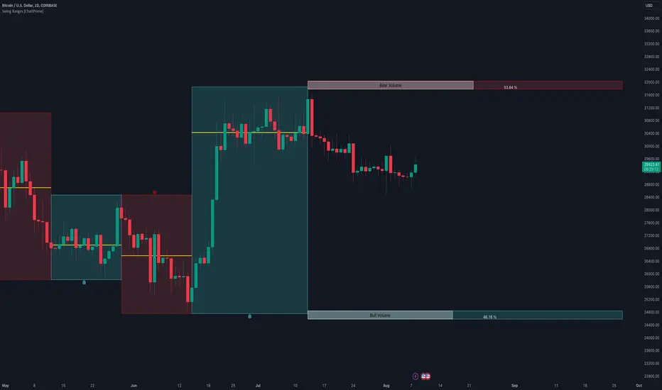
Swing Ranges [ChartPrime]Swing Ranges is an indicator designed to provide traders with valuable insights into swing movements and real-time support and resistance (SR) levels. This tool detects price swings and plots boxes around them, allowing traders to visualize the market dynamics efficiently. The indicator's primary focus is on real-time support and resistance levels, empowering traders to make well-informed decisions in dynamic market conditions.
Key Features:
Swing Box Visualization:
Swing Ranges excels at detecting swings in the price data and visually representing them with boxes on the price chart. This enables traders to quickly identify swing ranges, essential for understanding market trends and potential reversal points. VWAP POCs are also provided giving areas of high activity in each block.
Real-Time Support and Resistance Levels:
The core feature of Swing Ranges is its real-time support and resistance levels. These levels are dynamically calculated based on the volume-weighted data for each specific range. The indicator displays the strength of support and resistance zones with percentage bars, indicating the ratio between bullish and bearish volume. This real-time information empowers traders to assess the strength and significance of each SR level, enhancing their ability to execute well-timed trades.
ATR (Average True Range) Value:
Swing Ranges also includes an ATR value label, which shows the Average True Range for the selected period. ATR aids traders in understanding market volatility, enabling them to set appropriate stop-loss and take-profit levels for their trades.
VWAP (Volume Weighted Average Price) Information:
Traders c an readily access the VWAP value through the indicator's label. VWAP provides insights into the average price at which an asset has been traded, helping traders identify potential fair value areas and market trends.
Price Difference Percentage:
Swing Ranges displays the percentage difference between the high and low of each swing. This information allows traders to gauge the magnitude of price movements and assess potential profit targets more effectively.
The indicator also has a NV value. If the NV is high e.g. 10% or more there is indecision in the market and the market is trying to remain in a given range.
Settings Inputs:
1. Length Control:
The Length setting input in Swing Ranges allows traders to adjust the sensitivity of the indicator to detect swings. Traders can customize the length based on their trading strategies and timeframes.
2. ATR Period Adjustment:
The ATR Period input allows traders to fine-tune the calculation period for the Average True Range. This feature enables traders to adapt the indicator to different market conditions and asset classes.
Swing Ranges: Real-Time Support and Resistance Indicator is a comprehensive tool that combines swing visualization with dynamic support and resistance levels. By focusing on real-time SR levels, this indicator equips traders with the essential information needed to make confident trading decisions in ever-changing market conditions.
Retest Support Resistance Signals [ChartPrime]The Retest Support Resistance Signals Indicator is a powerful tool designed to assist traders in identifying key support and resistance levels within the market. Most importantly and uniquely it identifies retests of these structures and displays them on the trader's chart. By utilizing a combination of pivot points and price action analysis, this indicator offers valuable insights for both signal-based and support/resistance trading strategies.
Key Features & settings:
Retest Confirmation: The indicator waits for a break above a support or resistance level and observes subsequent price action. If price retraces and forms a wick below the level, followed by a bounce, the indicator identifies it as a retest and labels it as "R" to indicate potential support or resistance confirmation.
This indicator combines the benefits of signal-based trading and support/resistance analysis, providing users with a versatile trading tool suitable for various strategies.
Retest Weaker Toggle: Users have the option to enable or disable the retest weaker feature. When enabled, the indicator considers a support or resistance level weaker if it experiences a test. When disabled, the indicator assumes that a bounce may occur from the level.
Pivot Detection Customization: Users can adjust the pivot detection method based on either wicks or bodies. This flexibility allows traders to adapt the indicator to different market conditions and preferences. The trader can also customize the number of bars used for pivot detection on both the left and right sides. This feature enables traders to fine-tune the indicator's sensitivity and responsiveness.
Users also have control over how support or resistance levels are managed on the chart. They can choose to either stop updating the levels (freeze) or completely remove them (delete) from the chart.
Breakout Threshold Setting: Traders can adjust the breakout threshold until deletion setting. This setting determines the number of successful breakouts through a support or resistance level required to remove it from the chart. This feature helps filter out weaker levels and focus on more significant ones.
Shown above we see the retest labels in action denoted with an R label
This indicator can be a useful addition to an SR trader's toolkit. Identifying when a level in the market is retested can reveal interesting information about the underlying strength of a trend. This indicator has been designed with the two major schools of thought; a level gets weaker the more it's tested vs stronger the more it's tested. We have designed this therefore to be versatile and adapt to both thought procceses. The R labels should be taken and considered as a larger part of an analysis process and not followed blindly.

Bar Magnified Volume Profile/Fixed Range [ChartPrime]This indicator draws a volume profile by utilizing data from the lower timeframe to get a more accurate representation of where volume occurred on a bar to bar basis. The indicator creates a price range, and then splits that price range into 100 grids by default. The indicator then drops down to the lower timeframe, approximately 16 times lower than the current timeframe being viewed on the chart, and then parses through all of the lower timeframe bars, and attributes the lower timeframe bar volume to all grids that it is touching. The volume is dispersed proportionally to the grids which it is touching by whatever percent of the candle is inside each grid. For example, if one of the lower timeframe bars is interacting with "2" of the grids in the profile, and 60% of the candle is inside of the top grid, 60% of the volume from said candle will be attributed to the grid.
To make all of this magic happen, this script utilizes a quadratic time complexity algorithm while parsing and attributing the volume to all of the grids. Due to this type of algorithm being used in the script, many of the user inputs have been limited to allow for simplicity, but also to prevent possible errors when executing loops. For the most part, all of the settings have been thoroughly tested and configured with the right amount of limitations to prevent these errors, but also still give the user a broad range of flexibility to adjust the script to their liking.
📗 SETTINGS
Lookback Period: The lookback period determines how many bars back the script will search for the "highest high" and the "lowest low" which will then be used to generate the grids in-between
Number Of Levels: This setting determines how many grids there will be within the volume profile/fixed range. This is personal preference, however it is capped at 100 to prevent time complexity issues
Profile Length: This setting allows you to stretch or thin the volume profile. A higher number will stretch it more, vise versa a smaller number will thin it further. This does not change the volume profiles results or values, only its visual appearance.
Profile Offset: This setting allows you to offset the profile to the left or right, in the event the user does not appreciate the positioning of the default location of the profile. A higher number will shift it to the right, vise versa a lower number will shift it to the left. This is personal preference and does not affect the results or values of the profile.
🧰 UTILITY
The volume profile/fixed range can be used in many ways. One of the most popular methods is to identify high volume areas on the chart to be used as trade entries or exits in the event of the price revisiting the high volume areas. Take this picture as an example. The image clearly demonstrates how the 2 highest areas of volume within this magnified volume profile also line up to great areas of support and resistance in the market.
Here are some other useful methods of using the volume profile/fixed range
Identify Key Support and Resistance Levels for Setups
Determine Logical Take Profits and Stop Losses
Calculate Initial R Multiplier
Identify Balanced vs Imbalanced Markets
Determine Strength of Trends

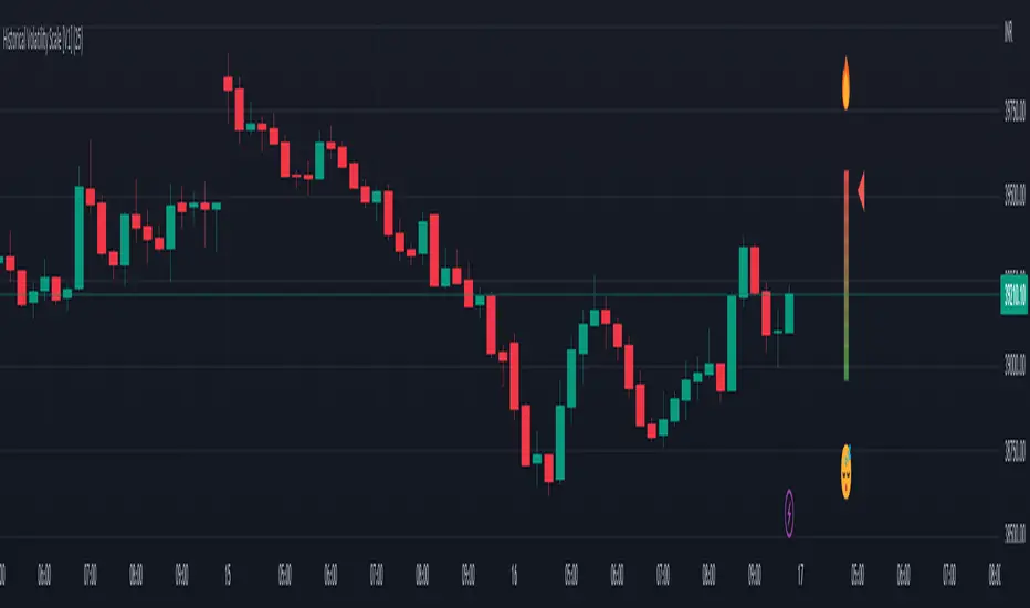
Historical Volatility Scale [ChartPrime]This indicator outputs a visual scale representing the level of volatility in the market relative to the timeframe selected on the users chart. The method of volatility used is "historical volatility" which is calculated by taking the standard deviation of a series of "x" length which contains the current closing price divided by the previous closing price for all nodes. The output of the volatility is standardized by also running an additional percentrank calculation over the raw volatility values to allow the volatility scale to oscillate properly between its minimum of 0 and maximum of 100.
📗 SETTINGS
Length: The length determines how many bars/nodes should be considered when calculating the standard deviation. In simple terms, the higher the length, the less sensitive and less reactive the scale will be to current price action, and larger moves would be required to trigger the scale.
🧰 UTILITY
The arrow or "The Pin" will move upwards towards the "fire" emoji when the volatility is higher than the majority of values for the amount of bars back that you set the "length" setting to. Vise Versa for when the pin is lowering towards the "snooze" emoji, the volatility is less than the majority of nodes/values for the past "length" amount of values.
When the volatility is low, a trader could consider utilizing more leading indicators to make their trading decisions as opposed to lagging indicator such as trend indicators. When the volatility is low, the price action is consolidation which would be bad for a trend following strategy. Vise Versa for trend strategies, having a higher volatility may be better for such strategies.
Its important to remember that this indicator itself is a lagging indicator, in that it relies on historical data to showcase the current state of the markets volatility. This means that although the recommendation in the previous paragraph may make logical sense, it is not a guarantee that if the volatility is showcasing a trending market, that your trend strategies will necessarily be profitable.
Parabolic Scalp Take Profit[ChartPrime]Indicators can be a great way to signal when the optimal time is for taking profits. However, many indicators are lagging in nature and will get market participants out of their trades at less than optimal price points. This take profit indicator uses the concept of slope and exponential gain to calculate when the optimal time is to take profits on your trades, thus making this a leading indicator.
Usage:
In essence the indicator will draw a parabolic line that starts from the market participants entry point and exponentially grows the slope of the line eventually intersecting with the price action. When price intersects with the parabolic line a take profit signal will appear in the form of an x. We have found that this take profit indicator is especially useful for scalp trades on lower timeframes.
How To Use:
Add the indicator to the chart. Click on the candle which the trade is on. Click on either the price which the trade will be at, or at the bottom of the candle in a long, or the top of a candle in a short. Select long or short. Open the settings of the indicator and adjust the aggressiveness to the desired value.
Settings:
- Start Time -- This is the bar in which your entry will be at, or occured at and the script will ask you to click on the bar with your mouse upon first adding the script.
- Start Price -- This is the price in which the entry will be at, or was at and the script will ask you to click on the price with your mouse upon first adding the script.
- Long/Short -- This is a setting which lets the script know if it is a long or a short trade, and the script will ask you to confirm this upon first adding it to the chart.
- Aggressiveness -- This directly affects how aggressive the exponential curve is. A value of 101 is the lowest possible setting, indicating a very non-aggressive exponential buildup. A value of 200 is the highest and most aggressive setting, indicating a doubling effect per bar on the slope.

Action Section, Volatility Choppiness Indicator (by ChartArt)Here is a solution to find entry points to trade. This indicator highlights price sections with low choppiness, where both the ADX (Average Directional Index) indicator shows strong movement (up or down!) in the price and a customized Money Flow indicator (which uses only the change of the volume not the change of the price, hence a Volume Flow indicator), also shows volatility is present. Using higher filter values than the default setting of "30" reduces the noise, but also shows less 'action sections'. Vice versa using values lower than "30" increases the amount and duration of action sections which are shown.
The "action section" indicator does not show the direction if the price is going up or down. It shows if there is enough action worthy the time to trade (lower odds of a neutral sideways trend). Therefore in addition a Heikin-Ashi based price change indicator can optionally be plotted, which shows the actual direction of the price.
Action Section, High Volume Volatility & Low Price Choppiness Indicator
This indicator works only on charts which have volume data.

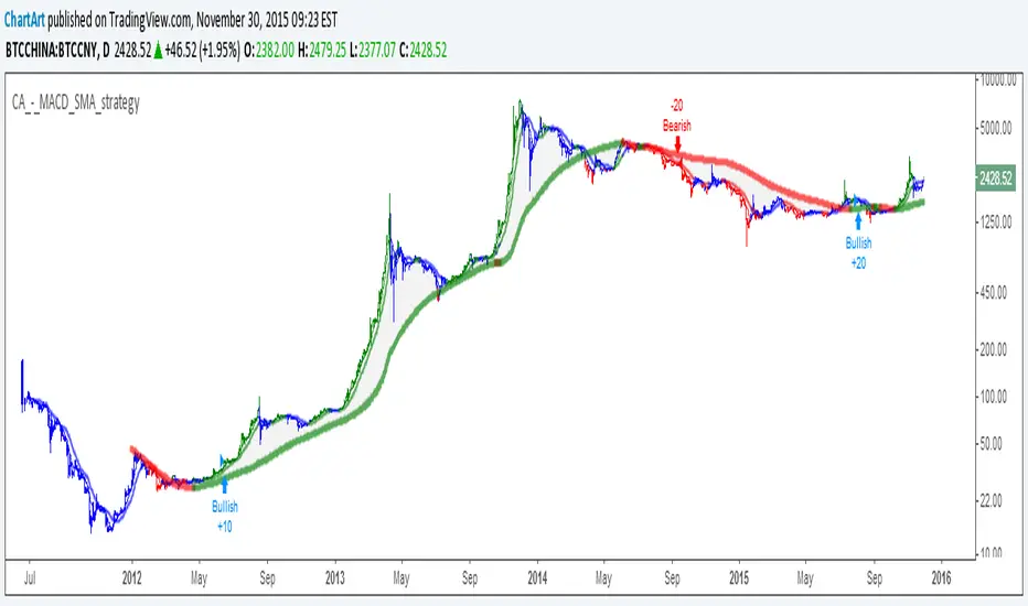
MACD + SMA 200 Strategy (by ChartArt)Here is a combination of the classic MACD (moving average convergence divergence indicator) with the classic slow moving average SMA with period 200 together as a strategy.
This strategy goes long if the MACD histogram and the MACD momentum are both above zero and the fast MACD moving average is above the slow MACD moving average. As additional long filter the recent price has to be above the SMA 200. If the inverse logic is true, the strategy goes short. For the worst case there is a max intraday equity loss of 50% filter.
Save another $999 bucks with my free strategy.
This strategy works in the backtest on the daily chart of Bitcoin, as well as on the S&P 500 and the Dow Jones Industrial Average daily charts. Current performance as of November 30, 2015 on the SPX500 CFD daily is percent profitable: 68% since the year 1970 with a profit factor of 6.4. Current performance as of November 30, 2015 on the DOWI index daily is percent profitable: 51% since the year 1915 with a profit factor of 10.8.
All trading involves high risk; past performance is not necessarily indicative of future results. Hypothetical or simulated performance results have certain inherent limitations. Unlike an actual performance record, simulated results do not represent actual trading. Also, since the trades have not actually been executed, the results may have under- or over-compensated for the impact, if any, of certain market factors, such as lack of liquidity. Simulated trading programs in general are also subject to the fact that they are designed with the benefit of hindsight. No representation is being made that any account will or is likely to achieve profits or losses similar to those shown.
Stock Market Trend Analysis Trading System 101 (by ChartArt)This is a very simple trading system which is measuring the core of uptrends and downtrends using three basic elements: Close price, HL2 price, Pivot price.
Depending if the uptrend or downtrend is strong, the buy/sell signals are shown in different colors. The stronger trends are in brighter colors (lime and fuchsia). If the trend just fully changed direction from uptrend to downtrend (or vice versa), there is a background color highlight in the color of the new trend direction.
The trend detection should work best on monthly charts. I have created this in under an hour. My goal was to use the least amount of rules possible, therefore there are many false signals and the code is quite lazy.
You can lose all your money if you rely on these buy/sell signals!

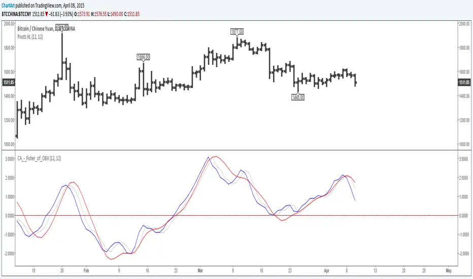
Fisher Transform of On Balance Volume (by ChartArt)A simple mash-up of the On Balance Volume (OBV) indicator with the Fisher Transform indicator (blue) with the classic Fisher Transform signal trigger (silver color), plus a linear regression as a second signal line (red).
I recommend to use a period for the linear regression which has the same speed or is slower than the period of the Fisher Transform to avoid overshooting.
P.S. Here are three areas where the indicator worked quite good on historic charts
Pivot Trend [ChartPrime]The Pivot Trend indicator is a tool designed to identify potential trend reversals based on pivot points in the price action. It helps traders spot shifts in market sentiment and anticipate changes in price direction.
◈ User Inputs:
Left Bars: Specifies the number of bars to the left of the current bar to consider when calculating pivot points.
Right Bars: Specifies the number of bars to the right of the current bar to consider when calculating pivot points.
Offset: Adjusts the sensitivity of pivot point detection.
◈ Indicator Calculation:
The indicator calculates pivot points based on the highest and lowest prices within a specified range of bars. It then determines the trend direction based on whether the current price crossed above upper band or crossed below lower band.
Upper and Lower Bands
◈ Visualization:
Trend direction is indicated by the color of the plotted lines, with blue representing an upward trend and red representing a downward trend.
Buy and sell signals are marked on the chart with corresponding symbols (🅑 for buy signals and 🅢 for sell signals).
Buy and sell signals generated by the indicator can be used in conjunction with other technical analysis tools to confirm trading decisions and manage risk.
Overall, the Pivot Trend indicator offers traders a simple yet effective method for identifying potential trend changes and capturing trading opportunities in the market. Adjusting the input parameters allows for customization according to individual trading preferences and market conditions.

Market Shift Levels [ChartPrime]Market Shift Levels
This indicator detects trend shifts and visualizes key market structure turning points using Hull Moving Average logic. It highlights potential areas of support and resistance where price is likely to react, empowering traders to spot early trend transitions.
Market Shift Levels are horizontal zones that mark the moment of a directional change in market behavior. These shifts are based on crossovers between two smoothed Hull Moving Averages (HMA), allowing the indicator to detect potential reversals with minimal lag.
Once a shift is detected:
A dashed horizontal Market Shift Level is plotted at the low (for bullish shift) or high (for bearish shift) of the candle.
These levels often become key reaction points during pullbacks and trend retests.
Volume or price labels are added when price wicks into these levels, helping traders gauge the strength of rejection or acceptance.
⯁ KEY FEATURES
Uses HMA-based logic to detect when price momentum shifts.
Plots clean Market Shift Levels (MSLs) that act as dynamic support and resistance.
Automatically colors bars and candles based on the price positioning relative to levels.
Labels wick-based retests with either:
Volume data of the 3-bar cluster (default).
Price level if toggled.
⯁ HOW TO USE
Look for trend shifts where the HMA crossover triggers a new level — this marks a possible structural pivot .
Use the horizontal level as a dynamic support or resistance zone — especially when price returns with wick rejections.
Watch for volume labels near the level — higher values signal stronger rejection and potential continuation.
Combine with confluence tools like Smart Money concepts or Fibonacci levels for added edge.
⯁ EXAMPLE SETUPS
After a bullish shift, wait for price to return and wick into the level — if volume spikes and candle closes strong, it’s a retest confirmation entry .
After a bearish shift, bearish wick rejections with volume may signal short re-entry zones .
⯁ CONCLUSION
The Market Shift Levels indicator offers a visual and data-backed approach to spotting trend reversals and critical retest zones. It’s a simple yet powerful tool to structure your trades around objective, repeatable market behavior — all in real-time.

Volumatic Trend [ChartPrime]
A unique trend-following indicator that blends trend logic with volume visualization, offering a dynamic view of market momentum and activity. It automatically detects trend shifts and paints volume histograms at key levels, allowing traders to easily spot strength or weakness within trends.
⯁ KEY FEATURES
Trend Detection System:
Uses a custom combination of weighted EMA (swma) and regular EMA to detect trend direction.
A diamond appears on trend shift, indicating the starting point of a new bullish or bearish phase.
Volume Histogram Zones:
At each new trend, the indicator draws two horizontal zones (top and bottom) and visualizes volume activity within that trend using dynamic histogram candles.
Gradient-Based Candle Coloring:
Candle color is blended with a gradient based on volume intensity. This helps highlight where volume spikes occurred, making it easy to identify pressure points.
Volume Summary Labels:
A label at the end of each trend zone displays two critical values:
- Delta: net volume difference between bullish and bearish bars.
- Total: overall volume accumulated during the trend.
⯁ HOW TO USE
Monitor diamond markers to identify when a new trend begins.
Use volume histogram spikes to assess if the trend is supported by strong volume or lacking participation.
A high delta with strong total volume in a trend indicates institutional support.
Compare gradient strength of candles—brighter areas represent higher-volume trading activity.
Can be used alone or combined with other confirmation tools like structure breaks, liquidity sweeps, or order blocks.
⯁ CONCLUSION
Volumatic Trend gives you more than just trend direction—it provides insight into the force behind it. With volume-graded candles and real-time histogram overlays, traders can instantly assess whether a trend is backed by conviction or fading strength. A perfect tool for swing traders and intraday strategists looking to add volume context to their directional setups.

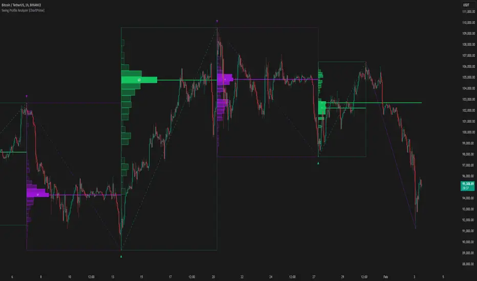
Swing Profile Analyzer [ChartPrime]Swing Profile Analyzer
The Swing Profile Analyzer is a comprehensive tool designed to provide traders with valuable insights into swing frequency profiles, enabling them to identify key price levels and areas of market interest.
⯁ KEY FEATURES
Swing Frequency Profiles
Automatically plots frequency profiles for each swing, highlighting price distribution and key levels of significance.
Point of Control (POC) Line
Marks the price level with the highest number of closes within a swing, acting as a key area for potential price reactions.
Customizable Trend Display
Allows users to toggle between displaying profiles for bullish swings, bearish swings, or both, offering tailored analysis.
Integrated ZigZag Lines
Visualizes swing highs and lows, providing a clear picture of market trends and reversals.
Dynamic Profile Visualization
Profiles are color-coded to indicate the frequency of closes, with the highest value bins distinctly marked for easy recognition.
Max Frequency Highlight
Displays numerical values for the most active price level within each profile, showing how many closes occurred at the peak bin.
Updates only after swing formed
Profiles and POC lines automatically appear after swing is done
⯁ HOW TO USE
Identify Critical Price Levels
Use the POC line and frequency distribution to locate levels where price is likely to react or consolidate.
Analyze Swing Characteristics
Observe swing profiles to understand the strength, duration, and behavior of market trends.
Plan Entries and Exits
Leverage significant price levels and high-frequency bins to make more informed trading decisions.
Focus on Specific Trends
Filter profiles to analyze bullish or bearish swings based on your trading strategy.
⯁ CONCLUSION
The Swing Profile Analyzer is an essential tool for traders seeking to understand price dynamics within market swings. By combining frequency profiles, POC levels, and trend visualization, it enhances your ability to interpret and act on market movements effectively.
High-Low Cloud Trend [ChartPrime]The High-Low Cloud Trend - ChartPrime indicator, combines the concepts of trend following and mean reversion into a dynamic cloud representation. This indicator constructs high and low bands based on lookback periods, which adjust dynamically to reflect market conditions. By highlighting the upper and lower extremes, it provides a visual gauge for potential reversals and continuation points.
◆ KEY FEATURES
Dynamic Cloud Bands : Uses high and low derived from user-defined lookback periods to create reactive bands that illustrate trend strength and potential reversal zones.
Color-coded Visualization : Applies distinct colors to the bands based on the trend direction, improving readability and decision-making speed.
Mean Reversion Detection : Identifies points where price extremes may revert to a mean, signaling potential entry or exit opportunities based on deviation from expected values.
Flexible Visualization : Offers options to display volume or price-based metrics within labels, enhancing analytical depth.
◆ FUNCTIONALITY DETAILS
Band Formation : Calculates two sets of bands; one based on a primary lookback period and another for a shorter period to capture mean reversion points.
◆ USAGE
Trend Confirmation : Use the main bands to confirm the prevailing market trend, with the cloud filling acting as a visual guide.
Breakout Identification : Monitor for price breaks through the cloud to identify strong momentum that may suggest a viable breakout.
Risk Management : Adjust positions based on the proximity of price to either band, using these as potential support or resistance areas.
Mean Reversion Strategies : Apply mean reversion techniques when price touches or crosses the bands, indicating a possible return to a central value.
⯁ USER INPUTS
Lookback Period : Sets the primary period for calculating high and low bands.
Mean Reversion Points : Toggles the identification of mean reversion opportunities within the bands.
Volume/Price Display : Chooses between displaying volume or price information in the indicator's labels for enhanced detail.
The High-Low Cloud Trend indicator is a versatile and powerful tool for traders who engage in both trend following and mean reversion strategies. It provides a clear visual representation of market dynamics, helping traders to make informed decisions based on established and emerging patterns. This indicator's dual approach ensures that it is suitable for various trading styles and market conditions.

Multiple Non-Linear Regression [ChartPrime]This indicator is designed to perform multiple non-linear regression analysis using four independent variables: close, open, high, and low prices. Here's a breakdown of its components and functionalities:
Inputs:
Users can adjust several parameters:
Normalization Data Length: Length of data used for normalization.
Learning Rate: Rate at which the algorithm learns from errors.
Smooth?: Option to smooth the output.
Smooth Length: Length of smoothing if enabled.
Define start coefficients: Initial coefficients for the regression equation.
Data Normalization:
The script normalizes input data to a range between 0 and 1 using the highest and lowest values within a specified length.
Non-linear Regression:
It calculates the regression equation using the input coefficients and normalized data. The equation used is a weighted sum of the independent variables, with coefficients adjusted iteratively using gradient descent to minimize errors.
Error Calculation:
The script computes the error between the actual and predicted values.
Gradient Descent: The coefficients are updated iteratively using gradient descent to minimize the error.
// Compute the predicted values using the non-linear regression function
predictedValues = nonLinearRegression(x_1, x_2, x_3, x_4, b1, b2, b3, b4)
// Compute the error
error = errorModule(initial_val, predictedValues)
// Update the coefficients using gradient descent
b1 := b1 - (learningRate * (error * x_1))
b2 := b2 - (learningRate * (error * x_2))
b3 := b3 - (learningRate * (error * x_3))
b4 := b4 - (learningRate * (error * x_4))
Visualization:
Plotting of normalized input data (close, open, high, low).
The indicator provides visualization of normalized data values (close, open, high, low) in the form of circular markers on the chart, allowing users to easily observe the relative positions of these values in relation to each other and the regression line.
Plotting of the regression line.
Color gradient on the regression line based on its value and bar colors.
Display of normalized input data and predicted value in a table.
Signals for crossovers with a midline (0.5).
Interpretation:
Users can interpret the regression line and its crossovers with the midline (0.5) as signals for potential buy or sell opportunities.
This indicator helps users analyze the relationship between multiple variables and make trading decisions based on the regression analysis. Adjusting the coefficients and parameters can fine-tune the model's performance according to specific market conditions.

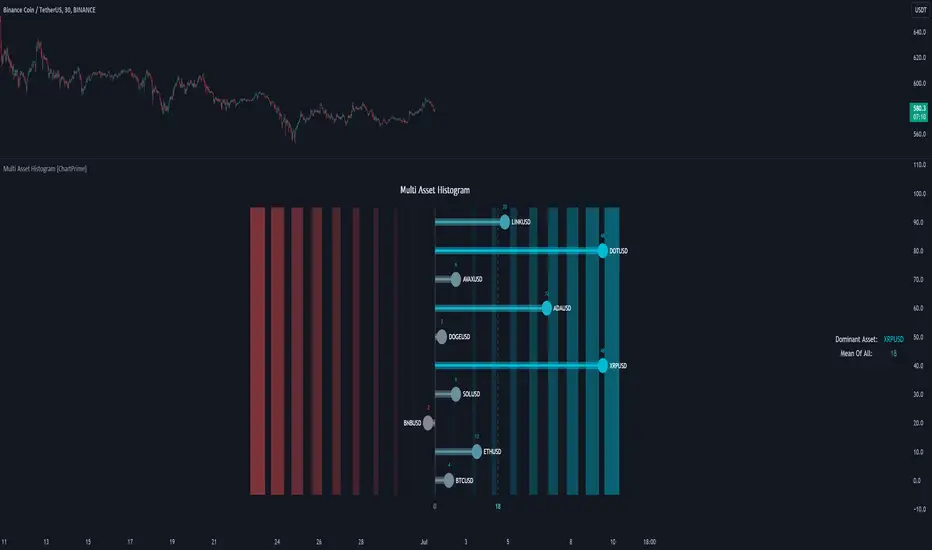
Multi Asset Histogram [ChartPrime]Multi Asset Histogram Indicator
Overview:
The "Multi Asset Histogram" indicator provides a comprehensive visualization of the performance of multiple assets relative to each other. By calculating a score for each asset and displaying it in a histogram format, this indicator helps traders quickly identify the trends, dominant asset and the average performance of the assets in the selected group.
Key Features:
◆ Multi-Asset Score Calculation:
The indicator calculates a trend score for each selected asset based on the price source (e.g., hl2).
The trend score is determined by comparing the current price to the prices over the past bars back defined by user, adding or subtracting points based on whether the current price is higher or lower than previous prices.
// Score Function
trscore(src) =>
total = 0.0
for i = 1 to 50
total += (src >= nz(src ) ? 1 : -1)
total
◆ Flexible Symbol Input:
Traders can input up to 10 different symbols (e.g., BTCUSD, ETHUSD, etc.) to be included in the histogram analysis.
◆ Dynamic Visualization:
A histogram is plotted for each asset, with bars colored based on the score, providing a clear visual representation of the relative performance.
Color gradients from red to aqua indicate the performance, with red representing negative scores and aqua representing positive scores.
◆ Adaptive Histogram Lines:
The width and placement of histogram lines adapt based on the calculated scores, ensuring clear visualization regardless of the values.
Dashed lines represent the mean score of all assets, helping traders identify the overall market trend.
◆Detailed Labels and Values:
Labels are placed on the histogram to display the exact score for each asset.
Mean value and zero line labels provide additional context for the overall performance.
◆ Visual Scaling Lines:
Zero line and mean line are clearly marked, helping traders understand the distribution and scale of scores.
Scales on the left and right of the histogram indicate the performance range.
◆ Informative Table:
A table is displayed on the chart, showing the dominant asset (the one with the highest score) and the mean score of all assets.
The table updates dynamically to reflect real-time changes in asset performance.
◆ Settings:
Length: The value of number bars back is greater or less than the current value of the source
Source: The price source to be used for score calculation (e.g., hl2).
Symbols: Up to 10 different asset symbols can be input for analysis.
Usage Notes:
This indicator is useful for traders who monitor multiple assets simultaneously and need a quick visual reference to identify the strongest and weakest performers.
The color coding and dynamic labels make it easy to interpret the relative performance and make informed trading decisions.
This indicator is designed to enhance multi-asset analysis by providing a clear, visual representation of each asset's performance relative to the others, making it easier to identify trends and dominant assets in the market.
Linear Regression Oscillator [ChartPrime]Linear Regression Oscillator Indicator
Overview:
The Linear Regression Oscillator is a custom TradingView indicator designed to provide insights into potential mean reversion and trend conditions. By calculating a linear regression on the closing prices over a user-defined period, this oscillator helps identify overbought and oversold levels and highlights trend changes. The indicator also offers visual cues and color-coded price bars to aid in quick decision-making.
Key Features:
◆ Customizable Look-Back Period:
Input: Length
Default: 20
Description: Determines the period over which the linear regression is calculated. A longer period smooths the oscillator but may lag, while a shorter period is more responsive but may be noisier.
◆ Overbought and Oversold Thresholds:
Inputs: Upper Threshold and Lower Threshold
Default: 1.5 and -1.5 respectively
Description: Define the upper and lower bounds for identifying overbought and oversold conditions. Values outside these thresholds suggest potential reversals.
◆ Candlestick Color Plotting:
Input: Plot Bar Color
Default: false
Description: Option to color the price bars based on the oscillator's value, providing a visual representation of market conditions. Bars turn cyan for positive oscillator values and blue for negative.
◆ Mean Reversion and Trend Signals:
Visual markers and labels indicate when the oscillator suggests mean reversion or trend changes, aiding in identifying key market turning points.
◆ Invalidation Levels:
Tracks the highest and lowest prices over a recent period to set levels where the current trend signal would be considered invalidated.
◆ Gradient Color Coding:
Utilizes gradient color coding to enhance the visualization of oscillator values, making it easier to interpret overbought and oversold conditions.
◆ Usage Notes:
Setting the Look-Back Period:
Adjust the "Length" input based on the timeframe and the type of trading you are conducting. Shorter periods are more suited for intraday trading, while longer periods can be used for swing trading.
Interpreting Thresholds:
Use the upper and lower threshold inputs to fine-tune the sensitivity of the overbought and oversold signals. Higher absolute values reduce the number of signals but increase their reliability.
Candlestick Coloring:
Enabling the "Plot Bar Color" option can help quickly identify the current state of the oscillator in relation to the zero line. This visual aid can be particularly useful in fast-moving markets.
Mean Reversion and Trend Signals:
Pay attention to the symbols and labels on the chart indicating mean reversion and trend changes. These signals are designed to highlight potential entry and exit points.
Invalidation Levels:
Use the plotted invalidation levels as stop-loss or signal invalidation points. If the price moves beyond these levels, the current trend signal is likely invalid.
This indicator helps traders identify overbought and oversold conditions, potential mean reversions, and trend changes based on the linear regression of the closing prices over a specified look-back period.
