Outlier changes alertAn indicator that calculates click (price change), percentage change, and Z-score changes while displaying outliers based on defined ranges.
Outlier Detection:
Mark outliers (for price, percentage, Z-score) based on user-defined thresholds. For example, any price movement exceeding a certain Z-score or percentage change could be marked as an outlier and displayed on chart.
Indicator Overview:
1. Click (Price Change):
Calculate the absolute price change from one period to another (e.g., from the current closing price to the previous closing price).
2. Percentage Change:
Calculate the percentage price change over a specific period, showing how much the price has changed in relative terms compared to the previous price.
3. Z-Score:
Compute the Z-score to standardize the price change relative to its historical average and standard deviation. The Z-score helps in detecting whether a price movement is an outlier or falls within a normal range of volatility.
Pesquisar nos scripts por "change"

Percent Change of Day [ilovealgotrading]
OVERVIEW:
This indicator aims to effectively show us the percentage change of the price within the time frame we have chosen.
What is the purpose of this indicator?
This indicator shows how the price changes for each bar at different time frames we have chosen. By examining the percentage change in different time periods, we can easily look at the change in the face of the market during the time interval. Also if the price is above or below the value of 0 during the specified time, the color of our percentage line changes.
IMPLEMENTATION DETAILS:
First of all, let's understand How to Calculate Percent Change?
The difference between the old and new value of a quantity given in percentages is known as a percent change. It's rather simple to calculate the % difference between two given quantities.
The formula is given by;
Example
The price of a kilo of rice went from 10$ to12.5$, what is the percentage change?
Explanation
• The old value of sugar = $ 10
• New value = $12.5
• Now apply the percent change formula;
• Percentage change = ×100%
= x 100%
= (2.5/10) x 100%
= 25%
In this case, the percent change is positive and therefore, it is an increase.
How Is Percentage Change Used in Finance?
In the world of finance, percentage change is frequently used to analyze changes in the value of stocks or major market indexes over time.
Percentage change is used for many purposes in finance, most notably to track the price change of stocks market and crypto market.
What can we change from the settings panel ?
We can set time frame setting of the percentage change from place number 1
We are able to adjust the changing color if the percentage change is above or below zero from place 2 and 3
ALSO:
Please do not open trades without properly managing your risk and psychology!!!
If you have any ideas what to add to my work to add more sources or make calculations cooler, suggest in DM .
Percentage price changeThis indicator marks bars whose values increase or decrease by an amount greater than or equal to the value of the specified parameter as a percentage. Bars that meet the condition are marked with labels, boxes and colors. In addition to the standard method of calculating the percentage change at the closing price of the current and previous bars, the indicator allows you to choose non-standard calculation methods (at the prices of opening and closing the current bar, as well as at the prices of the maximum at the minimum of the current bar). You can choose to display the percentage changes of individual bars as well as a series of bars. You can select the number of bars in a series of bars. You can also apply filters by the direction of the bars in the series or by the percentage of individual bars in the series.
It is important to remember that in version 5 of Pine Script™, the maximum possible number of labels and the maximum possible number of boxes cannot exceed 500!
There are several main parameters that can be changed in section PARAMETERS FOR CALCULATION:
1. 'Bars count' - The number of bars for which the percentage rise or fall is calculated.
2. ‘Percentage change’ - sets the price change as a percentage. Bars with a price range above or equal to the specified value will be marked on the chart.
3. ‘First and second points of calculation’ - the first and second points for calculating the percentage change. Here you can set several different values for the calculation:
- 'Cl.pr., Close' - Closing price of the previous bar and closing price of the current bar (or a series of bars) (these values are used for the standard calculation of the percentage change on the chart).
- 'Open, Close' - Opening and closing prices of the current bar (or a series of bars).
- 'High|Low' - Highest and lowest price of the current bar (or a series of bars).
- 'Cl.pr.|High|Low' - Highest or lowest price of the current bar (or a series of bars) (depending on whether the bar is going up or down) or closing price of the previous bar for first point (one of these values is automatically selected, which gives a larger result, depending on whether there is a gap between these values). Highest or lowest price of the current bar for second point.
In the LIMITS section, you can set the following parameters.
1. ‘Only for the last bar’ - If this option is selected, the indicator will be applied only for the last bar (or series of bars).
2. 'Only bars in one direction' - A condition that takes into account sequences from the selected number of bars going in only one direction. If at least one bar has a different direction from the other bars, then such a sequence will not be taken into account. This only works if the 'Bars count' is > 1.
3. "Cut off higher values" - This field cuts off higher values. Bars with a price range above or equal to the specified value will not be marked on the chart. This can be used in some cases to make the chart less loaded with data and more visual. Of course, you can also use this option however you want.
4. ‘Min percent in series of bars’ - If the value 'Number of bars' is > 1, then a series of bars is taken into account, in which the percentage change of individual bars is greater than or equal to the set value.
In the DATE RANGE section, you can set the limits of the time and date range in which the calculation will be performed. In some cases, this can be used in order not to exceed the limit on the number of labels or boxes, which cannot exceed 500. Of course, you can also use this option however you want. By default, the date range is unlimited.
'Timezone offset, hours' - It is used only for the correct display of the limits of the date range in the parameter table.
In the PRICE INCREASE LABELS and PRICE REDUCTION LABELS section, you can define the design of labels bars and boxes, such as colors, shapes, sizes, and location. You can set the colors of the bars separately on the Style tab. On the Style tab, you can also turn on/off the display of frames, labels and color markings of bars.
The PARAMETER TABLE section is designed to adjust the display of the table for a more visual display of the selected values of all parameters on the Arguments tab. Depending on which values have been set and which parameters have been enabled or disabled, the table will change its appearance, display or hide some rows. A single line 'Total found' will be displayed all the time. It shows the count of bars that meet the condition and count of labels or boxes used in the diagram. Since the bars are labeled with labels or boxes, their number cannot exceed 500 for Pine script version 5.
1. 'Pos.' - sets the main position of the table on the screen.
2. 'X off.', 'Y off.' - You can set the offset of the table along the X and Y axes. This option can be useful to avoid overlapping multiple tables if you want to use two or more instances of this indicator on your chart. The minimum value is -30, the maximum is 30. Positive values shift the table to the right on the X axis and up on the Y axis. Negative values shift the table to the left on the X axis and down on the Y axis.
3. 'Font color' - The font color in the table.
'Warn. font color', 'Warn. backgr. color' - The font and background colors in the 'Total found' row in the table. If the number of labels or boxes exceeds 500, the font and background will be colored in these colors.
4. ‘Font size’ – Sets the font size in the table.
5. 'Show hours and minutes in date/time range' - changes the date and time format of time range from {yyyy.MM.dd HH:mm} to {yyyy.MM.dd}.
6. 'View all params' - used to display all parameters, even those duplicated in the main line of the indicator.
7. ‘Title’ – If desired, you can make a header for the table.
The last row of the table shows the number of bars found that meet the conditions. Since these bars are marked with labels (in the case of one bar) or boxes (in the case of series of bars), the limit that can be marked on the chart is 500. Exceeding this value will be displayed in the table and additionally highlighted in red font. This will signal that not all bars found are displayed on the chart.
On the Style tab, you can turn the table display on/off.

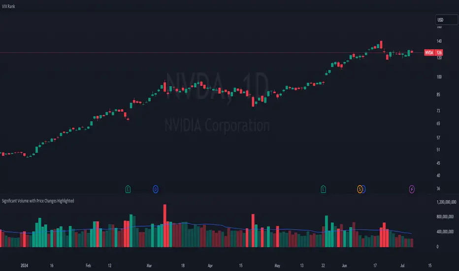
Significant Volume with Price Changes HighlightedSignificant Volume with Price Changes Highlighted
The "Significant Volume with Price Changes Highlighted" indicator by PappyTrading is a powerful tool designed to help traders identify significant volume spikes and price changes in the market. This indicator overlays the volume bars on the price chart and highlights them based on specific volume and price change conditions, providing a clear visual representation of market activity.
What It Does
This indicator calculates the moving average of the volume over a specified period and compares the current volume to this average. It also calculates the daily percentage change relative to the previous day's close and compares this to its moving average. The volume bars are then color-coded based on the following conditions:
Bright Green (#089981): Indicates a significant volume spike with an above-average price increase.
Bright Red (#f23645): Indicates a significant volume spike with an above-average price decrease.
Green with 60% transparency: Indicates a normal up day with a price increase but not a significant volume spike.
Red with 60% transparency: Indicates a normal down day with a price decrease but not a significant volume spike.
Additionally, the indicator plots a 20-period simple moving average (SMA) of the volume, providing a reference point to understand the general volume trend.
How It Works
Volume Calculation:
The indicator calculates the 20-period SMA of the volume and compares the current volume to this average to determine if there is a significant volume spike.
Price Change Calculation:
The indicator calculates the daily percentage change in price relative to the previous day's close and compares this to the 20-period SMA of the percentage change to identify significant price movements.
Color Coding:
The volume bars are color-coded based on the combination of the volume and price change conditions. This visual representation allows traders to quickly identify significant market activities.
How to Use It
Overlay on Chart:
Add the "Significant Volume with Price Changes Highlighted" indicator to your chart. The volume bars will be displayed at the bottom of the chart, color-coded based on the conditions described above.
Identify Market Activity:
Use the color-coded volume bars to identify significant market activities. Bright green bars indicate strong buying pressure, while bright red bars indicate strong selling pressure. Transparent green and red bars indicate normal market activity without significant volume spikes.
Volume Moving Average:
The blue line represents the 20-period SMA of the volume. Use this as a reference to understand the general volume trend and identify deviations from the average.
Concepts Underlying the Calculations
Volume Spikes: Significant volume spikes often precede or accompany major market moves. By highlighting these spikes, traders can gain insights into potential market turning points or continuation patterns.
Price Changes: Large price changes relative to the previous day's close indicate strong market momentum. By comparing these changes to their moving average, the indicator helps traders identify unusually strong buying or selling pressure.
This indicator is ideal for traders who want to gain a deeper understanding of market dynamics by analyzing volume and price changes together. It is suitable for various trading styles, including trend following, swing trading, and scalping.
Price Change Sentiment Index [tradeviZion]Price Change Sentiment Index
A technical indicator that measures price changes relative to the day's range.
Indicator Overview
Normalizes price changes on a 0-100 scale
Uses a smoothing period for signal clarity
Shows potential overbought/oversold conditions
Inputs
Smoothing Period (default: 3)
Show Background Colors (on/off)
Overbought Level (default: 75)
Oversold Level (default: 25)
Reading the Indicator
Values above 75: Price change showing strong upward movement
Values below 25: Price change showing strong downward movement
Around 50: Neutral price movement
Technical Details
// Core calculation
changePct = (currClose - prevClose) / (high - low)
normalized = 50 + (changePct * 50)
smoothedNormalized = ta.sma(normalizedClamped, smoothingPeriod)
Usage Notes
Best used with other technical analysis tools
Adjustable smoothing period affects signal sensitivity
Background colors highlight extreme readings
Works on any timeframe
Settings Guide
Smoothing Period:
- Lower values (1-3): More responsive
- Higher values (5-10): Smoother output
Visual Settings: Toggle background colors
Levels: Adjust overbought/oversold thresholds
This indicator is a technical analysis tool. Please conduct your own research and testing before use.

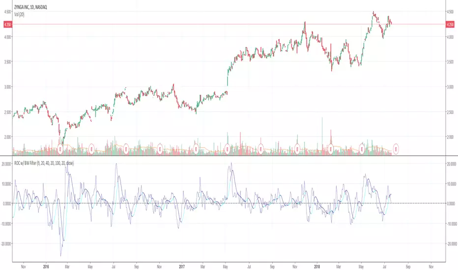
Rate of Change w/ Butterworth FilterIt passes the Rate of Change data through a Butterworth filter which creates a smooth line that can allow for easier detection of slope changes in the data over various periods of times.
The butterworth filter line and the rate of change are plotted together by default. The values for the lengths, for both the butterworth filter and the raw ROC data, can be changed from the format menu (through a toggle).
The shorter the Butterworth length, the closer the line is fitted to the raw ROC data, however you trade of with more frequent slope changes.
The longer the Butterworth length, the smoother the line and less frequent the slope changes, but the Butterworth line is farther of center from the raw ROC data.
Rate of Change RSIIndicator Name: Rate of Change RSI
Description:
The Rate of Change (ROC) of the Relative Strength Index (RSI) is a technical indicator designed to provide insights into the momentum of an asset's price movement. It combines the Relative Strength Index (RSI), a popular momentum oscillator, with the Rate of Change (ROC) concept to assess the speed at which RSI values are changing.
How It Works:
Relative Strength Index (RSI): The RSI measures the magnitude of recent price changes to evaluate overbought or oversold conditions in an asset. It oscillates between 0 and 100, with readings above 70 typically indicating overbought conditions and readings below 30 indicating oversold conditions.
Rate of Change (ROC): The ROC calculates the percentage change in a given indicator over a specified period. In this indicator, we apply the ROC to the RSI values to determine how quickly the RSI is changing over time.
Key Features:
Acceleration and Deceleration: The ROC of RSI helps traders identify whether the momentum of the RSI is accelerating or decelerating. Positive values suggest increasing momentum, while negative values indicate decreasing momentum.
Dynamic Color Change: The color of the ROC RSI line changes dynamically based on the RSI level. When the RSI is between 0 and 40, the line color is blue, indicating potential oversold conditions. When the RSI is between 40 and 60, the line color is yellow, suggesting neutral conditions. When the RSI is above 60, the line color changes to green, indicating potential overbought conditions.
How to Use:
Acceleration: When the ROC RSI is positive and increasing while the RSI is above 60 (green), it may signal strong upward momentum.
Deceleration: Conversely, if the ROC RSI is negative and decreasing while the RSI is below 40 (blue), it may indicate weakening downward momentum.
Originality and Usefulness:
This indicator combines the RSI, a well-known momentum oscillator, with the ROC concept to provide a unique perspective on momentum dynamics. By dynamically adjusting the color of the ROC RSI line based on RSI levels, traders can quickly assess potential overbought or oversold conditions in the market.
Chart:
The chart displayed alongside this script provides a clean and easy-to-understand visualization of the ROC RSI indicator. The ROC RSI line color changes dynamically based on RSI levels, allowing traders to visually identify potential market conditions at a glance.

BossHouse - Price ChangeBossHouse - Price Change
What it is:
In the stock market, a price change is the difference in trading prices from one period to the next or the difference between the daily opening and closing prices of a share of stock.
Here you have a timeline with a bar price change. In seconds you can see if the selected market has good and high price changes or not.
The values are in percentage and you have a limiter in the settings, so you can show only bar/values above a value. Ex. 2.4%.
Why it Matters:
Price changes are a core component of financial analysis, and predicting price changes can be as, if not more, important than an actual price change.
It is important to remember, however, that percent-based price changes are useful only in the context of the number of dollars involved.
A 75% change in the price of a company X, for example, may only involve a few dollars while a 75% change in the price of company Y may involve thousands of dollars.
Settings:
Show the SMA 21 line
Minimum Limit - Set the minimum value to show a bar
Calculation:
For example, let's say Company XYZ shares opened at $25 this morning and closed at $24.
The price change is -$1, or -$1/$25 = -4%.
Any help and suggestions will be appreciated.
Marcos Issler @ Isslerman
USDT Market Cap Change [Alpha Extract]A sophisticated stablecoin market analysis tool that tracks USDT market capitalization changes across daily and 60-day periods with statistical normalization and gradient intensity visualization. Utilizing z-score methodology for overbought/oversold detection and dynamic color gradients reflecting change magnitude, this indicator delivers institutional-grade market liquidity assessment through stablecoin flow analysis. The system's dual-timeframe approach combined with statistical normalization provides comprehensive market sentiment measurement based on capital inflows and outflows from the dominant stablecoin.
🔶 Advanced Market Cap Tracking Framework
Implements daily USDT market capitalization monitoring with dual-period change calculations measuring both 1-day and 60-day net capital flows. The system retrieves real-time CRYPTOCAP:USDT data on daily timeframe resolution, calculating absolute dollar changes to quantify stablecoin supply expansion or contraction as primary market liquidity indicator.
// Core Market Cap Analysis
USDT = request.security("CRYPTOCAP:USDT", "D", close)
USDT_60D_Change = USDT - USDT
USDT_1D_Change = USDT - USDT
🔶 Dynamic Gradient Intensity System
Features sophisticated color gradient engine that intensifies visual representation based on change magnitude relative to recent extremes. The system normalizes current 60-day change against configurable lookback period maximum, applying gradient strength calculation to transition colors from neutral tones through progressively intense blues (negative) or reds (positive) based on flow direction and magnitude.
🔶 Statistical Z-Score Normalization Engine
Implements comprehensive z-score calculation framework that normalizes 60-day market cap changes using rolling mean and standard deviation for objective overbought/oversold determination. The system applies statistical normalization over configurable periods, enabling cross-temporal comparison and threshold-based regime identification independent of absolute market cap levels.
// Z-Score Normalization
Change_Mean = ta.sma(USDT_60D_Change, Normalization_Length)
Change_StdDev = ta.stdev(USDT_60D_Change, Normalization_Length)
Z_Score = Change_StdDev > 0 ? (USDT_60D_Change - Change_Mean) / Change_StdDev : 0.0
🔶 Multi-Tier Threshold Detection System
Provides four-level regime classification including standard overbought (+1.5σ), standard oversold (-1.5σ), extreme overbought (+2.5σ), and extreme oversold (-2.5σ) thresholds with configurable adjustment. The system identifies market liquidity extremes when stablecoin inflows or outflows reach statistically significant levels, indicating potential market turning points or trend exhaustion.
🔶 Dual-Timeframe Flow Visualization
Features layered area plots displaying both 60-day strategic flows and 1-day tactical movements with distinct color coding for instant flow direction assessment. The system overlays short-term daily changes on longer-term 60-day trends, enabling traders to identify divergences between tactical and strategic capital flows into or out of stablecoin reserves.
🔶 Gradient Color Psychology Framework
Implements intuitive color scheme where red gradients indicate capital inflow (bullish for crypto as USDT supply expands for buying) and blue gradients show capital outflow (bearish as USDT is redeemed). The intensity progression from pale to vivid colors communicates flow magnitude, with extreme colors signaling statistically significant liquidity events requiring attention.
🔶 Background Zone Highlighting System
Provides subtle background coloring when z-score breaches overbought or oversold thresholds, creating visual alerts without obscuring primary data. The system applies translucent red backgrounds during overbought conditions and blue during oversold states, enabling instant regime recognition across chart timeframes.
🔶 Configurable Normalization Architecture
Features adjustable gradient lookback and statistical normalization periods enabling optimization across different market cycles and trading timeframes. The system allows traders to calibrate sensitivity by modifying the window used for maximum change detection (gradient) and mean/standard deviation calculation (z-score), adapting to volatile or stable market regimes.
🔶 Market Liquidity Interpretation Framework
Tracks USDT supply changes as proxy for overall cryptocurrency market liquidity conditions, where expanding market cap indicates fresh capital entering crypto markets and contracting cap suggests capital flight. The system provides leading indicator properties as large stablecoin inflows often precede major market rallies while outflows may signal distribution phases.
🔶 Why Choose USDT Market Cap Change ?
This indicator delivers sophisticated stablecoin flow analysis through statistical normalization and gradient visualization of USDT market capitalization changes. Unlike traditional market sentiment indicators that rely on price action alone, this tool measures actual capital flows through the dominant stablecoin, providing objective assessment of market liquidity conditions. The combination of dual-timeframe tracking, z-score normalization for overbought/oversold detection, and intensity-based gradient coloring makes it essential for traders seeking macro-level market assessment and regime change detection across cryptocurrency markets. The indicator excels at identifying liquidity extremes that often precede major market reversals or trend accelerations.

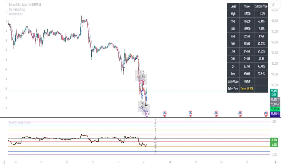
Percent Change IndicatorPercent Change Indicator Description
Overview:
The Percent Change Indicator is a Pine Script (version 6) indicator designed for TradingView to calculate and visualize the percentage change of the current close price relative to a user-selected reference price. It provides a customizable interface to display percentage changes as candlesticks or a line plot, with optional horizontal lines and labels for key levels. The indicator also includes visual signals and alerts for user-defined percentage thresholds, making it useful for identifying significant price movements.
Key Features:
1. Percentage Change Calculation:
- Computes the percentage change of the current close price compared to a reference price, scaled by a user-defined length parameter.
- Formula: percentChange = (close - refPrice) / refPrice * len
- The reference price is sourced from a user-selected timeframe (default: 1D) and price type (Open, High, Low, Close, HL2, HLC3, or HLCC4).
2. Visualization Options:
- Candlestick Plot: Displays percentage change as candlesticks, colored green for rising values and red for falling values.
- Line Plot: Plots the percentage change as a line, with the same color logic.
- Horizontal Lines: Optional horizontal lines at key percentage levels (0%, ±0.2%, ±0.5%, ±0.8%, ±1%) for reference.
- Labels: Optional labels for percentage levels (0, ±15%, ±35%, ±50%, ±65%, ±85%, ±100%) displayed at the chart's right edge.
- All visualizations are toggleable via input settings.
3. Signal and Alert System:
- Threshold-Based Signals: Plots green triangles below bars for long signals (percent change above a user-defined threshold) and red triangles above bars for short signals (percent change below the threshold).
- Alerts: Configurable alerts for long and short conditions, triggered when the percentage change crosses the user-defined threshold (default: 2%). Alert messages include the threshold value for clarity.
4. Customizable Inputs:
- Show Labels: Toggle visibility of percentage level labels (default: true).
- Show Percentage Change: Toggle the line plot of percentage change (default: true).
- Show HLines: Toggle visibility of horizontal reference lines (default: false).
- Show Candle Plot: Toggle the candlestick plot (default: true).
- Percent Change Length: Adjust the scaling factor for percentage change (default: 14).
- Plot Timeframe: Select the timeframe for the reference price (default: 1D).
- Price Type: Choose the reference price type (Open, High, Low, Close, HL2, HLC3, HLCC4; default: Open).
- Percentage Threshold: Set the threshold for long/short signals and alerts (default: 0.02 or 2%).
How It Works:
- The indicator fetches the reference price using request.security() based on the selected timeframe and price type.
- It calculates the percentage change and scales it by the user-defined length.
- Visuals (candlesticks, lines, labels, horizontal lines) are plotted based on user preferences.
- Long and short signals are generated when the percentage change exceeds or falls below the user-defined threshold, with corresponding triangles plotted and alerts triggered.
Use Cases:
- Trend Identification: Monitor significant price movements relative to a reference price.
- Signal Generation: Identify potential entry/exit points based on percentage change thresholds.
- Custom Analysis: Analyze price changes across different timeframes and price types for various trading strategies.
- Alert Notifications: Receive alerts for significant price movements to stay informed without constant chart monitoring.
Setup Instructions:
1. Add the indicator to a TradingView chart.
2. Adjust input settings (timeframe, price type, threshold, etc.) to suit your analysis.
3. Enable/disable visualization options (candlesticks, lines, labels, horizontal lines) as needed.
4. Set up alerts in TradingView:
- Go to the "Alerts" tab and select "Percent Change Indicator."
- Choose "Long Alert" or "Short Alert" to monitor threshold crossings.
- Configure alert frequency and notification method (e.g., email, webhook).
Notes:
- The indicator is non-overlay, displayed in a separate pane below the main chart.
- Alerts trigger on bar close by default; adjust TradingView alert settings for real-time notifications if needed.
- The indicator is released under the Mozilla Public License 2.0.
Author: Dshergill
This indicator is ideal for traders seeking a flexible tool to track percentage-based price movements with customizable visuals and alerts.
Color Change EMA 200 (4H)200 Color Change EMA (4H Locked)
Overview
This indicator displays a 200-period Exponential Moving Average (EMA) that is locked to the 4-hour timeframe, regardless of what chart timeframe you're currently viewing. The EMA line changes color dynamically based on price action to provide clear visual trend signals.
Key Features
• Multi-Timeframe Capability : Always shows the 4H 200 EMA on any chart timeframe
• Dynamic Color Coding :
- Green: Price is above the 200 EMA (bullish condition)
- Red: Price is below the 200 EMA (bearish condition)
• Clean Visual Design : Bold 2-pixel line width for clear visibility
• Real-time Updates : Colors change instantly as price crosses above or below the EMA
How to Use
1. Add the indicator to any timeframe chart
2. The 4H 200 EMA will appear as a smooth line
3. Watch for color changes:
- When the line turns green, it indicates price strength above the key moving average
- When the line turns red, it suggests price weakness below the moving average
4. Use for trend identification, support/resistance levels, and entry/exit timing
Best Practices
• Combine with other technical analysis tools for confirmation
• Use the color changes as alerts for potential trend shifts
• Consider the 200 EMA as a major support/resistance level
• Works well for swing trading and position sizing decisions
Settings
• Length : Default 200 periods (customizable)
• Source : Default closing price (customizable)
Perfect for traders who want to keep the important 4H 200 EMA visible across all timeframes with instant visual trend feedback.
Percent Trend Change [BigBeluga]The Percent Trend Change indicator is a trend-following tool that provides real-time percentage changes during trends based on entry prices. Using John Ehlers’ Ultimate Smoother filter, it detects trend direction, identifies uptrends and downtrends, and tracks percentage changes during the trend. Additionally, it has a channel that can be toggled on or off, and the width can be customized, adding an extra visual layer to assess trend strength and direction.
NIFTY50:
META:
🔵 IDEA
The Percent Trend Change indicator helps traders visualize the progression of a trend with percentage changes from entry points. It identifies trends and marks percentage changes during the trend, making it easier to assess the strength and sustainability of the ongoing trend.
The use of John Ehlers' Ultimate Smoother filter helps detect trend changes based on consecutive price movements over five bars, making it highly responsive to short- and medium-term trends.
🔵 KEY FEATURES & USAGE
◉ Ultimate Smoother Filter for Trend Detection:
The trend is detected using the Ultimate Smoother filter. If the smoothed line rises five times in a row, the indicator identifies an uptrend. If it falls five times in a row, it identifies a downtrend.
◉ Trend Entry with Price Labels:
The indicator marks trend entry points with up (green) and down (red) triangles. These triangles are labeled with the entry price, allowing traders to track the starting price of the trend.
◉ Percentage Change Labels During Trends:
During a trend, the indicator periodically plots percentage change labels based on the bar period set in the settings.
In an uptrend, positive changes are marked in green, while negative changes are marked in orange. In a downtrend, negative changes are marked in red, while positive changes are marked in orange.
Each plotted percentage label also includes a count of the trend points, allowing traders to track how many times the percentage labels have been plotted during the current trend.
These percentage labels help traders understand how much the price has changed since the trend began and can be used to define potential take-profit targets.
◉ Channel Toggle and Width Customization:
The indicator includes a channel that visually highlights the trend. Traders can toggle this channel on or off, and the width of the channel can be adjusted to match individual preferences. The channel helps visualize the overall trend direction and the range within which price fluctuations occur.
🔵 CUSTOMIZATION
Smoother Length: Adjusts the length of the Ultimate Smoother filter, affecting how responsive the indicator is to price fluctuations.
Bars Percent: Defines how many bars must pass before a new percentage label is plotted. A smaller value plots labels more frequently, while a higher value shows fewer labels.
Channel Width & Show Channel: The width of the channel can be customized, and traders can toggle the channel on or off depending on their preferences.
Color Customization: Traders can customize the colors for the uptrend, downtrend, and percentage labels, providing flexibility in how the indicator is displayed on the chart.
By combining trend-following capabilities with percentage change tracking, the Percent Trend Change indicator offers a powerful tool for identifying trend direction and setting potential take-profit targets. The ability to customize the channel and percentage labels makes it adaptable to various trading strategies.

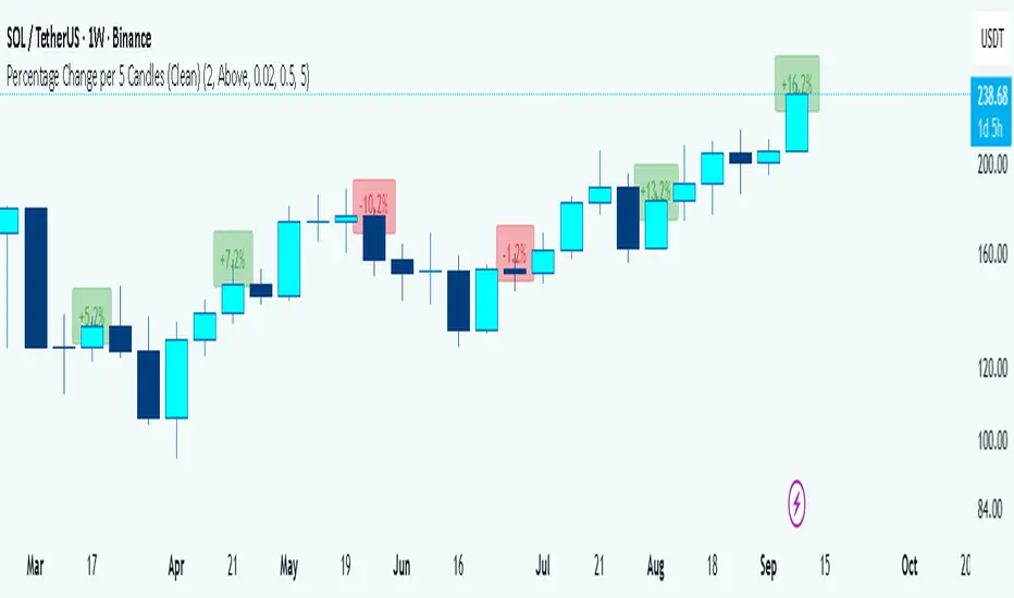
Percentage Change per 5 Candles
🔎 What this indicator does
This indicator calculates and displays the percentage change of each candlestick directly on the chart.
• If a candle closed higher than it opened (bullish candle), it shows a positive % change (green).
• If a candle closed lower than it opened (bearish candle), it shows a negative % change (red).
• Small moves below your chosen threshold (e.g., 0.1%) are ignored to avoid clutter.
• The labels are placed above, below, or in the center of the candle (you choose).
So essentially, every candle “tells you in numbers” exactly how much it changed relative to its opening price.
________________________________________
⚙️ How it operates (the logic inside)
1. Calculate the change
o Formula:
\text{% Change} = \frac{(\text{Close} - \text{Open})}{\text{Open}} \times 100
o Example: If a candle opens at 100 and closes at 105, that’s a +5% change.
2. Round it nicely
o You can control decimals (e.g., show 2 decimals → +5.23%).
3. Filter out noise
o If a candle barely moved (say 0.02%), the label won’t appear unless you reduce the threshold.
4. Style the labels
o Bullish = green text, slightly transparent green background.
o Bearish = red text, slightly transparent red background.
o Neutral (0%) = gray.
5. Place the labels
o Options: above the candle, below the candle, or centered.
o Small vertical offset is applied so labels don’t overlap the candle itself.
________________________________________
📊 How this helps traders
This indicator turns visual candles into quantifiable numbers at a glance. Instead of guessing whether a move was “big” or “small,” you see it clearly.
Key Benefits:
1. Quick volatility analysis
o You can instantly see if candles are making big % swings or just small moves.
o This is especially useful on higher timeframes (daily/weekly) where moves can be large.
2. Pattern confirmation
o For example, you might spot a strong bullish engulfing candle — the % change label helps confirm whether it was truly significant (e.g., +4.5%) or just modest (+0.7%).
3. Noise filtering
o By setting a minimum % threshold, you only see labels when moves are meaningful (say > 0.5%). This keeps focus on important candles.
4. Backtesting & comparison
o You can compare moves across time:
“How strong was this breakout candle compared to the last one?”
“Are today’s bearish candles weaker or stronger than yesterday’s bullish candles?”
5. Better decision-making
o If you’re trading breakouts, reversals, or trend-following, knowing the % size of each candle helps confirm if the move has enough momentum.
________________________________________
✅ In short:
This indicator quantifies price action. Instead of just seeing “green” or “red” candles, you now know exactly how much the price changed in percentage terms, directly on the chart, in real time. It helps you distinguish between strong and weak moves and makes your analysis more precise.
________________________________________
Supertrend + MACD Trend Change with AlertsDetailed Guide
1. Indicator Overview
Purpose:
This script combines the Supertrend and MACD indicators to help you detect potential trend changes. It plots a Supertrend line (green for bullish, red for bearish) and marks the chart with shapes when a trend reversal is signaled by both indicators. In addition, it includes alert conditions so that you can be notified when a potential trend change occurs.
How It Works:
Supertrend: Uses the Average True Range (ATR) to determine dynamic support and resistance levels. When the price crosses these levels, it signals a possible change in trend.
MACD: Focuses on the crossover between the MACD line and the signal line. A bullish crossover (MACD line crossing above the signal line) suggests upward momentum, while a bearish crossover (MACD line crossing below the signal line) suggests downward momentum.
2. Supertrend Component
Key Parameters:
Factor:
Function: Multiplies the ATR to create an offset from the mid-price (hl2).
Adjustment Impact: Lower values make the indicator more sensitive (producing more frequent signals), while higher values result in fewer, more confirmed signals.
ATR Period:
Function: Sets the number of bars over which the ATR is calculated.
Adjustment Impact: A shorter period makes the ATR react more quickly to recent price changes (but can be noisy), whereas a longer period provides a smoother volatility measurement.
Trend Calculation:
The script compares the previous close with the dynamically calculated upper and lower bands. If the previous close is above the upper band, the trend is set to bullish (1); if it’s below the lower band, the trend is bearish (-1). The Supertrend line is then plotted in green for bullish trends and red for bearish trends.
3. MACD Component
Key Parameters:
Fast MA (Fast Moving Average):
Function: Represents a shorter-term average, making the MACD line more sensitive to recent price movements.
Slow MA (Slow Moving Average):
Function: Represents a longer-term average to smooth out the MACD line.
Signal Smoothing:
Function: Defines the period for the signal line, which is a smoothed version of the MACD line.
Crossover Logic:
The script uses the crossover() function to detect when the MACD line crosses above the signal line (bullish crossover) and crossunder() to detect when it crosses below (bearish crossover).
4. Combined Signal Logic
How Signals Are Combined:
Bullish Scenario:
When the MACD shows a bullish crossover (MACD line crosses above the signal line) and the Supertrend indicates a bullish trend (green line), a green upward triangle is plotted below the bar.
Bearish Scenario:
When the MACD shows a bearish crossover (MACD line crosses below the signal line) and the Supertrend indicates a bearish trend (red line), a red downward triangle is plotted above the bar.
Rationale:
By combining the signals from both indicators, you increase the likelihood that the detected trend change is reliable, filtering out some false signals.
5. Alert Functionality
Alert Setup in the Code:
The alertcondition() function is used to define conditions under which TradingView can trigger alerts.
There are two alert conditions:
Bullish Alert: Activated when there is a bullish MACD crossover and the Supertrend confirms an uptrend.
Bearish Alert: Activated when there is a bearish MACD crossover and the Supertrend confirms a downtrend.
What Happens When an Alert Triggers:
When one of these conditions is met, TradingView registers the alert condition. You can then create an alert in TradingView (using the alert dialog) and choose one of these alert conditions. Once set up, you’ll receive notifications (via pop-ups, email, or SMS, depending on your settings) whenever a trend change is signaled.
6. User Adjustments and Their Effects
Factor (Supertrend):
Adjustment: Lowering the factor increases sensitivity, resulting in more frequent signals; raising it will filter out some signals, making them potentially more reliable.
ATR Period (Supertrend):
Adjustment: A shorter ATR period makes the indicator more responsive to recent price movements (but can introduce noise), while a longer period smooths out the response.
MACD Parameters (Fast MA, Slow MA, and Signal Smoothing):
Adjustment:
Shortening the Fast MA increases sensitivity, generating earlier signals that might be less reliable.
Lengthening the Slow MA produces a smoother MACD line, reducing noise.
Adjusting the Signal Smoothing changes how quickly the signal line responds to changes in the MACD line.
7. Best Practices and Considerations
Multiple Confirmation:
Even if both indicators signal a trend change, consider confirming with additional analysis such as volume, price action, or other indicators.
Market Conditions:
These indicators tend to perform best in trending markets. In sideways or choppy conditions, you may experience more false alerts.
Backtesting:
Before applying the indicator in live trading, backtest your settings to ensure they suit your trading style and the market conditions.
Risk Management:
Always use proper risk management, including stop-loss orders and appropriate position sizing, as alerts may occasionally produce late or false signals.
Happy trading!

Dynamic Rate of Change OscillatorDynamic Rate of Change (RoC) Oscillator with Color-Coded Histogram
Detailed Description for Publication
The Dynamic Rate of Change (RoC) Oscillator with Color-Coded Histogram is a sophisticated technical analysis tool designed to enhance your understanding of market momentum. Created using Pine Script v5 on the TradingView platform, this indicator integrates multiple Rate of Change (RoC) calculations into a unified momentum oscillator. The resulting data is displayed as a color-coded histogram, providing a clear visual representation of momentum changes.
Key Features and Functionality
Multi-Length RoC Calculation:
Short-term RoC: Calculated over a user-defined period (shortRoCLength), this captures variations in price momentum over a shorter duration, offering insights into the immediate price action.
Long-term RoC: This uses a longer period (longRoCLength) to provide a broader view of momentum, helping to smooth out short-term fluctuations and highlight more established trends.
Mid-term RoC: A weighted average of the short-term and long-term RoCs, the mid-term RoC (midRoCWeight) allows you to balance sensitivity and stability in the oscillator's behavior.
Weighted RoC Calculation:
The indicator calculates a single weighted average RoC by integrating short-term, long-term, and mid-term RoCs. The weighting factor can be adjusted to prioritize different market dynamics according to the trader’s strategy. This flexible approach enables the oscillator to remain applicable across diverse market conditions.
Oscillator Calculation and Smoothing:
The oscillator value is computed by subtracting a 14-period Weighted Moving Average (WMA) from the weighted RoC, which helps to normalize the oscillator, making it more responsive to changes in momentum.
The oscillator is then smoothed using a Simple Moving Average (SMA) over a user-defined period (smoothLength). This process reduces market noise, making the oscillator's signals clearer and easier to interpret.
Color-Coded Histogram:
The smoothed oscillator is displayed as a histogram, which is color-coded to reflect bullish or bearish momentum. You can customize the colors to match your charting style, with green typically representing upward momentum and red representing downward momentum.
The color-coded histogram allows for quick visual identification of momentum changes on the chart, aiding in your market analysis.
Zero-Line Reference:
A horizontal line at the zero level is plotted as a reference point. This zero-line helps in identifying when the histogram shifts from positive to negative or vice versa, which can be useful in understanding momentum shifts.
The zero-line offers a straightforward visual cue, making it easier to interpret the oscillator's signals in relation to market movements.
Customization and Versatility
The Dynamic RoC Oscillator with Histogram is designed with flexibility in mind, making it suitable for a wide range of trading styles, from short-term trading to longer-term analysis. Users have the ability to fine-tune the indicator’s input parameters to align with their specific needs:
Adjustable RoC Periods: Customize the short-term and long-term RoC lengths to match the timeframes you focus on.
Weighted Sensitivity: Adjust the mid-term RoC weight to emphasize different aspects of momentum according to your analysis approach.
Smoothing Options: Modify the smoothing moving average length to control the sensitivity of the oscillator, allowing you to balance responsiveness with noise reduction.
Use Cases
Momentum Analysis: Gain a clearer understanding of momentum changes within the market, which can aid in the evaluation of market trends.
Trend Analysis: The oscillator can help in assessing trends by highlighting when momentum is increasing or decreasing.
Chart Visualization: The color-coded histogram provides a visually intuitive method for monitoring momentum, helping you to more easily interpret market behavior.
Conclusion
The Dynamic Rate of Change (RoC) Oscillator with Color-Coded Histogram is a versatile and powerful tool for traders who seek a deeper analysis of market momentum. With its dynamic calculation methods and high degree of customization, this indicator can be tailored to suit a variety of trading strategies. By integrating it into your TradingView charts, you can enhance your technical analysis capabilities, gaining valuable insights into market momentum.
This indicator is easy to use and highly customizable, making it a valuable addition to any trader’s toolkit. Add it to your charts on the TradingView platform and start exploring its potential to enrich your market analysis.
T3 [RATE OF CHANGE] by SKiNNiEHDeveloped by Tim Tillson, the Tilson Moving Average (T3) is a trend indicator with the advantage of having less lag than other ones. That is, a faster moving average. The T3 moving average is an "indicator of an indicator" as it includes several EMAs of another EMA. Unlike other moving averages, the t3 adds the so-called volume factor, a value between 0 and 1.
The T3 RATE OF CHANGE by SKiNNiEH is a unique indicator that integrates the T3 moving average with a normalized Rate of Change (RoC) calculation. Unlike traditional T3 moving averages, this indicator provides additional smoothing modes (SINGLE, DOUBLE & TRIPLE) for the T3, whilst enhancing visual feedback of the plotted line by generating a dynamic line thickness, a dynamic line color & brightness and trade entry bars, offering traders a more dynamic view of market conditions without going "overboard" with settings.
How It Works
Visualization
The T3 line varies in thickness and color based on the RoC values, giving traders visual cues about market strength and direction.
Thicker and brighter lines indicate stronger trends, while thinner and duller lines suggest weaker trends.
Rate of Change Filte r
This filter refines trend detection by using the line thickness measurement.
Adjustable from 0 (disabled) to 4, where higher settings only consider stronger trends for signals.
The T3 line turns gray when the filter is triggered or when the RoC is extremely low, signaling a weak or neutral market.
T3 Calculation (mode)
SINGLE
The T3 calculation is applied once to the closing price.
This mode has the least smoothing effect and the least lag. It reacts more quickly to price changes but is less smooth.
DOUBLE
The T3 calculation is applied twice sequentially.
The first T3 calculation smooths the closing price.
The second T3 calculation smooths the result of the first T3 calculation.
This mode provides more smoothing and introduces more lag compared to SINGLE mode. It is smoother but reacts slower to price changes.
TRIPLE
The T3 calculation is applied three times sequentially.
The first T3 calculation smooths the closing price.
The second T3 calculation smooths the result of the first T3 calculation.
The third T3 calculation smooths the result of the second T3 calculation.
This mode provides the most smoothing and introduces the most lag by reacting the slowest to price changes.
Rate of Change (RoC) Calculation
The script calculates the Rate of Change (RoC) for the T3 values based on the selected mode (SINGLE, DOUBLE, TRIPLE). The RoC measures the percentage change between the most recent value and a value in the past. The measurement is then normalized in three different ranges.
Normalization 5: Determines T3 line thickness on a scale from 0 - 5
Normalization 10: Determines T3 color brightness on a scale from 0 - 10
Normalization 100: Determines Rate of Change percentage
Rate of Change Filter
The script uses the RoC filter to refine the trend detection logic. By using the line thickness measurement, a filter can be enabled by setting this input on 1 - 4. As an example, setting this to 4 means that only a line thickness of 5 would be considered for a trade signal. Setting this to 0 disables the filter. The T3 line will turn gray when the filter is triggered, the T3 line can also turn gray without the filter, when the Rate of Change is extremely low.
Trade Signals
A trade signal is printed as a vertical green or red bar when the following conditions are met:
Long:
Closing price is above the T3 line
Rate of Change percentage is above 0
Previous trade signal was a short signal **
Rate of Change is not filtered
Short:
Closing price is below the T3 line
Rate of Change percentage is below 0
Previous trade signal was a long signal **
Rate of Change is not filtered
** Or this is the very first recorded trade signal
It should be noted that the trade signals in this script are trade entry signals, not trade exit signals. Use at your own risk.
Instructions for Use
Setting Up the Indicator
Apply the indicator to your trading chart.
Choose the desired T3 mode (SINGLE, DOUBLE, TRIPLE) based on your need for smoothing and lag.
Set the desired length (lookback period).
Set the desired factor between 0 and 1 (increments of 0.1)
Choose an overall line thickness and brightness that suits your screen and taste preferences.
Apply the Rate of Change filter. Setting this to 0 will disable the filter
Tip: use the trade entry vertical bars as a visual calibration tool the adjust mode, length, factor and filter.
Interpreting Visual Cues
Observe the T3 line's thickness: thicker lines indicate stronger trends, while thinner lines suggest weaker trends.
Observe the T3 line's color and color brightness: green indicates a more bullish trend, while red indicates a more bearish trend. A brighter color suggest a stronger trend. A gray color means the RoC is very low / neutral, or the RoC filter is active.
Observe the T3 line's location relative to price: below price indicates a more bullish trend, above price indicates a more bearish trend. The T3 line distance from price can also be an indication of trend strength.
Observe vertical bars: a vertical bar is printed green when long conditions are met, a vertical bar is printed red when short conditions are met. See the rules that explain the trigger for this bar above.
Alerts
Go to the settings tab, set the condition to T3.RoC.S + LONG or SHORT.
Enter an alert name and message.
Configure your notification preferences in the notifications tab and create the alert
Notifications-tab: Choose your notification preferences
Create the alert.

Half Causal EstimatorOverview
The Half Causal Estimator is a specialized filtering method that provides responsive averages of market variables (volume, true range, or price change) with significantly reduced time delay compared to traditional moving averages. It employs a hybrid approach that leverages both historical data and time-of-day patterns to create a timely representation of market activity while maintaining smooth output.
Core Concept
Traditional moving averages suffer from time lag, which can delay signals and reduce their effectiveness for real-time decision making. The Half Causal Estimator addresses this limitation by using a non-causal filtering method that incorporates recent historical data (the causal component) alongside expected future behavior based on time-of-day patterns (the non-causal component).
This dual approach allows the filter to respond more quickly to changing market conditions while maintaining smoothness. The name "Half Causal" refers to this hybrid methodology—half of the data window comes from actual historical observations, while the other half is derived from time-of-day patterns observed over multiple days. By incorporating these "future" values from past patterns, the estimator can reduce the inherent lag present in traditional moving averages.
How It Works
The indicator operates through several coordinated steps. First, it stores and organizes market data by specific times of day (minutes/hours). Then it builds a profile of typical behavior for each time period. For calculations, it creates a filtering window where half consists of recent actual data and half consists of expected future values based on historical time-of-day patterns. Finally, it applies a kernel-based smoothing function to weight the values in this composite window.
This approach is particularly effective because market variables like volume, true range, and price changes tend to follow recognizable intraday patterns (they are positive values without DC components). By leveraging these patterns, the indicator doesn't try to predict future values in the traditional sense, but rather incorporates the average historical behavior at those future times into the current estimate.
The benefit of using this "average future data" approach is that it counteracts the lag inherent in traditional moving averages. In a standard moving average, recent price action is underweighted because older data points hold equal influence. By incorporating time-of-day averages for future periods, the Half Causal Estimator essentially shifts the center of the filter window closer to the current bar, resulting in more timely outputs while maintaining smoothing benefits.
Understanding Kernel Smoothing
At the heart of the Half Causal Estimator is kernel smoothing, a statistical technique that creates weighted averages where points closer to the center receive higher weights. This approach offers several advantages over simple moving averages. Unlike simple moving averages that weight all points equally, kernel smoothing applies a mathematically defined weight distribution. The weighting function helps minimize the impact of outliers and random fluctuations. Additionally, by adjusting the kernel width parameter, users can fine-tune the balance between responsiveness and smoothness.
The indicator supports three kernel types. The Gaussian kernel uses a bell-shaped distribution that weights central points heavily while still considering distant points. The Epanechnikov kernel employs a parabolic function that provides efficient noise reduction with a finite support range. The Triangular kernel applies a linear weighting that decreases uniformly from center to edges. These kernel functions provide the mathematical foundation for how the filter processes the combined window of past and "future" data points.
Applicable Data Sources
The indicator can be applied to three different data sources: volume (the trading volume of the security), true range (expressed as a percentage, measuring volatility), and change (the absolute percentage change from one closing price to the next).
Each of these variables shares the characteristic of being consistently positive and exhibiting cyclical intraday patterns, making them ideal candidates for this filtering approach.
Practical Applications
The Half Causal Estimator excels in scenarios where timely information is crucial. It helps in identifying volume climaxes or diminishing volume trends earlier than conventional indicators. It can detect changes in volatility patterns with reduced lag. The indicator is also useful for recognizing shifts in price momentum before they become obvious in price action, and providing smoother data for algorithmic trading systems that require reduced noise without sacrificing timeliness.
When volatility or volume spikes occur, conventional moving averages typically lag behind, potentially causing missed opportunities or delayed responses. The Half Causal Estimator produces signals that align more closely with actual market turns.
Technical Implementation
The implementation of the Half Causal Estimator involves several technical components working together. Data collection and organization is the first step—the indicator maintains a data structure that organizes market data by specific times of day. This creates a historical record of how volume, true range, or price change typically behaves at each minute/hour of the trading day.
For each calculation, the indicator constructs a composite window consisting of recent actual data points from the current session (the causal half) and historical averages for upcoming time periods from previous sessions (the non-causal half). The selected kernel function is then applied to this composite window, creating a weighted average where points closer to the center receive higher weights according to the mathematical properties of the chosen kernel. Finally, the kernel weights are normalized to ensure the output maintains proper scaling regardless of the kernel type or width parameter.
This framework enables the indicator to leverage the predictable time-of-day components in market data without trying to predict specific future values. Instead, it uses average historical patterns to reduce lag while maintaining the statistical benefits of smoothing techniques.
Configuration Options
The indicator provides several customization options. The data period setting determines the number of days of observations to store (0 uses all available data). Filter length controls the number of historical data points for the filter (total window size is length × 2 - 1). Filter width adjusts the width of the kernel function. Users can also select between Gaussian, Epanechnikov, and Triangular kernel functions, and customize visual settings such as colors and line width.
These parameters allow for fine-tuning the balance between responsiveness and smoothness based on individual trading preferences and the specific characteristics of the traded instrument.
Limitations
The indicator requires minute-based intraday timeframes, securities with volume data (when using volume as the source), and sufficient historical data to establish time-of-day patterns.
Conclusion
The Half Causal Estimator represents an innovative approach to technical analysis that addresses one of the fundamental limitations of traditional indicators: time lag. By incorporating time-of-day patterns into its calculations, it provides a more timely representation of market variables while maintaining the noise-reduction benefits of smoothing. This makes it a valuable tool for traders who need to make decisions based on real-time information about volume, volatility, or price changes.

2024 - Median High-Low % Change - Monthly, Weekly, DailyDescription:
This indicator provides a statistical overview of Bitcoin's volatility by displaying the median high-to-low percentage changes for monthly, weekly, and daily timeframes. It allows traders to visualize typical price fluctuations within each period, supporting range and volatility-based trading strategies.
How It Works:
Calculation of High-Low % Change: For each selected timeframe (monthly, weekly, and daily), the script calculates the percentage change from the high to the low price within the period.
Median Calculation: The median of these high-to-low changes is determined for each timeframe, offering a robust central measure that minimizes the impact of extreme price swings.
Table Display: At the end of the chart, the script displays a table in the top-right corner with the median values for each selected timeframe. This table is updated dynamically to show the latest data.
Usage Notes:
This script includes input options to toggle the visibility of each timeframe (monthly, weekly, and daily) in the table.
Designed to be used with Bitcoin on daily and higher timeframes for accurate statistical insights.
Ideal for traders looking to understand Bitcoin's typical volatility and adjust their strategies accordingly.
This indicator does not provide specific buy or sell signals but serves as an analytical tool for understanding volatility patterns.

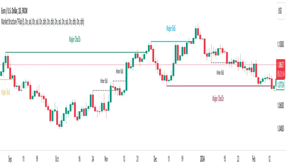
Market Structures SMC [TradingFinder] BOS/CHoCH Major & Minor🟣Introduction
Understanding market structure involves analyzing market behavior. In other words, market structure encompasses how the market forms and evolves within trends.
Market structures are typically fractal and nested, so we categorize them into internal (minor) and external (major) structures. There are various definitions of market structure, with different approaches such as Smart Money and ICT providing their own interpretations.
🟣How to Use
The first step in identifying market structure is to analyze key highs and lows. An uptrend is formed when highs and lows are successively higher than previous ones. Similarly, in a downtrend, lows and highs are successively lower than previous ones.
Market trends consist of two types of movements :
•Impulsive movements
•Corrective movements
Impulsive movements align with the main trend and possess high strength and momentum. Conversely, corrective movements go against the main trend and have lower strength and momentum. The following example illustrates these concepts.
🔵 Identifying Break of Structure (BOS)
In a specific trend, for example in a downtrend, when the price breaks below the previous low and forms a new low (LL), a Break of Structure occurs. In an uptrend, a BOS (Market Structure Break or MSB) happens when the price rises and surpasses the last high.
We need at least one BOS to confirm a trend. Breaking above or below the previous high or low must be confirmed by closing at least one candle after that level.
🔵 Identifying Change of Character (CHOCH)
Change of Character (CHOCH) is a key concept in market structure analysis. A change in structure signals a trend change. In other words, a trend ends with a CHOCH (Market Structure Shift or MSS). For instance, in a downtrend, the price declines with BOS.
BOS indicates the strength of the trend, but when the price increases and surpasses the last high, a CHOCH occurs, signaling a shift from a downtrend to an uptrend.
This does not mean entering a buy trade; instead, we should wait for a BOS in the upward direction to confirm the uptrend. Unlike BOS, confirming a CHOCH does not require a candle to close; simply breaking above or below the previous high or low with the candle's wick is sufficient. The following examples show bearish and bullish CHOCH.
🔵 Range Market Structure
Besides uptrends and downtrends, a third structure often found in the market is the range or sideways structure. In this state, the power of buyers and sellers is almost equal, and the market lacks a clear trend.
Many traders believe that the Forex market ranges 80% of the time. Therefore, it requires a lot of patience to wait for a new trend to start.
🟣 Settings
Through the settings, you can customize the display, visibility, and color of each line as desired.
Qullamaggie ADR and Volatility and Price Change IndicatorElevate your trading strategy with Qullamaggie ADR, a dynamic indicator inspired by the Kristjan Qullamaggie trading approach. Gain a deeper understanding of market dynamics, daily price movements, and potential turning points.
Key Features:
Qullamaggie ADR: Assess market volatility through the QullaADR, offering customizable time intervals (5, 10, 15, 20 days) to adapt to various trading styles.
Today's Change: Monitor price changes relative to the low of the current trading day, providing valuable intraday insights.
PrevDay price differentials from the previous day's low, aiding in the identification of potential trend reversals.
Track the percentage change from the opening price, offering a snapshot of intraday market sentiment.
Percent from 10-day SMA: Visualize the percentage difference between the closing price and a 10-day Simple Moving Average (SMA), a key trend-following indicator.
Usage:
Utilize QullaADR to set realistic profit targets and stop-loss levels based on current market conditions.
Identify potential trend shifts by observing changes from the previous day's low with Today's QullaChange.
Incorporate QullaPercent from 10-day SMA for trend confirmation and well-informed trading decisions.
Strategy Inspiration:
QullaADR draws inspiration from the Kristjan Qullamaggie trading strategy, aiming to complement your trading toolkit and enhance decision-making.
Disclaimer:
Trading involves risk, and past performance is not indicative of future results. Use this indicator as a supplementary tool within a comprehensive trading strategy.
Version: 1.0

Normalized Volume Rate of ChangeThis indicator is designed to help traders gauge changes in volume dynamics and identify potential shifts in buying or selling pressure. By normalizing the volume rate of change and comparing it to moving averages of itself, it offers valuable insights into market trends and can assist in making informed trading decisions.
Calculation:
The indicator calculates the Volume Rate of Change (VROC) by measuring the percentage change in volume over a specified length. This calculation provides a relative measure of how quickly the volume is increasing or decreasing. It then normalizes the VROC to a range of -1 to +1 by scaling it based on the highest and lowest values observed within the specified length. This normalization allows for easy comparison of the current VROC value with historical levels, enabling traders to assess the intensity of volume fluctuations.
Interpretation:
The main plot of the indicator displays the normalized VROC values as columns. The color of each column provides valuable information about the relationship between the VROC and the moving averages. Lime-colored columns indicate that the VROC is above both moving averages, suggesting increased buying pressure and potential bullish sentiment. Conversely, fuchsia-colored columns indicate that the VROC is below both moving averages, suggesting increased selling pressure and potential bearish sentiment. Yellow-colored columns indicate that the VROC is between the two moving averages, reflecting a period of consolidation or indecision in the market.
To further enhance interpretation, the indicator includes two moving averages. The Aqua line represents the faster moving average (MA1), and the Orange line represents the slower moving average (MA2). These moving averages provide additional context by smoothing out the VROC values and highlighting the overall trend. Traders can observe the interaction between the moving averages and the VROC to identify potential crossovers and assess the strength of trend reversals or continuations.
Colors:
-- Lime : The lime color is used to represent high volume rate of change above both moving averages. This color indicates a potentially bullish market sentiment, suggesting that buyers are dominant.
-- Fuchsia : The fuchsia color is used to represent low volume rate of change below both moving averages. This color indicates a potentially bearish market sentiment, suggesting that sellers are dominant.
-- Yellow : The yellow color is used to represent the volume rate of change between the two moving averages. This color reflects a transitional phase where neither buyers nor sellers have a clear advantage, signaling a period of consolidation or indecision in the market.
To provide additional visual cues for potential trade signals, the indicator includes lime-colored arrows below the price chart when there is a crossover upwards (MA1 crossing above MA2). This lime arrow indicates a potential bullish signal, suggesting a favorable time to consider long positions. Similarly, fuchsia-colored arrows are displayed above the price chart when there is a crossover downwards (MA1 crossing below MA2), signaling a potential bearish signal and suggesting a favorable time to consider short positions.
Applications:
This indicator offers various applications in trading strategies, including:
-- Trend Identification : By observing the relationship between the normalized VROC and the moving averages, traders can identify potential shifts in market trends. Lime-colored columns above both moving averages indicate a strong bullish trend, suggesting an opportunity to capitalize on upward price movements. Conversely, fuchsia-colored columns below both moving averages indicate a strong bearish trend, suggesting an opportunity to profit from downward price movements. Yellow-colored columns between the moving averages indicate a period of consolidation or uncertainty, signaling a potential trend reversal or continuation.
-- Confirmation of Price Moves : The indicator's ability to reflect volume dynamics in relation to the moving averages can help traders validate price moves. When significant price movements are accompanied by lime-colored columns (indicating high volume rate of change above both moving averages), it adds confirmation to the bullish sentiment. Similarly, fuchsia-colored columns accompanying downward price movements validate the bearish sentiment. This confirmation can enhance traders' confidence in the reliability of price moves.
-- Trade Timing : The indicator's moving average crossovers and the presence of arrows provide timing signals for trade entries and exits. Lime arrows appearing below the price chart signal potential long entry opportunities, indicating a bullish market sentiment. Conversely, fuchsia arrows appearing above the price chart suggest potential short entry opportunities, indicating a bearish market sentiment. These signals can be used in conjunction with other technical analysis tools to improve trade timing and increase the probability of successful trades.
Parameter Adjustments:
Traders can adjust the length of the VROC and the moving averages according to their trading preferences and timeframes. Longer VROC lengths provide a broader view of volume dynamics over an extended period, making it suitable for assessing long-term trends. Shorter VROC lengths offer a more sensitive measure of recent volume changes, making it suitable for shorter-term analysis. Similarly, adjusting the lengths of the moving averages can help adapt the indicator to different market conditions and trading styles.
Limitations:
While the indicator provides valuable insights, it has some limitations that traders should be aware of:
-- False Signals : Like any technical indicator, false signals can occur. During periods of low liquidity or in choppy markets, the indicator may generate misleading signals. It is essential to consider other indicators, price action, and fundamental analysis to confirm the signals before taking any trading actions.
-- Lagging Nature : Moving averages inherently lag behind the price action and volume changes. As a result, there may be a delay in the generation of signals and capturing trend reversals. Traders should exercise patience and avoid solely relying on this indicator for immediate trade decisions. Combining it with other indicators and tools can provide a more comprehensive picture of market conditions.
In conclusion, this indicator offers valuable insights into volume dynamics and trend analysis. By comparing the normalized VROC with moving averages, traders can identify shifts in buying or selling pressure, validate price moves, and improve trade timing. However, it is important to consider its limitations and use it in conjunction with other technical analysis tools to form a well-rounded trading strategy. Additionally, thorough testing, experimentation, and customization of the indicator's parameters are recommended to align it with individual trading preferences and market conditions.

Multiple Moving Averages - UnclutteringFeatures
- 4 MAs in one indicator
- User changeable period for each MA
- SMA/EMA user selectable option for each MA
- Source is set to close and cannot be changed.
CISD with Alerts [neo|]█ OVERVIEW
CISD (or Change in State of Delivery) is an ICT concept and reversal pattern which may allow traders to identify reversals or changes in market structure early, compared to using traditional market structure. This script aims to correctly identify, and update these levels and provide alerts, so that traders can take advantage of this concept with ease.
█ CONCEPTS
Simply put, CISD may be identified when price closes above the open of the candle which started the most recent downtrend or liquidity sweep. Generally, it is most powerful when applied to key points in the market as a confirmation from where you may want price to reverse.
For example, when price is in a downtrend, we take the open of the last consecutive downwards candle and observe the CISD once price closes above it, beginning an uptrend.
Examples:
COMEX:GC1!
CME_MINI:NQ1!
█ How to use
To use the indicator, simply apply it to your chart and modify any of your desired inputs.
• Bullish CISD color allows you to change the color of +CISD levels.
• Bearish CISD color allows you to change the color of -CISD levels.
• Line width allows you to modify the width of +-CISD lines.
• Line extension bars allows you to change how far ahead CISD levels are drawn (by default it is 5).
• Keep old CISD levels will allow you to preserve all past CISD levels if you would like to observe the logic.
• Enable stat table will let you add a table on your chart which will tell you the current CISD trend, as well as your ticker and timeframe.
• Table position allows you to customize where the table will appear on your chart.
