Rate Of Change Earnings Move - ROCEMRate Of Change Earnings Move
What is it and how does it work?
The Rate of Change Earnings Move indicator or ROCEM is an indicator designed for giving the user an idea of how much a stock has moved up or down in past earnings reports. This is ideal for options traders who can use ROCEM to calculate whether or not their long straddles are actually probable of happening.
How it works
The indicator measures the absolute value rate of change and then calculates the average rate of change for the day of the earnings report for the past 8 earnings reports (2 years). It then takes the current stock price and finds the upper and lower price based on the average rate of change for past earnings.
I have also included a moving average (purple line), use this to see if the current rate of change is higher than usual.
Additionally, earnings reports are marked with a red x on the indicator.
How to trade ROCEM
This is primarily made for options trading so I will be explaining how it can be used for that. It is not suited for traditional stock trading as it does not determine a market direction.
Select a stock with an upcoming earnings
Enter your per leg commissions in the indicator if you want it to calculate new upper and lower prices (makes it easier to determine if the options trade will pass the breakeven when commissions are factored in)
Compare your long straddle breakevens with the upper and lower prices of the indicator. If the upper breakeven is smaller than the upper price in ROCEM and the lower breakeven is larger than the lower price in ROCEM, then a long straddle position could be considered a reasonable trade based on past earnings performance.
Pesquisar nos scripts por "change"

[KA] Rate of ChangeRate of Change (ROC)
Given a source series, calculates a running Rate of Change -- simply the percentage difference between the current value of said source to the value N bars back.
One nicety here, compared to the stock tradingview indicator is allowance to force plot certain bounds. This allows more visibility on the relative movement of the series within the plotted bounds.
For example, you know the particular bounds for a timeframe, and can visibly see when those bounds are violated.
See:
StockCharts ROC Explanation
Inputs:
Source Series, anything indicator series on chart
N Bars, the reference no. of bars to compare change since.
Mandatory % Bounds, if value specified, this +value and -value, will be plotted
[RESEARCH] Rate of ChangeHello traders and developers!
I was wondering how built-in "roc" function in Pine is defined and calculated so I made a little research.
I examined 4 samples:
1) "roc" function itself
2) "roc" according to its description
3) price change ratio
4) price percent change ratio
The results of the first and fourth samples are identical.
So, TV built-in roc(source, length) = 100 * change(source, length) / source .
And it's description is incorrect.
If you didnt know it - now you know it.
Good luck!

color change rsi overbougth and oversold if rsi >70 ;
the colors of the candles change to Blue
;else;
;the colors of the candles change to red
if fast Ema

CryptoManic: Long/Short Interest ChangeA simple script to determine the change in Long and short open interest (Bitfinex symbols). i.e. the change in open interest from the previous candle.
Usage: in settings. Go to inputs and in symbol enter your symbol. e.g.
BTCUSD
ETHUSD
ADABTC
BCHBTC
EOSBTC
XRPBTC
TRXBTC
LTCBTC
It plots overlapping area chart of change in open long contracts (in green) and open short contracts (in red)
TSP Volume Change Big Small// Better Display of Volume change
// green candle : Big volume change
// red Candle : Small volume change
// Default for BTC m5
// Big volume are limited up to $limup% 5%
// Pump : Volume over $limgreen% 2%
// Flat : Very Small Volume under $limdo% 0.2%
// Adjust based on volatility / TF
// BTC/USD 1h : 4,2,0.25

Aesthetic Margin Long/Short Changes v2 [MrBit]This is a rewrite of the original:
I really like the above script (Thank you Pastafarian!) but it was annoying that
it always took so long to load, so I made some edits so it would run faster.
Basically I replaced all the custom code (the sum loop and the calculations)
with pinescript builtins since they are faster and I commented out price since it
runs slowly (and I always have it on the chart anyway), but feel free to uncomment if you want it,
it is still a speed up.

PT - Min/Max Buy Change PercentageDEFAULT_buy_min_change_percentage
Only purchase a coin if the 24 hour percentage change is above the set value.
Example:
DEFAULT_buy_min_change_percentage = 3.5 –> Only buy a coin if the 24 hour change is above 3.5%
DEFAULT_buy_min_change_percentage = -2 –> Only buy a coin if the 24 hour change is above -2%
DEFAULT_buy_max_change_percentage
Only purchase a coin if the 24 hour percentage change is below the set value.
Example:
DEFAULT_buy_max_change_percentage = 8 –> Only buy a coin if the 24 hour change is below 8%
DEFAULT_buy_max_change_percentage = -1 –> Only buy a coin if the 24 hour change is below -1%
Source Profit Trailer Wiki ( wiki.profittrailer.com )
Candle Percentage Change, Clean, Hover Only Price Move IndicatorA minimal, clutter-free indicator that displays the percentage change of each candle (Open → Close) directly in the TradingView status line.
✔ No lines, labels, or drawings on the chart
✔ No separate pane
✔ Positive values shown in green, negative in red
✔ Value updates live and is visible on hover or next to the indicator name
Perfect for traders who want quick context on candle strength without polluting the chart — especially useful on higher timeframes (daily, weekly, monthly).
Simple, lightweight, and designed to stay out of the way while still giving you the information you need.

Bull/Bear vs Base vs Index (% Change Spread)Visualizes the performance gap ("Beta Decay") between 3x Leveraged ETFs (SOXL/SOXS) and their underlying sector (SOXX), relative to the S&P 500 (SPY).
This indicator is designed for traders who trade leveraged products (like SOXL/SOXS, TQQQ/SQQQ) and need to see true relative strength beyond simple price action.
It calculates the percentage change over a user-defined lookback period for four instruments:
Base (1x): The sector benchmark (Default: SOXX).
Bull (3x): The leveraged long ETF (Default: SOXL).
Bear (-3x): The leveraged inverse ETF (Default: SOXS).
Index: The broad market zero-line (Default: SPY).
It then plots the Spread to reveal the health of the trend:
Bull Spread (Green Line): Bull % - Base %
Bear Spread (Red Line): Bear % - Base %
Base vs Index (Filled Area): Base % - SPY %
🧠 The Logic: Why Use Spreads?
In a perfectly efficient trending market, a 3x Bull ETF should move exactly 300% of the underlying asset. However, in choppy or volatile markets, volatility decay (beta slippage) causes leveraged ETFs to underperform mathematically.
Positive Spread: The leveraged ETF is successfully capturing momentum (The "Sweet Spot").
Negative Spread: The leveraged ETF is suffering from drag or the underlying asset is chopping.
📈 Recommended Trading Plan
Note: This indicator works best as a filter for entry conditions, not a standalone signal. Always use proper risk management.
Strategy A: The "Clean Trend" (Momentum)
Goal: Enter a 3x position only when volatility drag is minimal.
1. Bull Signal:
Condition 1: The Base vs Index (Area) is Green (Sector is outperforming SPY).
Condition 2: The Bull Spread (Green Line) is Positive (> 0).
Why: This confirms the sector is strong AND the 3x ETF is amplifying that move efficiently without decay eating the profits.
2. Bear Signal:
Condition 1: The Base vs Index (Area) is Red (Sector is lagging SPY).
Condition 2: The Bear Spread (Red Line) is Positive (> 0).
Why: This confirms the sector is crashing and the Bear ETF is successfully capturing the downside momentum.
Strategy B: The "Decay Avoidance" (Cash is King)
Goal: Avoid leveraged funds during chop.
Condition: If BOTH the Bull Spread and Bear Spread are Negative (< 0) (below the zero line).
Action: Stay in Cash or trade the 1x underlying (SOXX) only.
Why: When both spreads are negative, it mathematically proves that the market is too choppy for leverage. Both the Long and Short leveraged funds are losing value relative to the underlying asset.
Features:
Pine Script® v6: Updated for the latest engine performance and visuals.
Dashboard Table: Real-time percentage spreads displayed directly on the chart (customizable position).
Fully Customizable: Works on any sector (e.g., set inputs to QQQ/TQQQ/SQQQ for Tech).
Disclaimer:
Trading leveraged ETFs involves significant risk. This script is for educational purposes only.

Santhosh Zero lag Trend change AlertThis indicator alert whenever these is a change in trend direction. Change input to match with your Asset/Index. This works well in all time frame, I recommend this for Scalping and Position trading

BHUVANA Fib 50–61.8 • Turn Alerts when FIB directions change
Detects step-up / step-down on both Fib 50 & 61.8 (your “stairs” logic).
Triggers BUY/SELL on that slope change (optionally also requires price to be above/below the line).Spot volatility compression around the 50%–61.8% Fibonacci mid-band of the current swing, then trade the first expansion with clean, rules-based entries and auto SL references.
Swing mapping: Finds the active high/low over a user-defined lookback and computes Fib 50% and Fib 61.8%.
Squeeze detection: Measures the distance between 50% and 61.8%. If the band width is ≤ (ATR × multiplier), the zone is flagged as a Squeeze.
Breakout entries (on close):
Long when price crosses up through 50% while squeezed.
Short when price crosses down through 61.8% while squeezed.
Risk framework: Auto-plots stop lines from the signal bar:
Long SL = swing low; Short SL = swing high.
Visuals: Fib lines (50/61.8) + optional yellow zone highlight during squeeze.
Signals evaluate on bar close (no forward-looking data).
Works well on XAUUSD / US30 intraday (5–15m) during London/NY sessions.
Add your own alertcondition() lines if you want push alerts on Long/Short entries.

Weekday-to-Weekday % Change (selectable, Line + Axis)Weekday-to-Weekday % Change
Plots % change between the chosen weekday occurrences (week-over-week style) or intraday open→close if you select that comparison type.
Shows as a line in a separate pane (overlay=false).
Auto-scales the Y-axis in percent using invisible padded bounds so TradingView draws a readable axis and ticks.
Optional EMA smoothing and labels on the selected-day bars.

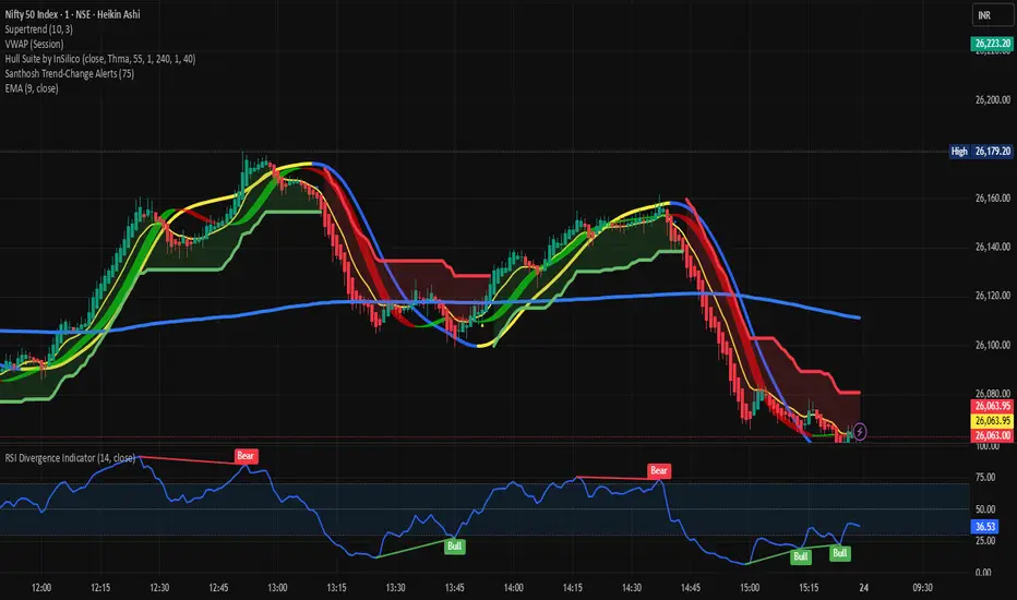
Santhosh Trend-Change AlertsSanthosh Trend-Change Alerts : This indicator identifies potential trend change in market. i would suggest to use 1Min time frame with 75 Period ( Input). To have more accuracy on trading , add RSI Divergence (14) and Super trend (10,3)
Adaptive Momentum Pressure (AMP)🔹 Adaptive Momentum Pressure (AMP)
A hybrid momentum oscillator that adapts to volatility and trend dynamics.
AMP measures the rate of change of price pressure and automatically adjusts its sensitivity based on market volatility.
It reacts faster in trending markets and smooths out noise during consolidation — helping traders identify genuine momentum shifts early while avoiding whipsaws.
🧠 Core Concept
AMP fuses three elements into one adaptive momentum model:
Normalized Momentum (ROC) – captures directional acceleration of price.
Adaptive Smoothing – the smoothing length dynamically contracts when volatility rises and expands when it falls.
Directional Bias – derived from the short-term EMA slope to weight momentum toward the prevailing trend.
Combined, these form a pressure value oscillating between –100 and +100, revealing when momentum expands or fades.
⚙️ How It Works
Calculates a normalized rate of change (ROC) relative to recent volatility.
Adjusts its effective length using the ATR — more volatile periods shorten the lookback for quicker reaction.
Applies a custom EMA that adapts in real time.
Modulates momentum by a normalized EMA slope (“trend bias”).
Produces a smoothed AMP line with a Signal line and crossover markers.
🔍 How to Read It
Green AMP line rising above Signal → Building bullish momentum.
Red AMP line falling below Signal → Fading or bearish momentum.
White Signal line = smoothed confirmation of trend energy.
Green dots = early bullish crossovers.
Red dots = early bearish crossovers.
Typical interpretations:
AMP crossing above 0 from below → early bullish impulse.
AMP peaking near +50–100 and curling down → potential momentum exhaustion.
Crosses below 0 with red pressure → bearish confirmation.
⚡ Advantages
✅ Adaptive across all markets and timeframes
✅ Built-in trend bias filters false signals
✅ Reacts earlier than RSI/MACD while reducing noise
✅ No manual retuning required
🧩 Suggested Use
Combine with structure or volume tools to confirm breakouts.
Works well as a momentum confirmation filter for entries/exits.
Optimal display: separate oscillator pane (not overlay).
Use it responsibly — AMP is an analytical tool, not financial advice.

24h Change Shows TF‑independent 24‑hour % change in the status line. The value is computed strictly on fixed 1‑minute data—last confirmed 1m close vs. the 1m close 1,440 minutes earlier—so changing chart timeframes does not affect the result. Updates once per minute; for best parity with an exchange, use the matching symbol/price type (Last vs. Mark/Index) and ensure ≥1,440 minutes of history.

Period Range AnalyzerThis indicator analyzes a specific periodic range, which can start from a fixed date or a defined lookback period. It draws percentage levels and colored zones between the highest and lowest price. It also displays a detailed information table, which shows the price's position within the range in "Trend" mode, and the relative strength of currency pairs in "Forex" mode. The current price position is also indicated by a label with a percentage value and the name of the corresponding zone.
User Guide
Calculation Method
This setting determines how the indicator defines the range used for the calculation.
Lookback Period: In this mode, the indicator uses the last N candles (the number can be specified in the "Lookback Period (bars)" field). The range (the highest and lowest price) is "floating," meaning it is recalculated with each new candle based on the last N candles.
Date Based: In this mode, the calculation starts from a fixed date and time you select. The indicator finds the opening price of the start date and continuously tracks the highest and lowest price from that point on. This mode is ideal for measuring performance from a specific event (e.g., start of a week/month/year, news).
Data Handling Note: If you select a date in "Date Based" mode for which no data is available on the current timeframe (e.g., switching to a very low timeframe), the indicator will automatically use the earliest available candle as the starting point. All calculations (Open, Max, Min, Range, Percentage, Change, Trend) are based on this actual start date.
Start Date & Time
This setting is only active in "Date Based" mode.
Here you can specify the fixed starting point for the calculation.
The specified time is in the Exchange timezone.
Important limitation: Due to TradingView platform limits, visual elements (levels, zones) are only drawn for a maximum of 250 candles back. If the set date is older than this, the calculation still applies to the entire period (from the set date), but the drawing only covers the last 250 candles. The table always displays accurate data for the entire period.
When switching to a higher timeframe, the range may restart from a slightly later bar due to TradingView's bar alignment. For best accuracy, set your timeframe first, then select the start date.
Table Mode
This setting controls what data the information table displays.
Trend: This is the default mode, which works on any symbol (stock, index, crypto, etc.). It displays information related to the trend and the range.
Forex: This is a special mode used to measure the strength of currency and crypto pairs. It only works on symbols with exactly 6 characters (e.g., "EURUSD", "BTCUSD"). It treats the first 3 characters as the base currency (e.g., EUR) and the last 3 as the quote currency (e.g., USD). If the symbol does not have 6 characters, the table will automatically display in "Trend" mode.
Trend
This trend determination operates based on the formation order of the high and low within the analyzed range:
Its switch is located in the “Table Additional Rows” menu.
Bullish: Indicated if the low was formed before the high (on different candles). Or if they formed on the same candle, it was a bullish candle.
Bearish: Indicated if the high was formed before the low (on different candles). Or if they formed on the same candle, it was a bearish candle.
Neutral: Indicated if the high and low formed on the same candle, and it was a "doji" candle (close = open).
Upper & Lower Threshold
These settings (Upper Threshold (%) and Lower Threshold (%) in the "Label Coloring" section) primarily determine the state (Bullish/Bearish/Neutral) of the top row of the table.
The logic is not based on the percentage change of the price movement, but on the current price's position within the range, where the bottom of the range is 0% and the top is 100%.
Upper Threshold (%): The percentage level (e.g., 60.0) above which the indicator considers the price position "Bullish" (or "Strong").
Lower Threshold (%): The percentage level (e.g., 40.0) below which the indicator considers the price position "Bearish" (or "Weak").
If the price is between the two (e.g., between 40% and 60%), the signal is Neutral.
Secondary function: These thresholds also control the color of the label next to the price, provided the "Dynamic Label Coloring" option is enabled.

Trend change[YI_YA_HA_]這是一個趨勢變化和盤整突破偵測指標。
This is a trend change and consolidation breakout detection indicator.
它能自動識別價格進入狹窄盤整區間。
It automatically identifies when price enters a tight consolidation range.
當價格突破箱型上緣,就判定為上升趨勢開始。
When price closes above the box top, it signals the start of an uptrend.
當價格突破箱型下緣,則觸發下跌趨勢警報。
When price closes below the box bottom, it triggers a downtrend alert.
程式會畫出黃色盤整箱體,突破後自動消失。
The script draws a yellow consolidation box that auto-deletes after breakout.
突破向上時,會從低點畫一條綠色趨勢線持續延伸。
On upward breakout, a green trendline is drawn from the low and extends right.
右側標籤即時顯示目前趨勢狀態與價格。
A label on the right shows the current trend status and price in real-time.

10Y–2Y Treasury Yield Curve Spread & MES % Change📝 Description:
This indicator tracks the U.S. 10-Year minus 2-Year Treasury yield spread — a powerful macroeconomic signal often used by professional traders to gauge market sentiment and recession risk — and overlays an optional MES % change line to help intraday futures traders spot macro–price divergences in real time.
Features:
🏦 Plots the 10Y–2Y spread, with optional EMA smoothing.
📉 Highlights yield curve inversion (background turns red when spread < 0).
📊 Optional MES % change line from daily or RTH open for directional bias.
🔔 Alert conditions for:
Yield curve inversion / un-inversion.
Sudden spread spikes in basis points (customizable).
🧮 Optional correlation plot to visualize relationship strength between MES and the yield curve.
🧭 Z-score normalization allows both series to be viewed in one pane without scaling issues.
Why it matters:
A falling or inverted 2s10s spread often signals risk-off behavior and pressure on equities.
A steepening curve tends to support risk-on rallies.
Divergences between MES price action and the spread can provide early warning signals of reversals or fakeouts.
Best used with:
MES (MES1!) or MYM charts for intraday & swing bias.
Fed event days, CPI/NFP, or any macro-sensitive sessions.
VWAP or structure-based intraday trading strategies.
⚠️ Note: This indicator is for informational purposes only and does not constitute financial advice. Always combine macro context with your own trade plan and risk management.

Candle % ChangePercentage change on each candle. It will show how much the stock has given on each candle

% Change & Range (With SMA)- Calculates the % range and change for each candle
- uses SMA over "n" bars to show the average % range and the average % change for green days and red days
- optional standard deviation line (k bands)
