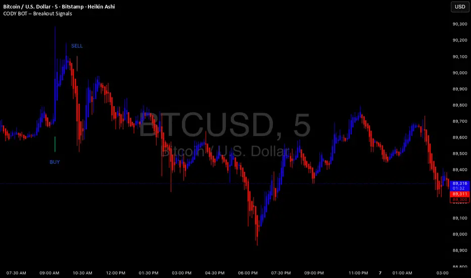
CODY BOT – Breakout SignalsCODY BOT is a minimalist, high-probability breakout indicator designed to keep your chart clean while highlighting actionable trading opportunities.
Unlike traditional indicators that generate too many signals, CODY BOT only alerts you to strong directional moves following consolidation, helping you focus on high-quality entries.
Key Features:
Detects breakouts above recent highs and below recent lows.
Filters weak moves using minimum candle body size.
Includes a cooldown period to prevent signal spam.
Clean and intuitive visual signals with large arrows for easy interpretation.
Optional customization for consolidation lookback bars, minimum candle size, and arrow visibility.
Alerts built-in for server-side and mobile notifications.
How to Use:
Look for BUY arrows when price breaks above consolidation highs.
Look for SELL arrows when price breaks below consolidation lows.
Combine with your preferred risk management and trend confirmation strategies.
Pesquisar nos scripts por "breakout"
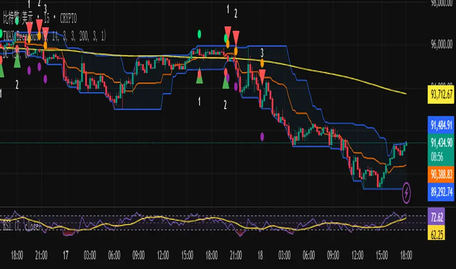
VCP Trendline breakoutThe Signal:
Green Triangles indicate the price is approaching the trendline (Watchlist candidate).
Yellow Triangles indicate the price is very tight against the line (Execution imminent).
The Trigger: When price closes above the Grey Dotted Line, the line stops extending. This is your breakout signal.
Indicator Overview
The The VCP Trendline breakout indicator is a sophisticated technical indicator designed for trend followers and breakout traders (O'Neil, Minervini, Wyckoff styles). This script employs a State Machine logic to identify structural Volatility Contraction Patterns (VCP) in real-time.
It automatically detects valid Bases, tracks the "Right Side" construction, identifies nested handles (contractions), and draws precise supply trendlines—while strictly enforcing structural integrity rules (Higher Lows).
Core Logic & Features
1. Smart Base Detection
Trend Filter: The pattern recognition engine only activates when the price is above the 200 SMA, ensuring you are trading with the primary trend.
Base Validation: It identifies a "Base High" (H1) based on a configurable lookback period. It tracks the depth of the base and automatically invalidates the pattern if the drawdown exceeds the user-defined threshold (default 30%).
2. Recursive Nested Trendlines (VCP)
The indicator is capable of drawing Nested Trendlines (recursive resistance). It doesn't just draw a line from the peak; it identifies internal contractions within the base.
H1 (Primary): The main supply line from the top of the base.
H2, H3 (Internal): Trendlines connecting subsequent lower highs (handles) as volatility contracts.
Smart Fan: Includes a "Clean Fan" mode to show only the most relevant, latest trendline per anchor point.
3. Structural Integrity Enforcement (The "Higher Low" Rule)
This is the standout feature of this script. It performs an Anchor Integrity Check on every bar.
In a valid VCP, every contraction must form a Higher Low.
If the price creates a new pivot (H3) but then crashes lower than the previous contraction's floor (H2), the script identifies this as a Structural Failure.
Auto-Deletion: It immediately retroactively deletes the invalid trendlines associated with that failed contraction, keeping your chart clean and free of "ghost" signals.
4. "Right-Side" Logic
Collision Detection: Trendlines are calculated using "Right-Side Clearance." A line is only drawn if the path from the anchor to the new pivot is unobstructed by price action.
Signal Protection: "Watch" and "Near" signals are suppressed during the decline phase (Left Side). They only appear once the "Bottom" (L1) has been confirmed and price is recovering on the Right Side.
5. Proximity Alerts & Breakouts
Watch Zone (Green Triangle): Appears when the Low of the bar is within 8% (configurable) of a valid trendline.
Near Zone (Yellow Triangle): Appears when the Low of the bar is within 4% (configurable) of a valid trendline.
Breakout Stop: Trendlines are dynamic. The moment a bar closes above a trendline, the line stops extending immediately, marking the exact breakout point.
How to Use This Indicator
The Setup: Look for a stock in an uptrend (Price > 200 SMA).
The Construction: Wait for the script to identify the Base High (H1). As the price corrects and begins to recover, you will see Grey Dotted Lines appear, connecting the highs.
The Contraction: Watch for Nested Trendlines. If you see a second or third line form from a lower high (H2, H3), it indicates a tightening of price action (VCP).
Settings Configuration
Moving Averages
21 EMA, 50 SMA, 200 SMA: Built-in reference averages.
Base Settings
H1 Lookback: How many bars back the script looks to find the "Start" of the base (Default: 21). Increase this for longer-term bases.
Sub-High Pivot Bars: Controls the sensitivity of identifying internal highs (handles).
Max Base Depth: If the base drops more than this % (Default: 30%), the structure is considered failed and lines are removed.
Enable Nested Trendlines: Toggle ON to see internal VCP lines (H2, H3). Toggle OFF to see only the main H1 trendline.
Show Only Latest Line: Keeps the chart clean by removing older lines from the same anchor point.
Visuals & Signals
Near/Watch Zone %: Adjust the sensitivity of the Green/Yellow triangles.
Signal Size: Change the size of the triangle markers.
DISCLAIMER
This is an indicator, not a trading system. Apply good risk management and do your own due diligence before putting your hard earned money into anything.
This script is for educational and analytical purposes only. It does not constitute financial advice. Automated pattern recognition has limitations and should always be verified visually.
Range Lattice## RangeLattice
RangeLattice constructs a higher-timeframe scaffolding on any intraday chart, locking in structural highs/lows, mid/quarter grids, VWAP confluence, and live acceptance/break analytics. It provides a non-repainting overlay that turns range management into a disciplined process.
HOW IT WORKS
Structure Harvesting – Using request.security() , the script samples highs/lows from a user-selected timeframe (default 240 minutes) over a configurable lookback to establish the dominant range.
Grid Construction – Midpoint and quarter levels are derived mathematically, mirroring how institutional traders map distribution/accumulation zones.
Acceptance Detection – Consecutive closes inside the range flip an acceptance flag and darken the cloud, signaling balanced auction conditions.
Break Confirmation – Multi-bar closes outside the structure raise break labels and alerts, filtering the countless fake-outs that plague breakout traders.
VWAP Fan Overlay – Session VWAP plus ATR-based bands provide a live measure of flow centering relative to the lattice.
HOW TO USE IT
Range Plays : Fade taps of the outer rails only when acceptance is active and VWAP sits inside the grid—this is where mean-reversion works best.
Breakout Plays : Wait for confirmed break labels before entering expansion trades; the dashboard's Width/ATR metric tells you if the expansion has enough fuel.
Market Prep : Carry the same lattice from pre-market into regular trading hours by keeping the structure timeframe fixed; alerts keep you notified even when managing multiple tickers.
VISUAL FEATURES
Range Tap and Mid Pivot markers provide a tape-reading breadcrumb trail for journaling.
Cloud fill opacity tightens when acceptance persists, visually signaling balance compressions ready to break.
Dashboard displays absolute width, ATR-normalized width, and current state (Balanced vs Transitional) so you can glance across charts quickly.
Acceptance Flag toggle: Keep the repeated acceptance squares hidden until you need to audit balance.
PARAMETERS
Structure Timeframe (default: 240): Choose the timeframe whose ranges matter most (4H for indices, Daily for stocks).
Structure Lookback (default: 60): Bars sampled on the structure timeframe.
Acceptance Bars (default: 8): How many consecutive bars inside the range confirm balance.
Break Confirmation Bars (default: 3): Bars required outside the range to validate a breakout.
ATR Reference (default: 14): ATR period for width normalization.
Show Midpoint Grid (default: enabled): Display the midpoint and quarter levels.
Show Adaptive VWAP Fan (default: enabled): Toggle the VWAP channel for assets where volume distribution matters most.
Show Acceptance Flags (default: disabled): Turn the acceptance markers on/off for maximum visual control.
Show Range Dashboard (default: enabled): Disable if screen space is limited, re-enable during prep sessions.
ALERTS
The indicator includes five alert conditions:
Range High Tap: Price interacted with the RangeLattice high
Range Low Tap: Price interacted with the RangeLattice low
Range Mid Tap: Price interacted with the RangeLattice mid
Range Break Up: Confirmed upside breakout
Range Break Down: Confirmed downside breakout
Where it works best
This indicator works best on liquid instruments with clear structural levels. On very low timeframes (1-minute and below), the structure may update too frequently to be useful. The acceptance/break confirmation system requires patience—faster traders may find the multi-bar confirmation too slow for scalping. The VWAP fan is session-based and resets daily, which may not suit all trading styles.

FluxPulse Beacon## FluxPulse Beacon
FluxPulse Beacon applies a microstructure lens to every bar, combining directional thrust, realized volatility, and multi-timeframe liquidity checks to decide whether the tape is being pushed by real sponsorship or just noise. The oscillator's color-coded columns and adaptive burst thresholds transform complex flow dynamics into a single actionable flux score for futures and equities traders.
HOW IT WORKS
Momentum Extraction – Price differentials over a configurable pulse distance are smoothed using exponential moving averages to isolate directional thrust without reacting to single prints.
Volatility + Liquidity Normalization – The momentum stream is divided by realized volatility and multiplied by both local and higher-timeframe EMA volume ratios, ensuring pulses only appear when volatility and liquidity align.
Adaptive Thresholding – A volatility-derived standard deviation of flux is blended with the base threshold so bursts scale automatically between low-volatility and high-volatility market conditions.
Divergence Engine – Linear regression slopes compare price vs. flux to tag bullish/bearish divergences, highlighting stealth accumulation or distribution zones.
HOW TO USE IT
Continuation Entries : Go with the trend when histogram bars stay above the adaptive threshold, the signal line confirms, and trend bias agrees—this is where liquidity-backed follow-through lives.
Fade Plays : Watch for divergence alerts and shrinking compression values; when flux prints below zero yet price grinds higher, hidden selling pressure often precedes rollovers.
Session Filter : Compression percentage in the diagnostics table instantly tells you whether to trade thin overnight sessions—low compression means stand down.
VISUAL FEATURES
Dynamic background heat maps flux magnitude, while threshold lines provide a quick read on whether a pulse is statistically significant.
Diagnostics table displays live flux, signal, adaptive threshold, and compression for quick reference.
Alert-first workflow: The surface is intentionally clean—bursts and divergences are delivered via alerts instead of on-chart clutter.
PARAMETERS
Trend EMA Length (default: 34): Defines the macro bias anchor; increase for higher-timeframe confirmation.
Pulse Distance (default: 8): Controls how sensitive momentum extraction becomes.
Volatility Window (default: 21): Sample window for realized volatility normalization.
Liquidity Window (default: 55): Volume smoothing window that proxies liquidity expansion.
Liquidity Reference TF (default: 60): Select a higher timeframe to cross-check whether current volume matches institutional flows.
Adaptive Threshold (default: enabled): Disable for fixed thresholds on slower markets; enable for high-volatility assets.
Base Burst Threshold (default: 1.25): Minimum flux magnitude that qualifies as an actionable pulse.
ALERTS
The indicator includes four alert conditions:
Bull Burst: Detects upside liquidity pulses
Bear Burst: Detects downside liquidity pulses
Bull Divergence: Flags bullish delta divergence
Bear Divergence: Flags bearish delta divergence
LIMITATIONS
This indicator is designed for liquid futures and equity markets. Performance may degrade in low-volume or highly illiquid instruments. The adaptive threshold system works best on timeframes where sufficient volatility history exists (typically 15-minute charts and above). Divergence signals are probabilistic and should be confirmed with price action.
INSERT_CHART_SNAPSHOT_URL_HERE
---
## RangeLattice Mapper
RangeLattice Mapper constructs a higher-timeframe scaffolding on any intraday chart, locking in structural highs/lows, mid/quarter grids, VWAP confluence, and live acceptance/break analytics. It provides a non-repainting overlay that turns range management into a disciplined process.
HOW IT WORKS
Structure Harvesting – Using request.security() , the script samples highs/lows from a user-selected timeframe (default 240 minutes) over a configurable lookback to establish the dominant range.
Grid Construction – Midpoint and quarter levels are derived mathematically, mirroring how institutional traders map distribution/accumulation zones.
Acceptance Detection – Consecutive closes inside the range flip an acceptance flag and darken the cloud, signaling balanced auction conditions.
Break Confirmation – Multi-bar closes outside the structure raise break labels and alerts, filtering the countless fake-outs that plague breakout traders.
VWAP Fan Overlay – Session VWAP plus ATR-based bands provide a live measure of flow centering relative to the lattice.
HOW TO USE IT
Range Plays : Fade taps of the outer rails only when acceptance is active and VWAP sits inside the grid—this is where mean-reversion works best.
Breakout Plays : Wait for confirmed break labels before entering expansion trades; the dashboard's Width/ATR metric tells you if the expansion has enough fuel.
Market Prep : Carry the same lattice from pre-market into regular trading hours by keeping the structure timeframe fixed; alerts keep you notified even when managing multiple tickers.
VISUAL FEATURES
Range Tap and Mid Pivot markers provide a tape-reading breadcrumb trail for journaling.
Cloud fill opacity tightens when acceptance persists, visually signaling balance compressions ready to break.
Dashboard displays absolute width, ATR-normalized width, and current state (Balanced vs Transitional) so you can glance across charts quickly.
Acceptance Flag toggle: Keep the repeated acceptance squares hidden until you need to audit balance.
PARAMETERS
Structure Timeframe (default: 240): Choose the timeframe whose ranges matter most (4H for indices, Daily for stocks).
Structure Lookback (default: 60): Bars sampled on the structure timeframe.
Acceptance Bars (default: 8): How many consecutive bars inside the range confirm balance.
Break Confirmation Bars (default: 3): Bars required outside the range to validate a breakout.
ATR Reference (default: 14): ATR period for width normalization.
Show Midpoint Grid (default: enabled): Display the midpoint and quarter levels.
Show Adaptive VWAP Fan (default: enabled): Toggle the VWAP channel for assets where volume distribution matters most.
Show Acceptance Flags (default: disabled): Turn the acceptance markers on/off for maximum visual control.
Show Range Dashboard (default: enabled): Disable if screen space is limited, re-enable during prep sessions.
ALERTS
The indicator includes five alert conditions:
Range High Tap: Price interacted with the RangeLattice high
Range Low Tap: Price interacted with the RangeLattice low
Range Mid Tap: Price interacted with the RangeLattice mid
Range Break Up: Confirmed upside breakout
Range Break Down: Confirmed downside breakout
LIMITATIONS
This indicator works best on liquid instruments with clear structural levels. On very low timeframes (1-minute and below), the structure may update too frequently to be useful. The acceptance/break confirmation system requires patience—faster traders may find the multi-bar confirmation too slow for scalping. The VWAP fan is session-based and resets daily, which may not suit all trading styles.
---

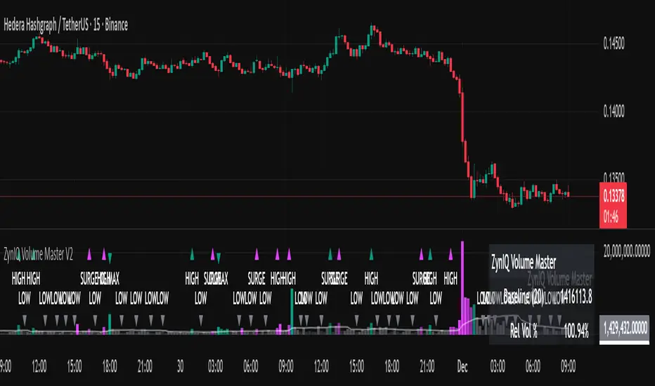
ZynIQ Volume Surge Master v2 - (Lite Pack)Overview
ZynIQ Volume Surge Master v2 (Lite) highlights abnormal increases in trading volume and identifies moments when market participation expands significantly. It provides clean, visual alerts that help traders spot shifts in activity that often precede directional moves.
Key Features
• Surge detection based on volatility-adjusted volume thresholds
• Configurable sensitivity for different markets or timeframes
• Clear labels showing surge conditions
• Optional HUD panel with surge status
• Lightweight visuals designed for intraday charting
• Works alongside trend, breakout or momentum tools for confirmation
Use Cases
• Spotting volume expansion during breakouts
• Identifying exhaustion vs. continuation conditions
• Filtering entries based on participation strength
• Assessing when a move has real momentum behind it
Notes
This tool highlights volume surges for context and confirmation. It is not a standalone trading system. Use it together with your preferred market structure tools and risk management.
Bollinger Band Breakout & Re-entry StrategyA mean reversion indicator that identifies failed breakouts of Bollinger Bands and generates entry signals when price returns to the band range. Requires 2 consecutive closes outside the bands to confirm a breakout, then triggers LONG signals when price re-enters above the lower band or SHORT signals when re-entering below the upper band. Each signal includes a quality score (0-100) based on volume, volatility, and momentum, with automatic stop loss and 4 profit targets calculated using risk multiples (0.85R to 4.5R).

Bassi's Pattern Breakout IndicatorBASSI'S PATTERN BREAKOUT INDICATOR
Author: Bassi | Published 2025
One of the cleanest and most accurate classic pattern detectors on TradingView – proudly coded and shared by Bassi.
Detects & confirms breakouts from:
• Double Top / Double Bottom
• Triple Top / Triple Bottom
• Head & Shoulders
• Inverse Head & Shoulders
Key Features:
• 100% non-repainting – signals only appear after candle close
• Smart breakout confirmation using the correct neckline level
• Visual pattern drawing (tops/bottoms + necklines)
• Clear breakout labels with vertical confirmation lines
• Real-time TradingView alerts (one alert per bar close)
• All alerts include "Bassi" prefix so you know it's the original
• Dynamic coloring for Double Bottom (red in lower areas, green in higher areas)
• No messy BUY/SELL labels – clean professional look (as requested by the community)
Why traders love it:
- Extremely reliable on all timeframes (1m to monthly)
- Works perfectly on Forex, Stocks, Crypto, Indices
- No false signals during consolidation
- Perfect for swing trading, scalping and position trading
Settings:
• Pivot Left/Right Bars – adjust sensitivity
• Price Tolerance % – how flat the tops/bottoms must be
• Max Pivot Storage – memory management
• Enable/disable alerts and visual markers
How to use:
1. Add to chart
2. Create alert → select "Bassi's Pattern Breakout Indicator"
3. Choose "Once per bar close"
4. Get notified instantly on every confirmed breakout!
This is the original and only authorized version by Bassi.
If you enjoy this indicator, please leave a like and follow for future updates!
© Bassi 2025 – All rights reserved
#pattern #breakout #doubletop #doublebottom #headandshoulders #tradingview #bassi

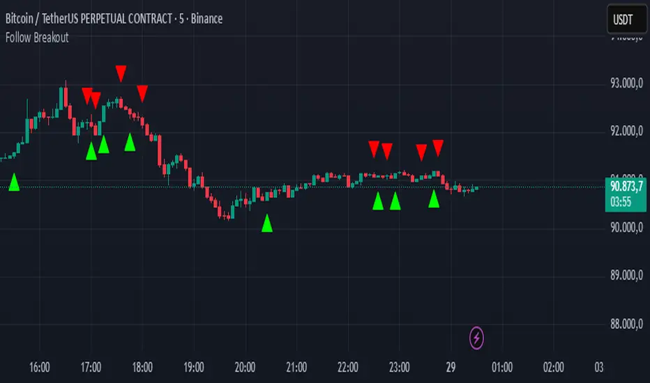
Follow BreakoutThe indicator tracks trend breakouts. It generates multiple signals during sideways trends.
Sideways & Breakout Detector + Forecast//@version=6
indicator("Sideways & Breakout Detector + Forecast", overlay=true, max_labels_count=500)
// Inputs
lengthATR = input.int(20, "ATR Länge")
lengthMA = input.int(50, "Trend MA Länge")
sqFactor = input.float(1.2, "Seitwärtsfaktor")
brkFactor = input.float(1.5, "Breakoutfaktor")
// ATR / Volatilität
atr = ta.atr(lengthATR)
atrSMA = ta.sma(atr, lengthATR)
// Basislinie / Trend
basis = ta.sma(close, lengthATR)
trendMA = ta.sma(close, lengthMA)
// Seitwärtsbedingung
isSideways = atr < atrSMA * sqFactor
// Breakouts
upperBreak = close > basis + atr * brkFactor
lowerBreak = close < basis - atr * brkFactor
// Vorhergesagter Ausbruch (Forecast)
// Wenn Seitwärtsphase + Kurs nahe obere oder untere Kanalgrenze
forecastBull = isSideways and (close > basis + 0.5 * atr)
forecastBear = isSideways and (close < basis - 0.5 * atr)
// Farben
barcolor(isSideways ? color.new(color.yellow, 40) : na)
barcolor(upperBreak ? color.green : na)
barcolor(lowerBreak ? color.red : na)
// Breakout-Bänder
plot(basis + atr * brkFactor, "Bull Break Zone", color=color.new(color.green, 60))
plot(basis - atr * brkFactor, "Bear Break Zone", color=color.new(color.red, 60))
// Labels (klein)
if isSideways
label.new(bar_index, close, "Seitwärts", color=color.yellow, style=label.style_label_center, size=size.tiny)
if upperBreak
label.new(bar_index, high, "Bull Breakout", color=color.green, style=label.style_label_up, size=size.tiny)
if lowerBreak
label.new(bar_index, low, "Bear Breakout", color=color.red, style=label.style_label_down, size=size.tiny)
// Vorhergesagte Ausbrüche markieren
plotshape(forecastBull, title="Forecast Bull", location=location.abovebar, color=color.new(color.green, 0), style=shape.triangleup, size=size.tiny)
plotshape(forecastBear, title="Forecast Bear", location=location.belowbar, color=color.new(color.red, 0), style=shape.triangledown, size=size.tiny)
// Alerts
alertcondition(isSideways, "Seitwärtsphase", "Der Markt läuft seitwärts.")
alertcondition(upperBreak, "Bull Breakout", "Ausbruch nach oben!")
alertcondition(lowerBreak, "Bear Breakout", "Ausbruch nach unten!")
alertcondition(forecastBull, "Forecast Bull", "Voraussichtlicher Bull-Ausbruch!")
alertcondition(forecastBear, "Forecast Bear", "Voraussichtlicher Bear-Ausbruch!")

Consolidation Breakout PRO — Clean Boxes + 200 EMA Trend Filter High-probability range breakout detector that draws perfect, always-visible consolidation boxes and only alerts when price breaks out with strong volume and (optionally) in the direction of the prevailing trend.
Features
Automatically draws and extends clean consolidation boxes in real time
Boxes stop extending the moment the breakout occurs — no more “ghost” lines
Optional but powerful 200 EMA trend filter (dramatically reduces false breakouts)
Stronger volume confirmation (default 1.8× the 20-period average, fully adjustable)
Auto-deletes old boxes so your chart stays perfectly clean even after hundreds of signals
Clear “BREAKOUT ↑” and “BREAKDOWN ↓” labels + ready-to-use alerts
Works on any market and any timeframe (best on 1H, 4H, Daily)
How to trade it (edge > 65 % when used correctly)
Wait for the labeled breakout candle to close
Enter on pullback/retest of the box edge (or on strong close + retest)
Stop-loss just outside the opposite side of the box
Take-profit: minimum 1:2, ideally measured move (box height added/subtracted) or trailing with the 20 EMA
This is the cleanest and most professional public consolidation breakout tool available in 2025 — no repainting, no lag, no chart clutter.
Created and continuously improved with love for the TradingView community.

Compression Breakout [30min 65+33 EMA]Compression Breakout
by GhostMMXM (inspired by Chris Cady & Steidlmayer Market Profile principles)
This indicator automates the exact compression-to-displacement setup that veteran CBOT floor trader and Market Profile pioneer Chris Cady describes in interviews and his work with Peter Steidlmayer.
Core idea
Chris Cady uses two simple moving averages on the 30-minute chart — a 33-period and a 65-period — to visually detect when the market falls into “balance” (compression). When both lines go almost perfectly flat for several bars, the market is in a low-volatility, high-consensus state — the calm before a violent vertical breakout.
What this script does
• Detects when both the 33 EMA and 65 EMA are virtually flat (user-adjustable sensitivity)
• Requires a minimum of 6 consecutive flat bars (adjustable) before declaring compression
• Draws a light-grey background + live-updating box showing the detecting compression
• Triggers only on the first strong displacing bar that:
– closes entirely above the compression high OR entirely below the compression low
– has a range ≥ 1.5× the average bar range inside the compression zone (adjustable)
• Plots a clear “LONG Cady Break” or “SHORT Cady Break” label on the breakout bar
• Fires a clean alert instantly usable on entire watchlists:
BTC → Compression LONG breakout!
ES1! → Compression SHORT breakout!
Designed for 30-minute charts (BTC, ETH, SOL, NQ, CL, GC, etc.) but works on any timeframe.
Perfect for traders who want to catch the highest-conviction vertical moves that Chris Cady has traded for decades with only a few contracts scaled in aggressively on the break.
Settings
• Minimum flat bars for compression (default 6)
• Max % slope to be considered flat (default 0.08 %)
• Minimum range multiplier vs compression average (default 1.5×)
Enjoy the cleanest, most mechanical version of Chris Cady’s famous compression breakout strategy available on TradingView.
Happy trading!

Micha Stokes Buyers Breakout Alert v2Buyer Breakout Rules (Word Definition)
The alert is triggered when ALL conditions in Section 1 and Section 3 are met, AND one of the two Scenarios in Section 2 is met.
1. The Setup and Breakout (The Initial Requirement)
Price Action: The closing price of the current candle must break above the highest resistance level established during the recent period of flat trading (the setup).
2. The Confirmation (Scenario A OR Scenario B)
The breakout must be accompanied by evidence of buying strength:
Scenario A: High-Conviction Breakout (Immediate Demand)
The current candle is GREEN (it closed higher than it opened).
AND the volume is HIGHER than the volume of the previous candle.
Scenario B: Seller-Exhaustion Breakout (Micha Stokes' Unique Signal)
The current candle is GREEN (it closed higher than it opened).
AND the volume is LOWER than the volume of the previous candle. (This means the price rose without much seller resistance.)
3. The Strength Filter (Conviction Check)
The candle must close near its high, showing that buyers maintained control and didn't face significant selling pressure immediately after the breakout.

TMAX Breakout – by EricFreemanTMAX Breakout is a trend-following breakout indicator inspired by the classic Turtle Trading System, designed by EricFreeman.
It identifies Donchian Channel breakouts with an MA trend filter to help traders capture strong directional moves while reducing false breakout signals.
Ideal for:
Trend-following traders
Visual breakout confirmation
Manual trading or automated strategy development
More indicators in the TMAX series—RSI Divergence, Bollinger strategies, MA Cross, and more—will be released soon to form a complete professional trading toolkit.
TMAX Breakout 是一款基於海龜交易法(Turtle System)延伸打造的趨勢突破指標,由 EricFreeman 設計。
透過 Donchian Channel 突破判斷結合 MA 趨勢過濾,幫助交易者在關鍵價格突破時進場,並避免弱勢走勢造成假突破。
此指標適合:
喜歡順勢交易的人
想要視覺化突破訊號的交易者
搭配 EA、自動化策略、或手動交易判斷
TMAX 系列將陸續推出更多指標:RSI 背離、布林通道策略、均線交叉等,打造完整專業交易套件。
MTF Checklist DashboardMTF Checklist Dashboard
Overview
The MTF Checklist Dashboard is an advanced multi-timeframe analysis tool that provides traders with a comprehensive visual dashboard to analyze market conditions across six customizable timeframes simultaneously. This indicator combines multiple technical analysis methods, including Opening Range Breakouts (ORB), VWAP, EMAs, and daily price levels, to generate high-probability confluence-based trading signals.
Unlike traditional single-timeframe indicators, this dashboard displays all critical information in one organized table, allowing traders to instantly identify when multiple timeframes align for optimal entry and exit opportunities.
Key Features
Multi-Timeframe Analysis
Analyzes up to 6 timeframes simultaneously (default: 1m, 5m, 15m, 30m, 1h, 4h)
Fully customizable timeframe selection via comma-separated input
Color-coded cells for instant visual recognition (green=bullish, red=bearish, yellow=neutral)
Technical Indicators Tracked
Current and previous candle direction
Opening Range Breakout (ORB) positioning with custom period
VWAP relationship (above/below)
200 EMA positioning
Daily and previous day high/low proximity
EMA crossovers (9 vs 21, both vs 200)
Advanced Signal Filtering System
Confluence scoring: Requires multiple timeframes to align (3-6 timeframes)
Higher timeframe confirmation: Ensures 30m/1h/4h agreement
Volume filter: Confirms signals with above-average volume (1.5x default)
ATR volatility filter: Validates sufficient market movement
Session timing: Restricts signals to optimal trading hours (EST)
Momentum confirmation: Requires recent directional strength
Range positioning: Blocks signals near daily extremes
Candle strength: Validates strong directional candles (60%+ body ratio)
Visual Signals
Optional entry arrows (above/below bars)
Background color highlighting
Organized dashboard with real-time price levels
ORB range, current day, and previous day summary rows
Alert Conditions
JSON-formatted alerts for automated trading integration
Separate alerts for long entry, short entry, long exit, and short exit
Compatible with webhook automation systems
How To Use
Dashboard Interpretation
The dashboard displays a color-coded table with the following columns:
TF: Timeframe being analyzed
C: Current candle (Green=bullish, Red=bearish)
P: Previous candle (Green=bullish, Red=bearish)
ORB: Opening Range Breakout position (A=Above, B=Below, W=Within)
VWAP: Price vs VWAP (A=Above, B=Below)
E200: Price vs 200 EMA (A=Above, B=Below)
D Hi/Lo: Proximity to current day high/low (Hi/Lo/Mid)
PD Hi/Lo: Proximity to previous day high/low (Hi/Lo/Mid)
9 vs 21: EMA 9 vs EMA 21 relationship (A=9 above 21, B=9 below 21)
9&21 v200: Both EMAs vs 200 EMA (>>=both above, <<=both below, <>=mixed)
Signal Generation
Long Entry Signal triggers when:
Minimum number of timeframes show bullish alignment (default: 5 of 6)
Higher timeframes (30m/1h/4h) confirm direction (default: 2 of 3)
Price breaks above ORB high with sufficient distance
Volume exceeds average by specified multiplier
ATR shows adequate volatility
Trade occurs during optimal session hours
Recent momentum is upward
Price not too close to daily high
Strong bullish candle forms
Short Entry Signal uses opposite conditions
Exit Signals trigger when opposing timeframe confluence reaches threshold (default: 3 timeframes)
Recommended Workflow
Select your asset and primary trading timeframe
Observe the dashboard - Look for rows showing mostly green (bullish) or red (bearish)
Wait for alignment - The indicator will show arrows when confluence requirements are met
Check the bottom rows - Review ORB levels and daily ranges for context
Set alerts - Enable TradingView alerts using the built-in alert conditions
Manage risk - Use appropriate position sizing and stop losses based on ORB range or daily ATR
Settings Guide
Basic Settings
Timeframes: Enter comma-separated values (e.g., "1,5,15,30,60,240")
Show Header: Toggle column headers on/off
ORB Minutes: Set opening range period (default: 15 minutes)
Near % for daily highs/lows: Define proximity threshold (default: 0.20%)
Use close for comparisons: Compare using close vs current price
Dashboard Position: Choose from 9 screen positions
Confluence Filters
Minimum Timeframes Aligned: Set required confluence (3-6, default: 5)
Require Higher Timeframe Confirmation: Toggle HTF requirement on/off
Min Higher Timeframes: Specify HTF agreement needed (1-3, default: 2)
Volume Filter
Volume Confirmation: Enable/disable volume filtering
Volume vs Average: Set multiplier threshold (default: 1.5x)
Volume Average Length: Period for volume average (default: 20 bars)
Volatility Filter (ATR)
Volatility Filter: Enable/disable ATR confirmation
ATR Length: Calculation period (default: 14)
Min ATR vs Average: Required ATR level (default: 0.5x = 50%)
ORB Filters
ORB Breakout Distance Required: Toggle distance requirement
Min Breakout % Beyond ORB: Additional breakout threshold (default: 0.10%)
Session Filter
Trade Only During Best Hours: Enable time-based filtering
Session 1: First trading window (default: 0930-1130 EST)
Session 2: Second trading window (default: 1400-1530 EST)
Momentum Filter
Recent Momentum Required: Enable directional momentum check
Lookback Bars: Period for momentum comparison (default: 3 bars)
Daily Range Filter
Block Signals Near Daily Extremes: Prevent entries at extremes
Distance from High/Low %: Minimum distance required (default: 2.0%)
Candle Filter
Strong Directional Candle: Require candle strength
Min Candle Body %: Body-to-range ratio threshold (default: 60%)
Visual Signals
Show Entry Signals: Master toggle for visual signals
Show Arrows: Display entry arrows on chart
Background Color: Enable background highlighting
Best Practices
Start with default settings and adjust based on your trading style and asset volatility
Higher confluence requirements (5-6 timeframes) produce fewer but higher-quality signals
Enable all filters for conservative trading; disable some for more frequent signals
Use the dashboard as confirmation alongside your existing trading strategy
Backtest on your specific instruments before live trading
Consider market conditions—trending vs ranging markets may require different settings
Alerts
This indicator includes four alert conditions with JSON formatting for webhook integration:
Long Entry Signal: Triggers when all long conditions are met
Short Entry Signal: Triggers when all short conditions are met
Long Exit Signal: Triggers when opposing confluence reaches exit threshold
Short Exit Signal: Triggers when opposing confluence reaches exit threshold
Alert messages include ticker symbol, action (buy/sell), price, and quantity for automated trading systems.
Important Notes
This indicator works best on liquid instruments with clear price action
Highly volatile markets may require adjusted ATR and ORB distance settings
Session times are in EST timezone—adjust if trading non-US markets
The ORB calculation requires sufficient price history for the day
Signals are generated in real-time but should be confirmed at candle close
Limitations
Maximum of 6 timeframes can be analyzed due to TradingView's security call limits
ORB calculations may not work correctly on instruments with gaps or irregular sessions
The indicator is most effective during regular market hours when volume and volatility are adequate
Lower timeframes (1m, 5m) may produce more false signals in choppy conditions
License
Mozilla Public License 2.0 (MPL-2.0)
This indicator is licensed under the Mozilla Public License 2.0. You are free to use, modify, and distribute this code under the terms of the MPL-2.0. The full license text is available at mozilla.org
Key license provisions:
You may use this code commercially
You may modify and distribute modified versions
Modified versions must be released under the same license
You must include the original license notice in any distributions
No trademark rights are granted
Disclaimer
This indicator is provided for educational and informational purposes only. It is not financial advice, and past performance does not guarantee future results. Trading involves substantial risk of loss. Always:
Practice proper risk management
Test thoroughly on paper/demo accounts before live trading
Use appropriate position sizing
Never risk more than you can afford to lose
Consult with a financial advisor for personalized advice
The creator assumes no liability for trading losses incurred using this indicator.
Version: 2.0
Pine Script Version: v6
Author: © EliasVictor

PA Breakout Signals (Neutral)This indicator highlights potential breakout opportunities using a price-action approach. It identifies consolidation ranges, detects breakouts above or below these ranges, and optionally confirms retests with simple candle patterns. Higher-timeframe structure (HH/HL or LH/LL) can be used as an additional directional filter.
The tool plots neutral “Trigger” markers along with optional entry, stop, and target reference lines to support discretionary analysis. It does not provide trading advice and is intended only as a visual aid for chart interpretation.
ORB - Openning Range BreakoutORB - Opening Range Breakout (Indicator)
This indicator visualizes the Opening Range Breakout (ORB) for the New York market session (9:30 AM – 4:00 PM NY), highlighting the High and Low of the first 5 minutes of the session.
Key Features:
Automatically calculates the High and Low of the 9:30 AM candle and updates if subsequent candles expand the range within the first 5 minutes.
Plots invisible lines representing the High and Low of the opening range throughout the session.
Fills the area between High and Low with a semi-transparent background, clearly showing the opening range zone.
Works on any intraday timeframe and adapts automatically to the NY session.
Perfect for breakout strategies, visually marking early support and resistance zones.
How to Use:
The shaded area between High and Low indicates the opening range.
Traders can watch for breakouts above the High or breakdowns below the Low for potential entry signals.
Can be combined with trend or volume indicators for confirmation.
Notes:
The session is automatically calculated using New York time.
Background transparency can be adjusted to your preference.

Previous D/W/M HLOCHey traders,
Here's a simple Multi-Timeframe indicator that essentially turns time and price into a box. It'll take the previous high, low, opening price, or closing price from one of the three timeframes of your choice (day, week, or month). For whatever reason I can't get the opening price to function consistently so if you find improvements feel free to let me know, this will help traders who prefer to use opening price over closing price.
Naturally this form of charting is classical and nature and some key figures you could use to study its usage are
- Richard W. Schabacker (1930s)
- Edwards & Magee (1948)
- Peter Brandt
- Stacey Burke (more on the intraday side - typically our preference)
It's usage put plainly:
- Quantifying Accumulation or Distribution
- Revealing Energy Build-Up (Compression)
- Framing Breakouts and False Breakouts
- Structuring Time
- Identifying opportunities to trade a daily, weekly, or monthly range.

Enhanced Level Breakout Strategy ProEnhanced Level Breakout Strategy Pro — Executive Summary
Level-driven breakout engine with single-position governance, three staged targets, and live USD/INR currency awareness. It operationalizes last session levels and swing structure to generate actionable entries only when price confirms and volume validates.
What it does
Surfaces breakouts of previous day and previous week high/low/open/close.
Confirms with optional volume expansion.
Enters one position at a time. Manages SL + TP1/TP2/TP3 and auto-expires after time.
Tracks outcomes and KPIs, including a rolling 30-day dashboard.
Auto-detects INR vs USD charts and handles live USD/INR conversion for capital displays.
How trades are found
Levels
Uses completed prior Daily and Weekly OHLC as reference rails.
Breakout up: close > prior high/open/close.
Breakout down: close < prior low/open/close.
Volume filter (optional)
Current volume > 20-SMA(volume) × threshold.
Swing context (visual only)
Marks most recent 3–4-bar swing high/low to show nearby structure.
Entry logic
Long if any daily/weekly upside breakout confirms on the closed bar and volume filter passes.
Short if any downside breakout confirms with the same gating.
Single-trade mode by default. You can allow new trades before completion if required.
Risk model and exits
Stop-loss
Long: min(low , low )
Short: max(high , high )
Targets
TP1 = 1.5R, TP2 = 2R, TP3 = 3R.
Hitting TP3 implies TP2 and TP1 are counted as achieved.
Time exit
Force close after 50 bars if no TP/SL.
Labels/lines
Entry, SL, TP1/2/3 plotted only while the trade is active.
Capital and currency enablement
Initial Capital and Risk % per trade drive the on-chart capital panel.
Auto-detects chart currency (INR for NSE/BSE tickers, else USD).
Live USD/INR pull with fallback to manual rate.
Shows position size (float units), investment amount, and risk amount in the selected display currency.
On-chart UX
Level rails
Daily levels on the left (custom color).
Weekly levels on the right (custom color).
Swing tags: SH / SL at the latest swing points.
Signal markers: Entry labels on the confirmation bar.
Two tables
Performance (top-right): trades, win rate, average P/L, TP1/2/3 hit counts and accuracies, 30-day counts and average TP profits, SL stats, configuration flags.
Capital (bottom-left): capital, risk/trade, position size, investment, stop distance, R:R set, conversion rate and source.
KPIs tracked
All-time: total trades, win rate, average P/L, TP1/TP2/TP3 accuracy and average profit, SL accuracy.
Last 30 days: number of trades hitting TP1/TP2/TP3 or SL, plus average TP1/TP2/TP3 profit across those hits.
Configuration levers
Currency: Auto / INR / USD, live or manual USD/INR rate.
Components: toggle daily/weekly levels and entry generation.
Swing: lookback 2–10, show/hide.
Risk: initial capital, risk % per trade.
Filters: volume on/off and threshold.
Display: TP/SL lines, labels, transparent tables, one-trade policy, wait-for-completion.
Styling: independent colors and thickness for daily/weekly/swing levels.
Governance and constraints
One active position unless you opt out.
Entries trigger on bar close to avoid repaint.
Level references are always previous completed sessions.
Arrays capped to manage memory; stats keep recent history efficiently.
Operating procedure
Select timeframe. Add to chart.
Set capital and risk %. Confirm currency mode.
Optional: enable volume filter and set threshold.
Monitor left/right level rails. Trade fires on confirmed breaches.
Manage optional discretion using swing markers and stop distance readout.
Review top-right KPIs for continuous improvement. Iterate thresholds as needed.
Tips
Use higher timeframes for fewer but higher-quality signals.
Keep volume filter on during trend days to avoid weak breaks.
For INR equities, prefer AUTO currency with Live conversion enabled for cleaner dashboards.
If you scale manually, keep single-trade mode enabled to avoid overlapping signals.

Nexus Breakout System💎 What Makes the Nexus Breakout System Special?
Many indicators can draw a box around a price range, but most are one-dimensional. The Nexus Breakout System (NBS) is different. Its edge comes from a sophisticated, multi-layered approach to analyzing market behavior.
Think of it as moving from a flat map to a 3D holographic view of the market.
1. A Deeper Understanding of "Consolidation"
Instead of just looking at highs and lows, the NBS engine analyzes three critical dimensions to qualify a true consolidation zone:
Price Range: Is the market truly range-bound?
Order Flow: Is there a balance between buying and selling pressure? (It looks at the engine of the market, not just the price).
Momentum: Is the market lacking directional energy?
By requiring all three conditions to be met, NBS identifies zones where significant energy is genuinely building up, leading to more reliable breakout signals.
2. The "Nexus Bias" — Anticipating the Next Move
This is the core of the engine. While price is consolidating, NBS is constantly analyzing the underlying currents of the market. It calculates a proprietary Bias Score by looking at:
Underlying Trend Structure: What is the "path of least resistance" on a micro-level?
Money Flow Dynamics: Who is winning the quiet battle inside the range—buyers or sellers?
This score is translated into a simple " Bullish Lean ," " Bearish Lean ," or " Neutral " reading right on your chart. It’s designed to give you an intelligent hint about the breakout's most likely direction before it happens.
3. Statistical Breakout Confirmation — Reducing False Signals
Most indicators signal a breakout on a simple price cross, which is why fakeouts are so common. NBS uses a statistical method known as CUSUM (Cumulative Sum Control Chart) to validate a breakout.
In simple terms, it waits for a true "change of character" in the price action. The signal is designed to trigger only when the market moves from a state of balance (consolidation) to a state of imbalance (trending), providing a much higher degree of confidence.
---
📜 How to Trade with the Nexus Edge: A Strategic Framework
Trading with NBS is about combining its signals into a coherent, high-probability strategy.
Step 1: Identify the Opportunity (The Zone & The Bias)
Wait for the script to draw a Nexus Box. This is your signal that a market is coiling for a potential move.
Check the intraday bias within the box. A zone showing a " Bullish Lean " in a larger uptrend is a higher-quality setup than one that is " Neutral ." This is your first clue.
Step 2: Consult the Strategist (The Analysis Panel)
This step is crucial. Always check the Strategic Analysis Panel before considering a trade. This panel acts as your personal market strategist.
Look for Alignment: The highest probability trades occur when the chart signal aligns with the panel's insight.
A+ Setup Example: The panel shows a " Dominant Bull Trend " for the 1H/4H, and your 15-minute chart forms a Nexus Box with a " Bullish Lean ." A breakout to the upside is a very strong, A+ signal.
Warning Signal: The panel warns of a " Major Trend Conflict " (e.g., Daily is bullish, 4H is bearish). You should be extremely cautious. Any breakout during this condition is lower probability and should be traded with smaller size or avoided entirely.
Step 3: Execute the Breakout (The Entry)
The classic entry is on the close of the candle that breaks out of the Nexus Box.
Confirmation: The box's border will change color (blue for bullish, pink for bearish), visually confirming the breakout is active.
Targets: Your initial profit targets (T1 and T2) are immediately plotted. T1 is often an excellent level to take partial profits and move your stop-loss to break even.
Step 4: Manage the Trade (The "Breakout Failure" Guard)
This is your safety net. After a breakout, the script monitors the health of the move.
If you receive a " Breakout Failure " alert, it is a critical warning that momentum is failing and the move may be a trap.
Actionable Signal: Use this alert to aggressively manage your trade. It could be a signal to:
Tighten your stop-loss immediately.
Close the trade to protect your capital.
Take profits if the price is hesitating near a key level.

Advanced Candle Compression BollingerColors candles based on Bollinger Band width relative to its average — showing when volatility tightens.
Orange = medium compression
Red = strong compression
Candle color appears only after several consecutive bars meet the condition.
You can adjust thresholds, colors, bar count, and the Bollinger source (default: (High+Low+Close)/3).
Useful to spot low-volatility zones that often precede breakouts.

BBB INDICATOR - London Breakout BBB Indicator — London Breakout
The indicator highlights potential London session breakouts derived from the Asian session range.
How it works (high level):
• Draws the Asian session box (03:00–10:00 UTC+3).
• After London opens (11:00 UTC+3), a breakout is valid when the candle’s body exceeds user-defined thresholds (body% of bar, buffer vs Asia range, optional body ≥ k × ATR).
• Once valid, it plots Entry at the breakout close, SL based on the selected method, and TP using a fixed R:R (default 1:1.5).
Intended use: XAUUSD / 15m (testable elsewhere).
Important: Use on standard candlestick charts only. Non-standard chart types (Heikin Ashi, Renko, Kagi, Point & Figure, Range) are not supported and may produce unrealistic results.
Inputs overview: Asia session hours, London open, body% threshold, Asia-range buffer %, optional ATR multiple, and R:R.
Notes: Educational tool to assist analysis; not financial advice. No external links or solicitations.
Opening Candle Zone with ATR Bands by nkChartsThis indicator highlights the opening range of each trading session and projects dynamic ATR-based zones around it.
Key Features
Plots high and low levels of the opening candle for each new daily session.
Extends these levels across the session, providing clear intraday support and resistance zones.
Adds ATR-based offset bands above and below the opening range for volatility-adjusted levels.
Customizable colors, ATR length, and multiplier for flexible use across markets and timeframes.
Adjustable session history limit to control how many past levels remain on the chart.
How to Use:
The opening range high/low often acts as strong intraday support or resistance.
The ATR bands give an adaptive volatility buffer, useful for breakout or mean-reversion strategies.
Works on any market with clear session opens.
This tool is designed for traders who want to combine session-based price action with volatility insights, helping identify potential breakouts, reversals, or consolidation areas throughout the day.
⚠️ Disclaimer: This indicator is for educational purposes only. It does not provide financial advice or guarantee profits. Always perform your own analysis before making trading decisions.

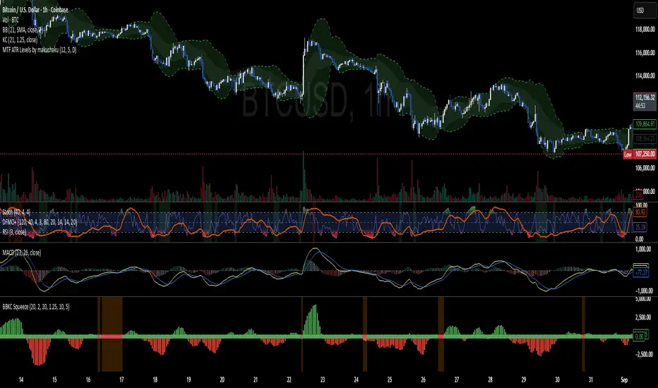
Bollinger Keltner Squeeze Indicator (BBKC)Bollinger Keltner Squeeze Indicator (BBKC)This single-pane indicator combines the power of Bollinger Bands (BB) and Keltner Channels (KC) to accurately identify periods of low volatility compression—the famous Squeeze—which often precedes large, directional moves.Designed for traders utilizing Accumulation, Manipulation, Distribution (AMD) strategies, this tool makes spotting the 'Accumulation' phase simple and visually clear, perfect for high BTC Beta equities or futures markets like MES and MNQ.Key Features:Clear Squeeze Visualization:The background of the main chart is shaded Orange when the Squeeze is active (BB is inside KC). This immediately highlights periods of extreme compression.A simple Red/Green Dot below the chart confirms the Squeeze state (Red = Squeeze ON, Green = Squeeze OFF).Momentum Histogram:A built-in momentum oscillator smooths price action and guides the anticipated direction of the breakout.Teal/Orange Bars: Indicate momentum direction while the Squeeze is active (building pressure).Bright Green/Red Bars: Indicate momentum direction after the Squeeze has broken (expansion/breakout).How to Find Maximum Volatility Compression (The "Tightest" Squeeze)To align this indicator with a strategy focused on catching only the most extreme volatility compression—the key to those explosive moves—traders should adjust the Keltner Channel Multiplier setting.Setting Name: KC Multiplier (ATR)Default Value: 1.5Recommended Adjustment: To filter for only the absolute tightest squeezes (where price is least volatile), decrease this multiplier value, typically down to 1.25 or even 1.0.By lowering the KC Multiplier (ATR), you narrow the Keltner Channel boundaries. This requires the Bollinger Bands to compress even further to fit inside, ensuring the indicator only signals the Squeeze state during moments of truly minimal volatility, setting you up for maximum opportunity.