Green/Red Candle Probability (EMA 7, SMA 20, SMA 200)### Strategy Explanation for Candle Probability Indicator
This script is designed to calculate the **probability of bullish (green) and bearish (red) candles** over a given analysis period. It leverages three key moving averages to identify market trends and display these probabilities directly on the chart, making it easier for traders to make informed decisions.
#### **How the Script Works:**
1. **Trend Detection Using Moving Averages:**
- The script calculates three moving averages:
- **EMA (Exponential Moving Average) over 7 periods**
- **SMA (Simple Moving Average) over 20 periods**
- **SMA over 200 periods**
The trend is classified as:
- **Bullish:** When EMA 7 > SMA 20 > SMA 200
- **Bearish:** When EMA 7 < SMA 20 < SMA 200
2. **Candle Analysis:**
The script analyzes the last "n" candles (based on the user-defined lookback period) to count the number of bullish and bearish candles:
- **Bullish (green) candle:** The closing price is higher than the opening price.
- **Bearish (red) candle:** The closing price is lower than the opening price.
3. **Probability Calculation:**
The probabilities are calculated as a percentage of bullish and bearish candles in the lookback period:
- **Green Probability (%) = (Number of Green Candles / Lookback Period) × 100**
- **Red Probability (%) = (Number of Red Candles / Lookback Period) × 100**
4. **Displaying Results in a Table:**
The results are displayed in a table on the chart, including:
- **Green Probability (%)**
- **Red Probability (%)**
- **Current Trend (Bullish, Bearish, or Neutral)**
#### **Strategy Overview:**
This indicator provides traders with a quick overview of the candle probabilities and the current market trend based on moving averages. It helps traders:
- Gauge the likelihood of bullish or bearish candles appearing in the near future.
- Identify the prevailing trend (bullish, bearish, or neutral).
- Adjust their trading strategies based on statistical probabilities rather than assumptions.
### **Important Notes:**
- The lookback period can be customized between **10 and 200 periods**.
- The indicator does not provide buy/sell signals but gives insights into market behavior.
By understanding the candle probabilities and the trend, traders can better assess market conditions and improve their decision-making process.
Pesquisar nos scripts por "bear"

MA Trend DashboardMA Trend Dashboard - Features
The MA Trend Dashboard is a versatile and user-friendly indicator designed to provide a comprehensive overview of market trends across multiple timeframes using moving averages (MAs). Here's what this script offers:
1. Dashboard Display
A compact and visually appealing dashboard is overlaid on the chart.
The dashboard displays the trend direction and deviation percentages for 30-minute, 1-hour, and 4-hour timeframes.
Users can position the dashboard in different locations (Top Right, Middle Right, or Bottom Right) and customize the text size (Tiny, Small, Normal).
2. Multi-Timeframe Trend Analysis
The script uses the concept of Multi-Timeframe (MTF) analysis to assess trends across:
30-minute (30m)
1-hour (1h)
4-hour (4h)
Each timeframe's trend is evaluated using the selected moving average method.
3. Customizable Moving Average Methods
Users can choose from various moving average calculation methods:
SMA (Simple Moving Average)
EMA (Exponential Moving Average)
SMMA (Smoothed Moving Average or RMA)
WMA (Weighted Moving Average)
VWMA (Volume-Weighted Moving Average)
This flexibility allows for tailored trend analysis based on the user's preferred methodology.
4. Visual Trend Indicators
Clear visual cues indicate the trend direction for each timeframe:
↑ (Up): Bullish trend.
↓ (Down): Bearish trend.
↘ (Weak Up): Mild bullishness.
↗ (Weak Down): Mild bearishness.
The background color of each cell dynamically changes based on the trend:
Green: Uptrend.
Red: Downtrend.
5. Deviation Percentage
The dashboard includes the percentage difference between the current price and the moving average for each timeframe.
Positive percentages are highlighted in green, and negative percentages in red.
6. Customization Options
Text Color: Allows users to adjust the color of the text displayed in the dashboard.
MA Length: Users can set the period for the moving averages (default is 50).
7. Dynamic Requests
Utilizes TradingView's dynamic_requests feature to ensure accurate real-time data across different timeframes without cluttering the chart.
Usage
This indicator is ideal for traders who want a quick and reliable snapshot of market trends across multiple timeframes. It is particularly suited for intraday and swing trading strategies, offering insights into price momentum and potential reversals.

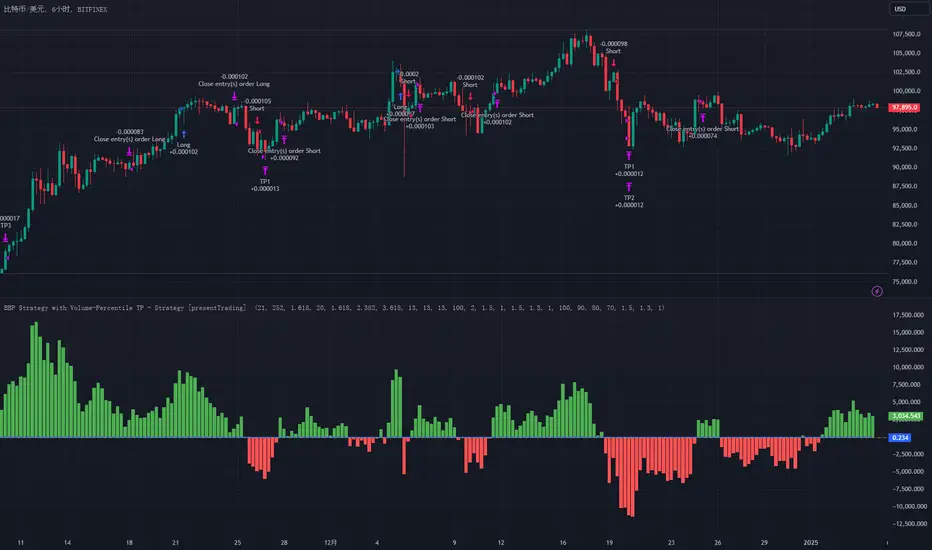
BullBear with Volume-Percentile TP - Strategy [presentTrading] Happy New Year, everyone! I hope we have a fantastic year ahead.
It's been a while since I published an open script, but it's time to return.
This strategy introduces an indicator called Bull Bear Power, combined with an advanced take-profit system, which is the main innovative and educational aspect of this script. I hope all of you find some useful insights here. Welcome to engage in meaningful exchanges. This is a versatile tool suitable for both novice and experienced traders.
█ Introduction and How it is Different
Unlike traditional strategies that rely solely on price or volume indicators, this approach combines Bull Bear Power (BBP) with volume percentile analysis to identify optimal entry and exit points. It features a dynamic take-profit mechanism based on ATR (Average True Range) multipliers adjusted by volume and percentile factors, ensuring adaptability to diverse market conditions. This multifaceted strategy not only improves signal accuracy but also optimizes risk management, distinguishing it from conventional trading methods.
BTCUSD 6hr performance
Disable the visualization of Bull Bear Power (BBP) to clearly view the Z-Score.
█ Strategy, How it Works: Detailed Explanation
The BBP Strategy with Volume-Percentile TP utilizes several interconnected components to analyze market data and generate trading signals. Here's an overview with essential equations:
🔶 Core Indicators and Calculations
1. Exponential Moving Average (EMA):
- **Purpose:** Smoothens price data to identify trends.
- **Formula:**
EMA_t = (Close_t * (2 / (lengthInput + 1))) + (EMA_(t-1) * (1 - (2 / (lengthInput + 1))))
- Usage: Baseline for Bull and Bear Power.
2. Bull and Bear Power:
- Bull Power: `BullPower = High_t - EMA_t`
- Bear Power: `BearPower = Low_t - EMA_t`
- BBP:** `BBP = BullPower + BearPower`
- Interpretation: Positive BBP indicates bullish strength, negative indicates bearish.
3. Z-Score Calculation:
- Purpose: Normalizes BBP to assess deviation from the mean.
- Formula:
Z-Score = (BBP_t - bbp_mean) / bbp_std
- Components:
- `bbp_mean` = SMA of BBP over `zLength` periods.
- `bbp_std` = Standard deviation of BBP over `zLength` periods.
- Usage: Identifies overbought or oversold conditions based on thresholds.
🔶 Volume Analysis
1. Volume Moving Average (`vol_sma`):
vol_sma = (Volume_1 + Volume_2 + ... + Volume_vol_period) / vol_period
2. Volume Multiplier (`vol_mult`):
vol_mult = Current Volume / vol_sma
- Thresholds:
- High Volume: `vol_mult > 2.0`
- Medium Volume: `1.5 < vol_mult ≤ 2.0`
- Low Volume: `1.0 < vol_mult ≤ 1.5`
🔶 Percentile Analysis
1. Percentile Calculation (`calcPercentile`):
Percentile = (Number of values ≤ Current Value / perc_period) * 100
2. Thresholds:
- High Percentile: >90%
- Medium Percentile: >80%
- Low Percentile: >70%
🔶 Dynamic Take-Profit Mechanism
1. ATR-Based Targets:
TP1 Price = Entry Price ± (ATR * atrMult1 * TP_Factor)
TP2 Price = Entry Price ± (ATR * atrMult2 * TP_Factor)
TP3 Price = Entry Price ± (ATR * atrMult3 * TP_Factor)
- ATR Calculation:
ATR_t = (True Range_1 + True Range_2 + ... + True Range_baseAtrLength) / baseAtrLength
2. Adjustment Factors:
TP_Factor = (vol_score + price_score) / 2
- **vol_score** and **price_score** are based on current volume and price percentiles.
Local performance
🔶 Entry and Exit Logic
1. Long Entry: If Z-Score crosses above 1.618, then Enter Long.
2. Short Entry: If Z-Score crosses below -1.618, then Enter Short.
3. Exiting Positions:
If Long and Z-Score crosses below 0:
Exit Long
If Short and Z-Score crosses above 0:
Exit Short
4. Take-Profit Execution:
- Set multiple exit orders at dynamically calculated TP levels based on ATR and adjusted by `TP_Factor`.
█ Trade Direction
The strategy determines trade direction using the Z-Score from the BBP indicator:
- Long Positions:
- Condition: Z-Score crosses above 1.618.
- Short Positions:
- Condition: Z-Score crosses below -1.618.
- Exiting Trades:
- Long Exit: Z-Score drops below 0.
- Short Exit: Z-Score rises above 0.
This approach aligns trades with prevailing market trends, increasing the likelihood of successful outcomes.
█ Usage
Implementing the BBP Strategy with Volume-Percentile TP in TradingView involves:
1. Adding the Strategy:
- Copy the Pine Script code.
- Paste it into TradingView's Pine Editor.
- Save and apply the strategy to your chart.
2. Configuring Settings:
- Adjust parameters like EMA length, Z-Score thresholds, ATR multipliers, volume periods, and percentile settings to match your trading preferences and asset behavior.
3. Backtesting:
- Use TradingView’s backtesting tools to evaluate historical performance.
- Analyze metrics such as profit factor, drawdown, and win rate.
4. Optimization:
- Fine-tune parameters based on backtesting results.
- Test across different assets and timeframes to enhance adaptability.
5. Deployment:
- Apply the strategy in a live trading environment.
- Continuously monitor and adjust settings as market conditions change.
█ Default Settings
The BBP Strategy with Volume-Percentile TP includes default parameters designed for balanced performance across various markets. Understanding these settings and their impact is essential for optimizing strategy performance:
Bull Bear Power Settings:
- EMA Length (`lengthInput`): 21
- **Effect:** Balances sensitivity and trend identification; shorter lengths respond quicker but may generate false signals.
- Z-Score Length (`zLength`): 252
- **Effect:** Long period for stable mean and standard deviation, reducing false signals but less responsive to recent changes.
- Z-Score Threshold (`zThreshold`): 1.618
- **Effect:** Higher threshold filters out weaker signals, focusing on significant market moves.
Take Profit Settings:
- Use Take Profit (`useTP`): Enabled (`true`)
- **Effect:** Activates dynamic profit-taking, enhancing profitability and risk management.
- ATR Period (`baseAtrLength`): 20
- **Effect:** Shorter period for sensitive volatility measurement, allowing tighter profit targets.
- ATR Multipliers:
- **Effect:** Define conservative to aggressive profit targets based on volatility.
- Position Sizes:
- **Effect:** Diversifies profit-taking across multiple levels, balancing risk and reward.
Volume Analysis Settings:
- Volume MA Period (`vol_period`): 100
- **Effect:** Longer period for stable volume average, reducing the impact of short-term spikes.
- Volume Multipliers:
- **Effect:** Determines volume conditions affecting take-profit adjustments.
- Volume Factors:
- **Effect:** Adjusts ATR multipliers based on volume strength.
Percentile Analysis Settings:
- Percentile Period (`perc_period`): 100
- **Effect:** Balances historical context with responsiveness to recent data.
- Percentile Thresholds:
- **Effect:** Defines price and volume percentile levels influencing take-profit adjustments.
- Percentile Factors:
- **Effect:** Modulates ATR multipliers based on price percentile strength.
Impact on Performance:
- EMA Length: Shorter EMAs increase sensitivity but may cause more false signals; longer EMAs provide stability but react slower to market changes.
- Z-Score Parameters:*Longer Z-Score periods create more stable signals, while higher thresholds reduce trade frequency but increase signal reliability.
- ATR Multipliers and Position Sizes: Higher multipliers allow for larger profit targets with increased risk, while diversified position sizes help in securing profits at multiple levels.
- Volume and Percentile Settings: These adjustments ensure that take-profit targets adapt to current market conditions, enhancing flexibility and performance across different volatility environments.
- Commission and Slippage: Accurate settings prevent overestimation of profitability and ensure the strategy remains viable after accounting for trading costs.
Conclusion
The BBP Strategy with Volume-Percentile TP offers a robust framework by combining BBP indicators with volume and percentile analyses. Its dynamic take-profit mechanism, tailored through ATR adjustments, ensures that traders can effectively capture profits while managing risks in varying market conditions.
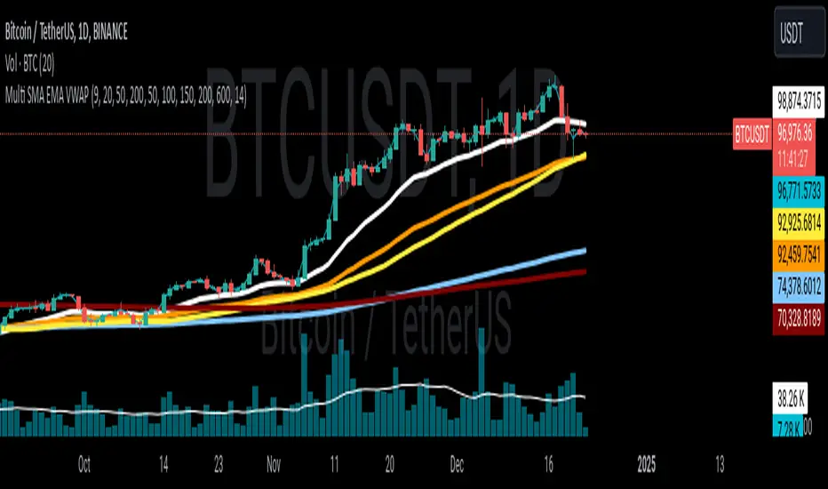
Multi SMA EMA VWAP1. Moving Average Crossover
This is one of the most common strategies with moving averages, and it involves observing crossovers between EMAs and SMAs to determine buy or sell signals.
Buy signal: When a faster EMA (like a short-term EMA) crosses above a slower SMA, it can indicate a potential upward movement.
Sell signal: When a faster EMA crosses below a slower SMA, it can indicate a potential downward movement.
With 4 EMAs and 5 SMAs, you can set up crossovers between different combinations, such as:
EMA(9) crosses above SMA(50) → buy.
EMA(9) crosses below SMA(50) → sell.
2. Divergence Confirmation Between EMAs and SMAs
Divergence between the EMAs and SMAs can offer additional confirmation. If the EMAs are pointing in one direction and the SMAs are still in the opposite direction, it is a sign that the movement could be stronger and continue in the same direction.
Positive divergence: If the EMAs are making new highs while the SMAs are still below, it could be a sign that the market is in a strong trend.
Negative divergence: If the EMAs are making new lows and the SMAs are still above, you might consider that the market is in a downtrend or correction.
3. Using EMAs as Dynamic Support and Resistance
EMAs can act as dynamic support and resistance in strong trends. If the price approaches a faster EMA from above and doesn’t break it, it could be a good entry point for a long position (buy). If the price approaches a slower EMA from below and doesn't break it, it could be a good point to sell (short).
Buy: If the price is above all EMAs and approaches the fastest EMA (e.g., EMA(9)), it could be a good buy point if the price bounces upward.
Sell: If the price is below all EMAs and approaches the fastest EMA, it could be a good sell point if the price bounces downward.
4. Combining SMAs and EMAs to Filter Signals
SMAs can serve as a trend filter to avoid trading in sideways markets. For example:
Bullish trend condition: If the longer-term SMAs (such as SMA(100) or SMA(200)) are below the price, and the shorter EMAs are aligned upward, you can look for buy signals.
Bearish trend condition: If the longer-term SMAs are above the price and the shorter EMAs are aligned downward, you can look for sell signals.
5. Consolidation Zone Between EMAs and SMAs
When the price moves between EMAs and SMAs without a clear trend (consolidation zone), you can expect a breakout. In this case, you can use the EMAs and SMAs to identify the direction of the breakout:
If the price is in a narrow range between the EMAs and SMAs and then breaks above the fastest EMA, it’s a sign that an upward trend may begin.
If the price breaks below the fastest EMA, it could indicate a potential downward trend.
6. "Golden Cross" and "Death Cross" Strategy
These are classic strategies based on crossovers between moving averages of different periods.
Golden Cross: Occurs when a faster EMA (e.g., EMA(50)) crosses above a slower SMA (e.g., SMA(200)), which suggests a potential bullish trend.
Death Cross: Occurs when a faster EMA crosses below a slower SMA, which suggests a potential bearish trend.
Additional Recommendations:
Combining with other indicators: You can combine EMA and SMA signals with other indicators like the RSI (Relative Strength Index) or MACD (Moving Average Convergence/Divergence) for confirmation and to avoid false signals.
Risk management: Always use stop-loss and take-profit orders to protect your capital. Moving averages are trend-following indicators but don’t guarantee that the price will move in the same direction.
Timeframe analysis: It’s recommended to use different timeframes to confirm the trend (e.g., use EMAs on hourly charts along with SMAs on daily charts).
VWAP
1. VWAP + EMAs for Trend Confirmation
VWAP can act as a trend filter, confirming the direction provided by the EMAs.
Buy Signal: If the price is above the VWAP and the EMAs are aligned in an uptrend (e.g., short-term EMAs are above longer-term EMAs), this indicates that the trend is bullish and you can look for buy opportunities.
Sell Signal: If the price is below the VWAP and the EMAs are aligned in a downtrend (e.g., short-term EMAs are below longer-term EMAs), this suggests a bearish trend and you can look for sell opportunities.
In this case, VWAP is used to confirm the overall trend. For example:
Bullish: Price above VWAP, EMAs aligned to the upside (e.g., EMA(9) > EMA(50) > EMA(200)), buy.
Bearish: Price below VWAP, EMAs aligned to the downside (e.g., EMA(9) < EMA(50) < EMA(200)), sell.
2. VWAP as Dynamic Support and Resistance
VWAP can act as a dynamic support or resistance level during the day. Combining this with EMAs and SMAs helps you refine your entry and exit points.
Support: If the price is above VWAP and starts pulling back to VWAP, it could act as support. If the price bounces off the VWAP and aligns with bullish EMAs (e.g., EMA(9) crossing above EMA(50)), you can consider entering a buy position.
Resistance: If the price is below VWAP and approaches VWAP from below, it can act as resistance. If the price fails to break through VWAP and aligns with bearish EMAs (e.g., EMA(9) crossing below EMA(50)), it could be a good signal for a sell.
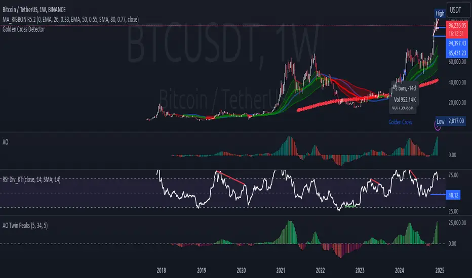
Awesome Oscillator Twin Peaks Strategy
1. The indicator identifies both bullish and bearish twin peaks:
- Bullish: Two consecutive valleys below zero, where the second valley is higher than the first
- Bearish: Two consecutive peaks above zero, where the second peak is lower than the first
2. Visual elements:
- AO histogram with color-coding for increasing/decreasing values
- Triangle markers for confirmed twin peak signals
- Zero line for reference
- Customizable colors through inputs
3. Built-in safeguards:
- Minimum separation between peaks to avoid false signals
- Maximum time window for pattern completion
- Clear signal reset conditions
4. Alert conditions for both bullish and bearish signals
To use this indicator:
1. Add it to your TradingView chart
2. Customize the input parameters if needed
3. Look for triangle markers that indicate confirmed twin peak patterns
4. Optional: Set up alerts based on the signal conditions
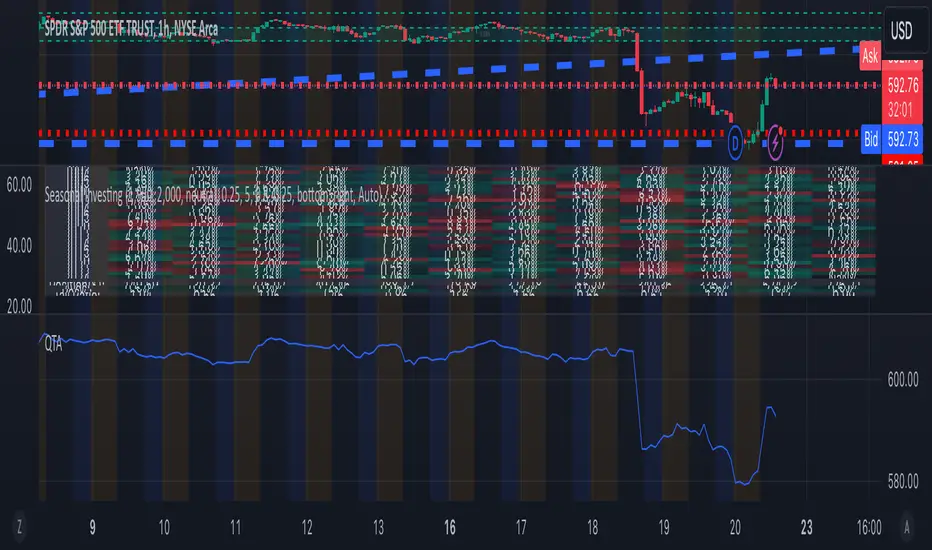
QTALibrary "QTA"
This is simple library for basic Quantitative Technical Analysis for retail investors. One example of it being used can be seen here ().
calculateKellyRatio(returns)
Parameters:
returns (array) : An array of floats representing the returns from bets.
Returns: The calculated Kelly Ratio, which indicates the optimal bet size based on winning and losing probabilities.
calculateAdjustedKellyFraction(kellyRatio, riskTolerance, fedStance)
Parameters:
kellyRatio (float) : The calculated Kelly Ratio.
riskTolerance (float) : A float representing the risk tolerance level.
fedStance (string) : A string indicating the Federal Reserve's stance ("dovish", "hawkish", or neutral).
Returns: The adjusted Kelly Fraction, constrained within the bounds of .
calculateStdDev(returns)
Parameters:
returns (array) : An array of floats representing the returns.
Returns: The standard deviation of the returns, or 0 if insufficient data.
calculateMaxDrawdown(returns)
Parameters:
returns (array) : An array of floats representing the returns.
Returns: The maximum drawdown as a percentage.
calculateEV(avgWinReturn, winProb, avgLossReturn)
Parameters:
avgWinReturn (float) : The average return from winning bets.
winProb (float) : The probability of winning a bet.
avgLossReturn (float) : The average return from losing bets.
Returns: The calculated Expected Value of the bet.
calculateTailRatio(returns)
Parameters:
returns (array) : An array of floats representing the returns.
Returns: The Tail Ratio, or na if the 5th percentile is zero to avoid division by zero.
calculateSharpeRatio(avgReturn, riskFreeRate, stdDev)
Parameters:
avgReturn (float) : The average return of the investment.
riskFreeRate (float) : The risk-free rate of return.
stdDev (float) : The standard deviation of the investment's returns.
Returns: The calculated Sharpe Ratio, or na if standard deviation is zero.
calculateDownsideDeviation(returns)
Parameters:
returns (array) : An array of floats representing the returns.
Returns: The standard deviation of the downside returns, or 0 if no downside returns exist.
calculateSortinoRatio(avgReturn, downsideDeviation)
Parameters:
avgReturn (float) : The average return of the investment.
downsideDeviation (float) : The standard deviation of the downside returns.
Returns: The calculated Sortino Ratio, or na if downside deviation is zero.
calculateVaR(returns, confidenceLevel)
Parameters:
returns (array) : An array of floats representing the returns.
confidenceLevel (float) : A float representing the confidence level (e.g., 0.95 for 95% confidence).
Returns: The Value at Risk at the specified confidence level.
calculateCVaR(returns, varValue)
Parameters:
returns (array) : An array of floats representing the returns.
varValue (float) : The Value at Risk threshold.
Returns: The average Conditional Value at Risk, or na if no returns are below the threshold.
calculateExpectedPriceRange(currentPrice, ev, stdDev, confidenceLevel)
Parameters:
currentPrice (float) : The current price of the asset.
ev (float) : The expected value (in percentage terms).
stdDev (float) : The standard deviation (in percentage terms).
confidenceLevel (float) : The confidence level for the price range (e.g., 1.96 for 95% confidence).
Returns: A tuple containing the minimum and maximum expected prices.
calculateRollingStdDev(returns, window)
Parameters:
returns (array) : An array of floats representing the returns.
window (int) : An integer representing the rolling window size.
Returns: An array of floats representing the rolling standard deviation of returns.
calculateRollingVariance(returns, window)
Parameters:
returns (array) : An array of floats representing the returns.
window (int) : An integer representing the rolling window size.
Returns: An array of floats representing the rolling variance of returns.
calculateRollingMean(returns, window)
Parameters:
returns (array) : An array of floats representing the returns.
window (int) : An integer representing the rolling window size.
Returns: An array of floats representing the rolling mean of returns.
calculateRollingCoefficientOfVariation(returns, window)
Parameters:
returns (array) : An array of floats representing the returns.
window (int) : An integer representing the rolling window size.
Returns: An array of floats representing the rolling coefficient of variation of returns.
calculateRollingSumOfPercentReturns(returns, window)
Parameters:
returns (array) : An array of floats representing the returns.
window (int) : An integer representing the rolling window size.
Returns: An array of floats representing the rolling sum of percent returns.
calculateRollingCumulativeProduct(returns, window)
Parameters:
returns (array) : An array of floats representing the returns.
window (int) : An integer representing the rolling window size.
Returns: An array of floats representing the rolling cumulative product of returns.
calculateRollingCorrelation(priceReturns, volumeReturns, window)
Parameters:
priceReturns (array) : An array of floats representing the price returns.
volumeReturns (array) : An array of floats representing the volume returns.
window (int) : An integer representing the rolling window size.
Returns: An array of floats representing the rolling correlation.
calculateRollingPercentile(returns, window, percentile)
Parameters:
returns (array) : An array of floats representing the returns.
window (int) : An integer representing the rolling window size.
percentile (int) : An integer representing the desired percentile (0-100).
Returns: An array of floats representing the rolling percentile of returns.
calculateRollingMaxMinPercentReturns(returns, window)
Parameters:
returns (array) : An array of floats representing the returns.
window (int) : An integer representing the rolling window size.
Returns: A tuple containing two arrays: rolling max and rolling min percent returns.
calculateRollingPriceToVolumeRatio(price, volData, window)
Parameters:
price (array) : An array of floats representing the price data.
volData (array) : An array of floats representing the volume data.
window (int) : An integer representing the rolling window size.
Returns: An array of floats representing the rolling price-to-volume ratio.
determineMarketRegime(priceChanges)
Parameters:
priceChanges (array) : An array of floats representing the price changes.
Returns: A string indicating the market regime ("Bull", "Bear", or "Neutral").
determineVolatilityRegime(price, window)
Parameters:
price (array) : An array of floats representing the price data.
window (int) : An integer representing the rolling window size.
Returns: An array of floats representing the calculated volatility.
classifyVolatilityRegime(volatility)
Parameters:
volatility (array) : An array of floats representing the calculated volatility.
Returns: A string indicating the volatility regime ("Low" or "High").
method percentPositive(thisArray)
Returns the percentage of positive non-na values in this array.
This method calculates the percentage of positive values in the provided array, ignoring NA values.
Namespace types: array
Parameters:
thisArray (array)
_candleRange()
_PreviousCandleRange(barsback)
Parameters:
barsback (int) : An integer representing how far back you want to get a range
redCandle()
greenCandle()
_WhiteBody()
_BlackBody()
HighOpenDiff()
OpenLowDiff()
_isCloseAbovePreviousOpen(length)
Parameters:
length (int)
_isCloseBelowPrevious()
_isOpenGreaterThanPrevious()
_isOpenLessThanPrevious()
BodyHigh()
BodyLow()
_candleBody()
_BodyAvg(length)
_BodyAvg function.
Parameters:
length (simple int) : Required (recommended is 6).
_SmallBody(length)
Parameters:
length (simple int) : Length of the slow EMA
Returns: a series of bools, after checking if the candle body was less than body average.
_LongBody(length)
Parameters:
length (simple int)
bearWick()
bearWick() function.
Returns: a SERIES of FLOATS, checks if it's a blackBody(open > close), if it is, than check the difference between the high and open, else checks the difference between high and close.
bullWick()
barlength()
sumbarlength()
sumbull()
sumbear()
bull_vol()
bear_vol()
volumeFightMA()
volumeFightDelta()
weightedAVG_BullVolume()
weightedAVG_BearVolume()
VolumeFightDiff()
VolumeFightFlatFilter()
avg_bull_vol(userMA)
avg_bull_vol(int) function.
Parameters:
userMA (int)
avg_bear_vol(userMA)
avg_bear_vol(int) function.
Parameters:
userMA (int)
diff_vol(userMA)
diff_vol(int) function.
Parameters:
userMA (int)
vol_flat(userMA)
vol_flat(int) function.
Parameters:
userMA (int)
_isEngulfingBullish()
_isEngulfingBearish()
dojiup()
dojidown()
EveningStar()
MorningStar()
ShootingStar()
Hammer()
InvertedHammer()
BearishHarami()
BullishHarami()
BullishBelt()
BullishKicker()
BearishKicker()
HangingMan()
DarkCloudCover()
Trend Strength/DirectionThis is a really good, though complex indicator, so I will add two different explanations so to appease both the laymen and those who take the time to read thoroughly.
Simple Explanation
This indicator utilizes 6HMA's to display their angles
The greater the angle ---> the stronger the trend
If more angles are positive, then trend is very strong
If more are negative, then very negative
Comprehensive Explanation
6 angles, each of a different time frame are used to represent direction and trend strength. Angles are used because they intrinsically represent momentum and speed. An angle of 45 represents a perfect balance between something that can cover the furthest distance without compensating for speed. 1 of the 6 angles is intended(though customizable) to represent the 5 hma's angle. This is because the 5hma is very good at representing very near term price action.
Angle Levels
Its important to understand what the angle levels mean for the underlying hma's. The 0 level represents a hma that is horizontal. This is important because this is the point at which it decides to be bullish or bearish. +/- 45, as noted before, represent bullishness/bearishness that represent strong trends without compensating for speed. A continuous increase/decrease and or a cross of these levels generally indicate significant change in sentiment, of which trades may be taken.
Strategy
You should weigh your decision by those angles that represent the longer time frame. If more angles represent a certain sentiment, it is obviously unwise to fight against that long term sentiment. The purpose of this indicator was to provide a proper representation of trend direction and strength, but also solve the problem of when you should 'dip' buy.
For an example: if all angles are increase or decreasing, then you may use the 5hma's angle to find the proper points at which you will enter a position.
***NOTE: I dont think the +/- 45 bands should indicate 'overbought' or 'oversold' zones that some might assume. Instead you should wait for a crossing of this zone.

Strength of Divergence Across Multiple Indicators (+CMF&VWMACD)Modified Version of Strength of Divergence Across Multiple Indicators by reees
Purpose:
This Pine Script indicator is designed to identify and evaluate the strength of bullish and bearish divergences across multiple technical indicators. Divergences occur when the price of an asset is moving in one direction while a technical indicator is moving in the opposite direction, potentially signaling a trend reversal.
Key Features:
1. Multiple Indicator Support: The script now analyzes divergences for the following indicators:
* RSI (Relative Strength Index)
* OBV (On-Balance Volume)
* MACD (Moving Average Convergence/Divergence)
* STOCH (Stochastic Oscillator)
* CCI (Commodity Channel Index)
* MFI (Money Flow Index)
* AO (Awesome Oscillator)
* CMF (Chaikin Money Flow) - Newly added
* VWMACD (Volume-Weighted MACD) - Newly added
2. Customizable Divergence Parameters:
* Bullish/Bearish: Enable or disable the detection of bullish and bearish divergences independently.
* Regular/Hidden: Detect both regular and hidden divergences (hidden divergences can indicate trend continuation).
* Broken Trendline Exclusion: Optionally ignore divergences where the trendline connecting price pivots is broken by an intermediate pivot.
* Pivot Lookback Periods: Adjust the number of bars used to identify valid pivot highs and lows for divergence calculations.
* Weighting: Assign different weights to regular vs. hidden divergences and to the relative change in price vs. the indicator.
3. Indicator-Specific Settings:
* Weight: Each indicator can be assigned a weight, influencing its contribution to the overall divergence strength calculation.
* Extreme Value: Define a threshold above which an indicator's divergence is considered "extreme," giving it a higher strength rating.
4. Divergence Strength Calculation:
* For each indicator, the script calculates a divergence "degree" based on the magnitude of the divergence and the user-defined weightings.
* The total divergence strength is the sum of the individual indicator divergence degrees.
* Strength is categorized as "Extreme," "Very strong," "Strong," "Moderate," "Weak," or "Very weak."
5. Visualization:
* Divergence Lines: The script draws lines on the chart connecting the price and indicator pivots that form a divergence (optional, with customizable transparency).
* Labels: Labels display the total divergence strength and a breakdown of each indicator's contribution. The size and visibility of labels are based on the strength.
6. Alerts:
* The script can generate alerts when the total divergence strength exceeds a user-defined threshold.
New Indicators (CMF and VWMACD):
* Chaikin Money Flow (CMF):
* Purpose: Measures the buying and selling pressure by analyzing the relationship between price, volume, and the accumulation/distribution line.
* Divergence: A bullish CMF divergence occurs when the price makes a lower low, but the CMF makes a higher low (suggesting increasing buying pressure). A bearish divergence is the opposite.
* Volume-Weighted MACD (VWMACD):
* Purpose: Similar to the standard MACD but uses volume-weighted moving averages instead of simple moving averages, giving more weight to periods with higher volume.
* Divergence: Divergences are interpreted similarly to the standard MACD, but the VWMACD can be more sensitive to volume changes.
How It Works (Simplified):
1. Pivot Detection: The script identifies pivot highs and lows in both price and the selected indicators using the specified lookback periods.
2. Divergence Check: For each indicator:
* It checks if a series of pivots in price and the indicator are diverging (e.g., price makes a lower low, but the indicator makes a higher low for a bullish divergence).
* It calculates the divergence degree based on the difference in price and indicator values, weightings, and whether it's a regular or hidden divergence.
3. Strength Aggregation: The script sums up the divergence degrees of all enabled indicators to get the total divergence strength.
4. Visualization and Alerts: It draws lines and labels on the chart to visualize the divergences and generates alerts if the total strength exceeds the set threshold.
Benefits:
* Comprehensive Divergence Analysis: By considering multiple indicators, the script provides a more robust assessment of potential trend reversals.
* Customization: The many adjustable parameters allow traders to fine-tune the script to their specific trading style and preferences.
* Objective Strength Evaluation: The divergence strength calculation and categorization offer a more objective way to evaluate the significance of divergences.
* Early Warning System: Divergences can often precede significant price movements, making this script a valuable tool for anticipating potential trend changes.
* Volume Confirmation: The inclusion of CMF and VWMACD add volume-based confirmation to the divergence signals, potentially increasing their reliability.
Limitations:
* Lagging Indicators: Most of the indicators used are lagging, meaning they are based on past price data. Divergences may sometimes occur after a significant price move has already begun.
* False Signals: No indicator is perfect, and divergences can sometimes produce false signals, especially in choppy or ranging markets.
* Subjectivity: While the script aims for objectivity, some settings (like weightings and extreme values) still involve a degree of subjective judgment.

Wick Length Display + Alert conditionsDescription of the Wick Length Display (Advanced) script
Originality and purpose of the script
The Wick Length Display (Advanced) script is an innovative tool for traders who want to gain detailed insights into the length of candle wicks. It stands out for its versatility and user-friendly customization options. It combines precise technical calculations with visual representation to provide important information about market movements and dynamics right on the chart.
Functionality
The script calculates and displays the length of the upper and lower wicks of each candle on the chart. It also provides additional visual cues such as:
• “Bull pressure”: When green candles do not have upper wicks, this indicates strong buying pressure.
• “Bear pressure”: When red candles do not have lower wicks, this indicates strong selling pressure.
• Threshold conditions: Only displays wicks that exceed a certain threshold (optional).
• Display in pips: Allows you to display wick lengths in pips, which is useful for forex traders.
How it works
The script analyzes each candle using the following calculations:
1. Wick length calculation:
◦ Upper wick length = High - (top of the body)
◦ Lower wick length = (bottom of the body) - Low
2. Display conditions:
◦ It distinguishes between bullish and bearish candles.
◦ It checks if the calculated wicks exceed the defined thresholds before displaying them.
3. Dynamic labels:
◦ Labels are placed above or below the respective candles.
◦ Size, color and type of labels are fully customizable.
4. Limitation of labels:
◦ To ensure clarity, a maximum number of labels is defined.
Usage
1. Customization:
◦ Open the script in the Pine Script Editor in TradingView.
◦ Use the input options to customize parameters such as color selection, label size, thresholds and other details according to your requirements.
2. Enable thresholds:
◦ Enable thresholds to show labels only for relevant wicks (default is 6).
◦ Define the minimum wick lengths for bullish (green) and bearish (red) candles.
3. Show in pips:
◦ Enable the “Show wick length in pips” option to show the results in pips (especially suitable for Forex).
4. Edit pressure labels:
◦ Turn the “Bull Pressure” and “Bear Pressure” features on or off depending on your analysis settings.
Concepts behind the calculations
• Technical market analysis: Wick lengths can indicate buying or selling pressure and provide important information on market psychology.
• Thresholds and filtering: The script uses thresholds to avoid visual overload and highlight only essential data.
• Label display: Dynamic labels improve chart readability and give the user instant feedback on market developments.
Usage
This script is great for:
• Intraday trading: Analyzing short-term movements using wick lengths.
• Forex trading: Tracking market momentum using the pip indicator.
• Swing trading: Identifying buying or selling pressure in key markets.
• Visual support: Ideal for traders who prefer a graphical display.
Description of the Wick Length Display (Advanced) script
Originality and purpose of the script
The Wick Length Display (Advanced) script is an innovative tool for traders who want to gain detailed insights into the length of candle wicks. It stands out for its versatility and user-friendly customization options. It combines precise technical calculations with visual representation to provide important information about market movements and dynamics right on the chart.
Functionality
The script calculates and displays the length of the upper and lower wicks of each candle on the chart. It also provides additional visual cues such as:
• “Bull pressure”: When green candles do not have upper wicks, this indicates strong buying pressure.
• “Bear pressure”: When red candles do not have lower wicks, this indicates strong selling pressure.
• Threshold conditions: Only displays wicks that exceed a certain threshold (optional).
• Display in pips: Allows you to display wick lengths in pips, which is useful for forex traders.
How it works
The script analyzes each candle using the following calculations:
1. Wick length calculation:
◦ Upper wick length = High - (top of the body)
◦ Lower wick length = (bottom of the body) - Low
2. Display conditions:
◦ It distinguishes between bullish and bearish candles.
◦ It checks if the calculated wicks exceed the defined thresholds before displaying them.
3. Dynamic labels:
◦ Labels are placed above or below the respective candles.
◦ Size, color and type of labels are fully customizable.
4. Limitation of labels
Alert conditions:
Alerts are triggered when the wick length of a bullish or bearish candle exceeds the defined thresholds.
Alert function:
alert() is used to issue messages with a frequency of once per candle when the conditions are met.
How to set up alerts
Save the script and add it to your chart.
Open the alert settings in TradingView.
Select the script's custom message as a trigger.
Adjust the frequency and notification type (popup, email, etc.).
Now you have a powerful tool with visual analysis and alert function!

Prometheus Markov ChainThe Prometheus Markov Chain Indicator is a custom-built tool designed to predict potential future price movements using a Markov Chain approach. A Markov Chain is a statistical model that assumes the probability of moving to a future state depends solely on the current state. In this indicator, states represent price movement classifications—bullish, bearish, or neutral—and are determined based on historical price changes (percentage returns). The indicator builds a transition matrix to calculate probabilities of transitioning from one state to another, enabling traders to identify patterns and forecast likely price actions.
Core Functionality and Transition Matrix
The transition matrix is the backbone of the Markov Chain. It captures the frequency of transitions between states in the historical price data and normalizes these counts into probabilities. For example, if the price was in a bearish state and transitioned to a bullish state 3 out of 10 times, the probability of transitioning from bearish to bullish would be 0.3. The matrix is created dynamically using the stateFunc function to classify states, which can use either dynamic thresholds (highest and lowest returns over a lookback period) or a user-defined percent return threshold. Below is the snippet that updates the transition matrix:
transitionMatrix = matrix.new(dimension, dimension, 0.0)
for i = 0 to array.size(vec) - 2
fromState = array.get(vec, i)
toState = array.get(vec, i + 1)
transitionMatrix.set(fromState, toState, transitionMatrix.get(fromState, toState) + 1)
for i = 0 to dimension - 1
rowSum = 0.0
for j = 0 to dimension - 1
rowSum += transitionMatrix.get(i, j)
for j = 0 to dimension - 1
prob = transitionMatrix.get(i, j) / rowSum
transitionMatrix.set(i, j, prob)
This snippet iterates through historical price movements, counts state transitions, and then normalizes each row of the matrix so that the sum of probabilities for all possible transitions from a given state equals 1.
How the Indicator Predicts Future States
After constructing the transition matrix, the indicator calculates the current state of the price based on the latest percentage return and then uses the matrix to compute probabilities for transitioning to other states. The state with the highest probability is predicted as the next state, which is displayed on the chart using color-coded labels: green for bullish and red for bearish. The following snippet demonstrates how the current state and predictions are calculated:
current_chng = (close - close ) / close
var int current_state = na
if not use_custom_thresh
highest_chng = ta.highest(current_chng, int(size) * 2)
lowest_chng = ta.lowest(current_chng, int(size) * 2)
current_state := stateFunc(current_chng, highest_chng, lowest_chng)
else
current_state := stateFunc(current_chng, custom_thresh)
predicted_probs = array.new(dimension, 0.0)
for j = 0 to dimension - 1
array.set(predicted_probs, j, transitionMatrix.get(current_state, j))
The indicator evaluates which state has the highest transition probability (highest_prob) and places corresponding labels on the chart. For example, if the next state is predicted to be bullish, a green "Bullish" label is placed below the current bar. This predictive functionality helps traders anticipate potential reversals or continuations in price trends based on historical behavior patterns.
Usage:
Here we see the indicator at work on $PLTR. The states predicted are bullish then bearish. In this example we then see price move in a way that verifies those predictions.
On this 4 Hour NASDAQ:AMZN chart we see predictions play out in a short trade style. States quickly move from one to another but not without giving traders a way to take advantage.
This is the perspective we aim to provide. We encourage traders to not follow indicators blindly. No indicator is 100% accurate. This one can give you a different perspective market state. We encourage any comments about desired updates or criticism!

Indicator DashboardThis script creates an 'Indicator Dashboard' designed to assist you in analyzing financial markets and making informed decisions. The indicator provides a summary of current market conditions by presenting various technical analysis indicators in a table format. The dashboard evaluates popular indicators such as Moving Averages, RSI, MACD, and Stochastic RSI. Below, we'll explain each part of this script in detail and its purpose:
### Overview of Indicators
1. **Moving Averages (MA)**:
- This indicator calculates Simple Moving Averages (“SMA”) for 5, 14, 20, 50, 100, and 200 periods. These averages provide a visual summary of price movements. Depending on whether the price is above or below the moving average, it determines the market direction as either “Bullish” or “Bearish.”
2. **RSI (Relative Strength Index)**:
- The RSI helps identify overbought or oversold market conditions. Here, the RSI is calculated for a 14-period window, and this value is displayed in the table. Additionally, the 14-period moving average of the RSI is also included.
3. **MACD (Moving Average Convergence Divergence)**:
- The MACD indicator is used to determine trend strength and potential reversals. This script calculates the MACD line, signal line, and histogram. The MACD condition (“Bullish,” “Bearish,” or “Neutral”) is displayed alongside the MACD and signal line values.
4. **Stochastic RSI**:
- Stochastic RSI is used to identify momentum changes in the market. The %K and %D lines are calculated to determine the market condition (“Bullish” or “Bearish”), which is displayed along with the calculated values for %K and %D.
### Table Layout and Presentation
The dashboard is presented in a vertical table format in the top-right corner of the chart. The table contains two columns: “Indicator” and “Status,” summarizing the condition of each technical indicator.
- **Indicator Column**: Lists each of the indicators being tracked, such as SMA values, RSI, MACD, etc.
- **Status Column**: Displays the current status of each indicator, such as “Bullish,” “Bearish,” or specific values like the RSI or MACD.
The table also includes rounded indicator values for easier interpretation. This helps traders quickly assess market conditions and make informed decisions based on multiple indicators presented in a single location.
### Detailed Indicator Status Calculations
1. **SMA Status**: For each moving average (5, 14, 20, 50, 100, 200), the script checks if the current price is above or below the SMA. The status is determined as “Bullish” if the price is above the SMA and “Bearish” if below, with the value of the SMA also displayed.
2. **RSI and RSI Average**: The RSI value for a 14-period is displayed along with its 14-period SMA, which provides an average reading of the RSI to smooth out volatility.
3. **MACD Indicator**: The MACD line, signal line, and histogram are calculated using standard parameters (12, 26, 9). The status is shown as “Bullish” when the MACD line is above the signal line, and “Bearish” when it is below. The exact values for the MACD line, signal line, and histogram are also included.
4. **Stochastic RSI**: The %K and %D lines of the Stochastic RSI are used to determine the trend condition. If %K is greater than %D, the condition is “Bullish,” otherwise it is “Bearish.” The actual values of %K and %D are also displayed.
### Conclusion
The 'Indicator Dashboard' provides a comprehensive overview of multiple technical indicators in a single, easy-to-read table. This allows traders to quickly gauge market conditions and make more informed decisions. By consolidating key indicators like Moving Averages, RSI, MACD, and Stochastic RSI into one dashboard, it saves time and enhances the efficiency of technical analysis.
This script is particularly useful for traders who prefer a clean and organized overview of their favorite indicators without needing to plot each one individually on the chart. Instead, all the crucial information is available at a glance in a consolidated format.

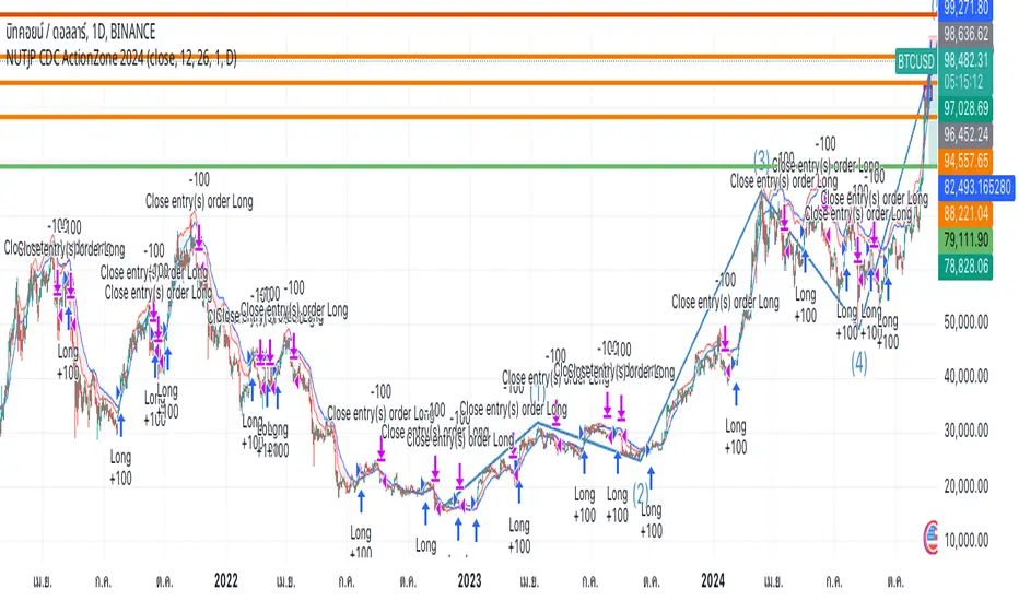
NUTJP CDC ActionZone 20241. Core Components of the Strategy
• Fast EMA and Slow EMA:
• The Fast EMA (shorter period) is more reactive to recent price changes.
• The Slow EMA (longer period) reacts slower and provides a smoother view of the overall trend.
• Relationship Between Fast EMA and Slow EMA:
• When the Fast EMA is above the Slow EMA, the market is considered Bullish.
• When the Fast EMA is below the Slow EMA, the market is considered Bearish.
2. Zones Based on Price and EMAs
The strategy defines six zones based on the position of the price, Fast EMA, and Slow EMA:
1. Green Zone (Buy):
• Bullish trend (Fast EMA > Slow EMA)
• Price is above the Fast EMA.
• Indicates a strong uptrend and suggests buying.
2. Blue and Light Blue Zones (Pre-Buy):
• Price is above the Fast EMA but below or near the Slow EMA.
• Represents potential bullish signals but not strong enough to trigger a buy.
3. Red Zone (Sell):
• Bearish trend (Fast EMA < Slow EMA)
• Price is below the Fast EMA.
• Indicates a strong downtrend and suggests selling or avoiding long trades.
4. Orange and Yellow Zones (Pre-Sell):
• Price is below the Fast EMA but above or near the Slow EMA.
• Represents potential bearish signals but not strong enough to trigger a sell.
These zones help traders visualize the market conditions and determine whether to buy, hold, or sell.
3. Buy and Sell Conditions
• Buy Condition:
A buy signal is triggered when:
• The price enters the Green Zone (Bullish trend and price > Fast EMA).
• It’s the first green candle after a non-green candle.
• Sell Condition:
A sell signal is triggered when:
• The price enters the Red Zone (Bearish trend and price < Fast EMA).
• It’s the first red candle after a non-red candle.
4. Trade Execution Logic
• Buy:
The strategy enters a long position (buy) when the above buy condition is met.
• Sell:
The strategy exits the long position when the sell condition is met.
Note: It doesn’t support short trades, meaning it doesn’t enter sell positions.
5. Momentum-Based Signals (Optional)
The indicator also includes momentum signals using Stochastic RSI to provide additional buy/sell signals:
• These are based on oversold and overbought levels of the Stochastic RSI.
• It filters signals depending on whether the trend is Bullish or Bearish.
6. Visual Features
The indicator is designed to make the trading zones and signals visually intuitive:
• Bar Colors:
Candlesticks are colored based on the current zone (e.g., Green for Buy, Red for Sell).
• EMA Lines:
The Fast EMA and Slow EMA are plotted, making it easy to see crossover points.
• Buy/Sell Signals:
Marked with shapes (e.g., circles) below/above bars for clarity.
7. Strategy Assumptions
• Trend-Following Nature:
This strategy assumes that trends persist. It works best in trending markets but might give false signals in ranging markets.
• Lagging Nature of EMAs:
As EMAs are lagging indicators, buy and sell signals may occur after significant moves have already begun or ended.
• Momentum Confirmation (Optional):
Adding momentum signals can help filter false signals, though it’s not part of the core logic.
8. Usage Recommendations
• Timeframes:
Works on various timeframes but may perform better on higher timeframes (e.g., 1H, Daily) to reduce noise.
• Markets:
Can be applied to stocks, forex, and cryptocurrencies.
• Backtesting and Optimization:
Before live trading, backtest the strategy with different EMA periods and other parameters to find optimal settings for your market and timeframe.
DB369 - Directional Bias 369
DB369 - Directional Bias 369 Indicator
The **DB369** indicator helps traders identify key market levels and trends by combining multiple timeframes' price action analysis. It highlights important **pivot points** on the chart and provides visual cues to help you make more informed buy and sell decisions based on the overall market direction.
Key Features
1. Pivot Points Across Multiple Timeframes**:
- The indicator calculates and displays pivot points for the **Monthly**, **Weekly**, **Daily**, **4-Hour**, and **1-Hour** timeframes (or 30-minute equivalent if desired). These pivots represent significant price levels where the market may retest.
2. **Trend Detection**:
- The indicator evaluates the relationship between the current price and the pivot point for each timeframe. Based on this comparison, it classifies the market as **Bullish**, **Bearish**, or **Neutral** on each timeframe.
3. **Pivot Lines**:
- Horizontal lines are drawn to mark the key pivot points for each selected timeframe. These lines extend into the future and adjust dynamically as the market moves in real time.
- **Customizable**: You can choose which timeframes to display pivot points by enabling/disabling them in the settings.
4. **Trend Table**:
- A **table** is displayed at the top-right of the chart to show the trend for the **Daily**, **4-Hour**, and **30-Minute** timeframes. It provides an easy-to-read view of the trend direction across these timeframes.
5. **Buy/Sell Arrows**:
- **Buy Arrow**: A green arrow will appear when the **Daily**, **4-Hour**, and **30-Minute** trends are all **Bullish** (aligned in the same direction).
- **Sell Arrow**: A red arrow will appear when all three timeframes show a **Bearish** trend.
- These arrows appear only once per alignment change and can be enabled or disabled for alerts. This helps avoid clutter on the chart and ensures that you only see a signal when the alignment occurs or changes.
### **How to Use the DB369 Indicator**:
1. **Pivot Points**:
- The pivot points represent significant price levels where the market might retest in the future. For instance:
- **Bullish Market**: If the price is above the pivot point, the market is considered bullish.
- **Bearish Market**: If the price is below the pivot point, the market is considered bearish.
- **Neutral Market**: When the price is near the pivot point, the market is neither strongly bullish nor bearish.
2. **Trend Alignment**:
- When the **Daily**, **4-Hour**, and **30-Minute** timeframes all show the same trend direction (either **Bullish** or **Bearish**), this alignment signifies a stronger trend.
- You will receive a **Buy Arrow** when all three timeframes are aligned bullish, and a **Sell Arrow** when they are aligned bearish.
- These arrows are displayed at the point when the alignment is first detected and can also trigger **alerts**.
3. **Alerts**:
- You can choose to enable alerts for when a **Buy** or **Sell** arrow appears on the chart. This allows you to be notified in real-time when the alignment conditions are met.
4. **Using the Pivot Points for Entry**:
- **Buy Trade**: Look for a buy trade when the price is near the **pivot line** of the higher timeframes, particularly when the trend across all three timeframes is **Bullish**.
- **Sell Trade**: Similarly, look for a sell trade when the price is near a **pivot line** and the trend is **Bearish**.
5. **Customization**:
- You can customize which timeframes' pivots are shown on the chart by toggling the visibility of the **Monthly**, **Weekly**, **Daily**, **4-Hour**, and **1-Hour** pivots in the settings.
- The indicator automatically adjusts the pivot levels in real-time as the market progresses.
**Important Notes**:
- This indicator does not guarantee successful trades; it is intended to assist in identifying potential trade opportunities based on the alignment of higher timeframe trends.
- Always combine the information from the DB369 indicator with other technical analysis tools and risk management strategies to ensure more accurate trade decisions.

Correlation Confluence Trend IndicatorCorrelation Confluence Trend Indicator
Overview
The Correlation Confluence Trend Indicator combines exponential moving averages (EMAs) and statistical correlation measures to identify high-confidence trend alignments between an asset and a benchmark. By filtering signals through correlation strength, this indicator highlights opportunities when the asset and benchmark move together. In other words, it defines a trend and then uses correlation strength and the trend of a second asset to identify high-confidence trends.
Key Features
Dual EMA Trend Analysis :
Calculates fast and slow EMAs for both the asset and the selected benchmark (e.g., SPY) to identify bullish and bearish trends.
Correlation Strength Filtering :
Evaluates correlation between the asset and benchmark, identifying stronger-than-average relationships based on the mean and standard deviation.
Background Color Coding :
- Green : Strong correlation, both asset and benchmark bullish.
- Aqua : Weak correlation, both asset and benchmark bullish.
- Red : Strong correlation, both asset and benchmark bearish.
- Fuchsia : Weak correlation, both asset and benchmark bearish.
- Orange : Strong correlation, benchmark bullish, asset bearish.
- Yellow : Weak correlation, benchmark bullish, asset bearish.
- Purple : Strong correlation, benchmark bearish, asset bullish.
- Lime : Weak correlation, benchmark bearish, asset bullish.
Visual Trend Indicators :
Plots fast and slow EMAs for the asset, dynamically colored based on aggregate trend signals. The color of this corresponds to the main trend signal.
Inputs
Benchmark Symbol : Symbol of the benchmark asset to compare against.
Fast EMA Length : Period for the fast EMA calculation.
Slow EMA Length : Period for the slow EMA calculation.
Correlation Length : Number of bars for correlation calculation.
Correlation Mean Length : Number of bars for mean and standard deviation calculation.
Std Dev Multiplier : Multiplier for standard deviation to define correlation strength. When the correlation is Std Dev Multiplier standard deviations above the mean, it counts as a strong correlation.
Set Background Color : Toggle background coloring on or off.
Notes
This indicator is primarily designed for trend-following strategies. By combining trend analysis and correlation filtering, it ensures that signals occur during aligned market conditions, reducing false signals.
Before incorporating this indicator into your trading strategy:
Always backtest on historical data to evaluate its performance before committing capital.
Use proper risk management to control position sizes and mitigate potential losses.
Remember that no indicator guarantees success. I'm quite proud of this one, but it's not the holy grail.

Arshtiq - Multi-Timeframe Trend StrategyMulti-Timeframe Setup:
The script uses two distinct timeframes: a higher (daily) timeframe for identifying the trend and a lower (hourly) timeframe for making trades. This combination allows the script to follow the larger trend while timing entries and exits with more precision on a shorter timeframe.
Moving Averages Calculation:
higher_ma: The 20-period Simple Moving Average (SMA) calculated based on the daily timeframe. This average gives a sense of the larger trend direction.
lower_ma: The 20-period SMA calculated on the hourly (current) timeframe, providing a dynamic level for detecting entry and exit points within the broader trend.
Trend Identification:
Bullish Trend: The script determines that a bullish trend is present if the current price is above the daily moving average (higher_ma).
Bearish Trend: Similarly, a bearish trend is identified when the current price is below this daily moving average.
Trade Signals:
Buy Signal: A buy signal is generated when the price on the hourly chart crosses above the hourly 20-period MA, but only if the higher (daily) timeframe trend is bullish. This ensures that buy trades align with the larger upward trend.
Sell Signal: A sell signal is generated when the price on the hourly chart crosses below the hourly 20-period MA, but only if the daily trend is bearish. This ensures that sell trades are consistent with the broader downtrend.
Plotting and Visual Cues:
Higher Timeframe MA: The daily 20-period moving average is plotted in red to help visualize the long-term trend.
Buy and Sell Signals: Buy signals appear as green labels below the price bars with the text "BUY," while sell signals appear as red labels above the bars with the text "SELL."
Background Coloring: The background changes color based on the identified trend for easier trend recognition:
Green (with transparency) when the daily trend is bullish.
Red (with transparency) when the daily trend is bearish.

Confirmed market structure buy/sell indicatorOverview
The Swing Point Breakout Indicator with Multi-Timeframe Dashboard is a TradingView tool designed to identify potential buy and sell signals based on swing point breakouts on the primary chart's timeframe while simultaneously providing a snapshot of the market structure across multiple higher timeframes. This dual approach helps traders make informed decisions by aligning short-term signals with broader market trends.
Key Features
Swing Point Breakout Detection
Swing Highs and Lows: Identifies significant peaks and troughs based on a user-defined lookback period.
Breakout Signals:
Bullish Breakout (Buy Signal): Triggered when the price closes above the latest swing high.
Bearish Breakout (Sell Signal): Triggered when the price closes below the latest swing low.
Visual Indicators: Highlights breakout bars with colors (lime for bullish, red for bearish) and plots buy/sell markers on the chart.
Multi-Timeframe Dashboard
Timeframes Monitored: 1m, 5m, 15m, 1h, 4h, 1D, and 1W.
Market Structure Status:
Bullish: Indicates upward market structure.
Bearish: Indicates downward market structure.
Neutral: No clear trend.
Visual Table: Displays each timeframe with its current status, color-coded for quick reference (green for bullish, red for bearish, gray for neutral).
Operational Workflow
Initialization:
Sets up a dashboard table on the chart's top-right corner with headers "Timeframe" and "Status".
Swing Point Detection:
Continuously scans the main timeframe for swing highs and lows using the specified lookback period.
Updates the latest swing high and low levels.
Signal Generation:
Detects when the price breaks above the last swing high (bullish) or below the last swing low (bearish).
Activates potential buy/sell setups and confirms signals based on subsequent price movements.
Dashboard Update:
For each defined higher timeframe, assesses the market structure by checking for breakouts of swing points.
Updates the dashboard with the current status for each timeframe, aiding in trend confirmation.
Visualization:
Colors the bars where breakouts occur.
Plots buy and sell signals directly on the chart for easy identification.

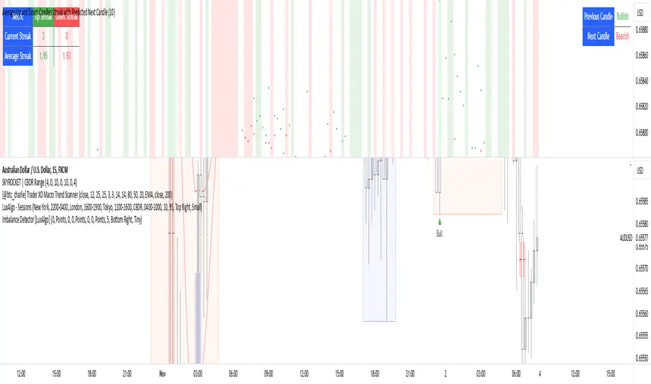
Average Up and Down Candles Streak with Predicted Next CandleThis indicator is designed to analyze price trends by examining the patterns of up and down streaks (consecutive bullish or bearish candles) over a defined period. It uses this data to provide insights on whether the next candle is likely to be bullish or bearish, and it visually displays relevant information on the chart.
Here’s a breakdown of what the indicator does:
1. Inputs and Parameters
Period (Candles): Defines the number of candles used to calculate the average length of bullish and bearish streaks. For example, if the period is set to 20, the indicator will analyze the past 20 candles to determine average up and down streak lengths.
Bullish/Bearish Bias Signal Toggle: These options allow users to show or hide visual signals (green or red circles) when there’s a bullish or bearish bias in the trend based on the indicator’s calculations.
2. Streak Calculation
The indicator looks at each candle within the period to identify if it closed up (bullish) or down (bearish).
Up Streak: The indicator counts consecutive bullish candles. When there’s a bearish candle, it resets the up streak count.
Down Streak: Similarly, it counts consecutive bearish candles and resets when a bullish candle appears.
Averages: Over the defined period, the indicator calculates the average length of up streaks and average length of down streaks. This provides a baseline to assess whether the current streak is typical or extended.
3. Current and Average Streak Display
The indicator displays the current up and down streak lengths alongside the average streak lengths for comparison. This data appears in a table on the chart, allowing you to see at a glance:
The current streak length (for both up and down trends)
The average streak length for up and down trends over the chosen period
4. Trend Prediction for the Next Candle
Next Candle Prediction: Based on the current streak and its comparison to the average, the indicator predicts the likely direction of the next candle:
Bullish: If the current up streak is shorter than the average up streak, suggesting that the bullish trend could continue.
Bearish: If the current down streak is shorter than the average down streak, indicating that the bearish trend may continue.
Neutral: If the current streak length is near the average, which could signal an upcoming reversal.
This prediction appears in a table on the chart, labeled as “Next Candle.”
5. Previous Candle Analysis
The Previous Candle entry in the table reflects the last completed candle (directly before the current candle) to show whether it was bullish, bearish, or neutral.
This data gives a reference point for recent price action and helps validate the next candle prediction.
6. Visual Signals and Reversal Zones
Bullish/Bearish Bias Signals: The indicator can plot green circles on bullish bias and red circles on bearish bias to highlight points where the trend is likely to continue.
Reversal Zones: If the current streak length reaches or exceeds the average, it suggests the trend may be overextended, indicating a potential reversal zone. The indicator highlights these zones with shaded backgrounds (green for possible bullish reversal, red for bearish) on the chart.
Summary of What You See on the Chart
Bullish and Bearish Bias Signals: Green or red circles mark areas of expected continuation in the trend.
Reversal Zones: Shaded areas in red or green suggest that the trend might be about to reverse.
Tables:
The Next Candle prediction table displays the trend direction of the previous candle and the likely trend of the next candle.
The Streak Information table shows the current up and down streak lengths, along with their averages for easy comparison.
Practical Use
This indicator is helpful for traders aiming to understand trend momentum and potential reversals based on historical patterns. It’s particularly useful for swing trading, where knowing the typical length of bullish or bearish trends can help in timing entries and exits.
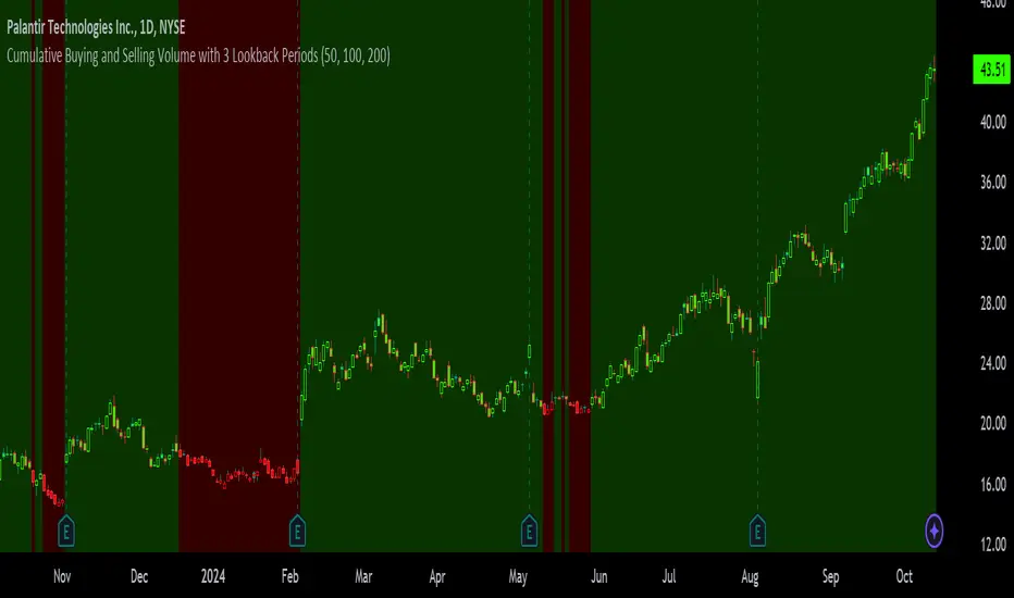
Cumulative Buying and Selling Volume with 3 Lookback PeriodsScript Overview:
This script is designed to help traders identify market momentum by analyzing buying and selling volume. It calculates the cumulative buying and selling pressure over three different lookback periods, providing insights into whether the bulls or bears are dominating at any given time. The script does this by computing the cumulative buying and selling volume for each period and comparing them through exponential moving averages (EMA) to smooth out short-term fluctuations.
Purpose and Use:
The primary goal of this script is to highlight shifts in market sentiment based on volume dynamics. Volume is a critical component in market analysis, often signaling the strength behind price movements. By focusing on cumulative buying and selling pressure, the script gives traders an idea of whether the market is trending towards more buying or selling during specific periods. Traders can use this tool to:
Identify potential entry points when buying pressure is strong.
Recognize potential selling opportunities when selling pressure is increasing.
Detect periods of indecision when neither buying nor selling dominates.
Key Concepts:
1. Buying Volume (BV):
The buying volume is calculated based on the price range of each candle. It represents the volume allocated to the bullish side of the market:
When the close is near the high, the buying volume is higher.
Formula: BV = volume * (close - low) / (high - low).
2. Selling Volume (SV):
Similarly, selling volume is derived based on the position of the close relative to the low:
When the close is near the low, selling volume is higher.
Formula: SV = volume * (high - close) / (high - low)
3. Lookback Periods:
The script allows users to define three different lookback periods (5, 10, and 20 by default). These periods smooth out the cumulative buying and selling volumes using EMA calculations:
Shorter periods capture more immediate changes in volume dynamics.
Longer periods provide a broader perspective on market trends.
4. Cumulative Volume Calculation:
For each lookback period, cumulative buying and selling volumes are tracked separately and then smoothed with EMA:
emaBuyVol and emaSellVol are the smoothed values for buying and selling volumes over the lookback periods.
5. Market Pressure Comparison:
Buying Pressure: If the EMA of buying volume is greater than the EMA of selling volume for a particular lookback period, the script considers that buying pressure dominates for that period.
Selling Pressure: Conversely, if selling volume dominates over buying volume for a period, the script registers selling pressure.
6. Overall Market Pressure:
The script aggregates the buying and selling pressures from the three lookback periods to determine the overall market sentiment:
If the majority of periods show buying pressure, the market is bullish.
If the majority show selling pressure, the market is bearish.
If neither side dominates, it suggests a neutral or indecisive market.
Visual Cues:
The script provides visual feedback to help traders quickly interpret the market pressure:
Background Color:
Green (#2bff00) when buying pressure dominates.
Red (#ff0000) when selling pressure dominates.
Gray (#404040) when there is no clear dominance.
Bar Color: The script also colors the price bars based on the dominant market pressure:
Green for buying pressure.
Red for selling pressure.
Gray for neutral or balanced market pressure.
Reset Mechanism:
At the start of each new candle, the cumulative volumes for all three periods are reset to zero. This ensures that the cumulative volumes are only measured for the current candle, preventing carryover from previous periods that could distort the analysis.
How Traders Can Use This Script:
Trend Confirmation: Traders can use the script as a trend confirmation tool. When the background turns green (buying dominance), it suggests bullish momentum. When red, bearish momentum is likely. This information can be used to confirm existing positions or signal new trades in the direction of the market pressure.
Reversal Detection: A sudden shift in the background color (from green to red or vice versa) can indicate a potential reversal. This can be particularly useful when combined with other technical indicators such as price action or support/resistance levels.
Multiple Timeframes: Since the script supports three different lookback periods, it provides a comprehensive view of market pressure across short-term, medium-term, and long-term perspectives. Traders can tailor the lookback periods based on their preferred timeframe to match their trading style, whether it’s intraday trading or longer-term swing trading.
Risk Management: The script's clear visual cues help traders manage risk by highlighting when selling pressure increases, allowing them to consider reducing long positions or tightening stop-losses.
Engulfing Candles Alert - Multi Symbol (Miu)This indicator plots triangle shapes on each engulfing candles (bullish or bearish) on current chart.
The main use for this indication is to set alerts on multiple symbols at once.
Please follow steps below to set your alarms:
1) Add indicator to the chart
2) Go to settings
3) Check symbols you want to receive alerts (choose up to 8 different symbols)
4) Check if you want only bullish or bearish alerts or both
5) Once all is set go back to the chart and click on 3 dots to set alert in this indicator, rename your alert and confirm
6) You can remove indicator after alert is set and it'll keep working as expected
What does this indicator do?
This indicator will generate alerts anytime a candle closes and reaches bullish or bearish engulfing condition for any of symbol set.
Alert messages example: "Bullish alert on {Symbol}"
This script requests open and close information for each symbol through request.security() built-in function.
Detailed indicator description:
If current bar open is less than or equal to the previous bar close AND current bar open is less than previous bar open AND current bar close is greater than previous bar open THEN True
bullishEngulfing = (openBarCurrent <= closeBarPrevious) and (openBarCurrent < openBarPrevious) and (closeBarCurrent > openBarPrevious)
The opposite condition will be bearishEngulfing
Feel free to give feedbacks on comments section below. Enhancement suggestions are welcome =).
Enjoy!

ADX Trend Strength Analyzer█ OVERVIEW
This script implements the Average Directional Index (ADX), a powerful tool used to measure the strength of market trends. It works alongside the Directional Movement Index (DMI), which breaks down the directional market pressure into bullish (+DI) and bearish (-DI) components. The purpose of the ADX is to indicate when the market is in a strong trend, without specifying the direction. This indicator can be especially useful for identifying market trends early and validating trading strategies based on trend-following systems.
The ADX component in this script is based on two key parameters:
ADX Smoothing Length (adxlen), which determines the degree of smoothing for the trend strength.
DI Length (dilen), which defines the look-back period for calculating the directional index values.
Additionally, a horizontal line is plotted at the 30 level, providing a widely used threshold that signifies when a trend is considered strong (above 30).
█ CONCEPTS
Directional Movement (DM): The core idea behind this indicator is the calculation of price movement in terms of bullish and bearish forces. By evaluating the change in highs and lows, the script distinguishes between bullish movement (+DM) and bearish movement (-DM). These values are normalized by dividing them by the True Range (TR), creating the +DI and -DI values.
True Range (TR): The True Range is calculated using the Average True Range (ATR) formula, and it serves to smooth out volatility, ensuring that short-term fluctuations don't distort the long-term trend signal.
ADX Calculation: The ADX is derived from the absolute difference between the +DI and -DI. By smoothing this difference and normalizing it, the ADX is able to measure the overall strength of the trend without regard to whether the market is moving up or down. A rising ADX indicates increasing trend strength, while a falling ADX signals weakening trends.
█ METHODOLOGY
Directional Movement Calculation: The script first determines the upward and downward price movement by comparing changes in the high and low prices. If the upward movement is greater than the downward movement, it registers a bullish signal and vice versa for bearish movement.
True Range Adjustment: The script then applies a smoothing function to normalize these movements by dividing them by the True Range (ATR). This ensures that the trend signal is based on relative, rather than absolute, price movements.
ADX Signal Generation: The final step is to calculate the ADX by applying the Relative Moving Average (RMA) to the difference between +DI and -DI. This produces the ADX value, which is plotted in red, making it easy to visualize shifts in market momentum.
Threshold Line: A blue horizontal line is plotted at 30, which serves as a key reference point. When the ADX is above this line, it indicates a strong trend, whether bullish or bearish.
█ HOW TO USE
Trend Strength: Traders typically use the 30 level as a critical threshold. When the ADX is above 30, it signifies a strong trend, making it a favorable environment for trend-following strategies. Conversely, ADX values below 30 suggest a weak or non-trending market.
+DI and -DI Relationship: The indicator also provides insight into whether the trend is bullish or bearish. When +DI is greater than -DI, the market is considered bullish. When -DI is greater than +DI, the market is considered bearish. While this script focuses on the ADX value itself, the underlying +DI and -DI help interpret the trend direction.
Market Conditions: This indicator is effective in trending markets, but not ideal for choppy or sideways conditions. Traders can use it to determine the best entry and exit points when trends are strong, or to avoid trading in periods of low volatility.
Combining with Other Indicators: The ADX is commonly used in conjunction with oscillators like RSI or moving averages, to confirm the trend strength and avoid false signals.
█ METHOD VARIANTS
This script applies the standard approach for calculating the ADX, but could be adapted with the following variants:
Different Timeframes: The script could be modified to calculate ADX values across higher or lower timeframes, depending on the trader's strategy.
Custom Thresholds: Instead of using the default 30 threshold, traders could adjust the horizontal line to suit their own risk tolerance or market conditions.

Candlestick_patternsLibrary "CandlestickepatternsClase3"
TODO: add library description here
bullish_engulfing()
bearish_engulfing()
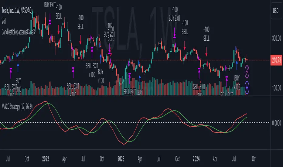
Prometheus Volatility StopThe Prometheus Volatility Stop is an indicator designed to give you a moving risk metric along with a custom Moving Average cross. After a calculation of the annualized volatility for the specified lookback period we determine bullish or bearish from the moving averages and plot the Volatility Stop accordingly.
User Input:
A user can select from Hull Moving Average, Exponential Moving average, Simple Moving Average, the Moving Average used in RSI, and Weighted Moving Average. The default is Hull Moving Average and Exponential Moving average.
A user can also specify the lookback period. The default is 30.
A user may also turn off the plots for the Moving Averages.
The reason for this approach is to be more original from the traditional Volatility Stop.
Calculation:
The Historical Volatility is calculated by taking the standard deviation of the log returns for the specified period and then annualizing it.
hv = ta.stdev(math.log(close / close ), lkb) * math.sqrt(252/5)
Then the Volatility Stop is calculated as follows:
recent_max = ta.highest(close, lkb)
recent_min = ta.lowest(close, lkb)
hv_stop = ma_2 > ma_1 ? recent_max + hv : recent_min - hv
When the second selected moving average is greater than the first, which signals bearishness, the historical volatility gets added to the high of that period. When the moving averages signal bullish the historical volatility gets subtracted from the low of that period.
Here is an example on NASDAQ:ARM :
After the first crossover, bullish signal, price runs for some time. As we get higher and higher so does the Volatility Stop. At the highs before a bearish crossover the price hits and closes at the Volatility Stop. Providing what could be an exit from a strong run up.
Intra-day example on NASDAQ:QQQ :
We see that in the early bearish move price goes on to hit the Volatility Stop before the trend switches.
We also see that in the failed long. The price action throughout the rest of the day, while not providing in profit stop outs, do provide fine directional alerts.
All those examples have been done with the default settings. Upon changing Moving Average One to a WMA and Moving Average Two to an SMA, as well as the lookback to 75. We see this quickly can become a simple trend follower.
This is the perspective we aim to provide. We encourage traders to not follow indicators blindly. No indicator is 100% accurate. This one can give you a different perspective of price strength with volatility. We encourage any comments about desired updates or criticism!
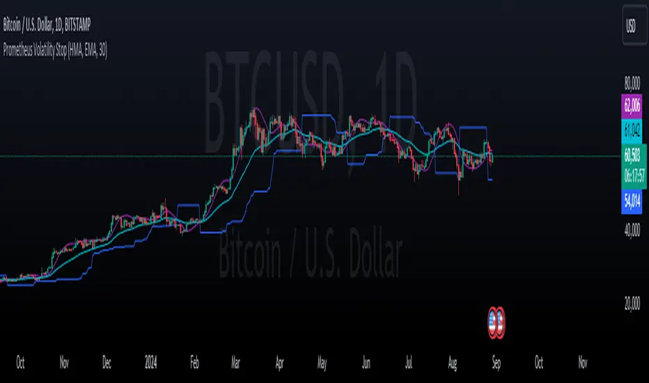
Change in State of Delivery (CISD) [LuxAlgo]The Change In State Of Delivery (CISD) indicator detects and displays Change in State Of Delivery, a concept related to market structures.
Users can choose between two different CISD detection methods. Various filtering options are also included to filter out less significant CISDs.
🔶 USAGE
A Change in State of Delivery (CISD) is a concept closely related to market structures, where price breaks a level of interest, confirming trends and their continuations from the resulting breakouts.
Unlike more traditional market structures which rely on swing points, CISDs rely on a persistent sequence of candles, using the sequence extremes as breakout levels.
CISDs are detected as follows:
Bullish: The price closes above the opening price of the first candle in a sequence of bearish candles (or its own opening price if it's the only candle).
Bearish: The price closes below the opening price of the first candle in a sequence of bullish candles (or its own opening price if it's the only candle).
If a newly detected CISD aligns with the indicator's current established trend, this confirms a trend continuation (represented with a dashed line).
On the other hand, if a newly detected CISD is in the opposite direction to the detected trend it can confirm a trend reversal (represented with a solid line).
🔹 Liquidity Sweep Detection Method
Using Liquidity Sweeps to update CISD breakout levels allows us to obtain less frequent and more relevant levels that are less sensitive to noisy price variations.
Sweeps are obtained from detected Swing Points , with a higher Swing Length allowing us to obtain longer-term swing levels and potentially more detected sweeps from a specific level over time.
Note: The 'Swing Length' setting is only applicable on the Liquidity Sweep Detection Method and will only change the Liquidity levels.
A Liquidity Sweep is valid when the price reaches an important liquidity level , after which the price closes below/above this level.
Bullish scenario: The price goes below a previous unbroken Swing Low but closes above.
Bearish scenario: The price goes above a previous unbroken Swing High but closes below.
After a Liquidity Sweep has been detected, the last level of importance acts as support/resistance . Breaking this level in the other direction changes the state of delivery .
Users must keep observing the price and significant levels, as highlighted by the white rectangle in the above example.
🔹 CISD Filtering
Users can adjust the following two settings:
Minimum CISD Duration: The minimum length of the 'CISD' line
Maximum Swing Validity: The maximum length of the 'CISD' line; potential CISD lines that aren't broken are deleted when exceeding the limit.
The chart can get cluttered when the Minimum CISD Duration is low. Users could focus on a switch in trend (first solid line CISD ), where the following dashed CISD lines can be seen as extra opportunities/confirmations.
🔶 DETAIL
🔹 Using Different Timeframes
When an important liquidity level (Previous Swing high/low, FVG, etc.) is reached on the higher timeframe, the user can move to a lower timeframe to check whether there is a CISD .
Above example:
The high of the last candle breaches a liquidity level (previous Swing High). The opening price of the last candle acts as a trigger/confirmation level.
A confirmed CISD is seen in a lower timeframe, just after this Liquidity Sweep. This could be an early opportunity.
Later, a confirmed CISD on the higher timeframe is established.
🔶 SETTINGS
Detection Method: Classic or Liquidity Sweep
Swing Length: Period used for the swing detection, with higher values returning longer-term Swing Levels.
Minimum CISD Duration: The minimum length of the CISD line
Maximum Swing Validity: The maximum length of the CISD line; potential CISD lines that aren't broken are deleted when exceeding the limit.
