Altcoins Screener [SwissAlgo]Introduction: The Altcoins Screener at a Glance
The Altcoins Screener is a cryptocurrency analysis tool designed to provide an overview of potential trading opportunities across multiple crypto coins/tokens and categories. By combining technical analysis, price action assessment, and social metrics (via LunarCrush data), it presents market information and trading signals for a broad range of altcoins (approx. 300 USDT.P pairs of 9 crypto categories).
The screener is designed to consolidate market information onto a single chart , aiming to streamline the analysis of market conditions. It provides a consolidated market overview, which can simplify the assessment of market conditions, compared to monitoring individual charts with several layered indicators.
Key Features:
🔹 Multi-category analysis covering 300 crypto pairs of 9 categories on a single chart (Layer 1 & Top Coins, Layer2 & Scaling, Defi & Landing, Gaming & Metaverse, AI & Data, Exchanges & Trading, NFT & Social, Memes & Community, Other, User's Custom Portfolio).
🔹 Technical analysis with trade signals (Long/Short) based on an aggregated view of technical and social data points
🔹 Social sentiment integration through LunarCrush metrics (GalaxyScore, AltRank, Social Sentiment)
🔹 Real-time market scanning provides automated alerts when market conditions for specified coins/tokens potentially change.
🔹 Custom watchlist support for personalized monitoring (users can define a custom category containing a set of specific cryptocurrencies, i.e. own portfolio).
The screener presents data in a table format, using color-coded indicators to aid visual analysis. Detailed technical information is also provided. The assessments/trade signals provided by this indicator should be considered as one input among many when forming your trading strategy.
--------------------------------------
What It Does
The Altcoins Screener is a cryptocurrency analysis tool that offers:
Data Display and Analysis (Technical/Social):
🔹 Technical Metrics
* Technical Raw Data : Displays raw values for a range of technical indicators, including RSI, Stochastic RSI, DMI/ADX, RVI, ATR, OBV, and Hull Moving Averages (including their recent trends and potential significance).
Detailed view of key technical indicators, for further analysis and evaluation:
* Technical Analysis (Summary) : Provides a summarized interpretation of technical conditions based on aggregated parameters:
* Price Action
* Trend
* Momentum
* Volatility
* Volume
Summarized view of confluences for potential long/short bias:
🔹 Social Metrics (LunarCrush) : Presents data from LunarCrush®, including Galaxy Score®, AltRank®, and Social Sentiment® (including their recent trends and potential significance).
Lunarcrush data for the top 10 coins for each crypto category:
🔹 PVSRA (Price Volume & Market Makers Activity) Candles : Shows special candles highlighting potential market maker activity and volume anomalies, helping identify possible manipulation zones (including imbalance zones, i.e. price areas that market makers may revisit)
--------------------------------------
Key Features:
Automated trade signals (Long/Short) are generated based on algorithmic calculations and signal confidence levels across technical and social data points. These signals are intended to be used as one component of a broader trading strategy.
Custom sensitivity settings allow users to adjust the analysis timeframe (options: 1D, 2D, or 1W). Higher timeframes may provide a broader perspective, while the 2D setting is the default configuration.
Multi-category analysis covering a selection of approximately 300 crypto pairs across 9 predefined crypto categories.
Custom symbol selection: Users can define a custom list of up to 10 symbols for focused monitoring.
Automated Alerts to track potential trend changes across crypto categories (Long to Short to Neutral, or vice versa)
Visual Interface:
Organized table display with color-coded indicators to aid interpretation.
Clear and efficient format for scanning market information.
--------------------------------------
Target Audience
🔹 The screener is designed for cryptocurrency traders who:
Need to efficiently monitor multiple USDT perpetual futures markets
Use technical analysis in their trading decisions
Want to track sector-wide movements across crypto categories
🔹 Suitable for different trading styles:
Scalpers requiring quick market assessment
Swing traders analyzing multi-day trends
Position traders monitoring longer-term setups
The color-coded interface makes it accessible for intermediate traders while providing detailed metrics for advanced users. A basic understanding of technical analysis and crypto trading is recommended.
--------------------------------------
How It Works
The Altcoins Screener evaluates cryptocurrencies through a multi-layered analysis:
🔹 Core Analysis Components
Each parameter combines multiple indicators for comprehensive evaluation:
Price Action
EMA crossovers and momentum
Support/resistance zones
Candlestick patterns
Trend
Hull Moving Average system
DMI/ADX trend strength
Multi-timeframe confirmation
Momentum
RSI/Stochastic RSI readings
MACD convergence/divergence
Oscillator confirmations
Volatility
RVI/ATR measurements
Bollinger Bands behavior
Historical volatility trends
Volume
OBV trend analysis
Volume/price correlations
Volume profile assessment
🔹 Signal Generation Process
1. Real-time data collection across timeframes
2. Weighted indicator calculations
3. Parameter aggregation and analysis
4. Signal strength determination
5. Color-coding and alert generation
--------------------------------------
How to Use
🔹 Initial Setup:
Add the indicator to a chart (use the 1D timeframe)
Select your preferred crypto category or create a custom list
Choose between Technical Analysis or Technical Metrics view
Set data sensitivity based on your trading style
🔹 Using the Technical Analysis View:
Monitor color-coded dots for quick market assessment
Green: bullish conditions
Red: bearish conditions
Gray: neutral conditions
Check the "Trade Signal" column for potential Long/Short entries signaled by confluences among technical and/or social data points
🔹 Using the Technical Metrics View:
Review detailed numerical values
Monitor slopes (↑↓ arrows) for the most recent trend direction of each data point
Watch for pivotal points (highlighted cells): these are data points that suggest potential trend reversals
Focus on the confluence of multiple indicators
The technical metrics view corroborates the conclusions shown in the Technical Analysis View, providing more details about some critical data points.
🔹 Alert Configuration:
Enable Technical Alerts for signal notifications (which coin/token seems most suited for Long or Short trades, and which coin/token is in a neutral/uncertain state for trading = "No Trade")
Configure alert conditions based on trading style
Set timeframe-appropriate sensitivity
Monitor alert messages for trade signals
Instructions on how to set alerts are provided in the script (enable "Signals Setup Instructions" in User Interface to get a step-by-step guide about setting up alerts)
Best Practices:
Confirm signals across multiple timeframes
Use appropriate sensitivity for your trading style
Monitor multiple categories for sector rotation
Combine signals with your trading strategy
Verify signals with price action confirmation and deep dive into the charts of your potential targets
--------------------------------------
About the Settings
🔹 Crypto Category Selection
Layer 1 & Major: Top market cap coins (BTC, ETH, XRP,...), established protocols
Layer 2 & Scaling: ETH L2s, scaling solutions
DeFi & Lending: Decentralized finance protocols
Gaming & Metaverse: Gaming and virtual world tokens
AI & Data: Artificial intelligence and data projects
Exchange & Trading: Exchange tokens, trading protocols
NFT & Social: NFT platforms, social tokens
Memes & Community: Community-driven tokens
Others & Misc: Other categories
Custom Category: User-defined list (up to 10 symbols)
Data Type Options
Technical Analysis: Color-coded summary view
Technical Metrics: Detailed numerical values of some key technical data points
Sensitivity Settings
Higher: Shorter timeframe, more frequent signals
Default: Balanced timeframe, standard signals
Lower: Longer timeframe, stronger signals
Alert Settings
Technical Alerts: Trade signal notifications
Data Timeframe: Minimum 1D required
Theme: Dark/Light mode options
Note: All analysis is performed on USDT Perpetual Futures pairs from Binance
--------------------------------------
FAQ
Q: Does the screener work on other exchanges besides Binance?
A: No, it's designed specifically for Binance USDT Perpetual Futures pairs. Binance offers the highest liquidity and trading volume in the crypto derivatives market, making it ideal for technical analysis. The extensive range of trading pairs and reliable data streams help ensure more accurate signals and analysis. Using a single high-liquidity exchange also helps avoid inconsistencies that could arise from aggregating data across multiple platforms with varying liquidity levels.
Q: What's the minimum timeframe required?
A: The screener requires a minimum 1D (daily) timeframe. This requirement ensures that the technical analysis has sufficient data points for reliable signal generation. Lower timeframes can produce more noise and false signals, while daily timeframes help filter out market noise and identify stronger trends.
Q: Why are some social metrics showing "NaN"?
A: "NaN" (Not a Number) appears when cryptocurrencies don't have associated LunarCrush data. This typically occurs with newer tokens or those with lower market caps. The technical analysis remains fully functional regardless of social metric availability, as these are complementary data points.
Q: How often are signals updated?
A: Signals update with each new candle on the selected timeframe (1D, 2D, or 1W). For example, on the default 2D setting, signals are recalculated every two days as new candles form. This helps reduce noise while maintaining timely analysis of market conditions.
Q: Can I add spot trading pairs?
A: No, the screener is optimized for Binance USDT perpetual futures pairs for data consistency and analysis purposes. While spot and perpetual prices typically align closely due to arbitrage, using a single data source (Binance) and contract type (USDT perpetual) ensures uniform data quality and analysis across all pairs. This standardization helps maintain reliable technical analysis and signal generation.
Q: How many coins can I add to my custom list?
A: Users can add up to 10 custom symbols to their watchlist. This limit is designed to maintain optimal performance while allowing focused monitoring of specific assets. The custom list complements the predefined categories that cover over 300 pairs.
Q: What determines signal confidence levels?
A: Signal confidence is calculated through a weighted algorithm that considers multiple factors: trend strength (Hull MA, DMI/ADX), momentum indicators (RSI, SRSI), volatility measurements (RVI, ATR, BB), volume analysis (OBV, volume trends), and price action patterns. Higher confidence levels indicate stronger alignment across these factors.
Q: Are signals guaranteed to work?
A: No. Signals are analytical tools based on historical and current market data, not guaranteed predictions. They should be used as one component of a comprehensive trading strategy that includes proper risk management, position sizing, and additional confirmation factors. Past performance does not guarantee future results.
Q: Why does the screener need higher timeframes?
A: Higher timeframes (1D minimum) provide several benefits: reduced market noise, more reliable technical signals, better trend identification, and lower likelihood of false signals. They also align better with institutional trading patterns and allow for a more thorough analysis of market conditions across multiple indicators.
--------------------------------------
Conclusion
The Altcoins Screener is a comprehensive crypto market analysis tool that:
Scans 300+ cryptocurrencies across 9 sectors on a single chart
Combines technical indicators and social metrics for signal generation
Identifies potential trading opportunities through color-coded visuals
Saves time by eliminating the need to monitor multiple charts
The tool is suited for:
Market overview and sector rotation analysis
Quick assessment of market conditions
Technical and social sentiment tracking
Systematic trading approach with alerts
Use this screener with caution and as a complement to any other tool you use to define your trading strategy.
--------------------------------------
Disclaimer
This indicator is for informational and educational purposes only:
Not financial advice: This indicator should not be considered investment advice.
No guarantee of accuracy: The indicator's calculations and signals are based on specific algorithms and data sources, but accuracy cannot be guaranteed. Market conditions can change rapidly.
Past performance is not predictive: Past performance of the indicator's signals or any specific asset is not indicative of future results.
Substantial risk of loss: Trading cryptocurrencies involves a substantial risk of loss. You can lose money trading these assets.
User responsibility: Users are solely responsible for their own trading decisions and should exercise caution.
Independent research required: Always conduct thorough independent research (DYOR) before making any trading decisions.
Technical analysis is one of many tools: Technical analysis, including the output of this indicator, is just one tool among many and should not be relied upon exclusively.
Risk management is essential: Use proper risk management techniques, including position sizing and stop-loss orders.
Comprehensive strategy: Use this tool as part of a comprehensive trading strategy, not as a standalone solution.
No liability for trading results: The Author assumes no responsibility or liability for any trading results or losses incurred as a result of using this indicator.
No TradingView affiliation: SwissAlgo is an independent entity and is not affiliated with or endorsed by TradingView.
LunarCrush data: The indicator utilizes publicly available data from LunarCrush. LunarCrush data and trademarks are the property of LunarCrush.
Consult a financial advisor: Consult with a qualified financial advisor before making any investment decisions.
By using this indicator, you acknowledge and agree to these terms. If you do not agree with these terms, please refrain from using this indicator.
Pesquisar nos scripts por "algo"

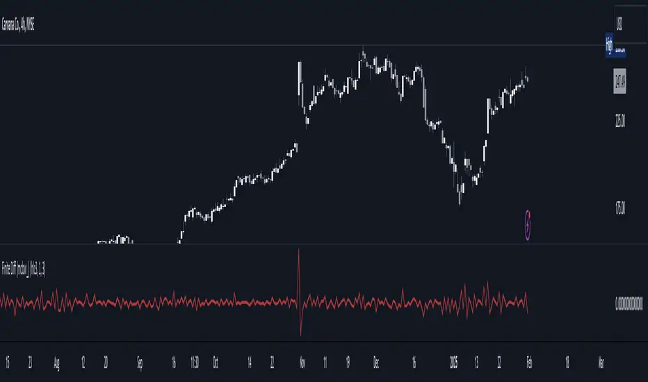
Finite Difference - Backward (mcbw_)In calculus there exists a 'derivative', which simply just measures the difference between two points on a curve. For well behaved mathematical functions there are infinitely many points and so there exists a derivative at every point. Where there are infinitely many points in a curve that curve is called 'continuous'. Continuous curves are very nice to deal with since each point on it exists almost exactly where its neighbors are. However, if the curve does not have infinitely many points on it, but instead has a finite number of points on it, that curve is called 'discrete' instead of continuous. Taking the derivative of discrete curves is much trickier business since there are none of the mathematical conveniences that a continuous offers. In the real world everything we measure is a discrete curve, including Price (since we measure it a finite number of times, aka each candlestick)!
The branch of Discrete Mathematics has found an approach to measure the derivative along a discrete curve, that approach is aptly called " Finite Difference ". To get a more accurate approximation of a discrete derivative, the finite difference approach uses weighted combinations of neighboring points. The most common type of finite difference is a 'central' difference, this uses a combination of points before and after the point of interest to approximate the discrete derivative. This is great for historical analysis but is not of much use for trading algorithms since it technically means using future prices to calculate the derivative of the current point. Instead we can use a less common variant called a ' Backwards Difference ' that only uses a combination of points before the current one to help approximate the current derivative.
In this script you can choose the " Order " of your derivative and the " Accuracy " of its approximation. This script is for educational purposes for folks building trading algorithms. Many trading algorithms often have an element of seeing how much Price has changed from the previous candle to the current candle. This approach is the lowest accuracy derivative possible, and using the backwards finite differences, made available for the first time on TradingView (!!), algorithms that use derivatives can now have higher orders of accuracy!
Happy Trading/Developing!
Trading IQ - Razor IQIntroducing TradingIQ's first dip buying/shorting all-in-one trading system: Razor IQ.
Razor IQ is an exclusive trading algorithm developed by TradingIQ, designed to trade upside/downside price dips of varying significance in trending markets. By integrating artificial intelligence and IQ Technology, Razor IQ analyzes historical and real-time price data to construct a dynamic trading system adaptable to various asset and timeframe combinations.
Philosophy of Razor IQ
Razor IQ operates on a single premise: Trends must retrace, and these retracements offer traders an opportunity to join in the overarching trend. At some point traders will enter against a trend in aggregate and traders in profitable positions entered during the trend will scale out. When occurring simultaneously, a trend will retrace against itself, offering an opportunity for traders not yet in the trend to join in the move and continue the trend.
Razor IQ is designed to work straight out of the box. In fact, its simplicity requires just a few user settings to manage output, making it incredibly straightforward to manage.
Long Limit Order Stop Loss and Minimum ATR TP/SL are the only settings that manage the performance of Razor IQ!
Traders don’t have to spend hours adjusting settings and trying to find what works best - Razor IQ handles this on its own.
Key Features of Razor IQ
Self-Learning Retracement Detection
Employs AI and IQ Technology to identify notable price dips in real-time.
AI-Generated Trading Signals
Provides retracement trading signals derived from self-learning algorithms.
Comprehensive Trading System
Offers clear entry and exit labels.
Performance Tracking
Records and presents trading performance data, easily accessible for user analysis.
Self-Learning Trading Exits
Razor IQ learns where to exit positions.
Long and Short Trading Capabilities
Supports both long and short positions to trade various market conditions.
How It Works
Razor IQ operates on a straightforward heuristic: go long during the retracement of significant upside price moves and go short during the retracement of significant downside price moves.
IQ Technology, TradingIQ's proprietary AI algorithm, defines what constitutes a “trend” and a “retracement” and what’s considered a tradable dip buying/shorting opportunity. For Razor IQ, this algorithm evaluates all historical trends and retracements, how much trends generally retrace and how long trends generally persist. For instance, the "dip" following an uptrend is measured and learned from, including the significance of the identified trend level (how long it has been active, how much price has increased, etc). By analyzing these patterns, Razor IQ adapts to identify and trade similar future retracements and trends.
In simple terms, Razor IQ clusters previous trend and retracement data in an attempt to trade similar price sequences when they repeat in the future. Using this knowledge, it determines the optimal, current price level where joining in the current trend (during a retracement) has a calculated chance of not stopping out before trend continuation.
For long positions, Razor IQ enters using a market order at the AI-identified long entry price point. If price closes beneath this level a market order will be placed and a long position entered. Of course, this is how the algorithm trades, users can elect to use a stop-limit order amongst other order types for position entry. After the position is entered TP1 is placed (identifiable on the price chart). TP1 has a twofold purpose:
Acts as a legitimate profit target to exit 50% of the position.
Once TP1 is achieved, a stop-loss order is immediately placed at breakeven, and a trailing stop loss controls the remainder of the trade. With this, so long as TP1 is achieved, the position will not endure a loss. So long as price continues to uptrend, Razor IQ will remain in the position.
For short positions, Razor IQ provides an AI-identified short entry level. If price closes above this level a market order will be placed and a short position entered. Again, this is how the algorithm trades, users can elect to use a stop-limit order amongst other order types for position entry. Upon entry Razor IQ implements a TP order and SL order (identifiable on the price chart).
Downtrends, in most markets, usually operate differently than uptrends. With uptrends, price usually increases at a modest pace with consistency over an extended period of time. Downtrends behave in an opposite manner - price decreases rapidly for a much shorter duration.
With this observation, the long dip entry heuristic differs slightly from the short dip entry heuristic.
The long dip entry heuristic specializes in identifying larger, long-term uptrends and entering on retracement of the uptrends. With a dedicated trailing stop loss, so long as the uptrend persists, Razor IQ will remain in the position.
The short dip entry heuristic specializes in identifying sharp, significant downside price moves, and entering short on upside volatility during these moves. A fixed stop loss and profit target are implemented for short positions - no trailing stop is used.
As a trading system, Razor IQ exits all TP orders using a limit order, with all stop losses exited as stop market orders.
What Classifies As a Tradable Dip?
For Razor IQ, tradable price dips are not manually set but are instead learned by the system. What qualifies as an exploitable price dip in one market might not hold the same significance in another. Razor IQ continuously analyzes historical and current trends (if one exists), how far price has moved during the trend, the duration of the trend, the raw-dollar price move of price dips during trends, and more, to determine which future price retracements offer a smart chance to join in any current price trend.
The image above illustrates the Razor Line Long Entry point.
The green line represents the Long Retracement Entry Point.
The blue upper line represents the first profit target for the trade.
The blue lower line represents the trailing stop loss start point for the long position.
The position is entered once price closes below the green line.
The green Razor Lazor long entry point will only appear during uptrends.
The image above shows a long position being entered after the Long Razor Lazor was closed beneath.
Green arrows indicate that the strategy entered a long position at the highlighted price level.
Blue arrows indicate that the strategy exited a position, whether at TP1, the initial stop loss, or at the trailing stop.
Blue lines above the entry price indicate the TP1 level for the current long trade. Blue lines below the current price indicate the initial stop loss price.
If price reaches TP1, a stop loss will be immediately placed at breakeven, and the in-built trailing stop will determine the future exit price.
A blue line (similar to the blue line shown for TP1) will trail price and correspond to the trailing stop price of the trade.
If the trailing stop is above the breakeven stop loss, then the trailing stop will be hit before the breakeven stop loss, which means the remainder of the trade will be exited at a profit.
If the breakeven stop loss is above the trailing stop, then the breakeven stop loss will be hit first. In this case, the remainder of the position will be exited at breakeven.
The image above shows the trailing stop price, represented by a blue line, and the breakeven stop loss price, represented by a pink line, used for the long position!
You can also hover over the trade labels to get more information about the trade—such as the entry price and exit price.
The image above exemplifies Razor IQ's output when a downtrend is active.
When a downtrend is active, Razor IQ will switch to "short mode". In short mode, Razor IQ will display a neon red line. This neon red line indicates the Razor Lazor short entry point. When price closes above the red Razor Lazor line a short position is entered.
The image above shows Razor IQ during an active short position.
The image above shows Razor IQ after completing a short trade.
Red arrows indicate that the strategy entered a short position at the highlighted price level.
Blue arrows indicate that the strategy exited a position, whether at the profit target or the fixed stop loss.
Blue lines indicate the profit target level for the current trade when below price. and blue lines above the current price indicate the stop loss level for the short trade.
Short traders do not utilize a trailing stop - only a fixed profit target and fixed stop loss are used.
You can also hover over the trade labels to get more information about the trade—such as the entry price and exit price.
Minimum Profit Target And Stop Loss
The Minimum ATR Profit Target and Minimum ATR Stop Loss setting control the minimum allowed profit target and stop loss distance. On most timeframes users won’t have to alter these settings; however, on very-low timeframes such as the 1-minute chart, users can increase these values so gross profits exceed commission.
After changing either setting, Razor IQ will retrain on historical data - accounting for the newly defined minimum profit target or stop loss.
AI Direction
The AI Direction setting controls the trade direction Razor IQ is allowed to take.
“Trade Longs” allows for long trades.
“Trade Shorts” allows for short trades.
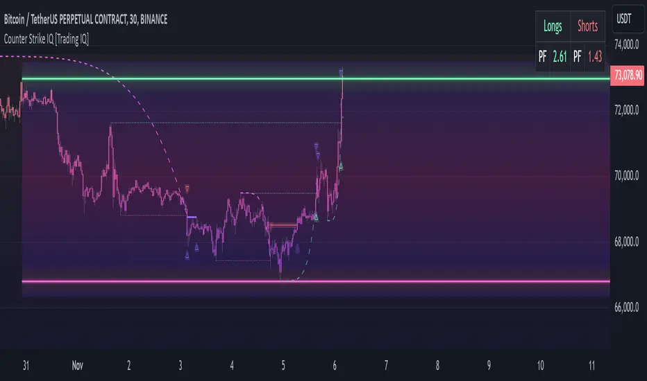
Verifying Razor IQ’s Effectiveness
Razor IQ automatically tracks its performance and displays the profit factor for the long strategy and the short strategy it uses. This information can be found in the table located in the top-right corner of your chart showing.
This table shows the long strategy profit factor and the short strategy profit factor.
The image above shows the long strategy profit factor and the short strategy profit factor for Razor IQ.
A profit factor greater than 1 indicates a strategy profitably traded historical price data.
A profit factor less than 1 indicates a strategy unprofitably traded historical price data.
A profit factor equal to 1 indicates a strategy did not lose or gain money when trading historical price data.
Using Razor IQ
While Razor IQ is a full-fledged trading system with entries and exits - manual traders can certainly make use of its on chart indications and visualizations.
The hallmark feature of Razor IQ is its ability to signal an acceptable dip entry opportunity - for both uptrends and downtrends. Long entries are often signaled near the bottom of a retracement for an uptrend; short entries are often signaled near the top of a retracement for a downtrend.
Razor IQ will always operate on exact price levels; however, users can certainly take advantage of Razor IQ's trend identification mechanism and retracement identification mechanism to use as confluence with their personally crafted trading strategy.
Of course, every trend will reverse at some point, and a good dip buying/shorting strategy will often trade the reversal in expectation of the prior trend continuing (retracement). It's important not to aggressively filter retracement entries in hopes of avoiding an entry when a trend reversal finally occurs, as this will ultimately filter out good dip buying/shorting opportunities. This is a reality of any dip trading strategy - not just Razor IQ.
Of course, you can set alerts for all Razor IQ entry and exit signals, effectively following along its systematic conquest of price movement.
Script pago

AiTrend Pattern Matrix for kNN Forecasting (AiBitcoinTrend)The AiTrend Pattern Matrix for kNN Forecasting (AiBitcoinTrend) is a cutting-edge indicator that combines advanced mathematical modeling, AI-driven analytics, and segment-based pattern recognition to forecast price movements with precision. This tool is designed to provide traders with deep insights into market dynamics by leveraging multivariate pattern detection and sophisticated predictive algorithms.
👽 Core Features
Segment-Based Pattern Recognition
At its heart, the indicator divides price data into discrete segments, capturing key elements like candle bodies, high-low ranges, and wicks. These segments are normalized using ATR-based volatility adjustments to ensure robustness across varying market conditions.
AI-Powered k-Nearest Neighbors (kNN) Prediction
The predictive engine uses the kNN algorithm to identify the closest historical patterns in a multivariate dictionary. By calculating the distance between current and historical segments, the algorithm determines the most likely outcomes, weighting predictions based on either proximity (distance) or averages.
Dynamic Dictionary of Historical Patterns
The indicator maintains a rolling dictionary of historical patterns, storing multivariate data for:
Candle body ranges, High-low ranges, Wick highs and lows.
This dynamic approach ensures the model adapts continuously to evolving market conditions.
Volatility-Normalized Forecasting
Using ATR bands, the indicator normalizes patterns, reducing noise and enhancing the reliability of predictions in high-volatility environments.
AI-Driven Trend Detection
The indicator not only predicts price levels but also identifies market regimes by comparing current conditions to historically significant highs, lows, and midpoints. This allows for clear visualizations of trend shifts and momentum changes.
👽 Deep Dive into the Core Mathematics
👾 Segment-Based Multivariate Pattern Analysis
The indicator analyzes price data by dividing each bar into distinct segments, isolating key components such as:
Body Ranges: Differences between the open and close prices.
High-Low Ranges: Capturing the full volatility of a bar.
Wick Extremes: Quantifying deviations beyond the body, both above and below.
Each segment contributes uniquely to the predictive model, ensuring a rich, multidimensional understanding of price action. These segments are stored in a rolling dictionary of patterns, enabling the indicator to reference historical behavior dynamically.
👾 Volatility Normalization Using ATR
To ensure robustness across varying market conditions, the indicator normalizes patterns using Average True Range (ATR). This process scales each component to account for the prevailing market volatility, allowing the algorithm to compare patterns on a level playing field regardless of differing price scales or fluctuations.
👾 k-Nearest Neighbors (kNN) Algorithm
The AI core employs the kNN algorithm, a machine-learning technique that evaluates the similarity between the current pattern and a library of historical patterns.
Euclidean Distance Calculation:
The indicator computes the multivariate distance across four distinct dimensions: body range, high-low range, wick low, and wick high. This ensures a comprehensive and precise comparison between patterns.
Weighting Schemes: The contribution of each pattern to the forecast is either weighted by its proximity (distance) or averaged, based on user settings.
👾 Prediction Horizon and Refinement
The indicator forecasts future price movements (Y_hat) by predicting logarithmic changes in the price and projecting them forward using exponential scaling. This forecast is smoothed using a user-defined EMA filter to reduce noise and enhance actionable clarity.
👽 AI-Driven Pattern Recognition
Dynamic Dictionary of Patterns: The indicator maintains a rolling dictionary of N multivariate patterns, continuously updated to reflect the latest market data. This ensures it adapts seamlessly to changing market conditions.
Nearest Neighbor Matching: At each bar, the algorithm identifies the most similar historical pattern. The prediction is based on the aggregated outcomes of the closest neighbors, providing confidence levels and directional bias.
Multivariate Synthesis: By combining multiple dimensions of price action into a unified prediction, the indicator achieves a level of depth and accuracy unattainable by single-variable models.
Visual Outputs
Forecast Line (Y_hat_line):
A smoothed projection of the expected price trend, based on the weighted contribution of similar historical patterns.
Trend Regime Bands:
Dynamic high, low, and midlines highlight the current market regime, providing actionable insights into momentum and range.
Historical Pattern Matching:
The nearest historical pattern is displayed, allowing traders to visualize similarities
👽 Applications
Trend Identification:
Detect and follow emerging trends early using dynamic trend regime analysis.
Reversal Signals:
Anticipate market reversals with high-confidence predictions based on historically similar scenarios.
Range and Momentum Trading:
Leverage multivariate analysis to understand price ranges and momentum, making it suitable for both breakout and mean-reversion strategies.
Disclaimer: This information is for entertainment purposes only and does not constitute financial advice. Please consult with a qualified financial advisor before making any investment decisions.

Bayesian Price Projection Model [Pinescriptlabs]📊 Dynamic Price Projection Algorithm 📈
This algorithm combines **statistical calculations**, **technical analysis**, and **Bayesian theory** to forecast a future price while providing **uncertainty ranges** that represent upper and lower bounds. The calculations are designed to adjust projections by considering market **trends**, **volatility**, and the historical probabilities of reaching new highs or lows.
Here’s how it works:
🚀 Future Price Projection
A dynamic calculation estimates the future price based on three key elements:
1. **Trend**: Defines whether the market is predisposed to move up or down.
2. **Volatility**: Quantifies the magnitude of the expected change based on historical fluctuations.
3. **Time Factor**: Uses the logarithm of the projected period (`proyeccion_dias`) to adjust how time impacts the estimate.
🧠 **Bayesian Probabilistic Adjustment**
- Conditional probabilities are calculated using **Bayes' formula**:
\
This models future events using conditional information:
- **Probability of reaching a new all-time high** if the price is trending upward.
- **Probability of reaching a new all-time low** if the price is trending downward.
- These probabilities refine the future price estimate by considering:
- **Higher volatility** increases the likelihood of hitting extreme levels (highs/lows).
- **Market trends** influence the expected price movement direction.
🌟 **Volatility Calculation**
- Volatility is measured using the **ATR (Average True Range)** indicator with a 14-period window. This reflects the average amplitude of price fluctuations.
- To express volatility as a percentage, the ATR is normalized by dividing it by the closing price and multiplying it by 200.
- Volatility is then categorized into descriptive levels (e.g., **Very Low**, **Low**, **Moderate**, etc.) for better interpretation.
---
🎯 **Deviation Limits (Upper and Lower)**
- The upper and lower limits form a **projected range** around the estimated future price, providing a framework for uncertainty.
- These limits are calculated by adjusting the ATR using:
- A user-defined **multiplier** (`factor_desviacion`).
- **Bayesian probabilities** calculated earlier.
- The **square root of the projected period** (`proyeccion_dias`), incorporating the principle that uncertainty grows over time.
🔍 **Interpreting the Model**
This can be seen as a **dynamic probabilistic model** that:
- Combines **technical analysis** (trends and ATR).
- Refines probabilities using **Bayesian theory**.
- Provides a **visual projection range** to help you understand potential future price movements and associated uncertainties.
⚡ Whether you're analyzing **volatile markets** or confirming **bullish/bearish scenarios**, this tool equips you with a robust, data-driven approach! 🚀
Español :
📊 Algoritmo de Proyección de Precio Dinámico 📈
Este algoritmo combina **cálculos estadísticos**, **análisis técnico** y **la teoría de Bayes** para proyectar un precio futuro, junto con rangos de **incertidumbre** que representan los límites superior e inferior. Los cálculos están diseñados para ajustar las proyecciones considerando la **tendencia del mercado**, **volatilidad** y las probabilidades históricas de alcanzar nuevos máximos o mínimos.
Aquí se explica su funcionamiento:
🚀 **Proyección de Precio Futuro**
Se realiza un cálculo dinámico del precio futuro estimado basado en tres elementos clave:
1. **Tendencia**: Define si el mercado tiene predisposición a subir o bajar.
2. **Volatilidad**: Determina la magnitud del cambio esperado en función de las fluctuaciones históricas.
3. **Factor de Tiempo**: Usa el logaritmo del período proyectado (`proyeccion_dias`) para ajustar cómo el tiempo afecta la estimación.
🧠 **Ajuste Probabilístico con la Teoría de Bayes**
- Se calculan probabilidades condicionales mediante la fórmula de **Bayes**:
\
Esto permite modelar eventos futuros considerando información condicional:
- **Probabilidad de alcanzar un nuevo máximo histórico** si el precio sube.
- **Probabilidad de alcanzar un nuevo mínimo histórico** si el precio baja.
- Estas probabilidades ajustan la estimación del precio futuro considerando:
- **Mayor volatilidad** aumenta la probabilidad de alcanzar niveles extremos (máximos/mínimos).
- **La tendencia del mercado** afecta la dirección esperada del movimiento del precio.
🌟 **Cálculo de Volatilidad**
- La volatilidad se mide usando el indicador **ATR (Average True Range)** con un período de 14 velas. Este indicador refleja la amplitud promedio de las fluctuaciones del precio.
- Para obtener un valor porcentual, el ATR se normaliza dividiéndolo por el precio de cierre y multiplicándolo por 200.
- Además, se clasifica esta volatilidad en categorías descriptivas (e.g., **Muy Baja**, **Baja**, **Moderada**, etc.) para facilitar su interpretación.
🎯 **Límites de Desviación (Superior e Inferior)**
- Los límites superior e inferior representan un **rango proyectado** en torno al precio futuro estimado, proporcionando un marco para la incertidumbre.
- Estos límites se calculan ajustando el ATR según:
- Un **multiplicador** definido por el usuario (`factor_desviacion`).
- Las **probabilidades condicionales** calculadas previamente.
- La **raíz cuadrada del período proyectado** (`proyeccion_dias`), lo que incorpora el principio de que la incertidumbre aumenta con el tiempo.
---
🔍 **Interpretación del Modelo**
Este modelo se puede interpretar como un **modelo probabilístico dinámico** que:
- Integra **análisis técnico** (tendencias y ATR).
- Ajusta probabilidades utilizando **la teoría de Bayes**.
- Proporciona un **rango de proyección visual** para ayudarte a entender los posibles movimientos futuros del precio y su incertidumbre.
⚡ Ya sea que estés analizando **mercados volátiles** o confirmando **escenarios alcistas/bajistas**, ¡esta herramienta te ofrece un enfoque robusto y basado en datos! 🚀

TradingIQ - Counter Strike IQIntroducing "Counter Strike IQ" by TradingIQ
Counter Strike IQ is an exclusive trading algorithm developed by TradingIQ, designed to trade upside/downside breakouts of varying significance. By integrating artificial intelligence and IQ Technology, Counter Strike IQ analyzes historical and real-time price data to construct a dynamic trading system adaptable to various asset and timeframe combinations.
Philosophy of Counter Strike IQ
Counter Strike IQ operates on a single premise: Support and resistance levels cannot hold forever. At some point either side must break for the underlying asset to exhibit trends; otherwise, prices would be confined to an infinitely narrowing range.
Counter Strike IQ is designed to work straight out of the box. In fact, its simplicity requires just four user settings to manage output, making it incredibly straightforward to manage.
Minimum ATR Profit, Minimum ATR Stop, EMA Filter and EMA Filter Length are the only settings that manage the performance of Counter Strike IQ!
Traders don’t have to spend hours adjusting settings and trying to find what works best - Counter Strike IQ handles this on its own.
Key Features of Counter Strike IQ
Self-Learning Breakout Detection
Employs AI and IQ Technology to identify notable breakouts in real-time.
AI-Generated Trading Signals
Provides breakout trading signals derived from self-learning algorithms.
Comprehensive Trading System
Offers clear entry and exit labels.
Performance Tracking
Records and presents trading performance data, easily accessible for user analysis.
Self-Learning Trading Exits
Counter Strike IQ learns where to exit positions.
Long and Short Trading Capabilities
Supports both long and short positions to trade various market conditions.
Strike Channel
The Strike Channel represents what Counter Strike IQ considers a tradable long opportunity or a tradable short opportunity. The Strike Channel is dynamic and adjusts from chart to chart.
IQ Graph Gradient
Introduces the IQ Graph Gradient, designed to classify extreme values in price on a grand scale.
How It Works
Counter Strike IQ operates on a straightforward heuristic: go long during significant upside price moves that break established resistance levels and go short during significant downside price moves that break established support levels.
IQ Technology, TradingIQ's proprietary AI algorithm, defines what constitutes a “significant price move” and what’s considered a tradable breakout. For Counter Strike IQ, this algorithm evaluates all historical support/resistance breaks and any subsequent breakouts. For instance, the price move following up to a breakout is measured and learned from, including the significance of the identified support/resistance level (how long it’s been active, how far price moved away from it, etc). By analyzing these patterns, Counter Strike IQ adapts to identify and trade similar future breakout sequences.
In simple terms, Counter Strike IQ learns from violations of historical support/resistance levels to identify potential entry points at currently established support/resistance levels. Using this knowledge, it determines the optimal, current support/resistance price level where a breakout has a higher chance of occurring.
For long positions, Counter Strike IQ places a stop-market order at the AI-identified resistance point. If price violates this level a market order will be placed and a long position entered. Of course, this is how the algorithm trades, users can elect to use a stop-limit order amongst other order types for position entry. After the position is entered TP1 is placed (identifiable on the price chart). TP1 has a twofold purpose:
Acts as a legitimate profit target to exit 50% of the position.
Once TP1 is closed over, the initial stop loss is converted to a trailing stop, and the long position remains active so long as price continues to uptrend.
For short positions, Counter Strike IQ places a stop-market order at the AI-identified support point. If price violates this level a market order will be placed and a short position entered. Again, this is how the algorithm trades, users can elect to use a stop-limit order amongst other order types for position entry. Upon entry TP1 is placed (identifiable on the price chart). TP1 has a twofold purpose:
Acts as a legitimate profit target to exit 50% of the position.
Once TP1 is closed over, the initial stop loss is converted to a trailing stop, and the short position remains active so long as price continues to downtrend.
As a trading system, Counter Strike IQ exits TP1 using a limit order, with all stop losses exited as stop market orders.
What Classifies As a Tradable Upside Breakout or Tradable Downside Breakout?
For Counter Strike IQ, tradable price breakouts are not manually set but are instead learned by the system. What qualifies as a significant upside or downside breakout in one market might not hold the same significance in another. Counter Strike IQ continuously analyzes historical and current support/resistance levels, how far price has extended from those levels, the raw-dollar price move leading up to a violation of those levels, their longevity, and more, to determine which future levels have a higher chance of breaking out when retested!
The image above illustrates the Strike Channel and explains the corresponding prices and levels
The green upper line represents the Long Breakout Point.
The pink lower line represents the Short Breakout Point.
Any price between the two deviation points is considered “Acceptable”.
The image above shows a long position being entered after the Upside Breakout Point was reached.
Green arrows indicate that the strategy entered a long position at the highlighted price level.
Blue arrows indicate that the strategy exited a position, whether at TP1, the initial stop loss, or at the trailing stop.
Blue lines indicate the TP1 level for the current trade. Red lines indicate the initial stop loss price.
If price closes above TP1, the initial stop loss will be replaced with a trailing stop. A blue line (similar to the blue line shown for TP1) will trail price and correspond to the trailing stop price of the trade.
The image above shows the trailing stop price, represented by a blue line, used for the long position!
You can also hover over the trade labels to get more information about the trade—such as the entry price and exit price.
The image above shows a short position being entered after the Downside Breakout Point was reached.
Red arrows indicate that the strategy entered a short position at the highlighted price level.
Blue arrows indicate that the strategy exited a position, whether at TP1, the initial stop loss, or at the trailing stop.
Blue lines indicate the TP1 level for the current trade. Red lines indicate the initial stop loss price.
If price closes below TP1, the initial stop loss will be replaced with a trailing stop. A blue line (similar to the blue line shown for TP1) will trail price and correspond to the trailing stop price of the trade.
The image above shows the trailing stop price, represented by a blue line, used for the short position!
You can also hover over the trade labels to get more information about the trade—such as the entry price and exit price.
IQ Gradient Graph
The IQ Gradient Graph provides a macro characterization of extreme prices.
The lower macro extremity of the IQ Gradient Graph is colored green, while the upper macro extremity is colored red.
Minimum Profit Target And Stop Loss
The Minimum ATR Profit Target and Minimum ATR Stop Loss setting control the minimum allowed profit target and stop loss distance. On most timeframes users won’t have to alter these settings; however, on very-low timeframes such as the 1-minute chart, users can increase these values so gross profits exceed commission.
After changing either setting, Counter Strike IQ will retrain on historical data - accounting for the newly defined minimum profit target or stop loss.
AI Direction
The AI Direction setting controls the trade direction Counter Strike IQ is allowed to take.
“Trade Longs” allows for long trades.
“Trade Shorts” allows for short trades.
EMA Filter
The EMA Filter setting controls whether the AI should implement an EMA trading filter. Simply, if the EMA Filter is active, long trades can only initiate if price is trading above the user-defined EMA. Conversely, short trades can only initiate if price is trading below the user-defined EMA.
The image above shows the EMA Filter in action!
Verifying Counter Strike IQ’s Effectiveness
Counter Strike IQ automatically tracks its performance and displays the profit factor for the long strategy and the short strategy it uses. This information can be found in the table located in the top-right corner of your chart showing.
This table shows the long strategy profit factor and the short strategy profit factor.
The image above shows the long strategy profit factor and the short strategy profit factor for Counter Strike IQ.
A profit factor greater than 1 indicates a strategy profitably traded historical price data.
A profit factor less than 1 indicates a strategy unprofitably traded historical price data.
A profit factor equal to 1 indicates a strategy did not lose or gain money when trading historical price data.
Using Counter Strike IQ
While Counter Strike IQ is a full-fledged trading system with entries and exits - manual traders can certainly make use of its on chart indications and visualizations.
The hallmark feature of Counter Strike IQ is its ability to signal a breakout near its origin point. Long entries are often signaled near the start of a large upside price move; short entries are often signaled near the start of a large downside price move.
For live analysis, the Strike Channel serves as a valuable tool for identifying breakout points.
The further price moves toward the Upside Breakout Point (green), the stronger the indication that price might breakout to the upside. Conversely, the deeper price reaches toward the Downside Breakout Point (red), the stronger the indication that price might breakout to the downside.
Of course, should buying or selling pressure stall, price may fail to breakout at the identified breakout level. This is a natural consequence of any breakout trading strategy!
With this information at hand, traders can quickly switch between charts and timeframes to identify optimized areas of interest.
Script pago
Market Trades PinescriptlabsThis algorithm is designed to emulate the true order book of exchanges by showing the quantity of transactions of an asset in real-time, while identifying patterns of high activity and volatility in the market through the analysis of volume and price movements. 📈 Below, I explain how to understand and use the information provided by the chart, along with the trades table:
Identification of High Activity Zones 🚀
The algorithm calculates the average volume and the rate of price change to detect areas with spikes in activity. This is visualized on the chart with labels "Volatility Spike Buy" and "Volatility Spike Sell":
Volatility Spike Buy: Indicates an unusual increase in volatility in the buying market, suggesting a potential surge in buying interest. 🟢
Volatility Spike Sell: Signals an increase in volatility in the selling market, which may indicate selling pressure or a sudden massive sell-off. 🔴
Market Trades Table 📋
The table provides a detailed view of the latest trades:
Price: Displays the price at which each trade was executed. 💵
Quantity (Traded): Indicates the amount of the asset traded. 💰
Type of Trade (Buy/Sell): Differentiates between buy (Buy) and sell (Sell) operations based on volume and strength. 🔄
Date and Time: Refers to the start of the calculated trading candle. ⏰
Recency: Identifies the most recent trade to facilitate tracking of current activity. 🔍
Analysis of Trade Imbalance ⚖️
The imbalance between buys and sells is calculated based on the volume of both. This indicator helps to understand whether the market has a tendency toward buying or selling, showing if there is greater strength on one side of the market.
A positive imbalance suggests more buying pressure. 📊
A negative imbalance indicates greater selling pressure. 📉
Volume Presentation
Visualizes the volume of buying and selling in the market, allowing the identification of buying or selling strength through the size of the volume candle. 🔍
Español :
"Este algoritmo está diseñado para emular el verdadero libro de órdenes de los intercambios al mostrar la cantidad de transacciones de un activo en tiempo real, mientras identifica patrones de alta actividad y volatilidad en el mercado a través del análisis de volumen y movimientos de precios. 📈 A continuación, explico cómo entender y usar la información proporcionada por el gráfico, junto con la tabla de operaciones:"
Identificación de Zonas de Alta Actividad 🚀
El algoritmo calcula el volumen promedio y la velocidad de cambio de precio para detectar zonas con picos de actividad. Esto se visualiza en el gráfico con etiquetas de "Volatility Spike Buy" y "Volatility Spike Sell":
Volatility Spike Buy: Indica un incremento inusual de volatilidad en el mercado de compra, sugiriendo un posible interés de compra elevado. 🟢
Volatility Spike Sell: Señala un incremento de volatilidad en el mercado de venta, lo cual puede indicar presión de venta o una venta masiva repentina. 🔴
Tabla de Operaciones en el Mercado (Market Trades) 📋
La tabla proporciona una vista detallada de las últimas operaciones:
Precio: Muestra el precio al cual se realizó cada operación. 💵
Cantidad (Transaccionada): Indica la cantidad del activo transaccionada. 💰
Tipo de operación (Buy/Sell): Diferencia entre operaciones de compra (Buy) y de venta (Sell), dependiendo del volumen y fuerza. 🔄
Fecha y Hora: Refleja el inicio de la vela de negociación calculada. ⏰
Recency: Identifica la operación más reciente para facilitar el seguimiento de la actividad actual. 🔍
Análisis de Desequilibrio de Operaciones (Imbalance) ⚖️
El desequilibrio entre compras y ventas se calcula con base en el volumen de ambas. Este indicador ayuda a entender si el mercado tiene una tendencia hacia la compra o venta, mostrando si hay una mayor fuerza en uno de los lados del mercado.
Un desequilibrio positivo sugiere más presión de compra. 📊
Un desequilibrio negativo indica mayor presión de venta. 📉
Presentación en Volumen
Visualiza el volumen de compra y venta en el mercado, permitiendo identificar mediante el tamaño de la vela de volumen la fuerza, ya sea compradora o vendedora. 🔍

Premium Signals with Dynamic TP & SL OptimizationThis algorithm is designed to generate buy and sell signals using two channels calculated from moving averages and price ranges 📊. The channels are configured with customizable periods and multipliers that adjust their width 🔄.
✨ Signals are generated when the price crosses and is confirmed on the second candle that exceeds the upper or lower limits of both channels 📉📈.
Once a buy or sell signal is confirmed, the indicator dynamically sets the levels of "Take Profit" (TP) and "Stop Loss" (SL), calculated based on the difference between the entry price and the maximum or minimum range reached in the last bars 📏. This allows the algorithm to adjust each chart signal with its own dynamic level, adapting to market conditions in real-time 🕰️.
🚀 Key Features:
1️⃣ Dynamic Channel Calculation 📊:
The channels adjust according to recent price action. Instead of relying solely on simple averages, the upper and lower limits of each channel are calculated using multipliers applied to the recent price range. This allows the channels to reflect changes in market volatility, expanding or contracting dynamically 🌐.
2️⃣ Dynamic TP and SL Optimization 🎯:
The TP and SL levels are automatically calculated after each signal, using adjustable percentages based on the amplitude of recent price ranges 📉.
3️⃣ Real-Time Tracking ⏱️:
The information table provides a quick view of the current operation status, facilitating decision-making 📋.
________________________________________
🧩 Confirmation Function:
Channel 2 (long-term) acts as a confirmation of Channel 1 (short-term). Signals are validated when the price crosses the limits of both channels simultaneously 🔄.
• Buy Signal 🟢: The price must close above the upper limits of both channels in at least two confirmed candles ✅.
• Sell Signal 🔴: The price must close below the lower limits of both channels in at least two confirmed candles ⛔.
________________________________________
🎯 1: Multi-Level Take Profit with Alerts 🔔:
This advanced Take Profit (TP) system calculates three distinct TP levels for each operation, dynamically set based on recent market movements and patterns 🌐.
➡️ Dynamic Calculation of TP Levels:
• The code generates three Take Profit levels: TP1, TP2, and TP3 🔢.
• These levels are calculated based on the most recent price range, multiplied by an adjustable factor that determines the distance at which each TP will be set 📐.
• The TP dynamically adapts based on market volatility 📊. If the market is more volatile, the TP levels will be wider; in contrast, in less volatile markets, the TP levels will be narrower 🔍.
➡️ TP Level Alerts 📲:
• The system generates automatic alerts when the price reaches each of the TP1, TP2, and TP3 levels 📢. This is useful for the trader to receive real-time notifications on how their trade is progressing 🕒.
• These alerts are fully customizable ✨. You can set specific alerts for each buy or sell signal, as well as individual alerts for each TP level.
________________________________________
🚫 2: Dynamic Stop Loss with Alerts 🔔:
The Stop Loss (SL) system is dynamically designed to adapt to market conditions, providing a smarter and more reactive risk management 🛡️.
➡️ Volatility-Based Stop Loss 📉:
• The SL level is dynamically calculated based on market volatility, adjusting as a percentage of the third Take Profit (TP3) level.
• By default, SL is set at 50% of the value of TP3. This parameter can be modified by the user to make it more conservative or aggressive ⚙️.
➡️ Market Adaptability 🌐:
• Since the SL is based on recent volatility, it automatically adjusts to be closer in low volatility markets or farther away in high volatility markets 🌪️. This helps reduce the likelihood of the SL being hit by minor fluctuations 🔄.
➡️ Stop Loss and Take Profit Alerts 🔔:
• In addition to the Take Profit alerts, the system also generates an alert when the price reaches the Stop Loss level ❌.
________________________________________
⚙️ Adjustable Parameters:
• Channel Periods 1 and 2: Adjust the length of the channels for different timeframes 📅.
• Channel Multipliers 1 and 2: Control the sensitivity of the channels to price movements 🔍.
• Price Source: Allows selection between close, open, high, low, etc. 📈.
• Stop Loss Ratio: Adjust the SL level as a percentage of Take Profit ⚖️.
________________________________________
💬 Support: For questions or support, leave a comment on this post. I will try to respond as soon as possible 📩.
⚠️ Risk Management Limitations: Although the script provides TP and SL levels, it does not include more sophisticated risk management features, such as adjusting position size according to market volatility 📉.
🕒 Recommended timeframes: 1D, 4H, 2H, 1H, and 30M ⏰.
Español:
Este algoritmo está diseñado para generar señales de compra y venta utilizando dos canales calculados a partir de promedios móviles y rangos de precios 📊. Los canales están configurados con períodos personalizables y multiplicadores que ajustan su amplitud 🔄.
✨ Las señales se generan cuando el precio cruza y se confirma en la segunda vela que supera los límites superiores o inferiores de ambos canales 📉📈.
Una vez que se confirma una señal de compra o venta, el indicador establece dinámicamente los niveles de "Take Profit" (TP) y "Stop Loss" (SL), calculados en base a la diferencia entre el precio de entrada y el rango máximo o mínimo alcanzado en las últimas barras 📏. Esto permite que el algoritmo ajuste cada señal del gráfico con su propio nivel dinámico, adaptándose a las condiciones del mercado en tiempo real 🕰️.
🚀 Características Clave:
1️⃣ Cálculo Dinámico de Canales 📊:
Los canales se ajustan de acuerdo con la acción reciente del precio. En lugar de depender únicamente de promedios simples, los límites superior e inferior de cada canal se calculan usando multiplicadores aplicados al rango reciente de precios. Esto permite que los canales reflejen cambios en la volatilidad del mercado, expandiendo o contrayéndose dinámicamente 🌐.
2️⃣ Optimización Dinámica de TP y SL 🎯:
Los niveles de TP y SL se calculan automáticamente tras cada señal, utilizando porcentajes ajustables basados en la amplitud del rango de precios recientes 📉.
3️⃣ Seguimiento en Tiempo Real ⏱️:
La tabla informativa ofrece una visión rápida del estado de la operación actual, facilitando la toma de decisiones 📋.
________________________________________
🧩 Función de Confirmación:
El Canal 2 (largo plazo) actúa como confirmación del Canal 1 (corto plazo). Las señales se validan cuando el precio atraviesa los límites de ambos canales simultáneamente 🔄.
• Señal de Compra 🟢: El precio debe cerrar por encima de los límites superiores de ambos canales en al menos dos velas confirmadas ✅.
• Señal de Venta 🔴: El precio debe cerrar por debajo de los límites inferiores de ambos canales en al menos dos velas confirmadas ⛔.
________________________________________
🎯 1: Take Profit Multinivel con Alertas 🔔:
Este sistema avanzado de Take Profit (TP) calcula tres niveles distintos de TP para cada operación, establecidos de manera dinámica según los movimientos y patrones recientes del mercado 🌐.
➡️ Cálculo Dinámico de Niveles de TP:
• El código genera tres niveles de Take Profit: TP1, TP2 y TP3 🔢.
• Estos niveles se calculan en función del rango de precio más reciente, multiplicado por un factor ajustable que determina la distancia en la que se colocará cada TP 📐.
• El TP se adapta dinámicamente según la volatilidad del mercado 📊. Si el mercado es más volátil, los niveles de TP serán más amplios; en contraste, en mercados con menor volatilidad, los niveles de TP serán más ajustados 🔍.
➡️ Alertas por Nivel de TP 📲:
• El sistema genera alertas automáticas cuando el precio alcanza cada uno de los niveles de TP1, TP2 y TP3 📢. Esto es útil para que el trader reciba notificaciones en tiempo real sobre cómo se está desarrollando su operación 🕒.
• Estas alertas son completamente personalizables ✨. Puedes configurar alertas específicas para cada señal de compra o venta, así como alertas individuales para cada nivel de TP.
________________________________________
🚫 2: Stop Loss Dinámico con Alerta 🔔:
El sistema de Stop Loss (SL) está diseñado de manera dinámica para adaptarse a las condiciones del mercado, proporcionando una gestión de riesgo más inteligente y reactiva 🛡️.
➡️ Stop Loss Basado en la Volatilidad 📉:
• El nivel de SL se calcula dinámicamente en función de la volatilidad del mercado, ajustándose como un porcentaje del tercer nivel de Take Profit (TP3).
• Por defecto, el SL se establece en un 50% del valor de TP3. Este parámetro puede ser modificado por el usuario para hacerlo más conservador o agresivo ⚙️.
➡️ Adaptabilidad al Mercado 🌐:
• Dado que el SL está basado en la volatilidad reciente, se ajusta automáticamente para que esté más cerca en mercados de baja volatilidad o más lejos en mercados de alta volatilidad 🌪️. Esto ayuda a reducir la probabilidad de que el SL sea alcanzado por fluctuaciones menores 🔄.
➡️ Alertas de Stop Loss y Take Profit 🔔:
• Además de las alertas por niveles de Take Profit, el sistema también genera una alerta cuando el precio alcanza el nivel de Stop Loss ❌.
________________________________________
⚙️ Parámetros Ajustables:
• Período de los Canales 1 y 2: Ajusta la longitud de los canales para diferentes marcos de tiempo 📅.
• Multiplicador de los Canales 1 y 2: Controla la sensibilidad de los canales a los movimientos del precio 🔍.
• Fuente del Precio: Permite la selección entre cierre, apertura, máximo, mínimo, etc. 📈.
• Proporción de Stop Loss: Ajusta el nivel de SL como un porcentaje del Take Profit ⚖️.
________________________________________
💬 Soporte: Para preguntas o soporte, deja un comentario en esta publicación. Intentaré responder lo antes posible 📩.
⚠️ Limitaciones en la Gestión de Riesgos: Aunque el script proporciona niveles de TP y SL, no incluye una gestión de riesgos más sofisticada, como el ajuste del tamaño de la posición según la volatilidad del mercado 📉.
🕒 Marcos de tiempo recomendados: 1D, 4H, 2H, 1H y 30M ⏰

RSI (Kernel Optimized) | Flux Charts💎 GENERAL OVERVIEW
Introducing our new KDE Optimized RSI Indicator! This indicator adds a new aspect to the well-known RSI indicator, with the help of the KDE (Kernel Density Estimation) algorithm, estimates the probability of a candlestick will be a pivot or not. For more information about the process, please check the "HOW DOES IT WORK ?" section.
Features of the new KDE Optimized RSI Indicator :
A New Approach To Pivot Detection
Customizable KDE Algorithm
Realtime RSI & KDE Dashboard
Alerts For Possible Pivots
Customizable Visuals
❓ HOW TO INTERPRET THE KDE %
The KDE % is a critical metric that reflects how closely the current RSI aligns with the KDE (Kernel Density Estimation) array. In simple terms, it represents the likelihood that the current candlestick is forming a pivot point based on historical data patterns. a low percentage suggests a lower probability of the current candlestick being a pivot point. In these cases, price action is less likely to reverse, and existing trends may continue. At moderate levels, the possibility of a pivot increases, indicating potential trend shifts or consolidations.Traders should start monitoring closely for confirmation signals. An even higher KDE % suggests a strong likelihood that the current candlestick could form a pivot point, which could lead to a reversal or significant price movement. These points often align with overbought or oversold conditions in traditional RSI analysis, making them key moments for potential trade entry or exit.
📌 HOW DOES IT WORK ?
The RSI (Relative Strength Index) is a widely used oscillator among traders. It outputs a value between 0 - 100 and gives a glimpse about the current momentum of the price action. This indicator then calculates the RSI for each candlesticks, and saves them into an array if the candlestick is a pivot. The low & high pivot RSIs' are inserted into two different arrays. Then the a KDE array is calculated for both of the low & high pivot RSI arrays. Explaining the KDE might be too much for this write-up, but for a brief explanation, here are the steps :
1. Define the necessary options for the KDE function. These are : Bandwidth & Nº Steps, Array Range (Array Max - Array Min)
2. After that, create a density range array. The array has (steps * 2 - 1) elements and they are calculated by (arrMin + i * stepCount), i being the index.
3. Then, define a kernel function. This indicator has 3 different kernel distribution modes : Uniform, Gaussian and Sigmoid
4. Then, define a temporary value for the current element of KDE array.
5. For each element E in the pivot RSI array, add "kernel(densityRange.get(i) - E, 1.0 / bandwidth)" to the temporary value.
6. Add 1.0 / arrSize * to the KDE array.
Then the prefix sum array of the KDE array is calculated. For each candlestick, the index closest to it's RSI value in the KDE array is found using binary search. Then for the low pivot KDE calculation, the sum of KDE values from found index to max index is calculated. For the high pivot KDE, the sum of 0 to found index is used. Then if high or low KDE value is greater than the activation threshold determined in the settings, a bearish or bullish arrow is plotted after bar confirmation respectively. The arrows are drawn as long as the KDE value of current candlestick is greater than the threshold. When the KDE value is out of the threshold, a less transparent arrow is drawn, indicating a possible pivot point.
🚩 UNIQUENESS
This indicator combines RSI & KDE Algorithm to get a foresight of possible pivot points. Pivot points are important entry, confirmation and exit points for traders. But to their nature, they can be only detected after more candlesticks are rendered after them. The purpose of this indicator is to alert the traders of possible pivot points using KDE algorithm right away when they are confirmed. The indicator also has a dashboard for realtime view of the current RSI & Bullish or Bearish KDE value. You can fully customize the KDE algorithm and set up alerts for pivot detection.
⚙️ SETTINGS
1. RSI Settings
RSI Length -> The amount of bars taken into account for RSI calculation.
Source -> The source value for RSI calculation.
2. Pivots
Pivot Lengths -> Pivot lengths for both high & low pivots. For example, if this value is set to 21; 21 bars before AND 21 bars after a candlestick must be higher for a candlestick to be a low pivot.
3. KDE
Activation Threshold -> This setting determines the amount of arrows shown. Higher options will result in more arrows being rendered.
Kernel -> The kernel function as explained in the upper section.
Bandwidth -> The bandwidth variable as explained in the upper section. The smoothness of the KDE function is tied to this setting.
Nº Bins -> The Nº Steps variable as explained in the upper section. It determines the precision of the KDE algorithm.
Uptrick: Dynamic AMA RSI Indicator### **Uptrick: Dynamic AMA RSI Indicator**
**Overview:**
The **Uptrick: Dynamic AMA RSI Indicator** is an advanced technical analysis tool designed for traders who seek to optimize their trading strategies by combining adaptive moving averages with the Relative Strength Index (RSI). This indicator dynamically adjusts to market conditions, offering a nuanced approach to trend detection and momentum analysis. By leveraging the Adaptive Moving Average (AMA) and Fast Adaptive Moving Average (FAMA), along with RSI-based overbought and oversold signals, traders can better identify entry and exit points with higher precision and reduced noise.
**Key Components:**
1. **Source Input:**
- The source input is the price data that forms the basis of all calculations. Typically set to the closing price, traders can customize this to other price metrics such as open, high, low, or even the output of another indicator. This flexibility allows the **Uptrick** indicator to be tailored to a wide range of trading strategies.
2. **Adaptive Moving Average (AMA):**
- The AMA is a moving average that adapts its sensitivity based on the dominant market cycle. This adaptation allows the AMA to respond swiftly to significant price movements while smoothing out minor fluctuations, making it particularly effective in trending markets. The AMA adjusts its responsiveness dynamically using a calculated phase adjustment from the dominant cycle, ensuring it remains responsive to the current market environment without being overly reactive to market noise.
3. **Fast Adaptive Moving Average (FAMA):**
- The FAMA is a more sensitive version of the AMA, designed to react faster to price changes. It serves as a signal line in the crossover strategy, highlighting shorter-term trends. The interaction between the AMA and FAMA forms the core of the signal generation, with crossovers between these lines indicating potential buy or sell opportunities.
4. **Relative Strength Index (RSI):**
- The RSI is a momentum oscillator that measures the speed and change of price movements, providing insights into whether an asset is overbought or oversold. In the **Uptrick** indicator, the RSI is used to confirm the validity of crossover signals between the AMA and FAMA, adding an additional layer of reliability to the trading signals.
**Indicator Logic:**
1. **Dominant Cycle Calculation:**
- The indicator starts by calculating the dominant market cycle using a smoothed price series. This involves applying exponential moving averages to a series of price differences, extracting cycle components, and determining the instantaneous phase of the cycle. This phase is then adjusted to provide a phase adjustment factor, which plays a critical role in determining the adaptive alpha.
2. **Adaptive Alpha Calculation:**
- The adaptive alpha, a key feature of the AMA, is computed based on the fast and slow limits set by the trader. This alpha is clamped within these limits to ensure the AMA remains appropriately sensitive to market conditions. The dynamic adjustment of alpha allows the AMA to be highly responsive in volatile markets and more conservative in stable markets.
3. **Crossover Detection:**
- The indicator generates trading signals based on crossovers between the AMA and FAMA:
- **CrossUp:** When the AMA crosses above the FAMA, it indicates a potential bullish trend, suggesting a buy opportunity.
- **CrossDown:** When the AMA crosses below the FAMA, it signals a potential bearish trend, indicating a sell opportunity.
4. **RSI Confirmation:**
- To enhance the reliability of these crossover signals, the indicator uses the RSI to confirm overbought and oversold conditions:
- **Buy Signal:** A buy signal is generated only when the AMA crosses above the FAMA and the RSI confirms an oversold condition, ensuring that the signal aligns with a momentum reversal from a low point.
- **Sell Signal:** A sell signal is triggered when the AMA crosses below the FAMA and the RSI confirms an overbought condition, indicating a momentum reversal from a high point.
5. **Signal Management:**
- To prevent signal redundancy during strong trends, the indicator tracks the last generated signal (buy or sell) and ensures that the next signal is only issued when there is a genuine reversal in trend direction.
6. **Signal Visualization:**
- **Buy Signals:** The indicator plots a "BUY" label below the bar when a buy signal is generated, using a green color to clearly mark the entry point.
- **Sell Signals:** A "SELL" label is plotted above the bar when a sell signal is detected, marked in red to indicate an exit or shorting opportunity.
- **Bar Coloring (Optional):** Traders have the option to enable bar coloring, where green bars indicate a bullish trend (AMA above FAMA) and red bars indicate a bearish trend (AMA below FAMA), providing a visual representation of the market’s direction.
**Customization Options:**
- **Source:** Traders can select the price data input that best suits their strategy (e.g., close, open, high, low, or custom indicators).
- **Fast Limit:** Adjustable sensitivity for the fast response of the AMA, allowing traders to tailor the indicator to different market conditions.
- **Slow Limit:** Sets the slower boundary for the AMA’s sensitivity, providing stability in less volatile markets.
- **RSI Length:** The period for the RSI calculation can be adjusted to fit different trading timeframes.
- **Overbought/Oversold Levels:** These thresholds can be customized to define the RSI levels that trigger buy or sell confirmations.
- **Enable Bar Colors:** Traders can choose whether to enable bar coloring based on the AMA/FAMA relationship, enhancing visual clarity.
**How Different Traders Can Use the Indicator:**
1. **Day Traders:**
- **Uptrick: Dynamic AMA RSI Indicator** is highly effective for day traders who need to make quick decisions in fast-moving markets. The adaptive nature of the AMA and FAMA allows the indicator to respond rapidly to intraday price swings. Day traders can use the buy and sell signals generated by the crossover and RSI confirmation to time their entries and exits with greater precision, minimizing exposure to false signals often prevalent in high-frequency trading environments.
2. **Swing Traders:**
- Swing traders can benefit from the indicator’s ability to identify and confirm trend reversals over several days or weeks. By adjusting the RSI length and sensitivity limits, swing traders can fine-tune the indicator to catch longer-term price movements, helping them to ride trends and maximize profits over medium-term trades. The dual confirmation of crossovers with RSI ensures that swing traders enter trades that have a higher probability of success.
3. **Position Traders:**
- For position traders who hold trades over longer periods, the **Uptrick** indicator offers a reliable method to stay in trades that align with the dominant trend while avoiding premature exits. By adjusting the slow limit and extending the RSI length, position traders can smooth out the indicator’s sensitivity, allowing them to focus on major market shifts rather than short-term volatility. The bar coloring feature also provides a clear visual indication of the overall trend, aiding in trade management decisions.
4. **Scalpers:**
- Scalpers, who seek to profit from small price movements, can use the fast responsiveness of the FAMA in conjunction with the RSI to identify micro-trends within larger market moves. The indicator’s ability to adapt quickly to changing conditions makes it a valuable tool for scalpers looking to execute numerous trades in a short period, capturing profits from minor price fluctuations while avoiding prolonged exposure.
5. **Algorithmic Traders:**
- Algorithmic traders can incorporate the **Uptrick** indicator into automated trading systems. The precise crossover signals combined with RSI confirmation provide clear and actionable rules that can be coded into algorithms. The adaptive nature of the indicator ensures that it can be used across different market conditions and timeframes, making it a versatile component of algorithmic strategies.
**Usage:**
The **Uptrick: Dynamic AMA RSI Indicator** is a versatile tool that can be integrated into various trading strategies, from short-term day trading to long-term investing. Its ability to adapt to changing market conditions and provide clear buy and sell signals makes it an invaluable asset for traders seeking to improve their trading performance. Whether used as a standalone indicator or in conjunction with other technical tools, **Uptrick** offers a dynamic approach to market analysis, helping traders to navigate the complexities of financial markets with greater confidence.
**Conclusion:**
The **Uptrick: Dynamic AMA RSI Indicator** offers a comprehensive and adaptable solution for traders across different styles and timeframes. By combining the strengths of adaptive moving averages with RSI confirmation, it delivers robust signals that help traders capitalize on market trends while minimizing the risk of false signals. This indicator is a powerful addition to any trader’s toolkit, enabling them to make informed decisions with greater precision and confidence. Whether you're a day trader, swing trader, or long-term investor, the **Uptrick** indicator can enhance your trading strategy and improve your market outcomes.

MidnightQuant Buy/Exit SignalsThe MidnightQuant Indicator is a sophisticated trend-following tool designed for traders seeking an edge in market analysis through a multi-symbol, multi-timeframe approach. Built on an enhanced Supertrend algorithm, this indicator goes beyond traditional trend-following methods by integrating advanced features that cater to both novice and experienced traders. Its unique design provides comprehensive market insights, empowering traders to make informed decisions with confidence.
Keep in mind that it was tested mainly with higher timeframes, 4H, 1D, 1W.
Overview:
MidnightQuant is specifically engineered to simplify the complexity of market analysis by monitoring and analyzing multiple currency pairs simultaneously. It combines trend detection, reversal signals, and a user-friendly dashboard to present a holistic view of market conditions. Whether you're trading a single asset or managing a portfolio, MidnightQuant delivers actionable insights in real-time.
Key Features:
Multi-Symbol Trend Analysis:
MidnightQuant's most distinguishing feature is its ability to track and analyze up to ten different currency pairs simultaneously. Unlike traditional indicators that focus on a single asset, this multi-symbol capability provides a broader view of market dynamics, allowing traders to identify correlations and divergences across various pairs. This is particularly useful for traders who want to confirm the strength of a trend across different markets before making a trading decision.
Enhanced Supertrend Algorithm:
At the core of MidnightQuant lies an optimized Supertrend algorithm that has been fine-tuned for both accuracy and responsiveness. The algorithm calculates trend directions by factoring in average true range (ATR) data, which helps in identifying significant price movements while filtering out market noise. This results in more reliable trend detection and fewer false signals, making it a powerful tool for trend-following strategies.
Intuitive Dashboard Display:
The MidnightQuant dashboard is designed to centralize critical information, making it accessible at a glance. It displays four key columns: Potential Reversals, Confirmed Reversals, Bullish Trends, and Bearish Trends. Each column provides a quick summary of the current market state for all tracked symbols, allowing traders to see where potential opportunities lie. This streamlined presentation reduces the need for constant chart monitoring and helps traders focus on the most promising setups.
Visual Signals and Candlestick Integration:
MidnightQuant enhances chart readability by incorporating visual signals directly on the price chart. Buy and sell signals are clearly marked at points where trend reversals are detected, providing immediate entry and exit cues. Additionally, the indicator color-codes candlesticks according to the current trend direction—purple for bullish and light lavender for bearish—enabling traders to instantly gauge market sentiment.
Customizable Alerts:
The indicator includes flexible alert conditions that can be customized according to your trading preferences. Alerts are triggered for trend direction changes, providing timely notifications for potential buy or sell opportunities. This feature is invaluable for traders who need to stay informed of market movements even when they are not actively monitoring their charts.
Trend Reversal Detection:
One of MidnightQuant's core functionalities is its ability to detect and signal trend reversals. The indicator monitors changes in the trend direction with precision, helping traders to identify potential turning points in the market. This feature is particularly useful for swing traders and those who aim to capitalize on shifts in market momentum.
Customizable Settings:
The indicator comes with various settings that allow traders to tailor it to their specific needs. From selecting which symbols to track to adjusting the sensitivity of the Supertrend algorithm, users have full control over how the indicator behaves. This customization ensures that MidnightQuant can be adapted to different trading styles and strategies.
How It Works:
MidnightQuant uses a proprietary calculation based on the Supertrend algorithm, which leverages ATR to dynamically adjust to market volatility. The indicator tracks the midpoint of each trading range and applies a factor that defines the threshold for trend changes. When the closing price crosses this threshold, a new trend is identified, and corresponding signals are generated.
The multi-symbol feature is powered by the request.security function, which allows MidnightQuant to pull in data from multiple symbols and timeframes. This data is then processed through the Supertrend algorithm to determine the trend direction for each symbol, which is subsequently displayed on the dashboard.
The indicator also includes a built-in dashboard that provides a summarized view of market conditions, including potential and confirmed reversals, as well as current trend directions. This dashboard updates in real-time, giving traders a continuously updated snapshot of market sentiment across multiple assets.
Use Cases:
Swing Traders: The trend reversal detection and real-time alerts help swing traders identify potential entry and exit points, making it easier to capitalize on market swings.

ICT Power Of Three | Flux Charts💎 GENERAL OVERVIEW
Introducing our new ICT Power Of Three Indicator! This indicator is built around the ICT's "Power Of Three" strategy. This strategy makes use of these 3 key smart money concepts : Accumulation, Manipulation and Distribution. Each step is explained in detail within this write-up. For more information about the process, check the "HOW DOES IT WORK" section.
Features of the new ICT Power Of Three Indicator :
Implementation of ICT's Power Of Three Strategy
Different Algorithm Modes
Customizable Execution Settings
Customizable Backtesting Dashboard
Alerts for Buy, Sell, TP & SL Signals
📌 HOW DOES IT WORK ?
The "Power Of Three" comes from these three keywords "Accumulation, Manipulation and Distribution". Here is a brief explanation of each keyword :
Accumulation -> Accumulation phase is when the smart money accumulate their positions in a fixed range. This phase indicates price stability, generally meaning that the price constantly switches between up & down trend between a low and a high pivot point. When the indicator detects an accumulation zone, the Power Of Three strategy begins.
Manipulation -> When the smart money needs to increase their position sizes, they need retail traders' positions for liquidity. So, they manipulate the market into the opposite direction of their intended direction. This will result in retail traders opening positions the way that the smart money intended them to do, creating liquidity. After this step, the real move that the smart money intended begins.
Distribution -> This is when the real intention of the smart money comes into action. With the new liquidity thanks to the manipulation phase, the smart money add their positions towards the opposite direction of the retail mindset. The purpose of this indicator is to detect the accumulation and manipulation phases, and help the trader move towards the same direction as the smart money for their trades.
Detection Methods Of The Indicator :
Accumulation -> The indicator detects accumulation zones as explained step-by-step :
1. Draw two lines from the lowest point and the highest point of the latest X bars.
2. If the (high line - low line) is lower than Average True Range (ATR) * accumulationConstant
3. After the condition is validated, an accumulation zone is detected. The accumulation zone will be invalidated and manipulation phase will begin when the range is broken.
Manipulation -> If the accumulation range is broken, check if the current bar closes / wicks above the (high line + ATR * manipulationConstant) or below the (low line - ATR * manipulationConstant). If the condition is met, the indicator detects a manipulation zone.
Distribution -> The purpose of this indicator is to try to foresee the distribution zone, so instead of a detection, after the manipulation zone is detected the indicator automatically create a "shadow" distribution zone towards the opposite direction of the freshly detected manipulation zone. This shadow distribution zone comes with a take-profit and stop-loss layout, customizable by the trader in the settings.
The X bars, accumulationConstant and manipulationConstant are subject to change with the "Algorithm Mode" setting. Read the "Settings" section for more information.
This indicator follows these steps and inform you step by step by plotting them in your chart.
🚩UNIQUENESS
This indicator is an all-in-one suite for the ICT's Power Of Three concept. It's capable of plotting the strategy, giving signals, a backtesting dashboard and alerts feature. Different and customizable algorithm modes will help the trader fine-tune the indicator for the asset they are currently trading. The backtesting dashboard allows you to see how your settings perform in the current ticker. You can also set up alerts to get informed when the strategy is executable for different tickers.
⚙️SETTINGS
1. General Configuration
Algorithm Mode -> The indicator offers 3 different detection algorithm modes according to your needs. Here is the explanation of each mode.
a) Small Manipulation
This mode has the default bar length for the accumulation detection, but a lower manipulation constant, meaning that slighter imbalances in the price action can be detected as manipulation. This setting can be useful on tickers that have lower liquidity, thus can be manipulated easier.
b) Big Manipulation
This mode has the default bar length for the accumulation detection, but a higher manipulation constant, meaning that heavier imbalances on the price action are required in order to detect manipulation zones. This setting can be useful on tickers that have higher liquidity, thus can be manipulated harder.
c) Short Accumulation
This mode has a ~70% lower bar length requirement for accumulation zone detection, and the default manipulation constant. This setting can be useful on tickers that are highly volatile and do not enter accumulation phases too often.
Breakout Method -> If "Close" is selected, bar close price will be taken into calculation when Accumulation & Manipulation zone invalidation. If "Wick" is selected, a wick will be enough to validate the corresponding zone.
2. TP / SL
TP / SL Method -> If "Fixed" is selected, you can adjust the TP / SL ratios from the settings below. If "Dynamic" is selected, the TP / SL zones will be auto-determined by the algorithm.
Risk -> The risk you're willing to take if "Dynamic" TP / SL Method is selected. Higher risk usually means a better winrate at the cost of losing more if the strategy fails. This setting is has a crucial effect on the performance of the indicator, as different tickers may have different volatility so the indicator may have increased performance when this setting is correctly adjusted.
3. Visuals
Show Zones -> Enables / Disables rendering of Accumulation (yellow) and Manipulation (red) zones.

KNN OscillatorOverview
The KNN Oscillator is an advanced technical analysis tool designed to help traders identify potential trend reversals and market momentum. Using the K-Nearest Neighbors (KNN) algorithm, this oscillator normalizes KNN values to create a dynamic and responsive indicator. The oscillator line changes color to reflect the market sentiment, providing clear visual cues for trading decisions.
Key Features
Dynamic Color Oscillator: The line changes color based on the oscillator value – green for positive, red for negative, and grey for neutral.
Advanced KNN Algorithm: Utilizes the K-Nearest Neighbors algorithm for precise trend detection.
Normalized Values: Ensures the oscillator values are normalized to align with the stock price range, making it applicable to various assets.
Easy Integration: Can be easily added to any TradingView chart for enhanced analysis.
How It Works
The KNN Oscillator leverages the K-Nearest Neighbors algorithm to calculate the average distance of the nearest neighbors over a specified period. These values are then normalized to match the stock price range, ensuring they are comparable across different assets. The oscillator value is derived by taking the difference between the normalized KNN values and the source price. The line's color changes dynamically to provide an immediate visual indication of the market's state:
Green: Positive values indicate upward momentum.
Red: Negative values indicate downward momentum.
Grey: Neutral values indicate a stable or consolidating market.
Usage Instructions
Trend Reversal Detection: Use the color changes to identify potential trend reversals. A shift from red to green suggests a bullish reversal, while a shift from green to red indicates a bearish reversal.
Momentum Analysis: The oscillator's value and color help gauge market momentum. Strong positive values (green) indicate strong upward momentum, while strong negative values (red) indicate strong downward momentum.
Market Sentiment: The dynamic color changes provide an easy-to-understand visual representation of market sentiment, helping traders make informed decisions quickly.
Confirmation Tool: Use the KNN Oscillator in conjunction with other technical indicators to confirm signals and improve the accuracy of your trades.
Scalability: Applicable to various timeframes and asset classes, making it a versatile tool for all types of traders.

LC: Trend & Momentum IndicatorThe "LC: Trend & Momentum Indicator" was built to provide as much information as possible for traders and investors in order to identify or follow trend and momentum. The indicator is specifically targeted towards the cryptocurrency market. It was designed and developed to present information in an way that is easy to consume for beginner to intermediate traders.
Indicator Overview
While the indicator provides trend data through a number of components, it presents this data in an easy to understand colour coded schema that is consistent across each component; green for an uptrend, red for a downtrend and orange for transition and/or chop. The indicator allows traders to compare price trends when trading altcoins between USD pairs, BTC pairs and the BTC/USDT pair. This is achieved by representing price trends in easy-to-consume trend bars, allowing traders to get as much information as possible in a quick glance. The indicator also includes RSI which is also a useful component in identifying trend and momentum. The RSI component includes a custom RSI divergence detection algorithm to assist traders in identifying changes in trend direction. By providing both Price Trend comparison and RSI components, a full picture is provided when determining trend and momentum of an asset without having to switch between trading pairs. This makes it particularly useful for the beginner to intermediate trader.
The indicator is split into three components:
RSI
The RSI is colour-coded to identify the RSI trend based on when it crosses an EMA. Green indicates that the RSI is in a bullish trend, red indicates a bearish trend and orange indicates a transition between trends. RSI regular divergences are detected using a custom algorithm built from the ground up. The algorithm uses a combination of ATR and candle structure to determine highs and lows for both price action and RSI. Based on this information, divergences are determined making sure to exclude any invalid divergences crossing over highs and lows for both price action and RSI.
Asset Price Trend Bar
The asset price trend is detected using a cross over of a fast EMA (length 8) and slow EMA (length 21) and is displayed as a trend bar (First bar in the indicator). There are additional customised confirmation and invalidation algorithms included to ensure that trends don't switch back and forth too easily if the EMAs cross due to deeper corrections. These algorithms largely use candle structure and momentum to determine if trends should be confirmed or invalidated. For price trends, green represents a bullish trend, red represents a bearish trend and orange can be interpreted as a trend transition, or a period of choppy price action.
BTC Price Trend Bars
When Altcoins are selected, a BTC pair trend bar (Second bar in the indicator) as well as a BTCUSDT trend bar (Third bar in the indicator) is displayed. The algorithm to determine these trends is based on exactly the same logic as the asset price trend. The same colour coding applies to these price trend bars.
Why are these components combined into a single indicator?
There are two primary reasons for this.
1. The colour coded schema employed across both RSI and price trends makes it user-friendly for the beginner to intermediate trader. It can be extremely difficult and overwhelming for a beginner to identify asset price trend, BTC relative price trends and the RSI trend. By providing these components in a single indicator it helps the user to identify these trends quickly while being able to find confluence across these trends by matching the colour coded schema employed across the indicator. For experienced traders this can be seen as convenient. For beginners it can be seen as a method to identify, and learn how to identify these trends.
2. It is not obvious, especially to beginners, the advantage of using the RSI beyond divergences and overbought/oversold when identifying trend and momentum. The trend of the RSI itself as well as it's relative % can be useful in building a picture of the overall price trend as well as the strength of that trend. The colour coded schema applied to the RSI trend makes it difficult to overlook, after which it is up to the trader to decide if this is important or not to their own strategies.
Indicator Usage
NOTE: It is important to always back test and forward test strategies before using capital. While a strategy may look like it is working in the short term, it may not be the case over varying conditions.
This indicator is intended to be used in confluence with trading strategies and ideas. As it was designed to provide easy-to-consume trend and momentum information, the usage of the indicator is based on confluence. It is up to a user to define, test and implement their own strategies based on the information provided in the indicator. The indicator aims to make this easier through the colour coded schema used across the indicator.
For example, using the asset price trend alone may indicate a good time to enter trades. However, adding further trend confluence may make the case stronger to enter the trade. If an asset price is trending up while the BTCUSDT pair is also trending up, it may add strength to the case that it may be a good time to enter long positions. Similarly, extra confluence may be added by looking at RSI, either at divergences, trend or the current RSI % level.

Edge AI Forecast [Edge Terminal]This indicator inputs the previous 150 closing prices in a simple two-layer neural network, normalizes the network inputs using a sigmoid function, uses a feedforward calculation to send it to the second layer, shows the MSE loss curve and uses both automatic and manual backpropagation (user input) to find the most likely forecast values and uses the analog forecasting algorithm to adjust and optimize the data furthermore to display potential prices on the chart.
Here's how it works:
The idea behind this script is to train a simple neural network to predict the future x values based on the sample data. For this, we use 2 types of data, Price and Volume.
The thinking behind this is that price alone can’t be used in this case because it doesn’t provide enough meaningful pattern data for the network but price and volume together can change the game. We’re planning to use more different data sets and expand on this in the future.
To avoid a bad mix of results, we technically have two neural networks, each processing a different data type, one for volume data and one for price data.
The actual prediction is decided by the way price and volume of the closing price relate to each other. Basically, the network passes the price and volume and finds the best relation between the two data set outputs and predicts where the price could be based on the upcoming volume of the latest candle.
The network adjusts the weights and biases using optimization algorithms like gradient descent to minimize the difference between the predicted and actual stock prices, typically measured by a loss function, (in this case, mean squared error) which you can see using the error rate bubble.
This is a good measure to see how well the network is performing and the idea is to adjust the settings inputs such as learning rate, epochs and data source to get the lowest possible error rate. That’s when you’re getting the most accurate prediction results.
For each data set, we use a multi-layer network. In a multi-layer neural network, the outputs of neurons in one layer serve as inputs to neurons in the next layer. Initially, the input layer of the neural network receives the historical data. Each input neuron represents a feature, such as previous stock prices and trading volumes over a specific period.
The hidden layers perform feature extraction and transformation through a series of weighted connections and activation functions. Each neuron in a hidden layer computes a weighted sum of the inputs from the previous layer, applies an activation function to the sum, and passes the result to the next layer using the feedforward (activation) function.
For extraction, we use a normalization function. This function takes a value or data (such as bar price) and divides it up by max scale which is the highest possible value of the bar. The idea is to take a normalized number, which is either below 1 or under 2 for simple use in the neural network layers.
For the activation, after computing the weighted sum, the neuron applies an activation function a(x). To introduce non-linearity into the model to pass it to the next layer. We use sigmoid activation functions in this case. The main reason we use sigmoid function is because the resulting number is between 0 to 1 and is better for models where we have to predict the probability as an output.
The final output of the network is passed as an input to the analog forecasting function. This is an algorithm commonly used in weather prediction systems. In this case, this is used to make predictions by comparing current values and assuming the patterns might repeat in the future.
There are many different ways to build an analog forecasting function but in our case, we’re used similarity measurement model:
X, as the current situation or set of current variables.
Y, as the outcome or variable of interest.
Si as the historical situations or patterns, where i ranges from 1 to n.
Vi as the vector of variables describing historical situation Si.
Oi as the outcome associated with historical situation Si.
First, we define a similarity measure sim(X,Vi) that quantifies the similarity between the current situation X and historical situation Si based on their respective variables Vi.
Then we select the K most similar historical situations (KNN Machine learning) based on the similarity measure sim(X,Vi). We denote the rest of the selected historical situations as {Si1, Si2,...Sik).
Then we examine the outcomes associated with the selected historical situations {Oi1, Oi2,...,Oik}.
Then we use the outcomes of the selected historical situations to forecast the future outcome Y^ using weighted averaging.
Finally, the output value of the analog forecasting is standardized using a standardization function which is the opposite of the normalization function. This function takes a normalized number and turns it back to its original value by multiplying it by the max scale (highest value of the bar). This function is used when the final number is produced by the network output at the end of the analog forecasting to turn the final value back into a price so it can be displayed on the chart with PineScript.
Settings:
Data source: Source of the neural network's input data.
Sample Bars: How many historical bars do you want to input into the neural network
Prediction Bars: How many bars you want the script to forecast
Show Training Rate: This shows the neural network's error rate for the optimization phase
Learning Rate: how many times you want the script to change the model in response to the estimated error (automatic)
Epochs: the network cycle or how many times you want to run the data through the network from the first layer to the last one.
Usage:
The sample bars input determines the number of historical bars to be used as a reference for the network. You need to change the Epochs and Learning Rate inputs for each asset and chart timeframe to get the lowest error rate.
On the surface, the highest possible epoch and learning rate should produce the most effective results but that's not always the case.
If the epochs rate is too high, there is a chance we face overfitting. Essentially, you might be over processing good data which can make it useless.
On the other hand, if the learning rate is too high, the network may overshoot the optimal solution and diverge. This is almost like the same issue I mentioned above with a high epoch rate.
Access:
It took over 4 months to develop this script and we’re constantly improving it so it took a lot of manpower to develop this script. Also when it comes to neural networks, Pine Script isn’t the most optimal language to build a neural network in, so we had to resort to a few proprietary mathematical formulas to ensure this runs smoothly without giving out an error for overprocessing, specially when you have multiple neural networks with many layers.
The optimization done to make this script run on Pine Script is basically state of the art and because of this, we would like to keep the code closed source at the moment.
On the other hand we don’t want to publish the code publicly as we want to keep the trading edge this script gives us in a closed loop, for our own small group of members so we have to keep the code closed. We only accept invites from expert traders who understand how this script and algo trading works and the type of edge it provides.
Additionally, at the moment we don’t want to share the code as some of the parts of this network, specifically the way we hand the data from neural network output into the analog method formula are proprietary code and we’d like to keep it that way.
You can contact us for access and if we believe this works for your trading case, we will provide you with access.
Quarterly Cycles [Dango]Introducing the Comprehensive Quarterly Cycle Indicator, a powerful and original tool designed to enhance your understanding of price action through the lens of quarterly cycles. This innovative script is a novel creation that accurately incorporates the nuances and complexities often overlooked by those who claim to have a quarterly cycle indicator.
Key Features:
- Displays 90-minute, daily, weekly, monthly, and yearly quarterly cycles
- Employs advanced algorithms and a deep understanding of cycle theory to precisely map out cycles
- Accounts for subtle nuances ignored by other indicators
How It Works:
The Comprehensive Quarterly Cycle Indicator meticulously calculates and visualizes various quarterly cycles based on a proprietary algorithm that determines the presence and absence of quarters. This intricate formula takes into account multiple factors and complex relationships between time and price to accurately identify when a quarter is present and when it isn't.
By leveraging this unique approach, the indicator can provide a more precise and reliable representation of quarterly cycles compared to other methods. The advanced algorithms employed by the script go beyond simple trend detection or scalping techniques, offering a comprehensive view of the underlying market rhythms.
The indicator's visual representation of quarterly cycles serves as an invaluable aid in recognizing time-based patterns, turning points, and potential trend shifts. Through the lens of this indicator, traders can gain a deeper understanding of how time influences market dynamics and can make more informed decisions based on this knowledge.
Intended Use:
The Comprehensive Quarterly Cycle Indicator is designed primarily for educational purposes, helping traders develop a keen intuition for interpreting price action through the lens of quarterly cycles. By studying the indicator's output alongside price movements, users can gain valuable insights into market dynamics and timing.
Please note that while this indicator is a powerful learning tool, it should not be considered a standalone trading system. As with any technical analysis tool, it is essential to combine its insights with other forms of analysis and risk management principles.
Limitations:
The indicator's accuracy may be impacted by extreme market volatility or unusual events
Quarterly cycles are one of many factors influencing price action and should not be relied upon in isolation
By offering a novel and accurate representation of quarterly cycles, this indicator aims to empower traders in their journey to understand and navigate the markets effectively. However, as with any trading tool, individual results may vary, and past performance does not guarantee future outcomes.
Disclaimer:
This indicator is provided for educational purposes only and should not be considered financial advice. Always conduct your own due diligence and consult with a financial professional before making any trading decisions.
Privacy of Code
Please note that the underlying logic and specific calculations used in the proprietary algorithm are not disclosed to protect the intellectual property of the script. The main reason for keeping these details hidden is due to the intricate formula used to determine when a quarter is actually present and when it isn't, taking into account various factors and complex relationships between time and price.
The proprietary algorithm is the result of extensive research, testing, and refinement, forming the core of the Comprehensive Quarterly Cycle Indicator's unique approach to identifying and visualizing quarterly cycles. By keeping the specific calculations confidential, the script maintains its competitive edge and ensures the protection of its intellectual property.
Despite not disclosing the exact details, the description aims to provide a clear understanding of the script's functionality, its unique approach to identifying quarterly cycles, and the potential benefits for traders. The information provided offers insights into the key features, general methodology, and advantages of utilizing the Comprehensive Quarterly Cycle Indicator in your trading analysis.