Angular Volatility📘 Angular Volatility – Technical Indicator for Trend Intensity Analysis
Angular Volatility is an advanced technical analysis tool developed specifically for cryptocurrency markets on the Binance platform. Its primary objective is to detect structural shifts in price dynamics with greater precision by analyzing the combined behavior of market volume and the angular slope of a customizable moving average.
Unlike conventional indicators that operate directly over the price chart, this script displays all of its metrics within a dedicated secondary window, allowing a cleaner and more isolated view of critical movements such as acceleration, pause, or potential reversals. In addition, it includes a robust system for volatility intensity classification, automated alerts, and a live technical info table that summarizes key real-time values.
🎯 What does Angular Volatility analyze?
Angular Volatility measures the interaction between traded volume and the angle of a moving average selected by the user from six types (SMA, EMA, WMA, HMA, ALMA, and SWMA). From these variables, the system generates:
- Angular Volatility Index: A composite value representing the product of volume and angular slope, reflecting the true strength behind a move.
- Angular Oscillator: A standalone line that displays the directional angle (in degrees) of the selected moving average, limited between ±90°.
- Volatility Intensity Levels: Automatic classification of peaks into four levels—moderate, elevated, high, and extreme—displayed with distinct colors and geometric shapes.
- Technical Data Table: A real-time panel showing both the current angle of the moving average and the current value of the Angular Volatility Index in a compact, user-friendly format.
- Custom Alerts System: Five built-in alert conditions allow users to monitor key volatility events without needing to watch the chart constantly.
⚙️ Configuration Parameters
The script includes multiple configuration sections that allow users to fine-tune both its analytical precision and visual appearance:
- High Volume Detection: Adjustable historical depth and sensitivity to identify significant volume spikes.
- Initial Moving Average Settings: Selection of MA type, length, offset, and dynamic coloring based on slope angle.
- Volatility Index Options: Fully customizable visuals, synced with the angle values set in the moving average section.
- Volatile Intensity Styling: Choose which levels to display, customize their colors and icons, and optionally color the main chart candles for quick interpretation.
- Information Table: Options to show/hide the table, adjust size and position, and customize background/text colors.
🧠 Compatibility and Technical Recommendations
This indicator was developed to operate exclusively on Binance using the following timeframes only: 1m – 5m – 15m – 30m – 1h – 4h – 1D.
This restriction is deliberate, ensuring consistency in the mathematical model used to calculate angular data. Using this script on other platforms or timeframes may result in inaccurate readings or logic errors, as asset types like stocks, forex, or indices behave differently in terms of volume structure and slope normalization.
If applied to unsupported markets or timeframes, the script will automatically display a warning message without calculating or drawing technical values.
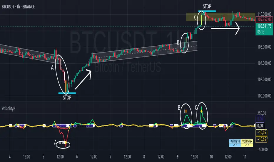
🔬 Practical Example
The following case study—applied to the BTC chart on a 1-hour timeframe—demonstrates how volatility intensity levels behave in structured scenarios such as channel breakdowns, rebound phases, false breakouts, and high-energy consolidation zones:
🔻 Letter A: Downward breakout and full intensity sequence
- The price was moving within a fairly uniform descending channel, which ends with a false breakout to the upside—quickly invalidated as a market trap.
- The true breakout occurs to the downside through a strong red candle, categorized by the system as moderate intensity (gray).
- This candle is followed by a Doji, then a smaller red candle also marked as moderate intensity, followed by a larger red candle showing high intensity (white), and finally a stronger red candle painted yellow, indicating extreme intensity.
- This full sequence (moderate → moderate → high → extreme) marks a technical climax, after which the price begins a progressive reversal.
- Although the drop unfolds over five red candles, the subsequent recovery takes place over 18 candles, mostly green and smaller in size, forming a “V” shape: sharp decline followed by a steady upward climb.
- This entire section is enclosed within an oval labeled A, with the four intensity levels clearly reflected on both the main chart and the Angular Volatility panel.
🔼 Letter B: Ascending channel and breakout with increasing bullish pressure
- After the rebound described in section A, the price begins forming a new ascending channel, marked with the letter B. This channel starts right where the previous range ends, with a very slight upward offset—nearly indistinguishable.
- In the final stage of this channel, a green candle classified as moderate intensity (gray) attempts a breakout. It is followed by a stronger green candle, painted brown, indicating elevated intensity and confirming bullish acceleration.
- Both candles and the corresponding peak on the Angular Volatility indicator are enclosed in an oval labeled B, representing a second wave of directional energy.
⛓️ Letter C: Resistance zone and consolidation following extreme volatility
- The upward movement continues until it reaches a resistance level, where a large green candle emerges, painted yellow to denote extreme intensity.
- Unlike the previous case in section A, this movement does not trigger a sharp reversal, but rather a technical pause followed by sideways consolidation, forming a horizontal range.
- This zone is marked on the chart with an oval labeled C, representing a classic case of stopping volume and range formation.
Pesquisar nos scripts por "Table"
Floor and Roof Indicator with SignalsFloor and Roof Indicator with Trading Signals
A comprehensive support and resistance indicator that identifies premium and discount zones with automated signal generation.
Key Features:
Dynamic Support/Resistance Zones: Calculates floor (support) and roof (resistance) levels using price action and volatility
Premium/Discount Zone Identification: Highlights areas where price may find resistance or support
Customizable Signal Frequency: Control how often signals are displayed (every Nth occurrence)
Visual Signal Table: Optional table showing the last 5 long and short signal prices
Multiple Timeframe Compatibility: Works across all timeframes
Technical Details:
Uses ATR-based calculations for dynamic zone width adjustment
Combines Bollinger Bands with highest/lowest price analysis
Smoothing options for cleaner signal generation
Fully customizable colors and display options
How to Use:
Floor Zones (Blue): Potential support areas where long positions may be considered
Roof Zones (Pink): Potential resistance areas where short positions may be considered
Signal Crosses: Visual markers when price interacts with key levels
Signal Table: Track recent signal prices for analysis
Settings:
Length: Period for calculations (default: 200)
Smooth: Smoothing factor for cleaner signals
Zone Width: Adjust the thickness of support/resistance zones
Signal Frequency: Control signal display frequency
Visual Options: Customize colors and table position
Alerts Available:
Long signal alerts when price touches discount zones
Short signal alerts when price reaches premium zones
Educational Purpose: This indicator is designed to help traders identify potential support and resistance areas. Always combine with proper risk management and additional analysis.
This description focuses on the technical aspects and educational value while avoiding any language that could be interpreted as financial advice or guaranteed profits.
ItsGuarantee Instrument Net Change Real-TimeDescription of the Indicator
The "ItsGuarantee Instrument Net Change Real-Time" is a Pine Script (version 5) indicator developed for TradingView to provide real-time net price change metrics for a financial instrument across three timeframes: Year-to-Date (YTD), Month-to-Date (MTD), and Day-to-Date (DTD). It calculates the difference between the instrument's current closing price and its opening price at the start of the year, month, and day, respectively. These net changes are displayed in a customizable table overlaid on the chart, enabling traders to quickly assess the instrument's performance over these periods without manual calculations.
Key Features:
Real-Time Net Change Calculation:
YTD Net Change: Measures the difference between the current price and the opening price on January 1, 2025 (or the specified year).
MTD Net Change: Calculates the difference between the current price and the opening price at the beginning of the current month.
DTD Net Change: Computes the difference between the current price and the opening price of the current trading day.
Customizable Table Display:
The table's position on the chart can be adjusted via a user input dropdown, with options including "top_right," "top_left," "middle_right," "middle_left," "bottom_right," or "bottom_left."
The table is structured with two columns ("Metric" and "Value") and four rows (a header row followed by three rows for the net change metrics).
It features a clean design with a gray header and white cells, accented by a border for improved readability.
Overlay on Chart:
The indicator operates in overlay=true mode, meaning the table is displayed directly on the price chart rather than in a separate pane, allowing traders to view performance metrics alongside price action seamlessly.
Error Handling:
If data for a specific timeframe (e.g., the yearly open price) is unavailable (na), the table displays "N/A" instead of a numerical value, ensuring the indicator remains functional even with incomplete data.
How It Works:
Inputs:
The script defines the starting year for the YTD calculation (default is 2025) and includes an input for the table's position on the chart.
A switch statement maps the user-selected table position (e.g., "top_right") to the corresponding Pine Script position constant (e.g., position.top_right).
Data Retrieval:
The current price is sourced using the close variable, which updates in real-time as new price data becomes available.
Historical opening prices for the year, month, and day are retrieved using request.security, pulling data from the specified timeframes ("12M" for yearly, "M" for monthly, "D" for daily). The barmerge parameters ensure accurate data alignment without gaps or lookahead bias.
Net Change Calculations:
YTD Net Change = Current Price - Yearly Open Price (January 1, 2025)
MTD Net Change = Current Price - Monthly Open Price (start of the current month)
DTD Net Change = Current Price - Daily Open Price (start of the current trading day)
The na function checks for missing data to prevent errors during calculations.
Table Creation and Population:
A table is created using table.new with 2 columns and 4 rows, positioned according to the user's input.
The first row serves as a header with "Metric" and "Value" labels, styled with a gray background and white text for contrast.
The subsequent rows display the YTD, MTD, and DTD net changes in dollars, formatted to two decimal places using str.tostring. If a value is unavailable, it displays "N/A."
Use Case for Traders:
This indicator is highly practical for traders and investors who need to monitor an instrument's performance across different timeframes without performing manual calculations. Specific use cases include:
Day Traders: The DTD net change provides a snapshot of intraday performance, helping traders make quick decisions based on daily price movements.
Swing Traders: The MTD net change offers insights into short-term trends within the month, aiding in the identification of potential swing opportunities.
Long-Term Investors: The YTD net change allows for tracking yearly performance, which is valuable for portfolio management, performance evaluation, or tax-related purposes (e.g., assessing gains/losses in 2025).
The table's overlay format ensures that these metrics are always visible on the chart, providing a convenient reference point during technical analysis. It complements other tools like momentum indicators or moving averages, offering a comprehensive view of both price performance and trend dynamics.
Potential Enhancements:
Percentage Change: The indicator currently displays net changes in dollar terms. Adding percentage changes (e.g., YTD % change = (YTD Net Change / Year Open Price) * 100) could provide a more normalized perspective on performance.
Color Coding: Incorporating conditional formatting (e.g., green for positive net changes, red for negative) would make the table more visually intuitive for quick decision-making.
Dynamic Year Input: Allowing users to dynamically input the starting year (instead of hardcoding 2025) would enhance the indicator's flexibility for use in future years.
Additional Timeframes: Including other periods like Quarter-to-Date (QTD) could align with business reporting practices, as highlighted in related sources like Sisense (2025), which discusses the importance of QTD metrics for trend analysis.
Connection to the Original Post:
The "ItsGuarantee Instrument Net Change Real-Time" indicator connects directly to the theme of the original X post by @ItsGuarantee
about "Instrument Speed & Close Momentum." While the post likely refers to a momentum-based indicator (focusing on the rate of price changes to assess trend strength), this net change table provides a complementary perspective by quantifying price performance over specific timeframes. Momentum indicators, as noted in the Investopedia (2025) web results, are useful for identifying overbought or oversold conditions, while net change metrics (YTD, MTD, DTD) offer a straightforward way to track overall price movement, supporting trend confirmation or portfolio monitoring. The "ItsGuarantee" branding ties this indicator to the creator's suite of tools, emphasizing real-time, actionable insights for traders.

PowerHouse SwiftEdge AI v2.10 with Custom Filters & AI AnalysisPowerHouse SwiftEdge AI v2.10 with Custom Filters & AI Analysis
Overview
PowerHouse SwiftEdge AI v2.10 is an advanced TradingView Pine Script indicator designed to identify high-probability trading setups by combining pivot-based structure analysis, multi-timeframe trend detection, and adaptive AI-driven signal filtering. The script integrates Change of Character (CHoCH) and Break of Structure (BOS) signals with customizable momentum, volume, breakout, and trend filters to enhance trade precision. Additionally, it offers an optional AI Market Analysis module that predicts future price trends across multiple timeframes, providing traders with a comprehensive market outlook.
The script is highly customizable, allowing users to tailor inputs to their trading style, whether for scalping, swing trading, or long-term strategies. It is suitable for all asset classes, including stocks, forex, crypto, and commodities, and performs optimally on timeframes ranging from 1-minute to daily charts.
Key Features
Pivot-Based Signal Generation:
Identifies pivot highs and lows to detect CHoCH (reversal patterns) and BOS (continuation patterns).
Signals are plotted as "Buy" or "Sell" labels with optional "Get Ready" pre-signals to prepare traders for potential setups.
Take-profit (TP) levels are automatically calculated based on user-defined points, with optional TP box visualization.
Multi-Timeframe Trend Analysis:
Analyzes trends across seven timeframes (1M, 5M, 15M, 30M, 1H, 4H, D) using EMA and VWAP to determine bullish, bearish, or neutral conditions.
Displays a futuristic AI-Trend Matrix dashboard showing trend direction, strength, and confidence levels for quick decision-making.
Customizable Signal Filters:
Momentum Filter: Ensures signals align with significant price changes, adjusted dynamically using ATR-based volatility.
Higher Timeframe Trend Filter: Requires signals to align with the trend of a user-selected higher timeframe (e.g., 1H).
Lower Timeframe Trend Filter: Prevents signals that conflict with the trend of a user-selected lower timeframe (e.g., 5M).
Volume Filter: Optionally requires above-average volume to confirm signals.
Breakout Filter: Optionally requires price to break previous highs/lows for signal validation.
Repeated Signal Restriction: Prevents consecutive signals in the same trend direction until the trend changes on a user-defined timeframe.
AI-Driven Adaptivity:
Incorporates Cumulative Volume Delta (CVD) to assess buying/selling pressure and classify market volatility (Low, Medium, High).
Uses ATR to dynamically adjust momentum thresholds, ensuring signals adapt to current market conditions.
Optional AI Market Analysis module predicts trends across multiple timeframes by combining trend, momentum, and volatility scores.
Visual Elements:
Plots CHoCH and BOS levels as horizontal lines with distinct colors (aqua for CHoCH sell, lime for CHoCH buy, fuchsia for BOS sell, teal for BOS buy).
Draws dynamic support and resistance trendlines based on short and long-term price action, colored by trend strength.
Displays TP levels and pivot highs/lows for easy reference.
How It Works
The script combines several technical analysis concepts to create a robust trading system:
Market Structure Analysis:
Pivot highs and lows are identified using a user-defined lookback period (Pivot Length).
CHoCH occurs when price crosses below a pivot high (bearish reversal) or above a pivot low (bullish reversal).
BOS occurs when price breaks a previous pivot low (bearish continuation) or pivot high (bullish continuation).
Trend and Momentum Integration:
Trends are determined by comparing price to EMA and VWAP on multiple timeframes.
Momentum is calculated as the percentage price change, with thresholds adjusted by ATR to account for volatility.
"Get Ready" signals appear when momentum approaches the threshold, preparing traders for potential CHoCH or BOS signals.
Signal Filtering:
Filters ensure signals align with user-defined criteria (e.g., trend direction, volume, breakouts).
The Restrict Repeated Signals option prevents over-signaling by requiring a trend change on a specified timeframe before generating a new signal in the same direction.
AI Market Analysis:
The optional AI module calculates a score for each timeframe based on trend direction, momentum, and volatility (ATR compared to its SMA).
Scores are translated into predictions (▲ for bullish, ▼ for bearish, — for neutral), displayed in a dedicated table.
CVD and Volatility Context:
CVD tracks buying vs. selling pressure by accumulating volume based on price direction.
Volatility is classified using CVD magnitude, influencing the script’s visual cues and signal sensitivity.
Why This Combination?
The integration of pivot-based structure analysis, multi-timeframe trend filtering, and AI-driven adaptivity addresses common trading challenges:
Precision: CHoCH and BOS signals focus on key market turning points, reducing noise from minor price fluctuations.
Context: Multi-timeframe analysis ensures trades align with broader market trends, improving win rates.
Adaptivity: ATR and CVD adjustments make the script responsive to changing market conditions, avoiding static thresholds that fail in volatile or quiet markets.
Customization: Extensive input options allow traders to adapt the script to their preferred markets, timeframes, and risk profiles.
Predictive Insight: The AI Market Analysis module provides forward-looking trend predictions, helping traders anticipate market moves.
This combination creates a self-contained system that balances responsiveness with reliability, making it suitable for both novice and experienced traders.
How to Use
Add to Chart:
Apply the indicator to your TradingView chart for any asset and timeframe.
Recommended timeframes: 5M to 1H for scalping/day trading, 4H to D for swing trading.
Configure Inputs:
Pivot Length: Adjust (default 5) to control sensitivity to pivot highs/lows. Lower values for faster signals, higher for stronger confirmations.
Momentum Threshold: Set the minimum price change (default 0.01%) for signals. Increase for stricter conditions.
Take Profit Points: Define TP distance (default 10 points). Adjust based on asset volatility.
Signal Filters: Enable/disable filters (momentum, trend, volume, breakout) to match your strategy.
Higher/Lower Timeframe: Select timeframes for trend alignment (e.g., 1H for higher, 5M for lower).
AI Market Analysis: Enable for predictive trend insights across timeframes.
Get Ready Signals: Enable to see pre-signals for potential setups.
Interpret Signals:
Buy/Sell Labels: Act on green "Buy" or red "Sell" labels, confirming with TP levels and trend direction.
Get Ready Labels: Yellow "Get Ready BUY" or orange "Get Ready SELL" indicate potential setups; prepare but wait for confirmation.
CHoCH/BOS Lines: Use aqua/lime (CHoCH) and fuchsia/teal (BOS) lines as key support/resistance levels.
AI-Trend Matrix: Check the top-right dashboard for trend strength (%), confidence (%), and timeframe-specific trends.
AI Market Analysis Table: If enabled, view predictions (▲/▼/—) for each timeframe to anticipate market direction.
Trading Tips:
Combine signals with other indicators (e.g., RSI, MACD) for additional confirmation.
Use higher timeframe trend alignment for higher-probability trades.
Adjust TP and signal distance based on asset volatility and trading style.
Monitor the AI-Trend Matrix for trend strength; values above 50% or below -50% indicate strong directional bias.
Originality
PowerHouse SwiftEdge AI v2.10 stands out due to its unique blend of:
Adaptive Signal Generation: ATR-based momentum thresholds and CVD-driven volatility context ensure signals remain relevant across market conditions.
Multi-Timeframe Synergy: The script’s ability to filter signals based on both higher and lower timeframe trends provides a rare balance of precision and context.
AI-Powered Insights: The AI Market Analysis module offers predictive capabilities not commonly found in traditional indicators, simulating institutional-grade analysis.
Visual Clarity: The futuristic dashboard and color-coded trendlines make complex data accessible, enhancing usability for all trader levels.
Unlike standalone pivot or trend indicators, this script integrates multiple layers of analysis into a cohesive system, reducing false signals and providing actionable insights without requiring external tools or research.
Limitations
False Signals: No indicator is foolproof; signals may fail in choppy or low-volume markets. Use filters to mitigate.
Timeframe Sensitivity: Performance varies by timeframe and asset. Test settings thoroughly.
AI Predictions: The AI Market Analysis is based on historical data and simplified scoring; it’s not a guaranteed forecast.
Resource Usage: Enabling all filters and AI analysis may slow performance on lower-end devices.

ULTIMATE Price Action Oscillator with Volume-Based S/R - MehtaULTIMATE Price Action Oscillator with Volume-Based S/R (UPO-PRO-VOL)
Key Features:
Smart Oscillator: Combines price action momentum with customizable smoothing.
Volume-Confirmed S/R: Identifies high-confidence Support/Resistance levels when price crosses above-average volume.
Real-Time Tracking: Displays S/R levels with timestamps (IST) in a clean table.
Visual Alerts: Dashed lines + labels mark key levels for easy spotting.
⚠️ STRONG DISCLAIMER
❌ This indicator is for educational purposes only.
❌ Not financial advice. Trading involves risk—always conduct your own analysis.
❌ No guarantee of accuracy. Past performance ≠ future results.
❌ Adjust settings carefully. Test in a demo account first.
❌ Volume thresholds may vary by asset. Customize Volume Threshold Multiplier as needed.
📝 How to Use:
S/R Signals: Green "S" = Support (oscillator crosses up with high volume). Red "R" = Resistance (oscillator crosses down with high volume).
Table: Tracks latest S/R prices and formation time (IST).
Tweak Settings: Adjust Oscillator Length, Smoothing, and Volume Threshold for your trading style.
Tip: Combine with trend analysis for higher-probability trades!
Script Settings (Default):
Oscillator Length: 5 (Can be adjusted upto a maximum value of 200)
Smoothing: 3
S/R Lookback: 100 bars
Volume Threshold: 1.5x avg volume
Volume Delta & Order Block Suite [QuantAlgo]Upgrade your volume analysis and order flow trading with Volume Delta & Order Block Suite by QuantAlgo, a sophisticated technical indicator that leverages advanced volume delta calculations, along with dynamic order block detection to provide deep insights into market participant behavior. By calculating the distribution of volume between buyers and sellers and tracking pivotal volume zones, the indicator helps traders understand the underlying forces driving price movements. It is particularly valuable for those looking to identify high-probability trading opportunities based on volume imbalances and key price levels where significant activity has occurred.
🟢 Technical Foundation
The Volume Delta & Order Block Suite utilizes sophisticated volume analysis techniques to estimate buying and selling pressure within each price candle. The core volume delta calculation employs a formula that estimates buy volume as: Volume × (Close - Low) ÷ (High - Low) , with sell volume calculated as the remainder of total volume. This approach assumes that when price closes near the high of a candle, most volume represents buying pressure, and when price closes near the low, most volume represents selling pressure.
For order block detection, the indicator implements a multi-step process involving volume pivot identification and price state tracking. It first detects significant volume pivot points using the ta.pivothigh function with a user-defined pivot period. It then tracks the market's order state based on whether the high exceeds the highest high or the low falls below the lowest low. When a volume pivot occurs, the indicator creates order blocks based on price levels at that pivot point. These blocks are continuously monitored for invalidation based on subsequent price action.
🟢 Key Features & Signals
1. Volume Delta Representation on Candles
The Volume Delta visualization on candles shows the buy/sell distribution directly on price bars, creating an immediate visual representation of volume pressure.
When buyers are dominant, candles are colored with the bullish theme color (default: green/teal).
Similarly, when sellers are dominant, candles are colored with the bearish theme color (default: red).
This visualization provides immediate insights into underlying volume pressure without requiring separate indicators, helping traders quickly identify which side of the market is in control.
2. Buy/Sell Pressure Information Table
The Volume Analysis Table provides a comprehensive breakdown of volume metrics across multiple timeframes, helping traders identify shifts in market behavior.
The table is organized into four timeframe columns:
Current Volume
1 Bar Before
1 Day Before
1 Week Before
For each timeframe, the table displays:
Buy volume: The estimated buying volume based on price action
Sell volume: The estimated selling volume based on price action
Total volume: The sum of buy and sell volume
Delta: The difference between buy and sell volume (positive when buyers are dominant, negative when sellers are dominant)
Additionally, the table shows both absolute values and percentage distributions, with trend indicators (Up, Down, or Neutral) at the bottom row of each timeframe column.
This multi-timeframe approach helps traders:
→ Identify volume imbalances between buyers and sellers
→ Track changes in volume delta across different periods
→ Compare current conditions with historical patterns
→ Detect potential reversals by watching for shifts in delta direction
The delta values are particularly useful as they provide a clear indication of market dominance – positive delta (Up) when buyers are dominant, and negative delta (Down) when sellers are dominant.
3. Order Blocks and Their Confluence
Order blocks represent significant price zones where volume pivots occur, potentially indicating areas of significant market participant activity.
The indicator identifies two types of order blocks:
Bullish Order Blocks (support): Highlighted with a green/teal color, these represent potential support areas where price might bounce when revisited
Bearish Order Blocks (resistance): Highlighted with a red color, these represent potential resistance areas where price might reverse when revisited
Each order block is visualized as a colored rectangle with a dashed line showing the average price within the block. The blocks are extended to the right until they are invalidated.
Order blocks can serve as key reference points for trading decisions, for example:
Support/resistance identification
Stop loss placement (beyond the opposite edge of the block)
Potential reversal zones
Target areas for profit-taking
When price approaches an order block, traders should look for confluence with the volume delta on candles and the information in the volume analysis table. Strong setups occur when all three components align – for example, when price approaches a bearish order block with increasing sell volume shown on the candles and in the volume table.
🟢 Practical Usage Tips
→ Volume Analysis and Interpretation: The indicator visualizes the buy/sell volume ratio directly on price candles using color intensity, allowing traders to immediately identify which side (buyers or sellers) is dominant. This information helps in assessing the strength behind price movements and potential continuation or reversal signals.
→ Order Block Trading Strategies: The indicator highlights significant price zones where volume pivots occur, marking these as potential support (bullish order blocks) or resistance (bearish order blocks). Traders can use these levels to identify potential reversal points, stop placement, and profit targets.
→ Multi-timeframe Volume Comparison: Through its comprehensive volume analysis table, the indicator enables traders to compare volume patterns across current, recent, daily, and weekly timeframes. This helps in identifying shifts in market behavior and confirming the strength of ongoing trends.
🟢 Pro Tips
Adjust Pivot Period based on your timeframe:
→ Lower values (3-5) for more frequent order blocks
→ Higher values (7-10) for stronger, less frequent order blocks
Fine-tune Mitigation Method based on your trading style:
→ "Wick" for more conservative invalidation
→ "Close" for more lenient order block survival
Look for confluence between components:
→ Strong volume delta in the expected direction when price touches an order block
→ Corresponding patterns in the volume analysis table
→ Overall market context aligning with the expected direction
Use for multiple trading approaches:
→ Support/resistance trading at order blocks
→ Trend confirmation with volume delta
→ Reversal detection when volume delta changes direction
→ Stop loss placement using order block boundaries
Combine with:
→ Trend analysis using trend-following indicators for trade confirmation
→ Multiple timeframe analysis for strategic context

NFP High/Low Levels PlusNFP High/Low Levels Plus
Description:
This indicator stores the 12 most recent NFP (Non-Farm-Payroll) days and their values.
Values are captured from 0830 (NFP Release) until close of market
The High and Low values for each NFP month are drawn on the chart with horizontal lines.
- Labels indicating the month's high or low line are placed after the line
- Optionally the high/low price can be displayed additionally
Support and Resistance boxes can be drawn at the closest NFP level above and below the
current price.
- Boxes will automatically update as prices cross the NFP value
Macro Indicator
- This option displays a small table in the top right corner that says "Up" or " Down"
- The Macro Indicator can be used to judge the potential direction for the current month
- Macro direction is calculated by the following:
- UP: If two consecutive days both open and close above the most recent NFP High level
- DOWN: If two consecutive days both open and close below the most recent NFP Low level
Micro Indicator
- This option displays a small table in the top right corner that says "Up" or " Down"
- The Micro Indicator can be used to judge the potential direction for low timeframes 1H or
lower
- Micro direction is calculated by the following:
- UP: If two consecutive 10m candles close above the 20EMA
- DOWN: If two consecutive 10m candles close below the 20EMA
NFP Session Bars
- This feature draws an arrow at the bottom of the chart for each candle that falls within the
NFP session day
- This is useful for identifying NFP Days
Support / Resistance Table
- This displays a table bottom center showing the nearest high and low NFP line level
What is an NFP Day and why is it useful to add to my chart?
- NFP Days are one of the most important data releases monthly
- NFP (Non-Farm-Payroll) is the official release of 80% of the US workforce employed in
manufacturing, construction, and goods
- It does not include those who work on farms, private households, non-profit and
government workers
- Historically these high/low levels for the day create strong support and resistance levels
- Having them displayed on the chart can help identify potential strong levels and pivot points
Full Indicator with all options enabled and identified
Easily update NFP Release Days in the indicator settings
Modify various options: Show/Hide lines, labels, directional indicator tables, values tables
Adjust line width, offsets, colors, font sizes, box widths
Enable individual Directional Indicators and modify colors
Example of full indicator enabled
You can find a list of the NFP Release Schedule on the official US Bureau of Labor Statistics website. This is useful for updating the indicator settings with the correct dates

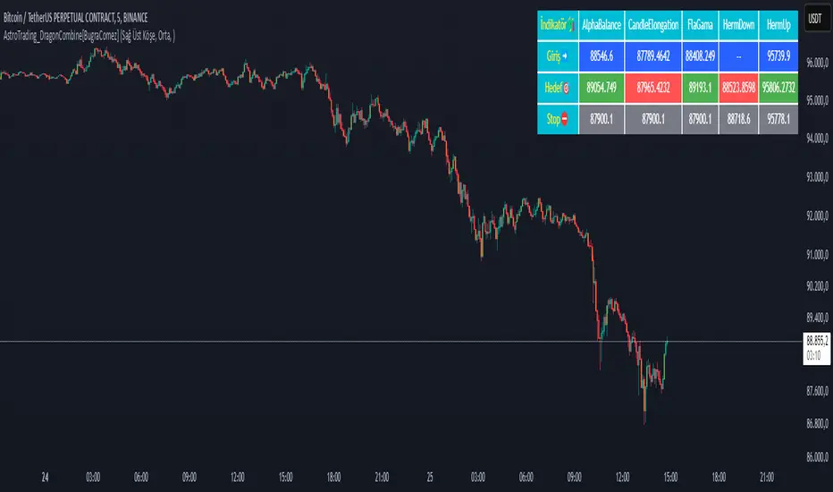
AstroTrading_DragonCombine1. Table Setup and User Inputs
Table Position and Font Size:
The script begins by asking the user to select a table position (e.g. Top Right) and a font size (Small, Medium, Large, Huge) via input options.
pinescript
Kopyala
positionInput = input.string("Sağ Üst Köşe", title="Tablo Konumu", options= )
fontSizeInput = input.string("Orta", title="Yazı Punto Büyüklüğü", options= )
Table Creation:
A table is created using table.new with 6 rows and 4 columns. The location of the table is determined by the selected input. This table will later display the name, entry, target, and stop levels for each of the five strategies.
2. Variable Declarations
The script defines several persistent variables to store levels for each indicator. These include:
Entry, target, and stop levels for each of the five sub-indicators (labeled as _1, _2, _3, _4, and _5).
Examples include targetLevel_1, fibLow_1, lastEntry_1, lastTarget_1, etc.
3. Indicator 1 – AstroTrading_AlphaBalance
Logic:
This part examines the previous candle’s high and low to compute its range. It then defines two conditions:
conditionUp_1: When the current close exceeds the previous high by at least 50% of the previous range.
conditionDown_1: When the current close falls below the previous low by 50% of the previous range.
Action:
Depending on whether the move is upward or downward, the script sets:
For an upward move:
fibLow_1 is set to the current low.
The entry level is taken as the current high.
The target is computed by taking the high and subtracting –0.786 times the range (this negative multiplier inverts the move).
The stop is set at the previous low.
For a downward move, similar logic applies with reversed roles.
Purpose:
This module generates a primary signal (AlphaBalance) based on extreme candle movements relative to the prior candle’s range.
4. Indicator 2 – AstroTrading_CandleElongation
Higher Timeframe Data:
The script uses the request.security function to obtain high, low, close, and open values from a user-specified timeframe.
Fibonacci Extension Calculation:
A function fiboExtension calculates two Fibonacci extension levels (approximately 0.786 and 1.618 multipliers) based on three price points.
Signal Conditions:
It checks if the previous candle (two bars ago) meets certain criteria relative to its open, and if the current candle’s close confirms an elongation move.
Output:
If conditions are met, the script sets:
candleEntry_2 to the lower Fibonacci level,
candleTarget_2 to the higher Fibonacci extension,
candleStop_2 to the current low (for a bullish setup) or high (for bearish).
Purpose:
This sub-indicator looks to capture significant candle elongation moves by using Fibonacci extension levels to define entry, target, and stop.
5. Indicator 3 – AstroTrading_FlaGama
Similar to a Flag Formation:
Like the previous “FlaGama” indicator, it checks if the current close is more than 50% beyond the previous candle’s high (conditionUp_3) or below the previous low (conditionDown_3).
Bar Coloring:
If either condition is met, the bar is colored orange to signal an extreme move.
Signal Generation:
Depending on the move’s direction:
Bullish Setup:
Calculates a Fibonacci level at 78.6% from the current low to high.
Sets the entry at this Fibonacci level.
The target is computed by adding the difference between the current high and the Fibonacci level to the current high.
The stop is set at the current low.
Bearish Setup:
Mirrors the Fibonacci calculation to derive a level for short entry.
The target is set below the current low, and the stop is at the current high.
Purpose:
The FlaGama section provides confirmation signals when extreme moves occur, helping traders decide on potential reversals.
6. Indicator 4 – AstroTrading_HermDown
EMA Crossover:
An EMA (111-period) is calculated. A crossover of the EMA above the close triggers a “kesilme” (cutoff) event.
First Candle Identification:
Once a crossover is detected, the next candle’s close is monitored. If that candle’s close remains below the cutoff level, it is considered the “first candle” of the HermDown setup.
Fibonacci Retracement:
It then calculates the highest high over the last 30 bars and derives a target level (fibNeg0618_4) at about 48.6% retracement from that high.
Signal Levels:
The entry is the cutoff close, the target is the calculated Fibonacci level, and the stop is the low of the cutoff candle.
Purpose:
This module aims to capture bearish reversals (HermDown) when the price drops sharply below an EMA, using Fibonacci retracement as a guide.
7. Indicator 5 – AstroTrading_HermUp
EMA Crossunder:
Similarly, an EMA (111-period) is used. A crossunder (EMA crossing below the close) signals a potential bullish reversal.
First Candle Confirmation:
The next candle’s close is checked to confirm the move.
Fibonacci Level:
A Fibonacci extension (approximately 61.8% of the distance from the cutoff close to the high) is computed to serve as the target.
Signal Levels:
The entry is set at the cutoff close, the target is the Fibonacci level, and the stop is set at the low.
Purpose:
This section captures bullish reversal signals (HermUp) when the price moves above an EMA.
8. Displaying Levels in a Table
Aggregating Data:
The script gathers the entry, target, and stop levels from all five sub-indicators.
Table Layout:
The table displays five rows (one for each indicator) with four columns:
Indicator name (e.g., “AlphaBalance”, “CandleElongation”, “FlaGama”, “HermDown”, “HermUp”)
Entry level
Target level
Stop level
Color Coding:
Entry cells have a blue background.
Target cells are colored green if above the current close or red if below.
Stop cells are given a gray background.
Purpose:
This consolidated view allows traders to quickly assess all key levels from different strategies on the chart.
Summary
The “AstroTrading_DragonCombine” indicator is a multi-faceted tool that merges five distinct trading setups into one comprehensive display. Each sub-indicator utilizes a unique method—ranging from extreme candle moves and Fibonacci extensions to EMA crossovers—to determine entry, target, and stop levels. These levels are then neatly summarized in a table overlay on the chart. By combining these approaches, traders can gain a broader perspective on market conditions and potential reversal points, enhancing their decision-making process while adhering to sound risk management principles.
This explanation is written to meet TradingView’s script publication standards, providing a clear, objective, and detailed overview of the indicator’s functionality and logic.
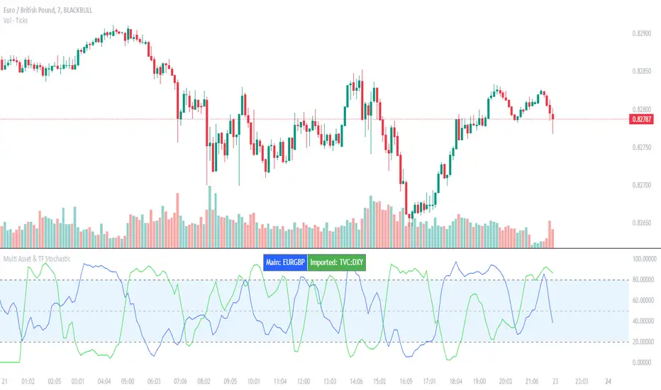
Multi Asset & TF Stochastic
Multi Asset & TF Stochastic
This indicator allows you to compare the stochastic oscillator values of two different assets across multiple timeframes in a single pane. It’s designed for traders who want to analyse the momentum of one asset (by default, the chart’s asset) alongside a second asset of your choice (e.g., comparing EURUSD to the USD Index).
How It Works:
Main Asset:
The indicator automatically uses the chart’s asset for the primary stochastic calculation. You have the option to adjust the timeframe for this asset using a dropdown that includes TradingView’s standard timeframes, a "Chart" option (which automatically uses your chart’s timeframe), or a "Custom" option where you can type in any timeframe.
Second Asset:
You can enable the display of a second asset by toggling the “Display Second Asset” option. Choose the asset symbol (default is “DXY”) and select its timeframe from an identical dropdown. When enabled, the script calculates the stochastic oscillator for the second asset, allowing you to compare its momentum (%K and %D lines) with that of the main asset.
Stochastic Oscillator Settings:
Customize the %K length, the smoothing period for %K, and the smoothing period for %D. Both assets’ stochastic values are calculated using these parameters.
Visual Display:
The indicator plots the %K and %D lines for the main asset in prominent colours. If the second asset is enabled, its %K and %D lines are also plotted in different colours. Additionally, overbought (80) and oversold (20) levels are marked, with a midline at 50, making it easier to gauge market conditions at a glance.
%D line can be toggled off for a cleaner view if required:
Asset Information Table:
A table at the top-centre of the pane displays the active asset symbols—ensuring you always know which assets are being analysed.
How to Use:
Apply the Indicator:
Add the script to your chart. By default, it will use the chart’s current asset and timeframe for the primary stochastic oscillator.
Adjust the Main Asset Settings:
Use the “Main Asset Timeframe” dropdown to select a specific timeframe for the main asset or stick with the “Chart” option for automatic syncing with your current chart.
Enable and Configure the Second Asset (Optional):
Toggle on “Display Second Asset” if you wish to compare another asset. Select the desired symbol and adjust its timeframe using the provided dropdown. Choose “Custom” if you need a timeframe not listed by default.
Review the Plots and Table:
Observe the stochastic %K and %D lines for each asset. The overbought/oversold levels help indicate potential market turning points. Check the table at the top-centre to confirm the asset symbols being displayed.
This versatile tool is ideal for traders who rely on momentum analysis and need to quickly compare the stochastic signals of different markets or instruments. Enjoy seamless multi-asset analysis with complete control over your timeframe settings!
Crodl Position Size CalculatorThe Crodl Size Position Calculator is a powerful and intuitive tool designed for traders to calculate their position size, risk, and reward before entering a trade. This indicator simplifies trade planning by providing clear calculations of key metrics such as risk-to-reward ratio, position size, expected profit, and current PnL (Profit and Loss).
Features:
Dynamic Input Fields: Customize your trade parameters, including risk loss, leverage, entry price, stop loss, and take profit.
Position Size Calculation: Automatically calculate the number of units to trade based on your risk tolerance and leverage.
Risk/Reward Ratio: See the ratio of potential profit to risk for informed decision-making.
Real-Time PnL Tracking: Monitor your current profit or loss directly on the chart.
Expected Profit Projection: Displays the profit potential based on your risk-to-reward ratio.
Position Plotting: Visualize your entry, stop loss, and take profit levels directly on the chart with color-coded lines and zones.
User-Friendly Table: A detailed table provides clear visibility of all trade metrics, including:
Risk Loss
Leverage
Entry Price
Stop Loss
Take Profit
Risk/Reward Ratio
Bet Amount
Crypto Units
Real-Time PnL
Expected Profit
How It Works:
Set Your Parameters: Input your desired risk loss, leverage, entry price, stop loss, and take profit levels in the settings.
Get Instant Results: The indicator calculates position size, PnL, expected profit, and other key metrics.
Visualize on the Chart: See your entry, stop loss, and take profit levels plotted on the chart for clarity.
Review the Trade Table: A table at the bottom-right of the screen summarizes all calculations and updates dynamically as the market price changes.
Who is it for? This indicator is ideal for traders of all experience levels, whether you're a beginner learning risk management or a professional looking for efficient trade planning tools.
Customization Options:
Adjust the size of the plotted position zones.
Enable or disable zone plotting for a cleaner chart.
Tailor inputs to match your trading strategy.
Note: Always use proper risk management and ensure your trading parameters align with your personal trading goals and strategy. Use at Own Risk

MTF RSI CandlesThis Pine Script indicator is designed to provide a visual representation of Relative Strength Index (RSI) values across multiple timeframes. It enhances traditional candlestick charts by color-coding candles based on RSI levels, offering a clearer picture of overbought, oversold, and sideways market conditions. Additionally, it displays a hoverable table with RSI values for multiple predefined timeframes.
Key Features
1. Candle Coloring Based on RSI Levels:
Candles are color-coded based on predefined RSI ranges for easy interpretation of market conditions.
RSI Levels:
75-100: Strongest Overbought (Green)
65-75: Stronger Overbought (Dark Green)
55-65: Overbought (Teal)
45-55: Sideways (Gray)
35-45: Oversold (Light Red)
25-35: Stronger Oversold (Dark Red)
0-25: Strongest Oversold (Bright Red)
2. Multi-Timeframe RSI Table:
Displays RSI values for the following timeframes:
1 Min, 2 Min, 3 Min, 4 Min, 5 Min
10 Min, 15 Min, 30 Min, 1 Hour, 1 Day, 1 Week
Helps traders identify RSI trends across different time horizons.
3. Hoverable RSI Values:
Displays the RSI value of any candle when hovering over it, providing additional insights for analysis.
Inputs
1. RSI Length:
Default: 14
Determines the calculation period for the RSI indicator.
2. RSI Levels:
Configurable thresholds for RSI zones:
75-100: Strongest Overbought
65-75: Stronger Overbought
55-65: Overbought
45-55: Sideways
35-45: Oversold
25-35: Stronger Oversold
0-25: Strongest Oversold
How It Works:
1. RSI Calculation:
The RSI is calculated for the current timeframe using the input RSI Length.
It is also computed for 11 additional predefined timeframes using request.security.
2. Candle Coloring:
Candles are colored based on their RSI values and the specified RSI levels.
3. Hoverable RSI Values:
Each candle displays its RSI value when hovered over, via a dynamically created label.
Multi-Timeframe Table:
A table at the bottom-left of the chart displays RSI values for all predefined timeframes, making it easy to compare trends.
Usage:
1. Trend Identification:
Use candle colors to quickly assess market conditions (overbought, oversold, or sideways).
2. Timeframe Analysis:
Compare RSI values across different timeframes to determine long-term and short-term momentum.
3. Signal Confirmation:
Combine RSI signals with other indicators or patterns for higher-confidence trades.
Best Practices
Use this indicator in conjunction with volume analysis, support/resistance levels, or trendline strategies for better results.
Customize RSI levels and timeframes based on your trading strategy or market conditions.
Limitations
RSI is a lagging indicator and may not always predict immediate market reversals.
Multi-timeframe analysis can lead to conflicting signals; consider your trading horizon.

Line Break Chart StrategyHello All!
We should not pass this year without a gift!
My last publication in 2024 is Complete Line Break Chart Strategy with many features!
What is Line Break Chart?
" Line Break is a Japanese chart style that disregards time intervals and only focuses on price movements, similar to the Kagi and Renko chart styles. Line Break charts form a series of up and down bars (referred to as lines). Up lines represent rising prices, and down lines represent falling prices. New confirmed lines only form on the chart when closing prices break the range covered by previous lines. Users can control the number of past lines used in the calculation via the "Number of Lines" input in the chart settings. The typical "Number of Lines" setting is 3, meaning the chart forms a new up line when the closing price is above the high prices of the last three lines, and it forms a new down line when the closing price is below the past three lines' low prices. If the current price is higher, it is an up line and if it is lower, it is a down line. If the current closing price is the same or the move in the opposite direction is not large enough to warrant a reversal, l then no new line is draw n" by Tradingview. You can find it here
Now let's start examining the features of the indicator:
By using Line break reversals it shows trend on the main chart. You can create alert .
Moreover, you can decide which trade should be taken by using Risk Management in the indicator. You can set the " Maximum Risk " and then if the risk is more than you set then the trade is not taken. When trend changed it checks the distance between reversal level and open price and compare it with the Maximum Risk
Breakout:
It can find breakouts and shows on the chart. You can create alert for breakouts
It can show breakouts on the main chart:
Flip-Flops:
Upon looking at set of price break charts, the trader will notice that there are instances when uptrend blocks is followed by one reversal block, and then by a reversal to a series of uptrend blocks. The opposite is also possible: a series of downtrend blocks is followed by one reversal box and then by an immediate reversal to downtrend. This price action is called a " Flip-Flop ". This structure usually produces trend continuation signal. when we see this then we better use Buy/Sell stop order. lets see this on the chart:
Temporal Sequence Table:
Sequence frequency shows the frequency distribution of the number of sequential highs and the number of sequential lows that have been generated. This is quite important to the trader who is seeking to join a trend or put on a trade when the price break reverses into a new trend direction. For example, if the pattern over the past year has been that there never were more than nine consecutive high closes, it would make sense not to enter a position late into the sequence of new high closes.
also you can see market structure. I have tried to formalize it and show it under the table. so you can understand if it's choppy market.
"Number of Lines" has very important role. While using low time frames such seconds/minutes time frame you may want to choose higher number of lines such 5,6. ( this may minimize the risk of a whipsaw )
Gaps feature:
You can set Gaps on/off. if Gaps on then you can see how long it takes for each box
Reversal and Continuation Probability:
The script calculated Reversal level and Continuation probability of the trend by using Sequence frequency.
It also shows unconfirmed box and current closing price level:
Last but not least it has Overlay option for all items, and can show all items in the main chart!
P.S. I added alerts :)
Wish you all a happy new year!
Enjoy!

BTC Dominance/Price vs Alts Logic (QKWESI)BTC Dominance & Price vs. Alts Indicator
Overview: The BTC Dominance & Price vs. Alts indicator is designed to help cryptocurrency traders understand the relationship between Bitcoin's market dominance, its price movements, and the subsequent impact on altcoin trends. By analyzing these key metrics, the indicator provides actionable insights to inform trading decisions.
Key Features:
BTC Dominance Tracking: Monitors Bitcoin's dominance percentage to assess its influence over the crypto market.
Real-Time BTC Price: Displays the latest Bitcoin price movements for informed analysis.
Alts Trend Prediction: Predicts altcoin behavior—such as Pump, Dump, Stable, or Increase—based on the combined trends of BTC Dominance and BTC Price.
Color-Coded Table: Presents data in a structured table with color indicators for easy interpretation.
Trend Indicators: Utilizes clear symbols to represent the direction of each metric, aiding quick decision-making.
Logic Table:
BTC Dominance BTC Price Alts Result
Increases Increases Decrease
Increases Decreases Dump
Increases Stable Stable
Decreases Increases Pump
Decreases Decreases Stable
Decreases Stable Increase
Explanation:
Increases in BTC Dominance & Increases in BTC Price: Altcoins are likely to Decrease in value.
Increases in BTC Dominance & Decreases in BTC Price: Altcoins may Dump, experiencing a sharp drop.
Increases in BTC Dominance & Stable BTC Price: Altcoins are expected to remain Stable.
Decreases in BTC Dominance & Increases in BTC Price: Altcoins may Pump, gaining significant value.
Decreases in BTC Dominance & Decreases in BTC Price: Altcoins are likely to remain Stable.
Decreases in BTC Dominance & Stable BTC Price: Altcoins may Increase moderately.
Benefits:
Informed Trading Decisions: Leverage BTC metrics to anticipate altcoin movements.
Efficient Market Analysis: Quickly assess market conditions without multiple indicators.
Structured Insights: The color-coded table and trend indicators provide a clear overview of key market dynamics.

ds-Income Statement Analyzer for TradersPURPOSE: Identifies trends in Revenue, Margins, and Earnings (RME), providing a quick indication of areas that may warrant further focus.
FOCUS:
This tool focuses exclusively on quarterly data, making it especially useful for traders who follow the styles of William O'Neil, Mark Minervini, and David Ryan. Built on the concept that fundamental trends support technical price trends, this indicator is designed to assist swing and position traders in analyzing income statements by highlighting recent trends in revenue, margins, and earnings. It requires three quarters of data to establish a trend, emphasizing the last three quarters. Tools and indicators should 'tell something useful,' and in this case, the tool reveals whether revenue, margins, and earnings are expanding, contracting, or remaining flat, as well as whether these movements are accelerating or decelerating. Finally, built-in logic offers an at-a-glance interpretation of whether a stock warrants closer examination of its fundamental and technical data.
SETTINGS:
# Qtrs to Include: Allows you to select how many quarters of available data to display. (5-16)
Size: Allows you to adjust the size of the displayed table.
KPI Data Text Size: Allows you to adjust the size of the text in the KPI Row. Some text here is more verbose than others.
Position: Allows you to position the table.
Show Minervini 2Qtr Avgs.?: Hover of the “i” in settings for explanation.
Show Estimates vs Actuals?: Hover of the “i” in settings for explanation.
Emphasized Data Only in Headline Indicator?: Hover of the “i” in settings for explanation.
TABLE SECTIONS
Vertically: The table is divided into three sections: Revenues, Profit Margins, and Earnings.
Horizontally:
The top row contains section headers and key information.
The second row includes column headers and summary indicator symbols.
The main body displays quarterly data, with a default of 5 quarters and a maximum of 16.
Analysis sections include 3Q Trend, KPI, and ATH.
The bottom row shows the version number and provides a column symbol indicator for each data column.
TABLE - TOP ROW (Left to Right):
SYM: Displays the symbol being viewed.
Qtrs Avail: Shows the quarters of data available from TradingView, typically up to a maximum of 32 quarters, or 8 years. If this displays less than 8 years, the company is relatively young.
REVENUES: Header label for the Revenues section. To its right is a symbol that indicates the worst case from the bottom row of symbols, based on your settings.
PROFIT MARGINS: Header label for the Profit Margins section. To its right is a symbol that indicates the worst case from the bottom row of symbols, based on your settings.
EARNINGS: Header label for the Earnings section. To its right is a symbol that indicates the worst case from the bottom row of symbols, based on your settings.
TABLE - HEADER ROW:
This row displays the column header labels. Note the Emphasized column headers “yellow text” highlight the most important column data “Rev Actual ($)”, “Rev YoY Qtr Chg (%)”, “Net Margin (NM) (%)”, “NP YoY Qtr Chg (%)”, “EPS YoY Qtr Chg (%)”. This can be modified in the settings. If you hover over the header, a label will pop up to provide more details.
TABLE BODY ROWS: Shows up to 16 rows of quarterly data.
A black or blank background cell without text indicates that data is unavailable from TradingView. Green text shows a value higher than the prior quarter, while red text shows a value lower than the prior quarter, allowing you to quickly spot trends within each data column. A yellow background highlights cells with negative values, marking them as unfavorable. The yellow cells indicate data points that ideally should not be negative.
ANAYSIS ROWS: Shown with brown background.
3Q TREND: Analyzes the last three quarters of data in each column to determine if the trend is rising, falling, or flat.
KPI: Key Performance Indicator. Highlights critical information, such as whether the current quarter is an all-time high (ATH), momentum (MOM) is sideways or accelerating upward, or percentage margins have fallen below all-time highs. You may sometimes see "struct." in the cell here which indicates there is a structural issue. e.g., Net Margin is higher than Operating, EBITDA, or Gross Margin. This might reflect a one-time event that boasted earnings and is worth investigating.
ATH: All-time-high value. If KPI shows ATH then the value in this cell should be equal to the most recent quarters value.
TABLE - BOTTOM ROW (Left to Right):
Version Number: Displays the version number of the indicator code.
Column-Specific Symbol Indicator: Shown at the bottom of each column, this indicator assesses the data in that column for trends, performance, and other factors.
Symbols include:
Green Checkmark: Indicates acceptable performance.
Yellow Triangle: Suggests caution; a closer inspection of this column's data may be warranted.
Orange Diamond: Signals extreme caution, more serious than the Yellow Triangle but not as critical as a Red Flag.
Red Flag: Warns of undesirable performance characteristics associated with this column's data, indicating potential danger.
Minervini CODE33 from Trade Like a Stock Market Wizard
Code 33 situation, three quarters of acceleration in earnings, sales, and profit margins. This can be observed in this indicator by focusing on the “Rev YoY Qtr Chg (%)”, “Net Margin (NM) (%)”, “EPS YoY Qtr Chg (%)” looking for the green text in the last two quarters of data. Remember green text simply indicates the value is greater than the prior value. Note I have chosen not to represent the “Net Margin (NM) (%)” as a Year-over-Year (YoY) figure. If you wish to see the bottom line represented as a YoY, you can approximate that by using the “NP YoY Qtr Chg (%)”.
Minervini Smoothing Volatility: Quarterly financial results can be volatile. By averaging the earnings, sales, or other key financial metrics over the last two quarters, Minervini aims to reduce the impact of any one-off events or seasonal fluctuations, providing a more stable view of the company's operational performance. In this indicator I incorporated it for “Rev 2Qtr Chg (%)” and “NP 2Qtr Avg Chg (%)” which averages the last two quarters of Quarter-over-Quarter (QoQ) change.

GL LineIntroduction
The GL Line Indicator is a versatile tool designed to assist traders in identifying market trends by utilizing three different types of moving averages (EMA, SMA, VWMA) across multiple timeframes. This indicator provides a comprehensive view of market conditions, making it easier to spot potential trading opportunities.
Features
Multiple Moving Average Types:
Choose between Exponential Moving Average (EMA), Simple Moving Average (SMA), and Volume Weighted Moving Average (VWMA) for more tailored analysis.
Triple Timeframe Analysis:
Analyze trends across three different timeframes (Main, Secondary, Tertiary) to get a clearer picture of market direction.
Configurable Parameters:
Customizable lengths for fast and slow-moving averages. Adjustable ATR length and multiplier to refine trend detection sensitivity.
Visual Trend Indication:
Bullish and bearish trends are marked with color-coded lines and fills, enhancing visual clarity.
Confluence Table:
Optional confluence table that shows trend direction across the selected timeframes, aiding in decision-making.
How It Works
Main Trend Calculation:
Select the type of moving average and set the lengths for fast and slow MAs. The difference between these MAs, adjusted by the ATR multiplier, determines the trend direction.
Secondary and Tertiary Trends:
Similar calculations are done for secondary and tertiary timeframes, providing a broader market overview.
Trend Direction and Plotting:
The indicator plots the moving averages and fills the area between them with colors to denote bullish (green) and bearish (red) trends.
How to Use
Select Moving Average Type:
Choose between EMA, SMA, or VWMA based on your trading strategy.
Set Lengths and Multipliers:
Customize the lengths for the fast and slow-moving averages and adjust the ATR length and multiplier for better trend sensitivity.
Analyze Trends:
Use the color-coded plots and fills to identify market trends and make informed trading decisions.
Check Confluence Table:
Optionally display the confluence table to see trend directions across different timeframes.
Disclaimer
This indicator is designed to work best when the secondary and tertiary trends are set to higher timeframes than the chart's timeframe. Using higher timeframes for additional trends provides a broader market perspective and enhances the reliability of trend signals.

IDX Financials v2This indicator adds financial data, ratios, and valuations to your chart. The main objective is to present financial overview that can be glanced quickly to add to your considerations.
The visualization of the indicator consists of two parts:
A. Plots (lines alongside the candlestick)
B. Financial table on the right. Drag your candlestick to the left to provide blank area for the table.
Programatically, the financial data is obtained by using these Pine API:
request.earnings(...) API for the EPS values that are used by the price at average PER line , and
request.financial(..) API for the rest of financial data required by the indicator.
See What financial data is available in Pine for more info on getting financial data in Pine.
A. THE PLOTS
The plots produces two lines, price at average PER in blue and price at average PBV line in pink, calculated over some adjustable time period (the default is one year). By default, only price at average PER line is shown.
Note that PER stands for Price to Earning Ratio.
The price at average PER line shows the price level at the average PER. It is calculated using formula as follows:
line = AVGPER * EPSTTM
where AVGPER is the average PER over some time period (default is one year, adjustable) and EPSTTM is the standardized EPS TTM.
Note that the EPS is updated at the actual time of earning report publication , and not at standard quarter dates such as March 31st, Dec 31st, etc.. This approach is chosen to represent the actual PE at the time.
The price at average PBV line (PBV stands for Price to Book Value), which can be enabled in settings, shows the price at average PBV. It is calculated using formula as follows:
line = AVGPBV * BVPS
where AVGPBV is the average PBV over some period of time (default is one year, adjustable) and BVPS is the book value per share. Note that the PBV is clipped to range to avoid values that are too small/large.
Also note that unlike PER, the BVPS is updated at each quarterly date (such as March 31st, Dec 31st, etc.).
Apart from those lines, some values are written to the status line (i.e. the numbers next to indicator name), which represent the corresponding value at the currently hovered bar:
PER TTM
Average PER
Std value (zvalue) of PER TTM (equal to = (PERTTM - AVGPER)/STDPER)
PBV
The meaning for these abbreviations should be straightforward.
Using the price at average PER line
There are several ways to use the price at average PER line .
You can quickly get the sense of current valuation by seeing the price relative to the price at average PER line . If the price is above the line, the valuation is higher than the average valuation, and vice versa if the price is lower.
The distance between the price and the average is measured in unit of standard deviation. This is represented by the third number in the status line. Value zero indicates the price is exactly at the average PER line. Positive value indicates price is higher than average, and negative if price is lower than average. Usually people use value +2 and -2 to indicate extreme positions.
The second way to use the line is to see how the line jumps up or down at the earning report date . If the line jumps up, this indicates the increase of EPSTTM. And vice versa when the line jumps down.
When EPSTTM is trending up over several quarters, or if EPSTTM is expected to go up, usually the price is also trending up and the valuation is over the average. And vice versa when EPSTTM is trending down or expected to go down. Deviation from this pattern may present some buying or selling opportunity.
B. THE FINANCIAL TABLE
The second visual part is the financial table. The financial table contains financial information at the last bar . It has four sections:
1. Revenue
2. Income
3. Valuations
4. Ratios
Let's discuss them in detail.
1. Revenue and income sections
The revenue and income table are organized into rows and columns.
Each row shows the data at the specified time frame, as follows:
The first four rows shows quarterly revenue/income of the last four quarters.
Then followed by TTM data.
Then followed by forecast of next quarter revenue/income, if such forecast exists. Note the "(F)" notation next to the quarter name.
Then followed by forecast of TTM data of next quarter (only for income), if such forecast exists. Note the "(F)" notation next to the TTM name.
The columns of revenue and income sections show the following:
The time frame information (such as quarter name, TTM, etc.)
The revenue/income value, in billions or millions (configurable).
YoY (year on year) growth, i.e. comparing the value with the value one year earlier, if any.
QoQ (quarter on quarter) growth, i.e. comparing the value with previous quarter value, if any.
GPM/NPM (gross profit margin or net profit margin), i.e. the margin on the specified time period.
Using the Revenue and Income table
The table provides quick way to see the revenue and income trend. You can see the YoY growth as well as QoQ, if that is applicable (non seasonal stocks). You can also see how the margins change over the periods.
The values are also presented with relevant background color . Green indicates "good" value and red indicates "bad" value. The intensity represents how good/bad the value is. The limits of the good and bad values are currently hardcoded in the script.
2. Valuations section
The valuation shows current stock valuation. The section is organized in rows and columns. Each row contains one type of valuation criteria, as follows:
PER (Price Earning Ratio)
Next quarter PER forecast (marked by "(F)" notation) when available
PBV (Price to Book value)
For each valuation criteria, several values are presented as columns:
The current value of the criteria. By current, it means the value at the last bar.
The one year standard deviation position
The three years standard deviation position
3. Ratios Section
The ratios section contains the following useful financial ratios:
ROA (Return on Asset), equal to: NET_INCOME_TTM / TOTAL_ASSETS
ROE (Return on Equity), equal to: NET_INCOME_TTM / BOOK_VALUE_PER_SHARE
PEG (PER to Growth Ratio), equal to PER_TTM / (INCOME_TTM_GROWTH*100)
DER (Debt to Equity Ratio), taken from request.financial(syminfo.tickerid, "DEBT_TO_EQUITY", "FQ")
DPR (Dividend Payout Ratio), taken from request.financial(syminfo.tickerid, "DIVIDEND_PAYOUT_RATIO", "FY")
Dividend yield, equal to (DPR * (NET_INCOME_TTM / TOTAL_SHARES_OUTSTANDING)) / close
KNOWN BUGS
Currently does not handle when the financial quarter contains gap, i.e. there is missing quarter. This usually happens on newly IPO stocks.

Machine Learning: Optimal RSI [YinYangAlgorithms]This Indicator, will rate multiple different lengths of RSIs to determine which RSI to RSI MA cross produced the highest profit within the lookback span. This ‘Optimal RSI’ is then passed back, and if toggled will then be thrown into a Machine Learning calculation. You have the option to Filter RSI and RSI MA’s within the Machine Learning calculation. What this does is, only other Optimal RSI’s which are in the same bullish or bearish direction (is the RSI above or below the RSI MA) will be added to the calculation.
You can either (by default) use a Simple Average; which is essentially just a Mean of all the Optimal RSI’s with a length of Machine Learning. Or, you can opt to use a k-Nearest Neighbour (KNN) calculation which takes a Fast and Slow Speed. We essentially turn the Optimal RSI into a MA with different lengths and then compare the distance between the two within our KNN Function.
RSI may very well be one of the most used Indicators for identifying crucial Overbought and Oversold locations. Not only that but when it crosses its Moving Average (MA) line it may also indicate good locations to Buy and Sell. Many traders simply use the RSI with the standard length (14), however, does that mean this is the best length?
By using the length of the top performing RSI and then applying some Machine Learning logic to it, we hope to create what may be a more accurate, smooth, optimal, RSI.
Tutorial:
This is a pretty zoomed out Perspective of what the Indicator looks like with its default settings (except with Bollinger Bands and Signals disabled). If you look at the Tables above, you’ll notice, currently the Top Performing RSI Length is 13 with an Optimal Profit % of: 1.00054973. On its default settings, what it does is Scan X amount of RSI Lengths and checks for when the RSI and RSI MA cross each other. It then records the profitability of each cross to identify which length produced the overall highest crossing profitability. Whichever length produces the highest profit is then the RSI length that is used in the plots, until another length takes its place. This may result in what we deem to be the ‘Optimal RSI’ as it is an adaptive RSI which changes based on performance.
In our next example, we changed the ‘Optimal RSI Type’ from ‘All Crossings’ to ‘Extremity Crossings’. If you compare the last two examples to each other, you’ll notice some similarities, but overall they’re quite different. The reason why is, the Optimal RSI is calculated differently. When using ‘All Crossings’ everytime the RSI and RSI MA cross, we evaluate it for profit (short and long). However, with ‘Extremity Crossings’, we only evaluate it when the RSI crosses over the RSI MA and RSI <= 40 or RSI crosses under the RSI MA and RSI >= 60. We conclude the crossing when it crosses back on its opposite of the extremity, and that is how it finds its Optimal RSI.
The way we determine the Optimal RSI is crucial to calculating which length is currently optimal.
In this next example we have zoomed in a bit, and have the full default settings on. Now we have signals (which you can set alerts for), for when the RSI and RSI MA cross (green is bullish and red is bearish). We also have our Optimal RSI Bollinger Bands enabled here too. These bands allow you to see where there may be Support and Resistance within the RSI at levels that aren’t static; such as 30 and 70. The length the RSI Bollinger Bands use is the Optimal RSI Length, allowing it to likewise change in correlation to the Optimal RSI.
In the example above, we’ve zoomed out as far as the Optimal RSI Bollinger Bands go. You’ll notice, the Bollinger Bands may act as Support and Resistance locations within and outside of the RSI Mid zone (30-70). In the next example we will highlight these areas so they may be easier to see.
Circled above, you may see how many times the Optimal RSI faced Support and Resistance locations on the Bollinger Bands. These Bollinger Bands may give a second location for Support and Resistance. The key Support and Resistance may still be the 30/50/70, however the Bollinger Bands allows us to have a more adaptive, moving form of Support and Resistance. This helps to show where it may ‘bounce’ if it surpasses any of the static levels (30/50/70).
Due to the fact that this Indicator may take a long time to execute and it can throw errors for such, we have added a Setting called: Adjust Optimal RSI Lookback and RSI Count. This settings will automatically modify the Optimal RSI Lookback Length and the RSI Count based on the Time Frame you are on and the Bar Indexes that are within. For instance, if we switch to the 1 Hour Time Frame, it will adjust the length from 200->90 and RSI Count from 30->20. If this wasn’t adjusted, the Indicator would Timeout.
You may however, change the Setting ‘Adjust Optimal RSI Lookback and RSI Count’ to ‘Manual’ from ‘Auto’. This will give you control over the ‘Optimal RSI Lookback Length’ and ‘RSI Count’ within the Settings. Please note, it will likely take some “fine tuning” to find working settings without the Indicator timing out, but there are definitely times you can find better settings than our ‘Auto’ will create; especially on higher Time Frames. The Minimum our ‘Auto’ will create is:
Optimal RSI Lookback Length: 90
RSI Count: 20
The Maximum it will create is:
Optimal RSI Lookback Length: 200
RSI Count: 30
If there isn’t much bar index history, for instance, if you’re on the 1 Day and the pair is BTC/USDT you’ll get < 4000 Bar Indexes worth of data. For this reason it is possible to manually increase the settings to say:
Optimal RSI Lookback Length: 500
RSI Count: 50
But, please note, if you make it too high, it may also lead to inaccuracies.
We will conclude our Tutorial here, hopefully this has given you some insight as to how calculating our Optimal RSI and then using it within Machine Learning may create a more adaptive RSI.
Settings:
Optimal RSI:
Show Crossing Signals: Display signals where the RSI and RSI Cross.
Show Tables: Display Information Tables to show information like, Optimal RSI Length, Best Profit, New Optimal RSI Lookback Length and New RSI Count.
Show Bollinger Bands: Show RSI Bollinger Bands. These bands work like the TDI Indicator, except its length changes as it uses the current RSI Optimal Length.
Optimal RSI Type: This is how we calculate our Optimal RSI. Do we use all RSI and RSI MA Crossings or just when it crosses within the Extremities.
Adjust Optimal RSI Lookback and RSI Count: Auto means the script will automatically adjust the Optimal RSI Lookback Length and RSI Count based on the current Time Frame and Bar Index's on chart. This will attempt to stop the script from 'Taking too long to Execute'. Manual means you have full control of the Optimal RSI Lookback Length and RSI Count.
Optimal RSI Lookback Length: How far back are we looking to see which RSI length is optimal? Please note the more bars the lower this needs to be. For instance with BTC/USDT you can use 500 here on 1D but only 200 for 15 Minutes; otherwise it will timeout.
RSI Count: How many lengths are we checking? For instance, if our 'RSI Minimum Length' is 4 and this is 30, the valid RSI lengths we check is 4-34.
RSI Minimum Length: What is the RSI length we start our scans at? We are capped with RSI Count otherwise it will cause the Indicator to timeout, so we don't want to waste any processing power on irrelevant lengths.
RSI MA Length: What length are we using to calculate the optimal RSI cross' and likewise plot our RSI MA with?
Extremity Crossings RSI Backup Length: When there is no Optimal RSI (if using Extremity Crossings), which RSI should we use instead?
Machine Learning:
Use Rational Quadratics: Rationalizing our Close may be beneficial for usage within ML calculations.
Filter RSI and RSI MA: Should we filter the RSI's before usage in ML calculations? Essentially should we only use RSI data that are of the same type as our Optimal RSI? For instance if our Optimal RSI is Bullish (RSI > RSI MA), should we only use ML RSI's that are likewise bullish?
Machine Learning Type: Are we using a Simple ML Average, KNN Mean Average, KNN Exponential Average or None?
KNN Distance Type: We need to check if distance is within the KNN Min/Max distance, which distance checks are we using.
Machine Learning Length: How far back is our Machine Learning going to keep data for.
k-Nearest Neighbour (KNN) Length: How many k-Nearest Neighbours will we account for?
Fast ML Data Length: What is our Fast ML Length? This is used with our Slow Length to create our KNN Distance.
Slow ML Data Length: What is our Slow ML Length? This is used with our Fast Length to create our KNN Distance.
If you have any questions, comments, ideas or concerns please don't hesitate to contact us.
HAPPY TRADING!
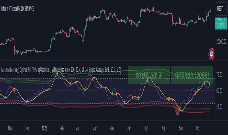
Average Range Levels [Pro+]Description:
The Average Range Levels builds on the concepts of ADR projections showcased in its lite version.
Average Daily Range (ADR) is a common metric used to measure volatility in an asset. It calculates the average difference between the highest and lowest price over a time interval – normally five days.
The Inner Circle Trader teaches the importance of this metric from an algorithmic point of view; in particular the 1/3ADR price level is deemed to be a threshold used to determine the area at which a Judas Swing – false move to trick market participants, protraction, manipulation – might exhaust.
Another key difference in the ICT-use of this metric compared to the classic approach is that the average range is calculated from New York midnight Time, rather than the daily candle's open.
This exact concept was upscaled to higher Timeframe fractals obtaining the Average Weekly Range (AWR) and the Average Monthly Range (AMR). The latter two metrics are anchored at the first Monday’s midnight (New York Time) of the respective interval – however they also have the option to be anchored at the True Week Open (Tuesday’s Daily Open) and True Month Open (Second Week Open).
It is crucial to remember that the elements of Time are key when it comes to interpreting how price action will, or won't, react to these levels: what Time of the day is it? what day of the week? what week of the month?
If one thinks about the Power of Three of a candle (Accumulation, Manipulation Distribution), it is highly unlikely that a Manipulation event will happen later in the candle’s development – seeing the 1/3ADR hold in London session or New York open, seeing the 1/3AWR hold on Tuesday or Wednesday, or seeing price race to the 1/3AMR early on in the month gives undeniable edge to an Analyst.
Apart from the 1/3 level seen from a Judas perspective, the opposing 1/3 level, and the full AR projections, are excellent algorithmic levels at which we will see orderflow or reactions worth studying. These can be take profit targets, reversal opportunities, pyramid entries, …
Last but not least, the tool is equipped with a Data Table. You have a clear narrative but you are unsure of when price will expand? Track the previous 5 ARs and the current Range for Daily, Weekly, and Monthly – the smaller the AR the higher the chance for an expansion, the larger the AR the higher the chance for a consolidation.
Tool Features:
Auto Color the drawings based on your chart’s background or choose your own
Decide whether to consider daily candles, or New York (00:00 to 00:00 NY Time) for the basis of the calculation
Show the last 10 Historical Levels
– See the AR Range, the AR price levels and 1/3AR price levels by hovering over the text labels
Plot the AR levels from their Time Anchor, or as offset markers on the side for a cleaner look
Show/Hide all elements individually
In the Idea below, you can see how INDEX:BTCUSD hit the 1/3AMR level at the end of the second week of the month. The subsequent rejection from this level suggests we might have witnessed a Judas Swing, hence we flip to bullish bias.
In the more recent AWR levels, we can see how price did not touch any level until friday – this is a consolidation week with low probability setups. This was expected, if one looks at the precious two week's ranges and respective average ranges in the Data Table: both breached the AR value, due to to the great expansion higher.
Lastly for the ADR levels we can see how the Judas higher got beautifully stopped at the 1/3 level, and the full ADR level on the opposite side catches price while it falls.
To Get Access, and Level Up see the Author's Instructions below!
This indicator is available only on the TradingView platform.
⚠️ Intellectual Property Rights ⚠️
While this tool's base concepts are public, its interpretation, code, and presentation are protected intellectual property. Unauthorized copying or distribution is prohibited.
⚠️ Terms and Conditions ⚠️
This financial tool is for educational purposes only and not financial advice. Users assume responsibility for decisions made based on the tool's information. Past performance doesn't guarantee future results. By using this tool, users agree to these terms.
Round Numbers Breakouts Smart Formula Signals and AlertsThis indicator uses Round Numbers breakouts and then uses smart formula with the near Round Numbers to determine best TP (take profit)/SL (stop loss) areas. Furthermore, it calculates win percentage, shows in-profit/in-loss peaks and the price amount result over a customizable date range, which when combined well with the smart formula provides decent profitable outcome. I have decided to write my own backtesting engine as the integrated TradingView strategy one has limitations and has shown inconsistencies when compared to manual backtesting…
There are many settings you can manually change to trade any instrument, any style, any approach and there are presets included for Bitcoin(BTCUSD), FOREX(EURUSD), SPY(S&P500), so you can start trading immediately! Alerts correspond to indicator settings and are turned on with a few clicks. There are 3 tables (each can be shown/hidden) showing everything you need to see/know to calibrate the indicator as you wish.
Labels, lines, tables explanations (everything can be hidden/shown):
- LONG Labels: medium-green: position open, dark-green: SL, bright-green: TP, blue: TP2
- SHORT Labels: medium-red: position open, dark-red: SL, bright-red: TP, purple: TP2
- Gray circles: position entry area | Yellow crosses: SL area
- Green line: Long TP1, Blue line: Long TP2 | Red Line: Short TP1, Purple line: Short TP2
- Grey lines: Round Numbers (customized via “Round Number up/down measure unit” input)
- Yellow labels at end of each week: end of week OVERALL total results
- Red colored background: power segment
- 3 tables: 1) INFO | STATS, 2) SPY Options Calculator, 3) Indicator Settings
If you decide to fully customize the indicator yourself, on the very top - under “PRESETS” select “MANUAL”! NOTE: If you select any of the pre-set presets, only GLOBAL settings can be changed, the rest of the settings will be “frozen” until you switch it to “MANUAL”!
- Global Settings are self-explanatory and mainly observational, show/hide, etc.
- Manual TP2 (Multi-Take-Profit) Settings:
>>>>> Include TP2 System? Turn on/off multi-profit system, with this unchecked, every trade will either end with SL or with TP1.
>>>>> TP2 System: NEAREST/FORMULA, NEAREST – after TP1 is taken > next TP2 will be a round number price target nearest to where TP1 was taken (sometimes it can be very near, sometimes further away…), FORMULA – 2nd round number price target will be optimally selected based on the distance behind and ahead of TP1 area. For TP2 – FORMULA would be the most logical choice as with multi-take-profit setting turned on – you’d want to ride it out as far as possible.
>>>>> TP1/TP2 division type: 1) Each price target (TP1, TP2) will be ½ of the position 2) TP1 will be 2/3 of the position and TP2 will be the remaining 1/3.
>>>>> TP2 hit type: “close” > candle has to close on top/crossing the price target line, “touch” > once candle touches the price target – you will be immediately alerted to take the partial profit (if you will use such setting – you will need to take the partial profits as soon as you receive the alert.
>>>>> TP1 > Back to Entry hit type: similar to TP2, “close” > candle close, “touch” > candle touch. Please note: this is a very tricky setting as if you use “close” option – your profitable trade may become a loss if a huge candle will close against your position eliminating your TP1 profit, however often the price will touch and cross the entry area to only bounce and continue with your position direction for even bigger profits… so experiment with the date range results to see what works best for your instrument/setting/strategy.
>>>>> TP2 count towards trades count: this can be a bit confusing, but it is simply how should TP2 be treated towards trades count. The indicator will show you Win Percentage and Win % is obtained from winning trades count divided by total trades count. While TP2 is not “a new trade”, it expands the profit of the trade. This is an experimental setting to count TP2 as the whole winning trade, ½ of a trade, or not count it at all.
- Manual Signals/TP1 Settings:
>>>>> TP1/TP2 offset: this one is really cool, with this feature you can hunt these conditions when the price comes very near the profit target area, but never touches it. With this setting turned on and with a good offset amount – you will be able to catch these for TP1 and TP2!
>>>>> TP1/TP2 offset amount: just what the title says, please be careful with this as this number varies significantly depending on the instrument you will be trading. Examples: 1) For SPY 0.1 would be $0.10 offset - if TP1 is $400 and price hits $399.90 > TP1 considered taken/signal shown/alert) | 2) For EURUSD, it is very different and if wrong will show TP1 immediately at position open, typical good offset for EURUSD is: 0.0005 | 3) For BTCUSD, 10 - $10 offset, if TP is $15,000 > $14,990, etc.
>>>>> Round Number up/down measure unit (in dollars $): this one is very important if you will be using “MANUAL” selection to build your own setup as it is very different for every instrument. For SPY, round numbers are single dollars or even half-dollar 50 cent numbers: 1 or 0.5 (350, 351, 352, etc. or 350.50, 351, 351.50, 352, etc.), while for Bitcoin (BTCUSD) a single unit ($1) is too small to be a round number as Bitoin moves much faster and wider every second and it would have to be at least 50 ($50) to make sense. Similar for FOREX (EUR/USD) a single 1 unit ($1) will be too big as EURUSD will never move a whole $1 in 15 minutes or even a day.. and would have to be something like 1.05500. You can easily determine if this number makes sense for your instrument by observing the grey Round Number lines which will correspond based on this setting. You can also visually observer if the price of the instrument appreciates these round numbers.
>>>>> Close Position Before Market Closes: just what the title says. Indicator will close the position 15 minutes before market closes (US session), update backtesting stats, alert you.
>>>>> Close Position Before Power Hour: 3PM – 4PM ET is the last hour of US trading session, where sudden move in any direction can happen with huge volatility, while sometimes nothing will happen at all… Many try to avoid it, so if you wish to avoid it as well - turn this on and it will alert you to close your positions 15 minutes before Power Hour starts, backtesting/stats will be adjusted accordingly.
>>>>> Skip OVERSIZED candles in signals: turn on this setting to skip signals, which happen to fall on big candles. This is basically a protection from huge volatility moves, which usually happen during financial news/events and if you are not a fan of these – you can set this option for indicator to not open anything based on the candle size.
>>>>> Color OVERSIZED candles: this will help you calibrate the size of the OVERSIZED candles if you decide to use this setting and overall visually see them.
>>>>> OVERSIZED candle size: OVERSIZED candle size must be input as it varies significantly. Please note: for each instrument – the size number is completely different, as for SPY: 2 would mean any candle bigger than $2 distance will be considered OVERSIZED, for Bitcoin it would have to be several hundred dollars, like 400-500. For FOREX, this would have to be a decimal, for EURUSD something like 0.0005. It’s best to experiment visually with this setting depending on the instrument you will be trading while setting up the size. To see a typical huge unusual candle – look up financial calendar for something like FOMC meeting, then measure the candle input it into this setting.
>>>>> OVERSIZED candle size calculation type: this is just more flexibility for your preference. If you wish to calculate the size of the candle based on the open/close – select “BODY”, if you wish to use high/low – select “STICKS (from tip to tip)”. Hard to say which one is better, so it is up to you to decide.
>>>>> Include EMA in signal formula: LONG signals will only be shown only if above EMA, SHORT if below EMA. EMA length is of course customizable in below.
>>>>> Skip opposite candle types in signals: signals where the candle color confirms the direction of the trade, but the candle type is opposite (like a green colored bearish hammer for example) will be avoided (such candles can be very uncertain/deceptive).
>>>>> Skip doji: signals where the signal candle is doji (uncertain) will be avoided.
>>>>> TP1 hit type/system: same thing as TP2 hit type/system.
>>>>> SL hit type/system: same as TP1 and TP2 types/systems.
>>>>> Intraday Session Signals Active Time in ET: time range during the day when indicator will show signals (open trades, alert you, etc.). This is specifically for intraday trading. You can turn it off completely by selecting a BLANK option.
>>>>> Intraday TP/SL Active Time in ET: same as above, but for taking profits/stop losses.
*** To add the alerts
-Right-click anywhere on the TradingView chart
-Click on Add alert
-Condition: Select this indicator by it’s name
-Alert name: Whatever you want
-Hit “Create”
-Note: If you change ANY Settings within the indicator – you must DELETE the current alert and create a new one per steps above, otherwise it will continue triggering alerts per old Settings!
If you wish to try this out for a week or so – please write me directly and I will give you access.

SUPERTREND MIXED ICHI-DMI-DONCHIAN-VOL-GAP-HLBox@RLSUPERTREND MIXED ICHI-DMI-VOL-GAP-HLBox@RL
by RegisL76
This script is based on several trend indicators.
* ICHIMOKU (KINKO HYO)
* DMI (Directional Movement Index)
* SUPERTREND ICHIMOKU + SUPERTREND DMI
* DONCHIAN CANAL Optimized with Colored Bars
* HMA Hull
* Fair Value GAP
* VOLUME/ MA Volume
* PRICE / MA Price
* HHLL BOXES
All these indications are visible simultaneously on a single graph. A data table summarizes all the important information to make a good trade decision.
ICHIMOKU Indicator:
The ICHIMOKU indicator is visualized in the traditional way.
ICHIMOKU standard setting values are respected but modifiable. (Traditional defaults = .
An oriented visual symbol, near the last value, indicates the progression (Ascending, Descending or neutral) of the TENKAN-SEN and the KIJUN-SEN as well as the period used.
The CLOUD (KUMO) and the CHIKOU-SPAN are present and are essential for the complete analysis of the ICHIMOKU.
At the top of the graph are visually represented the crossings of the TENKAN and the KIJUN.
Vertical lines, accompanied by labels, make it possible to quickly visualize the particularities of the ICHIMOKU.
A line displays the current bar.
A line visualizes the end of the CLOUD (KUMO) which is shifted 25 bars into the future.
A line visualizes the end of the chikou-span, which is shifted 25 bars in the past.
DIRECTIONAL MOVEMENT INDEX (DMI) : Treated conventionally : DI+, DI-, ADX and associated with a SUPERTREND DMI.
A visual symbol at the bottom of the graph indicates DI+ and DI- crossings
A line of oriented and colored symbols (DMI Line) at the top of the chart indicates the direction and strength of the trend.
SUPERTREND ICHIMOKU + SUPERTREND DMI :
Trend following by SUPERTREND calculation.
DONCHIAN CHANNEL: Treated conventionally. (And optimized by colored bars when overshooting either up or down.
The lines, high and low of the last values of the channel are represented to quickly visualize the level of the RANGE.
SUPERTREND HMA (HULL) Treated conventionally.
The HMA line visually indicates, according to color and direction, the market trend.
A visual symbol at the bottom of the chart indicates opportunities to sell and buy.
VOLUME:
Calculation of the MOBILE AVERAGE of the volume with comparison of the volume compared to the moving average of the volume.
The indications are colored and commented according to the comparison.
PRICE: Calculation of the MOBILE AVERAGE of the price with comparison of the price compared to the moving average of the price.
The indications are colored and commented according to the comparison.
HHLL BOXES:
Visualizes in the form of a box, for a given period, the max high and min low values of the price.
The configuration allows taking into account the high and low wicks of the price or the opening and closing values.
FAIR VALUE GAP :
This indicator displays 'GAP' levels over the current time period and an optional higher time period.
The script takes into account the high/low values of the current bar and compares with the 2 previous bars.
The "gap" is generated from the lack of overlap between these bars. Bearish or bullish gaps are determined by whether the gap is above or below HmaPrice, as they tend to fill, and can be used as targets.
NOTE: FAIR VALUE GAP has no values displayed in the table and/or label.
Important information (DATA) relating to each indicator is displayed in real time in a table and/or a label.
Each information is commented and colored according to direction, value, comparison etc.
Each piece of information indicates the values of the current bar and the previous value (in "FULL" mode).
The other possible modes for viewing the table and/or the label allow a more synthetic view of the information ("CONDENSED" and "MINIMAL" modes).
In order not to overload the vision of the chart too much, the visualization box of the RANGE DONCHIAN, the vertical lines of the shifted marks of the ICHIMOKU, as well as the boxes of the HHLL Boxes indicator are only visualized intermittently (managed by an adjustable time delay ).
The "HISTORICAL INFO READING" configuration parameter set to zero (by default) makes it possible to read all the information of the current bar in progress (Bar #0). All other values allow to read the information of a historical bar. The value 1 reads the information of the bar preceding the current bar (-1). The value 10 makes it possible to read the information of the tenth bar behind (-10) compared to the current bar, etc.
At the bottom of the DATAS table and label, lights, red, green or white indicate quickly summarize the trend from the various indicators.
Each light represents the number of indicators with the same trend at a given time.
Green for a bullish trend, red for a bearish trend and white for a neutral trend.
The conditions for determining a trend are for each indicator:
SUPERTREND ICHIMOHU + DMI: the 2 Super trends together are either bullish or bearish.
Otherwise the signal is neutral.
DMI: 2 main conditions:
BULLISH if DI+ >= DI- and ADX >25.
BEARISH if DI+ < DI- and ADX >25.
NEUTRAL if the 2 conditions are not met.
ICHIMOKU: 3 main conditions:
BULLISH if PRICE above the cloud and TENKAN > KIJUN and GREEN CLOUD AHEAD.
BEARISH if PRICE below the cloud and TENKAN < KIJUN and RED CLOUD AHEAD.
The other additional conditions (Data) complete the analysis and are present for informational purposes of the trend and depend on the context.
DONCHIAN CHANNEL: 1 main condition:
BULLISH: the price has crossed above the HIGH DC line.
BEARISH: the price has gone below the LOW DC line.
NEUTRAL if the price is between the HIGH DC and LOW DC lines
The 2 other complementary conditions (Datas) complete the analysis:
HIGH DC and LOW DC are increasing, falling or stable.
SUPERTREND HMA HULL: The script determines several trend levels:
STRONG BUY, BUY, STRONG SELL, SELL AND NEUTRAL.
VOLUME: 3 trend levels:
VOLUME > MOVING AVERAGE,
VOLUME < MOVING AVERAGE,
VOLUME = MOVING AVERAGE.
PRICE: 3 trend levels:
PRICE > MOVING AVERAGE,
PRICE < MOVING AVERAGE,
PRICE = MOVING AVERAGE.
If you are using this indicator/strategy and you are satisfied with the results, you can possibly make a donation (a coffee, a pizza or more...) via paypal to: lebourg.regis@free.fr.
Thanks in advance !!!
Have good winning Trades.
**************************************************************************************************************************
SUPERTREND MIXED ICHI-DMI-VOL-GAP-HLBox@RL
by RegisL76
Ce script est basé sur plusieurs indicateurs de tendance.
* ICHIMOKU (KINKO HYO)
* DMI (Directional Movement Index)
* SUPERTREND ICHIMOKU + SUPERTREND DMI
* DONCHIAN CANAL Optimized with Colored Bars
* HMA Hull
* Fair Value GAP
* VOLUME/ MA Volume
* PRIX / MA Prix
* HHLL BOXES
Toutes ces indications sont visibles simultanément sur un seul et même graphique.
Un tableau de données récapitule toutes les informations importantes pour prendre une bonne décision de Trade.
I- Indicateur ICHIMOKU :
L’indicateur ICHIMOKU est visualisé de manière traditionnelle
Les valeurs de réglage standard ICHIMOKU sont respectées mais modifiables. (Valeurs traditionnelles par défaut =
Un symbole visuel orienté, à proximité de la dernière valeur, indique la progression (Montant, Descendant ou neutre) de la TENKAN-SEN et de la KIJUN-SEN ainsi que la période utilisée.
Le NUAGE (KUMO) et la CHIKOU-SPAN sont bien présents et sont primordiaux pour l'analyse complète de l'ICHIMOKU.
En haut du graphique sont représentés visuellement les croisements de la TENKAN et de la KIJUN.
Des lignes verticales, accompagnées d'étiquettes, permettent de visualiser rapidement les particularités de l'ICHIMOKU.
Une ligne visualise la barre en cours.
Une ligne visualise l'extrémité du NUAGE (KUMO) qui est décalé de 25 barres dans le futur.
Une ligne visualise l'extrémité de la chikou-span, qui est décalée de 25 barres dans le passé.
II-DIRECTIONAL MOVEMENT INDEX (DMI)
Traité de manière conventionnelle : DI+, DI-, ADX et associé à un SUPERTREND DMI
Un symbole visuel en bas du graphique indique les croisements DI+ et DI-
Une ligne de symboles orientés et colorés (DMI Line) en haut du graphique, indique la direction et la puissance de la tendance.
III SUPERTREND ICHIMOKU + SUPERTREND DMI
Suivi de tendance par calcul SUPERTREND
IV- DONCHIAN CANAL :
Traité de manière conventionnelle.
(Et optimisé par des barres colorées en cas de dépassement soit vers le haut, soit vers le bas.
Les lignes, haute et basse des dernières valeurs du canal sont représentées pour visualiser rapidement la fourchette du RANGE.
V- SUPERTREND HMA (HULL)
Traité de manière conventionnelle.
La ligne HMA indique visuellement, selon la couleur et l'orientation, la tendance du marché.
Un symbole visuel en bas du graphique indique les opportunités de vente et d'achat.
*VI VOLUME :
Calcul de la MOYENNE MOBILE du volume avec comparaison du volume par rapport à la moyenne mobile du volume.
Les indications sont colorées et commentées en fonction de la comparaison.
*VII PRIX :
Calcul de la MOYENNE MOBILE du prix avec comparaison du prix par rapport à la moyenne mobile du prix.
Les indications sont colorées et commentées en fonction de la comparaison.
*VIII HHLL BOXES :
Visualise sous forme de boite, pour une période donnée, les valeurs max hautes et min basses du prix.
La configuration permet de prendre en compte les mèches hautes et basses du prix ou bien les valeurs d'ouverture et de fermeture.
IX - FAIR VALUE GAP
Cet indicateur affiche les niveaux de 'GAP' sur la période temporelle actuelle ET une période temporelle facultative supérieure.
Le script prend en compte les valeurs haut/bas de la barre actuelle et compare avec les 2 barres précédentes.
Le "gap" est généré à partir du manque de recouvrement entre ces barres.
Les écarts baissiers ou haussiers sont déterminés selon que l'écart est supérieurs ou inférieur à HmaPrice, car ils ont tendance à être comblés, et peuvent être utilisés comme cibles.
NOTA : FAIR VALUE GAP n'a pas de valeurs affichées dans la table et/ou l'étiquette.
Les informations importantes (DATAS) relatives à chaque indicateur sont visualisées en temps réel dans une table et/ou une étiquette.
Chaque information est commentée et colorée en fonction de la direction, de la valeur, de la comparaison etc.
Chaque information indique la valeurs de la barre en cours et la valeur précédente ( en mode "COMPLET").
Les autres modes possibles pour visualiser la table et/ou l'étiquette, permettent une vue plus synthétique des informations (modes "CONDENSÉ" et "MINIMAL").
Afin de ne pas trop surcharger la vision du graphique, la boite de visualisation du RANGE DONCHIAN, les lignes verticales des marques décalées de l'ICHIMOKU, ainsi que les boites de l'indicateur HHLL Boxes ne sont visualisées que de manière intermittente (géré par une temporisation réglable ).
Le paramètre de configuration "HISTORICAL INFO READING" réglé sur zéro (par défaut) permet de lire toutes les informations de la barre actuelle en cours (Barre #0).
Toutes autres valeurs permet de lire les informations d'une barre historique. La valeur 1 permet de lire les informations de la barre précédant la barre en cours (-1).
La valeur 10 permet de lire les information de la dixième barre en arrière (-10) par rapport à la barre en cours, etc.
Dans le bas de la table et de l'étiquette de DATAS, des voyants, rouge, vert ou blanc indique de manière rapide la synthèse de la tendance issue des différents indicateurs.
Chaque voyant représente le nombre d'indicateur ayant la même tendance à un instant donné. Vert pour une tendance Bullish, rouge pour une tendance Bearish et blanc pour une tendance neutre.
Les conditions pour déterminer une tendance sont pour chaque indicateur :
SUPERTREND ICHIMOHU + DMI : les 2 Super trends sont ensemble soit bullish soit Bearish. Sinon le signal est neutre.
DMI : 2 conditions principales :
BULLISH si DI+ >= DI- et ADX >25.
BEARISH si DI+ < DI- et ADX >25.
NEUTRE si les 2 conditions ne sont pas remplies.
ICHIMOKU : 3 conditions principales :
BULLISH si PRIX au dessus du nuage et TENKAN > KIJUN et NUAGE VERT DEVANT.
BEARISH si PRIX en dessous du nuage et TENKAN < KIJUN et NUAGE ROUGE DEVANT.
Les autres conditions complémentaires (Datas) complètent l'analyse et sont présents à titre informatif de la tendance et dépendent du contexte.
CANAL DONCHIAN : 1 condition principale :
BULLISH : le prix est passé au dessus de la ligne HIGH DC.
BEARISH : le prix est passé au dessous de la ligne LOW DC.
NEUTRE si le prix se situe entre les lignes HIGH DC et LOW DC
Les 2 autres conditions complémentaires (Datas) complètent l'analyse : HIGH DC et LOW DC sont croissants, descendants ou stables.
SUPERTREND HMA HULL :
Le script détermine plusieurs niveaux de tendance :
STRONG BUY, BUY, STRONG SELL, SELL ET NEUTRE.
VOLUME : 3 niveaux de tendance :
VOLUME > MOYENNE MOBILE, VOLUME < MOYENNE MOBILE, VOLUME = MOYENNE MOBILE.
PRIX : 3 niveaux de tendance :
PRIX > MOYENNE MOBILE, PRIX < MOYENNE MOBILE, PRIX = MOYENNE MOBILE.
Si vous utilisez cet indicateur/ stratégie et que vous êtes satisfait des résultats,
vous pouvez éventuellement me faire un don (un café, une pizza ou plus ...) via paypal à : lebourg.regis@free.fr.
Merci d'avance !!!
Ayez de bons Trades gagnants.
Advanced Candle Patterns detector-GSK-VIZAG-AP-INDIA 📌 Description
This indicator automatically detects and highlights common candlestick patterns on the chart and provides a reference table with explanations. It is designed as a visual and educational tool for learning candlestick psychology and price action.
🔍 Features
Pattern Detection (on-chart):
Detects well-known bullish, bearish, and neutral patterns:
Bullish Engulfing, Bearish Engulfing
Hammer, Inverted Hammer
Morning Star, Evening Star
Three White Soldiers, Three Black Crows
Bullish Harami, Bearish Harami
Piercing Line, Dark Cloud Cover
Tweezer Bottom, Tweezer Top
Doji
Patterns are marked directly on the chart using labels.
Labels can show pattern names or serial numbers (user choice).
Bullish = Green, Bearish = Red, Neutral = Yellow.
Reference Table (on-chart panel):
Lists all detected patterns with color-coded text.
Option to show short explanations for each pattern, or just identifiers.
Table includes a “Serial” column so users can match with chart labels.
Chart & Table Settings (customizable):
Table Position: choose Top Left, Top Right, Bottom Left, Bottom Right.
Text Size: choose Tiny, Small, Normal, Large, or Huge.
Toggle Options:
Show/Hide explanation table.
Show/Hide descriptions in table.
Show serial numbers instead of pattern labels on chart.
🎓 Educational Purpose
This tool is meant for study and research. Candlestick patterns alone are not reliable signals; their strength depends on trend, volume, and market context. Use this script to visually learn patterns and combine with other analysis methods.
⚠️ Disclaimer:
This indicator is for educational purposes only. It does not provide trading or investment advice. No candlestick pattern guarantees future price movement. Always confirm with other tools and do your own research before making trading decisions.
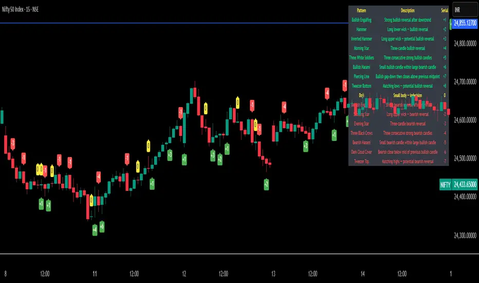
MTF Target Prediction LiteMTF Target Prediction Enhanced
Description:
MTF Target Prediction Enhanced is an advanced multi-timeframe technical analysis indicator that identifies and clusters target price levels based on trendline breakouts across multiple timeframes. The indicator uses sophisticated clustering algorithms to group similar price targets and provides visual feedback through dynamic arrows, cluster boxes, and detailed statistics.
Key Features:
Multi-Timeframe Analysis: Simultaneously analyzes up to 8 different timeframes to identify convergence zones
Smart Clustering: Groups nearby target prices into clusters with quality scoring
Predictive Arrows: Dynamic arrows that track price movement toward cluster targets
Grace Period System: Prevents false cluster loss signals with configurable waiting period
Enhanced Quality Scoring: 5-component quality assessment (Density, Consistency, Reachability, Size, Momentum)
Real-time Statistics: Track performance with win rate, P&L, and success metrics
Adaptive Performance Modes: Optimize for speed or accuracy based on your needs
How It Works:
The indicator identifies pivot points and trendlines on each selected timeframe
When a trendline breakout occurs, it calculates a target price based on the measured move
Multiple targets from different timeframes are grouped into clusters when they converge
Each cluster receives a quality score based on multiple factors
High-quality clusters generate prediction arrows showing potential price targets
The system tracks whether targets are reached or clusters are lost
Settings Guide:
⚡ Performance
Performance Mode: Choose between Fast (200 bars), Balanced (500 bars), Full (1000 bars), or Unlimited processing
🎯 Clustering
Max Cluster Distance (%): Maximum price difference to group targets (default: 1.5%)
Min Cluster Size: Minimum number of targets to form a cluster (default: 2)
One Direction per TF: Allow only one direction signal per timeframe
Cluster Grace Period: Bars to wait before considering cluster lost (default: 10)
➡️ Prediction Arrows
Min Quality for Arrow: Minimum cluster quality to create arrow (0.1-1.0)
Quality Weights: Adjust importance of each quality component
Close Previous Arrows: Auto-close arrows when new ones appear
Use Trend Filter: Create arrows only in trend direction
Trend Filter Intensity: Sensitivity of trend detection (High/Medium/Low)
📅 Timeframes
Pivot Length: Bars for pivot calculation (default: 3)
Timeframes 1-8: Select up to 8 timeframes for analysis
Visualize
Show Cluster Analysis: Display cluster boxes and labels
Show Cluster Boxes: Rectangle visualization around clusters
Show TP Lines: Display individual target price lines
Show Trend Filter: Visualize trend cloud
Show Prediction Arrows: Display directional arrows to targets
Show Statistics Table: Performance metrics display
Visual Elements:
Green/Red Boxes: Cluster zones with transparency based on quality
Arrows: Diagonal lines pointing to cluster targets
Green/Red: Active and tracking
Orange: In grace period
Gray: Cluster lost
Labels: Detailed cluster information including:
Timeframes involved
Center price (C)
Quality score (Q)
Component scores (D,C,R,S,M)
Distance from current price
Result Markers:
✓ Green: Target reached successfully
✗ Red/Gray: Cluster lost
Quality Components Explained:
D (Density): How tightly packed the TPs are relative to ATR
C (Consistency): How close the timeframes are to each other
R (Reachability): Likelihood of reaching target based on distance and trend
S (Size): Number of TPs in cluster (with diminishing returns)
M (Momentum): Alignment with current price momentum
Best Practices:
Start with Balanced performance mode and default settings
Use higher timeframes (D, W) for more reliable clusters
Look for clusters with quality scores above 0.7
Enable trend filter to reduce false signals
Adjust grace period based on your timeframe (higher TF = longer grace)
Monitor the statistics table to track indicator performance
Alerts Available:
High-quality cluster formation (UP/DOWN)
Target reached notifications
Cluster lost warnings
RUSSIAN VERSION
MTF Target Prediction Enhanced
Описание:
MTF Target Prediction Enhanced - это продвинутый мультитаймфреймовый индикатор технического анализа, который идентифицирует и кластеризует целевые уровни цен на основе пробоев трендовых линий на нескольких таймфреймах. Индикатор использует сложные алгоритмы кластеризации для группировки схожих ценовых целей и предоставляет визуальную обратную связь через динамические стрелки, кластерные боксы и детальную статистику.
Ключевые особенности:
Мультитаймфреймовый анализ: Одновременный анализ до 8 различных таймфреймов для определения зон схождения
Умная кластеризация: Группировка близких целевых цен в кластеры с оценкой качества
Прогнозные стрелки: Динамические стрелки, отслеживающие движение цены к целям кластера
Система Grace Period: Предотвращение ложных сигналов потери кластера с настраиваемым периодом ожидания
Улучшенная оценка качества: 5-компонентная оценка (Плотность, Согласованность, Достижимость, Размер, Импульс)
Статистика в реальном времени: Отслеживание эффективности с винрейтом, P&L и метриками успеха
Адаптивные режимы производительности: Оптимизация скорости или точности по вашим потребностям
Как это работает:
Индикатор определяет опорные точки и трендовые линии на каждом выбранном таймфрейме
При пробое трендовой линии рассчитывается целевая цена на основе измеренного движения
Множественные цели с разных таймфреймов группируются в кластеры при схождении
Каждый кластер получает оценку качества на основе нескольких факторов
Высококачественные кластеры генерируют стрелки прогноза, показывающие потенциальные цели
Система отслеживает достижение целей или потерю кластеров
Руководство по настройкам:
⚡ Производительность
Performance Mode: Выбор между Fast (200 баров), Balanced (500), Full (1000) или Unlimited
🎯 Кластеризация
Max Cluster Distance (%): Максимальная разница цен для группировки (по умолчанию: 1.5%)
Min Cluster Size: Минимальное количество целей для формирования кластера (по умолчанию: 2)
One Direction per TF: Разрешить только один сигнал направления на таймфрейм
Cluster Grace Period: Бары ожидания перед потерей кластера (по умолчанию: 10)
➡️ Стрелки прогноза
Min Quality for Arrow: Минимальное качество кластера для создания стрелки (0.1-1.0)
Quality Weights: Настройка важности каждого компонента качества
Close Previous Arrows: Автозакрытие стрелок при появлении новых
Use Trend Filter: Создавать стрелки только в направлении тренда
Trend Filter Intensity: Чувствительность определения тренда (Высокая/Средняя/Низкая)
📅 Таймфреймы
Pivot Length: Бары для расчета пивота (по умолчанию: 3)
Timeframes 1-8: Выбор до 8 таймфреймов для анализа
Визуализация
Show Cluster Analysis: Отображение боксов и меток кластеров
Show Cluster Boxes: Визуализация прямоугольников вокруг кластеров
Show TP Lines: Отображение линий целевых цен
Show Trend Filter: Визуализация облака тренда
Show Prediction Arrows: Отображение направленных стрелок к целям
Show Statistics Table: Отображение метрик эффективности
Визуальные элементы:
Зеленые/Красные боксы: Зоны кластеров с прозрачностью на основе качества
Стрелки: Диагональные линии, указывающие на цели кластера
Зеленые/Красные: Активные и отслеживающие
Оранжевые: В периоде ожидания
Серые: Кластер потерян
Метки: Детальная информация о кластере:
Задействованные таймфреймы
Центральная цена (C)
Оценка качества (Q)
Оценки компонентов (D,C,R,S,M)
Расстояние от текущей цены
Маркеры результата:
✓ Зеленый: Цель успешно достигнута
✗ Красный/Серый: Кластер потерян
Объяснение компонентов качества:
D (Density/Плотность): Насколько плотно расположены TP относительно ATR
C (Consistency/Согласованность): Насколько близки таймфреймы друг к другу
R (Reachability/Достижимость): Вероятность достижения цели с учетом расстояния и тренда
S (Size/Размер): Количество TP в кластере (с убывающей отдачей)
M (Momentum/Импульс): Соответствие текущему импульсу цены
Лучшие практики:
Начните с режима Balanced и настроек по умолчанию
Используйте старшие таймфреймы (D, W) для более надежных кластеров
Ищите кластеры с оценкой качества выше 0.7
Включите фильтр тренда для уменьшения ложных сигналов
Настройте grace period в зависимости от вашего таймфрейма (старший TF = дольше grace)
Следите за таблицей статистики для отслеживания эффективности индикатора
Доступные алерты:
Формирование высококачественного кластера (ВВЕРХ/ВНИЗ)
Уведомления о достижении цели
Предупреждения о потере кластера
Disclaimer / Отказ от ответственности:
This indicator is for educational and informational purposes only. Past performance does not guarantee future results. Always conduct your own analysis and risk management.
Данный индикатор предназначен только для образовательных и информационных целей. Прошлые результаты не гарантируют будущих результатов. Всегда проводите собственный анализ и управление рисками.

MTF Target Prediction LiteMTF Target Prediction Enhanced Lite
Description:
MTF Target Prediction Enhanced is an advanced multi-timeframe technical analysis indicator that identifies and clusters target price levels based on trendline breakouts across multiple timeframes. The indicator uses sophisticated clustering algorithms to group similar price targets and provides visual feedback through dynamic arrows, cluster boxes, and detailed statistics.
Key Features:
Multi-Timeframe Analysis: Simultaneously analyzes up to 8 different timeframes to identify convergence zones
Smart Clustering: Groups nearby target prices into clusters with quality scoring
Predictive Arrows: Dynamic arrows that track price movement toward cluster targets
Grace Period System: Prevents false cluster loss signals with configurable waiting period
Enhanced Quality Scoring: 5-component quality assessment (Density, Consistency, Reachability, Size, Momentum)
Real-time Statistics: Track performance with win rate, P&L, and success metrics
Adaptive Performance Modes: Optimize for speed or accuracy based on your needs
How It Works:
The indicator identifies pivot points and trendlines on each selected timeframe
When a trendline breakout occurs, it calculates a target price based on the measured move
Multiple targets from different timeframes are grouped into clusters when they converge
Each cluster receives a quality score based on multiple factors
High-quality clusters generate prediction arrows showing potential price targets
The system tracks whether targets are reached or clusters are lost
Settings Guide:
⚡ Performance
Performance Mode: Choose between Fast (200 bars), Balanced (500 bars), Full (1000 bars), or Unlimited processing
🎯 Clustering
Max Cluster Distance (%): Maximum price difference to group targets (default: 1.5%)
Min Cluster Size: Minimum number of targets to form a cluster (default: 2)
One Direction per TF: Allow only one direction signal per timeframe
Cluster Grace Period: Bars to wait before considering cluster lost (default: 10)
➡️ Prediction Arrows
Min Quality for Arrow: Minimum cluster quality to create arrow (0.1-1.0)
Quality Weights: Adjust importance of each quality component
Close Previous Arrows: Auto-close arrows when new ones appear
Use Trend Filter: Create arrows only in trend direction
Trend Filter Intensity: Sensitivity of trend detection (High/Medium/Low)
📅 Timeframes
Pivot Length: Bars for pivot calculation (default: 3)
Timeframes 1-8: Select up to 8 timeframes for analysis
Visualize
Show Cluster Analysis: Display cluster boxes and labels
Show Cluster Boxes: Rectangle visualization around clusters
Show TP Lines: Display individual target price lines
Show Trend Filter: Visualize trend cloud
Show Prediction Arrows: Display directional arrows to targets
Show Statistics Table: Performance metrics display
Visual Elements:
Green/Red Boxes: Cluster zones with transparency based on quality
Arrows: Diagonal lines pointing to cluster targets
Green/Red: Active and tracking
Orange: In grace period
Gray: Cluster lost
Labels: Detailed cluster information including:
Timeframes involved
Center price (C)
Quality score (Q)
Component scores (D,C,R,S,M)
Distance from current price
Result Markers:
✓ Green: Target reached successfully
✗ Red/Gray: Cluster lost
Quality Components Explained:
D (Density): How tightly packed the TPs are relative to ATR
C (Consistency): How close the timeframes are to each other
R (Reachability): Likelihood of reaching target based on distance and trend
S (Size): Number of TPs in cluster (with diminishing returns)
M (Momentum): Alignment with current price momentum
Best Practices:
Start with Balanced performance mode and default settings
Use higher timeframes (D, W) for more reliable clusters
Look for clusters with quality scores above 0.7
Enable trend filter to reduce false signals
Adjust grace period based on your timeframe (higher TF = longer grace)
Monitor the statistics table to track indicator performance
Alerts Available:
High-quality cluster formation (UP/DOWN)
Target reached notifications
Cluster lost warnings
------------------------------------------------------------------------------------------------------------------
MTF Target Prediction Enhanced Lite
Описание:
MTF Target Prediction Enhanced - это продвинутый мультитаймфреймовый индикатор технического анализа, который идентифицирует и кластеризует целевые уровни цен на основе пробоев трендовых линий на нескольких таймфреймах. Индикатор использует сложные алгоритмы кластеризации для группировки схожих ценовых целей и предоставляет визуальную обратную связь через динамические стрелки, кластерные боксы и детальную статистику.
Ключевые особенности:
Мультитаймфреймовый анализ: Одновременный анализ до 8 различных таймфреймов для определения зон схождения
Умная кластеризация: Группировка близких целевых цен в кластеры с оценкой качества
Прогнозные стрелки: Динамические стрелки, отслеживающие движение цены к целям кластера
Система Grace Period: Предотвращение ложных сигналов потери кластера с настраиваемым периодом ожидания
Улучшенная оценка качества: 5-компонентная оценка (Плотность, Согласованность, Достижимость, Размер, Импульс)
Статистика в реальном времени: Отслеживание эффективности с винрейтом, P&L и метриками успеха
Адаптивные режимы производительности: Оптимизация скорости или точности по вашим потребностям
Как это работает:
Индикатор определяет опорные точки и трендовые линии на каждом выбранном таймфрейме
При пробое трендовой линии рассчитывается целевая цена на основе измеренного движения
Множественные цели с разных таймфреймов группируются в кластеры при схождении
Каждый кластер получает оценку качества на основе нескольких факторов
Высококачественные кластеры генерируют стрелки прогноза, показывающие потенциальные цели
Система отслеживает достижение целей или потерю кластеров
Руководство по настройкам:
⚡ Производительность
Performance Mode: Выбор между Fast (200 баров), Balanced (500), Full (1000) или Unlimited
🎯 Кластеризация
Max Cluster Distance (%): Максимальная разница цен для группировки (по умолчанию: 1.5%)
Min Cluster Size: Минимальное количество целей для формирования кластера (по умолчанию: 2)
One Direction per TF: Разрешить только один сигнал направления на таймфрейм
Cluster Grace Period: Бары ожидания перед потерей кластера (по умолчанию: 10)
➡️ Стрелки прогноза
Min Quality for Arrow: Минимальное качество кластера для создания стрелки (0.1-1.0)
Quality Weights: Настройка важности каждого компонента качества
Close Previous Arrows: Автозакрытие стрелок при появлении новых
Use Trend Filter: Создавать стрелки только в направлении тренда
Trend Filter Intensity: Чувствительность определения тренда (Высокая/Средняя/Низкая)
📅 Таймфреймы
Pivot Length: Бары для расчета пивота (по умолчанию: 3)
Timeframes 1-8: Выбор до 8 таймфреймов для анализа
Визуализация
Show Cluster Analysis: Отображение боксов и меток кластеров
Show Cluster Boxes: Визуализация прямоугольников вокруг кластеров
Show TP Lines: Отображение линий целевых цен
Show Trend Filter: Визуализация облака тренда
Show Prediction Arrows: Отображение направленных стрелок к целям
Show Statistics Table: Отображение метрик эффективности
Визуальные элементы:
Зеленые/Красные боксы: Зоны кластеров с прозрачностью на основе качества
Стрелки: Диагональные линии, указывающие на цели кластера
Зеленые/Красные: Активные и отслеживающие
Оранжевые: В периоде ожидания
Серые: Кластер потерян
Метки: Детальная информация о кластере:
Задействованные таймфреймы
Центральная цена (C)
Оценка качества (Q)
Оценки компонентов (D,C,R,S,M)
Расстояние от текущей цены
Маркеры результата:
✓ Зеленый: Цель успешно достигнута
✗ Красный/Серый: Кластер потерян
Объяснение компонентов качества:
D (Density/Плотность): Насколько плотно расположены TP относительно ATR
C (Consistency/Согласованность): Насколько близки таймфреймы друг к другу
R (Reachability/Достижимость): Вероятность достижения цели с учетом расстояния и тренда
S (Size/Размер): Количество TP в кластере (с убывающей отдачей)
M (Momentum/Импульс): Соответствие текущему импульсу цены
Лучшие практики:
Начните с режима Balanced и настроек по умолчанию
Используйте старшие таймфреймы (D, W) для более надежных кластеров
Ищите кластеры с оценкой качества выше 0.7
Включите фильтр тренда для уменьшения ложных сигналов
Настройте grace period в зависимости от вашего таймфрейма (старший TF = дольше grace)
Следите за таблицей статистики для отслеживания эффективности индикатора
Доступные алерты:
Формирование высококачественного кластера (ВВЕРХ/ВНИЗ)
Уведомления о достижении цели
Предупреждения о потере кластера
Disclaimer / Отказ от ответственности:
This indicator is for educational and informational purposes only. Past performance does not guarantee future results. Always conduct your own analysis and risk management.
Данный индикатор предназначен только для образовательных и информационных целей. Прошлые результаты не гарантируют будущих результатов. Всегда проводите собственный анализ и управление рисками.
