MKAST-IndexThis is one of my free for all Indicators.
The TJ-Index is something I have been working on for quite a while and always was wanting to have on my charts, yet it took me longer than expected to finally finish it.
Now it is done and you can simply favourite this script and add it to your chart.
It is made out of 2 main parts.
Part 1:
15 Indicators and conditions like
-Delta MACD,
-Crypto Indicator,
-RSI,
-MACD,
-Momentum,
-CCI,
-OBV,
-Stochastic,
-CMF,
-Raw Buy and Sell Volume Domination,
-Super Guppy,
-Ichimoku,
-DIOSC,
-Volume Weighted MACD,
-Golden cross/Death Cross
Part 2:
The white line - the index itself.
So how this works is, you see 15 horizontal lines in green and red alternating, mentioned in that order above, if a bullish condition islet the horizontal line turn green, if it is a bearish condition, it is red.
The white index line, is basically depicting the number of bullish conditions at the same time.
I have seen that it is extremely powerful for divergences and especially thinking to take any position, checking if the index is high or low at the time.
An extra feature is that if ALL bullish or bearish conditions are met, the background of the oscillator will color itself green or red.
You can also turn on and off the horizontal lines for the easier user of the TJ-Index.
For now, the code will remain hidden, since I still have some important parts of this Index in my main Invite Only Indicator.
I will be publishing an open version of the TJ-Index soy ou can incorporate it in your own indicators.
Should you be interested in my main indicator or scripting work, feel free to DM me.
Pesquisar nos scripts por "RSI MACD"

ANN MACD BTC v2.0 This script is the 2nd version of the BTC Deep Learning (ANN) system.
Created with the following indicators and tools:
RSI
MACD
MOM
Bollinger Bands
Guppy Exponential Moving Averages:
(3,5,8,10,12,15,30,35,40,45,50,60)
Note: I was inspired by the CM Guppy Ema script.
Thank you very much to dear wroclai for his great help.
He has been a big help in the deep learning series.
That's why the licenses in this series are for both of us.
I'm sharing these series and thats the first. Stay tuned and regards!
Note : Alerts added.

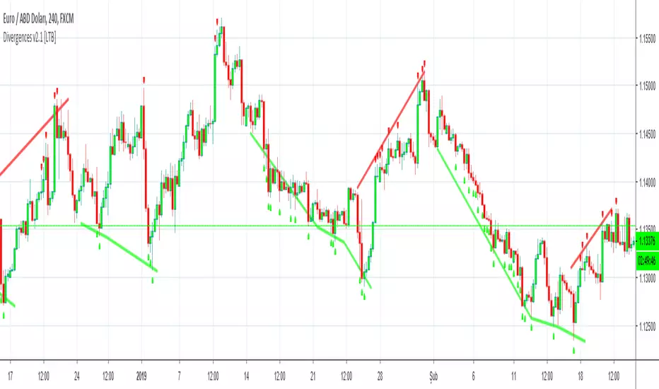
Divergence Ribbon (10 indicators)One of the most important signals for trend reversal is divergence.
This script finds divergences for 10 indicators and draws ribbon. So you can see which indicator has divergence. Red columns are negatif and lime columns are positive divergences. Divergences are searched from MinLength to MaxLength back, and you can change them as you wish.
Currently script checks divergence for RSI , MACD , MACD Histogram, Stochastic , CCI , Momentum, OBV, Diosc, VWMACD and CMF indicators.
If you find this script useful, please consider a donation
BTC: 16XRqyS3Vgh1knAU1tCcruqhUrVm4QWWmR

Divergences for many indicators v2.0A gift from me to all.
This script is developed to find Divergences for many indicators. it analyses divergences and then draws line on the graph. red for negatif, lime for positive divergences.
Currently script checks divergence for RSI, MACD, MACD Histogram, Stochastic, CCI, Momentum, OBV, Diosc, VWMACD and CMF indicators. You can use some or all of these indicators to check divergences as you wish by choosing them on the menu. Also you can add/remove many other indicators to the script to check if there is divergence.
The script first calculates tops/bottoms by using higher time frame zig zag and then finds divergences.
Higher Time Frames are
if currend period 1 min => HTF = 5 mins
if currend period 3 mins => HTF = 15 mins
if currend period 5 mins => HTF = 15 mins
if currend period 15 mins => HTF = 1 hour
if currend period 30 mins => HTF = 1 hour
if currend period 45 mins => HTF = 1 hour
if currend period 1 hour => HTF = 4 hours
if currend period 2 hours => HTF = 4 hours
if currend period 3 hours => HTF = 4 hours
if currend period 4 hours => HTF = 1 day
if currend period 1 day => HTF = 1 week
if currend period 1 week => HTF = 1 week
future plan : script finds regular divergences, soon I will add hidden divergences and also I plan to add alert ;)
Divergence/Convergence v1.0 [LonesomeTheBlue]The script is developed to find Divergence/Convergence for various indicators
it counts number of Divergence/Convergence and draws arrow
Arrow length changes according to number of Divergence/Convergence
that means if there is Divergence/Convergence on one indicator then arrow length = 1
if there is Divergence/Convergence on two indicator then arrow length = 2 etc.
Currently script checks Divergence/Convergence for RSI, MACD, MACD Histogram, Momentum, CMF indicators
You can add/remove many other indicators to check if there is Divergence/Convergence

Multi Signal RSI MACD HIgh Lo & indicator Macd BB SMA Heat BandsBuy and sell signal and indicator Macd BB SMA Heat Bands
Price Divergence Detector V3 revised by JustUncleLThis is a revised version of the original "Price Divergence Detector by RicardoSantos".
Description:
Price Divergence detection for various methods : RSI, MACD, STOCH, VOLUME, ACC-DIST, FISHER, CCI, BB %B and Ehlers IdealRSI. Both Hidden and Regular Divergences are detected.
Mofidifications:
Revision 3.0 by JustUncleL
Added option to disable/enable Hidden and Regular Divergence
Added new divergence method BB %B (close only)
Added new divergence mothos Ehlers IdealRSI (close only)
Revision 2.0 - by RicardoSantos
References:
Information on Divergence Trading:
www.babypips.com
www.incrediblecharts.com (BB %B)

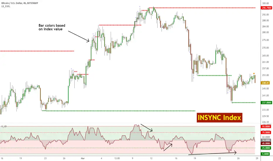
Insync Index [LazyBear]BB Support + Histo mode
-------------------------------
Code: pastebin.com
Show enclosing BB
Show Insync as Histo:
v02 - Configurable levels
---------------------------------
Small update to allow configuring the 95/75/25/5 levels.
Latest source code: pastebin.com
v01 - orginal description
---------------------------------
Insync Index, by Norm North, is a consensus indicator. It uses RSI, MACD, MFI, DPO, ROC, Stoch, CCI and %B to calculate a composite signal. Basically, this index shows that when a majority of underlying indicators is in sync, a turning point is near.
There are couple of ways to use this indicator.
- Buy when crossing up 5, sell when crossing down 95.
- Market is typically bullish when index is above 50, bearish when below 50. This can be a great confirmation signal for price action + trend lines.
Also, since this is typical oscillator, look for divergences between price and index.
Levels 75/25 are early warning levels. Note that, index > 75 (and less than 95) should be considered very bullish and index below 25 (but above 5) as very bearish. Levels 95/5 are equivalent to traditional OB/OS levels.
The various values of the underlying components can be tuned via options page. I have also provided an option to color bars based on the index value.
More info: The Insync Index by Norm North, TASC Jan 1995
drive.google.com
List of my free indicators: bit.ly
List of my app-store indicators: blog.tradingview.com
(Support doc: bit.ly)
Entry Scanner Conservative Option AKeeping it simple,
Trend,
RSI,
Stoch RSI,
MACD, checked.
Do not have entry where there is noise on selection, look for cluster of same entry signals.
If you can show enough discipline, you will be profitable.
CT

Machine Learning Moving Average [BackQuant]Machine Learning Moving Average
A powerful tool combining clustering, pseudo-machine learning, and adaptive prediction, enabling traders to understand and react to price behavior across multiple market regimes (Bullish, Neutral, Bearish). This script uses a dynamic clustering approach based on percentile thresholds and calculates an adaptive moving average, ideal for forecasting price movements with enhanced confidence levels.
What is Percentile Clustering?
Percentile clustering is a method that sorts and categorizes data into distinct groups based on its statistical distribution. In this script, the clustering process relies on the percentile values of a composite feature (based on technical indicators like RSI, CCI, ATR, etc.). By identifying key thresholds (lower and upper percentiles), the script assigns each data point (price movement) to a cluster (Bullish, Neutral, or Bearish), based on its proximity to these thresholds.
This approach mimics aspects of machine learning, where we “train” the model on past price behavior to predict future movements. The key difference is that this is not true machine learning; rather, it uses data-driven statistical techniques to "cluster" the market into patterns.
Why Percentile Clustering is Useful
Clustering price data into meaningful patterns (Bullish, Neutral, Bearish) helps traders visualize how price behavior can be grouped over time.
By leveraging past price behavior and technical indicators, percentile clustering adapts dynamically to evolving market conditions.
It helps you understand whether price behavior today aligns with past bullish or bearish trends, improving market context.
Clusters can be used to predict upcoming market conditions by identifying regimes with high confidence, improving entry/exit timing.
What This Script Does
Clustering Based on Percentiles : The script uses historical price data and various technical features to compute a "composite feature" for each bar. This feature is then sorted and clustered based on predefined percentile thresholds (e.g., 10th percentile for lower, 90th percentile for upper).
Cluster-Based Prediction : Once clustered, the script uses a weighted average, cluster momentum, or regime transition model to predict future price behavior over a specified number of bars.
Dynamic Moving Average : The script calculates a machine-learning-inspired moving average (MLMA) based on the current cluster, adjusting its behavior according to the cluster regime (Bullish, Neutral, Bearish).
Adaptive Confidence Levels : Confidence in the predicted return is calculated based on the distance between the current value and the other clusters. The further it is from the next closest cluster, the higher the confidence.
Visual Cluster Mapping : The script visually highlights different clusters on the chart with distinct colors for Bullish, Neutral, and Bearish regimes, and plots the MLMA line.
Prediction Output : It projects the predicted price based on the selected method and shows both predicted price and confidence percentage for each prediction horizon.
Trend Identification : Using the clustering output, the script colors the bars based on the current cluster to reflect whether the market is trending Bullish (green), Bearish (red), or is Neutral (gray).
How Traders Use It
Predicting Price Movements : The script provides traders with an idea of where prices might go based on past market behavior. Traders can use this forecast for short-term and long-term predictions, guiding their trades.
Clustering for Regime Analysis : Traders can identify whether the market is in a Bullish, Neutral, or Bearish regime, using that information to adjust trading strategies.
Adaptive Moving Average for Trend Following : The adaptive moving average can be used as a trend-following indicator, helping traders stay in the market when it’s aligned with the current trend (Bullish or Bearish).
Entry/Exit Strategy : By understanding the current cluster and its associated trend, traders can time entries and exits with higher precision, taking advantage of favorable conditions when the confidence in the predicted price is high.
Confidence for Risk Management : The confidence level associated with the predicted returns allows traders to manage risk better. Higher confidence levels indicate stronger market conditions, which can lead to higher position sizes.
Pseudo Machine Learning Aspect
While the script does not use conventional machine learning models (e.g., neural networks or decision trees), it mimics certain aspects of machine learning in its approach. By using clustering and the dynamic adjustment of a moving average, the model learns from historical data to adjust predictions for future price behavior. The "learning" comes from how the script uses past price data (and technical indicators) to create patterns (clusters) and predict future market movements based on those patterns.
Why This Is Important for Traders
Understanding market regimes helps to adjust trading strategies in a way that adapts to current market conditions.
Forecasting price behavior provides an additional edge, enabling traders to time entries and exits based on predicted price movements.
By leveraging the clustering technique, traders can separate noise from signal, improving the reliability of trading signals.
The combination of clustering and predictive modeling in one tool reduces the complexity for traders, allowing them to focus on actionable insights rather than manual analysis.
How to Interpret the Output
Bullish (Green) Zone : When the price behavior clusters into the Bullish zone, expect upward price movement. The MLMA line will help confirm if the trend remains upward.
Bearish (Red) Zone : When the price behavior clusters into the Bearish zone, expect downward price movement. The MLMA line will assist in tracking any downward trends.
Neutral (Gray) Zone : A neutral market condition signals indecision or range-bound behavior. The MLMA line can help track any potential breakouts or trend reversals.
Predicted Price : The projected price is shown on the chart, based on the cluster's predicted behavior. This provides a useful reference for where the price might move in the near future.
Prediction Confidence : The confidence percentage helps you gauge the reliability of the predicted price. A higher percentage indicates stronger market confidence in the forecasted move.
Tips for Use
Combining with Other Indicators : Use the output of this indicator in combination with your existing strategy (e.g., RSI, MACD, or moving averages) to enhance signal accuracy.
Position Sizing with Confidence : Increase position size when the prediction confidence is high, and decrease size when it’s low, based on the confidence interval.
Regime-Based Strategy : Consider developing a multi-strategy approach where you use this tool for Bullish or Bearish regimes and a separate strategy for Neutral markets.
Optimization : Adjust the lookback period and percentile settings to optimize the clustering algorithm based on your asset’s characteristics.
Conclusion
The Machine Learning Moving Average offers a novel approach to price prediction by leveraging percentile clustering and a dynamically adapting moving average. While not a traditional machine learning model, this tool mimics the adaptive behavior of machine learning by adjusting to evolving market conditions, helping traders predict price movements and identify trends with improved confidence and accuracy.

MANOLES MINDSETBEST STRATEGY AT SUPPORTS “This indicator combines Bollinger Bands, RSI, Stochastic RSI, MACD, and a Moving Average to identify potential buy/sell points. It also includes alert conditions for trade signals.”

Michal D. Lagless Moving Average | MisinkoMasterThe 𝕸𝖎𝖈𝖍𝖆𝖑 𝕯. 𝕷𝖆𝖌𝖑𝖊𝖘𝖘 𝕸𝖔𝖛𝖎𝖓𝖌 𝕬𝖛𝖊𝖗𝖆𝖌𝖊 is my latest creation of a trend following tool, which is a bit different from the rest. By trying to de-lag the classical moving average, it gives you fast signals on changes in trend as fast as possible, keeping traders & investors always in check for potential risks they might want to avoid.
How does it work?
First we need to calculate lengths. The lengths are calcuted using a user defined input called the "Length Multiplier" and we of course need as well the length input too.
The indicator uses 10 lengths, 5 for an average price, 5 for median price.
The length for the average is the following:
length_2_avg = length_1_avg * length_multiplier
length_3_avg = length_2_avg * length_multiplier
...
and for the median lengths:
length_1_median = length_2_avg
length_2_median = length_3_avg
Here applies this rule
length_x_median < length_x_avg
This is intentional, and it is because the average is a little more reactive, while the median is a bit slower. To make up for the "slowness" of the median, we simple reduce the length of it a bit more than the average.
Now that we have our length we are ready to calculate averages and medians over their respective period. This is the a normal average from elementary school, nothing too fancy.
Now that we have all of them we match the pairs using another user defined input called "Median Weight" like so:
(Average_x * (2-median_weight) + Median_x * median_weight)/2
This gives more weight to the average (also due to the max value limit set to avoid breaking the fundational logic behind it).
After doing it to all the pairs we now average those pairs using another input called "Exponential Weight Multiplier".
The Exponential Weight Multiplier is used for weights which I will cover soon:
weight1 = weight
weight2 = weight * weight
weight3 = weight * weight * weight....
This is done until we have all the weights calculated
This gives exponentially more weight to the less lagging indicators, which is how we delag the indicator.
Then we sum all the pairs like so:
sum = pair1 * weight1 + pair2 * weight2 + pair3 * weight3 + pair4 * weight4 + pair5 * weight5
Then the sum is divided by the sum of weights, this results in us getting the final value.
Methodology & What is the actual point & how was it made?
I want to cover this one a bit deeper:
The methodology behind this was creating an indicator that would not be lagging, and would be able to avoid lag while not producing signals too often.
In many attempts in the first part, I tried using EMA, RMA, DEMA, TEMA, HMA, SMA and so on, but they were too noisy (except for SMA & RMA, but those had their flaws), so I tried the classical average taught in elementary school. This one worked better, but the noise was too high still after all this time. This made me include the median, which helped the noise, but made it far too lagging.
Here came the idea of making the median length lower and adding weights to counter the lag of the median, but it was still too lagging. This made me make the weights for lengths more exponential, while previously they were calculated using a little bit amplified sums that were alright, but nowhere near my desired result.
Using the new weights I got further, and after a bit of testing I was sattisfied with the results.
The logic for the trend was a big part in my development part, there were many I could think of, but not enough time to try them, so I stuck to the usual one, and I leave it up to YOU to beat my trend logic and get even better results.
Use Cases:
- Price/MA Crossovers
Simple, effective, useful
- Source for other indicators
This I tried myself, and it worked in a cool way, making the signals of for example RSI much smoother, so definitely try it out if you know how to code, or just simply put it in the source of the RSI.
- ROC
This trend logic stuck with me, I think you could find a way to make it good, but mainly for the people that can code in pine, trying out to combine the trend logic with ROC could work very well, do not sleep on it!
- Education
This concept is not really that complex, so for people looking for new ideas, inspiration, or just watching how trend following tools behave in general this is something that could benefit anyone, as the concept can be applied to ANYTHING, even the classical RSI, MACD, you could try even the Parabolic SAR, maybe STC or VZO, there is no limit to imagination.
- Strategy creation
Filtering this indicator with "and" conditions, or maybe even "or" or anything really could be very useful in a strategy that desires fast signals.
- Price Distance from bands
I noticed this while looking at past performance:
The stronger the trend the higher the distance from the Moving Average.
Final Notes
Watch out for mean reverting markets, as this is trend following you could get easily screwed in them.
Play around with this if it fits your desired outcome, you might find something I did not.
Hope you find it useful,
See you next time!
THOR SignalTHOR Signal Indicator
Trend Regime Detection via Volatility-Normalized Acceleration Scoring
The THOR Signal Indicator classifies market direction into “long-favorable” or “short/risk-off” regimes using a three-layer signal process that adapts to volatility, momentum strength, and directional consistency. This script is specifically designed for swing traders looking to reduce false positives during choppy or trendless periods.
⸻
How It Works
THOR does not use standard technical indicators like RSI, MACD, or moving average crossovers. Instead, it creates a composite signal using three custom-calculated conditions:
1. Volatility-Normalized Price Deviation:
• Measures how far price has moved relative to recent volatility.
• Helps distinguish between meaningful trend movement and noise.
2. Directional Acceleration Score:
• Calculates the second derivative (rate of change of momentum) of a smoothed trend backbone.
• Signals regime shifts only when acceleration exceeds a dynamic threshold.
3. Persistence Filter:
• Applies a custom smoothing layer (similar to a Kalman filter) to confirm that directional strength is sustainable and not short-term whipsaw.
• Filters out one-bar momentum spikes.
A signal is plotted only when all three layers agree:
• Green dot = Long-side favorable regime
• Red dot = Short-side or risk-off regime
⸻
Why This Is Different
Unlike standard momentum tools that rely on fixed thresholds (like RSI overbought/oversold levels), THOR dynamically adapts its regime criteria based on the asset’s own behavior. It avoids laggy confirmation signals by using real-time volatility conditioning and trend persistence scoring.
It is not a mashup of public indicators. No MA crossovers, Bollinger Bands, or known oscillator logic is used. The architecture is original and built entirely from low-level functions and mathematical modeling.
⸻
How to Use It
• Best timeframes: Weekly, Daily, or Renko
• Use bar-close confirmation only (do not trade intrabar signals)
• Green dot: Consider long position or hold existing longs
• Red dot: Consider exiting longs or entering defensive stance
• Use with existing risk management and discretionary context
⸻
Use Case
• Swing trade filter
• Trend regime switch detector
• Allocation toggling (risk-on vs risk-off)
⸻
Disclosures
This is a closed-source script. Logic has been explained conceptually to comply with TradingView script publishing policies. No proprietary code is exposed. The tool is not intended as financial advice and does not guarantee accuracy or profitability.

Sri_Heikinashi T3 Candle line for long entry📌 Script Name:
Sri_Heikinashi T3 line for long entry (SRi-T3)
🔎 What this script does:
This indicator is a custom Heikin Ashi + T3 smoothed candle plotting tool.
Instead of showing raw candles or raw Heikin Ashi, it applies a double stage of T3 smoothing to Heikin Ashi values, giving a cleaner trend-following visual without market noise.
It doesn’t replace the original chart candles — it overlays smoothed, wick-less “trend candles” on top of your chart to highlight trend direction clearly.
🧩 Key Components:
1. Custom Timeframe Input
customTF = input.timeframe("120", "Custom Timeframe")
👉 You can choose any timeframe (5m, 15m, 1h, Daily, etc.), regardless of your chart timeframe.
This allows multi-timeframe analysis (e.g., plotting 2-hour smoothed candles on a 5-minute chart).
2. T3 Smoother Function
A custom function t3(src, length, v) is used.
T3 is a triple exponential moving average (EMA) smoother with a “volume factor” v.
Advantage: less lag than normal EMA/SMA, but smoother and cleaner trend lines.
3. Heikin Ashi Logic (inside calcHaT3)
Stage 1: Apply T3 smoothing to Heikin Ashi open, high, low, close.
Stage 2: Recalculate Heikin Ashi formula (open/close averaging, high/low logic).
Stage 3: Apply another round of T3 smoothing.
Final Output: Super-smooth OHLC values.
4. Plotting
Candles are plotted with:
No wicks (only body high/low).
Colors:
Green (lime) if close > open.
Red/Orange if close < open.
Slight transparency (95) so they don’t overpower chart candles.
👉 This way you get a visual overlay of the smoothed Heikin Ashi trend.
5. Alerts
Alerts are triggered when trend color changes:
From red → green (potential long entry).
From green → red (potential exit/short).
✅ Pros (Advantages)
Noise Reduction
Double T3 + Heikin Ashi makes signals smoother than raw price or single MA.
Clear Trend Identification
Candles change color only when trend is strong enough, filtering false moves.
Multi-Timeframe Support
You can plot higher timeframe trends (e.g., daily smoothed trend) on lower charts.
No Wick Confusion
Removes wicks to simplify visuals, focusing purely on direction.
Alerts for Trend Shifts
Automatic alert conditions for quick reaction.
Perfect for Long Entries
Since it’s designed for “long entry” confirmation, it’s especially helpful to avoid early entries.
⚡ How to Use This Script
Add to Chart
Copy → Paste into TradingView Pine Editor → Save & Add to Chart.
Select Custom Timeframe
Default is 120m (2 hours) but you can change to 15m, 60m, Daily, etc.
Example: On a 5m chart, load a 1h or 4h SRi-T3 to align with bigger trend.
Look for Color Changes
Green = bullish trend (favorable for long entries).
Orange/Red = bearish trend (avoid longs or look for short setup).
Use Alerts
Set alerts for "Heikin-Ashi Smoothed from red to green" = Long Signal.
"Heikin-Ashi Smoothed from green to red" = Exit/Short Signal.
Combine with Other Tools
Works best if combined with pivots, support/resistance, or momentum oscillators (RSI, CCI, etc.).
Use SRi-T3 as trend filter, enter trades only in its direction.
📊 Example Trading Setup
On a 15m chart:
Plot SRi-T3 with 60m timeframe → this gives you higher timeframe trend.
Enter long trades only if SRi-T3 is green.
Add RSI/MACD for entry confirmation.

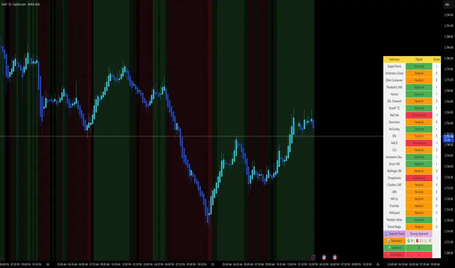
📈 Aidous-Comprehensive Trend Signal Matrix📈 Aidous-Comprehensive Trend Signal Matrix
A powerful, multi-dimensional trend analysis tool that aggregates signals from 24+ technical indicators across 6 key categories:
Pure Trend Indicators (SuperTrend, Ichimoku, EMA Crossover, Parabolic SAR, etc.)
Momentum Oscillators (RSI, MACD, CCI, Stochastic RSI, Awesome Oscillator)
Volatility-Based Tools (Bollinger Bands, Choppiness Index)
Volume & Flow Indicators (Chaikin Money Flow, OBV)
Price Action Filters (Higher Highs/Lower Lows, Fractals)
Custom & Proprietary Logic (Wolfpack ID, Waddah Attar Explosion, Trend Magic)
This indicator doesn’t just show one signal—it synthesizes 24 independent trend signals into a unified matrix, giving you a holistic view of market direction. The Overall Trend is dynamically classified as:
Strong Uptrend (≥ +5 net bullish signals)
Uptrend (+1 to +4)
Neutral (balanced or conflicting signals)
Downtrend (–1 to –4)
Strong Downtrend (≤ –5 net bearish signals)
📊 Interactive Table Display
Choose between Full Table (detailed per-indicator breakdown) or Compact Summary mode. Customize position and size to fit your chart layout.
🎨 Visual Feedback
Background color changes based on overall trend strength
Color-coded signal cells (green = bullish, red = bearish, orange = neutral)
Real-time signal counts for quick sentiment assessment
💡 How to Use:
Use the Overall Trend for high-level market bias
Drill into the table to identify which indicators are driving the signal
Combine with your own strategy for confluence-based entries/exits
⚠️ Disclaimer:
This script is provided "as is" without warranty of any kind. Past performance is not indicative of future results. Always conduct your own analysis and risk management.
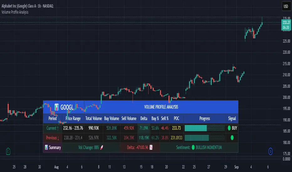
Volume Profile AnalysisThe Volume Profile Dashboard is a professional-grade analysis tool built for TradingView. It focuses on displaying a comprehensive volume profile breakdown within a dashboard format directly on the chart. The purpose of this tool is to help traders quickly assess buy versus sell volume dynamics, momentum, and sentiment in order to support informed trading decisions.
Instead of plotting simple bars, this indicator uses a detailed table and visual progress bar to summarize live and historical market activity. By condensing key metrics into a structured format, traders can analyse market behaviour without manually calculating or switching between multiple indicators.
________________________________________
How the Script Works
1. Data Gathering
The script uses lower-timeframe price and volume data to calculate buy volume, sell volume, and total traded volume for the current and previous candles.
2. Volume Allocation
Buy and sell volumes are estimated by looking at the candle’s range (high to low) and how the closing price aligns within that range. The closer the close is to the high, the stronger the buying pressure. The closer the close is to the low, the stronger the selling pressure.
3. Delta and Momentum
o Delta measures the difference between buy and sell volume.
o Volume momentum compares the current candle’s activity to the previous one, showing if interest is rising or fading.
4. Point of Control (POC)
An average of high, low, and close is calculated to give an approximate “point of control” level—an area of balance where buyers and sellers previously agreed on price.
5. Dashboard Visualization
All these calculations are displayed inside a clean dashboard table with separate rows for the current candle, previous candle, and a summary row. Icons, colors, and progress bars make it visually intuitive.
6. On-Chart Progress Indicator
A dynamic horizontal progress bar is plotted on the chart above price, showing the balance between buy and sell volume for the latest activity.
7. Alerts
Built-in alerts trigger when strong buying or selling pressure is detected or when there is a significant spike in total traded volume.
________________________________________
How This Tool Can Be Used
• Intraday Trading: Quickly gauge whether buyers or sellers are in control of the market at any moment.
• Swing Trading: Compare momentum shifts between candles to identify early trend reversals.
• Risk Management: Use delta and sentiment signals to confirm whether to hold or reduce exposure.
• Confirmation: Align the volume profile dashboard with other indicators (such as RSI, MACD, or trendlines) for stronger trading conviction.
________________________________________
Using Mixed Indicators for Decisions
This dashboard alone provides volume insights, but better decisions come when it is combined with other tools:
• Pairing it with an RSI can show whether heavy buying is happening in overbought conditions.
• Combining with a SuperTrend or moving averages can confirm if volume momentum aligns with the price trend.
• Overlaying support/resistance levels can identify whether strong buy/sell signals occur at critical levels.
Mixed indicators prevent relying on one signal alone, reducing false trades.
________________________________________
Importance of This Tool
• Clarity: Condenses complex volume data into a simple, visual format.
• Speed: Traders can react faster with pre-calculated buy/sell percentages.
• Precision: Highlights hidden imbalances that are not obvious from candles alone.
• Professional-grade dashboard: Offers an institutional-style view of market behavior directly within TradingView.
________________________________________
Parameters in the Dashboard Table
• Period: Shows whether the row is for the current or previous candle, along with trend arrows.
• Price Range: The high–low range of the candle.
• Total Volume: The sum of buy and sell activity.
• Buy Volume / Sell Volume: Separated distribution of transactions leaning bullish or bearish.
• Delta: The net difference between buy and sell volumes, highlighting pressure imbalance.
• Buy % / Sell %: The percentage contribution of each side to total volume.
• POC: An average reference level where market consensus was strongest.
• Progress: A graphical bar showing buy vs sell dominance.
• Signal: Simplified output like Strong Buy, Buy, Strong Sell, Sell, Neutral.
• Summary Row: Compares changes between the current and previous candles and gives overall market sentiment.
________________________________________
Stock Market Disclaimer
This tool is for educational and informational purposes only. It does not constitute financial advice, investment advice, or trading recommendations. The stock market and cryptocurrency markets involve high risk. Traders and investors should do their own research and consult licensed financial advisors before making investment decisions. Past performance is not indicative of future results.
________________________________________
Misuse Disclaimer
This script has been developed as per TradingView’s rules and is intended for responsible trading analysis only. Any misuse, redistribution, or modification outside of TradingView’s policies is discouraged. The author and platform are not responsible for financial losses, misinterpretation of signals, or misuse of the code.
________________________________________
Disclaimer
Training & Educational Only — This material and the indicator are provided for educational purposes only. Nothing here is investment advice or a solicitation to buy or sell financial instruments. Past simulated or historical performance does not predict future results. Always perform full back testing and risk management, and consider seeking advice from a qualified financial professional before trading with real capital.
________________________________________
PDT AI✅ Features
Multi-indicator fusion: RSI + MACD + EMA + higher timeframe RSI
Signal strength (%): Each signal gets a confidence score (0–100)
Dynamic ATR-based targets and stops
Alerts: Buy/Sell triggers for real-time notifications
Fully customizable inputs
SKT's Volume Weighted Ichimoku Conviction Candle ColoringOverview
This indicator is a customized, volume-weighted variation of the classic Ichimoku Kinko Hyo system, designed to provide traders with an "at-a-glance" visualization of trend conviction and exhaustion. It overlays dynamic candle coloring on your chart, using a smooth gradient from deep green (strong bullish conviction) to gray (neutral or exhausted) to deep red (strong bearish conviction). The colors are driven by a composite score (-10 to +10, displayed as -100% to +100% strength), which quantifies probabilistic bias based on historical Ichimoku patterns, normalized for volatility and enhanced with volume dynamics.
Unlike standard Ichimoku, this version emphasizes "conviction strength" through gradients, helping identify not just trends but their reliability—e.g., fading colors signal potential reversals or pullbacks. It's particularly suited for trending assets like BTC/USD on daily or higher timeframes, where volume-weighted adjustments make lines hug price action during high-participation moves.
Key Benefits
Visual Heat Map: Candles shift colors based on score intensity, making it easy to spot weakening trends (pale shades) or strong continuations (deep shades).
Exhaustion Detection: Incorporates slope flattening, volume divergences, and cloud thinning to proactively desaturate colors near potential turns.
Strength Box: A persistent top-right label shows current % strength (e.g., "+75% Bull"), synced to the candle gradient for quick reference.
Adaptability: Works on any timeframe/asset; inputs allow tuning (e.g., for crypto's 24/7 volatility).
How It Works
The indicator computes a conviction score per bar, ranging from -10 (max bearish) to +10 (max bullish), then maps it to candle colors and a % strength display. The score is a weighted sum of five factors (total 100%), each normalized by ATR for scale-invariance:
Base: Normalized Price-Cloud Distance (40% Weight): Measures how far price is above (bullish) or below (bearish) the cloud. Calculation: Distance / ATR, clamped via tanh sigmoid for smoothness. Penalty: Fades score if distance <0.5 ATR (approaching cloud edge). Rationale: Large separations historically predict ~60-70% continuation; proximity hints at reversals.
Cloud Thickness & Color Alignment (15% Weight): Thickness = |Senkou A - B| / ATR; compared to SMA average. Boost if thick (>average: up to +3); penalty if thin (<0.5 average: up to -3). +1 bonus if cloud color aligns (green bull, red bear). Rationale: Thicker clouds act as stronger support/resistance; thinning signals exhaustion.
Other Lines: Chikou & Tenkan/Kijun Positions (15% Weight): Chikou distance from price/cloud ( / ATR): +4 if aligned far; -0.5 penalty if misaligned. Tenkan-Kijun separation ( / ATR): +3 if diverging (>0.5 ATR). Averaged for contribution. Rationale: Chikou confirms momentum from history; diverging lines indicate strength.
Exhaustion: Slope Calculation (Tenkan/Kijun) (15% Weight): Avg slope = (Tenkan linreg * 0.7 + Kijun linreg * 0.3) / ATR. Boost if steep (>0.2 abs: +3); penalty if flat (<0.1 abs: -3) or declining in trend (-4). Doubled if lines converging (<0.5 ATR sep). Rationale: Flattening/declining slopes detect fading momentum early.
Exhaustion: Volume Boost/Penalty (15% Weight): Dynamic thresholds: High = SMA(vol) + STD; Low = max(SMA - STD, 0). Boost if vol > high & slope aligns (up to +3). Penalty if vol < low or slope diverges (up to -3); skipped on new-bar first tick (barstate.isnew). Symmetric clamp: volContrib bounded ±3 to avoid spikes. Rationale: High aligning volume confirms conviction; low/diverging signals traps/exhaustion.
Score clamped ±10 overall. Gradients use RGB mixing: Deep colors for high abs(score), desaturated near 0 for smooth fades. Neutral bars vary gray shades by cloud thickness.
Inputs and Customization
All parameters are adjustable via TradingView's indicator settings:
Tenkan/Kijun/Senkou B Periods (9/26/52): Standard Ichimoku lengths; increase for smoother lines on volatile assets.
Displacement (26): Cloud shift; tweak for forward projection.
ATR Length (14): Volatility normalizer; longer for less sensitivity.
Slope/Volume/Thickness Lookbacks (5/20/20): Periods for slopes, vol SMA/STD, cloud avg—balance responsiveness vs. noise.
Scale Factor (2.0): Controls sigmoid clamping sharpness; lower for more gradual scores.
For BTC/USD: Try 20/60/120 periods on 1H/4H for crypto's non-stop trading.
Usage Instructions
Add to your chart via TradingView's Indicators menu.
Interpret Gradients: Deep Green: Strong bull (>+70% strength)—ride trends. Pale Green: Weakening bull (~+20-50%)—watch for exhaustion. Gray: Neutral (inside cloud)—avoid directionals. Symmetric for reds (bearish).
Strength Box: Top-right label shows live % (updates per tick).
Combine with: RSI/MACD for reversals (e.g., RSI divergence + pale gradient = potential turn).
Timeframes: Works on all; daily+ for best results. Test settings per asset/TF.
Notes and Disclaimer
- Performance: Backtest on your assets—score aligns with ~60% historical continuation in strong trends, but markets are unpredictable.
- Limitations: Volume-sensitive on low-TF or illiquid assets (fixed with clamps/barstate.isnew); no built-in alerts (add via TradingView).
- Disclaimer: For educational purposes only—not financial advice. Past performance ≠ future results; use with risk management.

DECODE Moving Average ToolkitDECODE Moving Average Toolkit: Your All-in-One MA Analysis Powerhouse!
This versatile indicator is designed to be your go-to solution for analysing trends, identifying potential entry/exit points, and staying ahead of market movements using the power of Moving Averages (MAs).
Whether you're a seasoned trader or just starting out, the Decode MAT offers a comprehensive suite of features in a user-friendly package.
Key Features:
Multiple Moving Averages: Visualize up to 10 Moving Averages simultaneously on your chart.
Includes 5 Exponential Moving Averages (EMAs) and 5 Simple Moving Averages (SMAs).
Easily toggle the visibility of each MA and customize its length to suit your trading style and the asset you're analyzing.
Dynamic MA Ribbons: Gain a clearer perspective on trend direction and strength with 5 configurable MA Ribbons.
Each ribbon is formed between a corresponding EMA and SMA (e.g., EMA 20 / SMA 20).
The ribbon color changes to indicate bullish (e.g., green) or bearish (e.g., red) sentiment, providing an intuitive visual cue.
Toggle ribbon visibility with a single click.
Powerful Crossover Alerts: Never miss a potential trading opportunity with up to 5 customizable MA Crossover Alerts.
Define your own fast and slow MAs for each alert from any of the 10 available MAs.
Receive notifications directly through TradingView when your specified MAs cross over or cross under.
Optionally display visual symbols (e.g., triangles ▲▼) directly on your chart at the exact crossover points for quick identification.
Highly Customizable:
Adjust the source price (close, open, etc.) for all MA calculations.
Fine-tune the appearance (colors, line thickness) of every MA line, ribbon, and alert symbol to match your charting preferences.
User-Friendly Interface: All settings are neatly organized in the indicator's input menu, making configuration straightforward and intuitive.
How Can You Use the Decode MAT in Your Trading?
This toolkit is incredibly versatile and can be adapted to various trading strategies:
Trend Identification:
Use longer-term MAs (e.g., 50, 100, 200 period) to identify the prevailing market trend. When prices are consistently above these MAs, it suggests an uptrend, and vice-versa.
Observe the MA ribbons: A consistently green ribbon can indicate a strong uptrend, while a red ribbon can signal a downtrend. The widening or narrowing of the ribbon can also suggest changes in trend momentum.
Dynamic Support & Resistance:
Shorter-term MAs (e.g., 10, 20 period EMAs) can act as dynamic levels of support in an uptrend or resistance in a downtrend. Look for price pullbacks to these MAs as potential entry opportunities.
Crossover Signals (Entries & Exits):
Golden Cross / Death Cross: Configure alerts for classic crossover signals. For example, a 50-period MA crossing above a 200-period MA (Golden Cross) is often seen as a long-term bullish signal. Conversely, a 50-period MA crossing below a 200-period MA (Death Cross) can be a bearish signal.
Shorter-Term Signals: Use crossovers of shorter-term MAs (e.g., EMA 10 crossing EMA 20) for more frequent, shorter-term trading signals. A fast MA crossing above a slow MA can signal a buy, while a cross below can signal a sell.
Use the on-chart symbols for quick visual confirmation of these crossover events.
Confirmation Tool:
Combine the Decode MAT with other indicators (like RSI, MACD, or volume analysis) to confirm signals and increase the probability of successful trades. For instance, a bullish MA crossover combined with an oversold RSI reading could strengthen a buy signal.
Multi-Timeframe Analysis:
Apply the toolkit across different timeframes to get a broader market perspective. A long-term uptrend on the daily chart, confirmed by a short-term bullish crossover on the 1-hour chart, can provide a higher-confidence entry.
The DECODE Moving Average Toolkit empowers you to tailor your MA analysis precisely to your needs.
Regime Scope | mad_tiger_slayerRegimeScope by mad_tiger_slayer
Adapt to the Market’s Mood. Trade in Sync with Regime Scope.
Overview
Regime Scope is an advanced multi-factor market regime identifier meticulously engineered to determine whether an asset is exhibiting trending behavior (Markup/Markdown phases) or mean-reverting dynamics (Sideways - Accumulation/Distribution). By integrating and synthesizing outputs from nine rigorously chosen statistical and volatility-based models, this tool offers a unified framework for assessing regime conditions with precision.
This indicator is best used in conjunction with other tools in your trading arsenal—serving not as a standalone signal generator, but as a high-value filter for confluence and strategic alignment. Whether you're trading breakouts, reversals, or mean-reversion setups, Regime Scope can elevate your system’s contextual awareness and execution timing.
How It Works – Part 1
Regime Scope calculates a composite "regime score" by normalizing and averaging a range of volatility and statistical measures. This score, which ranges between -1 and +1, indicates the likelihood of the market being in a trending versus mean-reverting state.
Values near +1 suggest a strong trending environment.
Values near -1 suggest strong mean-reversion (sideways, volatile) conditions.
Values between -0.30 and +0.30 are considered neutral and indicate choppy or range-bound market behavior.
When the average regime score crosses above the upper threshold, the asset likely enters a trending state.
When it crosses below the lower threshold, the market likely shifts to a volatile, mean-reverting state.
The histogram and dynamic background color provide an intuitive visual guide to the current regime.
How It Works – Part 2: Components
Each of the following sub-models has been carefully selected for its contribution to understanding price behavior. All components are normalized to create a consistent, unified score:
Phillips-Perron Test: Detects the presence of a unit root to infer stationarity and mean-reverting characteristics.
Hurst Exponent: Measures long-term memory in a time series to identify persistence or anti-persistence.
KPSS Test: Tests for level stationarity to contrast against unit-root behavior and validate trending assumptions.
GARCH Volatility: Captures volatility clustering and regime shifts in conditional variance.
Wavelet Transform: Decomposes price action into time-frequency space to extract non-linear and localized dynamics.
Half-Life of Mean Reversion: Estimates the speed at which price returns to its mean, enhancing the timing of reversion plays.
Augmented Dickey-Fuller (ADF) Test: Statistically verifies whether a series exhibits mean-reverting tendencies.
Garman-Klass-Yang-Zhang Volatility: A robust historical volatility measure using open-high-low-close data.
ADX (Average Directional Index): A classic technical tool for quantifying the strength of trend directionality.
How It Works – Part 3: Output Interpretation
All sub-models are normalized and synthesized into a single histogram plot shown in the lower chart panel.
+1.0 to +0.30: Indicates high probability of a directional, trending market.
-1.0 to -0.30: Indicates high probability of a sideways, mean-reverting regime.
-0.30 to +0.30: Suggests a neutral, uncertain market condition.
Transitions above or below these thresholds signal regime shifts.
Background shading adapts in real-time to visually reflect regime classification.
Features
Customizable thresholds to fine-tune sensitivity for regime classification.
Visual overlay positioning (choose from top-left, bottom-right, etc.).
Toggleable reference lines for regime thresholds.
Cross-timeframe consistency through dynamic normalization.
Each sub-model includes adjustable settings for personalized optimization.
Use Cases
Dynamically switch between trend-following and mean-reversion strategies.
Filter out choppy, low-probability zones by avoiding neutral regime periods.
Use regime score as confluence with entry/exit signals from other indicators.
Adapt strategies across timeframes—works well from scalping to swing trading.
Best used on timeframes ≥12H for macro regime context, but scalpers can benefit by using it on shorter windows with tuned parameters.
Scalping Use Case
Overlay the regime score on low timeframes (e.g., 1m–15m) and use it to avoid high chop zones or confirm breakout volume spikes during trending periods.
Long-Term Use Case
On 1D–1W charts, Regime Scope can filter false breakouts and confirm macro trend alignment for position trades or swing setups.
Tip
Combine Regime Scope with traditional technical tools like RSI, MACD, Bollinger Bands, or moving average crossovers to enhance strategic coherence.
For example, only act on breakout or trend-following signals when the regime score exceeds the upper threshold, confirming a high-trend environment.
Conversely, mean-reversion strategies like fading RSI extremes or trading Bollinger Band bounces work best when the regime score is in the lower range.
Aligning your tactical entries with the broader regime can significantly reduce false signals, enhance trade probability, and improve overall system robustness.

HTF EMA Pivot PointsHTF EMA Pivot Points - TradingView Indicator
📌 Overview
The HTF EMA Pivot Points indicator displays Exponential Moving Averages (EMAs) from higher timeframes (HTF) on your current chart. These EMAs act as dynamic support and resistance levels, helping traders identify key areas where price is likely to react.
⚡ Key Features
✅ Plots EMAs from multiple timeframes (1H, 4H, Daily)
✅ Works on any chart (1M, 5M, 15M, etc.)
✅ Acts as pivot points for price action, helping with trade entries & exits
✅ Customizable EMA lengths for flexibility
✅ Ideal for scalping, 0DTE options trading, and swing trading
🛠 How It Works
The script calculates EMAs from 1H, 4H, and Daily charts and overlays them on your current timeframe. These levels often act as support and resistance zones, where price tends to bounce or reject.
🎯 How to Use It for Trading
📍 Bullish Setup (Buy Calls)
• Price bounces off a higher timeframe EMA (e.g., 4H or Daily EMA)
• Confirmation with RSI or Fair Value Gaps (FVGs)
📍 Bearish Setup (Buy Puts)
• Price rejects from a higher timeframe EMA
• Confirmation with other indicators (RSI, MACD, Order Flow)
🚀 Why Use This Indicator?
• Filters out noise from lower timeframe EMAs
• Confirms trend direction using key moving averages
• Helps avoid false breakouts by identifying strong institutional levels
This is a must-have tool for traders who rely on higher timeframe confluence for scalping, options trading, or swing trading. 📈🔥

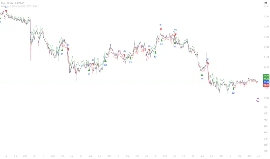
Dilly DivergencesThis script calculates the time series of 5 indicators (Stochastic-RSI, RSI, MACD, CVD, and OBV) searches for divergences, and plots all divergences on the main price chart. Regular divergences = D; Hidden divergences = H

Confluence of Indicators and Signals v1 skvWhy this script
This script will display the buy or sell signals received from indicators, super trend, adx, rsi, macd, sma, and floor pivots along with some tweaked calculations and fixed numbers. This is useful for beginners who want to study the signals and timing to practice. This script is created for educational purpose and can be used for intraday scalping with 5 minutes time frame only after the signals are understood clearly.
How to use
Strong Buy - when series of buy/long signals generated by indicators, bright green up arrow indicates momentum/strength
Strong Sell - when series of sell/short signals generated by indicators, bright orange down arrow indicates momentum/strength
Exits - use the pivot lines, or the RSI-LX, SX exit signals. Also combine with Bollinger Bands to understand the exit points.
Look for reversals at pivot resistance and support.
Disclaimer
1. Only for educational purpose
2. Intraday scalping strategies only and on 5 min timeframe
3. Do paper trade before using any information for actual trading
4. Not swing or positional trade
