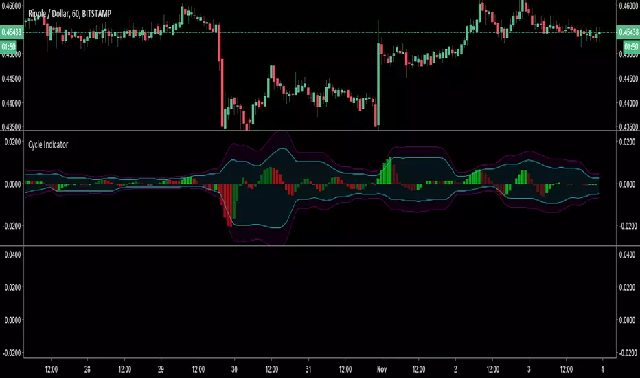
DB ZEMAThe DB ZEMA indicator is a no repaint indicator that is designed to local trends and local tops/bottoms. Since the indicator does not repaint, decisions can be made upon bar/period OPEN.
That means, when the indicator turns red indicating a market top is finished, then a decision can be made to close at the OPEN of that period. Likewise, when the indicator turns green, a decision can be made to buy at OPEN or during the current bar.
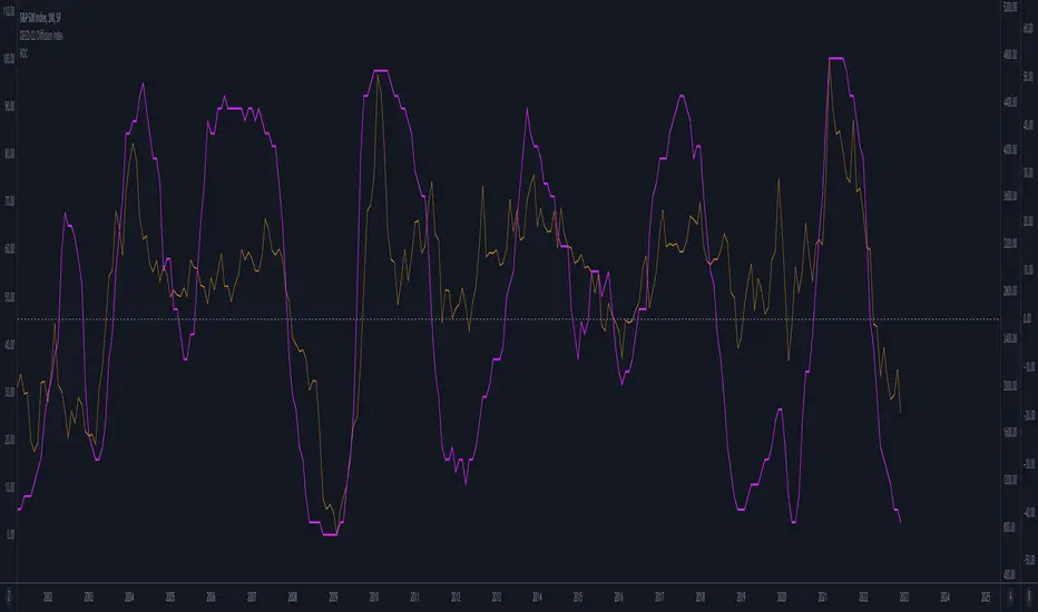
Additionally, traders may use the ZEMA level to get insight on the strength of the asset. For example, when the ZEMA is below -50 that would indicate a major low or weakness is present. ZEMAs under a certain threshold can indicate very good investment long entry points. Alternatively, zooming the chart out to view a long range of periods can show a pattern of common low ZEMA levels can be used as a baseline for good entry points. The same holds true for existing a long or entering a short.
Using a combination of the ZEMA color and the ZEMA level it's can be easy to tell smart entry and exist points. Especially on the weekly or higher timeframes.
For traders wanting real time data, there is a setting to disable the no-repaint mode to display the current real time ZEMA value. Traders may also adjust the length. By default the length of 10 is provided which is excellent for Weekly. We recommend a length of less than 10 for even high timeframes. For example a length of 2 is excellent on 4 Month timeframe for looking at market cycles, etc.
Finally the indicator offers the ability to change the symbol. This can be helpful in crypto in comparing the chart asset again BTC or similar.
Enjoy!
Indicador Pine Script®