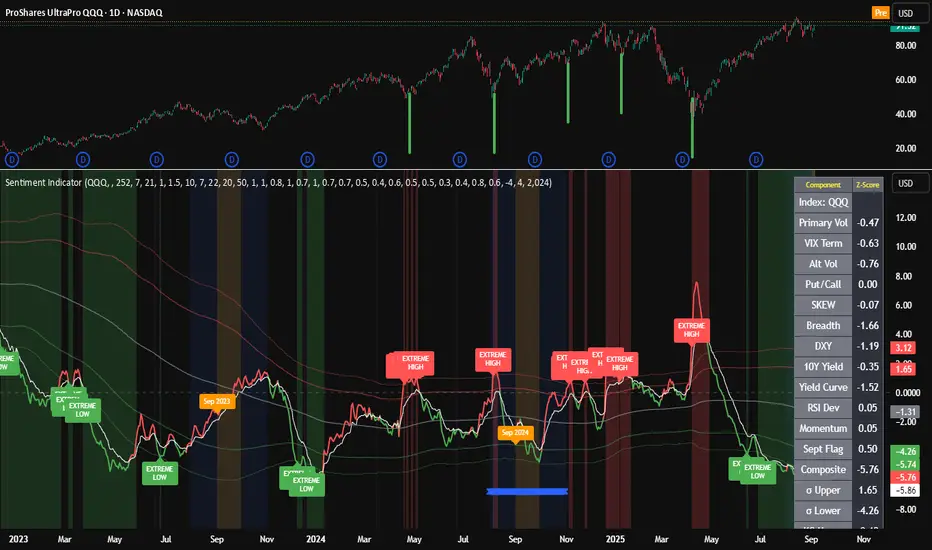
SRT - NK StockTalkSRT stands for Speculation Ratio Territory. It's a technique used in the stock market to identify the top and bottom of an index, which helps define the buying and selling zones.
Here's a brief overview of how it works:
Calculation: The SRT value is calculated by dividing the index value (like Nifty) by the 124-day Simple Moving Average (SMA) on a daily chart.
Range: The SRT value typically ranges between 0.6 (bottom) and 1.5 (top)2.
Investment Strategy:
Buying Zone: Ideal entry points are when the SRT value is between 0.6 and 0.9.
Selling Zone: It's recommended to start booking profits when the SRT value is above 1.3 and exit when it reaches around 1.4
This method helps investors make informed decisions about when to enter or exit the market, aiming for better returns and reduced risks.
Pesquisar nos scripts por "Cycle"
Historical Monthly Returns TrackerThe Historical Monthly Returns Tracker is a powerful Pine Script v5 indicator designed to provide a detailed performance analysis of an asset’s monthly returns over time. It calculates and displays the percentage change for each month, aggregated into a structured table. The indicator helps traders and investors identify seasonal trends, recurring patterns, and historical profitability for a selected asset.
Key Features
✅ Historical Performance Analysis – Tracks monthly percentage changes for any asset.
✅ Customizable Start Year – Users can define the beginning year for data analysis.
✅ Comprehensive Data Table – Displays a structured table with yearly returns per month.
✅ Aggregated Statistics – Shows average return, total sum, number of positive months, and win rate (WR) for each month.
✅ Clear Color Coding – Highlights positive returns in green, negative in red, and neutral in gray.
✅ Works on Daily & Monthly Timeframes – Ensures accurate calculations based on higher timeframes.
How It Works
Data Collection:
The script fetches monthly closing prices.
It calculates month-over-month percentage change.
The values are stored in a matrix for further processing.
Table Generation:
Displays a structured table where each row represents a year, and each column represents a month (Jan–Dec).
Monthly returns are color-coded for easy interpretation.
Aggregated Statistics:
AVG: The average return per month across all available years.
SUM: The total cumulative return for each month.
+ive: The number of times a month had positive performance vs. total occurrences.
WR (Win Rate): The percentage of times a month had a positive return.
Use Cases
📈 Seasonality Analysis: Identify which months historically perform better or worse.
📊 Risk Management: Plan trading strategies based on historical trends.
🔍 Backtesting Aid: Support algorithmic and discretionary traders with real data insights.
🔄 Asset Comparison: Compare different stocks, forex pairs, or cryptocurrencies for their seasonal behavior.
How to Use
Apply the Indicator to a chart in TradingView.
Ensure your timeframe is Daily or Monthly (lower timeframes are not supported).
The table will automatically populate based on available historical data.
Analyze the patterns, trends, and win rates to optimize trading decisions.
Limitations
⚠️ Requires a sufficient amount of historical data to provide accurate analysis.
⚠️ Works best on high-liquidity assets (stocks, indices, forex, crypto).
⚠️ Not a predictive tool but rather a historical performance tracker.
Final Thoughts
The Historical Monthly Returns Tracker is an excellent tool for traders seeking to leverage seasonal trends in their strategies. Whether you're a stock, forex, or crypto trader, this indicator provides clear, data-driven insights to help refine entry and exit points based on historical patterns.
🚀 Use this tool to make smarter, more informed trading decisions!
Enhanced RSIEnhanced RSI with Phases, Divergences & Volume Control:
This advanced RSI indicator expands on the traditional Relative Strength Index by introducing dynamic exhaustion phase detection, automatic divergence identification, and volume-based control evaluation. It provides traders with actionable insights into trend momentum, potential reversals, and market dominance.
Key Features:
Dynamic Exhaustion Phases:
Identifies real phases of the RSI based on slope and momentum:
Acceleration: Momentum increasing rapidly (green phase).
Deceleration: Momentum weakening (red phase).
Plateau: Momentum flattening (yellow phase).
Neutral: No significant momentum shift detected.
Phases are displayed dynamically in a box on the chart.
Automatic Divergence Detection:
Bullish Divergence: Identified when price makes a lower low while RSI makes a higher low.
Bearish Divergence: Identified when price makes a higher high while RSI makes a lower high.
Divergences are marked directly on the RSI chart with labeled circles.
Volume-Based Control Evaluation:
Analyzes price action relative to volume to determine market dominance:
Bulls in Control: Closing price is higher than the opening price.
Bears in Control: Closing price is lower than the opening price.
Neutral: No significant dominance (closing equals opening).
Volume status is displayed alongside the RSI phase in the chart’s top-left box.
Custom RSI Plot:
Includes overbought (70), oversold (30), and neutral (50) levels for easier interpretation of market conditions.
RSI plotted in blue for clarity.
How to Use:
Add to Chart:
Apply this indicator to any chart in TradingView.
Interpret the RSI Phase Box:
Use the RSI phase (Acceleration, Deceleration, Plateau, Neutral) to identify trend momentum.
Combine the phase with the volume status (Bulls or Bears in Control) to confirm market sentiment.
Identify Divergences:
Look for Bullish Divergence (potential upward reversal) or Bearish Divergence (potential downward reversal) marked directly on the RSI chart.
Adjust Settings:
Customize the RSI period, phase sensitivity, and divergence lookback period to fit your trading style.
Disclaimer:
This indicator is a tool to assist with technical analysis. It is not a financial advice or a guarantee of market performance. Always combine this indicator with other methods or strategies for better results.
New Day DividerPlots vertical dividers on your chart to mark the beginning of a new trading day based on your preferred time convention.
✅ Customizable New Day Start Time:
"Use Midnight" → Marks the start of a new day at 00:00 (midnight) in the selected timezone.
"Use Digital Open" → Marks the start of a new day at 18:00 New York time, commonly used for digital asset trading.
✅ Full Timezone Support:
Choose from all U.S. time zones (default: New York).
Supports UTC and full UTC offset adjustments for global traders.
✅ Customizable Line Appearance:
Select divider color, width, and style (Solid, Dashed, or Dotted).
RoGr75 - Global Exchange Open/Close SignalsGlobal Exchange Open/Close Signals Indicator
This indicator helps traders track market hours for major global exchanges (NYSE, LSE, TSE, HKEX, and ASX) with these key features:
• Real-time Status Dashboard: Shows which exchanges are currently open/closed with an easy-to-read color-coded display (Green = Open, Red = Closed)
• Visual Market Open/Close Signals: Displays gradient background lines when your selected exchange opens (green) or closes (red)
• Timezone Adjustment: Easily adapt the indicator to your local timezone using the UTC offset setting
Supported Exchanges and Trading Hours (UTC):
• NYSE: 13:30 - 20:00 (9:30 AM - 4:00 PM ET)
• LSE: 08:00 - 16:30 (8:00 AM - 4:30 PM London)
• TSE: 00:00 - 06:30 (9:00 AM - 3:30 PM Tokyo)
• HKEX: 01:30 - 08:00 (9:30 AM - 4:00 PM HK)
• ASX: 00:00 - 06:00 (10:00 AM - 4:00 PM Sydney)
Settings:
• Select Exchange: Choose which exchange to monitor for open/close signals
• Show Dashboard: Toggle the exchange status dashboard on/off
• User Timezone Offset: Adjust the display to your local timezone (in UTC)
Use Cases:
• Monitor multiple exchange hours simultaneously
• Get visual alerts for market opens and closes
• Coordinate trading across different time zones
• Plan entries and exits around market hours
• Manage global trading portfolios effectively
Note: The indicator handles timezone conversions and markets crossing midnight automatically. Times are based on standard trading sessions and may not reflect holidays or special trading hours.
US 20Y Treasury YieldWhat This Indicator Does
This Pine Script creates a custom indicator for TradingView that displays the US 20-Year Treasury Yield (US20Y) on your chart. Here's what it does step by step:
1. What Is the US 20-Year Treasury Yield?
The US 20-Year Treasury Yield is a financial metric that shows the interest rate (or yield) investors earn when they buy US government bonds that mature in 20 years. It’s an important indicator of the economy and can influence other markets like stocks, bonds, and currencies.
2. How Does the Indicator Work?
The indicator fetches the latest data for the US 20-Year Treasury Yield from TradingView's database.
It then plots this data in a separate pane below your main chart, so you can easily monitor the yield without cluttering your price chart.
3. What Does the Indicator Show?
A blue line is drawn in the separate pane, showing the movement of the US 20-Year Treasury Yield over time.
A gray dashed line is added at the 4.0% level as a reference point. You can use this line to quickly see when the yield is above or below 4.0%.
5. Why Use This Indicator?
Monitor Economic Trends : The US 20-Year Treasury Yield is a key economic indicator. By plotting it on your chart, you can stay informed about changes in interest rates and their potential impact on other markets.
Master Litecoin Dominance Network Value ModelUse this indicator on the LTC.D (Litecoin daily) chart to get a comprehensive view of Litecoin's network value relative to Bitcoin. It analyzes on-chain metrics and market data to help assess Litecoin's intrinsic worth and market trends.
Jerusalem Session Weekday MarkingJerusalem Session Weekday Marking
This indicator applies a background color to each trading day based on the Jerusalem time zone (Asia/Jerusalem). It's a simple, no-frills tool for traders operating in markets that follow a Sunday-Thursday business week.
How It Works:
Monday to Thursday → Red background (Regular trading days)
Friday to Sunday → Green background (Weekend/non-standard trading days)
Background coloring applies to the entire day (not just session hours).
Why Use This?
Designed for traders focusing on Middle Eastern, Israeli, and Forex markets.
Helps differentiate trading days at a glance in a market where Friday-Saturday weekends are standard.
Works automatically with Jerusalem timezone, no manual adjustments needed.
🚀 Simple, effective, and useful for traders who care about local trading schedules. 🚀
Custom Time K-barCustom Time K-bar Indicator
This custom indicator highlights specific times on the chart, helping traders identify key moments based on user-defined time intervals. The script is designed to highlight two distinct times with different colors, which can be customized to suit the trader's needs.
Features:
Custom Time Inputs: Set two specific times in hours and minutes (e.g., 09:00 and 22:30).
Highlighting on Chart: The chart background changes color when the current time matches the defined times. Green for the first time and red for the second time.
Dynamic Labels: Labels display the exact time at the lowest and highest points of the corresponding candles, showing the user-defined times in a clear and visible format.
Timezone Adjustment: The indicator is adjusted for the GMT+8 timezone.
Customization:
Easily adjust the two key times and customize the colors for highlighting.
The script allows for easy tracking of key time events, which can be crucial for strategies that rely on specific timings during market hours.
This indicator is ideal for traders who want to track and visualize important times dynamically on the chart. Whether you're focusing on specific market events or just want to see certain time intervals highlighted, this script can help streamline your analysis.
Relative Strength Index With Range ZoneRSI (Relative Strength Index) with 45-55 Range Zone
1. Introduction and Historical Background
The Relative Strength Index (RSI) is a momentum indicator developed in 1978 by J. Welles Wilder Jr. It measures the speed and magnitude of price changes to assess overbought and oversold conditions of an asset. This widely used oscillator ranges between 0 and 100.
Historically, the RSI was mainly used to detect trend reversals by identifying extreme levels: above 70 (overbought) and below 30 (oversold). However, its application has evolved, and new approaches refine its interpretation, such as adding a 45-55 neutral zone to identify consolidation (range) periods.
2. RSI Calculation
The RSI is calculated using the following formula:
RSI=100−(1001+RS)RSI=100−(1+RS100)
Where:
RS=Average gain over N periodsAverage loss over N periodsRS=Average loss over N periodsAverage gain over N periods
• RS (Relative Strength) is the ratio between the average gains and the average losses over N periods (typically 14 periods).
• Gains and losses are calculated based on daily price variations.
Example calculation with a 14-day period:
1. Compute daily gains and losses.
2. Take an exponential or simple moving average of these values over 14 days.
3. Apply the formula to get the RSI value.
3. Classic RSI Usage
The RSI is typically interpreted as follows:
• RSI > 70: Overbought → Possible correction or bearish reversal.
• RSI < 30: Oversold → Possible rebound or bullish reversal.
• RSI between 50 and 70: Bullish momentum.
• RSI between 30 and 50: Bearish momentum.
4. Adding the 45-55 Zone to Identify Range Phases
Adding a neutral zone between 45 and 55 helps identify consolidation periods, when price moves sideways without a strong trend.
• RSI between 45 and 55: The market is in a range, meaning neither buyers nor sellers dominate.
• RSI breaking out of this zone:
o Above 55: Indicates the start of a bullish trend.
o Below 45: Indicates the start of a bearish trend.
This zone is particularly useful for:
• Avoiding false signals by waiting for trend confirmation.
• Identifying ranging markets, favoring range trading strategies (buying at support, selling at resistance).
• Filtering trend-based entries, waiting for the RSI to exit the 45-55 zone.
5. Trading Strategies Using RSI with the 45-55 Range Zone
1. Range Trading:
• When the RSI oscillates between 45 and 55, it signals a lack of strong trend.
• Strategy:
o Identify a support and resistance level.
o Buy near support when the RSI touches 45.
o Sell near resistance when the RSI touches 55.
2. Breakout Trading:
• If the RSI exits the 45-55 zone:
o Above 55 → Buy (start of a bullish trend).
o Below 45 → Sell (start of a bearish trend).
• This breakout can be used as a confirmed entry signal.
3. Confirmation with Divergences:
• A bullish divergence (price making lower lows while RSI makes higher lows) is more relevant if the RSI moves above 55.
• A bearish divergence (price making higher highs while RSI makes lower highs) is stronger if the RSI drops below 45.
6. Conclusion
The RSI is a powerful tool for analyzing price momentum. Adding a 45-55 zone enhances its usage by clearly distinguishing:
• Consolidation phases (range markets).
• Trend beginnings when RSI breaks out of this range.
This approach improves RSI reliability by filtering out false signals and allowing traders to adapt their strategy based on market conditions.
5am C.R.T.Here’s a rewritten description for your **Custom Time Frame OHLC Indicator** that complies with **TradingView's House Rules** and focuses on the core functionality of the indicator: drawing the **Open, High, Low, Close (OHLC)** for a custom time frame and providing alerts when the range is broken. The description is concise, clear, and adheres to TradingView's guidelines.
---
### **Custom Time Frame OHLC Indicator with Range Break Alerts**
This indicator is designed to help traders identify key price levels by drawing the **Open, High, Low, and Close (OHLC)** for a **custom time frame**. It also provides **alerts** when the price breaks above the high or below the low of the defined range. This tool is ideal for traders who rely on specific time-based ranges for their trading strategies.
---
#### **Key Features**
1. **Custom Time Frame OHLC:**
- Draws the **Open, High, Low, and Close (OHLC)** levels for a user-defined time frame (e.g., 5AM, 9AM, or any custom time).
- The OHLC levels are displayed as horizontal lines on the chart, making it easy to visualize the range.
2. **Range Break Alerts:**
- Sends **alerts** when the price breaks above the high or below the low of the defined range.
- Alerts can be customized to notify traders via email, SMS, or TradingView's notification system.
3. **Flexible Time Frame:**
- Traders can set the **custom time frame** to match their preferred trading session or strategy (e.g., 5AM for the 5AM CR Model or any other time).
4. **Clean and Simple Visualization:**
- The OHLC levels are displayed as clear horizontal lines, ensuring the chart remains uncluttered and easy to interpret.
---
#### **How to Use the Indicator**
1. **Set the Custom Time Frame:**
- Input the desired time (e.g., 5:00 AM) in the indicator settings.
- The indicator will automatically draw the **Open, High, Low, and Close (OHLC)** levels for that specific time frame.
2. **Monitor the Range:**
- Use the OHLC levels as reference points for potential support, resistance, or breakout zones.
- The high and low of the range act as key levels for breakout or reversal strategies.
3. **Receive Alerts:**
- When the price breaks above the high or below the low of the range, the indicator will trigger an alert.
- Traders can use these alerts to take action based on their trading strategy.
---
#### **Customizable Parameters**
- **Custom Time:** Set the specific time for the OHLC levels (e.g., 5:00 AM, 9:00 AM, etc.).
- **Alert Settings:** Enable or disable alerts for range breaks (high or low).
- **Line Colors:** Customize the colors of the OHLC lines for better visualization.
---
#### **Why This Indicator is Useful**
- **Simplifies Range Identification:** Automatically draws the OHLC levels for any custom time frame, saving traders time and effort.
- **Alerts for Breakouts:** Provides real-time alerts when the price breaks the range, helping traders act quickly on potential trading opportunities.
- **Flexible and Customizable:** Works with any time frame and can be tailored to fit various trading strategies.
---
#### **Limitations**
- **Time-Sensitive:** The indicator is most useful when the custom time frame aligns with key market sessions or trading strategies.
- **No Predictive Power:** The indicator does not predict future price movements. It simply identifies the OHLC levels and alerts when the range is broken.
- **Manual Confirmation:** Traders should use additional analysis (e.g., trend, volume, or other indicators) to confirm trading decisions.
---
#### **Compliance with TradingView Rules**
- **English Title and Description:** The title and description are in English, with no all-caps or special characters.
- **Original and Useful:** The indicator is original and adds value to the TradingView community by simplifying the process of identifying OHLC levels and range breaks.
- **No Misleading Claims:** The description clearly states the indicator's purpose, limitations, and how it should be used.
- **No Lookahead Bias:** The script does not use `request.security()` with lookahead to access future data.
---
### **Example Chart Setup**
- **Clean Chart:** The indicator is published with a clean chart, showing the OHLC levels for the custom time frame (e.g., 5:00 AM).
- **Symbol/Timeframe:** The chart includes complete symbol and timeframe information for clarity.
---
### **Conclusion**
The **Custom Time Frame OHLC Indicator with Range Break Alerts** is a simple yet powerful tool for traders who rely on specific time-based ranges in their trading strategies. By automating the process of drawing OHLC levels and providing alerts for range breaks, this indicator helps traders stay informed and act quickly on potential trading opportunities.
---
This description is concise, compliant with TradingView's rules, and clearly explains the functionality and purpose of the indicator. It avoids making unrealistic claims and focuses on the practical use of the tool.
[Daily] CRT with OHLC Reference Here’s a breakdown of Daily CRT:
1. What is Daily CRT?
Daily CRT focuses on the price action of daily candles, treating them as ranges that can be broken or manipulated.
The theory suggests that certain candles on the daily chart form ranges that act as key levels for price expansion or reversal.
These ranges are not just simple support and resistance levels but are tied to the concept of liquidity draws, where price is likely to move towards areas where liquidity is concentrated (e.g., highs, lows, or key levels).
2. Key Components of Daily CRT
Ranging Candle: The first candle in the CRT setup establishes the range. This candle’s high and low become the key levels to watch.
Manipulation Candle: The second candle often manipulates the range by either breaking it or testing it. This is where turtle soup (false breakouts) can occur.
Distribution Candle: The third candle is where the price either confirms the breakout or reverses, leading to a potential expansion in the opposite direction.
3. How to Use Daily CRT
Identify the Range: On the daily chart, identify a candle that forms a clear range (high and low). This is your Ranging Candle.
Watch for Manipulation: The next candle (Manipulation Candle) will often test or break the range. If it breaks the range but then reverses back inside, it’s a turtle soup (false breakout), indicating a potential reversal.
Trade the Distribution: The third candle (Distribution Candle) is where you look for confirmation. If the price breaks the range and continues in the same direction, it’s a true breakout. If it reverses, it’s a false breakout, and you can trade the reversal.
4. Daily CRT and Key Levels
Daily CRT works best when combined with higher timeframe key levels (e.g., weekly or monthly highs/lows, order blocks, fair value gaps, etc.).
The daily candle ranges often align with these key levels, providing confluence for potential reversals or expansions.
5. Time Alignment in Daily CRT
Time is a critical factor in CRT. The PDF emphasizes that the highest probability CRT setups occur at specific times of the day or week.
For example, the purge (breakout or reversal) of a daily CRT often happens during key trading sessions (e.g., London open, New York open).
6. Practical Steps for Daily CRT
Determine the Draw on Liquidity: Use higher timeframe analysis (weekly or monthly) to identify where price is likely to move (e.g., towards a key level or liquidity pool).
Identify the Daily Range: On the daily chart, mark the high and low of the ranging candle.
Watch for Manipulation: Observe the next candle to see if it breaks the range or tests it. Look for signs of turtle soup (false breakouts).
Trade the Distribution: Once the third candle confirms the direction (either breakout or reversal), enter the trade with proper risk management.
7. Example of Daily CRT
Ranging Candle: On Monday, a daily candle forms a range between 1.1000 (low) and 1.1100 (high).
Manipulation Candle: On Tuesday, the price breaks below 1.1000 but then reverses back above it, forming a turtle soup (false breakout).
Distribution Candle: On Wednesday, the price confirms the reversal by breaking above 1.1100, signaling a potential bullish expansion.
8. Integration with Other Concepts
Daily CRT should not be used in isolation. It works best when combined with other ICT concepts like:
Market Profiles: Understanding whether the market is in a ranging, expansion, or reversal phase.
Orderflow: Identifying bullish or bearish orderflow to confirm the direction of the CRT.
Key Levels: Using higher timeframe key levels to add confluence to the CRT setup.
Time: Aligning the CRT with key times (e.g., London open, New York open) for higher probability setups.
9. Risk Management in Daily CRT
Always use proper risk management when trading CRT setups. The PDF suggests risking no more than 0.5% of your account per trade.
Use stop-losses and position sizing to protect your capital, especially since CRT setups can involve false breakouts (turtle soups).
10. Summary
Daily CRT is a powerful tool for identifying key levels and potential price expansions or reversals on the daily chart.
It involves analyzing three key candles: the Ranging Candle, the Manipulation Candle, and the Distribution Candle.
The theory is most effective when combined with higher timeframe key levels, market profiles, orderflow, and proper time alignment.
By mastering Daily CRT, you can improve your ability to predict market movements and frame high-probability trades.
Time LinesWe can count time using a calendar
OR we can use our price charts
Here we are counting how much time has passed and it is expressed as a diagonal line on our time/price chart
Set the tool to any starting date, and it will begin to count
Set the "End Time" wherever you would like, the table in the right corner will give you the time between the two dates for the active options you've set
The table for now is only visible on a black or dark background colour
I might update at some point, but I like how simple the script is right now
This tool will probably generate some questions, I can't be sure I have an answer; but not a big deal - play around!
BTC ETF Inflows and Outflows with Combined BTC CorrelationThis script tracks Bitcoin Spot ETF inflows and outflows, calculating their correlation with Bitcoin's price to identify market trends and sentiment. It provides visual insights into ETF flows and the relationship with BTC price movements.
NOTE: The script relies on volume and opens / closes for calculating inflows and outflows. An ETF might issue more shares, which would skew the numbers.
Alternate RTH Background OnlyThis “Alternate RTH Background Only” script highlights the chart background in alternating colors for each new day during the regular trading session (9:30–16:00 EST). It detects the start of a new calendar day (midnight) to increment its day counter, then applies a different semi-transparent color to the 9:30–16:00 bars for easy daily separation. No lines or indicators are plotted—only the background shading changes each day.
U.S. Recessions Since 1900The indicator shows US Recessions since 1900 as a background color on the price chart. It was created with TradeSage Claude AI.
World Digital Clock Original code developed by br.tradingview.com
In this update I added the Frankfurt stock exchange, left the times according to Western Europe, and added another light signal to identify whether the stock exchange is open or closed.
This indicator provides a digital clock and real-time status for major financial markets, including Tokyo, London, New York, and Frankfurt. It displays whether each market is currently OPEN or CLOSED, along with the time remaining until the market opens or closes. The indicator is designed to keep traders informed about market activity at a glance.
Key Features:
Digital Clock:
Displays the current time based on a user-defined UTC offset.
Customizable text color, size, and background color.
Market Status:
Shows whether each major market is OPEN or CLOSED.
Displays a countdown timer indicating the time remaining until the market opens or closes.
Includes markets for Tokyo, London, New York, and Frankfurt.
Color Indicators:
A green dot indicates the market is open.
A red dot indicates the market is closed.
Text colors for open and closed markets can be customized.
Customizable Layout:
Choose the table position on the chart (e.g., top right, bottom left).
Adjust text sizes for both the clock and market status.
Daylight Saving Time:
Automatically adjusts market opening and closing times based on daylight saving rules (e.g., summer and winter time).
Alerts:
Optionally triggers alerts when a market opens, keeping you updated in real-time.
Use Cases:
Perfect for day traders or swing traders who need to monitor global market activity.
Useful for keeping track of trading hours and planning strategies based on market availability.
Helps avoid trading outside active market hours, reducing slippage and volatility risks.
This versatile and customizable tool ensures you're always aware of market status and time zones, enhancing your trading efficiency and decision-making.
Master Bitcoin & Litecoin Stock To Flow (S2F) ModelMaster Bitcoin & Litecoin Stock-to-Flow (S2F) Model
This indicator visualizes the Stock-to-Flow (S2F) models for Bitcoin (BTC) and Litecoin (LTC) based on Plan B's methodology. It calculates S2F and projects price models for both assets, incorporating daily changes in circulating supply. The script is designed exclusively for daily timeframes.
Features:
LTC & BTC S2F Models:
Calculates Stock-to-Flow values for both assets using daily new supply and circulating supply data.
Models S2F values with a customizable multiplier for precise adjustments.
500-Day Moving Average Models:
Smoothens the S2F model by applying a 500-day (18-month) moving average, providing a long-term trend perspective.
Customizable Inputs:
Adjust LTC and BTC multipliers to fine-tune the models.
Alert for Timeframe:
Alerts users to switch to the daily timeframe if another period is selected.
Plots:
LTC S2F Model: Blue line representing Litecoin’s calculated S2F-based price model.
BTC S2F Model: Orange line representing Bitcoin’s calculated S2F-based price model.
500-Day Avg Models: Smoothened S2F models for both LTC and BTC.
Notes:
Requires daily timeframe (1D) for accurate calculations.
Supply data is sourced from GLASSNODE:LTC_SUPPLY and GLASSNODE:BTC_SUPPLY.
Disclaimer:
This model is derived from Plan B's S2F methodology and is intended for educational and entertainment purposes only. It does not reflect official predictions or financial advice. Always conduct your own research before making investment decisions.
Adaptive Trend Finder - Pulse Frequency(Basic)The Adaptive Pulse Frequency & Amplitude Trend Indicator is a Pine Script-based tool designed for lower timeframe volume analysis and trend detection. By analyzing volume dynamics and identifying significant "pulses" in market activity, this indicator provides insights into bullish and bearish trends. Here's an overview of its key features and components:
1. Lower Timeframe Volume Analysis
Custom Timeframe Input: The indicator scans lower timeframe data to approximate Up/Down volume, with an optional override to set a custom timeframe.
Volume Delta Calculation: Tracks changes in volume (deltaVolume), representing the difference between up and down volume for each bar.
2. Adaptive Pulse Detection
Rolling Percentile Threshold: Dynamically calculates a threshold based on the pulsePercentile of the absolute delta volume within a specified lookback period (pulseLookback).
Pulse Identification: Bars where the absolute delta volume exceeds the adaptive threshold are classified as "pulses," indicating significant market activity.
Bullish Pulse: Positive delta volume exceeding the threshold.
Bearish Pulse: Negative delta volume exceeding the threshold.
3. Frequency & Amplitude Analysis
Pulse Frequency: Measures the number of bullish or bearish pulses within a rolling window (freqLookback), providing insights into the activity level.
Pulse Amplitude: Computes the cumulative volume delta for bullish and bearish pulses over a defined period (ampLookback), offering a finer view of market strength:
Bullish Amplitude: Sum of positive delta volume for bullish pulses.
Bearish Amplitude: Sum of absolute delta volume for bearish pulses.
4. Trend Logic
Trend Classification:
Bullish Trend: Higher bullish pulse frequency and amplitude.
Bearish Trend: Higher bearish pulse frequency and amplitude.
Neutral Trend: Mixed or inconclusive signals.
Advanced Metrics: Combines frequency and amplitude for robust trend assessment.
5. Visualization
Dynamic Threshold: Plots the adaptive threshold for real-time pulse detection.
Trend Visualization: Colors the chart background based on the identified trend (Bullish, Bearish, Neutral).
Amplitude and Frequency Lines: Displays separate plots for:
Net Frequency (Bullish - Bearish pulses).
Net Amplitude (Bullish amplitude - Bearish amplitude).
Individual bullish and bearish amplitudes for reference.
Use Case
This indicator is ideal for traders seeking to:
Analyze market activity on lower timeframes.
Identify shifts in bullish/bearish momentum through volume dynamics.
Enhance trend-following strategies with adaptive frequency and amplitude metrics.
With its focus on precision and adaptability, the Adaptive Pulse Frequency & Amplitude Trend Indicator is a powerful tool for volume-based market analysis.
Bidirectional Momentum Aggregator w/ Time Weighting Intrabar Data Extraction:
The script optionally harnesses lower time frame data (e.g., per-second intervals) for high and low prices within each primary bar. You can set it to the current chart time but if you want to use intrabar data it uses the request.security_lower_tf() to properly pull intrabar data.
This fine-grained data enables an in-depth examination of the price action that occurs within a standard timeframe, enhancing the ability to detect subtle market movements.
A key threshold based on Average True Range (ATR) is used to measure significant price changes intrabar, adding a robust filter for volatility sensitivity.
Cumulative Time-to-Threshold Analysis:
The indicator tracks how long it takes for price changes to reach specified thresholds, marking critical time points when upward or downward price movements exceed these levels. This approach provides insights into the speed and intensity of directional shifts within the market.
The calculated time-to-threshold values act as temporal markers that influence subsequent momentum weighting.
Bidirectional Momentum Calculation:
Momentum is assessed in two directions (upward and downward) using a comprehensive array of price changes.
Adaptive Weighting Mechanism:
Each momentum value is weighted by the calculated time-to-threshold, giving preference to momentum that occurs more rapidly and aligning with potential breakout conditions.
The script also factors in correlations between momentum and price change, ensuring that only the most relevant signals contribute to the final analysis.
Iterative Length Analysis:
By iterating over a range of lengths (e.g., 100 to 200 periods), the script aggregates data to assess momentum across different time scales. This provides a more holistic view of market behavior, accommodating both short-term fluctuations and longer-term trends.
Each length is evaluated using moving averages and correlations to determine its contribution to the total weighted momentum.
Final Aggregated Output:
The weighted sums of upward and downward momentum are normalized by the total weight to produce a final composite metric.
The indicator plots these results as separate upward and downward momentum lines, offering traders a visual representation of which direction holds more momentum strength over various intervals.
Practical Application:
This indicator's advanced design is tailored for traders who require a deeper understanding of price movement dynamics and the underlying forces driving market momentum. By incorporating intrabar data, adaptive time-to-threshold calculations, and iterative analysis, this tool seeks to provide a clearer view of potential market direction shifts and their timing.
The indicator can be used to:
Identify potential breakout or reversal points by observing significant shifts in weighted momentum.
Gauge the relative strength of uptrends and downtrends through the plotted momentum lines.
Enhance decision-making with an additional layer of granularity from intrabar data.
In essence, this script is an ambitious attempt to blend multi-scale analysis, momentum dynamics, and time-weighted evaluation, creating a unique approach to understanding market behavior beyond conventional indicators.
Candle-Based Negative Space (Improved)This script visualizes the concept of negative space (when a candle closes below a defined baseline) and positive space (when a candle closes above the baseline) on a price chart. It uses user-defined inputs to configure the baseline and optionally includes a moving average for additional trend analysis. Below is a detailed explanation of the script and suggestions for improving its plotting.
Explanation of the Script
Purpose
The script helps traders visualize the relationship between price movements and a dynamically chosen baseline. The baseline can be based on:
The high/low of the previous candle.
The open/close of the current candle.
The "negative space" is calculated when the closing price is below the baseline, and the "positive space" is calculated when the closing price is above the baseline. The sum of these spaces over a period is plotted as a histogram to provide insights into market strength.
German Market Opening UTC+1Description:
This script highlights the opening time of the German stock market (08:00 UTC+1) on a TradingView chart. It is designed to help traders quickly identify market openings and analyze price movements during this key trading period.
Key Features:
Market Opening Identification:
Automatically detects the exact moment the German stock market opens each day (08:00 UTC+1).
Marks the opening with a vertical line spanning the entire chart and a label for visual clarity.
Custom Indicators:
A blue line is drawn from the lowest to the highest price of the opening candle, extending across the chart to visually indicate the start of the trading day.
A labeled marker reading "DE-Opening" is placed at the top of the opening candle for additional clarity.
Ease of Use:
Simple overlay indicator that works seamlessly on any timeframe chart.
Helps traders focus on key opening price action.
Use Case:
This script is particularly useful for day traders and scalpers who want to identify and analyze the price behavior around the opening of the German stock market. It provides a visual cue to help traders develop strategies or make informed decisions during this active trading period.
Note:
Ensure your chart’s timezone is set to match UTC+1 or appropriately adjust for your location to ensure accurate time alignment.
If you have questions or suggestions, feel free to provide feedback!
Hossa Indicator PureThe Hossa Indicator Pure is a custom technical analysis tool designed to measure market volatility and momentum using normalized Ichimoku-based calculations. It identifies overbought and oversold conditions, providing traders with insights into potential trend reversals or continuation points.
Key Features:
Ichimoku-Based Volatility Analysis:
Calculates volatility using the difference between Tenkan-sen, Kijun-sen, and Senkou Span B.
Incorporates a normalized "Kumo depth" calculation for enhanced volatility insights.
Normalization with Dynamic Bands:
Smooths raw volatility data using a moving average and adjusts it with a standard deviation multiplier.
The normalized indicator is scaled between custom overbought and oversold levels, making it adaptable to different market conditions.
Overbought and Oversold Alerts:
Generates alerts when the indicator crosses into overbought or oversold zones, allowing traders to act promptly.
Dynamic Color-Coded Trend Visualization:
Displays the indicator line in green for upward momentum and red for downward momentum, providing an at-a-glance view of market conditions.
Customizable Inputs:
Tenkan-sen Period: Controls the short-term trend sensitivity.
Kijun-sen Period: Adjusts the medium-term trend.
Senkou Span B Period: Configures the long-term trend baseline.
Smoothing Period: Refines volatility analysis.
Standard Deviation Multiplier: Tailors the sensitivity of the overbought/oversold zones.
Overbought/Oversold Levels: Defines thresholds for signal generation.
How It Works:
Ichimoku Calculations:
Tenkan-sen and Kijun-sen are calculated as averages of the highest high and lowest low over their respective periods.
Future Span A and Future Span B form the basis for volatility depth (Kumo depth).
Volatility Normalization:
The raw Kumo depth is smoothed using a moving average and normalized using statistical bands (average ± standard deviation).
Signal Generation:
Overbought signals are triggered when the normalized indicator exceeds the overbought level.
Oversold signals are generated when the indicator falls below the oversold level.
Visual Representation:
Plots a normalized indicator line with dynamic colors based on momentum.
Includes horizontal dashed lines marking the overbought and oversold thresholds.
Alerts:
Customizable alerts notify traders when overbought or oversold conditions are met.
How to Use:
Set Input Parameters:
Adjust the periods for Tenkan-sen, Kijun-sen, and Senkou Span B to align with your trading style (e.g., shorter periods for scalping, longer for swing trading).
Configure smoothing and standard deviation multiplier to control signal sensitivity.
Monitor Indicator Line:
Look for overbought and oversold conditions based on the defined thresholds.
Use dynamic line colors to identify potential trend reversals (green for bullish, red for bearish).
Alerts:
Set alerts to notify you of overbought/oversold conditions to stay updated without constant chart monitoring.
The Hossa Indicator Pure provides a versatile tool for volatility analysis and momentum detection, suitable for traders seeking precise and customizable insights into market conditions.
ATT + Key Levels with SessionsKey Features:
ATT Turning Point Numbers:
This input allows the user to define specific numbers (e.g., "3,11,17,29,41,47,53,59") that mark turning points in price action, which are checked using the bar_index modulo 60. If the current bar index matches one of these turning points, it triggers potential buy or sell signals.
RSI (Relative Strength Index):
The RSI is calculated based on a user-defined period (rsi_period), typically 14, and used to indicate overbought or oversold conditions. The script defines overbought (70) and oversold (30) levels, which are used to filter buy or sell signals.
Session Times:
The script includes predefined session times for major trading markets:
New York: From 9:30 AM EST to 4:00 PM EST.
London: From 8:00 AM GMT to 4:30 PM GMT.
Asia: From 12:00 AM GMT to 9:00 AM GMT.
These session times are used to restrict the buy and sell signals to specific market sessions.
Key Levels:
The script calculates and plots key market levels for the current day and week:
Daily High and Low: The highest and lowest prices of the current day.
Weekly High and Low: The highest and lowest prices of the current week.
These levels are plotted with different colors for visual reference.
Signal Logic:
Buy Signal: Triggered when the current bar is a turning point (according to the ATT model), the RSI is below the oversold threshold, and the current time is within the active session times (New York, London, or Asia).
Sell Signal: Triggered when the current bar is a turning point, the RSI is above the overbought threshold, and the current time is within the active session times.
Signal Limitations:
A user-defined limit (max_signals_per_session) controls the maximum number of signals that can be plotted within each session. This prevents excessive signal generation.
Plotting and Background Highlights:
Buy and Sell Signals: The script plots shapes (labels) above or below the bars to indicate buy or sell signals when the conditions are met.
Background Highlight: The background color is highlighted in yellow when the current bar matches one of the defined ATT turning points.
In Summary:
The indicator combines multiple technical factors to generate trading signals:
Turning points in price action (based on custom ATT numbers),
RSI levels (overbought/oversold),
Market session times (New York, London, Asia),
Key price levels (daily and weekly highs and lows).
This combination helps traders identify potential buying and selling opportunities while considering broader market dynamics and limiting the number of signals during each session.