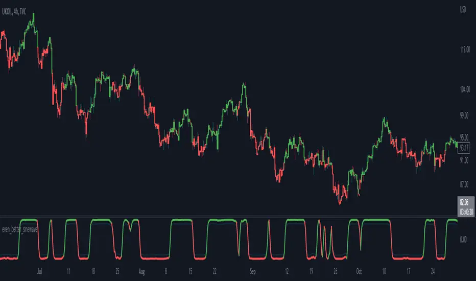
The Ultimate strategy by ATK**The Ultimate Strategy by ATK**
This comprehensive trading script is designed to enhance market analysis and trading strategies by integrating advanced tools for market structure, SMT (Separation and Divergence), Fair Value Gaps (FVG), and session-based insights. With customizable features, real-time alerts, and multi-timeframe functionality, this script caters to both scalpers and long-term traders seeking deeper market insights.
### 🔵 **Key Features**
**🔹 SMT (Divergence) Detection:**
- **High/Low SMT Analysis:** Compares highs and lows between a primary symbol (e.g., NQ1!) and a user-defined comparison symbol (e.g., ES1!).
- Automatically visualizes discrepancies with red (highs) and green (lows) lines.
- Supports two modes: real-time comparison and historical range checks.
- Alerts for detected SMT conditions.
- **Close Price SMT Analysis:** Compares closing prices to highlight divergences.
- Includes user-defined lookback periods and granular cycle-based SMT detection.
**🔹 PSP (Precision Swing Point):**
- Detects and highlights price divergences between symbols, such as NQ and ES, with multi-timeframe compatibility (15-minute, 1-hour, 4-hour).
- Integrated PSP table for visualizing divergences across timeframes.
- Configurable for first PSP detection only or all patterns without lower timeframe interference.
**🔹 Session Analysis with ASIA Session Insights:**
- Tracks high and low prices during the Asia session (1:00–7:00 AM Israel time).
- Draws horizontal lines marking session highs and lows.
- Alerts when prices cross session boundaries.
**🔹 FFMS (First Five-Minute Strategy):**
- Utilizes the high and low of the first five minutes of the trading day.
- Generates buy or sell signals based on retracement and breakout conditions around the previous day’s high/low.
- Real-time alerts for long and short opportunities.
**🔹 Multi-Timeframe Tables and Alerts:**
- Displays SMT and PSP conditions across multiple timeframes (1-minute, 15-minute, 1-hour, etc.).
- Alerts for SMT divergences and PSP patterns across selected time intervals.
**🔹 Visual Enhancements and Customizability:**
- Color-coded lines and labels for easy interpretation of SMT, PSP, and session levels.
- User-friendly input settings for symbol selection, session tracking, and cycle configuration.
- Flexible session range adjustments with macro and micro cycle segmentation (90-minute and 6-hour sessions).
### 🎯 **Use Cases**
- **Scalping:** Analyze short-term divergences with real-time SMT and PSP detection on lower timeframes.
- **Swing Trading:** Leverage session-based insights and SMT conditions to identify potential reversal points.
- **Multi-Symbol Analysis:** Compare key indices or assets (e.g., NQ vs. ES) for SMT-based opportunities.
This script is perfect for traders looking to combine advanced tools into a seamless, actionable trading system. Stay ahead of the markets with **The Ultimate Strategy by ATK**!
Pesquisar nos scripts por "Cycle"
Ehlers Reflex Indicator [CC]The Reflex Indicator was created by John Ehlers (Stocks and Commodities Feb 2020) and this is a zero lag indicator that works similar to an overbought/oversold indicator but with the current stock cycle data. I find that this indicator works well as a leading indicator as well as a divergence indicator. Generally speaking, this indicator indicates a medium to long term downtrend when the indicator is below the line and a medium to long term uptrend when the indicator is above the line. Ehlers has created a few complementary indicators that I will release in the next few days but just keep in mind that this indicator focuses on the underlying cycle component while removing as much noise with no lag. I have color coded the lines to show strong signals with the darker colors and normal signals with the lighter colors. Buy when the line turns green and sell when it turns red.
Let me know if there are any other scripts you would like to see me publish!
Time Trades 1929The Time Trades script showing key timing elements for the period of 1927-1930, centered around the 1929 crash.
This script includes the following timing elements:
Medium Pivots is a rough 3 month cycle based on the inner planets. This script includes Medium Pivots from 1924-10-01 to 1930-09-30
Small Pivots is a monthly cycle based on the Moon. This script includes Small Pivots from 1926-10-01 to 1929-12-29
Gann Waves is a different monthly cycle based on the Moon. This script includes Gann Waves from 1926-10-01 to 1930-03-29
New lunar signs indicates when the moon enters Aquarius or Leo which tends to be important signs for trend changes. This script includes Aquarius and Leo lunar signs from 1929-04-03 to 1929-12-29
Unlike the Time Trades script for current dates, this script does NOT include:
Cheat Code purple or teal vertical lines
Moon void of course periods as we don't have access to intraday prices in the historical dataset
Lunar aspects as we don't have access to intraday prices in the historical dataset
This script is part of the Time Trades service.
Ehlers Modified Relative Strength Index [CC]The Modified Relative Strength Index was created by John Ehlers (Cycle Analytics For Traders pgs 87-88) and this is a typical RSI that uses his roofing filter as the input. He smooths it with his own super smoother filter to provide signals. This indicator is extremely reactive and works in cycles so keep that in mind. I haven't been able to come up with clear buy and sell signals at this point so let me know if you any suggestions but I'm publishing the code to complete my goal of publishing all of his work one day. I will be publishing a bunch of Ehlers scripts in the next few weeks so stay tuned. What I recommend for buy and sell signals at this point are to buy when the indicator goes below the oversold line and starts going up and sell when the indicator goes below the oversold line a second time. Vice versa for sell signals.
Let me know if there are any other scripts you would like to see me publish!
VHF Adaptive Fisher Transform [Loxx]VHF Adaptive Fisher Transform is an adaptive cycle Fisher Transform using a Vertical Horizontal Filter to calculate the volatility adjusted period.
What is VHF Adaptive Cycle?
Vertical Horizontal Filter (VHF) was created by Adam White to identify trending and ranging markets. VHF measures the level of trend activity, similar to ADX DI. Vertical Horizontal Filter does not, itself, generate trading signals, but determines whether signals are taken from trend or momentum indicators. Using this trend information, one is then able to derive an average cycle length.
What is Fisher Transform?
The Fisher Transform is a technical indicator created by John F. Ehlers that converts prices into a Gaussian normal distribution.
The indicator highlights when prices have moved to an extreme, based on recent prices. This may help in spotting turning points in the price of an asset. It also helps show the trend and isolate the price waves within a trend.
Included:
Zero-line and signal cross options for bar coloring
Customizable overbought/oversold thresh-holds
Alerts
Signals
Bitcoin Price Temperature: Weekly TimeframeUse this oscillator at weekly timeframes:
The Bitcoin Price Temperature (BPT) is an oscillator that models the number of standard deviations the price has moved away from the 4-yr moving average. This seeks to establish a mean reversion model based on the cyclical nature of Bitcoin halving and investment cycles. The BPT bands then establish price levels that coincide with specific standard deviation multiples to identify fair and extreme valuations.
Coined By:
DilutionProof
Interpretation:
Values above 6 indicate extremely high price areas: (TOP OF THE MARKET)
Areas below 0.2 indicate extremely low price areas: (BOTTOM OF THE MARKET)
2π Indicator including Prediction-FeaturePI Cycle indicator is very good on finding potential tops.
PI cycle uses the 350MA/111MA which equals around 3,14
Using the 700MA its very obvious that we can spot potential Bottoms.
We are also using the 111MA, so 700MA/111MA equals to 6,30 which is ~ 2π.
I also built in a Prediction feature so we could speculate on a potential Bottom in the future.
Obviously the prediction might change over time if price is more volatily it changes the outcome.
Use Daily chart for best results.
Bitcoin Daily Support/ResistanceA new indicator for tradingview.
Indicator Overview
The 2-Year MA Multiplier is intended to be used as a long term investment tool.
It highlights periods where buying or selling Bitcoin during those times would have produced outsized returns.
To do this, it uses a moving average (MA) line, the 2yr MA, and also a multiplication of that moving average line, 2yr MA x5.
Note: the x5 multiplication is of the price values of the 2yr moving average, not of its time period.
Buying Bitcoin when price drops below the 2yr MA (green line) has historically generated outsized returns. Selling Bitcoin when price goes above the 2yr MA x 5 (red line) has been historically effective for taking profit.
Why This Happens
As Bitcoin is adopted, it moves through market cycles. These are created by periods where market participants are over-excited causing the price to over-extend, and periods where they are overly pessimistic where the price over-contracts. Identifying and understanding these periods can be beneficial to the long term investor.
This tool is a simple and effective way to highlight those periods
MA 50/100/150 was historically good support and resistance. When we cross them we have a new trend that is established.
Cyclical bands v1This indicator is the evolution of the Bollinger bands, but adapted to our philosophy of cyclicality!
Highlight the excesses of the cycles.
Its construction is based on our centered medium design.
It works great when paired with our Cyclical Volatility Index indicator.
This fantastic indicator can be set at will!
It is possible to set the bands based on a variation of the standard deviation or percentage!
The bands are dual zones, in the sense that each band can be configured independently from the other, for example:
upper band% variation + 20
lower band% variation +15
For any bugs contact the creators
Bull Market BarrierThis is a very special band of long-term Bollinger Bands derived from Fib values, and is specifically made for Bitcoin .
It represents one of, if not the strongest dynamic resistance in the BTCUSD market, and divides the market into bull and bear cycles.
The BMB uses the BLX long-term data.
Bitcoin Cycle Top IndicatorBitcoin Cycle Top Indicator on the 1W Bitcoin Logarithmic chart.
Called all 3 tops so far to a T, this indicator will be great use for the next upcoming cycle.
I kept it sweet and simple, no need to overcomplicate. That's all this indicator does.
HurstCycles PeaksOnly way I found to plot hurst cycles. I gave up on anything other than daily chart.
Published on request.
HurstCycles ThroughsOnly way I found to plot hurst cycles. I gave up on anything other than daily chart.
Published on request.
"Cycling Willy" Indicator very good tbuy/sell/trend signals!This oscillator is based on the williams%R combined with EMA's for better signals. it shows momentum and ob/os signals and indicates market cycles.
you can switch between the two EMA's for more direct or filtered signals and smooth the %R if needed.
i added 4 alertconditions to be triggered on crossovers of signal EMA and Filter EMA.
please let me know in the comments what you think about the indicator!!
happy trading!
Investor Tool - Z ScoreThe Investor Tool is intended as a tool for long term investors, indicating periods where prices are likely approaching cyclical tops or bottoms. The tool uses two simple moving averages of price as the basis for under/overvalued conditions: the 2-year MA (green) and a 5x multiple of the 2-year MA (red).
Price trading below the 2-year MA has historically generated outsized returns, and signalled bear cycle lows.
Price trading above the 2-year MA x5 has been historically signalled bull cycle tops and a zone where investors de-risk.
Just like the Glassnode one, but here on TV and with StDev bands
Now with Z-SCORE calculation:
The Z-Score is calculated to be -3 Z at the bottom bands and 3 Z at the top bands
mean = (upper_sma + bottom_sma) / 2
bands_range = upper_sma - bottom_sma
stdDev = bands_range != 0 ? bands_range / 6 : 0
zScore = stdDev != 0 ? (close - mean) / stdDev : 0
Created for TRW
FFT Signal AnalyzerFFT Signal Analyzer
The FFT Signal Analyzer uses a simplified Fast Fourier Transform (FFT) approach to extract dominant cyclical components from price data. By detrending and applying adaptive smoothing, the indicator highlights frequency-driven signals that traditional indicators often miss.
This tool is ideal for traders who want to visualize cyclical market behavior, identify turning points, and confirm entries/exits with frequency-based momentum signals.
How it works:
Removes price trend via detrending (moving average subtraction)
Applies a bandpass filter (EMA) to isolate dominant frequency components
Normalizes the signal using a z-score for consistent visibility
Amplifies the signal for easy interpretation
Highlights slope changes with background coloring (green = rising, red = falling)
Use Cases:
Use zero-line crosses to detect cycle shifts or momentum pivots
Combine with trend filters (e.g., GRJMOM) for high-probability setups
Ideal for detecting underlying rhythm in sideways or oscillating markets
Best for:
Swing traders, scalpers, and cycle analysts looking for frequency-aware confirmation signals
Works on all timeframes and asset classes
Crypto Compass | QuantEdgeBIntroducing Crypto Compass | QuantEdgeB
Overview
Crypto Compass | QuantEdgeB is a multi-asset market regime indicator that decodes the collective momentum and sentiment of the cryptocurrency space. By computing correlation-adjusted valuation across a basket of major tokens and blending them with the chart’s own momentum pulse, it delivers a real-time “compass” of risk-on/off regimes. Plotted as dual EMAs and color-coded candles, and accompanied by a comprehensive dashboard table, Crypto Compass guides traders through broad market cycles instead of isolated price swings.
Key Features
• Correlation-Adjusted Valuation Aggregation
Computes individual valuation for the top 30 Market Cap tokens plus total-market indices; weights each by its correlation to Bitcoin, then averages.
• Large-Cap-Only Mode
Optionally restricts the basket to the top 10 by market cap for a streamlined “blue-chip” sentiment readout.
• Composite Momentum Blend
Mixes the basket average with the chart’s own valuation to capture both cross-asset and local momentum.
• Dual EMA Overlay & Candle Coloring
Plots 12- and 21-period EMAs colored by the composite valuation gradient; candles are likewise color-filled to reflect regime strength.
• Interactive Dashboard Table
Live “Crypto Compass Dashboard” shows, for each asset:
o Current value & prior bar value
o Rate of Change (direction arrow)
o Duration since last EMA crossover
o Current trend state (“Bullish” / “Bearish”)
• Regime Labels & Risk-On/Off Signal
Translates the composite valuation into four regimes—Contraction, Weak, Recovery, Strong—with a clear risk-on/off indicator banner.
How It Works
1. Data Fetch & Valuation Computation
o Retrieves price and a simple TPI (12 vs 21 EMA cross) for each symbol via request.security.
o Calculates a rolling standard deviation over a lookback (length) for each asset and the chart.
2. Correlation Weighting
o Measures each asset’s correlation to Bitcoin
o Multiplies each asset’s value by its correlation coefficient to emphasize high-beta relationships.
3. Basket Averaging
o Averages the top-N weighted value (10 if “Large Cap Only” is true, else all )
o Blends the final average with the chart’s own valuation
4. Visual & Table Overlays
o EMAs (12, 21) and candles are colored via a gradient tied to zsumad thresholds.
o A table grid at the bottom-right displays per-asset metrics and computes duration since TPI crossovers to flag trend longevity.
5. Regime Mapping
≤ –1.5 ⇒ Contraction (Risk Off)
–1.5 to 0 ⇒ Weak (Risk Off)
0 to 1.5 ⇒ Recovery (Risk On)
1.5 ⇒ Strong (Risk On)
How to Use / Who Should Use It
• Crypto Portfolio Managers seeking a holistic market-wide directional bias before allocating capital.
• Swing & Position Traders looking to confirm if cross-asset strength aligns with their primary coin.
• Systematic Strategy Developers integrating regime filters into algorithmic models.
• Risk-Conscious Allocators wanting an early warning on risk-off contractions vs. risk-on expansions.
Default Settings
• Plot EMA: On
• Value Lookback Length: 90
• BTC Correlation Length: 195
• Large Cap Only: True
Conclusion
Crypto Compass distills complex cross-asset dynamics into a single, actionable gauge. By combining correlation-weighted valuation, blended momentum, and dynamic regime mapping—visualized through color-coded EMAs, candles, and a rich dashboard—it empowers traders to navigate the broader crypto market cycle with clarity and confidence.
🔹 Disclaimer: Past performance is not indicative of future results. No trading strategy can guarantee success in financial markets.
🔹 Strategic Advice: Always backtest, optimize, and align parameters with your trading objectives and risk tolerance before live trading.
Gann Ultimate Time-Price Squares Method V 1.0This Script is an outcome of my Passion towards Gann Theory and his Methodology towards Trading.
The Script is still Evolving.So wait for more updates....
# Complete Trading Guide: Gann Time-Price Squares Indicator
## 🎯 Core Trading Philosophy
**Gann's Key Principle**: "When time and price come together, a change in trend occurs."
Your indicator identifies these critical moments where **Time = Price**, creating high-probability trading opportunities.
---
## 📊 Setup & Configuration
### Recommended Settings by Timeframe
| Timeframe | Pivot Lookback | Min Price Move | Tolerance | Use Case |
|-----------|---------------|----------------|-----------|----------|
| **1-5 min** | 5-8 bars | 0.5-1.0 | 1.0-2.0 | Scalping |
| **15-30 min** | 8-12 bars | 1.0-3.0 | 1.5-2.5 | Day Trading |
| **1-4 hour** | 10-15 bars | 2.0-5.0 | 2.0-3.0 | Swing Trading |
| **Daily** | 15-25 bars | 5.0-20.0 | 3.0-5.0 | Position Trading |
### Initial Setup Steps
1. **Add indicator** to your chart
2. **Set lookback period** based on your timeframe
3. **Adjust tolerance** - start with 2.0 and fine-tune
4. **Enable all visualizations** initially
5. **Position info table** where it doesn't block price action
---
## 🚀 Trading Strategies
### Strategy 1: Square Completion Reversal Trading
#### **Long Entry Setup**
```
CONDITIONS:
✅ Bullish square completes (green box appears)
✅ Info table shows "✅ COMPLETED" status
✅ Price bounces off square's bottom edge
✅ Volume increases on bounce
✅ RSI < 30 (oversold confirmation)
ENTRY: Market buy when price breaks above square's top edge
STOP: Below square's bottom edge (-2 ATR)
TARGET: Next resistance level or 1:2 Risk/Reward
```
#### **Short Entry Setup**
```
CONDITIONS:
✅ Bearish square completes (red box appears)
✅ Info table shows "✅ COMPLETED" status
✅ Price rejects square's top edge
✅ Volume increases on rejection
✅ RSI > 70 (overbought confirmation)
ENTRY: Market sell when price breaks below square's bottom edge
STOP: Above square's top edge (+2 ATR)
TARGET: Next support level or 1:2 Risk/Reward
```
### Strategy 2: Gann Angle Trend Following
#### **1x1 Angle (45°) - The Master Angle**
- **Most Important**: This is Gann's primary trend line
- **Bullish**: Price above 1x1 = uptrend intact
- **Bearish**: Price below 1x1 = downtrend intact
- **Break**: 1x1 angle break = major trend change
#### **Multi-Angle Confluence Trading**
```
STRONG BULLISH SIGNAL:
✅ Price above 1x1 angle (45°)
✅ Bouncing off 2x1 angle (support)
✅ Volume increasing
✅ Multiple angles pointing up
ENTRY: Buy on 2x1 angle bounce
STOP: Below 1x2 angle
TARGET: Next angle resistance
```
### Strategy 3: Projection Trading (Forming Squares)
#### **Anticipation Strategy**
```
SETUP IDENTIFICATION:
👀 Info table shows "⚡ FORMING" status
👀 Progress bar > 70%
👀 P/T Ratio approaching 1.00
👀 Price approaching projected completion zone
ENTRY PREPARATION:
- Set alerts for projected completion levels
- Prepare for reversal at projection zone
- Watch for volume confirmation
- Monitor momentum indicators
```
## 📈 Step-by-Step Trading Process
### Phase 1: Market Analysis (Before Trading)
1. **Check Market Trend**: Look at info table trend indicator
2. **Identify Active Pivots**: Note last significant high/low
3. **Assess Volatility**: High volatility = larger stops needed
4. **Review Completed Squares**: These become support/resistance zones
### Phase 2: Trade Setup Identification
1. **Monitor Forming Squares**: Watch progress bars in info table
2. **Check Gann Angles**: Are they supporting or opposing your bias?
3. **Confirm with Volume**: Look for volume spikes at key levels
4. **Set Alerts**: Use TradingView alerts for completion zones
### Phase 3: Trade Execution
1. **Wait for Confirmation**: Don't trade on projections alone
2. **Enter on Breakout**: Price breaking square boundaries
3. **Set Stops Immediately**: Use square edges as stop levels
4. **Scale Out**: Take partial profits at angle intersections
### Phase 4: Trade Management
1. **Trail Stops**: Use Gann angles as trailing stop levels
2. **Monitor Progress**: Watch for new square formations
3. **Exit Signals**: New squares in opposite direction
4. **Review Performance**: Analyze win/loss against square accuracy
---
## 🎯 High-Probability Setups
### Setup A: Double Confirmation
```
BULLISH EXAMPLE:
1. Bullish square completes at major support
2. Price bounces off 1x1 Gann angle
3. Volume surge confirms reversal
4. RSI divergence present
PROBABILITY: 75-80%
RISK/REWARD: 1:3 typical
```
### Setup B: Angle Breakout
```
BEARISH EXAMPLE:
1. Price breaks below 1x1 angle
2. Bearish square forming below break
3. Multiple angles now resistance
4. Volume confirms breakdown
PROBABILITY: 70-75%
RISK/REWARD: 1:2.5 typical
```
### Setup C: Time Cycle Convergence
```
REVERSAL EXAMPLE:
1. Square completion at time cycle high/low
2. Multiple Gann angles converging
3. Momentum divergence
4. Volume climax
PROBABILITY: 80-85%
RISK/REWARD: 1:4 possible
```
---
## ⚠️ Risk Management Rules
### Position Sizing
- **Conservative**: 1-2% risk per trade
- **Aggressive**: 2-3% risk per trade
- **Never exceed**: 5% total portfolio risk
### Stop Loss Guidelines
- **Completed Squares**: Opposite edge + 1 ATR
- **Gann Angles**: Below/above angle + 0.5 ATR
- **Projections**: 50% of square height
### Take Profit Targets
- **Target 1**: Next Gann angle (1:1 R/R)
- **Target 2**: Next completed square (1:2 R/R)
- **Target 3**: Major S/R level (1:3 R/R)
---
## 📊 Reading the Info Table for Trading
### Market Trend Section
```
📈 BULLISH → Look for long setups
📉 BEARISH → Look for short setups
➡️ NEUTRAL → Wait for direction
```
### Volatility Status
```
🔥 HIGH → Larger stops needed
⚡ ELEVATED → Normal stops
😴 LOW → Tighter stops possible
📊 NORMAL → Standard approach
```
### Square Progress Monitoring
```
✅ COMPLETED → Ready to trade
⚡ FORMING → Prepare for setup
🔥 ACTIVE → Monitor closely
⏳ WAITING → No immediate action
```
### P/T Ratio Interpretation
```
🎯 Perfect (0.8-1.2) → High probability setup
⚡ Good (0.6-1.4) → Moderate probability
⚠️ Watch (outside range) → Lower probability
```
---
## 🔄 Common Trading Scenarios
### Scenario 1: Trend Continuation
**Setup**: Price pulls back to completed square in uptrend
**Action**: Buy at square support with 1x1 angle confirmation
**Management**: Trail stop below each new square formation
### Scenario 2: Reversal Trading
**Setup**: Multiple squares complete at major S/R
**Action**: Fade the move when price rejects square edges
**Management**: Quick profits, tight stops
### Scenario 3: Breakout Trading
**Setup**: Price consolidates in square, then breaks out
**Action**: Trade breakout direction with volume confirmation
**Management**: Use opposite square edge as stop
---
## 📱 Alert Setup Recommendations
### Critical Alerts
1. **Square Completion**: "Gann Square Completed - Check for reversal"
2. **1x1 Angle Break**: "Master angle broken - Trend change possible"
3. **Projection Reached**: "Forming square at 90% - Prepare for reversal"
4. **Multi-Angle Touch**: "Price at angle confluence - High probability setup"
---
Remember: **Gann analysis is both art and science**. The indicator provides the mathematical framework, but successful trading requires patience, discipline, and continuous learning. Start with small positions while you master the methodology!
Rainbow Price Chart This indicator is a technical and on-chain analysis tool for Bitcoin, designed to help investors better understand the different phases of the market cycle and underlying sentiment. It directly overlays on the price chart (overlay=true).
Indicator Name: "Rainbow Price Chart & V/T Ratio Signals"
General Purpose:
It combines two popular methodologies for visualizing Bitcoin's value and sentiment: the classic "Rainbow Price Chart" and signals derived from the "Value per Transaction Ratio" (V/T Ratio) based on blockchain data. It is ideal for long-term investors looking for strategic entry/exit points.
Main Components:
Rainbow Price Chart:
Concept: Divides Bitcoin's price range into different market "sentiment zones" (e.g., "Bubble Zone," "FOMO Zone," "HODL Zone," "Accumulation Zone," "Buy Zone," "Fire Sale Zone") using colored bands. These bands are calculated as ascending and descending multiples of a base Exponential Moving Average (EMA), configurable by default to 200 periods.
Visualization: The zones are represented with transparent color fills on the price chart. A detailed legend in the top right corner of the chart explains the meaning of each color and sentiment zone.
Important Note: This type of chart is designed to be viewed and analyzed correctly on a logarithmic price scale. The indicator includes a visual reminder to activate this scale.
Value per Transaction (V/T) Ratio Signals:
Concept: Measures the average value per transaction on the Bitcoin blockchain by dividing the total transacted volume in USD by the number of transactions. This ratio is smoothed with an Exponential Moving Average (by default, 7 periods) and is framed within a dynamic Linear Regression Channel (LRC) based on standard deviation.
Signal Generation: Based on the position of the smoothed V/T Ratio within this LRC channel, the indicator generates signals directly on the price chart, such as:
"BOTTOM": Low price, V/T Ratio in the lower band of the LRC.
"SEMI-LOW" / "SEMI-HIGH": Intermediate phases within the channel.
"ATH" (All-Time High): Potentially overvalued price, V/T Ratio in the upper band of the LRC.
On-Chain Data: The indicator requests external daily on-chain data for total transacted volume (TVTVR) and number of transactions (NTRAN) from the Bitcoin blockchain.
Diagnostic Panes: Includes plots of the raw on-chain data (volume and number of transactions) in a separate pane, which are useful for debugging or verifying the data source. The lines for the V/T Ratio itself and its LRC channel are not plotted by default but can be activated in the code for deeper analysis.
Ideal for:
Bitcoin investors and "hodlers" who desire a visual tool that combines price-based market cycle context with fundamental signals derived from on-chain activity, to help identify key moments for accumulation or potential distribution.
Considerations:
Relies on the availability of external on-chain data (QUANDL:BCHAIN) within TradingView.
Functions best on a daily timeframe.
Schaff Trend Cycle (STC)The STC (Schaff Trend Cycle) indicator is a momentum oscillator that combines elements of MACD and stochastic indicators to identify market cycles and potential trend reversals.
Key features of the STC indicator:
Oscillates between 0 and 100, similar to a stochastic oscillator
Values above 75 generally indicate overbought conditions
Values below 25 generally indicate oversold conditions
Signal line crossovers (above 75 or below 25) can suggest potential entry/exit points
Faster and more responsive than traditional MACD
Designed to filter out market noise and identify cyclical trends
Traders typically use the STC indicator to:
Identify potential trend reversals
Confirm existing trends
Generate buy/sell signals when combined with other technical indicators
Filter out false signals in choppy market conditions
This STC implementation includes multiple smoothing options that act as filters:
None: Raw STC values without additional smoothing, which provides the most responsive but potentially noisier signals.
EMA Smoothing: Applies a 3-period Exponential Moving Average to reduce noise while maintaining reasonable responsiveness (default).
Sigmoid Smoothing: Transforms the STC values using a sigmoid (S-curve) function, creating more gradual transitions between signals and potentially reducing whipsaw trades.
Digital (Schmitt Trigger) Smoothing: Creates a binary output (0 or 100) with built-in hysteresis to prevent rapid switching.
The STC indicator uses dynamic color coding to visually represent momentum:
Green: When the STC value is above its 5-period EMA, indicating positive momentum
Red: When the STC value is below its 5-period EMA, indicating negative momentum
The neutral zone (25-75) is highlighted with a light gray fill to clearly distinguish between normal and extreme readings.
Alerts:
Bullish Signal Alert:
The STC has been falling
It bottoms below the 25 level
It begins to rise again
This pattern helps confirm potential uptrend starts with higher reliability.
Bearish Signal Alert:
The STC has been rising
It peaks above the 75 level
It begins to decline
This pattern helps identify potential downtrend starts.
2-Year MA Multiplier [UAlgo]The 2-Year MA Multiplier is a technical analysis tool designed to assist traders and investors in identifying potential overbought and oversold conditions in the market. By plotting the 2-year moving average (MA) of an asset's closing price alongside an upper band set at five times this moving average, the indicator provides visual cues to assess long-term price trends and significant market movements.
🔶 Key Features
2-Year Moving Average (MA): Calculates the simple moving average of the asset's closing price over a 730-day period, representing approximately two years.
Visual Indicators: Plots the 2-year MA in forest green and the upper band in firebrick red for clear differentiation.
Fills the area between the 2-year MA and the upper band to highlight the normal trading range.
Uses color-coded fills to indicate overbought (tomato red) and oversold (cornflower blue) conditions based on the asset's closing price relative to the bands.
🔶 Idea
The concept behind the 2-Year MA Multiplier is rooted in the cyclical nature of markets, particularly in assets like Bitcoin. By analyzing long-term price movements, the indicator aims to identify periods of significant deviation from the norm, which may signal potential buying or selling opportunities.
2-year MA smooths out short-term volatility, providing a clearer view of the asset's long-term trend. This timeframe is substantial enough to capture major market cycles, making it a reliable baseline for analysis.
Multiplying the 2-year MA by five establishes an upper boundary that has historically correlated with market tops. When the asset's price exceeds this upper band, it may indicate overbought conditions, suggesting a potential for price correction. Conversely, when the price falls below the 2-year MA, it may signal oversold conditions, presenting potential buying opportunities.
🔶 Disclaimer
Use with Caution: This indicator is provided for educational and informational purposes only and should not be considered as financial advice. Users should exercise caution and perform their own analysis before making trading decisions based on the indicator's signals.
Not Financial Advice: The information provided by this indicator does not constitute financial advice, and the creator (UAlgo) shall not be held responsible for any trading losses incurred as a result of using this indicator.
Backtesting Recommended: Traders are encouraged to backtest the indicator thoroughly on historical data before using it in live trading to assess its performance and suitability for their trading strategies.
Risk Management: Trading involves inherent risks, and users should implement proper risk management strategies, including but not limited to stop-loss orders and position sizing, to mitigate potential losses.
No Guarantees: The accuracy and reliability of the indicator's signals cannot be guaranteed, as they are based on historical price data and past performance may not be indicative of future results.
Session OHLC [neo.|]OHLC/OLHC and Po3 (Power of Three by ICT) are both concepts describing a potential way to describe candle formations. While OHLC stands for Open High Low Close, what it usually refers to is the bearish scenario of how a candle first opens, manipulates until the high then creates the low before closing, and vice versa for OLHC. Po3 goes hand in hand with this concept as a way to sequentialize this candle formation into three separate cycles seen on a lower timeframe known as "Accumulation", "Manipulation", and "Distribution". Where the accumulation in the OHLC scenario would be the range created before the high, the manipulation being the high, and the distribution being the run downwards to the low.
What Session OHLC allows you to do, is to view these Po3 scenarios not through a higher timeframe candle perspective, but instead through a fully customizable session perspective. For example, you might want to see a specific period of time as a candle to simplify the process of identifying an AMD cycle, and all you would need to do is to enter that period of time in the indicator settings, and when you are at that period of time, you will see it being represented as a bar candle, with the session open, high, low, and close being annotated as O, H, L, and C.
This is especially useful for when you want to track the manipulation before a session open, or track a specific time where there is more volume in the market, allowing you to enter trades prior to when a distribution phase will begin.
Currently, you are able to select up to 4 different sessions that will appear on your chart while the session is active, however it is a good idea for the session times you choose not to overlap as the drawings will overlap as well. If you would like to monitor two times that happen to overlap, it is a good idea to add another instance of the indicator to your chart, and adjust the bar offset on one of them in the settings.
Wyckoff Method IndicatorThe Wyckoff Method Market Cycle Indicator is a powerful tool designed to help traders identify the current market phase based on the principles of the Wyckoff Method. This indicator analyzes price action and volume patterns to determine whether the market is in an accumulation, markup, distribution, or markdown phase.
The Wyckoff Method, developed by Richard D. Wyckoff, is a time-tested approach to understanding market dynamics and identifying potential trading opportunities. By studying the interaction between price and volume, the Wyckoff Method aims to provide insight into the actions of market participants and the potential direction of the market.
This indicator automatically detects the key market phases as defined by the Wyckoff Method:
Accumulation: This phase occurs when large institutional investors are quietly accumulating positions, often leading to a period of consolidation with low volatility and decreasing volume.
Markup: Following the accumulation phase, the markup phase is characterized by a breakout above the accumulation range, accompanied by increasing volume. This indicates a potential bullish trend.
Distribution: After a significant price advance, the distribution phase emerges. It is marked by high volatility and increasing volume as large investors begin to distribute their holdings to the public.
Markdown: The markdown phase follows the distribution phase and is characterized by a breakdown below the distribution range, accompanied by increasing volume. This suggests a potential bearish trend.
The indicator plots the detected market phases on the chart using the following signals:
Green triangle pointing upwards: Accumulation phase
Blue triangle pointing downwards: Markup phase
Red triangle pointing downwards: Distribution phase
Orange triangle pointing upwards: Markdown phase
By utilizing this indicator, traders can gain valuable insights into the underlying market structure and make more informed trading decisions. However, it is important to note that the Wyckoff Method Market Cycle Indicator should be used in conjunction with other technical analysis tools and risk management strategies.
The indicator provides two input parameters:
Lookback Period: The number of bars used to calculate the volatility and determine the market phases. The default value is 50.
Volume Condition Multiple: The multiple used to compare the current volume with the volume of the lookback period. The default value is 2.
Traders can adjust these parameters to suit their specific trading style and the characteristics of the asset being analyzed.
Please note that this indicator is intended for educational and informational purposes only. It does not constitute financial advice. Always conduct your own analysis and exercise proper risk management when trading.
Happy trading!
Daye Quarterly Theory ~ DQT [Liquidity_Pro]Thanks
This indicator puts the time-based research of trader Daye on your chart. Daye studied the ICT killzones and macro times and presented his findings, as “Quarterly Theory” on YouTube. Thank you Daye for sharing!
This indicator is not the first, so S/O to @toodegrees, @a1tmaniac and @joshuuu for their own excellent Quarterly Theory indicators. Last but not least, huge thanks go to ICT for his trading innovation and generous free price action education and to @twingall for his insight, attention to detail and great teamwork coding this indicator.
Daye’s Quarterly Theory
First, the fundamental concept is that all units of time can be divided by four into quarters -- just as we look at the year’s corporate reporting cycle of Q1, Q2, Q3, and Q4.
Dividing the day by four, into six hour quarters and again into 90 minute quarters and again into 22.5 minute ‘Micro’ quarters we reach the smallest unit shown by this indicator. Apply it to your NQ1! or ES1! charts and you may see remarkable confluence with the ICT macro times!
Why would we want to do this? It helps us understand, visualize and predict ICT’s PO3 concept:
• A - Accumulation (required for a cycle to occur)
• M - Manipulation
• D - Distribution
• X - Reversal/Continuation
The bottom line - we want to sell after a manipulation (M) up, or buy after a manipulation down and Quarterly Theory plots times on your chart where this may occur. Every asset is different, so back-test and research it.
Note, this indicator always shows Q1 as the accumulation quarter (by color), but the order is not fixed and instead of AMDX may appear as XAMD, where Q1 is the Reversal/Continuation quarter. We may eventually offer an update to this indicator which would automatically transpose the quarter colors for you.
The Quarters
Yearly:
• Q1 - Jan, Feb, Mar
• Q2 - Apr, May, Jun
• Q3 - Jul, Aug, Sep
• Q4 - Oct, Nov, Dec
Monthly (starts with the first month’s Monday regardless of the date):
• Q1 - Week 1, first Monday of the month
• Q2 - Week 2, second Monday of the month
• Q3 - Week 3, third Monday of the month
• Q4 - Week 4, fourth Monday of the month
Weekly (Daye ignores Friday and Sunday’s price action):
• Q1 - Mon
• Q2 - Tue
• Q3 - Wed
• Q4 - Thu
Daily (times are all EST / New York):
• Q1 - 18:00 - 00:00 Asia
• Q2 - 00:00 - 06:00 London
• Q3 - 06:00 - 12:00 NY AM
• Q4 - 12:00 - 18:00 NY PM
90 Minute:
• Q1 - 18:00 - 19:30
• Q2 - 19:30 - 21:00
• Q3 - 21:00 - 22:30
• Q4 - 22:30 - 00:00
Micro (22.5 minute quarters, DQT only displays Micros on 7 minute TF or lower)
• Q1 - 18:00 - 18:22:30
• Q2 - 18:22:30 - 18:45
• Q3 - 18:45 - 19:07:30
• Q4 - 19:07:30 - 19:30
About the DQT Indicator
This indicator plots the quarterly time boxes in a panel which can be placed above or below your chart. It allows you to add labels with the opening time and dates and also place time of day markers which can be useful for anyone who wants to mark lunch, and of the trading day or perhaps a favorite ICT macro time. It also works on GOLD (CAPITALCOM), DXY (TVC), currencies and stocks in Regular Trading Hour (RTH) mode.
Note the way that the indicator displays quarters is affected by the time frame you are viewing and as a result you may notice imperfections. Also, the indicator is not tuned to work with every broker, so for example with DXY, you will see the TVC feed is displayed nicely but other feeds are not.
Settings
The DQT indicator offers a great deal of flexibility to customize the display of quarters aesthetically. But it’s designed to work out-of-the-box on both light and dark background charts. It's set up to only show 90 minute and micro quarters initially, but in the settings, you can turn on the daily, weekly, monthly, and yearly quarters. Remember you will only see the Micros on the 7 minute TF or lower.
Lastly, the DQT indicator works well with our DOB indicator allowing you to visualize the confluence of high timeframe PDAs or POIs with manipulation quarters.
If you find our indicators useful, please boost, comment and share -- it's very motivational for us to develop them further and publish new ones!