PI_GRM Bitcoin Golden Ratio Multipier [wozdux]Golden Ratio Multiplier
Formula GRM=MA350(BTC USD) * (1.6;2;3;5;8;13;21)
The multiplier examines medium-and long-term time cycles.
For this, a multiple of 350 MA is used to determine the areas of potential resistance.
Additionally, fibo levels from the main line.
version 2021 year modification
Pesquisar nos scripts por "BTC"

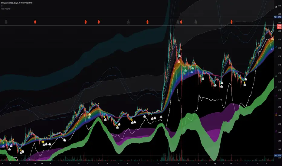
Liquidity Rainbow - Trillion ResearchThis indicator uses regression along with RSI and moving averages from multiple time frames to help you visualize the market in a single view. After learning the notations, you will be able to identify pockets of liquidity and determine high/low probability price zones without drawing a single line.
Booster symbols help confirm short term trends and breakouts based off of two waveform functions, one long period, the other with a much shorter period. You get the buy signal that everyone else sees plus the confirmation!
This is a system that is not fully developed, PNL is not available yet. Strategy version is coming soon, still back testing.
I am tuning this model for crypto specifically, although it works for anything with a price chart.
2 EMAs (configurable to MA)
Dragonskin - RGB circle plots eMA
Rainbow - RGB area plots eMA
+When you see the rainbow appear it means that the price is above the slowest ema baseline. Generally bullish as price tends to ride the rainbow. Ideally, you will see a white cloud at the origin.
-When you see white step line cutting into the upper colors of the rainbow.
Once the price has traded below the rainbow for the FIRST time, not just wicked. You can set a target that's just above the previous high bodys above the rainbow. Do not sell the dip, let the floppers flop.
The second time price cuts down through a thick rainbow is usually bearish .
What makes me so sure? Liquidity
In order to be successful, we need to understand liquidity, the juiciest pockets of profit.
I will reveal more of the strategy in the second script.
For now, use:
SUN symbol - Notice how the price always seems to come back and sweep up any SUNs that get left behind (up and down) this is a liquidity nugget
CLOUD(s) indicators of support. Meaning that on ema trend we expect a lower price but each time that happens, it gets bought up above baseline. weak->strong (little gray - light blue - white)
LIGHTNING indicator of resistance. Meaning the price is not being allowed to recover, each time it rises above baseline, it is sold down again.
YELLOW CROSS - Classically known as a whale manipulation indicator. It tends to indicate a strong bearish move incoming or the reversal of an ongoing bearish move. There's dumping. "Get ready something is happening" indicator.
HEARTS = BUY
SPADES = Buy
CLUBS = Sell
DIAMONDS = SELL
*do not use these during periods of consolidation. consolidation is a period when the price swings in both directions but not too much. In a narrow range the indicators can pop up.
Why does this happen?
Short periods, during which exchanges stabilize the prices, are necessary for the redistribution of assets over the course of trading. Sometimes they happen multiple times a week and can last 24 or 48hours. Also it is a great time to eat up algo traders and that's why you'll see noise.
You want to focus on the period immediately following a consolidations. Don't rush it, they really do take 20 hours+
If you realize that you are in one of these consolidation ranges, limit order the tips of the wicks, nothing in the middle. There is not much profit here but also there is minimal risk.
If you're confirmed in a consolidation, exchanges will work to buoy the price to the appropriate mark price even if there is a big buy/sell order. A lot of time price will go up the congruent amount afterwards to compensate the toxic vwap .
I hope this helps people see the bigger picture and become even more successful with bigger gains.
I've tested this on all the major cryptos. Bitcoin BTC Ethereum ETH HEX
Honestly, I have tested very few stonks with this, later.
-Market Enemy
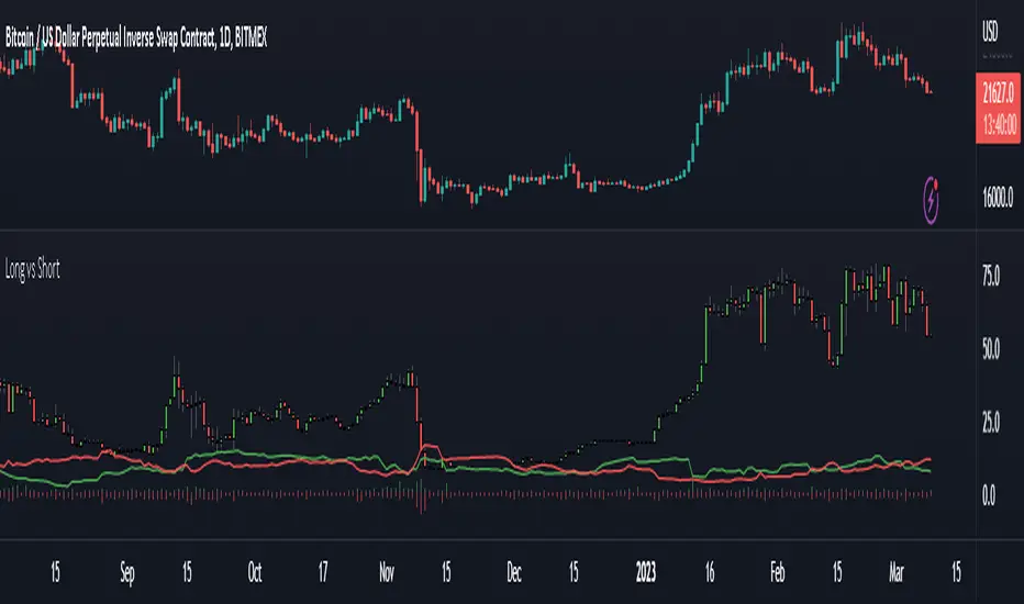
Long vs short BTC + ETHRatio of total long vs short orders. Candles are calculated by ((BITFINEX:BTCUSDLONGS / BITFINEX:BTCUSDSHORTS) + (BITFINEX:ETHUSDLONGS / BITFINEX:ETHUSDSHORTS))/2. BTC and ETH can be viewed separately or inverted in the settings.
MarketsCONCEPT
This indicator gives a clean overview of how markets are trading relatively to each other.
The line in the middle represents a global market average price (a combination of spot and perpetuals).
The dots, which represent individual markets, float around that line.
This way you can easily tell which markets are more expensive (or cheaper) than others.
Markets used:
Coinbase spot (USD)
Bitfinex spot (USD)
Binance spot (USDT)
FTX spot (USDT)
Bitmex perp (coin margin)
Bybit perp (coin margin)
Binance perp (dollar margin)
FTX perp (dollar margin)
The indicator works for both BTC and ETH.
FEATURES
Markets
The main use is to see if spot exchanges are trading above or below derivatives exchanges.
You'll notice that usually when bottoms form it's when derivs start trading below the market average and spot above.
It's considered bearish when derivs trade way above the market average. It's quite normal that derivs trade a little bit above baseline but if they trade pretty far above spot it becomes worrisome.
I personally think it's most useful on lower timeframes like the 4h or 1h, but it works the same on all timeframes.
Distortion
There's also a distortion metric which shows how big the spread is between all exchanges.
Normally speaking all exchange prices trade very closely together, but sometimes the market gets more turbulent and then prices move apart.
The higher the distortion levels the more turbulent the market.
It's interesting to look at once in a while but it's probably not very useful for trading.
I have noticed though that high distortion usually happens after a violent drop and it often marks bottoms.
But then the obvious question is "what is high distortion" and I can't give you an answer because it varies.
In this screenshot I used ohlc4 for the candle source.
Both
You can also choose for the indicator to show both the markets and the distortion at the same time.
All spot markets are green and all derivatives are grey because that's just the theme I use, but you can change the colours in the settings.
You can choose the candle source as well. By default it's set on candle close prices (which makes the most sense in my opinion).
TRADING
Like I already mentioned, the indicator's main purpose is to show you how individual markets are trading relatively to the global market average price.
The most important aspect of it is to see if spot markets are trading higher than derivs. Spot trading above the average while derivs trade below is usually bullish.
Local bottoms often print when spot trading significantly above the rest.
You can also use the indicator to identify arbitrage opportunities because some times there's one market that suddenly starts trading way above or below every other market.
This is obviously a more niche use case of course.
If you want access to this indicator send me a private message so we can discuss it.
Cheers.

Aggregated Perpetuals VolumeCONCEPT
An aggregated crypto perpetual swap contracts volume indicator that works both for BTC and ETH.
The volume is denominated in USD.
FEATURES
It shows the combined perpetuals volume of 6 of the most prominent derivatives exchanges in crypto, which can be displayed in 4 different ways.
Exchanges used:
Binance (USDT)
Huobi (USD)
Bybit (USD)
FTX (USD)
Bitmex (XBT)
Deribit (USD)
In the settings you can choose to exclude certain exchanges and then that volume is removed from the calculation.
There are 4 different display modes.
stacked
Index
Normal
Delta
For more info check out the spot volume version of this indicator:
TRADING
This is indicator is pretty straight forward... It's volume .
The cool thing about this indicator is that it shows combined volume of a couple of the most important crypto exchanges and it can be displayed in multiple different ways and it works both for bitcoin and ethereum .
It's free so if you add it to your favourites you can start using it right away (it's possible that you'll have to refresh Tradingview before it actually works).
Cheers.

Aggregated Spot VolumeCONCEPT
An aggregated crypto spot volume indicator that works both for BTC and ETH.
FEATURES
It shows the combined volume of 6 of the most prominent exchanges in crypto, which can be displayed in 4 different ways.
Exchanges used:
Binance (USDT)
Okex (USDT)
Huobi (USDT)
Coinbase (USD)
Bitfinex (USD)
FTX (USD)
In the settings you can choose to exclude certain exchanges and then that volume is removed from the calculation.
There are 4 different display modes.
Stacked
This stacks the volume so that you can see exactly which portion of each volume bar each exchange is responsible for.
Index
The indexed format shows you percentage wise the volume of each exchange so that it's even more clear which exchanges are more dominant.
Normal
For the people who like classic volume bars, but still want to use aggregated volume.
Delta
The delta separates buy volume and sell volume.
It's a fun way to display the volume, but take this one with a grain of salt because on Tradingview we can't actually see the exact difference between market buys and sell.
This delta counts a positive candle close as "up" volume and a negative candle close as "down" volume.
TRADING
This is indicator is pretty straight forward... It's volume.
The cool thing about this indicator is that it shows combined volume of a couple of the most important crypto exchanges and it can be displayed in multiple different ways and it works both for bitcoin and ethereum.
It's free so if you add it to your favourites you can start using it right away (it's possible that you'll have to refresh Tradingview before it actually works).
Cheers.

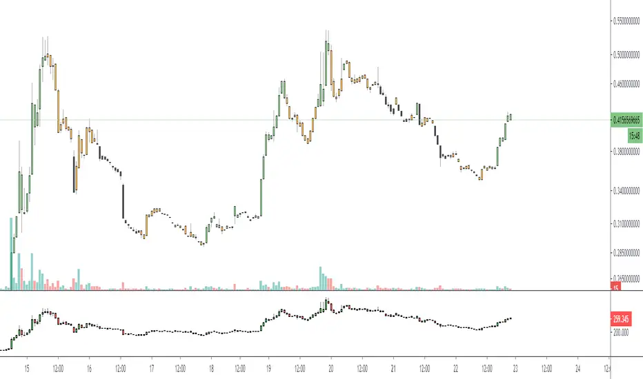
Relative Volume - BITCOINRelative Volume indicator that pulls data from 9 different Bitcoin exchanges. Please note that this indicator only works with BTC and will not use data from your current chart.
Includes the following exchanges:
BYBIT:BTCUSD
BITFINEX:BTCUSD
BITSTAMP:BTCUSD
INDEX:BTCUSD
COINBASE:BTCUSD
FTX:BTCUSD
PHEMEX:BTCUSD
BITTREX:BTCUSD
POLONIEX:BTCUSDT
Hunt Bitcoin CoT Buy/Sell signalWhy Bother another CoT signal?
Its different & focused on the Insider's.
Performance -
This Indicator provided a
1. Signal 1 = 26th March 2019 = SUPER LONG at $4,500 that saw a near $14,000 run up
2. Signal 2 = 18th & 24th June 2019 = SHORT at the second & final level $11,700 after repeated attempts & failure in the $13K range, the mini Echo Bitcoin Bull of 2019
3. Signal 3 = 17th December 2019 = LONG $6,900, Bitcoin rallied to Mid $10,500's
4. Signal 4 = 18th Feb 2020 = SUPER SHORT from $9,700's to a final extreme Low of $3,000, calling the CV-19 collapse
5. Signal 5 = 17th March 2020 = LONG from $5,400 no closure point yet
6. Signal 6 = 29th June 2020 = SUPER LONG reiterate from $10,700 no closure sell signal yet
7. Signal 7 = 17th May 2020 = LONG another accumulate LONG with no sell signal yet generated at Post H&S's low of $33,000
Note - This indicator only commences March 2019, as Bitcoin futures were a recent introduction and needed to settle for 6 months in both use and data, no signals were meaningful prior & data was light.
What is Provided. - Please note the need to also add the Hunt Bitcoin Historical Volatility Indicator for full understanding.
We provide 3 things with the 3 indicators.
'Insider' indications from Largest players in the futures market.
1. Bitcoin Macro Buy Signals.
a) The Bitcoin Commitment of Traders results see us focus solely on Largest 4 Short Open Interest & Largest 4 Long Open Interest aspects of the CoT Release data.
When the difference - is tight, a kind of pinch, these have been great Buy signals in Bitcoin.
We call this difference the Delta & When Delta is 5% or less Bitcoin is a Buy.
2. Bitcoin Macro Sells.
a) A sell signal is Triggered in Bitcoin at any point the Largest 4 short OI > or = to 70
3. AMPLIFIER Trade signals 'Super' Longs or Shorts -
Extreme low volatility events leads to highly impulsive & volatile subsequent moves, if either of 1 or 2 above occur, combined with extreme low volatility
a 'Super Long' or 'SUPER SELL' is generated. In the case of the short side, given Bitcoins general expansive and MACRO Bull trend since inception, we seek an additional component
that is an extreme differential/Delta reading between 4 biggest Longs & Shorts OI.
Namely CoT Delta also must be > 47.5%
We also have a Cautionary level, where it is not necessarily a good idea to accumulate Bitcon, as a better opportunity lower may avail itself, see conditions below.
So the required logic explicitly stated below for all Signals.
1. Long - Hunt Bitcoin CoT Delta < or = 5
2. SUPER Long - Hunt Bitcoin CoT Delta < or = 5; and 2 Day Historical Bitcoin Volatility = or < 20
3. Short - Largest 4 Sellers OI = or > 70
4. SUPER Short - Largest 4 Sellers OI = or > 70; AND..
Hunt Bitcoin CoT Delta = or > 47.5 AND 2 Day Historical BTC Volatility = or < 20
5. Caution - Largest 4 Sellers OI = or > 67.5 AND Hunt Bitcoin CoT Delta = or > 45
WARNING SEE Notes Below
Note 1 - = Largest 4 Open Interest Shorts
Note 2 - = Largest 4 Open Interest Longs
Note 3 - = Hunt Cot Delta = (Largest 4 sellers OI) -( Largest 4 Buyers OI)
Caution = Avoid new Bitcoin Accumulation Right Now, A sell signal might follow Enter on next Long
Note 4 - The Hunt Bitcoin COT Delta signal is a Largest 'Insider' Tracking tool based on a segment of Commitment of Traders data on Bitcoin Futures, released once a week on a Friday.
It is a Macro Timeframe signal , and should not be used for Day trading and Short Timeframe analysis , Entries may be optimised after a Hunt Bitcoin CoT Signal is generated by separate shorter Timeframe analysis.
Note 5 - The Historical Bitcoin Volatility is an additional 'Amplifier' component to the 'Hunt Bitcoin Cot Delta' Insider Signal
Note 6 - The Historical Bitcoin Volatility criteria varies by timeframe, the above levels are those applying on a Two Day TF Chart, select this custom timeframe in Trading View.
if additional criteria are met for LONG & SHORT insider signals, they may become 'Super Longs/Shorts', see conditions box above.

GBTC PremiumThis script simply shows the premium (when positive) and discount (when negative) associated with GBTC as compared with its estimated NAV based on BTC underlying holdings. This will of course need to be updated frequently for accuracy, but it serves as a rough estimate for educational purposes.

Crypto PricesA simple indicator that gives you a quick overview of which BTC & ETH markets are the most expensive and which are the cheapest at any given time.
Five spot markets and five derivatives markets are included.
An average price of all those markets is calculated and then it shows you how the markets selected are trading relatively to that average.
The average will always be based on all markets (for each coin), but you can add or exclude markets to compare in the settings (do it in the input settings, NOT the style settings).
There's a lot of information that can be derived from comparing prices of different markets.
Markets included:
SPOT
Bitfinex
Coinbase
Binance
FTX
Huobi
DERIVS
Bitmex
Bybit
Binance
FTX
Deribit
It's free so just add it to your favourites and you can start using it.
Shout-out to /u/dogepgp for helping me out with this indicator.

Korea PremiumA simple indicator based on the percentage price difference between Korean crypto markets and western markets.
It currently shows the premium for BTC & ETH.
If it's positive (red) it means that the Korean market is trading at a premium.
Vice versa negative (blue) means the West is trading at a premium.
Because the Korean crypto market is so closed off (because of regulations) the premium sometimes gets really wild.
The Korean average is based on Bithumb & Korbit prices.
The index made for the west is based on Coinbase, Kraken and Bitstamp.
By default it uses closing prices for the calculation but you can change that.
You can also change the timeframe in the settings although it's probably best that you keep it at "same as chart".
It's free so you can just add it to your favourites and start using it.

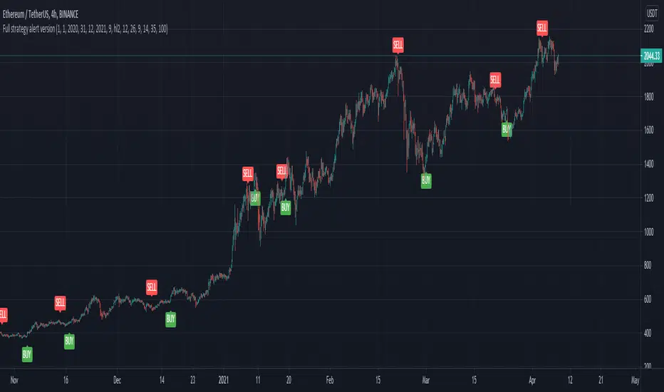
Full CRYPTO pack macd, rsi, obv, ema alert versionThis is the indicator version of a simple, yet very efficient crypto strategy, adapted to 4h time frame, on big coins like ETH and BTC . However it can be adapted to other markets, timeframes etc
For this strategy I use a combination of a trend line , an oscillator, price action and volume .
This study has alert for both long and short entries/exit.
The rules are the next ones:
Long : we check that current candle is ascending and above the moving average, the macd is in positive range, rsi is below overbought level and volume is bigger than the moving avg of volume .
For short, we have the opposite long rules.
If you have any questions, please let me know !
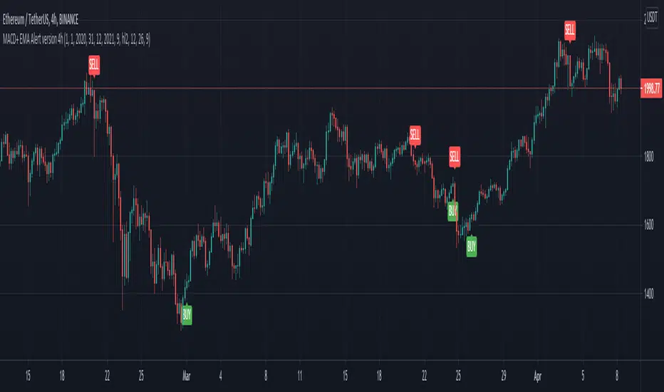
MACD oscillator with EMA alert version 4HThis is the study/indicator alert version of the macd + ema strategy.
The strategy details are the following :
Is a simple, yet efficient strategy, which is made from a combination of an oscillator and a moving average.
Its setup for 4h candles with the current settings, however it can be adapted to other different timeframes.
It works nicely ,beating the buy and hold for both BTC and ETH over the last 3 years.
As well with some optimizations and modifications it can be adapted to futures market, indexes(NASDAQ, NIFTY etc), forex( GBPUSD ), stocks and so on.
Components:
MACD
EMA
Time condition
Long/short option
For long/exit short we enter when we are above the ema , histogram is positive and current candle is higher than previous.
For short /exit long , when close below ema , histo negative and current candles smaller than previous
If you have any questions please let me know !
[MAD] BTC Multiexchange_CandlesA script which volume weights 4 exchanges and paints the average candlebars of 4 major Crypto-Exchanges
Setup for BTC only but Ticker is changeable
configurable offset for comparison
feel free to modify

Automated Quarters Theory With BTC and ETHThis is based on "Automatic Quarters Theory Lines" by monzakaamera. Added calculations for BTC and ETH and fixed script to work on the weekends.

MA200W buy sell BTC ColoredA script to help you plan your entrances and exits with beautiful colors for BTC. It just helps to better highlight the gap between the start of the week and the end.
It only work on Weekly.
Info :
Blue ... you can wait, enjoy your life
Green is when you buy
Yellow when you enter bull market
Orange is when you begin to take care of next week
Red when you begin to sell low part
White, if while a week you see white you can sell bigs bags, if it end with White you can close majors positions
Warning White may not appear, if second week after first Red week is not White you can sell large position
Good luck and take a breath

Mayfair Crypto Strength IndexWorking on the basis of a currency strength index - expresses the index value of a currency. For economists, it is often calculated as purchasing power. while for financial traders, it can be described as an indicator, reflecting many factors related to the currency; for example, fundamental data, overall economic performance or in Crypto terms the strength of the company/asset itself.
In the base version;
BTC is the thicker Orange level.
ETH - the Green
XRP - Blue
The concept then is similar to a stochastic indicator or RSI - 20% oversold regio & 80% overbought. The zero line can be used as Bullush or Bearish.
We wanted to create something that shows the correlation between the top cryptocurrencies as we are often asked about breaking down one or the other.
This is not a buy me now or sell me then indicator - just there to assist and compare assets easily.
Please feel free to like and follow.
Disclaimer
This idea does not constitute as financial advice. It is for educational purposes only, our principle trader has over 20 years’ experience in stocks, ETF’s, and Forex. Hence each trade setup might have different hold times, entry or exit conditions, and will vary from the post/idea shared here. You can use the information from this post to make your own trading plan for the instrument discussed. Trading carries a risk; a high percentage of retail traders lose money. Please keep this in mind when entering any trade. Stay safe.

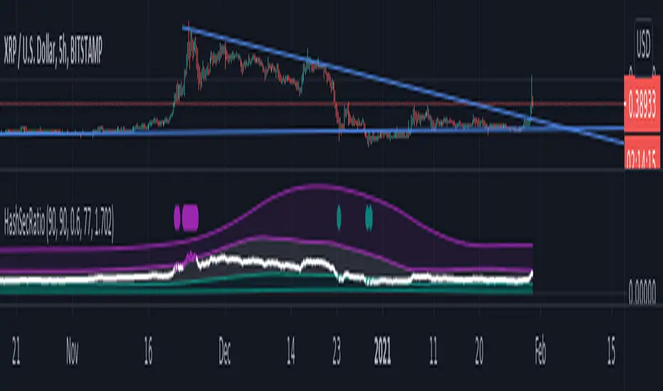
Hashrate to Securities RatioTMcV
HashSecRatio Original
January,30,2021
The Hashrate to securities ratio is a study to get a view on data flowing through the blockchain and can be applied to any asset available in Tradingview.
This indicator illustrates asset performance vs the moving average of BTC hash rate and accurately highlights price trend tops and bottoms allowing for excellent entry points in long and short trades highlighting overbought and oversold conditions in custom timeframes.
I will allow protected access for a short period of time to gather public opinion after that access will be limited to paid only.
For now if you would like to use this script please leave a comment and add to your favorite scripts.

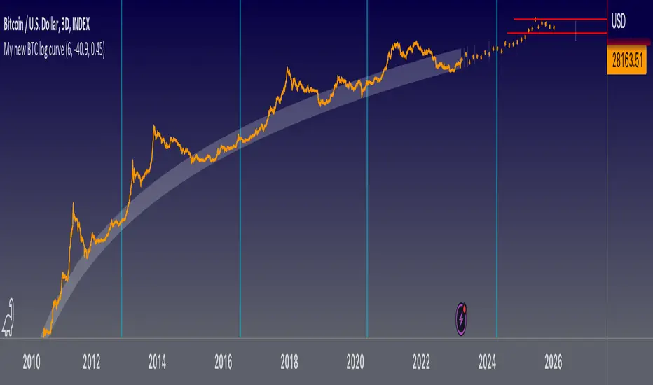
My new BTC log curveThis is my new logarithmic regression curve to the USD/BTC price chart. It is based on a new, very simple equation: y = (e^b)*(x^a), where x is number of days since the Genesis block, a and b are parameters set by the user. Also included is an upper regression curve that is fit to the peaks of each Bitcoin cycle; no fundamental analysis went into making these lines, they are merely fits to the data, so it should not be expected that they can be used to predict tops and bottoms. The upper regression curve is the product of the support curve (lower curve) and two other factors: a constant, and an exponential decay. The constant and the decay factors are parameters that can be set by the user.
Crypto Derivatives Sentiment HeatmapWhat?
This is a heatmap that shows derivatives sentiment for some of the most prominent coins in crypto.
Content
Coins included:
BTC
ETH
LTC
DOT
LINK
YFI
The indicator takes the Binance USDT perpetual swaps of these coins and compares them to their respective spot indices.
Binance is the exchange of choice because their perps have the highest volume in the market.
For the spot indices I've used the indices created by Bitmex.
These are very intricate and weighted indices with compositions of the most important and trustworthy spot markets.
For more information check the Bitmex website.
The heatmap shows red coloring if the perp is trading above spot (bearish).
It shows green coloring if the perp is trading below spot (bullish).
The lighter the color the less wide the gap is between perps & spot.
The darker (brighter) the coloring the more extreme the difference.
Trading
It's quite simple.
When you see a lot of green, preferably dark green, you should have a bullish bias because it means that perps are oversold or that spot is bidding hard.
Vice versa a lot of red should give a bearish bias.
It's very practical for a quick sentiment check.
This indicator is free so you can just add it to your favorites.
Shout-out to zzzcrypto123 for inspiring me.

Weighted derivatives premium BTCCan be extended with more derivative or spot pairs, see the comments in the code for instructions. Most importantly, the pairs need to be added to the respective arrays in the same order, so that the weights are applied to the correct pairs.