Candle Open Time labels (& TAPDA Lines)Description of the "4-Hour Candle Opening Times (TAPDA Lines)" Indicator
The "4-Hour Candle Opening Times (TAPDA Lines)" indicator integrates key principles of the Time and Price Action Trading Algorithm (TAPTA) with practical tools for analyzing market behavior. This script is designed for traders who leverage the interaction between time and price to identify opportunities in the market. The indicator supports the identification of significant price levels and potential areas of interest based on historical data and recurring patterns tied to specific timeframes.
Core Concepts
Time and Price Interaction (TAPTA Logic):
The script implements TAPTA principles by focusing on time intervals (4-hour candles) and the price action associated with those intervals.
Traders use this logic to recognize how prices behave at specific times, identifying patterns, levels of support or resistance, and potential reversals.
Highs and Lows Recognition (TAPDA):
The indicator includes logic for identifying and marking "Tapped Highs and Lows," which occur when price action retraces to previously significant levels within a specified tolerance. These taps are visually represented with horizontal lines, enabling traders to spot recurring price behaviors and levels of interest.
Dynamic Levels for Decision-Making:
By combining time and price, the script visualizes key price levels and their relevance over time, equipping traders with actionable insights for entry, exit, and risk management.
Indicator Features
1. Visual Representation of Candle Opening Times
The indicator marks the opening times of 4-hour candles on the chart.
A customizable label system displays the time in either a 12-hour or 24-hour format, with options to toggle the visibility of AM/PM suffixes.
2. TAPDA Logic
Identifies and highlights price levels that have been tapped within a specified tolerance.
Horizontal lines are drawn to mark these levels, allowing traders to see historical price levels acting as support or resistance.
The "Tapped Highs and Lows" are updated dynamically based on the most recent price action.
3. Timeframe-Specific Filtering
Users can limit the display to specific times of interest, such as 2 AM, 6 AM, and 10 AM, by toggling the "GCT (General Candle Times)" option.
Additional options allow filtering TAPDA logic by AM or PM timeframes, catering to traders who focus on specific market sessions.
4. Adjustable Plotting Limits
The script incorporates settings for controlling the maximum number of labels and lines displayed on the chart:
Max Labels: Limits the number of labels plotted for 4-hour candle opening times.
Max TAPDA Lines: Limits the number of TAPDA horizontal lines displayed.
A "Sync Lines and Labels" option ensures the same number of labels and lines are plotted when enabled, providing a consistent and clutter-free visualization.
5. Plot Maximum Capability
A "Plot Max" feature allows users to override the default behavior and force the plotting of the maximum allowed labels and lines, providing a comprehensive view of historical data.
6. User-Friendly Customization
Fully customizable label styles, including options for position, size, color, and background opacity.
Adjustable tolerance levels for TAPDA lines ensure compatibility with different market conditions and trading strategies.
Settings for flipping or aligning label positions above or below candles, or locking them to the opening price.
Script Logic
The script is built to prioritize efficiency and clarity, adhering to TradingView's Pine Script best practices and community standards:
Initialization:
Arrays are used to store historical price data, including highs, lows, and timestamps, ensuring only the necessary amount of data is processed.
A flexible and efficient data management system maintains a rolling window of data for both labels and TAPDA lines, ensuring smooth performance.
Label and Line Plotting:
Labels are plotted dynamically at user-defined positions and styles to mark the opening times of 4-hour candles.
TAPDA lines are drawn between historical high or low points and the current price action when the tolerance condition is met.
Limit Management:
The script enforces limits on the number of labels and lines plotted on the chart to maintain visual clarity.
Users can enable synchronization between the maximum labels and lines to ensure consistent visualization.
Customization Options:
Extensive customization settings allow traders to tailor the indicator to their strategies and preferences, including:
Label and line styles.
Session filtering (AM, PM, or specific times).
Display limits and synchronization options.
Capabilities
1. Enhance Time-Based Analysis
By marking significant times (4-hour candle openings), traders can identify key market phases and recurring behaviors tied to specific hours.
2. Leverage Historical Price Action
TAPDA logic highlights areas where price action interacts with historical highs and lows, providing actionable insights into potential support or resistance zones.
3. Improve Decision-Making
The indicator supports informed decision-making by blending visual data with time and price action principles, helping traders spot opportunities and mitigate risks.
4. Flexible Application Across Strategies
Suitable for day traders, swing traders, and position traders who utilize time and price action for trend analysis, reversals, or breakout strategies.
Best Practices for Use
Key Levels Analysis:
Focus on labels and TAPDA lines near critical price zones to gauge potential market reactions.
Session-Based Trading:
Use AM/PM filters or GCT settings to isolate specific trading sessions relevant to your strategy.
Combine with Other Indicators:
Enhance the effectiveness of this indicator by combining it with moving averages, RSI, or other tools for confirmation.
Risk Management:
Use the identified levels for stop-loss placement or target setting to align with your risk tolerance.
Pesquisar nos scripts por "12月4号是什么星座"
ATT + Key Levels with SessionsKey Features:
ATT Turning Point Numbers:
This input allows the user to define specific numbers (e.g., "3,11,17,29,41,47,53,59") that mark turning points in price action, which are checked using the bar_index modulo 60. If the current bar index matches one of these turning points, it triggers potential buy or sell signals.
RSI (Relative Strength Index):
The RSI is calculated based on a user-defined period (rsi_period), typically 14, and used to indicate overbought or oversold conditions. The script defines overbought (70) and oversold (30) levels, which are used to filter buy or sell signals.
Session Times:
The script includes predefined session times for major trading markets:
New York: From 9:30 AM EST to 4:00 PM EST.
London: From 8:00 AM GMT to 4:30 PM GMT.
Asia: From 12:00 AM GMT to 9:00 AM GMT.
These session times are used to restrict the buy and sell signals to specific market sessions.
Key Levels:
The script calculates and plots key market levels for the current day and week:
Daily High and Low: The highest and lowest prices of the current day.
Weekly High and Low: The highest and lowest prices of the current week.
These levels are plotted with different colors for visual reference.
Signal Logic:
Buy Signal: Triggered when the current bar is a turning point (according to the ATT model), the RSI is below the oversold threshold, and the current time is within the active session times (New York, London, or Asia).
Sell Signal: Triggered when the current bar is a turning point, the RSI is above the overbought threshold, and the current time is within the active session times.
Signal Limitations:
A user-defined limit (max_signals_per_session) controls the maximum number of signals that can be plotted within each session. This prevents excessive signal generation.
Plotting and Background Highlights:
Buy and Sell Signals: The script plots shapes (labels) above or below the bars to indicate buy or sell signals when the conditions are met.
Background Highlight: The background color is highlighted in yellow when the current bar matches one of the defined ATT turning points.
In Summary:
The indicator combines multiple technical factors to generate trading signals:
Turning points in price action (based on custom ATT numbers),
RSI levels (overbought/oversold),
Market session times (New York, London, Asia),
Key price levels (daily and weekly highs and lows).
This combination helps traders identify potential buying and selling opportunities while considering broader market dynamics and limiting the number of signals during each session.

Intraday -RSKWhat You See:
Session Boxes:
As you observe, the larger purple box represents the Asian Session, spanning from around 22:00 to 06:00 UTC. You notice how it captures the overnight market activity.
The smaller, greyish box marks the London Session, from about 08:00 to 12:00 UTC. You can see how the price action changes during this session.
The New York Session is also indicated, with vertical lines possibly marking the open and close, helping you track movements as the U.S. markets come into play.
High and Low Levels:
Horizontal lines are drawn at the high and low of each session. You can use these as potential support or resistance levels, aiding in your decision-making process.
Vertical Lines:
These lines likely correspond to specific key times, such as session opens or closes. You can quickly identify the transition between sessions, which is crucial for your timing.
Color Coding:
Each session is color-coded, making it easier for you to distinguish between them at a glance. The purple, grey, and additional lines offer a clear visual distinction.
How You Use It:
This indicator is your go-to for understanding how different market sessions affect price action. You’ll use it to:
Recognize important price levels within each session.
Identify potential entry and exit points based on session highs and lows.
Observe how the market transitions from one session to another, giving you insight into the best times to trade.
Customization:
You have the flexibility to adjust the settings. You can change session times to suit your trading hours, modify colors to match your chart theme, and even choose which sessions to display or hide based on your focus.
This tool is designed to enhance your analysis, providing you with a structured view of market sessions. With this indicator, you’re well-equipped to navigate the global markets with greater precision and confidence.
Open-source script
Precision Trading Strategy: Golden EdgeThe PTS: Golden Edge strategy is designed for scalping Gold (XAU/USD) on lower timeframes, such as the 1-minute chart. It captures high-probability trade setups by aligning with strong trends and momentum, while filtering out low-quality trades during consolidation or low-volatility periods.
The strategy uses a combination of technical indicators to identify optimal entry points:
1. Exponential Moving Averages (EMAs): A fast EMA (3-period) and a slow EMA (33-period) are used to detect short-term trend reversals via crossover signals.
2. Hull Moving Average (HMA): A 66-period HMA acts as a higher-timeframe trend filter to ensure trades align with the overall market direction.
3. Relative Strength Index (RSI): A 12-period RSI identifies momentum. The strategy requires RSI > 55 for long trades and RSI < 45 for short trades, ensuring entries are backed by strong buying or selling pressure.
4. Average True Range (ATR): A 14-period ATR ensures trades occur only during volatile conditions, avoiding choppy or low-movement markets.
By combining these tools, the PTS: Golden Edge strategy creates a precise framework for scalping and offers a systematic approach to capitalize on Gold’s price movements efficiently.

Normalised ATR - Configurable Session Volatility AnalysisThis indicator analyzes price volatility across different trading sessions throughout the day. Here are its key features:
1. **Configurable Time Periods**
- Users can set specific date ranges for analysis
- Supports up to 12 customizable trading sessions
- Adjustable session durations (1-8 hours each)
2. **Volatility Measurements**
- Offers two calculation methods:
* Normalized Range: (High-Low)/Midpoint Price × 100 (as percentage)
* Absolute Range: Simple High-Low difference
- Tracks key statistics for each session:
* Maximum range
* Minimum range
* Average range
* 25% quartile range
3. **Statistical Analysis**
- Calculates 5th and 95th percentiles across all sessions
- Provides visual reference lines for these percentiles
- Shows detailed statistics in a color-coded table
4. **Visual Display**
- Clear tabular display of session statistics
- Color-coded for easy reading
- Plot of daily ranges with percentile bounds
- Session times displayed in UTC
This tool is particularly useful for:
- Understanding market volatility patterns across different trading sessions
- Identifying optimal trading hours
- Planning trading strategies based on historical volatility patterns
- Comparing volatility across different market periods

Ensemble Alerts█ OVERVIEW
This indicator creates highly customizable alert conditions and messages by combining several technical conditions into groups , which users can specify directly from the "Settings/Inputs" tab. It offers a flexible framework for building and testing complex alert conditions without requiring code modifications for each adjustment.
█ CONCEPTS
Ensemble analysis
Ensemble analysis is a form of data analysis that combines several "weaker" models to produce a potentially more robust model. In a trading context, one of the most prevalent forms of ensemble analysis is the aggregation (grouping) of several indicators to derive market insights and reinforce trading decisions. With this analysis, traders typically inspect multiple indicators, signaling trade actions when specific conditions or groups of conditions align.
Simplifying ensemble creation
Combining indicators into one or more ensembles can be challenging, especially for users without programming knowledge. It usually involves writing custom scripts to aggregate the indicators and trigger trading alerts based on the confluence of specific conditions. Making such scripts customizable via inputs poses an additional challenge, as it often involves complicated input menus and conditional logic.
This indicator addresses these challenges by providing a simple, flexible input menu where users can easily define alert criteria by listing groups of conditions from various technical indicators in simple text boxes . With this script, you can create complex alert conditions intuitively from the "Settings/Inputs" tab without ever writing or modifying a single line of code. This framework makes advanced alert setups more accessible to non-coders. Additionally, it can help Pine programmers save time and effort when testing various condition combinations.
█ FEATURES
Configurable alert direction
The "Direction" dropdown at the top of the "Settings/Inputs" tab specifies the allowed direction for the alert conditions. There are four possible options:
• Up only : The indicator only evaluates upward conditions.
• Down only : The indicator only evaluates downward conditions.
• Up and down (default): The indicator evaluates upward and downward conditions, creating alert triggers for both.
• Alternating : The indicator prevents alert triggers for consecutive conditions in the same direction. An upward condition must be the first occurrence after a downward condition to trigger an alert, and vice versa for downward conditions.
Flexible condition groups
This script features six text inputs where users can define distinct condition groups (ensembles) for their alerts. An alert trigger occurs if all the conditions in at least one group occur.
Each input accepts a comma-separated list of numbers with optional spaces (e.g., "1, 4, 8"). Each listed number, from 1 to 35, corresponds to a specific individual condition. Below are the conditions that the numbers represent:
1 — RSI above/below threshold
2 — RSI below/above threshold
3 — Stoch above/below threshold
4 — Stoch below/above threshold
5 — Stoch K over/under D
6 — Stoch K under/over D
7 — AO above/below threshold
8 — AO below/above threshold
9 — AO rising/falling
10 — AO falling/rising
11 — Supertrend up/down
12 — Supertrend down/up
13 — Close above/below MA
14 — Close below/above MA
15 — Close above/below open
16 — Close below/above open
17 — Close increase/decrease
18 — Close decrease/increase
19 — Close near Donchian top/bottom (Close > (Mid + HH) / 2)
20 — Close near Donchian bottom/top (Close < (Mid + LL) / 2)
21 — New Donchian high/low
22 — New Donchian low/high
23 — Rising volume
24 — Falling volume
25 — Volume above average (Volume > SMA(Volume, 20))
26 — Volume below average (Volume < SMA(Volume, 20))
27 — High body to range ratio (Abs(Close - Open) / (High - Low) > 0.5)
28 — Low body to range ratio (Abs(Close - Open) / (High - Low) < 0.5)
29 — High relative volatility (ATR(7) > ATR(40))
30 — Low relative volatility (ATR(7) < ATR(40))
31 — External condition 1
32 — External condition 2
33 — External condition 3
34 — External condition 4
35 — External condition 5
These constituent conditions fall into three distinct categories:
• Directional pairs : The numbers 1-22 correspond to pairs of opposing upward and downward conditions. For example, if one of the inputs includes "1" in the comma-separated list, that group uses the "RSI above/below threshold" condition pair. In this case, the RSI must be above a high threshold for the group to trigger an upward alert, and the RSI must be below a defined low threshold to trigger a downward alert.
• Non-directional filters : The numbers 23-30 correspond to conditions that do not represent directional information. These conditions act as filters for both upward and downward alerts. Traders often use non-directional conditions to refine trending or mean reversion signals. For instance, if one of the input lists includes "30", that group uses the "Low relative volatility" condition. The group can trigger an upward or downward alert only if the 7-period Average True Range (ATR) is below the 40-period ATR.
• External conditions : The numbers 31-35 correspond to external conditions based on the plots from other indicators on the chart. To set these conditions, use the source inputs in the "External conditions" section near the bottom of the "Settings/Inputs" tab. The external value can represent an upward, downward, or non-directional condition based on the following logic:
▫ Any value above 0 represents an upward condition.
▫ Any value below 0 represents a downward condition.
▫ If the checkbox next to the source input is selected, the condition becomes non-directional . Any group that uses the condition can trigger upward or downward alerts only if the source value is not 0.
To learn more about using plotted values from other indicators, see this article in our Help Center and the Source input section of our Pine Script™ User Manual.
Group markers
Each comma-separated list represents a distinct group , where all the listed conditions must occur to trigger an alert. This script assigns preset markers (names) to each condition group to make the active ensembles easily identifiable in the generated alert messages and labels. The markers assigned to each group use the format "M", where "M" is short for "Marker" and "x" is the group number. The titles of the inputs at the top of the "Settings/Inputs" tab show these markers for convenience.
For upward conditions, the labels and alert messages show group markers with upward triangles (e.g., "M1▲"). For downward conditions, they show markers with downward triangles (e.g., "M1▼").
NOTE: By default, this script populates the "M1" field with a pre-configured list for a mean reversion group ("2,18,24,28"). The other fields are empty. If any "M*" input does not contain a value, the indicator ignores it in the alert calculations.
Custom alert messages
By default, the indicator's alert message text contains the activated markers and their direction as a comma-separated list. Users can override this message for upward or downward alerts with the two text fields at the bottom of the "Settings/Inputs" tab. When the fields are not empty , the alerts use that text instead of the default marker list.
NOTE: This script generates alert triggers, not the alerts themselves. To set up an alert based on this script's conditions, open the "Create Alert" dialog box, then select the "Ensemble Alerts" and "Any alert() function call" options in the "Condition" tabs. See the Alerts FAQ in our Pine Script™ User Manual for more information.
Condition visualization
This script offers organized visualizations of its conditions, allowing users to inspect the behaviors of each condition alongside the specified groups. The key visual features include:
1) Conditional plots
• The indicator plots the history of each individual condition, excluding the external conditions, as circles at different levels. Opposite conditions appear at positive and negative levels with the same absolute value. The plots for each condition show values only on the bars where they occur.
• Each condition's plot is color-coded based on its type. Aqua and orange plots represent opposing directional conditions, and purple plots represent non-directional conditions. The titles of the plots also contain the condition numbers to which they apply.
• The plots in the separate pane can be turned on or off with the "Show plots in pane" checkbox near the top of the "Settings/Inputs" tab. This input only toggles the color-coded circles, which reduces the graphical load. If you deactivate these visuals, you can still inspect each condition from the script's status line and the Data Window.
• As a bonus, the indicator includes "Up alert" and "Down alert" plots in the Data Window, representing the combined upward and downward ensemble alert conditions. These plots are also usable in additional indicator-on-indicator calculations.
2) Dynamic labels
• The indicator draws a label on the main chart pane displaying the activated group markers (e.g., "M1▲") each time an alert condition occurs.
• The labels for upward alerts appear below chart bars. The labels for downward alerts appear above the bars.
NOTE: This indicator can display up to 500 labels because that is the maximum allowed for a single Pine script.
3) Background highlighting
• The indicator can highlight the main chart's background on bars where upward or downward condition groups activate. Use the "Highlight background" inputs in the "Settings/Inputs" tab to enable these highlights and customize their colors.
• Unlike the dynamic labels, these background highlights are available for all chart bars, irrespective of the number of condition occurrences.
█ NOTES
• This script uses Pine Script™ v6, the latest version of TradingView's programming language. See the Release notes and Migration guide to learn what's new in v6 and how to convert your scripts to this version.
• This script imports our new Alerts library, which features functions that provide high-level simplicity for working with complex compound conditions and alerts. We used the library's `compoundAlertMessage()` function in this indicator. It evaluates items from "bool" arrays in groups specified by an array of strings containing comma-separated index lists , returning a tuple of "string" values containing the marker of each activated group.
• The script imports the latest version of the ta library to calculate several technical indicators not included in the built-in `ta.*` namespace, including Double Exponential Moving Average (DEMA), Triple Exponential Moving Average (TEMA), Fractal Adaptive Moving Average (FRAMA), Tilson T3, Awesome Oscillator (AO), Full Stochastic (%K and %D), SuperTrend, and Donchian Channels.
• The script uses the `force_overlay` parameter in the label.new() and bgcolor() calls to display the drawings and background colors in the main chart pane.
• The plots and hlines use the available `display.*` constants to determine whether the visuals appear in the separate pane.
Look first. Then leap.

Alerts█ OVERVIEW
This library is a Pine Script™ programmers tool that provides functions to simplify the creation of compound conditions and alert messages. With these functions, scripts can use comma-separated "string" lists to specify condition groups from arbitrarily large "bool" arrays , offering a convenient way to provide highly flexible alert creation to script users without requiring numerous inputs in the "Settings/Inputs" menu.
█ CONCEPTS
Compound conditions
Compound conditions are essentially groups of two or more conditions, where each required condition must occur to produce a `true` result. Traders often combine conditions, including signals from various indicators, to drive and reinforce trade decisions. Similarly, programmers use compound conditions in logical operations to create scripts that respond dynamically to groups of events.
Condition conundrum
Providing flexible condition combinations to script users for signals and alerts often poses a significant challenge: input complexity . Conventionally, such flexibility comes at the cost of an extensive list of separate inputs for toggling individual conditions and customizing their properties, often resulting in complicated input menus that are difficult for users to navigate effectively. Furthermore, managing all those inputs usually entails tediously handling many extra variables and logical expressions, making such projects more complex for programmers.
Condensing complexity
This library introduces a technique using parsed strings to reference groups of elements from "bool" arrays , helping to simplify and streamline the construction of compound conditions and alert messages. With this approach, programmers can provide one or more "string" inputs in their scripts where users can list numbers corresponding to the conditions they want to combine.
For example, suppose you have a script that creates alert triggers based on a combination of up to 20 individual conditions, and you want to make inputs for users to choose which conditions to combine. Instead of creating 20 separate checkboxes in the "Settings/Inputs" tab and manually adding associated logic for each one, you can store the conditional values in arrays, make one or more "string" inputs that accept values listing the array item locations (e.g., "1,4,8,11"), and then pass the inputs to these functions to determine the compound conditions formed by the specified groups.
This approach condenses the input space, improving navigability and utility. Additionally, it helps provide high-level simplicity to complex conditional code, making it easier to maintain and expand over time.
█ CALCULATIONS AND USE
This library contains three functions for evaluating compound conditions: `getCompoundConditon()`, `getCompoundConditionsArray()`, and `compoundAlertMessage()`. Each function has two overloads that evaluate compound conditions based on groups of items from one or two "bool" arrays . The sections below explain the functions' calculations and how to use them.
Referencing conditions using "string" index lists
Each function processes "string" values containing comma-separated lists of numerals representing the indices of the "bool" array items to use in its calculations (e.g., "4, 8, 12"). The functions split each supplied "string" list by its commas, then iterate over those specified indices in the "bool" arrays to determine each group's combined `true` or `false` state.
For convenience, the numbers in the "string" lists can represent zero-based indices (where the first item is at index 0) or one-based indices (where the first item is at index 1), depending on the function's `zeroIndex` parameter. For example, an index list of "0, 2, 4" with a `zeroIndex` value of `true` specifies that the condition group uses the first , third , and fifth "bool" values in the array, ignoring all others. If the `zeroIndex` value is `false`, the list "1, 3, 5" also refers to those same elements.
Zero-based indexing is convenient for programmers because Pine arrays always use this index format. However, one-based indexing is often more convenient and familiar for script users, especially non-programmers.
Evaluating one or many condition groups
The `getCompoundCondition()` function evaluates singular condition groups determined by its `indexList` parameter, returning `true` values whenever the specified array elements are `true`. This function is helpful when a script has to evaluate specific groups of conditions and does not require many combinations.
In contrast, the `getCompoundConditionsArray()` function can evaluate numerous condition groups, one for each "string" included in its `indexLists` argument. It returns arrays containing `true` or `false` states for each listed group. This function is helpful when a script requires multiple condition combinations in additional calculations or logic.
The `compoundAlertMessage()` function is similar to the `getCompoundConditionsArray()` function. It also evaluates a separate compound condition group for each "string" in its `indexLists` array, but it returns "string" values containing the marker (name) of each group with a `true` result. You can use these returned values as the `message` argument in alert() calls, display them in labels and other drawing objects, or even use them in additional calculations and logic.
Directional condition pairs
The first overload of each function operates on a single `conditions` array, returning values representing one or more compound conditions from groups in that array. These functions are ideal for general-purpose condition groups that may or may not represent direction information.
The second overloads accept two arrays representing upward and downward conditions separately: `upConditions` and `downConditions`. These overloads evaluate opposing directional conditions in pairs (e.g., RSI is above/below a level) and return upward and downward condition information separately in a tuple .
When using the directional overloads, ensure the `upConditions` and `downConditions` arrays are the same size, with the intended condition pairs at the same indices . For instance, if you have a specific upward RSI condition's value at the first index in the `upConditions` array, include the opposing downward RSI condition's value at that same index in the `downConditions` array. If a condition can apply to both directions (e.g., rising volume), include its value at the same index in both arrays.
Group markers
To simplify the generation of informative alert messages, the `compoundAlertMessage()` function assigns "string" markers to each condition group, where "marker" refers to the group's name. The `groupMarkers` parameter allows you to assign custom markers to each listed group. If not specified, the function generates default group markers in the format "M", where "M" is short for "Marker" and "" represents the group number starting from 1. For example, the default marker for the first group specified in the `indexLists` array is "M1".
The function's returned "string" values contain a comma-separated list with markers for each activated condition group (e.g., "M1, M4"). The function's second overload, which processes directional pairs of conditions, also appends extra characters to the markers to signify the direction. The default for upward groups is "▲" (e.g., "M1▲") and the default for downward ones is "▼" (e.g., "M1▼"). You can customize these appended characters with the `upChar` and `downChar` parameters.
Designing customizable alerts
We recommend following these primary steps when using this library to design flexible alerts for script users:
1. Create text inputs for users to specify comma-separated lists of conditions with the input.string() or input.text_area() functions, and then collect all the input values in a "string" array . Note that each separate "string" in the array will represent a distinct condition group.
2. Create arrays of "bool" values representing the possible conditions to choose from. If your script will process pairs of upward and downward conditions, ensure the related elements in the arrays align at the same indices.
3. Call `compoundAlertMessage()` using the arrays from steps 1 and 2 as arguments to get the alert message text. If your script will use the text for alerts only, not historical display or calculation purposes, the call is necessary only on realtime bars .
4. Pass the calculated "string" values as the `message` argument in alert() calls. We recommend calling the function only when the "string" is not empty (i.e., `messageText != ""`). To avoid repainting alerts on open bars, use barstate.isconfirmed in the condition to allow alert triggers only on each bar's close .
5. Test the alerts. Open the "Create Alert" dialog box and select "Any alert() function call" in the "Condition" field. It is also helpful to inspect the strings with Pine Logs .
NOTE: Because the techniques in this library use lists of numbers to specify conditions, we recommend including a tooltip for the "string" inputs that lists the available numbers and the conditions they represent. This tooltip provides a legend for script users, making it simple to understand and utilize. To create the tooltip, declare a "const string" listing the options and pass it to the `input.*()` call's `tooltip` parameter. See the library's example code for a simple demonstration.
█ EXAMPLE CODE
This library's example code demonstrates one possible way to offer a selection of compound conditions with "string" inputs and these functions. It uses three input.string() calls, each accepting a comma-separated list representing a distinct condition group. The title of each input represents the default group marker that appears in the label and alert text. The code collects these three input values in a `conditionGroups` array for use with the `compoundAlertMessage()` function.
In this code, we created two "bool" arrays to store six arbitrary condition pairs for demonstration:
1. Bar up/down: The bar's close price must be above the open price for upward conditions, and vice versa for downward conditions.
2. Fast EMA above/below slow EMA : The 9-period Exponential Moving Average of close prices must be above the 21-period EMA for upward conditions, and vice versa for downward conditions.
3. Volume above average : The bar's volume must exceed its 20-bar average to activate an upward or downward condition.
4. Volume rising : The volume must exceed that of the previous bar to activate an upward or downward condition.
5. RSI trending up/down : The 14-period Relative Strength Index of close prices must be between 50 and 70 for upward conditions, and between 30 and 50 for downward conditions.
6. High volatility : The 7-period Average True Range (ATR) must be above the 40-period ATR to activate an upward or downward condition.
We included a `tooltip` argument for the third input.string() call that displays the condition numbers and titles, where 1 is the first condition number.
The `bullConditions` array contains the `true` or `false` states of all individual upward conditions, and the `bearConditions` array contains all downward condition states. For the conditions that filter either direction because they are non-directional, such as "High volatility", both arrays contain the condition's `true` or `false` value at the same index. If you use these conditions alone, they activate upward and downward alert conditions simultaneously.
The example code calls `compoundAlertMessage()` using the `bullConditions`, `bearConditions`, and `conditionGroups` arrays to create a tuple of strings containing the directional markers for each activated group. On confirmed bars, it displays non-empty strings in labels and uses them in alert() calls. For the text shown in the labels, we used str.replace_all() to replace commas with newline characters, aligning the markers vertically in the display.
Look first. Then leap.
█ FUNCTIONS
This library exports the following functions:
getCompoundCondition(conditions, indexList, minRequired, zeroIndex)
(Overload 1 of 2) Determines a compound condition based on selected elements from a `conditions` array.
Parameters:
conditions (array) : (array) An array containing the possible "bool" values to use in the compound condition.
indexList (string) : (series string) A "string" containing a comma-separated list of whole numbers representing the group of `conditions` elements to use in the compound condition. For example, if the value is `"0, 2, 4"`, and `minRequired` is `na`, the function returns `true` only if the `conditions` elements at index 0, 2, and 4 are all `true`. If the value is an empty "string", the function returns `false`.
minRequired (int) : (series int) Optional. Determines the minimum number of selected conditions required to activate the compound condition. For example, if the value is 2, the function returns `true` if at least two of the specified `conditions` elements are `true`. If the value is `na`, the function returns `true` only if all specified elements are `true`. The default is `na`.
zeroIndex (bool) : (series bool) Optional. Specifies whether the `indexList` represents zero-based array indices. If `true`, a value of "0" in the list represents the first array index. If `false`, a `value` of "1" represents the first index. The default is `true`.
Returns: (bool) `true` if `conditions` elements in the group specified by the `indexList` are `true`, `false` otherwise.
getCompoundCondition(upConditions, downConditions, indexList, minRequired, allowUp, allowDown, zeroIndex)
(Overload 2 of 2) Determines upward and downward compound conditions based on selected elements from `upConditions` and `downConditions` arrays.
Parameters:
upConditions (array) : (array) An array containing the possible "bool" values to use in the upward compound condition.
downConditions (array) : (array) An array containing the possible "bool" values to use in the downward compound condition.
indexList (string) : (series string) A "string" containing a comma-separated list of whole numbers representing the `upConditions` and `downConditions` elements to use in the compound conditions. For example, if the value is `"0, 2, 4"` and `minRequired` is `na`, the function returns `true` for the first value only if the `upConditions` elements at index 0, 2, and 4 are all `true`. If the value is an empty "string", the function returns ` `.
minRequired (int) : (series int) Optional. Determines the minimum number of selected conditions required to activate either compound condition. For example, if the value is 2, the function returns `true` for its first value if at least two of the specified `upConditions` elements are `true`. If the value is `na`, the function returns `true` only if all specified elements are `true`. The default is `na`.
allowUp (bool) : (series bool) Optional. Controls whether the function considers upward compound conditions. If `false`, the function ignores the `upConditions` array, and the first item in the returned tuple is `false`. The default is `true`.
allowDown (bool) : (series bool) Optional. Controls whether the function considers downward compound conditions. If `false`, the function ignores the `downConditions` array, and the second item in the returned tuple is `false`. The default is `true`.
zeroIndex (bool) : (series bool) Optional. Specifies whether the `indexList` represents zero-based array indices. If `true`, a value of "0" in the list represents the first array index. If `false`, a value of "1" represents the first index. The default is `true`.
Returns: ( ) A tuple containing two "bool" values representing the upward and downward compound condition states, respectively.
getCompoundConditionsArray(conditions, indexLists, zeroIndex)
(Overload 1 of 2) Creates an array of "bool" values representing compound conditions formed by selected elements from a `conditions` array.
Parameters:
conditions (array) : (array) An array containing the possible "bool" values to use in each compound condition.
indexLists (array) : (array) An array of strings containing comma-separated lists of whole numbers representing the `conditions` elements to use in each compound condition. For example, if an item is `"0, 2, 4"`, the corresponding item in the returned array is `true` only if the `conditions` elements at index 0, 2, and 4 are all `true`. If an item is an empty "string", the item in the returned array is `false`.
zeroIndex (bool) : (series bool) Optional. Specifies whether the "string" lists in the `indexLists` represent zero-based array indices. If `true`, a value of "0" in a list represents the first array index. If `false`, a value of "1" represents the first index. The default is `true`.
Returns: (array) An array of "bool" values representing compound condition states for each condition group. An item in the array is `true` only if all the `conditions` elements specified by the corresponding `indexLists` item are `true`. Otherwise, the item is `false`.
getCompoundConditionsArray(upConditions, downConditions, indexLists, allowUp, allowDown, zeroIndex)
(Overload 2 of 2) Creates two arrays of "bool" values representing compound upward and
downward conditions formed by selected elements from `upConditions` and `downConditions` arrays.
Parameters:
upConditions (array) : (array) An array containing the possible "bool" values to use in each upward compound condition.
downConditions (array) : (array) An array containing the possible "bool" values to use in each downward compound condition.
indexLists (array) : (array) An array of strings containing comma-separated lists of whole numbers representing the `upConditions` and `downConditions` elements to use in each compound condition. For example, if an item is `"0, 2, 4"`, the corresponding item in the first returned array is `true` only if the `upConditions` elements at index 0, 2, and 4 are all `true`. If an item is an empty "string", the items in both returned arrays are `false`.
allowUp (bool) : (series bool) Optional. Controls whether the function considers upward compound conditions. If `false`, the function ignores the `upConditions` array, and all elements in the first returned array are `false`. The default is `true`.
allowDown (bool) : (series bool) Optional. Controls whether the function considers downward compound conditions. If `false`, the function ignores the `downConditions` array, and all elements in the second returned array are `false`. The default is `true`.
zeroIndex (bool) : (series bool) Optional. Specifies whether the "string" lists in the `indexLists` represent zero-based array indices. If `true`, a value of "0" in a list represents the first array index. If `false`, a value of "1" represents the first index. The default is `true`.
Returns: ( ) A tuple containing two "bool" arrays:
- The first array contains values representing upward compound condition states determined using the `upConditions`.
- The second array contains values representing downward compound condition states determined using the `downConditions`.
compoundAlertMessage(conditions, indexLists, zeroIndex, groupMarkers)
(Overload 1 of 2) Creates a "string" message containing a comma-separated list of markers representing active compound conditions formed by specified element groups from a `conditions` array.
Parameters:
conditions (array) : (array) An array containing the possible "bool" values to use in each compound condition.
indexLists (array) : (array) An array of strings containing comma-separated lists of whole numbers representing the `conditions` elements to use in each compound condition. For example, if an item is `"0, 2, 4"`, the corresponding marker for that item appears in the returned "string" only if the `conditions` elements at index 0, 2, and 4 are all `true`.
zeroIndex (bool) : (series bool) Optional. Specifies whether the "string" lists in the `indexLists` represent zero-based array indices. If `true`, a value of "0" in a list represents the first array index. If `false`, a value of "1" represents the first index. The default is `true`.
groupMarkers (array) : (array) Optional. If specified, sets the marker (name) for each condition group specified in the `indexLists` array. If `na`, the function uses the format `"M"` for each group, where "M" is short for "Marker" and `` represents the one-based index for the group (e.g., the marker for the first listed group is "M1"). The default is `na`.
Returns: (string) A "string" containing a list of markers corresponding to each active compound condition.
compoundAlertMessage(upConditions, downConditions, indexLists, allowUp, allowDown, zeroIndex, groupMarkers, upChar, downChar)
(Overload 2 of 2) Creates two "string" messages containing comma-separated lists of markers representing active upward and downward compound conditions formed by specified element groups from `upConditions` and `downConditions` arrays.
Parameters:
upConditions (array) An array containing the possible "bool" values to use in each upward compound condition.
downConditions (array) An array containing the possible "bool" values to use in each downward compound condition.
indexLists (array) An array of strings containing comma-separated lists of whole numbers representing the `upConditions` and `downConditions` element groups to use in each compound condition. For example, if an item is `"0, 2, 4"`, the corresponding group marker for that item appears in the first returned "string" only if the `upConditions` elements at index 0, 2, and 4 are all `true`.
allowUp (bool) Optional. Controls whether the function considers upward compound conditions. If `false`, the function ignores the `upConditions` array and returns an empty "string" for the first tuple element. The default is `true`.
allowDown (bool) Optional. Controls whether the function considers downward compound conditions. If `false`, the function ignores the `downConditions` array and returns an empty "string" for the second tuple element. The default is `true`.
zeroIndex (bool) Optional. Specifies whether the "string" lists in the `indexLists` represent zero-based array indices. If `true`, a value of "0" in a list represents the first array index. If `false`, a value of "1" represents the first index. The default is `true`.
groupMarkers (array) Optional. If specified, sets the name (marker) of each condition group specified in the `indexLists` array. If `na`, the function uses the format `"M"` for each group, where "M" is short for "Marker" and `` represents the one-based index for the group (e.g., the marker for the first listed group is "M1"). The default is `na`.
upChar (string) Optional. A "string" appended to all group markers for upward conditions to signify direction. The default is "▲".
downChar (string) Optional. A "string" appended to all group markers for downward conditions to signify direction. The default is "▼".
Returns: ( ): A tuple of "string" values containing lists of markers corresponding to active upward and downward compound conditions, respectively.

Volume Rate of Change (VROC)Volume Rate of Change (VROC) is an indicator that calculates the percentage change in trading volume over a specific period, helping analyze market momentum and activity. It is calculated as:
VROC = ((Current Volume - Past Volume) ÷ Past Volume) × 100
This indicator shows changes in market interest. Positive values indicate increasing volume, while negative values signal a decrease. High VROC values often suggest potential trend reversals or breakouts.
Applications:
Breakout Validation: VROC > 200% confirms strong breakouts; below this may signal false moves.
Market Stagnation: VROC < 0% suggests shrinking volume and range-bound markets.
Trend End Alert: A drop below 0% during trends may indicate weakening momentum.
Adjusting for Timeframes: Tailor VROC to timeframes.
Examples:
Daily: VROC(5) compares with last week's same day; VROC(20) with 1 month ago.
Monthly: VROC(12) compares with the same month last year; VROC(1) with last month.
Intraday: VROC(24) (hourly) and VROC(288) (5 minutes) for the same time yesterday.

Session Highs and Lows IndicatorThis indicator marks the high and low levels for key trading sessions, allowing traders to identify significant price zones across different markets. The default session times are defined in UTC and will automatically adjust to your local timezone:
- **London Session (07:00-09:00 UTC)**: Tracks intraday liquidity zones for potential highs/lows.
- **New York Session (12:00-14:00 UTC)**: Highlights volatility during market overlaps with Europe.
- **Asia Session (23:00-01:00 UTC)**: Confirms trend continuation and retracement opportunities.
- **New York Close Session (19:00-21:00 UTC)**: Focuses on reversals and breakout tests during global transitions.
The script dynamically updates session highs and lows with clear labels and dashed horizontal lines for better visualization. **Time ranges can be adjusted to suit your trading preferences.** This makes the indicator flexible and effective for liquidity hunting, trend trading, and breakout strategies.

Four Supertrend By Baljit AujlaThis Pine Script is an implementation of a "Four Supertrend" indicator by Baljit Aujla. It calculates and plots four Supertrend indicators based on the Average True Range (ATR) method, allowing for different ATR periods and multipliers for each line.
Here is an explanation of the key components:
Inputs
1:- ATR Periods: Four different periods for ATR, adjustable by the user (defaults: 10, 11, 12, 13).
2:- ATR Multipliers: Four different multipliers for the ATR, adjustable by the user (defaults: 1.0, 2.0, 3.0, 4.0).
3:- Source: The data source used for calculation, default is the average of high and low prices (hl2).
4:- Change ATR Calculation Method: Option to switch between the traditional ATR and a simple moving average of true range (SMA of TR).
5:- Signal Display- Options to show buy/sell signals and highlight trends.
Logic:
The script computes four separate Supertrend lines using the ATR method for each line. For each of the four lines, it calculates an uptrend and downtrend threshold, and the trend direction changes when the close price crosses these thresholds.
For each trend line:
1. Uptrend and Downtrend Calculation: The script uses ATR-based bands above and below the price. The uptrend line is calculated by subtracting the ATR multiplied by a given multiplier from the source price, and the downtrend line is calculated by adding the ATR multiplied by a multiplier to the source price.
2. Trend Reversal Logic: The trend switches based on the price action relative to the uptrend and downtrend lines. If the price moves above the downtrend, it signals a switch to an uptrend, and vice versa for a downtrend.
3. Signal Generation: Buy signals occur when the trend changes from negative to positive (down to up), and sell signals occur when the trend changes from positive to negative (up to down).
Plots:
The script plots:
Uptrend and Downtrend Lines: These are visualized as green and red lines for each trend.
Buy/Sell Signals: Small circles are drawn on the chart when a trend change occurs (buy and sell signals).
Trend Highlighting: Background highlighting is applied to show when the market is in an uptrend (green) or downtrend (red).
Alerts:
The script has commented-out alert conditions (alertcondition), which can be enabled to send notifications when a buy or sell signal occurs, or when a trend change happens.
Enhancements:
1. Background Highlighting: This is an option to visually emphasize uptrends and downtrends by filling the background with respective colors.
2. Signal Visibility: You can toggle whether to show the buy/sell signals on the chart.
3. ATR Calculation Method: Option to change the ATR calculation method (using SMA of TR vs the default ATR).
The script is useful for identifying multi-timeframe trends with adjustable parameters and provides both signals and visual markers on the chart to aid in trading decisions.
Issues and Improvements:
The code seems to be truncated, specifically for the last Supertrend line (Line 4). To fully complete the functionality for the fourth line, the logic for up4, down4 and tread4 needs to be finished, similar to the other three lines.
Would you like help finishing the script for the fourth line or improving specific parts of it?

Indicator DashboardThis script creates an 'Indicator Dashboard' designed to assist you in analyzing financial markets and making informed decisions. The indicator provides a summary of current market conditions by presenting various technical analysis indicators in a table format. The dashboard evaluates popular indicators such as Moving Averages, RSI, MACD, and Stochastic RSI. Below, we'll explain each part of this script in detail and its purpose:
### Overview of Indicators
1. **Moving Averages (MA)**:
- This indicator calculates Simple Moving Averages (“SMA”) for 5, 14, 20, 50, 100, and 200 periods. These averages provide a visual summary of price movements. Depending on whether the price is above or below the moving average, it determines the market direction as either “Bullish” or “Bearish.”
2. **RSI (Relative Strength Index)**:
- The RSI helps identify overbought or oversold market conditions. Here, the RSI is calculated for a 14-period window, and this value is displayed in the table. Additionally, the 14-period moving average of the RSI is also included.
3. **MACD (Moving Average Convergence Divergence)**:
- The MACD indicator is used to determine trend strength and potential reversals. This script calculates the MACD line, signal line, and histogram. The MACD condition (“Bullish,” “Bearish,” or “Neutral”) is displayed alongside the MACD and signal line values.
4. **Stochastic RSI**:
- Stochastic RSI is used to identify momentum changes in the market. The %K and %D lines are calculated to determine the market condition (“Bullish” or “Bearish”), which is displayed along with the calculated values for %K and %D.
### Table Layout and Presentation
The dashboard is presented in a vertical table format in the top-right corner of the chart. The table contains two columns: “Indicator” and “Status,” summarizing the condition of each technical indicator.
- **Indicator Column**: Lists each of the indicators being tracked, such as SMA values, RSI, MACD, etc.
- **Status Column**: Displays the current status of each indicator, such as “Bullish,” “Bearish,” or specific values like the RSI or MACD.
The table also includes rounded indicator values for easier interpretation. This helps traders quickly assess market conditions and make informed decisions based on multiple indicators presented in a single location.
### Detailed Indicator Status Calculations
1. **SMA Status**: For each moving average (5, 14, 20, 50, 100, 200), the script checks if the current price is above or below the SMA. The status is determined as “Bullish” if the price is above the SMA and “Bearish” if below, with the value of the SMA also displayed.
2. **RSI and RSI Average**: The RSI value for a 14-period is displayed along with its 14-period SMA, which provides an average reading of the RSI to smooth out volatility.
3. **MACD Indicator**: The MACD line, signal line, and histogram are calculated using standard parameters (12, 26, 9). The status is shown as “Bullish” when the MACD line is above the signal line, and “Bearish” when it is below. The exact values for the MACD line, signal line, and histogram are also included.
4. **Stochastic RSI**: The %K and %D lines of the Stochastic RSI are used to determine the trend condition. If %K is greater than %D, the condition is “Bullish,” otherwise it is “Bearish.” The actual values of %K and %D are also displayed.
### Conclusion
The 'Indicator Dashboard' provides a comprehensive overview of multiple technical indicators in a single, easy-to-read table. This allows traders to quickly gauge market conditions and make more informed decisions. By consolidating key indicators like Moving Averages, RSI, MACD, and Stochastic RSI into one dashboard, it saves time and enhances the efficiency of technical analysis.
This script is particularly useful for traders who prefer a clean and organized overview of their favorite indicators without needing to plot each one individually on the chart. Instead, all the crucial information is available at a glance in a consolidated format.

Price Action Dynamics Oscillator (PADO)1 minute ago
Price Action Dynamics Oscillator (PADO)
Indicator Overview and Technical Deep Dive
Concept and Philosophy
The Price Action Dynamics Oscillator (PADO) is a sophisticated technical analysis tool designed to provide multi-dimensional insights into market behavior by decomposing price action into manipulation and distribution metrics. The indicator goes beyond traditional momentum or trend indicators by introducing a nuanced approach to understanding market microstructure.
Key Architectural Components
1. Timeframe and Depth Selection
Pivot Depth Options:
Short Term (Length: 12 periods)
Intermediate Term (Length: 20 periods)
Long Term (Length: 100 periods)
This flexible configuration allows traders to adapt the indicator's sensitivity to different market conditions and trading styles.
2. Core Calculation Methodology
Manipulation Metrics
Calculates manipulation differently for green (bullish) and red (bearish) candles
Normalized against Average True Range (ATR) for consistent comparison across different volatility environments
Green Candle Manipulation: (Open - Low) / ATR
Red Candle Manipulation: (High - Open) / ATR
Distribution Metrics
Measures the directional strength and potential momentum shift
Green Candle Distribution: (Close - Open)
Red Candle Distribution: (Open - Close)
3. Normalization and Smoothing
Uses Simple Moving Average (SMA) for smoothing
Dynamic length calculation based on price range distance
Ensures minimum SMA length of 2 to prevent calculation errors
Unique Features
Visualization Toggles
Traders can selectively display:
Manipulation data
Distribution data
Long-term reference lines
Valuation metrics
Strategy signals
Valuation Comparative Analysis
Compares current manipulation and distribution metrics to 1000-bar long-term averages
Color-coded visualization for quick interpretation
Blue: Manipulation above average
Purple: Manipulation below average
Orange: Distribution above average
Yellow: Distribution below average
Strategy Deployment
Generates a composite strategy signal by comparing manipulation and distribution valuations
Uses Exponential Moving Average (EMA) for smoother signal generation
Incorporates volatility bands for context-aware signal interpretation
Quadrant Analysis
Classifies market state into four quadrants based on manipulation and distribution valuations:
Q1: Low Manipulation, High Distribution
Q2: High Manipulation, High Distribution
Q3: Low Manipulation, Low Distribution
Q4: High Manipulation, Low Distribution
Each quadrant is color-coded to provide visual market state representation.
Warning Signals
Manipulation Warning: When strategy crosses below low volatility band
Distribution Warning: When strategy crosses above high volatility band
Visual Indicators
Bar coloration based on strategy momentum
Multiple color states representing different market dynamics
Recommended Use Cases
Intraday and swing trading
Multi-timeframe market analysis
Volatility and momentum assessment
Trend reversal and continuation identification
Potential Limitations
Complexity might require significant trader education
Performance can vary across different market conditions
Requires careful parameter optimization
Recommended Settings
Best used on liquid markets with clear price action
Ideal for:
Forex
Futures
Large-cap stocks
Cryptocurrency pairs
Customization and Optimization
Traders should:
Backtest across multiple assets
Adjust timeframe settings
Calibrate visualization toggles
Use in conjunction with other technical indicators
Licensing
Mozilla Public License 2.0
Open-source and modification-friendly
Conclusion
The PADO represents an advanced approach to market analysis, blending traditional technical analysis with innovative metrics for deeper market understanding.
PADO Quadrant Color Analysis: Deep Dive
Quadrant Color Scheme Breakdown
Quadrant 1: Lime Green Background (RGB: 0, 255, 21, 90)
Condition: val_manip < 1 AND val_distr > 1
Market Interpretation:
Low Manipulation Pressure
High Distribution Activity
Potential Scenario:
Smart money might be gradually distributing positions
Trading Implications:
Caution for current trend followers
Potential preparation for trend change
Increased probability of consolidation or reversal
Quadrant 2: Bright Blue Background (RGB: 0, 191, 255, 90)
Condition: val_manip > 1 AND val_distr > 1
Market Interpretation:
High Manipulation Pressure
High Distribution Activity
Potential Scenario:
Strong institutional involvement
Potential market transition phase
Significant volume and momentum
Trading Implications:
High volatility expected
Increased market uncertainty
Potential for sharp price movements
Requires careful risk management
Quadrant 3: Light Gray Background (RGB: 252, 252, 252, 90)
Condition: val_manip < 1 AND val_distr < 1
Market Interpretation:
Low Manipulation Pressure
Low Distribution Activity
Potential Scenario:
Market consolidation
Reduced institutional activity
Potential low-volatility period
Trading Implications:
Range-bound market
Reduced trading opportunities
Potential setup for future breakout
Ideal for mean reversion strategies
Quadrant 4: Light Yellow Background (Hex: #f6ff0019)
Condition: val_manip > 1 AND val_distr < 1
Market Interpretation:
High Manipulation Pressure
Low Distribution Activity
Potential Scenario:
Accumulation of positions
Trading Implications:
Increased probability of directional move soon
Color Psychology and Technical Significance
Color Selection Rationale
Lime Green (Q1): Represents potential growth and transition
Bright Blue (Q2): Signifies high energy and institutional activity
Light Gray (Q3): Indicates neutrality and consolidation
Transparent Green (Q4): Suggests emerging trend potential
Advanced Interpretation Guidelines
Color Transition Analysis
Observe how the quadrant colors change
Rapid color shifts might indicate:
Market regime changes
Shifts in institutional sentiment
Potential trend acceleration or reversal
Technical Implementation Notes
Calculation Snippet
pinescriptCopyq1 = (val_manip < 1) and (val_distr > 1)
q2 = (val_manip > 1) and (val_distr > 1)
q3 = (val_manip < 1) and (val_distr < 1)
q4 = (val_manip > 1) and (val_distr < 1)
bgcolor(q1 ? color.rgb(0, 255, 21, 90):
q2 ? color.rgb(0, 191, 255, 90):
q3 ? color.rgb(252, 252, 252, 90):
q4 ? #f6ff0019:na)
Alpha Channel (Transparency)
90 and 0x19 values ensure background color doesn't overwhelm chart
Allows underlying price action to remain visible
Subtle visual cue without significant chart obstruction
Practical Trading Recommendations
Never Trade Solely on Quadrant Colors
Use as a complementary analysis tool
Combine with other technical and fundamental indicators
Timeframe Considerations
Validate quadrant signals across multiple timeframes
Longer timeframes provide more reliable signals
Risk Management
Set appropriate stop-loss levels
Use position sizing strategies
Be prepared for false signals
Recommended Workflow
Identify current quadrant
Assess overall market context
Confirm with other indicators
Execute with proper risk management

MACD, ADX & RSI -> for altcoins# MACD + ADX + RSI Combined Indicator
## Overview
This advanced technical analysis tool combines three powerful indicators (MACD, ADX, and RSI) into a single view, providing a comprehensive analysis of trend, momentum, and divergence signals. The indicator is designed to help traders identify potential trading opportunities by analyzing multiple aspects of price action simultaneously.
## Components
### 1. MACD (Moving Average Convergence Divergence)
- **Purpose**: Identifies trend direction and momentum
- **Components**:
- Fast EMA (default: 12 periods)
- Slow EMA (default: 26 periods)
- Signal Line (default: 9 periods)
- Histogram showing the difference between MACD and Signal line
- **Visual**:
- Blue line: MACD line
- Orange line: Signal line
- Green/Red histogram: MACD histogram
- **Interpretation**:
- Histogram color changes indicate potential trend shifts
- Crossovers between MACD and Signal lines suggest entry/exit points
### 2. ADX (Average Directional Index)
- **Purpose**: Measures trend strength and direction
- **Components**:
- ADX line (default threshold: 20)
- DI+ (Positive Directional Indicator)
- DI- (Negative Directional Indicator)
- **Visual**:
- Navy blue line: ADX
- Green line: DI+
- Red line: DI-
- **Interpretation**:
- ADX > 20 indicates a strong trend
- DI+ crossing above DI- suggests bullish momentum
- DI- crossing above DI+ suggests bearish momentum
### 3. RSI (Relative Strength Index)
- **Purpose**: Identifies overbought/oversold conditions and divergences
- **Components**:
- RSI line (default: 14 periods)
- Divergence detection
- **Visual**:
- Purple line: RSI
- Horizontal lines at 70 (overbought) and 30 (oversold)
- Divergence labels ("Bull" and "Bear")
- **Interpretation**:
- RSI > 70: Potentially overbought
- RSI < 30: Potentially oversold
- Bullish/Bearish divergences indicate potential trend reversals
## Alert System
The indicator includes several automated alerts:
1. **MACD Alerts**:
- Rising to falling histogram transitions
- Falling to rising histogram transitions
2. **RSI Divergence Alerts**:
- Bullish divergence formations
- Bearish divergence formations
3. **ADX Trend Alerts**:
- Strong trend development (ADX crossing threshold)
- DI+ crossing above DI- (bullish)
- DI- crossing above DI+ (bearish)
## Settings Customization
All components can be fine-tuned through the settings panel:
### MACD Settings
- Fast Length
- Slow Length
- Signal Smoothing
- Source
- MA Type options (SMA/EMA)
### ADX Settings
- Length
- Threshold level
### RSI Settings
- RSI Length
- Source
- Divergence calculation toggle
## Usage Guidelines
### Entry Signals
Strong entry signals typically occur when multiple components align:
1. MACD histogram color change
2. ADX showing strong trend (>20)
3. RSI showing divergence or leaving oversold/overbought zones
### Exit Signals
Consider exits when:
1. MACD crosses signal line in opposite direction
2. ADX shows weakening trend
3. RSI reaches extreme levels with divergence
### Risk Management
- Use the indicator as part of a complete trading strategy
- Combine with price action and support/resistance levels
- Consider multiple timeframe analysis for confirmation
- Don't rely solely on any single component
## Technical Notes
- Built for TradingView using Pine Script v5
- Compatible with all timeframes
- Optimized for real-time calculation
- Includes proper error handling and NA value management
- Memory-efficient calculations for smooth performance
## Installation
1. Copy the provided Pine Script code
2. Open TradingView Chart
3. Create New Indicator -> Pine Editor
4. Paste the code and click "Add to Chart"
5. Adjust settings as needed through the indicator settings panel
## Version Information
- Version: 2.0
- Last Updated: November 2024
- Platform: TradingView
- Language: Pine Script v5

TASC 2024.12 Dynamic ADX Histogram█ OVERVIEW
This script introduces a new version of the ADX oscillator, designed by Neil Jon Harrington and featured in the "Revisualizing The ADX Oscillator" article from the December 2024 edition of TASC's Traders' Tips .
█ CONCEPTS
The directional movement index (DMI+ and DMI−) and average directional index (ADX) indicators have long been popular with technical analysts. Developed by J. Welles Wilder in the 1970s, these indicators provide information about the direction and strength of price movements across bars. The DMI+ measures positive price movement, the DMI- measures negative price movement, and the ADX gauges the average strength of price trends. Although these indicators can provide helpful insights into price action and momentum, Neil Jon Harrington argues they are often misunderstood or misapplied.
Harrington's indicator, the Dynamic ADX Histogram (DADX), applies directional information to the ADX based on DMI+ and DMI- values to create a single oscillator centered around 0. The indicator displays the oscillator as a histogram with dynamic colors based on ADX movements and user-defined strength thresholds. The author believes this modification of the ADX and DMI data offers a more intuitive visualization of the information provided by Wilder's calculations.
An additional feature of the DADX is the option to use average (smooth) DMI+ and DMI- values in the oscillator's calculation, which reduces noise and choppiness at the cost of added lag.
█ USAGE
The "ADX Length" input determines the number of bars in the DMI and ADX calculation. The "DMI Smoothing Length" input controls the number of bars in the DMI smoothing calculation. Use a value of 1 for non-smoothed DMI data.
The sign of the DADX indicates the direction of price movements based on the difference between the smoothed DMI+ and DMI- values. The absolute value of the oscillator corresponds to the ADX, representing the trend strength.
The "Low Threshold" and "High Threshold" inputs define the ADX thresholds for categorizing trending, non-trending, and exhaustion states. The low threshold specifies the minimum absolute oscillator value required to indicate a trend, and the high threshold marks the absolute value where trend strength is excessive, possibly suggesting an upcoming consolidation or reversal. The indicator colors the histogram based on these thresholds and changes in the ADX, with brighter colors denoting a strengthening trend and darker colors signaling a weakening trend.

TechniTrend: Volatility and MACD Trend Highlighter🟦 Overview
The "Candle Volatility with Trend Prediction" indicator is a powerful tool designed to identify market volatility based on candle movement relative to average volume while also incorporating trend predictions using the MACD. This indicator is ideal for traders who want to detect volatile market conditions and anticipate potential price movements, leveraging both price changes and volume dynamics.
It not only highlights candles with significant price movements but also integrates a trend analysis based on the MACD (Moving Average Convergence Divergence), allowing traders to gauge whether the market momentum aligns with or diverges from the detected volatility.
🟦 Key Features
🔸Volatility Detection: Identifies candles that exceed normal price fluctuations based on average volume and recent price volatility.
🔸Trend Prediction: Uses the MACD indicator to overlay trend analysis, signaling potential market direction shifts.
🔸Volume-Based Analysis: Integrates customizable moving averages (SMA, EMA, WMA, etc.) of volume, providing a clear visualization of volume trends.
🔸Alert System: Automatically notifies traders of high-volatility situations, aiding in timely decision-making.
🔸Customizability: Includes multiple settings to tailor the indicator to different market conditions and timeframes.
🟦 How It Works
The indicator operates by evaluating the price volatility in relation to average volume and identifying when a candle's volatility surpasses a threshold defined by the user. The key calculations include:
🔸Average Volume Calculation: The user selects the type of moving average (SMA, EMA, etc.) to calculate the average volume over a set period.
🔸Volatility Measurement: The indicator measures the body change (difference between open and close) and the high-low range of each candle. It then calculates recent price volatility using a standard deviation over a user-defined length.
🔸Weighted Index: A unique index is created by dividing price change by average volume and recent volatility.
🔸Highlighting Volatility: If the weighted index exceeds a customizable threshold, the candle is highlighted, indicating potential trading opportunities.
🔸Trend Analysis with MACD: The MACD line and signal line are plotted and adjusted with a user-defined multiplier to visualize trends alongside the volatility signals.
🟦 Recommended Settings
🔸Volume MA Length: A default of 14 periods for the average volume calculation is recommended. Adjust to higher periods for long-term trends and shorter periods for quick trades.
🔸Volatility Threshold Multiplier: Set at 1.2 by default to capture moderately significant movements. Increase for fewer but stronger signals or decrease for more frequent signals.
🔸MACD Settings: Default MACD parameters (12, 26, 9) are suggested. Tweak based on your trading strategy and asset volatility.
🔸MACD Multiplier: Adjust based on how the MACD should visually compare to the average volume. A multiplier of 1 works well for most cases.
🟦 How to Use
🔸Volatile Market Detection:
Look for highlighted candles that suggest a deviation from typical price behavior. These candles often signify an entry point for short-term trades.
🔸Trend Confirmation:
Use the MACD trend analysis to verify if the highlighted volatile candles align with a bullish or bearish trend.
For example, a bullish MACD crossover combined with a highlighted candle suggests a potential uptrend, while a bearish crossover with volatility signals may indicate a downtrend.
🔸Volume-Driven Strategy:
Observe how volume changes impact candle volatility. When volume rises significantly and candles are highlighted, it can suggest strong market moves influenced by big players.
🟦 Best Use Cases
🔸Trend Reversals: Detect potential trend reversals early by spotting divergences between price and MACD within volatile conditions.
🔸Breakout Strategies: Use the indicator to confirm price breakouts with significant volume changes.
🔸Scalping or Day Trading: Customize the indicator for shorter timeframes to capture rapid market movements based on volatility spikes.
🔸Swing Trading: Combine volatility and trend insights to optimize entry and exit points over longer periods.
🟦 Customization Options
🔸Volume-Based Inputs: Choose from SMA, EMA, WMA, and more to define how average volume is calculated.
🔸Threshold Adjustments: Modify the volatility threshold multiplier to increase or decrease sensitivity based on your trading style.
🔸MACD Tuning: Adjust MACD settings and the multiplier for trend visualization tailored to different asset classes and market conditions.
🟦 Indicator Alerts
🔸High Volatility Alerts: Automatically triggered when candles exceed user-defined volatility levels.
🔸Bullish/Bearish Trend Alerts: Alerts are activated when highlighted volatile candles align with bullish or bearish MACD crossovers, making it easier to spot opportunities without constantly monitoring the chart.
🟦 Examples of Use
To better understand how this indicator works, consider the following scenarios:
🔸Example 1: In a strong uptrend, observe how volume surges and volatility highlight candles right before price consolidations, indicating optimal exit points.
🔸Example 2: During a downtrend, see how the MACD aligns with volume-driven volatility, signaling potential short-selling opportunities.
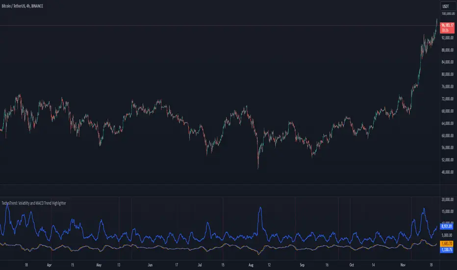
Multiple RSITitle: MultiRSI: A Versatile Multi-Timeframe RSI Indicator
Short Description:
A powerful RSI-based indicator that incorporates three RSI lengths (Fast, Medium, and Slow) to help traders analyze trends, momentum, and potential reversals with clear visual signals.
Full Description:
Overview:
The MultiRSI script provides traders with a dynamic tool to assess market conditions across multiple RSI timeframes. It calculates Fast, Medium, and Slow RSI values, assigns meaningful colors based on trend analysis, and highlights key crossover points for actionable insights.
Key Features:
Triple RSI Display:
Fast RSI (default: 8): Ideal for capturing short-term momentum.
Medium RSI (default: 12): Provides a balanced perspective.
Slow RSI (default: 16): Helps identify longer-term trends.
Trend Analysis:
Color-coded RSI lines:
Green, blue, and aqua for uptrends.
Yellow, orange, and red for potential downtrends.
Visual differentiation for easy interpretation.
Crossover Signals:
Upward Cross (triangle up): Indicates potential bullish momentum.
Downward Cross (triangle down): Suggests possible bearish momentum.
Marked directly on the chart for clarity.
Customizable Inputs:
Adjust RSI lengths to suit your trading strategy.
Grouped input settings for a seamless configuration experience.
Usage Scenarios:
Identify trend strength and reversals in different timeframes.
Spot key momentum shifts with crossover signals.
Combine with other indicators for a comprehensive trading strategy.
How It Works:
The script compares the Fast RSI against the Medium RSI and the Medium RSI against the Slow RSI to determine short-, medium-, and long-term trends. Crossovers between Medium and Slow RSI values signal potential momentum shifts.
Visualization:
Clear, color-coded plots for the three RSI levels.
Highlighted crossovers for quick decision-making.
License:
This script is open-source under the Mozilla Public License 2.0. Feel free to use, modify, and share!
