(CA|RS) Caruso Adaptive Relative StrengthCaruso Adaptive Relative Strength helps an investor identify when a stock is performing better than an index on a relative basis. Going beyond traditional Relative Strength(RS) methods, CARS uses a stock's Beta to determine when Relative Strength is present when adjusting for the individual stock's volatility and correlation to its benchmark. Therefore, it allows investors to not only visualize if a stock is outperforming an index but rather if it is outperforming when considering the stock's Beta. This allows Relative Strength to be more easily viewed in lower volatility equities as well as ETFs, Commodities, and alternative assets. To be as effective as possible, I have built CARS to be an RS composite, and it factors in RS from different time periods in making its calculation.
To make the application as simple as possible, I designed CARS to change the background of the chart to blue when Relative Strength is identified. You also have the option to display a box around the data or plot symbols along the bottom of the chart to best suit your visual need. CARS access comes with CARS Signal access which is a separate indicator that plots below the price chart. It provides greater insight into the robustness of the CARS signal by displaying how many core internal components of CARS are displaying RS.
Importantly, you can also change which index or symbol you would like to use for comparison purposes. I have the default set to the S&P 500, but you can use any index, ETF, or security for comparison.
CARS is also adaptable to any time frame.
The greatest benefit in identifying Relative Strength is to discover which stocks are outperforming an index, therefore are undergoing accumulation. It is important to then time your entry into the stock when the price confirms. If an investor is seeking absolute price gains, then this last point of timing an entry is critical because a stock can outperform an index yet still fall - albeit less than the index.
Comparação de Força Relativa

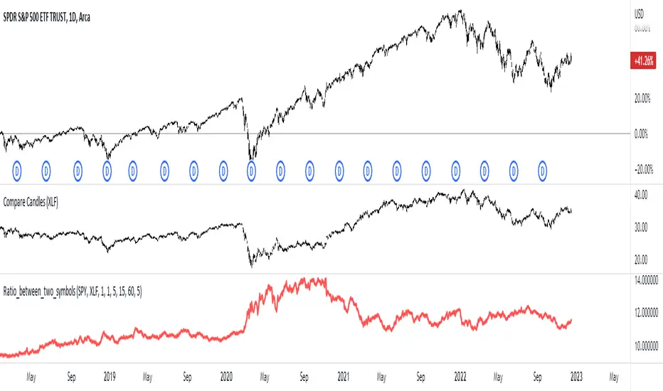
Ratio_between_two_symbolsThis script plots the ratio of two symbols to show the relative strength between in order to determine which is the stronger security
Relative Strength against IndexThis is a very simple script to compare the performance of a single stock against its index, by adding / subtracting points for particular price action on up /down - days in the index.
For instance: If the index is down <-1ATR and the stock is not, it's +1 point. If the index is up >1ATR and the stock is up less than half, it's -1 point.
Basic idea (vs the commonly used "relative strength comparison") is that regular relative strength action over a time tells more about accumulaiton than pure price outperformance.
Formula can probably be made better - I'm open to suggestions...

[TTI] Combined Absolute Relative Strength - ARS toolHISTORY AND CREDITS–––––––––––––––––––––––––––––––––––––––––––––––––––––––
I got inspired to build this based on some public lectures I have seen of Matt Caruso. Matt says he has taken 10 years to build similar tool. The idea of a 'better' Relative Strength hit home and I cracked open the textbooks to see which technique would serve best. I think I have made a very close (my estimate about 90%) script to the original. Examples of side by side in comments.
WHAT IT DOES––––––––––––––––––––––––––––––––––––––––––––––––––––––––––––––
💡A significant advancement in relative strength analysis is Combined Adaptive Relative Strength (ARS tool).
The ARS tool makes it quick and easy to determine whether an asset exhibits Relative Strength and is therefore subject to institutional accumulation.
ARS is not restricted to equities and may be used to find RS on any traded security like crypto, forex, bonds or ETFs. By design, ARS adjusts to a security's volatility to discover RS in a slower-moving, dividend-paying investment just as easily as in a one with strong velocity. Due to this feature, investors are able to use RS analysis on any security type that fits their objectives and risk tolerance.
When the indicator calculates a favourable, strong relative strength in the ticker it paints the background of the chart to the chosen color.
🎁 Unlike the original indicator, I have left a few customisable settings for those who wish to toggle the sensitivity:
✅. You can choose which index you compare Relative Strength against (perfect for anyone trading international)
✅. You can choose how manyDays Lookback the ticker uses to make calculations
✅. You can chooses what Timeperiod in number of bars the ticker uses to calculate Relative Strength
✅. I have made all calculations adaptable for larger and smaller timeframes (so wether you are daytrader or investor this will adapt to the way you have customised your chart).
HOW TO USE IT–––––––––––––––––––––––––––––––––––––––––––––––––––––––––––––
The tool highlights the periods of time when the ticker has the highest probability of attracting institutional investors and hence result in price appreciation. The blue color appears in stages of the indicator where significant upward moves are probable.
You can use the indicator as part of the longer term trend analysis of your research.

IT-Dual Relative StrengthOne can use this indicator to compare two security i.e. (Nifty and stock with its own sector) how it is performing in compare with preferred index ( Nifty 50 by default).
> 0 outperforming
< 0 underperforming
Works best for Daily TF, but can be applied to Weekly and monthly charts .
Can be use on smaller time frame as well, as per the number of hour you want to calculate.
Apply it to Nifty 50 , industry index, sector index or other security in similar sector
I have Added the Box table as well which shows the performance agents Nifty and selected sector.

SCREENER:INDEX
TradingView enables traders and investors to make smarter and better investment decisions. TradingView offers to scan 20 or 40 stock or index. Scanner can be shown in dash board as shown in
above image. This dashboard has following figure
1.Column No.1 show sectoral and thematic index.
2. The price is slipped due to aggressive order punched by market participants. There is six types of price slippage. Three are bullish and three are bearish . This price slippage indicates market fear and greed. Green slippage indicates that bullish rally can start while Red slippage indicates that Bearish rally can start. Area of slippage will act as a support and resistance for future price moment. Where column No. 2,3 and 4 shows H.G., W.G. and T.V. shows price slippage.
3.Column No.6 show resistance strength
4.Column No.7 show Volume strength with respect to ( SMA1000X2)
5.Column No.8 show volatility while Column No. 9 shows liquidity
with previous 1000 bar.
6.Column No.10 show relative strength comparison with respect to broader index.

Diver RSIDiver RSI background and line
Diver RSI background and line
Diver RSI background and line
Diver RSI background and line

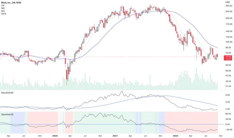
Mansfield Relative Strength (Original Version) by stageanalysisThe Mansfield Relative Strength ( Mansfield RS ) is one of the core components of the Stan Weinstein's Stage Analysis method as discussed in his classic book Stan Weinstein's Secrets for Profiting in Bull and Bear Markets .
The Mansfield RS measures the relative performance of the stock compared to an index such as the S&P 500, or to another stock etc.
However, this should not to be confused with the popular RSI (Relative Strength Index developed J. Welles Wilder), which is a momentum oscillator that measures the speed and change of price movements on a single stock.
The Mansfield RS indicator consists of the Relative Strength comparison line versus the S&P 500 (default universal setting, but can be edited), and the "Zero Line" – which is the 52 week MA of the Relative Strength line, that's been flattened to create the oscillator style.
How to use the Indicator:
Outperforming – Above the Zero Line
When the Relative Strength line crosses above the Zero Line (it's flattened 52 week RS MA), it is outperforming the index or stock that it's comparing against, and so it is showing stronger relative strength.
Underperforming – Below the Zero Line
When the Relative Strength line crosses below the Zero Line (it's flattened 52 week RS MA), it is underperforming the index or stock that it's comparing against, and so it is showing weaker relative strength.
Settings:
When you first add the indicator is has a coloured background, with a green tint for a postive RS score, and a red tint for a negative RS score. However, this can be turned off, or edited in the indicator settings, in the Style tab. So you can change the colors or remove it and just have the RS line and zero line showing. Both of which can also be edited in the settings.
Change the symbol that it compares against. The default is the S&P 500. But for crypto you might want to use Bitcoin for example. Or you might want to compare against competing stocks in the same peer group, or against the industry group or sector. The choice is yours. But the S&P 500 is a universal measure for the Mansfield RS. So I would recommend leaving it on that unless you have a particular reason to change it as mentioned.
MA Length is also an editable setting. This creates the Zero Line. So it will affect the values of the Mansfield RS if you change it. 52 is the default setting, and is set as such for the weekly chart. So I'd recommend not editing it on the weekly chart, but for other timeframes, different settings can be used.
Relative Strength MomentumThe RSI is a traders friend - it can provide insight that other indicators simply cannot. The RSI achilles heel is that it can often fail to highlight divergence. Constance Brown attempted to resolve this problem with the 'Composite index' - a powerful tool. However.. for me, looking at two indicators can get a bit much - especially if viewing multiple time-frames. I want one tool which provides the RSI, it's ranging/reversal behaviour (as documented by Andrew Cardwell) and a better grasp of momentum swings (via divergence and reversal signals). So this is my best effort, and I hope it can prove useful to some of you. At first the differences may be hard to spot - but they are there!
My default settings are optimised - as with the 'normal' RSI you can expect a bullish trend to result in few (if any) moves below 30. In a bearish trend, you can expect few (if any) incursions above 70. Cardwell's observations apply. I recommend using this with a 50 period EMA to provide some additional context.
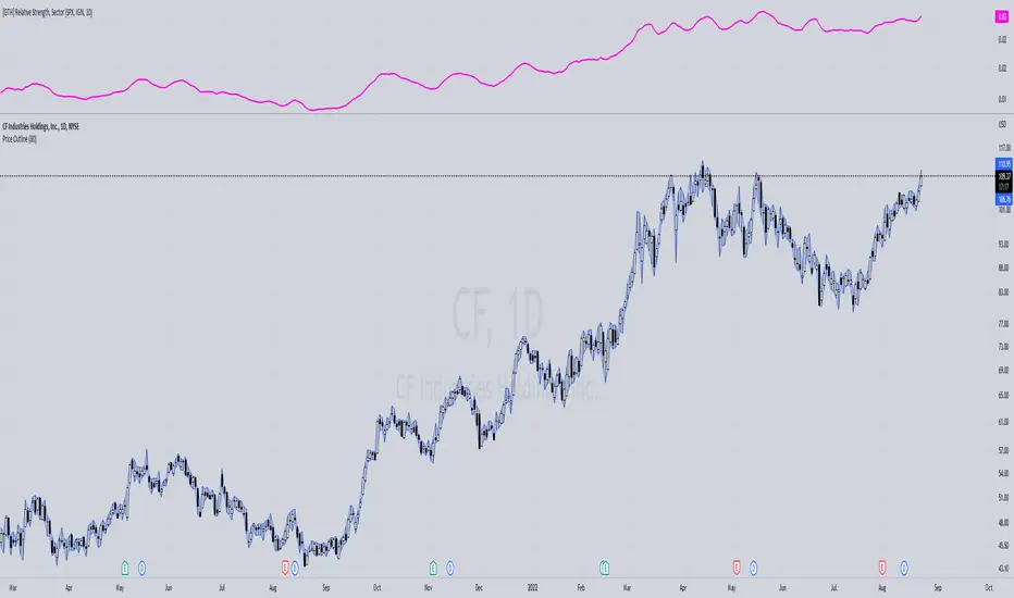
[GTH] Relative Strength, SectorsDisplays the Relative Strength (RS) of a symbol in relation to some common sector ETFs, SPX and NDX (select from drop-down list). This is done by dividing the symbol's price by the chosen sector ETF's price.
You can also select a symbol of your choice to compare against.
Interpretation:
RS line ascending: symbol performs stronger than the sector ETF.
RS line decending: symbol performs weaker than the sector ETF.
In case of error reports: please be specfic. Thanks.
Relative Strength
Compare the percentage change of the current symbol with the benchmark in last 5 periods.
By default the benchmark is SPY, you can change it from Indicator Settings.

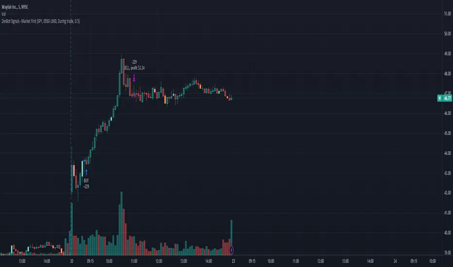
Market First - Relative Strength/Weakness (the ZenBot strategy)This market-first trading strategy gives BUY, SHORT, and CLOSE signals based on volume, trend, and relative strength or weakness to the market (SPY by default, can be customized). This indicator is useful for signaling day-trade entries and exits for tickers that are strong (or weak) against the market.
Stocks that are showing relative strength (or weakness) to the market, are trending, and have decent movement generate a buy (or short) signal. When the trend runs out, a CLOSE signal is fired.
Potential profit (based on ATR) and actual profit is calculated, predicting the type of move expected
Unique 'stay in trade' logic helps prevent unnecessary CLOSE signals if a trend is likely to continue
A colored plot indicates the strength of the current trend and turns orange/red when the strength is weakened.
Crypto traders can uncheck 'Trade during market hours' for 24-hour trading, and should change the comparison ticker from SPY to BTCUSD or something similar for their market.
Enjoy!
KEY CONCEPTS
The three- and five-minute timeframes are used to establish and verify trend ( ADX /DI with custom logic)
Entries and exits are based on Parabolic SAR and confirmed on multiple timeframes, trend, and relative volume
Relative strength /weakness to the market compares ticker to SPY
Chop is avoided at all costs. I've experimented with choppiness indicator below 38, but found that the ADX DI+/- readings work even better.
Trend is established using ADX DI+/- readings over 20, confirmed by EMA 5/13 crossover and EMA5 slope
Signals will fire only if the average volume for the current 5-min bar is above normal
Only tickers with a five-bar / 13 period ATR of 1% the ticker's price generate signal.
Only longs above daily-anchored VWAP , shorts below daily-anchored VWAP
Signals fire on bar close to prevent repainting / look-ahead bias
Indicator labels and alerts generated
SIGNALS
BUY: up-trending tickers showing relative strength are bought on the three-minute PSAR
SELL: when the close price falls below the 1, 3, and 5-minute PSAR, or the ADX DI- falls below 20
SHORT: down-trending tickers with relative weakness are shorted on the three-minute PSAR
COVER: when the close price moves above the 1, 3, and 5-minute PSAR, or the ADX DI- falls below 20
ALERTS
Alerts are generated on BUY, SELL, SHORT, and COVER signals, as well as optional LOST RELATIVE STRENGTH and LOST RELATIVE WEAKNESS
INPUTS
Use relative strength /weakness comparison with the market : trigger trades based on the ticker's strength or weakness to the selected comparison ticker (usually SPY for equities or BTCUSD for crypto)
[* ]Comparison Ticker for relative strength /weakness : Ticker to compare against for relative strength /weakness
Trade during market hours only : Take buy/sells during specified hours. Disable this for crypto trading.
[* ]Market hours (market time) : Customize market hours - defaults to 9:30 to 16:00 EST
[* ]"Only trade very strong trends" : take trades only if an established trend is very strong ( ADX over 40 ) (DEFAULT = ON)
"Limit trade direction to VWAP" : Long trades only above VWAP , shorts below (DEFAULT = ON)
"Limit trade direction to Market direction" : Long trades only if SPY (or selected comparison ticker) is up, shorts if the market is down. (DEFAULT= ON)
"Limit trades based on a ticker's green/red status for the day" : Long trades if the ticker is green for the day, shorts if red. (DEFAULT = ON)
Market First Signals - Relative Strength/WeaknessThis market-first trading strategy gives BUY, SHORT, and CLOSE signals based on volume, trend, and relative strength or weakness to the market (SPY by default, can be customized). This indicator is useful for signaling day-trade entries and exits for tickers that are strong (or weak) against the market.
Stocks that are showing relative strength (or weakness) to the market, are trending, and have decent movement generate a buy (or short) signal. When the trend runs out, a CLOSE signal is fired.
Potential profit (based on ATR) and actual profit is calculated, predicting the type of move expected
Unique 'stay in trade' logic helps prevent unnecessary CLOSE signals if a trend is likely to continue
A colored plot indicates the strength of the current trend and turns orange/red when the strength is weakened.
Crypto traders can uncheck 'Trade during market hours' for 24-hour trading, and should change the comparison ticker from SPY to BTCUSD or something similar for their market.
Enjoy!
KEY CONCEPTS
The three- and five-minute timeframes are used to establish and verify trend (ADX/DI with custom logic)
Entries and exits are based on Parabolic SAR and confirmed on multiple timeframes, trend, and relative volume
Relative strength /weakness to the market compares ticker to SPY
Chop is avoided at all costs. I've experimented with choppiness indicator below 38, but found that the ADX DI+/- readings work even better.
Trend is established using ADX DI+/- readings over 20, confirmed by EMA 5/13 crossover and EMA5 slope
Signals will fire only if the average volume for the current 5-min bar is above normal
Only tickers with a five-bar / 13 period ATR of 1% the ticker's price generate signal.
Only longs above daily-anchored VWAP, shorts below daily-anchored VWAP
Signals fire on bar close to prevent repainting / look-ahead bias
Indicator labels and alerts generated
SIGNALS
BUY: up-trending tickers showing relative strength are bought on the three-minute PSAR
SELL: when the close price falls below the 1, 3, and 5-minute PSAR, or the ADX DI- falls below 20
SHORT: down-trending tickers with relative weakness are shorted on the three-minute PSAR
COVER: when the close price moves above the 1, 3, and 5-minute PSAR, or the ADX DI- falls below 20
ALERTS
Alerts are generated on BUY, SELL, SHORT, and COVER signals, as well as optional LOST RELATIVE STRENGTH and LOST RELATIVE WEAKNESS
INPUTS
Use relative strength/weakness comparison with the market : trigger trades based on the ticker's strength or weakness to the selected comparison ticker (usually SPY for equities or BTCUSD for crypto)
Comparison Ticker for relative strength/weakness : Ticker to compare against for relative strength/weakness
Trade during market hours only : Take buy/sells during specified hours. Disable this for crypto trading.
Market hours (market time) : Customize market hours - defaults to 9:30 to 16:00 EST
"Only trade very strong trends" : take trades only if an established trend is very strong (ADX over 40) (DEFAULT = OFF)
"Limit trade direction to VWAP" : Long trades only above VWAP, shorts below (DEFAULT = ON)
"Limit trade direction to Market direction" : Long trades only if SPY (or selected comparison ticker) is up, shorts if the market is down. (DEFAULT= OFF)
"Limit trades based on a ticker's green/red status for the day" : Long trades if the ticker is green for the day, shorts if red. (DEFAULT = OFF)

SR Relative StrengthThis is a relative strength model for Indian Stock Markets where in the price of the stock in the current scenario is compared with the benchmark indices ( NIFTY / BANKNIFTY) over a period of 55 days ( by default).
This indicator also has RSI and Supertrend built-in by default. Hence this indicator can be used in place of 3 indicators.
How to use?
1. When the background is blue, it means that the stock is relatively strong as compared to the bench mark indices over a period of 55 days and the RSI is > 50
When both RS > 0 & RSI > 50 the background will be blue. If either or is true it won't turn blue.
2. Superternd by default setting is 10,3 which can be changed as per one's requirement.
Thanks!!

Greater Currency Correlation Matrix (Forex)Other available matrixes I found have a limited number of forex symbols. Consequentially, you need to keep switching them if you want to do a proper analysis. As a result of that, I produced my own currency matrix.
Correlation studies relationships between different price charts.
High correlation may be completely random in the short term, but it may signify a fundamental relationship between the two symbols if calculated over the long term.
For example, the currency of an oil-producing country may rally along with oil, whereas the importer's currency may drop. This means that watching the oil price chart may be worth it for such pairs.
The script includes all Major and Minor pairs with the addition of Gold (XAUEUR) and two optional symbols.
▬▬▬▬
To avoid too frequent use of security(), I decided to calculate all symbol values from EUR pairs. It should improve performance and keep room for some additional symbols in the future.
Please report any bugs.
Overlay Mini Plot(s) of Correlated Asset(s)Overlay a small plot of a correlated asset of your choosing. Shrink/expand, Set vertical and horizontal position, plot multiple mini-plots via duplicate indicators with varied settings.
Plots the last X bars of any asset; including the live candle currently painting
Useful for low time frame trading when you want to see correlated asset price movement right alongside the price movement you're watching.
Useful for quick and simple comparisons; when you don't want the clutter of split screen or multi-pane view.
Useful for backtesting.
Price scale agnostic; just plots the shape of the recent price action, with several optional labels: Asset+timeframe | Live Price | Highest price over X bars | Lowest price over X bars.
Works fine with all the assets i've tested it on.
~~User inputs~~
-number of bars to paint.
-horizontal offset: plot to right X bars or to left X bars
-vertical offset: shift up or down, shrink or expand; by using 2 'spacer' inputs
-color/transparancy of candles and price labels.
-width (pixels) of candle bodies.
-choose to display price labels or not
-choose to display asset label or not
~~Tips~~
--Add several of these indicators; changing the vertical 'Shift/Shrink' settings on each to visually separate them.
--In the above chart or EurUsd, there are three indicators =>> three mini-plots overlaid: DXY, EurGbp and GbpUsd. Using the following settings for Space Above:Space Below: DXY- 0.1:4.5 | EurGbp- 1.8:1.8 | GbpUsd- 4.5:0.1
--the more you add, the more you'll have to vertically shrink the plots
© twingall

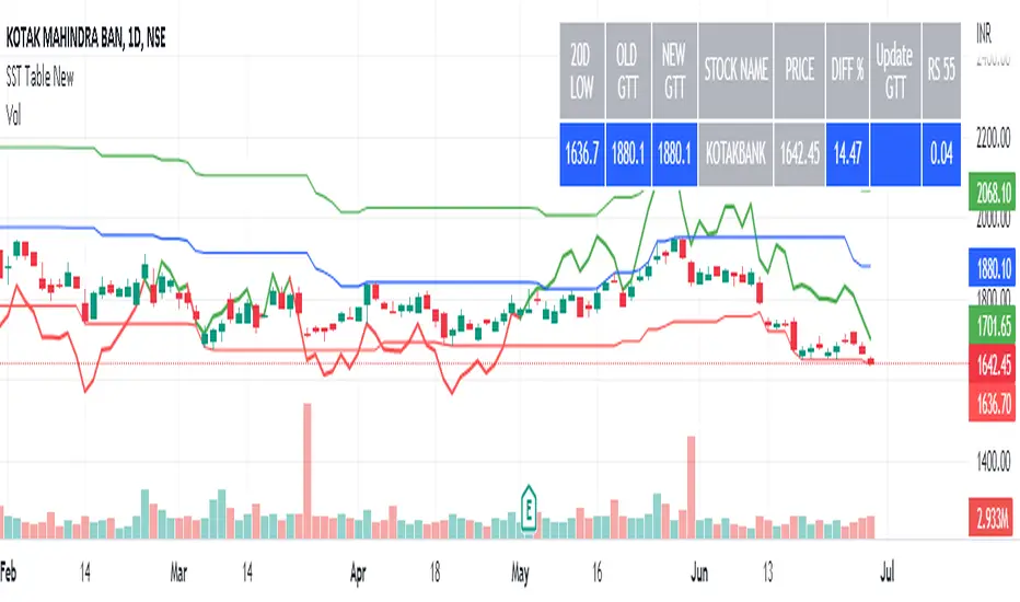
SST Table NewData Table for Update GTT Orders in Stocks....
Updated GTT Order details for SST , also added Relative Strength of Stock compared with NIFTY Index for 55 Days (3 Months) period.
RS line plotted on chart… taken reference of close price of day candle… just a bigger picture of actual RS indicator plotted on chart itself... RS line in red color means below zero line (negative) and green color means above zero line (positive).
Added code for checking RS value on chart for any previous day.
FXminds currency strengthFXminds Currency strength indicator:
The goal of this indicator is to calculate all the currency overall value increases and decreases,
to exploit these by trading a currency that is gaining overall value against a currency that is losing overall value.
========================================================================================================================================================================================
* Fase 1: absolute currency value lines
This script makes theoretical currency absolute currency value line.
It does this by taking the average increase in value from each of the currency pairs the currency has a place in and averaging these increases.
After this, the script makes a factor of the average increase.
Then it multiplies a theoretical value line with this average increase factor, note that this theoretical line start at the value 100.
Example: EUR candle “1”
EUR/USD : +1%
EUR/GBP : +1%
EUR/CAD : +1%
EUR/NZD : +1%
EUR/JPY : +1%
EUR/AUD : +1%
average increase : 1%
average increase factor 1.01
EUR absolute currency value line cande “0” : 100
EUR absolute currency value line cande “1” : 101
Please note that all different exchange rates are weighted equally.
These absolute currency value lines are shown when you set the “indicator modus” setting to “show all absolute value lines”.
When you only want the relevant currency value lines to be shown, set the “indicator modus” setting to “show Base & Quote absolute value lines”.
========================================================================================================================================================================================
* Fase 2:
this script then places a moving average over the self-made absolute currency value lines,
this moving average has a length of n which can be changed by the “currency absolute value line moving average length” setting.
It then calculates the deviation between the currency absolute value line and its moving average in percentages.
this deviation is used to determine whether a currency is gaining or losing value.
These deviations are shown when you set the “indicator modus” setting to “show all absolute value lines deviation % against moving average”.
When you only want the relevant currency value line to be shown, set the “indicator modus” setting to “show Base & Quote absolute value lines deviation % against moving average”.
Then one deviation is starting to trump the other, this is a signal that one currency is gaining value over the other and there is a possible trade to be found.
Please note that if you use the “show Base & Quote absolute value lines deviation % against moving average” setting, the indicator also plots the difference between the two deviations in the form of a histogram.
when on deviation trumps the other and thus there is a signal for a possible trade, this is also shown by the histogram as an 0-line cross.
========================================================================================================================================================================================
* Fase 3:
this script then uses this information to create an entry signal indicator, which is visualized when set the “indicator modus” setting to “plot as entry indicator”.
When using this mode, the indicator also still shows the difference between two deviations histogram.
When looking at the histogram, you can see that the indicator is prone to giving weak signals when two currencies are barely outperforming each other.
To prevent the indicator from giving weak signals, use the “signal line to entry signal smoothing” setting.
With this setting, u can determine the minimum difference in deviation of currency performance needed to create a signal.
Please note that increasing this value makes it so that you get less weak signals, but has the downside that it tends to delay your signals for a bit.
It is also possible to just show the histogram of the difference between the currency performances.
when you want this, set the “indicator modus” setting to “show signal line as 0-cross”.

TAPLOT Relative Strength New High Multi LookbackThis indicator will compare your Stock or ETF to any other security of your choice. The indicator a stock's price action to that of the S&P 500. A rising line tells you the stock is outperforming the benchmark index. When looking for stocks to swing trade, I like to build my watchlist from stocks that are showing a rising/strong Relative Strength line.
What differentiates this indicator from others that are available out there is:
Ability to choose any benchmark index to compare to (from ticker pick field in settings)
Plotting Relative Strength New High (Relative Strength NH) and Relative Strength New High Before Price (RS NHBP) on the Relative Strength line by looking back at 3 different lookback periods (3 months, 6 months, and 12 months)
Plotting all history occurrences of RS NH and RS NHBP
By being able to plot NHs from all 3 lookback periods gives you an early heads up on stocks that started to outperform the market early on (3 months RS NHs). The indicator then switches to 6 months plotting Crosses for NHs and then to 12 month lookback when 12 month Relative Strength New Highs are present.
The Relative Strength line itself will be plot on all of your chart timeframes however the RS NH and RS NHBP are only plotted on Daily and Weekly charts.
The indictor is very customizable - you are able to adjust:
Benchmark to compare to
Lookback period (default to Multi/All)
Change the width of Relative Strength line and color
Change the size of Dashes, Crosses, and Circles plotted on RS line
Change the color of NH and NHBP plots
Force Relative Strength NH/NHBP shapes to Circles for all lookback periods
This is version 1.0 and initial release. Please report any bugs in the comments section below. Hope you find this useful.
Here is an example of $NFE showing early signs of strength from late Feb 2022 with 3 month Dashed signals then 6 month outperformance with Crosses and finally 12 months outperformance with Circles.

Z-Score DeltaHeavily modified from Z Score by jwammo12
Compares the z-score of two assets, the onscreen one and the reference one configured. If you're familiar, you can think of it as Bollinger Band Percent of Onscreen Asset minus the Bollinger Band Percent of Reference Asset.
It's compared off a simple moving average, due to how standard deviation is calculated.
I view this a more literal meaning of relative strength.
Has the ability to offset or delay in time one to another.
TODO: add MAD and MAD/STD.DEV views
Not my greatest work, but it's functional.

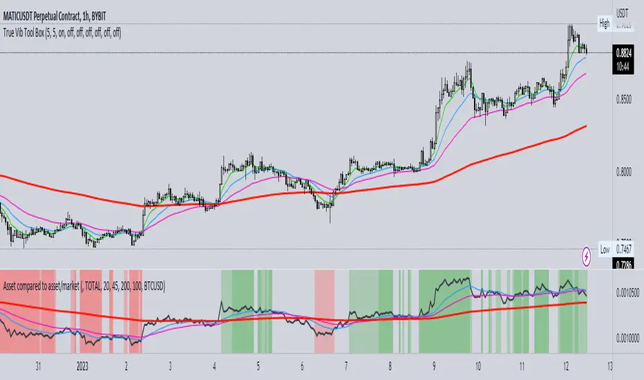
Asset compared to asset/marketThis indicator simply divides an asset to another asset and multiplies the result by 100.
There are the options for choosing a timeframe and symbols. I've also added EMAs.
There's also the option to put red/green background when the EMAs are above the index and are upsloping and vice versa.
Enjoy!
CCI + EMA with RSI Cross StrategyThis strategy uses the CCI + 2 RSIs + 2 EMAs to generate trade signals. Trades are only taken during the normal trading session and all open trades are closed 15 min before the close of the current session. A trailing stop loss is used and is customizable.
Not trading advice, use at your own risk.

Comparative Relative Strength for Crypto (USDT/USD)Comparative Relative Strength for Crypto (USDT/USD)
An adaption of the indicator as published by © bharatTrader->
Please visit the link for details as published by the original coder.
Configured for Crypto by presetting (per filter) for CIX100 usage - either in USDT (Kucoin) or USD (Capitolcom)
