Risk Management Console Pro by ShogunRisk Management Console Pro - Professional Trading Analytics
⚠️ CRITICAL LIQUIDATION DISCLAIMER ⚠️
The liquidation price calculated by this indicator is an approximation based on MEXC perpetual futures methodology and serves as a guide only. This level represents a catastrophic threshold and should never be approached in live trading. Actual liquidation prices vary by exchange, position size, market conditions, and fee structures. It is the trader's sole responsibility to diligently monitor risk exposure, maintain adequate margin buffers, and manage positions appropriately. This tool does not replace proper risk management protocols or real-time exchange data.
---
Overview
The Risk Management Console Pro is institutional-grade risk architecture I've built for futures traders who need precision capital deployment and surgical risk management. After a decade working across institutional finance and fintech, I developed this tool to bridge the gap between professional trading desks and retail execution.
Core Functionality
When you load the indicator, it prompts you to set three critical price anchors using a simple drag-and-drop interface: Entry Price, Stop Loss, and Take Profit. The system calculates an approximate liquidation threshold using MEXC perpetual futures methodology, so you can visualize your catastrophic risk boundary. All levels appear as horizontal reference lines with visual labels - a much cleaner approach than standard long/short tools.
The console automatically detects whether you're going long or short based on where your entry sits relative to your take profit. No manual configuration needed. The liquidation calculations adapt correctly for both directions.
Capital Allocation Framework
You configure two key parameters:
- Maintenance Margin (default $1,000 USD) - the collateral required to open and maintain your leveraged position
- Leverage (default 50x) - your position multiplier that determines capital efficiency and risk exposure
These inputs drive all the real-time calculations, letting you model position sizing with institutional precision before you commit capital.
Dashboard Analytics
The on-chart console displays comprehensive trade metrics in a clean, modern interface built for quick decision-making:
- Position Architecture: Margin, Leverage, Position Size, Quantity
- Risk/Reward Ratio: Real-time R:R calculation showing your trade asymmetry
- Price Levels: Entry, Stop Loss, Take Profit, Liquidation (color-coded as blue/red/green/orange)
- Live Performance: Unrealized P/L updating tick-by-tick with percentage of margin exposure (green for profit, red for loss)
- Projected Outcomes: Maximum loss and profit potential with margin-relative percentages
Display Customization
You have full control over visual elements through Display Settings:
- Toggle horizontal price lines
- Show/hide price level labels
- Toggle dashboard visibility
- Adjust table position (6 locations available)
- Modify color scheme (title, data, text, accent colors)
Professional Design
I went with an institutional dark theme using a slate/charcoal palette. The interface delivers Wall Street-caliber aesthetics with functional clarity. Every element is built for traders operating in high-stakes environments where milliseconds and basis points matter. The dashboard footer carries the Kaizen Systems signature, representing our commitment to continuous improvement in trading methodology.
Key Features Summary
- Automatic long/short detection
- MEXC-based liquidation calculation
- Real-time unrealized P/L tracking
- Draggable price level inputs
- Color-coded risk visualization
- Institutional-grade interface
- Fully customizable display options
- Position size optimization
- R:R ratio analysis
Risk Management Philosophy
This tool embodies a principle I've learned over the years: professional traders quantify risk before entering positions. By visualizing entry, exit, and catastrophic thresholds simultaneously, the Risk Management Console Pro enforces disciplined capital allocation and eliminates emotional decision-making during live market conditions.
Intended Use
I designed this for futures traders using leverage on perpetual contracts, particularly those trading on MEXC or similar platforms. It's ideal for intraday scalpers, swing traders, and position traders who need precise risk calculations across varying timeframes. The console transforms abstract concepts like "position sizing" and "risk/reward" into tangible, actionable data.
About Me
I'm Shogun, and I've spent the last decade deep in quantitative analysis, algorithmic strategy development, and institutional trading operations. As Founding Director of Kaizen Systems - a fintech platform I built to democratize institutional-grade tools for retail traders - I've created multiple proprietary indicators including the Katana strategy series. My focus is translating complex quantitative frameworks into accessible, actionable tools that empower traders at every level to execute with professional discipline.
The Risk Management Console Pro represents my commitment to elevating retail trading standards by providing the same caliber of risk analytics used by professional trading desks. Through continuous refinement and trader feedback, Kaizen Systems delivers tools that merge technical sophistication with practical usability.
Technical Notes
- Compatible with all timeframes and instruments
- Lightweight execution with minimal CPU overhead
- Updates in real-time on every tick
- No repainting or future data leakage
- Pure Pine Script v5 implementation
Support and Updates
For questions, feature requests, or trading strategy consultation, connect with me through TradingView messaging or visit Kaizen Systems for comprehensive trading resources and community support.
---
© 2025 Shogun for Kaizen Systems | All Rights Reserved
Trade responsibly. Past performance does not guarantee future results. Leverage amplifies both gains and losses.
Pine utilities

BOT MAN STRATEGYthis indicator is made and updated by SPXHERO
the daily updates is to add new levels in SPX500 that are aligned with our new innovative strategy to read market movements and define useful Support and resistant

Simulated Liquidation Heatmap [QuantAlgo]🟢 Overview
This indicator visualizes where clusters of stop-loss orders and liquidation levels are likely located, displayed as a 'heatmap'. It's based on the concept of market structure liquidity: large groups of stop orders tend to gather around obvious technical levels (like swing highs and lows), and these pools of orders often attract price movement from institutional traders. The indicator uses a fractal-based algorithm to identify these high-probability liquidation zones and displays them as dynamic, color-coded boxes.
The key feature is the thermal color gradient, which indicates the freshness (age) and therefore the relative relevance of the liquidity zone. Hot colors (e.g., Red/Yellow) represent fresh clusters that have just formed, suggesting strong and immediate liquidity interest. Cold colors (e.g., Blue/Purple) represent aged or decaying clusters that are becoming less relevant over time. This visualization allows traders to anticipate potential liquidity sweeps (stop hunts) and understand areas of significant retail and institutional positioning.
🟢 Key Features
1. Liquidity Zone Heatmap
The core function is the identification of swing high and swing low price points using a user-defined Lookback period. These points are where retail traders are statistically most likely to place their stop-loss orders. The indicator simulates the clustering of these orders by drawing a zone (box) around the detected swing point, with the vertical size controlled by the Stop/Liquidation Zone Width (%) setting.
▶ Cluster Lookback: Defines the sensitivity of swing point detection. Lower values detect frequent, minor zones (scalping/intraday); higher values detect major, stronger swing points (swing trading).
▶ Zone Width (%): Sets the percentage range above and below the swing point where stops are simulated to cluster, accounting for slippage and typical stop placement spread.
▶ Liquidity Decay: Zones gradually fade in color intensity and are eventually removed after the user-defined Liquidity Decay Period (Bars), ensuring the heatmap only displays relevant, current liquidity areas.
▶ Round Number Filter: An optional filter that limits the display to liquidity zones occurring only at psychologically significant round numbers (e.g., $100, $1,500.00), which typically attract higher concentrations of orders.
2. Thermal Color Gradient
The heatmap's color is a direct function of the zone's age, providing a visual proxy for immediate relevance.
▶ Freshness: Newly created zones are displayed in the Hot Color (high relevance).
▶ Decay: As bars pass, the zone color transitions along the gradient toward the Cold Color and increased transparency (lower relevance), until it is removed entirely.
▶ Color Schemes: Multiple pre-configured and custom color schemes are available to optimize the visualization for different chart themes and color preferences.
3. Liquidity Heat Thermometer
An optional visual thermometer is displayed on the chart to provide an instant, overall assessment of the current liquidation heat level in the immediate vicinity of the price.
▶ Calculation: The thermometer calculates an aggregate heat score based on the age and proximity of all liquidity zones within a user-defined Zone Detection Range (%) of the current price.
▶ Visual Feedback: A marker (triangle) points to the corresponding level on the thermometer's color gradient (Hot to Cold). A high reading indicates price is close to fresh, dense stop clusters, suggesting high volatility or an imminent liquidity sweep is probable. A low reading indicates price is in a low-density or aged liquidity area.
▶ Customization: The thermometer's resolution, position, and text size are fully customizable for optimal chart placement and readability.
🟢 Practical Applications
▶ Anticipate Sweeps: Prioritize trading in the direction of Hot (fresh) liquidity zones. For example, a hot low-side zone suggests strong sell-side liquidity (stop-losses) is available for large buyers to sweep.
▶ Filter Noise: Use the Round Number Filter to focus only on the highest probability liquidation zones, which are often at clean, psychological price levels.
▶ Validate Entries: Combine the Heat Thermometer with price action analysis. A rising heat level indicates increasing proximity to a major stop cluster, signaling a potential turn or an aggressive market move to sweep those stops.
▶ Risk Management: Understand that price often acts dynamically around these zones. High heat levels imply high risk/reward setups; stops should be placed strategically beyond the defined Liquidation Zone Width.
▶ Multi-Timeframe Context: Higher timeframes (e.g., Daily, 4-Hour) often reveal more significant, major liquidity zones. Use this indicator on lower timeframes (e.g., 5-min, 15-min) for execution, but prioritize zones that align with higher-timeframe structures.

Watermark | Bar Time | Average Daily RangeMulti Info Panel & Watermark
Multi Info Panel & Watermark is a utility indicator that displays several pieces of chart information in a single, customizable panel. It is designed to support intraday and swing analysis by making key data—such as symbol details, date, and average daily range—easy to see at a glance, as well as providing simple tools for notes and backtesting.
Features
Watermark / Custom Note
Optional text overlay that can be used as a watermark or personal note.
Can display a strategy name, reminder, or any other user-defined label on the chart.
Ticker Info
Shows information about the currently active symbol on the chart (for example, symbol name and other basic details depending on the inputs).
Helps keep track of which market or pair is being analyzed, especially when using multiple charts.
Current Date
Displays the current date directly on the chart.
Useful for screenshots, journaling, and documenting analysis.
Average Daily Range (ADR)
Calculates the average daily range of the active symbol over a user-defined number of recent days.
Helps visualize how much price typically moves in a day, which can support position sizing, target setting, or volatility awareness within your own trading approach.
Open Bar Time Marker
Marks the open time of a selected bar (for example, a session open or a specific reference bar).
Primarily intended as a visual aid for manual backtesting and reviewing historical price action.
Usage
Use the watermark and ticker info to keep your charts labeled and organized.
Refer to the ADR readout to understand typical daily volatility of the instrument you are studying.
Use the date and open bar time marker when creating screenshots, trade journals, or when replaying historical sessions for review.
This script does not generate trading signals and does not guarantee any performance or results. It is provided solely as an informational and visualization tool. Always combine it with your own analysis, risk management, and decision-making. Nothing in this indicator or description should be considered financial advice.

GexView📈 OVERVIEW
GexView indicator plots the Historical Gamma Exposure (GEX) profile, directly on the chart. It enables traders and analysts to observe how GEX profile evolve across multiple days/sessions.
🧲 CONCEPT
Today everybody uses Gamma Exposure. Gamma is the ROC (Rate of Change) for an option’s delta. GEX is crucial for all traders, not just intraday traders, because it helps assess market stability and potential volatility shifts driven by options positioning.
High positive GEX generally implies a mean-reverting market, where big price swings are dampened, while negative GEX signals increased volatility and potential large moves.
Understanding GEX allows traders to anticipate liquidity-driven price action, identify key support and resistance levels, and adjust strategies accordingly. In today’s market, where options flow heavily influences underlying assets, ignoring GEX can mean missing critical market dynamics that impact both short-term and long-term positions.
💡 UNIQUENESS
This indicator is a unique tool and offers a groundbreaking way to visualize market dynamics by plotting Historical Gamma Exposure (GEX), like a Volume Profile across multiple days or sessions. For the first time, traders can clearly see how GEX levels evolve over time, revealing how certain price zones gain or lose importance as market conditions change. This multi-session GEX profile allows users to identify persistent areas of dealer positioning and potential support or resistance that develop and shift over days. Unlike traditional GEX tools designed primarily for intraday use, this indicator provides valuable insight for both short-term traders and medium-term investors seeking to understand how option market flows influence price behaviour over extended periods.
⚙️ FEATURES
• Historical Gamma Exposure
The GexView indicator by default plots the last 6 days of the GEX profile, providing a framework for understanding the bigger picture.
• GEX profile
Displays the 10 largest GEX levels across all expirations (thick lines), as well as the 10 largest GEX levels for the next expiration (thin lines, 0DTE or upcoming).
• Update
Daily, after market close, based on new open interest. No more manual level imports.
Just one-click update.
• Settings
Option to plot total sum GEX for all expirations, or only net GEX for next expiration.
• Watchlist
SPX, NDX, DIA, SPY, QQQ, VIX, VXX, IBIT
(Additional tickers coming soon)
• Mapping
The indicator automatically detects and maps the underlying ticker on your chart, or lets you plot any symbol from the available watchlist.
🔍 HOW TO USE
• Identify intraday support and resistance levels shaped by option market dynamics
• Quickly spot significant GEX levels and compare how they relate to other key levels.
• Compare current vs. past GEX distributions for contextual trend analysis
• Observe structural GEX shifts that may align with volatility or mean-reversion setups
• Easily understanding if an asset trading on positive gamma (around green lines), or negative gamma (around red lines)
Examples:
1. DIA ETF
2. QQQ and VIX
📚 NOTES
• Calculation
GEX for All Expirations: This is the total sum (Call+Put) of gamma exposure of all expirations.
GEX for Nearest Expirations: This is the net sum (Call-Put) of gamma exposure of next expirations (0DTE if available).
• Trading Session - RTH & ETH
The indicator can include the extended trading hours when activated on the chart.
✅ VISUALIZATION
• Vertical implementation of gamma exposure profile.
• Thick lines represent the total gamma exposure across all expiration contracts.
• Thin lines represent the gamma exposure of next expiration only.
• All Expirations: Green colour if Calls > Puts, Red colour if Calls < Puts
• Next Expiration: Lime colour if Calls > Puts, Maroon colour if Calls < Puts
⚠️ DISCLAIMER
This indicator is provided for informational and educational purposes only.
It does not constitute financial advice or a recommendation to buy or sell any financial instrument.
Historical Gamma patterns and analytical interpretations do not guarantee future performance.
All analysis should be combined with independent research and risk management.

MTF Dashboard Table - Sachin ThakareOne Dashboard, Complete Market View!
By - Sachin Thakare (India, Mumbai)
MTF HUD Indicator - All-in-One Market Dashboard
📊 Basic Information
Indicator Name: MTF HUD Table - Bias Column
Created By: Sachin Thakare
Version: Pine Script v5
Type: Multi-Timeframe Heads-Up Display (HUD)
Category: Strategy/Utility Tool
🎯 What This Indicator Does
This is a comprehensive Multi-Timeframe Market Dashboard that displays key technical indicators across 8 different timeframes (3min to Monthly) in a single, easy-to-read table format. It helps traders quickly assess market bias and make informed decisions.
✨ Key Features
📈 Multi-Timeframe Analysis
8 Timeframes: 3m, 5m, 15m, 1H, 4H, Daily, Weekly, Monthly
Real-time Updates: All timeframes update simultaneously
Color-coded Signals: Instant visual feedback
🔢 Technical Indicators Included
Price Change & % Change - Immediate price movement
VWAP - Volume Weighted Average Price
EMA 9/21 - Exponential Moving Average crossover
200 MA - Long-term trend indicator
SuperTrend 10/3 - Trend-following indicator
RSI 9 - Momentum oscillator
MACD 8/21/5 - Moving Average Convergence Divergence
ADX 7/7 - Average Directional Index
Alligator - Bill Williams' trend indicator
Stochastic 5/3/3 - Overbought/Oversold levels
ATR 10 - Average True Range (volatility)
PH/PL - Previous Day High/Low position
🎨 Visual Design
Color Psychology:
🟢 Green: Strong Bullish
🟩 Light Green: Bullish
🔴 Red: Strong Bearish
🟥 Light Red: Bearish
⚪ Gray: Neutral
Customizable Position: Top/Bottom, Left/Right, Center
Clean Table Format: Professional HUD-style display
⚙️ Smart Features
Bias Column: Automatic market bias calculation
Score-based System: 11 indicators contribute to bias score
Customizable Thresholds: Adjust bull/bear levels
Multi-timeframe Security: Accurate timeframe calculations
🚀 How to Use
For Beginners:
Install the indicator on any chart
Look at the BIAS column for overall market direction
Check consistency across timeframes
Stronger signals when multiple timeframes agree
For Advanced Traders:
Identify confluence - When multiple indicators align
Timeframe alignment - Look for agreements across timeframes
Divergence spotting - When timeframes show conflicting signals
Entry/Exit points - Use with price action confirmation
Trading Strategies:
Trend Following: Follow the dominant bias across higher timeframes
Mean Reversion: Look for extreme readings in oscillator columns
Breakout Trading: Use PH/PL and ATR columns
Swing Trading: Focus on 4H and Daily timeframes
⚙️ Customization Settings
Position Settings:
Choose from 5 display positions
Adjust to your preferred chart layout
Indicator Parameters:
Adjust all indicator lengths and periods
Modify OB/OS levels for RSI and Stochastic
Change MA types (SMA/EMA) for 200 MA
Bias Thresholds:
Strong Bull Threshold: 8 (default)
Bull Threshold: 3 (default)
Bear Threshold: -3 (default)
Strong Bear Threshold: -8 (default)
💡 Pro Tips
Start with Higher Timeframes - Daily and Weekly first
Look for Alignment - Best trades when 3+ timeframes agree
Watch the BIAS Column - Quick market sentiment check
Combine with Price Action - Use support/resistance with signals
Risk Management - Never trade on indicator alone
⚠️ Important Notes
Not a Standalone System: Use with other analysis methods
Lagging Indicators: Most components are trend-following
Market Conditions: Works best in trending markets
Customize for Your Style: Adjust parameters for your trading style
🔄 Updates & Support
The indicator is regularly updated based on user feedback and market changes. For suggestions or issues, please leave a comment on the TradingView script page.
Perfect For: Day Traders, Swing Traders, Position Traders, Market Analysts, and anyone needing quick multi-timeframe analysis.
Best Results: When combined with fundamental analysis, risk management, and proper trading psychology.

Grid Percentage Optimizer (V6)Optimizer for an infinity grid. Allows you to determine the optimal percentage for an infinity grid over a specific time range.


PoC Migration Map [BackQuant]PoC Migration Map
A volume structure tool that builds a side volume profile, extracts rolling Points of Control (PoCs), and maps how those PoCs migrate through time so you can see where value is moving, how volume clusters shift, and how that aligns with trend regime.
What this is
This indicator combines a classic volume profile with a segmented PoC trail. It looks back over a configurable window, splits that window into bins by price, and shows you where volume has concentrated. On top of that, it slices the lookback into fixed bar segments, finds the local PoC in each segment, and plots those PoCs as a chain of nodes across the chart.
The result is a "migration map" of value:
A side volume profile that shows how volume is distributed over the recent price range.
A sequence of PoC nodes that show where local value has been accepted over time.
Lines that connect those PoCs to reveal the path of value migration.
Optional trend coloring based on EMA 12 and EMA 21, so each PoC also encodes trend regime.
Used together, this gives you a structural read on where the market has actually traded size, how "value" is moving, and whether that movement is aligned or fighting the current trend.
Core components
Lookback volume profile - a side histogram built from all closes and volumes in the chosen lookback window.
Segmented PoC trail - rolling PoCs computed over fixed bar segments, plotted as nodes in time.
Trend heatmap - optional color mapping of PoC nodes using EMA 12 versus EMA 21.
PoC labels - optional labels on every Nth PoC for easier reading and referencing.
How it works
1) Global lookback and binning
You choose:
Lookback Bars - how far back to collect data.
Number of Bins - how finely to split the price range.
The script:
Finds the highest high and lowest low in the lookback.
Computes the total price range and divides it into equal binCount slices.
Assigns each bar's close and volume into the appropriate price bin.
This creates a discretized volume distribution across the entire lookback.
2) Side volume profile
If "Show Side Profile" is enabled, a right-hand volume profile is drawn:
Each bin becomes a horizontal bar anchored at a configurable "Right Offset" from the current bar.
The horizontal width of each bar is proportional to that bin's volume relative to the maximum volume bin.
Optionally, volume values and percentages are printed inside the profile bars.
Color and transparency are controlled by:
Base Profile Color and its transparency.
A gradient that uses relative volume to modulate opacity between lower volume and higher volume bins.
Profile Width (%) - how wide the maximum bin can extend in bars.
This gives you an at-a-glance view of the volume landscape for the chosen lookback window.
3) Segmenting for PoC migration
To build the PoC trail, the lookback is divided into segments:
Bars per Segment - bars in each local cluster.
Number of Segments - how many segments you want to see back in time.
For each segment:
The script uses the same price bins and accumulates volume only from bars in that segment.
It finds the bin with the highest volume in that segment, which is the local PoC for that segment.
It sets the PoC price to the center of that bin.
It finds the "mid bar" of the segment and places the PoC node at that time on the chart.
This is repeated for each segment from older to newer, so you get a chain of PoCs that shows how local value has migrated over time.
4) Trend regime and color coding
The indicator precomputes:
EMA 12 (Fast).
EMA 21 (Slow).
For each PoC:
It samples EMA 12 and EMA 21 at the mid bar of that segment.
It computes a simple trend score as fast EMA minus slow EMA.
If trend heatmap is enabled, PoC nodes (and the lines between them) are colored by:
Trend Up Color if EMA 12 is above EMA 21.
Trend Down Color if EMA 12 is below EMA 21.
Trend Flat Color if they are roughly equal.
If the trend heatmap is disabled, PoC color is instead based on PoC migration:
If the current PoC is above the previous PoC, use the Up PoC Color.
If the current PoC is below the previous PoC, use the Down PoC Color.
If unchanged, use the Flat PoC Color.
5) Connecting PoCs and labels
Once PoC prices and times are known:
Each PoC is connected to the previous one with a dotted line, using the PoC's color.
Optional labels are placed next to every Nth PoC:
Label text uses a simple "PoC N" scheme.
Label background uses a configurable label background color.
Label border is colored by the PoC's own color for visual consistency.
This turns the PoCs into a visual path that can be read like a "value trajectory" across the chart.
What it plots
When fully enabled, you will see:
A right-sided volume profile for the chosen lookback window, built from volume by price.
Colored horizontal bars representing each price bin's relative volume.
Optional volume text showing each bin's volume and its percentage of the profile maximum.
A series of PoC nodes spaced across the chart at the mid point of each segment.
Dotted lines connecting those PoCs to show the migration path of value.
Optional PoC labels at each Nth node for easier reference.
Color-coding of PoCs and lines either by EMA 12 / 21 trend regime or by up/down PoC drift.
Reading PoC migration and market pressure
Side profile as a pressure map
The side profile shows where trading has been most active:
Thick, opaque bars represent high volume zones and possible high interest or acceptance areas.
Thin, faint bars represent low volume zones, potential rejection or transition areas.
When price trades near a high volume bin, the market is sitting on an area of prior acceptance and size.
When price moves quickly through low volume bins, it often does so with less friction.
This gives you a static map of where the market has been willing to do business within your lookback.
PoC trail as a value migration map
The PoC chain represents "where value has lived" over time:
An upward sloping PoC trail indicates value migrating higher. Buyers have been willing to transact at increasingly higher prices.
A downward sloping trail indicates value migrating lower and sellers pushing the center of mass down.
A flat or oscillating trail indicates balance or rotational behaviour, with no clear directional acceptance.
Taken together, you can interpret:
Side profile as "where the volume mass sits", a static pressure field.
PoC trail as "how that mass has moved", the dynamic path of value.
Trend heatmap as a regime overlay
When PoCs are colored by the EMA 12 / 21 spread:
Green PoCs mark segments where the faster EMA is above the slower EMA, that is, a local uptrend regime.
Red PoCs mark segments where the faster EMA is below the slower EMA, that is, a local downtrend regime.
Gray PoCs mark flat or ambiguous trend segments.
This lets you answer questions like:
"Is value migrating higher while the trend regime is also up?" (trend confirming value).
"Is value migrating higher but most PoCs are red?" (value against the prevailing trend).
"Has value started to roll over just as PoCs flip from green to red?" (early regime transition).
Key settings
General Settings
Lookback Bars - how many bars back to use for both the global volume profile and segment profiles.
Number of Bins - how many price bins to split the high to low range into.
Profile Settings
Show Side Profile - toggle the right-hand volume profile on or off.
Profile Width (%) - how wide the largest volume bar is allowed to be in terms of bars.
Base Profile Color - the starting color for profile bars, with transparency.
Show Volume Values - if enabled, print volume and percent for each non-zero bin.
Profile Text Color - color for volume text inside the profile.
PoC Migration Settings
Show PoC Migration - toggle the PoC trail plotting.
Bars per Segment - the number of bars contained in each segment.
Number of Segments - how many segments to build backwards from the current bar.
Horizontal Spacing (bars) - spacing between PoC nodes when drawn. (Used to separate PoCs horizontally.)
Label Every Nth PoC - draw labels at every Nth PoC (0 or 1 to suppress labels).
Right Offset (bars) - horizontal offset to anchor the side profile on the right.
Up PoC Color - color used when a PoC is higher than the previous one, if trend heatmap is off.
Down PoC Color - color used when a PoC is lower than the previous one, if trend heatmap is off.
Flat PoC Color - color used when the PoC is unchanged, if trend heatmap is off.
PoC Label Background - background color for PoC labels.
Trend Heatmap Settings
Color PoCs By Trend (EMA 12 / 21) - when enabled, overrides simple up/down coloring and uses EMA-based trend colors.
Fast EMA - length for the fast EMA.
Slow EMA - length for the slow EMA.
Trend Up Color - color for PoCs in a bullish EMA regime.
Trend Down Color - color for PoCs in a bearish EMA regime.
Trend Flat Color - color for neutral or flat EMA regimes.
Trading applications
1) Value migration and trend confirmation
Use the PoC path to see if value is following price or lagging it:
In a healthy uptrend, price, PoCs, and trend regime should all lean higher.
In a weakening trend, price may still move up, but PoCs flatten or start drifting lower, suggesting fewer participants are accepting the new highs.
In a downtrend, persistent downward PoC migration confirms that sellers are winning the value battle.
2) Identifying acceptance and rejection zones
Combine the side profile with PoC locations:
High volume bins near clustered PoCs mark strong acceptance zones, good areas to watch for re-tests and decision points.
PoCs that quickly jump across low volume areas can indicate rejection and fast repricing between value zones.
High volume zones with mixed PoC colors may signal balance or prolonged negotiation.
3) Structuring entries and exits
Use the map to refine trade location:
Fade trades against value migration are higher risk unless you see clear signs of exhaustion or regime change.
Pullbacks into prior PoC zones in the direction of the current PoC slope can offer higher quality entries.
Stops placed beyond major accepted zones (clusters of PoCs and high volume bins) are less likely to be hit by random noise.
4) Regime transitions
Watch how PoCs behave as the EMA regime changes:
A flip in EMA 12 versus EMA 21, coupled with a turn in PoC slope, is a strong signal that value is beginning to move with the new trend.
If EMAs flip but PoC migration does not follow, the trend signal may be early or false.
A weakening PoC path (lower highs in PoCs) while trend colors are still green can warn of a late-stage trend.
Best practices
Start with a moderate lookback such as 200 to 300 bars and a moderate bin count such as 20 to 40. Too many bins can make the profile overly granular and sparse.
Align "Bars per Segment" with your trading horizon. For example, 5 to 10 bars for intraday, 10 to 20 bars for swing.
Use the profile and PoC trail as structural context rather than as a direct buy or sell signal. Combine with your existing setups for timing.
Pay attention to clusters of PoCs at similar prices. Those are areas where the market has repeatedly accepted value, and they often matter on future tests.
Notes
This is a structural volume tool, not a complete trading system. It does not manage execution, position sizing or risk management. Use it to understand:
Where the bulk of trading has occurred in your chosen window.
How the center of volume has migrated over time.
Whether that migration is aligned with or fighting the current trend regime.
By turning PoC evolution into a visible path and adding a trend-aware heatmap, the PoC Migration Map makes it easier to see how value has been moving, where the market is likely to feel "heavy" or "light", and how that structure fits into your trading decisions.


Indicador de divergencias RSI (confirmación EMA12)RSI divergence indicator on the 5-period timescale for BTC. It includes a filter for the first RSI peak in extreme zones (overbought for long positions, overbought for short positions). It also features optional confirmation of a 12-period EMA breakout after the divergence.

Dynamic Pip Value CalculatorPIP Value (Account Currency + Pips) is a lightweight risk-management tool that helps you instantly see how much each pip is worth in your own account currency – and how much money a given move in pips represents for your position size.
What this indicator does
Automatically reads the current symbol (Forex, Gold, Silver, Crypto, indices…).
Calculates pip value per 1 pip based on: Symbol type (Forex / XAUUSD / XAGUSD / BTC / ETH…), Tick size, Standard lot size, Your position size (Lots input)
Converts pip value from the quote currency of the pair (e.g. USD in EURUSD) into your Account Currency using real-time FX rates.
Multiplies by the number of Pips you input to show the total money you would gain or lose if price moves that distance.
📥 Inputs
1. Account Currency
Choose your account’s currency (USD, EUR, GBP, JPY, AUD, CAD, CHF, NZD, THB).
AUTO option will use the quote currency of the current symbol.
2. Pips: Number of pips you want to measure (for example: your SL or TP distance).
3. Lots: Position size in lots (0.01, 0.1, 1.0, 2.5, …).
4. Font Color / Background Color: Customize the appearance of the info box to match your chart style.
📊 Output
A small info panel in the bottom-right corner shows:
Symbol & lots: EURUSD | 1.00 lot(s)
Pip value per 1 pip (converted to your Account Currency): Pip value: 9.62 USD per 1 pip
Money value for the number of pips you entered: 50 pips = 481.00 USD
This lets you quickly answer questions like:
“If my stop loss is 35 pips, how much money will I lose with 0.2 lots?”
“How much is 1 pip on XAUUSD with 1 lot in an EUR account?”
📌 Notes
Works on most Forex pairs, XAUUSD, XAGUSD, BTCUSD, ETHUSD and many other symbols.
Pip definitions for Gold, Silver and Crypto are aligned with common trading conventions.
This indicator is for position sizing and risk awareness only – it does not generate trading signals.
⚠️ Disclaimer
This script is for educational and informational purposes only and does not constitute financial advice. Trading Forex, CFDs, metals and cryptocurrencies involves a high level of risk and may not be suitable for all investors. Always do your own research and never risk money you cannot afford to lose.

GOD MODE HUNT v2.0 — SCREENER ULTIME 2025test screener pour détecter les crypto basée sur des règles strict

MCX GOLD1! SpotHelps convert MCX gold rolling contract symbol to spot price.
Note: It cant accurately infer the contract role date, so it makes some assumptions, use the rolldays to adjust where needed

Multi-Factor Trend Confluence Indicator (PTP V4)Disclaimer: This is a technical analysis tool for educational and informational purposes only. It does not constitute investment advice, financial solicitation, or a recommendation to buy or sell any security or instrument. Trading involves significant risk, and past performance is not indicative of future results. Use at your own risk.
KEY Features and Strategic Methodology
This is a comprehensive trend and confluence indicator built on multiple factors to identify potential pullbacks within an established trend.
• Core Trend Filter: Uses a long-term EMA to confirm the overall market bias.
• Fibonacci Pullback Logic: Identifies potential low-risk entry zones by calculating a 61.8% Fibonacci Retracement over a user-defined lookback period.
• Multi-Factor Confluence: A signal is generated only when the price touches the Fib zone AND the following factors align (You can edit the script to adjust the confluence conditions.):
o RSI is above 50.
o Positive DI is above Negative DI (DMI Bullish Crossover).
o Price is above the fast EMA.
• Consecutive Signal Counter: Includes a unique counter that highlights bars where the confluence conditions have been met for a minimum number of consecutive candles (4 by default), aiding in the validation of strong momentum entries.
• Moving Average Visualization: Plots and color-fills 10 WMA, 21 EMA, 42 EMA, and 200 EMA to provide a full market context and visualize momentum shifts.
1. Short-Term Momentum (WMA10 vs. EMA42 Fill)
This fill area highlights immediate price acceleration and momentum shifts:
• Green Fill (Bullish Momentum): WMA10 > EMA42.
• Red Fill (Bearish Momentum): WMA10 < EMA42.
2. Long-Term Market Context (EMA200 vs. EMA42 Fill)
This fill area defines the dominant backdrop of the market, essential for strategic positioning:
• Green Fill (Bullish Context): EMA200 < EMA42.
• Red Fill (Bearish Context): EMA200 > EMA42.
EMA200 Line Coloration
The EMA200 line color itself also provides a visual cue for the long-term context:
• Red Line: When EMA200 > EMA42 (Bearish Context).
• Green Line: When EMA200 < EMA42 (Bullish Context).
Customization
The indicator is highly customizable via the settings menu, allowing users to adjust lengths for EMA, RSI, DMI, Pivot Points, and the specific parameters for the Fibonacci Retracement Strategy (tolerance and candle limits).

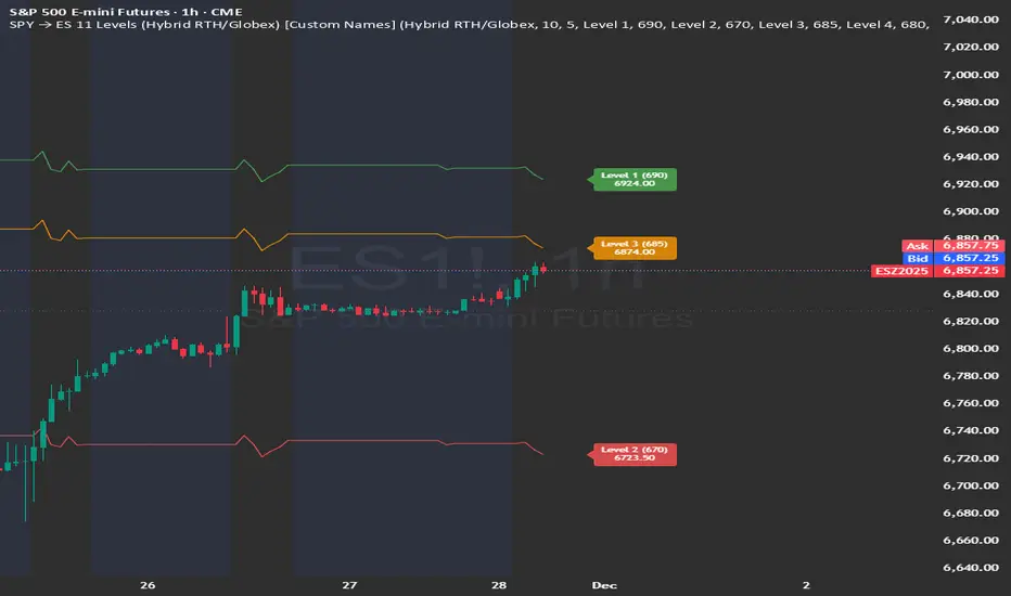
SPY → ES 11 Levels (Hybrid RTH/Globex) [Tick Fixed]📌 Description for SPY → ES 11-Level Converter (with Labels)
This script converts important SPY options-based levels into their equivalent ES futures prices and plots them directly on the ES chart.
Because SPY trades at a different price scale than ES, each SPY level is multiplied by a customizable ES/SPY ratio to project accurate ES levels.
It is designed for traders who use SpotGamma, GEXBot, MenthorQ, Vol-trigger levels, or their own gamma/oi/volume models.
🔍 Features
✅ Converts SPY → ES using custom or automatic ratio
Option to manually enter a ratio (recommended for accuracy)
Or automatically compute ES/SPY from live prices
✅ Plots 11 major levels on the ES chart
Each level can be individually turned ON/OFF:
Call Wall
Put Wall
Volume Trigger
Spot Price
+Gamma Level
–Gamma Level
Zero Gamma
Positive OI
Negative OI
Positive Volume
Negative Volume
All levels are drawn as clean horizontal lines using the converted ES value.
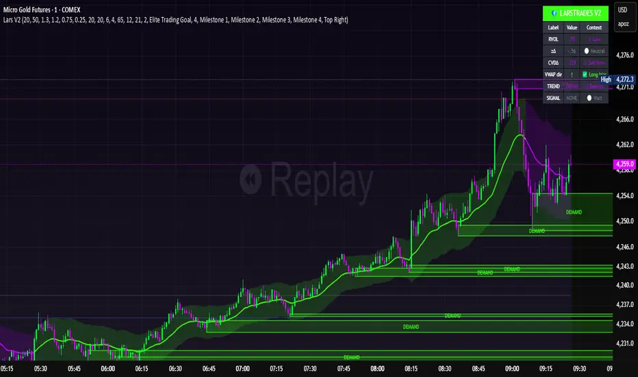
LarsTrades Order Flow ZonesLarsTrades Order Flow Zones
**Important:
-Futures charts only!
-Trust the default settings
-best on 2min or lower timeframe.
-if indicator error in replay mode: exit, ctrl+r - it will reset.
This indicator builds a full trade workflow from raw order flow imbalances. It finds aggressive buy and sell imbalances, promotes the strongest ones into key levels, and manages each level through its entire life cycle. Every level becomes a visual zone on the chart that updates in real time as the market moves.
It is built for short-term traders who want clarity, speed, and a structured decision process based on imbalances instead of guesswork.
If you rely on order flow, imbalance zones, or systematic retest setups, this tool helps you stay consistent and understand the story behind each move.
Psychological levels [Kodologic] Psychological levels
Markets are not random, they are driven by human psychology and algorithmic order flow. A well-known phenomenon in trading is the "Whole Number Bias" — the tendency for price to react significantly at clean, round numbers (e.g., Bitcoin at $95,000 or EURUSD at 1.0500).
Manually drawing horizontal lines at every round number is tedious, clutters your object tree, and distracts you from analyzing price action.
Psychological levels Numbers is a workflow utility designed to solve this problem. It automatically projects a clean, customizable grid of key price levels onto your chart, helping you instantly identify areas where liquidity and orders are likely to cluster.
Why This Indicator Helps Traders :
Professional traders know that "00" and "50" levels act as magnets for price. Here is how this tool assists in your analysis:
1. Institutional Footprints : Large institutions and bank algorithms often execute orders at whole numbers to simplify accounting. This script highlights these potential liquidity zones automatically.
2. Support & Resistance Discovery: You will often notice price wicking or reversing exactly on these grid lines. This helps in spotting natural support and resistance without needing complex technical analysis.
3. Cognitive Load Reduction: Instead of calculating where the next "major level" is, the grid is visually present, allowing you to focus on candlestick patterns and market structure.
Features :
Dynamic Calculation : The grid updates automatically as price moves, you never have to redraw lines.
Zero Clutter : The lines are drawn using code, meaning they do not appear in your manual drawing tools list or clutter your object tree.
Fully Customizable Step : You define what constitutes a "Round Number" for your specific asset class (Forex, Crypto, Indices, or Stocks).
Visual Control : Adjust line styles (Solid, Dotted, Dashed), colors, and transparency to keep your chart aesthetic and readable.
How to Use in Your Strategy :
1. Target Setting (Take Profit)
If you are in a long position, use the next upper grid line as a logical Take Profit area. Price often gravitates toward these whole numbers before reversing or consolidating.
2. Stop Loss Placement
Avoid placing Stop Losses exactly on a round number, as these are often "stop hunted." Instead, use the grid to visualize the level and place your stop slightly *below* or *above* the round number for better protection.
3. Confluence Trading
Do not use these lines in isolation. Look for Confluence :
Example: If a Fibonacci 61.8% level lines up exactly with a Round Number grid line, that level becomes a high-probability reversal zone.
Settings Guide (Important)
Since every asset is priced differently, you must adjust the "levels Step Size" to match your instrument:
Forex (e.g., EURUSD, GBPUSD): Set Step Size to `0.0050` (50 pips) or `0.0100` (100 pips).
Crypto (e.g., BTCUSD): Set Step Size to `500` or `1000`.
Indices (e.g., US30, SPX500): Set Step Size to `100` or `500`.
Gold (XAUUSD):** Set Step Size to `10`.
Disclaimer: This tool is for educational and visual aid purposes only. It does not provide buy or sell signals. Always manage your risk.

Nifty 500 Liquidity Momentum ScreenerTesting screener for momentum stocks in nifty 500 weekly time frame

AG Pro Dynamic Channels PremiumAG Pro Dynamic Channels Premium
The Gold Standard in Automated Market Structure.
AG Pro Dynamic Channels Premium is the culmination of advanced algorithmic development, designed specifically for professional traders who refuse to compromise on chart clarity.
While standard indicators flood your screen with noise, this Premium edition employs a proprietary "Smart Filtering Engine" to identify, validate, and project only the most statistically significant support and resistance channels. It transforms chaos into a clear, actionable roadmap.
🏆 Why Go Premium?
This is not just an update; it is a complete overhaul of the trend detection logic.
1. 🧠 Smart Quality Control (Exclusive) The core difference in the Premium version is its ability to "think" before it draws.
Volatility Filtering: The script analyzes the slope of every potential trend. It automatically rejects unsustainable "pump/dump" moves and flat ranges, keeping only tradeable structures.
Wick Exclusion Logic: An advanced algorithm that ignores extreme volatility spikes (wicks), drawing channels based on candle body consolidation for higher precision.
2. 🏷️ Intelligent Labeling System Instant situational awareness. Every channel is auto-labeled (e.g., Mj Ext Up), so you know exactly which market phase (Major or Minor, Internal or External) you are trading in without guessing.
3. ⚡ Zero-Lag Optimization The code has been refactored for maximum efficiency, ensuring faster load times and smoother performance even on lower timeframes.
💎 Key Features
Dual-Layer Architecture: Simultaneously tracks Major Trends (for bias) and Minor Trends (for entries).
Dynamic Support & Resistance: The dotted midline acts as a high-probability reversal zone.
Institutional Grade Alerts: Fully customizable alerts for Breakouts and Reactions, complete with metadata for automated trading systems.
Auto-Tuning: Default settings are optimized for a balance of sensitivity and reliability, but fully customizable for specific assets (Crypto, Forex, Indices).
⚙️ Methodology (How It Works)
To comply with TradingView House Rules, here is the technical logic behind the script:
Pivot Detection: The script scans price action using a highly sensitive lookback period to find raw Pivot Highs and Lows.
Structure Mapping: It processes these points to define the Market Structure (HH, LL, LH, HL).
Validation Layer: Before rendering, the Smart Filter calculates the channel's duration and slope coefficient. If the channel is too short or too steep (violating the user-defined Max Slope threshold), it is discarded as "Market Noise."
Projection: Validated channels are drawn with dynamic extensions and fill zones.
🔒 How to Get Access
This is an Invite-Only script. Access is restricted to authorized users.
To Request Access: Please send me a private message on TradingView or check the links in my profile signature for more information.
Existing Members: If you have active access, the script will load automatically.
Disclaimer: Technical analysis tools are for educational purposes. Past performance does not guarantee future results.
Developed by Ali Gurtuna (AG Pro Series).

Risk Manager Pro – Position Size CalculatorDescription (설명문)
ENGLISH DESCRIPTION (required)
Risk Manager Pro is a professional-grade risk and position management tool designed for crypto traders who need precise control over position sizing, TP/SL targets, and partial take-profit scenarios.
Simply enter your desired Risk ($), Entry, TP, and SL, and the script automatically calculates:
Position size (Qty)
Position value ($)
Full take-profit profit
Risk/Reward ratio (R:R)
Partial TP1 & TP2 profits (optional)
Combined partial profit
Auto-adjusted decimal precision based on each symbol’s syminfo.mintick
This indicator also dynamically builds a clean table on the chart, showing only the values relevant to your setup (TP1/TP2 rows appear only when used).
Works for both long and short trades, and supports any symbol (BTC, altcoins, futures, spot, etc.)
Features
Automatic position size calculation based on Risk$
Auto TP/SL → Profit/R:R calculation
Partial Take-Profit (TP1 / TP2) with percentage control
Auto decimal formatting using format.mintick
Works on all symbols: BTC / alt / futures / spot
Clean dynamic table (no empty rows)
Perfect for traders who use position sizing and risk-based entries
🇰🇷 한국어 설명 (선택 사항)
Risk Manager Pro는 트레이더가 가장 많이 사용하는 핵심 기능들을 통합한
프로페셔널 리스크 관리 도구입니다.
리스크 금액(Risk$), 진입가(Entry), 익절(TP), 손절(SL)을 입력하면
자동으로 다음 값이 계산됩니다:
포지션 수량(코인)
포지션 크기($)
전체 익절 시 수익
손익비(R:R)
부분익절(TP1 / TP2) 수익
부분익절 합계
종목별 소수점 자리 자동 최적화(syminfo.mintick 기반)
TP1/TP2가 입력된 경우에만 해당 줄이 표시되어
표가 깔끔하게 유지됩니다.
비트코인/알트/선물/현물 모두 지원합니다.

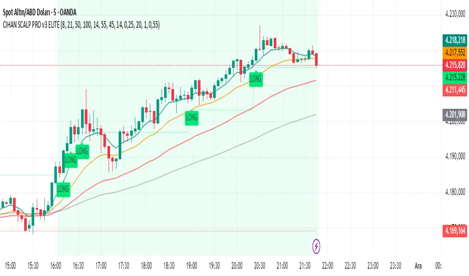
CIHAN SCALP PRO v3 ELITEI’m sharing a testable scalping strategy:
When you see a Long or Short signal, you can open a position without waiting for the candle to close and take quick profits with a short TP.
But the real game-changer is coming soon!
The Professional Scalping System I’ve been working on, with 85%+ accuracy, is almost ready.
This system is fully mechanical — no analysis needed, it instantly catches momentum and trend shifts.
It will be available soon with a small monthly subscription fee.
Stay tuned!