MarketMind LITEM🜁rketMind LITE ────────────────────
Essential Market Awareness, Reduced to Its Core
M🜁rketMind LITE is a lightweight market awareness tool designed to display essential situational context .
It provides basic orientation and movement awareness without interpretation, risk framing, diagnostics, or decision guidance.
This script is designed as a standalone awareness layer. It does not evaluate trade quality, issue signals, or influence decision-making.
WHAT IT DOES ────────────────────
M🜁rketMind LITE presents a minimal, static view of current market conditions focused entirely on awareness rather than analysis.
The system displays only essential context, allowing traders to stay oriented without introducing judgment, noise, or implied direction.
The script provides visibility into:
Time-of-day session context
Basic market regime classification (trending, range-bound, mixed)
Short-term momentum direction only (up, down, neutral)
A clean, static HUD display
M🜁rketMind LITE also includes a minimal visual state indicator that reflects recent price responsiveness, intended to be observed over time alongside the trader’s own experience.
The goal is to support awareness without influence .
HOW TO USE IT ────────────────────
M🜁rketMind LITE is not a signal generator.
It is designed to remain visible in the background of any chart, offering quiet orientation while traders rely entirely on their own process for analysis and execution.
Common use cases include:
Maintaining session awareness
Preserving context during focused trading periods
Reducing cognitive load while monitoring markets
M🜁rketMind LITE does not evaluate risk, alignment, or opportunity.
It simply shows what is happening.
DESIGN PHILOSOPHY ────────────────────
M🜁rketMind LITE is intentionally minimal.
It includes only essential awareness elements and excludes all interpretive or evaluative logic:
Situational context only
Directional momentum (up / down / neutral)
No diagnostics, confidence, or conviction framing
No process, risk, or quality assessment
Presentation controls only (HUD on/off, size, position)
Nothing is inferred.
Nothing is suggested.
This script shows market state without interpretation.
WHO IT IS FOR ────────────────────
M🜁rketMind LITE is suited for traders who:
Want passive situational awareness
Prefer minimal on-chart information
Already operate with a defined decision process
It is not designed for:
Analytical or diagnostic use
Risk evaluation or context synthesis
Traders seeking guidance or confirmation
IMPORTANT NOTES ────────────────────
M🜁rketMind LITE does not provide financial advice
No system can predict future price behavior
This tool is designed for awareness only
Used appropriately, M🜁rketMind LITE helps traders stay oriented without interference.
Overlay

Smart Divergence Engine Overlay [ChartNation]SMART DIVERGENCE ENGINE OVERLAY — CANDLE-ANCHORED RSI DIVERGENCE VISUALIZATION
═══════════════════════════════════════════
TECHNICAL OVERVIEW
═══════════════════════════════════════════
Smart Divergence Engine Overlay renders pivot-confirmed RSI divergences directly on the price chart with candle-anchored lines and labels. This companion overlay shares the identical detection logic as the panel version but visualizes signals at their exact price levels rather than in oscillator space.
The overlay implements repainting-proof divergence detection through pivot-locked RSI evaluation at historical bars (rsi ), ensuring all lines and labels remain stable as new bars form. Visual elements anchor to xloc.bar_index coordinates, maintaining precise positioning across zoom levels and timeframe changes.
═══════════════════════════════════════════
CORE ARCHITECTURE
═══════════════════════════════════════════
PIVOT-LOCKED DETECTION SYSTEM
The overlay evaluates RSI at confirmed pivot bars, not at the current bar:
Technical implementation:
Price pivots detected via ta.pivotlow() / ta.pivothigh() with configurable Left/Right parameters
RSI value captured at the pivot bar: rsi (historical bar offset)
Divergence comparison performed between stored pivot values (lowRsiPrev vs lowRsiCurr)
State management via var floats prevents recalculation across bars
Result: Once a divergence line prints, it never moves or disappears. Historical stability is guaranteed because RSI evaluation occurs at a locked bar index (bar_index - pivotR), not at the moving present.
Bullish divergence logic:
if not na(lowPricePrev) and lowPriceCurr < lowPricePrev and lowRsiCurr > lowRsiPrev
→ Price made lower low, RSI made higher low
→ Divergence confirmed at lowIdxCurr (pivot bar index)
Bearish divergence logic:
if not na(highPricePrev) and highPriceCurr > highPricePrev and highRsiCurr < highRsiPrev
→ Price made higher high, RSI made lower high
→ Divergence confirmed at highIdxCurr (pivot bar index)
RSI ENGINE
The overlay uses the same RSI calculation as the panel version to ensure signal synchronization:
Base calculation: ta.rsi(src, 14) — standard RSI momentum window
Smoothing layer: ta.rma(rsiRaw, 2) — reduces high-frequency noise
Volatility bands: 34-period SMA basis with 1.618 standard deviation multiplier
Purpose: Bands define adaptive overbought/oversold context (not plotted on overlay)
The volatility framework exists in the calculation layer to maintain logic parity with the panel version, ensuring divergences trigger at identical bars across both implementations.
CANDLE-ANCHORED RENDERING
All visual elements use xloc.bar_index positioning:
Line rendering:
line.new(x1=lowIdxPrev, y1=lowPricePrev, x2=lowIdxCurr, y2=lowPriceCurr,
xloc=xloc.bar_index, color=bullCol, width=lineW)
This anchors lines to specific bar indices and price levels, not to time coordinates. Result: Lines maintain exact positioning when zooming, panning, or switching timeframes.
Label rendering:
label.new(x=lowIdxCurr, y=lowPriceCurr, text="BUY",
xloc=xloc.bar_index, style=label.style_label_up)
Labels attach to the second pivot's bar index and price level, scaling naturally with chart transformations.
═══════════════════════════════════════════
VISUAL IMPLEMENTATION
═══════════════════════════════════════════
DIVERGENCE LINES
Bullish divergence: Connects two price swing lows with upward-sloping line
Color: Configurable (default lime green)
Width: 1-6 pixels (configurable)
Endpoint 1: Previous swing low (lowPricePrev at lowIdxPrev)
Endpoint 2: Current swing low (lowPriceCurr at lowIdxCurr)
Requirement: Current price lower than previous, current RSI higher than previous
Bearish divergence: Connects two price swing highs with downward-sloping line
Color: Configurable (default red)
Width: 1-6 pixels (configurable)
Endpoint 1: Previous swing high (highPricePrev at highIdxPrev)
Endpoint 2: Current swing high (highPriceCurr at highIdxCurr)
Requirement: Current price higher than previous, current RSI lower than previous
Lines extend between pivot bars only (extend.none), never projecting into future.
DIVERGENCE LABELS
Optional BUY/SELL markers render at the second pivot:
BUY label (bullish divergence):
Position: Below current swing low (label.style_label_up)
Text: "BUY"
Color: Matches bullish line color
Size: Normal (size.normal)
SELL label (bearish divergence):
Position: Above current swing high (label.style_label_down)
Text: "SELL"
Color: Matches bearish line color
Size: Normal (size.normal)
Labels can be toggled independently of lines via showLabels input.
═══════════════════════════════════════════
CONFIGURATION PARAMETERS
═══════════════════════════════════════════
RSI CALCULATION SETTINGS:
Price Source: close (configurable to any price field)
RSI Length: 14 (standard momentum window)
Volatility Band Length: 34 (SMA period for RSI basis)
Band Multiplier: 1.618 (standard deviation expansion)
Note: Bands calculate internally but don't plot (logic parity with panel)
DIVERGENCE DETECTION SETTINGS:
Pivot Left: 10 bars (left-side swing confirmation)
Pivot Right: 10 bars (right-side swing confirmation)
Overbought Level: 68 (reference, does not affect logic)
Oversold Level: 32 (reference, does not affect logic)
Pivot parameters control strictness:
Higher values = fewer, more significant divergences (requires wider swings)
Lower values = more frequent divergences (detects smaller swings)
VISUAL SETTINGS:
Show Divergence Lines: true/false toggle
Show BUY/SELL Labels: true/false toggle (independent of lines)
Line Width: 1-6 pixels
Bull Color: Configurable (default lime green)
Bear Color: Configurable (default red)
═══════════════════════════════════════════
ALERT SYSTEM
═══════════════════════════════════════════
Two alert conditions trigger at identical timing as visual signals:
"Bullish Divergence (Overlay)"
Triggers when: Bullish divergence confirms at second pivot
Timing: Fires AFTER Pivot Right bars complete (delayed but stable)
Message: "TDI: Bullish divergence"
Reliability: Never repaints (confirmation locked at rsi )
"Bearish Divergence (Overlay)"
Triggers when: Bearish divergence confirms at second pivot
Timing: Fires AFTER Pivot Right bars complete (delayed but stable)
Message: "TDI: Bearish divergence"
Reliability: Never repaints (confirmation locked at rsi )
Alert configuration:
Set once on any chart/timeframe
Fires only when divergence condition evaluates true
Synchronized with visual rendering (alert = line + label appear)
═══════════════════════════════════════════
TRADING IMPLEMENTATION
═══════════════════════════════════════════
VISUAL ANALYSIS WORKFLOW
The overlay provides direct price-level context for divergence signals:
Bullish divergence interpretation:
Identify two connected swing lows with upward-sloping line
Lower price low indicates selling pressure weakening
Higher RSI low indicates momentum refusing to confirm price weakness
BUY label marks the second swing low (divergence confirmation point)
Bearish divergence interpretation:
Identify two connected swing highs with downward-sloping line
Higher price high indicates buying pressure weakening
Lower RSI high indicates momentum refusing to confirm price strength
SELL label marks the second swing high (divergence confirmation point)
CONFLUENCE WITH PRICE STRUCTURE
Overlay enables direct correlation with chart elements:
Support/Resistance alignment:
Bullish divergence at major support level = higher probability reversal
Bearish divergence at major resistance level = higher probability reversal
Divergence in middle of range = lower conviction signal
Volume confirmation:
Divergence with decreasing volume = confirms momentum exhaustion
Divergence with increasing volume = mixed signal, proceed with caution
Multi-timeframe context:
Higher timeframe trend alignment increases signal reliability
Counter-trend divergences (against HTF trend) require additional confirmation
ENTRY/EXIT FRAMEWORK
The overlay marks divergence confirmation points, not entry triggers:
Entry consideration process:
Divergence line appears → structure-confirmed momentum divergence detected
Wait for price confirmation (engulfing candle, break of structure, rejection wick)
Validate with additional confluence (volume, support/resistance, HTF trend)
Enter with predefined stop below/above divergence pivot
Size position according to distance to invalidation level
Exit planning:
Initial target: Previous swing high (bullish) / swing low (bearish)
Trail stop: Move to breakeven after initial profit target
Invalidation: Close below divergence low (bullish) / above divergence high (bearish)
═══════════════════════════════════════════
PANEL VS OVERLAY USAGE
═══════════════════════════════════════════
IDENTICAL DETECTION LOGIC
Both versions implement the same pivot-locked RSI evaluation:
Same RSI calculation (14-length with 2-period RMA smoothing)
Same volatility band framework (34-SMA + 1.618σ)
Same pivot confirmation (10 Left + 10 Right)
Same divergence comparison (rsi at locked bar indices)
Result: Divergences trigger at identical bars across both implementations.
RENDERING DIFFERENCES
Panel version (overlay=false):
Renders in separate pane below price chart
Displays RSI line, volatility bands, 50-line midline
Divergence lines drawn in oscillator space (RSI value coordinates)
Optional Shark Fin exhaustion visualization
Labels positioned relative to RSI levels
Overlay version (overlay=true):
Renders directly on price chart
No RSI line or bands visible (calculate internally for logic only)
Divergence lines drawn in price space (actual price coordinates)
No Shark Fin visualization (price chart remains clean)
Labels positioned at actual swing high/low prices
COMPLEMENTARY WORKFLOW
Recommended usage pattern:
Panel version: Monitor RSI regime (above/below 50), band interactions, Shark Fin exhaustion
Overlay version: Identify exact divergence price levels, correlate with support/resistance
Combined analysis: Use panel for momentum context, overlay for entry/exit precision
Alternative workflow (overlay only):
If RSI analysis not required, overlay version provides clean divergence detection
Pair with external RSI indicator if separate momentum visualization needed
Focuses chart space on price action and divergence markers only
═══════════════════════════════════════════
TECHNICAL SPECIFICATIONS
═══════════════════════════════════════════
RESOURCE ALLOCATION:
max_lines_count: 500 (divergence connector lines)
max_labels_count: 500 (BUY/SELL markers)
Suitable for most chart configurations and timeframes
RENDERING STABILITY:
xloc.bar_index positioning ensures visual stability across zoom/pan operations
Historical divergences never move once printed
Lines and labels scale proportionally with chart transformations
TIMEFRAME COMPATIBILITY:
Functions on any timeframe (1m to 1M)
Pivot detection adapts to bar spacing automatically
Lower timeframes generate more frequent signals (smaller swings)
Higher timeframes generate fewer signals (larger swings)
SYMBOL COMPATIBILITY:
Works on all asset classes (stocks, forex, crypto, futures, indices)
No symbol-specific logic or calculations
Universal RSI-based divergence detection
PERFORMANCE CHARACTERISTICS:
Lightweight calculation overhead (RSI + pivot detection + state management)
Visual rendering occurs only on divergence confirmation (not every bar)
No continuous repainting or historical recalculation
═══════════════════════════════════════════
USE CASE SCENARIOS
═══════════════════════════════════════════
SCENARIO 1: Support/Resistance Divergence
Setup: Price tests major support level twice, second test makes lower low
Signal: Bullish divergence line appears, RSI makes higher low at support
Interpretation: Momentum refusing to confirm price weakness at critical level
Action: Consider long entry on next bullish candle above divergence low
SCENARIO 2: Trend Exhaustion
Setup: Strong uptrend, price makes new high but momentum slowing
Signal: Bearish divergence line appears, RSI makes lower high
Interpretation: Buying pressure weakening despite higher price high
Action: Consider profit-taking on longs, watch for reversal confirmation
SCENARIO 3: Range-Bound Reversal
Setup: Price oscillating in horizontal range, tests lower boundary
Signal: Bullish divergence at range support
Interpretation: Oversold bounce opportunity within defined range
Action: Long entry targeting range midpoint or upper boundary
SCENARIO 4: Failed Breakout
Setup: Price breaks resistance but momentum doesn't confirm
Signal: Bearish divergence forms immediately after breakout
Interpretation: Breakout lacks momentum conviction, likely false breakout
Action: Consider fade setup (short) with stop above divergence high
═══════════════════════════════════════════
LIMITATIONS & CONSIDERATIONS
═══════════════════════════════════════════
SIGNAL TIMING:
Divergences print AFTER Pivot Right bars complete. This delay is intentional:
Ensures structure confirmation (full swing formation)
Prevents real-time repaint issues
Trades confirmation reliability for signal speed
Users requiring instant signals should use real-time divergence detectors (with repaint risk).
Users requiring reliable, stable signals should accept the confirmation delay.
LINE CLUTTER:
On lower timeframes with sensitive pivot settings:
High signal frequency may create visual clutter
Solution: Increase Pivot Left/Right values to filter smaller swings
Alternative: Use panel version for primary analysis, overlay for key divergences only
FALSE SIGNALS:
Divergences indicate momentum divergence, not guaranteed reversals:
Strong trends can maintain divergent conditions for extended periods
Divergence in isolation is a warning sign, not a trade trigger
Requires confluence with price action, volume, structure for high-probability setups
VOLATILITY BAND CONTEXT:
Bands calculate internally but don't visualize on overlay:
Users lose visual context of RSI overbought/oversold zones
Solution: Use panel version alongside overlay for complete RSI regime awareness
Alternative: Add separate RSI indicator to chart for band visualization
═══════════════════════════════════════════
Smart Divergence Engine Overlay provides candle-anchored, repainting-proof RSI divergence visualization directly on price charts. Lines and labels render at exact pivot price levels using xloc.bar_index positioning, maintaining stability across all chart transformations. Divergence detection uses pivot-locked RSI evaluation (rsi ) to ensure historical signals never move or disappear.
The overlay shares identical detection logic with the panel version but renders in price space rather than oscillator space, enabling direct correlation with support/resistance levels and price structure. All visual elements trigger only after full pivot confirmation (Pivot Left + Pivot Right bars), trading signal speed for absolute reliability.

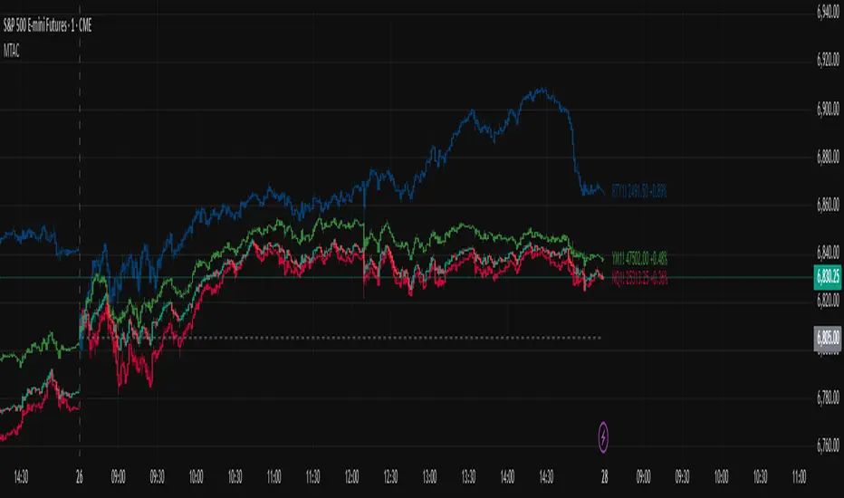
Multi-Ticker Anchored CandlesMulti-Ticker Anchored Candles (MTAC) is a simple tool for overlaying up to 3 tickers onto the same chart. This is achieved by interpreting each symbol's OHLC data as percentages, then plotting their candle points relative to the main chart's open. This allows for a simple comparison of tickers to track performance or locate relationships between them.
> Background
The concept of multi-ticker analysis is not new, this type of analysis can be extremely helpful to get a gauge of the over all market, and it's sentiment. By analyzing more than one ticker at a time, relationships can often be observed between tickers as time progresses.
While seeing multiple charts on top of each other sounds like a good idea...each ticker has its own price scale, with some being only cents while others are thousands of dollars.
Directly overlaying these charts is not possible without modification to their sources.
By using a fixed point in time (Period Open) and percentage performance relative to that point for each ticker, we are able to directly overlay symbols regardless of their price scale differences.
The entire process used to make this indicator can be summed up into 2 keywords, "Scaling & Anchoring".
> Scaling
First, we start by determining a frame of reference for our analysis. The indicator uses timeframe inputs to determine sessions which are used, by default this is set to 1 day.
With this in place, we then determine our point of reference for scaling. While this could be any point in time, the most sensible for our application is the daily (or session) open.
Each symbol shares time, therefore, we can take a price point from a specified time (Opening Price) and use it to sync our analysis over each period.
Over the day, we track the percentage performance of each ticker's OHLC values relative to its daily open (% change from open).
Since each ticker's data is now tracked based on its opening price, all data is now using the same scale.
The scale is simply "% change from open".
> Anchoring
Now that we have our scaled data, we need to put it onto the chart.
Since each point of data is relative to it's daily open (anchor point), relatively speaking, all daily opens are now equal to each other.
By adding the scaled ticker data to the main chart's daily open, each of our resulting series will be properly scaled to the main chart's data based on percentages.
Congratulations, We have now accurately scaled multiple tickers onto one chart.
> Display
The indicator shows each requested ticker as different colored candlesticks plotted on top of the main chart.
Each ticker has an associated label in front of the current bar, each component of this label can be toggled on or off to allow only the desired information to be displayed.
To retain relevance, at the start of each session, a "Session Break" line is drawn, as well as the opening price for the session. These can also be toggled.
Note: The opening price is the opening price for ALL tickers, when a ticker crosses the open on the main chart, it is crossing its own opening price as well.
> Examples
In the chart below, we can see NYSE:MCD NASDAQ:WEN and NASDAQ:JACK overlaid on a NASDAQ:SBUX chart.
From this, we can see NASDAQ:JACK was the top gainer on the day. While this was the case, it also fell roughly 4% from its peak near lunchtime. Unlike the top gainer, we can see the other 3 tickers ended their day near their daily high.
In the explanations above, the daily timeframe is used since it is the default; however, the analysis is not constrained to only days. The anchoring period can be set to any timeframe period.
In the chart below, you can observe the Daily, Weekly, and Monthly anchored charts side-by-side.
This can be used on all tickers, timeframes, and markets. While a typical application may be comparing relevant assets... the script is not limited.
Below we have a chart tracking COMEX:GCV2026 , FX:EURUSD , and COINBASE:DOGEUSD on the AMEX:SPY chart.
While these tickers are not typically compared side-by-side, here it is simply a display of the capabilities of the script.
Enjoy!
Smart RSI MTF [DotGain]Summary
Are you tired of constantly switching between timeframes to check the RSI, only to miss the bigger picture?
The Smart RSI MTF (Multi-Timeframe) is designed to solve this exact problem. It is a streamlined chart overlay that monitors RSI conditions across up to 10 different timeframes simultaneously —from the 1-minute chart all the way up to the Monthly view.
This indicator removes the need for multiple open tabs and declutters your analysis by plotting signals directly on your main chart using a smart "visual hierarchy" system based on transparency.
⚙️ Core Components and Logic
The Smart RSI MTF relies on a sophisticated 3-layer logic to deliver clear, actionable context:
Multi-Timeframe Engine: The script runs 10 independent RSI calculations in the background. It checks standard intervals (5m, 15m, 1h, 4h, Daily, Weekly, Monthly) to ensure you never miss a momentum extreme on any scale.
Classic RSI Thresholds:
Overbought (> 70): Indicates price may be extended to the upside.
Oversold (< 30): Indicates price may be extended to the downside.
Smart Visibility System (The "Secret Sauce"): Not all signals are equal. A 5-minute Overbought signal is "noise" compared to a Weekly Overbought signal. This indicator automatically applies Transparency to differentiate importance:
Minutes = High Transparency (Faint).
Hours = Medium Transparency.
Days/Weeks/Months = No Transparency (Solid/Bold).
🚦 How to Read the Indicator
The indicator plots shapes (Labels by default) directly above or below the candles. The appearance tells you the direction and the timeframe significance:
🟥 RED SIGNALS (Overbought Condition)
Trigger: RSI is above 70 on a specific timeframe.
Location: Placed above the candle bar.
Meaning: Potential bearish reversal or pullback.
🟩 GREEN SIGNALS (Oversold Condition)
Trigger: RSI is below 30 on a specific timeframe.
Location: Placed below the candle bar.
Meaning: Potential bullish reversal or bounce.
👻 TRANSPARENCY (Signal Strength)
Faint/Ghostly: The signal comes from a lower timeframe (e.g., 5m, 15m). Use for scalping or entry timing.
Solid/Bright: The signal comes from a major timeframe (e.g., Daily, Weekly). Use for swing trading and identifying major market turns.
Visual Elements
Symbol Shapes: Fully customizable (Label, Diamond, Circle, Triangle, etc.) via settings.
Stacking: If multiple timeframes trigger at once, symbols will overlay, creating a visually denser and darker color, indicating Confluence .
Key Benefit
The goal of the Smart RSI MTF is to help traders instantly spot Confluence . When you see a faint short-term signal align with a solid long-term signal, you have identified a high-probability reversal zone without leaving your chart.
Have fun :)
Disclaimer
This "Smart RSI MTF" indicator is provided for informational and educational purposes only. It does not, and should not be construed as, financial, investment, or trading advice.
The signals generated by this tool (both "Buy" and "Sell" indications) are the result of a specific set of algorithmic conditions. They are not a direct recommendation to buy or sell any asset. All trading and investing in financial markets involves substantial risk of loss. You can lose all of your invested capital.
Past performance is not indicative of future results. The signals generated may produce false or losing trades. The creator (© DotGain) assumes no liability for any financial losses or damages you may incur as a result of using this indicator.
You are solely responsible for your own trading and investment decisions. Always conduct your own research (DYOR) and consider your personal risk tolerance before making any trades.
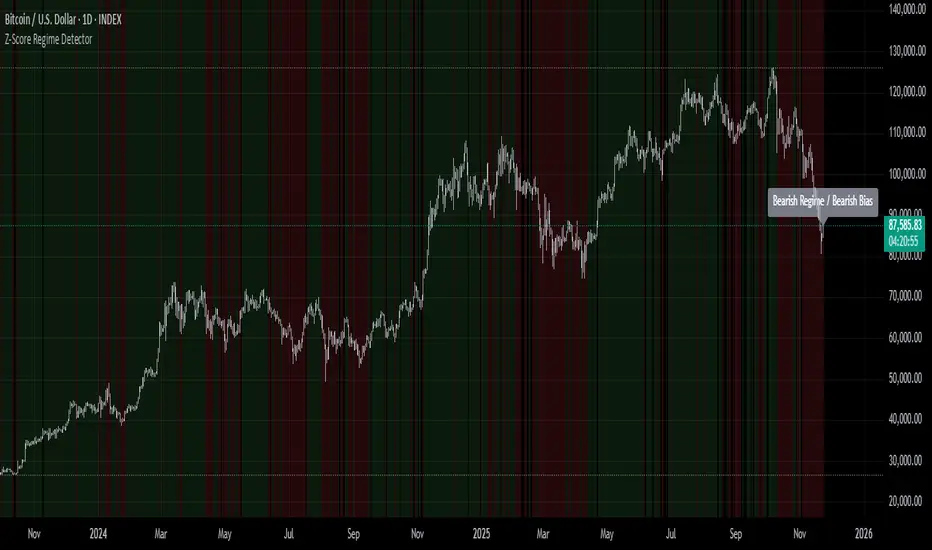
Z-Score Regime DetectorThe Z-Score Regime Detector is a statistical market regime indicator that helps identify bullish and bearish market conditions based on normalized momentum of three core metrics:
- Price (Close)
- Volume
- Market Capitalization (via CRYPTOCAP:TOTAL)
Each metric is standardized using the Z-score over a user-defined period, allowing comparison of relative extremes across time. This removes raw value biases and reveals underlying momentum structure.
📊 How it Works
- Z-Score: Measures how far a current value deviates from its average in terms of standard deviations.
- A Bullish Regime is identified when both price and market cap Z-scores are above the volume Z-score.
- A Bearish Regime occurs when price and market cap Z-scores fall below volume Z-score.
Bias Signal:
- Bullish Bias = Price Z-score > Market Cap Z-score
- Bearish Bias = Market Cap Z-score > Price Z-score
This provides a statistically consistent framework to assess whether the market is flowing with strength or stress.
✅ Why This Might Be Effective
- Normalizing the data via Z-scores allows comparison of diverse metrics on a common scale.
- Using market cap offers broader insight than price alone, especially for crypto.
- Volume as a reference threshold helps identify accumulation/distribution regimes.
- Simple regime logic makes it suitable for trend confirmation, filtering, or position biasing in systems.
⚠️ Disclaimer
This script is for educational purposes only and should not be considered financial advice. Always perform your own research and risk management. Past performance is not indicative of future results. Use at your own discretion.
NeuraAlgo - Market DynamicsNeuraAlgo – Market Dynamics
Simplyfying the Market Dynamics
Unlock the complexity of financial markets with NeuraAlgo – Market Dynamics. Designed for traders and investors alike, this intelligent tool distills the chaos of price movements, volume fluctuations, and trend directions into clear, actionable insights. With advanced algorithms working behind the scenes, it simplifies market dynamics so you can focus on making informed decisions, spotting opportunities, and managing risk with confidence.
Behind this simple overlay lies a powerful, complex algorithm.
Main Settings -Main Algorithm
Timeframe – Choose the chart timeframe that the indicator will analyze. It adapts the calculations to the selected interval for precise market insights.
Preset – Select the operating mode:
Main Trend: Focuses on the dominant market trend.
Multi Trend: Analyzes multiple trend layers for a broader perspective.
Sensitivity – Adjusts the indicator’s responsiveness to price changes. Higher values make the system more reactive to market fluctuations, while lower values smooth out minor noise.
Smooth Tuner – Controls the smoothing of the underlying calculations, helping to reduce false signals and provide cleaner trend visualization.
Orderflow Statistics – Toggle to display detailed order flow statistics directly on the chart for deeper market analysis.
Performance Statistics – Toggle to enable backtesting tables, showing historical performance metrics of the indicator for strategy evaluation.
2.Art Settings -Change Visuals
Color Scheme – Select a pre-defined visual theme for your charts:
Bright Light – High-contrast, vibrant colors for maximum clarity.
Freezer Mode – Cool-toned palette for calm, visually comfortable analysis.
Standard Mode – Balanced, neutral colors for everyday use.
Delta Mode – Highlights key differences and movements with distinct colors.
Custom – Fully customize the colors of bullish, bearish, and range elements.
Green / Red / Range (Custom Colors) – When “Custom” is selected, these options allow you to define the colors for bullish (Green), bearish (Red), and neutral/range areas (Range) according to your preference.
Candle Coloring Type – Choose how candles are highlighted based on market signals:
Confirmation Simple – Basic signal-based coloring for clear, direct visualization.
Confirmation Gradient – Smooth gradient-based coloring for more dynamic and aesthetic signal representation.
3.Dashboard -Market Statistics
The Dashboard provides a compact, at-a-glance overview of key market conditions and indicator metrics, helping traders make faster and more informed decisions.
Functionality & Layout – The dashboard dynamically displays multiple sections:
Optimal Scale ⚖️ – Shows key market scaling metrics like volatility for better decision-making.
Risk Manager 📊 – Indicates the active risk management strategy (e.g., Risk-Reward, Partial Exits, or Trailing Stop Loss).
Orderflow Statistics 📈 – Displays market sentiment, footprint strength, and delta trends for precise order flow analysis.
Market Status 🌐 – Highlights current trend conditions and trend strength across different timeframes.
Bias Scores 🎯 – Provides trend strength percentages across multiple timeframes (5min, 15min, 30min, 1H, 4H, 1D) to quickly gauge market bias.
Backtest Performance -A summary panel showing the overall performance of the strategy.
Deposit -The starting capital used for backtesting.
Win Trades -Total number of profitable trades.
Winrate -Percentage of winning trades out of all trades.
Max DD -Maximum drawdown — the largest peak-to-trough loss.
PnL -Net profit or loss generated by the strategy.
Return -Percentage growth of the account during the test.
Profit Factor -Ratio of total profits to total losses.
The dashboard uses color-coded indicators (green for bullish, red for bearish, yellow for neutral) and merged cells for a clean and organized display.
It’s designed to simplify complex market dynamics into a visually intuitive interface, giving traders real-time insights without cluttering the chart.
4.Neura Engineering – Enhancements
This section provides advanced filtering options to fine-tune market analysis, reduce noise, and highlight meaningful trends.
Noise Filter – Smoothens minor price fluctuations to reduce false signals.Noise Sensitivity helps Adjust how aggressively the filter suppresses noise.
Gap Filter – Detects and smooths price gaps to improve trend clarity.Gap Sensitivity helps Controls the responsiveness of the gap filter.
Range Filter – Filters out small-range price movements to focus on significant market swings.helps Adjusts how tightly the filter defines meaningful ranges.
Volatility Filter – Highlights periods of high market volatility while filtering less active periods.helps Sets the threshold for what constitutes high volatility.
Trend Filter – Focuses analysis on strong trends by filtering out weaker signals.helps Determines the minimum strength required for a trend to be considered valid.helps Uses Average True Range to dynamically adjust trend filtering based on market movement.
These enhancement tools allow traders to customize signal clarity, reduce noise, and focus on meaningful market dynamics, creating a cleaner and more actionable charting experience.
5.Neura Overlays – Market Visual Enhancements
These overlays add visual intelligence to your chart, helping you instantly understand trend behavior, sentiment shifts, and price structure.
Reversal Cloud - Highlights potential reversal zones where price may change direction.Reversal Sensitivity helps Controls how quickly the cloud reacts to shifts in momentum.
Sentiment Cloud -Maps the underlying market mood—bullish, bearish, or neutral—directly onto the chart.Sentiment Sensitivity helps Adjusts how sensitive the sentiment readings are.
Price Steps -Draws structured “price steps” that reveal hidden market rhythm, impulse strength, and trend flow.Price Step Depth helps Determines the size and spacing of these steps.
Market Bias -Shows directional bias based on deeper trend pressure and underlying orderflow.Bias Sensitivity helps Controls how strict or lenient the bias detection is.
6.Risk Management Settings – Intelligent Trade Control
This module controls how your trades manage themselves after entry. Choose between traditional Risk/Reward exits, partial profit-taking, or an adaptive trailing stop system.
RiskReward
A classic risk-to-reward exit system.You set a risk multiple (e.g., 1:2), and the indicator automatically sets one Stop Loss and one Take Profit based on that ratio.
Partials
Scales out your position at multiple take-profit levels.Instead of closing the entire trade at once, the system secures profits gradually at TP1, TP2, and TP3 while keeping the remainder running.
TrailingStop
Uses a dynamic stop loss that follows price as it moves in your favor.There is no fixed Take Profit; instead, the trailing stop locks in profit and exits the trade automatically when momentum reverses.
7.Automatic Alert System
This is the System that organizes all settings related to the automatic webhook alert creator inside the indicator.
Rule No. 1 is never lose money. Rule No. 2 is never forget Rule No. 1.
Warren Buffet
NeuraAlgo – Market Dynamics transforms complex market behavior into clear, actionable insights for smarter trading decisions.

Average Volume Corner BoxAn indicator that anchors a single info box to the chart’s top right corner. It compares the current volume to a selectable moving average (SMA, EMA, WMA) and displays a status (VOL > AVG or VOL < AVG), the current volume, the average volume, and percent difference. The color switches between red and green backgrounds so you can read volume at a glance without cluttering the chart with those stinky volume rectangles.
Features
• Fixed corner box anchored to the chart top right
• Choose MA type: SMA, EMA, WMA
• Selectable MA length
• Optional percent difference display
• Threshold multiplier to only flag meaningful spikes (e.g., vol > avg * 1.5)
• Configurable colors and font size

Axel AltsOverview
Axel Alts is a higher-timeframe-aware overlay that forms a two-line support band for altcoins using a sticky, threshold-and-step progression. It draws an Upper Support (mid) and a Lower Support (low) derived from evolving local lows, with smoothed transitions and an optional halving-cycle bear-window background.
The goal is disciplined context: identify controlled pullbacks into support in constructive regimes and avoid emotional chasing. All core settings are fixed for consistent behavior across symbols.
Core logic (concepts, not implementation)
• Two baseline levels are computed as fractional distances from the current base and then smoothed.
• A sticky mechanism advances each line toward its target only when deviation is material, and in capped steps. This reduces whipsaw and preserves structure.
• Visual easing smooths transitions so curves remain stable and readable.
• Rendering accounts for higher-timeframe structure and uses interpolation on lower timeframes for visual continuity; values do not look ahead and finalize on higher-timeframe closes.
• An optional bear-window background is derived from halving dates to flag a more cautious phase between the late part of one cycle and the run-up to the next.
Inputs
• Parameters are locked (lengths, fractions, sticky thresholds/steps, easing radii, bear-window bounds). No user-tweakable inputs—this prevents overfitting and improves repeatability.
How to read it
• The zone between Upper Support and Lower Support is the preferred “controlled pullback” area in constructive regimes.
• Persistent closes above Upper Support indicate strength; orderly reactions into the band can be constructive.
• Sustained closes below Lower Support warn of deterioration; be cautious with aggressive longs until recovery.
• The bear-window background suggests a more conservative stance on risk and size.
• Confirmations are best taken on daily/weekly closes; short-term pokes through the band are often noise.
Practical use cases
• Altcoin rotation: prioritize names holding the band; de-prioritize those persisting below it.
• Dollar-Cost Averaging (DCA) context: scale within the band during favorable regimes.
• Risk framing: tighten or reduce exposure on breaks below Lower Support or during the bear window.
• Confluence: combine with volume/volatility tools and market-wide risk gauges.
Best practices
• Rely on daily/weekly closes for confirmation.
• Pair with market structure (HH/HL vs. LH/LL) and higher-timeframe support/resistance.
• Consider broader cycle context (e.g., halving windows) before scaling risk.
Technical notes
• Non-repainting: values finalize on the close of the higher timeframe used by each calculation.
• Interpolation on lower timeframes is for continuity only; it is not forward-looking.
• Bear-window boundaries are fixed and derived from publicly known Bitcoin halving dates.
• The fill between lines is fixed in the current configuration.
Who it is for
• Traders who want a fixed-rules, repeatable context for alt pullbacks and trend health.
• Systematic users who prefer deterministic, non-tunable overlays for portfolio discipline.
Limitations & disclosures
• Closed-source; for educational and analytical use only.
• Not financial advice. Markets involve risk; past performance does not guarantee future results.
Release notes
• Includes sticky progression for both support lines with eased transitions.
• Improved visual continuity on lower timeframes while respecting higher-timeframe structure.
• Added halving-based bear-window highlighting (bounds are fixed).
Originality & why closed-source
This is not a reimplementation of public open-source scripts. Axel Alts integrates (1) sticky threshold-and-step progression, (2) dual support lines built from fractional levels off evolving lows with separate smoothing, (3) visual easing for stability, and (4) a halving-based bear window. The interaction of thresholds/steps, smoothing, and the regime window is proprietary and tuned to retain structure while limiting lag. The source is closed to protect this implementation.
Integration, not a mashup
Axel Alts is a single, self-contained framework. It does not merely merge indicators; its components are designed to work together to form a unified support band with a clear reading protocol (hold within the band, caution below, close-based confirmations, optional bear-window context).
Indicator, not a strategy
This publication is an indicator overlay, not a trading strategy. It includes no backtests, position logic, performance claims, or risk assumptions. Use it as analytical context within your own risk management.
Comparison to common tools
Compared to standard moving-average channels or volatility bands, Axel Alts emphasizes (1) structure retention via sticky thresholds/steps, (2) smoother visuals through eased transitions, and (3) explicit cycle context via the halving-based bear window.

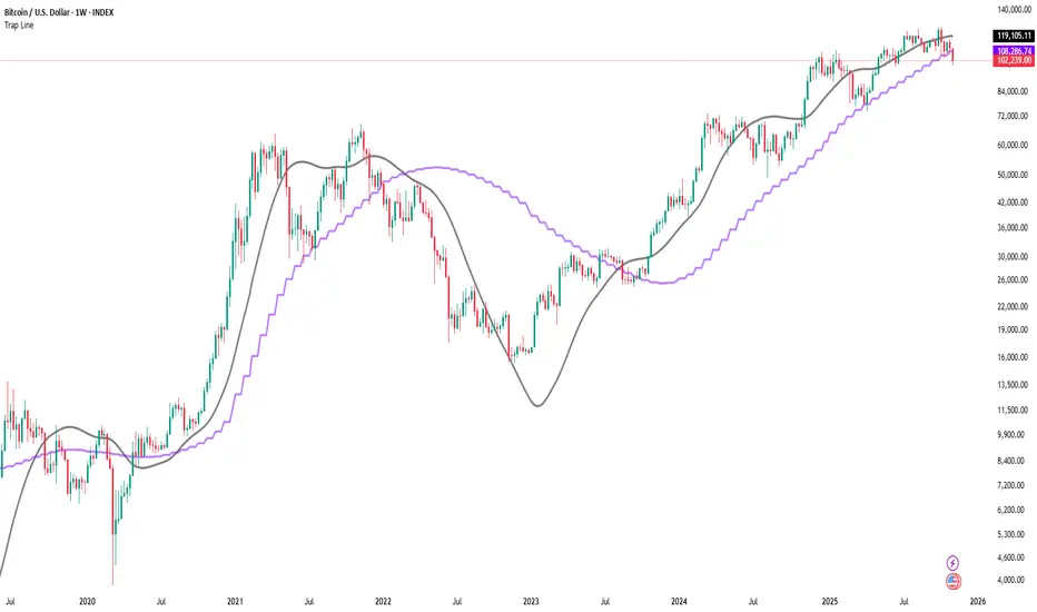
Trap LineOverview
Trap Line is a higher-timeframe trend framework designed to define market regimes using smoothed weekly (1W) and three-week (3W) baselines. Price trading above the line reflects a bullish regime; price below the line reflects a bearish one. The goal is regime discipline—stay aligned with the dominant higher-timeframe direction and avoid late, emotional entries. All parameters are fixed to ensure consistent behavior across symbols.
Core logic (concepts, not full code)
• Computes a Hull-type moving average on 1W and 3W closes (with optional linear-regression pre-filtering) and projects them onto lower timeframes via interpolation.
• Produces a smooth, lag-reduced structural baseline that tracks the weekly trend path.
• Observing price vs. the baseline highlights potential trap zones—temporary breaches that often fail without a confirmed weekly close.
• The 3-Week Trap Line adds a macro confirmation layer and is hidden by default in the Style tab to keep charts clean.
Inputs
• Parameters (length, smoothing type, regression toggle, interpolation mode) are fixed to prevent overfitting and preserve repeatability.
How to read it
• Above the line => bullish regime.
• Below the line => bearish regime.
• A confirmed weekly close through the line suggests a regime transition.
• A weekly close above the line with a green candle supports bullish continuation; a weekly close below the line with a red candle supports bearish continuation.
• Intraweek deviations near the line are often noise and may fade.
Practical use cases
• Weekly bias filter for swing/position frameworks.
• Regime confirmation across related assets or sectors.
• Portfolio overlay: favor long exposure in bullish regimes; reduce risk in bearish regimes.
• Combine with volume or ATR-based tools to assess trend quality.
Best practices
• Wait for the weekly close before declaring regime flips.
• Avoid overreacting to intraweek moves around the baseline.
• Combine with structure analysis (HH/HL vs. LH/LL) and higher-timeframe S/R.
• Use standard time-based candles; avoid interpreting signals on Heikin Ashi, Renko, Kagi, Point & Figure, or Range charts.
Technical notes
• Built on locked higher-timeframe data (1W and 3W).
• Interpolation is used to render HTF structure smoothly on lower charts.
• Non-repainting : values finalize when the higher timeframe closes; lower-TF plotting is interpolated, not forward-looking.
Who it is for
• Traders who want a consistent, rules-based higher-timeframe bias filter.
• Systematic users who prefer fixed-parameter baselines for regime context.
Limitations & disclosures
• Closed-source; educational and analytical use only.
• Not financial advice. Markets involve risk; past performance does not guarantee future results.
Release notes
• Includes the 3-Week Trap Line (3W). It is hidden by default in the Style tab; enable it if you want an additional macro confirmation layer.
• Fixed-parameter design (no user-tweakable inputs) for consistent behavior across symbols.
• Non-repainting values finalize on 1W/3W candle close.
Originality & why closed-source
This is not a reimplementation of public open-source scripts. Trap Line uses a specific combination of higher-timeframe Hull smoothing, optional linear-regression pre-filtering, and lower-timeframe interpolation designed to expose trap zones (temporary regime breaches that often fail without a confirmed weekly close). The integration and thresholds are proprietary and tuned to retain weekly structure with reduced lag. The source is closed to protect this implementation.
Integration, not a mashup
Trap Line is a single, self-contained framework. It does not merely merge other indicators; its components are integrated to produce a unified higher-timeframe baseline (1W/3W) with a defined reading protocol (above/below line, weekly-close confirmation, optional candle-color confirmation).
Indicator, not a strategy
This publication provides an indicator overlay , not a trading strategy. It includes no backtests, position logic, performance claims, or risk assumptions. Use it as an analytical bias filter within your own risk management.
Comparison to common tools
Compared to standard MAs or SuperTrend-style bands, Trap Line prioritizes (1) higher-timeframe structure fidelity, (2) reduced lag via HMA-type smoothing, and (3) explicit weekly-close confirmation to avoid premature regime flips. The optional 3-Week line acts as a macro confirmation layer and is hidden by default in the Style tab.
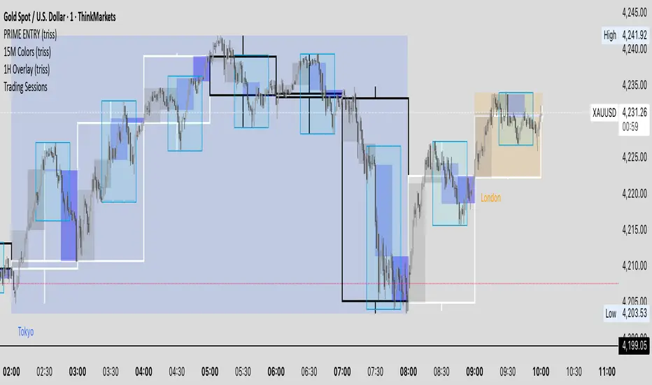
1W Overlay (triss)Overlay of the Weekly candle, simple one color with a line inside the candle to show direction.
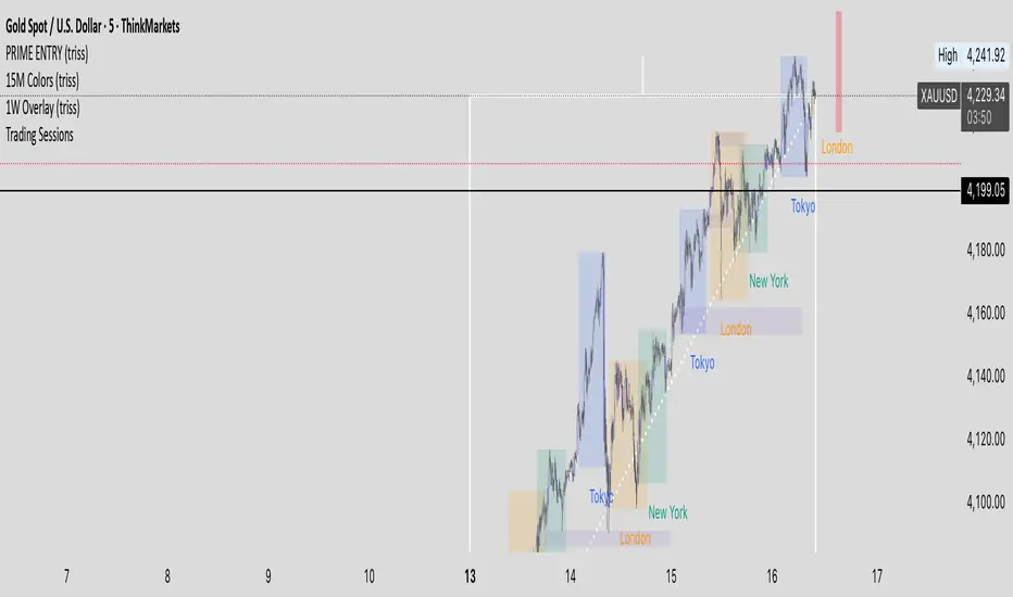
1D Overlay (triss)Overlay of the Daily candle, simple one color with a line inside the candle to show direction.

4H Overlay (triss)Overlay of the 4 Hour candle, simple one color with a line inside the candle to show direction.

Trend Heat Meter by JaeheePurpose
A compact, overlay gauge that shows where the current close sits within the last 50 bars’ high-low range. It converts price position into a 0–100% “heat” scale and renders a vertical gradient from Frozen (low end) to Overheated (high end).
How it works
• Looks back 50 bars to get highest(high, 50) and lowest(low, 50).
• Normalizes the current close into a percentile: (close − low) / (high − low) * 100.
• Draws a vertical cold→hot bar at the right side of the chart, with a pointer and a fixed-width percentage readout (two decimals) to avoid jitter.
• Labels the extremes as Overheated (top) and Frozen (bottom).
• The script is an overlay and does not modify candles or generate orders.
What makes it different
• Pure position metric: No EMA smoothing or oscillation math. It’s a direct percentile of price inside a rolling range, so interpretation is immediate.
• Jitter-free readout: Fixed-width numeric formatting keeps the value visually stable as price ticks.
• High signal legibility: A single, color-coded “thermometer” avoids multi-plot clutter and works well on any chart style.
• Non-repainting logic: Uses only in-bar values and a rolling 50-bar window; no future bars are referenced.
Inputs
• Use Black Text (White→Black): Switches label/pointer text from white to black for dark or light chart themes.
(Length and visual rows are internally set to 50 and 21 for a consistent footprint.)
Practical use
Trend context
• >70% = price is trading near the upper segment of its recent range → bullish pressure / “hot.”
• <30% = price is trading near the lower segment of its recent range → bearish pressure / “cold.”
Confluence
• Combine with your entry method (structure breaks, OB/FVG, KZ sessions, etc.).
– Prefer long setups when the meter stays >50% and rising.
– Prefer short setups when the meter stays <50% and falling.
Risk management
• Treat extreme reads (>85% or <15%) as potential exhaustion zones inside ranges; wait for confirmation before fading.
Timeframes & markets
• Works on any timeframe and symbol. Large-cap, liquid instruments typically provide the cleanest read.
Notes and limitations
• The meter shows relative position, not momentum or volatility. Pair it with your preferred filters for full trade qualification.
• It does not produce buy/sell signals, alerts, or TP/SL levels.
• Visual table draws only on the last bar for efficiency.
Compatibility
• Pine Script® v6
• Overlay: true
Disclaimer
This script is for educational purposes only and is not financial advice. Trading involves risk. Test on a demo and use proper risk management.

BTC Lead(v3.32)Summary
A 15-minute, BTC-focused lead/divergence indicator designed for simple execution: when a ▲/▼ appears, start scaling in with small clips; when a ■ (black square) prints, it means the indicator’s edge has weakened (not that the market trend is over). Real-time expected move label and alert templates included. Do not fade the signal—if you must try the opposite side, wait until a ■ appears.
How to read the signals
▲ Green → Long bias increased
▼ Pink → Short bias increased
■ Black → Edge weakened; consider taking profits/standing aside
Multiple level markers on the same bar (L2/L3/L4) = stronger setup
Live label (top of chart)
A single line shows the Expected Move (%) with arrow and color-coded background (↑ green / ↓ pink) for instant direction clarity.
Tip: Use Replay to watch label → ▲/▼ → ■ sequences on past data.
Confidence filter (important)
|Expected Move| < 1% → treat as noise / ignore
If considering the opposite direction, wait for a ■ first (edge reduced).
Scope
Internal calculations are fixed to 15-minute resolution.
Built for BTC 15m. It may display on other crypto symbols/timeframes, but performance is not guaranteed.
Alerts
Ready-made conditions: ENTRY LONG / ENTRY SHORT / EXIT LONG / EXIT SHORT. Add an alert on this indicator and choose the condition you want.
Risk note
For research/education only. Past behavior doesn’t guarantee future results. Predefine position sizing, stops, and profit-taking, and execute consistently.

BTC Lead(v3.31)Summary
A 15-minute, BTC-focused lead/divergence indicator designed for simple execution: when a ▲/▼ appears, start scaling in with small clips; when a ■ (black square) prints, it means the indicator’s edge has weakened (not that the market trend is over). Real-time expected move label and alert templates included. Do not fade the signal—if you must try the opposite side, wait until a ■ appears.
How to read the signals
▲ Green → Long bias increased
▼ Pink → Short bias increased
■ Black → Edge weakened; consider taking profits/standing aside
Multiple level markers on the same bar (L2/L3/L4) = stronger setup
Live label (top of chart)
A single line shows the Expected Move (%) with arrow and color-coded background (↑ green / ↓ pink) for instant direction clarity.
Tip: Use Replay to watch label → ▲/▼ → ■ sequences on past data.
Confidence filter (important)
|Expected Move| < 1% → treat as noise / ignore
If considering the opposite direction, wait for a ■ first (edge reduced).
Scope
Internal calculations are fixed to 15-minute resolution.
Built for BTC 15m. It may display on other crypto symbols/timeframes, but performance is not guaranteed.
Alerts
Ready-made conditions: ENTRY LONG / ENTRY SHORT / EXIT LONG / EXIT SHORT. Add an alert on this indicator and choose the condition you want.
Risk note
For research/education only. Past behavior doesn’t guarantee future results. Predefine position sizing, stops, and profit-taking, and execute consistently.
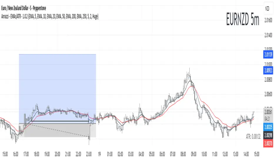
Anrazzi - EMAs/ATR - 1.0.2The Anrazzi – EMAs/ATR indicator is a multi-purpose overlay designed to help traders track trend direction and market volatility in a single clean tool.
It plots up to six customizable moving averages (MAs) and an Average True Range (ATR) value directly on your chart, allowing you to quickly identify market bias, dynamic support/resistance, and volatility levels without switching indicators.
This script is ideal for traders who want a simple, configurable, and efficient way to combine trend-following signals with volatility-based position sizing.
📌 Key Features
Six Moving Averages (MA1 → MA6)
Toggle each MA on/off individually
Choose between EMA or SMA for each
Customize length and color
Perfect for spotting trend direction and pullback zones
ATR Display
Uses Wilder’s ATR formula (ta.rma(ta.tr(true), 14))
Can be calculated on current or higher timeframe
Adjustable multiplier for position sizing (e.g., 1.5× ATR stops)
Displays cleanly in the bottom-right corner
Custom Watermark
Displays symbol + timeframe in top-right
Adjustable color and size for streamers, screenshots, or clear charting
Compact UI
Organized with group and inline inputs for quick configuration
Lightweight and optimized for real-time performance
⚙️ How It Works
MAs: The script uses either ta.ema() or ta.sma() to compute each moving average based on the user-selected type and length.
ATR: The ATR is calculated using ta.rma(ta.tr(true), 14) (Wilder’s smoothing), and optionally scaled by a multiplier for easier use in risk management.
Tables: ATR value and watermark are displayed using table.new() so they stay anchored to the screen regardless of zoom level.
📈 How to Use
Enable the MAs you want to track and adjust their lengths, type, and colors.
Enable ATR if you want to see volatility — optionally select a higher timeframe for broader context.
Use MAs to:
Identify overall trend direction (e.g. price above MA20 = bullish)
Spot pullback zones for entries
See when multiple MAs cluster together as support/resistance zones
Use ATR value to:
Size your stop-loss dynamically (e.g. stop = entry − 1.5×ATR)
Detect volatility breakouts (ATR spikes = market expansion)
🎯 Recommended For
Day traders & swing traders
Trend-following & momentum strategies
Volatility-based risk management
Traders who want a clean, all-in-one dashboard
Heikin Ashi Overlay SuiteHeikin Ashi Overlay Suite is designed to give traders more control and clarity when working with Heikin Ashi candles — whether you're analyzing trend strength, reducing chart noise, or simply improving your visual read of market momentum. It works by layering multiple types of HA overlays and color systems on top of your standard candlestick chart — without switching chart types. With dynamic gradient coloring, smoothing options, and a predictive line tool, this script helps you see not just what the current trend is, but how strong it is, and what it would take to reverse it.
Heikin Ashi candles help reduce noise but this script goes further by:
➡️adding color intelligence that shows trend strength using a streak counter
➡️uses smoothing logic to clean up chop and whipsaws
➡️introduces a predictive close line — a subtle but powerful guide for anticipating trend flips before they happen
Everything is configurable: colors, candle sources, overlays, predictive tools, and line styles. It’s built for traders who want visual speed, but don’t want to sacrifice signal quality.
At its core, the script offers two powerful dropdown controls:
💥HA Color Scheme (Colors Regular Candles) — Applies Heikin Ashi-derived coloring to your regular candles based on trend direction or streak strength. This gives you instant visual context without switching to a separate chart type.
💥HA Candle Overlay Mode — Overlays actual Heikin Ashi-style candles directly on top of your chart, using your preferred source:
➡️Custom HA candles using internal formula logic
➡️TradingView’s built-in Heikin Ashi source with your own colors
➖➖➖➖➖➖➖➖➖➖➖➖➖➖➖➖➖➖➖➖➖➖➖➖➖➖➖➖➖➖➖
🎨 Custom + Gradient HA Coloring🎨
See trend strength at a glance:
➡️1–4 bar streaks → lighter tone
➡️5–8 bars → medium tone
➡️9+ bars → bold tone, ideal for momentum-based entries, exits, or scaling strategies
→ Choose from:
➡️Your own custom color set
➡️A simple 2-color base mode
➡️Or a 3-level gradient for progressive trend analysis (using the streak counter)
🏛️ TradingView Official Heikin Ashi Overlay
Prefer native HA candles but want your own colors?
This mode plots TradingView's Heikin Ashi source, with your personal bullish/bearish color scheme.
➡️Ensures consistency with built-in charts while still leveraging your visual style.
🌊 Smoothed Heikin Ashi Candles — Clarity in Chaos🌊
These aren’t your standard HA candles. Smoothed Heikin Ashi uses a two-step EMA process to transform chaotic price action into a cleaner, slower-moving trend structure:
🔹 First, it smooths the raw OHLC data using EMA — filtering out minor price fluctuations.
🔹 Then, it applies the Heikin Ashi transformation on top of the smoothed data.
🔹 Finally, it applies a second EMA smoothing pass to the HA values — creating ultra-smooth candles.
📈 What You See:
Trends appear more fluid and consistent.
Choppy ranges and fakeouts are visually suppressed.
Minor pullbacks within a trend are de-emphasized, helping you avoid premature exits.
🎯 Best For:
Swing traders looking to stay in positions longer.
Intraday traders dealing with volatile or noisy instruments.
Anyone who wants a "trend map" overlay without the distractions of raw price action.
✅ Reduces whipsaws
✅ Delivers high-contrast trend zones
✅ Makes reversals more visually apparent (but with a slight lag)
📍 Predictive Close Line📍
Shows where the real close must land to flip the current HA candle's color.
✅ Use it like predictive support/resistance
✅ Know if the trend is actually at risk
✅Visualize potential fakeouts or confirmation
Color-coded based on current HA direction (bullish, bearish, or neutral).
📈 Tick by tick & bar-to-bar Plots📈
Provides 2 plot types:
1)1 plot that tracks a bar tick by tick
2)another plot that tracks the close from bar to bar
For the bar to bar plot, you can choose between 2 options:
✅Full Plot — continuous line colored by HA trend
✅Recent Segments — color just the last few bars (configurable) to reduce chart clutter
✅ Customize width, number of bars, and visibility
➖➖➖➖➖➖➖➖➖➖➖➖➖➖➖➖➖➖➖➖➖➖➖➖➖➖➖➖➖➖➖
📘 How to Use this script📘
Imagine you're watching a choppy 15-minute chart on a volatile crypto pair — price action is messy, and it’s hard to tell if a trend is forming or just noise.
Here’s how to cut through the chaos using Heikin Ashi Overlay Suite:
🔹 Step 1: Enable "Smoothed HA Candles"
Start by turning on the smoothed candles. You’ll immediately notice the noise fades, and broader directional moves become easier to follow. It's like switching from static to clean trend zones.
🧠 Why: Smoothed HA uses a double EMA process that filters out small reversals and lets larger moves stand out. Perfect for sideways or jittery charts.
🔹 Step 2: Watch the Color Gradient Build
As the smoothed candles begin to align in one direction, the gradient coloring (1–4, 5–8, 9+ streaks) gives you an at-a-glance visual of how strong the trend is.
✅ If you see 9+ same-colored candles? You’re likely in a mature trend.
✅ If it resets often? You’re in chop — consider staying out.
🔹 Step 3: Use the Predictive Close Line for Anticipation
Now here’s the edge — this line tells you where the candle would have to close to flip colors.
📉 If price is hovering just above it during a bullish run — momentum may be weakening.
📈 If price bounces off it — the trend may be strengthening.
This is excellent for confirming entries, exits, or spotting early warning signs.
🔹 Step 4: Switch Between Candle Modes as Needed
You can flip between:
✅ Custom HA: Gradient candles with your colors
✅ TradingView HA: The official source with your styling
✅ None: Just color regular candles using the HA logic
Use what fits your style — everything is modular.
🔹 Step 5: Tune It to Your Chart
Lastly, tweak streak thresholds (currently only can do this within the source code), smoothing lengths, and line styles to match your timeframe and strategy.
🎯 Tailor The Settings to Fit Your Trading Style🎯
🔹 🧪 Scalper (1–5 min charts)
If you’re trading fast intraday moves, you want quicker responsiveness and less lag.
Try these settings:
🔸Smoothing Lengths: Use lower values (e.g. len = 3, len2 = 5)
🔸Candle Mode: Use Custom HA or TV’s HA for real-time color flips
🔸Predictive Close Line: Great for ultra-fast anticipation of color reversals
🔸Line Mode: Use Recent Segments mode to track short bursts of trend
🔸Colors: Use high-contrast, opaque colors for clarity
✅ These settings help you catch micro-trends and flip signals faster, while still filtering out the worst of the noise.
🔹 🧪 Swing Trader (30m–4h charts and beyond)
If you’re looking for multi-hour or multi-day trend confirmation, prioritize clarity and staying in moves longer.
Recommended setup:
🔸Smoothing Lengths: Medium to high values (e.g. len = 8, len2 = 21)
🔸Candle Mode: Use Smoothed HA Candles to block out intrabar chop
🔸Gradient Colors: Enable to visualize trend maturity and strength
🔸Predictive Close Line: Helps confirm trend continuation or spot early reversals
🔸Line Mode: Use Full Plot Line for clean HA-based trend tracking
✅ These settings give you a calm, clean view of the bigger picture — ideal for holding positions longer and avoiding early exits.
🔧 This script isn’t just a chart overlay — it’s a visual trend engine.🔧
Ideal For:
🔶 Trend-followers who want clean, color-coded confirmation
🔶 Reversal traders spotting exhaustion via predictive flips
🔶 Scalpers filtering noise with lighter smoothing
🔶 Swing traders using smoothed visuals to hold longer
📌 Final Note
Heikin Ashi Overlay Pro is designed to help you see momentum, trend shifts, and market structure with greater clarity — not to predict price on its own. For best results:
✔️ Combine with support/resistance, moving averages, or price action patterns
✔️ Use Predictive Close as a confirmation tool, not a signal generator
✔️ Pair gradient colors with structure to gauge trend maturity
✔️ Always zoom out and check higher timeframes for context
🧠 Use this as part of a layered approach — not a standalone system.
🙏 Credits🙏
⚡HA logic based on SimpleCryptoLife
⚡Smoothed HA concept adapted from a script by Jackvmk
💡💡💡Turn logic into clarity. Structure into trades. And uncertainty into confidence.💡💡💡

Candle Overlay htf embedHTF Candle Overlay for mltf candle
A candle overlay that provides ease of use for the 1m chart to see candle structures of 30m or more from 1m. (with OHLC)

Historical Year OverlayThis script allows you to simply source any historical calendar year and overlay it over any other year (usually a historical year overlaying a year in the future). It was made using an LLM for coding help and logic.
It is great for working out potential pivots and it also maps the previous profit/loss from the source year over the plot year so that we can see the connection to price levels throughout the plot year and also with the yearly close (we get a horizontal line for the close).
It uses the year open as a price reference to plot the P&L over the plot year (if use plot year option is selected).
if the year has not started yet you can use the "manual opening price" OR it will auto set to the current price (great for "replay mode", it will catch the actual opening price once it happens).
The settings are self explanatory. Choose a source year and plot year.
Choose a multiplier if you'd like (it simply multiplies the plot year P&L by that number; ie: 1 means the same as it was, 0.5 means half of what is was, 2 means 2x the source P&L)
The resolution is max default 50 line segments but you can simplify if you'd like.
I've released the code open-source so you can see what it is doing.
Please update it with all the enhancements you can think of.
Please let me know if you do this as I will be very interested!

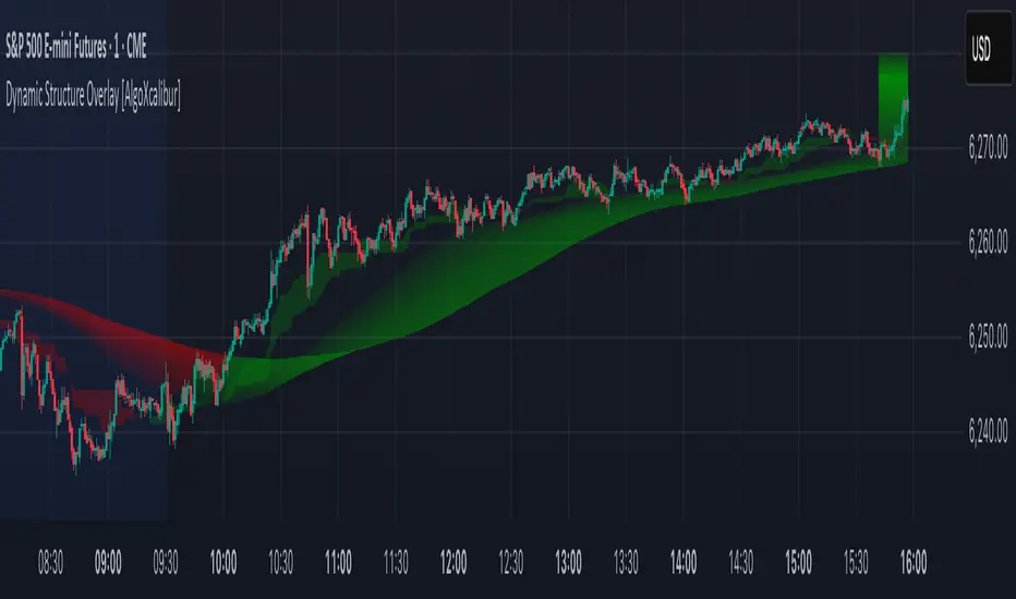
Dynamic Structure Overlay [AlgoXcalibur]Dynamic Structure Overlay combines an ultra-dynamic Ribbon, adaptive supply/demand Zones, and a versatile momentum-based Cloud to paint a stunning picture of market structure. Whether you're riding strong trends or patiently analyzing consolidation, this tool helps visualize factors that influence trend direction and price movement.
📊 Indicator Components and Functions
This indicator integrates three core elements to provide an intuitive analysis of trend and market structure. Each component can be independently enabled or disabled to suit your preferences.
• Dynamic Ribbon
At the center of attention is the Dynamic Ribbon, which uses multi-layered moving averages rendered as a flowing ribbon with adaptive color gradients. It reacts to price action in real time, revealing trend direction, strength, and periods of expansion or compression.
• Dynamic Zones
These volume-weighted supply and demand zones are derived from price-to-volume deviations relative to VWAP. These zones often guide price action during strong trends.
• Dynamic Cloud
A unique momentum-based structure derived from dynamic price ranges by averaging the highs and lows from recent price action. The Cloud captures momentum strength and directional pressure, providing a visual guide to trend continuations and transitions.
Together, these components form a comprehensive overlay that adapts in real time to changing market conditions.
🚀 Ride the Trend
Dynamic Structure Overlay is a multi-dimensional tool — its framework helps visualize dynamic factors that often influence price action, assisting traders in staying aligned with the evolving trend.
Institutional Sessions Overlay (Asia/London/NY)Institutional Sessions Overlay is a professional TradingView indicator that visually highlights the main trading sessions (Asia, London, and New York) directly on your chart.
Customizable: Easily adjust session start and end times (including minutes) for each market.
Timezone Alignment: Shift session boxes using the timezone offset parameter so sessions match your chart’s timezone exactly.
Clear Visuals: Colored boxes and optional labels display session opens and closes for fast institutional market structure reference.
Toggle Labels: Show or hide session open/close labels with a single click for a clean or detailed look.
Intuitive UI: User-friendly grouped settings for efficient configuration.
This tool is designed for day traders, institutional traders, and anyone who wants to instantly recognize global session timing and ranges for SMC, ICT, and other session-based strategies.
How to use:
Set your chart to your local timezone.
Use the "Session timezone offset" setting if session boxes do not match actual session opens on your chart.
Adjust the hours and minutes for each session as needed.
Enable or disable labels in the “Display” settings group.
Tip: Use the overlay to spot session highs and lows, volatility windows, and institutional liquidity sweeps.

Live Price Watermark (Flashing Overlay)Displays the current price as a large, centered watermark directly on your chart. The text color updates dynamically:
- Green when price rises
- Red when price falls
- Translucent black when unchanged
