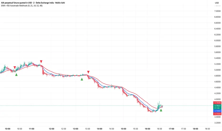
EMA + RSI Autotrade Webhook - VarunOverview
The EMA + RSI Autotrade Webhook is a powerful trend-following indicator designed for automated crypto futures trading. This indicator combines the reliability of Exponential Moving Average (EMA) crossovers with RSI momentum filtering to generate high-probability buy and sell signals optimized for webhook integration with crypto exchanges like Delta Exchange, Binance Futures, and Bybit.Key Features
Simple & Effective: Uses proven EMA 9/21 crossover strategy
RSI Momentum Filter: Eliminates low-probability trades in ranging markets
Webhook Ready: Two clean alerts (LONG Entry, SHORT Entry) for seamless automation
Exchange Compatible: Works with Delta Exchange, 3Commas, Alertatron, and other webhook platforms
Zero Lag Signals: Real-time alerts on crossover confirmation
Visual Clarity: Clean chart markers for easy signal identification
How It Works
Entry Signals:
LONG Entry: Triggers when EMA 9 crosses above EMA 21 AND RSI is above 52 (bullish momentum confirmed)
SHORT Entry: Triggers when EMA 9 crosses under EMA 21 AND RSI is below 48 (bearish momentum confirmed)
Technical Components:
Fast EMA: 9-period (tracks short-term price action)
Slow EMA: 21-period (identifies primary trend)
RSI: 14-period (confirms momentum strength)
RSI Long Threshold: 52 (filters weak bullish signals)
RSI Short Threshold: 48 (filters weak bearish signals)
Best Use Cases
Crypto Futures Trading: Bitcoin, Ethereum, Altcoin perpetual contracts
Automated Trading Bots: Integration with Delta Exchange webhooks, TradingView alerts
Timeframes: Optimized for 15-minute charts (works on 5min-1H)
Markets: Trending crypto markets with clear directional moves
Risk Management: Best used with 1-2% stop loss per trade (managed externally)
Webhook Automation Setup
Add indicator to your TradingView chart
Create alerts for "LONG Entry" and "SHORT Entry"
Configure webhook URL from your exchange (Delta Exchange, Binance, etc.)
Use alert message: Entry LONG {{ticker}} @ {{close}} or Entry SHORT {{ticker}} @ {{close}}
Exchange automatically reverses positions on opposite signals
Advantages
✅ No manual trading required - fully automated
✅ Eliminates emotional trading decisions
✅ Catches trending moves early with EMA crossovers
✅ RSI filter reduces whipsaws in choppy markets
✅ Works 24/7 without monitoring
✅ Simple two-alert system (easy to manage)
✅ Compatible with multiple exchanges via webhooksStrategy Philosophy
This indicator follows a trend-following with momentum confirmation approach. By waiting for both EMA crossover AND RSI confirmation, it ensures you're entering trades with genuine momentum behind them, not just random price noise. The tight RSI thresholds (52/48) keep you aligned with the prevailing trend.Recommended Settings
Timeframe: 15-minute (primary), 5-minute (scalping), 1-hour (swing)
Markets: BTC/USDT, ETH/USDT, high-liquidity altcoin perpetuals
Position Sizing: 100% capital per signal (exchange manages reversals)
Stop Loss: 2% (managed via exchange or external bot)
Leverage: 1-2x for conservative approach, up to 5x for aggressive
Important Notes
⚠️ This indicator generates entry signals only - position reversals are handled automatically by your exchange
⚠️ Always backtest on historical data before live trading
⚠️ Use proper risk management and position sizing
⚠️ Best performance in trending markets; may generate false signals in tight ranges
⚠️ Requires TradingView Premium or higher for webhook functionalityTags
cryptocurrency futures automated-trading ema-crossover rsi webhook delta-exchange tradingview-alerts trend-following momentum bitcoin ethereum crypto-bot algo-trading 15-minute-strategy
Osciladores
GIBBS911-10 - ScalpMaster Dual RSI PRO v5 - Timeframe: 3M (better signal-to-noise ratio) or 5M if you want fewer trades.
LONG entry: RSI 24 crosses 50 upwards RSI 5 smooth 14 already > 50 .
Price ABOVE EMA 21 Volume > 1.8x average 20 periods → Market entry, SL below the last low (-0.4% max)
Exit: RSI 5 smooth 14 breaks 50 down → output 70% position TP remaining at +1.8% or trail stop on EMA 9 → Average ratio 1:2.7
ANTI-LOSS Filters: Never during news (red on ForexFactory)
Only if ATR(14) > average → volatile market Max 3 trades/hour, otherwise you burn out

Ichimoku_RSI_MACD_CleanIchimoku + RSI + MACD. A combination of three indicators. The important thing is that they have a BUY or SELL alert, so it makes it easy to understand the numbers.


Ichimoku_RSI_MACD_CleanIchimoku + RSI + MACD indicator. It combines these three indicators. It tells whether the trend is bullish or bearish. Multi-timeframe.

MACD + StochasticMACD + Stochastic 14 Scenarios - Complete Signal Analysis
Combines MACD and Stochastic Oscillator to identify 14 different market scenarios based on crossover timing and indicator positioning.
🎯 Signal Strength Classification:
• STRONG (⭐⭐⭐⭐⭐): Both indicators cross together - highest confidence
• MODERATE (⭐⭐⭐⭐): One crosses while other confirms - good confidence
• WEAK (⭐⭐): Conflicting signals - low confidence
📊 Visual Features:
✓ Color-coded shapes on chart (triangles, circles, X marks)
✓ Scenario labels (1-16, excluding 12 & 14)
✓ Real-time info table showing current status
✓ Customizable signal display (show/hide by strength)
✓ Built-in alerts for all signal types
Perfect for swing traders and position traders looking for high-probability entries with dual indicator confirmation. Use on daily
timeframe for best results.
Includes toggleable display options for strong, moderate, and weak signals.

Ultimate Prime Hyper Oscillator Pro [TraderCloud]추세, 변동성, 모멘텀, 평균회귀 모든 분석과 원리를 분석할 수 있는 최고의 오실레이터.
맨 상단에는 고래의 매수와 매도 시그널을 보여준다.
중간에는 rsi, mfi, rci, cci 등의 과열/과냉 지표를 로지스틱 회귀 평활화로 복합 운영하는 종합 모멘텀 오실레이터이다. 단기, 중기, 장기 이렇게 3가지의 기간별 다이버전스와 히든 다이버전스를 시각화한다.
또한 오실레이터 중간에 있는 히스토그램은 lazybear의 squeeze momentum oscillator를 기반으로 제작한 히스토그램 지표이다.
주요 변동성 오실레이터 바로 상/하단에는 히스토그램과 UPO 오실레이터의 추세가 동일하거나, 잠재성을 가질 때를 시각화해서 보여준다.
아래에는 중단기 추세를 Chop Zone 형식으로 시각화해서 보여준다.
아래 얇은 막대의 자잘 자잘한 신호들은 중단기적 평균회귀 구간을 보여준다.
마지막으로 테이블은 타임별 오실레이터의 추세를 간략화해서 정리해준다.
“The ultimate oscillator capable of analyzing all aspects of trend, volatility, momentum, and mean reversion.”
At the very top, it displays whale buy and sell signals.
In the middle, it functions as a comprehensive momentum oscillator that combines and smooths overbought/oversold indicators such as RSI, MFI, RCI, and CCI through logistic regression. It visualizes three types of divergences — short-term, mid-term, and long-term — as well as hidden divergences.
The histogram located in the center of the oscillator is based on LazyBear’s Squeeze Momentum Oscillator.
Right above and below the main volatility oscillator, it visualizes when the histogram and UPO oscillator share the same trend or show potential correlation.
At the bottom, mid- to short-term trends are visualized in a Chop Zone style.
The small thin bars below indicate short- to mid-term mean reversion zones.
Finally, the table provides a simplified summary of each oscillator’s trend by timeframe.

Pulse RSI | Lyro RSPulse RSI | Lyro RS
The Pulse RSI is a momentum oscillator that enhances the traditional RSI by incorporating volume-weighted price and linear regression. It generates multiple trading signals, including trend shifts, overbought/oversold conditions, and custom threshold levels.
By integrating both price and volume into its calculation, Pulse RSI is more robust and responsive than the standard RSI. This helps you identify trends faster, spot potential reversals sooner, and set up custom alerts based on your own strategy.
Key Features
Four Signal Types:
Type 1 (Trend): Triggers when the indicator's current value crosses its previous value, highlighting short-term momentum shifts.
Type 2 (Midline Trend): The classic midline cross. A bullish bias is indicated above 50, while a bearish bias is indicated below 50.
Type 3 (Overbought/Oversold): Flags potential reversal zones, suggesting where buying or selling opportunities may emerge.
Type 4 (Custom Thresholds): This type lets you define your own threshold levels. Instead of following a trend, use it to mark your specific conditions for a reversal. For example, set a long reversal at a low level (e.g., 5) for an early buy signal, or a short reversal at a high level (e.g., 80) for an early sell signal.
Calculation Method:
The indicator uses a volume-weighted price (Close * High * Low) and applies linear regression to smooth the data. This creates a unique and more stable oscillator, avoiding the chaotic movement seen in others.
Color System:
Choose from multiple color themes like Classic, Mystic, Accented, and Royal, or create your own custom colors for bullish and bearish signals.
Visual Plotting:
Features a clear plot with a glow effect, a midline, adjustable threshold lines, and shapes/labels to mark long/short and overbought/oversold signals.
Alerts:
Instant alerts are available for every signal type, which you can quickly enable based on your trading conditions.
How It Works:
Core Calculation
The indicator calculates a volume-weighted price using (Close * High * Low) multiplied by the absolute volume. This value is then smoothed with linear regression and converted into an oscillator, normalized to a 0-100 scale.
Trading Logic:
Bullish Signals: Trigger when the main plot line crosses above a key level—be it the previous value, the 50 midline, or a custom threshold.
Bearish Signals: Trigger when the main plot line crosses below a key level.
Visual Logic:
The system displays a main plot line, colors candles, and plots signal shapes, all customizable through a variety of color schemes.
Practical Use
Trend Confirmation (Types 1 & 2): Use Type 1 for early momentum shifts and Type 2 to confirm the overall trend direction.
Reversals (Type 3): Consider long entries when oversold signals fire, suggesting an asset is undervalued. Look for exits at overbought signals, which suggest a potential downward reversal.
Custom Thresholds (Type 4): Set tight thresholds to catch early trends and reversals. Be aware that more sensitive settings may also increase false positives.
Customization:
Adjust the Length: A higher setting makes the indicator more suited for long-term trends, while a lower setting makes it more sensitive for short-term moves.
Enable/Disable Signals: Turn the four signal types on or off to match your trading style.
Set Your Levels: Fully adjustable thresholds for Type 4 long/short conditions.
Choose Your Colors: Select from a variety of color schemes for all bullish and bearish elements.
⚠️ Disclaimer
This indicator is a tool for technical analysis and does not guarantee results. It should be used alongside other analysis methods and solid risk management practices. The creators are not responsible for any financial decisions made based on its signals.

RSI(Min-Max)RSI (Min-Max) is an enhanced version of Welles Wilder's Relative Strength Index, designed to offer greater analytical precision and dynamic insight into the behavior of the RSI within each candlestick.In addition to displaying the traditional RSI value, this script calculates the possible extreme values — the minimum and maximum RSI — based on the low and high prices of the current candle. This allows you to estimate how the RSI would react if the price moved to the extremes of the bar, providing a predictive and refined reading of momentum.

ADX Trend Strength Filter + TRAMA [DotGain]Summary
Are you tired of trading trend signals, only to get stopped out in volatile, sideways chop?
The ADX Trend Strength Filter (ADX TSF) is designed to solve this exact problem. It is a comprehensive trend-following system that only generates signals when a trend not only has the right direction and momentum, but also sufficient strength.
This indicator filters out weak or indecisive market phases (the "chop") and will only color the bars Green or Red when all conditions for a strong, confirmed trend are met.
⚙️ Core Components and Logic
The ADX TSF relies on a triple-filter logic to generate a clear trade signal:
Trend Filter (TRAMA): A TRAMA (Trending Adaptive Moving Average) is used as the main trendline. This adaptive average automatically adjusts to market volatility, acting as a dynamic support/resistance level.
Price > TRAMA = Bullish
Price < TRAMA = Bearish
Momentum Filter (RSI Crossover): Momentum is measured by a crossover of two moving averages of the RSI (a fast EMA and a slow SMA). This confirms whether the momentum is pointing in the same direction as the trend.
Strength Filter (ADX): This is the most important filter. A signal is only considered valid if the ADX (Average Directional Index) is above a defined threshold (Default: 30). This ensures the trend has sufficient strength.
🚦 How to Read the Indicator
The indicator has three states, displayed directly as bar colors on your chart:
🟩 GREEN BARS (Strong Uptrend) All three conditions are met:
Price is above the TRAMA.
RSI momentum is bullish (Fast MA > Slow MA).
ADX is above 30 (Strong trend is present).
🟥 RED BARS (Strong Downtrend) All three conditions are met:
Price is below the TRAMA.
RSI momentum is bearish (Fast MA < Slow MA).
ADX is above 30 (Strong trend is present).
🟧 ORANGE BARS (Neutral / Caution) This state appears if any of the following conditions are true:
Weak Trend: The ADX is below 30. The market is in consolidation or a sideways phase. (This is the primary filter!)
Indecision: The price is caught in the "Neutral Zone" between the TRAMA and the 200 SMA.
Visual Elements
Bar Colors: (Green/Red/Orange) Show the current trend status.
TRAMA (Orange Line): Your primary adaptive trendline.
200 SMA (White Line): Serves as a reference for the long-term trend.
Orange Background (Fill): Fills the area between the TRAMA and SMA to visually highlight the "Neutral Zone."
Key Benefit
The goal of the ADX TSF is to keep traders out of weak, unpredictable markets and help them participate only in strong, momentum-confirmed trends.
Have fun :)
Disclaimer
This "Buy The F*cking Dip" (BTFD) indicator is provided for informational and educational purposes only. It does not, and should not be construed as, financial, investment, or trading advice.
The signals generated by this tool (both "Buy" and "Sell") are the result of a specific set of algorithmic conditions. They are not a direct recommendation to buy or sell any asset. All trading and investing in financial markets involves substantial risk of loss. You can lose all of your invested capital.
Past performance is not indicative of future results. The signals generated may produce false or losing trades. The creator (© DotGain) assumes no liability for any financial losses or damages you may incur as a result of using this indicator.
You are solely responsible for your own trading and investment decisions. Always conduct your own research (DYOR) and consider your personal risk tolerance before making any trades.

Cumulative Delta_Effort vs Result_immy**Cumulative Delta Oscillator\_effort**
This script creates a “Cumulative Delta Effort vs Result” oscillator, a custom indicator designed to measure the balance between buying and selling pressure (Effort) versus actual price movement (Result).
**How It Works**
Delta Volume: Measures aggressive buying vs selling per candle.
Cumulative Delta: Tracks net buying/selling pressure over time.
Effort vs Result: Compares volume delta (effort) to price movement (result).
Oscillator: Highlights divergence between effort and result, useful for spotting absorption (high effort, low result) and exhaustion (low effort, high result).
Histogram: Visual cue for accumulation/distribution zones.
----------------------------
This indicator combines volume delta (effort) and price movement (result), so it tells you how efficiently volume is moving price — a concept sometimes called effort vs. result analysis in Wyckoff or volume–spread analysis (VSA).
🔍 Concept Summary
Effort (delta volume) = how much buying/selling pressure is there (volume side).
Result (price change) = how much that effort moves price (price side).
Oscillator (Effort − Result) = how much “extra” effort is not producing movement — often showing absorption or exhaustion.
📈 How to Interpret the Signals
1\. Oscillator above Signal line → Bullish Momentum
When osc > signal, histogram turns green.
Means buying effort is stronger than price reaction — often early sign of accumulation or rising demand.
This can signal:
Possible bullish continuation if confirmed by rising prices.
Or early absorption if prices aren’t yet breaking out (smart money absorbing supply).
✅ Bullish Entry Signal:
When the oscillator crosses above the signal line (green cross) and price is near support or consolidating → potential long setup.
2\. Oscillator below Signal line → Bearish Momentum
When osc < signal, histogram turns red.
Selling effort dominates; can mean increasing supply or price exhaustion.
This often appears before:
Bearish continuation (trend strengthening)
Or upthrust/exhaustion (price rising on weak volume)
❌ Bearish Entry Signal:
When the oscillator crosses below the signal line (red cross), especially if near resistance → potential short setup.
3\. Crossovers
The alert is triggered when: ta.cross(osc, signal)
That means:
Bullish crossover: oscillator line crosses above signal → potential buy momentum shift.
Bearish crossover: oscillator line crosses below signal → potential sell momentum shift.
These work like MACD crossovers, but volume-adjusted.
4\. Zero Line
The zero line is the neutral point.
When osc crosses above zero, overall buying effort exceeds price change — market gaining strength.
When osc crosses below zero, selling pressure increases — market weakening.
→ Combining signal line crosses with zero-line crosses gives stronger confirmation.
5\. Histogram Analysis (Absorption \& Exhaustion)**
Tall green bars: rising momentum (buyers dominate)
Tall red bars: falling momentum (sellers dominate)
Shrinking bars: momentum fading — possible reversal zone.
If volume increases but price stalls, oscillator may spike while price stays flat — absorption (big players taking the opposite side).
If price surges but oscillator weakens, exhaustion — move running out of volume support.
------------------------------------------------------------------------
🧠 Practical Strategy Example
Situation What It Might Mean Possible Action
Oscillator crosses above signal near support Buyer effort increasing, price may rise Go long / close shorts
Oscillator crosses below signal near resistance Seller effort rising, price may drop Go short / take profits
Oscillator high but price flat Absorption (big players absorbing supply) Wait for breakout confirmation
Oscillator low but price flat Absorption (demand absorbing supply) Look for bullish reversal
Oscillator diverges from price Volume–price divergence Early warning of reversal
⚙️ Best Practice
Works best on volume-sensitive assets (futures, crypto, forex tick data).
**Combine with:**
Price structure (support/resistance)
Volume profile / delta footprint
Candle confirmation
We’ll go through both bullish and bearish examples so you can see how to trade with it in real market context.
---------------------------------------------------------------------------------
🟩 Example 1 — Bullish Setup (Long Trade)
Step 1. Context: Identify Potential Support Zone
Before relying on any indicator, find support using:
Previous swing low
Demand zone
VWAP / volume profile node
Trendline or moving average
👉 You’re looking for a place where buyers might step in.
Step 2. Wait for Oscillator Signal
Watch the oscillator panel:
The oscillator (green line) has been below the signal line (orange) → bearish phase.
Then it crosses above the signal line and the histogram turns green.
This means:
➡️ Buying “effort” is increasing faster than price reaction — momentum shift upward.
Step 3. Confirm with Price
On your chart:
Candle closes above short-term resistance or above previous candle high
Ideally volume confirms (green candle with increasing volume)
✅ Bullish Entry Condition
osc crosses above signal
price closes above local resistance
Step 4. Entry \& Stop
Entry: Next candle open after confirmation cross
Stop-loss: Below recent swing low or support zone
Take profit:
2R or 3R target
or near next resistance level
🧠 Optional filter: Only take the trade if oscillator is rising from below zero (coming out of weakness).
Step 5. Manage Trade
If oscillator flattens or starts curling down → tighten stop
If it crosses below the signal again → consider exit
Example Interpretation:
Oscillator crosses above signal from -200 to +100, histogram turns green, price breaks a resistance line → strong bullish reversal → enter long.
🟥 Example 2 — Bearish Setup (Short Trade)
Step 1. Context: Find Resistance
Look for: Prior swing high
Supply zone
Major moving average
Trendline top
Step 2. Wait for Oscillator Cross Down
The oscillator (green) crosses below the signal line (orange).
Histogram turns red.
This means:
➡️ Selling effort is rising relative to price movement — bearish pressure.
Step 3. Confirm with Price
Price fails to make higher highs, or
Forms a bearish engulfing candle near resistance.
✅ Bearish Entry Condition
osc crosses below signal
price confirms with bearish candle
Step 4. Entry \& Stop
Entry: On next candle open
Stop-loss: Above resistance or recent swing high
Take profit: 2R or more or at next major support
Step 5. Exit on Opposite Signal
If oscillator crosses back above signal → momentum shift → exit short.
⚙️ Pro Tips
Tip Why It Matters
Use on 15m–4H+ charts More reliable delta signal
Combine with volume or OBV Confirms “effort” strength
Watch divergences Early reversals
Align with higher timeframe trend Avoid countertrend traps
-------------------------------------------------------------------------------------------------
🧩 Quick Checklist
Step Condition Action
1 Identify zone (support/resistance) Mark area
2 Oscillator crossover Prepare order
3 Candle confirmation Enter
4 Stop-loss \& target Manage risk
5 Opposite cross Exit
Please follow and like if you appreciate my work. thank you.

Fisher MPzFisher MPz - Multi-Period Z-Score Fisher Transform
Overview
An enhanced Fisher Transform that uses multi-period analysis and improved statistical methods to provide more reliable trading signals with the goal of fewer false positives.
Evolution Beyond Traditional Fisher Transform
While the classic Fisher Transform uses simple price normalization and basic smoothing, Fisher MPz introduces several key enhancements:
- Multi-period composite instead of single timeframe analysis
- Robust z-score normalization using median/MAD rather than mean/standard deviation
- Winsorization to handle outliers and price spikes
- Dynamic clipping that adapts to market volatility
- Kalman filtering for superior noise reduction vs. traditional EMA smoothing
These improvements result in cleaner signals, better adaptability to different market conditions, handles trending markets without over-saturation at extreme values, and reduced false signals compared to the standard Fisher Transform.
Key Features
Multi-Period Analysis
- Three Timeframe Approach: Simultaneously analyzes short (default 8), medium (default 13), and long (default 26) periods
- Weighted Composite: Combines all three periods using customizable weights for optimal signal generation
- Individual Period Display: Optional visualization of each period's Fisher Transform for deeper analysis
Advanced Statistical Methods
Robust Z-Score Calculation
- Uses median and MAD (Median Absolute Deviation) instead of mean and standard deviation
- More resistant to outliers and extreme price movements
- Provides stable normalization across varying market conditions
Winsorization
- Caps extreme price values at specified percentiles (default 5th and 95th)
- Reduces the impact of price spikes and anomalies
- Configurable lookback period for threshold calculation
Dynamic Z-Score Clipping
- Automatically adjusts clipping levels based on recent volatility
- Tighter bounds in calm markets (0.05) for precision
- Wider bounds in volatile markets (0.2) to capture significant moves
- Uses ATR-based volatility measurement
Kalman Filter Smoothing
- Optional advanced noise reduction using Kalman filtering
- Superior to traditional EMA smoothing for optimal signal extraction
- Configurable process noise (Q) and measurement noise (R) parameters
- Fallback to traditional smoothing factor available
How to Use
Basic Interpretation
- Above Zero: Bullish momentum
- Below Zero: Bearish momentum
- Extreme Values: Potential overbought/oversold conditions
- Crossovers: Entry/exit signals when composite crosses trigger line
Customizable Settings
Periods: Adjust based on your trading timeframe
- Lower values (3-10): More sensitive, suitable for scalping
- Medium values (10-20): Balanced for swing trading
- Higher values (20-50): Smoother for position trading
Weights: Customize responsiveness
- Increase short weight: More reactive to recent price changes
- Increase long weight: More stability and trend confirmation
Kalman Settings
- Lower Q (0.001-0.02): Smoother, more filtered signals
- Higher Q (0.02-0.1): More responsive to price changes
- Lower R (0.01-0.05): Trust data more, less filtering
- Higher R (0.1-1.0): More skeptical of data, more smoothing
True Strength Index with Crossovers Alerts🚀 True Strength Index (TSI) with Visual Crossover Alerts
Hey everyone! I’m sharing my customized True Strength Index (TSI) indicator, which I've boosted with clear visual signals and alert conditions based on my personal, high-probability trading strategy.
The True Strength Index is a powerful, oscillation-based momentum indicator that smooths price movements twice using Exponential Moving Averages (EMAs). This double-smoothing process helps to filter out market noise, giving you a much clearer view of momentum changes than basic indicators.
🛠️ How This Script Works
This script focuses on the crucial interaction between the TSI line and its Signal Line:
TSI Line (Blue): Tracks momentum direction and strength.
Signal Line (Red): A simple EMA of the TSI line, used to determine short-term trend shifts.
Visual Buy/Sell Signals:
To make signals impossible to miss, I've added distinct visual markers:
🟢 Green Dot: A "Buy Signal" is plotted at the bottom of the indicator pane when the TSI crosses above the Signal Line (bullish crossover).
🔴 Red Dot: A "Sell Signal" is plotted at the bottom when the TSI crosses below the Signal Line (bearish crossover).
Additionally, I've included named alertconditions so you can set up real-time notifications for these exact crossovers in the TradingView Alert system.
🧠 My Trading Logic: Combining TSI with RSI
I don't use the TSI in isolation. My favorite approach is to use this TSI indicator as a timing tool, but only when it aligns with the overall momentum context defined by the Relative Strength Index (RSI).
This is the key to my strategy:
Bullish Trade Filter: I only take a BUY signal (Green Dot) when my RSI indicator is already in a bullish territory (above 50).
Bearish Trade Filter: I only take a SELL signal (Red Dot) when my RSI indicator is already in a bearish territory (below 50).
This combination ensures you are trading with the underlying momentum trend, improving the probability of success.
⚙️ My Recommended Custom Settings
For the best results with this strategy, I recommend using the following custom settings. You can enter these values in the "Inputs" tab when adding the indicator to your chart.
1. TSI (Alerts) Settings
Long Length - 60
Higher value for smoother price change data.
Short Length -30
Medium-term smoothing for clearer momentum shifts.
Signal Length - 9
Short length for a responsive signal line.
2. Companion RSI Settings (RSI+)
RSI Length - 150
A long look-back period for highly accurate trend filtering.
MA1 Length - 60
Used for additional smoothing.
MA2 Length - 150
Used for powerful trend confluence.
MILLION MEN - Zone ScannerWhat it is
MILLION MEN - Zone Scanner is a context-driven momentum tool that visualizes trend regimes (bullish / bearish) and highlights the first-touch opportunity within each regime’s reactive zones. It’s designed to help traders identify pullbacks inside an existing bias rather than chasing breakouts.
How it works
Uses a custom RSI-style momentum meter calculated from RMA of up/down moves.
When the meter > upper threshold → Green Regime.
When the meter < lower threshold → Red Regime.
Defines LONG Zone (34 – 40) and SHORT Zone (60 – 70) for mean-reversion touches.
Prints L FT or S FT on the first confirmed touch after a regime turns on.
Optional candle-color filter (green bar for LONG / red bar for SHORT).
Exit signals trigger once the meter revisits the regime boundary.
Optional Neon Glow styling improves visual clarity without clutter.
How to use
Identify regime direction (green = bullish bias, red = bearish bias).
Wait for the first touch into the relevant zone.
Confirm with higher-time-frame structure or volume context.
Manage position or exit once the meter retests its regime limit.
Use it as a context tool, not an auto-entry system.
Originality & Value
This script enforces discipline by allowing only one signal per regime, reducing over-trading and noise. The zone visualization and glow layers offer a clean, cinematic UI consistent with the MILLION MEN visual standard.
Limitations & Transparency
Works best on standard candlesticks and normal-time frames (tested on BTC, ETH, XRP, BNB, XAUUSD).
No look-ahead or future data.
Signals are bar-close confirmed (barstate.isconfirmed).
Educational tool — not financial advice.
Free Protected Version
Published for public educational use under the MILLION MEN framework. Core logic is protected to maintain script integrity.

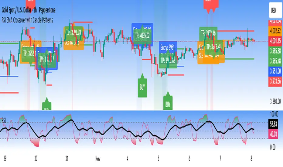
RSI EMA Crossover with Price ActionThe RSI and RSI's EMA Crossover with Price Action (1:2 Risk-Reward) strategy combines Momentum, Trend confirmation, and Basic price-action logic to generate high-probability trade setups with Proper Risk Management.
This script identifies entries when the RSI crosses a key threshold and aligns with an RSI - EMA crossover, confirming Exhaustion of a current trend and Price action confirms the Change in Trend direction. It integrates price action filters to avoid false signals during low-volatility or choppy conditions.
The strategy also includes a risk-management module, setting a fixed 1:2 risk-to-reward ratio — automatically placing a take-profit target twice the size of the stop loss. Also the Stop loss can be adjusted to nearest swing low or last 3 candles Low. to avoid Stoploss hunt.
Features
✅ RSI and EMA crossover confirmation for directional bias
✅ Basic price-action validation (optional filters)
✅ Configurable stop-loss and take-profit levels (default 1:2)
✅ Visual trade markers for entries and exits
Disclaimer: This script is intended for educational and research purposes only. It should not be considered financial advice or a guaranteed trading system. Users are encouraged to test and optimize parameters before using in live markets.
SamRSIIts multiple timeframe RSI indicator
Second RSI indicator can be enabled or disabled up on the necessity
Second RSI indicator has the ability to set to a different timeframe
Perfect for all types of trade (Intraday, Positional, Short term and Long term)

VMS Multi Index Options Buying Indicator📊 VMS Multi-Index Options Buying Indicator – Consolidated Overview
________________________________________
🎯 What It Is
A professional-grade options trading system that analyses multiple technical parameters to generate quantified buy signals for call and put options. It includes:
• Integrated risk management
• Multi-layered confirmation
• Quantified strength scores
________________________________________
⚡ Core Functionality
• Dual Analysis System: Call and put analysis running simultaneously
• Multi-Timeframe Analysis: Intraday to swing trading
• Quantified Scoring: Objective 0–7 strength scoring system
• Holistic Market View: Combines technicals, levels, volume, and momentum into a single signal
________________________________________
🔧 Technical Components
1. VMS Core Momentum System
• VMS SQZM Momentum: Primary oscillator (must be positive for both calls and puts)
• VMS Index Trends: Short-term and medium-term alignment
• Strength Scoring: 7-point system evaluating multiple parameters
2. Support/Resistance Levels (L0–L10)
Level Significance Options Trading Application
L00–L02 Strong Support Ideal for CALL BUY entries
L05 Critical Decision Point Wait for confirmation
L08–L9 Strong Resistance Ideal for PUT BUY entries
3. ATR Trend System
• Green Lines: Bullish momentum (favour calls)
• Red Lines: Bearish momentum (favour puts)
• ▲/▼ Triangles: Primary entry signals
• +L/+S Signals: Add-to-position opportunities
4. Volume Confirmation
• Real-time buy/sell volume analysis
• Cumulative volume trends
• Bullish/bearish candle counts
• Net volume direction confirmation
5. Spread Analysis
• Call-put spread direction and momentum
• Market sentiment gauge
• Options flow implications
________________________________________
📈 Signal Generation
Strength-Based Signals
• STRONG BUY: ≥4/7 strength points + clear advantage
• WEAK BUY: 3–3.9/7 strength points + modest advantage
• NO TRADE: All other scenarios
Critical Rules
• Both call and put VMS SQZM must be positive for any trade
• A clear strength advantage is required over the opposite option
• Volume confirmation enhances signal reliability
________________________________________
🧩 Ideal Trade Setups
Call Buy Setup
if (call_strength >= 4 and
call_strength > put_strength and
val_call > 0 and val_put > 0 and
ATR_trend_green and
price_near_support and
volume_bullish and
spread_positive_expanding):
execute_strong_call_buy()
Put Buy Setup
if (put_strength >= 4 and
put_strength > call_strength and
val_put > 0 and val_call > 0 and
ATR_trend_red and
price_near_resistance and
volume_bearish and
spread_negative_contracting):
execute_strong_put_buy()
________________________________________
📊 Dashboard Interpretation Guide
Section Call Buy Signal Put Buy Signal Critical Check
Spread Positive + Expanding Negative + Contracting Must confirm direction
VMS SQZM Green + Positive Green + Positive Both must be positive
Strength ≥4 & > Put ≥4 & > Call Primary decision factor
Squeeze "ON" preferred "ON" preferred Increases probability
Levels Near L00–L02 Near L08–L10 Confluence adds confidence
ATR Green + Rising Red + Falling Trend alignment
Volume Bullish patterns Bearish patterns Must confirm signal
________________________________________
⏰ Timeframe-Specific Strategies
Intraday Trading (5–15 min)
• Monitor strength changes every candle
• Use +L/+S for quick scalp entries
• Exit before last 30 minutes
• Tighter stops (50% premium)
Swing Trading (1H–Daily)
• Require ≥4.5 strength scores
• Focus on major level breaks (L00, L05, L10)
• Use wider stops (60% premium)
• Hold until the opposite signal generation
________________________________________
🛡️ Risk Management Integration
• Automatic position sizing based on signal strength
• Built-in exit triggers and stop-loss levels
• Daily trade limits and risk controls
________________________________________
💡 Unique Value
• Quantified scoring removes emotional trading
• Multiple confirmation layers reduce false signals
• Comprehensive dashboard for quick decision-making
• Options-specific analysis (not generic indicators)
________________________________________
🚨 Quick Decision Flowchart
1. Start → Check strength scores
2. Call ≥4 & > Put? → Yes → Check VMS SQZM >0? → Yes → ✅ Strong Call Buy
3. Put ≥4 & > Call? → Yes → Check VMS SQZM >0? → Yes → ✅ Strong Put Buy
4. Call ≥3 & > Put? → Yes → ✅ Weak Call Buy (reduced size)
5. Put ≥3 & > Call? → Yes → ✅ Weak Put Buy (reduced size)
6. ❌ No Trade – Wait for better setup
________________________________________
⚠️ Important Note
This is a decision support tool – not a guaranteed profit system. It requires:
• Proper risk management
• Trading experience
• Integration into a comprehensive trading strategy
Ideal for traders who want a systematic approach, objective signals, options focus, and multiple confirmation layers.
🎯 VMS Multi-Index Options Buying Indicator - MASTER CHEAT SHEET
📊 QUICK DECISION MATRIX
🟢 CALL BUY SIGNALS (All Must Align)
Component Strong Signal Weak Signal
Strength ≥4 & > Put 3-3.9 & > Put
VMS SQZM Both Positive Both Positive
Spread Positive + Expanding Positive
ATR Green + Rising Green
Levels L00-L02 Near Support
Volume Bullish Confirmed Mixed Bullish
Squeeze ON Any
🔴 PUT BUY SIGNALS (All Must Align)
Component Strong Signal Weak Signal
Strength ≥4 & > Call 3-3.9 & > Call
VMS SQZM Both Positive Both Positive
Spread Negative + Contracting Negative
ATR Red + Falling Red
Levels L08-L10 Near Resistance
Volume Bearish Confirmed Mixed Bearish
Squeeze ON Any
________________________________________
⚡ INSTANT EXECUTION RULES
✅ STRONG TRADES (High Conviction)
# STRONG CALL BUY
if (call_strength >= 4 and
call_strength > put_strength and
val_call > 0 and val_put > 0):
execute_call_buy()
# STRONG PUT BUY
if (put_strength >= 4 and
put_strength > call_strength and
val_put > 0 and val_call > 0):
execute_put_buy()
🟡 WEAK TRADES (Reduced Size Only)
if strength >= 3 and strength > opposite_strength:
execute_weak_trade() # 30-50% normal size
❌ NO TRADE CONDITIONS
if (any_vms_sqzm_negative or
both_strengths >= 3 or
strength < 3 or
no_clear_advantage):
AVOID_TRADE()
________________________________________
🎯 CONFIRMATION HIERARCHY
PERFECT CALL SETUP
1. ✅ Strength: Call ≥4, Put < Call
2. ✅ VMS SQZM: Both positive
3. ✅ Spread: Positive & Expanding
4. ✅ ATR: Green + Rising
5. ✅ Levels: Near L00-L02 support
6. ✅ Volume: Bullish confirmation
7. ✅ Squeeze: ON
PERFECT PUT SETUP
1. ✅ Strength: Put ≥4, Call < Put
2. ✅ VMS SQZM: Both positive
3. ✅ Spread: Negative & Contracting
4. ✅ ATR: Red + Falling
5. ✅ Levels: Near L08-L10 resistance
6. ✅ Volume: Bearish confirmation
7. ✅ Squeeze: ON
________________________________________
📈 POSITION MANAGEMENT
🎚️ Sizing Matrix
Signal Strength Position Size Stop Loss Profit Target
≥4 (STRONG) 70-80% normal 50-60% premium 1:1 R:R + Trail
3-3.9 (WEAK) 30-50% normal 40-50% premium Quick 1:1
<3 (NO TRADE) 0% N/A N/A
🚪 Exit Triggers
• Stop Loss: 50-60% premium loss OR VMS SQZM turns negative
• Profit Taking: 50% at 1:1, trail balance using VMS Index
• Signal Exit: Opposite strength reaches ≥3 OR current strength drops below entry
________________________________________
⏰ TIMEFRAME STRATEGIES
🔄 Intraday (5-15 min)
• Monitor strength changes every candle
• Exit before last 30 minutes
• Tighter stops (50% premium)
• Use +L/+S for quick scalps
📅 Swing (1H-Daily)
• Require ≥4.5 strength scores
• Focus on major level breaks
• Wider stops (60% premium)
• Hold until opposite signal
________________________________________
🛡️ RISK MANAGEMENT
📉 Daily Limits
• Max Trades: 3 per day
• Max Risk: 2% capital per trade
• Loss Limit: Stop after 2 consecutive losses
• Portfolio: Never trade both call/put simultaneously
🧠 Psychological Rules
1. Wait for clear signals - don't force
2. Respect strength scoring - no overrides
3. Stick to position sizing - no revenge trading
4. Accept "NO TRADE" as valid outcome
________________________________________
🚀 QUICK START FLOW
1. CHECK Strength Scores
2. CONFIRM VMS SQZM Both Positive
3. VALIDATE Spread Direction
4. ALIGN ATR Trend
5. CONFIRM Volume & Levels
6. EXECUTE or WAIT
________________________________________
📊 VMS DASHBOARD FLOWCHART
START → Check Strength Scores
↓
→ YES → → YES → 🟢 STRONG CALL
↓ NO ↓ NO
→ YES → → YES → 🔴 STRONG PUT
↓ NO ↓ NO
→ YES → 🟡 WEAK CALL (Reduce Size)
↓ NO
→ YES → 🟡 WEAK PUT (Reduce Size)
↓ NO
❌ NO TRADE - Wait
________________________________________
⚠️ CRITICAL REMINDERS
• MUST: Both VMS SQZM positive for ANY trade
• MUST: Clear strength advantage (≥0.5 difference)
• PREFER: Volume confirmation for maximum size
• AVOID: Trading during news events
• RESPECT: Daily risk limits
________________________________________
💡 SUCCESS FORMULA
Patience + Confirmation + Risk Management = Consistent Results
Wait for ≥4 strength signals with multiple confirmations, always use proper position sizing, and journal every trade.
Happy Trading! 📈
Remember: This system provides probabilities, not guarantees. Always trade with proper risk management and within your financial means.

LuxAum Fisher ScaledLuxAum Fisher Scaled
Fisher Transform scaled 0–100, shows momentum in a separate pane with neutral = 50, min = 0, max = 100.
© LuxAum. Disclaimer: Educational and informational purposes only; not financial advice.

Delta ROC (acceleration) + GuideStan Druckenmiller often stresses that markets are driven not by absolute numbers but by their rate of change. He says the key is to “focus on the central banks and the movement of liquidity,” and notes that “because it used second-derivative rate of change, these things will often bottom a year to a year and a half before the fundamentals.” In essence, he looks for inflection points—moments when momentum itself begins to turn—well before the data or headlines confirm it.
The ΔROC (Delta Rate of Change) indicator applies that same philosophy. It measures both the first derivative of price (ROC: speed or momentum) and the second derivative (ΔROC: acceleration or deceleration of that momentum). Green bars signal that momentum is accelerating—buyers gaining control—while red bars show slowing momentum or exhaustion. Combine this with trend filters like the 30- and 50-day moving averages to spot early shifts in sentiment and liquidity—the kind of turning points Druckenmiller calls the “second-derivative moments” that often lead the real economy by months.

Emerson v8.4 – Kulture Metrics🜂 Emerson v8.4 – Kulture Metrics
“When volatility breathes, probability answers.”
The Emerson Engine isn’t another indicator—it’s a precision instrument built to exploit the hidden mathematics of motion.
Born from Kulture Metrics’ Nosreme lineage, this model fuses trend architecture, volatility anatomy, and Linetsky’s path-integral weighting into one living signal core. It doesn’t predict — it quantifies belief.
Each trigger passes through three unforgiving filters:
Classical Trend & Momentum Logic — directional strength, pure and unadulterated.
Squeeze Regime Anticipation — volatility compression before the break.
Path-Integral Confirmation — stochastic payoffs weighted by risk-free discounting and volatility density.
The result?
Only signals where the math, the market, and the moment all align — Absolute Confirmations.
No noise. No guessing. No emotion.
In practice, Emerson waits. It calculates. Then it strikes with surgical precision — entries that respect volatility, discount rates, and expected path contributions like a derivatives desk built into your chart.
Each decision point carries the full weight of stochastic probability theory — the same principles driving modern option pricing — yet distilled into something you can read at a glance.
Benefits that separate you from the herd:
✅ Trades filtered by volatility percentile and expected payoff distribution — not gut feel.
✅ Dotted bias line reveals the “probabilistic current” beneath price itself.
✅ Alerts trigger only when logic, momentum, and probability form a unanimous verdict.
✅ Dynamic macro-window shading adapts to volatility pressure in real time.
✅ Every entry inherently respects your risk, target, and discounting horizon.
Emerson v8.4 doesn’t ask the market what’s happening — it tells it what must happen next, given the probabilities.
It’s not designed to comfort. It’s designed to confirm.
Kulture Metrics. Built for traders who understand that randomness is just order not yet resolved.

RSI Divergence DetectorOverview
The RSI Divergence Detector is a comprehensive technical analysis tool designed to identify both regular and hidden divergences between price action and the Relative Strength Index (RSI). This indicator helps traders spot potential trend reversals and continuations by automatically detecting when price movements diverge from RSI momentum.
What are Divergences?
Regular Divergences signal potential trend reversals:
Bullish Divergence: Price makes a lower low while RSI makes a higher low → Potential upward reversal
Bearish Divergence: Price makes a higher high while RSI makes a lower high → Potential downward reversal
Hidden Divergences signal trend continuation:
Hidden Bullish Divergence: Price makes a higher low while RSI makes a lower low → Uptrend continuation
Hidden Bearish Divergence: Price makes a lower high while RSI makes a higher high → Downtrend continuation
Automatic Divergence Detection
Detects all four types of divergences automatically
Draws connecting lines between divergence points on the RSI
Labels each divergence with clear text indicators ("Bull", "Bear", "HBull", "HBear")
Independent toggle switches for each divergence type
Dynamic RSI Display
RSI line changes color based on momentum:
Green when RSI is above 50 (bullish momentum)
Red when RSI is below 50 (bearish momentum)
Standard overbought (70) and oversold (30) levels marked
Shaded background zones for overbought/oversold areas
Pivot Detection System
Adjustable pivot lookback period (default: 4 bars)
Visual pivot markers at tops and bottoms of RSI
Configurable maximum divergence range (default: 60 bars)
Adjust the setting to you desired sensitivity on each timeframe.
Full Customization Suite
Label Customization:
Choose label size (Tiny, Small, Normal, Large, Huge)
Separate color selection for each divergence type
Adjustable transparency (0-100%)
Line Customization:
Independent color control for bullish and bearish lines
Line style options for each type (Solid, Dashed, Dotted)
Default: Regular divergences use dashed lines, hidden divergences use dotted lines
Visual Settings:
Customizable overbought/oversold zone colors and transparency
Gray horizontal reference lines (70, 50, 30)
Pivot markers with adjustable visibility
Default Settings
RSI Length: 14 periods
Pivot Lookback: 4 bars
Max Divergence Range: 60 bars
Label Size: Normal
Bullish Color: #4CAF50 (Material Green)
Bearish Color: #FF5252 (Material Red)
Regular Line Style: Dashed
Hidden Line Style: Dotted
How to Use
Customize Settings: Adjust colors, line styles, and detection parameters to your preference
Toggle Divergence Types: Enable/disable specific divergence types based on your trading strategy
Identify Signals: Look for labeled divergences with connecting lines on the RSI pane
Confirm with Price Action: Use divergences in conjunction with other technical analysis tools
Best Practices
Regular Divergences: Best used to spot potential reversals at market extremes
Hidden Divergences: Best used to identify pullback entry points in trending markets
Confirmation: Always wait for price confirmation before entering trades based on divergences
Multiple Timeframes: Check for divergences across multiple timeframes for stronger signals
Risk Management: Use proper stop-losses as not all divergences lead to reversals
Technical Specifications
PineScript Version: v6
Indicator Type: Oscillator (separate pane)
Maximum Lines: 500
Calculation Method: Pivot-based divergence detection using price and RSI comparisons

💎 ELMAS FORMASYONU 2.0 💎 The new version of the Indikaterdem Diamond Formation is beta 2.0. It is a trend-based software. When a stock enters a trend, diamond crystals form, and diamonds form periodically. There are two sensitivity settings: Smoothing and Average. Changing any other settings is not recommended.

İNDİKATERDEM DİAMOND (💎 entegre)The new version of the Indikaterdem Diamond Formation is beta 2.0. It is a trend-based software. When a stock enters a trend, diamond crystals form, and diamonds form periodically. There are two sensitivity settings: Smoothing and Average. Changing any other settings is not recommended.
