Penny Stock Golden Cross ScannerPenny Stock Golden Cross Scanner
Scan and track potential breakout opportunities in penny stocks with this Golden Cross Scanner. Designed for traders looking at low-priced, high-volume stocks, this indicator identifies bullish setups using 50, 100, and 200-period moving averages.
Key Features:
✅ Monitors up to 10 user-defined tickers.
✅ Filters penny stocks by maximum price and minimum volume.
✅ Detects proximity to 100 MA and 200 MA for potential golden cross or support/resistance signals.
✅ Assigns signal tiers for each stock (Tier 1 🔥, Tier 2 ⚡, Tier 3 📊) based on price action relative to moving averages.
✅ Customizable scanner table with position options on the chart.
✅ Real-time plotting of 50, 100, and 200 moving averages for context.
✅ Option to display only stocks currently generating signals.
Osciladores

CYCLE RESEARCH PRO - FIXEDCYCLE RESEARCH PRO – Fixed & Cleaned (2025 Edition)
The only public T+21 / T+35 / T+147 cycle tracker that actually works.
Features:
• Exact days since the legendary GME sneeze (28 Jan 2021)
• Highlights active T+21, T+35, and T+147 windows (± user-defined tolerance)
• Live countdown to next cycle date for all three
• FTD Proxy detector (extreme volume + true-range spike)
• Clean wide dashboard – no clutter
• Background glows when any cycle window is active
• Built-in alerts including the infamous “T+21 + FTD” combo
• 100 % non-repainting – uses only confirmed bars
• Zero errors, zero warnings, Pine v6 native
Made famous in the meme-stock wars.
Now cleaned, fixed, and ready for the next run.
Works on GME, AMC, BBBY, any stock or crypto.
Use it. Share it. Profit.
Not financial advice. Just math & cycles.
– Published with love for the apes, degens, and cycle chads everywhere

Erva & nur (stoch rsi)This script builds a custom oscillator that combines WaveTrend, RSI and Stochastic RSI to analyze momentum and overbought/oversold zones.

Bli-Rik (Buy and sell based on RSI & SMA)Basis analysis of Stoch RSI + RSI + 34/200 SMA Signals we have identified and generated Buy and sell indication on chart, This will help to guild buy and sell process...

Traffic Lights - BETA ZONESTraffic Lights - BETA ZONES
Overview
The Traffic Light indicator is a simple, visual tool designed to help traders gauge market bias, trend strength, and momentum at a glance. It displays three rows of colored dots (like a traffic light) in a separate pane below your chart:
• Green: Bullish signal (go/buy bias).
• Red: Bearish signal (stop/sell bias).
• Orange: Neutral or caution (mixed/uncertain conditions).
This indicator combines price action (via EMA positioning), trend direction (via RSI), and momentum expansion (via RSI + MACD histogram) to provide a layered view of the market. When all three rows align as green or red, it generates Buy or Sell labels on the main chart for potential entry signals.
It's non-repainting in its core logic (Row 2 uses delayed RSI comparison to avoid noise), making it reliable for live trading. Best used on trending markets like forex, stocks, or crypto on timeframes from 15M to Daily.
How It Works
The indicator evaluates three independent "rows" of conditions, each represented by a colored dot:
1. Row 1: Price Action Signal (EMA Touch) This row assesses the overall trend bias based on price's position relative to a slow EMA (default: 50-period).
o Green: Price is cleanly above the EMA (bullish bias).
o Red: Price is cleanly below the EMA (bearish bias).
o Orange: Price is "touching" or within a volatility buffer around the EMA (neutral/caution). The "touch zone" is defined by ATR padding, which can be toggled off for a stricter (green/red only) mode.
2. Row 2: Buyers/Sellers Trend (RSI) This row tracks the underlying trend of buyer/seller strength using RSI (default: 14-period on close). To reduce noise and repainting, it uses a delayed comparison (RSI vs. RSI ):
o Green: RSI is rising (buyers gaining strength).
o Red: RSI is falling (sellers gaining strength). No orange here—it's purely directional.
3. Row 3: Buyers/Sellers Signal (RSI + MACD Histogram) This row focuses on momentum expansion, requiring alignment across RSI zones and MACD histogram:
o Green: RSI > 50 (bull zone), MACD hist > 0 (positive), and histogram is expanding upward.
o Red: RSI < 50 (bear zone), MACD hist < 0 (negative), and histogram is expanding downward.
o Orange: Any mismatch (e.g., pullbacks, consolidations, or weak momentum). MACD defaults: Fast=12, Slow=26, Signal=9.
Signals
• Buy Signal: Triggers a "Buy" label below the bar when all three rows turn green for the first time (crossover from non-aligned).
• Sell Signal: Triggers a "Sell" label above the bar when all three rows turn red for the first time. These are conservative signals—use them for trend confirmation or entries in alignment with your strategy. They don't repaint once fired.
Inputs & Customization
All inputs are grouped for easy tweaking:
• Row 1: Price Action Signal
o Slow EMA Length (default: 50): Adjusts the trend baseline.
o EMA Timeframe (default: empty/current): Use a higher timeframe (e.g., "240" for 4H) for multi-timeframe analysis.
o Enable Orange 'Touch' Zone (default: true): Toggle for strict (green/red only) vs. touch mode.
o ATR Length (default: 3): Volatility period for touch padding.
o Touch Padding (ATR mult, default: 0.15): Widens the orange buffer; set to 0 for wick-touch only.
• Row 2: Buyers/Sellers Trend (RSI)
o RSI Length (default: 14): Period for RSI calculation.
o RSI Source (default: close): Change to high/low/open for different sensitivities.
• Row 3: Buyers/Sellers Signal (RSI + MACD hist)
o MACD Fast/Slow/Signal Lengths (defaults: 12/26/9): Standard MACD settings.
Usage Tips
• Trend Trading: Wait for all-green for long entries or all-red for shorts. Use in conjunction with support/resistance.
• Scalping/Intraday: Enable orange touch zone for more nuance in choppy markets; disable for cleaner signals in trends.
• Multi-Timeframe: Set Row 1 EMA to a higher TF for "big picture" bias while keeping others on current.
• Risk Management: Always combine with stop-losses (e.g., below recent lows for buys). Backtest on your asset/timeframe.
• Limitations: In ranging markets, orange dots may dominate—pair with volatility filters like ADX. Not a standalone system; use as a confirmation tool.
If you have feedback or suggestions, drop a comment below! Happy trading 🚦

Multi-Timeframe RSI Table (Movable) by AKIt as a Multi Time Frame RSI (Movable) by AK
It has RSI value from 5 min to 1 month timeframe.
Green indicates RSI above 60 - Yellow indicates RSI Below 40

Marumaroo's RSI + MFI (가격과 거래량의 이중 체크)매매할 때 RSI랑 MFI를 같이 보는데, 지표창 두 개 띄우기 귀찮아서 하나로 합쳤습니다.
RSI(가격)만 보면 가짜 반등에 속을 때가 많은데, MFI(거래량)랑 같이 보면 다이버전스나 휩소 걸러내기가 훨씬 수월합니다.
특징:
보기 편함: RSI는 빨강, MFI는 회색입니다.
배경색 알림: 과매수(80 이상) 구간은 빨간 배경, 과매도(20 이하) 구간은 초록 배경이 뜹니다. 한눈에 파악하기 좋습니다.
복잡한 기능 다 빼고 깔끔하게 만들었으니 필요하신 분 쓰세요.
I combined RSI and MFI into a single chart to save screen space and filter out fake signals.
Checking Money Flow (MFI) alongside Price Action (RSI) helps in spotting divergences and avoiding traps.
Features:
Clean Look: RSI is Red, MFI is Gray.
Background Colors: automatically highlights Overbought (>80) zones in Red and Oversold (<20) zones in Green.
Simple and lightweight script. Hope it helps!

Relative Strength Heatmap [BackQuant]Relative Strength Heatmap
A multi-horizon RSI matrix that compresses 20 different lookbacks into a single panel, turning raw momentum into a visual “pressure gauge” for overbought and oversold clustering, trend exhaustion, and breadth of participation across time horizons.
What this is
This indicator builds a strip-style heatmap of 20 RSIs, each with a different length, and stacks them vertically as colored tiles in a single pane. Every tile is colored by its RSI value using your chosen palette, so you can see at a glance:
How many “fast” versus “slow” RSIs are overbought or oversold.
Whether momentum is concentrated in the short lookbacks or spread across the whole curve.
When momentum extremes cluster, signalling strong market pressure or exhaustion.
On top of the tiles, the script plots two simple breadth lines:
A white line that counts how many RSIs are above 70 (overbought cluster).
A black line that counts how many RSIs are below 30 (oversold cluster).
This turns a single symbol’s RSI ladder into a compact “market pressure gauge” that shows not only whether RSI is overbought or oversold, but how many different horizons agree at the same time.
Core idea
A single RSI looks at one length and one timescale. Markets, however, are driven by flows that operate on multiple horizons at once. By computing RSI over a ladder of lengths, you approximate a “term structure” of strength:
Short lengths react to immediate swings and very recent impulses.
Medium lengths reflect swing behaviour and local trends.
Long lengths reflect structural bias and higher timeframe regime.
When many lengths agree, for example 10 or more RSIs all above 70, it suggests broad participation and strong directional pressure. When only a few fast lengths stretch to extremes while longer ones stay neutral, the move is more fragile and more likely to mean-revert.
This script makes that structure visible as a heatmap instead of forcing you to run many separate RSI panes.
How it works
1) Generating RSI lengths
You control three parameters in the calculation settings:
RS Period – the base RSI length used for the shortest strip.
RSI Step – the amount added to each successive RSI length.
RSI Multiplier – a global scaling factor applied after the step.
Each of the 20 RSIs uses:
RSI length = round((base_length + step × index) × multiplier) , where the index goes from 0 to 19.
That means:
RSI 1 uses (len + step × 0) × mult.
RSI 2 uses (len + step × 1) × mult.
…
RSI 20 uses (len + step × 19) × mult.
You can keep the ladder dense (small step and multiplier) or stretch it across much longer horizons.
2) Heatmap layout and grouping
Each RSI is plotted as an “area” strip at a fixed vertical level using histbase to stack them:
RSI 1–5 form Group 1.
RSI 6–10 form Group 2.
RSI 11–15 form Group 3.
RSI 16–20 form Group 4.
Each group has a toggle:
Show only Group 1 and 2 if you care mainly about fast and medium horizons.
Show all groups for a full spectrum from very short to very long.
Hide any group that feels redundant for your workflow.
The actual numeric RSI values are not plotted as lines. Instead, each strip is drawn as a horizontal band whose fill color represents the current RSI regime.
3) Palette-based coloring
Each tile’s color is driven by the RSI value and your chosen palette. The script includes several palettes:
Viridis – smooth green to yellow, good for subtle reading.
Jet – strong blue to red sequence with high contrast.
Plasma – purple through orange to yellow.
Custom Heat – cool blues to neutral grey to hot reds.
Gray – grayscale from white to black for minimalistic layouts.
Cividis, Inferno, Magma, Turbo, Rainbow – additional scientific and rainbow-style maps.
Internally, RSI values are bucketed into ranges (for example, below 10, 10–20, …, 90–100). Each bucket maps to a unique colour for that palette. In all schemes, low RSI values are mapped to the “cold” or darker side and high RSI values to the “hot” or brighter side.
The result is a true momentum heatmap:
Cold or dark tiles show low RSI and oversold or compressed conditions.
Mid tones show neutral or mid-range RSI.
Warm or bright tiles show high RSI and overbought or stretched conditions.
4) Bull and bear breadth counts
All 20 RSI values are collected into an array each bar. Two counters are then calculated:
Bull count – how many RSIs are above 70.
Bear count – how many RSIs are below 30.
These are plotted as:
A white line (“RSI > 70 Count”) for the overbought cluster.
A black line (“RSI < 30 Count”) for the oversold cluster.
If you enable the “Show Bull and Bear Count” option, you get an immediate reading of how many of the 20 horizons are stretched at any moment.
5) Cluster alerts and background tagging
Two alert conditions monitor “strong cluster” regimes:
RSI Heatmap Strong Bull – triggers when at least 10 RSIs are above 70.
RSI Heatmap Strong Bear – triggers when at least 10 RSIs are below 30.
When one of these conditions is true, the indicator can tint the background of the chart using a soft version of the current palette. This visually marks stretches where momentum is extreme across many lengths at once, not just on a single RSI.
What it plots
In one oscillator window, the indicator provides:
Up to 20 horizontal RSI strips, each representing a different RSI length.
Color-coded tiles reflecting the current RSI value for each length.
Group toggles to show or hide each block of five RSIs.
An optional white line that counts how many RSIs are above 70.
An optional black line that counts how many RSIs are below 30.
Optional background highlights when the number of overbought or oversold RSIs passes the strong-cluster threshold.
How it measures breadth and pressure
Single-symbol breadth
Breadth is usually defined across a basket of symbols, such as how many stocks advance versus decline. This indicator uses the same concept across time horizons for a single symbol. The question becomes:
“How many different RSI lengths are stretched in the same direction at once?”
Examples:
If only 2 or 3 of the shortest RSIs are above 70, bull count stays low. The move is fast and local, but not yet broadly supported.
If 12 or more RSIs across short, medium and long lengths are above 70, the bull count spikes. The move has broad momentum and strong upside pressure.
If 10 or more RSIs are below 30, bear count spikes and you are in a broad oversold regime.
This is breadth of momentum within one market.
Market pressure gauge
The combination of heatmap tiles and breadth lines acts as a pressure gauge:
High bull count with warm colors across most strips indicates strong upside pressure and crowded long positioning.
High bear count with cold colors across most strips indicates strong downside pressure and capitulation or forced selling.
Low counts with a mixed heatmap indicate neutral pressure, fragmented flows, or range-bound conditions.
You can treat the strong-cluster alerts as “extreme pressure” signals. When they fire, the market is heavily skewed in one direction across many horizons.
How to read the heatmap
Horizontal patterns (through time)
Look along the time axis and watch how the colors evolve:
Persistent hot tiles across many strips show sustained bullish pressure and trend strength.
Persistent cold tiles across many strips show sustained bearish pressure and weak demand.
Frequent flipping between hot and cold colours indicates a choppy or mean-reverting environment.
Vertical structure (across lengths at one bar)
Focus on a single bar and read the column of tiles from top to bottom:
Short RSIs hot, long RSIs neutral or cool: early trend or short-term fomo. Price has moved fast, longer horizons have not caught up.
Short and long RSIs all hot: mature, entrenched uptrend. Broad participation, high pressure, greater risk of blow-off or late-entry vulnerability.
Short RSIs cold but long RSIs mid to high: pullback in a higher timeframe uptrend. Dip-buy and continuation setups are often found here.
Short RSIs high but long RSIs low: countertrend rallies within a broader downtrend. Good hunting ground for fades and short entries after a bounce.
Bull and bear breadth lines
Use the two lines as simple, numeric breadth indicators:
A rising white line shows more RSIs pushing above 70, so bullish pressure is expanding in breadth.
A rising black line shows more RSIs pushing below 30, so bearish pressure is expanding in breadth.
When both lines are low and flat, few horizons are extreme and the market is in mid-range territory.
Cluster zones
When either count crosses the strong threshold (for example 10 out of 20 RSIs in extreme territory):
A strong bull cluster marks a broadly overbought regime. Trend followers may see this as confirmation. Mean-reversion traders may see it as a late-stage or blow-off context.
A strong bear cluster marks a broadly oversold regime. Downtrend traders see strong pressure, but the risk of sharp short-covering bounces also increases.
Trading applications
Trend confirmation
Use the heatmap and breadth lines as a trend filter:
Prefer long setups when the heatmap shows mostly mid to high RSIs and the bull count is rising.
Avoid fresh shorts when there is a strong bull cluster, unless you are specifically trading exhaustion.
Prefer short setups when the heatmap is mostly low RSIs and the bear count is rising.
Avoid aggressive longs when a strong bear cluster is active, unless you are trading reflexive bounces.
Mean-reversion timing
Treat cluster extremes as exhaustion zones:
Look for reversal patterns, failed breakouts, or order flow shifts when bull count is very high and price starts to stall or diverge.
Look for reflexive bounce potential when bear count is very high and price stops making new lows or shows absorption at the lows.
Use the palette and counts together: hot tiles plus a peaking white line can mark blow-off conditions, cold tiles plus a peaking black line can mark capitulation.
Regime detection and risk toggling
Use the overall shape of the ladder over time:
If upper strips stay warm and lower strips stay neutral or warm for extended periods, the market is in an uptrend regime. You can justify higher risk for long-biased strategies.
If upper strips stay cold and lower strips stay neutral or cold, the market is in a downtrend regime. You can justify higher risk for short-biased strategies or defensive positioning.
If colours and counts flip frequently, you are likely in a range or choppy regime. Consider reducing size or using more tactical, short-term strategies.
Multi-horizon synchronization
You can think of each RSI length as a proxy for a different “speed” of the same market:
When only fast RSIs are stretched, the move is local and less robust.
When fast, medium and slow RSIs align, the move has multi-horizon confirmation.
You can require a minimum bull or bear count before allowing your main strategy to engage.
Spotting hidden shifts
Sometimes price appears flat or drifting, but the heatmap quietly cools or warms:
If price is sideways while many hot tiles fade toward neutral, momentum is decaying under the surface and trend risk is increasing.
If price is sideways while many cold tiles climb back toward neutral, selling pressure is decaying and the tape is repairing itself.
Settings overview
Calculation Settings
RS Period – base RSI length for the shortest strip.
RSI Step – the increment added to each successive RSI length.
RSI Multiplier – scales all generated RSI lengths.
Calculation Source – the input series, such as close, hlc3 or others.
Plotting and Coloring Settings
Heatmap Color Palette – choose between Viridis, Jet, Plasma, Custom Heat, Gray, Cividis, Inferno, Magma, Turbo or Rainbow.
Show Group 1 – toggles RSI 1–5.
Show Group 2 – toggles RSI 6–10.
Show Group 3 – toggles RSI 11–15.
Show Group 4 – toggles RSI 16–20.
Show Bull and Bear Count – enables or disables the two breadth lines.
Alerts
RSI Heatmap Strong Bull – fires when the number of RSIs above 70 reaches or exceeds the configured threshold (default 10).
RSI Heatmap Strong Bear – fires when the number of RSIs below 30 reaches or exceeds the configured threshold (default 10).
Tuning guidance
Fast, tactical configurations
Use a small base RS Period, for example 2 to 5.
Use a small RSI Step, for tight clustering around the fast horizon.
Keep the multiplier near 1.0 to avoid extreme long lengths.
Focus on Group 1 and Group 2 for intraday and short-term trading.
Swing and position configurations
Use a mid-range RS Period, for example 7 to 14.
Use a moderate RSI Step to fan out into slower horizons.
Optionally use a multiplier slightly above 1.0.
Keep all four groups enabled for a full view from fast to slow.
Macro or higher timeframe configurations
Use a larger base RS Period.
Use a larger RSI Step so the top of the ladder reaches very slow lengths.
Focus on Group 3 and Group 4 to see structural momentum.
Treat clusters as regime markers rather than frequent trading signals.
Notes
This indicator is a contextual tool, not a standalone trading system. It does not model execution, spreads, slippage or fundamental drivers. Use it to:
Understand whether momentum is narrow or broad across horizons.
Confirm or filter existing signals from your primary strategy.
Identify environments where the market is crowded into one side.
Distinguish between isolated spikes and truly broad pressure moves.
The Relative Strength Heatmap is designed to answer a simple but powerful question:
“How many versions of RSI agree with what I am seeing on the chart?”
By compressing those answers into a single panel with clear colour coding and breadth lines, it becomes a practical, visual gauge of momentum breadth and market pressure that you can overlay on any trading framework.

Magic Equity Trend & PivotsMagic Equity Trend & Pivots is a robust technical analysis engine designed specifically for equity and index traders. It serves as a comprehensive "Trend & Level" companion, combining institutional Pivot Points with a proprietary EMA trend filtering system to identify high-probability setups.
How the Magic Works
This indicator simplifies complex market data into a clear visual workflow:
1. The Magic Equity Trend (Trend Identification) The script uses a weighted system to determine the dominant market direction:
Bullish Trend: Price holds above the primary Trend SMA + a Volatility Buffer (Green Zone).
Bearish Trend: Price is rejected below the Trend SMA - Buffer (Red Zone).
No-Trade Zone: When the price is trapped inside the buffer (Gray Channel), the trend is considered weak or ranging.
2. Institutional Pivot Points Price often reacts at hidden levels. This tool calculates and overlays these levels automatically:
Multi-Type Support: Choose between Traditional, Fibonacci, Woodie, Classic, DM, and Camarilla pivots.
Timeframe Smart-Switching: Use fixed timeframes (e.g., Weekly Pivots on a Daily chart) or let the "Auto" mode decide the best reference period for your current view.
Historical Mode: Unlike standard pivots, these can be back-tested visually to see how prices respected levels in the past.
3. Precision Entry & Exit Logic Trade signals are not random; they are based on a strict confluence of "Magic" factors:
Entry Signal: Requires Trend Alignment + Fast/Slow EMA Crossover + RSI Strength (>60) + Relative Volume Spike.
Top-Up (Add-on): Detects low-risk opportunities to add to a position when price pulls back to the EMA10/20 during a strong trend.
Two-Stage Exit: Secures profits using either an ATR Trailing Stop or an Intraday RSI Breakdown, depending on your settings.
4. Divergence & Momentum
RSI Divergence: Automatically plots Regular Bullish and Bearish divergences to warn of potential reversals at tops or bottoms.
Darvas Boxes: Visualizes consolidation ranges to help identify breakouts.
5. Performance Dashboard A data table provides a snapshot of the asset's health:
Mean Reversion: Measures the % distance from key EMAs (10, 20, 50).
RVOL & ADR: Displays Relative Volume and Average Daily Range to gauge volatility.
Performance Tracker: A theoretical summary table showing how the trend signals have performed over the last 1W, 1M, and 1Y periods.
Settings & Customization
Visuals: Fully customizable colors for the Trend Cloud, Pivots, and Backgrounds.
Filters: Toggle specific filters (Volume, RSI, Trend Buffer) to adapt the sensitivity to different asset classes.
Disclaimer: This tool is for educational purposes and technical analysis assistance only. Past performance displayed in the dashboard does not guarantee future results.

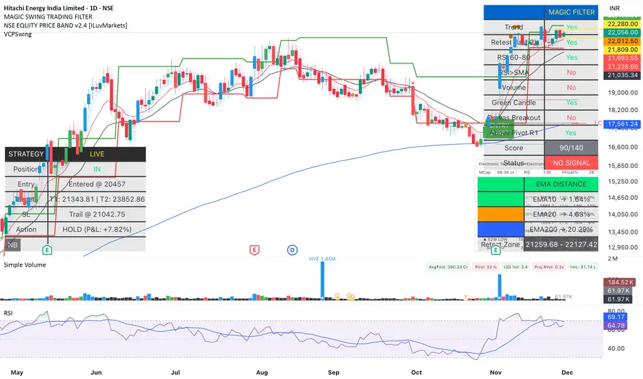
Magic Swing Suite: Trend, Pullback & Risk DashboardMagic Swing Suite: Trend, Pullback & Risk Dashboard
This indicator is a complete Swing Trading System designed to identify high-probability trend continuation setups. It combines classic trend-following principles with a unique "3-Bar Retest" logic and provides a real-time Strategy Dashboard to help you manage positions without needing a separate strategy script.
How it Works:
The system looks for a "Confluence" of factors before generating a signal. It scores every bar out of 140 points based on the following criteria:
Trend Alignment: Price must be above EMA 10, and EMA 10 must be above EMA 20.
Momentum (RSI): RSI must be in the "Bullish Control Zone" (60-80) and above its SMA.
Volume: Volume must be significantly higher than the average (1.5x by default).
The "Magic" Retest: The script checks the last 2-5 bars to see if the price has pulled back to "kiss" the EMA 10. This ensures we are buying a dip in a trend, not chasing a top.
Breakout Confirmation: Checks for Darvas Box breakouts and price position relative to Pivot R1.
Features:
🎯 Virtual Strategy Dashboard: A table that mimics a strategy tester. It tracks Entry, Stop Loss (Trailing), Target 1, and Target 2 in real-time.
📊 Confluence Scorecard: A detailed table showing exactly why a signal was (or wasn't) generated (Trend, Retest, RSI, Volume, etc.).
🛡️ Risk Management: automatically calculates a Trailing Stop (EMA 10) and fixed Risk:Reward targets based on recent highs.
📉 Multi-Layered Overlays: Includes Auto-Pivots (Traditional, Fib, Woodie, etc.) and Darvas Boxes to identify support/resistance levels.
How to Use:
Wait for a Signal:
"FULL BUY SIGNAL" (Green): All conditions are met, including a recent retest of the EMA. This is the highest probability setup.
"BUY - NO RETEST" (Orange): Trend and momentum are strong, but price hasn't pulled back recently. Use caution, as this may be a breakout trade.
Monitor the Dashboard: Once a trade is active, the dashboard will change to "IN POSITION." Follow the "Action" row.
If the trend weakens, the Trailing Stop (EMA 10) will move up to protect profits.
Targets:
T1: Previous Swing High (or 5% if no high found).
T2: 1:1.6 Risk/Reward extension.
Settings:
Volume Spike Factor: Adjust how much volume is needed to confirm a move. Default is 1.2.
Retest Tolerance: Adjust how close the price needs to get to the EMA 10 to count as a "retest."
Dashboard Toggles: You can hide the tables if you prefer a clean chart.
Pivot Timeframes: customizable lookback for S/R levels.
FAQ:
Does this repaint?
No. All signals trigger only on confirmed bars.
Can I use this intraday?
Yes. Works great from 5m to 1D.
Are exits manual or automated?
The indicator tracks SL, T1, and T2, and marks them on the chart.
Does retest affect the buy signal?
Retest is optional. The buy logic does not require it, but adds weight to the score.
Disclaimer: This tool is for educational purposes only. The "Strategy Dashboard" is a simulation based on script calculations and does not execute real trades. Always manage your own risk.
ADX Forecast Colorful [DiFlip]ADX Forecast Colorful
Introducing one of the most advanced ADX indicators available — a fully customizable analytical tool that integrates forward-looking forecasting capabilities. ADX Forecast Colorful is a scientific evolution of the classic ADX, designed to anticipate future trend strength using linear regression. Instead of merely reacting to historical data, this indicator projects the future behavior of the ADX, giving traders a strategic edge in trend analysis.
⯁ Real-Time ADX Forecasting
For the first time, a public ADX indicator incorporates linear regression (least squares method) to forecast the future behavior of ADX. This breakthrough approach enables traders to anticipate trend strength changes based on historical momentum. By applying linear regression to the ADX, the indicator plots a projected trendline n periods ahead — helping users make more accurate and timely trading decisions.
⯁ Highly Customizable
The indicator adapts seamlessly to any trading style. It offers a total of 26 long entry conditions and 26 short entry conditions, making it one of the most configurable ADX tools on TradingView. Each condition is fully adjustable, enabling the creation of statistical, quantitative, and automated strategies. You maintain full control over the signals to align perfectly with your system.
⯁ Innovative and Science-Based
This is the first public ADX indicator to apply least-squares predictive modeling to ADX dynamics. Technically, it embeds machine learning logic into a traditional trend-strength indicator. Using linear regression as a predictive engine adds powerful statistical rigor to the ADX, turning it into an intelligent, forward-looking signal generator.
⯁ Scientific Foundation: Linear Regression
Linear regression is a fundamental method in statistics and machine learning used to model the relationship between a dependent variable y and one or more independent variables x. The basic formula for simple linear regression is:
y = β₀ + β₁x + ε
Where:
y = predicted value (e.g., future ADX)
x = explanatory variable (e.g., bar index or time)
β₀ = intercept
β₁ = slope (rate of change)
ε = random error term
The goal is to estimate β₀ and β₁ by minimizing the sum of squared errors. This is achieved using the least squares method, ensuring the best linear fit to historical data. Once the coefficients are calculated, the model extends the regression line forward, generating the ADX projection based on recent trends.
⯁ Least Squares Estimation
To minimize the error, the regression coefficients are calculated as:
β₁ = Σ((xᵢ - x̄)(yᵢ - ȳ)) / Σ((xᵢ - x̄)²)
β₀ = ȳ - β₁x̄
Where:
Σ = summation
x̄ and ȳ = means of x and y
i ranges from 1 to n (number of data points)
These formulas provide the best linear unbiased estimator under Gauss-Markov conditions — assuming constant variance and linearity.
⯁ Linear Regression in Machine Learning
Linear regression is a foundational algorithm in supervised learning. Its power in producing quantitative predictions makes it essential in AI systems, predictive analytics, time-series forecasting, and automated trading. Applying it to the ADX essentially places an intelligent forecasting engine inside a classic trend tool.
⯁ Visual Interpretation
Imagine an ADX time series like this:
Time →
ADX →
The regression line smooths these values and projects them n periods forward, creating a predictive trajectory. This forecasted ADX line can intersect with the actual ADX, offering smarter buy and sell signals.
⯁ Summary of Scientific Concepts
Linear Regression: Models variable relationships with a straight line.
Least Squares: Minimizes prediction errors for best fit.
Time-Series Forecasting: Predicts future values using historical data.
Supervised Learning: Trains models to predict outcomes from inputs.
Statistical Smoothing: Reduces noise and highlights underlying trends.
⯁ Why This Indicator Is Revolutionary
Scientifically grounded: Based on rigorous statistical theory.
Unprecedented: First public ADX using least-squares forecast modeling.
Smart: Uses machine learning logic.
Forward-Looking: Generates predictive, not just reactive, signals.
Customizable: Flexible for any strategy or timeframe.
⯁ Conclusion
By merging ADX and linear regression, this indicator enables traders to predict market momentum rather than merely follow it. ADX Forecast Colorful is not just another indicator — it’s a scientific leap forward in technical analysis. With 26 fully configurable entry conditions and smart forecasting, this open-source tool is built for creating cutting-edge quantitative strategies.
⯁ Example of simple linear regression with one independent variable
This example demonstrates how a basic linear regression works when there is only one independent variable influencing the dependent variable. This type of model is used to identify a direct relationship between two variables.
⯁ In linear regression, observations (red) are considered the result of random deviations (green) from an underlying relationship (blue) between a dependent variable (y) and an independent variable (x)
This concept illustrates that sampled data points rarely align perfectly with the true trend line. Instead, each observed point represents the combination of the true underlying relationship and a random error component.
⯁ Visualizing heteroscedasticity in a scatterplot with 100 random fitted values using Matlab
Heteroscedasticity occurs when the variance of the errors is not constant across the range of fitted values. This visualization highlights how the spread of data can change unpredictably, which is an important factor in evaluating the validity of regression models.
⯁ The datasets in Anscombe’s quartet were designed to have nearly the same linear regression line (as well as nearly identical means, standard deviations, and correlations) but look very different when plotted
This classic example shows that summary statistics alone can be misleading. Even with identical numerical metrics, the datasets display completely different patterns, emphasizing the importance of visual inspection when interpreting a model.
⯁ Result of fitting a set of data points with a quadratic function
This example illustrates how a second-degree polynomial model can better fit certain datasets that do not follow a linear trend. The resulting curve reflects the true shape of the data more accurately than a straight line.
⯁ What is the ADX?
The Average Directional Index (ADX) is a technical analysis indicator developed by J. Welles Wilder. It measures the strength of a trend in a market, regardless of whether the trend is up or down.
The ADX is an integral part of the Directional Movement System, which also includes the Plus Directional Indicator (+DI) and the Minus Directional Indicator (-DI). By combining these components, the ADX provides a comprehensive view of market trend strength.
⯁ How to use the ADX?
The ADX is calculated based on the moving average of the price range expansion over a specified period (usually 14 periods). It is plotted on a scale from 0 to 100 and has three main zones:
Strong Trend: When the ADX is above 25, indicating a strong trend.
Weak Trend: When the ADX is below 20, indicating a weak or non-existent trend.
Neutral Zone: Between 20 and 25, where the trend strength is unclear.
⯁ Entry Conditions
Each condition below is fully configurable and can be combined to build precise trading logic.
📈 BUY
🅰️ Signal Validity: The signal will remain valid for X bars .
🅰️ Signal Sequence: Configurable as AND or OR .
🅰️ +DI > -DI
🅰️ +DI < -DI
🅰️ +DI > ADX
🅰️ +DI < ADX
🅰️ -DI > ADX
🅰️ -DI < ADX
🅰️ ADX > Threshold
🅰️ ADX < Threshold
🅰️ +DI > Threshold
🅰️ +DI < Threshold
🅰️ -DI > Threshold
🅰️ -DI < Threshold
🅰️ +DI (Crossover) -DI
🅰️ +DI (Crossunder) -DI
🅰️ +DI (Crossover) ADX
🅰️ +DI (Crossunder) ADX
🅰️ +DI (Crossover) Threshold
🅰️ +DI (Crossunder) Threshold
🅰️ -DI (Crossover) ADX
🅰️ -DI (Crossunder) ADX
🅰️ -DI (Crossover) Threshold
🅰️ -DI (Crossunder) Threshold
🔮 +DI (Crossover) -DI Forecast
🔮 +DI (Crossunder) -DI Forecast
🔮 ADX (Crossover) +DI Forecast
🔮 ADX (Crossunder) +DI Forecast
📉 SELL
🅰️ Signal Validity: The signal will remain valid for X bars .
🅰️ Signal Sequence: Configurable as AND or OR .
🅰️ +DI > -DI
🅰️ +DI < -DI
🅰️ +DI > ADX
🅰️ +DI < ADX
🅰️ -DI > ADX
🅰️ -DI < ADX
🅰️ ADX > Threshold
🅰️ ADX < Threshold
🅰️ +DI > Threshold
🅰️ +DI < Threshold
🅰️ -DI > Threshold
🅰️ -DI < Threshold
🅰️ +DI (Crossover) -DI
🅰️ +DI (Crossunder) -DI
🅰️ +DI (Crossover) ADX
🅰️ +DI (Crossunder) ADX
🅰️ +DI (Crossover) Threshold
🅰️ +DI (Crossunder) Threshold
🅰️ -DI (Crossover) ADX
🅰️ -DI (Crossunder) ADX
🅰️ -DI (Crossover) Threshold
🅰️ -DI (Crossunder) Threshold
🔮 +DI (Crossover) -DI Forecast
🔮 +DI (Crossunder) -DI Forecast
🔮 ADX (Crossover) +DI Forecast
🔮 ADX (Crossunder) +DI Forecast
🤖 Automation
All BUY and SELL conditions are compatible with TradingView alerts, making them ideal for fully or semi-automated systems.
⯁ Unique Features
Linear Regression: (Forecast)
Signal Validity: The signal will remain valid for X bars
Signal Sequence: Configurable as AND/OR
Condition Table: BUY/SELL
Condition Labels: BUY/SELL
Plot Labels in the Graph Above: BUY/SELL
Automate and Monitor Signals/Alerts: BUY/SELL
Background Colors: "bgcolor"
Background Colors: "fill"
Linear Regression (Forecast)
Signal Validity: The signal will remain valid for X bars
Signal Sequence: Configurable as AND/OR
Table of Conditions: BUY/SELL
Conditions Label: BUY/SELL
Plot Labels in the graph above: BUY/SELL
Automate & Monitor Signals/Alerts: BUY/SELL
Background Colors: "bgcolor"
Background Colors: "fill"

Super-AO Engine - Sentiment Ribbon - 11-29-25Super-AO Sentiment Ribbon by Signal Lynx
Overview:
The Super-AO Sentiment Ribbon is the visual companion to the Super-AO Strategy Suite.
While the main strategy handles the complex mathematics of entries and risk management, this tool provides a simple "Traffic Light" visual at the top of your chart to gauge the overall health of the market.
How It Works:
This indicator takes the core components of the Super-AO strategy (The SuperTrend and the Awesome Oscillator), calculates the spread between them and the current price, and generates a normalized "Sentiment Score."
Reading the Colors:
🟢 Lime / Green: Strong Upward Momentum. Ideally, you only want to take Longs here.
🟤 Olive / Yellow: Trend is weakening. Be careful with new entries, or consider taking profit.
⚪ Gray: The "Kill Zone." The market is chopping sideways. Automated strategies usually suffer here.
🟠 Orange / Red: Strong Downward Momentum. Ideally, you only want to take Shorts here.
Integration:
This script uses the same default inputs as our Super-AO Strategy Template and Alerts Template. Use them together to confirm your automated entries visually.
About Signal Lynx:
Free Scripts supporting Automation for the Night-Shift Nation 🌙
(www.signallynx.com)

Super-AO with Risk Management Alerts Template - 11-29-25Super-AO with Risk Management: ALERTS & AUTOMATION Edition
Signal Lynx | Free Scripts supporting Automation for the Night-Shift Nation 🌙
1. Overview
This is the Indicator / Alerts companion to the Super-AO Strategy.
While the Strategy version is built for backtesting (verifying profitability and checking historical performance), this Indicator version is built for Live Execution.
We understand the frustration of finding a great strategy, only to realize you can't easily hook it up to your trading bot. This script solves that. It contains the exact same "Super-AO" logic and "Risk Management Engine" as the strategy version, but it is optimized to send signals to automation platforms like Signal Lynx, 3Commas, or any Webhook listener.
2. Quick Action Guide (TL;DR)
Purpose: Live Signal Generation & Automation.
Workflow:
Use the Strategy Version to find profitable settings.
Copy those settings into this Indicator Version.
Set a TradingView Alert using the "Any Alert() function call" condition.
Best Timeframe: 4 Hours (H4) and above.
Compatibility: Works with any webhook-based automation service.
3. Why Two Scripts?
Pine Script operates in two distinct modes:
Strategy Mode: Calculates equity, drawdowns, and simulates orders. Great for research, but sometimes complex to automate.
Indicator Mode: Plots visual data on the chart. This is the preferred method for setting up robust alerts because it is lighter weight and plots specific values that automation services can read easily.
The Golden Rule: Always backtest on the Strategy, but trade on the Indicator. This ensures that what you see in your history matches what you execute in real-time.
4. How to Automate This Script
This script uses a "Visual Spike" method to trigger alerts. Instead of drawing equity curves, it plots numerical values at the bottom of your chart when a trade event occurs.
The Signal Map:
Blue Spike (2 / -2): Entry Signal (Long / Short).
Yellow Spike (1 / -1): Risk Management Close (Stop Loss / Trend Reversal).
Green Spikes (1, 2, 3): Take Profit Levels 1, 2, and 3.
Setup Instructions:
Add this indicator to your chart.
Open your TradingView "Alerts" tab.
Create a new Alert.
Condition: Select SAO - RM Alerts Template.
Trigger: Select Any Alert() function call.
Message: Paste your JSON webhook message (provided by your bot service).
5. The Logic Under the Hood
Just like the Strategy version, this indicator utilizes:
SuperTrend + Awesome Oscillator: High-probability swing trading logic.
Non-Repainting Engine: Calculates signals based on confirmed candle closes to ensure the alert you get matches the chart reality.
Advanced Adaptive Trailing Stop (AATS): Internally calculates volatility to determine when to send a "Close" signal.
6. About Signal Lynx
Automation for the Night-Shift Nation 🌙
We are providing this code open source to help traders bridge the gap between manual backtesting and live automation. This code has been in action since 2022.
If you are looking to automate your strategies, please take a look at Signal Lynx in your search.
License: Mozilla Public License 2.0 (Open Source). If you make beneficial modifications, please release them back to the community!

$TGM | Topological Geometry Mapper (Custom)TGM | Topological Geometry Mapper (Custom) – 2025 Edition
The first indicator that reads market structure the way institutions actually see it: through persistent topological features (Betti-1 collapse) instead of lagging price patterns.
Inspired by algebraic topology and persistent homology, TGM distills regime complexity into a single, real-time proxy using the only two macro instruments that truly matter:
• CBOE:VIX – market fear & convexity
• TVC:DXY – dollar strength & global risk appetite
When the weighted composite β₁ persistence drops below the adaptive threshold → market structure radically simplifies. Noise dies. Order flow aligns. A directional explosion becomes inevitable.
Features
• Structural Barcode Visualization – instantly see complexity collapsing in real time
• Dynamic color system:
→ Neon green = long breakout confirmed
→ red = short breakout confirmed
→ yellow = simplification in progress (awaiting momentum)
→ deep purple = complex/noisy regime
• Clean HUD table with live β₁ value, threshold, regime status and timestamp
• Built-in high-precision alerts (Long / Short / Collapse)
• Zero repaint – uses only confirmed data
• Works on every timeframe and every market
Best used on:
BTC, ETH, ES/NQ, EURUSD, GBPUSD, NAS100, SPX500, Gold – anywhere liquidity is institutional.
This is not another repainted RSI or MACD mashup.
This is structural regime detection at the topological level.
Welcome to the future of market geometry.
Made with love for the real traders.
Open-source. No paywalls. No BS.
#topology #betti #smartmoney #ict #smc #orderflow #regime #institutional

Triple Sine Oscillator (TSO) — Squeeze EditionTriple Sine Oscillator (TSO) – Squeeze Edition
A unique sine-cubed momentum oscillator that identifies cyclic exhaustion zones combined with real-time liquidity stress detection (MLO proxy via credit spreads + VIX).
Designed for both normal stocks and heavily shorted names (GME/AMC-style).
Features:
• Overbought/oversold reversals
• Bullish/bearish divergence
• "Squeeze Favorable" background + amplified alerts
• Real-time dashboard with trading advice
• Special 🚀 SQUEEZE and 💎 MEGA alerts when conditions align

🗓️ FTD Cycle Lite Tracker🗓️ FTD Cycle Lite Tracker (Open Source)This is the simplified, open-source companion to the premium FTD SPIKE PREDICTOR - ML Model.This Lite version focuses purely on time-based cyclic analysis, highlighting the periods when the market is approaching the most well-known FTD-related time windows, based on historical, cyclic patterns.It's the perfect tool for traders who want clean, visual confirmation of anticipated cyclic dates without the complexity or predictive power of a multi-factor model.Key Features of the Lite Version:T+35 Cycle Tracking: Highlights the approximate 49-day calendar cycle (representing 35 trading days) often associated with mandatory Failures-to-Deliver clearing.147-Day Major Cycle: Highlights the long-term institutional cycle commonly observed in assets with complex contract deadlines, anchored from the January 28, 2021 date.Custom Anchor Points: Both cycles allow you to adjust the anchor date to suit different ticker-specific patterns.Visual Windows: Provides clear background shading and shape markers to indicate when the critical 5-day cycle windows are active.👑 Upgrade to the Full Prediction Engine!The open-source Lite version only gives you the calendar dates. The full, proprietary indicator goes far beyond simple calendar counting by telling you how probable a spike is on those dates, and which other factors are confirming the risk.Why Upgrade?FeatureFTD Cycle Lite (Free)FTD SPIKE PREDICTOR (Premium)OutputCalendar Dates0-100% Probability ScoreLogic2 Time Cycles Only7 Weighted Features (ML Model)ConfirmationNoneVolume, Price, Volatility, OPEX, Swap RollConfidenceNone95% Confidence IntervalsSignalsDate MarkersCritical Alerts & Feature BreakdownUnlock the Full PowerYou can get the FTD SPIKE PREDICTOR - ML Model for a one-time fee of $50.00.Since TradingView's invite-only feature is not available, you can contact me directly to gain access:TradingView: Timmy741X.com (Twitter): TimmyCrypto78

🚀 Hull Squeeze + Money Flow Trinity - Ultimate Breakout Hunter🚀 Hull Squeeze + Money Flow Trinity - Ultimate Breakout HunterThis is a high-octane, multi-factor breakout hunter designed to capture explosive moves by identifying the rare confluence of extreme price compression, aligned trend, and confirmation from institutional money flow. It combines three best-in-class market analysis tools into a single, comprehensive signaling system.The indicator is engineered to filter out noisy, low-probability setups, focusing instead on high-conviction events like "MEGA SQUEEZE FIRE" and the elusive "GOD MODE SETUP".How the Trinity Works:📊 Hull Ribbon & Compression: Uses a ribbon of Hull Moving Averages (HMAs) to filter the underlying trend and, crucially, measure the compression of volatility relative to ATR. When the ribbon is highly compressed, it signals the market is coiled and ready for a major move—a Pre-Squeeze warning.💥 Squeeze Detection: Implements the classic Bollinger Band (BB) / Keltner Channel (KC) Squeeze logic to pinpoint the exact moment volatility is drained (Squeeze ON) and the moment the resulting energy is released (Squeeze FIRE).💰 Money Flow Trinity: Confirms the quality of the move by aggregating three volume-based indicators—Force Index, Chaikin Money Flow (CMF), and Accumulation/Distribution (A/D) Line. This generates a Money Flow Score ($\le 3$) that validates the directional pressure, ensuring the breakout is backed by genuine buying or selling.The Ultimate Edge:The indicator plots actionable signals directly on the chart and provides a real-time Dashboard displaying the status of each component and the final Signal Status. Use it to spot low-risk, high-reward opportunities on your favorite instruments.

#Fibonacci Time Spiral Projector 🌀🌀 Fibonacci Time Spiral Projector 🎯
This advanced indicator is built for the time-based technical analyst seeking to project future reversal dates using the power of the Fibonacci Time Cycles. It automatically detects significant market pivots and creates a forward-looking "time spiral" by projecting the next potential high or low target based on a sequence of user-defined Fibonacci numbers (e.g., 3, 5, 8, 13, 21, 34, etc.).
Key Features & Analysis:
Dynamic Pivot Detection: Utilizes the ta.pivothigh() and ta.pivotlow() functions to identify significant historical turning points on the chart.
Time Spiral Projection: Projects future time targets by adding Fibonacci sequence numbers (in days/bars) to the detected pivot bar.
Alternating Reversal Targets: Targets alternate between expected Lows (after a high pivot) and expected Highs (after a low pivot), guiding your expectation for the next reversal type.
Visualization & Performance: Projection lines and labels are drawn directly on the chart, color-coded for clarity. The script includes a performance table that tracks the historical accuracy of each Fibonacci interval, allowing you to see which cycles are most effective for your current asset and timeframe.
Customization: Fully customizable inputs for pivot strength, number of Fibonacci levels to track, maximum concurrent spirals, and neon-style V6-compliant colors.
The Fibonacci Time Spiral Projector is an invaluable tool for anticipating market turns based on historical, cyclic time patterns, providing crucial context for trade timing.

🦍 INSTITUTIONAL DARK POOL & BASKET MANIPULATOR 🚀📝 Indicator Description
🦍 INSTITUTIONAL DARK POOL & BASKET MANIPULATOR 🚀
This is the ultimate edge detection tool for tracking institutional manipulation in basket-linked stocks (e.g., GME, AMC, KOSS). It combines four powerful, independent analysis modules into a single, high-performance indicator. The goal is to identify points of high institutional pressure, coordinated trading, and critical FTD/Gamma Cycle confluence, offering clear BUY/SELL signals and detailed dashboard metrics.
Key Features & Analysis Modules:
🔥 Dark Pool / Unusual Activity Detection: Uses Z-Score analysis on volume spikes, block trade detection, and end-of-day (EOD) institutional sweeps to identify periods of hidden accumulation or distribution. Tracks Cumulative Institutional Pressure to visualize the long-term trend of dark pool activity.
🦍 Basket Correlation Engine: Measures the real-time correlation between the current ticker and up to four user-defined comparison tickers (e.g., meme stocks or related ETFs). Alerts you to a Correlation Break (un-tethering) or a Manipulation Signal (high, synchronized movement) indicative of coordinated basket trading.
📅 T+35 FTD Cycle Tracker: Automatically calculates and highlights the predicted 35-day Failure-to-Deliver (FTD) cycle windows, providing a crucial time-based manipulation context.
⚡ Gamma Pinning Detector: Identifies when the price is being tightly controlled near major option strike prices (e.g., $5, $10, $20), warning of potential Gamma Pinning behavior.
This tool is designed for experienced traders operating on 4-Hour (4H) or Daily timeframes who want to see beneath the surface of the market and exploit institutional footprint.

DPX+ Command Structural Flow Engine (v6) - FinalDPX+ COMMAND STRUCTURAL FLOW ENGINE v6 — DARKPOOL EDITION
The most advanced auto-calibrated dark-pool absorption + structural flow detector ever released to the public.
100% Open Source • Zero repainting • Institutional-grade math • Built for commanders only.
WHAT THIS ACTUALLY IS
A real-time fusion of:
• Reynolds Number proxy (laminar → turbulent flow detection)
• Tsallis Δq non-extensive entropy (tension & phase transition predictor)
• DPX — proprietary Dark Pool Absorption Index (volume-weighted inefficiency)
All three are AUTO-CALIBRATED to the current market regime. No manual thresholds. Works on BTC, SPX, TSLA, 1m or monthly — same settings.
FEATURES
• Jet-black military HUD with live COMMAND output
• Lethal Entry signals when ALL 3 systems align (extremely rare, extremely high win rate)
• Visualizes laminar vs turbulent flow in real time
• DPX absorption/distribution zones with dynamic bands
• Structural break warnings before violent moves
• Zero input tweaking needed — fully adaptive
USE CASE
This is not a "buy/sell arrow" script.
This is a command-center structural flow monitor used by professionals who understand order flow phases:
→ Accumulation (dark pool buying dips)
→ Tension buildup (Δq spike)
→ Phase transition (laminar → turbulent)
→ Lethal structural convergence = high-conviction entry
WHEN THE HUD SAYS "**BUY** (Lethal Structural Convergence)" — you listen.
Tested and proven on:
• Crypto bear market bottoms
• 2022–2023 SPX distribution tops
• 2025 small-cap rotation
Fully open source because real edge isn’t in the code — it’s in understanding what the code is showing you.
If you know, you know.
#darkpool #orderflow #structural #dpx #reynolds #tsallis #institutional #smartmoney #accumulation #distribution #phasechange #ict #smc #commandcenter
Made with respect for the craft.
Drop a ♥ if this speaks to you.

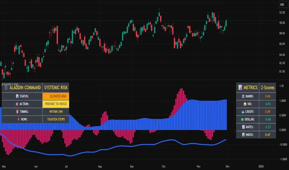
@Aladdin's Trading Web – Command CenterThe indicator uses standard Pine Script functionality including z-score normalization, standard deviation calculations, percentage change measurements, and request.security calls for multiple predefined symbols. There are no proprietary algorithms, external data feeds, or restricted calculation methods that would require protecting the source code.
Description:
The @Aladdin's Trading Web – Command Center indicator provides a composite market regime assessment through a weighted combination of multiple intermarket relationships. The indicator calculates normalized z-scores across several key market components including banks, volatility, the US dollar, credit spreads, interest rates, and alternative assets.
Each component is standardized using z-score methodology over a user-defined lookback period and combined according to configurable weighting parameters. The resulting composite measure provides a normalized assessment of the prevailing market environment, with the option to invert rate relationships for specific market regime conditions.
The indicator focuses on capturing the synchronized behavior across these interconnected market segments to provide a unified view of systemic market conditions.
Momentum Market Structure ProThis first indicator in the Beyond Market Structure Suite gives you clear market structure at a glance, with adaptive support & resistance zones. It's the only SMC-style indicator built from momentum highs & lows, as far as I know. It creates dynamic support & resistance zones that change strength and resize intelligently, and gives you timely alerts when price bounces from support/rejects from resistance.
You’re free to use the provided entry and exit signals as a ready-to-use, self-contained strategy, or plug its structure into your existing system to sharpen your edge :
• Market structure bias may help improve a compatible system's win rate by taking longs only in bullish bias and shorts in bearish structure.
• Support/resistance can help trend traders identify inflection points, and help range traders define ranges.
🟩 HIGHLIGHTS
⭐ Unique market structure with different characteristics than purely price-based models.
⭐ Support and resistance created from only the extreme levels.
⭐ Support & resistance zones adapt to remain relevant. Zones are deactivated when they become too weak.
⭐ Long and short signals for a bounce from support/rejection from resistance.
🟩 WHY "MARKET STRUCTURE FIRST, ALWAYS"?
"There is only one side to the stock market; and it is not the bull side or the bear side, but the right side." — Jesse Livermore, Reminiscences of a Stock Operator (1923)
If the market is structurally against your trade, you're gonna have a bad time. So you must know what the market structure is before you plan your trade. The more precise and relevant your definition of market structure, the better.
🟩 HOW TO TRADE USING THIS INDICATOR (SIMPLE)
• Directional filter : The prevailing bias background can be used for any kind of trades you want to take. For example, you can long a bounce from support in a bullish market structure bias, or short a rejection from resistance in bearish bias.
• Entries : For more conservative entries, you could wait for a Candle Trend flip after a reaction from your chosen zone (see below for more about Candle Trend).
• Stops : The included running stop-loss level based on Average True Range (ATR) can be used for a stop-loss — set the desired multiplier, and use the level from the bar where you enter your trade.
• Take-profit : Similarly, you can set a Risk:Return-based take-profit target. Support and resistance zones can also be used as full or partial take-profit targets.
See the Advanced section below for more ideas.
🟩 SIGNALS
⭐ ENTRIES
You can enable signals and alerts for bounces from support and rejections from resistance (you'll get more signals using Adaptive mode). You can filter these by requiring corresponding market structure bias (it uses the bias you've already set for the background), and by requiring that Candle Trend confirm the move.
I've slipped in my all-time favourite creation to this indicator: Candle Trend. When price makes a Simple Low pivot, the trend flips bullish. When price then makes a Simple High pivot, the trend flips bearish (see my Market Structure library for a full explanation). This tool is so simple, yet I haven't noticed it anywhere else. It shows short-term trends beautifully. I use it mainly as confirmation of a move. You can use it to confirm ANY kind of move, but here we use it for bounces from support/rejections from resistance.
Note that the pivots and Zigzags are structure, not signals.
⭐ STOPS
You can use the supplied running ATR-based stop level to find a stop-loss level that suits your trading style. Set the desired multiplier, and use the level from the bar where you enter your trade.
⭐ TAKE-PROFIT
Similarly, you can set a take-profit target based on Risk:Return (R:R). If this setting is enabled, the indicator calculates the distance between the closing price and your configured stop, then multiplies that by the configured R:R factor to calculate an appropriate take-profit level. Note that while the stop line is reasonably smooth, the take-profit line varies much more, reflecting the fact that if price has moved away from your stop, the trade requires a greater move in order to hit a given R:R ratio.
Since the indicator doesn't know where you were actually able to enter a position, add a ray using the drawing tool and set an alert if you want to be notified when price reaches your stop or target.
🟩 WHAT'S UNIQUE ABOUT THIS INDICATOR
⭐ MOMENTUM PIVOTS
Almost all market structure indicators use simple Williams fractals. A very small number incorporate momentum, either as a filter or to actually derive the highs and lows. However, of those that derive pivots from momentum, I'm not aware of any that then create full market structure from it.
⭐ SUPPORT & RESISTANCE
Some other indicators also adjust S/R zones after creation, some use volume in zone creation, some increase strength for overlap, a few merge zones together, and many use price interactions to classify zones. But my implementation differs from others, as far as I can tell after looking at many many indicators, in seven specific ways:
+ Zones are *created* from purely high-momentum pivots, not derived or filtered from simple Williams pivots (e.g. `ta.pivothigh()`).
+ Zones are *weakened* dynamically as well as strengthened. Many people know that S/R gets stronger if price rejects from it, but this is only half the story. Different price patterns strengthen *or weaken* zones.
+ We use *conviction-weighted candle patterns* to adjust strength. Not simply +1 for price touching the zone, but a set of single-bar and multi-bar patterns which all have different effects.
+ The rolling strength adjustments are all *moderated by volume*. The *relative volume* forms a part of each adjustment pattern. Some of our patterns reward strong volume, some punish it.
+ We do our own candle modelling, and the adjustment patterns take this into account.
+ We *resize* zones as a result of certain candle patterns ("indecision erodes, conviction defends").
+ We shrink overlapping zones to their sum *and* add their strengths.
🟩 HOW TO TRADE USING THIS INDICATOR (ADVANCED)
In addition to the ideas in the How to Trade Using This indicator (Simple) section above, here are some more ideas.
You can use the market structure:
• As a bias for entries given by more reactive momentum resets, or indeed other indicators and systems.
• You could use a change in market structure to close a long-running trend-following position.
You can use the distance from a potential entry to the CHoCH line as a filter to choose higher-potential trades in ranging assets.
Confluence between market structure and your favourite trend indicator can be powerful.
Multi timeframe analysis
This is a bit of a rabbit hole, but you could use a split screen with this indicator on a higher timeframe (HTF) view of the same asset:
• If the 1D structure turns bullish, the next time that the 1H structure also flips bullish might be a good entry.
• Rejection from a HTF zone, confirmed by lower timeframe (LTF) structure, could be a good entry.
None of this is advice. You need to master your own system, and especially know your own strengths and weaknesses, in order to be a successful trader. An indicator, no matter how cool, is not going to one-shot that process for you.
In Adaptive mode, a skillful trader will be able to spot more opportunities to classify and use support and resistance than any algorithm, including mine, now that they've been automatically drawn for you.
If you are doing historical analysis, note that the "Calculated bars" setting is set to a reasonably small number by default, which helps performance. Either increase this number (setting to zero means "use all the bars"), or use Bar Replay to examine further back in the chart's history. If you encounter errors or slow loading, reduce this number.
🟩 SUPPORT & RESISTANCE
A support zone is an area where price is more likely to bounce, and a resistance zone is an area where price is more likely to reject. Marking these zones up on the chart is extremely helpful, but time-consuming. We create them automatically from only high-momentum areas, to cut noise and highlight the zones we consider most important.
In Simple mode, we simply mark S/R zones from momentum and Implied pivots. We don't update them, just deactivate them if price closes beyond them. Use this mode if you're interested in only recent levels.
In Adaptive mode, zones persist after they're traversed. Once the zones are created, we adjust them based on how price and volume interact with them. We display stronger zones with more opaque fills, and weaker zones with more transparent fills. To calculate strength, we first preprocess candles to take into account gaps between candles, because price movement after market is just as important in its own way. The preprocessing also redefines what constitutes upper and lower wicks, so as to better account for order flow and commitment. We use these modelled candle values, as well as their relative amplitude historically, rather than the raw OHLC for all calculations for interactions of price and zones. It's important to understand, when trying to figure out why the indicator strengthened or weakened a zone, that it sees fundamental price action in a different way to what is shown on standard chart candles (and in a way that can't easily be represented accurately on chart candles).
Then, we strengthen or weaken , and resize support and resistance zones dynamically using different formulas for different events, based on principles including these:
• The close is the market's "vote", the momentum shift anchor.
• Defended penetrations reveal validated liquidity clusters.
• Markets contract to defended levels.
• "The wick is the fakeout, but the close tells you if institutions held the level." — ICT (Inner Circle Trader)
Adaptive mode is more powerful, but you might need to tweak some of the Advanced Support & Resistance settings to get a comfortable number of zones on the chart.
🟩 MOMENTUM PIVOTS
The building blocks of market structure are Highs and Lows — places where price hits a temporary extreme and reverses. All the indicators I could find that create full market structure do so from basic price pivots — Williams fractals, being the highest/lowest candle wick for N candles backwards and forwards (there are some notable first attempts on TradingView to use momentum to define pivots, but no full structure). "Highest/lowest out of N bars" is the almost universal method, but it also picks up somewhat arbitrary price movements. Recognising this, programmers and traders often use longer lookbacks to focus on the more significant Highs and Lows. This removes some noise, but can also remove detail.
My indicator uses a completely different way of thinking about High and Low pivots. A High is where *momentum* peaks and falls back, and a low is where it dips and then recovers. While this is happening, we record the extremes in price, and use those prices as the High or Low pivot zones.
This deliberately picks out different, more meaningful pivots than any purely price-based approach, helping you focus on the swings that matter. By design, it also ignores some stray wicks and other price action that doesn't reflect significant momentum. Price action "purists" might not like this at first, but remember, ultimately we want to trade this. Check and see which levels the market later respects. It's very often not simply the numerically higher/lower local maxima and minima, but the levels that held meaning, interpreted here through momentum.
The first-release version uses the humble Stochastic as the structural momentum metric. Yes, I know — it's overlooked by most people, but that's because they're using it wrong. Stochastic is a full-range oscillator with medium excursions, unlike RSI, say, which is a creeping oscillator with reluctant resets. This makes Stoch (at the default period of 14) not quite reactive enough for on-the-ball momentum reset entry signals, but close to perfect (no metric is 100%) for structural pivots.
Stochastic is also a solid choice for structure because divergences are rare and not usually very far away in terms of price. More reactive momentum metrics such as Stochastic RSI produce very noisy structure that would take a whole extra layer of interpreting (see Further Research, below).
For these reasons, I may or may not add other options for momentum. In the initial release, I've added smoothed RSI as an alternative just to show it's possible, which takes even longer than Stochastic to migrate from one extreme to another, creating an interesting, longer-term structure.
🟩 IMPLIED PIVOTS
We want pivots to mark important price levels so that we can compute market direction and support & resistance zones from them.
In this context, we see that some momentum metrics, and Stochastic in particular, tend to give multiple consecutive resets in the same direction. In other words, we get High followed by High, or Low followed by Low, which does not give us the chance to create properly detailed structure. To remedy this, we simply take the most extreme price action between two same-direction pivots, and create an Implied pivot out of it, after the second same-direction pivot is created.
Obviously these pivots are created very late. Recalling why we wanted them, we realise that this is fine. By definition , price has not exceeded the Implied Pivot level when they're created. So they show us an interesting level that is yet untested.
Implied Pivots are thus created indirectly by momentum but defined directly by price. They are for structure only. We choose not to give them a Dow type (HH, HL, LH, LL) and not to include them in the Main Zigzag to emphasise their secondary nature. However, Implied Pivots are not "internal" or "minor" pivots. There is no such concept in the current Momentum Market Structure model.
If you want less responsive, more long-term structure, you can turn Implied Pivots off.
🟩 DOW STRUCTURE
Dow structure is the simplest form of market structure — Higher Highs (HHs) and Higher Lows (HLs) is an uptrend (showing buyer dominance), and vice-versa for a downtrend.
We label all Momentum (not Implied) Pivots with their Dow qualifier. You can also choose to display the background bias according to the Dow trend.
There is an input option to enable a "Ranging" Dow state, which happens when you get Lower Highs in an uptrend or Higher Lows in a downtrend.
🟩 SMC-STYLE STRUCTURE (BOS, CHOCH)
The ideas of trend continuation after taking out prior highs/lows and looking for early signs of possible reversal go back to Dow and Wyckoff, but have been popularised by SMC as Break Of Structure (BOS) and Change of Character (CHoCH).
BOS can be used as a trigger: for example:
• Wait for a bullish break of structure
• Then attempt to buy the pullback
• Cancel if structure breaks bearish (meaning, we get a bearish CHoCH break)
How to buy the pullback? This is the trillion-dollar question. First, you need solid structure. Without structure, you got nothin'. Then, you want some identified levels where price might bounce from.
If only we incorporated intelligent support and resistance into this very indicator 😍
Creating and maintaining correct BOS and CHoCH continuously , without resetting arbitrarily when conditions get difficult, is technically challenging. I believe I've created an implementation of this structure that is at least as solid as any other available.
In general, BOS is fully momentum‑pivot‑driven; CHoCH is anchored to momentum pivots but maintained mainly by raw price extremes relative to those anchors (breaks are obviously pure price). This means that the exact levels will sometimes differ from your previous favourite market structure indicator.
We have made some assumptions here which may or may not match any one person's understanding of the "correct" way to do things, including: BOS is not reset on wicks because, for us, if price cannot close beyond the BOS there is no BOS break, therefore the previous wick level is still important. The candidate for CHoCH on opposing CHoCH break *is* reset on a wick, because we want to be sure to overcome the leftover liquidity at that new extreme before calling a Change of Character. The CHoCH is moved on a BOS break. For a bullish BOS break, the new CHoCH is the lowest price *since the last momentum pivot was confirmed, creating the BOS that just broke*, and vice-versa for bearish. If there's a stray wick before that, which doesn't shift momentum, we don't care about it.
🟩 ZIGZAG
The Major Swing Zigzag dynamically connects momentum highs and lows (e.g., from a Higher Low to the latest Higher High), adjusting as new extremes form to reveal the overall trend leg.
The Implied Structure Zigzag joins momentum pivots and Implied pivots, if enabled.
🟩 REPAINTING
It's really important to understand two things before asking "Does it repaint?":
1. ALL structure indicators repaint, in the sense of drawing things into the past or notifying you of things that happened in past bars, because by definition, structure needs some kind of confirmation, which takes at least one bar, usually several. This is normal.
2. Almost all indicators of ANY kind repaint in that they display unconfirmed values until the current bar closes. This is also normal.
Most features of this indicator repaint in the ordinary, intended ways described above: the pivots (Implied doubly so), BOS and CHoCH lines, and formation of S/R zones.
The Zigzags, by design, adjust themselves to new pivots. The active lines often change and attach themselves to new anchors. This is a form of repainting. It's important to note that the Zigzags are not signals. They're there to help visualise market structure, and structure does change. Therefore, I prioritised clearly explaining what price did rather than preserving its history.
One of the "bad" kinds of repainting is if a signal is printed when the bar closes, but then on a later bar that "confirmed" signal changes. This is a fundamental issue with some high timeframe implementations. It's bad because you might already have entered a trade and now the indicator is pretending that it never signalled it for you. My indicators do not do this (in fact I wrote an entire library to help other authors avoid this).
If you are ever in any doubt, play with an indicator in Bar Replay mode to see exactly what it does.
To understand repainting, see the official docs: www.tradingview.com
🟩 FURTHER RESEARCH
I've attempted to answer two of the tricky problems in technical analysis in Pine: how to do robust and responsive market structure, and how to maintain support and resistance zones once created. However, this just opens up more possibilities. Which momentum metrics are suitable for structure? Can more reactive metrics be used, and how do we account for divergences in a structural model based on key horizontal levels? Which sets of rules give the best results for maintaining support and resistance? Does the market have a long or a short memory? Is bar decay a natural law or a coping mechanism?
🟩 CREDITS
❤️ I'd like to thank my humble trading mentor, whose brilliant ideas inspire me to garble out code. Thanks are also due to @Timeframe_Titans for guidance on the finer points of market structure (all mistakes and distortions are my own), and to @NJPorthos for feedback and encouragement during the months in the wilderness.
Script pago

XAU Power Meter + HTF FVG SystemWhat is this?
XAU Power Meter + HTF FVG System is an execution-support tool for XAUUSD that combines:
Local trend & momentum on your entry timeframe (e.g. 5m)
Volatility regime (ATR)
Higher-timeframe FVG bias (e.g. 1H)
The goal is simple: filter out low-quality trades and size up only when the market actually moves.
Core Components
1. LTF Trend (MA Stack 20 / 50 / 200)
The indicator builds a “stacked trend” using three MAs:
Bullish trend → price > MA20 > MA50 > MA200
Bearish trend → price < MA20 < MA50 < MA200
Anything else → RANGE
This gives a clean directional bias for intraday execution.
2. CCI Impulse (“Power”)
The CCI block measures the strength of the current move via |CCI| and classifies it into 4 bands:
LOW – weak momentum, usually not worth it
MEDIUM – acceptable impulse
HIGH – strong impulse
EXTREME – very strong, potential blow-off / late entry zone
These bands are used both for signal quality (Grade) and for position size guidance.
3. ATR Volatility Regime
ATR(14) is compared against its own SMA(100) to classify volatility:
QUIET – ATR < K * ATR_slow
NORMAL
ACTIVE – ATR > K * ATR_slow
You don’t want to size up in a dead market. ATR regime is used inside the Grade calculation.
4. Grade System (A / B / C / X)
The indicator compresses Trend + CCI + ATR into a single Grade:
A – In trend, strong impulse (HIGH/EXTREME), active volatility → top setups
B – In trend, at least MEDIUM impulse, acceptable volatility → good setups
C – In trend, but weaker conditions → borderline, be selective
X – Out of trend or no momentum → avoid
Internally, execution signals require Grade ≥ B for two bars in a row, to avoid one-bar “fake” spikes.
5. HTF FVG Bias (e.g. 1H)
On a higher timeframe (default: 1H), the script runs a Fair Value Gap engine with:
EMA 50/200 trend filter
ATR-based body filter (minimum candle strength)
Wilder ADX filter (trend strength)
Deep retest requirement inside the FVG zone
Optional zone auto-expiry and delete-on-use
It returns:
BUY (bullish HTF FVG confirmed)
SELL (bearish HTF FVG confirmed)
NONE (no valid zone active)
You can control how strict this bias is used via a “Strict: require active HTF FVG for entry” checkbox:
Strict OFF (default) → HTF bias can block trades against a strong HTF signal, but allows trades when HTF is neutral.
Strict ON → LTF entries are allowed only when HTF has an active FVG in the same direction (very selective).
HTF events are shown on the chart as HTF BUY / HTF SELL markers.
Execution Signals (LTF LONG / SHORT)
On your entry timeframe (e.g. 5m), the script generates LONG / SHORT arrows when:
Trend is clearly bullish or bearish (MA stack aligned),
Grade ≥ B for two consecutive bars,
HTF bias conditions are satisfied (depending on the strict mode).
These arrows are not a full auto-strategy, but a high-quality execution cue:
“Trend OK + Momentum OK + Volatility OK + HTF not against you.”
Dashboard
A compact dashboard in the corner shows, in real time:
Trend – UP / DOWN / RANGE (20/50/200 stack)
Impulse (CCI) – LOW / MEDIUM / HIGH / EXTREME
Volatility (ATR) – QUIET / NORMAL / ACTIVE
Size Multiplier – suggested risk sizing factor based on impulse
Grade – A / B / C / X
HTF FVG – BUY / SELL / NONE
This lets you sanity-check the context before pressing the button, not after the loss.
Recommended Use
Instrument: XAUUSD
Timeframe: 5m (scalping / intraday), but can be tested on 15m/1H as well
HTF: 1H by default (can experiment with 4H)
Focus on:
Grade A/B only
Strict mode ON for more institutional, fewer but higher-quality trades
Size up only when both impulse and volatility are supportive
Disclaimer
This script is a decision-support tool, not financial advice and not a guarantee of profit.
Always forward-test, understand the logic, and use your own risk management.
