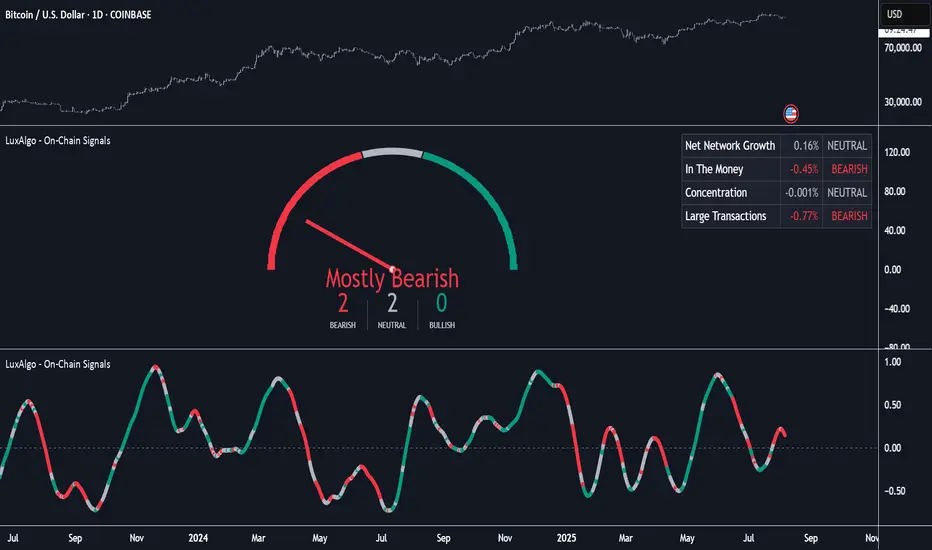
On-Chain Signals [LuxAlgo]The On-Chain Signals indicator uses fundamental blockchain metrics to provide traders with an objective technical view of their favorite cryptocurrencies.
It uses IntoTheBlock datasets integrated within TradingView to generate four key signals: Net Network Growth, In the Money, Concentration, and Large Transactions.
Together, these four signals provide traders with an overall directional bias of the market. All of the data can be visualized as a gauge, table, historical plot, or average.
🔶 USAGE
The main goal of this tool is to provide an overall directional bias based on four blockchain signals, each with three possible biases: bearish, neutral, or bullish. The thresholds for each signal bias can be adjusted on the settings panel.
These signals are based on IntoTheBlock's On-Chain Signals.
Net network growth: Change in the total number of addresses over the last seven periods; i.e., how many new addresses are being created.
In the Money: Change in the seven-period moving average of the total supply in the money. This shows how many addresses are profitable.
Concentration: Change in the aggregate addresses of whales and investors from the previous period. These are addresses holding at least 0.1% of the supply. This shows how many addresses are in the hands of a few.
Large Transactions: Changes in the number of transactions over $100,000. This metric tracks convergence or divergence from the 21- and 30-day EMAs and indicates the momentum of large transactions.
All of these signals together form the blockchain's overall directional bias.
Bearish: The number of bearish individual signals is greater than the number of bullish individual signals.
Neutral: The number of bearish individual signals is equal to the number of bullish individual signals.
Bullish: The number of bullish individual signals is greater than the number of bearish individual signals.
If the overall directional bias is bullish, we can expect the price of the observed cryptocurrency to increase. If the bias is bearish, we can expect the price to decrease. If the signal is neutral, the price may be more likely to stay the same.
Traders should be aware of two things. First, the signals provide optimal results when the chart is set to the daily timeframe. Second, the tool uses IntoTheBlock data, which is available on TradingView. Therefore, some cryptocurrencies may not be available.
🔹 Display Mode
Traders have three different display modes at their disposal. These modes can be easily selected from the settings panel. The gauge is set by default.
🔹 Gauge
The gauge will appear in the center of the visible space. Traders can adjust its size using the Scale parameter in the Settings panel. They can also give it a curved effect.
The number of bars displayed directly affects the gauge's resolution: More bars result in better resolution.
The chart above shows the effect that different scale configurations have on the gauge.
🔹 Historical Data
The chart above shows the historical data for each of the four signals.
Traders can use this mode to adjust the thresholds for each signal on the settings panel to fit the behavior of each cryptocurrency. They can also analyze how each metric impacts price behavior over time.
🔹 Average
This display mode provides an easy way to see the overall bias of past prices in order to analyze price behavior in relation to the underlying blockchain's directional bias.
The average is calculated by taking the values of the overall bias as -1 for bearish, 0 for neutral, and +1 for bullish, and then applying a triangular moving average over 20 periods by default. Simple and exponential moving averages are available, and traders can select the period length from the settings panel.
🔶 DETAILS
The four signals are based on IntoTheBlock's On-Chain Signals. We gather the data, manipulate it, and build the signals depending on each threshold.
Net network growth
float netNetworkGrowthData = customData('_TOTALADDRESSES')
float netNetworkGrowth = 100*(netNetworkGrowthData /netNetworkGrowthData - 1)
In the Money
float inTheMoneyData = customData('_INOUTMONEYIN')
float averageBalance = customData('_AVGBALANCE')
float inTheMoneyBalance = inTheMoneyData*averageBalance
float sma = ta.sma(inTheMoneyBalance,7)
float inTheMoney = ta.roc(sma,1)
Concentration
float whalesData = customData('_WHALESPERCENTAGE')
float inverstorsData = customData('_INVESTORSPERCENTAGE')
float bigHands = whalesData+inverstorsData
float concentration = ta.change(bigHands )*100
Large Transactions
float largeTransacionsData = customData('_LARGETXCOUNT')
float largeTX21 = ta.ema(largeTransacionsData,21)
float largeTX30 = ta.ema(largeTransacionsData,30)
float largeTransacions = ((largeTX21 - largeTX30)/largeTX30)*100
🔶 SETTINGS
Display mode: Select between gauge, historical data and average.
Average: Select a smoothing method and length period.
🔹 Thresholds
Net Network Growth : Bullish and bearish thresholds for this signal.
In The Money : Bullish and bearish thresholds for this signal.
Concentration : Bullish and bearish thresholds for this signal.
Transactions : Bullish and bearish thresholds for this signal.
🔹 Dashboard
Dashboard : Enable/disable dashboard display
Position : Select dashboard location
Size : Select dashboard size
🔹 Gauge
Scale : Select the size of the gauge
Curved : Enable/disable curved mode
Select Gauge colors for bearish, neutral and bullish bias
🔹 Style
Net Network Growth : Enable/disable historical plot and choose color
In The Money : Enable/disable historical plot and choose color
Concentration : Enable/disable historical plot and choose color
Large Transacions : Enable/disable historical plot and choose color
Onchainanalysis
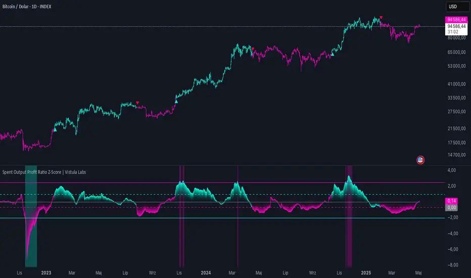
Spent Output Profit Ratio Z-Score | Vistula LabsOverview
The Spent Output Profit Ratio (SOPR) Z-Score indicator is a sophisticated tool designed by Vistula Labs to help cryptocurrency traders analyze market sentiment and identify potential trend reversals. It leverages on-chain data from Glassnode to calculate the Spent Output Profit Ratio (SOPR) for Bitcoin and Ethereum, transforming this metric into a Z-Score for easy interpretation.
What is SOPR?
Spent Output Profit Ratio (SOPR) measures the profit ratio of spent outputs (transactions) on the blockchain:
SOPR > 1: Indicates that, on average, coins are being sold at a profit.
SOPR < 1: Suggests that coins are being sold at a loss.
SOPR = 1: Break-even point, often seen as a key psychological level.
SOPR provides insights into holder behavior—whether they are locking in profits or cutting losses—making it a valuable gauge of market sentiment.
How It Works
The indicator applies a Z-Score to the SOPR data to normalize it relative to its historical behavior:
Z-Score = (Smoothed SOPR - Moving Average of Smoothed SOPR) / Standard Deviation of Smoothed SOPR
Smoothed SOPR: A moving average (e.g., WMA) of SOPR over a short period (default: 30 bars) to reduce noise.
Moving Average of Smoothed SOPR: A longer moving average (default: 180 bars) of the smoothed SOPR.
Standard Deviation: Calculated over a lookback period (default: 200 bars).
This Z-Score highlights how extreme the current SOPR is compared to its historical norm, helping traders spot significant deviations.
Key Features
Data Source:
Selectable between BTC and ETH, using daily SOPR data from Glassnode.
Customization:
Moving Average Types: Choose from SMA, EMA, DEMA, RMA, WMA, or VWMA for both smoothing and main averages.
Lengths: Adjust the smoothing period (default: 30) and main moving average length (default: 180).
Z-Score Lookback: Default is 200 bars.
Thresholds: Set levels for long/short signals and overbought/oversold conditions.
Signals:
Long Signal: Triggered when Z-Score crosses above 1.02, suggesting potential upward momentum.
Short Signal: Triggered when Z-Score crosses below -0.66, indicating potential downward momentum.
Overbought/Oversold Conditions:
Overbought: Z-Score > 2.5, signaling potential overvaluation.
Oversold: Z-Score < -2.0, indicating potential undervaluation.
Visualizations:
Z-Score Plot: Teal for long signals, magenta for short signals.
Threshold Lines: Dashed for long/short, solid for overbought/oversold.
Candlestick Coloring: Matches signal colors.
Arrows: Green up-triangles for long entries, red down-triangles for short entries.
Background Colors: Magenta for overbought, teal for oversold.
Alerts:
Conditions for Long Opportunity, Short Opportunity, Overbought, and Oversold.
Usage Guide
Select Cryptocurrency: Choose BTC or ETH.
Adjust Moving Averages: Customize types and lengths for smoothing and main averages.
Set Thresholds: Define Z-Score levels for signals and extreme conditions.
Monitor Signals: Use color changes, arrows, and background highlights to identify opportunities.
Enable Alerts: Stay informed without constant chart watching.
Interpretation
High Z-Score (>1.02): SOPR is significantly above its historical mean, potentially indicating overvaluation or strong bullish momentum.
Low Z-Score (<-0.66): SOPR is below its mean, suggesting undervaluation or bearish momentum.
Extreme Conditions: Z-Scores above 2.5 or below -2.0 highlight overbought or oversold markets, often preceding reversals.
Conclusion
The SOPR Z-Score indicator combines on-chain data with statistical analysis to provide traders with a clear, actionable view of market sentiment. Its customizable settings, visual clarity, and alert system make it an essential tool for both novice and experienced traders seeking an edge in the cryptocurrency markets.
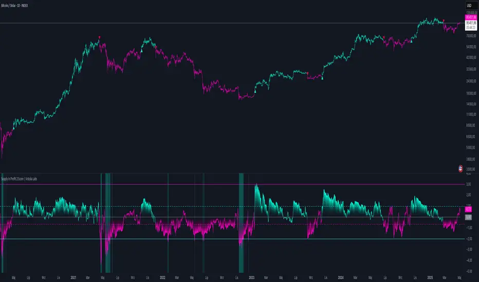
Supply In Profit Z-Score | Vistula LabsOverview
The Supply In Profit Z-Score indicator is a Pine Script™ tool developed by Vistula Labs for technical analysis of cryptocurrencies, specifically Bitcoin (BTC) and Ethereum (ETH). It utilizes on-chain data from IntoTheBlock to calculate the difference between the percentage of addresses in profit and those in loss, transforming this metric into a Z-Score. This indicator helps traders identify market sentiment, trend-following opportunities, and overbought or oversold conditions.
What is Supply In Profit?
Supply In Profit is defined as the net difference between the percentage of addresses in profit and those in loss:
Profit Percentage: The proportion of addresses where the current value of holdings exceeds the acquisition price.
Loss Percentage: The proportion of addresses where the current value is below the acquisition price.
A positive value indicates more addresses are in profit, suggesting bullish sentiment, while a negative value indicates widespread losses, hinting at bearish sentiment.
How It Works
The indicator computes a Z-Score to normalize the Supply In Profit data relative to its historical behavior:
Z-Score = (Current Supply In Profit - Moving Average of Supply In Profit) / Standard Deviation of Supply In Profit
Current Supply In Profit: The latest profit-minus-loss percentage.
Moving Average: A customizable average (e.g., EMA, SMA) over a default 180-bar period.
Standard Deviation: Calculated over a default 200-bar lookback period.
Key Features
Data Source:
Selectable between BTC and ETH, pulling daily profit/loss percentage data from IntoTheBlock.
Customization:
Moving Average Type: Options include SMA, EMA, DEMA, RMA, WMA, or VWMA (default: EMA).
Moving Average Length: Default is 180 bars.
Z-Score Lookback: Default is 200 bars.
Thresholds: Adjustable for long/short signals and overbought/oversold levels.
Signals:
Long Signal: Z-Score crosses above the Long Threshold (default: 1.0).
Short Signal: Z-Score crosses below the Short Threshold (default: -0.64).
Overbought/Oversold Conditions:
Overbought: Z-Score > 3.0.
Oversold: Z-Score < -2.0.
Visualizations:
Z-Score Plot: Teal for long signals, magenta for short signals.
Threshold Lines: Dashed lines for long/short, solid lines for overbought/oversold.
Candlestick Coloring: Matches signal colors (teal/magenta).
Arrows: Green up-triangles for long entries, red down-triangles for short entries.
Background Colors: Magenta for overbought, teal for oversold.
Alerts:
Conditions for Long Opportunity, Short Opportunity, Overbought, and Oversold.
Usage Guide
Trend Following
Long Entry: When Z-Score crosses above 1.0, indicating potential upward momentum.
Short Entry: When Z-Score crosses below -0.64, suggesting potential downward momentum.
Overbought/Oversold Analysis
Overbought (Z-Score > 3.0): Consider profit-taking or preparing for a reversal.
Oversold (Z-Score < -2.0): Look for buying opportunities or exiting shorts.
Timeframe
Uses daily IntoTheBlock data, ideal for medium to long-term analysis.
Interpretation
High Z-Score: Indicates Supply In Profit is significantly above its historical mean, potentially signaling overvaluation.
Low Z-Score: Suggests Supply In Profit is below its mean, indicating possible undervaluation.
Signals and thresholds help traders act on shifts in market sentiment or extreme conditions.
Conclusion
The Supply In Profit Z-Score indicator provides a robust, data-driven approach to analyzing cryptocurrency market trends and sentiment. By combining on-chain metrics with statistical normalization, it empowers traders to make informed decisions based on historical context and current market dynamics.
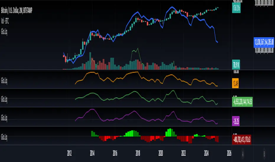
Blockchain Fundamentals: Global LiquidityGlobal Liquidity Indicator Overview
This indicator provides a comprehensive technical analysis of liquidity trends by deriving a Global Liquidity metric from multiple data sources. It applies a suite of technical indicators directly on this liquidity measure, rather than on price data. When this metric is expanding Bitcoin and crypto tends to bullish conditions.
Features:
1. Global Liquidity Calculation
Data Integration: Combines multiple market data sources using a ratio-based formula to produce a unique liquidity measure.
Custom Metric: This liquidity metric serves as the foundational input for further technical analysis.
2. Timeframe Customization
User-Selected Period: Users can select the data timeframe (default is 2 months) to ensure consistency and flexibility in analysis.
3. Additional Technical Indicators
RSI, Momentum, ROC, MACD, and Stochastic:
Each indicator is computed using the Global Liquidity series rather than price.
User-selectable toggles allow for enabling or disabling each individual indicator as desired.
4. Enhanced MACD Visualization
Dynamic Histogram Coloring:
The MACD histogram color adjusts dynamically: brighter hues indicate rising histogram values while darker hues indicate falling values.
When the histogram is above zero, green is used; when below zero, red is applied, offering immediate visual insight into momentum shifts.
Conclusion
This indicator is an enlightening tool for understanding liquidity dynamics, aiding in macroeconomic analysis and investment decision-making by highlighting shifts in liquidity conditions and market momentum.
Crypto Realized Profits/Losses Extremes [AlgoAlpha]🌟🚀 Introducing the Crypto Realized Profits/Losses Extremes Indicator by AlgoAlpha 🚀🌟
Unlock the potential of cryptocurrency markets with our cutting-edge On-Chain Pine Script™ indicator, designed to highlight extreme realized profit and loss zones! 🎯📈
Key Features:
✨ Realized Profits/Losses Calculation: Uses real-time data from the blockchain to monitor profit and loss realization events.
📊 Multi-Crypto Compatibility: The Indicator is compatible on other Crypto tickers besides Bitcoin.
⚙️ Customizable Sensitivity: Adjust the look-back period, normalization period, and deviation thresholds to tailor the indicator to your trading style.
🎨 Visual Enhancements: Choose from a variety of colors for up and down trends, and toggle extreme profit/loss overlay for easy viewing.
🔔 Integrated Alerts: Set up alerts for high and extreme profit or loss conditions, helping you stay ahead of significant market movements.
🔍 How to Use:
🛠 Add the Indicator: Add the indicator to favorites. Customize settings like period lengths and deviation thresholds according to your needs.
📊 Market Analysis: Monitor the main oscillator and the bands to understand current profit and loss extremes in the market. When the oscillator is at the upper band, this means that the market is doing really well and traders/investors will be likely to take profit and cause a reversal. The opposite is true when the oscillator reaches the lower band. The main oscillator can also be used for trend analysis.
🔔 Set Alerts: Configure alerts to notify you when the market enters a zone of high profit or loss, or during trend changes, enabling timely decisions without constant monitoring.
How It Works:
The indicator calculates a normalized area under the RSI curve applied on on-chain data regarding the number of wallets in profit. It employs a custom "src" variable that aggregates data from the blockchain about profit and loss addresses, adapting to intraday or longer timeframes as needed. The main oscillator plots this normalized area, while the upper and lower bands are plotted based on a deviation metric to identify extreme conditions. Colored fills between these bands visually denote these zones. For interaction, the indicator plots bubbles for extreme profits or losses and provides optional bar coloring to reflect the current market trend.
🚀💹 Enjoy a comprehensive, customizable, and visually engaging tool that helps you stay ahead in the fast-paced crypto market!

Limited Growth Stock-to-Flow (LGS2F) [AlgoAlpha]Description:
The "∂ Limited Growth Stock-to-Flow (LG-S2F)" indicator, developed by AlgoAlpha, is a technical analysis tool designed to analyze the price of Bitcoin (BTC) based on the Stock-to-Flow model. The indicator calculates the expected price range of BTC by incorporating variables such as BTC supply, block height, and model parameters. It also includes error bands to indicate potential overbought and oversold conditions.
How it Works:
The LG-S2F indicator utilizes the Stock-to-Flow model, which measures the scarcity of an asset by comparing its circulating supply (stock) to its newly produced supply (flow). In this script, the BTC supply and block height data are obtained to calculate the price using the model formula. The formula includes coefficients (a, b, c) and exponentiation functions to derive the expected price.
The script incorporates error bands based on uncertainty values derived from the standard errors of the model parameters. These error bands indicate the potential range of variation in the expected price, accounting for uncertainties in the model's parameters. The upper and lower error bands visualize potential overbought and oversold conditions, respectively.
Usage:
Traders can utilize the LG-S2F indicator to gain insights into the potential price movements of Bitcoin. The indicator's main line represents the expected price, while the error bands highlight the potential range of variation. Traders may consider taking long positions when the price is near or below the lower error band and short positions when the price is close to or above the upper error band.
It's important to note that the LG-S2F indicator is specifically designed for Bitcoin and relies on the Stock-to-Flow model. Users should exercise caution and consider additional analysis and factors before making trading decisions solely based on this indicator.
Originality:
The LG-S2F indicator, developed by QuantMario and AlgoAlpha, is an original implementation that combines the Stock-to-Flow model with error bands to provide a comprehensive view of BTC's potential price range. While the concept of Stock-to-Flow analysis exists, the specific calculations, incorporation of error bands, and customization options in this script are unique to QuantMario's methodology. The script is released under Mozilla Public License 2.0, allowing users to utilize and modify it while adhering to the license terms.

TTP NVT StudioNVT Studio is an indicator that aims to find areas of reversal of the Bitcoin price based on the extreme areas of Network Value Transaction.
Instructions:
- We recommend using it on INDEX:BTCUSD
- Use the daily or weekly timeframe
The indicator works as an oscillator and offers to visualisation modes.
1) Showing the short term oscillations of NVT showing signals in potential areas of reversal.
2) The actual value of NVT displayed. When in green is an area of value and in red when its overextended.
This indicator can be used based on the signals or based on breakouts of trend lines drawn in the oscillator mode.
Red/green dots: signal type 1 - extremes with confirmation, these might trigger late
Yellow/Orange: signal type 2 - extremes without confirmation, might trigger too soon

Trendmaster - Crypto On-Chain Metric BundleWhat it is:
The ‘Trendmaster Crypto On-Chain Metric Bundle’ is truly a one-of-a-kind bundle. It provides a complete insight into the on-chain dynamics of the entire Crypto asset class, with a multitude of different included indicators providing unique information and data points to give users an edge regardless of ticker, timeframe, or trading style.
What it Does:
Allows you to switch between several different metrics in one place and see specific combined metrics and look at the metrics to take contrarian positions
How to Use it:
Use these metrics to see the on-chain actions in cryptocurrency and play the contrarian. For example, when people are flooding into stablecoins as the price goes down you can see that as a potential buy indicator.
All metrics can be viewed with a Dashboard allowing the user to see all of the information in 1 place.
List of On-Chain Metrics:
To begin with, we have the ‘Trendmaster On-Chain Rating’ – which is our all-in-one, complete on-chain overview metric that can give you an instant insight into the fundamental and underlying strength of any given Crypto asset. It collates the key factors provided by all other indicators within the bundle, weighing in and condensing all of that information into a simple -5 to 5 scale; with a -5 indicating a completely bearish outlook on the asset, and a +5 representing truly great upcoming upside potential. As this indicator is taking into account large amounts of data and statistics to provide an on-chain overview, this value is best taken into consideration on higher timeframes such as the 4hour or daily to provide fundamentally strong buy or sell swing trade opportunities. Extreme rating signals on this indicator are rare but always worth taking into serious consideration.
Secondly, we have the ‘Collated Open Interest Oscillator’ – which gives us a peek into the current outlook of the derivatives market across a wide array of Crypto futures on a number of different exchanges. This indicator provides data on a 0-100 scale, with 100 indicating a substantial and sustained increase in open derivative positions in relation to the underlying market volume. A score of 100 can tell us that a huge amount of traders are trying to position themselves with high leverage in anticipation of a big move, and can often be compared to periods of extreme greed from market participants. On the contrary, a value of 0 shows us that the derivative market is decreasing in volume and therefore open interest is decreasing, which can be likened to periods of extreme fear. This data is only provided at daily intervals, but as incredibly high or low values on this indicator can have an almost instant impact, this indicator is best utilized for medium-term trading and investment decisions.
The ‘Social Sentiment Oscillator' analyses bullish and bearish narratives in relation to a number of large Cryptocurrencies and the market in general, across multiple social media platforms. Rather than a traditional 0-100 ‘Fear & Greed’ index that many may be familiar with, this indicator tracks the changing in sentiment across platforms on a -100 to 100 scale. A score of -100 may not necessarily indicate immediate extreme fear in the market, but instead a huge shift from an incredibly bullish narrative to an incredibly bearish one. Similar to a score of 100, this does not necessarily indicate that the current outlook on social media platforms is currently positive, but rather that a substantial amount of people are altering their views and have become more bullish on a short-term basis. This data is only provided at daily intervals, so make sure to keep an eye on price and sentiment divergences for the best swing trade opportunities to play contrarian to the majority.
Following this is the ‘Miner Confidence Metric’, which provides a long-term overview of the current Crypto miner's outlook. This simple -10 to 10 scale gives us an easy-to-follow bearish to the bullish sentiment of miners. This indicator takes into account the current hash rate, looking at both how it historically compares as well as its rate of decrease/increase; as well as on-chain miner movements to verify their stance on either holding onto their Crypto earnings or preferring to move their coins to exchanges to sell and cover their running costs. Generally speaking, miners can face difficulties operating during times of large market drawdowns, and may be forced into offloading and selling physical and virtual resources to remain afloat – this is indicated by a -10 value at the extreme end, and has historically provided outsized returns for long-term investors accumulating at their demise. Contrary to this, a score of 10 can indicate that miners are not only bullish on the future of crypto, but are likely also expanding operations in anticipation of higher prices in the future. This data is only provided at daily intervals, but on longer-term timeframes provide some of the best long-term accumulation opportunities available to market participants.
Next is the ‘Collated On-Chain Volume’ indicator, which simply monitors a variety of Cryptocurrencies and their underlying on-chain transactional usage. When collating these volumetric data it can provide invaluable insight into the current actions taken by market buyers and sellers and often larger players who can have a big influence on price. Typically when we see large spikes in on-chain usage it indicates substantial levels of accumulation or distribution, which can be made more obvious by observing where we currently are in a market cycle. Large spikes after large and extended periods of drawdown can represent coins transferring from retail to larger players who are often referred to as ‘smart money’; and with large on-chain volume following a substantial bull cycle, this may show us larger players distributing coins to retail. Data can only be fetched at daily intervals, but watch for big spikes to try and position yourself alongside the big players.
We also have the ‘Holder in Profit %’ which as it sounds, is just giving us a percentile value of Crypto traders, investors, and holders who are currently in profit on their positions. Historically speaking, when a majority are at a loss – and buying ‘when there is blood in the streets has been a profitable venture. Considering cutting some of your positions when market exuberance is in full effect and a vast majority of participants are reaping in easy profits. As data is only obtained at daily intervals, using this as a longer-term gauge for where we may be in a cycle is where it is most insightful.
The ‘Long/Short Ratio Crossover’ analyses the current disparity between traders who have positioned themselves in a long position on derivatives markets in comparison to those betting on prices going down. This indicator provides another impressive insight into the fallacy of the herd mentality, and how aiming to be on the opposite side of the masses can often be a profitable venture. A value of 100 can show us that an overwhelming majority of traders are predicting a price increase and are trying to position themselves accordingly, whereas a value of -100 indicates almost all derivative traders are trying to bet on a sizeable market downturn. This metric can be useful for both long-term positions and shorter-term scalping methods of trading and investing, updating on a per-candle basis.
Along with this, the ‘Retail Stablecoin Demand’ looks into the current demand for a number of Crypto stablecoins, aiming to mimic an underlying value close to that of traditional fiat currencies like the US Dollar. This is calculated by analyzing the short to mid-term rush to these ‘safer’ assets by retail traders. Traditionally people will exit their positions in favor of stable assets when they are either currently or are expecting to experience losses. Conversely, when users foresee upcoming profits they are likely to transition into a more ‘risk-on’ thesis and exit their stablecoins for more speculative assets. A value of 100 represents a huge demand for stablecoins, whereas a value of -100 shows that there is currently a lack of interest. Another indication providing a chance to profitably play the contrarian, with figures constantly updating to provide the functionality to all regardless of your trading methodology or investment philosophy.
Lastly the ‘Whale Bubbles’, display overlaying circles of varying size and opacity to represent on-chain activity by larger market players who are transferring a portion of their substantial holding, usually to exchanges to sell. These bubbles are placed over price action to clearly see the point at which the transaction occurred. We can also lower the minimum requirement of what is defined as a ‘whale movement’ by increasing the sensitivity within the indicator settings and subsequently increasing signal frequency. When whales begin to sell in numbers, it may be worth considering doing the same yourself!
We hope you can find utility in all of these indicators, and that in unison they can take your trading and investment to the next level. A majority of these indicators within the bundle can be tweaked and optimized within the bundle to further fine-tune and cater to your preferred trading and investing thesis. Check out our other resources and let us know what you’d like to see next!

Ethereum OnChain Data Indicator - The Quant ScienceEthereum On Chain Data Indicator - The Quant Science™ is a quantitative indicator created for mid-long term analysis.
The indicator uses quantitative statistics to recreate a model that represents the most important data from the on-chain analysis for the Ethereum blockchain.
The on-chain data used to create this model are:
1. Total weekly transactions
2. Total monthly transactions
3. Frequency of transactions per second on a daily scale
4. Frequency of transactions per second on a weekly scale
5. Amount of Ethereum burned on a daily scale
6. Amount of Ethereum burned on a weekly scale
7. Volume of short positions on a daily scale
8. Volume of short positions on a weekly scale
9. Volume of short positions more/less than average on a daily scale
10. Volume of short positions more/less than average on a weekly scale
All these data were extrapolated and manipulated using the mean and standard deviation.
The end result is a powerful tool that enables mid-long term investors and traders to analyze on-chain data through quantitative analysis.
FEATURES
The blue color area refers to the average change in data on a weekly scale. The light blue colored area indicates the monthly changes in the data. It is interesting to observe the correlation relationship between price and times when short-run data increases compared to long-run data and vice versa.
The more intense purple histograms refer to the standard deviation of the mean change in data on an annual scale. Histograms of less intense purple color refer to the standard deviation of the mean variation of data on a monthly scale. It is interesting to observe the ratio of the standard deviation between two different time periods.
This indicator can be used to perform statistical comparative analysis for manual and mid-long term investments. It can also be used to create auto trading strategies when used and integrated within an algorithm.
On-chain data are updated every 24 hours, so the timeframes to be used for analysis with this indicator are: D, 4H, 1H.

BTC Active Address Momentum (On-chain)This indicator shows the difference between the % change in BTC price and the % change in BTC’s active addresses (BTC’s utility value).
- Dark red: Extreme overbought conditions
BTC price is increasing too fast and outgrows the increase in its utility value
(RSI of % change difference > 70)
- Light red: Overbought conditions
BTC price is increasing too fast and outgrows the increase in its utility value
(RSI of % change difference > 60)
- Dark green: Extreme oversold conditions
BTC price is dropping too fast and outruns the decrease in its utility value
(RSI of % change difference < 30)
- Light green: Oversold conditions
BTC price is dropping too fast and outruns the decrease in its utility value
(RSI of % change difference < 40)
*Not financial advice.

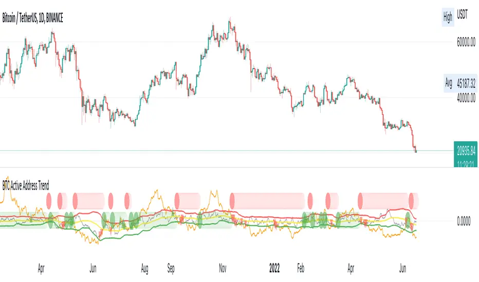
BTC Active Address Trend (On-chain)This indicator compares the % change in BTC price and the % change in BTC’s active addresses (BTC’s utility value).
1. % changes in BTC price & active addresses
- Orange line: BTC’s price change (%)
- Gray line: BTC’s active address change (%)
- Red/Yellow/Green lines: Bollinger bands for change in active address
2. Trend:
- Green circles: Bullish Sentiment Trend
Market sentiment is bullish and BTC price outgrows the increase in its utility value (overpricing)
- Red circles: Bearish Sentiment Trend
Market sentiment is bearish and BTC price drops more than the decrease in its utility value (underpricing)
3. Potential Re-Entries:
- Green/Red triangles: potential bullish/bearish entries
When % change of BTC price gets similar to that of active addresses
*Not financial advice.
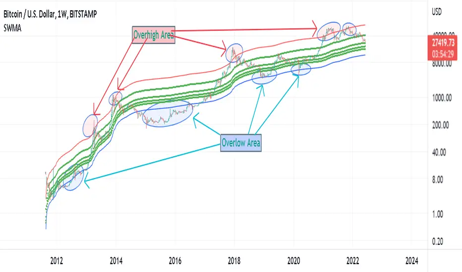
Supply Weighted Moving Average: OnchinUse this Onchain Channel in Weekly Timeframe - on BTCUSD BUTSTAMP Chart:
This Moving average channel is weighted based on BTC's new Supply:
I believe the slope of the Bitcoin trend line is correlated to the new supply and the issue of Halving.
The chart below shows this:
In fact, after each Halving, the supply is halved. Halving the supply increases the demand-for-supply ratio and increases the price. But the uptrend slope also halves after each halving.
Therefore, the slope of the bitcoin trend is correlated with the new supply rate. This is the logic of this new metric.
Accordingly, the moving average is weighted based on the new supply. This new channel can identify where bitcoin is too cheap or too expensive in the historical chart. It has also marked support/resistance Supply Weighted Moving Average.
SOPR SignalThe script uses Glassnode's SOPR on-chain data to identify:
1. Sentiment Trends:
- Green circle on bottom (Bullish) -> Investors are selling in profits
- Red circle on top (Bearish) -> Investors are selling in losses
2. Short-term Entries:
- Small green circle on SOPR (Bullish) -> Approaching investor purchase price in bull run -> not willing to sell -> decrease supply
- Small red circle on SOPR (Bearish) -> Approaching break even price in bear run -> chance to get out -> increase supply
3. Potential Trend Change:
- Yellow circle on top/bottom -> Potential trend changing soon

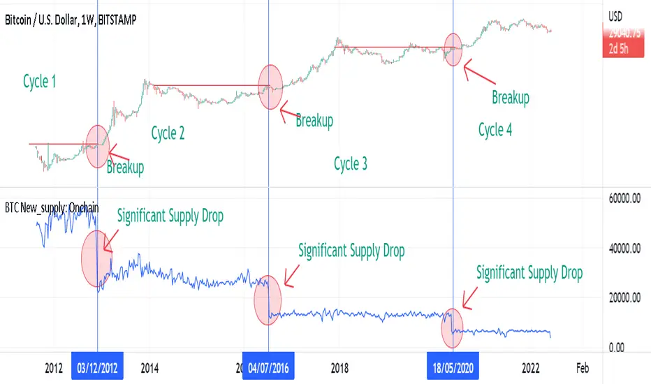
BTC New Supply: OnchainThis Onchain Metric shows the sum of newly issued coins.
This metric is very useful for finding new bull run cycles in the market. The new bull run is accompanied by a significant drop in the new supply.
BTC Supply weighted channel: OnchainUse this oscillator in the weekly time frame and then draw the above linear channel
The premise of this idea is that the trend slope of the bitcoin price correlates with the bitcoin supply chart, which shows the total amount of bitcoin ever created/issued.
Therefore, Bitcoin price is weighted based on Bitcoin supply.
As a result, the above channel has been created, which is a linear channel, and it seems that it can be an oscillator to determine the bitcoin trend, as well as the tops and bottoms of the market.
Bitcoin seems to respect the bottom and top lines of this channel as well as its midline

BTC Leading SOPR: OnchainUse This indicator in Weekly Timeframe:
This Onchain Metric is based on SOPR Moving Average.
This metric is very efficient for finding the tops and bottoms of the market as well as the ascending or descending biases in the market.
You can use it alongside RSI to filter out incorrect rsi signals
overhigh areas signal a top, overlow areas signal a low, zero line cross-up indicates an uptrend bias and its cross-down indicates a downtrend bias in the market

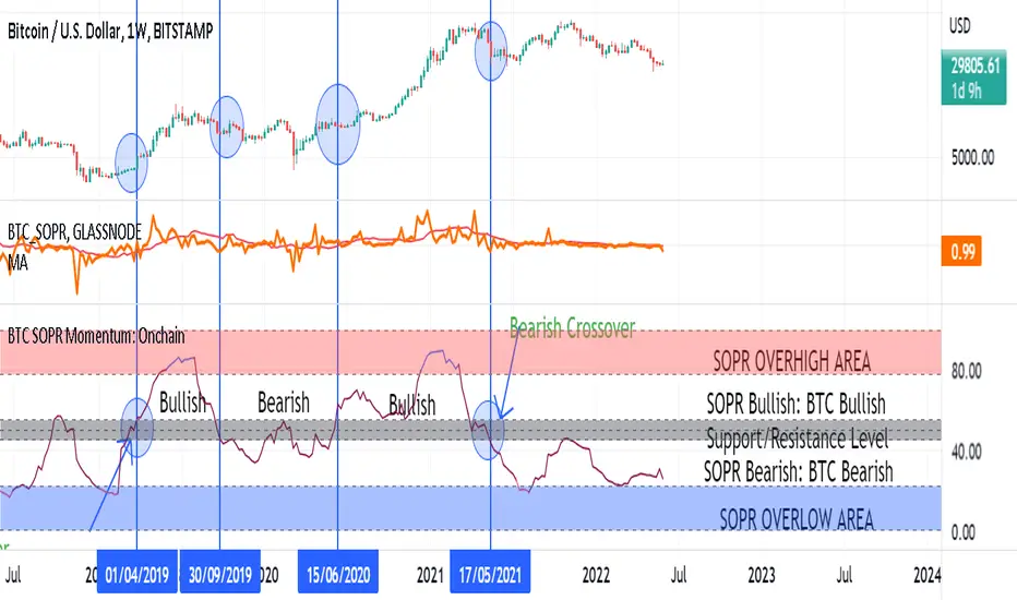
BTC SOPR Momentum: OnchainThis Onchin metric is based on SOPR data
Use this metric on daily and weekly timeframes:
SOPR:
The Spent Output Profit Ratio (SOPR) is computed by dividing the realized value (in USD) divided by the value at creation (USD) of a spent output. Or simply: price sold / price paid. Renato Shirakashi created this metric. When SOPR > 1, it means that the owners of the spent outputs are in profit at the time of the transaction; otherwise, they are at a loss. You can find "SOPR" in tradingview indicators
BTC SOPR Momentum: Onchain
This metric is based on SOPR Momentum. I made some changes to it so that its momentum can be checked.
Interpretation:
If the indicator is above the gray level of resistance/support, bitcoin has an uptrend and Bullish bias
If the indicator is below the resistance/ support level, bitcoin has a downtrend and Bearish Bias
Crossup the gray level is a long signal
Cross-down the gray level is a shorts signal
Entering and exit of the indicator to the overhigh area means creating a top
Entering and leaving the indicator to the overflow area means creating a bottom
V/T Ratio: Onchain BTC MetricThis is a New Onchain metric that is designed for bitcoin by myself Mjshahsavar (Ghoddusifar), and it is published for the first time in this trading view in this post.
I think this metric has a very high capability to determine the ATH and bottom of the market. This metric can solve a problem that channels are unable to solve. this could be the equivalent of what is known in the stock market as P/E
Calculations:
V/T RATIO = MA (7) of Log ((THE TOTAL VOLUME OF BITCOIN TRANSFERRED ONCHAIN IN USD)/(THE TOTAL AMOUNT OF TRANSACTIONS))
INTERPRETATION:
What is the long-term price channel of Bitcoin? Have you ever thought that maybe drawing a price channel is not right and maybe we should look for something else?
Channel drawing for the price is a subjective and interpretive subject. Look at the charts below, they are all correct in terms of drawing, but no one can say which one will happen. There is no certainty because drawing them is objective.
But who can say which one will definitely work?
We need something more objective. I think V/T Ratio does that.
Just draw the channel. There is only one channel for it. And it has worked historically well to this day.
Compare the drawn channel with the price chart. It works right. When the metric reaches the top line of the channel, it indicates the new ATH and the end of the cycle.
When it reaches the bottom line of the channel, it indicates that the price has reached the bottom.
A Market Cycle:
According to this metric, the bitcoin cycle has 5 stages:
1- Bottom Price: which V/T Ratio touches the bottom line of the channel: In this case, we expect the price to reach the bottom.
2- Semi-high price: that the metric reaches the middle line of the channel: In this case, Bitcoin creates a local top in the MID-Term and Long-Term timeframes
3- Semi-low price: which has a metric return to the lower part of the channel (but the price can still increase)
4- ATH: that Bitcoin reaches its highest historical price
5- It starts after the ATH until the metric reaches the bottom part of the channel again.

NVT Ratio: OnchainNVT Ratio
Defined as the ratio of market capitalization divided by transacted volume (in USD).
Network Value to Transactions Ratio (NVT Ratio) is defined as the ratio of market capitalization divided by transacted volume in the specified window.
History
NVT first made an appearance as a tweet on Woo Bull account in Feb 2017. In that tweet he promised an explanatory article which came much later in Oct 2017, first debuting on Forbes.
In Feb 2018, Dimitry Kalichkin published his work to improve NVT for use as a more responsive indicator, hence Kalichkin NVT Signal. In the same month, Woo Bull applied some trader techniques to NVT Signal and published an article summarising how to use it within a trading environment.
Interpretation:
NVT Ratio (Network Value to Transactions Ratio) is similar to the PE Ratio used in equity markets.
this indicator measures whether the blockchain network is overvalued or not.
When Bitcoin`s NVT is high, it indicates that its network valuation is outstripping the value being transmitted on its payment network, this can happen when the network is in high growth and investors are valuing it as a high return investment, or alternatively when the price is in an unsustainable bubble.
High: Overvalued Network worth - Bearish
Marketcap is too much valued compared to the low ability to transact coins in terms of volume
Low : Undervalued Network worth - Bullish
Marketcap is undervalued compared to the high ability to transact coins in terms of volume

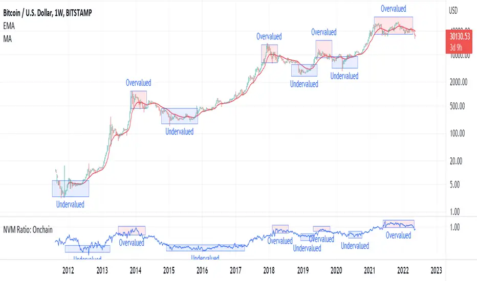
NVM Ratio: OnchainNetwork Value to Metcalfe Ratio (NVM Ratio) is defined as the ratio of the log of market capitalization divided by the log of the square of daily active addresses.
This oscillator evaluates bitcoin price according to the Metcalfe Ratio to show whether the current value of Bitcoin is higher or lower than the real price
in this oscillator, High values indicate the overvalued price, and low values indicate undervalued price.
BTC HASHRATE DROP: OnchainWhy is the drop of hashrate important?
Drop of hashrate usually occurs because some miners in the mining network stop for working. There are several possible reasons for this. Such as new anti-mining regulations in some countries or a sharp drop in the price of bitcoin, which makes mining no longer affordable for some miners. So they turn off their devices
This reduces the supply of bitcoin in the market and according to the law of supply and demand can eventually lead to an increase in the price of bitcoin.
This oscillator is designed to detect hashrate drop. for this, we use the data of glassnode . Maroon color indicates decrease in hashrate and Red color indicates excessive hash rate drop. As can be seen on the chart, usually after this drop, we see an increase in the price of bitcoin

Blockchain Rhythms by Cryptorhythms🎼 Blockchain Rhythms v1.0 by Cryptorhythms
This indicator and data plot suite is for bitcoin BTCUSD analysis over longer periods and higher time frames. 🚨For this to plot anything you must use on Daily or higher timeframe🚨 .
You want to have an alternative to the typical technical indicators you see everywhere? This is it. Seen crypto twitter talking about/using all sorts of indicators you have never seen before on tradingview? Here you go. Are you a long term investor and not a short term speculator?... I think you get the picture...
With the wealth of data here, I cannot go into a fully detailed analysis for every indicator. Please make liberal use of google and as always DYOR before trading on a system you have never used.
These indicators are best observed versus a logarithmic price scale. If I have missed any indicators you think should be in here let me know! Let me preempt that by saying MVRV and UTXO Age Distribution are not possible to create on Tradingview at this time.
🚧Error Screen:
If you see this you need to choose a data-point or indicator to plot!
⌚If you are loading this indicator with alot of chart history shown (as in the example screenshots) it may take up to a minute to load.
Please note: some of the screenshots below show chart title plots which I subsequently had to remove due to limitations. If you would like a title for all the plot, simple use the Indicator Labels checkbox option located in the scales tab of chart settings.
[b📊 Fundamental Blockchain Indicators
NVT Signal & Ratio
Both are related. NVT / NVT Signal can be interpreted as the strength of market confidence in the means of payment / settlement layer narrative. A “measure of the chain’s strength as a payment network compared to its market value — a low NVT may suggest that a network is undervalued compared to the service it is providing as a settlement layer” (Matteo Leibowitz).
💰NVT Ratio:
NVT Ratio (Network Value to Transactions Ratio) is similar to the PE Ratio used in equity markets.
When Bitcoin`s NVT is high, it indicates that its network valuation is outstripping the value being transmitted on its payment network, this can happen when the network is in high growth and investors are valuing it as a high return investment, or alternatively when the price is in an unsustainable bubble.
🚦NVT Signal:
NVT Signal (NVTS) is a derivative of NVT Ratio created by Dimitry Kalichkin. This indicator provides more emphasis on predictive signaling ahead of price peaks.
🚀Bitcoin Velocity
Velocity is a measure of how quickly money is circulating in the economy. Is bitcoin trending towards savings or payments? This can help you decide. It is similar to Bitcoin Network Momentum, except this takes into account bitcoins increasing supply.
🏃Bitcoin Network Momentum
Network Momentum is a view created by PositiveCrypto which looks into the value transmitted through the Bitcoin blockchain denominated in BTC value plotted against Bitcoin's price. It serves as a leading indicator to bitcoin price, in that we need high levels of value throughput to drive the bull market. This indicator is experimental.
Both daily transaction values and price exhibit cyclical patterns, but not in sync with each other. A hypothesis to explain the mismatch is that short-term mindset traders (using exchanges) heavily influence price; but long-term mindset investments (more likely to be directly recorded on-chain) have a greater contribution to the daily transaction value recorded in the ledger.
An alternative to the NVT / NVT Signal - tracks the relationship between Bitcoin’s price and BTC volume flowing through the blockchain network.
Ⓜ Mayer Multiple
Introduced by Trace Mayer as a way to gauge the current price of Bitcoin against its long range historical price movements (200 day SMA by default), the Mayer Multiple highlights when Bitcoin is overbought or oversold in the context of longer time frames.
It`s worth noting as the market becomes larger and less volatile, the peaks are becoming less exaggerated. This is because a 200 day moving average baseline is a static yardstick against an ever growing, more stable, Bitcoin market. We should eventually re-calibrate what constitutes the overbought/oversold extremes on this chart accordingly.
A more fully featured Mayer Multiple version available here:
💲 BTC Marketcap and Thermocap
We are all familiar with marketcap, but it does come with its disadvantages.
A more appropriate measure of network value was recently put forth by Nic Carter. Remember capital flows in crypto generally do not come in via exchanges (miners notably like to sell OTC). Every buy in an exchange is matched by a sell. Money that comes in = money that goes out.
True inflows (in Bitcoin, at least) are the aggregate of resources spent by miners¹. And a good proxy for that is the amount these folks are earning back from networks they support in return for their investments. That’s aggregate security spend (or Thermocap): what was actually paid out to miners (transactions * their price in USD at the time they were mined).
There is an option to deduct lost coins, genesis (Satoshi's) coins, and dead HODL'ers coins from the marketcap. This information was taken from ChainAnalysis' 2017 report
This shows both plots for comparison on a logrithmic scale:
⛏Mining Indicators & Data
⛏ Petahash Dollar Ratio
Bitcoin’s Hashrate (Daily PetaHashes) to Daily Mining Earnings (PetaHashDollar) is a robust metric to asses the day to day mining profitability. In addition, when plotted over the past five years, its overall trend represents a good way to quantify and visualize the relative progress in efficiency of ASICs (more specifically the inverse of that metric: 1/relative mining efficiency).
⛏Unmined Coins Marketcap
A simple statistic I created to plot the value of the unmined BTC still waiting to be extracted. If you find any interesting value for analysis please message me and let me know.
⛏Percentage of Total BTC Mined
I hope this one doesnt need an explanation. 😅
#️⃣ Network Hash Rate
A network's hashrate is the most important data point in blockchain tech. It indicates to the world how secure its network is. The hashrate is the "bridge" between the analog world, and the digital world. Essentially, the hashrate describes how much computing power (called hashing power in blockchain speak) is being thrown at the network, by users all across the world. These "miners" are running servers with dedicated processing chips to solve random, cryptographic math problems. The reason miners do this constant computing is that it betters their chances to reap a "block reward." The block reward entitles them to:
1.)Newly "mined" coins, and
2.)Transaction fees
Both of these are typically paid out with each new block. This rewards miners for their “proof-of-work.” It signals to the world that real "work" and resources, like electricity, have been spent on the Bitcoin network.
As more and more miners compete for the block reward, the hashrate, mining calculations and block difficulty will increase. This increase in the network's hashrate over time means an increase in the network’s security. Much better detail on this is available elsewhere, but primarily, this process solves digital money's vulnerability to attacks and the "double spend" problem.
I like to plot it directly on the price chart (click on the indicator and drag it up)
⛏ Revenue Per Transaction
A chart showing miners revenue divided by the number of transactions.
Fee Per Block Kilobyte
A measure of how much it costs per kilobyte of blockchain block size.
⛏Return Per TeraHash (TH)
Revenue per TH of mining hash power.
Can also be plotted on price chart and looks nice:
Cost Per TX (CPT) and Cost % Per TX Volume
CPT - A chart showing miners revenue divided by the number of transactions
C%PRV - A chart showing miners revenue as percentage of the transaction volume
Blockchain Statistics & Data Plots
🏋Network Difficulty
A relative measure of how difficult it is to find a new block. The difficulty is adjusted periodically as a function of how much hashing power has been deployed by the network of miners.
I like plotting this one on price chart as well:
Daily Output Value
The total value of all transaction outputs per day (includes coins returned to the sender as change).
🔢Number of Unique Addresses Used
Addresses are kind of like bank accounts.
Unlike bank accounts, addresses on the blockchain can be generated by anyone, anywhere and one single person could have thousands.
The plot shows bitcoins growth of addresses which are both unique and active per day, smoothed out over 14 days for clarity (using a zero lag ema). As you can see bull runs typically lead to more unique addresses the assumption being that more new money is drawn into the market due to the news cycle.
This is another one I prefer to plot on the price chart.
🔢Number of Transactions (NoTX) and NoTX - Exchange Wallets
Number of TX's on the chain (green line) and NoTX minus (-) Exchange Wallets (blue line).
⏳ Median Confirmation Time
The median time for a transaction to be accepted into a mined block and added to the public ledger (note: only includes transactions with miner fees). Displayed in minutes.
🔊Volume Dominance (Liquidity to Transaction Volume Ratio)
Volume Dominance is another metric I invented simply to show the ratio between spot exchange TXs (liquidity/speculation) and blockchain TXs (utility/HODLing). Its shows percent of volume attributed to blockchain TXs.
🙃 We REALLY hope you enjoy and find this indicator useful. I certainly enjoyed creating it and learned quite a bit myself manipulating the data! I welcome any suggestions or ideas you may have to further extend, or create new indicators.
👍 Enjoying this indicator or find it useful? Please give me a like and follow! I post crypto analysis, price action strategies and free indicators regularly.
💬 Questions? Comments? Want to get access to an entire suite of proven trading indicators? Come visit us on telegram and chat, or just soak up some knowledge. We make timely posts about the market, news, and strategy everyday. Our community isn't open only to subscribers - everyone is welcome to join.
