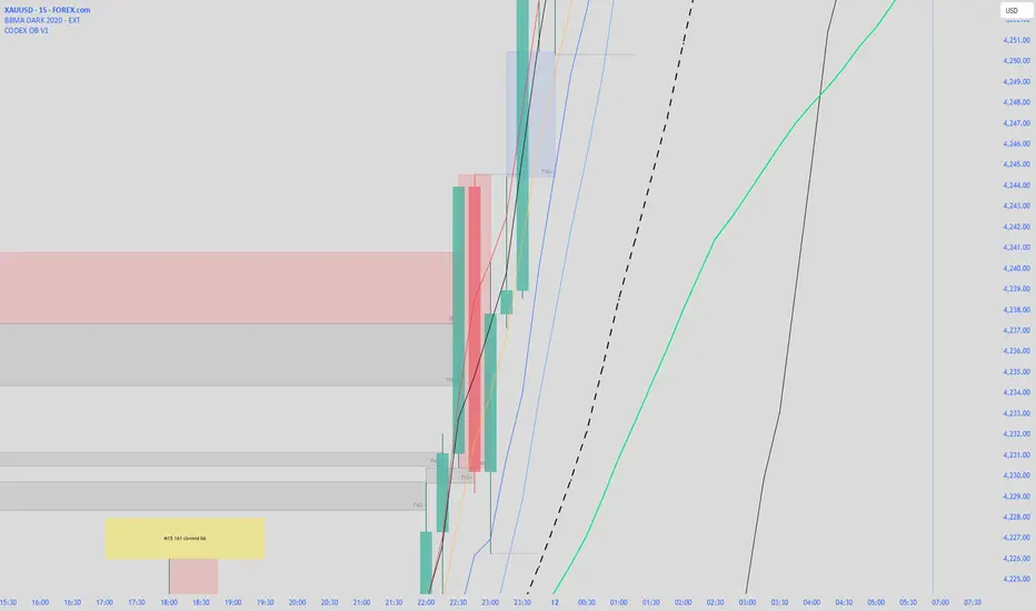
CODEX OB V1CODEX OB V1 is a multi-purpose Smart Money Concepts (SMC) indicator that automatically detects and visualizes key institutional trading elements such as Order Blocks, Fair Value Gaps, Rejection Blocks, Break of Structure, Pivots, High Volume Bars, and several qualitative SMC signals.
This tool helps traders identify institutional footprints and displacement-based setups with high clarity.
Multitimeframe
BTC Impulse Pro
BTC Impulse Pro — Precision Breakout Tool for Bitcoin (5m–15m)
BTC Impulse Pro is a structured breakout companion designed to help traders identify directional shifts and continuation opportunities on intraday Bitcoin charts.
The indicator focuses on clean visual signals, consistent rules, and intuitive workflow integration — without revealing proprietary logic.
Included Setups
1. Standard Breakout Signal
A large directional triangle.
This setup triggers when price shows a clean breakout and confirmation pattern.
It is the primary trading signal of the tool and reflects moments of strong directional intent.
2. Wick Breakout Signal
A smaller directional triangle.
This setup appears when price interacts with a key level through a wick rejection before breaking out.
It can highlight momentum shifts early, but requires additional caution in choppy market phases.
3. Confluence Dot
A small directional dot.
This appears when internal structure conditions align with the prevailing directional bias.
The Confluence Dot can:
act as secondary confirmation for the two breakout signals
or be used as its own standalone signal
However, because it may appear during early or developing moves, users should evaluate market context carefully before acting on it.
EMA Stack & Trend Context
The indicator includes an optional EMA stack that helps visualize directional strength and transitions.
While not required for signals, the EMA 200 often acts as a dynamic boundary — when price trades very close to it, users should treat all signals with increased caution due to higher whipsaw risk.
Dynamic Stop & TP Guides
Suggested Stop and Take-Profit levels are automatically displayed when structure confirms.
These levels are meant as orientation tools, not strict requirements.
Different volatility conditions may require different management techniques, so users are encouraged to test what works best for their style.
NY Reference Line (00:00 NY Time)
The vertical reference line can be shifted via the NY Offset setting.
It should be aligned with 00:00 New York time for consistent daily segmentation across different time zones and chart feeds.
Recommended Timeframes
Optimized for 5m and 15m, but can also be tested on other timeframes depending on market structure and volatility.
Usage Notes
This indicator is not financial advice.
All signals should be interpreted within broader market context.
The tool does not execute trades — it assists with visual decision-making.

LHAMA MTF Structure & Fibs [LTS]Overview
LHAMA MTF Structure & Fibs is a multi-purpose market structure toolkit that combines current-timeframe structure, higher-timeframe structure, Imbalance/FVG-based order blocks, and automatic Fibonacci retracements into a single chart overlay.
Current-Timeframe Structure
The indicator first maps current-timeframe market structure using swing highs and lows based on a user-defined pivot length (“Time-Horizon”):
Labels swing points as HH , HL , LH , and LL .
Draws BOS (Break of Structure) when price breaks beyond a prior swing.
Optionally identifies CHoCH (Change of Character) when a break occurs against the previous direction.
Lets you choose whether BOS/CHoCH confirmation uses closes or wicks .
Provides options to show/hide swing labels, choose line style (solid/dashed/dotted), and configure bullish/bearish colors.
Higher-Timeframe (HTF) Structure
On top of the local structure, the script builds a higher-timeframe structure map and projects it onto your active chart:
Aggregates price into HTF “bars” (e.g., 4h structure on a 5m chart).
Detects HTF pivots with their own pivot length setting.
Draws HTF BOS/CHoCH lines and labels back on the lower timeframe.
Lets you choose wick vs close confirmation for HTF breaks.
Optional “ pending ” HTF levels: lines extended from the latest HTF swing highs/lows that remain “waiting” until price breaks them.
This is designed to make it easier to see how intraday price is moving relative to the dominant higher-timeframe trend.
Order Blocks (Imbalance/FVG-Based)
The indicator detects simple bullish and bearish order blocks based on fair value gaps and prior sweeps:
Identifies bullish/bearish FVGs together with a sweep of a previous low/high.
Creates colored boxes anchored to an “anchor” candle and extends them forward.
Marks boxes as “broken” when price trades inside or through the opposite side.
Broken blocks can have reduced emphasis (more transparent, dashed border) and can optionally be deleted.
Show Nearest Only mode highlights only the closest active bullish and bearish blocks to reduce chart clutter.
Periodic cleanup removes very old boxes to maintain chart responsiveness.
Automatic Fibonacci Levels
The script can draw up to five customizable Fibonacci retracement levels using the HTF structure logic:
Measures swings using HTF pivots and extremes.
Historical mode : measures between two confirmed pivots in one direction.
Live mode : starts from the last confirmed pivot and tracks the evolving extreme; if price reverses through that pivot, measurement can flip to track the new leg.
Each Fib level has its own on/off toggle, ratio value, and color.
Draws a main swing line plus retracement lines projected slightly into the future.
Key Inputs & Customization
Market Structure (Current TF)
Pivot length (“Time-Horizon”).
BOS confirmation: candle close or wicks.
BOS/CHoCH line style and width.
Swing labels on/off and global label size.
Bullish/bearish colors.
Market Structure (HTF)
HTF timeframe selection.
Separate pivot length for HTF swings.
Close vs wick confirmation for HTF breaks.
HTF swing labels and CHoCH labels on/off.
Pending HTF levels: style, color, and visibility.
Order Block Settings
Bullish/bearish box colors and border width.
Maximum number of boxes to display.
Optional deletion of broken blocks.
“Show Nearest Only” filter to highlight the closest active zones.
Max bars to backscan for the anchor candle.
Cleanup frequency for removing very old boxes.
Fibonacci Settings
Show/hide auto Fibs.
Historical vs Live tracking mode.
Five user-defined ratios with individual toggles and colors.

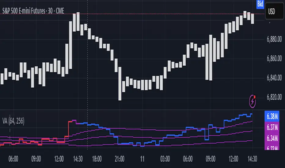
Volume Analysis🙏🏻 (signed) Volume Analysis is 2 of 2 structural layer / ordeflow analysis scripts, while the first one is Liquidity Analysis. Both are independent so can’t be released together as a single script, but should be used together.
The same math used in this script can be applied to other types of aggressive volume data: non-aggregated flow of market orders, volume traded of put vs call options.
There’s no universal agreement about terminology, but this script works with volumes signed by the aggressor who initiated a transaction. Then these volumes get aggregated by time and a cumulative sum is calculated. Mostly this is widely known as Cumulative Volume Delta.
However this script works with 'inferred' volumes vs the provided ones. It’s the better choice for equities, bonds; neutral choice for currencies; and suboptimal choice for natural and artificial commodities.
Contents:
Output description;
How to analyze & use the outputs;
How to use it together with Liquidity Analysis script;
How did I use both scripts to finish The Leap profitably and skipped many losses.
1. Output description
Color of the CVD line reflects (signed) volume imbalance state: red is negative, purple is neutral, blue is positive.
3 purple lines are lower deviation (lower band), basis (middle band), upper deviation (upper band): used to generate signals by a ruleset that would be explained in a minute
Gray number in the script’s status line is the advised input you may put into Inferred volume multiplier in script’s setting, I will explain it
Vertical dash line marks the moving window end, this way you can be certain over what exact data you see the profile was built.
2. How to analyze & use the outputs
Setup up the script:
Moving window length: set it to ~ ¼ of your data analysis window. E.g if you see on your charts and use ~ 256 bars, set the length to 64.
Inferred volume multiplier: you can easily leave it 256, this is not a critical factor for the math, it’s mostly there if you want to ~ equate inferred volumes with real ones in scale. For this, use the gray number in the script status line, it’s calculated as ratio of long term real volumes weighted avg to long term inferred volumes weighted avg.
Again, changing the inferred volume multiplier won’t affect the math.
Use 2 timeframes: main one and a far lower one 3 steps down, just like on the screenshot.
Find out current volume imbalance state:
As mentioned before, based on CVD line color, it can be negative, neutral or positive. This is the state variable that changes slowly and denies/confirms the signals generated by crossovers of CVD line and 3 purple thresholds.
For this I use my own very fast and lightweight metric that is totally statistically grounded, utilizes temporal information, and calculates volume imbalance without using heavy math like regressions as it’s usually done. It also provides a natural neutral zone, when volume imbalance is not strong enough to be confirmed.
...
CVD-based signals:
First you need to understand what precisely a touch of a threshold is:
Touch: an event when either of these 2 happens:
One CVD datapoint is above the threshold, and the next CVD datapoint is below the threshold
One CVD datapoint is below the threshold, and the next CVD datapoint is above the threshold
These are usually called crossovers/crossunders.
Now with the 3 purple thresholds we follow this logic:
Monitor the last touched threshold;
Once another threshold is touched, here we may generate a signal but only once !, after the first generated signal at that threshold we can’t generate more signals on this threshold, we need to wait when CVD comes to another threshold.
If CVD touches one threshold, and then goes down and touches another threshold downwards, we wait when CVD makes a datapoint above this threshold. When it happens, we register a long signal
If CVD touches one threshold, and then goes up and touches another threshold upwards, we wait when CVD makes a datapoint below this threshold. When it happens, we register a short signal
However, don’t open new trades against the current volume imbalance state. So don’t open shorts when the CDV line is blue, and don’t open longs when CVD line is red.
Btw, this technique I call it “reclaim” of a level/threshold. It can be applied to horizontal levels, and it’s very powerful especially when you fade levels on very volatility assets like BTC. This technique allows you to Not fade a level straight away, but wait when price goes past the level a bit, and then comes back and reclaims it, only there you enter, and moreover you now have a very well defined risk point.
The last part is multi-timeframe logic. Prefer to act when a lower timeframe is Not against the main timeframe. That’s all, no multiple higher timeframes are needed.
3. How to use it together with Liquidity Analysis script.
That script also has a mean to generate its own signals, and another state variable called Liquidity Imbalance.
So now you’re not only looking at volume imbalance but also at liquidity imbalance that would deny/confirm the CVD based signal. You need at least one of these two to favor your long or short.
This is the same logic widely used in HFT, where MM bots cancel/shift/resize orders when book is too onesided And ordeflow is one sided as well.
4. How did I use both scripts to finish The Leap profitably and skipped many losses.
Even tho you can use structural information as your main strategic layer, as many so-called orderflow traders do, I traded in objective style: my fade signals were volatility based in essence, and I used ordeflow for better entries and stops, but most importantly to skip losses.
When ‘both‘ liquidity imbalance and volume imbalance (in their main timeframes) were against my trades, I skipped them all, saving many ~$500 stop losses (that was my basis risk unit for the Leap). Unless I had a very strong objective signal, i.e. confluence of several signals, or just one higher timeframe signal, I did all these skips.
I traded ~ intraweek timeframe, so I was analyzing either the last 230 30min bars or 1380 5min bars. Both Liquidity Analysis and (signed) Volume Analysis scripts were set to moving window length 46 or 276 for either granularity.
I finished the leap with 9% profit and max DD ~ 5%, a bit short of my goal of 12.5%. If not these 2 scripts I would’ve finished a bit above breakeven I think.
,,,
Another thing, I made these 2 scripts invite-only because they are made particularly for trading, particularly for certain types of market data. These are tools adapted for particular use case, not like my other posts with general math entities like Kernel Density Estimation or Kalman filter, that you can take and apply properly on any data you need yourself.
However these are made from general math entities like everything else. ‘All’ the components are available in my other scripts, ideas, and other sources related to me. If you want to reverse-engineer these, you can find all the components you need in my already posted open source work.
∞
@Fhunded PxH/PxLPlots previous day/week highs and lows (PDH/PDL/PWH/PWL) along with daily, weekly, and monthly opens. Each level includes customizable colors, visibility toggles, and adjustable forward-projected line length for clean HTF reference levels.

ADX Indicator with VisualADX Indicator with line and clear number. Identifies when ADX Index is weak, trending, or strong. Depending on timeframe, this indicator can be used to identify early signs of a change in trend.
This is my first time creating an indicator and coding, so please, use it at your own discretion. If anyone has any helpful suggestions, please leave a comment. I can email you the source code so you can revise it. In return, I ask that you share the updated code with me so everyone that uses this indicator can benefit. Thank you! :)

EMA Convergence EstimatorEMA Convergence Estimator is a tool designed to help traders visualize when two key trend EMAs—typically the 50-EMA and 200-EMA—are moving toward or away from each other. By analyzing slope, distance, and rate of convergence, the script estimates how many candles, hours, or days remain until the EMAs potentially touch.
This can be helpful for identifying upcoming trend shifts, tightening market conditions, or periods where momentum may be compressing before a larger move.
🔍 Features
Fast EMA & Slow EMA (default 50 / 200)
EMA distance tracking
Slope-based convergence calculation
Estimated time until EMAs meet in:
📍 Candles
⏱️ Hours
📅 Days
Real-time label panel showing all values
On-chart EMA cross markers
“+” printed directly on bullish EMA crosses
“–” printed directly on bearish EMA crosses
Fully transparent label background so it does not obstruct candles
📈 Use Cases
Identifying when EMAs are tightening (consolidation)
Spotting potential future crossovers earlier than normal indicators
Estimating momentum compression or expansion
Tracking longer-term trend dynamics on any timeframe
⚠️ Notes
The convergence estimate is mathematical, not predictive.
EMAs react to price — they do not forecast it.
Results depend on current slope and can change rapidly as new candles form.
Always use this tool as part of a broader analysis process.
This script is for educational purposes only and does not constitute financial advice.

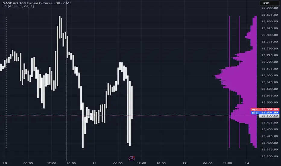
Liquidity Analysis🙏🏻 Liquidity Analysis is 1 of 2 structural layer / orderflow layer analysis scripts. Both are independent so can’t be released together as a single script, but should be used together. The second one which is called (Signed) Volume Analysis is incoming.
The same math used in this script can be applied on other types of profile-like data: orderbooks, trading volumes of all options for each strike.
Important: market or volume profile, just as orderbooks and options traded volume by strikes, are all liquidity ‘estimates’, showing where liquidity is more likely or less likely to be. These estimates however, especially combined with other info, are really useful and reliable.
This script works with inferred volumes vs the provided one. It's the better choice for equities, bonds; neutral choice for currencies; and suboptimal choice for natural & artificial commodities.
Contents:
Output description;
How to analyze & use the outputs;
How to use it together with upcoming (Signed) Volume Analysis script;
How did I use both scripts to finish The Leap profitably and skipped many losses.
1. Output description
Color of the profile reflects the liquidity imbalance state: red is negative, purple is neutral, blue is positive.
Bar coloring represents history values of liquidity imbalance for backtesting purposes. It can be turned on/off in the script's Style settings.
Two purple vertical lines represent calculated borders of excessive liquidity (HVN), scarce liquidity (LVN), and sufficient liquidity (NVN) zones.
Vertical dash line marks the moving window end, this way you can be certain over what exact data you see the profile was built.
2. How to analyze & use the outputs
Setup up the script:
Moving window length: set it to ~ ¼ of your data analysis window. E.g if you see on your charts and use ~ 256 bars, set the length to 64.
Native tick size multiplier: leave it at 0 to calculate optimal number of rows automatically, or set it manually to match native tick size multiples you desire.
Use 2 timeframes: main one and a far lower one 3 steps down, just like on the screenshot.
Native lot size multiplier allows to round profile rows themselves to nearest multiples of native lot size. I added this just in case any1 needs it.
Find out current liquidity imbalance state:
As mentioned before, based on profile color, it can be negative, neutral or positive. This is the state variable that changes slowly and denies/confirms the signals that would be explained in the minute.
I use my own statistically grounded imbalance metric (no hardcoded/learned thresholds), that unlike mainstream imbalance metrics (e.g orderbook imbalance as sum of bids vs sum of asks) provides a natural neutral zone, when liquidity imbalance is ofc there but not strong enough to be considered.
…
Profile-based signals: look at profile shape vs 2 vertical purple lines.
where profile rows exceed the left purple line, these prices are considered HVN. Too much potential liquidity is there.
where profile rows don’t exceed the right purple line, these prices are considered LVN. Potential thin/lack of liquidity is expected there.
where profile rows are in between these 2 purple lines, these are NVN, or neutral liquidity zones.
Trading ruleset itself is based on couple of simple rules:
Only! Use limit orders hence provide liquidity in LVNs and Only! use stop-market orders hence consume liquidity in HVNs;
These orders should be put in advance ‘only’. This is how you discover the direction or orders: you can only put sell limit orders above you and buy limit orders below you, and you can only put buy stop orders above you, and sell stop orders below you.
This is really it. It may look weird, but once you just try to follow these 2 rules letter by letter for 1 hour, you’ll see how liquidity trading works.
Now once you know that, just don’t open new trades against the liquidity imbalance state. So don’t open shorts when the profile is blue, and don’t open longs when it’s red.
The last part is multi-timeframe logic. Prefer to act when a lower timeframe is Not against the main timeframe. That’s all, no multiple higher timeframes are needed.
3. How to use it together with upcoming (Signed) Volume Analysis script.
That upcoming script would also have a mean to generate its own signals, and another state variable called volume imbalance.
So now you’re not only looking at liquidity imbalance but also at volume imbalance that would deny/confirm a profile based signal. You need at least one of these to favor your long or short.
This is the same logic widely used in HFT, where MM bots cancel/shift/resize orders when book is too onesided And ordeflow is one sided as well.
4. How did I use both scripts to finish The Leap profitably and skipped many losses.
Even tho you can use structural information as your main strategic layer, as many so-called orderflow traders do, I traded in objective style: my fade signals were volatility based in essence, and I used ordeflow for better entries and stops, but most importantly to skip losses.
When ‘both‘ liquidity imbalance and volume imbalance (in their main timeframes) were against my trades, I skipped them all, saving many ~$500 stop losses (that was my basis risk unit for the Leap). Unless I had a very strong objective signal, i.e confluence of several signals, or just one higher timeframe signal, I did all these skips.
I traded ~ intraweek timeframe, so I was analyzing either the last 230 30min bars or 1380 5min bars. Both Liquidity Analysis and (signed) Volume Analysis scripts were set to moving window length 46 or 276 for either granulary.
I finished the leap with 9% profit and max DD ~ 5%, a bit short of my goal of 12.5%. If not these 2 scripts I would’ve finished a bit above breakeven I think.
∞
Smart Money Time by TMUSMT-Integrated Institutional Structure
This solution addresses a critical limitation in retail technical analysis: Fractal Blindness. While standard indicators operate linearly on a single timeframe, this script utilizes a Synchronous Multi-Timeframe (MTF) Architecture combined with SMT (Smart Money Time) logic to overlay higher-order market structure directly onto your execution chart.
It is engineered to align your entry triggers with the dominant institutional trend, effectively filtering out counter-trend noise that often leads to liquidity sweeps.
Core Technology: The "Fractal-Sync" Engine
1. Hierarchical Trend Propagation (MTF Logic) The script performs a real-time request.security analysis of user-selected higher timeframes to determine the "True State" of the market.
The Mechanism: Instead of repainting historical data, the algorithm uses a Step-Locked logic. It projects the confirmed Swing Highs and Lows of the Higher Timeframe (e.g., 4H) onto your Lower Timeframe (e.g., 5m or 15m).
Practical Value: You instantly visualize the "Big Picture" bias without switching tabs, ensuring your local trades are aligned with the global flow.
2. SMT-Grade Pivot Detection Integrating concepts from Smart Money analysis, the indicator identifies Key Swing Points that have a high probability of defense by large operators.
Technique: By calculating volatility-adjusted deviations (ATR) across multiple timeframes, the script distinguishes between a standard "pullback" and a genuine Structure Shift (MSS) or Break of Structure (BOS).
Benefit: It visually separates weak internal structure (inducement) from strong external structure (protected levels).
Technical Specifications & Filters
To satisfy strict stability requirements and provide objective signals, the engine incorporates unique validation methods:
Volatility Normalization: Structure breaks are validated against a dynamic ATR threshold. This ensures that low-volume consolidation does not trigger false structural resets.
Candle-Close Validation Protocol: A level is considered breached only if the candle body closes beyond the pivot. This filters out "Wick Fakeouts" and Stop-Hunts often seen during news events.
Conflict Resolution: When the Lower Timeframe trend contradicts the Higher Timeframe structure, the indicator visualizes this as a "Retracement Phase," advising caution.
Operational Workflow
This tool acts as a Market Context Filter, not a simple signal generator:
Trend Alignment: Use the visual cues to instantly recognize the dominant institutional flow.
Zone Identification: The script automatically plots "Strong Lows" (Invalidation Points) and "Weak Highs" (Targets).
Execution: Seek entries on your timeframe only when the higher timeframe structure (shown by this script) confirms the direction.
Note for Professional Use: This script is designed for precision execution. It minimizes chart clutter by displaying only confirmed structural points, providing a clean, logic-driven workspace for objective decision-making.

SMT [Advanced] by TMUThis is a proprietary technical analysis tool designed to detect SMT (Smart Money Time) Divergences with a specific focus on Time-Cycle Theory and advanced Data Visualization.
Originality & Technical Uniqueness Unlike standard open-source SMT indicators that simply compare Highs/Lows and clutter the chart with overlapping text, this script utilizes a custom-built "Label Registry & Stacking Engine". Standard indicators often fail when multiple divergences occur simultaneously on different timeframes. This script solves this problem using a proprietary deferred rendering algorithm:
Registry System: Instead of drawing signals immediately, the script calculates potential divergences across multiple assets/timeframes and pushes them into a dynamic array (registry).
Dynamic Stacking: A background sorting algorithm processes this stack every bar, groups signals by their timestamp and type, and renders them with calculated offsets. This ensures labels never overlap, providing a clean, professional workspace impossible to achieve with basic plotting functions.
Signal Rotation: It implements a "rotation manager" logic for 90-minute cycles. As price action evolves, the script automatically assesses whether to update an existing divergence line or create a new historical reference, keeping the analysis strictly relevant to the current cycle structure.
How it Works (Methodology) The script performs a relative strength analysis between two correlated assets (e.g., ES vs. YM) using request.security to fetch comparative data.
Pivot Analysis: It identifies structural Pivot Highs and Lows based on a configurable length, filtering out minor internal noise.
Divergence Logic:
Bearish SMT: Validated when the primary asset makes a Higher High while the comparison asset makes a Lower High.
Bullish SMT: Validated when the primary asset makes a Lower Low while the comparison asset makes a Higher Low.
Time-Cycle Isolation: The analysis is confined within strictly defined temporal windows (Daily, Weekly, and custom 90-minute intraday blocks). The script detects cracks in correlation specifically within these isolated sessions rather than looking at infinite history.
Features
Smart Filter: Advanced logic to filter out "Internal" structure and focus only on major external pivot breaches.
Multi-Cycle Dashboard: A real-time table monitoring the SMT status of Monthly, Weekly, Daily, and intraday cycles simultaneously.
Auto-Ticker Selection: Automatically detects the current asset class (Indices/Forex) and selects the appropriate comparison symbol (e.g., selects YM when viewing ES).
Settings
Comparisons: Manual or Auto-ticker selection.
Visuals: Custom colors, line styles, and label positioning modes.
Alerts: Customizable alerts for valid SMT formation on any monitored timeframe.

NQ Points of Interest Suite (Fixed)Defines pre level of support and resistance
Daily MID LOW OPEN CLOSE
WEEKLY MID LOW OPEN CLOSE
MONTHLY MID LOW OPEN CLOSE

Amin_RsiBar_Macd2m in 1m_BB_ V 3.0Pro RSI Divergence Detector
This indicator automatically detects bullish and bearish divergences on the RSI by comparing key swing highs and lows in price with momentum shifts on the oscillator. It identifies both classic and hidden divergences, helping traders spot early trend reversals, momentum exhaustion, and high-probability entry zones.
Designed for traders who rely on momentum analysis, this tool provides clear on-chart signals, improves timing, and filters out false moves. It works on all markets and timeframes.
Suitable for: Crypto, Forex, Stocks, Indices
Use cases: Trend reversal detection, entry confirmation, exit optimization, momentum analysis

XXMonk Sequence Price Grid (Manual Origin + U)⭐ XXMonk Sequence Grid – Harmony Price Levels (1–144 Sequence Engine)
Algorithmic Sequence Mapping for Price Displacement
The XXMonk Sequence Grid is a precision mapping tool designed to project algorithmic price levels using harmonic numerical sequences derived from the ICT-inspired time/price symmetry concept.
This indicator takes a user-defined Origin (EQ level) and generates symmetrical expansion bands above and below price using any combination of the following sequence values:
These levels act as algorithmic rails that price frequently reacts to, respects, or expands toward — providing traders with a structural framework to interpret displacement, liquidity objectives, and sequence-based expansions.
🔷 Core Features
✔ Manual Origin (EQ Level)
Set any midpoint — daily open, session equilibrium, dealing range midpoint, your own anchor, etc.
✔ Manual U Value (Unit Size)
No restrictions. Enter any point value (ex: 0.25, 1, 5, 12.5, 25…) to scale the sequence to your instrument.
✔ Full Sequence Control
Toggle ON/OFF each individual harmonic sequence:
Micro ranges → 1, 3, 5
Intermediate → 8, 13, 21
Macro ranges → 34, 55, 89, 144
✔ Individual Line Colors
Every sequence level has its own color input for full customization.
✔ Static Lines (Do Not Move With Cursor)
Lines anchor from the first bar and extend infinitely to the right.
✔ Automatic Labels on Right Side
These levels often align with:
Liquidity pools
Displacement endpoints
PD array boundaries
Algorithmic expansion levels
Reversal zones
Session highs/lows
Volatility-based fractals
Price frequently travels sequence-to-sequence, creating a predictable harmonic structure.

Multi Time Frame Trend BiasSee the lower time frame and higher time frame trend at a glance. Choose 8 lower time frames, and 8 higher time frames. You can also choose your ema / sma relationship but I recommend using 13ema / 30 sma relationship. You can change the size of the table. You can also hide the rows and only view the overall trend if you want. Very useful as a confluence with your strategy / entry model. Trade in the same direction of the trend. Don't fight the trend.

Alloyz Traders_RSI by Sagar BRSI for Intraday purpose with moving average and volume weightage price added in RSI.


Punjis Dynamic Daily EMA/SMA 5,9,21,50,100 LevelsPunjis Dynamic Daily EMA/SMA 5,9,21,50,100 Levels
Overview:
This indicator displays daily timeframe moving averages as horizontal lines extending to the right of your chart, regardless of what timeframe you're currently viewing. It includes six key moving averages: EMA 5, EMA 9, EMA 21, SMA 50, SMA 100, and SMA 200.
Key Features:
Clean Chart Design: Unlike traditional moving average lines that clutter your chart with curves across all candles, this indicator uses horizontal lines that extend only from the current price level to the right edge of your screen
Multi-Timeframe Analysis: View daily moving averages on any intraday timeframe (1min, 5min, 15min, etc.) without switching charts
Fully Customizable:
Toggle each moving average on/off independently
Adjust the period length for each MA
Customize colors for each line
Master toggle to show/hide all lines at once
Reduced Visual Noise: Horizontal lines keep your price action clean and easy to read while still providing critical support/resistance levels
Professional Layout: Perfect for traders who need to monitor multiple key levels without obscuring candlestick patterns and chart analysis
Benefits of Horizontal Lines:
Cleaner Charts: Traditional MAs draw lines through every candle, creating visual clutter. Horizontal lines only show current values, keeping your chart clean
Focus on Current Levels: What matters most is where the MAs are NOW relative to price - horizontal lines highlight this instantly
Better Price Action Visibility: See candlestick patterns, volume, and support/resistance levels clearly without MA lines crossing through them
Quick Reference: Instantly identify if price is above or below key moving averages without following curved lines across the chart
Professional Appearance: Clean, minimalist design preferred by institutional traders and technical analysts
Use Cases:
Day traders monitoring higher timeframe levels on intraday charts
Swing traders tracking daily moving averages as dynamic support/resistance
Multi-timeframe analysis without chart switching
Identifying trend direction and potential reversal zones
Clean workspace for pattern recognition and price action trading

(5+15+60min+1D)EMA20+Y'SH/L+count简介: 这是一个专为 5分钟图表 (5min Chart) 日内交易者设计的综合辅助工具。它结合了多周期趋势均线、美股核心交易时段的时间周期计数以及关键流动性位置(前一日高低点)的智能突破监测。该脚本针对美股个股及 24/7 交易的 BTC/ETH 进行了优化,强制锁定纽约时间进行运算。
核心功能:
1. 多周期 EMA 监控系统 (MTF EMAs)
5min EMA20 (蓝色):日内短期趋势核心线(默认开启)。
60min EMA20 (绿色):小时级别趋势参考(默认开启)。
15min EMA20 (红色) & 1D EMA20 (橙色):可选开启,用于捕捉更大周期的支撑阻力。
特点:所有均线采用最细线宽,平滑显示,右上角表格实时展示当前价格。
2. 美股时段 Bar Count 计数器
时间锚定:以纽约时间 (New York Time) 09:30 开盘为起点(Bar 0)。
显示规则:仅在 K 线底部显示 偶数 序号 (0, 2, 4, 6 ...),直至第 82 根 K 线停止。
关键时间窗 (Time Pivots):
Bar 18 (约 NY 10:55) 和 Bar 40 (约 NY 12:45) 会被自动高亮。
字体变为 蓝色粗体,且对应 K 线实体变为蓝色,提示潜在的变盘或宏观流动性注入时刻。
3. 智能 PDH/PDL 射线 (Smart Rays)
精确锚点:前一日高点 (PDH) 和低点 (PDL) 的射线不是从开盘画起,而是从昨日形成高低点的具体时间点射出,精确还原价格行为。
自动阻断 (Breakout Logic):一旦当前价格触碰或突破该射线,射线将自动停止延伸,直观展示“阻力/支撑已失效”。
自动清理:每日自动清除旧线,仅保留当天的参考线,保持图表整洁。
4. 视觉优化
每日分割线:自动绘制灰色虚线分隔交易日。
图表限制:脚本仅在 5分钟图表上可见,切换周期自动隐藏,避免干扰大周期分析。
设置说明:
可在设置面板中自由开关各周期 EMA 的显示。
可开关底部的计数数字显示。
English Version (for TradingView Publishing)
Title: 5min Intraday Precision Toolkit: MTF EMAs + NY Session Count + Smart Rays
Introduction: This is a comprehensive auxiliary tool designed specifically for 5-minute chart intraday traders. It combines multi-timeframe trend EMAs, time cycle counting based on the US Session, and smart breakout monitoring for key liquidity levels (Previous Day High/Low). Optimized for US Equities and Crypto (BTC/ETH) using New York Time.
Key Features:
1. Multi-Timeframe EMA System
5min EMA20 (Blue): Core short-term intraday trend (On by default).
60min EMA20 (Green): Hourly trend reference (On by default).
15min EMA20 (Red) & 1D EMA20 (Orange): Optional overlays for higher timeframe support/resistance.
Visuals: All EMAs are rendered with fine lines for a clean look, accompanied by a top-right dashboard table.
2. NY Session Bar Count
Time Anchor: Starts counting from 09:30 New York Time (Bar 0).
Display Logic: Displays only EVEN numbers (0, 2, 4...) at the bottom of the bars, stopping at count 82.
Time Pivots:
Bar 18 (~10:55 NY) and Bar 40 (~12:45 NY) are highlighted.
Labels turn Bold Blue, and the specific candles are colored Blue to indicate potential reversal or liquidity injection times.
3. Smart PDH/PDL Rays
Precise Origin: Rays for Previous Day High (PDH) and Previous Day Low (PDL) originate from the exact timestamp they were created yesterday, not just the daily open.
Breakout Stop Logic: Rays automatically stop extending once price touches or breaks them, clearly indicating that the level has been tested.
Auto-Clean: Automatically removes old rays from previous days to keep the chart clean.
4. Visual Optimization
Daily Separators: Automatic vertical dotted lines marking new days.
Visibility: All elements are hidden on non-5m charts to prevent clutter.
Settings:
Toggle visibility for individual EMAs.
Toggle visibility for the bottom bar counter.

FANBLASTERFANBLASTER
Methodology & Rules (Live Trading Version)
Purpose
Catch the exact moment the market flips from chop into a high-conviction trending move using a clean, stacked Fib EMA ribbon + volatility + volume confirmation.
Core Idea
When the 5-8-13-21-34-55 EMA stack suddenly “fans out” in perfect order with significant separation, a real trend is being born. Most retail traders chase late – FANBLASTER alerts you on the very first bar the fan opens.
What Triggers a “FAN BLAST” Alert
Perfect EMA Alignment
Bullish: 5 > 8 > 13 > 21 > 34 > 55
Bearish: 5 < 8 < 13 < 21 < 34 < 55
(Has to flip from NOT aligned on the previous bar → aligned on this bar)
Significant Separation
Distance between EMA 5 and EMA 55 ≥ 1.3 × ATR(14)
(1.3 is the ES sweet spot – filters fake little wiggles)
Trend Strength Confirmation
ADX(14) ≥ 22
(Ensures the move isn’t just noise; ES trends explode while ADX is still climbing)
Volume Conviction
Current volume > 1.4 × 20-period EMA of volume
(Real moves have real participation)
When ALL FOUR conditions are true on the same bar → you get the green or red circle + phone alert.
How to Trade It (Live Rules)
Alert fires → look at the chart immediately
If price is pulling back to the 8 or 13 EMA in the direction of the fan → enter on touch or close above/below
Initial stop: opposite side of the fan (below the 55 for longs, above the 55 for shorts)
Target: 2–4 R minimum, trail with the 21 or 34 once in profit
No alert = stay flat. This is a “trend birth” sniper, not a scalping tool.
Best Instruments & Timeframes (2025)
ES & NQ futures
2 min, 5 min, 15 min (all work with the exact same settings)
Works on MES/MNQ too (same params)
Bottom Line
FANBLASTER sits silent 90 % of the day and only screams when the market is actually about to run 20–100+ points.
One alert = one high-probability trend. That’s it.
Lock it, load it, and let the phone do the hunting.
Good luck, stay disciplined, and stack those points.
— Your edge is now live.

RSI Swing Indicator (Win-Rate + Forecast Line + Range Row)What the script does:
It’s essentially an enhanced RSI tool that doesn’t just show the raw RSI line. Instead, it adds forecasting, trade statistics, and range detection so you can see how reliable RSI signals have been historically and what they might mean going forward.
The main components
RSI Calculation
- Uses your chosen source (close, hl2, etc.) and length (default 7).
- Plots the RSI line (orange).
Forecasting
- Projects RSI into the future using slope extrapolation.
- Plots a forecast line (blue) and shows whether RSI is likely to become overbought, oversold, or stay neutral.
Trade Statistics
- Tracks how many long and short trades would have been profitable based on RSI bias.
- Calculates Win‑Rate (percentage of profitable trades) and Average Return (average gain/loss per trade).
- This gives you a statistical edge: are longs or shorts historically working better?
Bias & Conflict Detection
- Defines current bias (Bullish, Bearish, Neutral).
- Flags Conflict when the forecast disagrees with the current bias (e.g., RSI bullish now but forecast bearish).
- Helps you avoid trading against weakening momentum.
Range Detection
- Checks if RSI slope is flat and values are between mid‑bounds (40–60).
- Calculates Range Probability (how often range conditions occur).
- Adds a Range row to the table so you know when the market is likely sideways instead of trending.
Table Display
- Summarizes everything in a neat table: Forecast, Win‑Rates, Avg Returns, Prob Bias, Conflict, Range Prob, and Range status.
- Color‑coded so you can instantly see what’s favorable (green), risky (red), or neutral (yellow/orange).
How to use it
- Trend trading: Look for Profitable Bias with forecast alignment.
- Range trading: When both win‑rates are weak and Range row says Range Likely, fade extremes (buy low RSI, sell high RSI).
- Risk management: Avoid trades when Conflict is flagged.
- Forecasting: Use the projected RSI to anticipate overbought/oversold zones before they happen.
In short:
The script is like a “smart RSI dashboard”. It takes the basic RSI, adds forecasting, tracks how well past trades worked, and tells you whether the market is trending or ranging. This way, you’re not just reacting to RSI — you’re trading with context, probabilities, and forward‑looking signals.

HTF Candle Overlay – Multi-Timeframe Visualization ToolThis indicator overlays true Higher Timeframe (HTF) candlesticks directly onto any lower timeframe chart, allowing you to see the larger market structure while trading on precise execution timeframes such as 1-minute, 3-minute, or 5-minute.
Instead of constantly switching chart timeframes, you can now see both higher and lower timeframe price action at the same time. Each HTF candle is drawn as a large transparent candlestick with full upper and lower wicks, perfectly aligned in both time and price.
This makes it easy to identify:
- Trend direction from the higher timeframe
- Key support and resistance zones inside each HTF candle
- Liquidity sweeps and rejections across timeframes
- Optimal entries on lower timeframes with higher-timeframe confirmation
Key Features
- Displays true Higher Timeframe candles on any lower timeframe
- Clear transparent candle bodies for unobstructed price visibility
- Full upper and lower wicks
- Non-repainting confirmed candles
- Optional live display of the currently forming HTF candle
- Accurate time-based alignment
- Lightweight and optimized for performance
Who This Indicator Is For
- Scalpers who want higher-timeframe bias
- Day traders using multi-timeframe confirmation
- Smart Money / ICT traders monitoring HTF structure
- Anyone who wants clean multi-timeframe clarity without chart switching
How To Use
- Apply the indicator to any chart.
- Select your preferred Higher Timeframe (HTF) in the settings.
- Use your lower timeframe for entries while respecting HTF structure and direction.
- This tool helps you trade with the bigger picture in view while executing with precision on lower timeframes.

NoProcess Prior Month/Week/Day High/Low/EQ Prior Period Levels
Plots key support/resistance levels from previous timeframes: Day, Week, and Month.
Levels Displayed:
PDH/PDL/PDE — Prior Day High, Low, and Equilibrium (midpoint)
PWH/PWL/PWE — Prior Week High, Low, and Equilibrium
PMH/PML/PME — Prior Month High, Low, and Equilibrium
Features:
Toggle each timeframe independently
Single color control for clean chart aesthetics
Configurable right extension (1-50 bars)
Dotted line style with labels positioned at line endpoints
Use Case:
Reference levels for institutional order flow concepts. Prior period highs/lows act as liquidity pools; equilibriums mark fair value zones where price often rebalances. Works on any instrument and timeframe.

OHLC HistoryOHLC History is a Pine Script v6 overlay that snapshots up to 32 historical OHLC-derived levels from a selectable higher (or different) timeframe and projects them onto the active chart. It uses request.security to fetch the chosen source (Close/High/Low/Open), rounds each value to the instrument’s minimum tick, and stores them in an array. A “Max Number Lookback” input limits how many of those levels are rendered. For each retained level the script draws a horizontal line extended both ways, coloring it dynamically based on whether the level is above (customizable “above” color) or below (customizable “below” color) the current price, and places compact labels (01–32) with optional price text offset by a user-defined label distance. Prior bar artifacts (lines and labels) are explicitly deleted each update to keep the chart clean, while small white plot markers ensure the levels appear in the price scale and data window for quick reference.
