SETUP HMTR ZONESETUP HMTR ZONE
This indicator highlights high-probability market extremes by detecting a rare alignment between independent heatmap engines.
Captures volatility squeeze, trend exhaustion, and pressure asymmetry.
🎯 What the indicator does
🔵 Cold Match (Blue)
Appears when all engines detect cooling, fear, and liquidity contraction.
Often forms near accumulation phases, oversold washes, structural resets, discount zones.
🔴 Hot Match (Red)
Appears when all components show overheating, exhaustion, and aggressive pressure.
Often precedes distribution phases, liquidity grabs, blow-off tops, or trend fatigue.
✨ Why this matters
This tool does not give buy/sell entries.
It provides contextual confirmation of:
emerging accumulation or distribution
cooling or overheating phases
liquidity-driven stress points
behavioral extremes
regime shifts in trend structure
Use it as a market overlay layer, not as a standalone entry trigger.
🔔 Alerts Included
Cold zone
Hot zone
Signals fire only on confirmed candle close.
✔️ Best for traders who value:
risk-aware positioning
cycle and regime analysis
structural confirmation
heatmap-based market context
smart-money aligned behavior
Multitimeframe

Hardwaybets Strat Market Checklist Trading## **Hardwaybets TheStrat Market Checklist Engine**
**A Checklist-Driven TheStrat Trading**
---
### **Overview**
This script is an **informational market context and permission framework** designed to help users **organize structural and liquidity information** in a clear, checklist-based format.
It evaluates **price context only** and displays the results in a table.
It does **not** generate trade signals or trading instructions.
---
### **What This Script Does**
The indicator evaluates and displays:
* Nearest prior **Area of Interest (AOI)**
(Previous Day High/Low or Previous Week High/Low)
* Higher-timeframe structural bias (Daily & Weekly)
* Proximity to liquidity
* Liquidity behavior (acceptance vs rejection)
* **Strat pattern classification only** (12 canonical patterns)
* A final **permission state** based on the above conditions
All information is presented as **contextual reference data**, not execution guidance.
---
### **What This Script Does NOT Do**
* ❌ No buy or sell signals
* ❌ No arrows, markers, or execution prompts
* ❌ No entries, exits, stops, or targets
* ❌ No performance metrics or profitability claims
* ❌ No strategy or backtesting logic
The word **“TRADE”** in the dashboard refers to **permission status only**, not a recommendation to trade.
---
### **Dashboard Modes**
* **Full Mode**: displays AOI price and distance (points & ticks)
* **Compact Mode**: minimal checklist view for reduced screen usage
Both modes are **informational only**.
---
### **Pattern Classification**
The script identifies and labels Strat candle pattern **types only**, including:
* Reversal patterns
* Continuation patterns
* Compression patterns
* Expansion patterns
Pattern labels are **descriptive classifications**, not signals or instructions.
---
### **Intended Use**
This script is intended to be used as a **contextual reference tool** alongside a user’s own analysis, rules, or education.
It may be useful for:
* Market structure study
* Liquidity behavior observation
* Pattern classification review
* Educational purposes
---
### **Technical Notes**
* Pine Script® v6
* Uses completed candles only
* No repainting logic
* No future data access
* Table-based UI only
---
### **Disclaimer**
This indicator is provided **for educational and informational purposes only**.
The author does not provide financial advice, trading recommendations, or execution guidance.
All trading decisions remain the sole responsibility of the user.
---
### **Conceptual Attribution**
This script is inspired by publicly available market structure concepts commonly referred to as “The Strat” methodology.
No proprietary or paid content is included.
---
### **Feedback**
Constructive feedback and suggestions are welcome.
Please note that this script is intentionally **non-signaling by design**.

PERP Flow Radar PERP Flow Radar is a multi-asset monitoring tool designed to track real-time capital flow pressure across 30 major perpetual futures markets.
Instead of focusing on a single chart, the radar visualizes how buying and selling pressure evolves simultaneously across many assets, helping traders understand broad market behavior with a single glance.
The radar uses directional volume flow to map cumulative pressure for each asset, resetting daily to highlight fresh momentum and intraday rotation.
This allows traders to clearly see:
• which assets attract aggressive long activity
• which markets show persistent selling pressure
• early signs of trend strength or weakness
• synchronized movements across multiple PERP pairs
• intraday shifts in flow dominance
• comparative strength vs. weakness inside the crypto market
Every asset line can be independently toggled, recolored, or resized, creating a customizable environment for flow-based market observation.
CVD PERP Radar (30) does not provide buy or sell signals.
It functions as a contextual monitoring tool — a way to observe how intraday flows, rotation, and market pressure unfold across the perpetual futures market.
The radar is built for traders who value:
• multi-asset flow analysis
• intraday rotation awareness
• pressure-based interpretation
• momentum tracking
• clean, unobtrusive visualization
• cross-market confirmation
By condensing 30 PERP markets into one unified panel, this tool helps traders stay aware of developing flow regimes, strengthening trends, and weakening structures across the crypto futures landscape.

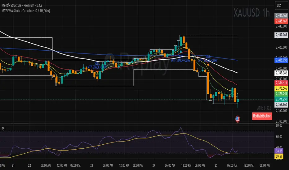
MTF EMA Stack + Curvature (D / 1H / 6m)Purpose of the Indicator
The MTF EMA Stack + Curvature Indicator is a trend-alignment confirmation tool.
Its goal is to identify high-probability trend continuation setups by requiring all of the following to agree:
Trend direction (EMA stacking)
Trend strength / acceleration (EMA curvature)
Multi-timeframe alignment (Daily, 1-Hour, and 6-Minute) with you can change to your preference
Instead of reacting to short-term noise, the indicator only signals when institutional-style trend structure is aligned across time frames.
SETUP HMTRSETUP HMTR (Heatmap Market) is a multi-layered market-structure framework designed to visualize how risk, sentiment, and phase behavior evolve across a market cycle.
Instead of using traditional oscillators, HMTR presents a heatmap of dynamic zones reflecting shifts in accumulation, expansion, distribution, overheating, and deep fear environments.
• early accumulation and recovery phases
• neutral equilibrium zones
• expansion stages with rising momentum
• distribution and trend exhaustion
• periods of euphoria or market overheating
• capitulation, fear, and deep discount environments
Color transitions are adaptive, highlighting how the market’s internal temperature changes over time.
This makes it possible to see cycle maturity, weakening structures, potential reversals, and zones where long-term or short-term opportunities historically emerge.
HMTR is not a signaling tool.
It does not provide buy or sell instructions.
Instead, it functions as a contextual framework, helping traders understand:
• when risk is structurally low
• when the market enters uncertainty or instability
• when accumulation zones may begin forming
• when overheating or distribution is developing
• how crowd psychology affects trend phases
The indicator provides a holistic view of market conditions that cannot be captured by a single oscillator or linear model.
HMTR is intended for traders who study market cycles, sentiment behavior, capital rotation, and structural risk dynamics.

SETUP ZONESETUP ZONE is a minimalistic market pressure indicator that highlights moments when the market enters zones of elevated aggression, imbalance, or momentum extremes.
These areas often precede the beginning of strong setups, trend expansions, or sharp corrective moves.
Instead of focusing on signals or traditional oscillators, SETUP ZONE visualizes pressure conditions that appear when buy or sell activity becomes unusually dominant.
When these conditions exceed normal market behavior, the chart background shifts into distinct zones:
• Green Zone strong upside pressure, often seen near expansion phases or aggressive buying conditions.
• Red Zone strong downside pressure, often appearing near exhaustion, distribution, or panic-driven selling.
These zones do not represent entries or exits.
They serve as contextual markers, helping traders understand when the market is transitioning into structurally important phases where significant setups tend to originate.
SETUP ZONE is useful for traders who focus on:
• momentum and aggression analysis
• liquidity and pressure behavior
• phase transitions
• trend continuation or reversal potential
• clean visual cues without clutter
The indicator does not provide buy/sell signals.
It functions as a market-context tool a way to quickly see when pressure becomes unusual enough to mark the beginning of an opportunity zone.

Setup Crypto RadarSetup Crypto Radar is a multi-asset, multi-timeframe dashboard designed to visualize how different parts of the crypto market transition through phases of pressure, imbalance, exhaustion, and potential setup formation.
Instead of analyzing each chart individually, Setup Crypto Radar aggregates structural behavior across key market assets and compresses it into a clean, real-time matrix.
Each horizontal row represents an asset, while each column reflects a specific timeframe creating a unified overview of emerging long and short conditions across the market.
The radar highlights moments when assets move into:
• expansion pressure
• aggressive sell or buy behavior
• market imbalance and overextension
• zones where strong setups may begin forming
• periods of relief, cooling, or stabilization
By observing how signals cluster across timeframes, traders can quickly identify:
• assets entering strong directional phases
• synchronized market pressure across multiple charts
• early transitions from neutral conditions to potential setups
• environments where trend continuation or reversal may develop
• points of elevated risk caused by macro-level pressure
Setup Crypto Radar does not generate buy or sell signals.
It provides a structural map of pressure conditions, helping traders recognize when the market is shifting into zones where setups commonly originate.
This tool is designed for traders who value:
• multi-timeframe context
• cross-asset alignment
• structural pressure analysis
• early recognition of opportunity zones
• a clean, non-intrusive visual framework
Setup Crypto Radar is not a forecasting or signaling indicator.
It is a context engine, allowing you to see how pressure, imbalance, and setup conditions unfold across the crypto market in real time.

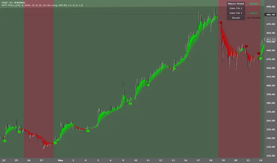
MTF TPSL Scalper System TP/SL Integration [TheScalpingAnt]MTF TPSL Scalper System TP/SL Integration
Credit: Aballard11 (Original Moving Average Shaded Fill Area Crossover Concept & Foundation) Developed / Implemented by: The Scalping Ant
OVERVIEW
MTF-TPSL Enhanced is a professional multi-timeframe TradingView indicator engineered to align macro market bias with micro execution timing, while simultaneously delivering visual trade management via integrated Take-Profit and Stop-Loss projections.
It is a complete execution framework:
• Macro context before entry
• Clean directional bias
• Precision entry timing
• Disciplined risk visualization
Built using an advanced dual-EMA fill model, MTF-TPSL filters noise, aligns directional momentum, and helps traders execute only high-probability opportunities. Whether you are scalping, day trading, or swing trading, this tool delivers the clarity and confidence required for professional-grade decision making.
Works on Forex, Crypto, Indices, Stocks, and Futures on any liquid market.
CORE CONCEPTS
MTF-TPSL is structured around three professional trading pillars:
1) Macro Bias (Higher-Timeframe Context)
A customizable higher-timeframe moving average defines directional bias:
• Bullish macro → long focus
• Bearish macro → short focus
This reduces counter-trend trades and improves directional consistency.
2) Micro Structure (Execution Layer)
On your trading timeframe, the system uses two EMA fill zones:
• EMA Fill 2 → Trend confirmation layer
• EMA Fill 1 → Precision entry timing layer
Signals are generated only when momentum, structure, and macro bias align, significantly improving execution quality.
3) Integrated TP/SL Visualization
Built-in trade projection tools allow you to:
• Input a manual entry price
• Visualize structured Stop-Loss placement
• Project one or multiple Take-Profit levels
This encourages planned trades, not emotional trades.
KEY FEATURES
Multi-Timeframe Intelligence
• Independent Macro and Micro engines
• Adjustable Macro MA length & type (SMA / EMA / WMA / VWMA)
• Dynamic higher-timeframe background bias visualization
Advanced Entry Logic
• Standard EMA alignment + crossover confirmation
• Optional Early Reversal Detection (captures momentum shifts before lagging crossovers)
• Optional Wait-For-Candle-Close confirmation filter
Trade earlier when aggressive. Trade later when conservative. You decide.
Signal Matrix (Optional Professional HUD)
• Real-time validation of Macro + Micro conditions
• Explains why a signal prints or does not
• Excellent for learning, strategy discipline, and confidence building
Signal Matrix – How to Read It
The Signal Matrix does not simply tell you if the market is bullish or bearish. It separates market context from execution timing, which prevents traders from entering too late or during weak signals.
The matrix has two roles:
1️⃣ Market Context (Trend Alignment)
• Macro Trend = Higher-timeframe bias
• EMA Fill 2 = Micro trend confirmation
• EMA Fill 1 = Short-term execution layer
If these are Bullish, the market has bullish structure.
If these are Bearish, the market has bearish structure.
This tells you the environment, not the entry.
2️⃣ Result (Signal Decision)
“Result” only shows LONG or SHORT when a valid trade setup is actually triggered.
A signal requires:
• Macro Trend aligned
• EMA Fill 2 aligned
• EMA Fill 1 alignment
• PLUS a trigger event
o EMA crossover or
o EMA color-shift reversal (if enabled)
o and optionally, candle close confirmation if selected
So you may sometimes see:
• Macro Trend → Bullish
• EMA Fill 2 → Bullish
• EMA Fill 1 → Bullish
• Result → NO SIGNAL
This is correct and intentional.
It means:
The market is bullish, but there is no fresh trade entry yet.
The indicator avoids late entries and only signals when a new high-probability setup forms.
If “Wait for Candle Close” is enabled, signals will only confirm after the bar closes to reduce noise and false entries.
Interpretation Summary
• Bullish + NO SIGNAL = Market is bullish, wait for entry trigger
• Bearish + NO SIGNAL = Market bearish, wait for entry trigger
• LONG = Valid bullish entry setup detected
• SHORT = Valid bearish entry setup detected
This keeps trading disciplined, structured, and prevents emotional entries.
Visual Trade Management
• Dynamic TP/SL Projection System
• Automatically plots:
– Entry reference
– Stop Loss
– TP / TP1 / TP2 levels
• Professional clean color coding
• Works for both Long and Short execution
You do not just enter trades—you execute structured plans.
CUSTOMIZATION
MTF-TPSL adapts to any trading style.
Macro Settings
• Select timeframe (example: 4H or Daily)
• Choose MA type
• Adjust sensitivity
Micro Execution Settings
• Two EMA Fill systems
• Adjustable fast/slow lengths
• Precision momentum logic
Signal Behavior
• Enable Early Reversal Detection
• Enable Candle Close Confirmation
• Toggle entry labels
• Toggle background bias
Risk Settings
• Manual entry input
• Direction selection (Long / Short)
• TP %, TP1 %, TP2 %
• Stop Loss %
• Fully visualized execution roadmap
Everything is transparent. Everything is trader-controlled.
USAGE – HOW TO TRADE WITH IT
1️⃣ Identify Macro Bias
Background color instantly shows market context.
2️⃣ Wait for Micro Alignment
EMA Fill 2 confirms trend
EMA Fill 1 provides execution timing
3️⃣ Enter on Confirmed Signal
LONG or SHORT label appears only when rules align.
4️⃣ Manage Risk Professionally
Activate TP/SL projection
Plan targets
Control risk
This workflow promotes discipline, patience, and consistency.
EXAMPLE SCENARIO
Bullish Setup Example
• Macro timeframe closes above macro MA → bullish bias
• EMA Fill 2 turns bullish → structure confirmed
• EMA Fill 1 shifts bullish → execution timing
• LONG signal appears
• Entry, Stop Loss, TP, TP1, TP2 are automatically visualized
Result:
A clean, structured trade aligned with higher-timeframe direction and supported by visual risk structure.
SETTINGS SUMMARY
Macro Controls
• Timeframe
• MA length & type
Micro Controls
• EMA Fill configurations
• Sensitivity tuning
Signal Filters
• Early Reversal toggle
• Candle Close confirmation
Visual Tools
• Background bias
• Entry labels
• Signal Matrix
Risk Engine
• Entry price
• Direction
• TP / TP1 / TP2
• SL
CONCLUSION
MTF-TPSL Enhanced delivers:
• Higher-timeframe clarity
• Precise execution logic
• Professional trade management
• Customizable flexibility
• Clean presentation and usability
In a world full of distractions, MTF-TPSL provides a structured, disciplined, and professional trading framework. It merges Trend + Momentum + Risk Management into one seamless execution system.
If you want to trade with confidence, structure, and real strategic clarity, this indicator is built for you.
DISCLAIMER
This is an analytical tool, not financial advice.
Trading involves risk and no indicator guarantees results.
Always backtest, practice risk management, and never risk more than you can afford to lose.
Daytrading Suite: Neon TPO + FVG v6.1Here is the summary of the code and the trading guide in English.
---
### 1. Code Summary: What does the chart show?
The script combines three dimensions of trading into a single chart:
* **The Context (TPO / Market Profile - Yesterday):**
* **Gold Zone (Center):** Yesterday's **POC (Point of Control)**. This was the "fairest price". It often acts as a magnet.
* **White Dashed Lines:** The **VAH (Value Area High)** and **VAL (Value Area Low)**. Yesterday, 70% of all trading volume happened between these lines. This is the area of "Balance".
* **The Structure (HTF - 1 Hour+):**
* **Red/Green Boxes (Right Edge):** Automatic **Supply & Demand Zones** based on the 1-hour chart (or your setting). They indicate major resistance and support levels.
* **The Timing (Entries):**
* **Neon FVG Boxes (Small):** "Fair Value Gaps". These represent imbalances in price. If price revisits these, it is often your **entry signal**.
* **Lines (VWAP, EMA, PDH/PDL):** Act as dynamic support and trend indicators.
---
### 2. Trading Strategy: How to use it
Do not just trade every colored spot. You must combine **Location (TPO)** with **Signal (FVG)**.
#### Step A: The Open (Where are we?)
In the morning (or at the US Open), check where the price is relative to the **white TPO lines**.
1. **Inside the White Lines (In Balance):**
* The market is undecided. Expect ranging/choppy behavior.
* **Strategy:** Buy at the bottom edge (VAL), Sell at the top edge (VAH). The target is often the Gold Zone (POC) in the middle.
2. **Outside the White Lines (Imbalance):**
* The market is seeking new prices. Danger of a Trend!
* **Strategy:** If price breaks above VAH and tests it from above -> **Long**. If it breaks below VAL -> **Short**.
#### Step B: The Setup (The High Probability Scenario)
Here is the "Rejection" Setup (Long Example):
1. Price drops to the lower white line (**VAL**) or into a green **Demand Zone**.
2. It bounces (shows a wick).
3. In the process, a small **green Neon FVG** is formed.
4. **Entry:** Limit Order at the top of the Neon FVG.
5. **Target:** The Gold Zone (POC) or the upper white line (VAH).
6. **Stop Loss:** Below the recent swing low.
#### Step C: Warning Signals (When NOT to trade)
* **In "No Man's Land":** If the price is sitting right in the middle between Gold (POC) and White (VAH/VAL), do nothing. The risk is 50/50. Wait until price hits an edge.
* **Against the Flow:** If EMA 9 and 21 are pointing steeply downwards, do not buy blindly at the VAL just because the line is there. Wait for confirmation (FVG).
### Pre-Trade Checklist:
1. **Level:** Am I at a white line (VAH/VAL) or the Gold Zone (POC)?
2. **Structure:** Do I have an HTF Demand/Supply Zone backing me up?
3. **Trigger:** Do I see a Neon FVG pointing in my direction?

Replay CountdownDisplays countdown for current bar in Replay mode.
Optionally also displays the current replay time in the exchange timezone.

Liquidity Hunter [VectorYield]Liquidity Hunter is a technical analysis tool designed to visualize market structure by identifying key liquidity pools—areas where stop-loss and pending orders are typically clustered. This indicator highlights these levels to help traders analyze potential price reaction zones.
What is Liquidity?
In technical analysis, liquidity refers to price levels where significant trading activity has historically occurred or is expected to occur, such as:
Above old Swing Highs (Buy-side liquidity)
Below old Swing Lows (Sell-side liquidity)
Core Features
1. Multi-Type Liquidity Detection
Plots various categories of market structure:
Structural : Swing Highs/Lows (S-H, S-L) and Equal Highs/Lows (EQH, EQL).
Time-Based : Previous Day, Week, and Month Highs/Lows.
Session-Based : High/Low of Asia, London, and New York sessions.
2. Volume-Based Strength
The indicator analyses volume at the pivot point of a swing. Levels marked as High-Strength (⭐) indicate that the pivot was formed with above-average volume relative to the lookback period.
3. Sweep vs. Break Classification
Distinguishes between price interaction types:
Liquidity Sweep (💰): Price wicks through a level but closes within the range.
Structural Break (▶): Price closes firmly beyond the level.
4. Session & Killzone Visuals
Optionally overlays the Asian, London, and New York trading sessions and specific "Killzone" time windows on the chart.
5. Dashboard
An on-screen dashboard displays the nearest bullish and bearish targets, their distance from current price, and their calculated strength status.
Settings & Customization
Pivot Lookback : Adjust the sensitivity of swing detection.
Session Times : Configure custom start/end times and timezones for session overlays.
Visuals : All colors, line styles, and symbols can be toggled or customized in the settings menu.

Moving Avg on all timeframes w/ full controlThis indicator is a multi-moving-average overlay built for intraday traders who want daily context + intraday timing on the same chart. It’s designed to work cleanly on common intraday timeframes like 5-minute, 10-minute, and 65-minute, while still letting you reference your key daily trend levels.
Key ideas
Daily trend context on intraday charts: You can plot moving averages that represent your daily structure (ex: 10/20/50/200) while trading intraday.
Intraday “day-equivalent” moving averages: If you like the Brian Shannon style approach, you can use intraday period equivalents (ex: on 5-min, 5D ≈ 390, 10D ≈ 780, 20D ≈ 1560) so you can “feel” multi-day trend/slope directly on lower timeframes.
Sessions awareness (Premarket + RTH)
Includes session inputs so you can define Premarket (1) and RTH (M) windows.
This helps keep your chart behavior consistent with how you trade (especially if you care about RTH structure vs extended hours).
Each MA slot typically includes:
On/Off toggle (so you can declutter instantly)
Length (any period you want: daily-style or intraday equivalents)
MA type selection (ex: SMA/EMA style options)
Visual controls like line width / style (so your key MA stands out)
Why this is useful
On higher intraday frames (like 65-min) you can track the “intermediate trend” cleanly.
On lower intraday frames (5-min / 10-min) you can time entries/exits while still respecting the bigger MA bias.

Infinity Algo Dashboard█ OVERVIEW
Infinity Algo Dashboard combines 4 powerful modules into one clean overlay: Multi-Timeframe Analysis, Order Blocks, Market Structure (BOS/CHoCH), and Adaptive Cloud Bands.
Monitor 8 timeframes simultaneously, spot supply/demand zones with volume metrics, track structure shifts in real-time, and assess volatility — all without cluttering your chart.
Includes 16+ built-in alert conditions and 17 color themes.
█ KEY FEATURES
✅ Multi-Timeframe Dashboard (8 TFs) — trend + volatility at a glance
✅ Algorithmic Order Blocks / Supply & Demand Zones with volume analysis
✅ Market Structure Labels (BOS / CHoCH) for regime detection
✅ Adaptive Cloud Bands for dynamic support/resistance
✅ 16+ Built-in Alert Conditions for automation
✅ 17 Color Themes including colorblind-friendly options
✅ Designed for crypto, forex, stocks, indices, and commodities
█ WHAT MAKES THIS INDICATOR DIFFERENT
📊 Multi-Timeframe Analysis
Most MTF dashboards just show moving average direction. This one shows trend state + volatility regime + volatility trend across 8 timeframes simultaneously. Spot alignment instantly.
🧱 Smart Order Blocks
Not just rectangles on a chart. These zones include volume metrics (Buy/Sell split), midlines, break detection, and automatic pruning of invalid zones.
📐 Market Structure That Makes Sense
BOS (Break of Structure) and CHoCH (Change of Character) labels derived from actual swing highs/lows — not arbitrary price levels.
☁️ Adaptive Cloud Bands
Volatility-aware envelope that auto-adjusts its period based on your timeframe. Expands in trending markets, contracts in consolidation.
█ MODULES EXPLAINED
1) Multi-Timeframe Dashboard
Monitors up to 8 user-selected timeframes simultaneously
Trend State: Bullish / Bearish / Overbought / Oversold
Volatility State: High / Low / Normal
Volatility Trend: Rising / Falling / Stable
Two visual styles: Pro Neutral (clean) or Semantic Heatmap (color-coded)
AVG row shows overall market bias across all timeframes
2) Order Blocks / Buy-Sell Zones
Algorithmic detection of swing-based supply/demand zones
Volume Metrics: Total volume + Buy/Sell % split inside each zone
Midline: Key level within the zone for precision entries
Break Labels: "Break Up" / "Break Down" when zones are invalidated
Exit Markers: Signals when price leaves a zone (Close or Wick trigger)
Smart Filtering: Show nearest only, hide overlaps, limit history
3) Market Structure (BOS/CHoCH)
BOS (Break of Structure): Trend continuation signal — confirms momentum
CHoCH (Change of Character): Early reversal warning — first sign of regime shift
Derived from pivot highs/lows using configurable sensitivity
Optional candle coloring based on structure bias
4) Cloud Bands (Adaptive Envelope)
Smoothed, volatility-aware channel (Keltner-style with enhancements)
Auto Mode: Period adjusts automatically based on your chart timeframe
Manual Mode: Set your own period for full control
Dynamic midline for trend bias assessment
Edge dots highlight when price touches band boundaries
Great for identifying breakouts vs. mean-reversion setups
█ USE CASES
📈 Trend Confirmation
Check the MTF Dashboard for alignment. When 6+ timeframes agree (Strong Bullish/Bearish), you have confluence. Use Order Blocks as entry zones in the direction of the trend.
📉 Reversal Hunting
Watch for CHoCH labels — they signal potential regime change before the crowd sees it. Combine with Order Blocks for well-defined reversal entries.
🎯 Precision Entries
Use Order Block midlines as entry targets. When price retraces to the midline of an unbroken zone aligned with higher-TF bias, you have a more selective setup.
⚡ Volatility Assessment
Cloud Bands show you the current volatility regime. Price outside bands = trending (ride it). Price inside bands = consolidation (fade the edges or wait).
🤖 Alert Automation
Set alerts for zone breaks, BOS/CHoCH events, MTF alignment shifts, or cloud breakouts. React to opportunities even when away from the screen.
█ HOW TO USE
Apply to your chart (any timeframe, any market)
Configure your 8 dashboard timeframes (e.g., 1m/5m/15m/1h/4h/1D/1W/1M)
Watch for MTF alignment — strong alignment = cleaner directional bias
Use Order Blocks as "areas of interest" — prefer zones aligned with HTF bias
Monitor BOS/CHoCH for structure shifts — CHoCH = warning, BOS = confirmation
Use Cloud Bands to assess volatility — outside = trending, inside = ranging
Set alerts for the events that matter to your strategy
█ ALERTS
16+ built-in alert conditions:
Order Blocks: Zone breaks, zone entries, zone exits
Market Structure: Bullish/Bearish BOS, Bullish/Bearish CHoCH
MTF Alignment: Strong bullish/bearish (6+), Full alignment (8/8)
MTF Bias Flip: When average bias crosses bullish/bearish threshold
Cloud Events: Breakout up/down, Midband cross up/down
█ WORKS ON
Crypto
Forex
Stocks
Indices
Commodities
█ REALISTIC EXPECTATIONS
Order Blocks are algorithmic approximations — not true order flow data
BOS/CHoCH labels update on confirmed swings — some lag is expected
MTF alignment doesn't guarantee direction — it shows current state
Always combine dashboard insights with your own analysis and risk management
█ LIMITATIONS
Order Blocks are derived from swing behavior + volume — not actual institutional order flow
Zones/labels can update on the realtime candle until the swing is confirmed
Performance may slow with max history on low timeframes — reduce settings if needed
MTF data updates on higher-TF bar closes — slight delay is normal
█ DISCLAIMER
This indicator is provided for educational and informational purposes only and does not constitute financial advice. Trading involves substantial risk of loss, and you are solely responsible for your own trading decisions.


True Daily EMAs (4) on Any ChartIt calculated the 4 EMAs based on days as input. Even on a weekly or monthly chart it shows 20/50/100/200 Day EMAs. Changing the time frame of chart does not effect the EMAs
Statistical Deviation per AssetINDICATOR: STATISTICAL DEVIATION PER ASSET (SDPA)
1. Overview
The Statistical Deviation per Asset (SDPA) is a quantitative analysis tool designed to measure the strength and exhaustion of price movements. Unlike standard oscillators (like RSI ), the SDPA calculates the actual percentage deviation from the most recent pivot point (High or Low) and compares it against historical performance averages specific to each asset.
---
2. Core Logic & Calculation
The script operates on a Mean Reversion principle. It assumes that every asset (Gold, Bitcoin, Ethereum, etc.) has a unique "volatility signature" depending on the timeframe.
* Dynamic Pivot Detection : The indicator identifies recent Swing Highs and Swing Lows using an adaptive lookback period.
* Real-Time Return Calculation : Once a pivot is confirmed, the script calculates the real-time percentage gain (from a Low) or loss (from a High).
* Zero-Indexed Histogram : This return is plotted as an oscillator centered around a Zero Line , representing the current trend's progress since the last reversal.
---
3. Adaptive Intelligence (Multi-Asset & Multi-TF)
The SDPA is pre-loaded with a statistical database. It automatically adjusts its sensitivity and thresholds based on:
1. The Selected Asset : Whether trading XAUUSD , Bitcoin , or Solana , the deviation thresholds adapt to the specific volatility of that instrument.
2. The Timeframe (TF) : The calculation period ( period ) and performance targets ( hausse_perf / baisse_perf ) change dynamically. For example, a 1-minute scalping setup uses a longer lookback (200) compared to a Daily swing setup (10).
---
4. Visual Anatomy
The interface is designed for instant "at-a-glance" interpretation:
* The Histogram :
* Green : Price is trending up since the last Swing Low .
* Red : Price is trending down since the last Swing High .
* Threshold Lines (The Statistical Averages) :
* Thick Line (60% Opacity) : Represents the Average Historical Deviation . When the histogram hits this line, the move is considered "statistically mature."
* Thin Line (70% Opacity) : Represents the Strong Deviation Zone (1.5x the average), indicating extreme momentum or potential exhaustion.
* Background Highlighting : The chart background colors automatically when the price exceeds historical averages, signaling a High-Probability Reversal Zone .
---
5. How to Trade with SDPA
* Trend Maturity : If the histogram exceeds the Bullish Average (Green line), the current move has reached its typical historical limit. Traders should look for take-profit opportunities or wait for a reversal.
* Impulse Strength : A rapid move from the Zero Line toward the thresholds confirms strong institutional interest.
* Mean Reversion : When the histogram reaches the Strong Zone (1.5x), the price is "overextended" statistically, offering a high reward-to-risk ratio for counter-trend setups.
---
6. Technical Parameters
* Asset Choice : Dropdown menu to select the specific asset.
* Colors : Customizable Bullish and Bearish colors to match any UI theme.
* Precision : Set to 4 decimal places to ensure accuracy across all asset types.

Fair Value Gap [Tradeuminati]Fair Value Gap
Fair Value Gap is a clean and rule-based Fair Value Gap indicator for TradingView, designed to display only valid and confirmed Fair Value Gaps (FVGs) and Inverted Fair Value Gaps (iFVGs).
The indicator is built on a strict 3-candle FVG definition and operates exclusively on candle close, ensuring no repainting and no premature signals.
🔹 Key Features
Valid Fair Value Gaps (FVG)
- Detects bullish and bearish Fair Value Gaps using a precise 3-candle structure
- FVGs are only plotted after the confirming candle has closed
- A Fair Value Gap remains visible only as long as it is valid
- Once price closes beyond the FVG, it is removed or converted
Inverted Fair Value Gaps (iFVG)
- When a valid FVG is invalidated by a candle close, it can be converted into an iFVG
- iFVGs retain the original price range and structure
- Only valid iFVGs are displayed
- As soon as price closes through an iFVG, it is automatically removed
Clean & Controlled Visualization
- Only the last N active FVGs are displayed (bullish + bearish combined)
- Only the last N valid iFVGs are shown
- Boxes automatically extend to the current price + configurable bars
- Labels are dynamically positioned at the right edge of each zone
🔹 Technical Notes
- No repainting
- No intrabar signals
- Close-based validation only
- Works on all markets and timeframes
- Lightweight and performance-friendly
⚠️ Disclaimer
This indicator is for technical analysis purposes only and does not constitute trading or investment advice.

Look Back Calculator Custom Lookbacks with Individual Colors (Accurate on All Timeframes)
A clean, monochrome-grey indicator that displays historical closing price levels from user-defined lookback periods.
Key Features:
• 4 Custom Hourly Levels (e.g., 1.5h, 3h, 6h, 9h or any value you choose) – fully accurate on 15-minute and lower timeframes
• 4 Custom Daily Levels (e.g., 20d, 40d, 60d, 90d or any number of days)
• Independent toggle for each level
• Individual color selection for every vertical line
• Table column backgrounds match the selected vertical line colors
• Optional candle highlighting (background/border/both) at lookback bars
• Dashed vertical lines at lookback points (toggleable)
• Current price row with automatic spanning
• Time row shown only for daily levels (cleaner layout for intraday)
• Alerts on price crossing any enabled level (with dynamic messages)
• Compact mode for shorter labels
Perfect for support/resistance analysis, order flow, or ICT/SMC concepts. Works seamlessly on any timeframe, including 15min charts.

Market Return Analyzerمؤشر محلل عوائد السوق يعرض أداء الأصل المالي عبر عدة فترات زمنية (يومي، أسبوعي، شهري، سنوي، وطويل الأجل) في جدول واضح وقابل للتخصيص مباشرة على الشارت، لمساعدة المتداول على اتخاذ قرارات أسرع وأكثر دقة
Market Return Analyzer displays multi-timeframe performance (Daily, Weekly, Monthly, YTD, and Long-Term returns) in a clean, customizable table directly on your chart.
Designed for traders and investors who want quick performance insights without clutter

Batik Lite BATIK INDICATOR LITE — the Syndicate’s silent signal for clean, high-probability zones. No noise. No drama. Just zones.
What is BATIK?
BATIK stands for:
Balance • Accuracy • Timing • Intelligent • Konsistent
It’s a proprietary zone concept designed to highlight areas where price is most likely to react, reverse, or continue after confirmation — so you can wait for the retest and move like a professional, not a chaser.
What this Lite version does
Marks BATIK B (Buy Zone) & BATIK S (Sell Zone) after confirmation
Draws a clean zone box based on the key candle and extends it up to 55 bars
Keeps your chart clean: only 10 previous zones + 1 current zone
Built for fast reading and sniper-style planning
Performance Claim
BATIK is known in the community for a high win-rate, with a claimed up to 98% when used with proper filtering, discipline, and risk management.
Results may vary. Trading is risky — manage risk like a boss.
Recommended Timeframe
✅ M5 and above
🏆 M5 is reported as the highest win-rate timeframe for BATIK-style execution.
Market Coverage
✅ Can be used on all available charts and pairs in the market
(Forex, Gold, Crypto, Indices — wherever your chart lives.)
Pricing (Subscription / Access)
MYR 150 / month
MYR 750 / 6 months
MYR 1200 / year
Request Access / Support
Email: castcallasia@gmail.com
WhatsApp: +60179999109

The Navigator Fortress (ORB M15 + H4 Filter)To read The Navigator Fortress (v1.4), you simply follow a "top-down" sequence of filters. It moves from the macro-trend (The Compass) to the local boundary (The Harbor) and finally to your execution signal (The Beam).
1. The H4 Compass (The Strategy Filter)
Before you look at the price, look at the Dashboard in the top-right corner.
🧭 COMPASS: BULLISH (Blue): The "Big Ships" are moving up. You are only authorized to take LONG breakouts.
🧭 COMPASS: BEARISH (Orange): The "Big Ships" are moving down. You are only authorized to take SHORT breakouts.
🧭 COMPASS: IN JAWS (Gray): Price is stuck between the H4 10 and 50 EMAs. This is "The Fog." Do not trade, as the win rate drops significantly in this zone.
2. The M15 Harbor (The Field of Play)
At 8:45 AM CST, the script will finish drawing two horizontal lines:
Blue Line (Top): The high of the 8:30–8:45 AM window. This is your resistance wall.
Orange Line (Bottom): The low of that same window. This is your support floor.
The Rule: You are waiting for a candle to close completely outside these lines. A "wick" poking through is not a signal; it is a trap.
3. The Beam & State (The Execution)
When a valid breakout happens that matches your H4 Compass:
The Label: A label will appear above or below the candle saying "LONG" or "SHORT".
The Background: The entire chart background will turn faint Blue or Orange. This tells you the "Harbor is Open" in that direction until the 10:00 AM CST session close.
The Moat (Stop Loss): Check your Alerts tab or phone notification. The script will give you a specific price (e.g., 1.08552). This is your 2.0x ATR "Moat"—place your stop loss here to stay safe from market noise.
🛡️ Summary of the Workflow
Check Compass: Is it Blue, Orange, or Gray?
Wait for 8:45: Let the M15 Harbor lines form.
Wait for the Beam: Did a candle close outside the line?
Drop Anchor: Execute the trade, set your stop at the "Moat" price from the alert, and aim for the next major Daily S/R level or a 2:1 reward.

pD Zones [MMT]pD Zones plots a clean set of intraday high‑of‑day (HOD) and low‑of‑day (LOD) zones that automatically extend forward, flip color on mitigation, and archive as historical levels for context. It is designed to give intraday traders a simple visual map of premium/discount zones derived from a chosen calculation timeframe.
Overview
Objective : Highlight the current day’s HOD/LOD wick zones as actionable intraday support and resistance.
Core logic runs on a user‑selectable source timeframe (default 15m), then projects those zones onto any chart you are trading.
Zones extend into the future, react to price via mitigation logic, and then optionally roll into a dimmed historical layer.
Zone logic
Each session, the script tracks the extreme high and low plus their wick limits (open/close‑based) on the source timeframe to form two intraday zones.
When a new day starts, the finalized prior‑day zones are “locked in” and the current day begins tracking a fresh HOD/LOD pair.
Only one HOD and one LOD zone are created per day, reducing clutter and keeping focus on the most relevant levels.
Mitigation & color flips
Active HOD zones behave as resistance: a decisive break above the top of the box flips it to a bullish (supportive) color profile, while a move back below can re‑flip it.
Active LOD zones behave as support: a break below the bottom of the box flips it to a bearish profile, and a sustained reclaim can re‑flip it as well.
Once mitigated and carried into a new day, zones are restyled with a softer historical color so they remain visible but unobtrusive.
Alerts
When price breaks a HOD zone to the upside, the script can trigger an alert message noting that HOD resistance has been broken and showing the exact level.
When price breaks a LOD zone to the downside, an alert notes that LOD support has been broken, again with the precise price printed.
These alerts are meant for intraday confirmation of structure shifts at key daily extremes, rather than frequent scalper signals.
Inputs & customization
- Calculation Timeframe: choose which timeframe defines the daily HOD/LOD zones (e.g., 5m, 15m, 1h), independent from the chart.
- Visual Settings: customize support/resistance fill colors and border color to integrate with existing layouts.
- Logic Settings:
Max Active Zones: cap how many live zones remain on the chart at once to control noise.
Max Historical Zones: keep only the most recent historical levels or show all past days.
Zone Extension Offset (Bars): control how aggressively boxes project into the future.
- Mitigation Settings: choose the historical zone color to distinguish active levels from archived ones at a glance.

Techno Signals Pro ⚡ QUICK SETUP
FOR BEGINNERS:
Keep all defaults
Trade only A+ signals
Use provided TP/SL levels
Wait for volume confirmation
FOR ADVANCED:
Adjust confluence threshold (higher = fewer but better signals)
Toggle divergence optional for more flexibility
Use MTF alignment for higher timeframes
Enable slippage buffer for realistic risk
🚀 GETTING STARTED
Add indicator to your chart
Check table for current signal
Verify conditions match your timeframe
Set orders at TP/SL levels
Manage trade according to grade
Remember: No indicator is perfect. Always use proper risk management and combine with price action confirmation. Start with paper trading to understand the system before real money.
