QMF- Market Structure & Signal Suite [BullByte]QUANTUM MOMENTUM FUSION - Market Structure and Signal Suite
OVERVIEW
Quantum Momentum Fusion is a comprehensive market analysis framework built around a multi-dimensional momentum oscillator. This indicator was designed to give traders a complete analytical workspace in a single tool, combining momentum measurement, market structure identification, trendline analysis, divergence detection, and multi-timeframe context into one unified system.
The core philosophy behind QMF is that successful trading decisions come from understanding multiple aspects of market behavior simultaneously, not from relying on any single indicator or signal. The oscillator serves as the analytical foundation, and every other component builds upon it to create a complete picture of current market conditions.
This description will walk through each component of the indicator, explaining what it measures, why that information matters, and how to interpret what you see on the chart. Whether you are an experienced trader familiar with oscillator analysis or newer to technical indicators, each section aims to make the concepts accessible and practical.
THE QUANTUM ENGINE: UNDERSTANDING THE CORE OSCILLATOR (why its original and not a mashup)
At the heart of this indicator is the Quantum Momentum Fusion oscillator, displayed in its own pane below the price chart. Unlike traditional oscillators that measure a single aspect of price behavior, the QMF oscillator synthesizes four distinct market dimensions into one unified reading.
WHAT IS AN OSCILLATOR
For those less familiar with the term, an oscillator is a technical indicator that fluctuates between defined boundaries, typically showing whether an asset is experiencing strong buying pressure, strong selling pressure, or neutral conditions. The QMF oscillator moves between 0 and 100, with 50 representing the neutral midpoint.
When the oscillator is high (above 70), it suggests the market has experienced significant upward momentum and may be approaching exhaustion. When low (below 30), it suggests the market has experienced significant downward momentum and may be due for a bounce. The space between these extremes represents normal market fluctuation.
THE FOUR DIMENSIONS
What makes the QMF oscillator different from standard momentum indicators is that it combines four separate measurements into its calculation. Each dimension captures a different aspect of market behavior:
VELOCITY DIMENSION
This measures how quickly momentum itself is changing. Think of it like acceleration in a car. Knowing the car is moving forward (direction) is useful, but knowing whether the driver is pressing the accelerator or the brake (acceleration) tells you what is likely to happen next. The velocity dimension calculates the rate of change of the rate of change, providing early warning when momentum is about to shift direction. In practical terms, this can show momentum weakening before price actually reverses.
Why it matters: Price can continue in one direction for a while even after the underlying momentum starts to fade. By measuring acceleration, you can identify potential turning points earlier than with simple momentum indicators.
How it appears: This dimension is calculated internally and combined with the others. You do not see it separately, but its effect shows in the oscillator responding earlier to momentum shifts.
VOLUME DIMENSION
This measures price movement weighted by trading volume. A price move accompanied by high volume has different significance than the same price move on low volume. High volume suggests conviction and participation from larger traders. Low volume suggests the move may lack follow-through.
The volume dimension multiplies price change by a volume ratio (current volume compared to average volume), giving greater weight to moves that have volume confirmation behind them.
Why it matters: Volume often precedes price. Strong volume on a move suggests institutional participation and increases the probability that the move will continue. Weak volume on a move suggests it may be easily reversed.
How it appears: Moves with strong volume conviction will push the oscillator more definitively, while low-volume moves will have muted effect on the reading.
VOLATILITY DIMENSION
This normalizes price movement against the current volatility environment. Markets go through periods of high volatility (large price swings) and low volatility (small price swings). A 1% move during a low volatility period is more significant than a 1% move during a high volatility period.
The volatility dimension divides price change by Average True Range (ATR), which measures typical price range. This tells you whether current movement is significant relative to what is normal for this market right now.
Why it matters: Without volatility normalization, the oscillator would react the same way to all price moves regardless of context. By adjusting for volatility, the oscillator identifies moves that are genuinely significant versus normal noise within the current regime.
How it appears: During quiet markets, smaller price moves can still register as significant if they exceed normal volatility. During volatile markets, the oscillator will not overreact to moves that are within expected range.
SESSION DIMENSION
This tracks where price is positioned relative to the session Volume Weighted Average Price (VWAP). VWAP represents the average price at which trading has occurred during the session, weighted by volume. Institutional traders often use VWAP as a benchmark for fair value.
When price is consistently above VWAP, it suggests buyers are willing to pay above average prices, indicating accumulation. When price is consistently below VWAP, it suggests sellers are accepting below average prices, indicating distribution.
Why it matters: VWAP positioning provides insight into whether institutional traders are likely accumulating or distributing. Price repeatedly returning to and bouncing from VWAP can indicate support, while price repeatedly failing at VWAP can indicate resistance.
How it appears: The session dimension contributes bullish readings when price maintains above VWAP and bearish readings when price maintains below VWAP.
ADAPTIVE WEIGHTING
The four dimensions are combined using configurable weights, and the system can operate in Adaptive Mode. When Adaptive Mode is enabled, the indicator automatically adjusts its sensitivity based on the current volatility regime. During high volatility periods, sensitivity increases to capture larger moves. During low volatility periods, sensitivity decreases to filter out noise.
This means the oscillator adapts to changing market conditions without requiring manual adjustment.
READING THE OSCILLATOR: DISPLAY MODES AND ZONES
The QMF oscillator can be displayed in four different visual formats. Each shows the same underlying data but presents it differently based on trader preference.
ENERGY CANDLES
This mode displays the oscillator as candlestick-style candles. Just as price candles show open, high, low, and close for price, energy candles show these values for the QMF oscillator.
Green candles indicate the oscillator closed higher than it opened (bullish momentum). Red candles indicate the oscillator closed lower than it opened (bearish momentum). The body size shows how much the oscillator moved during the period. Larger bodies indicate stronger momentum conviction.
This format is useful for traders who are comfortable reading candlestick patterns and want to apply similar visual analysis to the oscillator.
QMF LINE
This mode displays the oscillator as a traditional line chart with a signal line overlay. The main QMF line shows current momentum. The signal line is a smoothed average of the QMF that helps identify direction changes.
When the QMF line is above the signal line, momentum is bullish. When below, momentum is bearish. Crossovers between the two lines can indicate momentum shifts.
This format is familiar to traders who use indicators like MACD and prefer clean line-based visualization.
IMPULSE BARS
This mode displays the oscillator as a histogram centered on the 50 midline. Bars above 50 indicate bullish momentum, bars below 50 indicate bearish momentum. Bar height shows momentum strength.
The color intensity changes based on momentum direction. Bars that are increasing in the bullish direction show brighter color. Bars that are decreasing show muted color. This makes it easy to see momentum acceleration and deceleration at a glance.
HEIKIN FLOW
This mode applies Heikin-Ashi smoothing to the energy candles. Heikin-Ashi is a Japanese technique that averages price data to create smoother trends with fewer reversals.
The result is cleaner visual trends that are easier to follow, though with slightly more lag than standard energy candles. This format is useful for identifying sustained momentum moves without getting distracted by minor fluctuations.
OSCILLATOR ZONES
Regardless of display mode, the oscillator pane includes horizontal reference lines that define important zones:
Midline at 50: The neutral point. When the oscillator is above 50, overall momentum is bullish. When below 50, overall momentum is bearish.
Overbought level at 70: When the oscillator crosses above this level, the market is showing strong bullish momentum. However, this also means prices have risen significantly and bearish reversal probability increases the longer the oscillator stays elevated.
Oversold level at 30: When the oscillator crosses below this level, the market is showing strong bearish momentum. However, this also means prices have fallen significantly and bullish reversal probability increases.
Extreme overbought at 85: Maximum bullish exhaustion. At this level, almost all short-term buying pressure has been expended. Reversal probability is high.
Extreme oversold at 15: Maximum bearish exhaustion. At this level, almost all short-term selling pressure has been expended. Reversal probability is high.
Understanding these zones helps you assess the current market condition before looking at any other indicator components.
MARKET STRUCTURE: DYNAMIC SUPPORT AND RESISTANCE
The second major component of the indicator is market structure analysis through dynamic support and resistance levels. Unlike price-based support and resistance, these levels are calculated directly on the oscillator.
WHAT ARE OSCILLATOR-BASED S/R LEVELS
When the QMF oscillator reaches a high point and then reverses lower, that high point becomes a resistance level on the oscillator. When the oscillator reaches a low point and then reverses higher, that low point becomes a support level.
These levels represent momentum thresholds that the market has previously found difficult to exceed. They answer the question: At what momentum reading has the oscillator historically reversed?
WHY THIS MATTERS
Oscillator support and resistance provides different information than price support and resistance. Price S/R tells you where buyers and sellers have previously entered the market. Oscillator S/R tells you what level of momentum the market has been able to sustain.
If the oscillator approaches its resistance level, it suggests momentum is reaching the upper bounds of what has been achievable recently. Either momentum will break through (indicating unusually strong conditions) or it will reverse (indicating normal mean reversion).
Similarly, if the oscillator approaches support, it suggests momentum is reaching exhaustion levels that have previously triggered bounces.
HOW IT APPEARS ON THE CHART
Resistance is displayed as a horizontal red line with a RES label on the oscillator pane. Support is displayed as a horizontal cyan line with a SUP label. These lines update dynamically as new pivots form.
When the oscillator breaks through these levels, markers appear:
R with up arrow: Resistance level broken, indicating unusually strong bullish momentum
S with down arrow: Support level broken, indicating unusually strong bearish momentum
R with checkmark: Resistance held, price rejected at this level
S with checkmark: Support held, price bounced from this level
The dashboard also shows current S/R status: whether the oscillator recently broke resistance, broke support, is currently at resistance, is currently at support, or is in clear space between levels.
AUTOMATED TRENDLINES: MOMENTUM TREND STRUCTURE
The third major component is automated trendline detection on the oscillator. This identifies trending behavior in momentum itself, separate from price trends.
WHAT ARE OSCILLATOR TRENDLINES
Just as you can draw trendlines on a price chart connecting swing lows (uptrend) or swing highs (downtrend), the indicator draws trendlines on the oscillator connecting pivot points.
Support trendlines connect oscillator pivot lows and project forward with a flat or rising slope. These show upward trending momentum where each pullback finds support at a higher level.
Resistance trendlines connect oscillator pivot highs and project forward with a flat or falling slope. These show downward trending momentum where each rally faces resistance at a lower level.
WHY THIS MATTERS
Price trends and momentum trends do not always align. Price can continue making higher highs while momentum makes lower highs, a condition called bearish divergence. Momentum trendlines help visualize this behavior.
When momentum is making higher lows (rising support trendline), it suggests underlying strength even if price is consolidating. When momentum is making lower highs (falling resistance trendline), it suggests underlying weakness even if price is holding.
Breaks of these trendlines often precede price moves. If a falling momentum resistance trendline breaks upward, it suggests bearish pressure is releasing and bullish momentum may follow. If a rising momentum support trendline breaks downward, it suggests bullish pressure is failing and bearish momentum may follow.
HOW IT APPEARS ON THE CHART
Support trendlines appear in blue/cyan, resistance trendlines appear in pink/magenta. Lines extend forward from the most recent pivot point to show projected levels.
Small circle markers can optionally appear at each pivot point used to construct the trendlines, helping you verify the anchor points.
When the oscillator breaks through a trendline, markers appear:
TL with up arrow: Resistance trendline broken upward (bullish breakout)
TL with down arrow: Support trendline broken downward (bearish breakdown)
Trendline strength is calculated based on three factors: how many pivot points validate the line, how recently it formed, and the angle of the slope. Stronger trendlines have more touches, formed recently, and have moderate slopes. You can filter trendlines by strength to show only the most significant ones.
Optional trendline zones can display a shaded area around each trendline rather than just a single line, showing a zone of influence rather than a precise level.
DIVERGENCE: WHEN PRICE AND MOMENTUM DISAGREE
The fourth major component is divergence detection, which identifies discrepancies between price action and oscillator behavior.
WHAT IS DIVERGENCE
Divergence occurs when price makes a new high or low, but the oscillator fails to confirm it. This disagreement between price and momentum often precedes reversals.
There are four types of divergence:
REGULAR BULLISH DIVERGENCE
Price makes a lower low (new low point below the previous low), but the oscillator makes a higher low (its low point is above its previous low). This suggests that despite price going lower, selling momentum is actually weakening. The implication is that sellers are losing conviction and a bounce or reversal may be approaching.
Visual example: Imagine price drops from 100 to 95, bounces to 97, then drops again to 93. At the same time, the oscillator drops to 25, bounces to 35, then drops only to 30. Price made a lower low (93 vs 95) but the oscillator made a higher low (30 vs 25). This is regular bullish divergence.
REGULAR BEARISH DIVERGENCE
Price makes a higher high (new high point above the previous high), but the oscillator makes a lower high (its high point is below its previous high). This suggests that despite price going higher, buying momentum is actually weakening. The implication is that buyers are losing conviction and a pullback or reversal may be approaching.
HIDDEN BULLISH DIVERGENCE
Price makes a higher low (its low point is above its previous low), but the oscillator makes a lower low (new low below its previous low). This occurs during uptrends and suggests the trend will continue. Price is holding higher but momentum briefly dipped further, indicating a temporary pullback within a larger uptrend.
HIDDEN BEARISH DIVERGENCE
Price makes a lower high (its high point is below its previous high), but the oscillator makes a higher high (new high above its previous high). This occurs during downtrends and suggests the trend will continue. Price is staying lower but momentum briefly spiked higher, indicating a temporary bounce within a larger downtrend.
Regular divergence suggests reversal. Hidden divergence suggests continuation.
HOW IT APPEARS ON THE CHART
When divergence is confirmed, labels appear on the oscillator:
BULL DIV: Regular bullish divergence confirmed
BEAR DIV: Regular bearish divergence confirmed
H-BULL: Hidden bullish divergence confirmed
H-BEAR: Hidden bearish divergence confirmed
Dotted lines connect the pivot points on the oscillator to show the divergence pattern. Regular divergence uses solid colored lines, hidden divergence uses dashed lines.
The dashboard shows divergence status in real-time:
CHECKING BULL: A potential bullish divergence pattern is forming but not yet confirmed
CHECKING BEAR: A potential bearish divergence pattern is forming but not yet confirmed
BULL CONFIRMED: Bullish divergence has been validated
BEAR CONFIRMED: Bearish divergence has been validated
NONE: No divergence currently active
Divergence strength is calculated from the magnitude of the oscillator discrepancy. Only divergences meeting the minimum strength threshold are displayed to filter out minor, less significant patterns.
FLOW RIBBONS: VISUALIZING MOMENTUM ALIGNMENT
The fifth major component is the Flow Ribbon system, which displays multiple moving averages of the QMF oscillator to visualize momentum trend and alignment.
WHAT ARE FLOW RIBBONS
Flow ribbons consist of three Exponential Moving Averages (EMAs) applied to the QMF oscillator values. Think of them as smoothed versions of the oscillator at different speeds:
Fast Ribbon : Responds quickly to momentum changes, showing recent momentum direction
Medium Ribbon: Balances responsiveness with smoothness, showing intermediate momentum
Slow Ribbon: Moves slowly and shows longer-term momentum context
When these three lines are plotted together with filled area between them, they create a visual ribbon that expands and contracts based on momentum conditions.
WHY RIBBON ALIGNMENT MATTERS
The relationship between these three averages tells you about momentum structure:
BULLISH ALIGNMENT (Fast above Medium above Slow)
When the ribbons are stacked with fast on top, medium in middle, and slow on bottom, momentum is aligned bullishly across multiple timeframes. Short-term momentum leads, with medium and long-term momentum confirming. This is the strongest bullish configuration.
BEARISH ALIGNMENT (Fast below Medium below Slow)
When the ribbons are inverted with fast on bottom, medium in middle, and slow on top, momentum is aligned bearishly across multiple timeframes. Short-term momentum leads downward, with medium and long-term momentum confirming. This is the strongest bearish configuration.
MIXED/TRANSITIONING
When the ribbons are not properly stacked, momentum is in transition. This often occurs during consolidation, trend changes, or choppy conditions. Trading during mixed ribbon states carries higher uncertainty.
RIBBON EXPANSION AND CONTRACTION
Beyond alignment, the distance between the fast and slow ribbon provides additional information:
EXPANDING RIBBON
When the gap between fast and slow ribbon is increasing, momentum is accelerating. In a bullish alignment with expansion, upward momentum is strengthening. In a bearish alignment with expansion, downward momentum is strengthening. Expansion confirms trend conviction.
CONTRACTING RIBBON
When the gap between fast and slow ribbon is decreasing, momentum is decelerating. The current trend may be losing steam. Contraction often precedes consolidation or reversal. It serves as an early warning that the current move may be exhausting.
HOW IT APPEARS ON THE CHART
The fast ribbon appears as a thicker line, the slow ribbon as a thinner line. The area between them fills with color:
Green fill: Bullish ribbon alignment
Red fill: Bearish ribbon alignment
Gray fill: Neutral or transitioning state
The dashboard shows ribbon state as BULL, BEAR, or NEUT, and indicates whether ribbons are expanding (EXP) or contracting (CON).
Ribbon crossovers occur when the fast ribbon crosses the slow ribbon, signaling potential momentum shifts. These crossovers are confirmed only after the bar closes to prevent false signals from intrabar movement.
REVERSAL CLOUDS: PROBABILITY ZONES
The sixth major component is the Reversal Cloud system, which visualizes zones where momentum reversals have elevated probability.
WHAT ARE REVERSAL CLOUDS
Reversal clouds are shaded areas around the QMF oscillator that indicate probability zones for mean reversion. They answer the question: How far from average has momentum extended, and what is the probability it will revert?
When the oscillator moves far from its normal range, it creates stretched conditions. Like a rubber band pulled to its limit, the probability increases that it will snap back toward center. Reversal clouds visualize these stretched conditions.
CLOUD CALCULATION METHODS
Five different calculation methods are available, each with different characteristics:
DYNAMIC BOLLINGER
Uses statistical standard deviation to create bands that adapt to oscillator volatility. When the oscillator is volatile, bands widen. When the oscillator is calm, bands narrow. This method identifies moves that are statistically significant relative to recent oscillator behavior.
GOLDEN RATIO
Applies Fibonacci proportions (0.214 and 0.786) to the oscillator range. These ratios appear throughout nature and markets. Some traders believe these proportions have psychological significance in market behavior.
ADAPTIVE HALO
Scales cloud width based on price ATR rather than oscillator volatility. This connects cloud width to actual price volatility, making the clouds wider during volatile price action and narrower during calm periods.
VOLATILITY SQUEEZE
Uses short-term standard deviation to create bands that contract during low volatility and expand during high volatility. This method is particularly useful for identifying potential breakout conditions when volatility is compressed.
ICHIMOKU RSI
Applies concepts from Ichimoku Kinko Hyo equilibrium theory to create balanced zones. Uses multiple lookback periods to establish equilibrium levels where the oscillator tends to find balance.
HOW TO READ THE CLOUDS
The oscillator moves through the cloud area as momentum fluctuates:
When QMF enters the upper cloud region, it indicates extended bullish momentum. The higher into the cloud, the greater the probability of bearish reversal through mean reversion.
When QMF enters the lower cloud region, it indicates extended bearish momentum. The deeper into the cloud, the greater the probability of bullish reversal through mean reversion.
Cloud opacity adjusts based on reversal probability. More opaque coloring indicates higher reversal probability. Subtle coloring indicates lower reversal probability.
IMPORTANT UNDERSTANDING
Clouds show probability zones, not certainty. Price can remain in extreme zones longer than expected, particularly during strong trends. Clouds are most useful when combined with other components like divergence, S/R breaks, and ribbon alignment rather than used in isolation.
MULTI-TIMEFRAME ANALYSIS: SEEING THE BIGGER PICTURE
The seventh major component is Multi-Timeframe (MTF) analysis, which calculates QMF values across multiple timeframes to assess momentum alignment at different time perspectives.
WHY MULTIPLE TIMEFRAMES MATTER
The timeframe you trade on shows only one perspective of market momentum. A bullish signal on a 15-minute chart may occur within a larger bearish trend on the 4-hour chart. Understanding momentum context from higher timeframes helps you assess whether you are trading with or against the larger flow.
When multiple timeframes align in the same direction, the probability of a successful trade increases. When timeframes conflict, the situation is more uncertain and requires additional caution.
HOW MTF ANALYSIS WORKS
The indicator calculates the full QMF oscillator independently on four configurable timeframes. By default, these are set to 5-minute, 15-minute, 60-minute (1 hour), and 240-minute (4 hour), but you can configure them to any timeframes that suit your trading style.
For each timeframe, the system determines the current momentum bias:
OB - Overbought: QMF above 70, indicating extended bullish momentum that may reverse
B+ - Strong Bullish: QMF above 55 and above its signal line, indicating solid bullish momentum
B - Bullish: QMF above its signal line, indicating mild bullish momentum
N - Neutral: QMF near 50 with no clear direction
S - Bearish: QMF below its signal line, indicating mild bearish momentum
S+ - Strong Bearish: QMF below 45 and below its signal line, indicating solid bearish momentum
OS - Oversold: QMF below 30, indicating extended bearish momentum that may reverse
ALIGNMENT SCORING
The dashboard displays an alignment score showing how many of the four timeframes agree with each directional bias. This appears as a fraction like 3/4 or 2/4.
4/4 Bullish: All four timeframes show bullish readings - maximum bullish alignment
3/4 Bullish: Three timeframes bullish, one diverging - strong bullish alignment
2/4: Split between bullish and bearish - no clear alignment, use caution
3/4 Bearish: Three timeframes bearish, one diverging - strong bearish alignment
4/4 Bearish: All four timeframes show bearish readings - maximum bearish alignment
Higher alignment scores indicate more reliable momentum context. Trading with 3/4 or 4/4 alignment in your favor provides better odds than trading against alignment or during mixed conditions.
NON-REPAINTING MTF DATA
The multi-timeframe data uses proper request.security settings with lookahead disabled and gaps handled correctly. This ensures the MTF readings you see in backtesting match what you would see in real-time trading, with no future data leakage that could create misleading results.
LIVE MOMENTUM SCORING: REAL-TIME MARKET ASSESSMENT
The eighth major component is the Live Momentum Scoring system, which provides continuous real-time feedback on current market conditions.
WHAT IS LIVE MOMENTUM SCORING
Unlike signals which only appear when specific patterns complete, live momentum scores update every bar to show the current balance between bullish and bearish factors. This answers the question: Right now, how do the bullish factors compare to the bearish factors?
The system evaluates six categories for each direction and adds up points:
ZONE POSITION (0-25 points)
Rewards positioning in favorable oscillator zones. Deep oversold positioning adds points to the bullish score. Deep overbought positioning adds points to the bearish score. Extreme zones receive maximum points, moderate zones receive partial points, neutral zones receive zero.
DIVERGENCE (0-20 points)
Rewards active or forming divergence patterns. Confirmed divergence receives full points. Forming (checking) divergence receives partial credit. No divergence receives zero points.
TREND ALIGNMENT (0-20 points)
Rewards proper EMA stacking and trend MA positioning. Full bullish EMA stack (fast above medium above slow above trend MA) receives maximum bullish points. Partial alignment receives partial points.
MOMENTUM DIRECTION (0-15 points)
Rewards current momentum direction and acceleration. Accelerating momentum in the favorable direction receives maximum points. Simple directional momentum receives moderate points. Histogram turning (early reversal signs) receives partial points.
RIBBON STATE (0-10 points)
Rewards proper ribbon alignment and expansion. Aligned and expanding ribbons receive maximum points. Aligned but contracting ribbons receive moderate points. Mixed ribbons receive zero points.
MULTI-TIMEFRAME (0-10 points)
Rewards higher timeframe alignment. 4/4 alignment receives maximum points, scaling down as alignment decreases.
READING THE LIVE SCORES
The dashboard displays current scores for both directions:
BULL: Shows bullish score as percentage (0-100) and letter grade (A through D)
BEAR: Shows bearish score as percentage (0-100) and letter grade (A through D)
BIAS: Shows which direction currently dominates (BULL, BEAR, or NEUTRAL if close)
Grade thresholds:
A Grade: 70% or higher - Strong momentum factors aligned
B Grade: 50-69% - Moderate momentum factors present
C Grade: 30-49% - Some momentum factors but incomplete
D Grade: Below 30% - Weak or missing momentum factors
The dominant bias shows which direction currently has stronger factors. When one side leads by more than 10 points, it shows that direction. Otherwise, it shows NEUTRAL indicating balanced or mixed conditions.
WHY LIVE SCORING MATTERS
Live scores help you understand current market conditions even when no signal has fired. You can see momentum building or fading in real-time. A rising bullish score suggests conditions are improving for potential long opportunities. A rising bearish score suggests conditions are deteriorating.
This continuous feedback helps with:
- Anticipating potential signals before they fire
- Assessing whether to act on signals that do fire
- Understanding why a signal did or did not appear
- Monitoring open positions for changing conditions
THE DASHBOARD: YOUR ANALYSIS CONTROL CENTER
The dashboard provides a comprehensive real-time summary of all indicator components in one organized table. It displays on the price chart using force overlay so it remains visible regardless of which pane you are focused on.
DASHBOARD LAYOUT
The dashboard can be configured in three detail levels:
COMPACT MODE
Shows only essential information: QMF value, zone status, S/R status, and volume. Uses minimal screen space for traders who want the indicator to remain unobtrusive.
STANDARD MODE
Shows balanced detail including QMF values, zone status, last signal information, grade statistics, divergence status, S/R and volume status, live momentum scores, and MTF panel. Suitable for most traders.
FULL MODE
Shows maximum detail including everything in Standard mode plus EMA structure, ribbon state, volatility regime, signal statistics breakdown, and trendline counts. For traders who want complete information access.
DASHBOARD ROWS EXPLAINED
Row 1 - HEADER
Shows indicator name for identification.
Row 2 - QMF VALUES
Displays three values:
- QMF with directional arrow showing current oscillator value and whether it is rising, falling, or unchanged
- SIG showing the signal line value
- Histogram value with plus or minus sign showing the difference between QMF and signal line
Row 3 - PROGRESS BAR
Visual representation of oscillator position from 0 to 100 using text characters. Provides quick visual reference without needing to look at the oscillator pane.
Row 4 - ZONE STATUS
Text classification of current zone with color coding:
- EXTREME OB (red): Oscillator at or above extreme overbought level
- OVERBOUGHT (light red): Oscillator in overbought zone
- BULLISH (light green): Oscillator above 55 but below overbought
- NEUTRAL (gray): Oscillator between 45 and 55
- BEARISH (light red): Oscillator below 45 but above oversold
- OVERSOLD (light blue): Oscillator in oversold zone
- EXTREME OS (blue): Oscillator at or below extreme oversold level
Row 5 - LAST SIGNAL (Standard and Full mode)
Shows information about the most recent signal:
- Direction and grade (LONG A, SHORT B, etc.)
- Bars ago since signal fired
- Entry price when signal fired
- Current profit/loss from that price level
This helps track performance of recent signals and manage any open positions based on them.
Row 6 - GRADE STATISTICS (Standard and Full mode)
Running count of signals generated:
- A: Count of Grade A signals
- B: Count of Grade B signals
- C: Count of Grade C signals
- T: Total signal count
This provides perspective on signal frequency and grade distribution over the visible chart period.
Row 7 - DIVERGENCE STATUS (Standard and Full mode)
Current state of divergence detection:
- CHECKING BULL: Bullish divergence pattern forming, not yet confirmed
- CHECKING BEAR: Bearish divergence pattern forming, not yet confirmed
- BULL CONFIRMED: Bullish divergence validated
- BEAR CONFIRMED: Bearish divergence validated
- NONE: No divergence currently active
Row 8 - S/R AND VOLUME
Two pieces of information:
- S/R status: Shows R BROKEN (resistance broken upward), S BROKEN (support broken downward), AT RES (testing resistance), AT SUP (testing support), or CLEAR (between levels)
- Volume status: Shows HIGH (volume 1.5x or more above average), MID (volume near average), or LOW (volume below average)
Row 9 - LIVE MOMENTUM (Standard and Full mode)
Real-time momentum scoring:
- BULL: Bullish percentage and letter grade
- BEAR: Bearish percentage and letter grade
- Dominant bias indicator
Row 10-11 - MTF PANEL (when enabled, Standard and Full mode)
Multi-timeframe status:
- Top row shows the four timeframe labels
- Bottom row shows the status code for each timeframe (OB, B+, B, N, S, S+, OS)
- Final cell shows alignment score as X/4
FULL MODE ADDITIONAL ROWS
Structure row: Shows EMA stack status (BULL STACK, BEAR STACK, or relationship between fast and slow) and trend MA position (ABOVE MA or BELOW MA)
Stats row: Shows count of long signals, short signals, and active trendlines
Ribbon row: Shows ribbon state (BULL, BEAR, NEUT), expansion status (EXP or CON), and volatility regime (H-VOL for high volatility, L-VOL for low volatility, N-VOL for normal)
DASHBOARD POSITIONING AND SIZING
Position options: Top Left, Top Center, Top Right, Middle Left, Middle Right, Bottom Left, Bottom Center, Bottom Right
Size options: Tiny (minimal space), Small (balanced), Normal (maximum readability)
Choose a position that does not obscure important price action on your chart and a size that balances readability with space efficiency.
HOW SIGNALS EMERGE FROM CONFLUENCE
After understanding all the individual components, it becomes clear how signals are generated. Signals in QMF are not arbitrary triggers based on single conditions. They emerge when multiple independent factors align to create confluence.
THE PATTERN-BASED APPROACH
The signal system uses a hierarchical pattern-based approach. Rather than calculating a score from random factors and labeling it, the system actively hunts for specific predefined pattern combinations.
The system first checks for Grade A patterns. If none are found, it checks for Grade B patterns. If none are found, it checks for Grade C patterns. Each grade represents specific combinations of factors that must be present together.
GRADE A REQUIREMENTS
Grade A patterns require multiple strong factors aligned. Examples of Grade A pattern combinations:
Pattern A1 - Perfect Storm Reversal:
- Extreme zone positioning (deeply oversold or overbought)
- Confirmed regular divergence
- Structural break (resistance broken or support broken or trendline broken)
- Strong volume conviction (1.3x or higher)
- High MTF alignment (3 or more timeframes agreeing)
Pattern A2 - Breakout Conviction:
- Resistance or support broken
- Accelerating momentum in the breakout direction
- Full EMA stack aligned
- Ribbon aligned and expanding
- Strong volume conviction (1.4x or higher)
- Good MTF alignment (2 or more timeframes)
Pattern A3 - Zone Reversal Multi-Confirmation:
- Extreme or standard zone positioning
- Regular or hidden divergence confirmed
- Active bounce from zone
- EMA crossover or MA break in reversal direction
- Good MTF alignment (2 or more timeframes)
- Volume conviction present (1.2x or higher)
All factors in the pattern must be present simultaneously. Missing any single factor disqualifies the Grade A pattern.
GRADE B REQUIREMENTS
Grade B patterns require fewer but still meaningful confirmations. These patterns fire only when no Grade A pattern is detected:
Pattern B1 - Zone with Confirmation:
- Oversold or overbought zone positioning
- Momentum in reversal direction
- Hidden divergence, EMA crossover, or trendline break present
- Minimum MTF alignment met
Pattern B2 - Divergence with Structure:
- Regular or hidden divergence confirmed
- Structural break (S/R or trendline or MA)
- Momentum confirming direction
- Volume at least average
Pattern B3 - Clean Trend Continuation:
- Above or below trend MA
- Ribbon aligned in direction
- Oscillator crossed signal line
- EMA stack complete
GRADE C REQUIREMENTS
Grade C patterns require basic confirmations. These patterns fire only when no Grade A or Grade B pattern is detected:
Pattern C1 - Early Zone Entry:
- Zone positioning or approaching zone
- Momentum in expected direction
- Oscillator or EMA crossover present
Pattern C2 - Momentum Shift:
- Histogram turning in expected direction
- Oscillator crossover confirmed
- Oscillator on expected side of midline
SIGNAL QUALITY CONTROLS
Beyond pattern detection, several quality controls must be satisfied:
COOLDOWN
A minimum number of bars must pass between any two signals. This prevents signal clustering during volatile conditions and ensures each signal represents a distinct opportunity.
DIRECTION ALTERNATION
When enabled, signals must alternate between LONG and SHORT. After a LONG signal, only SHORT signals can fire until direction changes. This prevents multiple consecutive signals in the same direction.
PULLBACK REQUIREMENT
After a signal fires, the oscillator must retrace a minimum percentage before another same-direction signal can fire. This ensures re-entry signals occur after meaningful pullbacks rather than immediately after the first signal.
VOLUME CONFIRMATION (Optional)
When enabled, volume must meet minimum threshold relative to average. This filters out signals during low-volume periods when moves may lack follow-through.
BAR CONFIRMATION
All signals require barstate.isconfirmed, meaning they only fire after the bar closes. This prevents signals from appearing and disappearing during live bar formation, ensuring backtest results match live behavior.
A comprehensive example that combines signal generation logic, grading system, with all elements clearly annotated for easy understanding.
SETTINGS REFERENCE
This section provides a reference for the main configurable settings organized by category.
QUANTUM ENGINE SETTINGS
Sensitivity (5-50): Primary lookback period for momentum calculations. Lower values respond faster but may include more noise. Higher values smooth the oscillator but increase lag. Default 14 balances responsiveness with stability.
Smoothing (1-10): Exponential smoothing applied to final QMF value. Higher values reduce noise, lower values preserve detail. Default 3 provides good noise reduction.
Adaptive Mode: When enabled, automatically adjusts sensitivity based on volatility regime. Increases sensitivity during high volatility, decreases during low volatility.
Dimension Toggles: Enable or disable each of the four dimensions (Velocity, Volume, Volatility, Session) individually. Useful for customizing the oscillator for specific instruments or conditions.
Dimension Weights: Adjust relative contribution of each dimension. Weights are normalized so they do not need to sum to 1.0. Higher weight means that dimension has more influence on the final value.
Signal Length: EMA period for the signal line. Lower values make signal line more responsive, higher values make it smoother.
DISPLAY SETTINGS
Display Mode: Choose between Energy Candles, QMF Line, Impulse Bars, or Heikin Flow visualization.
Candle Glow: Adds luminous glow effect around energy candles based on momentum strength. Visually striking but can impact performance on slower systems.
Glow Layers: Number of glow layers when candle glow is enabled. More layers create smoother gradient but use more resources.
VISUAL SETTINGS
Theme: Choose between Tokyo Night (dark blue with vibrant accents), Dracula (purple-grey with high contrast), or Nord (muted arctic tones). Each theme is designed for extended trading sessions.
Glow Intensity: Controls transparency of glow effects. Lower values create more visible glows, higher values more subtle.
Enable Glow Effects: Master toggle for all glow effects around candles and levels.
REVERSAL CLOUD SETTINGS
Enable Reversal Clouds: Toggle cloud display on or off.
Cloud Style: Choose calculation method (Dynamic Bollinger, Golden Ratio, Adaptive Halo, Volatility Squeeze, Ichimoku RSI).
Cloud Transparency: Higher values make clouds more transparent, lower values more visible.
Cloud Width: Multiplier for cloud width. Higher values create wider reversal zones.
FLOW RIBBON SETTINGS
Enable Ribbons: Toggle ribbon display.
Fast/Medium/Slow Ribbon: Period for each ribbon EMA. Faster periods respond quicker, slower periods show longer-term trend.
DIVERGENCE SETTINGS
Enable Divergence: Toggle divergence detection.
Pivot Sensitivity: Bars required on each side to confirm pivot point. Higher values detect more significant pivots but may miss shorter-term divergences.
Confirmation Bars: Bars to wait after pivot detection before confirming divergence.
Min Strength Pct: Minimum divergence strength percentage to display. Higher values filter out weaker divergences.
Show Lines: Draw connecting lines between divergence pivots.
Min/Max Distance: Range of bars between pivots for valid divergence.
SIGNAL SYSTEM SETTINGS
Enable Signals: Toggle signal generation.
Show Signals: Filter by grade (A Only, A and B, All Grades).
Cooldown Bars: Minimum bars between signals.
Pullback Required Pct: Percentage pullback needed before same-direction signal.
Require Direction Alternation: Force signals to alternate LONG and SHORT.
Fast/Slow EMA: Periods for EMA crossover analysis.
Trend MA: Period for trend-defining moving average.
Min MTF Alignment: Minimum timeframes that must align for higher grades.
Require Volume Confirmation: Make volume threshold mandatory for signals.
Min Volume Ratio: Minimum volume relative to average when required.
TRENDLINE SETTINGS
Enable Trendlines: Toggle automated trendline detection.
Pivot Left/Right: Bars for pivot detection.
Extension Bars: How far to extend lines into future.
Min Touch Points: Minimum pivots to validate line.
Enable Strength Filter: Filter by calculated strength.
Minimum Strength: Threshold for strength filter.
Show Trendline Zones: Display shaded zones around lines.
Zone Width StdDev: Standard deviation multiplier for zone width.
Line Style: Solid, Dashed, or Dotted.
Line Width: Thickness in pixels.
Show Touch Points: Display circle markers at pivots.
Show Strength Labels: Display strength percentage at line end.
SUPPORT RESISTANCE SETTINGS
Enable S/R: Toggle dynamic S/R display.
Pivot Lookback: Period for detecting S/R pivots.
DASHBOARD SETTINGS
Enable Dashboard: Toggle dashboard display.
Position: Screen position (8 options).
Size: Tiny, Small, or Normal.
Style: Compact, Standard, or Full detail level.
MTF Panel: Include or exclude multi-timeframe panel.
MTF 1-4: Timeframe selections for MTF analysis.
LEVEL SETTINGS
Overbought/Oversold: Standard zone thresholds.
Extreme OB/OS: Extreme zone thresholds.
PRACTICAL EXAMPLE: READING THE COMPLETE PICTURE
This example walks through analyzing a chart using all the indicator components together.
SCENARIO: You are analyzing a 15-minute chart looking for trading opportunities.
STEP 1: ASSESS OSCILLATOR ZONE
You look at the QMF oscillator and see it reading 24, which is in the oversold zone. The dashboard confirms this showing OVERSOLD in the zone status. The progress bar shows the oscillator is in the lower portion of its range.
Initial assessment: The market has experienced significant selling pressure and is in territory where bullish reversals have elevated probability.
STEP 2: CHECK STRUCTURE
You look at the dynamic S/R levels. The oscillator recently touched its support level at 22 and bounced. You see an S with checkmark marker indicating support held. The dashboard shows AT SUP status.
Assessment update: The oscillator found support at a level that has held before. This adds to the bullish case.
STEP 3: EXAMINE TRENDLINES
You notice a resistance trendline connecting recent oscillator highs that has been declining. The oscillator is currently approaching this trendline from below. No break has occurred yet.
Assessment update: There is overhead resistance that will need to be cleared. A break above would be significant.
STEP 4: CHECK DIVERGENCE
The dashboard shows BULL CONFIRMED in the divergence status. Looking at the oscillator, you see a BULL DIV label with a dotted line connecting two pivot lows. The oscillator made a higher low while price made a lower low.
Assessment update: Confirmed bullish divergence suggests selling momentum is weakening despite price continuing lower. This is a meaningful signal of potential reversal.
STEP 5: EVALUATE RIBBONS
The ribbons are currently mixed with fast below medium but both above slow. Ribbon fill is gray indicating transitioning state. However, you notice the fast ribbon is turning upward and approaching the medium ribbon from below.
Assessment update: Ribbons are not yet aligned bullish, but appear to be transitioning. A bullish crossover may be approaching.
STEP 6: CHECK MTF ALIGNMENT
The dashboard MTF panel shows: 5m is B+, 15m is B, 1H is N, 4H is S. The alignment shows 2/4 bullish.
Assessment update: Lower timeframes support bullish bias, but higher timeframes are neutral or bearish. This is mixed alignment, suggesting caution. Any bullish move may face resistance from higher timeframe sellers.
STEP 7: REVIEW LIVE MOMENTUM SCORES
Dashboard shows BULL at 52% Grade B, BEAR at 28% Grade D. Dominant bias shows BULL.
Assessment update: Bullish factors currently outweigh bearish factors. The score suggests moderate bullish conditions, not yet strong.
STEP 8: SYNTHESIS
Putting it together:
- Oversold zone positioning (bullish factor)
- Support held (bullish factor)
- Bullish divergence confirmed (strong bullish factor)
- Ribbons transitioning but not yet aligned (neutral)
- MTF alignment mixed at 2/4 (caution factor)
- Live score favors bullish moderately (supporting factor)
- Resistance trendline overhead (risk factor)
Conclusion: Conditions favor a bullish reversal but with caution warranted due to mixed MTF alignment and overhead resistance. This would not qualify for a Grade A signal due to insufficient MTF alignment. If a signal fires, it would likely be Grade B.
STEP 9: SIGNAL FIRES
Several bars later, the oscillator crosses above its signal line while still in oversold territory. The EMA fast crosses above EMA slow. A LONG B signal appears at 85% confluence.
The signal represents: Oversold positioning plus confirmed divergence plus momentum crossover, meeting Grade B pattern requirements.
STEP 10: MONITORING
After entry, you monitor the dashboard for changing conditions. Live momentum scores continue rising. The resistance trendline breaks (TL up arrow marker appears). Ribbons align bullish. MTF alignment improves to 3/4 as the 1H turns bullish.
The improving conditions confirm the trade thesis. You hold the position as conditions strengthen.
ALERTS AVAILABLE
28 alert conditions are available covering all major events. To set up alerts, click the alert icon in TradingView, select this indicator, and choose the desired condition.
SIGNAL ALERTS
- A-Grade LONG Signal: Highest probability bullish entry
- A-Grade SHORT Signal : Highest probability bearish entry
- B-Grade LONG Signal: Solid bullish entry
- B-Grade SHORT Signal: Solid bearish entry
- Any LONG Signal: Any bullish signal regardless of grade
- Any SHORT Signal: Any bearish signal regardless of grade
DIVERGENCE ALERTS
- Regular Bullish Divergence: Classic bullish reversal pattern
- Regular Bearish Divergence: Classic bearish reversal pattern
- Hidden Bullish Divergence: Bullish continuation pattern
- Hidden Bearish Divergence: Bearish continuation pattern
- Any Bullish Divergence: Either regular or hidden bullish
- Any Bearish Divergence: Either regular or hidden bearish
STRUCTURE ALERTS
- Trendline Break Up : Resistance trendline broken
- Trendline Break Down: Support trendline broken
- Resistance Broken: S/R resistance level broken
- Support Broken: S/R support level broken
CROSSOVER ALERTS
- EMA Cross Up : Fast EMA crossed above slow EMA
- EMA Cross Down : Fast EMA crossed below slow EMA
- Trend MA Break Up: Oscillator crossed above trend MA
- Trend MA Break Down: Oscillator crossed below trend MA
ZONE ALERTS
- Entered Overbought Zone: Oscillator entered overbought
- Entered Oversold Zone: Oscillator entered oversold
- Entered Extreme Overbought: Oscillator reached extreme overbought
- Entered Extreme Oversold: Oscillator reached extreme oversold
RIBBON ALERTS
- Ribbon Cross Up: Fast ribbon crossed above slow ribbon
- Ribbon Cross Down: Fast ribbon crossed below slow ribbon
BOUNCE ALERTS
- Bounce From Oversold: Active reversal from oversold zone
- Bounce From Overbought : Active reversal from overbought zone
NON-REPAINTING Structure
All visual elements and signals in this indicator are non-repainting:
- Signals use barstate.isconfirmed to fire only after bar close
- Divergence confirmation waits for pivot validation
- Trendline breaks confirm after bar close
- S/R breaks confirm after bar close
- MTF data uses lookahead off setting
- No future data is used in any calculation
What you see in backtesting accurately represents what would have appeared in real-time trading.
RISK DISCLAIMER
This indicator is provided for educational and informational purposes only. It does not constitute financial advice, investment advice, or trading advice.
Trading financial instruments involves substantial risk of loss and is not suitable for all investors. Past performance is not indicative of future results. The analysis provided by this indicator should not be relied upon as the sole basis for any trading decision.
Before trading:
- Understand you may lose some or all of your investment
- Never trade with money you cannot afford to lose
- Conduct your own research and due diligence
- Consider consulting with a qualified financial advisor
- Practice with paper trading before risking real capital
- Implement proper risk management with recommended maximum 1-2% risk per trade
By using this indicator, you acknowledge that you have read and understood this disclaimer and accept full responsibility for your trading decisions.
Mtf

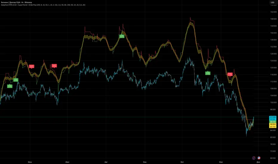
Adaptive ATR% Grid + SuperTrend + OrderFlipDescription:
This indicator combines multiple technical analysis tools to identify key price levels and trading signals:
ATR% Grid – automatic plotting of support and resistance levels based on current price and volatility (ATR). Useful for identifying potential targets and entry/exit zones.
SuperTrend – a classic trend indicator with an adaptive ATR multiplier that adjusts based on average volatility.
OrderFlip – identifies price reversal points relative to a moving average with ATR-based sensitivity, optionally filtered by OBV and DMI.
MTF Confirmation – multi-timeframe trend verification using EMA to reduce false signals.
Signal Labels – "LONG" and "SHORT" labels appear on the chart with an offset from the price for better visibility.
JSON Alerts – ready-to-use format for automated alerts, including price, SuperTrend direction, Fair Zone, and ATR%.
Features:
Fully compatible with Pine Script v6
Lines and signals are fixed on the chart, do not shift with new bars
Configurable grid, ATR, SuperTrend, and filter parameters
Works with MTF analysis and classic indicators (OBV/DMI)
Usage:
Best used with additional indicators and risk management strategies. ATR% Grid is ideal for both positional trading and intraday setups.
перевод на русский
Описание:
Этот индикатор объединяет несколько методов технического анализа для выявления ключевых уровней цены и сигналов на покупку/продажу:
Сетка ATR% (ATR% Grid) – автоматическое построение уровней поддержки и сопротивления на основе текущей цены и волатильности (ATR). Позволяет видеть потенциальные цели и зоны входа/выхода.
SuperTrend – классический трендовый индикатор с адаптивным множителем ATR, который корректируется на основе средней волатильности.
OrderFlip – определение моментов разворота цены относительно скользящей средней с учетом ATR, с возможностью фильтрации по OBV и DMI.
MTF-подтверждение – проверка направления тренда на нескольких таймфреймах с помощью EMA, чтобы снизить ложные сигналы.
Сигнальные метки – на графике появляются "LONG" и "SHORT" с отступом от цены для наглядности.
JSON Alerts – готовый формат для автоматических уведомлений, включающий цену, направление SuperTrend, Fair Zone и ATR%.
Особенности:
Поддержка Pine Script v6
Линии и сигналы закреплены на графике, не двигаются при обновлении свечей
Настраиваемые параметры сетки, ATR, SuperTrend и фильтров
Совместимость с MTF-анализом и классическими индикаторами OBV/DMI
Рекомендации:
Используйте в сочетании с другими индикаторами и стратегиями управления риском. Сетка ATR% отлично подходит для позиционной торговли и интрадей.
ATR% Grid – automatic plotting of support and resistance levels based on current price and volatility (ATR). Useful for identifying potential targets and entry/exit zones.
SuperTrend – a classic trend indicator with an adaptive ATR multiplier that adjusts based on average volatility.
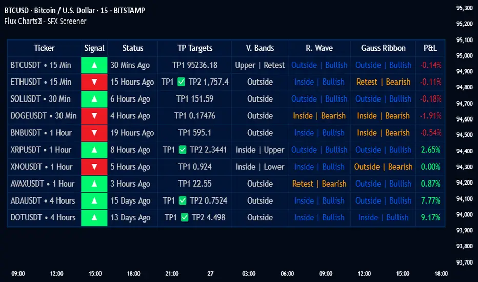
Flux Charts - SFX Screener💎 GENERAL OVERVIEW
The SFX Screener by Flux Charts is a multi-timeframe market scanner that extracts and visually organizes key conditions detected by the SFX Algo indicator across multiple assets in real-time. It does not perform independent analysis or generate new signals—instead, it pulls data directly from the SFX Algo’s calculations to ensure full alignment across different timeframes and tickers.
The SFX Algo is a multi-factor trading indicator that integrates trend analysis, signal generation, market overlays, and take-profit/stop-loss levels into a single system. It evaluates multiple trend components, including EMA direction, momentum shifts, and volatility cycles, to determine market conditions. Signal generation is based on an Adjusted Weighted Majority Algorithm, filtering out weaker signals by prioritizing the most reliable market indicators. Market overlays, such as Volatility Bands and the Retracement Wave, provide dynamic support, resistance, exit points, and entry points. Its adaptable structure allows traders to customize settings based on strategy preferences, making it effective for scalping, swing trading, and long-term trend analysis.
The SFX Screener’s purpose is to give traders a dashboard view of these SFX Algo signals across multiple tickers and timeframes in real-time.
📌 HOW DOES IT WORK ?
The SFX Algo indicator employs an Adjusted Weighted Majority algorithm to generate "buy" and "sell" signals. It evaluates multiple market indicators ("experts"), including momentum, ATR trends, and EMA trends, and assigns weights based on their recent performance. The "Time Weighting" setting allows users to balance between using more historical data or prioritizing recent trends. Unlike traditional weighted majority methods, SFX also dynamically penalizes larger losses. Signals are confirmed based on the consensus of the most successful indicators within the selected time period, filtering out weaker signals during underperforming phases.
The SFX Screener extracts these calculated outputs and visually organizes them into a real-time dashboard. Each signal, status, and volatility condition displayed in the screener is a direct output from the SFX Algo indicator.
🚩 UNIQUENESS
Unlike traditional screeners that rely on preset filters or static conditions, the SFX Screener dynamically updates its dashboard based on live outputs from the SFX Algo’s adaptive algorithm.
Traditional Screeners → Use predefined filters like “price above EMA” or “RSI overbought.” They do not adjust to market dynamics.
SFX Screener → Displays outputs directly from an adaptive algorithm that continuously evaluates trends, volatility, and momentum changes.
The SFX Screener can show SFX Algo's status on 8 different tickers on different timeframes. Key factors that make it unique include:
✅ Real-time sync with SFX Algo → Displays live conditions, not static filters.
✅ Comprehensive Dashboard – This screener provides a complete and customizable dashboard designed to enhance traders' decision-making by consolidating crucial SFX Algo insights into one user-friendly interface.
✅ Multi-Ticker & Multi-Timeframe Analysis – With support for up to 8 tickers and timeframes, traders can effortlessly analyze the bigger market picture, identifying trends and opportunities across different assets and timeframes.
By combining multiple analytical elements in a single view, this screener empowers traders with the insights needed to navigate the market more effectively.
🎯 SFX SCREENER FEATURES:
SFX Algo Signals : This tool can detect SFX Algo signals across different tickers & timeframes.
Volatility Bands : Detection of Volatility Bands Status & Retests.
Retracement Wave : Detection of Retracement Wave Status & Retests.
Highly Configurable : Offers multiple parameters for fine-tuning detection settings.
Up to 8 Tickers : Allows traders to analyze multiple tickers & timeframes simultaneously for enhanced accuracy.
📊 SFX SCREENER DATA BREAKDOWN
Signal ->
Buy -> The latest signal is a buy signal.
Sell -> The latest signal is a sell signal.
The rating of the signal is shown after the signal type.
Δ⭐ ->
Shows the rating change (delta) after the signal is triggered. Positive values mean that the rating is increased after the signal is given, negative values mean that it's decreased.
Status ->
Displays the amount of time passed after the signal is given.
TP Targets ->
Shows the Take-Profit targets of the signal, if a target was achieved, there is a ✅ symbol near it and the next target it displayed.
V. Bands ->
The Volatility Bands dynamically adjust to market conditions, expanding during high volatility and contracting during low volatility. When the volatility bands are tight, or the upper and lower bands are close to each other, the market is not volatile. During periods of low volatility, it’s common for price to consolidate or move sideways. An early indication of a large price move can occur when the bands widen or open up after being tight. When the volatility bands are wide, it reflects a period of increased volatility, typically during strong price trends or after a breakout. The volatility bands can also act as support and resistance areas. The upper band acts as resistance while the lower band acts as support. These mark out good areas for potential reversals. Breakouts can also occur when price moves beyond the bands, signaling a potential trend in the breakout direction.
Outside -> The price is currently outside of the Volatility Bands.
Inside | Upper -> The price is currently inside the Upper Volatility Band.
Inside | Lower -> The price is currently inside the Lower Volatility Band.
R. Wave ->
The Retracement Wave is used to identify entry points during pullbacks in trending markets. It can also be used to find exit points for open trades. The wave is bullish when price is above it and bearish when the price is below it. The retracement wave can be used as an area to enter during a pullback in a trending market. The wave can also be helpful for managing risk and closing out positions.
Outside | Bullish -> The Retracement Wave is currently Bullish, and the price is outside of it.
Outside | Bearish -> The Retracement Wave is currently Bearish, and the price is outside of it.
Inside | Bullish -> The Retracement Wave is currently Bullish, and the price is inside of it.
Inside | Bearish -> The Retracement Wave is currently Bearish, and the price is inside of it.
Profit & Loss (P&L) ->
Shows the amount of profit or loss the position is currently in. All values are shown in terms of percentage, and positive values mean the position is in profit while negative values mean that the position is in loss.
⚠ Timeframe Restriction : The selected timeframes for analysis cannot be lower than the chart’s current timeframe to ensure proper data alignment.
⏰ ALERTS
This screener supports alerts, so you never miss a key market move. You can choose to receive alerts when a buy or sell signal is given, helping you spot potential trading opportunities. Additionally, you can enable alerts for take-profit or stop-loss levels, which notify you when the price achieves those levels. The alerts will work for each enabled ticker in the settings. You can also toggle webhook format for alerts, and choose to include ticker metadata in it.
⚙️ SETTINGS
1. Algorithm Settings
Sensitivity: The sensitivity setting is a key parameter that influences the frequency of signals the SFX Algo generates. By adjusting this parameter, you can control the frequency of signals produced by the algorithm. Using a lower sensitivity setting generates more frequent signals that are highly responsive to minor price fluctuations. Using a higher sensitivity setting reduces the frequency of signals, focusing on more significant price movements and filtering out minor fluctuations.
Signal Strength: The Signal Strength setting filters signals based on their quality, allowing traders to focus on the most reliable opportunities. This feature helps traders balance the quantity and reliability of the algorithm’s signals to suit their trading strategy. Using a lower signal strength will display more signals, including those with lower signal ratings, for broader market coverage. Using a higher signal strength will display fewer signals by prioritizing those with higher signal ratings, reducing market noise.
Time Weighting: The Time Weighting setting in the SFX Algo determines how historical market data is analyzed to generate signals.
a) Recent Trends
Focuses on the most recent movements for short-term analysis. This setting is good for scalpers and intraday traders who need to react quickly to market changes.
b) Mixed Trends
Balances recent and historical price movements for a comprehensive market view. This setting is well-suited for swing traders and those who want to capture medium-term opportunities by combining the benefits of short-term responsiveness with the reliability of long-term trends.
c) Long-term Trends
Relies on extended historical market data to identify broader market trends, making it an excellent choice for traders focused on long-term strategies.
Minimum Star Rating : The Minimum Star Rating setting allows you to filter signals based on their strength, showing only those that meet or exceed your chosen threshold. For instance, setting the minimum star rating to 3 ensures you only receive signals with a rating of 3 stars or higher.
2. Take Profit / Stop Loss Methods
Key Levels
The Key Levels method uses pivot points to set take profit and stop-loss levels. The TP and SL levels are shown when a new signal is generated.
Volatility Bands
This TP/SL method uses the Volatility Bands overlay to set dynamic TP and SL levels. These levels are not predetermined so they will not be shown in advance when a signal is generated.
Signal Rating
Sets take profit and stop-loss levels based on changes in a signal's rating strength. These levels are not predetermined so they will not be shown in advance when a signal is generated.
Auto Stop-Loss
The auto method can only be applied to the SL. The auto method allows the algorithm to detect SL automatically when a momentum shift is detected. You can adjust the risk tolerance of the Auto SL by adjusting the ‘Auto Risk Tolerance’ setting. You can choose between Low, Medium, and High. A high-risk tolerance will result in stop losses being triggered less often.
3. Tickers
You can set, then enable or disable up to 8 tickers in this section to get informed about their latest SFX Algo signal.
‼️ Important Notes
TradingView has limitations when running advanced screeners, resulting in the following restrictions:
Computation Errors:
The computation of using MTF features and viewing several tickers is very intensive on TradingView. This can sometimes cause calculation timeouts. When this occurs simply force the recalculation by modifying one indicator’s settings or by removing the indicator and adding it to your chart again.
Inconsistencies:
You may notice inconsistencies when viewing the screener on a chart with a specific symbol because screener tickers originate from different markets. Since the cryptocurrency market operates 24/7, while stock markets have defined opening and closing hours, the screener may return varying information depending on whether you're currently viewing a cryptocurrency, stock, or currency pair.
Flux Charts - S&D Screener💎 GENERAL OVERVIEW
Introducing Supply & Demand Zones (S&D) Screener! This screener can spot trading opportunities for Supply & Demand traders across 8 different tickers and timeframes simultaneously! This screener offers a wide range of configurable settings, explained within this write-up.
S&D Screener Features:
Supply & Demand Zones : This tool can detect Supply & Demand zones using one of the two detection methods.
Highly Configurable : Offers multiple parameters for fine-tuning detection settings.
Up to 8 Tickers : Allows traders to analyze multiple tickers & timeframes simultaneously for enhanced accuracy.
🚩 UNIQUENESS
The S&D Screener is the first ever tool on TradingView that allows traders to screen 8 different tickers on different timeframes for Supply & Demand Zones. Key factors that make it unique include:
✅ Comprehensive Dashboard – This screener provides a complete and customizable dashboard designed to enhance traders' decision-making by consolidating crucial Supply & Demand insights into one user-friendly interface.
✅ Multi-Ticker & Multi-Timeframe Analysis – With support for up to 8 tickers and timeframes, traders can effortlessly analyze the bigger market picture, identifying trends and opportunities across different assets and timeframes.
By combining multiple analytical elements in a single view, this screener empowers traders with the insights needed to navigate the market more effectively.
📌 HOW DOES IT WORK ?
The S&D Screener helps traders identify Supply & Demand Zones on multiple tickers & timeframes. It offers customizable settings to adapt to different trading styles. The screener includes two zone detection methods. The Momentum Method identifies zones based on strong bullish or bearish price movements, making it ideal for traders who seek quick market reactions. The Regression Method uses statistical regression to detect zones by analyzing price deviations from the trend, which is more suitable for long-term traders. You can customize your zone preferences and enable up to 8 tickers and their respective timeframes. You'll be able to see the status of the latest detected zones on that ticker/timeframe. You can also see the distance from current price of the ticker to the zone and how many times price has retested that zone.
Supply Zone
In trading, a supply zone is a specific area on a price chart where selling interest surpasses buying interest, leading to a potential decline in asset prices. This zone typically forms after a price rally, indicating that sellers find the asset overvalued and are prepared to sell, creating downward pressure. Identifying supply zones can help traders anticipate potential price reversals or pullbacks.
Trading Possibilities with Supply Zones
Entering Short Positions -> When the price approaches a recognized supply zone, traders may consider initiating short positions, anticipating that increased selling pressure will drive prices down.
Setting Profit Targets -> For traders holding long positions, supply zones can serve as strategic points to set profit targets, as these areas may signal potential resistance and a subsequent price drop.
Demand Zone
In trading, a demand zone is a specific area on a price chart where buying interest is strong enough to halt a downtrend and potentially reverse it upward. This zone indicates a price level where demand exceeds supply, leading to a rise in price. Identifying these zones can provide traders with strategic entry points for potential long positions.
Trading Possibilities with Demand Zones
Entering Long Positions -> When the price approaches a recognized demand zone, traders may consider initiating long positions, anticipating that increased buying pressure will drive prices up.
Setting Profit Targets -> For traders holding short positions, demand zones can serve as strategic points to set profit targets, as these areas may signal potential resistance and a subsequent price increase.
Momentum Detection Method
The Momentum Detection Method identifies supply and demand zones by analyzing the strength and direction of price movements over a specified period. It looks for a sequence of strong bullish or bearish candles to determine potential zones. The method is sensitive to the ‘Sensitivity’ setting, which adjusts the threshold for what constitutes a "strong" candle.
Using the momentum method is ideal for traders looking to capitalize on immediate price reactions and momentum shifts.
Regression Detection Method
The Regression Method uses statistical regression to identify supply and demand zones by analyzing price consolidation patterns. It fits a regression line to price data and identifies zones where price deviates significantly from the trend. This method is more mathematical and less reliant on individual candle patterns. It focuses on the overall price structure and identifies zones based on statistical deviations from the trend.
This method is particularly useful for traders who focus on longer-term price trends and prefer a more statistical approach to pinpoint zones.
Using the momentum method is ideal for traders looking to capitalize on immediate price reactions and momentum shifts.
Status ->
Far -> This status indicates that the current price is significantly distant from any identified supply or demand zones. In this scenario, traders might exercise patience, waiting for the price to approach these zones before considering entry or exit points.
Approaching ⬆️ -> The price is rising towards a supply zone, suggesting potential selling opportunities as the price nears an area where selling pressure previously dominated.
Approaching ⬇️ -> The price is falling towards a demand zone, indicating potential buying opportunities as the price approaches an area known for strong buying interest.
Inside -> The current price is within the boundaries of a supply or demand zone. This status often signals a critical decision point:
Inside a Supply Zone: The area where selling pressure may increase, potentially leading to a price decline. Traders might look for confirmation before initiating short positions.
Inside a Demand Zone: The area where buying interest could surge, possibly resulting in a price increase. Traders might seek validation before entering long positions.
Being "inside" a zone suggests heightened market activity and potential volatility, warranting close monitoring for trading signals.
Retests -> A retest occurs when the price revisits a supply or demand zone but fails to break through it. Specifically, during a retest, the wick of a candlestick enters the zone, but the candle closes below the supply zone or above the demand zone. This price action suggests that the zone remains a strong area of resistance or support, as the market couldn't sustain movement beyond it. Traders often view such retests as confirmations to enter positions in the direction opposite to the zone's boundary. For instance, if the price retests a supply zone and fails to close above it, it may signal a selling opportunity. Conversely, a failed retest of a demand zone could indicate a buying opportunity. Monitoring the number of retests can provide insights into the strength of these zones; multiple retests without a breakout may reinforce the zone's significance. Here you can see how many times the price retested the supply or demand zone.
⚠ Timeframe Restriction : The selected timeframes for analysis cannot be lower than the chart’s current timeframe to ensure proper data alignment.
⏰ ALERTS
This screener supports alerts, so you never miss a key market move. You can choose to receive alerts when a new demand or supply zone is created, helping you spot potential trading opportunities. Additionally, you can enable alerts for retests, which notify you when the price returns to test a previously identified zone. The alerts will work for each enabled ticker in the settings.
⚙️ SETTINGS
1. General Configuration
Detection Method : There are two detection methods you can choose from for identifying Supply & Demand Zones. Both methods aim to identify key areas where price is likely to react, but they do so using different approaches. Traders can choose the method that aligns with their trading style and time horizon.
Sensitivity : The Sensitivity setting allows traders to adjust how aggressively the script identifies supply and demand zones when using the Momentum Detection Method. This setting directly impacts the threshold for detecting zones when using the momentum detection method.
High Sensitivity -> Detects smaller price movements, resulting in more zones being identified. This is ideal for traders who want to capture even minor supply and demand imbalances and prefer a higher frequency of potential trading opportunities.
Medium Sensitivity -> Balances between detecting significant price movements and avoiding excessive noise. This setting is suitable for most traders who want a moderate number of zones without being overwhelmed.
Low Sensitivity -> Focuses on larger, more significant price movements, resulting in fewer zones being identified. This is ideal for traders who prioritize quality over quantity and prefer to focus on the most impactful supply and demand areas.
Lowest Sensitivity -> Detects only the strongest and most pronounced price movements, identifying the most significant zones. This setting is best for traders who want to focus on high-probability, high-impact zones and avoid minor fluctuations.
Zone Invalidation : The Zone Invalidation setting determines how supply and demand zones are invalidated.
Wick -> A zone is invalidated if a candle’s wick goes below a demand zone or above a supply zone.
Close -> A zone is invalidated if a candle closes below a demand zone or above a supply zone.
Zone Visibility Range : The Zone Visibility Range setting controls how far from the current price supply and demand zones are displayed on the chart. It helps traders focus on relevant zones while avoiding clutter from distant or less impactful areas.
Minimum Zone Width : The Minimum Zone Width setting defines the smallest size a supply or demand zone must have to be displayed on the chart. It uses the Average True Range (ATR) as a reference to ensure zones are proportionate to current market volatility.
Minimum Zone Length : The Minimum Zone Length setting determines the minimum number of bars a supply or demand zone must span to be displayed on the chart. This setting helps filter out short-lived or insignificant zones, ensuring only meaningful areas of supply or demand are highlighted.
2. Tickers
You can set, then enable or disable up to 8 tickers in this section to get informed about their latest supply or demand zone.
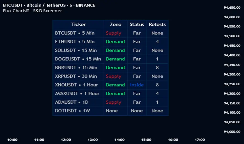
Contraction & Expansion Multi-Screener █ Overview:
The Contraction & Expansion Multi-Screener analyzes market volatility across many symbols. It provides insights into whether a market is contracting or expanding in volatility. With using a range of statistical models for modeling realized volatility, the script calculates, ranks, and monitors the degree of contraction or expansions in market volatility. The objective is to provide actionable insights into the current market phases by using historical data to model current volatility conditions.
This indicator accomplishes this by aggregating a variety of volatility measures, computing ranks, and applying threshold-based methods to identify transitions in market behavior. Volatility itself helps you understand if the market is moving a lot. High volatility or volatility that is increasing over time, means that the price is moving a lot. Volatility also mean reverts so if its extremely low, you can eventually expect it to return to its expected value, meaning there will be bigger price moves, and vice versa.
█ Features of the Indicator
This indicator allows the user to select up to 14 different symbols and retrieve their price data. There is five different types of volatility models that you can choose from in the settings of this indicator for how to use the screener.
Volatility Settings:
Standard Deviation
Relative Standard Deviation
Mean Absolute Deviation
Exponentially Weighted Moving Average (EWMA)
Average True Range (ATR)
Standard Deviation, Mean Absolute Deviation, and EWMA use returns to model the volatility, meanwhile Relative Standard Deviation uses price instead due to its geometric properties, and Average True Range for capturing the absolute movement in price. In this indicator the volatility is ranked, so if the volatility is at 0 or near 0 then it is contracting and the volatility is low. If the volatility is near 100 or at 100 then the volatility is at its maximum.
For traders that use the Forex Master Pattern Indicator 2 and want to use this indicator for that indicator, it is recommended to set your volatility type to Relative Standard Deviation.
Users can also modify the location of the screener to be on the top left, top right, bottom left, or bottom right. You also can disable sections of the screener and show a smaller list if you want to.
The Contraction & Expansion Screener shows you the following information:
Confirmation of whether or not there is a contraction or expansion
Percentage Rank of the volatility
Volatility MA direction: This screener uses moving averages on the volatility to determine if its increasing over time or decreasing over time.
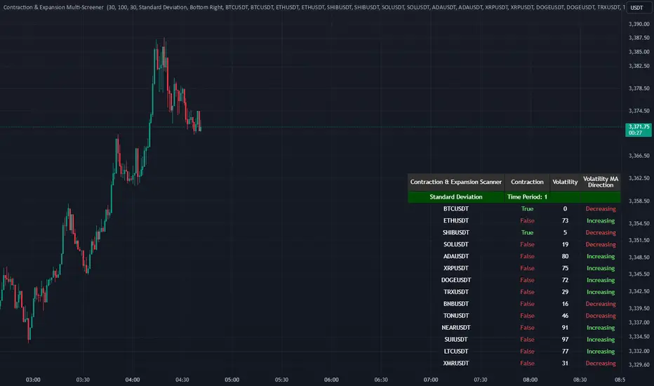
RSI MTF Panel [xdecow]This indicator shows the RSI of up to 10 different timeframes with various customization options:
Panel position
Panel orientation (vertical/horizontal)
Border width and color
Choose up to 10 time frames with RSI length and source
Background and text colors
Thresholds of overbought, oversold, uptrend, downtrend and no-trend zones to change the color of the RSI
Color debug mode

Ultimate Custom MTF ScreenerThis indicator will allow you to make your custom TradingView MTF screener without coding. Add it to the chart, select up to 10 instruments, 4 timeframes, and 4 indicators, and the screener will do the rest for you. The indicator will form a lovely table with all values and highlighted signals.
The screener is highly customizable, and you can choose its position on the chart, sorting, order of the columns, and colors for the tables. You can easily change parameters for all supported indicators and their signals.
Currently, there are 21 different custom indicators available. Current list of indicators:
Average Directional Index (ADX) - displaying the value of ADX and checking if it's higher than the threshold
Average True Range (ATR) - showing the value of ATR
Awesome Oscillator (AO) - displaying the value of AO and highlighting positive/negative values.
Bollinger Bands (BB) - showing if the price is above/below/in the channel.
Breakout Pivots - Displaying when the price is below/above the most recent pivot low/high.
Commodity Channel Index (CCI) - shows the last CCI value and highlights overbought/oversold values.
Directional Movement Index (DMI) - Up/Down signal (+DI above or below -DI)
Donchian Channel (DC) - showing if the price is above/below/in the channel.
Heikin Ashi Count (HAC) - What is the current Heikin Ashi candle color and for how long was this color?
Historical Volatility (HV) - Current value of Historical Volatility
Keltner Channel (KC) -showing if the price is above/below/in the channel.
Moving Average Convergence Divergence (MACD) - Up/Down signal (MACD above / below signal)
Moving Average Crossover (MA Cross) - Displaying MA crosses signals (SMA, EMA, WMA, HMA, VWMA, SMMA, DEMA, VWAP supported)
Moving Average Distance (MA DIST) - Displaying distance to the MA (SMA, EMA, WMA, HMA, VWMA, SMMA, DEMA, VWAP supported)
Parabolic Stop and Reverse (PSAR) - Up or Down
Relative Strength Index (RSI) - Displaying the last RSI value and highlighting overbought/oversold values.
Stochastic (STOCH) - Displaying the last Stochastic value and highlighting overbought/oversold values.
Stochastic RSI (STOCH RSI) - Displaying the last Stochastic RSI value and highlighting overbought/oversold values.
SuperTrend - Current state of the SuperTrend.
Trailing Stop-Loss (TSL) - Up or Down
True Strength Index (TSI) - Displaying the last TSI value and highlighting overbought/oversold values.
We're already working on adding a few more supported indicators. If you have any ideas about the indicators you want to see in our screener, contact us, and we'll consider them.
Disclaimer
Please remember that past performance may not be indicative of future results.
Due to various factors, including changing market conditions, the strategy may no longer perform as well as in historical backtesting.
This post and the script don’t provide any financial advice.

Custom Multi-Timeframe IndicatorIt's a pretty simple example of a nice custom screener you can run for multiple timeframes. This is an RSI screener, but you can easily change the function for your own Indicator.
Screener displays:
Last value of the instrument
RSI value for up to 10 instruments / 4 timeframes.
In Parameters you can change:
4 timeframes
10 instruments
Parameters for RSI
Styling parameters for table
If the selected timeframe will be lower than the current one you will receive a warning message in a table.
Thanks to @MUQWISHI to help me code it.
Disclaimer
Please remember that past performance may not be indicative of future results.
Due to various factors, including changing market conditions, the strategy may no longer perform as well as in historical backtesting.
This post and the script don’t provide any financial advice.

MTF Ichimoku Analysis[tanayroy]Ichimoku can state market conditions better than any indicator or group of indicators(My own perspective). Ichimoku works seamlessly in different timeframes. Analysis of Ichimoku in different timeframes can give you the bigger picture of the market.
This indicator analyzes six different timeframes with Ichimoku in depth. Default timeframes are 5M, 30M, 60M, D, W, and M. You can change the default timeframes from the setting.
As we are dealing with many relations, we can define the relationship with a simple score to get the trend strength.
Ichimoku Analysis:
Relationship of Price(P) with Ichimoku indicators: Here we are analyzing the current price and Ichimoku indicators. The position of price with respect to Ichimoku indicators states the market condition clearly.
Price(P) and Kumo(C): P > C = Bullish (↑). P < C = Bearish (↓). P <> C = consolidation or no trend(↔). Score: ±2
Price(P) and Tenkan Sen(T): P >= T = Bullish (↑). P < T = Bearish (↓). Score: ±0.5
Price(P) and Kijun Sen(K): P >= K = Bullish (↑). P < T = Bearish (↓). Score: ±0.5
Price(26 bars ago) and Chiku(L): L >= P(26) = Bullish (↑). L < P(26) = Bearish (↓). Score: ±0.5
Tenkan Sen and Kijun Sen Relation. Tenkan Sen depicts short-term trends and Kijun depicts mid-term trends. So this relationship is important for analyzing the current trend of the market.
Tenkan Sen(T) and Kijun Sen(K): T >= K = Bullish (↑). T < K = Bearish (↓). Score: ±2
Direction of Ichimoku indicators.
The direction of Ichimoku indicators helps us to understand the trend strength.
Tenkan Sen's(T) direction: Upward slope = Bullish (↑). Downward slope = Bearish (↓). Flat=consolidation or no trend(↔). Score: ±0.5
Kijun Sen's(K) direction: Upward slope = Bullish (↑). Downward slope = Bearish (↓). Flat=consolidation or no trend(↔). Score: ±0.5
Senkou A(A) direction: Upward slope = Bullish (↑). Downward slope = Bearish (↓). Flat=consolidation or no trend(↔). Score: ±0.5
Senkou B(A) direction: Upward slope = Bullish (↑). Downward slope = Bearish (↓). Flat=consolidation or no trend(↔). Score: ±0.5
Cloud and other Ichimoku indicators:
Kumo or Cloud is very important in the Ichimoku system. Analyzing its relation with other indicators is important to detect the overall market condition.
Kumo(C) and Tenkan Sen(T): T >= C = Bullish (↑). T < C = Bearish (↓). T <> C = consolidation or no trend(↔). Score: ±0.5
Kumo(C) and Kijun Sen(K): K >= C = Bullish (↑). K < C = Bearish (↓). K <> C = consolidation or no trend(↔). Score: ±0.5
Kumo(C) and Chiku(L): L >= C = Bullish (↑). L < C = Bearish (↓). L <> C = consolidation or no trend(↔). Score: ±0.5
Kumo(C) Shadow: By analyzing the last 252 bars(you can change this option) we are analyzing the Kumo shadow behind the current price. If Kumo shadow is present behind the price, trend strength will be weakened. Score: ±0.5
Kumo(C) Future (Senkou A(A) and Senkou B(B)): A >= B = Bullish (↑). A < B = Bearish (↓). Score: ±0.5
Chiku(L) Analysis:
Vertical and Horizontal Chiku analysis will tell us about the possible consolidation of the price.
Chiku Vertical: if the price consolidates for the next 5 bars(You can change this option) will it run into the price. Please remember we are placing the current price 26 bars ago and we are interested to see the current price in open space for a clear trend. Score: ±0.5
Chikou Horizontal: If Chiku is in open space (Not running into the price), we want to review Chiku vertically i.e how much percentage of fall or rise of the current price can cause Chiku to run into the price.
So, the maximum trend score is ±10.5.
Ichimoku signals:
We know, that the crossover of Ichimoku indicators provides important signals. In this section, you can see all the crossover i.e when they happened (Bars ago)
Distance between price and Tenkan Sen and Kijun Sen: We know, the price come back to Tenkan/Kijun if it goes far away from Tenkan/Kijun. So it is important to note the distance between Tenkan and Price.
Please note that this indicator is not a strategy or buy/sell signal. It just shows you the picture of Ichimoku in multiple timeframes. I am working on some strategies of Ichimoku and will publish the same when my research is complete.
If you want to analyze Ichimoku in a single timeframe, please review the following indicator.
To maintain the table size you can use the shorthand notation from the setting.
Table with detailed analysis:
Table with shorthand notation:
Please comment if you want any clarification or found any bugs to report.
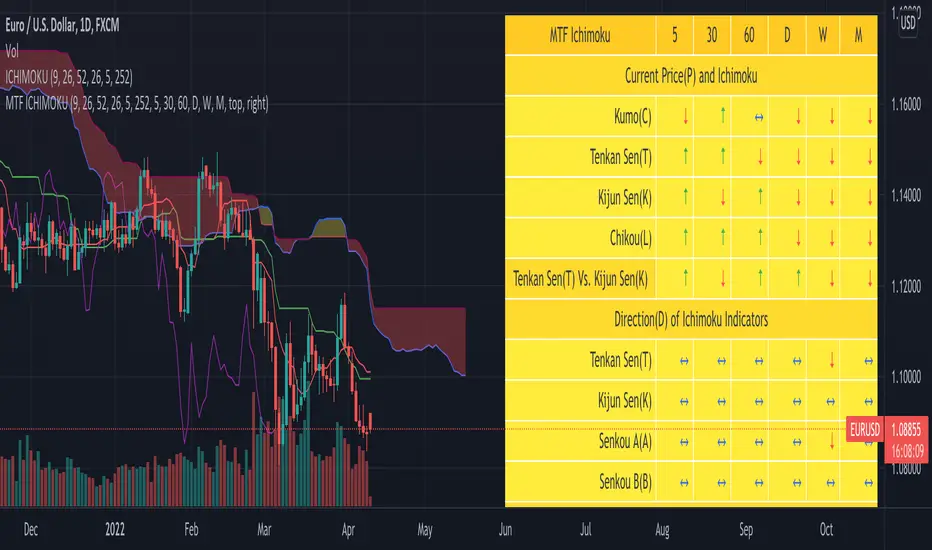
SuperJump QQE MOD MTFThis is a QQE MOD MTF version.
Mihkel00 modified Glaz's script, I modified Mihkel00 's script again.
This is a QQE Mod original version by Mihkel00 :
I simply changed the above script to update pine script 5.0 and extracted two functions.
Thank you to the two authors for sharing such a great script.

ORB Parabolic SAR Multi Time Frame (PSAR MTF)
This is an adaptation of the inbuilt PSAR function in a Multi Time Frame .
When MTF enabled It will plot two timeframe simultaneously as follows:-
1 Min with 5 Min (HTF)
5 Min with 15 Min(HTF)
15 Min with 1H(HTF)
1H with 4H(HTF)
4H with Daily(HTF)
Daily with Weekly(HTF)
Weekly with Monthly(HTF)
The higher timeframe(HTF) will get plotted in bigger circled lines.
By enabling plotting of all levels, you can see all current levels of all TF( M1 ,M5,M15,H,4H,D,W,M) on the same screen as "X" on the right side.
Alerts allow you to get alerts when these crossover happens.

MTF Bull Power Bear Power(Elder Ray Indicator)■Overview
This indicator enables to select an upper timeframe’s Bull Power Bear Power(aka Elder Ray Indicator) (MTF) and the one of chart’s timeframe simultaneously by which users can always analyze looking at upper timeframe situation.
Also, it displays signals when bull power bear power cross zero line with an ability to set alerts.
■Formula
The indicator calculates bull power and bear power following the original Elder Ray indicator as follows.
1.Bull Power : High - EMA(13)
2.Bear Power : Low - EMA(13)
3.Bull Power Bear Power : 1 + 2
※MTF is same as above
※MA period can be changed
※High/Low is highs/lows of a chart timeframe that users are opening unless you show MTF.
See the link below for the details.
www.investopedia.com
To enable MTF, users can select “Auto” mode and “Manual” mode. When “Auto” selected, upper timeframes are determined based on the chart’s timeframes that users are currently opening as follows.
Chart timeframes -> upper timeframes
Weekly -> Monthly
Daily -> Weekly
4hour -> Daily
1hour -> 4hour
30min -> 4hour
15min -> 1hour
5min -> 1hour
1min -> 15min
■Signals
When bull power bear power cross zero line, signals can be displayed. These can be used to analyze reversal of buying/selling power.
Alerts can be set with the same condition.
——————————————
エルダー·レイ·インジケーターとしても知られるブルパワー·ベアパワーのMTFバージョンインジケーターです。
一つの上位足のブルパワー·ベアパワーとチャートのタイムフレームのブルパワー·ベアパワーの両方を同時に表示することができるため、常に上位足の状況を鑑みながら分析することができます。
また、それぞれのブルパワー·ベアパワーとゼロラインとの交差でシグナル表示、アラート設定が可能です。
■計算式
ブルパワー·ベアパワーの計算式は以下の通りです。
オリジナルのエルダー·レイ·インジケーターと同じくEMAと高値·安値を用いて計算しています。
1.ブルパワー: 高値 - EMA(13)
2.ベアパワー: 安値 - EMA(13)
3.ブルパワー·ベアパワー = 1 + 2
※MTFも上記に同じ
※MAの期間は変更可能
※高値·安値は現在開いているチャートの高値·安値です。(MTFは指定したタイムフレームの高値・安値)
ブルパワー·ベアパワーの詳細は以下のリンクを参照してください。
www.investopedia.com
MTFのブルパワー·ベアパワーを表示するにあたっては、”Auto”モードと”Manual”モードの二つから選択することができます。
“Auto”モード選択時は、現在開いているチャートのタイムフレームに基づき、上位足のタイムフレームが下記の通りに自動的に決定されます。
チャートタイムフレーム -> 上位足タイムフレーム
週足 -> 月足
日足 -> 週足
4時間足 -> 日足
1時間足 -> 4時間足
30分足 -> 4時間足
15分足 -> 1時間足
5分足 -> 1時間足
1分足 -> 15分足
■シグナル
ブルパワー·ベアパワーとゼロラインとの交差でシグナルを表示します。
売り買いの強弱反転ポイントの目安として使ってください。
同じ条件でアラート設定も可能です。

Strat Radar_vtStrat Radar is a visual tool to trade "TheStrat" methodology.
TheStrat is a simple yet powerful model to view the market. From one bar to the next, there are only three possible scenarios or three types of candles:
type 1 - an inside bar. Market is in consolidation.
type 2 - a directional bar (2 up or 2 down). Market is trending.
type 3 - an outside bar. This is a broadening formation and market is taking liquidity from both upside and downside.
So by looking at candle type and combination, one can visualize what price is doing in the market.
Strat Radar makes it possible for user to see candle type and sequence for all major time frames – from a 5m bar to a yearly bar - all in one chart! And even better, it allows user to see not just one bar but last three bars!
Certain candle combination creates high probability trade setups, for example 2-1-2 or 2-2 reversals, so by looking at Strat Radar, user can quickly determine whether there are any good trading opportunities. The simple and visual layout makes it easy to go through a watch list and use Strat Radar as a scanner. There is no need to flip through multiple time frame charts.
Features:
Show candle type and color for twelve time frames from 5m to yearly bar
Show candle type and color for last three bars of each time frame
Location of candle number and candle color have specific meaning:
For non-directional bars ( 1 and 3):
Below candle means close > open
Above candle means close < open
For directional bar 2:
Below candle means: 2 up
Above candle means: 2 down
Candle color: green - close>open, red – close < open
A built-in trend strength system that can be turned on or off
A reversal marker that can be turned on or off. It is based on a combination of Strat candle sequence and trend strength
Since candle type and combination are clearly shown for each time frame, it is easy to determine whether is Full Time Frame Continuity (FTFC).
Strat Radar_vt is a light version of the full indicator and covers:
- most futures market
- 30 stocks in Dow Index
- Index and sector ETFs : SPY , QQQ , DIA, IWM , XLE , XLF , XLU , GDX , XLK , XLV , XLY , XLB , ITB , XRT , SMH , IBB , KRE , XLC , GDXJ , KBE
- Some key stocks: AAPL , AMZN , FB , GOOGL , TSLA , NVDA , NFLX
- Forex pairs: DXY , AUDCAD , AUDJPY , AUDNZD , AUDUSD , EURCAD , EURGBP , EURJPY , EURUSD , GBPJPY , GBPUSD , NZDUSD , USDCAD , USDJPY
Full version works on all stocks and assets. If you like this indicator and require the full version, please contact the author.

MTF RSI + Average (Multi-Timeframe) [TH]Multi-Timeframe Relative Strength Index --- MTF RSI
Eliminates having to change time intervals to view a different Time Interval's RSI value (up to 5 time intervals possible through the settings).
The RSI values from Multiple Time Frames can be averaged together to show one single RSI.
A table overlay (info box) makes it easy to quickly identify RSI values on the multiple different time frames.

Multi timeframes RSI Screener & indicator by noop42Since my previous x4 multi timeframes Stochastic RSI script seems to have been appreciated, I decided to make a 2nd version of this tool which focuses on the RSI indicator only.
Default parameters
RSI length : 14
Timeframes: 5, 15, 60, 240
OB/OS zones : 70 & 30
Repaint mode: enabled
Display lines: enabled
Display screener: enabled
Convergence warnings: timeframes 1, 2 & 3
Details
Repaint mode : Disabling it makes the indicator wait for the current candle to close before to change its value
Display lines: Allows you to disable RSI lines drawings, in order to move the screener on your main chart for example.
Display screener: Allows you to disable the screener, in order to use RSI lines only
OB/OS convergences warnings : Allows you to select which timeframe(s) must be taken into consideration for convergence signals (Selected timeframes can be distinguished in the screener, followed by a * char in the timeframes column)
Note The Stochastic RSI version of this tool is available here

MTF StochRSI indicator by noop42Here is a custom x3 timeframes Stochastic RSI indicator.
Main Features (can be disabled)
Average mode : for each timeframe, a single line corresponding to the average value between K and D is printed
Repaint mode : if enabled: values are updated in live, if disabled: values are updated once the concerned candle is closed
Default parameters
Timeframes: 1, 5, 15
Mode : Average value
Repaint mode: enabled

William %R MTF [DM]Greeting Colleagues
Today I share The Wlliams %R
Extras=
- 5 diferent length
- 1 extra signal with the technique used in the ultimate oscillator
- Fibo Leves based on ob os leves "width it's automatic"
- Colored bars bassed en average strength
- The indicator that is modified now has the same range as the ultimate oscillator.
Enjoy
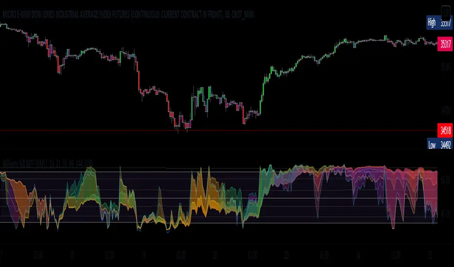
Hx MTF Sorted MAs Panel with Freeze WarningThis script displays the close price and 4 sorted moving averages of your choice in a small repositionable panel and, when used on a higher timeframe, warns you when values may be different from actual values in the higher timeframe, inciting you to double check the actual values of the moving averages in the higher timeframe the panel is supposed to reflect.
The 4 moving averages and close are sorted together, providing you with a bird’s-eye view of their relative positions, the same way moving averages and last price values are displayed on the right scale.
The black header reminds of:
(1) the timeframe (resolution) used in the panel
(2) the remaining time before a new bar is created in the panel timeframe. Note that this remaining time is different from the one on the right scale, since it is only updated when a new transaction occurs.
Below, price and moving averages are sorted, color coded and followed by:
(1) a trend indicator ↗ or ↘ meaning that last change is up or down
(2) the number of bars since the moving average is above or below close (0 means current bar). This is obviously not displayed after the close price line (white background color).
Use
This panel was basically developed to display higher timeframe data but it can also be used with the same timeframe as chart for example if you do not want to plot moving averages on your chart but are still interested in their trends and relative positions vs price.
If you see something strange (like header is not black and displays NaN), it just means you requested moving averages that are not available in the panel timeframe. This may happen with newly introduced cryptos and “long” MA timeframes.
Different Timeframe
If you choose to use the panel on a different timeframe than the current one, be aware that you should only use timeframes higher than the current one, as per Tradingview recommendations.
If you select a lower timeframe than the current one, the panel timeframe header cell will turn to the alert color you set (fuchsia by default).
After tinkering for a while with the security function, I noticed that sometimes indicator values “freeze” (i.e. stop udating) and I have found no workaround.
What I mean is that when you look at a sma on a 5 minutes timeframe (the reference) and look at this same sma on a 5 minutes timeframe but from a lower timeframe through the security function set with a timeframe of 5 minutes, values returned by the security function are not always up to date and “freeze”. That’s the bad news.
Freeze warning
The better news is that this unexpected behaviour seems to be predictable, at least on minutes timeframes and I implemented an indicator that endeavors to detecting such situations. When the panel believes data may be frozen, the ‘Remaining Time’ header cell will turn to the alert color.
This feature is only implemented on minutes timeframes and can be switched on or off.
Other points of interest in this script
If you code, this function may also interest you:
sortWithIndexes (arrayToSort) returns a tuple (sortedArray, sortedIndexes) and therefore allows multi-dimensional arrays sorting without actually implementing a sorting algorithm 😉.
Default Settings
The default settings provide an example of commonly used moving averages with associated colors ranked from Hot (more nervous) to Cold (less nervous).
These settings are just an example and are NOT meant to be used as a trading system! DYOR!
Hope it will be useful.
Does the Freeze warning work for you? What do you think of my pseudo sorting algorithm?
Enjoy and please let me know what you think in the comments.

MTF WatchList Charts [Anan]█ OVERVIEW
I am happy to present this script with a nice idea!
You can now customize a watchlist with your preferred time frame and any symbol from any market.
The main purpose is to be aware of any moves and watch a brief overview of the chart.
█ FEATURES
- 8 customizable symbols with the option to show/hide anyone
- Multi time frame support
- 3 Types of charts (Candles / Heikin Ashi / Line)
- Displaying up to 10 candles for every chart
- Customizable chart colors
- Option to Show/hide Price
- Option to Show/hide Price Line
- Option to change Labels and Text Size
- Show Symbol name and used time frame
- Option to change gaps between charts
- Hover over on the top of any candle to see (Open/High/Low/Close) Prices
█ SCREENSHOTS
-----------------------------------------------
Special thanks to @dgtrd for inspiration and for the amazing framework used here ( HTF Candles by DGT )
Special thanks to Pine Chat @fareidzulkifli @Bjorgum @JohnBaron @fpainchaud

Coppock Curve Correlation between MTF & SlopesMy first tool !
1. The waves shows the slope of the curve. The front one = 3 periods, back one = 2 periods, difference = white area.
2. The moving lines shows the curve correlation between 2x 2 time frames (adjustable on the settings) on 2 periods lookback.
2.1 Theres few regions of high correlation, lines are at (absolute values) 0.5, 0.75, 1
3. On the top there's the Coppock curve -> if falling since 1 period = red, else green.
4. Diamonds shows : if correlation is in the strong correlation area and slope is falling or rising : red or green diamond.
This tool could be interesting to have an idea if there's strong correlation between timeframes instead of watching 4-5 different timeframes !
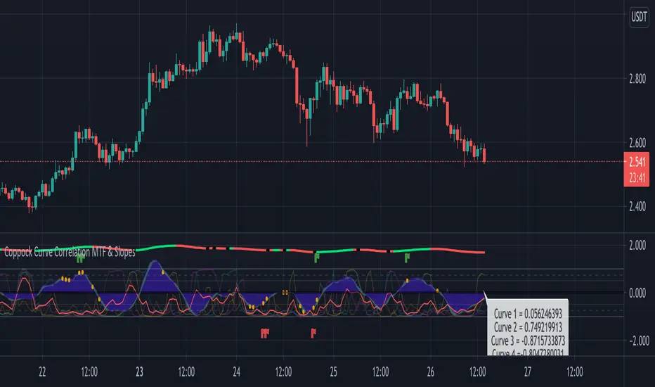
MTF Key Levels - Support and ResistanceThis indicator shows how to Multi Time Frame (MTF) interpret levels:
Watch how price acts around these levels and how they can act as support/resistance and can be used as great confluence levels for your technical analysis.
This indicator displays:
VWAP Levels
Daily / Weekly / Monthly / Yearly
Within the chart above I have marked out how displaying these VWAP levels can provide support and resistance levels to be aware of.
Daily – Weekly - Monthly – Yearly Levels
O = Open / H = High / L = Low
pO = Previous Open / pH = Previous High / pL = Previous Low / pEQ = Previous Equlibrium
Having previous Low/High levels makes you aware of Swing Failure Patterns (SFP). Also the daily/weekly/monthly opening and previous opening can assist with the trend.
Daily Open: Gives you an idea who is in control for the day. This level very often acts as strong support or resistance.
Weekly Open: Indicates where the price is within the higher timeframe.
Monthly Open & Yearly Levels: Overview of direction for the whole month without looking at a monthly chart and Yearly chart
Line Options
Within the line options you can choose to have a clean chart and display a “short line”. These line length can be adjusted by the user.
Line just to the right.
Line across the screen.
Disclaimer: The Monthly and Yealy VWAP will only show on higher timeframes this is due to restriction of how many candles can be shown on the chart. The candles displayed need to go back to either the start of the month of year to be able to calculate their VWAPs.
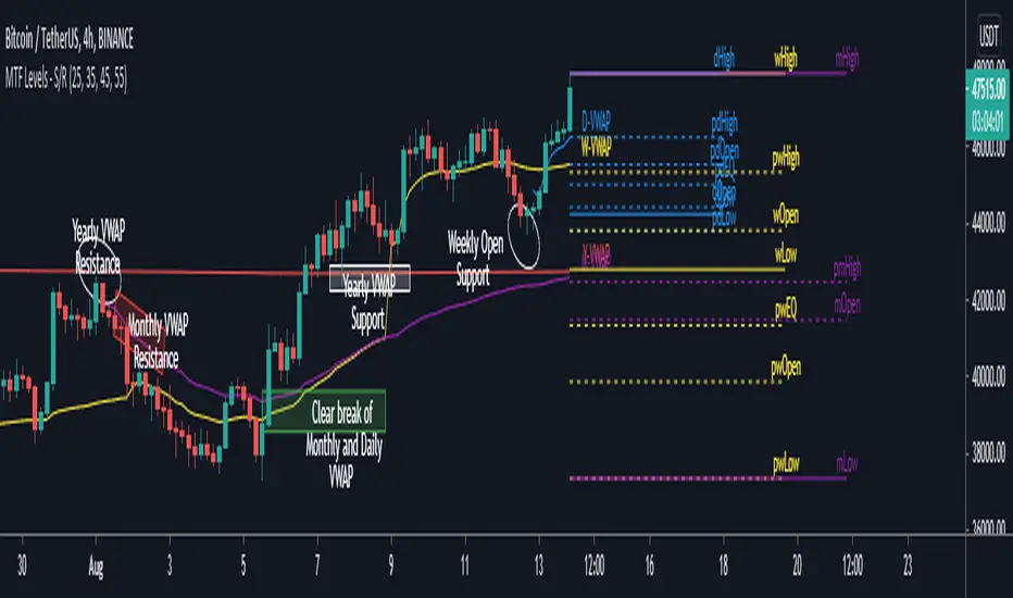
Multi TimeFrame (MTF) Trend StrengthCalculate and display simple multi timeframe (3 timeframe) trend strength using heikin ashi.
Papercuts Dual PSAR v01Dual PSAR is a trend following script that uses auto-higher timeframe calculation of the current timeframe to create a dual Parabolic Stop And Release.
This is useful because it can determine periods of transition or indecision and can flag those periods with which way it is learning even though it is undecided, what i call "Wait Zones".
When both PSARS are not in alignment, it uses the lower timeframe one to determine which way the wait zone is learning.
You can see below in the chart shows some good trends and some wait zones.
A wait zone can have bullish indication, but then still have a bearish continuation.
A wait zone can have bullish indication, and then enter a bull trend.
Typically I won't make trades in wait zones, and I will exit trades when entering one.
Just wanted to try this out and see how it did. Figured I'd share.
