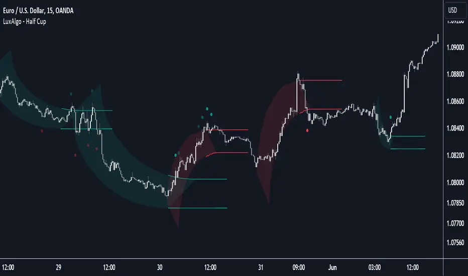
FVG Positioning Average [LuxAlgo]The FVG Positioning Average indicator aims to uncover potential price levels of interest by averaging together recent Fair Value Gap (FVG) initiation levels.
This indicator is grounded in the theory that significant buying or selling activity is the primary catalyst for creating FVGs.
By averaging together the prices where each FVG initiated, we may potentially reveal where major participants are positioned.
🔶  USAGE 
  
By analyzing the average price of bullish or bearish FVGs, users can identify potential support or resistance areas where the larger participants may re-enter or defend their positions.
These areas could be used to adjust entries and exits or assist with risk management such as take-profit or stop-loss levels.
The indicator displays 2 lines, the Bull Average and the Bear Average.
 
 The Bull Average is only displayed when the price holds above the bull Average.
 The Bear Average is only displayed when the price holds below the bear average.
 
When only one average is displayed alone, this level is seen as support or resistance, it is anticipated that this level would be defended for the current trend to stay valid.
When both averages are displayed simultaneously, it can be interpreted as one side attempting to take over the trend.
  
The movements and reactions during these attempts can be analyzed to provide helpful information about where the price might be headed.
Possible outcomes:
 
 Trend Confirmation/Re-Entry (From Weak Attempts)
 Trend Reversal (Creating Support or Resistance)
 Consolidation (Oscillating between/around Bull & Bear Averages)
 
🔶  DETAILS 
🔹  Lookback Types 
This indicator includes 2 lookback types:
 
 Bar Count: Uses Bars to determine what data to include. This type can be utilized for averages that are more locally relevant to the current chart data.
 FVG Count: Uses a specific # of FVGs for calculations. This type can be utilized for a continuous & consistent view, typically relevant with longer term analysis. 
 
 Note:  When using bar lookback, if no data is in range, no lines will be displayed. 
Below is an example of the 'FVG Count' Display.
  
🔹  Initiation Levels 
Initiation Levels are the specific price points where each FVG starts, these are the last points the price was traded at before creating the gap.
 
  Bull Initiation Level: Lowest Point (Bottom) of FVG
  Bear Initiation Level: Highest Point (Top) of FVG
 
  
🔹  FVG Display 
Each FVG being used for the current calculation of averages is displayed on the chart for reference.
  
 Note:  If you prefer to not display the FVGs, they can be toggled off in the settings, uncheck "Show FVGs on Chart". 
🔶  Settings 
 
 FVG Lookback:  As mentioned above in the 'Lookback Types', this sets the number of FVGs or Bars to use for consideration.
 Lookback Type:  As also mentioned above in 'Lookback Types', this determines the method of lookback to be used.
 ATR Multiplier:  The FVGs are required to have a Greater Width than (ATR * Multiplier) in order to be used for calculations. This allows you to focus on the data being considered if needed.
Luxalgo
Volume Delta Candles [LuxAlgo]Volume Delta Candles  provides insights about Intrabar trading activity in an easy-to-interpret manner. Lower timeframe or real-time data is used for displaying  Volume Delta percentage  against the  total volume  as a coloured bar part.
The script also highlights the intrabar price with the maximum trading activity, as well as complementary information.
🔶  USAGE 
  
The tool focuses on intrabar volume to provide more information about the trading activity associated with a candle, without having to use an external volume indicator.
  
Each indicator components is further explained below:
🔹  Volume Delta 
The volume delta is obtained by the difference between buy volume and sell volume, where buy volume is the volume associated with a bullish intrabar candle, and sell volume with a bearish intrabar candle.
 Positive volume delta  is displayed with a green candle area, while  negative delta  is displayed with a red candle area.
🔹  Bar Coloring 
The script displays VD as a percentage of the whole, or from the candle half, depending on the setting ' Display '.
Bars can be coloured as follows:
 
 Full (100%) when  Display  is set at ' Full Bar '
 Half (50% or 100% of half a bar) when  Display  is set at ' Half Bar '
 
  
A negative VD (more bearish than bullish volume) will fill the bar from the top (or centre) of the bar towards the bottom, and a positive VD will fill a bar from the bottom (or centre) of the bar towards the top.
A negative VD on a green candle will show a red-coloured VD against a green-bordered candle. On the other hand, a positive VD on a red candle will show a green-coloured VD against a red-bordered candle. 
  
Colours for VD sentiment opposite to the candle sentiment can be set differently if desired.
  
🔹  Highest Volume Price Level 
  
The script displays a white (black on light mode) line highlighting the intrabar price level with the highest volume.
  
  
When ' Show Previous Max Volume Price ' is checked, a white (black on light mode) dot is displayed 1 bar to the right.
🔶  DETAILS 
🔹  Tick/LTF data 
The above example used Lower TimeFrame (LTF) data.
The following example uses real-time tick data ( Settings  ->  Data From )
  
Both options,  LTF  or  tick  data, will show a vertical dotted line where the data starts.
🔹  LTF settings 
When ' Data from ' LTF is chosen and ' Auto ' enabled, the LTF will be the nearest possible x times smaller TF than the current TF. When 'Premium' is disabled, the minimum TF will always be 1 minute to ensure TradingView plans lower than Premium don't get an error.
Examples with current Daily TF (when  Premium  is enabled):
 
 500 : 3 minute LTF
 1500 (default): 1 minute LTF
 5000: 30 seconds LTF (1 minute if Premium is disabled)
 
🔹  Notes 
 
 Different LTFs give different data, which means different results; this doesn't mean it isn't correct; they are just different data sets.
  
(LTF is displayed at the top right corner)
 To ensure maximum visibility of values, we recommend using  Bars  from the  Bar's style  menu.
 
🔶  SETTINGS 
 
 Data from: Lower TimeFrame or real-time Tick data
 Resolution: LTF setting
 Auto + multiple: Adjusts the initial set resolution
 Premium: Enable when your TradingView plan is Premium or higher
 
🔹  Intrabar Data 
 
 Colours
 Display: Full/Half bar
 Show previous max volume price: White/black dot, showing previous highest volume price level
 
🔹  Table 
 
 Show TF: Show LTF at the top right corner
 Colour + table text size 
 
🔹  Details 
 
 Show details: label with  'Volume', 'Delta' (VD) and '%' 
 
See  USAGE  for more information 
Market Structure Volume Distribution [LuxAlgo]The Market Structure Volume Distribution tool allows traders to identify the strength behind breaks of market structure at defined price ranges to measure de correlation of forces between bulls and bears visually and easily.
🔶  USAGE 
  
This tool has three main features: market structure highlighting, grid levels, and volume profile. Each feature is covered more in depth below:
🔹  Market Structure 
The basic unit of market structure is a swing point, the period of the swing point is user-defined, so traders can identify longer-term market structures. Price breaking a prior swing point will confirm the occurrence of a market structure. 
The tool will plot a line after a market structure is confirmed, by default the lines on bullish MS will be green (indicative of an uptrend), and red in case of bearish MS (indicative of a downtrend).
🔹  Grid Levels 
  
The Grid visually divides the price range contained inside the tool execution window, into equal size rows, the number of rows is user-defined so users can divide the full price range up to 100 rows.
The main objective of this feature is to help identify the execution window and the limits of each row in the volume profile so traders can know in a simple look what BoMS belongs to each row.
There is however another use for the grid, by dividing the range into equal-sized parts, this feature provides automatic support and resistance levels as good as any other.
Grid provides a visual help to know what our execution window is and to associate MS with their rows in the profile. It can provide S/R levels too.
🔹  Volume Profile 
The volume profile feature shows in a visually easy way the volume behind each MS aggregated by rows and divided into buy and sell volume to spot the differences in a simple look.
This tool allows users to spot the liquidity associated with the event of a market structure in a specific price range, allowing users to know which price areas where associated with the most trading activity during the occurrence of a market structutre.
🔶  SETTINGS 
🔹  Data Gathering 
 
 Execute on all visible range: Activate this to use all visible bars on the calculations. This disables the use of the next parameter "Execute on the last N bars". Default false.
 Execute on the last N bars: Use last N bars on the calculations. To use this parameter "Execute on all visible range" must be disabled. Values from 20 to 5000, default 500.
 Pivot Length: How many bars will be used to confirm a pivot. The bigger this parameter is the fewer breaks of structure will detect. Values from 1, default 2
🔹  Profile 
 Profile Rows: Number of rows in the volume profile. Values from 2 to 100, default 10.
 Profile Width: Maximum width of the volume profile. Values from 25 to 500, default 200.
 Profile Mode: How the volume will be displayed on each row. "TOTAL VOLUME" will aggregate buy & sell volume per row, "BUY&SELL VOLUME" will separate the buy volume from the sell volume on each row. Default BUY&SELL VOLUME.
🔹  Style 
 Buy Color: This is the color for the buy volume on the profile when the "BUY&SELL VOLUME" mode is activated. Default green.
 Sell Color: This is the color for the sell volume on the profile when the "BUY&SELL VOLUME" mode is activated. Default red.
 Show dotted grid levels: Show dotted inner grid levels. Default true.
Sequencer [LuxAlgo]The  Sequencer  indicator is a tool that is able to highlight sequences of prices based on their relative position to past prices, which allows a high degree of customization from the user.
Two phases are included in this script, a "Preparation" phase and a "Lead-Up" phase, each with a customizable amount of steps, as well as other characteristics.
Users can also highlight the last step leading to each phase completion with a level, this level can eventually be used as a key price point.
🔶  USAGE 
  
The script highlights two phases, each being based on a sequence of events requiring prices to be higher/lower than prices various bars ago.
The completion of the preparation phase will lead to the evaluation of the lead-up phase, however, it isn't uncommon to see a reversal occurring after the completion of a preparation phase. In the script, bullish preparations are highlighted in green, while bearish preparations are highlighted in red.
  
Completion of a "Lead-Up" phase is indicative of a potential reversal, with a bullish reversal for the completion of a bullish lead-up (in blue), and a bearish reversal for the completion of a bearish lead-up (in orange).
  
Using a higher length for the preparation/lead-up phases can allow the detection of longer-term reversals.
  
Users wishing to display levels based on specific phases completion can do so from the settings in the "Preparation/Lead-Up Completion Levels" settings group.
The "Show Last" settings determine the amount of respective levels to display on the chart.
🔶  PREPARATION PHASE 
The "Preparation" phase precedes the "Lead-Up" phase. The completion of this phase requires  N  successive prices to be lower than the closing price  P  bars ago for a bullish phase, and for prices to be higher than the closing price  P  bars ago for a bearish phase, where  N  is the user set "Preparation Phase Length" and  P  the user set "Comparison Period".
🔹 Refined Preparations 
  
Sequences of the preparation phase can either be "Standard" or "Refined". Unlike the standard preparation previously described a refined preparation requires the low prices from the user-specified steps in "Refined Preparation Steps" to be above the low price of the last step for a bullish preparation phase, and for the high prices specified in the refined preparation steps to be below the high price of the last step for a bearish preparation phase.
🔶  LEAD-UP PHASE 
The "Lead-Up" phase is initiated by the completion of the "Preparation" phase.
Completion of this phase requires the price to be lower than the low price  P  bars ago  N  times for a bullish phase, and for prices to be higher than the high price  P  bars ago  N  times for a bearish phase, where  N  is the user set "Lead-Up Phase Length" and  P  the user set "Comparison Period".
Unlike with the "Preparation" phase these conditions don't need to be successive for them to be valid and can occur at any time.
🔹 Lead-Up Cancellation 
  
Incomplete "Lead-Up" phases can be canceled and removed from the chart once a preparation of the opposite sentiment is completed, avoiding lead-ups to be evaluated after completion of complete preparations.
This can be disabled by toggling off "Apply Cancellation".
🔹 Lead-Up Suspension 
  
Like with refined preparations, we can require specific steps from the lead-up phase to be higher/lower than the price on the last step. This can be particularly important since we do not require lead-up steps to be successive.
For a bullish lead-up, the low of the last step must be lower than the minimum closing prices of the user-specified steps for it to be valid, while for a bearish lead-up, the high of the last step must be higher than the maximum closing prices of the user-specified steps for it to be valid.
This effectively allows for eliminating lead-up phases getting completed on opposite trends.
🔶  SETTINGS 
🔹 Preparation Phase 
 
 Preparation Phase Length: Length of the "Preparation" phase.
 Comparison Period: Offset used to compare current prices to past ones.
 Preparation Type: Type of preparation to evaluate, options include "Standard" or "Refined"
 Refined Preparations Steps: Steps to evaluate when preparation type is "Refined"
 
🔹 Lead-Up Phase 
 
 Lead-Up Phase Length: Length of the "Lead-Up" phase.
 Comparison Period: Offset used to compare current prices to past ones.
 Suspension: Applies suspension rule to evaluate lead-up completion.
 Suspension Steps: Specifies the steps evaluated to determine if the lead-up referral is respected. Multiple steps are supported and should be comma-separated.
 Apply Cancellation: Cancellation will remove any incomplete lead-up upon the completion of a new preparation phase of the opposite sentiment.
 
🔹 Levels 
 
 Bullish Preparations Levels: When enabled display price levels from completed bullish preparations.
 Show Last: Number of most recent bullish preparations levels to display.
 Bearish Preparations Levels: When enabled display price levels from completed bearish preparations.
 Show Last: Number of most recent bearish preparations levels to display.
Money Flow Profile [LuxAlgo]The  Money Flow Profile  is a charting tool that measures the traded volume or the money flow at all price levels on the market over a specified time period and highlights the relationship between the price of a given asset and the willingness of traders to either buy or sell it, allowing traders to reveal dominant and/or significant price levels and to analyze the trading activity of a particular user-selected range.
This tool combines a volume/money flow profile, a sentiment profile, and price levels, where the right side of the profile highlights the distribution of the traded activity/money flow at different price levels, the left side of the profile highlights the market sentiment at those price levels, and in the middle the price levels. 
 🔶 USAGE 
  
A volume/money flow profile is an advanced charting tool that displays the traded volume/money flow at different price levels over a specific period. It helps traders visualize where the majority of trading activity/money flow has occurred. 
A sentiment profile is a difference between buy and sell volume/money flow aiming to highlight the sentiment/dominance at specific price levels.
Each row of the profile presents figures on volume and money flow specific to price levels.
  
High volume/money flow nodes indicate areas of high activity and are likely to act as support or resistance in the future. They attract price and try to hold it there. Conversely, low-volume nodes are areas with low trading activity, that are less subject to get revisited by the price. The market often bounces right over these levels, not staying for long. The "Profile Heatmap" option of the script helps to better emphasize the trading activity within each areas.
  
By measuring the traded activity at each price level the script presents an ability to highlight the consolidation zones, in other words, highlights accumulation and distribution zones. When the price moves toward one end of the consolidation and volume pick up, it can foreshadow a potential breakout.
  
Level of Significance, Point of Control, Highest Sentiment Zone, and Profile Price levels are some of the other profile-related options available with the script.  
  
 🔶 SETTINGS 
The script takes into account user-defined parameters and plots the profiles, where detailed usage for each user-defined input parameter in indicator settings is provided with the related input's tooltip.
 🔹 Profile Generic Settings 
 
 Lookback Length / Fixed Range: Sets the lookback length.
 Profile Source: Sets the profile source, Volume, or Money Flow.
 
 🔹 Profile Presentation Settings 
 
 Volume/Money Flow Profile: Toggles the visibility of the Volume/Money Flow Profile.
 High Traded Nodes: Threshold and Color option for high traded nodes.
 Average Traded Nodes: Color option for average traded nodes.
 Low Traded Nodes: Threshold and Color option for low traded nodes.
 
 🔹 Sentiment Profile Settings 
 
 Sentiment Profile: Toggles the visibility of the Sentiment Profile.
 Sentiment Polarity Method: Sets the method used to calculate the up/down volume/money flow.
 Bullish Nodes: Color option for Bullish Nodes.
 Bearish Nodes: Color option for Bearish Nodes.
 
 🔹 Profile Heatmap Settings 
 
 Profile Heatmap: Toggles the visibility of the profile heatmap.
 Heatmap Source: Sets the source of the profile heatmap, Volume/Money Flow Profile, or Sentiment Profile.
 Heatmap Transparency: Control the transparency of the profile heatmap.
 
 🔹 Other Presentation Settings 
 
 Level of Significance: Toggles the visibility of the level of significance line/zone.
 Consolidation Zones: Toggles the visibility of the consolidation zones. 
 Consolidation Threshold, Color: Sets the threshold value and zone color.
 Highest Sentiment Zone: Toggles the visibility of the highest bullish or bearish sentiment zone. 
 Profile Price Levels, Color, Size: Toggles the visibility of the profile price levels, and sets the color and the size of the level labels.
 Profile Range Background Fill: Toggles the visibility of the profiles range.
 
 🔹 Other Settings 
 
 Number of Rows: Specify how many rows each profile histogram will have.  
 Profile Width %: Alters the width of the rows in the histogram, relative to the profile length
 Profile Text Size: Alters the size of the text. Setting to Auto will keep the text within the box limits. 
 Profile Horizontal Offset: Enables to move profile in the horizontal axis. 
 
 🔶 RELATED SCRIPTS 
 Liquidity-Sentiment-Profile 
 Swing-Volume-Profiles 
For more and other conceptual scripts you are kindly invited to visit  LuxAlgo-Scripts .
Periodic Activity Tracker [LuxAlgo]The  Periodic Activity Tracker  tool periodically tracks the cumulative buy and sell volume in a user-defined period and draws the corresponding matching bars and volume delta for each period.
Users can select a predefined aggregation period from the following options: Hourly, Daily, Weekly, and Monthly.
🔶  USAGE 
  
This tool provides a simple and clear way of analyzing volumes for each aggregated period and is made up of the following elements:
 
  Buy and sell volumes by period as red and green lines with color gradient area
  Delta (difference) between buy & sell volume for each period
  Buy & sell volume bars for each period
  Separator between lines and bars, and period tags below each pair of bars for ease of reading
 
On the chart above we can see all the elements displayed, the volume level on the lines perfectly matches the volume level on the bars for each period.
In this case, the tool has the default settings so the anchor period is set to Daily and we can see how the period tag (each day of the week) is displayed below each pair of bars.
Users can disable the delta display and adjust the bar size.
🔹  Reading The Tool 
  
In trading, assessing the strength of the bulls (buyers) and bears (sellers) is key to understanding the current trading environment. Which side, if any, has the upper hand? To answer this question, some traders look at volume in relation to price.
This tool provides you with a view of buy volume versus sell volume, allowing you to compare both sides of the market.
As with any volume tool, the key is to understand when the forces of the two groups are balanced or unbalanced.
As we can observe on the chart: 
 
  NOV '23: Buy volume greater than sell volume, both moving up close together, flat delta. We can see that the price is in range.
  DEC '23: Buy volume bigger than Sell volume, both moving up but with a bigger difference, bigger delta than last month but still flat. We can see the price in the range above last month's range.
  JAN '24: Buy and sell volume tied together, no delta whatsoever. We can see the price in range but testing above and below last month's range.
  FEB '24: Buy volume explodes higher and sell volume cannot keep up, big growing delta. Price explodes higher above last month's range.
 
Traders need to understand that there is always an equal number of buyers and sellers in a liquid market, the quality here is how aggressive or passive they are. Who is 'attacking' and who is 'defending', who is using market orders to move prices, and who is using limit orders waiting to be filled?
This tool gives you the following information:
 
  Lines: if the top line is green, the buyers are attacking, if it is red, the sellers are attacking.
  Delta: represents the difference in their strength, if it is above 0 the buyers are stronger, if it is below 0 the sellers are stronger. 
  Bars: help you to see the difference in strength between buyers and sellers for each period at a glance.
 
🔹  Anchor Period 
  
By default, the tool is set to Hourly. However, users can select from a number of predefined time periods.
Depending on the user's selection, the bars are displayed as follows:
 
  Hourly	: hours of the current day
  Daily	: days of the current week
  Weekly	: weeks of the current month
  Monthly	: months of the current year
 
On the chart above we can see the four periods displayed, starting at the top left and moving clockwise we have hourly, daily, weekly, and monthly.
🔶  DETAILS 
🔹  Chart TimeFrame 
The chart timeframe has a direct impact on the visualization of the tool, and the user should select a chart timeframe that is compatible with the Anchor period in the tool's settings panel.
For the chart timeframe to be compatible it must be less than the Anchor period parameter. If the user selects an incompatible chart timeframe, a warning message will be displayed.
As a rule of thumb, the smaller the chart timeframe, the more data the tool will collect, returning indications for longer-term price variations.
These are the recommended chart timeframes for each period:
 
  Hourly	: 5m charts or lower
  Daily	: 1H charts or lower
  Weekly	: 4H charts or lower
  Monthly	: 1D charts or lower
 
🔹  Warnings 
  
This chart shows both types of warnings the user may receive
At the top, we can see the warning that is given when the 'Bar Width' parameter exceeds the allowed value.
At the bottom is the incompatible chart timeframe warning, which prompts the user to select a smaller chart timeframe or a larger "Anchor Period" parameter.
🔶  SETTINGS 
🔹  Data Gathering 
 
  Anchor period: Time period representing each bar: hours of the day, days of the week, weeks of the month, and months of the year. The timeframe of the chart must be less than this parameter, otherwise a warning will be displayed.
 
🔹  Style 
 
  Bars width: Size of each bar, there is a maximum limit so a warning will be displayed if it is reached.
  Volume color
  Delta: Enable/Disable Delta Area Display
Market Structure (Intrabar) [LuxAlgo]The  Market Structure (Intrabar)  indicator is designed to automatically detect and highlight real-time intrabar market structures, a core component of the Smart Money Concepts methodology.
 🔶 USAGE 
  
The proposed indicator gives a detailed picture of the most recent candle lower timeframe trends, highlighting market structures within them. 
This can be particularly useful to assess the price dynamic within the most recent candle. For example, we can see how pronounced a trend is by the number of opposite bullish/bearish market structures formed within the candle.
Users can select the intrabar timeframe of interest from the "Intrabar Timeframe" setting, using a timeframe significantly lower than the chart timeframe will return more intrabar candles and potentially more market structures.
 🔹 Dashboard 
  
Users have access to a dashboard returning useful statistics such as the number of formed CHoCH's and BOS's from the intrabar prices. These can be indicative of how predominant a trend is within the intrabar data or if there exist multiple trends.
 🔶 DETAILS 
  
Market structures allow determining trend continuations as well as trend reversals in the market through two distinct structures:
 🔹 Change of Character (CHoCH) 
A change of character (CHoCH) refers to a shift in the market behavior of a security that is driven by changes in the underlying supply and demand dynamics. CHoCH's are indicative of confirmed reversals.
 🔹 Break of Structure (BoS) 
The break of structure (BoS) refers to the point at which a key level of support or resistance is broken. BOS's are indicative of confirmed trend continuations.
 🔶 SETTINGS 
 🔹Inside the Bar Market Structure 
 
 Intrabar Timeframe: Lower timeframe setting option, if set to 'Auto' the script will determine the lower timeframe based on the chart timeframe.   
 Intrabar Market Structure, Length: Toggles the visibility of the break of structures and change of characters. Length defines the detection length of the swing levels.
 Intrabar Swing Levels: Toggles the visibility of the swing levels, including a color customization option for highs and lows.
 Intrabar Statistics: Toggles the visibility of the dashboard. Some further statistical details are presented in the tooltips of the table cells
 
 🔹 General 
 
 Market Structure Colors: Color customization option for the break of structure and change of character lines and labels.
 Intrabar Candle Colors: Color customization option for intrabar candles.
 Intrabar Candles Horizontal Offset: Adjusting the intrabar candles horizontal position
 Dashboard: Dashboard position and size customization option 
 
 🔶 LIMITATIONS 
Please note that seconds-based intervals are available for premium and professional plan holders, which implies that the seconds-based intervals usage of the indicator may not be available for all users depending on their subscription plan. 
 🔶 RELATED SCRIPTS 
 Smart-Money-Concepts 
 ICT-Concepts
Delta ZigZag [LuxAlgo]The  Delta ZigZag  indicator is focused on volume analysis during the development of ZigZag lines. Volume data can be retrieved from a Lower timeframe (LTF) or real-time Tick data.
Our Delta ZigZag publication can be helpful in detecting indications of a trend reversal or potential weakening/strengthening of the trend.
This indicator by its very nature backpaints, meaning that the displayed components are offset in the past.
🔶  USAGE 
  
The  ZigZag line  is formed by connecting  Swings , which can be set by adjusting the  Left  and  Right  settings.
 
 Left  is the number of bars for evaluation at the left of the evaluated point.
 Right  is the number of bars for evaluation at the right of the evaluated point.
 
A valid  Swing  is a value higher or lower than the bars at the  left/right .
A higher  Left  or  Right  set number will generally create broader ZigZag ( ZZ ) lines, while the drawing of the  ZZ line  will be delayed (especially when  Right  is set higher). On the other hand, when  Right  is set at 0,  ZZ line  are drawn quickly. However, this results in a hyperactive switching of the  ZZ  direction.
To ensure maximum visibility of values, we recommend using " Bars " from the " Bar's style " menu.
🔹  Volume examination 
The script provides two options for  Volume examination :
 
 Examination per ZigZag line 
 Examination per bar 
 
 Bullish Volume  is volume associated with a green bar ( close > open )
 Bearish Volume  is volume associated with a red bar ( close < open )
 Neutral Volume  (volume on a " close == open"  bar) is not included in this publication.
🔹  Examination per ZigZag line 
As long as the price moves in the same direction, the present  ZZ line  will continue. When the direction of the price changes, the bull/bear volume of the previous  ZZ line  is evaluated and drawn on the chart.
 
 The ZZ line is divided into two parts: a bullish green line and a bearish red line.
 The intercept of these two lines will depend on the ratio of bullish/bearish volume
 This ratio is displayed at the intercept as % bullish volume (Settings -> Show % Bullish Volume)
 
 * Note that we cannot draw between 2 bars. Therefore, if a ZZ line is only 1 bar long, the intercept will be at one of those 2 bars and not in between. The percentage can be helpful in interpreting bull/bear volume. 
  
In the example above (2 most right labels), you can see that an overlap of 2 labels is prevented, ensuring the ability to evaluate the bullish % volume of the  ZZ line .
The percentage will be colored green when more than 50%, red otherwise. The color will fade when the direction is contradictory; for example, 40% when the  ZZ line  goes up or 70% when the  ZZ line  falls.
More details can be visualized by enabling " Show " and choosing 1 of 3 options:
 
 Average Volume Delta/bar 
 Average Volume/bar 
 Normalised Volume Delta 
 
For both 'averages', the sum of " Volume "/" Volume Delta " of every bar on the  ZZ line  is divided by the number of bars (per  ZZ line ).
The " Normalised Volume Delta " is calculated by dividing the sum of " Delta Volume " by the sum of " Volume " (neutral volume not included), which is displayed as a percentage.
All three options will display a label at the last point of the  ZZ line  and be coloured similarly: green when the ratio bullish/bearish volume of the  ZZ line  is bullish and red otherwise. Here, the colour also fades when it is bullish, but the  ZZ line  falls or when it is bearish with a rising  ZZ line .
A tooltip at each label hints at the chosen option.
  
You can pick one of the options or combine them together.
  
  
🔹  Examination per bar 
Besides information about what's happening during the  ZZ line , information per bar can be visualized by enabling " Show Details " in  Settings .
  
 
 Split Volume per bar : show the sum of bullish (upV) and bearish (dnV) volume per bar
 Volume (bar) : Total Volume per bar (bullish + bearish volume, neutral volume not included)
 Δ Volume (bar) : Show Delta Volume (bullish - bearish volume)
 
🔹  Using Lower Timeframe Data 
  
The ZigZag lines using LTF data are colored brighter. Also note the  vertical line  where the LTF data starts and the gap between  ZZ lines  with LTF data and without.
When " LTF " is chosen for the " Data from: " option in  Settings , data is retrieved from Lower Timeframe bars (default 1 minute). When the LTF setting is higher than the current chart timeframe, the LTF period will automatically be adjusted to the current timeframe to prevent errors. 
  
As there is a 100K limit to the number of  LTF intrabars  that can be analyzed by a script, this implies the higher the difference between LTF and current TF; the fewer  ZZ lines  will be seen.
🔹  Using real-time tick data 
  
The principles are mostly the same as those of LTF data. However, in contrast with LTF data, where you already have LTF  ZZ lines  when loading the script, real-time tick data-based  ZZ lines  will only start after loading the chart. 
  
Changing the settings of a ticker will reset everything. However, returning to the same settings/ticker would show the cached data again.
  
Here, you can see that changing settings reset everything, but returning after 2 minutes to the initial settings shows the cached data. Don't expect it to be cached for hours or days, though.
🔶  DETAILS 
The timeframe used for LTF data should always be the same or lower than the current TF; otherwise, an error occurs. This snippet prevents the error and adjusts the LTF to the current TF when LTF is too high:
 
res  = input.timeframe('1')
res := timeframe.from_seconds(  math.min( timeframe.in_seconds(timeframe.period), timeframe.in_seconds(res) )  )
 
🔶  SETTINGS 
 
 Data from:  LTF  (Lower TimeFrame) or  Ticks  (Real-time ticks)
 Res: Lower TimeFrame (only applicable when choosing  LTF )
 Option: choose " high/low " or " close " for Swing detection
 
🔹  ZigZag 
 
 Left: Lookback period for Swings
 Right: Confirmation period after potential Swing
 
🔹  ZigZag Delta 
 
 Show % Bullish Volume : % bullish volume against total volume during the ZZ line
 Show: 
 
 
 Average Volume Delta/bar
 Average Volume/bar
 Normalised Volume Delta
 
See  USAGE  for more information 
🔹  Bar Data 
 
 Split Volume per bar: shows the sum of bullish ( upV ) and bearish ( dnV ) volume per bar
 Volume (bar): Total Volume per bar (bullish + bearish volume, neutral volume not included)
 Δ Volume (bar): Show  Volume Delta  (bullish - bearish volume)
Historical Correlation [LuxAlgo]The  Historical Correlation  tool aims to provide the historical correlation coefficients of up to 10 pairs of user-defined tickers starting from a user-defined point in time.
Users can choose to display the historical values as lines or the most recent correlation values as a heat map. 
🔶  USAGE 
  
This tool provides historical correlation coefficients, the correlation coefficient between two assets highlight their linear relationship and is always within the range (-1, 1).
It is a simple and easy to use statistical tool, with the following interpretation:
 
  Positive correlation (values close to +1.0): the two assets move in sync, they rise and fall at the same time.
  Negative correlation (values close to -1.0): the two assets move in opposite directions: when one goes up, the other goes down and vice versa.
  No correlation (values close to 0): the two assets move independently.
 
The user must confirm the selection of the anchor point in order for the tool to be executed; this can be done directly on the chart by clicking on any bar, or via the date field in the settings panel.
For the parameter  Anchor period , the user can choose between the following values NONE, HOURLY, DAILY, WEEKLY, MONTHLY, QUARTERLY and YEARLY. If NONE is selected, there will be no resetting of the calculations, otherwise the calculations will start from the first bar of the new period.
There is a wide range of trading strategies that make use of correlation coefficients between assets, some examples are:
 
  Pair Trading: Traders may wish to take advantage of divergences in the price movements of highly positively correlated assets; even highly positively correlated assets do not always move in the same direction; when assets with a correlation close to +1.0 diverge in their behavior, traders may see this as an opportunity to buy one and sell the other in the expectation that the assets will return to the likely same price behavior.
  Sector rotation: Traders may want to favor some sectors that are expected to perform in the next cycle, tracking the correlation between different sectors and between the sector and the overall market.
  Diversification: Traders can aim to have a diversified portfolio of uncorrelated assets. From a risk management perspective, it is useful to know the correlation between the assets in your portfolio, if you hold equal positions in positively correlated assets, your risk is tilted in the same direction, so if the assets move against you, your risk is doubled. You can avoid this increased risk by choosing uncorrelated assets so that they move independently.
  Hedging: Traders may want to hedge positions with correlated assets, from a hedging perspective, if you are long an asset, you can hedge going long a negative correlated asset or going short a positive correlated asset.
 
Traders generally need to develop awareness, a key point is to be aware of the relationships between the assets we hold or trade, the  historical correlation  is an invaluable tool in our arsenal which allows us to make better informed decisions.
  
On this chart we have an example of historical correlations for several futures markets.
We can clearly see how positively correlated the Nasdaq100 and Dow30 are with the SP500 over the whole period, or how the correlation between the Euro and the SP500 falls from almost +85% to almost -4% since 2021.
As we can see, correlations, like everything else in the market, are not static and vary over time depending on many factors, from macro to technical and everything in between.
🔹  Heatmap 
  
The chart above shows the tool with the default settings and the  Drawing Mode  set to 'HEATMAP'.
We can see the current correlation between the assets, in this case the FX pairs.
 
  The highest positive correlation is +90% (+0.90) between EURUSD and GBPUSD. 
  The highest negative correlation is -78% (-0.78) between EURUSD and USDJPY.
  The pair with no correlation is AUDUSD and EURCAD with 1% (0.01)
 
  
On the above chart we can see the current correlations for the futures markets.
Currently, the assets that are less correlated to the SP500 are NaturalGas and the Euro, the more positive correlations are Nasdaq100 and Dow20, and the more negative correlations are the Yen, Treasury Bonds and 10-Year Notes.
🔶  DETAILS 
🔹  Anchor Period 
  
This chart shows the standard FX correlations with the  Anchor Period  set to `MONTHLY`.
We can clearly see how the calculations restart with the new month, in this case we can clearly see the differences between the correlations from month to month.
Let us look at the correlation coefficient between GBPUSD and USDJPY
 
  In January, their correlation started at close to -100%, rose to close to +50%, only to fall to close to 0% and remain there for the second half of the month.
  In February it was -90% in the first few days of the month and is now around -57%.
 
And between AUDUSD and EURCAD
 
  Last month their correlation was negative for most of the month, reaching -70% and ending around -14%.
  This month their correlation has never gone below +21% and at the time of writing is close to +53%.
 
🔶  SETTINGS 
 
  Anchor point: Starting point from which the tool is executed
  Anchor period: At the beginning of each new period, the tool will reset the calculations
  Pairs from 1 to 10: For each pair of tickers, you can: enable/disable the pair, select the color and specify the two tickers from which you wish to obtain the correlation
 
🔹  Style 
 
  Drawing Mode: Output style, `LINES` will show the historical correlations as lines, `HEATMAP` will show the current correlations with a color gradient from green for correlations near 1 to red for correlations near -1.
All Time High (ATH) Levels [LuxAlgo]The All Time High (ATH) Levels indicator displays a user-set amount of historical all-time high levels made on the user's chart, highlighting potential key price levels.
Displayed levels can be filtered out based on their duration, as well as their relative distance from each other.
The script also evaluates the role a level might have as a support or resistance using a percentage, classifying ATH levels as either support or resistance depending on the result.
🔶  USAGE 
  
On certain assets market participants give a high level of attention to all-time highs made by an asset, with the most pertinent example being Bitcoin.
  
Previous all-time highs can play important roles as psychological price levels, with the most recent ones often offering major resistance points, and older ones being used as support.
  
Users can filter out temporary ATHs using the  ATH Minimum Duration  setting, removing any ATH that lasts less than the user-specified number of bars. Higher values of this setting effectively preserve ATHs that become distinguishable peaks. These can offer more significant support/resistance levels.
  
When displaying each historical level some of them can be very close to each other. Users can use the "Minimum Distance Between ATH" setting to filter out levels too close to each other, with higher values of this setting returning more spaced levels. Distances are first evaluated from the most recent ATH. Note that this setting can cause repainting.
🔹  SR Classification 
  
The script evaluates the ability of an ATH level to act as a support or resistance since its occurrence, and measures its strength as a percentage, with higher percentage values suggesting a stronger support or resistance.
Levels classified with "R" suggest that the price was located below the level most of the time, indicative of a resistance, while a level classified with "S" suggests that the price was located above the level most of the time, indicative of a support.
  
Percentages between 99% to 50% are often indicative of supports/resistances being tested, while values below 50% reflect more centered levels. A value of 100% suggests that an ATH level was not tested enough. users can filter out any level with a percentage below the "Minimum %" setting.
🔶  SETTINGS 
 
 Show Last ATH: Specify the amount of most recent ATH's to display.
 ATH Minimum Duration: Minimum duration (in bars) of an ATH, that is the minimum number of bars that must elapse before another ATH can be made.
 Minimum Distance Between ATH: Minimum distance between displayed ATH levels, starting from the most recent ATH. This distance is a multiple of the average true range.
 
🔹  SR Classification 
 
 Show SR%: Show percentage as well as ATH level classification.
 Minimum %: Minimum percentage values required to display an ATH level.
Historical Price Projection [LuxAlgo]The  Historical Price Projection  tool aims to project future price behavior based on historical price behavior plus a user defined growth factor.
The main feature of this tool is to plot a future price forecast with a surrounding area that exactly matches the price behavior of the selected period, with or without added drift.
Other features of the tool include:
 
  User-selected period up to 500 bars anywhere on the chart within 5000 bars
  User selected growth factor from 0 (no growth) to 100, this is the percentage of drift to be used in the forecast.
  User selected area wide
  Show/hide forecast area
 
🔶  USAGE 
  
This tool generates a price projection with exactly the same price behavior over the period selected by the user, plus a  growth factor .
The user must confirm the selection of the anchor point in order for the tool to be executed; this can be done directly on the chart by clicking on any bar, or via the date field in the settings panel.
As we can see on this chart, the four phases of the market cycle are clearly defined and marked, so we choose the distribution phase as our anchor point because in our analysis, we want to see how the market would behave if we were currently at the same point in the cycle.
In the image above, the  growth factor  parameter is set to 0 so that the projection matches the selection. The tool will use up to 500 bars after the selection point.
The  growth factor  is defined as the percentage of drift that the tool will use.
Drift is defined as follows:
 
 For periods with a positive return: average negative return within the period
 For negative return periods: average positive return within the period
 
  
On the chart above, we have selected the same period but added a  growth factor  of 10, so that the tool uses a 10% drift in its calculations of future prices.
As the return in the selected period is negative, the added drift will make the projection more bearish than the prices from the selection.
  
On this chart we have changed the selected period, we have chosen the accumulation phase of the last cycle as the anchor point, again with a  growth factor  of 10%.
As we can see, prices explode higher, making the projection very bullish, as the added effect of both the bullish selected period and the 10% drift is taken into account.
  
This last chart is a long-term chart, a quarterly chart of the Dow, and it will serve as a review exercise.
What if... everything goes south and the crash of '29 is repeated?
The answer is in the chart, and it is not for the faint of heart
In this case we have chosen a  growth factor  of 0 to see exactly the same price behaviour projected into the future.
🔶  SETTINGS 
🔹  Data Gathering 
 
  Anchor point: Starting point for data collection, up to 500 bars will be used.
 
🔹  Data Transformation 
 
  Growth Factor: Values from 0 to 100, is the amount of drift used to calculate the next price in the series.
  Area Width: Values from 0 to 100, controls the width of the area around the forecast as an increment/decrement of the growth factor.
 
🔹  Style 
 
  Price line width: Size of the price line.
  Bullish color
  Bearish color
  Show Area: Show forecast area.
  Area color
Fair Value Gaps Mitigation Oscillator [LuxAlgo]The Fair Value Gaps Mitigation Oscillator is an oscillator based on the traditional Fair Value Gaps (FVGs) imbalances. The oscillator displays the current total un-mitigated values for the number of FVGs chosen by the user.
The indicator also displays each New FVG as a bar representing the current ratio of the New FVG in relation to the current un-mitigated total for its direction.
🔶  USAGE 
  
When an FVG forms, it is often interpreted as strong market sentiment in the direction of the gap. For example, an upward FVG during an uptrend is typically seen as a confirmation of the strength and continuation of the trend, as it indicates that buyers are willing to purchase at higher prices without much resistance, suggesting strong demand and positive sentiment.
By analyzing the mitigation (or lack thereof), we can visualize the increase of directional strength in a trend. This is where the proposed oscillator is useful.
🔶  DETAILS 
  
The oscillator's values are expressed as Percentages (%). Each FVG is allocated 100% of the total of its width with a max potential value of 100 and minimum potential value of 0.
Based on the "FVG Lookback" Input, the FVGs are scaled to fit within the range of +1 to -1. Using a higher "FVG Lookback" value will allow you to get indications of longer-term trends.
A higher value of the normalized bullish FVG areas suggest a stronger and cleaner uptrend, while lower values of the bearish the normalized bullish FVG areas suggest a stronger and cleaner downtrend.
 
  +1 or -1 indicates that there is a Full Lookback of FVGs, and each one is fully un-mitigated, and the opposite direction of FVGs is entirely Mitigated.
 
When the price closes over/under or within an FVG it begins to get mitigated, when this happens the % of mitigation is subtracted from the total.
When a New FVG is formed, a Histogram bar is created representing the ratio of the current FVG's width to the total width off all un-mitigated FVGs.
 
 The entire bar represents 100% of total un-mitigated FVG Width.
 The filled area represents the current FVG's width relative to the whole.
 A 50% hash mark is also displayed for reference. 
 
🔶  SETTINGS 
 
  FVG Lookback - Determines the number of FVGs (Bullish and Bearish Pairs) to keep in memory for analysis.
ICT Killzones Toolkit [LuxAlgo]The  ICT Killzones Toolkit  is a comprehensive set of tools designed to assist traders in identifying key trading zones and patterns within the market.
The ICT Killzones Toolkit includes the following Price Action components:
 
 ICT Killzones with Pivot Highs/Lows   
 Order Blocks
 Breaker Blocks
 Fair Value Gaps
 Market Structure Shifts
 
By combining these components, the ICT Killzones Toolkit provides traders with a comprehensive framework for analyzing the market and identifying setups of interest. Leveraging these tools effectively can enhance traders' decision-making process and improve killzones interpretability.
 🔶 USAGE 
  
In forex/futures trading, timing is crucial. ICT Killzone are specific periods when there's a higher chance of finding setups of interest. Mastering these time intervals can offer significant advantages to traders who know how to use them effectively.
  
The image above highlights a potential setup of interest when using the ICT Killzones Toolkit.
  
As another example for utilizing the ICT Killzones Toolkit, we can see in the image above when price retests setups generated from killzones such as Order Blocks or Fair Value Gaps, a potential strategy could be to look for entries on those & take profits as the next killzone appears.
 🔹 Order Blocks 
Order Blocks are sections on a price chart where notable buying or selling activity has occured, often signaling interest zones for institutional traders. This toolkit's Order Blocks component pinpoints these areas within the Killzone, which may act as potential support or resistance levels.
  
 🔹 Breaker Blocks 
Breaker Blocks are zones built from mitigated order blocks, and highlight zones on the chart where price has previously stalled or reversed. These areas may act as significant barriers to price movement in the future, and the Breaker Blocks component helps traders identify them for potential trading opportunities.
  
 🔹 Fair Value Gaps 
Fair value gaps are especially favored by price action traders and arise from market inefficiencies or imbalances, typically when buying and selling are unequal. These gaps often attract price movement before resuming in the same direction. the Fair Value Gaps component of the toolkit helps traders identify and analyze them.
  
 🔹 Market Structure Shifts 
Market Structure Shifts refer to significant changes in the overall structure of the market, such as shifts in trend direction, volatility, or trading activity. These shifts can provide valuable insights into market sentiment and potential trading opportunities, and the Market Structure Shifts component helps traders identify and interpret them.
  
Overall, the ICT Killzone Toolkit combines these components to provide traders with a comprehensive framework for analyzing the markets and identifying high-probability trading setups. 
  
 🔶 SETTINGS 
 🔹 ICT Killzones 
 
 Asian, London Open, New York, and London Close: toggles the visibility of specific Killzones, allowing users to customize time periods and Killzone colors.   
 Killzone Lines : Top/Bottom, Mean and Extend Top/Bottom: toggles the visibility of the Killzone's pivot high and low lines, mean (average) line, and allows users to extend the pivot lines.
 Killzone Labels: Toggles the visibility of the Killzone labels.
 Display Killzones within Timeframes Up To: Toggles the visibility of the Killzones up to selected Timeframes.
 Open Price, Separator, Label, and Color: toggles the visibility of the open price of the Killzones or for the day, week, or month. If the day, week, or month is selected, a separator will be displayed to highlight the beginning of each respective period. Additionally, users can customize the color and toggle the label as needed. 
 
 🔹 Order Blocks & Breaker Blocks 
 
 Order Blocks | Breaker Blocks: toggles the visibility of the order blocks & breaker blocks.
 Swing Detection Length: lookback period used for the detection of the swing points used to create order blocks & breaker blocks.
 Mitigation Price: allows users to select between closing price or wick of the candle. 
 Use Candle Body in Detection: allows users to use candle bodies as order block areas instead of the full candle range.
 Remove Mitigated Order Blocks & Breaker Blocks: toggles the visibility of the mitigated order blocks & breaker blocks. 
 Extend Order Blocks & Breaker Blocks: enables processing of the order blocks & breaker blocks beyond the boundaries of the killzones. 
 Display Order Blocks & Breaker Blocks: enables the display of the first, last, or all occurrences of the order blocks & breaker blocks.
 Order Blocks : Bullish, Bearish Color: color customization option for order blocks.
 Breaker Blocks : Bullish, Bearish Color: color customization option for breaker blocks.
 Show Order Blocks & Breaker Blocks Text: toggles the visibility of the order blocks & breaker blocks labels.
 
 🔹 Market Structure Shifts 
  
 Market Structure Shifts: toggles the visibility of the market structure shifts.
 Detection Length: market structure shift detection length.
 Display Market Structure Shifts: enables the display of the first, last, or all occurrences of the market structure shifts.
 Market Structure Shifts : Bullish, Bearish Color: color custumization option for market structure shifts.
 Show Market Structure Shifts Text: toggles the visibility of the market structure shifts labels.
 
 🔹 Fair Value Gaps 
  
 Fair Value Gaps: toggles the visibility of the fair value gaps.
 Fair Value Gap Width Filter: filtering threshold wile detecting fair value gaps.
 Remove Mitigated Fair Value Gaps: removes mitigated fair value gaps. 
 Extend Fair Value Gaps: enables processing of the fair value gaps beyond the boundaries of the killzones.
 Display Fair Value Gaps: enables the display of the first, last, or all occurrences of the fair value gaps.
 Bullish Imbalance Color: color customization option.
 Bearish Imbalance Color: color customization option.
 Show Fair Value Gaps Text: toggles the visibility of the fair value gaps labels.
 
 🔶 RELATED SCRIPTS 
 Smart-Money-Concepts 
 Order-Blocks-Breaker-Blocks 
Thanks to our community for recommending this script. For more conceptual scripts and related content, we welcome you to explore by visiting >>>  LuxAlgo-Scripts .
Market Structure with Inducements & Sweeps [LuxAlgo]The Market Structure with Inducements & Sweeps indicator is a unique take on Smart Money Concepts related market structure labels that aims to give traders a more precise interpretation considering various factors.
Compared to traditional market structure scripts that include Change of Character (CHoCH) & Break of Structures (BOS) -- this script also includes the detection of Inducements (IDM) & Sweeps which are major components of determining other structures labeled on the chart.
SMC & price action traders have historically considered this a more accurate representation of market structure by including these components.
🔶  USAGE 
Below we can see a diagram for how market structure is displayed within the Market Structure with Inducements & Liquidity indicator.
  
Change of Characters (CHoCH) are based on swing points detection, while Break of Structures (BOS) are based on trailing maximum & minimums from the detected Change of Characters. We do this for a more dynamic & timely display of market structure.
🔹  Inducements (IDM) 
Traders that consider inducements as a part of their analysis of Change of Characters & Break of Structures can more easily avoid fakeouts within trends as shown below.
  
In this script IDM's are always required between each market structures.
🔹  Sweeps of Liquidity (x) 
SMC traders looking to properly analyze market structure need to look for sweeps of liquidity to ensure levels that are wicked are noted as sweeps, while levels that are fully closed above / below are labeled as confirmed market structures.
In the chart below we can see a Sweep of Liquidity which typically can occur on the longer term price action and indicate a potential reversal.
  
Notably, since labels such as CHoCH or BOS's can occur at the same level as a Sweep of liquidity, we have allowed the indicator to display the market structure label at the current bar in the event this happens.
  
The Sweeps of Liquidity are also based on trailing maximum / minimum, which allows for a continuous evaluation of areas for liquidity sweeps to occur. 
This can be helpful for traders looking for longer term & shorter term sweeps.
🔶  SETTINGS 
 
 CHoCH Detection Period: Detection period for CHoCH's, higher values will return longer term CHoCH's.
 IDM Detection Period: Detection period for IDM's, higher values will return longer term IDM's.
 
Thank you all for 500k followers on TradingView! Enjoy!
Daily Chess Puzzles [LuxAlgo]Play Chess Puzzles right on your Chart!
Daily Chess Puzzles brings you a new 1-Move chess puzzle straight to your chart every day.
🔶  USAGE 
  
Submit your answer to see if your solution is correct! For quick access to the settings, Double-Click on the Chess board to open the settings interface.
The current active color (Who's move it is) is represented by the color of the information bar, and the corner board squares.
This game uses long algebraic notation without pieces names for submitting moves.
This method for determining moves is perfect for simplicity and clarity, and is standard for the Universal Chess Interface (UCI). 
🔹  How to Notate 
Long algebraic notation (without pieces name) is simple to understand. This notation does not use capture symbols or check/checkmate symbols; it uses only the squares involved in the move and any promotion occurring.
 {Starting Square}{Ending Square}{Promotion Piece(if needed)} 
 
 Locate the starting square and the ending square of the piece being moved, without mentioning the piece itself. 
 Identify the column letters (a-h) and row numbers (1-8) that align with your desired move.
 If a pawn reaches the opposite end of the board the pawn gets promoted, add the letter representing the piece it is promoted to at the end of the move.
 Put it all together and you've got your notation!
 
 Piece Notations for Pawn Promotions: 
 
 'n' for Knight ('k' is reserved for the King in chess notation)
 'b' for Bishop
 'r' for Rook
 'q' for Queen
 
Normal Move Example: Moving a piece from e2 to e4 is notated as "e2e4".
Pawn Promotion Example:  Promoting a pawn to a queen is notated as "e7e8q".
🔶  DETAILS 
Miss a day? Yesterday's puzzle can be re-played, check the box for 'View Yesterday's Puzzle' in the settings.
 This indicator makes use of Tooltips! . Hover over a square to see that square's notation.
This script makes use of 5 libraries, each storing 2 years worth of daily chess puzzles amounting to 10 years of unique daily chess puzzles.
"timenow" is used to determine which day it is, so even on a closed ticker or weekend or holiday a new chess puzzle will be displayed.
Users have the option to choose from 5 different board themes.
 
MACD Based Price Forecasting [LuxAlgo]The MACD Based Price Forecasting tool is an innovative price forecasting method based on signals generated by the MACD indicator.
The forecast includes an area which can help traders determine the area where price can develop after a MACD signal.
🔶  USAGE 
  
The forecast returned by the tool allows users to obtain a general picture of how price tends to progress after a specific MACD signal. The forecast is constructed based on percentiles of previous price progressions done after a specific MACD signal is generated.
Users can change which condition is used to generate MACD signals from the "Trend Determination" dropdown menu, with "MACD" determining trends based on whether the MACD is positive (uptrend) or negative (downtrend) and "MACD-Signal" determining trends based on the position of the MACD relative to its signal line, with an MACD above the signal line indicating an uptrend, else a downtrend.
  
Users can introduce bias to the forecast by changing the "Average Percentage" setting, with values above 50% introducing bullish bias, and below bearish bias.
  
It can be possible for the forecast to highlight potential reversals depending on the selected forecasting horizon as long as reversals can be observed on trends detected by the MACD.
🔹  Forecasting Area 
  
The forecasting area can help visualize the area that will likely contain price after a specific signal. The area width is based on the "Top/Bottom Percentiles" settings, with a higher "Top Percentile" value returning a higher top bound and a lower "Bottom Percentile" value returning a lower bottom bound.
These areas can also serve as potential support/resistance areas.
🔶  SETTINGS 
 
 Fast Length: Fast length of the moving average used to compute the MACD
 Slow Length: Slow length of the moving average used to compute the MACD
 Signal Length: Length of the MACD moving average.
 Trend Determination: Method used to determine a trend direction from the MACD.
 
🔹  Forecast 
 
 Maximum Memory: Determines the maximum amount of prices recorded at each steps succeeding a signal. Lower values will return forecasts with a higher degree of variability.
 Forecasting Length: Forecasting horizon in bars, this value only serves as a limit of the forecasting horizon and might not be reached depending on user selected MACD settings.
 Top Percentile: Percentile value used to determine the upper bound of the forecasting area.
 Average Percentile: Percentile value used to determine the forecast.
 Lower Percentile: Percentile value used to determine the lower bound of the forecasting area.
Stablecoin Dominance [LuxAlgo]The Stablecoin Dominance tool displays the evolution of the relative supply dominance of major stablecoins such as USDT, USDC, BUSD, DAI, and TUSD.
Users can disable supported stablecoins to only show the supply dominance relative to the ones enabled.
🔶  USAGE 
  
The stablecoin space is subject to constant change due to new arriving stablecoins, regulation, collapse of coins...etc.
Studying the evolution in supply dominance can help see the effect that certain events can have on the stablecoin sphere.
  
This dominance graph is displayed over the user price chart to easily observe the correlation between stablecoin dominances and market prices. Users can still move the tool to a new pane below if having it on the price chart is not desired.
  
🔶  DETAILS 
Supported stablecoins include:
 
 Tether (USDT)
 USD Coin (USDC)
 Binance USD (BUSD)
 Dai (DAI)
 TrueUSD (TUSD)
 
Supply dominance of a stablecoin is calculated by dividing the total supply of that stablecoin by the total supply of all enabled stablecoins. That is for  N  stablecoins:
 sd(stablecoin A) = supply(stablecoin 1) /  [supply(stablecoin 1) + supply(stablecoin 2) + supply(stablecoin 3) + ... + supply(stablecoin N) 
🔹 Display 
Users can control the fill style of the displayed areas, with "Gradient" enabled by default. Using "Solid" will use a solid color for each area:
  
This can improve the performance of the script. 
Selecting "None" will not display areas.
🔶  SETTINGS 
 
 Fill Style: Fill style of the areas between each returned supply dominance. "Gradient" will color the areas using a gradient, while "Solid" will use a solid color.
 Stablecoins List: List of stablecoins used for the supply dominance calculation, disabling one stablecoin will exclude it from all calculations.
Open Interest Inflows & Outflows [LuxAlgo]The  Open Interest Inflows & Outflows  indicator focuses on highlighting alterations in the overall count of active contracts associated with a specific financial instrument.
The indicator also includes an oscillator highlighting the price sentiment to use in conjunction with the open interest flow sentiment and also includes a rolling correlation of the open interest flow sentiment with a user-selected source.
 🔶 USAGE 
  
Open Interest (OI) indicates the total number of active contracts, encompassing both long and short positions, for a specific financial instrument at any given moment. This key indicator helps traders and analysts assess market activity and sentiment. 
An increase in open interest generally indicates new money flowing into the market, suggesting increased activity and the potential for a trending market. Conversely, a decrease in open interest indicates that traders are closing their positions, suggesting less interest in that particular contract.
  
Open Interest Flow Sentiment assesses the correlation between the initiation of new positions (inflows) and the closure of existing positions (outflows) for a particular instrument. Positive values suggest a prevalence of inflows, while negative values signify a prevalence of outflows.
The magnitude of the deviation from zero reflects the extent of dominance, either in inflows or outflows.
Price Sentiment estimates the relationship between the strength of bulls (buyers) and bears (sellers) on an instrument. Positive values indicate higher bull power and negative values indicate higher bear power.
  
The correlation feature is a key component of the indicator and helps analyze the relationship between trading volume and Open Interest changes. If volume increases along with rising Open Interest, it supports the validity of the price trend.
A divergence between price movement, volume, and Open Interest may signal potential reversals.
 🔶 DETAILS 
This indicator, based on Dr. Alexander Elder's acclaimed Elder-Ray concept, aids traders in evaluating the strength of both bulls and bears by delving beneath the surface of the markets. It uncovers data not immediately apparent from a superficial glance at prices. The indicator comprises two components: Bull Power and Bear Power.
Considering that the high price of any candle signifies the maximum power of buyers and the low price represents the maximum power of sellers, Elder employs the 13-period Exponential Moving Average (EMA) to depict the average consensus of price value. Bull Power assesses whether buyers can drive prices above the average consensus of value, while Bear Power assesses whether sellers can push prices below this average.
Here are the formulas for Bull Power and Bear Power:
 
bull_power = high - ema(close, 13)
bear_power = low - ema(close, 13)
 
This concept is utilized to calculate Open Interest Flow Sentiment and Price Sentiment. The Open Interest Flow Sentiment estimates the relationship between new positions (inflows) and positions being closed (outflows), providing insights into market dynamics. The Price Sentiment, on the other hand, gauges the correlation between price movements and the Elder-Ray components, aiding traders in identifying potential shifts in market sentiment and momentum.
 🔶 SETTINGS 
 🔹Open Interest Inflows & Outflows 
 
 OI Sentiment Correlation: toggles the visibility of Open Interest correlation with a variety of sources.   
 Money Flow Estimates: toggles the visibility of Money Flow Estimates calculated for the last bar.
 
 🔹Style 
 
 OI Flow Sentiment: toggles the visibility of Open Interest Flow Sentiment, along with color customization options.
 Price Sentiment: toggles the visibility of Price Sentiment, along with color customization options.
 Correlation Colors: color customization option for the Correlation Area.
 
 🔹Others 
 
 Smoothing: smoothing length applicable for  Open Interest Flow Sentiment and Price Sentiment.  
 
 🔶 RELATED SCRIPTS 
 Open-Interest-Chart 
 Liquidation-Estimates 
Thanks to our community for recommending this script. For more conceptual scripts and related content, we welcome you to explore by visiting >>>  LuxAlgo-Scripts .
Liquidity Sweeps [LuxAlgo]The  Liquidity Sweeps  indicator detects the presence of liquidity sweeps on the user's chart, while also providing potential areas of support/resistance or entry when  Liquidity levels  are taken.
In the event of a  Liquidity Sweep  a  Sweep Area  is created which may provide further areas of interest.
🔶  USAGE 
A  Liquidity Sweep  occurs when the price breaks through a  liquidity level  (further referred to as  LqL ), after which the price returns below/above the  liquidity level , forming a wick. 
The script provides 2 options when this can happen:
 
 A wick passes a  LqL  after which the price quickly returns.
 First the closing price breaks through a  LqL . After a while, the price retests the  LqL  and forms a wick in the opposite direction.


The examples above show a bullish and bearish scenario of "a wick passing through an  LqL  where the price quickly comes back". This type of  Liquidity Sweep  is represented by a dotted line.
The following example shows a broken  LqL , where the price retests the  Liquidity zone  and bounces back.
  
Instead of a dotted line, this type of  Liquidity Sweep  is represented by a dashed line.
When a  Liquidity Sweep  takes place, this is indicated by highlighting the "wick- LqL "  distance. This distance is also the basis for the  Sweep Area  (see next sub-section). A small 3-bar long dotted line starts from the opposite wick as an extra aid to determine potential support/resistance/entry, ... 
  
Colors can be set in the settings (here yellow and aqua blue instead of default colors for clarity).
🔹  Sweep Areas 
The distance between the  LqL  and the maximum limit of the wick forms a  Sweep Area , which can provide a potential support/resistance or entry zone.
  
  
These examples show both types of  Liquidity Sweeps , followed by a box indicating the  Sweep Area . 
When the  Sweep Area  is mitigated or a certain amount of bars has passed (Settings - 'Max bars'), the boxes will no longer be updated.
  
  
In this case, the 'Trigger' label shows the bar where the high crossed a  LqL , after which a red box starts between  LqL  and high. 
The low of the 'Trigger' bar is the starting point of a short dotted line. Next to the 'Trigger bar' the high touches the  Sweep Area  before returning, providing a potential short entry. One bar further, another entry opportunity presents itself when the price breaks the small dotted line.
In the following bullish example, not only do we see opportunities when the LqL  has been swept, but the following  Sweep Area  provides some potential entries.
The small green dotted lines also act as a guide where the price breaks above, then forms a small range, after which the price continues in an upward direction.
  
  
Here, the initial trigger on the left forms a  Sweep Area  that is quickly broken. However, the small green line provides a potential entry area later on. The price moves in a short channel before breaking above the  LqL  (green dashed line), providing more potential entries. Price retests this  LqL , and goes below this level. The price remained around the previously formed channel, after which the price resumed its upward trend.
🔶  SETTINGS 
🔹  Liquidity Sweeps 
 
 Swings:  Period used for the swing detection, with higher values returning longer term  Liquidity Levels .
 Options:
- Only Wicks: Only detects a Liquidity Sweep when a wick sweeps a previous wick
- Only Outbreaks & Retest: Only detects a Liquidity Sweep when the price breaks a  Liquidity Level , returns & retests the  Liquidity Level , and forms a wick in the opposite direction.
- Wicks + Outbreaks & Retest: Both options can be detected.
 
🔹  Sweep Area 
 
 Extend: Enables/Disables extension of the  Sweep Area  boxes.
 Max Bars: Limit the extension to a certain number of bars.
 Color  Sweep Area  box.
Relative Strength Scatter Plot [LuxAlgo]The Relative Strength Scatter Plot indicator is a tool that shows the historical performance of various user-selected securities against a selected benchmark.
This tool is inspired by Relative Rotation Graphs®. Relative Rotation Graphs® is a registered trademark of JOOS Holdings B.V. This script is neither endorsed, nor sponsored, nor affiliated with them.
🔶  USAGE 
  
This tool depicts a simple scatter plot using the relative strength ratio as the X-axis and its momentum as the Y-axis of the user-selected symbols against the selected benchmark.
The graph is divided into four quadrants, and the interpretation of the graph is done depending on where a point is situated on the graph:
 
 A point in the green quadrant would indicate that the security is leading the benchmark in strength, with positive strength momentum.
 A point in the yellow quadrant would indicate that the security is leading the benchmark in strength, with negative strength momentum.
 A point in the blue quadrant would indicate that the security is lagging behind the benchmark in strength, with positive strength momentum.
 A point in the red quadrant would indicate that the security is lagging behind the benchmark in strength, with negative strength momentum.
 
  
The trail of each symbol allows the user to see the evolution of the relative strength momentum relative to the relative strength ratio. The length of the trail can be controlled by the "Trail Length" setting.
🔶  DETAILS 
  
Our relative strength ratio estimate is first obtained from the relative strength between the symbol of interest and the benchmark, the result is then smoothed using a linearly weighted moving average (wma). This result is then normalized with a wma of the smoothed relative strength, this ratio is again smoothed with the wma and multiplied by 100.
The relative strength momentum estimate is obtained from the ratio between the previously estimated RS-Ratio and its wma, this ratio is then multiplied by 100.
🔶  SETTINGS 
 
 Calculation Window: Calculation window of the RS-Ratio and RS-Momentum metrics.
 Symbols: Symbols used for the computation of the graph, each settings line allows us to determine whether the symbol is to be displayed on the graph as well as its color.
 Benchmark: Benchmark symbol used for the computation of the graph. Indices are commonly used as a benchmark.
 
🔹 Graph Settings 
 
 Trail Length: Number of past data points to display on the graph for each symbol.
 Resolution: Controls the horizontal length of the graph.
Inversion Fair Value Gaps (IFVG) [LuxAlgo]The Inversion Fair Value Gaps (IFVG) indicator is based on the inversion FVG concept by ICT and provides support and resistance zones based on mitigated Fair Value Gaps (FVGs).
🔶  USAGE 
  
Once mitigation of an FVG occurs, we detect the zone as an "Inverted FVG". This would now be looked upon for potential support or resistance.
Mitigation occurs when the price closes above or below the FVG area in the opposite direction of its bias.
 
 Inverted Bullish FVGs Turn into Potential Zones of Resistance.
 Inverted Bearish FVGs Turn into Potential Zones of Support.
 
  
After the FVG has been mitigated, returning an inversion FVG, a signal is displayed each time the price retests an IFVG zone and breaks below or above (depending on the direction of the FVG).
Keep in mind how IFVGs are calculated and displayed. Once price mitigates an IFVG, all associated graphical elements such as areas, lines, and signals will be deleted.
  
This indicator is not meant to be just a 'signal indicator'. Backtesting historical signals is incorrect as it does not consider the mitigation of IFVGs, which is a standard method for trading IFVGs & various concepts by ICT.
The signals displayed are meant for real-time analysis of current bars for discretionary analysis. Current confirmed retests of unmitigated IFVGs are still displayed to show which IFVGS have had significant reactions.
🔶  SETTINGS 
 
 Show Last: Specifies the number of most recent FVG Inversions to display in Bullish/Bearish pairs, starting at the current and looking back. Max 100 Pairs.
 Signal Preference: Allows the user to choose to send signals based on the (Wicks) or (Close) Prices. This can be changed based on user preference.
 ATR Multiplier: Filters FVGs based on ATR Width, The script will only detect Inversions that are greater than the ATR * ATR Width.
 
🔶  ALERTS 
This script includes alert options for all signals.
🔹 Bearish Signal 
 
  A bearish signal occurs when the price returns to a bearish inversion zone and rejects to the downside.
 
🔹 Bullish Signal 
 
  A bullish signal occurs when the price returns to a bullish inversion zone and bounces out of the top.
Session Levels Predictor [LuxAlgo]The "Session Levels Predictor" indicator predicts the maximum/minimum levels that will be made within a user-specified session. Hit rate percentages are displayed to measure how often a specific level has been hit.
🔶  USAGE 
  
The indicator can be used to estimate the expected maximum/minimum levels within a specified session, these are directly displayed at the start of a session. This operation can be useful to set take profits/stop losses levels when we expect to exit within a specific session.
  
Users can display up to 3 upper and lower extremities on their chart (by default only 2 upper and lower extremities are displayed), with their distance from the session opening price being determined by the user-set percentile setting, values closer to 100 will return levels farther away from the session opening price.
  
Predicting maximum/minimum levels effectively allows obtaining support/resistance levels for the user-defined session, with a breakout probability indicating how easy it can be for the price to reach the estimated levels. These levels can be extended outside the specified session, allowing to test their relevancy as support/resistance levels to prices outside the specified sessions.
🔶  DETAILS 
To predict maximum/minimum levels made within a session we keep a record of the distance between a session's maximum/minimum value and the session opening price (opening price when the session starts).
By using the  percentile_nearest_rank()  on our recorded distances we draw levels from the session opening price. If a level is hit between 2 sessions, this is saved for further calculations.
  
  
Lastly, a % hit rate of these levels is shown at the sessions open, indicating the probability that these levels could be hit before the next session.
  
  
🔹  array.percentile_nearest_rank() 
Returns the value for which the specified percentage of array values (percentile) is less than or equal to it, using the nearest-rank method.
For example, taking the 75th percentile from our recorded distances between the maximum session level and session opening price will return a new distance where 75% of the recorded distances are lower.
  
The same goes for the green session's open - low levels
  
🔶  SETTINGS 
 
 Session: User-defined session interval, uses the symbol timezone.
 Percentile (1, 2, 3): K-th percentile used to estimate session max/min levels, higher values will return more distant levels.
 Max Population: Maximum amount of recorded distance data for the calculation of percentiles.
🔹  Style 
 
 Extend Middle Line: Toggle to extend the blue Middle Line to the next session - Default disabled
Session Sweeps [LuxAlgo]The  Session Sweeps  indicator combines ICT-based features for a complete trading methodology involving market sessions, market structure, and fair value gaps to find optimal entry conditions for trading price action.
Traders frequently tend to place stop/limit orders at the high and low points of major trading sessions such as Asian (Tokyo), European (London), and North American (New York), resulting in the establishment of liquidity pools at those particular levels. The  Session Sweeps  indicator is crafted to recognize and underscore occurrences of session sweeps or liquidity sweeps during these major trading sessions.
 🔶 USAGE 
  
Default settings utilize major forex trading sessions, yet users can select their preferred opening and closing times, rename the sessions, or adjust the colors. It's important to note that the specified times for each session align with the respective local timezones: Asian (Tokyo) UTC+9, European (London) UTC, and North American (New York) UTC-5.
  
If the price briefly crosses either the highest or lowest point of a market session. These movements, aiming at triggering stop losses, suggest potential shifts in the market direction. Detecting such movements is the fundamental purpose and core functionality of the script. 
  
 🔹Market Structure Shifts 
  
A Market Structure Shift refers to a change in market direction, either from an uptrend to a downtrend or vice versa. A part of a common entry model when using session sweeps is waiting for the formation of a CHoCH after a session sweep.
 🔹Fair Value Gaps 
  
A Fair Value Gap (FVG) holds particular appeal for price action traders, emerging when there are inefficiencies or imbalances in the market, often a result of uneven buying and selling activity. The underlying concept of FVGs is that the market tends to revisit these inefficiencies before resuming its trajectory in alignment with the initial impulsive move.
After the formation of a CHoCH traders can enter a position when the price enters the area of a Fair Value Gap (FVG).
 🔹Setup Examples 
This entry setup is commonly used by ICT traders and is shared for informational & educational purposes only.
Long Positions (5-Minute Timeframe):
 
 Wait for the previous session's low to be swept.
 Look for a Bullish Choch.
 Find a Bullish FVG formed by or before the Choch.
 Entry Point: At the FVG.
 Take Profit (TP): At the session high or aim for a 1:2 Risk-Reward Ratio.
 Stop Loss (SL): At the session low or nearest Swing Low.
 Take partial profits at intermediate swings, but don’t shift SL prematurely.
 
Short Positions (5-Minute Timeframe):
 
 Wait for the previous session's high to be swept.
 Look for a Bearish Choch.
 Find a FVG formed by or before the Choch.
 Entry Point: At the FVG.
 Take Profit (TP): At the previous session's low or aim for a 1:2 RR.
 Stop Loss (SL): At the session high or nearest Swing High.
 Take partial profits at intermediate swings, but don’t shift SL prematurely.
 
 🔶 SETTINGS 
 🔹Session Sweeps 
 
 Buyside Sweep Zones, Color, and Margin: toggles the visibility of bullside sweep zones, customizes the associated color, and sets the margin value defining the range of a bullside sweep zone.
 Sellside Sweep Zones, Color, and Margin: toggles the visibility of sell-side sweep zones, customizes the associated color, and sets the margin value defining the range of a sell-side sweep zone.
 Sweep Margin Length: specifies the maximum allowed length of a sweep zone invalidation, the length over which the price slightly invalidated the margin range.
 Detect Sweeps Once per Session: if enabled will detect only once a sweep zone within a session.
 Hide Fake Sweep Zones, and Color: controls the visibility and color of the fake sweep zones.
 
 🔹Sessions 
 
 Session (Asia, London, New York AM, and New York PM), Start Time, and End Time: enables or disables the visibility of the named market session range, and customization of the session hours. 
 Color: color customization option of the named session.
 Extend Max/Min: extends the highest and lowest price levels of the named session until the end of the next enabled session. This option is recommended to be enabled when sweep zone detection is activated to observe the relationship between the sweep zone and previous session extreme levels.
 Extend Mid: extends the mean price levels of the named session until the end of the next enabled session. The extended line may serve as potential support and resistance levels.
 Fill: enables/disables background coloring of the named session.
 New York DST | London DST: enabling this option initiates Daylight Saving Time (DST) for New York or London. Note: Daylight Saving Time is not applied to the Asian (Tokyo) session.
 Sessions Extreme Lines | Sessions Names: toggles the visibility of the highest and lowest price levels, as well as the names, for all market sessions.
 Session Lines Width: sets the width of the lines for all sessions.
 Session Fill Transparency: sets the background color transparency of the range for all sessions.
 
 🔹Market Structure Shifts 
 
 Market Structure Shifts: toggles the visibility of market structure shifts, also known as change of character (CHoCH). 
 Detection Length: specifies the detection length.
 Market Structure Shifts; Bull & Bear: color customization options.
 
 🔹Fair Value Gaps 
 
 Fair Value Gaps: toggles the visibility of the fair value gaps.
 Fair Value Gap Width Filter: specifies the filtering multiplier; additional details can be found in the tooltip of the respective input option. 
 Bullish & Bearish Imbalance: color customization options.
 
 🔹Sessions Tabular View 
 
 Sessions Tabular View: toggles the visibility of the tabular view of the sessions, displaying date &time, status, and countdown counter. 
 Hide if not Forex Market Instrument: checks the market and automatically enables/disables the option based on the market instrument.
 Table Text Size & Position: size and placement customization options
 
 🔶 LIMITATIONS 
Please be aware that fair value gap filtering cannot be applied to the initial 144 candles (with a fixed-length ATR) as the ATR value necessary for filtering won't be available during this period.
 🔶 RELATED SCRIPTS 
 Buyside-Sellside-Liquidity 
 Sessions 
 Liquidity-Voids-FVG 
Thank you to our community for the recommendation of this script. To explore additional conceptual scripts and related content, we invite you to visit >>>  LuxAlgo-Scripts .


