BTC Price Prediction Model [Global PMI]V2🇺🇸 English Guide
1. Introduction
This indicator was created by GW Capital using Gemini Vibe Coding technology. It leverages advanced AI coding capabilities to reconstruct complex macroeconomic models into actionable trading tools.
2. Credits
Special thanks to the original model author, Marty Kendall. His research into the correlation between Bitcoin's price and macroeconomic factors lays the foundation for this algorithm.
3. Model Principles & Formula
This model calculates the "Fair Value" of Bitcoin based on four key macroeconomic pillars. It assumes that Bitcoin's price is a function of Global Liquidity, Network Security, Risk Appetite, and the Economic Cycle.
💡 Unique Insight: PMI & The 4-Year Cycle
A key distinguishing feature of this model is the hypothesis that Bitcoin's famous "4-Year Halving Cycle" may be intrinsically linked to the Global Business Cycle (PMI), rather than just supply shocks.
Therefore, the model incorporates PMI as a valuation "Amplifier".
Note: Due to TradingView data limitations, US PMI is currently used as the proxy for the global cycle.
The Formula
$$\ln(BTC) = \alpha + (1 + \beta \cdot PMI_{z}) \times $$
Global Liquidity (M2): Sum of M2 supply from US, China, Eurozone, and Japan (converted to USD). Represents the pool of fiat money available to flow into assets.
Network Security (Hashrate): Bitcoin's hashrate, representing the physical security and utility of the network.
Risk Appetite (S&P 500): Used as a proxy for global risk sentiment.
Economic Cycle (PMI Z-Score): US Manufacturing PMI is used to amplify or dampen the valuation based on where we are in the business cycle (Expansion vs. Contraction).
4. How to Use
The indicator plots the Fair Value (White Line) and four sentiment bands based on statistical deviation (Z-Score).
Sentiment Zones
🚨 Extreme Greed (Red Zone): Price > +0.3 StdDev. Historically indicates a market top or overheated sentiment.
⚠️ Greed (Orange Zone): Price > +0.15 StdDev. Bullish momentum is strong but caution is advised.
⚖️ Fair Value (White Line): The theoretical "correct" price based on macro data.
😨 Fear (Teal Zone): Price < -0.15 StdDev. Undervalued territory.
💎 Extreme Fear (Green Zone): Price < -0.3 StdDev. Historically a generational buying opportunity.
Sentiment Score (0-100)
100: Maximum Greed (Top)
50: Fair Value
0: Maximum Fear (Bottom)
5. Usage Recommendations
Timeframe: Daily (1D) or Weekly (1W) ONLY.
Reason: The underlying data sources (M2, PMI) are updated monthly. The S&P 500 and Hashrate are daily. Using this indicator on intraday charts (e.g., 15m, 1h, 4h) adds no value because the fundamental data does not change that fast.
Long-Term View: This is a macro-cycle indicator designed for identifying cycle tops and bottoms over months and years, not for day trading.
6. Disclaimer
This indicator is for educational and informational purposes only. It does not constitute financial advice. The model relies on historical correlations which may not hold true in the future. All trading involves risk. GW Capital and the creators assume no responsibility for any trading losses.
7. Support Us ❤️
If you find this indicator useful, please Boost 👍, Comment, and add it to your Favorites! Your support keeps us going.
🇨🇳 中文说明 (Chinese Version)
1. 简介
本指标由 GW Capital 使用 Gemini Vibe Coding 技术制作。利用先进的 AI 编程能力,将复杂的宏观经济模型重构为可执行的交易工具。
2. 致谢
特别感谢模型原作者 Marty Kendall。他对这一算法的研究奠定了基础,揭示了比特币价格与宏观经济因素之间的深层联系。
3. 模型原理与公式
该模型基于四大宏观经济支柱计算比特币的“公允价值”。它假设比特币的价格是全球流动性、网络安全性、风险偏好和经济周期的函数。
💡 独家洞察:PMI 与 4年周期
本模型的一个核心独特之处在于:我们认为比特币著名的“4年减半周期”背后的真正驱动力,可能与全球商业周期 (PMI) 高度同步,而不仅仅是供应减半。
因此,模型特别引入 PMI 作为估值的“放大器” (Amplifier)。
注:由于 TradingView 数据源限制,目前采用历史数据最详尽的美国 PMI 作为全球周期的代理指标。
模型公式
$$\ln(BTC) = \alpha + (1 + \beta \cdot PMI_{z}) \times $$
全球流动性 (M2): 美、中、欧、日四大经济体的 M2 总量(折算为美元)。代表可流入资产的法币资金池。
网络安全性 (Hashrate): 比特币全网算力,代表网络的物理安全性和实用价值。
风险偏好 (S&P 500): 作为全球风险情绪的代理指标。
经济周期 (PMI Z-Score): 美国制造业 PMI 用于根据商业周期(扩张 vs 收缩)来放大或抑制估值。
4. 指标用法
指标会在图表上绘制 公允价值 (白线) 以及基于统计偏差 (Z-Score) 的四条情绪带。
情绪区间
🚨 极度贪婪 (红色区域): 价格 > +0.3 标准差。历史上通常预示市场顶部或情绪过热。
⚠️ 一般贪婪 (橙色区域): 价格 > +0.15 标准差。多头动能强劲,但需谨慎。
⚖️ 公允价值 (白线): 基于宏观数据的理论“正确”价格。
😨 一般恐惧 (青色区域): 价格 < -0.15 标准差。进入低估区域。
💎 极度恐惧 (绿色区域): 价格 < -0.3 标准差。历史上通常是代际级别的买入机会。
情绪评分 (0-100)
100: 极度贪婪 (顶部)
50: 公允价值
0: 极度恐惧 (底部)
5. 使用建议
周期: 仅限日线 (1D) 或周线 (1W)。
原因: 底层数据源(M2, PMI)是月度更新的。标普500和算力是日度更新的。在日内图表(如15分钟、1小时、4小时)上使用此指标没有任何意义,因为基本面数据不会变化得那么快。
长期视角: 这是一个宏观周期指标,旨在识别数月甚至数年的周期顶部和底部,而非用于日内交易。
6. 免责声明
本指标仅供教育和参考使用,不构成任何财务建议。该模型依赖于历史相关性,未来可能不再适用。所有交易均涉及风险。GW Capital 及制作者不对任何交易损失承担责任。
Global

Global M2(USD) V2This indicator tracks the total Global M2 Money Supply in USD. It aggregates economic data from the world's four largest central banks (Fed, PBOC, ECB, BOJ). The script automatically converts non-USD money supplies (CNY, EUR, JPY) into USD using real-time exchange rates to provide a unified view of global liquidity.
Usage
Macro Analysis: Overlay this on assets like Bitcoin or the S&P 500 to see if price appreciation is driven by fiat currency debasement ("money printing").
Liquidity Trends: A rising orange line indicates expanding global liquidity (generally bullish for risk assets), while a falling line suggests monetary tightening.
Real-time Data: A label at the end of the line displays the exact raw total in USD for precise tracking.
该脚本旨在追踪以美元计价的全球 M2 货币供应总量。它聚合了四大央行(美联储、中国央行、欧洲央行、日本央行)的经济数据,并通过实时汇率将非美货币(人民币、欧元、日元)统一折算为美元,从而构建出一个标准化的全球流动性指标。
用法
宏观对冲: 将其叠加在比特币或股票图表上,用于判断资产价格的上涨是否由全球法币“大放水”推动。
趋势研判: 橙色曲线向上代表全球流动性扩张(通常利好风险资产),向下则代表流动性紧缩。
数据直观: 脚本会在图表末端生成一个标签,实时显示当前全球 M2 的具体美元总额。

BTC Price Prediction Model [Global PMI]🇨🇳 中文说明 (Chinese Version)
1. 简介
本指标由 GW Capital 使用 Gemini Vibe Coding 技术制作。利用先进的 AI 编程能力,将复杂的宏观经济模型重构为可执行的交易工具。
2. 致谢
特别感谢模型原作者 Marty Kendall。他对这一算法的研究奠定了基础,揭示了比特币价格与宏观经济因素之间的深层联系。
3. 模型原理与公式
该模型基于四大宏观经济支柱计算比特币的“公允价值”。它假设比特币的价格是全球流动性、网络安全性、风险偏好和经济周期的函数。
模型公式
$$\ln(BTC) = \alpha + (1 + \beta \cdot PMI_{z}) \times $$
全球流动性 (M2): 美、中、欧、日四大经济体的 M2 总量(折算为美元)。代表可流入资产的法币资金池。
网络安全性 (Hashrate): 比特币全网算力,代表网络的物理安全性和实用价值。
风险偏好 (S&P 500): 作为全球风险情绪的代理指标。
经济周期 (PMI Z-Score): 美国制造业 PMI 用于根据商业周期(扩张 vs 收缩)来放大或抑制估值。
4. 指标用法
指标会在图表上绘制 公允价值 (白线) 以及基于统计偏差 (Z-Score) 的四条情绪带。
情绪区间
🚨 极度贪婪 (红色区域): 价格 > +0.3 标准差。历史上通常预示市场顶部或情绪过热。
⚠️ 一般贪婪 (橙色区域): 价格 > +0.15 标准差。多头动能强劲,但需谨慎。
⚖️ 公允价值 (白线): 基于宏观数据的理论“正确”价格。
😨 一般恐惧 (青色区域): 价格 < -0.15 标准差。进入低估区域。
💎 极度恐惧 (绿色区域): 价格 < -0.3 标准差。历史上通常是代际级别的买入机会。
情绪评分 (0-100)
100: 极度贪婪 (顶部)
50: 公允价值
0: 极度恐惧 (底部)
5. 使用建议
周期: 仅限日线 (1D) 或周线 (1W)。
原因: 底层数据源(M2, PMI)是月度更新的。标普500和算力是日度更新的。在日内图表(如15分钟、1小时、4小时)上使用此指标没有任何意义,因为基本面数据不会变化得那么快。
长期视角: 这是一个宏观周期指标,旨在识别数月甚至数年的周期顶部和底部,而非用于日内交易。
6. 免责声明
本指标仅供教育和参考使用,不构成任何财务建议。该模型依赖于历史相关性,未来可能不再适用。所有交易均涉及风险。GW Capital 及制作者不对任何交易损失承担责任。
🇺🇸 English Guide (英文说明)
1. Introduction
This indicator was created by GW Capital using Gemini Vibe Coding technology. It leverages advanced AI coding capabilities to reconstruct complex macroeconomic models into actionable trading tools.
2. Credits
Special thanks to the original model author, Marty Kendall. His research into the correlation between Bitcoin's price and macroeconomic factors lays the foundation for this algorithm.
3. Model Principles & Formula
This model calculates the "Fair Value" of Bitcoin based on four key macroeconomic pillars. It assumes that Bitcoin's price is a function of Global Liquidity, Network Security, Risk Appetite, and the Economic Cycle.
The Formula
$$\ln(BTC) = \alpha + (1 + \beta \cdot PMI_{z}) \times $$
Global Liquidity (M2): Sum of M2 supply from US, China, Eurozone, and Japan (converted to USD). Represents the pool of fiat money available to flow into assets.
Network Security (Hashrate): Bitcoin's hashrate, representing the physical security and utility of the network.
Risk Appetite (S&P 500): Used as a proxy for global risk sentiment.
Economic Cycle (PMI Z-Score): US Manufacturing PMI is used to amplify or dampen the valuation based on where we are in the business cycle (Expansion vs. Contraction).
4. How to Use
The indicator plots the Fair Value (White Line) and four sentiment bands based on statistical deviation (Z-Score).
Sentiment Zones
🚨 Extreme Greed (Red Zone): Price > +0.3 StdDev. Historically indicates a market top or overheated sentiment.
⚠️ Greed (Orange Zone): Price > +0.15 StdDev. Bullish momentum is strong but caution is advised.
⚖️ Fair Value (White Line): The theoretical "correct" price based on macro data.
😨 Fear (Teal Zone): Price < -0.15 StdDev. Undervalued territory.
💎 Extreme Fear (Green Zone): Price < -0.3 StdDev. Historically a generational buying opportunity.
Sentiment Score (0-100)
100: Maximum Greed (Top)
50: Fair Value
0: Maximum Fear (Bottom)
5. Usage Recommendations
Timeframe: Daily (1D) or Weekly (1W) ONLY.
Reason: The underlying data sources (M2, PMI) are updated monthly. The S&P 500 and Hashrate are daily. Using this indicator on intraday charts (e.g., 15m, 1h, 4h) adds no value because the fundamental data does not change that fast.
Long-Term View: This is a macro-cycle indicator designed for identifying cycle tops and bottoms over months and years, not for day trading.
6. Disclaimer
This indicator is for educational and informational purposes only. It does not constitute financial advice. The model relies on historical correlations which may not hold true in the future. All trading involves risk. GW Capital and the creators assume no responsibility for any trading losses.

Global M2 ex-China MonitorGlobal M2 Monitor - Ultimate Edition
🎯 OVERVIEW
Advanced global M2 money supply monitoring indicator, offering a unique macroeconomic view of global liquidity. Real-time tracking of M2 evolution in major developed economies.
📊 KEY FEATURES
Global M2 Aggregation : USA, Japan, Canada, Eurozone, United Kingdom
Currency Conversion : All data converted to USD for consistent analysis
High Resolution Display : Daily curve by default
Technical Analysis : 50-period moving average (SMA/EMA/WMA)
Accurate YoY Calculation : Annual variation based on monthly data
Advanced Signal System : Multi-condition color codes
🎨 COLOR SYSTEM - DEFAULT SETTINGS
🟢 GREEN : YoY ≥ 7% AND M2 ≥ SMA → Strong growth + Bullish momentum
🔴 RED : YoY ≤ 2% AND M2 ≤ SMA → Weak growth + Bearish momentum
🟢 LIGHT GREEN : YoY ≥ 7% BUT M2 < SMA → Good fundamentals, temporarily weak momentum
🔴 LIGHT RED : YoY ≤ 2% BUT M2 > SMA → Weak fundamentals, price still supported
🔵 BLUE : YoY between 2% and 7% → Neutral zone of moderate growth
🇨🇳 WHY IS CHINA EXCLUDED BY DEFAULT?
Chinese M2 data presents methodological reliability and transparency issues. Exclusion allows for more consistent analysis of mature market economies.
Different M2 definition vs Western standards
Capital controls affecting real convertibility
Frequent monetary manipulations by authorities
✅ Available option : Can be activated in settings
⚙️ OPTIMIZED DEFAULT PARAMETERS
// DISPLAY SETTINGS
Candle Period: D (Daily)
// MOVING AVERAGE
MA Period: 50, Type: SMA
// BACKGROUND LOGIC
YoY Bullish: 7%, YoY Bearish: 2%
SMA Method: absolute, Threshold: 0.2%
// COLORS
Transparency: 5%
China M2: Disabled
📈 RECOMMENDED USAGE
Traders : Anticipate sector rotations
Investors : Identify abundant/restricted liquidity phases
Macro-analysts : Monitor monetary policy impacts
Portfolio managers : Understand inflationary pressures
🔍 ADVANCED INTERPRETATION
M2 ↗️ + YoY ≥ 7% → Favorable risk-on environment
M2 ↘️ + YoY ≤ 2% → Defensive risk-off environment
Divergences → Early warning signals for trend changes
💡 WHY THIS INDICATOR?
Global money supply is the lifeblood of the financial economy . Its growth or contraction typically precedes market movements by 6 to 12 months.
"Don't fight the Fed... nor the world's central banks"
🛠️ ADVANCED CUSTOMIZATION
All parameters are customizable:
YoY bullish/bearish thresholds
SMA comparison method (absolute/percentage)
Colors and transparency
Moving average period and type
Optional China inclusion
📋 TECHNICAL INFORMATION
YoY Calculation : Based on monthly data for consistency
Sources : FRED, ECONOMICS, official data
Updates : Real-time with publications
Currencies : Updated exchange rates

KT_Global Bond Yields by CountryGlobal Bond Yields Indicator Summary
The Global Bond Yields by Country indicator, developed for Trading View (Pine Script v5), provides a comprehensive tool for visualizing and analyzing government bond yields across multiple countries and maturities. Below are its key features:
Features
Country Selection: Choose from 20 countries, including the United States, China, Japan, Germany, United Kingdom, and more, to display their respective bond yields.
Multiple Maturities: Supports 18 bond maturities ranging from 1 month to 40 years, allowing users to analyze short-term to long-term yield trends.
Customizable Display:
Toggle visibility for each maturity (1M, 3M, 6M, 1Y, 2Y, 3Y, 4Y, 5Y, 6Y, 7Y, 8Y, 9Y, 10Y, 15Y, 20Y, 25Y, 30Y, 40Y) individually.
Option to show or hide all maturities with a single toggle for streamlined analysis.
10Y-2Y Yield Spread: Plots the difference between 10-year and 2-year bond yields, a key indicator of yield curve dynamics, with an option to enable/disable.
Zero Line Reference: Displays a dashed grey horizontal line at zero for clear visual reference.
Color-Coded Plots: Each maturity is plotted with a distinct color, ranging from lighter shades (short-term) to darker shades (long-term), for easy differentiation.
Country Label: Displays the selected country's name as a large, prominent label on the chart for quick identification.
Error Handling: Alerts users if an invalid country is selected, ensuring robust operation.
Data Integration: Fetches bond yield data from Trading View's database (e.g., TVC:US10Y) with support for ignoring invalid symbols to prevent errors.
This indicator is ideal for traders and analysts monitoring global fixed-income markets, yield curve shapes, and cross-country comparisons.

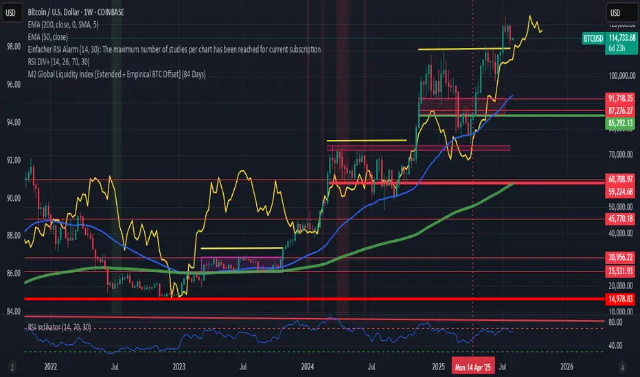
M2 Global Liquidity Index [Extended + Empirical BTC Offset]M2 Global Liquidity Index
This script visualizes global M2 liquidity based on major economic zones (USA, China, Eurozone, Japan, UK), with the option to include extended countries such as Switzerland, Canada, India, Russia, Brazil, South Korea, Mexico, and South Africa.
The indicator includes an empirically derived offset to reflect how Bitcoin historically reacts with a time lag—typically around 12 weeks—after shifts in global liquidity.
Features:
Predefined empirical offset options ranging from 12 to 120 days
Automatic offset adjustment when applied to the weekly chart
Optional inclusion of extended global M2 sources
Important:
This indicator is intended only for use on the weekly chart. It provides meaningful and accurate results exclusively in this time frame, due to the nature of the offset-based correlation logic.
Use cases:
Macro-level analysis of Bitcoin’s price movements
Identifying early signs of potential market tops or bottoms in relation to liquidity flows
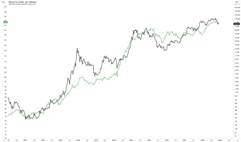
DECODE Global Liquidity IndexDECODE Global Liquidity Index 🌊
The DECODE Global Liquidity Index is a powerful tool designed to track and aggregate global liquidity by combining data from the world's 13 largest economies. It offers a comprehensive view of financial liquidity, providing crucial insights into the underlying currents that can influence asset prices and market trends.
The economies covered are: United States, China, European Union, Japan, India, United Kingdom, Brazil, Canada, Russia, South Korea, Australia, Mexico, and Indonesia. The European Union accounts for major individual economies within the EU like Germany, France, Italy, Spain, Netherlands, Poland, etc.
Key Features:
1. Customizable Liquidity Sources
Include Global M2: You can opt to include the M2 money supply from the 13 listed economies. M2 is a broad measure of money supply that includes cash, checking deposits, savings deposits, money market securities, mutual funds, and other time deposits. (Note: Australia uses M3 as its primary measure, which is included when M2 is selected for Australia).
Include Central Bank Balance Sheets (CBBS): Alternatively, or in addition, you can include the total assets held by the central banks of these economies. Central bank balance sheets expand or contract based on monetary policy operations like quantitative easing (QE) or tightening (QT).
Combined View: If you select both M2 and CBBS, and data is available for both, the indicator will display an average of the two aggregated values. If only one source type is selected, or if data for one type is unavailable despite both being selected, the indicator will display the single available and selected component. This provides flexibility in how you define and analyze global liquidity.
2. Lead/Lag Analysis (Forward Projection):
Lead Offset (Days): This feature allows you to project the liquidity index forward by a specified number of days.
Why it's useful: Global liquidity changes can often be a leading indicator for various asset classes, particularly those sensitive to risk appetite, like Bitcoin or growth stocks. These assets might lag shifts in liquidity. By applying a lead (e.g., 90 days), you can shift the liquidity data forward on your chart to more easily visualize potential correlations and identify if current asset price movements might be responding to past changes in liquidity.
3. Rate of Change (RoC) Oscillator:
Year-over-Year % View: Instead of viewing aggregate liquidity, you can switch to a Year-over-Year (YoY%) Rate of Change (ROC) oscillator.
Why it's useful:
Momentum Identification: The ROC highlights the speed and direction of liquidity changes. Positive values indicate liquidity is increasing compared to a year ago, while negative values show it's decreasing.
Turning Points: Oscillators make it easier to spot potential accelerations, decelerations, or reversals in liquidity trends. A cross above the zero line can signal strengthening liquidity momentum, while a cross below can signal weakening momentum.
Cycle Analysis: It helps in assessing the cyclical nature of liquidity provision and its potential impact on market cycles.
This indicator aims to provide a clear, customizable, and insightful measure of global liquidity to aid traders and investors in their market analysis.
Global M2 [BizFing]MARKETSCOM:BITCOIN ECONOMICS:USM2
This is an indicator designed to show the correlation between the global M2 money supply and Bitcoin.
This indicator basically provides a Global M2 index by summing the M2 money supply data from the United States, South Korea, China, Japan, the EU, and the United Kingdom.
Furthermore, it is configured to allow you to add or remove the M2 data of desired countries within the settings.
I hope this proves to be a small aid in predicting the future price of Bitcoin.
If you have any questions or require any improvements while using it, please feel free to contact me.
Thank you.

M2 Liqudity WaveGlobal Liquidity Wave Indicator (M2-Based)
The Global Liquidity Wave Indicator is designed to track and visualize the impact of global M2 liquidity on risk assets—especially those highly correlated to monetary expansion, like Bitcoin, MSTR, and other macro-sensitive equities.
Key features include:
Leading Signal: Historically leads Bitcoin price action by approximately 70 days, offering traders and analysts a forward-looking edge.
Wave-Based Projection: Visualizes a "probability cloud"—a smoothed band representing the most likely trajectory for Bitcoin based on changes in global liquidity.
Min/Max Offset Controls: Adjustable offsets let you define the range of lookahead windows to shape the wave and better capture liquidity-driven inflection points.
Explicit Offset Visualization: Option to manually specify an exact offset to fine-tune the overlay, ideal for testing hypotheses or aligning with macro narratives.
Macro Alignment: Particularly effective for assets with high sensitivity to global monetary policy and liquidity cycles.
This tool is not just a chart overlay—it's a lens into the liquidity engine behind the market, helping anticipate directional bias in advance of price moves.
How to use?
- Enable the indicator for BTCUSD.
- Set Offset Range Start and End to 70 and 115 days
- Set Specific Offset to 78 days (this can change so you'll need to play around)
FAQ
Why a global liquidity wave?
The global liquidity wave accounts for variability in how much global liquidity affects an underlying asset. Think of the Global Liquidity Wave as an area that tracks the most probable path of Bitcoin, MSTR, etc. based on the total global liquidity.
Why the offset?
Global liquidity takes time to make its way into assets such as #Bitcoin, Strategy, etc. and there can be many reasons for that. It's never a specific number of days of offset, which is why a global liquidity wave is helpful in tracking probable paths for highly correlated risk assets.

Gabriel's Global Market CapGabriel's Global Market Cap is a comprehensive financial indicator designed to track and analyze the total market capitalization across multiple asset classes. It incorporates various financial markets, including stocks, bonds, real estate, cryptocurrencies, commodities, derivatives, private equity, insurance, OTC markets, and natural resources, to provide a holistic view of global market dynamics.
This indicator integrates Ehlers' Adaptive Dominant Cycle Detection and a custom VIX formula to adjust market values based on volatility and volume fluctuations, allowing for a more refined understanding of market conditions.
Key Features
✅ Multi-Market Analysis – Tracks 10+ global financial sectors, each represented by a key ETF or index.
✅ Normalization & Readability – Converts market cap values into an easy-to-read format (Millions, Billions, Trillions, Quadrillions).
✅ Volatility & Volume Adjustments – Optional VIX-based smoothing and relative volume adjustment for more dynamic readings.
✅ Ehlers’ Cycle Detection – Utilizes dominant cycle length detection to uncover market rhythms and cyclic behavior.
✅ Risk Thresholds & Background Coloring – Identifies overbought and oversold conditions with cyclic bands and background shading.
✅ Customizable Inputs – Users can toggle different market categories on/off for focused analysis.
✅ Interactive Data Table – Displays real-time values for each asset class in a structured table format.
Market Categories & Data Sources
📈 Global Stock Market – iShares MSCI ACWI ETF (ACWI)
💰 Global Bond Market – Vanguard Total World Bond ETF (BNDW)
🏡 Real Estate Market – iShares Global REIT ETF (REET)
₿ Cryptocurrency Market – Total Crypto Market Cap (CRYPTOCAP:TOTAL)
🌾 Commodities Market – Invesco DB Commodity Index Fund (DBC)
📊 Derivatives Market – CME Group (CME)
🏦 Private Equity & VC – ProShares Global Listed Private Equity ETF (PEX)
🛡️ Insurance Market – SPDR S&P Insurance ETF (KIE)
💹 OTC Markets – OTC Markets Group (OTCM)
⛽ Natural Resources – iShares Global Energy ETF (IXC)
Technical Enhancements
1️⃣ Custom Volatility Index (VIX) Calculation (Work In Progress)
Adjusts asset values based on volatility conditions using Ehlers' Cycle Detection.
Higher VIX reduces market cap, while lower VIX stabilizes it.
2️⃣ Adaptive Market Normalization
Converts absolute market values into a relative strength scale (0-100) for better visual analysis.
Uses historical min/max values to adjust dynamically.
3️⃣ Cyclic Analysis & Overbought/Oversold Levels
Detects hidden market rhythms & time cycles.
Calculates upper and lower risk bands based on dominant cycle length.
Applies background shading for visualizing low or high risk periods.
Customization Options
🔧 Enable/Disable Market Categories – Select which asset classes to track.
📊 Toggle VIX & Volume Smoothing – Adjust how market cap reacts to volatility & volume.
🎨 Cyclic Risk Bands – Highlight overbought/oversold conditions with dynamic background colors.
Visual Elements
📉 Market Cap Trends – Each category is plotted with a unique color.
🌎 Total Global Value (TGV) – A combined index representing all selected markets.
🎨 Background Coloring – Indicates high/low risk periods.
📋 Real-Time Data Table – Displays normalized & raw market cap values in an easy-to-read format.
Practical Applications
📊 Macroeconomic Analysis – Track global liquidity and investment shifts across asset classes.
💹 Volatility & Risk Assessment – Identify high-risk market conditions based on cyclic behavior.
📈 Cross-Market Comparisons – See which sectors are leading or lagging in value growth.
🔍 Crypto & Stock Market Trends – Analyze how traditional and digital assets correlate.

Global GDPThis is the GlobalGDP of the richest and most populous countries
It is measured in USD
The countries included are the same than are included in my Global M2 indicator, as of to be able to compare them side to side.

Global (World) Monetary Supply M2 (measured in USD)This is the Global Monetary Supply M2 of the richest and most populous countries that have info from at least 2008
It is measured in USD (converting the M2 of each of the countries respective currencies and virtually converting them into USD)
This is less than the global liquidity as it does not include the countries' assets in other currencies (on their balance sheets), it only focuses on the monetary supply of each of the countries own currencies.

Global Monetary Supply M2 Vs the Global GDP This indicator compares the Global (world) Monetary Supply (measured in USD) compared to the Global GDP.
This can be useful to measure the "money printing speed" of the world compare to the "world gdp growth", the higher the slope (angle of growth) the more money printing.
It includes the exact same countries of the Global M2 indicator (done by me), to make fair the comparison, which has the richest and most populous countries so to have a clear overview.
There tough a few very populated countries excluded, the details can be found on the Global M2 indicator script and reason for exclusion.
Enjoy!

Global Unemployment RateThe Global Unemployment rate estimates what is the rate of unemployment of the whole world, taking same data from multiple countries and normalizing them.
It includes the Eurozone + 19 countries from all the continents, which are some of the richest countries as well as some of the most populous.
It sadly does not include India as its unemployment data on trading view as of today (Feb 2023) is only since year 2019, which is too short

Global Trend [BEA]Do you Ever Wonder How world Market/indices are Performing Before your Market Open?
This indicator consist of 30 Major global indices and 10 local Indices which will help you get a idea of the direction of the global markets. So basically I have calculate the % change for each bar, then I am calculating the weightage of positive change with respect to total % change for all four markets separately .
How to use this indicator?
As per my experience , each regional market will follow the global trend , so I think the the local markets will tends to converge towards the average of all four market trend ( I am situated in Asia , so you need to do your own research before using this indicator )
Following four markets are being plotted :
American Market
Asian Market
European Market
Local Market
I have provided inputs to select the indices , you can change the local index as per your location.
You can choose whichever market trend you want to display.
In the following image i have selected the American market and Local market
In the following image i have selected the American market and Local market
Sources & refences :
Big thank to www.pinecoders.com and kodify.net
DISCLAIMER
Any and all liability for risks resulting from investment transactions or other asset dispositions carried out by the user based on information received or a market analysis is expressly excluded by me.
All the information made available here is generally provided to serve as an example only, without obligation and without specific recommendations for action. It does not constitute and cannot replace investment advice. We therefore recommend that you contact your personal financial advisor before carrying out specific transactions and investments.
Do your own research, This is not a financial advice.
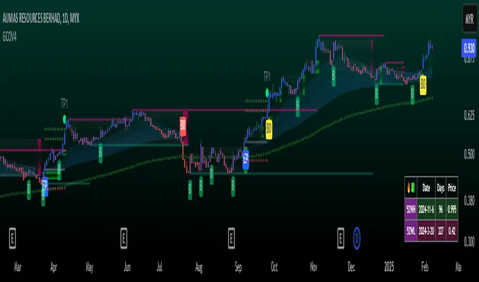
GCOV4 PROTECH GCOV4 PROTECH SYSTEM
This indicator is built specifically for SWING, PULLBACK and BREAKOUT strategy trading in the stocks/equity market. It uses an indicator instrument consisting of ATR TRAILING STOP (ATR), EXPONENTIAL MOVING AVERAGE(EMA), PIVOT POINT and VOLUME ANALYSIS.
The parameters that have been upgraded are to meet the needs of trading strategies whether short or long term trading. In addition, it is built to reduce the risk of trading activities and help traders to adhere to the best trading plan.
This transformation involves 3 trading strategy modes namely SWING PRO, PULL & BOUND and BREAKOUT STRATEGY.
Rebuild of Instrument & Parameter
This indicator is also an upgraded instrument that is sourced from the previous indicator, the GOLDENCO AIE2 INDICATOR.
This R&D of course to make trading activities more effective, dynamic and to increase the confidence of traders in current trading activities. The indicator has been upgraded in terms of parameters as well as additional instruments. Among them are;
1. ATR Trailing Stop
2. Exponential Moving Average – fastMA/slowMA Length
3. Label@Entry Price/Stoploss/Takeprofit line;
>The take profit and stop loss rates are based on percentages. However
traders can change the percentage rate according to their respective
trading plans.
>existing percentage rates have been set(build-in) for standard rate.
So you have to reset based on the type of stock/market cap either penny
stock or blue chip stock.
>The candle/bars have been colored to make it easier for traders to see price
trends whether in bullish or bearish conditions.
Hopefully with the upgrading of these indicators will make traders more successful in trading activities, especially in the equity markets.
DISCLAIMER;
ALL NOTES AND INDICATING TOOLS ARE FOR EDUCATIONAL ONLY AND AS A FACILITATOR AND PREPARATION IN TRADING ACTIVITIES. ADMIN IS NOT RESPONSIBLE FOR ANY RISKS IN YOUR TRADING ACTIVITIES. TAKE AT YOUR OWN RISK.
FunTrader/Aieyee @2022
BTC 1D Safety tradeImportant: use only the BTC/USD pair on the 1D timeframe
The indicator is designed to determine the zones for entry to buy or sell, as well as for closing deals.
The indicator is based on a moving average with a period of 12.
The parameters are not changeable, since the optimal settings (Safety trade) were used for the BTC/USD pair on the 1D timeframe.
The code is open, please change it according to your parameters.
Upper zones for closing long or opening short.
Lower zones for opening long or closing short.

Live Mini Terminal 2 : Relative USD Based Stock Markets Change This script displays relative data changes occurring in the adjustable period and/or adaptive automatic period in various stock markets.
It was inspired by the data terminals used by commercial traders.
Period selection can be set in the menu.
This script uses the adaptive period algorithm used by Autonomous LSTM and Relativity scripts.
Or you can set the period manually from the menu.
For more information about adaptive period this script uses:
This script works only for 1 day (1D) and 1 week (1W) time frames.
The most efficient time frame is 1 week because of different time-zones (1W) .
Features
Value changes on a percentage basis (%)
Stock exchange values are calculated in dollar terms.
Due to the advantage of movement, future data were chosen instead of spot values on the required instruments.
INSTRUMENTS
Usa : S&P 500 Futures
Japan: Nikkei 225 Futures
England: United Kingdom (FTSE) 100
Australia: Australia 200
Canada: S&P / TSX Composite
Switzerland: Swiss Market Index
New Zealand: NZX 50 Index
China: SSE Composite (000001)
Denmark: OMX Copenhagen 25 Index
Hong-Kong: Hang Seng Index Futures
India: Nifty 50
Norway: Oslo Bors All Share Index
Russia: MOEX Russia Index
Sweden: OMX Stockholm Index
Singapore: Singapore 30
Turkey: BIST 100
South Africa: South Africa Top 40 Index
Spain: IBEX 35
France: CAC 40
Italy: FTSE MIB Index
Netherlands: Netherlands 25
Germany : DAX
USAGE
The script can be used as an indicator by putting it under the chart as shown above.
It is necessary to enlarge to see clearly.
Since it is not often looked at,such use is the best method for healthy interpretation.

Live Mini Terminal 1 : Relative General Data ChangeThis script displays relative data changes occurring in the adjustable period and/or adaptive automatic period in various markets.
It was inspired by the data terminals used by commercial traders.
Period selection can be set in the menu.
This script uses the adaptive period algorithm used by Autonomous LSTM and Relativity scripts.
Or you can set the period manually from the menu.
For more information about adaptive period this script uses:
This script works only for 1 day (1D) and 1 week (1W) time frames.
Since COT data is used, the most efficient time frame is 1 week (1W) .
Features
Value changes on a percentage basis (%)
Commitment of Traders position changes on a percentage basis :
Net position percentage is calculated as Short - Long and there is no inverse relationship.
Direct relationship is provided.
Due to the advantage of movement, future data were drawn instead of spot values on the required instruments.
INSTRUMENTS
US10Y : U.S Government Bonds 10 Year Yields
VIX : CBOE Volatility Index (S&P 500 VIX )
GOLD : XAUUSD : Gold
WTI : West Texas Intermediate : USOIL , Crude Oil
BCO : Brent Crude Oil : UKOIL , Light Crude Oil
SP500 : S&P 500 Index
DXY : US Dollar Index
TIO : Iron Ore : Iron Ore %62 Fe CFR China Futures
XAG : SI : Silver
NG : Natural Gas
JPYUSD : Japanese Yen
EURUSD : Euro/Dollar
Position Change InfoPanel
10 US T-Bond positions are used because there is no position equivalent in US10Y.
In other instruments, the corresponding position provisions are written and their changes are calculated.
USAGE
The script can be used as an indicator by putting it under the chart as shown above.
It is necessary to enlarge to see clearly.
Since it is not often looked at,
such use is the best method for healthy interpretation.

Relativity Autonomous Distribution Blocks
The relativity method is a method of trade inspired by the Theory of Relativity of Albert Einstein , which argues that trade is a relative concept and, according to the case it advocates, creates the values to be evaluated relatively by using various engineering methods, and converts these values to factors to ensure the highest efficiency.
Many layers are common with Autonomous LSTM.
For more information about Autonomous LSTM :
But there are additional layers that are much higher than that.
These systems use COT (Commitment of Traders) data positively in trade and significantly increase the hit rate compared to conventional methods.
And in all traded instruments, it decides the degree of scoring by linking with global markets.
The more liquidity of the selected parities, the higher the success rate, the higher liquidity in the markets.
***STRUCTURE
Feature Layer 1 : Formulation : Common Layer with Autonomous LSTM
Feature Layer 2: Forecast Algorithm : Common Layer with Autonomous LSTM
Feature Layer 3 : Composite of Two Layers : Adaptive Period (Length) Algorithm : Common Layer with Autonomous LSTM
Feature Layer 4 : High - Low Selection Algorithm : Common Layer with Autonomous LSTM
Feature Layer 5 : Volume (Ticker ) - Open Interest (Global Market) Power Factor according to Global Markets and Related instrument (Ticker)
Feature Layer 6 : Quantum Equations including COT Commercial Positions (Communicate with layer 5)
Feature Layer 7 : World's Price/Earnings Ratio (This layer is automatically added to layer 6 as a factor each week.)
Feature Layer 8 : Distribution Blocks : The design of script as a histogram, with distributional buying and selling points and positive/negative zone coloring, with alerts.
Uses the relativity algorithm. This will contribute not only to leveraged transactions but also to portfolio management and will give a more realistic perspective.
Informs the trading points within the regions.
In this way, it allows for gradual buying and selling and reduces the risk to a much lower level.
These feature allows a difference perspective especially for traders who act with portfolio logic and / or add regular income.
The educational idea I shared in order to set an example for this logic:
***SETTINGS
Menu
1. * Market Type
The menu is divided into 5 different algorithms and covers all instruments around the world.
For example:
Futures : XAUUSD , GC , XAGUSD , SUGARUSD , SB1! , XAGUSD
Stocks : All Stocks and Modified Parities (Example : AAPL/EUR , XAU/XAG , AAPL , MT , BAC)
Forex Excluding USD/X : CHFUSD , EURUSD , EURJPY , AUDNZD
Forex USD/X : USDJPY , USDTRY , USDMXN
Crypto : BTCUSD , ETHUSD , ADAUSD or BTCETH , ETHBTC
2. * Barcolor
Barcolor Plotting Rules : On / off section with these rules when barcolor on :
Orange : Distributional Sell Signal ( Not Short )
Blue : Distributinaol Buy Signal
*** FEATURES
Indicator Features :
Red Background with Cross : Short Signal
Green Background with Cross : Buy Signal
Blue Histogram Color : Distributional Buy Signal
Orange Histogram Color : Distributional Sell Signal
Alerts
Long Alert
Short Alert
Distributional Buy Alert
Distributional Sell Alert
*** USAGE
Since the script uses various Commitment of Traders data, it is designed only for the weekly time frame. ( TF = 1W )
Script does not repaint 1 Week and above time frames . (Source = close )
NOTE :
The script design was inspired by one of RafaelZioni's script :
Best regards.

VolumeChart BTC Volume Powered by BotBoys [v09/11/2018]Btc global volume by volumeChart team (BotBoys).
Takes volumes of all exchanges with BTC.
It includes Europe, EEUU, Asia and South-America.

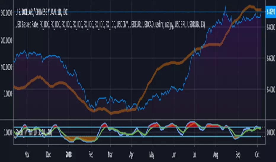
Compare currency against multiple (Basket of currencies)Early version of a script to compare one currency against multiple to get an index.
Default values loaded basically make something along the lines of, "USD global exchange rate"
I plan on making this less clunky/messy in future with respect to the coding and the user inputs. Works 100% right now though.
BTC World Volume (Multi-Exchange)Release: 2018-03-29
__________________________
WHAT IT DOES
Bitcoin is listed on multiple exchanges. Many people have called for a single global index that would quote BTC volume across all exchanges: this script is such a virtual volume aggregate of the 17 largest fiat exchanges on TradingView (listed in the script comments, and in Format > Inputs for you to select). It includes USD, EUR, JPY, KRW and USDT sources.
It will, independently for each tick, quote the volume from all selected exchanges and display a stacked representation, freely inspired from CoinMarketCap charts; also a Moving Average. Each fiat/continent has its own general color, to be able to quickly glance at where volume is coming from, e.g. BitMEX or Asia. (colors are based on Google's Material Design).
By default:
Grey: BitMEX
Green: USD
Yellow: Tether (USDT)
Red: Asia (JPY, KRW)
Blue: Europe (EUR)
No more "on Coinbase this" or "on Bitstamp that", you've now got a global overview! It becomes easy to debunk a few common myths.
See CoinMarketCap for reference.
Note: Bitmex is not taken into account in CoinMarketCap (afaik) since it's trading a derivative asset (XBTUSD contracts), but it usually amounts to ~50% of the overall BTC volume in USD value. The 16 other exchanges quote their volume in BTC, and they represent 30~40% of the overall BTC volume. I believe the whole is good enough to smooth out exchanges variations, and get a fair representation of real-time activity.
__________________________
HOW TO USE IT
Just add it to your chart, it will appear as a separate indicator. By default, it appears as stacked colored "areas". There is also a total volume Histogram, which is transparent by default: you can tweak that in Format > Style.
The darker and lighter backgrounds are respectively indicative of a downward price candle (open > close), or an upward price candle (close > open). They are unrelated to volume and simply help interpreting the indicator.
You can check/uncheck exchanges in the Format > Inputs tab to remove/add some of them from computation. All are enabled by default.
You can check/uncheck exchanges in the Format > Style tab to hide them (usually you would hide all or none).
You can edit colors and transpareny as well for each exchange.
You can edit "Volume histogram" transparency to have it show (it's a simpler representation than areas).
Moving Average: You can select the type (SMA, EMA, DEMA or TEMA) and length.
__________________________
Please leave feedback below or pm me directly for bugs and suggestions.
