Strong Economic Event Indicator (mtbr)Description:
This indicator is designed for traders to visualize entry levels, targets (TP1, TP2, TP3), and stop loss around key economic events for the selected asset, defaulting to XAUUSD. It provides a clear reference for potential market movements based on the event's surprise and direction (Bullish, Bearish, or Neutral).
Key Features:
Customizable Event Selection:
Select from a list of major economic events including ISM Services PMI, CPI, Non-Farm Payrolls, Fed Rate Decision, and more.
Set the exact year, month, day, hour, and minute for the event so that lines and labels appear at the correct bar.
Surprise Calculation and Direction:
Automatically calculates the difference between Actual and Forecast.
Displays the market direction in the table as Bullish, Bearish, or Neutral.
Price Levels in Pips Relative to Entry:
Entry, three targets (TP1, TP2, TP3), and Stop Loss can be set in pips relative to the entry price.
Directional logic ensures that levels adjust automatically according to Bullish or Bearish surprise.
Each line and label is independent and updates only when its corresponding input changes.
Chart Visualization:
Colored lines and labels:
Entry → Blue
TPs → Green
Stop Loss → Red
Vertical event line → Orange (dashed), highlighting the event release moment.
Integrated Informative Table:
Displays:
Selected economic event
Entry price
TP1, TP2, TP3 levels
Market direction status
Color-coded: green for Bullish, red for Bearish, gray for Neutral.
How to use the script:
Add the indicator to the chart of your preferred asset (default is XAUUSD).
Select the economic event from the drop-down list.
Set the event date and time in the input panel.
Enter the Entry Price and pip values for TP1, TP2, TP3, and Stop Loss according to your strategy.
The indicator will automatically draw lines and labels on the chart and update the table with event details and market direction.
Whenever an input value changes, only the corresponding line and label will update, leaving other levels intact.
Important Notes:
This indicator is visual and educational only; it does not place trades automatically.
Make sure the event timezone is correct to match your local release time.
Use in combination with your own trading strategy and risk management.
TradingView Publication Compliance:
Full instructions for usage
Explanation of inputs and settings
Description of line and label behavior
Educational disclaimer (no automated trading)
Análise Fundamentalista

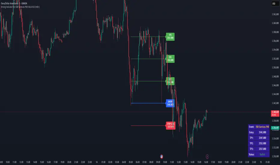
Strong Indicator for ISM Services PMI XAUUSD (mtbr)Description:
This indicator is designed to help traders visualize entry levels, targets (TP1, TP2, TP3), and stop loss around the ISM Services PMI economic event for the XAUUSD asset. It provides a clear reference for potential market movements based on the event’s surprise and market direction (Bullish or Bearish).
Key Features:
Customizable event date and time:
You can set the exact year, month, day, hour, and minute of the event so that the lines and labels appear precisely on the corresponding bar.
Surprise calculation and market direction:
The difference between Actual and Forecast is calculated and displayed in the table as Bullish, Bearish, or Neutral.
Price levels in pips:
Entry (Entry), three targets (TP1, TP2, TP3), and Stop Loss (SL) can be set in pips relative to the entry price.
Each level has independent lines and labels, which update only if the corresponding input value changes, keeping the rest of the chart intact.
Clear visualization on the chart:
Colored lines:
Entry → blue
TPs → green
Stop Loss → red
Vertical event line → orange, highlighting the release moment.
Integrated informative table:
Displays:
Event name
Entry price
TP1, TP2, TP3
Market direction status (Bullish/Bearish/Neutral)
Table colors reflect market direction (green for bullish, red for bearish, gray for neutral).
How to use the script:
Add the indicator to the XAUUSD chart.
Set the ISM Services PMI event date and time in the input panel.
Enter the Entry Price and pip values for TP1, TP2, TP3, and SL according to your strategy.
The indicator will automatically draw lines and labels on the chart and update the table with the event details and market direction.
Whenever you change an input value, only the corresponding line and label will update, keeping other levels fixed.
Important Notes:
The indicator does not perform automatic trades; it serves as a visual reference for trading decisions.
Ensure the event timezone is set correctly to match the release time in your local time zone.
Use in combination with your own risk management and trading strategy.
TradingView publication rules followed:
Full instructions for using the indicator
Clear explanation of inputs and settings
Description of lines and label behavior
Disclaimer that the script is educational and visual, not automated trading
4 EMA Multi-Length / Abbas4 EMA Multi Length indicator
in case you need to make 4 different EMA/s for your chart
for swinging you'll need 50/100/150/200
for scalping perhaps 9/20/50
this indicator allows you to combine up to 4 EMAS in one indicator instead of 4 separate ones.

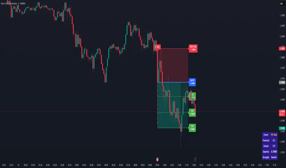
Strong Indicator for PPI MoM EURUSD (by Mestre dos Traders 2025)Strong Indicator for PPI MoM EURUSD (by Mestre dos Traders 2025)
Overview:
This indicator is designed to track the PPI MoM economic event and provide precise trading signals for EURUSD. It automatically calculates key levels, shows the market surprise, and visualizes potential trade opportunities with clear lines, labels, arrows, and a table panel.
Key Features:
Asset Filter: Apply the indicator only to the selected trading pair (default: EURUSD).
Event Timing: Configure event hour and minute in UTC or use a custom date/time for backtesting.
Invert Signal Logic: Option to invert bullish/bearish logic for different strategies.
Automatic Surprise Calculation: Computes the difference between Actual and Forecast values.
Strength Classification: Categorizes market impact as Strong/Moderate/Weak Bullish or Bearish.
Entry Direction & Levels:
Entry Price
Take Profit Levels: TP1, TP2, TP3
Stop Loss
All levels are calculated in pips and visually displayed on the chart.
Visual Alerts:
Arrows indicating BUY or SELL at the event bar.
Colored lines for entry, TP, and SL levels.
Vertical dashed line highlighting the event bar.
Table Panel: Displays Event Name, Forecast, Actual, Surprise, and Strength.
Customizable Line Extensions: Extend lines for better visibility.
Compatible with Multiple Timeframes: Works on any timeframe.
V1 – Action-Oriented:
“Catch the PPI MoM move! 🚀
Get instant BUY/SELL signals for EURUSD with clear entries, TP levels, Stop Loss, and market surprise. Perfect for fast, news-driven trades!”
V2 – Focus on Simplicity:
“Trade economic news effortlessly! 📊
This indicator shows entry, TPs, Stop Loss, and market strength around PPI MoM releases. Clear, visual signals for EURUSD traders.”
V3 – Impact & Excitement:
“Profit from PPI MoM spikes! 💹
Real-time signals with entry, TP1/2/3, Stop Loss, and surprise analysis. See exactly when to BUY or SELL EURUSD during news events.”
How to Use:
Set the Asset to Trade (default EURUSD).
Adjust Event Time or enable Custom Date for backtesting.
Input Forecast and Previous values. Leave Actual at 0 until the release.
Observe chart when the event occurs: the indicator will draw lines, labels, and arrows for potential trades.
Use Strength Classification to gauge market impact.
Trading bot gridsGuide: Price Lines – Arithmetic vs. Geometric
This script draws horizontal price lines (grids) between a start price and an end price.
You can choose whether the lines are distributed evenly (arithmetic) or by percentage (geometric).
🔧 Inputs
Start Price → Lower or upper boundary of the price range.
End Price → Opposite boundary of the price range.
Number of Lines → Total number of lines to be drawn between the start and end prices.
Distribution →
Arithmetic: Fixed USDT distance between each line.
Geometric: Fixed percentage distance between each line.
Grid Color → Color of the drawn lines.
📈 How it Works
The script calculates the lower (lo) and upper (hi) boundaries, regardless of which is entered first.
Arithmetic distribution: Each line is spaced by a fixed amount in USDT.
Geometric distribution: Each line is spaced by the same percentage difference from the previous one.
Lines are created only once at the first bar and remain on the chart.
All lines are extended across the entire visible chart.
💡 Tips
Useful for Grid Bot backtesting or visualizing price zones.
Works for both long and short price ranges.
In geometric mode, lines appear closer together near the lower price range and farther apart toward the upper range.

FVG + Bank Level Targeting w/ Alert TriggerDescription:
FVG + Bank Level Targeting w/ Alert Trigger is an intraday trading tool that combines Fair Value Gap (FVG) detection with dynamic institutional targeting using prior-day, weekly, and monthly high/low "Bank Levels." When a Fair Value Gap is detected, the script projects a logical target using the closest bank level in price's direction, and visually extends that level on your chart.
This tool is designed to help traders anticipate where price is most likely to move after an FVG appears — and alert them when price breaks through key target zones.
How It Works:
* Bank Level Calculation:
The indicator calculates Daily, Weekly, and Monthly high and low levels from the previous bar of each respective timeframe.
These are optionally plotted on the chart with a slight tick offset to avoid overlap with price.
* FVG Detection:
Bullish FVGs are defined by a gap between the low of the current candle and the high two candles prior, with a confirming middle candle.
Bearish FVGs follow the reverse pattern.
Once detected, the script finds the nearest unbroken institutional level (Bank Level) in the direction of the FVG and anchors a target line at that price level.
* Target Line Projection:
The script draws a persistent horizontal line (not just a plotted value) at the selected bank level.
These lines automatically extend a set number of bars into the future for clarity and trade planning.
* Breakout Detection:
When price crosses above a Bull Target or below a Bear Target, the script triggers a breakout condition.
These breakouts are useful for trade continuation or reversal setups.
* Alerts:
Built-in alert conditions notify you in real time when price crosses above or below a target.
These can be used to set TradingView alerts for your preferred Futures symbols or intraday pairs.
Parameters:
Tick Offset Multiplier: Adds distance between price and plotted levels.
Show Daily/Weekly/Monthly Levels: Toggle for each institutional level group.
FVG Extend Right (bars): Controls how far the target lines extend into the future.
Color Controls: Customize colors for FVG fill and target lines.
Use Case:
This indicator is designed for traders who want to:
Trade continuation or reversal moves around institutional price zones
Integrate Fair Value Gap concepts with more logical, historically anchored price targets
Trigger alerts when market structure evolves around key levels
It is especially useful for intraday Futures traders on the 15-minute chart or lower, but adapts well to any instrument with strong reactionary behavior at prior session highs/lows.
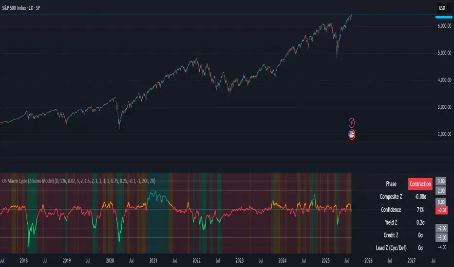
US Macro Cycle (Z-Score Model)US Macro Cycle (Z-Score Model)
This indicator tracks the US economic cycle in real time using a weighted composite of seven macro and market-based indicators, each converted into a rolling Z-score for comparability. The model identifies the current phase of the cycle — Expansion, Peak, Contraction, or Recovery — and suggests sector tilts based on historical performance in each phase.
Core Components:
Yield Curve (10y–2y): Positive & steepening = growth; inverted = slowdown risk.
Credit Spreads (HYG/LQD): Tightening = risk-on; widening = risk-off.
Sector Leadership (Cyclicals vs. Defensives): Measures market leadership regime.
Copper/Gold Ratio: Higher copper = growth signal; higher gold = defensive.
SPY vs. 200-day MA: Equity trend strength.
SPY/IEF Ratio: Stocks vs. bonds relative strength.
VIX (Inverted): Low/falling volatility = supportive; high/rising = risk-off.
Methodology:
Each series is transformed into a rolling Z-score over the selected lookback period (optionally using median/MAD for robustness and winsorization to clip outliers).
Z-scores are combined using user-defined weights and normalized.
The smoothed composite is compared against phase thresholds to classify the macro environment.
Features:
Customizable Weights: Emphasize the indicators most relevant to your strategy.
Adjustable Thresholds: Fine-tune cycle phase definitions.
Background Coloring: Visual cue for the current phase.
Summary Table: Displays composite Z, confidence %, and individual Z-scores.
Alerts: Trigger when the phase changes, with details on the composite score and recommended tilt.
Use Cases:
Align sector rotation or relative strength strategies with the macro backdrop.
Identify favorable or defensive phases for tactical allocation.
Monitor macro turning points to manage portfolio risk.
It's doesn't fill nan gaps so there is quite a bit of zeroes, non-repainting.
EPS QoQ % ChangeThis indicator calculates and displays the quarter-over-quarter (QoQ) percentage change in earnings per share (EPS) directly on your chart, aligned with each earnings event.
It is designed to quickly highlight EPS growth or decline without the need to open an earnings report, providing traders and investors with instant, visual performance context.
Features :
- Automatic Earnings Detection: Identifies earnings bars and calculates QoQ % change.
- Color-Coded Text: Positive changes are shown in your chosen “up” color, declines in your “down” color, and flat results in a neutral color.
- Customizable Appearance: Choose text size and colors to match your chart style.
- Tooltip Support: Optional detailed tooltip showing reported EPS, previous EPS, and calculated QoQ change.
- Compact Layout: Displays in its own pane to avoid cluttering price action.
Use Cases :
- Quickly assess EPS growth trends over time.
- Spot significant earnings beats or misses without reading earnings transcripts.
- Use alongside other technical or fundamental tools for better decision-making.
VRD-5: Volume Reversal Detector (5 Bars)Overview
This Pine Script indicator detects potential trend reversals based on volume patterns over a 5-bar period. It identifies accumulation (bullish) and distribution (bearish) patterns using volume analysis combined with price action.
Key Features
Volume Analysis:
Compares current volume to a 34-period SMA
Identifies strong/weak volume using configurable thresholds
Calculates volume "energy" as a 5-bar average ratio
Pattern Detection:
Bearish Signal: Looks for decreasing volume after a strong volume bar
Bullish Signal: Looks for increasing volume after weak volume bars
Visualization:
Colored volume histogram (bullish/bearish/neutral)
SMA volume line
Labels for detected signals
Customization Options:
Adjustable lookback period (3-10 bars)
Configurable thresholds for volume strength
Strict mode requiring confirming price action
Suggested Improvements
Performance Optimization:
Reduce the max_labels_count (currently 500) to improve performance
Consider using barstate.isconfirmed for more efficient calculations
Enhanced Visualization:
Add arrows on price chart for better visibility
Include a background color highlight for signal periods
Add option to display the energy level as a separate line
Additional Features:
Incorporate RSI or MACD for confirmation
Add multi-timeframe analysis capability
Include a strategy version for backtesting
Code Structure:
Separate the logic into distinct functions for better readability
Add more detailed comments for complex calculations
Consider using varip for real-time updates if needed
User Experience:
Add input options for label text size/position
Include sound options for alerts
Add a toggle for the information table
This indicator provides a solid foundation for volume-based reversal detection that could be further enhanced with these improvements while maintaining its core functionality.

Real-Time FTFC Dashboard (Styled)Full Time Frame Continuity dashboard that monitors real-time market direction across multiple timeframes for any stock, ETF, or index. Uses green, red, and pause emojis to visually indicate bullish, bearish, or inactive periods, helping traders quickly assess overall market alignment.

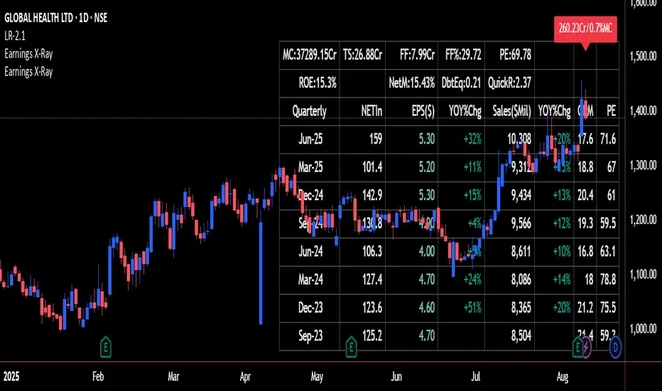
Earnings X-Ray and Fundamentals Data:VSMarketTrendThis indicator calculates essential financial metrics for stocks using TradingView's built-in functions and custom algorithms. The values are derived from fundamental data sources available on TradingView.
Key Output Metrics(YOY Basic Quaterly DATA)
MC (Market Cap): Company’s total market value (Price × Total Shares).
TS (Total Shares Outstanding): All shares (float + restricted) in circulation.
Sales: Annual revenue (TTM or latest fiscal year).
NETIn: Net income
P/E (Price-to-Earnings): Valuation ratio (Market Cap / Net Income or Price / EPS).
EPS (Earnings Per Share): Net income per share (Net Income / TS).
OPM (Operating Margin %): Core profitability (Operating Income / Revenue × 100).
Quick Ratio: Short-term liquidity ((Current Assets – Inventory) / Current Liabilities).
BVPS (Book Value Per Share): Equity per share (Shareholders’ Equity / TS).
PS (Price-to-Sales): Revenue-based valuation (Market Cap / Annual Revenue).
FCF (Free Cash Flow Per Share): Post-CapEx cash ((Operating Cash Flow – CapEx) / TS).
Data Sources & Methods
Uses TradingView’s request.financial() for income/balance sheet data (Revenue, EBITDA, etc.).
Fetches real-time metrics via request.security() (e.g., Shares Outstanding).
Normalizes data across timeframes (quarterly/annual).
Disclaimer
Not financial advice. Verify with official filings before trading.
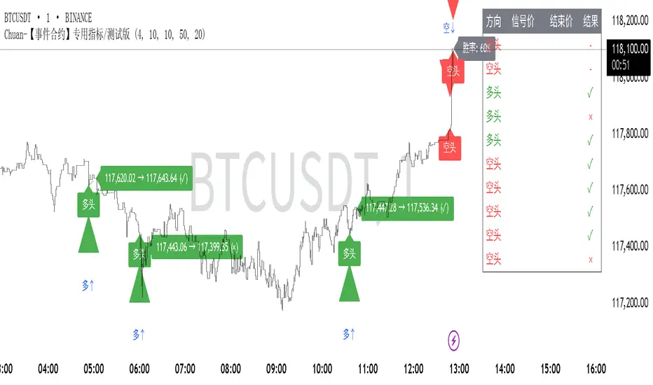
Chuan-事件合约专用指标-信号仅供参考This is a signal technical indicator developed by a technical analysis trader specifically for Binance event contracts. His name is ChuanCrypto
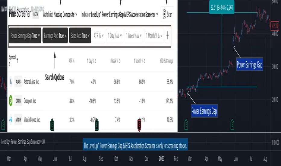
Power Earnings Gap Screener Pro [LevelUp]Customizable Pine Screener to scan for stocks with a Power Earnings Gap as well as accelerating earnings and sales. Historical analysis shows that strong earnings often trigger institutional buying, pushing prices higher and increasing the likelihood of sustained price gains.
🔹 Power Earnings Gap (PEG)
A power earnings gap refers to a significant price gap up after an earnings report, reflecting a rapid shift in investor sentiment and perceived value. It’s called "power" because the move is often sharp, sustained, and accompanied by high trading volume, signaling a potential trend continuation or reversal.
A gap is the difference between the closing price of a stock on the day before an earnings report and the opening price the next trading day. A power earnings gap typically exceeds a certain threshold (e.g., 8-10% or more) and is driven by earnings surprises, guidance changes, or other significant news.
Strong earnings beats, misses, or forward-looking guidance can trigger these gaps. For example, a company reporting higher-than-expected profits or raising guidance might gap up, while a miss or weak outlook could cause a gap down.
The gap is often accompanied by above-average trading volume, confirming the move's strength. Power gaps often lead to sustained price movement in the direction of the gap (continuation) or signal a reversal if the gap fills quickly.
How Power Earnings Gap Be Helpful
▪ Power earnings gaps often indicate strong momentum. Traders can capitalize on this by entering trades in the direction of the gap (e.g., buying on a gap-up if the trend continues).
Example: If a stock gaps up 10% after a stellar earnings report and shows high volume, traders might buy, expecting further upside as momentum builds.
▪ Breakout Opportunities: A gap through key technical levels (e.g., resistance or support) can signal a breakout. Traders use these gaps to identify potential long-term trends.
Example: A stock breaking above a resistance level on a power earnings gap may continue to rally, offering a setup for swing or position traders.
▪ Volatility for Short-Term Trades: Earnings gaps create heightened volatility, ideal for day traders or scalpers. The large price swings allow for quick profits if timed correctly.
Example: A trader might use options (e.g., calls for a gap-up, puts for a gap-down) to leverage the volatility around earnings.
▪ Confirmation of Fundamental Strength/Weakness: A power earning gap often reflects a fundamental shift, e.g., strong earnings growth or a major business development. Traders can use this to align technical setups with fundamental catalysts.
Example: A gap-up after a company raises its full-year guidance might signal a long-term buying opportunity.
▪ Risk Management and Stop Losses: Gaps provide clear levels for setting stop-loss orders. For instance, traders might place stops at or below the gap up bar low to protect against a potential reversal.
Example: If a stock gaps up from $100 to $110 and intraday hits a low of $105, a trader might set a stop at $105 or lower to limit downside risk.
▪ Gap Fill Strategies:Some traders bet on gaps filling, i.e., the stock returning to its pre-gap price. If a power earnings gap seems overextended (e.g., due to market overreaction), contrarian traders might short a gap-up or buy a gap-down, anticipating a pullback.
Example: A stock gaps up 15% but lacks volume or follow-through; a trader might short it, expecting the price to retreat.
🔹 Earnings and Sales Acceleration
Earnings and sales acceleration refers to the rate of growth in a company's earnings over consecutive quarters. It highlights companies that are not only growing but doing so at an accelerating pace, signaling improving financial health and operational momentum. This metric is derived from earnings reports, which detail a company’s financial performance.
Key Concepts
▪ Earnings Acceleration: When a company’s earnings per share (EPS) growth rate increases over time (e.g., EPS growth of 10% in Q1, 15% in Q2, 20% in Q3). It indicates improving profitability, often due to cost efficiencies, margin expansion and strong demand.
▪ Sales Acceleration: When revenue growth rates increase over time (e.g., revenue growth of 5% in Q1, 8% in Q2, 12% in Q3). This reflects rising demand for products/services and operational efficiency.
▪ Relation to Earnings Reports: Acceleration is calculated by comparing sequential quarter-over-year growth rates in earnings and sales, often highlighted in earnings reports or analyst commentary. It’s a sign of fundamental strength when both metrics accelerate together.
How It’s Helpful to Traders
▪ Identify High-Potential Stocks: Stocks with accelerating earnings and sales often attract investor attention, as they signal a company is outperforming expectations and gaining market share. This can lead to sustained price appreciation.
Example: A tech company reporting 20% EPS growth and 15% sales growth quarter-over-quarter may see bullish price action as investors bet on continued momentum.
▪ Momentum Trading Opportunities: Acceleration often fuels stock price momentum, especially post-earnings. Traders can ride these trends using technical setups like breakouts or pullbacks.
Example: A stock breaking above a key resistance level after reporting accelerating growth may be a buy signal for swing traders.
▪ Early Indicator of Breakouts: Companies with accelerating fundamentals are more likely to experience price breakouts, as institutional investors (e.g., hedge funds, mutual funds) pile in. Traders can use this to position early.
Example: A retailer with accelerating sales due to strong holiday demand might gap up post-earnings, offering a breakout trade.
▪ Confirmation of Fundamental Strength: Acceleration validates a company’s growth story, reducing the risk of investing in stocks with inconsistent performance. Traders can align technical trades with strong fundamentals.
Example: A biotech with accelerating sales from a new drug launch may sustain a rally, giving traders confidence in long positions.
▪ Volatility for Short-Term Trades: Earnings reports showing acceleration often lead to significant price gaps or volatility, creating opportunities for day traders or options traders.
Example: A trader might buy call options on a stock expected to report accelerating earnings, anticipating a sharp post-earnings move.
🔹 Power Earnings Gaps - Examples
🔹 Screening Features - Setting Your Search Criteria
Power Earnings Gap
▪ Search Range
How many bars back to search for Power Earnings Gaps, anywhere between 1 and 90 bars.
▪ Last Bar Only
Look only at the last bar for Power Earnings Gaps. This is useful when looking for PEGs when screening at the end of a trading day. Choosing this option, the Search Range will be ignored.
▪ Minimum Price % Gap Up From Prior Close
This is the minimum gap up percent change to be considered a Power Earnings Gap.
▪ Minimum Volume % Change Over Average
This is the minimum volume percent change, over the 50-day average volume, to be considered a Power Earnings Gap.
▪ Require Positive Surprise
Require a positive earnings surprise and the minimum percent change.
▪ Require Closing Range
To ensure the price action closed strong on the day, specify a preferred closing range as a percentage of the bar's daily range.
▪ Gap Up Bar
The gap up bar can be configured to require one of the following:
- Open Above Prior High - Ensures there is visible gap up from the prior bar.
- Low Above Prior High - Allows for intraday price action to go below the prior bar high.
- No Requirement
Earnings And Sales Acceleration
▪ Quarters of Acceleration
You can specify between 1 and 4 quarters of earnings and/or sales acceleration.
🔹 Installation And Usage
▪ Mark this indicator as a Favorite.
▪ Use the Pine Screener to search for stocks.
▪ Save the search results to a watchlist.
▪ View the watchlist in TradingView.
🔹 Note
▪ Risk of Reversals: Not all gaps sustain their direction. Over reactions can lead to gap fills.
▪ High Volatility: Earnings gaps can be unpredictable, requiring quick decision-making & discipline.
Script pago
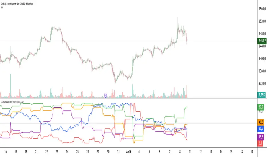
Comparaison DXY, VIX, SPX, DJI, GVZPine Script indicator compares the normalized values of DXY, VIX, SPX, DJI, and GVZ indices on a single scale from 0 to 100. Here's a breakdown of what it does:
Data Requests: Gets closing prices for:
US Dollar Index (DXY)
VIX Volatility Index
S&P 500 (SPX)
Dow Jones Industrial Average (DJI)
Gold Volatility Index (GVZ)
Normalization: Each index is normalized using a 500-period lookback to scale values between 0-100, making them comparable despite different price scales.
Visualization:
Plots each normalized index with distinct colors
Adds a dotted midline at 50 for reference
Uses thicker linewidth (2) for better visibility
Timeframe Flexibility: Works on any chart timeframe since it uses timeframe.period
This is useful for:
Comparing relative strength/weakness between these key market indicators
Identifying divergences or convergences in their movements
Seeing how different asset classes (currencies, equities, volatility) relate
You could enhance this by:
Adding correlation calculations between pairs
Including options to adjust the normalization period
Adding alerts when instruments diverge beyond certain thresholds
Including volume or other metrics alongside price
SulCryptoversity_4H_BuySell_CryptoIndicatorThis strategy is designed specifically for the 4-hour timeframe on trading charts. It works primarily for Bitcoin (BTC) but can also be applied to other high-market-cap cryptocurrencies such as Ethereum (ETH), Solana (SOL), Ripple (XRP), Sui (SUI), and even various other coins.
Please note that this is not financial advice—trading involves significant risk, and you should only proceed at your own discretion. We are not liable for any losses incurred from following these signals.
This strategy may be more effective in leverage trading to maximize gains, but leverage trading is highly risky and only recommended for highly skilled traders, as you could lose all your money. For regular purposes, use spot trading.
To use it effectively, focus on the "Buy" and "Sell" signals for your entry and exit points. While an "Exit Buy" signal may appear, rely solely on the main Buy and Sell indicators for decision-making.
-SulCryptoversity aka yo4Q
Risk Appetite IndexWhat This Indicator Does
The Risk Appetite Index measures market participants' willingness to take risk by analyzing multiple market factors. This indicator attempts to provide insights into overall market sentiment by combining information from different market segments into a single composite measure.
How It Works
The indicator uses a multi-factor approach that examines various aspects of market behavior including equity market conditions, interest rate environments, credit markets, volatility patterns, and other relevant market data. These factors are processed and combined to create a composite reading on a 0-100 scale.
Theoretical Foundation
The methodology is grounded in established financial theories including Modern Portfolio Theory principles for risk assessment, behavioral finance concepts regarding market sentiment cycles, and factor investing approaches for multi-dimensional market analysis. The indicator incorporates insights from academic research on market microstructure, volatility clustering phenomena, and cross-asset correlation patterns during different market regimes.
The approach draws from research on fear and greed cycles in financial markets, term structure modeling, and credit risk assessment methodologies. Statistical techniques employed include robust normalization methods and composite index construction principles established in econometric literature.
The methodology employs statistical techniques to normalize the different market inputs and reduce the impact of extreme values. The final output aims to reflect the general level of risk appetite present in financial markets.
Signal Interpretation
Values above 60 may suggest higher risk appetite conditions in markets. Values below 30 may indicate lower risk appetite environments. The 30-60 range represents neutral or mixed conditions where market sentiment may be unclear.
The indicator includes threshold levels that may help identify potential changes in market conditions. However, like all technical indicators, these levels should be considered as potential reference points rather than definitive signals.
Research Context
The approach builds upon established sentiment measurement methodologies documented in financial literature, including studies on VIX-based fear indicators, credit spread analysis, yield curve interpretation, and cross-asset momentum research. The multi-factor design reflects principles from academic research on composite economic indicators and systematic risk assessment frameworks used by central banks and institutional investors.
The threshold-based signal generation follows established precedents in quantitative finance research regarding regime detection and market state classification methodologies documented in institutional portfolio management literature.
Key Features
Analytics Dashboard: Displays real-time information about current readings, market regime assessment, and signal quality indicators.
Visual Tools: Multiple color schemes and background options to help visualize current market conditions and trends.
Alert System: Optional alerts for threshold crossings and regime changes to help monitor market conditions.
Quality Assessment: Built-in filters attempt to distinguish between higher and lower confidence readings based on data quality and market conditions.
How to Use
This indicator is designed to be used on daily timeframes and displays in a separate panel below the main chart. It works best when used as part of a comprehensive market analysis approach rather than as a standalone trading tool.
The dashboard provides additional context about current readings and may help users understand the quality and reliability of current signals. Users should consider multiple factors and conduct their own analysis when making trading decisions.
Important Considerations
This indicator is designed for educational and analytical purposes. It does not guarantee profitable trading results and should not be used as the sole basis for trading decisions.
Market conditions can change rapidly and unpredictably. Past behavior of any indicator does not predict future market movements. All trading involves substantial risk and may not be suitable for all investors.
The indicator's effectiveness may vary across different market environments and conditions. Users should consider their own risk tolerance and investment objectives when using any analytical tool.
Data Limitations
The indicator relies on multiple external data sources and may be affected by data quality, market holidays, or limited trading hours. Performance may vary during unusual market conditions or structural changes in financial markets.
Like all quantitative models, this indicator has inherent limitations and may not capture all relevant market factors or unprecedented market events.
Intended Use
This indicator may be useful for traders and analysts seeking additional tools for market sentiment analysis. It is designed for those who want to incorporate multiple market factors into their decision-making process.
Academic Research Foundation
The development approach incorporates established research methodologies from quantitative finance literature. Key theoretical frameworks include:
Factor Models: Based on research into multi-factor asset pricing models and their application to portfolio construction and risk management practices developed in academic finance literature.
Behavioral Finance: Incorporates findings from behavioral economics research on market anomalies, investor psychology, and sentiment-driven market movements as documented in financial psychology studies.
Market Microstructure: Utilizes principles from market microstructure research regarding information flow, price discovery mechanisms, and cross-market relationships established in institutional finance literature.
Risk Management: Built upon established risk measurement frameworks including Value at Risk methodologies, stress testing approaches, and systematic risk assessment techniques documented in risk management research.
Econometric Methods: Employs statistical techniques based on time series analysis, robust estimation methods, and composite index construction principles established in econometric literature and central bank research methodologies.
The proprietary methodology combines various market inputs in an attempt to provide insights into overall risk appetite trends, though results may vary and should always be considered alongside other forms of analysis.
Risk Warnings
Past performance does not guarantee future results. All trading involves substantial risk of loss. This indicator does not eliminate market risk and should be used as part of a comprehensive trading plan. Market conditions can change rapidly and unexpectedly. No indicator is accurate in all market conditions.
Technical Requirements
Optimal use on daily charts with TradingView Pro or higher for real-time data access. Designed primarily for US equity market analysis during regular trading hours.
Note: This is a closed-source indicator with proprietary calculation methods designed to maintain effectiveness and provide users with a unique analytical tool.
Script pago

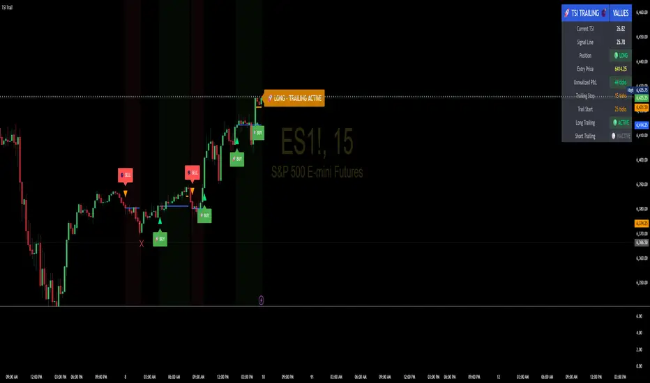
TSI Indicator with Trailing StopAuthor: ProfitGang
Type: Indicator (visual + alerts). No orders are executed.
What it does
This tool combines the True Strength Index (TSI) with a simple tick-based trailing stop visualizer.
It plots buy/sell markers from a TSI cross with momentum confirmation and, if enabled, draws a trailing stop line that “ratchets” in your favor. It also shows a compact info table (position state, entry price, trailing status, and unrealized ticks).
Signal logic (summary)
TSI is computed with double EMA smoothing (user lengths).
Signals:
Buy when TSI crosses above its signal line and momentum (TSI–Signal histogram) improves, with TSI above your Buy Threshold.
Sell when TSI crosses below its signal line and momentum weakens, with TSI below your Sell Threshold.
Confirmation: Optional “Confirm on bar close” setting evaluates signals on closed bars to reduce repaint risk.
Trailing stop (visual only)
Units are ticks (uses the symbol’s min tick).
Start Trailing After (ticks): activates the trail only once price has moved in your favor by the set amount.
Trailing Stop (ticks): distance from price once active.
For longs: stop = close - trail; it never moves down.
For shorts: stop = close + trail; it never moves up.
Exits shown on chart when the trailing line is touched or an opposite signal occurs.
Note: This is a simulation for visualization and does not place, manage, or guarantee broker orders.
Inputs you can tune
TSI Settings: Long Length, Short Length, Signal Length, Buy/Sell thresholds, Confirm on Close.
Trailing Stop: Start Trailing After (ticks), Trailing Stop (ticks), Show/Hide trailing lines.
Display: Toggle chart signals, info table, and (optionally) TSI plots on the price chart.
Alerts included
TSI Buy / TSI Sell
Long/Short Trailing Activated
Long/Short Trail Exit
Tips for use
Timeframes/markets: Works on any symbol/timeframe that reports a valid min tick. If your market has large ticks, adjust the tick inputs accordingly.
TSI view: By default, TSI lines are hidden to avoid rescaling the price chart. Enable “Show TSI plots on price chart” if you want to see the oscillator inline.
Non-repainting note: With Confirm on bar close enabled, signals are evaluated on closed bars. Intrabar previews can change until the bar closes—this is expected behavior in TradingView.
Limitations
This is an indicator for education/research. It does not execute trades, and visuals may differ from actual broker fills.
Performance varies by market conditions; thresholds and trail settings should be tested by the user.
Disclaimer
Nothing here is financial advice. Markets involve risk, including possible loss of capital. Always do your own research and test on a demo before using any tool in live trading.
— ProfitGang
Institutional level Indicator V5Smart money concept indicator with added VWAP for better understanding for fair price with relation to movement of price.

PFA_Earnings Surprise %📌 Indicator Name: Earnings Surprise %
📖 Description:
The Earnings Surprise % indicator calculates and plots the difference between reported EPS (Earnings Per Share) and analyst consensus estimates, expressed as a percentage of the estimate. It helps traders and investors quickly gauge how much a company’s earnings have deviated from expectations on each earnings release date.
Earnings Surprise % — See how earnings stack up against expectations!
This simple yet powerful tool shows the percentage difference between reported EPS and analyst estimates directly on your chart. Positive surprises are plotted in green, negative surprises in red, so you can instantly spot earnings beats and misses. Great for combining with gap analysis, volume spikes, or technical setups around earnings dates. Works best on daily charts of stocks and ETFs with regular earnings reports.

Fair Value Gap with Swing PointsFair Value Gaps occur when there's a significant price difference between the close of one period and the opening of the next, signaling market inefficiencies. Bullish gaps indicate potential upward momentum, while bearish gaps suggest potential downward pressure.

ETH/SOL 1D Dynamic Trend Core - STRATEGY v 45Overview
The Dynamic Trend Core is a sophisticated, multi-layer trading engine designed to identify high-probability, trend-following opportunities. Its core philosophy is rooted in confluence, meaning it requires multiple conditions across trend, momentum, and volume to align before generating a signal. This approach aims to filter out market noise and provide a clearer view of the underlying trend.
The script includes a comprehensive backtesting engine for strategy optimization and a rich, intuitive visual interface for real-time analysis.
How It Works: Core Logic
The engine validates signals through several sequential layers:
Primary Trend Analysis (SAMA): The foundation is a Self-Adjusting Moving Average (SAMA) that dynamically determines the primary market direction (Bullish, Bearish, or Consolidation).
Momentum Confirmation: Signals are then qualified using a blend of the Natural Market Slope and a Cyclic RSI to ensure momentum is firmly aligned with the established trend.
Advanced Filtering Suite: A suite of optional filters provides robust confirmation and allows for deep customization:
Volume & ADX: Confirms that trades are supported by sufficient market participation and trend strength.
Market Regime: Gauges broad market health (e.g., using TOTAL market cap) to avoid trading against the entire market.
Multi-Timeframe (MTF) Analysis: Aligns signals with the dominant trend on a higher timeframe (e.g., Weekly).
BTC Cycle Analysis: Positions trades within the context of historical Bitcoin cycles using models like the Halving Cycle or Mayer Multiple.
On-Chart Visuals & Features
The script provides full transparency into its logic with a powerful on-chart interface.
IMPORTANT: For the live visual elements to function correctly, you must enable "Recalculate on every tick" in the script's settings (Settings > Properties).
Power Core Gauge: Located at the bottom-center of the chart, this gauge is the heart of the system. It displays the number of filter conditions currently met (e.g., 5/6) and "powers up" by glowing brighter as more conditions align, indicating a fully confirmed signal is ready.
Live Conditions Panel: This panel in the bottom-right corner acts as a real-time pre-flight checklist. It shows the status (pass/fail) of every individual filter, so you know exactly why a signal is, or is not, being generated.
Energized Trendline: The primary SAMA trendline changes color and intensity based on the strength and direction of the trend, offering immediate visual context.
BTC Halving Cycle Visualizer: Provides a background color guide to the different phases of the Bitcoin halving cycle for macro context.
How to Use & Configure
Select Operation Mode:
Backtest Mode: Use this to test different settings on historical data and find optimal configurations for a specific asset and timeframe.
Alerts-Only Mode: Use this for live trading to generate alert signals without cluttering the chart with backtest data. (Contact publisher for access to this version)
Configure Your Filters:
Start with the default filter settings.
If a potential setup is missed, check the Live Conditions Panel to see which specific filter blocked the signal.
Enable, disable, or adjust filters in the script's settings to match your trading style and the asset's characteristics.
Manage Your Risk:
Go to the "Risk & Exit" settings to configure your Stop Loss and Take Profit parameters to match your personal risk tolerance.
Disclaimer: This script is for educational and informational purposes only. It is not financial advice. All trading involves risk, and past performance is not indicative of future results. Please conduct your own research and backtesting before making any trading decisions.
