30-Minute High and Low30-Minute High and Low Levels
This indicator plots the previous 30-minute candle’s high and low on any intraday chart.
These levels are widely used by intraday traders to identify key breakout zones, liquidity pools, micro-range boundaries, and early trend direction.
Features:
• Automatically pulls the previous 30-minute candle using higher-timeframe HTF requests
• Displays the HTF High (blue) and HTF Low (red) on lower-timeframe charts
• Works on all intraday timeframes (1m, 3m, 5m, 10m, etc.)
• Levels stay fixed until the next 30-minute bar completes
• Ideal for ORB strategies, scalping, liquidity sweeps, and reversal traps
Use Cases:
• Watch for breakouts above the 30-minute high
• Monitor for liquidity sweeps and fakeouts around the high/low
• Treat the mid-range as a magnet during consolidation
• Combine with VWAP or EMA trend structure for high-precision intraday setups
This indicator is simple, fast, and designed for traders who rely on HTF micro-structure to guide intraday execution.
Educational

🐋 MACRO POSITION TRADER - Quarterly Alignment 💎Disclaimer: This tool is an alignment filter and educational resource, not financial advice. Backtest and use proper risk management. Past performance does not guarantee future returns.
so the idea behind this one came from an experience i had when i first started learning how to trade. dont laugh at me but i was the guy to buy into those stupid AI get rich quick schemes or the first person to buy the "golden indicator" just to find out that it was a scam. Its also to help traders place trades they can hold for months with high confidence and not have to sit in front of charts all day, and to also scale up quickly with small accounts confidently. and basically what it does is gives an alert once the 3 mo the 6 mo and the 12 mo tfs all align with eachother and gives the option to toggle on or off the 1 mo tf as well for extra confidence. Enter on the 5M–15M after a sweep + CHOCH in the direction of the aligned 1M–12M bias. that simple just continue to keep watching key levels mabey take profit 1-2 weeks and jump back in scaling up if desired..easy way to combine any small account size.
Perfect balance of:
low risk
high R:R
optimal precision
minimal chop
best sweep/CHOCH clarity
hope you guys enjoy this one.

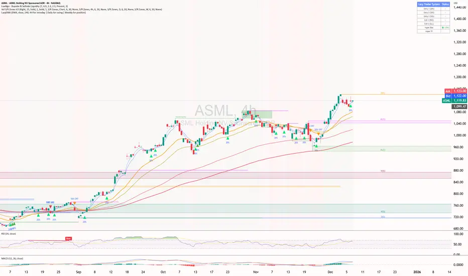
ShooterViz Lazy Trader EMA SystemShooterViz Lazy Trader EMA System - Complete User Guide
What This Script Does
This is a position scaling indicator that tells you exactly when to enter, add to, and exit trades using a simplified 5-EMA system. It removes the guesswork and decision fatigue from trading by giving you clear visual signals.
The Core Concept
3 entry signals that build your position from 20% → 50% → 100%
2 exit signals that scale you out at 50% → 50% (complete exit)
1 higher timeframe filter that keeps you on the right side of the trend
No Fibonacci calculations, no RSI divergence, no multi-indicator confusion. Just EMAs and price action.
What You'll See On Your Chart
1. Colored EMA Lines
Blue Lines (Entry Zone):
3 EMA (lightest blue) - Early reversal detector
5 EMA (darker blue) - Confirmation line
Green Lines (Add Zone):
21 EMA (bright green) - First add location
34 EMA (lighter green) - Final add location
Red Lines (Exit Zone):
89 EMA (lighter red) - First exit trigger
144 EMA (darker red) - Final exit trigger
Orange Lines (Hyper Frame - optional):
Hyper 21 EMA (from higher timeframe) - Trend direction
Hyper 34 EMA (from higher timeframe) - Bias confirmation
2. Triangle Signals
Green Triangles (Below Price) = BUY/ADD:
Lime triangle with "20%" = Entry 1: Price reclaimed 3→5 EMA (starter position)
Green triangle with "30%" = Entry 2: Price bounced off 21 EMA (first add)
Teal triangle with "50%" = Entry 3: Price broke out from 34 EMA compression (final add)
Red Triangles (Above Price) = SELL:
Orange triangle with "50% OFF" = Exit 1: Price broke below 89 EMA (take half off)
Red triangle with "EXIT ALL" = Exit 2: Price broke below 144 EMA (close remaining position)
3. Background Color (Trend Bias)
Light green background = Hyper frame EMAs trending up (bias LONG)
Light red background = Hyper frame EMAs trending down (bias SHORT)
Gray background = Neutral/choppy (be cautious)
4. Info Table (Top Right Corner)
A live status dashboard showing:
Which entry signals are currently active (✓ or —)
Which exit signals are currently active (⚠ or ⛔)
Current hyper frame bias (🟢 LONG / 🔴 SHORT / ⚪ NEUTRAL)
Which timeframe you're using for hyper frame filtering
How to Install and Set Up
Step 1: Add the Script to TradingView
Open TradingView
Click "Pine Editor" at the bottom of the screen
Copy the entire script code
Paste it into the Pine Editor
Click "Add to Chart"
Step 2: Configure Your Settings
Click the gear icon ⚙️ next to "LazyEMA" in your indicators list.
Critical Settings to Configure:
Hyper Frame Selection (Most Important!)
Location: "Hyper Frame (Pick ONE)" section
Setting: "Timeframe"
What to choose:
Trading 15min or 1H charts? → Use "240" (4-hour)
Trading 4H or Daily charts? → Use "D" (Daily)
Trading Daily or Weekly charts? → Use "W" (Weekly)
Why this matters: This filter keeps you aligned with the bigger trend. Only take longs when this timeframe is green, shorts when it's red.
MA Type (Optional, default is fine)
Location: "MA Config" section
Default: EMA (recommended)
Options: EMA, SMA, WMA, HMA, RMA, VWMA
Most traders should stick with EMA
Visual Toggles (Customize your view)
Entry Zone: Turn individual EMAs on/off (3, 5, 21, 34)
Exit Zone: Turn individual EMAs on/off (89, 144)
Hyper Frame: Toggle the higher timeframe EMAs on/off
Step 3: Clean Up Your Chart
Turn OFF these if visible:
Volume bars (they clutter the view)
Any other indicators you have loaded
Grid lines (optional, but cleaner)
Keep ONLY:
Price candles
Your ShooterViz Lazy Trader EMA System
Maybe support/resistance levels if you manually draw them
How to Trade With This Script
The Basic Workflow
Before the Market Opens:
Check the background color and info table bias
Green background? Look for LONG setups only
Red background? Look for SHORT setups only
Gray background? Stay flat or trade small
During the Trading Session:
LONGS (When hyper frame is bullish):
Wait for Entry 1 signal:
Lime triangle appears with "20%"
Price has reclaimed the 5 EMA after dipping to 3 EMA
Action: Enter 20% of your intended position
Stop loss: Place below the 5 EMA or recent swing low
Wait for Entry 2 signal:
Green triangle appears with "30%"
Price pulled back to 21 EMA and bounced
Action: Add 30% more (you're now at 50% total)
Move stop: Trail it up to below 21 EMA
Wait for Entry 3 signal:
Teal triangle appears with "50%"
Price compressed at 34 EMA and broke out
Action: Add final 50% (you're now 100% loaded)
Move stop: Trail it up to below 34 EMA
Wait for Exit 1 signal:
Orange triangle appears with "50% OFF"
Price broke below 89 EMA
Action: Exit 50% of your position immediately
Move stop on rest: Trail to 89 EMA or lock in profits
Wait for Exit 2 signal:
Red triangle appears with "EXIT ALL"
Price broke below 144 EMA
Action: Exit remaining 50% (you're now flat)
Or: Stop gets hit at 89 EMA (same result)
SHORTS (When hyper frame is bearish):
Same process, but inverted
Triangles appear above price instead of below
Look for breakdowns below EMAs instead of bounces off them
Exit when price reclaims 89 and 144 EMAs
Real-World Example Walkthrough
Setup: Trading ES (S&P 500 Futures) on 1H Chart
Chart Configuration:
Timeframe: 1 Hour
Hyper Frame: 240 (4-hour)
Ticker: ES
Pre-Market Check:
Background is light green
Info table shows "🟢 LONG" for Hyper Bias
Decision: Only look for long entries today
9:30 AM - Market Opens
Price dips and touches 3 EMA
Watch for: Reclaim of 5 EMA
9:45 AM - Entry 1 Triggers
Lime triangle appears below bar
Price closed above 5 EMA at $4,550
Action taken:
Enter long 20% position (2 contracts if targeting 10 total)
Stop loss at $4,545 (below 5 EMA)
Risk: $10 per contract × 2 = $20 risk
10:30 AM - Entry 2 Triggers
Price rallied to $4,565, pulls back
Green triangle appears at 21 EMA ($4,555)
Action taken:
Add 30% (3 more contracts, now have 5 total)
Move stop to $4,550 (below 21 EMA)
Current P/L: +$25 ($5 gain on original 2 contracts, break-even on new 3)
11:15 AM - Entry 3 Triggers
Price consolidates at 34 EMA around $4,560
Teal triangle appears as price breaks to $4,568
Action taken:
Add final 50% (5 more contracts, now have 10 total)
Move stop to $4,555 (below 34 EMA)
Current P/L: +$70
1:00 PM - Price Extends
Price rallies to $4,595 (on track)
89 EMA is at $4,575
No action yet, let it run
2:15 PM - Exit 1 Triggers
Price pulls back from $4,600
Orange triangle appears as price breaks below 89 EMA at $4,580
Action taken:
Exit 50% (5 contracts closed at $4,580)
Keep 5 contracts with stop at 89 EMA ($4,575)
Banked: +$150 average gain on closed 5 contracts
2:45 PM - Exit 2 Triggers
Price continues down
Red triangle appears as price breaks 144 EMA at $4,570
Action taken:
Exit remaining 5 contracts at $4,570
Banked: +$100 on remaining 5 contracts
Final Results:
Total gain: $250 on the trade
Initial risk: $50 (if stopped out at Entry 1)
Risk/Reward: 5:1
Time in trade: ~5 hours
Common Questions
"What if I miss Entry 1? Can I still take Entry 2?"
Yes! Each entry is independent. If you miss the 3→5 reclaim, wait for the 21 EMA bounce. You'll start with a 30% position instead of 20%, but that's fine.
Rule: Never chase. Wait for the next EMA setup.
"What if multiple entry signals trigger at the same bar?"
Rare, but possible. If you see both Entry 1 and Entry 2 trigger together:
Take Entry 1 first (20%)
If the next bar confirms Entry 2 is still valid, add 30%
When in doubt, scale in gradually
"The hyper frame is green but I'm seeing short signals?"
Don't take them. The hyper frame is your bias filter. If it says "go long," ignore short setups. They're usually lower probability and will get stopped out.
"Can I use this for swing trading overnight?"
Absolutely. Just switch your hyper frame:
If you're on Daily charts, use Weekly hyper frame
If you're on 4H charts, use Daily hyper frame
Adjust position sizes for overnight risk
"What if the signal appears right at market close?"
Don't chase it. Wait for the next bar (next day) to confirm. Signals that appear in the last 5 minutes are often noise.
"How do I set up alerts?"
Right-click on the chart
Select "Add Alert"
Choose "LazyEMA" from the condition dropdown
Select which signal you want alerts for:
Entry 1: 3→5 Reclaim
Entry 2: 21 EMA Add
Entry 3: 34 EMA Breakout
Exit 1: 89 EMA Break
Exit 2: 144 EMA Break
Click "Create"
Pro tip: Set up all 5 alerts so you never miss a signal.
Position Sizing Guide see
swingtradenotes.substack.com
Critical Rule: Know your total risk BEFORE you take Entry 1. Don't wing it.
Customization Tips
For Day Traders (Scalpers)
Use 5min or 15min charts
Hyper frame: 1H or 4H
Expect 2-4 setups per day
Tighter stops (0.5% risk per entry)
For Swing Traders
Use 4H or Daily charts
Hyper frame: Daily or Weekly
Expect 1-2 setups per week
Wider stops (1-2% risk per entry)
For Position Traders
Use Daily or Weekly charts
Hyper frame: Weekly or Monthly
Expect 1-2 setups per month
Widest stops (2-3% risk per entry)
The "Don't Be Stupid" Checklist
Before taking ANY signal from this script, ask:
✅ Is the hyper frame bias pointing in my direction?
✅ Is the signal clean (not at a weird time or during news)?
✅ Do I know my stop loss level?
✅ Do I know my position size?
✅ Can I afford to lose if this trade fails?
If you answered "no" to ANY of these, skip the trade.
Troubleshooting
"I'm not seeing any signals"
Possible causes:
The "Show Lazy Trader System" toggle is off (turn it on)
Your chart timeframe is too high (try 1H or 4H)
Market is in a tight range (EMAs are compressed)
You need to refresh the chart
"Too many signals, getting whipsawed"
Fixes:
Increase your chart timeframe (go from 15m to 1H)
Switch to a less volatile ticker
Only trade when hyper frame bias is STRONG (not neutral)
Add a minimum bar count between signals
"The info table is covering my price action"
Fix:
Edit the script
Find the line: table.new(position.top_right, ...
Change position.top_right to position.bottom_right or position.top_left
"Signals appear then disappear"
This is normal (repainting). Some signals (especially compression breakouts) can disappear if the next bar reverses. This is why you:
Wait for bar close before acting
Use alerts that only fire on confirmed bars
Don't chase signals mid-bar
Final Thoughts
This script is a decision-making tool, not a crystal ball. It shows you high-probability setups based on EMA dynamics and trend structure. You still need to:
Manage your risk
Choose your position size
Stick to the rules
Accept losses when they happen
The system works when YOU work the system.
Print this guide, tape it next to your monitor, and follow it religiously for 20 trades before making ANY changes.
Good luck, and stay lazy (the smart way).
SHUBHAM 50000 ULTRA OPTIONSHUBHAM 50000 ULTRA OPTION
OptionFlow Pro: Smart Money & Anomaly Detection Indicator
Tagline: Don't just follow the flow. Understand it.
Core Concept:
OptionFlow Pro is an advanced, real-time market scanner and visual indicator that transforms raw options chain data into actionable trading intelligence. It goes beyond simple volume and open interest by identifying Unusual Options Activity (UOA), tracking Sweep Orders, and calculating the Volume-Weighted Put/Call Ratio to highlight where institutional "smart money" is placing its bets.
Key Features for Traders:
Unusual Activity & Sweep Detector:
What it does: Scans every tick for orders that significantly deviate from normal trading patterns—large block trades executed at the ask (for calls) or bid (for puts), and "sweep" orders that clean out multiple price levels instantly.
Trader Benefit: Pinpoints potential breakout or breakdown candidates before major moves occur in the underlying stock. Alerts you to aggressive, high-conviction buying or selling that retail traders often miss.
Volume-Weighted Put/Call Ratio (with Trend):
What it does: Calculates the put/call ratio not just by volume, but by the premium spent. A high premium-weighted put/call ratio shows bears are putting serious money behind their bets, making it a stronger signal.
Trader Benefit: Offers a more nuanced view of market sentiment than standard PCR. Helps gauge extreme fear (potential oversold bounce) or complacency (overbought top) in a specific stock or index (SPX/SPY).
Max Pain & Gamma Exposure (GEX) Visualizer:
What it does: Dynamically calculates the "Max Pain" strike (where option sellers face minimal losses) and estimates Gamma Exposure levels. Visual overlays on the chart show key pin levels and large gamma walls.
Trader Benefit: Identifies potential price magnets for weekly/monthly expiry. Understand where hedging activity by market makers may amplify volatility (negative gamma) or suppress it (positive gamma), aiding in entry/exit planning.
Implied Volatility (IV) Rank & Skew Analysis:
What it does: Compares current IV to its historical range (IV Rank) and visualizes the volatility smile/skew across strikes. Highlights expensive vs. cheap option premiums.
Trader Benefit: Empowers you to sell overpriced volatility (high IV Rank) and buy underpriced volatility (low IV Rank). Skew anomalies can signal asymmetric risk/reward opportunities or market fears about a sharp directional move.
Customizable Alerts & Heatmaps:
What it does: Set alerts for specific UOA criteria, PCR spikes, or IV changes. The platform-wide heatmap aggregates flow data across all symbols to show sector-level money movement.
Trader Benefit: Saves hours of manual scanning. Focus only on the setups that match your strategy (e.g., "Alert me for any $1M+ call sweeps in tech stocks").
Who Is It For?
Active Options Traders & Scalpers: Find high-probability directional plays with institutional confirmation.
Hedgers & Portfolio Managers: Identify tail-risk hedging activity and gauge overall market dealer positioning.
Volatility Traders: Precisely time entries for strangles, straddles, or iron condors based on IV regime and gamma.
Swing Traders & Technical Analysts: Confirms or diverges from classic chart patterns (e.g., breakout with strong call flow = higher conviction).
Why It's Different:
Most indicators look backward at price. OptionFlow Pro looks forward at market structure, liquidity, and dealer hedging flows. It doesn't predict the future; it reveals the present positioning that will influence future price action.
Platform Integration: Available as a standalone web platform, a TradingView custom script, and a direct data feed into thinkorswim, Interactive Brokers, and other major brokerages.

Market Structure Shift (MSS) [Sword & Shield]MARKET STRUCTURE SHIFT (MSS)
A clean and focused indicator for identifying Market Structure Shifts in price action.
════════════════════════════════════════════════════════════════════════════════
WHAT IS MARKET STRUCTURE SHIFT (MSS)?
════════════════════════════════════════════════════════════════════════════════
A Market Structure Shift occurs when price breaks a significant swing high or swing low,
indicating a potential change in market direction. This indicator automatically detects
and plots these key levels.
BULLISH MSS: Price breaks above a previous swing high
BEARISH MSS: Price breaks below a previous swing low
════════════════════════════════════════════════════════════════════════════════
FEATURES
════════════════════════════════════════════════════════════════════════════════
CLEAN DISPLAY
- Shows only the last 2 MSS by default (1 bullish + 1 bearish)
- Keeps charts clean and focused on recent structure
- Automatically removes old MSS when new ones appear
CUSTOMIZABLE DETECTION
- Adjustable swing detection (left/right bars)
- Choose break confirmation method (Close or Wick)
- Fixed-length lines (no infinite extension by default)
SMART FILTERING
- Only plots one MSS per direction until opposite MSS occurs
- Prevents duplicate signals in the same direction
- Clear visual distinction between bullish (blue) and bearish (red)
CLEAN LABELS
- Text labels positioned above lines
- No background tooltips for cleaner appearance
- Color-matched to their respective MSS lines
════════════════════════════════════════════════════════════════════════════════
SETTINGS
════════════════════════════════════════════════════════════════════════════════
SWING DETECTION
- Swing Left Bars (default: 2)
- Swing Right Bars (default: 2)
- Higher values = more significant swings detected
BREAK CONFIRMATION
- Close: MSS confirmed when candle closes beyond level
- Wick: MSS confirmed when wick touches beyond level
DISPLAY OPTIONS
- Show Only Last 2 MSS: ON by default (keeps chart clean)
- Extend lines to the right: OFF by default (fixed-length lines)
- Line bars (when not extended): 50 bars (customizable)
════════════════════════════════════════════════════════════════════════════════
HOW IT WORKS
════════════════════════════════════════════════════════════════════════════════
DETECTION LOGIC
1. Identifies swing highs and swing lows using pivot detection
2. Monitors price action for breaks of these levels
3. Confirms break based on selected method (Close or Wick)
4. Plots MSS line at the broken level
FILTERING LOGIC
- Only one MSS per direction is allowed consecutively
- Example: If bullish MSS appears, no new bullish MSS until bearish MSS occurs
- This prevents multiple signals in trending markets
DISPLAY LOGIC
- When "Show Only Last 2 MSS" is enabled:
• Only the most recent bullish MSS is shown
• Only the most recent bearish MSS is shown
• Old MSS are automatically deleted when new ones appear
- When disabled: All historical MSS remain visible
════════════════════════════════════════════════════════════════════════════════
USAGE EXAMPLES
════════════════════════════════════════════════════════════════════════════════
FOR TREND IDENTIFICATION
- Bullish MSS = Potential uptrend beginning
- Bearish MSS = Potential downtrend beginning
- Use in conjunction with other indicators for confirmation
FOR ENTRY SIGNALS
- Wait for MSS to confirm trend change
- Enter on pullback to MSS level
- Use MSS as support/resistance
FOR SCALPING (Lower Timeframes)
- Swing Left/Right Bars: 2-3 (more sensitive)
- Break Confirmation: Close (more reliable)
- Show Only Last 2 MSS: ON (cleaner charts)
FOR SWING TRADING (Higher Timeframes)
- Swing Left/Right Bars: 5-10 (more significant swings)
- Break Confirmation: Close (avoid false breaks)
- Show Only Last 2 MSS: ON or OFF based on preference
════════════════════════════════════════════════════════════════════════════════
VISUAL DESIGN
════════════════════════════════════════════════════════════════════════════════
LINES
- Dashed style for easy identification
- Blue for bullish MSS
- Red for bearish MSS
- Fixed length (50 bars default) for cleaner appearance
LABELS
- "MSS" text positioned above each line
- No background for clean display
- Color-matched to line color
- Small size to avoid chart clutter
════════════════════════════════════════════════════════════════════════════════
CREDITS & LICENSE
════════════════════════════════════════════════════════════════════════════════
© Sword & Shield
This Pine Script code is subject to the terms of the Mozilla Public License 2.0
mozilla.org

Precious Matrix Signal-S-L15-sum⭐ PRECIOUS MATRIX SIGNAL™
Today Range + R1–R6 Multi-Layer Market Structure Engine
Final Output → 🔵 BUY | 🔴 SELL | ⏹ NEUTRAL
A powerful, multi-range decision engine that reads today’s live structure and compares it with six major past ranges, Δ/E shifts, and daily strength summaries to generate a precise directional signal.
📘 What This Indicator Does
This indicator builds a complete price-behavior matrix combining:
🔹 Today’s High–Low structure
🔹 Six custom historical ranges (R1–R6)
🔹 Live Δ/E trend shifts
🔹 A/R (Above–Below Range) positioning
🔹 Remaining Potential %
🔹 Last-5, Last-10, Last-15 day trend summary
🔹 Auto Spot–Future selection
🔹 Lot size & Margin info
( Not for dark mode &only on NSE Futures & Spot )
All layers combine to produce a single actionable signal.
🔶 How It Works (Simple Flow)
1️⃣ Symbol Auto-Detection
If chart is futures, uses futures data
If futures range missing → switches to continuous 1!
If chart is spot, uses spot cleanly
Auto-reads lot size and margin
2️⃣ Today’s Live Range Engine
Live High / Low
Time of High & Low
Δ (Range size)
A/R (Where current price sits inside the range)
Remaining Potential % (powerful continuation measure)
3️⃣ R1–R6 Custom Range Engine
Each user-set range displays:
High & Low
Δ
A/R positioning
Remaining Potential %
Overshoot/Breakdown markers
Δ/E (Direction shift)
Color-coded range strength
4️⃣ Δ/E Shift Logic (Live Mode)
For each R1–R6:
Prev = previous close before the range
E = end-close of the range
Δ/E = Direction:
▲ Positive → Bullish
▼ Negative → Bearish
■ Neutral → Sideways
If the range ends today → uses intraday close (E*).
5️⃣ Trend Validation (Last-5 / 10 / 15 Days)
Automatic summary tables:
Daily Date
Close
H/L
Δ
A/R
Net Trend Color
Strongest zone marked
This prevents false signals and confirms bias.
6️⃣ Final Signal Engine
Uses a weighted scoring across:
Today’s bias
R1–R6 bias
Δ/E direction
Remaining potential
Last-5/10/15 confirmation
🔵 BUY
→ Majority Ranges UP
→ Today’s structure UP
→ Δ/E = ▲
→ Last-5 positive
🔴 SELL
→ Majority Ranges DOWN
→ Today’s structure DOWN
→ Δ/E = ▼
→ Last-5 negative
⏹ NEUTRAL
→ Mixed or no clear dominance
→ Low potential/compressed price
📊 Dashboard Panels
Panel 1 – Today + R1–R6 Master Matrix
Shows:
H / L / Δ
A/R
Remaining Potential %
Δ/E (live option)
Range badges & colors
Panel 2 – Last-5 / 10 / 15 Summary
Your secondary confirmation panel.
Panel 3 – Lot Size + Margin
Auto margin estimate at 24%.
⚙️ Input Controls
Show/Hide HLX Panel
Custom Range Start/End
Δ/E Live Override
Force Intraday Mode
Last-5/10/15 Selector ( last work properly display on mobile )
Nudge (Panel Offset)
Potential % thresholds
Designed to adjust smoothly for all timeframes.
🎯 Recommended Usage
Use on 3m / 5m / 15m / 30m / 1H / 2H / 4H
Works great on Index Futures, Stock Futures, and Spot
Keep Option-2 Δ/E enabled for live trading
Last-5 and R2–R6 give strongest confirmation for trend days
📈 Who Is This For?
Traders who want:
Multi-range professional context
Reliable bias confirmation
High-probability directional entries
Auto-range intelligence without manual marking
Futures–spot multi-engine precision
🟢 SUPER-SIMPLE FLOWCHART
START
|
Detect Spot/Future + Lot
|
Compute TODAY H/L
|
Compute R1–R6 Ranges
|
Apply Δ/E Live Logic
|
Build Range Strength Score
|
Build Last5/10/15 Trend
|
Combine All Scores (matrix)
|
BUY ? SELL ? NEUTRAL ?
|
Display Full Dashboard
🛑 Disclaimer
This is an educational tool.
No buy/sell recommendations.
Always use proper risk management.

Elliott Wave Principle Pro - Frost & Prechter [abusuhil]الوصف العربي اسفل الوصف الإنجليزي .
✅ Professional Description (English)
Elliott Wave Principle Pro – Frost & Prechter Edition
A complete, professional-grade Elliott Wave detection and trading system designed for traders who want to identify market structure with precision and execute trades based on confirmed wave completion signals — without repainting.
This indicator combines the classical Elliott Wave rules from Frost & Prechter’s “Elliott Wave Principle” with modern algorithmic detection, Fibonacci validation, ZigZag pivot systems, and fully automated entry/exit levels.
⭐ Core Features
1. Automatic Elliott Wave Detection
Detects Impulse Waves (5-3-5-3-5)
Detects Corrective Waves (ABC) including:
• Zigzag
• Flat
• Expanded Flat
Supports multiple wave degrees (Cycle → Minuette)
2. Strict Elliott Rule Engine
All major EW rules are applied:
Wave 2 never retraces beyond Wave 1
Wave 4 must not overlap Wave 1
Wave 3 is never the shortest
Wave relationships validated using Fibonacci ratios
You can choose Strict / Standard / Flexible rule modes.
⭐ 3. Non-Repainting Confirmation System
Waves are confirmed only after pivot completion
Signals never change once displayed
Historical signals remain stable
Fully resistant to repainting
⭐ 4. Automated Trading Signals
Every completed structure triggers:
BUY Signals
End of Wave C
End of bearish Impulse (Wave 5)
SELL Signals
End of Wave 5 in bullish impulse
End of bullish ABC correction
Each signal includes:
Entry Line
Stop Loss (3 methods: Wave / ATR / Fixed)
TP1 – TP2 – TP3 (Fibonacci-based or Wave Projected)
Optional PRZ (Potential Reversal Zone)
You may show only the latest signal for clarity.
⭐ 5. Advanced Visual Tools
Wave numbers (1–5 / A–B–C)
Wave lines
Channels
Projection levels
Degree colors
Customizable labels and signal shapes (Box / Arrow / No Text)
A clean Simple Mode is available to hide all waves and show signals only.
⭐ 6. Informational Table (Optional)
Displays:
Last detected structure
Direction (Bullish / Bearish)
Active signal status (Buy / Sell / Wait)
⭐ How Traders Benefit
This tool helps traders:
Understand the full Elliott Wave context instantly
Know exactly when a wave cycle has completed
Enter trades with predefined, optimized levels
Avoid emotional decisions and subjective wave counting
Rely on a non-repainting analytical engine
Identify high-probability reversal zones
Improve trade timing and risk management
Perfect for swing trading, intraday trading, and wave practitioners.
🇸🇦 الوصف الاحترافي (العربية)
Elliott Wave Principle Pro – نسخة فروسـت وبريشتـر
مؤشر احترافي متكامل لتحليل موجات إليوت واكتشاف البُنى السعريّة بشكل آلي ودقيق، مع إعطاء إشارات تداول مؤكدة عند اكتمال الموجات — بدون إعادة رسم (Non-Repainting).
يجمع هذا المؤشر بين قواعد مدرسة إليوت الكلاسيكية من كتاب “Elliott Wave Principle” وبين خوارزميات حديثة تعتمد على الـ ZigZag، والفيبوناتشي، والتحقق الرياضي من صحة الموجة.
⭐ أهم المزايا
1. اكتشاف آلي كامل لموجات إليوت
اكتشاف الموجات الدافعة Impulse 5-3-5-3-5
اكتشاف الموجات التصحيحية ABC بما يشمل:
• Zigzag
• Flat
• Expanded Flat
دعم جميع درجات الموجة من Cycle حتى Minuette
⭐ 2. محرك قواعد إليوت الاحترافي
يطبق المؤشر جميع القواعد الأساسية لموجات إليوت، مثل:
الموجة 2 لا تتجاوز بداية الموجة 1
الموجة 4 يجب ألا تتداخل مع الموجة 1
الموجة 3 ليست الأقصر
تأكيد العلاقات باستخدام نسب فيبوناتشي
مع إمكانية اختيار نمط القواعد: صارم / قياسي / مرن.
⭐ 3. نظام تأكيد بدون إعادة رسم
لا يتم تأكيد الموجة إلا بعد اكتمالها فعليًا
لا يتم حذف أي إشارة بعد ظهورها
جميع النتائج ثابتة وغير قابلة للتغيير
مقاوم لإعادة الرسم 100%
⭐ 4. إشارات تداول تلقائية
يصدر المؤشر إشارات شراء وبيع عند اكتمال التركيبات التالية:
إشارات BUY
نهاية موجة C
نهاية موجة 5 الهابطة (انعكاس صاعد)
إشارات SELL
نهاية موجة 5 الصاعدة
نهاية تصحيح ABC الصاعد
وتتضمن الإشارة:
مستوى الدخول
وقف الخسارة (Wave / ATR / نسبة ثابتة)
الأهداف TP1 – TP2 – TP3
منطقة انعكاس محتملة PRZ (اختيارية)
ويمكن عرض آخر إشارة فقط لسهولة القراءة.
⭐ 5. أدوات بصرية متقدمة
ترقيم الموجات 1–5 و A–B–C
خطوط الموجات
قنوات Elliott
مستويات الإسقاط
ألوان الدرجات
تخصيص شكل الإشارة (مربع / سهم / بدون نص)
كما يمكن تفعيل الوضع البسيط لإظهار الإشارات فقط.
⭐ 6. جدول معلومات الاختياري
يعرض:
نوع آخر موجة مكتشفة
اتجاهها (صاعد / هابط)
حالة الإشارة الحالية (شراء / بيع / انتظار)
⭐ فوائد استخدام المؤشر للمتداول
هذا المؤشر يساعدك على:
فهم بنية موجات إليوت دون قراءة الشارت يدويًا
اكتشاف نقاط الانعكاس القوية قبل حدوثها
الدخول في صفقات محسوبة مسبقًا (Entry + SL + TP)
تقليل التشتت والتقدير الشخصي في العدّ
تحسين إدارة المخاطر
تعزيز دقة التوقيت في بداية الاتجاهات الجديدة
دراسة السوق بطريقة احترافية تعتمد على قاعدة علمية واضحة
مثالي للمضارب اليومي، المتداول المتأرجح، ولممارسي مدرسة إليوت.

MTF Alignment & Key Levelsso this one is specifically for the 1hr and 4hr time frame. but what it does is alert you once the monthly weekly and daily timeframes align with a trend in a certain direction wether its bearish or bullish but then it will mark out key levels on the 1hr and 4hr time frame to indicate when price breaks through that level to enter a trade in the direction of the higher timeframes alignment.

Fed Net Liquidity [Premium] [by Golman Armi]This indicator visualizes the USD Net Liquidity injected into the financial system by the Federal Reserve.
It is a fundamental macro-economic tool essential for understanding the underlying "fuel" driving risk assets such as the S&P 500 (SPX), Nasdaq (NDX), and Bitcoin (BTC).
Unlike many other liquidity scripts that incorrectly use Commercial Bank Assets (USCBBS), this script uses the Federal Reserve Total Assets (WALCL) to provide a mathematically accurate representation of Central Bank liquidity.
How It Works (The Formula)
Net Liquidity represents the actual cash available to the banking system for investment after government liabilities are subtracted. The formula used is:
NetLiquidity=WALCL−TGA−RRP
Where:
WALCL (Fed Balance Sheet): The total assets held by the Federal Reserve (The source of money printing).
TGA (Treasury General Account - WTREGEN): The checking account of the US Government. When the TGA goes up, money is removed from the economy; when it goes down, money is spent into the economy.
RRP (Reverse Repo - RRPONTTLD): Cash parked by banks and money market funds at the Fed overnight. A rise in RRP removes liquidity from the markets.
Features
Accurate Data Sourcing: Pulls daily data directly from FRED (Federal Reserve Economic Data).
Unit Correction: Automatically adjusts conflicting units (Millions vs Billions) from TradingView data feeds to output a correct value in Trillions of Dollars.
Trend Cloud: Features a smoothing EMA (Exponential Moving Average) with a color-coded cloud to easily identify the macro trend (Green for expansion, Red for contraction).
How to Use
Trend Correlation:
Rising Line (Green): Liquidity is expanding. Historically, this supports bullish trends in stocks and crypto.
Falling Line (Red): Liquidity is being drained (QT or TGA refill). This often leads to volatility or bearish trends in risk assets.
Divergences (The most powerful signal):
If the S&P 500 or Bitcoin makes a New High, but Net Liquidity makes a Lower High, it indicates a "hollow rally" lacking fundamental support, often preceding a correction.
Disclaimer
This tool is for educational purposes and macro-economic analysis only. It is not financial advice.

Credit Spread RegimeThe Credit Market as Economic Barometer
Credit spreads are among the most reliable leading indicators of economic stress. When corporations borrow money by issuing bonds, investors demand a premium above the risk-free Treasury rate to compensate for the possibility of default. This premium, known as the credit spread, fluctuates based on perceptions of economic health, corporate profitability, and systemic risk.
The relationship between credit spreads and economic activity has been studied extensively. Two papers form the foundation of this indicator. Pierre Collin-Dufresne, Robert Goldstein, and Spencer Martin published their influential 2001 paper in the Journal of Finance, documenting that credit spread changes are driven by factors beyond firm-specific credit quality. They found that a substantial portion of spread variation is explained by market-wide factors, suggesting credit spreads contain information about aggregate economic conditions.
Simon Gilchrist and Egon Zakrajsek extended this research in their 2012 American Economic Review paper, introducing the concept of the Excess Bond Premium. They demonstrated that the component of credit spreads not explained by default risk alone is a powerful predictor of future economic activity. Elevated excess spreads precede recessions with remarkable consistency.
What Credit Spreads Reveal
Credit spreads measure the difference in yield between corporate bonds and Treasury securities of similar maturity. High yield bonds, also called junk bonds, carry ratings below investment grade and offer higher yields to compensate for greater default risk. Investment grade bonds have lower yields because the probability of default is smaller.
The spread between high yield and investment grade bonds is particularly informative. When this spread widens, investors are demanding significantly more compensation for taking on credit risk. This typically indicates deteriorating economic expectations, tighter financial conditions, or increasing risk aversion. When the spread narrows, investors are comfortable accepting lower premiums, signaling confidence in corporate health.
The Gilchrist-Zakrajsek research showed that credit spreads contain two distinct components. The first is the expected default component, which reflects the probability-weighted cost of potential defaults based on corporate fundamentals. The second is the excess bond premium, which captures additional compensation demanded beyond expected defaults. This excess premium rises when investor risk appetite declines and financial conditions tighten.
The Implementation Approach
This indicator uses actual option-adjusted spread data from the Federal Reserve Economic Database (FRED), available directly in TradingView. The ICE BofA indices represent the industry standard for measuring corporate bond spreads.
The primary data sources are FRED:BAMLH0A0HYM2, the ICE BofA US High Yield Index Option-Adjusted Spread, and FRED:BAMLC0A0CM, the ICE BofA US Corporate Index Option-Adjusted Spread for investment grade bonds. These indices measure the spread of corporate bonds over Treasury securities of similar duration, expressed in basis points.
Option-adjusted spreads account for embedded options in corporate bonds, providing a cleaner measure of credit risk than simple yield spreads. The methodology developed by ICE BofA is widely used by institutional investors and central banks for monitoring credit conditions.
The indicator offers two modes. The HY-IG excess spread mode calculates the difference between high yield and investment grade spreads, isolating the pure compensation for below-investment-grade credit risk. This measure is less affected by broad interest rate movements. The HY-only mode tracks the absolute high yield spread, capturing both credit risk and the overall level of risk premiums in the market.
Interpreting the Regimes
Credit conditions are classified into four regimes based on Z-scores calculated from the spread proxy.
The Stress regime occurs when spreads reach extreme levels, typically above a Z-score of 2.0. At this point, credit markets are pricing in significant default risk and economic deterioration. Historically, stress regimes have coincided with recessions, financial crises, and major market dislocations. The 2008 financial crisis, the 2011 European debt crisis, the 2016 commodity collapse, and the 2020 pandemic all triggered credit stress regimes.
The Elevated regime, between Z-scores of 1.0 and 2.0, indicates above-normal risk premiums. Credit conditions are tightening. This often occurs in the build-up to stress events or during periods of uncertainty. Risk management should be heightened, and exposure to credit-sensitive assets may be reduced.
The Normal regime covers Z-scores between -1.0 and 1.0. This represents typical credit conditions where spreads fluctuate around historical averages. Standard investment approaches are appropriate.
The Low regime occurs when spreads are compressed below a Z-score of -1.0. Investors are accepting below-average compensation for credit risk. This can indicate complacency, strong economic confidence, or excessive risk-taking. While often associated with favorable conditions, extremely tight spreads sometimes precede sudden reversals.
Credit Cycle Dynamics
Beyond static regime classification, the indicator tracks the direction and acceleration of spread movements. This reveals where credit markets stand in the credit cycle.
The Deteriorating phase occurs when spreads are elevated and continuing to widen. Credit conditions are actively worsening. This phase often precedes or coincides with economic downturns.
The Recovering phase occurs when spreads are elevated but beginning to narrow. The worst may be over. Credit conditions are improving from stressed levels. This phase often accompanies the early stages of economic recovery.
The Tightening phase occurs when spreads are low and continuing to compress. Credit conditions are very favorable and improving further. This typically occurs during strong economic expansions but may signal building complacency.
The Loosening phase occurs when spreads are low but beginning to widen from compressed levels. The extremely favorable conditions may be normalizing. This can be an early warning of changing sentiment.
Relationship to Economic Activity
The predictive power of credit spreads for economic activity is well-documented. Gilchrist and Zakrajsek found that the excess bond premium predicts GDP growth, industrial production, and unemployment rates over horizons of one to four quarters.
When credit spreads spike, the cost of corporate borrowing increases. Companies may delay or cancel investment projects. Reduced investment leads to slower growth and eventually higher unemployment. The transmission mechanism runs from financial conditions to real economic activity.
Conversely, tight credit spreads lower borrowing costs and encourage investment. Easy credit conditions support economic expansion. However, excessively tight spreads may encourage over-leveraging, planting seeds for future stress.
Practical Application
For equity investors, credit spreads provide context for market risk. Equities and credit often move together because both reflect corporate health. Rising credit spreads typically accompany falling stock prices. Extremely wide spreads historically have coincided with equity market bottoms, though timing the reversal remains challenging.
For fixed income investors, spread regimes guide sector allocation decisions. During stress regimes, flight to quality favors Treasuries over corporates. During low regimes, spread compression may offer limited additional return for credit risk, suggesting caution on high yield.
For macro traders, credit spreads complement other indicators of financial conditions. Credit stress often leads equity volatility, providing an early warning signal. Cross-asset strategies may use credit regime as a filter for position sizing.
Limitations and Considerations
FRED data updates with a lag, typically one business day for the ICE BofA indices. For intraday trading decisions, more current proxies may be necessary. The data is most reliable on daily timeframes.
Credit spreads can remain at extreme levels for extended periods. Mean reversion signals indicate elevated probability of normalization but do not guarantee timing. The 2008 crisis saw spreads remain elevated for many months before normalizing.
The indicator is calibrated for US credit markets. Application to other regions would require different data sources such as European or Asian credit indices. The relationship between spreads and subsequent economic activity may vary across market cycles and structural regimes.
References
Collin-Dufresne, P., Goldstein, R.S., and Martin, J.S. (2001). The Determinants of Credit Spread Changes. Journal of Finance, 56(6), 2177-2207.
Gilchrist, S., and Zakrajsek, E. (2012). Credit Spreads and Business Cycle Fluctuations. American Economic Review, 102(4), 1692-1720.
Krishnamurthy, A., and Muir, T. (2017). How Credit Cycles across a Financial Crisis. Working Paper, Stanford University.

Absorption RatioThe Hidden Connections Between Markets
Financial markets are not isolated islands. When panic spreads, seemingly unrelated assets suddenly begin moving in lockstep. Stocks, bonds, commodities, and currencies that normally provide diversification benefits start falling together. This phenomenon, where correlations spike during crises, has devastated portfolios throughout history. The Absorption Ratio provides a quantitative measure of this hidden fragility.
The concept emerged from research at State Street Associates, where Mark Kritzman, Yuanzhen Li, Sebastien Page, and Roberto Rigobon developed a novel application of principal component analysis to measure systemic risk. Their 2011 paper in the Journal of Portfolio Management demonstrated that when markets become tightly coupled, the variance explained by the first few principal components increases dramatically. This concentration of variance signals elevated systemic risk.
What the Absorption Ratio Measures
Principal component analysis, or PCA, is a statistical technique that identifies the underlying factors driving a set of variables. When applied to asset returns, the first principal component typically captures broad market movements. The second might capture sector rotations or risk-on/risk-off dynamics. Additional components capture increasingly idiosyncratic patterns.
The Absorption Ratio measures the fraction of total variance absorbed or explained by a fixed number of principal components. In the original research, Kritzman and colleagues used the first fifth of the eigenvectors. When this fraction is high, it means a small number of factors are driving most of the market movements. Assets are moving together, and diversification provides less protection than usual.
Consider an analogy: imagine a room full of people having independent conversations. Each person speaks at different times about different topics. The total "variance" of sound in the room comes from many independent sources. Now imagine a fire alarm goes off. Suddenly everyone is talking about the same thing, moving in the same direction. The variance is now dominated by a single factor. The Absorption Ratio captures this transition from diverse, independent behavior to unified, correlated movement.
The Implementation Approach
TradingView does not support matrix algebra required for true principal component analysis. This implementation uses a closely related proxy: the average absolute correlation across a universe of major asset classes. This approach captures the same underlying phenomenon because when assets are highly correlated, the first principal component explains more variance by mathematical necessity.
The asset universe includes eight ETFs representing major investable categories: SPY and QQQ for large cap US equities, IWM for small caps, EFA for developed international markets, EEM for emerging markets, TLT for long-term treasuries, GLD for gold, and USO for oil. This selection provides exposure to equities across geographies and market caps, plus traditional diversifying assets.
From eight assets, there are twenty-eight unique pairwise correlations. The indicator calculates each using a rolling window, takes the absolute value to measure coupling strength regardless of direction, and averages across all pairs. This average correlation is then transformed to match the typical range of published Absorption Ratio values.
The transformation maps zero average correlation to an AR of 0.50 and perfect correlation to an AR of 1.00. This scaling aligns with empirical observations that the AR typically fluctuates between 0.60 and 0.95 in practice.
Interpreting the Regimes
The indicator classifies systemic risk into four regimes based on AR levels.
The Extreme regime occurs when the AR exceeds 0.90. At this level, nearly all asset classes are moving together. Diversification has largely failed. Historically, this regime has coincided with major market dislocations: the 2008 financial crisis, the 2020 COVID crash, and significant correction periods. Portfolios constructed under normal correlation assumptions will experience larger drawdowns than expected.
The High regime, between 0.80 and 0.90, indicates elevated systemic risk. Correlations across asset classes are above normal. This often occurs during the build-up to stress events or during volatile periods where fear is spreading but has not reached panic levels. Risk management should be more conservative.
The Normal regime covers AR values between 0.60 and 0.80. This represents typical market conditions where some correlation exists between assets but diversification still provides meaningful benefits. Standard portfolio construction assumptions are reasonable.
The Low regime, below 0.60, indicates that assets are behaving relatively independently. Diversification is working well. Idiosyncratic factors dominate returns rather than systematic risk. This environment is favorable for active management and security selection strategies.
The Relationship to Portfolio Construction
The implications for portfolio management are significant. Modern portfolio theory assumes correlations are stable and uses historical estimates to construct efficient portfolios. The Absorption Ratio reveals that this assumption is violated precisely when it matters most.
When AR is elevated, the effective number of independent bets in a diversified portfolio shrinks. A portfolio holding stocks, bonds, commodities, and real estate might behave as if it holds only one or two positions during high AR periods. Position sizing based on normal correlation estimates will underestimate portfolio risk.
Conversely, when AR is low, true diversification opportunities expand. The same nominal portfolio provides more independent return streams. Risk can be deployed more aggressively while maintaining the same effective exposure.
Component Analysis
The indicator separately tracks equity correlations and cross-asset correlations. These components tell different stories about market structure.
Equity correlations measure coupling within the stock market. High equity correlation indicates broad risk-on or risk-off behavior where all stocks move together. This is common during both rallies and selloffs driven by macroeconomic factors. Stock pickers face headwinds when equity correlations are elevated because individual company fundamentals matter less than market beta.
Cross-asset correlations measure coupling between different asset classes. When stocks, bonds, and commodities start moving together, traditional hedges fail. The classic 60/40 stock/bond portfolio, for example, assumes negative or low correlation between equities and treasuries. When cross-asset correlation spikes, this assumption breaks down.
During the 2022 market environment, for instance, both stocks and bonds fell significantly as inflation and rate hikes affected all assets simultaneously. High cross-asset correlation warned that the usual defensive allocations would not provide their expected protection.
Mean Reversion Characteristics
Like most risk metrics, the Absorption Ratio tends to mean-revert over time. Extremely high AR readings eventually normalize as panic subsides and assets return to more independent behavior. Extremely low readings tend to rise as some level of systematic risk always reasserts itself.
The indicator tracks AR in statistical terms by calculating its Z-score relative to the trailing distribution. When AR reaches extreme Z-scores, the probability of normalization increases. This creates potential opportunities for strategies that bet on mean reversion in systemic risk.
A buy signal triggers when AR recovers from extremely elevated levels, suggesting the worst of the correlation spike may be over. A sell signal triggers when AR rises from unusually low levels, warning that complacency about diversification benefits may be excessive.
Momentum and Trend
The rate of change in AR carries information beyond the absolute level. Rapidly rising AR suggests correlations are increasing and systemic risk is building. Even if AR has not yet reached the high regime, acceleration in coupling should prompt increased vigilance.
Falling AR momentum indicates normalizing conditions. Correlations are decreasing and assets are returning to more independent behavior. This often occurs in the recovery phase following stress events.
Practical Application
For asset allocators, the AR provides guidance on how much diversification benefit to expect from a given allocation. During high AR periods, reducing overall portfolio risk makes sense because the usual diversifiers provide less protection. During low AR periods, standard or even aggressive allocations are more appropriate.
For risk managers, the AR serves as an early warning indicator. Rising AR often precedes large market moves and volatility spikes. Tightening risk limits before correlations reach extreme levels can protect capital.
For systematic traders, the AR provides a regime filter. Mean reversion strategies may work better during high AR periods when panics create overshooting. Momentum strategies may work better during low AR periods when trends can develop independently across assets.
Limitations and Considerations
The proxy methodology introduces some approximation error relative to true PCA-based AR calculations. The asset universe, while representative, does not include all possible diversifiers. Correlation estimates are inherently backward-looking and can change rapidly.
The transformation from average correlation to AR scale is calibrated to match typical published ranges but is not mathematically equivalent to the eigenvalue ratio. Users should interpret levels directionally rather than as precise measurements.
Correlation regimes can persist longer than expected. Mean reversion signals indicate elevated probability of normalization but do not guarantee timing. High AR can remain elevated throughout extended crisis periods.
References
Kritzman, M., Li, Y., Page, S., and Rigobon, R. (2011). Principal Components as a Measure of Systemic Risk. Journal of Portfolio Management, 37(4), 112-126.
Kritzman, M., and Li, Y. (2010). Skulls, Financial Turbulence, and Risk Management. Financial Analysts Journal, 66(5), 30-41.
Billio, M., Getmansky, M., Lo, A., and Pelizzon, L. (2012). Econometric Measures of Connectedness and Systemic Risk in the Finance and Insurance Sectors. Journal of Financial Economics, 104(3), 535-559.

MTF OB & FVG detector w/ Alerts v2# MTF Order Blocks & Fair Value Gaps Detector with Alerts v2
## Overview
This indicator combines **Multi-Timeframe Order Blocks (OB)** and **Fair Value Gaps (FVG)** detection with integrated bounce alerts. It displays Order Blocks and Fair Value Gaps across multiple timeframes simultaneously and generates real-time alerts when price bounces from these critical zones.
## Key Features
### 🎯 Multi-Timeframe Order Blocks Detection
- **Volumetric Analysis**: Each Order Block displays total volume and dominant side percentage
- **Multiple Timeframes**: Supports 1min, 3min, 5min, 15min, and 60min timeframes
- **Smart Combining**: Automatically merges overlapping Order Blocks from different timeframes into powerful confluence zones
- **Dynamic Extension**: Order Blocks extend until broken, providing clear visual guidance
- **Volume Distribution**: Shows bullish vs bearish volume breakdown with percentage
### 📊 Fair Value Gaps (FVG) Detection
- **Lightweight Processing**: Works on current chart timeframe only for optimal performance
- **Volume Metrics**: Displays FVG volume and dominant side percentage
- **Mitigation Tracking**: Automatically tracks when FVGs are filled or broken
- **Customizable Mitigation Source**: Choose between close price or high/low wicks
### 🔔 Comprehensive Alert System
- **Bounce Alerts**: Get notified when price bounces from OB or FVG zones
- **New Formation Alerts**: Alerts when new Order Blocks or Fair Value Gaps form
- **Combined Zone Alerts**: Special alerts when multiple Order Blocks merge into strong confluence zones
- **Customizable Thresholds**: Set minimum number of combined OBs required for strong zone alerts
### 🎨 Visual Customization
- **Inverted Color Schemes**: Optional inverted colors for both OB and FVG
- OB: Choose between traditional (Bullish=Blue, Bearish=Red) or inverted (Bullish=Red, Bearish=Blue)
- FVG: Choose between Bullish=Orange/Bearish=Aqua or inverted
- **Clean Labels**: Shows timeframe, zone type, volume, and dominant percentage
- **Combined Tags**: Optional labels for merged zones
- **Adjustable Extension**: Control how far zones extend into the future
## How It Works
### Order Blocks
Order Blocks identify institutional trading zones where large players have placed significant orders. The indicator:
1. Detects swing highs/lows using configurable swing length
2. Identifies the last opposing candle before a strong move
3. Analyzes volume distribution (bullish vs bearish)
4. Tracks zone validity until price breaks through
5. Combines overlapping zones from multiple timeframes
### Fair Value Gaps
Fair Value Gaps represent price imbalances that often get filled. The indicator:
1. Identifies 3-candle patterns with gaps between candles
2. Filters gaps by size percentile to show only significant ones
3. Calculates volume distribution within the gap
4. Tracks mitigation when price returns to fill the gap
5. Extends gaps dynamically until filled
### Bounce Detection
The indicator detects bounces using a two-step process:
1. **Touch Phase**: Tracks when price enters a zone (touchedInside flag)
2. **Bounce Phase**: Confirms bounce when price exits the zone in the expected direction
- Bullish zones: Price closes above top after touching inside
- Bearish zones: Price closes below bottom after touching inside
## Settings Guide
### General Configuration
- **Show Historic Zones**: Display invalidated/broken zones
- **Zone Invalidation**: Choose between wick or close for break detection
- **Combine Overlapping Order Blocks**: Merge OBs from different timeframes
- **Swing Length**: Controls sensitivity (smaller = more OBs, larger = fewer OBs)
- **Zone Count**: Choose from High/Medium/Low/One per timeframe
- **Invert Colors OB**: Swap bullish/bearish color scheme
### Alert Settings
- **Enable Alerts**: Master switch for all alerts
- **Alert on Bullish/Bearish Bounce**: Choose which bounce directions to monitor
- **Alert on New OB Formation**: Get notified when new Order Blocks form
- **Alert on Combined OBs**: Alerts for strong confluence zones
- **Min OBs for Strong Zone Alert**: Threshold for combined zone alerts (default: 2)
### Fair Value Gaps
- **Show Fair Value Gaps**: Toggle FVG display
- **FVG Mitigation Source**: Choose close or high/low for mitigation detection
- **Bullish/Bearish FVG**: Enable/disable each type
- **Invert FVG Colors**: Swap FVG color scheme
### Multi-Timeframe
- **Show Lower Timeframes**: Display OBs from timeframes lower than chart
- **Individual Timeframe Toggles**: Enable/disable 1min, 3min, 5min, 15min, 60min
### Style
- **Text Color**: Customize label text color
- **Extend Zones**: Set extension length in bars (default: 40)
- **Show Tag**: Display combined indicator in merged zone labels
## Usage Tips
### For Day Trading
- Enable 1min, 3min, and 5min timeframes
- Use "High" zone count for more trading opportunities
- Watch for bounces from combined zones (highest probability)
### For Swing Trading
- Enable 15min, 60min, and higher timeframes
- Use "Medium" or "Low" zone count for major zones only
- Focus on combined zones with 3+ timeframes
### For Scalping
- Use current timeframe only (disable MTF)
- Enable both OB and FVG
- Set up alerts for quick bounce notifications
### Alert Setup
1. Click "Create Alert" in TradingView
2. Choose from available alert conditions:
- **Bullish Bounce (OB/FVG)**: Long entry opportunities
- **Bearish Bounce (OB/FVG)**: Short entry opportunities
- **New OB Formation**: Early zone identification
- **Strong Combined Zone**: High-probability confluence areas
3. Set alert frequency to "Once Per Bar Close" to avoid false signals
## Technical Details
### Performance Optimizations
- Maximum 100 boxes/labels for efficient rendering
- Lightweight FVG processing on current timeframe only
- Dynamic memory management with array size limits
- Selective rendering of active zones only
### Calculations
- **ATR Multiplier**: Zones exceeding 3.5x ATR are filtered out
- **Volume Percentage**: `max(bullVol, bearVol) / totalVolume × 100`
- **FVG Size Filter**: Uses 100th percentile of last 1000 gaps
- **Overlap Detection**: Uses intersection/union ratio for combining zones
## Credits & License
This indicator combines and enhances concepts from:
- "Volumized Order Blocks" methodology
- "Volumatic Fair Value Gaps" approach
**License**: Mozilla Public License 2.0 (MPL-2.0)
## Disclaimer
This indicator is provided for **educational and informational purposes only**. Trading involves substantial risk of loss and is not suitable for every investor. Past performance is not indicative of future results. Always do your own research and consult with a licensed financial advisor before making trading decisions.
## Version History
**v2 (Current)**
- Combined OB and FVG into single indicator
- Added comprehensive alert system
- Improved performance with lightweight FVG processing
- Enhanced bounce detection with touch-inside logic
- Added volume metrics to zone labels
- Implemented dynamic zone extension until broken
- Added combined zone detection with configurable thresholds
---
### Chart Examples
The indicator displays:
- **Red Zones** (Inverted): Bullish Order Blocks / Bearish FVGs
- **Blue Zones** (Inverted): Bearish Order Blocks / Bullish FVGs
- **Orange Zones** (Inverted): Bullish Fair Value Gaps
- **Aqua Zones** (Inverted): Bearish Fair Value Gaps
Each zone shows:
- Timeframe label (e.g., "5m", "15m", "1H")
- Zone type (OB or FVG)
- Total volume in millions (e.g., "12.5M")
- Dominant side percentage (e.g., "85%")
**Example Label**: ` 5m & 15m OB 45.2M (78%)`
- Combined zone from 5min and 15min timeframes
- Order Block type
- 45.2 million total volume
- 78% volume on dominant side
---
## Support & Updates
For issues, suggestions, or questions, please leave a comment on the indicator page.
**Author**: © rasukaru666
**Compatible with**: TradingView Pine Script v6

Market Analysis Pro [Trademy]OVERVIEW
Trademy Market Analysis Pro is a professional-grade trading system that combines advanced momentum analysis with institutional-level Supply/Demand zone mapping. This indicator is designed to provide crystal-clear market analysis with precise risk management tools, creating a complete trading framework within a single, streamlined interface.
Unlike complex indicators that overwhelm traders with information, Trademy focuses on what matters: high-probability setups with clear entry points, defined risk levels, and multiple profit targets. The system is built to eliminate guesswork and provide actionable signals that work across multiple timeframes and asset classes eg: ( INDEX:BTCUSD , NASDAQ:NVDA and more )
CORE CONCEPTS
Advanced Momentum Engine: The foundation of Trademy Market Analysis Pro is a proprietary momentum detection system that identifies true directional shifts in the market. The algorithm analyzes price behavior relative to volatility-adjusted dynamic levels, generating signals only when genuine momentum reversals occur. The "Signal Sensitivity" control allows you to adapt the system from conservative (fewer, higher-quality signals) to aggressive (more frequent opportunities) based on your trading style and market conditions.
Institutional Supply/Demand Zones: The system automatically identifies and plots key institutional levels where significant buying (Demand) or selling (Supply) pressure has occurred. These zones are calculated using advanced price structure analysis, filtered through intelligent overlap detection to ensure only the most relevant zones appear on your chart. When price approaches these levels, they often act as strong support or resistance, providing logical areas for entries and exits.
Intelligent Signal Classification: Not all signals are created equal. Trademy categorizes every signal as either "Normal" or "Strong" based on its alignment with the broader market structure and trend context. Strong signals represent higher-conviction setups where momentum and trend align perfectly, while normal signals indicate counter-trend or early reversal opportunities.
Non-Repainting Architecture: Every signal is locked in at bar close (when enabled), and all TP/SL levels are calculated using volatility measurements captured at the moment of signal generation.
KEY FEATURES
Precision Signal System
Dual Signal Modes: Choose between Normal signals (standard momentum reversals) or Strong signals (high-conviction trend-aligned setups), or view both simultaneously
Wait for Bar Close: Optional no-repaint mode ensures signals only appear after candle confirmation
Visual Signal Hierarchy: Normal signals shown with standard arrows (▲/▼), Strong signals marked with distinctive colors for instant recognition
Adjustable Arrow Sizes: Customize signal display from tiny to large based on your chart preferences
Professional Risk Management
Automated TP/SL Calculation: Three take-profit levels (TP1, TP2, TP3) and one stop-loss level automatically calculated using advanced volatility measurement
Fixed Risk Levels: TP/SL lines are locked at signal generation and never move—providing consistent, reliable risk parameters
Visual Risk Zones: Optional colored zones highlight your risk and reward areas for instant position assessment
Adjustable Risk Multiplier: Scale your targets up or down with a single parameter while maintaining proper risk-reward ratios
Clear On-Chart Labels: Every level displays exact price values in an easy-to-read format
Supply/Demand Zone Mapping
Automatic Zone Detection: System identifies high-probability supply and demand zones using advanced price structure analysis
Anti-Overlap Algorithm: Intelligent filtering prevents zone clutter by removing overlapping levels
Extended Zone Projection: Zones extend into the future, showing you key levels before price reaches them
Break-of-Structure Tracking: Monitors when zones are broken and removes invalidated levels
Fully Customizable: Adjust zone colors, swing length, history depth, and box width to match your analysis style
Visual Customization
Flexible Color Schemes: Customize colors for bull/bear signals, TP/SL levels, and supply/demand zones
Trend Background: Optional background coloring to instantly visualize the current market bias
Support/Resistance Lines: Toggle automatic S/R level plotting from key price pivots
Multiple Arrow Sizes: Choose from tiny, small, normal, or large signal arrows
WHAT MAKES TRADEMY MARKET ANALYSIS PRO DIFFERENT
✅ Simplicity Meets Power
✅ TP/SL Levels
✅ Institutional Zone Integration
✅ Universal Indicator for all markets
✅ Multi-Timeframe Flexibility
BEST PRACTICES
📌 Always Use Stop-Loss: Enable the TP/SL system and respect your stop-loss levels,risk management is key to long-term success
📌 Backtest First: Before live trading, replay historical charts to understand signal behavior on your specific asset and timeframe
📌 Combine Timeframes: Use higher timeframe signals as your bias, enter on lower timeframe signals in the same direction
📌 Watch the Zones: Highest probability setups occur when signals align with supply/demand zones (buy near demand, sell near supply)
📌 Don't Chase: If you miss a signal, wait for the next one,forcing trades leads to losses
📌 Partial Profits: Consider taking partial profits at TP1, moving stop to breakeven, and letting the rest run to TP2/TP3
📩 ACCESS & SUPPORT
This is an invite-only indicator. For access inquiries, please contact via TradingView private message.
Important Disclaimers:
This indicator is a tool for technical analysis and does not constitute financial advice
Past performance does not guarantee future results
Always practice proper risk management and never risk more than you can afford to lose
Trading carries substantial risk of loss and is not suitable for all investors
Volume Flow IndicatorVolume flow analysis
This indicator measures volume-weighted money flow by comparing price changes against a volatility-based threshold, then smoothing the result - when VFI is above zero (green cloud) it suggests accumulation/buying pressure, while below zero (red cloud) indicates distribution/selling pressure.

EMA 20/50/200 - Warning Note Before Cross EMA 20/50/200 - Smart Cross Detection with Customizable Alerts
A clean and minimalistic indicator that tracks three key Exponential Moving Averages (20, 50, and 200) with intelligent near-cross detection and customizable warning system.
═══════════════════════════════════════════════════════════════════
📊 KEY FEATURES
✓ Triple EMA System
• EMA 20 (Red) - Fast/Short-term trend
• EMA 50 (Yellow) - Medium/Intermediate trend
• EMA 200 (Green) - Slow/Long-term trend & major support/resistance
✓ Smart Near-Cross Detection
• Get warned BEFORE crosses happen (not after)
• Adjustable threshold percentage (how close is "close")
• Automatic hiding after cross to prevent false signals
• Configurable lookback period
✓ Dual Warning System
• Price Label: Appears directly on chart near EMAs
• Info Table: Positioned anywhere on your chart
• Both show distance percentage and direction
• Dynamic positioning to avoid blocking candles
✓ Color-Coded Alerts
• GREEN warning = Bullish cross approaching (EMA 20 crossing UP through EMA 50)
• RED warning = Bearish cross approaching (EMA 20 crossing DOWN through EMA 50)
✓ Cross Signal Detection
• Golden Cross (EMA 50 crosses above EMA 200)
• Death Cross (EMA 50 crosses below EMA 200)
• Fast crosses (EMA 20 and EMA 50)
═══════════════════════════════════════════════════════════════════
⚙️ CUSTOMIZATION OPTIONS
Warning Settings:
• Custom warning text for bull/bear signals
• Adjustable opacity for better visibility
• Toggle distance and direction display
• Flexible table positioning (9 positions available)
• 5 text size options
Alert Settings:
• Golden/Death Cross alerts
• Fast cross alerts (20/50)
• Near-cross warnings (before it happens)
• All alerts are non-repainting
Display Options:
• Show/hide each EMA individually
• Toggle all signals on/off
• Adjustable threshold sensitivity
• Dynamic label positioning
═══════════════════════════════════════════════════════════════════
🎯 HOW TO USE
1. ADD TO CHART
Simply add the indicator to any chart and timeframe
2. ADJUST THRESHOLD
Default is 0.5% - increase for less frequent warnings, decrease for earlier warnings
3. SET UP ALERTS
Create alerts for:
• Near-cross warnings (get notified before the cross)
• Actual crosses (when EMA 20 crosses EMA 50)
• Golden/Death crosses (major trend changes)
4. CUSTOMIZE APPEARANCE
• Change warning text to your language
• Adjust opacity for your chart theme
• Position table where it's most convenient
• Choose label size for visibility
═══════════════════════════════════════════════════════════════════
💡 TRADING TIPS
- Use the near-cross warning to prepare entries/exits BEFORE the cross happens
- Green warning = Prepare for potential long position
- Red warning = Prepare for potential short position
- Combine with other indicators for confirmation
- Higher timeframes = more reliable signals
- Warning disappears after cross to avoid confusion
═══════════════════════════════════════════════════════════════════
🔧 TECHNICAL DETAILS
- Pine Script v6
- Non-repainting (all signals confirm on bar close)
- Works on all timeframes
- Works on all instruments (stocks, crypto, forex, futures)
- Lightweight and efficient
- No external data sources required
═══════════════════════════════════════════════════════════════════
📝 SETTINGS GUIDE
Near Cross Settings:
• Threshold %: How close EMAs must be to trigger warning (default 0.5%)
• Lookback Bars: Hide warning for X bars after a cross (default 3)
Warning Note Style:
• Text Size: Tiny to Huge
• Colors: Customize bull/bear warning colors
• Position: Place table anywhere on chart
• Opacity: 0 (solid) to 90 (very transparent)
Price Label:
• Size: Tiny to Large
• Opacity: Control transparency
• Auto-positioning: Moves to avoid blocking candles
Custom Text:
• Bull/Bear warning messages
• Toggle distance display
• Toggle direction display
═══════════════════════════════════════════════════════════════════
⚠️ IMPORTANT NOTES
- Warnings only appear BEFORE crosses, not after
- After a cross happens, warning is hidden for the lookback period
- Adjust threshold if you're getting too many/too few warnings
- This is a trend-following indicator - best used with confirmation
- Always use proper risk management
═══════════════════════════════════════════════════════════════════
Happy Trading! 📈📉
If you find this indicator useful, please give it a boost and leave a comment!
For questions or suggestions, feel free to reach out.

Grok Gold Master 2025Grok Gold Master 2025 – Full Indicator Description Always & Forever Free, only for self use only
(TradingView Pine Script v6 – specially built for XAUUSD / Gold)
This is a clean, professional, all-in-one Gold trading indicator designed for swing/day traders who want clear institutional-style levels, bias confirmation, and visual structure on the chart.
Core Purpose
Help you trade Gold (XAUUSD) with a high-probability bullish bias when price is above key levels, using a simple but powerful “3-zone” framework:
- Support (demand zone)
- Buy Zone (the sweet spot where you actually want to go long)
- Resistance (supply zone)
Main Visual Elements on the Chart
1. **Daily Range Box**
- A semi-transparent green box that covers the entire trading day from Support to Resistance
- Automatically refreshes every new day without any “future leak” errors
- Gives instant context of the current daily range
2. **Three Horizontal Levels (always visible)**
**
- Support → dashed lime line (default 4114)
- Buy Zone → thick solid yellow line (default 4180) ← your main long trigger level
- Resistance → dashed red line (default 4314)
3. **Zone Fills**
- Yellow fill between Support ↔ Buy Zone (caution/neutral area)
Green fill between Buy Zone ↔ Resistance (bullish control area)
4. **4-hour EMA 50 (thick dodger blue line)**
- Pulled from the 4H timeframe (multi-timeframe)
- Acts as dynamic trend filter
5. **Entry Signals**
- Big green “LONG” label + arrow appears only the first bar when:
close > Buy Zone AND close > 4H EMA 50
- Optional green triangles below bars when there is also high volume confirmation (volume > 1.5× 20-period average)
6. **Info Panel (top-right mini table + big label)**
Shows current values for:
- Support / Buy Zone / Resistance
- Current 4H EMA 50
- Live BIAS: “BULLISH – LONG ✅” (green) or “NEUTRAL – WAIT ⏸️” (gray)
Key Logic & Rules Built Into the Indicator
Bullish / Long condition (all must be true):
- Price closes above the Buy Zone level
- Price closes above the 4-hour EMA 50
When both are satisfied → entire info label turns green and says “BULLISH – LONG ✅”
If not → stays neutral/gray and tells you to wait.
Customization Options (Inputs)
- Show/hide the big info label
- Show/hide high-volume confirmation triangles
- Use Dynamic Levels → turn on to manually override the three levels with your own values (very useful when Gold breaks to new all-time highs or you spot new initiation levels)
Why This Indicator Feels “Institutional”
- Clean three-zone structure (exactly how smart money & banks draw their levels)
- Daily range box gives perfect context
- Multi-timeframe trend filter (4H EMA50)
- Volume spike confirmation option
- No repainting, no future leaks
- Instant visual bias at a glance
Best Used On
- XAUUSD (Gold) on 5m, 15m, 1H or 4H charts
- Works beautifully in both ranging and trending markets
In short: “Grok Gold Master 2025” is your 2025-2026 Gold trading dashboard — it tells you exactly where the important levels are, when the trend is truly bullish, and when to press the long button with confidence.
Just add it to your chart and you’ll immediately see why many Gold traders already using almost this exact setup. Now it’s packaged, automated, and looks gorgeous.

ZenMatrix AlgoZenMatrix Algo – Matrix Range Levels
ZenMatrix Algo automatically identifies the early market range for each trading day and plots clean horizontal support and resistance levels based on that range designed by Finovatech Solutions.
These levels often become important price reaction zones throughout the session.
✔ Features :--
Automatically detects the opening range each day
Plots dynamic support & resistance zones
Helps identify breakout areas and intraday structure
Works on any market: Crypto, Forex, Stocks & Indices
Multiple timeframe compatibility
🎯 Best For :--
Intraday scalping
Swing trading confirmations
index traders
anyone who uses early-session ranges as part of their market analysis
How to Use :--
Price breaking above the upper level may indicate bullish momentum
Price dropping below the lower level may indicate bearish continuation
Combine these levels with price action, volume, trend indicators, or your own strategy
Disclaimer :--
This script is for educational purposes only and is not financial advice.
BTC vs Russell2000Description
The BTC vs Russell2000 – Weekly Cycle Map compares Bitcoin’s performance against the Russell 2000 (IWM) to identify long-term risk-on and risk-off market regimes.
The indicator calculates the BTC/RUT ratio on a weekly timeframe and applies a moving average filter to highlight macro momentum shifts.
White line: BTC/RUT ratio (Bitcoin relative strength vs small-cap equities)
Yellow line: Weekly SMA of the ratio (trend filter)
Green background: BTC outperforming → macro bull regime
Red background: Russell 2000 outperforming → macro bear regime
Halving markers: Visual reference points for Bitcoin market cycles
This tool is designed to help traders understand capital rotation between crypto and traditional markets, improve timing of macro entries, and visualize where Bitcoin stands within its broader cycle.

Trading Session IL7 Session-Based Intraday Momentum IndicatorOverview
This indicator is designed to support discretionary traders by highlighting intraday momentum phases based on price behavior and trading session context.
It is intended as a confirmation tool and not as a standalone trading system or automated strategy.
Core Concept
The script combines multiple market observations, including:
- Directional price behavior within the current timeframe
- Structural consistency in recent price movement
- Session-based filtering to focus on periods with higher activity and liquidity
Signals are only displayed when internal conditions align, helping traders avoid low-quality setups during sideways or low-momentum market phases.
How to Use
This indicator should be used to confirm existing trade ideas rather than generate trades on its own.
It can help traders:
- Identify periods where momentum is more likely to continue
- Filter out trades during unfavorable market conditions
- Align intraday execution with higher-timeframe bias
Best results are achieved when used alongside key price levels, higher-timeframe structure and proper risk management.
Limitations
This indicator does not predict future price movements.
Signals may change during active candles.
Market conditions may reduce effectiveness during extremely low volatility periods.
Language Notice
The indicator’s user interface labels are displayed in German.
This English description is provided first to comply with TradingView community script publishing rules.

n-Day Stock Return with MAs and SlopesThis indicator calculates the n-day percentage return of a stock and visualizes it either as a histogram or line, with optional moving averages (MA1 and MA2) of the return and their slopes. The script highlights trend changes in the slopes of these moving averages by drawing colored horizontal markers at each reversal point—green for upward slope shifts, red for downward shifts, and gray when the slope turns flat—allowing users to quickly identify strengthening, weakening, or neutral return trends over time. It also includes optional slope plots for additional trend context and a zero reference line for distinguishing positive and negative performance.

Breaker Blocks [TakingProphets]Breaker Blocks
Smart Money “breaker” zones automatically mapped on your chart.
This tool is designed for traders who use ICT / Smart Money concepts and want a clean, automated way to see breaker blocks form and evolve in real time.
-----------------------------------------------------------------------------------------------
🔍 What this indicator does
The script automatically detects potential bullish and bearish breaker blocks after a market structure shift, then draws and maintains those zones on your chart:
-Plots bullish breaker blocks as green shaded zones.
-Plots bearish breaker blocks as red shaded zones.
-Optionally shows the 50% (midline) of each breaker for refinement.
-Keeps a rolling list of the most recent breakers and removes older ones to keep your chart clean.
-Optionally hides breakers once price closes through them (invalidation), so only active zones remain.
It’s built to work on any symbol and any timeframe. Lower timeframes will naturally generate more breakers; higher timeframes will show fewer, more significant zones.
Important: This script does not open, manage, or close trades for you. It only visualizes price zones that may be relevant to your own strategy and analysis.
-----------------------------------------------------------------------------------------------
🧠 Core logic (high level)
Under the hood, the indicator:
Uses an internal zigzag swing structure to track major pivot highs and lows.
Watches for a market structure shift (MSS):
Bullish MSS: price closes above a prior swing high.
Bearish MSS: price closes below a prior swing low.
Once an MSS is confirmed, it:
Locates the relevant impulse candle(s) that price traded through.
Defines the breaker block using the high/low (or body vs. wick, based on internal settings).
Draws a breaker box from that origin forward in time.
Each breaker is stored as an internal object with:
Direction (bullish or bearish)
Top and bottom prices
Visual boxes and an optional midline
On every new candle, all active breakers are updated:
Extended forward as new bars print.
Optionally invalidated and deleted if price closes back through the breaker in the opposite direction.
This gives you a dynamic map of which breaker blocks are still “respected” by price and which have failed.
-----------------------------------------------------------------------------------------------
⚙️ Key Inputs & Settings
All user-facing options are grouped under “Breaker Blocks” for a clean UI.
-Display Breaker Block
Toggle the visualization on/off without removing detection logic.
-Bullish Color / Bearish Color
Choose the fill color for bullish and bearish breaker zones.
-Show 50% Line
Plots a dashed line at the mid-point of each breaker block.
Helpful if you use the 50% level as a refinement or entry anchor.
-Max Visible
Limits how many of the most recent breaker blocks stay on the chart.
Older breakers are deleted once this limit is exceeded (keeps things clean and lightweight).
-Hide When Invalidated
If enabled:
Bullish breaker is hidden once price closes below its low.
Bearish breaker is hidden once price closes above its high.
If disabled, breakers remain visible even after those closes (for study / backtesting purposes).
These options allow you to run the tool in either a minimal, current-context only mode, or a more historical, educational mode.
-----------------------------------------------------------------------------------------------
🧭 How traders might use it
Some common ways traders may incorporate breaker blocks into their own plans:
As context zones around which to look for entries using their personal triggers.
As potential support/resistance areas after a shift in structure.
To visually separate active vs. invalidated zones instead of manually redrawing them.
In confluence with other SMC tools (FVGs, liquidity pools, PD arrays, etc.) and higher-timeframe bias.
This indicator is intended as a visual aid and works best when combined with a complete trading plan, risk management rules, and your own discretion.
-----------------------------------------------------------------------------------------------
⚠️ Disclaimer
This indicator does not guarantee profits or specific outcomes.
It is provided for educational and informational purposes only.
Past price behavior around breaker blocks does not imply future results.
Always test any tool on a demo account or in a simulated environment before using it with real capital.
Trading involves risk, and you are solely responsible for your own decisions.

VectorCoresAI SMA + Bollinger Fusion v1VectorCoresAI — SMA + Bollinger Fusion (Free)
A clean, modern visual tool combining four key SMAs with an adaptive Bollinger structure.
This script merges two of the most widely used charting concepts into one simple, readable view:
Included
✔ SMA 21
✔ SMA 50
✔ SMA 100
✔ SMA 200
✔ Bollinger Bands with adjustable length + multiplier
✔ Adaptive “Fusion Squeeze” shading to highlight compression phases
✔ Optional visibility toggles for each SMA
✔ Lightweight, non-intrusive overlay
What this indicator is designed for
This tool helps traders quickly understand:
Trend alignment using the 21/50/100/200 SMAs
Volatility conditions around the Bollinger midline
Price compression and expansion
Early awareness of breakout environments
Clean visual structure without clutter
Everything is intentionally simple and transparent.
No predictions, no signals, no trading advice — just clean chart structure.
Why this version is unique
Instead of using standard Bollinger visuals, this Fusion edition uses subtle adaptive shading to show when the bands contract.
This makes compression zones instantly visible without overwhelming the chart.
The SMAs are fixed to widely-used trend levels, giving consistent readings across all markets and timeframes.
Who this is for
Newer traders who want a clear introduction to SMAs + Bollinger Bands
Experienced traders who want a lightweight visual tool
Anyone building structure-based strategies
Users of the VectorCoresAI suite who want a simple companion tool
Notes
This indicator is part of the VectorCoresAI Free Tools collection.
All logic is open-source and educational only.
More tools coming soon.

Alt Trading: Asia Fibonacci Strategy
The Alt Trading: Asia Fibonacci Strategy is a session-anchored liquidity and Fibonacci engine designed for traders who want to systematically exploit the overnight Asia range instead of just marking it and guessing. It automatically profiles the Asia session to build a precise high–low liquidity band, then waits for clean sweeps of that range before it will even consider a setup forcing every idea to start from an objective liquidity event. Behind the scenes, a swing-based structure model defines the dominant leg and projects a true, directionally-aligned Fibonacci map, extending down for long scenarios and up for shorts so the premium/discount zones are never “mirrored” or visually inverted. Key extension bands are converted into forward-projected price zones, with dedicated entry corridors that only activate once price has both raided the Asia high/low and traded back into the correct Fibonacci pocket. A lightweight FVG engine tracks the most recent opposing Fair Value Gap and uses its invalidation as a final confirmation step, so your long setups only trigger when a bearish imbalance has been meaningfully reclaimed and vice versa for shorts. The result is a minimal but strict playbook: sweep the Asia range, respect the leg, touch the fib zone, invalidate the opposing FVG, then and only then print a clean visual marker on the chart. Transparent fib blocks, trigger FVG highlights, and compact “double-circle” text markers keep the chart readable even on lower timeframes, while still giving you a clear sense of where the setup originated and which liquidity it’s built around. All colors and visual layers are customizable, making it easy to blend the tool into your existing layout while preserving the core logic. Rather than trying to predict the entire session, Asia Fibonacci Strategy turns one of the most consistent structures in the market overnight range and its sweep into a repeatable, rule-driven framework for high-quality intraday entries.
