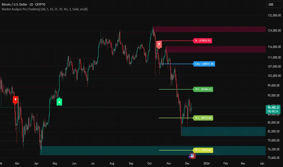
Market Analysis Pro [Trademy]OVERVIEW
Trademy Market Analysis Pro is a professional-grade trading system that combines advanced momentum analysis with institutional-level Supply/Demand zone mapping. This indicator is designed to provide crystal-clear market analysis with precise risk management tools, creating a complete trading framework within a single, streamlined interface.
Unlike complex indicators that overwhelm traders with information, Trademy focuses on what matters: high-probability setups with clear entry points, defined risk levels, and multiple profit targets. The system is built to eliminate guesswork and provide actionable signals that work across multiple timeframes and asset classes eg: ( INDEX:BTCUSD , NASDAQ:NVDA and more )
CORE CONCEPTS
Advanced Momentum Engine: The foundation of Trademy Market Analysis Pro is a proprietary momentum detection system that identifies true directional shifts in the market. The algorithm analyzes price behavior relative to volatility-adjusted dynamic levels, generating signals only when genuine momentum reversals occur. The "Signal Sensitivity" control allows you to adapt the system from conservative (fewer, higher-quality signals) to aggressive (more frequent opportunities) based on your trading style and market conditions.
Institutional Supply/Demand Zones: The system automatically identifies and plots key institutional levels where significant buying (Demand) or selling (Supply) pressure has occurred. These zones are calculated using advanced price structure analysis, filtered through intelligent overlap detection to ensure only the most relevant zones appear on your chart. When price approaches these levels, they often act as strong support or resistance, providing logical areas for entries and exits.
Intelligent Signal Classification: Not all signals are created equal. Trademy categorizes every signal as either "Normal" or "Strong" based on its alignment with the broader market structure and trend context. Strong signals represent higher-conviction setups where momentum and trend align perfectly, while normal signals indicate counter-trend or early reversal opportunities.
Non-Repainting Architecture: Every signal is locked in at bar close (when enabled), and all TP/SL levels are calculated using volatility measurements captured at the moment of signal generation.
KEY FEATURES
Precision Signal System
Dual Signal Modes: Choose between Normal signals (standard momentum reversals) or Strong signals (high-conviction trend-aligned setups), or view both simultaneously
Wait for Bar Close: Optional no-repaint mode ensures signals only appear after candle confirmation
Visual Signal Hierarchy: Normal signals shown with standard arrows (▲/▼), Strong signals marked with distinctive colors for instant recognition
Adjustable Arrow Sizes: Customize signal display from tiny to large based on your chart preferences
Professional Risk Management
Automated TP/SL Calculation: Three take-profit levels (TP1, TP2, TP3) and one stop-loss level automatically calculated using advanced volatility measurement
Fixed Risk Levels: TP/SL lines are locked at signal generation and never move—providing consistent, reliable risk parameters
Visual Risk Zones: Optional colored zones highlight your risk and reward areas for instant position assessment
Adjustable Risk Multiplier: Scale your targets up or down with a single parameter while maintaining proper risk-reward ratios
Clear On-Chart Labels: Every level displays exact price values in an easy-to-read format
Supply/Demand Zone Mapping
Automatic Zone Detection: System identifies high-probability supply and demand zones using advanced price structure analysis
Anti-Overlap Algorithm: Intelligent filtering prevents zone clutter by removing overlapping levels
Extended Zone Projection: Zones extend into the future, showing you key levels before price reaches them
Break-of-Structure Tracking: Monitors when zones are broken and removes invalidated levels
Fully Customizable: Adjust zone colors, swing length, history depth, and box width to match your analysis style
Visual Customization
Flexible Color Schemes: Customize colors for bull/bear signals, TP/SL levels, and supply/demand zones
Trend Background: Optional background coloring to instantly visualize the current market bias
Support/Resistance Lines: Toggle automatic S/R level plotting from key price pivots
Multiple Arrow Sizes: Choose from tiny, small, normal, or large signal arrows
WHAT MAKES TRADEMY MARKET ANALYSIS PRO DIFFERENT
✅ Simplicity Meets Power
✅ TP/SL Levels
✅ Institutional Zone Integration
✅ Universal Indicator for all markets
✅ Multi-Timeframe Flexibility
BEST PRACTICES
📌 Always Use Stop-Loss: Enable the TP/SL system and respect your stop-loss levels,risk management is key to long-term success
📌 Backtest First: Before live trading, replay historical charts to understand signal behavior on your specific asset and timeframe
📌 Combine Timeframes: Use higher timeframe signals as your bias, enter on lower timeframe signals in the same direction
📌 Watch the Zones: Highest probability setups occur when signals align with supply/demand zones (buy near demand, sell near supply)
📌 Don't Chase: If you miss a signal, wait for the next one,forcing trades leads to losses
📌 Partial Profits: Consider taking partial profits at TP1, moving stop to breakeven, and letting the rest run to TP2/TP3
📩 ACCESS & SUPPORT
This is an invite-only indicator. For access inquiries, please contact via TradingView private message.
Important Disclaimers:
This indicator is a tool for technical analysis and does not constitute financial advice
Past performance does not guarantee future results
Always practice proper risk management and never risk more than you can afford to lose
Trading carries substantial risk of loss and is not suitable for all investors
Educational
Supports & Resistances with Trend Lines EMA + VWAP + RangeSupports & Resistances with Trend Lines + EMA + VWAP + Opening Range
Key Features:
• Automatic Support & Resistance Levels
→ Pivot-based strong S/R detect karta hai
→ Visual boxes + labels ke saath clean display
• Smart Trend Lines (Uptrend & Downtrend)
→ Valid trend lines automatically draw karta hai
→ Fake breakout wali lines filter ho jati hain
→ Green = Uptrend, Red = Downtrend
• 13 EMA (Color Changing)
→ Bullish = Bright Green | Bearish = Red
→ Trend direction ek second mein samajh aata hai
• Session VWAP (Daily Reset)
→ Accurate intraday VWAP with purple line
→ Institutional level ka important reference
• Multiple Opening Ranges
→ 5-minute Opening Range
→ 15-minute Opening Range
→ First 1-Hour Range
→ Full Day High/Low Range
→ Fill + labels + clean lines
• Fully Customizable
→ Har feature ko on/off kar sakte ho
→ Colors, alerts, labels sab change kar sakte ho
Best for: Intraday, Scalping, Swing Trading, BTC/ETH, NIFTY, BANKNIFTY, Stocks, Forex
Alerts Available:
- New Support/Resistance detected
- Support/Resistance breakout
Made with by KingKuldeep, for traders

Critical_Poly_divergenceDetects various divergences and acts as Decision Making tool. Only for Educational purpose
Volume Flow IndicatorVolume flow analysis
This indicator measures volume-weighted money flow by comparing price changes against a volatility-based threshold, then smoothing the result - when VFI is above zero (green cloud) it suggests accumulation/buying pressure, while below zero (red cloud) indicates distribution/selling pressure.

EMA 20/50/200 - Warning Note Before Cross EMA 20/50/200 - Smart Cross Detection with Customizable Alerts
A clean and minimalistic indicator that tracks three key Exponential Moving Averages (20, 50, and 200) with intelligent near-cross detection and customizable warning system.
═══════════════════════════════════════════════════════════════════
📊 KEY FEATURES
✓ Triple EMA System
• EMA 20 (Red) - Fast/Short-term trend
• EMA 50 (Yellow) - Medium/Intermediate trend
• EMA 200 (Green) - Slow/Long-term trend & major support/resistance
✓ Smart Near-Cross Detection
• Get warned BEFORE crosses happen (not after)
• Adjustable threshold percentage (how close is "close")
• Automatic hiding after cross to prevent false signals
• Configurable lookback period
✓ Dual Warning System
• Price Label: Appears directly on chart near EMAs
• Info Table: Positioned anywhere on your chart
• Both show distance percentage and direction
• Dynamic positioning to avoid blocking candles
✓ Color-Coded Alerts
• GREEN warning = Bullish cross approaching (EMA 20 crossing UP through EMA 50)
• RED warning = Bearish cross approaching (EMA 20 crossing DOWN through EMA 50)
✓ Cross Signal Detection
• Golden Cross (EMA 50 crosses above EMA 200)
• Death Cross (EMA 50 crosses below EMA 200)
• Fast crosses (EMA 20 and EMA 50)
═══════════════════════════════════════════════════════════════════
⚙️ CUSTOMIZATION OPTIONS
Warning Settings:
• Custom warning text for bull/bear signals
• Adjustable opacity for better visibility
• Toggle distance and direction display
• Flexible table positioning (9 positions available)
• 5 text size options
Alert Settings:
• Golden/Death Cross alerts
• Fast cross alerts (20/50)
• Near-cross warnings (before it happens)
• All alerts are non-repainting
Display Options:
• Show/hide each EMA individually
• Toggle all signals on/off
• Adjustable threshold sensitivity
• Dynamic label positioning
═══════════════════════════════════════════════════════════════════
🎯 HOW TO USE
1. ADD TO CHART
Simply add the indicator to any chart and timeframe
2. ADJUST THRESHOLD
Default is 0.5% - increase for less frequent warnings, decrease for earlier warnings
3. SET UP ALERTS
Create alerts for:
• Near-cross warnings (get notified before the cross)
• Actual crosses (when EMA 20 crosses EMA 50)
• Golden/Death crosses (major trend changes)
4. CUSTOMIZE APPEARANCE
• Change warning text to your language
• Adjust opacity for your chart theme
• Position table where it's most convenient
• Choose label size for visibility
═══════════════════════════════════════════════════════════════════
💡 TRADING TIPS
- Use the near-cross warning to prepare entries/exits BEFORE the cross happens
- Green warning = Prepare for potential long position
- Red warning = Prepare for potential short position
- Combine with other indicators for confirmation
- Higher timeframes = more reliable signals
- Warning disappears after cross to avoid confusion
═══════════════════════════════════════════════════════════════════
🔧 TECHNICAL DETAILS
- Pine Script v6
- Non-repainting (all signals confirm on bar close)
- Works on all timeframes
- Works on all instruments (stocks, crypto, forex, futures)
- Lightweight and efficient
- No external data sources required
═══════════════════════════════════════════════════════════════════
📝 SETTINGS GUIDE
Near Cross Settings:
• Threshold %: How close EMAs must be to trigger warning (default 0.5%)
• Lookback Bars: Hide warning for X bars after a cross (default 3)
Warning Note Style:
• Text Size: Tiny to Huge
• Colors: Customize bull/bear warning colors
• Position: Place table anywhere on chart
• Opacity: 0 (solid) to 90 (very transparent)
Price Label:
• Size: Tiny to Large
• Opacity: Control transparency
• Auto-positioning: Moves to avoid blocking candles
Custom Text:
• Bull/Bear warning messages
• Toggle distance display
• Toggle direction display
═══════════════════════════════════════════════════════════════════
⚠️ IMPORTANT NOTES
- Warnings only appear BEFORE crosses, not after
- After a cross happens, warning is hidden for the lookback period
- Adjust threshold if you're getting too many/too few warnings
- This is a trend-following indicator - best used with confirmation
- Always use proper risk management
═══════════════════════════════════════════════════════════════════
Happy Trading! 📈📉
If you find this indicator useful, please give it a boost and leave a comment!
For questions or suggestions, feel free to reach out.

Krypton Fear & Greed + PURE PRICE ACTION👑 Krypton Fear & Greed + Pure Price Action
Unlock the power of pure price action with dynamic support/resistance levels based on market open
Perfect for NIFTY, BANKNIFTY, FINNIFTY, MIDCAPNIFTY, CRUDEOIL, STOCKS, BTCUSD, XAUUSD, EURUSD, SOLUSDT & more!
Core Features:
- Dynamic S/R Levels: 6 Supports (S1-S6) + 6 Resistances (R1-R6) calculated from session open price for each market type
→ Green for supports, Red for resistances – auto-drawn lines & labels that persist!
- Market Open (MO) Line: Highlights open price with time stamp (IST format)
- EMA 13: Auto-colored (green above, red below) + optional VWAP plot
- Weekly WTT/WTB Zones: Detects nearness to weekly high/low for big-picture context
- RSI Bar Coloring: Neutral gray bars (45-55 RSI) for chop detection
- Combined Table: Clean summary of SMI (Stochastic Momentum Index), RSI, VWAP & EMA20 trends
→ Bullish (green), Bearish (red), Neutral (gray) – with overbought/oversold alerts
→ Custom position (9 options) & size (Tiny to Huge)
- Alerts: Instant notifications for price near any S/R, VWAP, or MO
- SMI Oscillator: Overbought/oversold fills + EMA signal crossovers
Why it's a game-changer:
- Non-repainting levels – resets fresh each session
- Tailored for Indian indices (NIFTY etc.) + forex/crypto
- Fear & Greed via SMI/RSI: Spots reversals early
- Zero clutter: Everything overlays on price chart
Ideal for:
- Intraday scalpers hunting S/R bounces
- Positional traders watching MO/EMA breaks
From the mind of KULDEEP157 – simple, powerful.

👑KINGㅤKULDEEPKING KULDEEP PRO – The Ultimate All-in-One Trend Dashboard 👑
One indicator that rules them ALL.
This is not just a script — this is your complete trading command center.
Live on-chart dashboard combines 14+ powerful indicators and instantly tells you:
- Exact trend direction of every major signal
- When each indicator flipped (with 12-hour time stamp)
- Current market strength percentage (0-100%)
- India VIX fear level in real-time
What’s Inside:
• EMA 13, 21, 34, 200 (with auto color + touch detection)
• VWAP (daily reset, trend tracking)
• SuperTrend (ATR-based)
• Williams Alligator (full jaw/teeth/lips logic)
• MACD (classic crossover)
• Bollinger Bands (breakout detection)
• RSI (14) with overbought/oversold + neutral zone (45-55 bar coloring)
• Momentum, ADX + DI, ATR Volatility
• India VIX live reading (color-coded fear gauge)
Unique Features:
- Trend Strength Meter (0-100%) – combines ALL signals into one final verdict:
→ Strong Bullish | Bullish | Neutral | Bearish | Strong Bearish
- Every trend change timestamped (12-hour AM/PM format)
- Clean, beautiful on-chart table (4 positions, 5 text sizes)
- EMA 13 & 200 plotted directly on price chart (toggle on/off)
- RSI neutral zone (45-55) turns bars gray instantly
- Optional smoothing MA on RSI
Perfect for:
- Intraday & swing traders
- Nifty/BankNifty warriors
- Anyone who wants to see the entire market picture in ONE glance
No more switching tabs. No more confusion.
Just pure, clean, professional edge.
Coded with precision | Runs buttery smooth | Made for winners
Long live the King 👑
~ KULDEEP157

Grok Gold Master 2025Grok Gold Master 2025 – Full Indicator Description Always & Forever Free, only for self use only
(TradingView Pine Script v6 – specially built for XAUUSD / Gold)
This is a clean, professional, all-in-one Gold trading indicator designed for swing/day traders who want clear institutional-style levels, bias confirmation, and visual structure on the chart.
Core Purpose
Help you trade Gold (XAUUSD) with a high-probability bullish bias when price is above key levels, using a simple but powerful “3-zone” framework:
- Support (demand zone)
- Buy Zone (the sweet spot where you actually want to go long)
- Resistance (supply zone)
Main Visual Elements on the Chart
1. **Daily Range Box**
- A semi-transparent green box that covers the entire trading day from Support to Resistance
- Automatically refreshes every new day without any “future leak” errors
- Gives instant context of the current daily range
2. **Three Horizontal Levels (always visible)**
**
- Support → dashed lime line (default 4114)
- Buy Zone → thick solid yellow line (default 4180) ← your main long trigger level
- Resistance → dashed red line (default 4314)
3. **Zone Fills**
- Yellow fill between Support ↔ Buy Zone (caution/neutral area)
Green fill between Buy Zone ↔ Resistance (bullish control area)
4. **4-hour EMA 50 (thick dodger blue line)**
- Pulled from the 4H timeframe (multi-timeframe)
- Acts as dynamic trend filter
5. **Entry Signals**
- Big green “LONG” label + arrow appears only the first bar when:
close > Buy Zone AND close > 4H EMA 50
- Optional green triangles below bars when there is also high volume confirmation (volume > 1.5× 20-period average)
6. **Info Panel (top-right mini table + big label)**
Shows current values for:
- Support / Buy Zone / Resistance
- Current 4H EMA 50
- Live BIAS: “BULLISH – LONG ✅” (green) or “NEUTRAL – WAIT ⏸️” (gray)
Key Logic & Rules Built Into the Indicator
Bullish / Long condition (all must be true):
- Price closes above the Buy Zone level
- Price closes above the 4-hour EMA 50
When both are satisfied → entire info label turns green and says “BULLISH – LONG ✅”
If not → stays neutral/gray and tells you to wait.
Customization Options (Inputs)
- Show/hide the big info label
- Show/hide high-volume confirmation triangles
- Use Dynamic Levels → turn on to manually override the three levels with your own values (very useful when Gold breaks to new all-time highs or you spot new initiation levels)
Why This Indicator Feels “Institutional”
- Clean three-zone structure (exactly how smart money & banks draw their levels)
- Daily range box gives perfect context
- Multi-timeframe trend filter (4H EMA50)
- Volume spike confirmation option
- No repainting, no future leaks
- Instant visual bias at a glance
Best Used On
- XAUUSD (Gold) on 5m, 15m, 1H or 4H charts
- Works beautifully in both ranging and trending markets
In short: “Grok Gold Master 2025” is your 2025-2026 Gold trading dashboard — it tells you exactly where the important levels are, when the trend is truly bullish, and when to press the long button with confidence.
Just add it to your chart and you’ll immediately see why many Gold traders already using almost this exact setup. Now it’s packaged, automated, and looks gorgeous.

👑ᴀʟʟ ɪɴ 1 ᴀɴᴀʟʏꜱɪꜱ👑 All in 1 Analysis
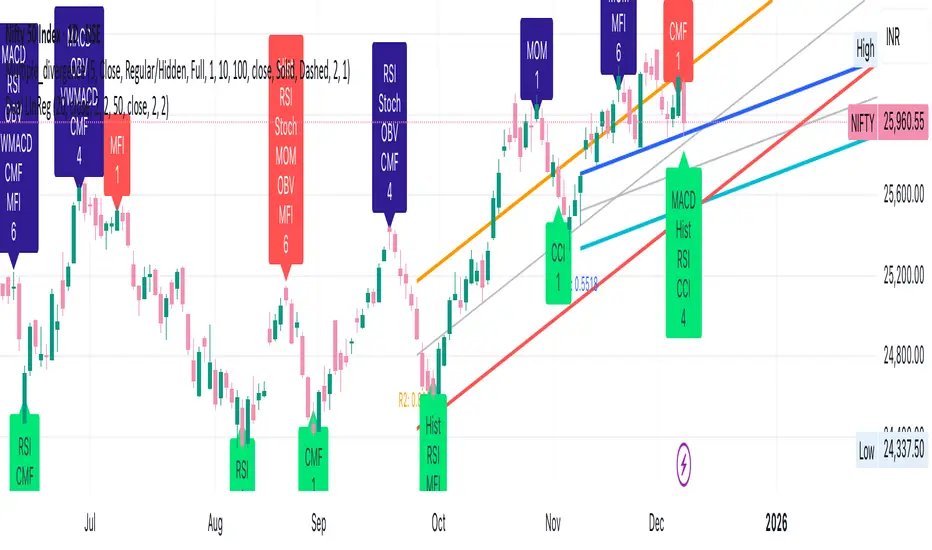
The ultimate all-in-one oscillator – switch between 15 powerful indicators with just one dropdown. No more cluttered charts!
Instantly analyze any asset using your favorite tool:
• Volume (with bullish/bearish breakdown + MA)
• MACD (line, signal, histogram)
• RSI (with MA, Bollinger Bands, color zones)
• ATR (with moving average)
• Bull Bear Power
• MFI (Money Flow Index)
• Momentum
• Chop Zone (trend strength & direction)
• Williams %R
• Accumulation/Distribution
• Average Day Range (ADR)
• BBTrend
• BB %b (Bollinger Bands %b)
• RSI Candlestick Oscillator (with regular & hidden divergence lines on chart!)
• ADX and DI (trend strength + direction)
Key Features:
- One-click switch between all 15 indicators
- Beautiful, easy-to-read analysis table (appears automatically)
→ Current value + clear status (Bullish, Bearish, Overbought, etc.)
→ Fully customizable position (6 options) and size (Tiny to Large)
- All plots, colors, levels, and MAs are fully customizable
- Super clean and lightweight – runs fast on any timeframe
- RSI Candlestick mode draws divergence lines directly on your price chart!
Perfect for:
- Day traders who need quick insights
- Swing traders switching between tools
- Anyone tired of adding 10+ indicators manually
- Learning how different oscillators behave on the same chart
Why use 15 separate indicators when you can have them all in one?
One indicator. Endless analysis. Zero clutter.
Made with ❤️ by KULDEEP157 | Pine Script™ v6 | Updated & Optimized

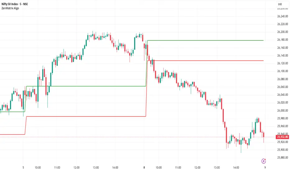
ZenMatrix AlgoZenMatrix Algo – Matrix Range Levels
ZenMatrix Algo automatically identifies the early market range for each trading day and plots clean horizontal support and resistance levels based on that range designed by Finovatech Solutions.
These levels often become important price reaction zones throughout the session.
✔ Features :--
Automatically detects the opening range each day
Plots dynamic support & resistance zones
Helps identify breakout areas and intraday structure
Works on any market: Crypto, Forex, Stocks & Indices
Multiple timeframe compatibility
🎯 Best For :--
Intraday scalping
Swing trading confirmations
index traders
anyone who uses early-session ranges as part of their market analysis
How to Use :--
Price breaking above the upper level may indicate bullish momentum
Price dropping below the lower level may indicate bearish continuation
Combine these levels with price action, volume, trend indicators, or your own strategy
Disclaimer :--
This script is for educational purposes only and is not financial advice.
HTF Candle Overlay
This custom indicator is designed to help traders see *Higher Timeframe (HTF)* price action without leaving their current (lower timeframe) chart. It overlays the body and wicks of a larger candle (e.g., 4-hour or Daily) directly onto your 5-minute or 15-minute chart.
Key Functions
1. *Multi-Timeframe Visualization:* It draws the Open, High, Low, and Close of a higher timeframe candle (like the 4-hour) on top of your current chart.
2. *Live Projection:* As the live market moves, the indicator projects the expected width of the current HTF candle, allowing you to see it forming in real-time.
3. *Custom Styling:* You can toggle the background fill on/off and customize colors for bullish/bearish borders and backgrounds separately.
Practical Trading Uses
* Trend Alignment: Traders often use this to ensure they are trading in the direction of the higher timeframe trend. For example, if the 4-hour candle is green (Bullish), you might only look for buy setups on the 5-minute chart.
* Support & Resistance: The High and Low of the previous HTF candle often act as strong support or resistance levels. This indicator makes those levels immediately visible.
* Engulfing Patterns: You can easily spot if the current price action is "engulfing" the previous HTF candle, which can be a powerful reversal signal.
* Context for Scalping: Scalpers use this to avoid shorting into a strong bullish HTF candle or buying into a bearish one. It keeps you aware of the "bigger picture."."

BTC vs Russell2000Description
The BTC vs Russell2000 – Weekly Cycle Map compares Bitcoin’s performance against the Russell 2000 (IWM) to identify long-term risk-on and risk-off market regimes.
The indicator calculates the BTC/RUT ratio on a weekly timeframe and applies a moving average filter to highlight macro momentum shifts.
White line: BTC/RUT ratio (Bitcoin relative strength vs small-cap equities)
Yellow line: Weekly SMA of the ratio (trend filter)
Green background: BTC outperforming → macro bull regime
Red background: Russell 2000 outperforming → macro bear regime
Halving markers: Visual reference points for Bitcoin market cycles
This tool is designed to help traders understand capital rotation between crypto and traditional markets, improve timing of macro entries, and visualize where Bitcoin stands within its broader cycle.

Trading Session IL7 Session-Based Intraday Momentum IndicatorOverview
This indicator is designed to support discretionary traders by highlighting intraday momentum phases based on price behavior and trading session context.
It is intended as a confirmation tool and not as a standalone trading system or automated strategy.
Core Concept
The script combines multiple market observations, including:
- Directional price behavior within the current timeframe
- Structural consistency in recent price movement
- Session-based filtering to focus on periods with higher activity and liquidity
Signals are only displayed when internal conditions align, helping traders avoid low-quality setups during sideways or low-momentum market phases.
How to Use
This indicator should be used to confirm existing trade ideas rather than generate trades on its own.
It can help traders:
- Identify periods where momentum is more likely to continue
- Filter out trades during unfavorable market conditions
- Align intraday execution with higher-timeframe bias
Best results are achieved when used alongside key price levels, higher-timeframe structure and proper risk management.
Limitations
This indicator does not predict future price movements.
Signals may change during active candles.
Market conditions may reduce effectiveness during extremely low volatility periods.
Language Notice
The indicator’s user interface labels are displayed in German.
This English description is provided first to comply with TradingView community script publishing rules.

n-Day Stock Return with MAs and SlopesThis indicator calculates the n-day percentage return of a stock and visualizes it either as a histogram or line, with optional moving averages (MA1 and MA2) of the return and their slopes. The script highlights trend changes in the slopes of these moving averages by drawing colored horizontal markers at each reversal point—green for upward slope shifts, red for downward shifts, and gray when the slope turns flat—allowing users to quickly identify strengthening, weakening, or neutral return trends over time. It also includes optional slope plots for additional trend context and a zero reference line for distinguishing positive and negative performance.

FAD Dashboard (Future vs Spot)Inspired by Wealthcon
This dashboard shows Real Time sentiment of Future Asset Difference with Future price of 3 Main Index & 10 Most significant Nifty 50 stocks . But the list is user customisable.
Fut Up + FAD Up (Deep Green)
Fut Down + FAD Up (Deep Blue)
Fut Up + FAD Down (Yellow)
Fut Down + FAD Down (Red)
Only for Educational purpose.

EMA Market Structure [BOSWaves]// This Pine Script™ code is subject to the terms of the Mozilla Public License 2.0 at mozilla.org
// Join our channel for more free tools: t.me
// This Pine Script® code is subject to the terms of the Mozilla Public License 2.0 at mozilla.org
// © BOSWaves
//@version=6
indicator("EMA Market Structure ", overlay=true, max_lines_count=500, max_labels_count=500, max_boxes_count=500)
// ============================================================================
// Inputs
// ============================================================================
// Ema settings
emaLength = input.int(50, "EMA Length", minval=1, tooltip="Period for the Exponential Moving Average calculation")
emaSource = input.source(close, "EMA Source", tooltip="Price source for EMA calculation (close, open, high, low, etc.)")
colorSmooth = input.int(3, "Color Smoothing", minval=1, group="EMA Style", tooltip="Smoothing period for the EMA color gradient transition")
showEmaGlow = input.bool(true, "EMA Glow Effect", group="EMA Style", tooltip="Display glowing halo effect around the EMA line for enhanced visibility")
// Structure settings
swingLength = input.int(5, "Swing Detection Length", minval=2, group="Structure", tooltip="Number of bars to the left and right to identify swing highs and lows")
swingCooloff = input.int(10, "Swing Marker Cooloff (Bars)", minval=1, group="Structure", tooltip="Minimum number of bars between consecutive swing point markers to reduce visual clutter")
showSwingLines = input.bool(true, "Show Structure Lines", group="Structure", tooltip="Display lines connecting swing highs and swing lows")
showSwingZones = input.bool(true, "Show Structure Zones", group="Structure", tooltip="Display shaded zones between consecutive swing points")
showBOS = input.bool(true, "Show Break of Structure", group="Structure", tooltip="Display BOS labels and stop loss levels when price breaks structure")
bosCooloff = input.int(15, "BOS Cooloff (Bars)", minval=5, maxval=50, group="Structure", tooltip="Minimum number of bars required between consecutive BOS signals to avoid signal spam")
slExtension = input.int(20, "SL Line Extension (Bars)", minval=5, maxval=100, group="Structure", tooltip="Number of bars to extend the stop loss line into the future for visibility")
slBuffer = input.float(0.1, "SL Buffer %", minval=0, maxval=2, step=0.05, group="Structure", tooltip="Additional buffer percentage to add to stop loss level for safety margin")
// Background settings
showBG = input.bool(true, "Show Trend Background", group="EMA Style", tooltip="Display background color based on EMA trend direction")
bgBullColor = input.color(color.new(#00ff88, 96), "Bullish BG", group="EMA Style", tooltip="Background color when EMA is in bullish trend")
bgBearColor = input.color(color.new(#ff3366, 96), "Bearish BG", group="EMA Style", tooltip="Background color when EMA is in bearish trend")
// ============================================================================
// Ema trend filter with gradient color
// ============================================================================
ema = ta.ema(emaSource, emaLength)
// Calculate EMA acceleration for gradient color
emaChange = ema - ema
emaAccel = ta.ema(emaChange, colorSmooth)
// Manual tanh function for normalization
tanh(x) =>
ex = math.exp(2 * x)
(ex - 1) / (ex + 1)
accelNorm = tanh(emaAccel / (ta.atr(14) * 0.01))
// Map normalized accel to hue (60 = green, 120 = yellow/red)
hueRaw = 60 + accelNorm * 60
hue = na(hueRaw ) ? hueRaw : (hueRaw + hueRaw ) / 2
sat = 1.0
val = 1.0
// HSV to RGB conversion
hsv_to_rgb(h, s, v) =>
c = v * s
x = c * (1 - math.abs((h / 60) % 2 - 1))
m = v - c
r = 0.0
g = 0.0
b = 0.0
if (h < 60)
r := c
g := x
b := 0
else if (h < 120)
r := x
g := c
b := 0
else if (h < 180)
r := 0
g := c
b := x
else if (h < 240)
r := 0
g := x
b := c
else if (h < 300)
r := x
g := 0
b := c
else
r := c
g := 0
b := x
color.rgb(int((r + m) * 255), int((g + m) * 255), int((b + m) * 255))
emaColor = hsv_to_rgb(hue, sat, val)
emaTrend = ema > ema ? 1 : ema < ema ? -1 : 0
// EMA with enhanced glow effect using fills
glowOffset = ta.atr(14) * 0.25
emaGlow8 = plot(showEmaGlow ? ema + glowOffset * 8 : na, "EMA Glow 8", color.new(emaColor, 100), 1, display=display.none)
emaGlow7 = plot(showEmaGlow ? ema + glowOffset * 7 : na, "EMA Glow 7", color.new(emaColor, 100), 1, display=display.none)
emaGlow6 = plot(showEmaGlow ? ema + glowOffset * 6 : na, "EMA Glow 6", color.new(emaColor, 100), 1, display=display.none)
emaGlow5 = plot(showEmaGlow ? ema + glowOffset * 5 : na, "EMA Glow 5", color.new(emaColor, 100), 1, display=display.none)
emaGlow4 = plot(showEmaGlow ? ema + glowOffset * 4 : na, "EMA Glow 4", color.new(emaColor, 100), 1, display=display.none)
emaGlow3 = plot(showEmaGlow ? ema + glowOffset * 3 : na, "EMA Glow 3", color.new(emaColor, 100), 1, display=display.none)
emaGlow2 = plot(showEmaGlow ? ema + glowOffset * 2 : na, "EMA Glow 2", color.new(emaColor, 100), 1, display=display.none)
emaGlow1 = plot(showEmaGlow ? ema + glowOffset * 1 : na, "EMA Glow 1", color.new(emaColor, 100), 1, display=display.none)
emaCore = plot(ema, "EMA Core", emaColor, 3)
emaGlow1b = plot(showEmaGlow ? ema - glowOffset * 1 : na, "EMA Glow 1b", color.new(emaColor, 100), 1, display=display.none)
emaGlow2b = plot(showEmaGlow ? ema - glowOffset * 2 : na, "EMA Glow 2b", color.new(emaColor, 100), 1, display=display.none)
emaGlow3b = plot(showEmaGlow ? ema - glowOffset * 3 : na, "EMA Glow 3b", color.new(emaColor, 100), 1, display=display.none)
emaGlow4b = plot(showEmaGlow ? ema - glowOffset * 4 : na, "EMA Glow 4b", color.new(emaColor, 100), 1, display=display.none)
emaGlow5b = plot(showEmaGlow ? ema - glowOffset * 5 : na, "EMA Glow 5b", color.new(emaColor, 100), 1, display=display.none)
emaGlow6b = plot(showEmaGlow ? ema - glowOffset * 6 : na, "EMA Glow 6b", color.new(emaColor, 100), 1, display=display.none)
emaGlow7b = plot(showEmaGlow ? ema - glowOffset * 7 : na, "EMA Glow 7b", color.new(emaColor, 100), 1, display=display.none)
emaGlow8b = plot(showEmaGlow ? ema - glowOffset * 8 : na, "EMA Glow 8b", color.new(emaColor, 100), 1, display=display.none)
// Create glow layers with fills (from outermost to innermost)
fill(emaGlow8, emaGlow7, showEmaGlow ? color.new(emaColor, 97) : na)
fill(emaGlow7, emaGlow6, showEmaGlow ? color.new(emaColor, 95) : na)
fill(emaGlow6, emaGlow5, showEmaGlow ? color.new(emaColor, 93) : na)
fill(emaGlow5, emaGlow4, showEmaGlow ? color.new(emaColor, 90) : na)
fill(emaGlow4, emaGlow3, showEmaGlow ? color.new(emaColor, 87) : na)
fill(emaGlow3, emaGlow2, showEmaGlow ? color.new(emaColor, 83) : na)
fill(emaGlow2, emaGlow1, showEmaGlow ? color.new(emaColor, 78) : na)
fill(emaGlow1, emaCore, showEmaGlow ? color.new(emaColor, 70) : na)
fill(emaCore, emaGlow1b, showEmaGlow ? color.new(emaColor, 70) : na)
fill(emaGlow1b, emaGlow2b, showEmaGlow ? color.new(emaColor, 78) : na)
fill(emaGlow2b, emaGlow3b, showEmaGlow ? color.new(emaColor, 83) : na)
fill(emaGlow3b, emaGlow4b, showEmaGlow ? color.new(emaColor, 87) : na)
fill(emaGlow4b, emaGlow5b, showEmaGlow ? color.new(emaColor, 90) : na)
fill(emaGlow5b, emaGlow6b, showEmaGlow ? color.new(emaColor, 93) : na)
fill(emaGlow6b, emaGlow7b, showEmaGlow ? color.new(emaColor, 95) : na)
fill(emaGlow7b, emaGlow8b, showEmaGlow ? color.new(emaColor, 97) : na)
// ============================================================================
// Swing high/low detection
// ============================================================================
// Swing High/Low Detection
swingHigh = ta.pivothigh(high, swingLength, swingLength)
swingLow = ta.pivotlow(low, swingLength, swingLength)
// Cooloff tracking
var int lastSwingHighPlot = na
var int lastSwingLowPlot = na
// Check if cooloff period has passed
canPlotHigh = na(lastSwingHighPlot) or (bar_index - lastSwingHighPlot) >= swingCooloff
canPlotLow = na(lastSwingLowPlot) or (bar_index - lastSwingLowPlot) >= swingCooloff
// Store swing points
var float lastSwingHigh = na
var int lastSwingHighBar = na
var float lastSwingLow = na
var int lastSwingLowBar = na
// Track previous swing for BOS detection
var float prevSwingHigh = na
var float prevSwingLow = na
// Update swing highs with cooloff
if not na(swingHigh) and canPlotHigh
prevSwingHigh := lastSwingHigh
lastSwingHigh := swingHigh
lastSwingHighBar := bar_index - swingLength
lastSwingHighPlot := bar_index
// Update swing lows with cooloff
if not na(swingLow) and canPlotLow
prevSwingLow := lastSwingLow
lastSwingLow := swingLow
lastSwingLowBar := bar_index - swingLength
lastSwingLowPlot := bar_index
// ============================================================================
// Structure lines & zones
// ============================================================================
var line swingHighLine = na
var line swingLowLine = na
var box swingHighZone = na
var box swingLowZone = na
if showSwingLines
// Draw line connecting swing highs with zones
if not na(swingHigh) and canPlotHigh and not na(prevSwingHigh)
if not na(lastSwingHighBar)
line.delete(swingHighLine)
swingHighLine := line.new(lastSwingHighBar, lastSwingHigh, bar_index - swingLength, swingHigh, color=color.new(#ff3366, 0), width=2, style=line.style_solid)
// Create resistance zone
if showSwingZones
box.delete(swingHighZone)
zoneTop = math.max(lastSwingHigh, swingHigh)
zoneBottom = math.min(lastSwingHigh, swingHigh)
swingHighZone := box.new(lastSwingHighBar, zoneTop, bar_index - swingLength, zoneBottom, border_color=color.new(#ff3366, 80), bgcolor=color.new(#ff3366, 92))
// Draw line connecting swing lows with zones
if not na(swingLow) and canPlotLow and not na(prevSwingLow)
if not na(lastSwingLowBar)
line.delete(swingLowLine)
swingLowLine := line.new(lastSwingLowBar, lastSwingLow, bar_index - swingLength, swingLow, color=color.new(#00ff88, 0), width=2, style=line.style_solid)
// Create support zone
if showSwingZones
box.delete(swingLowZone)
zoneTop = math.max(lastSwingLow, swingLow)
zoneBottom = math.min(lastSwingLow, swingLow)
swingLowZone := box.new(lastSwingLowBar, zoneTop, bar_index - swingLength, zoneBottom, border_color=color.new(#00ff88, 80), bgcolor=color.new(#00ff88, 92))
// ============================================================================
// Break of structure (bos)
// ============================================================================
// Track last BOS bar for cooloff
var int lastBullishBOS = na
var int lastBearishBOS = na
// Check if cooloff period has passed
canPlotBullishBOS = na(lastBullishBOS) or (bar_index - lastBullishBOS) >= bosCooloff
canPlotBearishBOS = na(lastBearishBOS) or (bar_index - lastBearishBOS) >= bosCooloff
// Bullish BOS: Price breaks above previous swing high while EMA is bullish
bullishBOS = showBOS and canPlotBullishBOS and emaTrend == 1 and not na(prevSwingHigh) and close > prevSwingHigh and close <= prevSwingHigh
// Bearish BOS: Price breaks below previous swing low while EMA is bearish
bearishBOS = showBOS and canPlotBearishBOS and emaTrend == -1 and not na(prevSwingLow) and close < prevSwingLow and close >= prevSwingLow
// Update last BOS bars
if bullishBOS
lastBullishBOS := bar_index
if bearishBOS
lastBearishBOS := bar_index
// Plot BOS with enhanced visuals and SL at the candle wick
if bullishBOS
// Calculate SL at the low of the current candle (bottom of wick) with buffer
slLevel = low * (1 - slBuffer/100)
// BOS Label with shadow effect
label.new(bar_index, low, "BOS", style=label.style_label_up, color=color.new(#00ff88, 0), textcolor=color.black, size=size.normal, tooltip="Bullish Break of Structure SL: " + str.tostring(slLevel))
// Main SL line at candle low
line.new(bar_index, slLevel, bar_index + slExtension, slLevel, color=color.new(#00ff88, 0), width=2, style=line.style_dashed, extend=extend.none)
// SL zone box for visual emphasis
box.new(bar_index, slLevel + (slLevel * 0.002), bar_index + slExtension, slLevel - (slLevel * 0.002), border_color=color.new(#00ff88, 60), bgcolor=color.new(#00ff88, 85))
// S/R label
label.new(bar_index + slExtension, slLevel, "S/R", style=label.style_label_left, color=color.new(#00ff88, 0), textcolor=color.black, size=size.tiny)
if bearishBOS
// Calculate SL at the high of the current candle (top of wick) with buffer
slLevel = high * (1 + slBuffer/100)
// BOS Label with shadow effect
label.new(bar_index, high, "BOS", style=label.style_label_down, color=color.new(#ff3366, 0), textcolor=color.white, size=size.normal, tooltip="Bearish Break of Structure SL: " + str.tostring(slLevel))
// Main SL line at candle high
line.new(bar_index, slLevel, bar_index + slExtension, slLevel, color=color.new(#ff3366, 0), width=2, style=line.style_dashed, extend=extend.none)
// SL zone box for visual emphasis
box.new(bar_index, slLevel + (slLevel * 0.002), bar_index + slExtension, slLevel - (slLevel * 0.002), border_color=color.new(#ff3366, 60), bgcolor=color.new(#ff3366, 85))
// S/R label
label.new(bar_index + slExtension, slLevel, "S/R", style=label.style_label_left, color=color.new(#ff3366, 0), textcolor=color.white, size=size.tiny)
// ============================================================================
// Dynamic background zones
// ============================================================================
bgcolor(showBG and emaTrend == 1 ? bgBullColor : showBG and emaTrend == -1 ? bgBearColor : na)
// ============================================================================
// Alerts
// ============================================================================
alertcondition(bullishBOS, "Bullish BOS", "Bullish Break of Structure detected!")
alertcondition(bearishBOS, "Bearish BOS", "Bearish Break of Structure detected!")
alertcondition(emaTrend == 1 and emaTrend != 1, "EMA Bullish", "EMA turned bullish")
alertcondition(emaTrend == -1 and emaTrend != -1, "EMA Bearish", "EMA turned bearish")
// ╔════════════════════════════════╗
// ║ Download at ║
// ╚════════════════════════════════╝
// ███████╗██╗███╗ ███╗██████╗ ██╗ ███████╗
// ██╔════╝██║████╗ ████║██╔══██╗██║ ██╔════╝
// ███████╗██║██╔████╔██║██████╔╝██║ █████╗
// ╚════██║██║██║╚██╔╝██║██╔═══╝ ██║ ██╔══╝
// ███████║██║██║ ╚═╝ ██║██║ ███████╗███████╗
// ╚══════╝╚═╝╚═╝ ╚═╝╚═╝ ╚══════╝╚══════╝
// ███████╗ ██████╗ ██████╗ ███████╗██╗ ██╗
// ██╔════╝██╔═══██╗██╔══██╗██╔════╝╚██╗██╔╝
// █████╗ ██║ ██║██████╔╝█████╗ ╚███╔╝
// ██╔══╝ ██║ ██║██╔══██╗██╔══╝ ██╔██╗
// ██║ ╚██████╔╝██║ ██║███████╗██╔╝ ██╗
// ╚═╝ ╚═════╝ ╚═╝ ╚═╝╚══════╝╚═╝ ╚═╝
// ████████╗ ██████╗ ██████╗ ██╗ ███████╗
// ╚══██╔══╝██╔═══██╗██╔═══██╗██║ ██╔════╝
// ██║ ██║ ██║██║ ██║██║ ███████╗
// ██║ ██║ ██║██║ ██║██║ ╚════██║
// ██║ ╚██████╔╝╚██████╔╝███████╗███████║
// ╚═╝ ╚═════╝ ╚═════╝ ╚══════╝╚══════╝
// ==========================================================================================

Breaker Blocks [TakingProphets]Breaker Blocks
Smart Money “breaker” zones automatically mapped on your chart.
This tool is designed for traders who use ICT / Smart Money concepts and want a clean, automated way to see breaker blocks form and evolve in real time.
-----------------------------------------------------------------------------------------------
🔍 What this indicator does
The script automatically detects potential bullish and bearish breaker blocks after a market structure shift, then draws and maintains those zones on your chart:
-Plots bullish breaker blocks as green shaded zones.
-Plots bearish breaker blocks as red shaded zones.
-Optionally shows the 50% (midline) of each breaker for refinement.
-Keeps a rolling list of the most recent breakers and removes older ones to keep your chart clean.
-Optionally hides breakers once price closes through them (invalidation), so only active zones remain.
It’s built to work on any symbol and any timeframe. Lower timeframes will naturally generate more breakers; higher timeframes will show fewer, more significant zones.
Important: This script does not open, manage, or close trades for you. It only visualizes price zones that may be relevant to your own strategy and analysis.
-----------------------------------------------------------------------------------------------
🧠 Core logic (high level)
Under the hood, the indicator:
Uses an internal zigzag swing structure to track major pivot highs and lows.
Watches for a market structure shift (MSS):
Bullish MSS: price closes above a prior swing high.
Bearish MSS: price closes below a prior swing low.
Once an MSS is confirmed, it:
Locates the relevant impulse candle(s) that price traded through.
Defines the breaker block using the high/low (or body vs. wick, based on internal settings).
Draws a breaker box from that origin forward in time.
Each breaker is stored as an internal object with:
Direction (bullish or bearish)
Top and bottom prices
Visual boxes and an optional midline
On every new candle, all active breakers are updated:
Extended forward as new bars print.
Optionally invalidated and deleted if price closes back through the breaker in the opposite direction.
This gives you a dynamic map of which breaker blocks are still “respected” by price and which have failed.
-----------------------------------------------------------------------------------------------
⚙️ Key Inputs & Settings
All user-facing options are grouped under “Breaker Blocks” for a clean UI.
-Display Breaker Block
Toggle the visualization on/off without removing detection logic.
-Bullish Color / Bearish Color
Choose the fill color for bullish and bearish breaker zones.
-Show 50% Line
Plots a dashed line at the mid-point of each breaker block.
Helpful if you use the 50% level as a refinement or entry anchor.
-Max Visible
Limits how many of the most recent breaker blocks stay on the chart.
Older breakers are deleted once this limit is exceeded (keeps things clean and lightweight).
-Hide When Invalidated
If enabled:
Bullish breaker is hidden once price closes below its low.
Bearish breaker is hidden once price closes above its high.
If disabled, breakers remain visible even after those closes (for study / backtesting purposes).
These options allow you to run the tool in either a minimal, current-context only mode, or a more historical, educational mode.
-----------------------------------------------------------------------------------------------
🧭 How traders might use it
Some common ways traders may incorporate breaker blocks into their own plans:
As context zones around which to look for entries using their personal triggers.
As potential support/resistance areas after a shift in structure.
To visually separate active vs. invalidated zones instead of manually redrawing them.
In confluence with other SMC tools (FVGs, liquidity pools, PD arrays, etc.) and higher-timeframe bias.
This indicator is intended as a visual aid and works best when combined with a complete trading plan, risk management rules, and your own discretion.
-----------------------------------------------------------------------------------------------
⚠️ Disclaimer
This indicator does not guarantee profits or specific outcomes.
It is provided for educational and informational purposes only.
Past price behavior around breaker blocks does not imply future results.
Always test any tool on a demo account or in a simulated environment before using it with real capital.
Trading involves risk, and you are solely responsible for your own decisions.

VectorCoresAI SMA + Bollinger Fusion v1VectorCoresAI — SMA + Bollinger Fusion (Free)
A clean, modern visual tool combining four key SMAs with an adaptive Bollinger structure.
This script merges two of the most widely used charting concepts into one simple, readable view:
Included
✔ SMA 21
✔ SMA 50
✔ SMA 100
✔ SMA 200
✔ Bollinger Bands with adjustable length + multiplier
✔ Adaptive “Fusion Squeeze” shading to highlight compression phases
✔ Optional visibility toggles for each SMA
✔ Lightweight, non-intrusive overlay
What this indicator is designed for
This tool helps traders quickly understand:
Trend alignment using the 21/50/100/200 SMAs
Volatility conditions around the Bollinger midline
Price compression and expansion
Early awareness of breakout environments
Clean visual structure without clutter
Everything is intentionally simple and transparent.
No predictions, no signals, no trading advice — just clean chart structure.
Why this version is unique
Instead of using standard Bollinger visuals, this Fusion edition uses subtle adaptive shading to show when the bands contract.
This makes compression zones instantly visible without overwhelming the chart.
The SMAs are fixed to widely-used trend levels, giving consistent readings across all markets and timeframes.
Who this is for
Newer traders who want a clear introduction to SMAs + Bollinger Bands
Experienced traders who want a lightweight visual tool
Anyone building structure-based strategies
Users of the VectorCoresAI suite who want a simple companion tool
Notes
This indicator is part of the VectorCoresAI Free Tools collection.
All logic is open-source and educational only.
More tools coming soon.

Alt Trading: Asia Fibonacci Strategy
The Alt Trading: Asia Fibonacci Strategy is a session-anchored liquidity and Fibonacci engine designed for traders who want to systematically exploit the overnight Asia range instead of just marking it and guessing. It automatically profiles the Asia session to build a precise high–low liquidity band, then waits for clean sweeps of that range before it will even consider a setup forcing every idea to start from an objective liquidity event. Behind the scenes, a swing-based structure model defines the dominant leg and projects a true, directionally-aligned Fibonacci map, extending down for long scenarios and up for shorts so the premium/discount zones are never “mirrored” or visually inverted. Key extension bands are converted into forward-projected price zones, with dedicated entry corridors that only activate once price has both raided the Asia high/low and traded back into the correct Fibonacci pocket. A lightweight FVG engine tracks the most recent opposing Fair Value Gap and uses its invalidation as a final confirmation step, so your long setups only trigger when a bearish imbalance has been meaningfully reclaimed and vice versa for shorts. The result is a minimal but strict playbook: sweep the Asia range, respect the leg, touch the fib zone, invalidate the opposing FVG, then and only then print a clean visual marker on the chart. Transparent fib blocks, trigger FVG highlights, and compact “double-circle” text markers keep the chart readable even on lower timeframes, while still giving you a clear sense of where the setup originated and which liquidity it’s built around. All colors and visual layers are customizable, making it easy to blend the tool into your existing layout while preserving the core logic. Rather than trying to predict the entire session, Asia Fibonacci Strategy turns one of the most consistent structures in the market overnight range and its sweep into a repeatable, rule-driven framework for high-quality intraday entries.

Tempo's Trades IFVG Mastery IndicatorThe indicator I use is called IFVG Mastery. Below you can find all of the features, Automatically maps 50% of the daily range level, Marks out all equal highs and equal lows, Marks out all session killzones, Plots all FVG and IFVGs.
We will constantly a

Multi-Symbol FVG Scanner - Fixed This is a Multi-Symbol Fair Value Gap (FVG) Scanner for TradingView that monitors multiple currency pairs simultaneously for FVG patterns.
Key Features
What it does:
Scans 5 currency pairs simultaneously for Fair Value Gaps (FVGs)
Detects both bullish and bearish FVG patterns
Tracks when FVGs get "mitigated" (price reverses back through them)
Displays results in a real-time table
Generates alerts when patterns are detected
Shows visual histogram of active signals

Volatility Risk PremiumTHE INSURANCE PREMIUM OF THE STOCK MARKET
Every day, millions of investors face a fundamental question that has puzzled economists for decades: how much should protection against market crashes cost? The answer lies in a phenomenon called the Volatility Risk Premium, and understanding it may fundamentally change how you interpret market conditions.
Think of the stock market like a neighborhood where homeowners buy insurance against fire. The insurance company charges premiums based on their estimates of fire risk. But here is the interesting part: insurance companies systematically charge more than the actual expected losses. This difference between what people pay and what actually happens is the insurance premium. The same principle operates in financial markets, but instead of fire insurance, investors buy protection against market volatility through options contracts.
The Volatility Risk Premium, or VRP, measures exactly this difference. It represents the gap between what the market expects volatility to be (implied volatility, as reflected in options prices) and what volatility actually turns out to be (realized volatility, calculated from actual price movements). This indicator quantifies that gap and transforms it into actionable intelligence.
THE FOUNDATION
The academic study of volatility risk premiums began gaining serious traction in the early 2000s, though the phenomenon itself had been observed by practitioners for much longer. Three research papers form the backbone of this indicator's methodology.
Peter Carr and Liuren Wu published their seminal work "Variance Risk Premiums" in the Review of Financial Studies in 2009. Their research established that variance risk premiums exist across virtually all asset classes and persist over time. They documented that on average, implied volatility exceeds realized volatility by approximately three to four percentage points annualized. This is not a small number. It means that sellers of volatility insurance have historically collected a substantial premium for bearing this risk.
Tim Bollerslev, George Tauchen, and Hao Zhou extended this research in their 2009 paper "Expected Stock Returns and Variance Risk Premia," also published in the Review of Financial Studies. Their critical contribution was demonstrating that the VRP is a statistically significant predictor of future equity returns. When the VRP is high, meaning investors are paying substantial premiums for protection, future stock returns tend to be positive. When the VRP collapses or turns negative, it often signals that realized volatility has spiked above expectations, typically during market stress periods.
Gurdip Bakshi and Nikunj Kapadia provided additional theoretical grounding in their 2003 paper "Delta-Hedged Gains and the Negative Market Volatility Risk Premium." They demonstrated through careful empirical analysis why volatility sellers are compensated: the risk is not diversifiable and tends to materialize precisely when investors can least afford losses.
HOW THE INDICATOR CALCULATES VOLATILITY
The calculation begins with two separate measurements that must be compared: implied volatility and realized volatility.
For implied volatility, the indicator uses the CBOE Volatility Index, commonly known as the VIX. The VIX represents the market's expectation of 30-day forward volatility on the S&P 500, calculated from a weighted average of out-of-the-money put and call options. It is often called the "fear gauge" because it rises when investors rush to buy protective options.
Realized volatility requires more careful consideration. The indicator offers three distinct calculation methods, each with specific advantages rooted in academic literature.
The Close-to-Close method is the most straightforward approach. It calculates the standard deviation of logarithmic daily returns over a specified lookback period, then annualizes this figure by multiplying by the square root of 252, the approximate number of trading days in a year. This method is intuitive and widely used, but it only captures information from closing prices and ignores intraday price movements.
The Parkinson estimator, developed by Michael Parkinson in 1980, improves efficiency by incorporating high and low prices. The mathematical formula calculates variance as the sum of squared log ratios of daily highs to lows, divided by four times the natural logarithm of two, times the number of observations. This estimator is theoretically about five times more efficient than the close-to-close method because high and low prices contain additional information about the volatility process.
The Garman-Klass estimator, published by Mark Garman and Michael Klass in 1980, goes further by incorporating opening, high, low, and closing prices. The formula combines half the squared log ratio of high to low prices minus a factor involving the log ratio of close to open. This method achieves the minimum variance among estimators using only these four price points, making it particularly valuable for markets where intraday information is meaningful.
THE CORE VRP CALCULATION
Once both volatility measures are obtained, the VRP calculation is straightforward: subtract realized volatility from implied volatility. A positive result means the market is paying a premium for volatility insurance. A negative result means realized volatility has exceeded expectations, typically indicating market stress.
The raw VRP signal receives slight smoothing through an exponential moving average to reduce noise while preserving responsiveness. The default smoothing period of five days balances signal clarity against lag.
INTERPRETING THE REGIMES
The indicator classifies market conditions into five distinct regimes based on VRP levels.
The EXTREME regime occurs when VRP exceeds ten percentage points. This represents an unusual situation where the gap between implied and realized volatility is historically wide. Markets are pricing in significantly more fear than is materializing. Research suggests this often precedes positive equity returns as the premium normalizes.
The HIGH regime, between five and ten percentage points, indicates elevated risk aversion. Investors are paying above-average premiums for protection. This often occurs after market corrections when fear remains elevated but realized volatility has begun subsiding.
The NORMAL regime covers VRP between zero and five percentage points. This represents the long-term average state of markets where implied volatility modestly exceeds realized volatility. The insurance premium is being collected at typical rates.
The LOW regime, between negative two and zero percentage points, suggests either unusual complacency or that realized volatility is catching up to implied volatility. The premium is shrinking, which can precede either calm continuation or increased stress.
The NEGATIVE regime occurs when realized volatility exceeds implied volatility. This is relatively rare and typically indicates active market stress. Options were priced for less volatility than actually occurred, meaning volatility sellers are experiencing losses. Historically, deeply negative VRP readings have often coincided with market bottoms, though timing the reversal remains challenging.
TERM STRUCTURE ANALYSIS
Beyond the basic VRP calculation, sophisticated market participants analyze how volatility behaves across different time horizons. The indicator calculates VRP using both short-term (default ten days) and long-term (default sixty days) realized volatility windows.
Under normal market conditions, short-term realized volatility tends to be lower than long-term realized volatility. This produces what traders call contango in the term structure, analogous to futures markets where later delivery dates trade at premiums. The RV Slope metric quantifies this relationship.
When markets enter stress periods, the term structure often inverts. Short-term realized volatility spikes above long-term realized volatility as markets experience immediate turmoil. This backwardation condition serves as an early warning signal that current volatility is elevated relative to historical norms.
The academic foundation for term structure analysis comes from Scott Mixon's 2007 paper "The Implied Volatility Term Structure" in the Journal of Derivatives, which documented the predictive power of term structure dynamics.
MEAN REVERSION CHARACTERISTICS
One of the most practically useful properties of the VRP is its tendency to mean-revert. Extreme readings, whether high or low, tend to normalize over time. This creates opportunities for systematic trading strategies.
The indicator tracks VRP in statistical terms by calculating its Z-score relative to the trailing one-year distribution. A Z-score above two indicates that current VRP is more than two standard deviations above its mean, a statistically unusual condition. Similarly, a Z-score below negative two indicates VRP is unusually low.
Mean reversion signals trigger when VRP reaches extreme Z-score levels and then shows initial signs of reversal. A buy signal occurs when VRP recovers from oversold conditions (Z-score below negative two and rising), suggesting that the period of elevated realized volatility may be ending. A sell signal occurs when VRP contracts from overbought conditions (Z-score above two and falling), suggesting the fear premium may be excessive and due for normalization.
These signals should not be interpreted as standalone trading recommendations. They indicate probabilistic conditions based on historical patterns. Market context and other factors always matter.
MOMENTUM ANALYSIS
The rate of change in VRP carries its own information content. Rapidly rising VRP suggests fear is building faster than volatility is materializing, often seen in the early stages of corrections before realized volatility catches up. Rapidly falling VRP indicates either calming conditions or rising realized volatility eating into the premium.
The indicator tracks VRP momentum as the difference between current VRP and VRP from a specified number of bars ago. Positive momentum with positive acceleration suggests strengthening risk aversion. Negative momentum with negative acceleration suggests intensifying stress or rapid normalization from elevated levels.
PRACTICAL APPLICATION
For equity investors, the VRP provides context for risk management decisions. High VRP environments historically favor equity exposure because the market is pricing in more pessimism than typically materializes. Low or negative VRP environments suggest either reducing exposure or hedging, as markets may be underpricing risk.
For options traders, understanding VRP is fundamental to strategy selection. Strategies that sell volatility, such as covered calls, cash-secured puts, or iron condors, tend to profit when VRP is elevated and compress toward its mean. Strategies that buy volatility tend to profit when VRP is low and risk materializes.
For systematic traders, VRP provides a regime filter for other strategies. Momentum strategies may benefit from different parameters in high versus low VRP environments. Mean reversion strategies in VRP itself can form the basis of a complete trading system.
LIMITATIONS AND CONSIDERATIONS
No indicator provides perfect foresight, and the VRP is no exception. Several limitations deserve attention.
The VRP measures a relationship between two estimates, each subject to measurement error. The VIX represents expectations that may prove incorrect. Realized volatility calculations depend on the chosen method and lookback period.
Mean reversion tendencies hold over longer time horizons but provide limited guidance for short-term timing. VRP can remain extreme for extended periods, and mean reversion signals can generate losses if the extremity persists or intensifies.
The indicator is calibrated for equity markets, specifically the S&P 500. Application to other asset classes requires recalibration of thresholds and potentially different data sources.
Historical relationships between VRP and subsequent returns, while statistically robust, do not guarantee future performance. Structural changes in markets, options pricing, or investor behavior could alter these dynamics.
STATISTICAL OUTPUTS
The indicator presents comprehensive statistics including current VRP level, implied volatility from VIX, realized volatility from the selected method, current regime classification, number of bars in the current regime, percentile ranking over the lookback period, Z-score relative to recent history, mean VRP over the lookback period, realized volatility term structure slope, VRP momentum, mean reversion signal status, and overall market bias interpretation.
Color coding throughout the indicator provides immediate visual interpretation. Green tones indicate elevated VRP associated with fear and potential opportunity. Red tones indicate compressed or negative VRP associated with complacency or active stress. Neutral tones indicate normal market conditions.
ALERT CONDITIONS
The indicator provides alerts for regime transitions, extreme statistical readings, term structure inversions, mean reversion signals, and momentum shifts. These can be configured through the TradingView alert system for real-time monitoring across multiple timeframes.
REFERENCES
Bakshi, G., and Kapadia, N. (2003). Delta-Hedged Gains and the Negative Market Volatility Risk Premium. Review of Financial Studies, 16(2), 527-566.
Bollerslev, T., Tauchen, G., and Zhou, H. (2009). Expected Stock Returns and Variance Risk Premia. Review of Financial Studies, 22(11), 4463-4492.
Carr, P., and Wu, L. (2009). Variance Risk Premiums. Review of Financial Studies, 22(3), 1311-1341.
Garman, M. B., and Klass, M. J. (1980). On the Estimation of Security Price Volatilities from Historical Data. Journal of Business, 53(1), 67-78.
Mixon, S. (2007). The Implied Volatility Term Structure of Stock Index Options. Journal of Empirical Finance, 14(3), 333-354.
Parkinson, M. (1980). The Extreme Value Method for Estimating the Variance of the Rate of Return. Journal of Business, 53(1), 61-65.

Quantum Uncertainty by Kingshuk GhoshLet me explain this indicator in simple, practical terms, including the fascinating physics concept that inspired me.
This indicator helps to understand when the market is predictable (safe to trade) versus unpredictable (risky to trade). It shows the probability zones where price is likely to move and warns you when conditions are too chaotic for reliable trading.
The Physics Behind It: Heisenberg's Uncertainty Principle:-
This indicator is inspired by one of the most profound discoveries in physics: Heisenberg's Uncertainty Principle.
What Is The Uncertainty Principle?
In 1927, physicist Werner Heisenberg discovered something remarkable about the universe: you cannot simultaneously know both the exact position and exact momentum of a particle with perfect precision. The more accurately you know one, the less accurately you can know the other.
Simple Analogy:
Imagine trying to photograph a speeding bullet:
Use fast shutter speed → You see exactly WHERE it is (position), but the image is frozen, so you can't tell HOW FAST it's moving (momentum)
Use slow shutter speed → You see motion blur showing HOW FAST it's moving (momentum), but you can't pinpoint exactly WHERE it is (position)
You can never have both perfect clarity simultaneously - there's always a trade-off.
How This Applies To Trading
The indicator translates this principle to financial markets:
In Physics:
Position Uncertainty × Momentum Uncertainty = Always greater than a minimum value
High uncertainty in one means high uncertainty overall
In Trading:
Price Position Uncertainty = How much the price bounces around (volatility)
Price Momentum Uncertainty = How erratic the directional strength is
Total Market Uncertainty = Price Volatility × Momentum Volatility
The Trading Insight:
Just like in physics, when BOTH price position and momentum are uncertain (highly volatile), the market becomes fundamentally unpredictable. You can't reliably know where price will go next because the system is in high uncertainty state.
Why This Matters For You
Traditional indicators often look at price OR momentum separately. This indicator recognizes that both must be considered together to truly understand market predictability, just as Heisenberg showed that position and momentum must be considered together in physics.
When both uncertainties are high simultaneously:
Price could jump anywhere
Momentum could shift instantly
Predictions become unreliable
Trading becomes gambling
When both uncertainties are low:
Price behavior is more regular
Momentum is more stable
Patterns become clearer
Trading becomes strategic
This is why the indicator's core metric multiplies price volatility by momentum volatility - it's capturing that fundamental uncertainty relationship.
Market Uncertainty
The indicator calculates how unpredictable the market currently is by examining:
How much price is bouncing around (price volatility)
How erratic the momentum is (momentum instability)
When both are high simultaneously, the market becomes highly unpredictable. When both are calm, the market is more reliable for trading.
Think of it like driving:
Low uncertainty = Clear road, good visibility, safe to drive
High uncertainty = Fog, rain, poor visibility, dangerous conditions
Probability Bands
The indicator draws colored bands around a central average price line:
White Center Line (Basis)
The average price over your lookback period
Acts as a equilibrium point where price gravitates
Blue Bands (Inner Zone)
Covers about 68% of normal price behavior
Price spends most of its time here
This is the "normal operating range"
Purple Bands (Outer Zone)
Covers about 95% of all price behavior
Price rarely ventures here
When it does, it's unusual and noteworthy
Highway Lane Analogy:
Most drivers stay in center lanes (blue zone)
Few drivers use extreme outer lanes (purple zone)
When someone drives on the shoulder, it's abnormal and signals something is happening
Wave Function Collapse
Another physics concept applied here: In quantum mechanics, particles exist in multiple states simultaneously (superposition) until they're measured - then the "wave function collapses" to a single state.
In This Indicator:
The probability bands represent all the possible states price could be in. When price moves and settles at a specific level, it's like the wave function collapsing - probability becomes reality.
The indicator helps you see:
Where price is most likely to be (high probability zones - blue bands)
Where price rarely goes (low probability zones - purple bands)
When price is in an "impossible" state (outside bands - tunneling)
Price Position
The indicator tracks where current price sits within these bands:
Upper position = Price in the top half (bullish territory)
Lower position = Price in the bottom half (bearish territory)
Extreme positions = Price in outer 30% on either side (potential reversal zones)
Quantum Tunneling Signals
This is another physics concept: In quantum mechanics, particles can sometimes "tunnel" through barriers that classical physics says they shouldn't be able to cross.
In Trading:
When price breaks through the 95% probability barrier, it's "tunneling" into statistically improbable territory - these are marked by triangles:
Green Triangle Up
Price tunneled through the upper 95% barrier
This is statistically rare (happens only 5% of the time)
Often signals price exhaustion or coming reversal downward
Like a particle that tunneled too far and will snap back
Red Triangle Down
Price tunneled through the lower 95% barrier
Also statistically unusual
Often signals panic selling may be overdone
Like a spring compressed too far, ready to bounce
These "tunneling events" are significant because they represent extreme deviations from normal probability - and markets tend to revert to normal.
Entanglement Score
In quantum physics, "entanglement" means two particles are connected such that measuring one instantly affects the other, no matter the distance.
In Trading:
This measures whether price movements are "entangled" with trading volume - do they move together in a connected way?
High Entanglement (above 0.5)
Price and volume move together
Volume confirms the price action
More reliable, trustworthy moves
Like entangled particles - they're truly connected
Low Entanglement (below 0.3)
Price moves without volume support
Suspicious, unsupported movements
Less reliable, be cautious
Like particles that aren't entangled - the connection is weak
Negative Entanglement
Price and volume move in opposite directions
Often signals divergence or potential reversal
Requires careful interpretation
Information Dashboard:
1. Uncertainty Level
Shows current market unpredictability (the core Heisenberg principle calculation):
✓ Normal (Green) = Market is behaving predictably, safe to trade
⚠ High Risk (Red) = Market is chaotic, avoid trading
This is your first checkpoint - if uncertainty is high, don't proceed further.
2. Probability Score
Shows how normal or extreme the current price is:
Percentage shown = Where price sits in the probability distribution
✓ Safe (Green) = Price in normal range (middle 70%)
⛔ Extreme (Red) = Price at statistical outliers (outer 15%)
High percentage (>85%) = Price near the average, stable situation
Low percentage (<15%) = Price at extremes, unstable situation
3. Position Indicator
Tells you which side of the market you're on:
Upper/Lower = Basic location in the bands
→ Neutral (Gray) = Price in balanced middle zone
⚠ Reversal? (Orange) = Price at extremes, watch for turnaround
This helps you anticipate potential support or resistance levels.
4. Entanglement Confirmation
Shows the correlation number and interpretation:
✓ Confirmed (Green) = Volume strongly supports price (>0.5)
⚠ Weak (Orange) = Poor volume support (<0.5)
Always prefer trading when entanglement is confirmed - it means the move is "real" with participant backing.
5. Trade Status - YOUR MAIN SIGNAL
This is the indicator's final verdict combining all factors:
✓ TRADEABLE (Green)
Uncertainty is normal
Probability is safe
Entanglement is decent
Action: Market conditions favor trading
⛔ AVOID (Red)
One or more conditions are unfavorable
Market is too unpredictable
Action: Stay out, preserve capital.
Scenario A: Perfect Buy Setup
Red triangle appears (quantum tunneling down)
Position shows "Lower" with "⚠ Reversal?" warning
Entanglement shows "✓ Confirmed"
Trade Status: "✓ TRADEABLE"
Interpretation: Price hit extreme low with volume support, likely to bounce back to probability zone
Action: Consider long entry with stop below recent low
Scenario B: Perfect Sell Setup
Green triangle appears (quantum tunneling up)
Position shows "Upper" with "⚠ Reversal?" warning
Entanglement shows "✓ Confirmed"
Trade Status: "✓ TRADEABLE"
Interpretation: Price hit extreme high, exhaustion in high uncertainty zone
Action: Consider short entry or exit longs with stop above recent high
Scenario C: High Uncertainty - Stay Out
Uncertainty shows "⚠ High Risk"
Probability shows "⛔ Extreme"
Trade Status: "⛔ AVOID"
Interpretation: Both price and momentum uncertainties are high - market is fundamentally unpredictable (Heisenberg principle in action)
Action: No trading, wait for uncertainty to decrease
Scenario D: Trending Market
Price consistently stays in upper bands
No tunneling signals
Entanglement remains high
Trade Status stays "✓ TRADEABLE"
Interpretation: Strong trend with low uncertainty
Action: Trade with the trend, don't fight it
Scenario E: Choppy, Range-Bound
Price bounces between inner blue bands
Frequent status changes between TRADEABLE and AVOID
Entanglement fluctuates
Interpretation: Market lacks direction, uncertainty fluctuating
Action: Use bands as support/resistance for scalping, or wait for breakout.
Why The Uncertainty Principle Matters In Trading
Traditional technical analysis often looks at indicators in isolation:
"RSI is oversold, so buy"
"Price is volatile, so wait"
"Volume is high, so trade"
But Heisenberg's principle teaches us that multiple uncertainties interact and compound. This indicator recognizes that truth:
When price volatility is high AND momentum is erratic:
You can't reliably predict where price will go
You can't reliably predict how strong the move will be
The combination creates fundamental unpredictability
This is when the indicator says "AVOID"
When price volatility is low AND momentum is stable:
Price behavior becomes more regular
Directional moves become more reliable
The low combined uncertainty creates tradeable conditions
This is when the indicator says "TRADEABLE"
The Probability Wave Function
In quantum mechanics, until you measure a particle, it exists in all possible states simultaneously (superposition). The probability wave describes where it's most likely to be found.
The bands work the same way:
Blue bands = Where price has 68% probability of being (1 standard deviation)
Purple bands = Where price has 95% probability of being (2 standard deviations)
Outside bands = Less than 5% probability (quantum tunneling territory)
When price is in the blue zone, it's in its "natural" superposition state - normal behavior.
When price tunnels outside, it's in an "improbable" state - like a quantum particle appearing where it shouldn't be. Physics tells us this can't last - the wave function will collapse back to normal probability zones. In trading, this means reversion to the mean.
Entanglement and Market Correlation
Quantum entanglement shows us that connections matter - particles don't act in isolation.
In markets:
Price shouldn't move in isolation from volume
When they're "entangled" (moving together), the move is authentic
When they're not entangled (price moves without volume), the move is suspicious
This is why the indicator checks entanglement - it's verifying that the market components are properly connected and confirming each other.
Golden Rules for the indicator:
Never trade during high uncertainty states - When the indicator shows AVOID, it's telling you that fundamental unpredictability (Heisenberg's principle) has taken over. This is non-negotiable.
Reduce position size when entanglement is weak - Even if uncertainty is low, weak volume entanglement means the move may not be authentic.
Respect the quantum tunneling signals - They mark statistical extremes where price has entered improbable territory. Reversion to normal probability zones is likely.
Don't chase price outside the bands - If you missed the tunneling entry, wait for price to return to normal probability zones.
Use the white center line as equilibrium - Like particles gravitating toward lower energy states, price tends to revert to its average.
Heisenberg's Uncertainty Principle teaches us a profound lesson: some things are fundamentally unknowable. You cannot eliminate uncertainty - you can only measure it and decide whether it's low enough to act.
This indicator embraces that wisdom:
It doesn't claim to predict the future
It doesn't promise guaranteed wins
It simply measures current uncertainty
And tells you when conditions are favorable vs. unfavorable
The market, like quantum particles, is probabilistic, not deterministic. You're trading probabilities, not certainties. The indicator helps you identify when those probabilities are in your favor (low uncertainty) and when they're not (high uncertainty).
This is a more mature, realistic approach to trading than indicators that promise to "predict" moves. Instead, this indicator honestly assesses predictability itself.
Remember: Not trading during high uncertainty is just as important as trading during low uncertainty. Preservation of capital is the foundation of long-term success. As Heisenberg taught us, some moments are simply too uncertain to act - and that's okay.
Chart attached: -NSE Persistent, EoD 05/12/25, Day Time Frame.
DISCLAIMER: This information is provided for educational purposes only and should not be considered financial, investment, or trading advice. Please do boost if you like it. Happy Trading.
