krishnadeshmukh/NIFTY50 Micro Sentiment Part 1📘 Script Description: NIFTY50 Micro Sentiment — Part 1
This indicator tracks real-time micro sentiment across the top 25 weighted stocks of the NIFTY50 index using a volume-based distribution model.
🔍 How it works:
Scans last N bars (configurable) for each stock.
Divides each stock’s price range into equal bins.
Measures bullish vs bearish volume in each bin based on:
Candle Color (Close > Open) or
Close Near High (Close > Midpoint).
Assigns a sentiment value:
+1 → Bullish dominance
-1 → Bearish dominance
0 → Neutral
📊 Each stock's sentiment is weighted by its contribution to the index.
🧮 Displays:
Weighted Sentiment Score
Bullish / Bearish / Neutral Components
Updated every 5 bars with an easy-to-read table.
Use this to gauge underlying micro shifts in sentiment before broader market moves.
Educational

krishnadeshmukh/NIFTY50 Micro Sentiment Part 1📘 Script Description: NIFTY50 Micro Sentiment — Part 1
This indicator tracks real-time micro sentiment across the top 25 weighted stocks of the NIFTY50 index using a volume-based distribution model.
🔍 How it works:
Scans last N bars (configurable) for each stock.
Divides each stock’s price range into equal bins.
Measures bullish vs bearish volume in each bin based on:
Candle Color (Close > Open) or
Close Near High (Close > Midpoint).
Assigns a sentiment value:
+1 → Bullish dominance
-1 → Bearish dominance
0 → Neutral
📊 Each stock's sentiment is weighted by its contribution to the index.
🧮 Displays:
Weighted Sentiment Score
Bullish / Bearish / Neutral Components
Updated every 5 bars with an easy-to-read table.
Use this to gauge underlying micro shifts in sentiment before broader market moves.
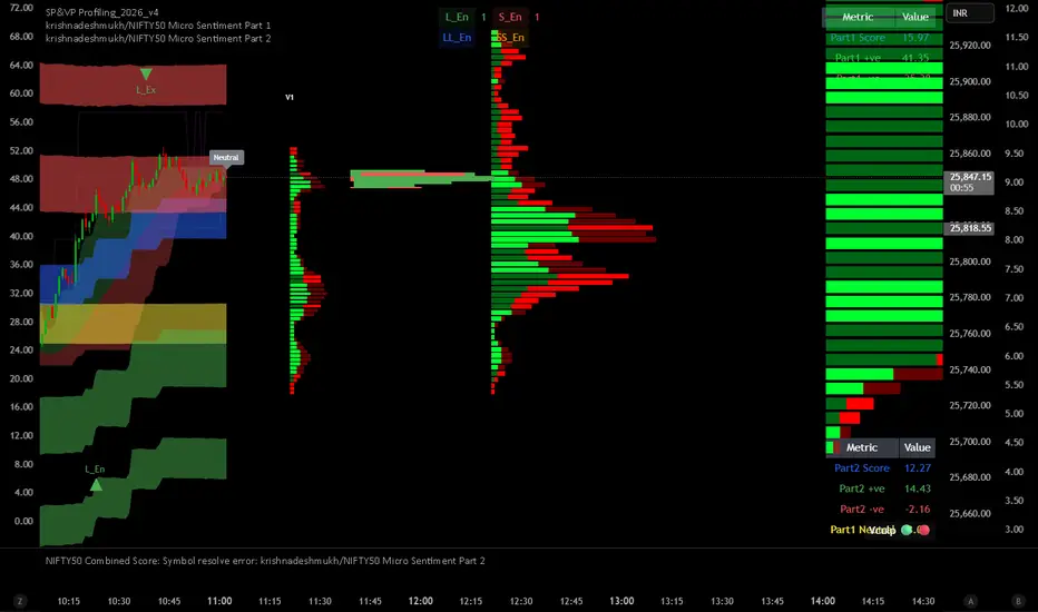
krishnadeshmukh/NIFTY50 Micro Sentiment Part 2📘 Script Description: NIFTY50 Micro Sentiment — Part 2
This indicator continues the NIFTY50 Micro Sentiment model by analyzing the remaining 25 stocks (Rank 26–50 by index weight) of the NIFTY50.
🔍 Key Features:
Applies the same volume-bin methodology used in Part 1.
Sentiment detection based on:
Candle Color (default) or
*Close vs Midpoint of the candle range.
Stocks are weighted by their index influence.
Output is a clean sentiment table:
+ve / -ve / Neutral Volume Score
Weighted Sentiment Output
Use this in conjunction with Part 1 to analyze the entire NIFTY50 sentiment landscape.
📘 Script Description: NIFTY50 Combined Score
This script aggregates live sentiment data from both:
🧩 NIFTY50 Micro Sentiment — Part 1
🧩 NIFTY50 Micro Sentiment — Part 2
🚀 What it does:
Imports Score, +ve, -ve, and Neutral components from both scripts.
Combines them to produce:
✅ Total Weighted Sentiment
🟢 Bullish Weight
🔴 Bearish Weight
🟡 Neutral Component
📊 Outputs are shown via a middle-right sentiment table, updated every 5 bars.
Perfect for traders seeking a unified view of micro sentiment across the entire NIFTY50 ecosystem — in one glance.

Triple Supertrend + EMA CrossoverCustomized 3 supertrend and EMA crossover which is helpful for identification of the trend.

Adaptive Trend-Based Fib Extension + TrendlinesThis advanced analysis tool is designed to take the guesswork out of Fibonacci trading. By combining Adaptive Fibonacci Extensions with multi-method Pivot Detection, Dynamic Trendlines, and Horizontal Support/Resistance, this indicator provides a comprehensive roadmap for any market trend.
Learn volume trading - @pricevolumetraders
Key Features
Adaptive Fibonacci Engine: Unlike static tools, this indicator uses an ATR-based adaptive factor to adjust extension levels according to current market volatility.
Smart Trend Detection: Automatically identifies trend direction using EMA cross-overs or Higher High/Higher Low sequences to determine whether to plot Bullish or Bearish extensions.
Multi-Method Pivots: Choose from six different pivot detection methods, including Volume-Based, Fractal, ATR-Based, and Long Wick detection, to suit your specific trading style.
Automated Trendlines & S/R: High-probability diagonal trendlines and horizontal S/R levels are drawn only when they meet a minimum "touch" requirement and volume confirmation.
Institutional Zones: Highlights the "Golden Zone" between the 127.2% and 161.8% extension levels, where trends often reach exhaustion or find major targets.
How to Use
Trend Alignment: Use the built-in Dashboard to quickly identify the current trend (Bull/Bear) and RSI momentum.
The 3-Point Setup: The indicator automatically finds Point 1 (Trend Start), Point 2 (Impulse End), and Point 3 (Retracement/Last Touch) to project future price targets.
Entry Confirmation: Look for price action near the 61.8% or 78.6% Retracement levels for high-probability entries in the direction of the trend.
Targeting: Use the extension levels (100%, 127.2%, 161.8%) as your primary Take Profit zones.
Confluence: The strongest setups occur when a Fibonacci level aligns perfectly with a Horizontal S/R line or a Diagonal Trendline.
Technical Settings
Pivot Settings: Adjust 'Left' and 'Right' bars to change the sensitivity of swing high/low detection.
Fib Timeframe: You can anchor Fibonacci levels to a higher timeframe (e.g., 1-hour levels) while trading on a lower timeframe (e.g., 5-minute).
Volume Multiplier: Filter for horizontal levels that were formed with significant institutional volume.
Disclaimer: Trading involves significant risk. This tool is for educational and analytical purposes only and should be used in conjunction with a complete trading plan.

First Presented FVGSummary: First Presented FVG Indicator
This is a Pine Script v6 TradingView indicator that identifies and visualizes the first Fair Value Gap (FVG) that forms within configurable time windows during a trading session.
What it Does
1. Detects FVGs : Uses the classic 3-candle FVG definition:
- Bullish FVG: When low > high (gap up)
- Bearish FVG: When high < low (gap down)
2. "First Presented" Logic : For each configured time slot, it captures only the first qualifying FVG that forms—subsequent FVGs in that window are ignored.
3. Visual Display :
- Draws a colored box spanning from detection time to session end
- Optional text label showing detection time (e.g., "9:38 Tue FP FVG")
- Optional grade lines at 25%, 50%, and 75% levels within the FVG
Key Configuration
Setting Description
Timeframe Only works on 5-minute charts or lower
Timezone IANA timezone for session times (default: America/New_York)
Session Futures trading hours (default: 1800-1715)
Min FVG Size Minimum gap size in ticks to qualify
4 Time Slots Each with enable toggle, time window, and color
Default Time Slots
Slot 1 (enabled): 09:30-10:30 — lime green
Slot 2 (enabled): 13:30-14:30 — blue
Slot 3 (disabled): 13:00-13:30 — teal
Slot 4 (disabled): 14:15-14:45 — fuchsia
Technical Features
Handles cross-midnight sessions correctly
Resets all drawings at each new session
Skips the first bar of each window to ensure valid 3-candle lookback
Clamps slot windows to session boundaries

GME Warrant Tracker [theUltimator5]The GME Warrant Tracker was designed to be used for GME warrants tracking. The theory behind this indicator is that warrants are priced similarly to options and generally follow the same Greeks. With that assumption, we can break down the price of the warrants by using known Greeks to estimate either the theoretical price, or even estimate Implied Volatility (IV).
The base settings for this indicator plot the calculated IV, the theoretical price (there are multiple methods of calculation which I will discuss later) and the current warrant price.
You can toggle on or off all of these plots to display only what you want to track.
For example, you can simply track the difference between the theoretical price and the current price to see if warrants are trading at a premium or a discount vs what the indicator calculates it to be.
Calculating implied volatility is extremely difficult and must be approximated.
The theoretical warrant price produced by this indicator depends primarily on the volatility input (σ) used in the Black–Scholes pricing model.
This script supports five distinct methods for approximating σ, each extracting different information from the market.
1) Close-to-Close Historical Volatility
Close-to-Close computes the standard deviation of daily close-to-close returns and uses a lookback window scaled to time-to-expiry. As the expiration approaches, the lookback window tightens, giving a more responsive volatility approximation relative to time-to-expiry.
This option produces conservative approximations for volatility, and may lag actual volatility intraday.
2) Parkinson High-Low Volatility
Parkinson High-Low volatility uses daily high and low prices to calculate intraday trading range for a more responsive estimation to volatility. It ignores opening and close gaps, so overnight volatility is not accounted for.
This option produces higher theoretical volatility during choppy price action and can over estimate actual volatility.
3) Garman–Klass Volatility
Garman–Klass volatility is a way to estimate how much price is fluctuating by using the open, high, low, and close for each period. Because it draws on multiple intraperiod price points (not just the range or close-to-close moves), it typically produces a tighter, more informative volatility estimate than simpler approaches. It’s often most helpful when gaps occur and when the open and close carry meaningful information about the session’s trading.
4)Yang–Zhang Volatility
The Yang–Zhang volatility estimator is designed to account for both opening jumps and price drift. It estimates volatility by combining overnight (close-to-open) variance, intraday (open-to-close) variance, and a weighted Rogers–Satchell component using OHLC data, often yielding a more robust measure than simpler close-to-close style estimators.
5) Option price
By default, the indicator uses the call option strike dated closest to the warrant expiration date. Since the Greeks for both the warrants and the
options are assumed to be equivalent with a minor difference in theta (time-to-expiry), the theoretical price of the warrants closely matches the trade price of the call strike chosen.
There is a table that can be enabled (off by default because it is large and fills entire screen on mobile) which shows all the configuration settings and Greeks.
You can also manually adjust the "dilution" factor for the warrants, which shifts the number of active warrants and moves the count into the shares outstanding for the underlying (GME). The reason for this is that as warrants get exercised, the total quantity of warrants in circulation decreases and the the total quantity of shares outstanding increases.
Since this indicator was built around the single warrant, ticker NYSE: GME/W, it is only meant to be used with NYSE:GME. Any other ticker will not work properly with this indicator.

A program written by a beginner# TXF Choppy Market Detector (Whipsaw Filter)
## Introduction
This project is a technical indicator developed in **Pine Script v5**, specifically optimized for **Taiwan Index Futures (TXF)** intraday trading.
The TXF market is known for its frequent periods of low-volatility consolidation following sharp moves, often resulting in "whipsaws" (double-loss scenarios for trend followers). This script utilizes **volatility analysis** and **trend efficiency metrics** to filter out noise and detect potential "Stop Hunting" or "Liquidity Sweep" setups within range-bound markets.
## Methodology & Algorithms
The strategy operates on the principle of **Mean Reversion**, combining two core components:
### 1. Market Regime Filter: Choppiness Index (CHOP)
We use the Choppiness Index (originally developed by E.W. Dreiss) to determine if the market is trending or consolidating based on **Fractal Dimension** theory.
* **Logic**:
The index ranges from 0 to 100. Higher values indicate low trend efficiency (consolidation), while lower values indicate strong directional trends.
* **Condition**: `CHOP > Threshold` (Default: 50).
* **Application**: When this condition is met, the background turns **gray**, signaling a "No-Trade Zone" for trend strategies and activating the Mean Reversion logic.
### 2. Whipsaw Detection: Bollinger Bands
Bollinger Bands are used to define the dynamic statistical extremities of price action.
* **Logic**:
We identify **Fakeouts** (False Breakouts) that occur specifically during the choppy regime identified above. This is often where institutional traders hunt for liquidity (stops) before reversing the price.
#### Signal Algorithms (Pseudocode)
**A. Bull Trap (Washout High)**
A false upside breakout designed to trap long traders.
```pine
Condition:
1. Is_Choppy == true (Market is sideways)
2. High > Upper_Bollinger_Band (Price pierces the upper band)
3. Close < Upper_Bollinger_Band (Price fails to hold and closes back inside)

History Trading SessionsThis indicator helps visually structure the trading day by highlighting custom time zones on the chart.
It is designed for historical analysis, trading discipline, and clear separation between analysis time, active trading, and no-trade periods.
Recommended to use on 4h and below time frames.

Delta Strength (True TV Delta)Description
Delta Strength measures the intensity of aggressive trading activity using TradingView’s native Volume Delta engine (ta.requestVolumeDelta).
Volume Delta shows which side is aggressive (buyers or sellers).
Delta Strength answers a different question:
How strong is that aggression compared to recent market behavior?
This indicator converts true per-bar volume delta into a relative strength ratio, helping identify institutional participation, initiative moves, absorption, and potential traps at key price locations.
No candle-based approximation is used. The calculation relies on TradingView’s internal bid-ask volume classification from lower timeframes.
How It Is Calculated
• Per-bar delta is derived from the difference between cumulative delta at bar close and bar open
• Absolute delta is averaged over a user-defined lookback period
• Current delta is compared against this average to produce a normalized strength value
This makes the indicator adaptive across instruments, volatility regimes, and sessions.
How to Read Delta Strength
• Values below the lower threshold indicate normal or low-quality activity
• Rising values show increasing professional participation
• Very high values indicate strong imbalance or aggressive initiative orders
• Extreme values without price follow-through often signal absorption or trapping
Delta Strength measures intensity only, not direction.
How to Use (Important)
Always combine Delta Strength with price location and structure.
Best locations include:
• VWAP and VWAP bands
• Previous Day High / Low
• Session highs and lows
• Range boundaries or value edges
Interpretation logic:
• Strong delta with price acceptance supports continuation
• Strong delta with price rejection suggests absorption or exhaustion
What This Indicator Is NOT
• Not a directional signal
• Not a standalone entry tool
• Not a trend indicator
Using Delta Strength without context can lead to false conclusions.
Intended Use
This indicator is designed for:
• Order Flow Analysis
• Market microstructure study
• Institutional activity confirmation
• Advanced discretionary trading workflows
It works best when combined with Volume Delta, VWAP, and structure-based analysis.
Summary
Delta shows who is aggressive.
Delta Strength shows how aggressive they are.
Price reaction shows whether that aggression is accepted or absorbed.
Used together, they provide insight into market intent rather than just price movement.

Implicit Dolar MEPWhich stock or CEDEAR offers the best implied MEP dollar rate?
This indicator displays labels positioned at the level of the implied MEP dollar rate for the 10 equity instruments (stocks, CEDEARs and ETFs) with the highest trading volume in MEP dollars over the last month on the BYMA market.
The implied rate for each asset is calculated as the ratio between its price in ARS and its price in MEP dollars, for example:
GGAL / GGALD.
As a reference (benchmark), a white line is plotted representing the implied MEP dollar rate of the AL30 bond, calculated as AL30 / AL30D, which is the most liquid government bond in the BYMA market.
Settings
• The user may enter the ticker of any bi-currency instrument (fixed income or equity) to add its label to the chart.
Key information
An information box highlights:
• The asset with the most expensive implied dollar (Best SELL).
• The asset with the cheapest implied dollar (Best BUY).
Not an investment recommendation.
This information is provided for informational purposes only and does not constitute an offer, solicitation, or investment advice. Investment decisions are the sole responsibility of the investor.

Goldbach Continuum | PO3 Market FrameworkGoldbach Continuum is an indicator recreation and reinterpretation based on the original Goldbach Trifecta methodology and teachings developed by Hopiplaka.
The indicator applies Power of Three (PO3) dealing ranges to visualize institutional price cycles using Goldbach-based mathematical levels. Price is organized into Liquidity, Flow, and Rebalance layers, highlighting where liquidity is engineered, directional bias is established, and price temporarily pauses or redistributes risk.
This implementation was built to preserve the core structural logic of the original model while presenting it in a clear, modular, and execution-focused format. Each layer can be displayed independently, and an optional mini-map provides higher-timeframe context for multi-timeframe analysis.
This project is created with respect to the original framework and is intended as an educational and analytical recreation, not a replacement for the official Goldbach Trifecta indicator.
Credits & Acknowledgments
Original methodology and teachings: Hopiplaka
Framework & code implementation: Noctis
Official reference: hopiplaka.gumroad.com

Goldbach TrifectaGoldbach Trifecta applies Power of Three (PO3) dealing ranges to map institutional price cycles using mathematically derived Goldbach-based levels.
Price is structured into three purpose-driven layers — Liquidity, Flow, and Rebalance — helping traders visualize where liquidity is engineered, bias is defined, and price pauses or redistributes risk with precision. Each layer can be displayed independently, and an optional mini-map provides higher-timeframe structural context at a glance.
This model builds on the foundational teachings of Hopiplaka, whose original Goldbach framework revolutionized how traders interpret engineered price cycles — thank you for the core insights and methodology. The underlying code structure and implementation were developed by Noctis, bringing this advanced framework to life in an easy-to-use indicator.
Credits: Hopiplaka (original founder & methodology), Noctis (framework development)
Reference: hopiplaka.gumroad.com

TASC 2026.01 The Reversion Index█ OVERVIEW
This script implements the Reversion Index as presented by John F. Ehlers in the January 2026 edition of the TASC Traders' Tips , "Identifying Peaks And Valleys In Ranging Markets”. This indicator was created to provide timely buy and sell signals for mean reversion strategies.
█ CONCEPTS
Ehlers came up with the idea for the Reversion Index following the development of the "Continuation Index" (featured in the September 2025 edition). While the Continuation Index provides indications for trend onset, continuation, and exhaustion; the Reversion Index serves as its counterpart for mean-reversion trading.
The raw Reversion Index value is calculated as the net change in price normalized to the sum of the absolute value of change in price over the same period; for clarity, it is then smoothed using Ehlers' SuperSmoother.
The Smooth Reversion Index value is led by a "Trigger" line, which is created by smoothing the raw data to half the smoothing period of the smoothed index.
Note: Ehlers suggests the smoothing lengths be left at 8 and 4 (Reversion Index & Trigger). For this reason these lengths are hard-coded in the script but can be easily modified in the code.
█ USAGE
In order to identify peaks and valleys effectively, the "Length" should ideally be set to half of that of the expected cycle of the data. If the expected cycle of your trading data is 20 bars, a 10 bar length should be set.
Note: The Reversion Index is intended to identify peaks and valleys within a cycle, not over a large sample period. Ehlers suggests that this would create an estimation of trend, which is not the goal here.
Once the length is set, peaks and valleys are interpreted as the cross of the "Trigger" and "Smooth" lines.

ICT MTF FVG BPR Toolkit [D4A}The ICT MTF FVG BPR Toolkit encompasses the following 5 components:
- Fair Value Gaps - current timeframe
- Fair Value Gaps - higher timeframe
- BPR - Balanced Price Range
- Long Wicks - which are considered to be gaps by ICT
- Immediate Rebalance - it leaves no gaps, but is as important in assessing current workflow
This is advanced Fair Value Gaps script that uses trading methodology taught by ICT trader. To use it effectively it requires at least some basic knowledge of Smart Money Concepts (SMC) as outlined in ICT's lectures found on YT. I may publish another SMC related scripts in future if this kind of tool is useful to anybody.
The idea behind this work, is to have all the necessary tools related to Fair Value Gaps in one script that is easy to use (requires SMC knowledge), fully customizable and will keep the chart as clutter free as possible. Since, I could not find a ready-made script which would tick all my requirements, I created this new script, partially by borrowing some ideas and code from existing open source projects that I liked. Rather than re-inventing the wheel, I focused on adopting and improving existing solutions and have them work together in one tool that could present the information accurately and in a polished way, where the trader can customize almost everything. Full credit goes to other coders, who tackled this subject before me, but particularly to:
QuantVue
LuxAlgo
pmk07
The script have these unique features:
- Can present FVGs from up to 3 different timeframes at any given interval
- The amount and interval of higher timeframe FVGs is fully customizable
- FVGs can be displayed based on size
- Volume Imbalance can be included as part of FVG (as recommended by ICT)
- Higher timeframe FVGs can have quadrants displayed along with C.E. (based on ATR filter)
- Both current and higher timeframe FVGs can be displayed in different ways depending on price interactions
- BPR which works on current timeframe only
- Long Wick detection logic has been slightly changed from the original LuxAlgo code
- Immediate Rebalance code has been simplified and re-focused on clarity
-----------------
Disclaimer
The information contained in my Scripts/Indicators/Ideas/Algos/Systems does not constitute financial advice or a solicitation to buy or sell any securities of any type. I will not accept liability for any loss or damage, including without limitation any loss of profit, which may arise directly or indirectly from the use of or reliance on such information.
All investments involve risk, and the past performance of a security, industry, sector, market, financial product, trading strategy, backtest, or individual's trading does not guarantee future results or returns. Investors are fully responsible for any investment decisions they make. Such decisions should be based solely on an evaluation of their financial circumstances, investment objectives, risk tolerance, and liquidity needs.
My Scripts/Indicators/Ideas/Algos/Systems are only for educational purposes!

SMC Academy [PhenLabs]📊 SMC Academy
Version: PineScript™ v6
📌 Description
The SMC Academy indicator is a comprehensive educational tool designed to demystify Smart Money Concepts (SMC) for traders of all levels. Unlike standard indicators that simply print signals, this script uses a “Learning Phase” system that allows users to toggle between individual concepts—such as Market Structure, Liquidity, Imbalances, and Order Blocks—or view them all simultaneously. It lets you focus on one piece of the puzzle at a time.
🚀 Points of Innovation
Progressive Learning Modes: Toggle between 5 distinct phases to master concepts individually before using the Full Strategy Mode.
Educational Tooltips: Hover over labels to read detailed explanations of why a BOS, MSS, or Liquidity zone was identified.
Smart Filtering: Uses ATR and Volume integration to filter out low-quality Fair Value Gaps and weak Order Blocks.
HTF Dashboard: A built-in panel analyzes Higher Timeframe (4H) data to ensure you are trading in alignment with the broader trend.
🔧 Core Components
Market Structure Engine: Automatically detects Swing Highs and Lows to map out market direction using configurable swing lengths.
Liquidity Manager: Identifies unmitigated swing points that serve as Buy-Side (BSL) and Sell-Side (SSL) liquidity magnets.
Imbalance Detector: Highlights Fair Value Gaps (FVG) where price inefficiencies exist, using ATR thresholds to ignore noise.
Order Block Identifier: Locates the specific candles responsible for structure breaks, validated by volume analysis.
🔥 Key Features
Break of Structure (BOS): Automatically marks trend continuation signals with solid lines and color-coded labels.
Market Structure Shift (MSS): Identifies potential trend reversals when significant swing points are breached.
Dashboard Context: Displays the current trend direction and the 4H context directly on your chart.
Custom Alerts: Built-in alert conditions for structure breaks and new Order Blocks allow for automated tracking.
🎨 Visualization
Structure Lines: Solid lines indicate confirmed breaks (Green for Bullish, Red for Bearish).
Liquidity Zones: Dotted lines extending rightward indicate resting liquidity levels that price may target.
FVG Boxes: Shaded boxes highlight imbalance zones, automatically extending for a user-defined number of bars.
Dashboard: A clean, non-intrusive table in the top-right corner displays trend status and active mode.
📖 Usage Guidelines
Setting Categories
Learning Mode: Select from ‘1. Market Structure’ through ‘5. Full Strategy Mode’ to filter what appears on the chart.
Swing Detection Length: Default (5). Determines the sensitivity of the swing high/low detection.
Structure Break Type: Options (Close/Wick). Choose whether a candle close or just a wick is required to confirm a break.
Min FVG Size: Default (0.5 ATR). Filters out gaps smaller than this multiplier to reduce noise.
Filter Weak OBs by Volume: Default (True). Only highlights Order Blocks where volume exceeds the 20-period average.
✅ Best Use Cases
Educational Study: Isolate “Phase 1: Market Structure” to practice identifying trend changes without distraction.
Trend Following: Use “Phase 3: Imbalances” to find entry points within an established trend.
Reversal Trading: Combine “Phase 2: Liquidity” and “Phase 4: Order Blocks” to catch reversals at key levels.
⚠️ Limitations
Subjectivity: Market structure can be interpreted differently depending on the swing length settings used.
Ranging Markets: Like all trend-following concepts, false BOS/MSS signals may generate during choppy, sideways price action.
Repainting: While the signals are non-repainting once confirmed, the live candle may flash a signal before the close if “Close” mode is selected.
💡 What Makes This Unique
Interactive Learning: The inclusion of tooltip explanations transforms this from a simple tool into an active mentor.
Phase-Based Workflow: The ability to strip the chart back to basics at the click of a button is unique to the PhenLabs ecosystem.
🔬 How It Works
Swing Analysis: The script calculates pivot highs and lows based on your length input to define the structural landscape.
Break Validation: It checks if price crosses these pivot points to trigger BOS (Continuation) or MSS (Reversal) logic.
Volume Confirmation: For Order Blocks, it looks back inside the swing leg to find the specific candle responsible for the move, verifying it has significant volume.
💡 Note:
For the best experience, start in Phase 1 to calibrate your Swing Detection Length to the specific volatility of the asset you are trading before enabling Full Strategy Mode.

RS High Beta Exposure | QuantLapseRS High Beta Exposure | QuantLapse
Conceptual Foundation and Innovation
The RS High Beta Exposure indicator from QuantLapse is a comprehensive multi-asset allocation and momentum-ranking system that integrates beta and trend analysis, pairwise relative strength comparison, and volatility-adjusted filtering.
Its objective is to identify dominant crypto assets while dynamically reallocating High Beta exposure based on a calculated relative strength. The objective is to integrate trend analysis along with volatility filtering to these pairs to determine its relative strength.
At its core, RS High Beta Exposure indicator measures the systematic (β) performance of each asset relative to other assets provided combining these measures with inter-asset ratio trends to determine which assets exhibit superior strength and momentum relative to the other assets.
This integration of relative strength comparison, and trend and filtering analysis represents a quantitative evolution of traditional relative strength analysis, designed for adaptive asset rotation across major cryptocurrencies.
Technical Composition and Calculation
The indicator is structured around three major analytical layers:
1. Beta and Alpha Analysis
-Each asset’s return is decomposed into systematic components relative to the other assets by using a trend based, volatility filtering model.
-Assets with the highest point on a relative strength basis above the median are considered outperformers and eligible for allocation.
2. Pairwise Ratio Momentum
-Every asset is compared against all others through a ratio-trend, where momentum based trend scores quantify the directional momentum between each pair.
-In addition, we filter any false signals with volatility adjusted trends in which ensure high quality signals.
3. High Confidence Ranking
-Using the Pairwise Momentum signals, the RS High Beta Exposure scores them. If the asset comparison is given a signal, the RS High Beta Exposure scores points for each asset.
-If the total points of an asset is 5, its given the rank the dominant asset and is most likely to outperform.
By combining these layers, RS High Beta Exposure determines not only which assets is the strongest but also which assets to be invested.
User Inputs and Feature Adaptability
The indicator includes set of customizable parameters to support portfolio and risk management preferences:
Start Date Filter – Defines the beginning of live strategy evaluation.
Display Options – Able to change the location of the RS Table, Background and equity color.
Asset Selection – Modify or replace up to six crypto assets in the ranking matrix
asset1 = input.symbol("CRYPTO:XRPUSD", title ="Asset 1")
asset2 = input.symbol("CRYPTO:BNBUSD", title ="Asset 2")
asset3 = input.symbol("CRYPTO:ADAUSD", title ="Asset 3")
asset4 = input.symbol("CRYPTO:DOGEUSD", title ="Asset 4")
asset5 = input.symbol("CRYPTO:XLMUSD", title ="Asset 5")
asset6 = input.symbol("CRYPTO:LINKUSD", title ="Asset 6")
Each module operates cohesively to maintain analytical transparency while allowing user-level control over system sensitivity and behavior.
Real World, Practical Applications
The RS High Beta Exposure indicator is designed for systematic traders and quantitative portfolio managers who seek a disciplined framework for dynamic crypto asset rotation.
Key applications include:
High-Beta Asset Identification: Systematically identify crypto assets exhibiting relative dominance and stronger momentum characteristics versus peers within the comparison set.
Rule-Based Portfolio Rotation: Reallocate exposure toward leading assets using objective pairwise signals, reducing emotional decision-making and FOMO-driven trades.
Trend-Aligned Risk Participation: Employ the pairwise relative strength model to maintain exposure only during favorable momentum conditions, helping avoid prolonged participation in weak or deteriorating trends.
By combining relative strength comparisons with trend-aware filtering, this framework bridges quantitative finance and market regime analysis, providing a structured, data-driven approach to crypto asset allocation.
Advantages and Strategic Value
RS High Beta Exposure goes beyond conventional relative strength tools by integrating multi-asset comparison, ratio-based dominance scoring, and volatility-aware regime filtering into a single coherent framework.
By employing a three-layer confluence model — combining trend integrity, relative performance attribution, and volatility-state confirmation — the system improves the reliability of rotation and trend-following decisions.
The model is particularly valuable for traders seeking to:
Mitigate drawdowns while participating in higher-beta assets through regime-aware exposure control.
Identify persistent outperformers early in emerging market trends.
Maintain capital exposure only when statistical and momentum conditions signal elevated confidence.
The inclusion of visual allocation tables and a dynamic alert system makes RS High Beta Exposure both transparent and actionable, supporting discretionary analysis as well as systematic or automated trading workflows.
Alerts and Visualization
The script delivers clear, intuitive visual cues and alert-based feedback to support real-time decision-making:
Color-coded background states visually indicate the current allocation regime.
Allocation labels and summary tables display the dominant asset and its relative strength in real time.
An integrated alert system automatically notifies users whenever allocation states change (e.g., “100% XRP” or “100% CASH”).
Together, these visualization and alert features make RS High Beta Exposure both analytically rigorous and easy to interpret, even in fast-moving live market conditions.
Summary and Usage Tips
RS High Beta Exposure is an advanced interpretation of relative strength analysis, blending pairwise momentum comparisons, multi-asset dominance scoring, and adaptive volatility filters into a disciplined framework for crypto asset rotation.
By combining cross-asset selection with systematic allocation logic, the indicator helps traders determine when to be exposed, which asset demonstrates leadership, and when to step aside during unfavorable conditions. The model is best applied on the 1D timeframe, where its structure is optimized for identifying sustained leadership rather than short-term price noise. For broader context and confirmation, it can be used alongside other QuantLapse systematic models at the portfolio level.
Note: Past performance does not guarantee future results. This indicator is intended for research and educational use within TradingView.

Bullish Breakout Finder by St0icTraderThis breakout finder is for PSEI. Buy on breakout candle close with stop loss of 5%.


Colored HMA + Color SARThis is a simple yet effective chart setup that I really like and trade with. I use the Heiken Ashi candlesticks so with this I get three conformations in one. If you like it great. I am not a coder but I do know what works for my brain and thought I would share this, thanks to Chat GBT.
I use it for entry most of the time on the 5 minute chart New York open. I also like the Orb break and retest by Quant Crawler as my second indicator.

Custom ORBIT GSK-VIZAG-AP-INDIA🚀 Custom ORBIT — Opening Range Breakout & Reversal Indicator
This indicator automatically calculates and plots the Opening Range (OR) high and low levels for a user-defined session and duration. It is designed to assist intraday traders by providing immediate visual signals for both price breakouts and subsequent reversals from these key levels.
The indicator is particularly suitable for markets with defined trading hours, such as the Indian indices (Nifty, Bank Nifty), given its default time settings are based on GMT+5:30.
⚙️ How It Works (Indicator Logic)
The indicator operates based on three main logical components: time definition, level calculation, and signal generation.
1. Time Session and Range Definition: All time calculations are based on GMT+5:30 (Indian Standard Time/IST). The script defines a specific trading session from a customizable start time (default 9:15 AM) to a session end time (default 3:30 PM). The Opening Range (OR) is established during the initial duration, which is set by the rangeMinutes input (default 15 minutes, meaning the OR is calculated from 9:15 AM to 9:30 AM).
2. Level Calculation and Plotting: During the initial range duration, the script captures the absolute highest price (OR High) and the absolute lowest price (OR Low). Once this period ends, two horizontal lines—a green line for the OR High and a red line for the OR Low—are drawn and automatically extended across the chart for the remainder of the active trading session. The visual style of these lines can be customized to Dotted, Dashed, or Solid.
3. Breakout and Reversal Logic: The indicator actively tracks the market's state relative to the OR levels to generate four distinct signals:
Break Up: A signal is generated when the closing price crosses over the OR High, indicating potential upward momentum.
Break Down: A signal is generated when the closing price crosses under the OR Low, indicating potential downward momentum.
Reversal Down: This yellow signal occurs only after a price has already broken above the OR High (Break Up state), and then the price moves back into the range (closing below the ORH), suggesting a failed breakout.
Reversal Up: This yellow signal occurs only after a price has already broken below the OR Low (Break Down state), and then the price moves back into the range (closing above the ORL), suggesting a failed breakdown.
💡 Suggested Use Cases
The signals generated by this indicator can be used in two primary ways:
Breakout Trading: A trader may enter a long position on a "Break Up" signal or a short position on a "Break Down" signal. A common risk management practice is to use the opposite OR level (ORL for long trades, ORH for short trades) as a stop-loss reference.
Faded Breakout / Reversal Trading: Look for the yellow "Reversal Up" or "Reversal Down" signals. These signals indicate a rejection of the OR level, and a trader may take a counter-trend position with the expectation that the price will return to the consolidation range or move toward the opposite OR level.
⚠️ Educational Disclaimer
This indicator is for educational and illustrative purposes only. It provides technical signals based on mathematical calculation of price action and should not be construed as financial advice, trading advice, or a solicitation to buy or sell any financial instrument. Trading carries a high level of risk, and you may lose more than your initial deposit. Past performance is not indicative of future results. Always consult with a qualified financial professional before making any investment decisions.


SIDD EMA RSI Supertrend Signal Table🔥 SIDD EMA RSI SuperTrend Multi-Timeframe Signal Table
**SIDD EMA RSI SuperTrend Signal Table** is a **clean, powerful multi-timeframe trend confirmation dashboard** designed for traders who want **clarity, confluence, and speed** — all in one glance.
This indicator **does NOT repaint** and uses **industry-standard trend logic** combining **EMA structure, RSI momentum, and SuperTrend direction** across **6 different timeframes**.
---
## 🧠 Core Logic Behind the Indicator
This script works on **three independent trend engines**, displayed together in a compact table:
### ✅ 1️⃣ EMA Trend (Structure Based)
* Uses **EMA 50 vs EMA 200**
* **Bullish** → EMA 50 above EMA 200
* **Bearish** → EMA 50 below EMA 200
* Captures **primary market structure**
### ✅ 2️⃣ RSI Trend (Momentum Based)
* RSI Length: **14**
* **Bullish** → RSI > **55**
* **Bearish** → RSI ≤ **55**
* Helps confirm **trend strength & momentum**
### ✅ 3️⃣ SuperTrend (Price Action Based)
* ATR Length: **10**
* Factor: **3.0**
* Clearly defines **trend direction & trailing bias**
* Excellent for **entry & exit alignment**
---
## ⏱️ Multi-Timeframe Coverage
The table analyzes trends across **6 configurable timeframes**:
* Intraday → **5m, 15m, 1H**
* Swing → **4H, Daily**
* Positional → **Weekly**
Each timeframe shows:
* 📈 EMA Trend
* 📊 RSI Trend
* 🔁 SuperTrend Direction
Color-coded for instant readability:
* 🟢 Bullish
* 🔴 Bearish
* ⚪ Neutral
---
## 🎯 How to Use This Indicator
✔ **Trend Trading**
Trade only when **EMA + RSI + SuperTrend align** across higher & lower timeframes.
✔ **Intraday Confirmation**
Use higher TF (1H / 4H) bias and take entries on lower TF.
✔ **Avoid Chop & False Signals**
If signals are mixed → market is likely **sideways or risky**.
✔ **Swing & Positional Trades**
Daily + Weekly alignment gives **high-probability setups**.
---
## ⚙️ Customization Options
* Adjustable **timeframes**
* Table **position** (Top/Bottom – Left/Right)
* Table **size** (Extra Small / Small / Normal)
* Custom **colors, borders & text**
* Optimized for **minimal chart clutter**
---
## ⚠️ Disclaimer
This indicator is a **trend confirmation & decision-support tool**.
Always combine with **price action, support/resistance, and proper risk management**.
