CTSA - Clear Trend and Swing Alert by Tony-TechCTSA – Clear Trend & Swing Alert
CTSA (Clear Trend & Swing Alert) is a precision market-structure indicator designed for traders who want high-quality swing, trend, and continuation signals across Forex, Crypto, Indices, and Commodities.
The indicator automatically analyzes swing points, trend direction, momentum, volatility, volume, and EMA structure to generate optimized BUY and SELL alerts. It adapts to different asset classes and trading styles through an intelligent Preset Engine, providing ideal settings for Intraday, Swing, or Position trading.
CTSA identifies:
Trend Continuation Signals
Trend Pullback Entries
Reversal Opportunities
HH/HL/LH/LL Swing Structures
Smart Exits using Opposite Signals or Trend Flip
The dashboard provides an at-a-glance view of market conditions including trend status, swing type, RSI, ADX, volume strength, EMA bias, and ADR levels.
CTSA is built for traders who want clean, actionable alerts, strong confluence, and a simplified decision-making workflow—whether scalping M15 or swing-trading H1/H4.
Educational

🎓 Smart Beginner Pro - AI Trading Assistant🎓 Smart Beginner Pro - AI Trading Assistant
Short Description:
Your perfect FIRST trading indicator! Clear BUY/SELL signals with automatic risk management. Learn professional trading while getting 5-star rated entries. Built-in education + Stop Loss/Take Profit included. No experience needed!
🎯 FULL DESCRIPTION
Smart Beginner Pro is the ONLY indicator designed specifically to help complete beginners start trading professionally from day one!
Unlike complicated indicators that overwhelm you with information, Smart Beginner Pro makes trading simple while teaching you professional techniques.
🌟 What Makes This Special?
⭐ 5-Star Quality Rating System
Every signal is rated 1-5 stars based on:
✅ Trend alignment
✅ Major trend confirmation
✅ Volume analysis
✅ RSI health check
✅ Trend strength
You always know EXACTLY how good a setup is before entering!
Example:
⭐⭐⭐⭐⭐ = Perfect setup (all factors aligned)
⭐⭐⭐⭐ = Excellent setup (4/5 factors)
⭐⭐⭐ = Good setup (3/5 factors)
Choose your preferred quality level - Conservative traders only take 5-star signals!
🎓 Built-in Education
Learn WHILE You Trade!
This isn't just an indicator - it's your AI trading teacher!
Beginner Mode Features:
✅ Educational tooltips on every signal
✅ Explains WHY each signal appears
✅ Shows what each factor means
✅ Teaches you professional analysis
✅ Risk management guidance included
After a few weeks, you'll understand:
How trends work
Why volume matters
When to enter trades
How to manage risk
Professional trading concepts
Turn OFF Beginner Mode when ready for cleaner charts!
🛡️ Automatic Risk Management
Never Wonder Where to Place Stops Again!
Every signal comes with:
Entry Zone (Green box)
Exact entry price shown
Small buffer zone for entry
Stop Loss (Red box)
Calculated using ATR (volatility)
Placed at safe distance
Protects your capital
Take Profit 1 (Yellow box)
First profit target (50% of full target)
Partial profit recommended
Take Profit 2 (Green box)
Full profit target (1:3 risk/reward default)
Let winners run!
Risk/Reward Ratio: Always displayed!
Default: 1:3 (Risk $10 to make $30)
Customizable: 1.5 to 5.0
Professional money management built-in
🎯 Crystal Clear Signals
No Confusion. No Guessing.
BUY Signals:
🟢 HUGE green arrow below bar
Text says "BUY"
Star rating above
Can't miss it!
SELL Signals:
🔴 HUGE red arrow above bar
Text says "SELL"
Star rating below
Impossible to miss!
WAIT (No Signal):
⚪ Dashboard shows "WAIT"
Don't trade when no signal
Patience is key!
📊 Live Dashboard
All Information at a Glance:
Everything you need to make a decision - RIGHT THERE!
⚙️ Three Sensitivity Modes
Choose your trading style:
🎯 Conservative (Recommended for Beginners)
✅ Only 5-star signals
✅ 2-3 signals per day
✅ Highest win rate
✅ Best for learning
✅ Perfect for part-time traders
⚖️ Balanced (Default)
✅ 4-5 star signals
✅ 5-8 signals per day
✅ Good win rate
✅ More opportunities
✅ Best for most traders
⚡ Aggressive (For Active Traders)
✅ 3-5 star signals
✅ 10-15 signals per day
✅ More trades
✅ Requires experience
✅ For full-time traders
Start Conservative → Move to Balanced → Then Aggressive as you improve!
🌍 Works on EVERYTHING
✅ All Markets:
Forex (EUR/USD, GBP/USD, etc.)
Crypto (Bitcoin, Ethereum, etc.)
Stocks (Apple, Tesla, etc.)
Indices (S&P 500, NASDAQ, etc.)
Commodities (Gold, Silver, Oil, etc.)
✅ All Timeframes:
M5-M15: Scalping (quick trades)
M15-H1: Day trading (same day)
H4-D1: Swing trading (multi-day)
One indicator for your entire trading career!
🕐 Session Highlighting
Trade at the Right Time!
Background colors show best trading sessions:
🟢 Green = London Session (8 AM - 4 PM GMT)
High liquidity
Best for EUR/GBP pairs
🔵 Blue = New York Session (1 PM - 9 PM GMT)
Maximum liquidity
Best for all USD pairs
No color = Asian Session
Lower liquidity
Beginners: Avoid or trade carefully
Toggle ON/OFF in settings if you don't need it.
📚 How to Use (Step by Step)
For Complete Beginners:
Step 1: Add to Chart
1. Open your favorite pair (Start with EUR/USD)
2. Set timeframe to M15
3. Add "Smart Beginner Pro" indicator
4. Done! Default settings work great!
Step 2: Wait for Signal
1. Watch the dashboard
2. When it says "BUY" or "SELL" → A signal appeared!
3. Check the star rating (aim for 4-5 stars)
4. Look at "Safe to Trade" (should be ✅ YES)
Step 3: Enter Trade
1. Enter at current market price
2. Set Stop Loss at RED box level
3. Set Take Profit at GREEN box level (TP2)
4. Optional: Take partial profit at YELLOW box (TP1)
Step 4: Manage Trade
1. Let the trade run to TP or SL
2. Don't move stops (trust the system)
3. When TP1 hit: Close 50%, let rest run
4. When TP2 hit or SL hit: Close completely
Step 5: Learn & Improve
1. Review what happened
2. Was it a 5-star? How did it perform?
3. Read the tooltips (Beginner Mode)
4. Understand WHY signals work
5. Get better with each trade!
💡 Trading Rules for Success
🟢 DO:
✅ Only trade 4-5 star signals at first
✅ Use proper position sizing (1-2% risk)
✅ Always set Stop Loss (use indicator levels)
✅ Be patient (wait for quality setups)
✅ Trade during good sessions (London/NY)
✅ Learn from each trade
✅ Keep a trading journal
🔴 DON'T:
❌ Trade 1-2 star signals (not shown anyway)
❌ Risk more than 2% per trade
❌ Move stop losses (honor them!)
❌ Trade without a signal
❌ Overtrade (quality > quantity)
❌ Trade when "Safe to Trade" says NO
❌ Trade on emotion
⚙️ Settings Explained
📊 Mode Settings
Beginner Mode (Default: ON)
What it does:
- Shows educational tooltips
- Displays "Why?" explanations
- Extra help text
- Star ratings always visible
Turn OFF when:
- You understand the signals
- Want cleaner charts
- Prefer minimal interface
Signal Sensitivity
Conservative: Only perfect setups (5 stars)
Balanced: Good setups (4-5 stars)
Aggressive: Okay setups (3-5 stars)
Tip: Start Conservative, upgrade as you improve!
📈 Trend Settings
Fast EMA (Default: 9)
Shorter period = More responsive
Longer period = Smoother trend
Recommended: Keep at 9
Slow EMA (Default: 21)
Used with Fast EMA for crossovers
Recommended: Keep at 21
Standard setting works best
Major Trend EMA (Default: 200)
The "big picture" trend
Above = Uptrend | Below = Downtrend
Never trade against this!
Recommended: Keep at 200
Show EMAs (Default: ON)
Toggle if you want cleaner chart
EMAs still calculated even if hidden
Dashboard still shows trend direction
🛡️ Risk Management
Risk/Reward Ratio (Default: 3.0)
How much profit vs risk
3.0 = Risk $10 to make $30
Conservative: 2.0
Balanced: 3.0
Aggressive: 4.0-5.0
Higher = Bigger targets (but fewer hits)
Stop Loss ATR Multiplier (Default: 1.5)
How far stop loss is placed
Based on volatility (ATR)
Tight: 1.0 (more stops hit)
Balanced: 1.5
Loose: 2.0-3.0 (fewer stops, bigger risk)
Show Entry/SL/TP Boxes (Default: ON)
Toggle the colored risk boxes
Keep ON for visual guidance
Turn OFF for minimal charts
🎨 Visual Settings
Highlight Trading Sessions (Default: ON)
Shows London/NY sessions with color
Helps you trade at best times
Turn OFF if you trade 24/7
Show Trend Strength Bar (Default: ON)
Shows trend strength percentage
Useful for filtering weak trends
Turn OFF if not needed
🎓 Educational Value
What You'll Learn:
Week 1-2: Basics
✅ How to read trend direction
✅ When to enter trades
✅ Where to place stop losses
✅ What risk/reward means
✅ Why some signals are better than others
Week 3-4: Intermediate
✅ How EMA crossovers work
✅ Why volume matters
✅ What RSI tells you
✅ Session timing importance
✅ Risk management principles
Month 2-3: Advanced
✅ Market structure understanding
✅ Trend vs range recognition
✅ Quality signal identification
✅ Position sizing strategies
✅ Trading psychology basics
After 3 Months:
🎯 You're no longer a beginner!
🎯 You understand price action
🎯 You can analyze markets yourself
🎯 You make informed decisions
🎯 Ready for advanced indicators
💎 Why Choose Smart Beginner Pro?
vs. Other Beginner Indicators:
Most Beginner Indicators:
❌ Just show arrows (no explanation)
❌ No quality rating
❌ No stop loss help
❌ No education
❌ Too many bad signals
❌ Confusing settings
Smart Beginner Pro:
✅ Explains WHY each signal
✅ 5-star quality system
✅ Automatic SL/TP levels
✅ Built-in education
✅ Quality over quantity
✅ Simple, clear settings
✅ Professional results from day 1
vs. Advanced Indicators:
Advanced Indicators:
❌ Too complicated for beginners
❌ Require trading knowledge
❌ No educational features
❌ Overwhelming settings
❌ Steep learning curve
Smart Beginner Pro:
✅ Simple but powerful
✅ No prior knowledge needed
✅ Teaches while you trade
✅ Easy to understand
✅ Grows with you
🚀 Quick Start Guide
First 24 Hours:
Hour 1: Setup
1. Add indicator to EUR/USD M15
2. Enable all alerts (BUY + SELL)
3. Read dashboard labels
4. Wait for first signal
Hour 2-24: Learn
1. Watch how signals appear
2. Check star ratings
3. Observe trend direction
4. Notice session highlights
5. Don't trade yet - just observe!
Day 2-7: Demo Trading
1. Open demo account
2. Trade ONLY 5-star signals
3. Use exact SL/TP from indicator
4. Risk $100 per trade (demo)
5. Keep journal of results
6. Review each trade (win or loss)
Week 2+: Real Trading
1. Start with SMALL real account ($100-500)
2. Risk only 1% per trade ($1-5)
3. Trade Conservative mode only
4. Build confidence slowly
5. Increase size as you improve
🔔 Alert System
Available Alerts:
1. BUY Signal
Triggers: When 4-5 star BUY appears
Message: "SMART BEGINNER PRO - BUY SIGNAL!"
Action: Check chart, enter if conditions met
2. SELL Signal
Triggers: When 4-5 star SELL appears
Message: "SMART BEGINNER PRO - SELL SIGNAL!"
Action: Check chart, enter if conditions met
3. 5-STAR BUY (Premium Quality)
Triggers: Only perfect 5-star BUY setups
Message: "PERFECT 5-STAR BUY SIGNAL!"
Action: Highest probability - don't miss!
4. 5-STAR SELL (Premium Quality)
Triggers: Only perfect 5-star SELL setups
Message: "PERFECT 5-STAR SELL SIGNAL!"
Action: Highest probability - don't miss!
Alert Setup:
1. Click "Create Alert" on indicator
2. Choose "BUY Signal" and "SELL Signal"
3. Set "Once Per Bar Close"
4. Enable notifications to phone/email
5. Never miss a quality setup!
📊 Best Practices
Daily Routine:
Before Market Open:
1. Check economic calendar
2. Identify trending pairs
3. Set up charts with indicator
4. Enable alerts
During Trading:
1. Wait for signal
2. Check star rating (4-5 only)
3. Verify "Safe to Trade" = YES
4. Enter with proper position size
5. Set SL/TP from boxes
6. Walk away (don't watch tick-by-tick)
After Trading:
1. Review trades in journal
2. What worked? What didn't?
3. Were they 4-5 star signals?
4. Did you follow rules?
5. Plan improvements
Position Sizing:
The 1% Rule:
Account: $1000
Risk per trade: 1% = $10
If SL is 20 pips away:
Position size = $10 / 20 pips = $0.50/pip
Simple! Never risk more than you can afford to lose.
🎯 Success Tips
From Professional Traders:
Tip #1: Quality Over Quantity
"Better to take 3 excellent trades per week
than 20 mediocre trades per day."
→ Focus on 5-star signals at first
Tip #2: Respect the Stop Loss
"The indicator calculated it for a reason.
Moving stops = breaking risk management."
→ Set it and honor it, always
Tip #3: Take Partial Profits
"Bank some profit at TP1, let the rest run to TP2.
This keeps you profitable even if TP2 doesn't hit."
→ Close 50% at TP1 (yellow box)
Tip #4: Trade Best Sessions
"London and New York overlap (1-4 PM GMT)
is the most liquid time of day."
→ Watch for green+blue background
Tip #5: Keep Learning
"Every trade is a lesson.
Winners teach confidence, losers teach discipline."
→ Journal everything, review weekly
⚠️ Important Disclaimers
Realistic Expectations:
This is NOT:
❌ A get-rich-quick scheme
❌ A 100% win rate system
❌ A replacement for education
❌ A guarantee of profits
❌ Financial advice
This IS:
✅ A learning tool
✅ A signal system with good probability
✅ A risk management helper
✅ A starting point for beginners
✅ An educational indicator
Trading Risks:
⚠️ All trading involves risk
⚠️ You can lose money
⚠️ Never trade with money you can't afford to lose
⚠️ Start small, grow slowly
⚠️ Past performance ≠ future results
⚠️ Demo trade first!
🎁 Bonus: Beginner's Checklist
Before Every Trade:
□ Signal appeared (BUY or SELL arrow)
□ Star rating is 4 or 5 stars
□ Dashboard shows "Safe to Trade: ✅ YES"
□ Trend and signal agree (both bullish or bearish)
□ Trading during London/NY session
□ Stop Loss level identified (red box)
□ Take Profit level identified (green box)
□ Position size calculated (1% risk max)
□ Emotionally ready (not revenge trading)
□ Have clear mind (not tired/stressed)
If ALL checked → TRADE
If ANY missing → SKIP
🎯 Final Words
Trading doesn't have to be complicated.
Smart Beginner Pro proves that you can:
Get professional results as a beginner
Learn proper trading techniques
Manage risk automatically
Understand WHY trades work
Build confidence step by step
This is your starting point.
Add it to your chart. Watch it work. Learn from it. Grow with it.
Welcome to professional trading! 🚀
📈 Ready to Start?
1. Click "Add to favorites"
2. Apply to your chart
3. Enable alerts
4. Wait for your first 5-star signal
5. Start your trading journey TODAY!
Questions? Comments? Success stories?
Share below! 👇
Happy Trading! 🎓📊✨
Disclaimer: This indicator is for educational purposes. Trading involves risk. Always use proper risk management and never trade with money you cannot afford to lose. Past performance does not guarantee future results.


orb cody hoskinscody orb designed a 15 min range orb indicator for people to use dur8ng market open in asian and new york
QQQ Levels on NQ# QQQ Levels on NQ - Professional Support & Resistance Indicator
## 🎯 Overview
Elevate your NASDAQ futures trading with precision-engineered QQQ support and resistance levels. This professional-grade indicator displays critical QQQ price levels directly on your NQ (E-mini NASDAQ-100) and MNQ (Micro E-mini NASDAQ-100) charts, providing institutional-quality analysis for retail traders.
## ⚡ Key Features
### 📊 Dual-Level System
- Whole Number Levels : 10 closest round QQQ levels around current price
- Half Levels : 0.5 increment levels for granular analysis
- Smart Scaling : Automatically converts QQQ levels to NQ/MNQ prices
### 🎨 Professional Visualization
- Clean Design : Minimalist lines that don't clutter your chart
- Customizable Colors : Choose your own colors for whole and half levels
- Historical Extension : Lines extend across your entire chart for context
- Dynamic Labels : Real-time QQQ price display with clear level identification
### ⚙️ Intelligent Features
- Auto-Detection : Works seamlessly on QQQ, NQ, and MNQ charts
- Real-Time Updates : Levels adjust automatically as QQQ price moves
- Performance Optimized : Efficient code that won't slow down your charts
- Flexible Settings : Toggle levels on/off based on your trading style
## 🎯 Perfect For
- NQ Futures Traders seeking QQQ correlation levels
- MNQ Micro Futures traders needing precise entry/exit points
- QQQ Options Traders analyzing support/resistance zones
- Day Traders requiring quick visual reference points
- Swing Traders identifying key technical levels
## 📈 How It Works
The indicator fetches real-time QQQ prices and calculates the 10 closest whole number levels (e.g., 480, 481, 482) plus half levels (480.5, 481.5, 482.5) around the current price. When applied to NQ or MNQ charts, it automatically scales these levels to match futures pricing, giving you precise QQQ-correlated support and resistance zones.
## 🔧 Customization Options
- QQQ Price Label : Toggle on/off
- Whole Number Levels : Show/hide with custom colors
- Half Levels : Show/hide with custom colors and transparency
- Visual Styling : Personalize colors to match your chart theme
## 💡 Trading Applications
- Support/Resistance : Identify key psychological levels
- Entry/Exit Points : Use levels for precise trade execution
- Risk Management : Set stops and targets at significant levels
- Market Structure : Understand institutional price zones
- Confluence Analysis : Combine with other technical indicators

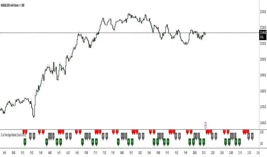
CC AJ Time Signal Marker [Zurich UTC+1]CC AJ Time Signal Marker
Overview
This non-repainting, overlay-free indicator displays time-based numerical signals derived from Zurich time (UTC+1) using three user-selectable calculation methods. It is designed for intraday traders who analyze time patterns and numerical confluence on lower timeframes (especially 1-minute charts).
Core Functionality
The script evaluates three mathematical conditions on every bar:
Method Calculation Row (Top → Bottom) Default Color
Subtraction Minute − Hour Top Row Red
Minute Minute Middle Row Gray
Addition Hour + Minute Bottom Row Green
When the result matches a user-defined AJ Time (0–77), the value is displayed in its dedicated row.
Key Features
Three dedicated label rows — no overlap, no clutter
User-defined AJ Times (0–77) with individual ON/OFF checkboxes
Fully customizable colors for current bar and future/past labels
Optimized for 1-minute charts during European session

Session H/L + Mid + 25%/75% — EvolvingPlots Session High and Low + the Midpoint between the two and also plots at 25% and 75% (Good for initial and rolling up/down stops)

Tweezer Top & Bottom PatternNOTE: This script is provided as-is for educational and trading purposes. Always use risk management strategies when trading.
Overview
This is the initial release of the "Tweezer Top & Bottom Pattern" Pine Script, it provides real-time detection of Tweezer candlestick reversal patterns with customizable filters, trend confirmation, and visual aids for traders using TradingView.
Key Features
- Pattern Detection: Identifies Tweezer Bottom (bullish reversal) and Tweezer Top (bearish reversal) patterns based on matching highs/lows, opposite candle directions, and user-defined tolerance.
- Noise Filtering: Optional ATR-based tolerance to adapt to market volatility, reducing false signals in noisy conditions.
- Wick Requirements: Configurable minimum wick size as a percentage of the candle body for stricter pattern validation.
- Engulfing Filter: Toggleable option to require the second candle to engulf the first, enhancing signal reliability.
- Trend Context: Uses a simple EMA (Exponential Moving Average) to ensure patterns occur in appropriate uptrends or downtrends.
- Visual Indicators:
- Labels ("TB ↑" for bottoms, "TT ↓" for tops) with customizable colors and styles.
- Persistent horizontal lines at pattern levels for stop-loss or support/resistance reference (resets on new patterns).
- Optional background highlights for quick visual spotting.
- Alerts: Built-in alert conditions for Tweezer Bottom and Top detections, integrable with TradingView's notification system.
- Customization: User inputs for toggling patterns, adjusting tolerance, ATR settings, wick percentages, engulfing requirements, and EMA length.
Usage Instructions
- Add the script to your TradingView chart via the Pine Editor.
- Customize settings through the indicator's input menu.
- Best suited for higher timeframes (e.g., 1H, Daily) on volatile assets like stocks, forex, or cryptocurrencies.
- Combine with other indicators (e.g., RSI, volume) for confirmation
Known Limitations
- Performance depends on market conditions—backtest thoroughly before live use.
- No volume integration in this version (planned for future updates).
Installation
1. Open TradingView and access the Pine Editor.
2. Paste the provided script code.
3. Save and add to your chart.
4. Adjust inputs as needed.
For feedback or issues, consider sharing on TradingView communities or forums dedicated to Pine Script development.
Future Plans
- Version 1.1: Add volume confirmation filter and multi-timeframe support.
- Version 2.0: Integrate machine learning-based pattern scoring (if feasible in Pine Script).

Liquidity Hunter Pro v11.9 — TQI EditionLiquidity Hunter Pro v12 is built for intraday traders who want structure, clarity, and precision without unnecessary clutter. The tool blends market structure, momentum, trend alignment, volatility regime analysis, and liquidity mapping into a single unified model.
This version focuses on three core goals:
1. Identify only high-quality, directional market conditions.
The engine filters through HTF bias, short-term structure shifts, RSI momentum, and volatility compression/expansion. The idea is simple: wait for the market to become clean, aligned, and directional before considering an entry.
2. Map liquidity and detect sweeps in real time.
Major highs and lows are tracked using extended pivots, and the system highlights key areas where stop hunts or sweeps may occur. Sweeps and pressure zones are evaluated and factored directly into the quality score.
3. Grade every potential setup with a single, objective metric (TQI).
The Trade Quality Index (0–5⭐) compresses all signals into one reading so the trader can quickly judge whether a setup has enough quality to act on.
The script includes:
• Trend + Momentum + Structure detection
• HTF bias (optional)
• Volatility regime analysis
• Liquidity sweeps + pressure zones
• Micro-confirmation engine
• PQI (0–100%)
• TQI (0–5⭐)
• Clean HUD and Driver’s Guide
• Auto-cleaning labels and signal management
• Optional session filtering (London/NY)
This tool is designed for traders who value confirmation over noise.
It will not fire constantly.
It will wait patiently for clean, directional, aligned markets — and only then issue a signal.
How to Use Liquidity Hunter Pro v12
1. Check the HUD (top-right by default)
The HUD is your dashboard. Before doing anything:
A. HTF Bias
This is your map. Only trade in the direction of the bias.
B. Trend / Momentum / Structure
These should ideally all match the direction of the bias.
If they don’t line up → wait. No alignment = low probability.
C. Liquidity + Volatility Regime
“Sweep ↑→↓” or “Sweep ↓→↑” = potential reversal points
“Expansion” = clean conditions
“Compression” = choppy, avoid
You don’t need to overthink any of this — just think:
“Are the ingredients lined up?”
2. Wait for a valid signal
The indicator will only trigger a BUY or SELL when:
✓ HTF bias aligns
✓ Trend & momentum align
✓ Structure supports the move
✓ Micro-confirmation kicks in
✓ PQI ≥ 75
✓ Sessions are open (optional)
Signals are rare on purpose.
When one prints, you know the market conditions are stacked.
3. Read the label
Each signal prints a small block next to the candle containing:
• Entry price
• SL (based on structure)
• TP(2R) suggestion
• Liquidity context (e.g., sweep or pressure)
• Volatility regime
• TQI ⭐ rating (0–5)
This helps you judge the setup instantly.
A simple rule for beginners:
Trade only if TQI ≥ ⭐⭐⭐
Lower than that = more noise, less edge.
4. Use the liquidity zones
The script plots subtle boxes at recent liquidity highs/lows.
These mark:
• Where the market may hunt stops
• Where reversals often start
• Where signals are more meaningful
When a signal happens near liquidity → higher quality.
5. Follow the session filter (optional but recommended)
By default the tool focuses on:
• London session
• New York session
That removes 70% of low-volatility garbage.
You can turn this off if you trade crypto or indices overnight, but beginners usually benefit from keeping it on.
Recommended Settings
These are the settings used by most testers and early users.
Everything is configurable, but start with this:
Core Settings
• Fast EMA: 21
• Slow EMA: 55
• RSI Length: 14
• Pivot Lookback: 2
These settings create balanced structure detection and smooth trend signals.
HTF Bias
• Use HTF Bias: ON
• HTF Timeframe: 240 (H4)
H4 bias keeps you out of counter-trend traps.
Sessions
• Use London/NY Filter: ON
• London: 08:00–17:00
• New York: 13:30–21:00
Perfect for FX, indices, and metals.
Crypto traders: turn sessions OFF.
HUD + Guide
• HUD: ON
• Guide: ON
• Linger Bars: 12
This keeps things readable and prevents clutter.
Trading Tips for Beginners
These help keep you out of trouble:
1. Don’t fade the bias.
If HTF says bearish → avoid buys.
2. Don’t trade in compression regimes.
It saves you from chop.
3. Don’t chase signals that fire far from structure.
If the signal candle is huge, let it go.
4. Don’t trade without at least ⭐⭐⭐.
You’ll thank yourself later.
Final Thoughts
Liquidity Hunter Pro v12 isn’t meant to spam signals.
It’s meant to filter hard, highlight clean conditions, and help new traders avoid the traps the market throws every day.
Treat it as a trading assistant that tells you:
“The environment is right. Now you decide.”

369 Energy Flow – GOLD & FOREXTesla-Inspired 3-6-9 Breakout System
Harness the hidden rhythm of the market with 369 Energy Flow, a precision indicator that maps 3:00, 6:00, and 9:00 price levels across UTC or EST, capturing the exact high and low of each sacred node.
Core Features:
• 369 Grid – Auto-detected 3-6-9 hourly levels with clean, color-coded lines (purple, orange, red)
• Vortex Math Filter – Only triggers when candle range reduces to 3, 6, or 9 (true harmonic resonance)
• Confluence Engine (C3–C18) – Scores price interaction with 369 levels:
C3 = single touch • C9 = 9-level break • C18 = full 3-6-9 alignment
• 22 EMA Equilibrium – Price must close above (long) or below (short) the 22-period EMA
• Previous Day Bias – Filters entries with yesterday’s open/close direction
• Smart Alerts – “369 LONG @ 4205.4 | Conf: 12” with exact price and confluence
Signal Logic (Mechanical):
LONG → Bull day + Close > 22 EMA + C≥6 + Vortex ON + Break above highest 369 high
SHORT → Bear day + Close < 22 EMA + C≥6 + Vortex ON + Break below lowest 369 low

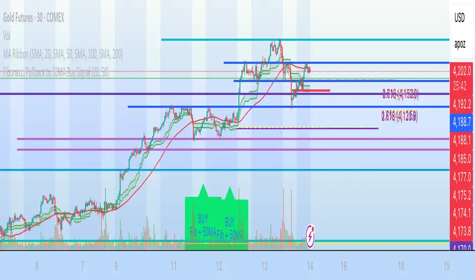
Fibonacci Pullback to 50MA Buy Signal// === CONDITIONS FOR BUY SIGNAL ===
// 1. Price must be inside the fib pullback zone
inFibZone = low <= fib50 and low >= fib618
// 2. Price must touch or approach the 50MA
touchMA = low <= ma50 * 1.002 and low >= ma50 * 0.998 // within 0.2%
// 3. Optional confirmation – bullish candle
reversalCandle = close > open
// FINAL BUY SIGNAL CONDITION
buySignal = inFibZone and touchMA and reversalCandle
// === MARK BUY SIGNAL ===
plotshape(buySignal, style=shape.labelup, color=color.lime, size=size.large,
location=location.belowbar, text="BUY Fib + 50MA")
Vertical Lines on Selected DatesThis Pine Script indicator allows a user to place vertical lines on a chart at specific dates and times. It provides three separate input sections, each dedicated to one targeted date. For each of the three dates, the user can select the exact timestamp and customize the line’s color, width, and style directly from the indicator’s settings panel.
Behind the scenes, the script converts the selected visual style (solid, dashed, or dotted) into the appropriate internal line style using a helper function. When the live chart time crosses each chosen timestamp, the script detects that crossover and draws a vertical line on that exact bar. The line extends both upward to the high and downward to the low of the chart, creating a full-height marker.
Overall, the indicator functions as a simple visual marking tool for highlighting important moments in time—such as events, sessions, or personal reminders—without affecting any price analysis. The flexibility of color, width, and style allows each vertical line to stand out uniquely, and because the script uses detection logic on a per-bar basis, each line is drawn only once at the appropriate moment.

Liquidity Sweeps 2.0 – MGTrading Professional Liquidity Sweep Engine with Volume, MACD, Trend, SMT Divergence & Rolling VWAP
Liquidity Sweeps 2.0 is a **complete precision-based liquidity detection framework** built for traders who follow smart money concepts, sweep-based entries, and algorithmic price behavior.
This tool detects **high-probability buy/sell sweeps**, confirms them with market structure, Volume, MACD engine, Trend filtering, SMT divergence, and overlays a Rolling VWAP to track accumulation & distribution behavior.
It is designed for futures, indices, forex, crypto, and options traders.
-
🔥 **MAIN FEATURES**
✅ **1. True Liquidity Sweep Detection**
Automatically detects when price:
* Sweeps a prior high (Sell Sweep)
* Sweeps a prior low (Buy Sweep)
* Rejects and closes back inside the previous range
This helps identify real **stop hunts**, **liquidity grabs**, and **reversal moments**.
---
✅ **2. Volume Spike Confirmation (Smart Filter) **
Sweeps are only confirmed when volume exceeds the dynamic SMA threshold.
This filters out weak sweeps and keeps only **high-quality liquidity grabs**.
✅ **3. MACD Engine Confirmation**
Advanced MACD rules confirm sweeps by:
* MACD direction
* MACD signal agreement
* MACD histogram alignment
This dramatically increases accuracy and removes fake sweeps that occur in weak trends.
Optional **MACD Divergence Detection** reveals trend exhaustion before major reversals.
✅ **4. EMA Trend Filter (9/21) **
Avoid fighting the trend with the optional trend filter:
* Only buy sweeps in uptrend
* Only sell sweeps in downtrend
Great for scalpers and day traders who want trend alignment.
✅ **5. SMT Divergence (Relative Strength vs Reference Symbol) **
Enable SMT to detect when:
* Your chart sweeps a high/low
* But the reference symbol DOES NOT
This creates **displacement**, a powerful reversal signal used by institutional traders.
The symbol is selectable (ES, NQ, SPY, QQQ, BTC.D, DXY, etc.).
✅ **6. Rolling VWAP (RVWAP)**
A more dynamic version of VWAP using:
* Time-based rolling windows
* Volume-weighted price
* Automatic or adjustable window size
* Color change based on slope
Excellent for tracking **accumulation**, **distribution**, and **algorithmic trend bias**.
✅ **7. Clean Mode**
Only show “confirmed” sweeps with a ✓
Ideal for traders who want a simple and clean chart.
# 📊 **LABELS & COLOR CODING**
* 🟥 **Sweep Sell**
* 🟩 **Sweep Buy**
* 🟧 **MACD Bearish Divergence**
* 🟩 **MACD Bullish Divergence**
* 🟦/🟧 **RVWAP Up/Down Trend**
* “✓” means the sweep passed all confirmations.
# 🎯 **WHO IS THIS FOR?**
✔ Futures Traders (ES, NQ, YM, RTY, CL, GC)
✔ Options Traders (SPX, SPY, QQQ)
✔ Forex Traders
✔ Crypto Traders
✔ Smart Money / ICT Style Traders
✔ Liquidity Sweep Traders
✔ Scalpers, Day Traders, Swing Traders
If you trade **liquidity**, **sweeps**, **SMT**, **divergence**, or **VWAP-based behavior**, this indicator is designed for you.
# 🧠 **HOW TO USE IT**
1. Wait for a sweep label to appear at a liquidity pool.
2. Confirm with volume + MACD + trend (if enabled).
3. Watch RVWAP for bias (accumulation vs distribution).
4. Enter on the imbalance/FVG, retrace, or structure break.
5. Use SMT divergence as a premium confirmation.
This tool does NOT repaint after the bar closes.
Signals only appear when conditions are confirmed.
# 📦 **SETTINGS OVERVIEW**
* Lookback window for sweeps: (7 - 13)
* Volume spike threshold
* MACD lengths & filters
* Trend filter (EMA 9/21)
* SMT reference symbol
* RVWAP window + colors
RVWAP Line Width: (2) & Minimum Window Bars: (5)
* Label placement & visual adjustments
* Clean mode
Everything is fully customizable.
⚠️ **DISCLAIMER**
This indicator is for educational purposes only.
It does not guarantee profits.
Always backtest, practice proper risk management, and trade responsibly.
❤️ **If this helped you, leave a like & comment! **
Your support motivates further updates, improvements, and new tools.

Macro Flow Assistant — Full Clean Levels public versionpublic easy macro flow tracker.
important levels only marked.
trend bias.

Long Term indicator for financial marketsIts the indicator that i have made for my friends following the learnings which i have learnt over the last few years for momentum traders

Presidential ScannerThe Presidential Scanner is an advanced analysis tool that combines state-of-the-art algorithmic calculations with the processing of economic and macroeconomic data in real time.
Thanks to its intelligent technology, it detects high-potential market revenue, offering clear, profitable and highly operationally effective signals.

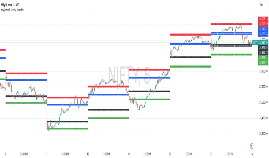
Key Zones & Levels - IntradayThis indicator provides key zones and levels for the day.
The levels are constant for the day and no re-painting.
The levels are plotted at 9:15pm IST for Indian stock market trading.
Use these levels with RSI for a perfect reversal setup with small stop loss.
Work perfectly for all types of market - Indices, stocks, commodity, futures.
Join my channel to support me - whatsapp.com
Average Daily Range DashboardThis script displays a non-intrusive ADR (Average Daily Range) dashboard designed to assist traders in monitoring real-time range expansion throughout the trading session. It compares the current day's high-low range to the average daily range calculated over a user-defined number of previous completed days (default: 5).
The tool provides a numerical ADR score (0–5) based on how much of the average daily range has been filled. It also includes optional visual cues and narrative descriptions to help contextualize current price behavior.
📘 Key Features:
Calculates ADR using fully completed daily bars (excluding the current session)
Tracks the current session’s intraday range live (high to low)
Outputs a score from 0 (low range expansion) to 5 (ADR fully filled or exceeded)
Optional alerts when ADR thresholds are crossed (e.g., 60%, 100%)
Displays optional debug values: ADR value, today’s range, session high/low
Customizable table position, size, colors, and visibility settings
🧮 Formula Transparency:
ADR = Simple Moving Average of (Daily High - Low) over the last N completed days
Intraday Range = Real-time (Session High - Session Low)
ADR Score is derived by comparing current range to ADR:
score = floor((sessionRange / adr) * 5), capped at 5
⚠️ Disclaimer:
This tool does not provide buy/sell signals, trading advice, or predictive forecasts. It is intended for educational and informational purposes only. Users should independently verify all data and apply their own analysis. Past performance of any range behavior is not indicative of future results.

Auto Fibonacci RetraceNOTE: This script is for educational purposes only.
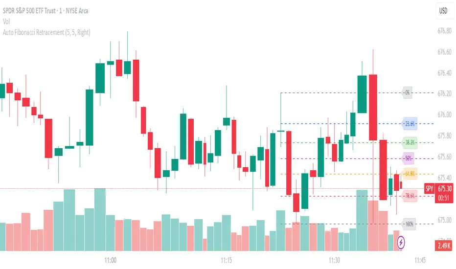
This Pine Script v6 indicator automates the drawing of Fibonacci retracement levels on a TradingView chart based on detected pivot highs and lows. It's designed to identify the most recent swing points in a price trend and plot horizontal lines at standard Fibonacci ratios (0%, 23.6%, 38.2%, 50%, 61.8%, 78.6%, 100%), along with optional labels for each level. The script is useful for traders who want dynamic, hands-free Fib retracements that update as new pivots form, helping to spot potential support/resistance zones without manual intervention.
Key Features
Automatic Pivot Detection: Uses TradingView's built-in ta.pivothigh and ta.pivotlow functions to find recent swing highs and lows. The sensitivity is adjustable via user inputs for "Left Bars" and "Right Bars" (default: 5 each), which define how many bars are checked on either side to confirm a pivot.
Trend Direction Awareness: Determines if the current swing is an uptrend (recent high after low) or downtrend (recent low after high) and orients the Fib levels accordingly—starting from the low in uptrends or high in downtrends.
Dynamic Drawing:
Plots dashed horizontal lines extending to the right of the chart for each Fib level.
Colors are predefined for visual distinction (e.g., blue for 23.6%, orange for 61.8%).
Lines and labels are cleared and redrawn only when a new pivot is detected or on initial load to prevent chart clutter.
Customizable Labels: Optional labels show the percentage (e.g., "61.8%") and can be positioned on the "Left" (at the swing start) or "Right" (pinned to the current bar, updating dynamically). Labels use semi-transparent backgrounds for readability.
Performance Optimizations: Uses arrays to manage lines and labels efficiently, with reverse-indexed loops for safe deletion. The max_bars_back=500 ensures it handles historical data without excessive computation.
User Inputs:
Left/Right Bars: Tune pivot detection (higher values for major trends, lower for shorter swings).
Show Fib Levels/Labels: Toggle visibility.
Label Position: "Left" or "Right" for placement flexibility.
Usage Instructions
Adding to Chart: Copy-paste into TradingView's Pine Editor, save as a new indicator, and add it to your chart via the "Indicators" menu.
Customization: Adjust inputs in the indicator settings panel. For example, set Left/Right Bars to 10 for daily charts in strong trends.
Best Practices:
Use on trending markets (e.g., stocks, forex, crypto like BTC/USD); avoid choppy sideways action.
Combine with other indicators (e.g., RSI for overbought/oversold confirmation) for better trade signals.
Test on historical data—zoom out to see how it redraws on past swings.
Limitations: Relies on pivot functions, so it may lag slightly (pivots confirm after "Right Bars"). Not a trading strategy—use for analysis only. No alerts built-in, but you can add alertcondition if extending it.
Potential Enhancements: Add extensions (e.g., 161.8%), user-defined levels, or alerts on price touches via simple modifications.
This script provides a clean, efficient way to visualize Fib retracements automatically, saving time compared to manual drawing. If you need further tweaks or integration into a full strategy, let me know!
BTC 1H Momentum + Near-Setup Alerts bigbeeukthis alert, sets up on 1h chart of BTC only. it alerts you to price action and when its close to a setup. it will then trigger again once the setup is ready

TTS Calculator Forex calculator - Input account size, risk size and stop loss size, to get your lot size.

12 Band Volume matched Candles📌 12 Band Volume matched Candles (Official Description)
12 Band Volume matched Candles is a next-generation volume-strength visualisation tool designed for traders who rely on precision, speed, and clarity.
Instead of colouring candles by price action or relative indicators, this script maps every candle to one of 12 absolute-volume strength bands, using real contract/share volume thresholds that you define.
No guessing.
No subjective smoothing.
No repainting.
Just pure, clean, calibrated volume pressure — visualised instantly.
🔥 Why This Indicator Exists
Traditional volume colouring is vague, delayed, or tied to assumptions (like moving averages).
Scalpers, orderflow watchers, and tape-readers all know the truth:
👉 The raw size of volume matters more than relative volume.
This tool removes all ambiguity and lets you define exact thresholds that match the behaviour of your market:
5k volume
10k volume
20k
35k
50k
70k
… all the way to
200k+ (or whatever instrument volume you want)
Those thresholds map to a 12-band spectrum, ranging from the coldest low-volume purples to the hottest high-volume reds.
The result?
A visual system that lets you read volume pressure instantly, the same way our RSI 12-band spectrum lets you read momentum immediately.
🎨 Premium 12-Band Colour Spectrum
This indicator uses the same refined colour spectrum as the In The Zone RSI – 12 Band script:
Weak Volume (Bands 1–6) – Cold Side
Ultra-dark violet
Deep purples
Cool blues
Light icy blue
Strong Volume (Bands 7–12) – Hot Side
Warm yellows
Oranges
Orange-reds
Deep maroons
Ultra-dark red for max volume
You instantly know:
When volume is dying
When volume is building
When a trend is being pushed
When a breakout has REAL participation
When a reversal is weak or strong
Your brain doesn’t need to “interpret” numbers — just read the colours.
⚙️ Key Features
✔ 12 Custom Volume Thresholds
Set exact volume values that match your instrument.
A perfect companion for multi-indicator visual alignment.
✔ Borders-Only Mode
Keep your chart clean and still read volume strength.
✔ Adjustable Brightness & Opacity
Fine-tune the aesthetic for dark or light chart themes.
✔ Legend Placement Options
Display the volume band legend in any corner of the chart.
✔ Zero Lag – Zero Repaint
Everything is based on historical volume — no tricks.
🚀 Who It’s For
This tool is extremely powerful for:
Scalpers
Momentum traders
Orderflow readers
Breakout traders
Reversal hunters
Algo / quant-style chart readers
Anyone who trades with candle-flow awareness
If you rely on the “feel” of a chart, volume rhythm, or momentum pressure — this indicator becomes a cheat-code.
🎯 Practical Uses
Spot when large players enter a move
Filter weak vs strong pullbacks
Confirm breakout candles
See exhaustion before reversals
Separate noise from real interest
Pair with IZ RSI + price structure for elite scalp precision
⭐ Why Traders Love It
Because it's clear.
Instant.
And it treats volume as the truth, not something to smooth or average.
This is how scalpers and tape-readers naturally think — now in a visual form.
🔥 Final Line
12 Band Volume matched Candles turns raw volume into a crystal-clear language.
Once you see volume this way, you will never go back to traditional colouring again.
