Mebane Faber GTAA 5In 2007, Mebane Faber published research that challenged the conventional wisdom of buy-and-hold investing. His paper, titled "A Quantitative Approach to Tactical Asset Allocation" and published in the Journal of Wealth Management, demonstrated that a simple timing mechanism could reduce portfolio volatility and drawdowns while maintaining competitive returns (Faber, 2007). This indicator implements his Global Tactical Asset Allocation strategy, known as GTAA5, following the original methodology.
The core insight of Faber's research stems from a century of market data. By analyzing asset class performance from 1901 onwards, Faber found that a ten-month simple moving average served as an effective trend filter across major asset classes. When an asset trades above its ten-month moving average, it tends to continue its upward trajectory; when it falls below, significant drawdowns often follow (Faber, 2007, pp. 12-16). This observation aligns with momentum research by Jegadeesh and Titman (1993), who documented that intermediate-term momentum persists across equity markets.
The GTAA5 strategy allocates capital equally across five diversified asset classes: domestic equities (SPY), international developed markets (EFA), aggregate bonds (AGG), commodities (DBC), and real estate investment trusts (VNQ). Each asset receives a twenty percent allocation when trading above its ten-month moving average. When an asset falls below this threshold, its allocation moves to short-term treasury bills (SHY), creating a dynamic cash position that scales with market risk (Cambria Investment Management, 2013).
The strategy's historical performance during market crises illustrates its function. During the 2008 financial crisis, traditional sixty-forty portfolios experienced drawdowns exceeding forty percent. The GTAA5 strategy limited losses to approximately twelve percent by reducing equity exposure as prices declined below their moving averages (Faber, 2013). This asymmetric return profile represents the strategy's primary characteristic.
This implementation uses monthly closing prices retrieved via request.security() to calculate the ten-month simple moving average. This distinction matters, as approximations using daily data (such as a 200-day moving average) can generate different signals during volatile periods. Monthly data ensures the indicator produces signals consistent with published academic research.
The indicator provides position monitoring, automatic rebalancing detection on either the first or last trading day of each month, and share calculations based on user-defined capital. A dashboard displays current trend status for each asset class, target versus actual weightings, and trade instructions for rebalancing. Performance metrics including annualized volatility and Sharpe ratio provide ongoing risk assessment.
Several limitations warrant acknowledgment. First, the strategy rebalances monthly, meaning it cannot respond to intra-month market crashes. Second, transaction costs and taxes from monthly rebalancing may reduce net returns for taxable accounts. Third, the ten-month lookback period, while historically robust, offers no guarantee of future effectiveness. As Ilmanen (2011) notes in "Expected Returns", all timing strategies face the risk of regime change, where historical relationships break down.
This indicator serves educational purposes and portfolio monitoring. It does not constitute financial advice.
References:
Cambria Investment Management (2013). Global Tactical Asset Allocation: An Introduction to the Approach. Research Report, Los Angeles.
Faber, M.T. (2007). A Quantitative Approach to Tactical Asset Allocation. Journal of Wealth Management, Spring 2007, pp. 9-79.
Faber, M.T. (2013). Global Asset Allocation: A Survey of the World's Top Asset Allocation Strategies. Cambria Investment Management, Los Angeles.
Ilmanen, A. (2011). Expected Returns: An Investor's Guide to Harvesting Market Rewards. John Wiley and Sons, Chichester.
Jegadeesh, N. and Titman, S. (1993). Returns to Buying Winners and Selling Losers: Implications for Stock Market Efficiency. Journal of Finance, 48(1), pp. 65-91.
Educational
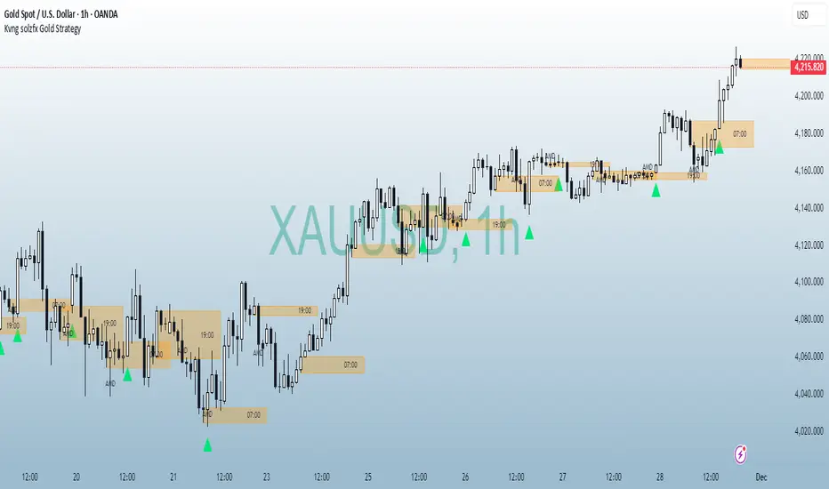
Kvng solzfx Gold StrategyThis indicator helps to find gold setups using kvng solz fx buy only strategy on gold
DTR SL-TPDTR SL-TP is a simple risk-management indicator designed to automatically plot stop-loss and take-profit levels based on the current market price. It helps traders visualize their risk-to-reward setup directly on the chart, making trade planning faster and more consistent.
The indicator uses two main inputs: a Stop Loss Percentage and a Take Profit Multiplier. The stop loss is calculated by reducing the current price by the chosen percentage. The take profit level is set by multiplying that same percentage by the Take Profit Multiplier and adding it to the current price. This creates a dynamic stop-loss and take-profit pair that updates with every candle.
The stop-loss line is plotted in red, and the take-profit line is plotted in green for immediate visual clarity. Traders can adjust the percentage and multiplier to match their personal risk tolerance or strategy requirements.
DTR SL-TP is useful for any style of trading that requires predefined exit levels, including scalping, day trading, and swing trading. It helps maintain discipline, enforce consistent risk management, and quickly evaluate whether a potential trade offers an acceptable reward-to-risk ratio.

High/Low Sweep Dashboard Heatmap/Table (Final v4)The High/Low Sweep Dashboard v6 is a versatile TradingView indicator that analyzes the past N candles to track how many times the high, low, both, or neither levels were taken out. It provides a clear visual summary through either a table or heatmap, with percentages for each category.
Key Features:
- Toggle between Table or Heatmap display.
- User-selectable dashboard position: Upper Right or Lower Right.
- Track sweep data over a custom number of candles.
- Optional markers on the chart for when both or none of the levels are taken.
- Clear percentage breakdowns for each sweep type.
This indicator is ideal for traders who want a quick overview of high/low sweeps and candle behavior over a defined historical window.

Local Watchlist Gauge v6The Local Watchlist Gauge displays a compact monitoring table for a user-defined list of symbols, showing their current trend status and performance relative to their 52-week high.
The indicator presents a table that simultaneously tracks multiple symbols and displays:
• Trend direction for each symbol, determined by whether the closing price is above or below a user-defined moving average
• Percentage distance from the 52-week high, providing a clear measure of recent performance relative to the yearly peak
Each symbol is displayed with:
Trend indicator showing whether the symbol is in an uptrend (above moving average) or downtrend (below moving average)
Distance from 52-week high expressed as a percentage, with color coding to indicate proximity to recent highs
Green indicates symbols trading within 5% of their 52-week high, orange indicates symbols between 5% and 20% below their 52-week high, and red indicates symbols trading more than 20% below their 52-week high.
The table provides an at-a-glance summary of the trend status and relative performance of all symbols in the specified watchlist, allowing users to quickly identify which instruments are maintaining trend strength near their recent highs and which have experienced significant pullbacks from their yearly peaks.

Burry Bubble DetectorThis indicator implements Michael Burry's bubble detection methodology, originally outlined in his famous 2020 analysis of GameStop (GME). Burry identified extreme bubble conditions when a stock's price significantly deviates from its fundamental book value, specifically when the Price-to-Book ratio exceeds extreme multiples.
The indicator creates valuation zones based on book value per share and identifies when a stock enters bubble territory according to Burry's criteria:
• Deep Value Zone: Price ≤ 0.5x Book Value (Burry's preferred buying area)
• Fair Value: Price between 0.5x and 1.5x Book Value
• Bubble Warning: Price exceeds user-defined multiple of book value (default 3x)
• Extreme Bubble: Price exceeds higher multiple of book value (default 5x)
Key features include:
Visual bubble zones with dynamic background coloring
Price-to-Book ratio monitoring
Speculation Score combining valuation extremes, volume spikes, and volatility
Entry signals when price enters the deep value zone
Comprehensive dashboard displaying current valuation zone and key metrics
The indicator requires user input of fundamental data (book value and shares outstanding) to establish the baseline valuation framework. Once configured, it continuously monitors whether the current price represents fair value or extreme speculation relative to the company's book value.
This methodology is particularly useful for identifying when stocks have detached from fundamental value and entered unsustainable bubble conditions, regardless of short-term price momentum. Additional Publishing Information:
When publishing, you may want to include the following notes in the description or as additional context:
"This indicator requires proper configuration of fundamental inputs (book value and shares outstanding) for accurate bubble detection. These values should be updated periodically to reflect the company's current financial position. The indicator is most effective when used with companies that have meaningful book value and where Price-to-Book serves as a relevant valuation metric.
The bubble detection framework is based on the principle that sustained prices significantly exceeding several multiples of book value represent speculative excess rather than fundamental value creation."
This description clearly explains the theoretical foundation of the indicator, its operational requirements, and the specific methodology it implements. The tags cover the key concepts and make the indicator discoverable for users specifically interested in value investing, bubble detection, and fundamental valuation analysis.

Futures Position Size Calculator (NQ/ES)DISCLAIMER:
This indicator is provided solely for informational and educational purposes. It calculates position sizing based on user-defined inputs such as entry and stop-loss levels, but it does not provide trading signals, recommendations, or financial advice . All trading decisions are made at the sole discretion of the user.
By using this indicator, you acknowledge that you are fully responsible for your own trades and risk management . The developer/publisher of this indicator assumes no liability for any losses, damages, or financial consequences that may arise from its use.
Features:
• Position size calculator (based on Entry & Stop Loss)
• Reward ratio calculator (1R, 2R, 3R, etc.)
• Supports: NQ / MNQ / ES / MES
Usage:
When you first add the script to your chart (on any supported futures symbol), you will be prompted to set the Entry Price and Stop Loss Price on the chart using draggable lines .
After setup, you can freely move the price lines, and the indicator will automatically update:
• Position size
• Reward targets
• Direction (long/short is auto-detected)
RISK Settings:
You can calculate position size using either:
1. Account Percent
Select "Percent" in the Risk Method dropdown and enter the percent of your account you want to risk per trade.
2. Fixed Dollar Amount
Select "Fixed Dollar" in the Risk Method dropdown and enter the dollar amount you want to risk.
You may set separate values for: NQ, MNQ, ES, and MES.
Reward Calculator:
Enable the checkbox "Show Reward Targets" in the Reward Ratio section to display projected targets (1R, 2R, etc.).
You can also choose how many R-levels are displayed on the chart.

Bassi's Pattern Breakout IndicatorBASSI'S PATTERN BREAKOUT INDICATOR
Author: Bassi | Published 2025
One of the cleanest and most accurate classic pattern detectors on TradingView – proudly coded and shared by Bassi.
Detects & confirms breakouts from:
• Double Top / Double Bottom
• Triple Top / Triple Bottom
• Head & Shoulders
• Inverse Head & Shoulders
Key Features:
• 100% non-repainting – signals only appear after candle close
• Smart breakout confirmation using the correct neckline level
• Visual pattern drawing (tops/bottoms + necklines)
• Clear breakout labels with vertical confirmation lines
• Real-time TradingView alerts (one alert per bar close)
• All alerts include "Bassi" prefix so you know it's the original
• Dynamic coloring for Double Bottom (red in lower areas, green in higher areas)
• No messy BUY/SELL labels – clean professional look (as requested by the community)
Why traders love it:
- Extremely reliable on all timeframes (1m to monthly)
- Works perfectly on Forex, Stocks, Crypto, Indices
- No false signals during consolidation
- Perfect for swing trading, scalping and position trading
Settings:
• Pivot Left/Right Bars – adjust sensitivity
• Price Tolerance % – how flat the tops/bottoms must be
• Max Pivot Storage – memory management
• Enable/disable alerts and visual markers
How to use:
1. Add to chart
2. Create alert → select "Bassi's Pattern Breakout Indicator"
3. Choose "Once per bar close"
4. Get notified instantly on every confirmed breakout!
This is the original and only authorized version by Bassi.
If you enjoy this indicator, please leave a like and follow for future updates!
© Bassi 2025 – All rights reserved
#pattern #breakout #doubletop #doublebottom #headandshoulders #tradingview #bassi

Adaptive Support and Resistance LevelsAdaptive Support and Resistance Levels
This indicator is a comprehensive institutional-grade trading tool designed to visualize Auction Market Theory (AMT), Support and Resistance concepts directly on the price chart. It is built for traders who require a deep understanding of market structure without the visual clutter of standard retail indicators.
Key Features:
1] Fractal Adaptive Engine:
The indicator automatically adjusts its calculations based on your timeframe.
-Intraday (1m-15m): Displays Daily Levels.
-Swing/Positional (30m-1H): Displays Weekly Levels.
-Long Term (Daily+): Displays Monthly Levels.
2]Untested Levels:
-Identifies levels from previous sessions that have not been tested by price.
-Extends these levels forward as "Magnets" until price touches them.
-Touch-Delete Logic: Once price interacts with a magnet, the line is automatically removed to keep the chart clean.
3] Institutional Dashboard:
- A "Flight Deck" table in the top-right corner provides real-time metrics:
-Context: Are we inside, above, or below the previous value zone?
-Auction State: Is the current market balanced or imbalanced?
-IB Status: Initial Balance (first 60 mins) breakout/breakdown status.
-Fuel Gauge: Measures current range vs. ADR (Average Daily Range) to gauge exhaustion.
-Volume Flow: Detects high-aggression volume relative to the average.
How to Use:
Trend Following: Look for price breaking out of the (Static Lines) , Pullback rejection, Rejection from the lines.
Reversion: Use the lower lines for bulls reversal and Upper lines for bears reversal ( Kind of reversal candle formation )
Risk Management: Use the ADR Fuel Gauge to avoid buying extended markets (>100% ADR).
Disclaimer: This tool is only for educational and analytical purposes only. Not any recommendation.

SPY → ES 11 Levels with Labels📌 Description for SPY → ES 11-Level Converter (with Labels)
This script converts important SPY options-based levels into their equivalent ES futures prices and plots them directly on the ES chart.
Because SPY trades at a different price scale than ES, each SPY level is multiplied by a customizable ES/SPY ratio to project accurate ES levels.
It is designed for traders who use SpotGamma, GEXBot, MenthorQ, Vol-trigger levels, or their own gamma/oi/volume models.
🔍 Features
✅ Converts SPY → ES using custom or automatic ratio
Option to manually enter a ratio (recommended for accuracy)
Or automatically compute ES/SPY from live prices
✅ Plots 11 major levels on the ES chart
Each level can be individually turned ON/OFF:
Call Wall
Put Wall
Volume Trigger
Spot Price
+Gamma Level
–Gamma Level
Zero Gamma
Positive OI
Negative OI
Positive Volume
Negative Volume
All levels are drawn as clean horizontal lines using the converted ES value.

Imbalance and OB finder by CryptdozMark all imbalances and key Order Blocks - automatically eliminates OB that have been mitigated and keep only those which are still unmitigated on various Time Frames. Makes its easy to see key area where the price may swing !

rahulp33It is a 15-min high-low for the day; this will help the fellow chartist understand a trend emerging for the day. This indicator, along with others, gives a general sense of the daily trend, but it's not the sole factor to consider.

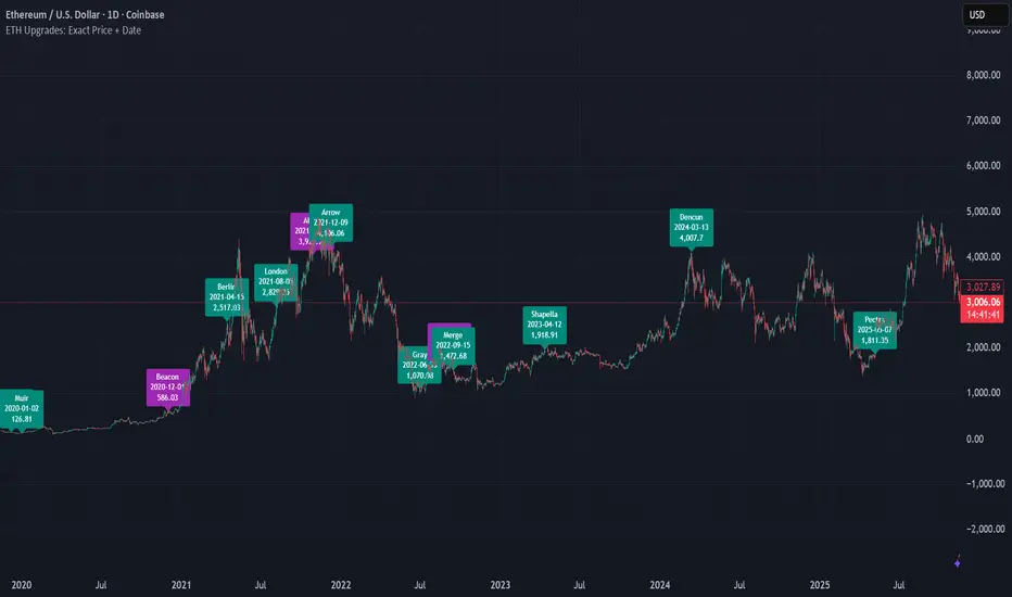
ETH Upgrades: Exact Price + DateThis indicator places markers on the chart that show you the exact date and price where each Ethereum upgrade occurred.
rahulpatkiIt is a 15-min high-low for the day; this will help the fellow chartist understand a trend emerging for the day. This indicator, along with others, provides a general idea of the daily trend, but it is not the only one to consider.

rahulpatkiIt is a 15-min high-low for the day; this will help the fellow chartist understand a trend emerging for the day. This indicator, along with others, provides a general idea of the daily trend, but it is not the only one to consider.

NAS Ultimate Algo v2.5NAS Ultimate Algo v2.5 has following features:
1. Dynamic Trailing SL Label
2. Auto-Hide on TP Hit
3. Dynamic Take-Profit Targets (ATR-based)
4. Label Colour Customization

Minervini VCP Pattern -Indian ContextThis script implements Mark Minervini's Trend Template and VCP (Volatility Contraction Pattern) pattern, specifically adapted for Indian stock markets (NSE). It helps identify stocks that are in strong uptrends and ready to break out.
Core Concepts Explained
1. What is the Minervini Trend Template?
Mark Minervini's method identifies stocks in Stage 2 uptrends - the sweet spot where institutional money is accumulating and stocks show the strongest momentum. Think of it as finding stocks that are "leaders" rather than "laggards."
2. What is VCP (Volatility Contraction Pattern)?
A VCP occurs when:
Stock price consolidates (moves sideways) after an uptrend
Price swings get tighter and tighter (like a coiled spring)
Volume dries up (fewer people trading)
Then it breaks out with force.
You can customize the strategy settings without editing code.
Key Settings:
Minimum Price (₹50): Filters out penny stocks that are too volatile
Min Distance from 52W Low (30%): Stock should be at least 30% above its yearly low
Max Distance from 52W High (25%): Stock should be within 25% of its yearly high (showing strength)
Moving Average Periods: 10, 50, 150, 200 days (industry standard)
Minimum Volume (100,000 shares): Ensures the stock is liquid enough to trade
Indian Market Adaptation: The default values (₹50 minimum, volume thresholds) are adjusted for NSE stocks, which behave differently than US markets.
The script pulls weekly chart data even when you're viewing daily charts.
Why it matters: Weekly trends are more reliable than daily noise. Professional traders use weekly charts to confirm the bigger picture.
What are Moving Averages (MAs)?
Simple averages of closing prices over X days
They smooth out price action to show trends
Think of them as the "average cost" of buyers over different time periods
The 4 Key MAs:
10 MA (Fast): Very short-term trend
50 MA: Short to medium-term trend
150 MA: Medium to long-term trend
200 MA: Long-term trend (the "grandfather" of all MAs)
Why Weekly MAs?
The script also calculates 10 and 50 MAs on weekly data for additional confirmation of the bigger trend.
The script Finds the highest and lowest prices over the past 52 weeks (1 year).
Why it matters:
Stocks near 52-week highs are showing strength (institutions buying)
Stocks far from 52-week lows have "room to run" upward
This is a psychological level that influences trader behaviour.
What is Volume here ?
The number of shares traded each day
High volume = many traders interested (conviction)
Low volume = lack of interest (weakness or consolidation)
Volume in VCP:
During consolidation (sideways movement), volume should dry up - this shows sellers are exhausted and buyers are holding. When volume spikes on a breakout, it confirms the move.
NSE Context: Indian stocks often have different volume patterns than US stocks, so the 50-day average is used as a baseline.
Relative Strength vs Nifty:
Example:
If your stock is up 20% and Nifty is up 10%, your stock has strong RS
If your stock is up 5% and Nifty is up 15%, your stock has weak RS (avoid it!)
Why it matters: The best performing stocks almost always have strong relative strength before major moves.
The 13 Minervini Conditions:-
Condition 1: Price > 50/150/200 MA
Meaning: Current price must be above ALL three major moving averages.
Why: This confirms the stock is in a clear uptrend. If price is below these MAs, the stock is weak or in a downtrend.
Condition 2: MA 50 > 150 > 200
Meaning: The moving averages themselves must be in proper order.
Analogy: Think of this like layers in a cake - short-term on top, long-term at bottom. If they're tangled, the trend is unclear.
Condition 3: 200 MA Rising (1 Month)
Meaning: The 200 MA today must be higher than it was 20 days ago.
Why: This confirms the long-term trend is UP, not flat or down. The means "20 bars ago."
Condition 4: 50 MA Rising
Meaning: The 50 MA today must be higher than 5 days ago.
Why: Confirms short-term momentum is accelerating upward.
Condition 5: Within 25% of 52-Week High
Meaning: Current price should be within 25% of its 1-year high.
Example:
52-week high = ₹1000
Current price must be above ₹750 (within 25%)
Why: Strong stocks stay near their highs. Weak stocks fall far from highs.
Condition 6: 30%+ Above 52-Week Low (OPTIONAL)
Meaning: Stock should be at least 30% above its yearly low.
Note: The script marks this as "SECONDARY - Optional" because the other conditions are more important. However, it's still a good confirmation.
Condition 7: Price > 10 MA
Meaning: Very short-term strength - price above the 10-day moving average.
Why: Ensures the stock hasn't just rolled over in the immediate term.
Condition 8: Price >= ₹50
Meaning: Filters out stocks below ₹50.
Why: In Indian markets, stocks below ₹50 tend to be penny stocks with poor liquidity and higher manipulation risk.
Condition 9: Weekly Uptrend
Meaning: On the weekly chart, price must be above both weekly MAs, and they must be properly aligned.
Why: Confirms the bigger picture trend, not just daily fluctuations.
Condition 10: 150 MA Rising
Meaning: The 150 MA is trending upward over the past 10 days.
Why: Another confirmation of medium-term trend health.
Condition 11: Sufficient Volume
Meaning: Average volume must exceed 100,000 shares (or your custom setting).
Why: Ensures you can actually buy/sell the stock without moving the price too much (liquidity).
Condition 12: RS vs Nifty Strong
Meaning: The stock's relative strength vs Nifty must be improving.
Why: You want stocks that are outperforming the market, not underperforming.
Condition 13: Nifty in Uptrend
Meaning: The Nifty 50 index itself must be above its 50 MA.
Why: "A rising tide lifts all boats." It's easier to make money in individual stocks when the overall market is bullish.
VCP Requirements:
Volatility Contracting: Price swings getting tighter (coiling spring)
Volume Drying Up: Fewer shares trading + trending lower
The Setup: When volatility contracts and volume dries up WHILE all 13 trend conditions are met, you have a VCP setup ready to explode.
What You See on Chart:
Colored Lines: 10 MA (green), 50 MA (blue), 150 MA (orange), 200 MA (red)
Blue Background: Trend template conditions met (watch zone)
Green Background: Full VCP setup detected (buy zone)
↟ Symbol Below Price: New VCP buy signal just triggered
Information Table:
What it does: Creates a checklist table on your chart showing the status of all conditions.
Table Structure:
Column 1: Condition name
Column 2: Status (✓ green = met, ✗ red = not met)
Final Row: Shows "BUY" (green) or "WAIT" (red) based on full VCP setup status.
Dos:
Example:
Account size: ₹5,00,000
Risk per trade: 1% = ₹5,000
Entry: ₹1000
Stop loss: ₹920 (8% below)
Distance to stop: ₹80
Shares to buy: ₹5,000 / ₹80 = 62 shares
Exit Strategy:
Sell 1/3 at +20% profit
Sell another 1/3 at +40% profit
Let the final 1/3 run with a trailing stop
Always exit if price closes below 10 MA on heavy volume
What This Script Does NOT Do:
Guarantee profits - No strategy works 100% of the time
Account for news events - Earnings, regulatory changes, etc.
Consider fundamentals - Company financials, debt, management quality
Adapt to market crashes - Works best in bull markets
Best Market Conditions:
✅ Nifty in uptrend (above 50 MA)
✅ Market breadth positive (more stocks advancing)
✅ Sector rotation happening
❌ Avoid in bear markets or high volatility periods
References:
Trade Like a Stock Market Wizard by Mark Minervini
Think & Trade Like a Champion by Mark Minervini
Chart attached: AU Small Finance Bank as on EoD dated 28/11/25
This script is a powerful tool for educational purpose only, remember: It's a tool, not a crystal ball. Use it to find high-probability setups, then apply proper risk management and patience. Good luck!

Prev/Current Day Open & Close (RamtinFX)Draws three transparent vertical lines marking the previous day’s close, the current day’s open, and the current day’s close.

RSI Screener TF + HTF (20 symbols, S/R + $Volume + ATR, Toggles)This script builds a table-style screener for up to 20 symbols and shows:
RSI (TF + HTF)
Uses a configurable intraday timeframe (default 1H) and a higher timeframe (default 1D)
RSI is displayed relative to the 50 line:
Above 50 → shown as a positive value (e.g. 56)
Below 50 → shown as a negative value (e.g. -45)
Cells are color-coded for overbought / oversold / neutral
Support / Resistance Proximity (TF + HTF)
Calculates recent support and resistance using a lookback window
Shows a 0–100% “S&R” value:
100% = price sitting on support
0% = price sitting at resistance
Mid values are neutral
Background color shifts for support zone / resistance zone / neutral
ATR % Regime (TF + HTF)
Converts ATR into a percentage of price
Colors the cell to show low / normal / high volatility regimes (quiet vs explosive conditions)
Dollar Volume (TF)
Uses close × volume and displays dollar volume in millions ($M)
Heat-colored based on relative volume vs its own average (hot / neutral / cold)
Sorting & Layout
Table can be sorted by:
RSI TF, RSI HTF
S&R TF, S&R HTF
ATR TF, ATR HTF
Volume TF
Sort direction: Ascending / Descending
Option to show full mode (Symbol + Price + all metrics) or compact mode (metrics only)
All columns (RSI, S&R, ATR, Volume, HTF columns) can be toggled on/off per your needs
Customization
Fully configurable colors, text size, table position (left/center/right)
User can adjust the RSI period, S/R lookback, ATR period, volume lookback and thresholds
Default setup is optimized for 1H + 1D swing/active trading, but timeframes are editable
This tool is meant as a dashboard to quickly see:
Which names have bullish vs bearish RSI regimes (signed vs 50)
Which ones are sitting on support or resistance
Where volatility is contracting or expanding
Where money/volume is flowing right now.

SupernovaWebSupernova is a trend-following indicator designed to identify potential entry and exit points. It displays key levels including point of interest, invalidation, and multiple take profit targets

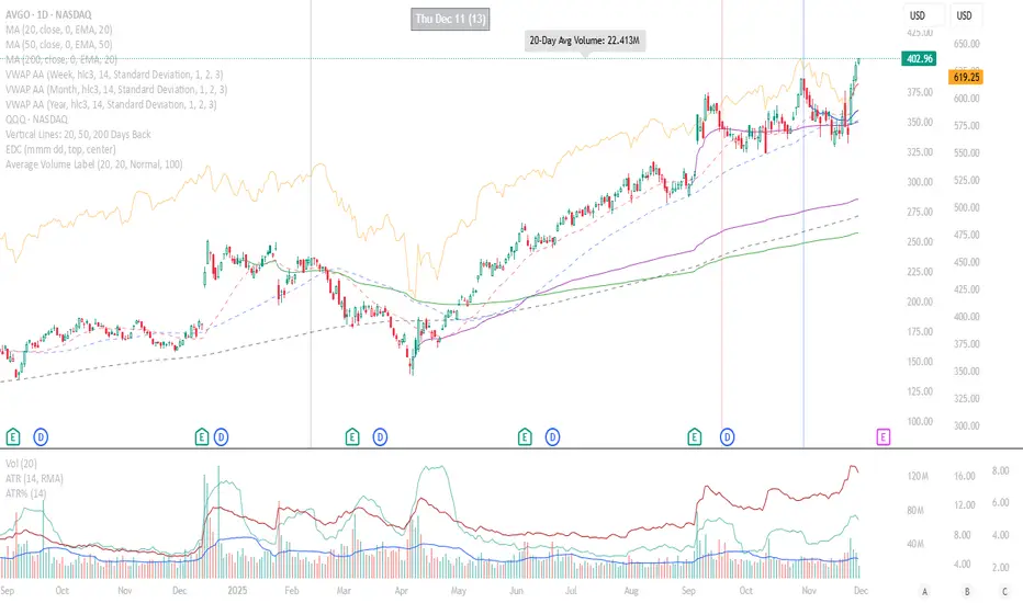
Average Volume LabelAverage Volume Label Indicator
This TradingView Pine Script creates a customizable label that displays the average trading volume over a specified period directly on your price chart.
Core Functionality:
Calculates the simple moving average (SMA) of volume over a user-defined number of days (default: 20 days)
Displays this average in a positioned label at the top of the chart
The label shows text like "20-Day Avg Volume: 1.2M" with automatic volume formatting
Key Customization Options:
Volume Calculation:
Adjustable lookback period (1-200 days) for the volume average
Label Appearance:
Text color, background color, and transparency controls
Five size options (Tiny to Huge)
Configurable horizontal position (how many bars back from the current bar to place the label)
Technical Implementation:
Updates only on the most recent bar to optimize performance
Positions the label at the highest price point within the visible range for consistent top-of-chart placement
Includes safety checks to prevent runtime errors with lookback periods
Also plots the average volume data (visible in the data window for reference)
This indicator is useful for traders who want to quickly assess whether current volume is above or below the recent average without cluttering their chart with additional panes.
Weekly Future and ZoneDescription
🔹This multi-tool indicator plots Best-Strike–based R/S levels, BEP zones, Panic zones, Synthetic Future High/Low, Previous Day OHLC, Daily Open, CPR (Daily/Weekly), and key EMAs.
Designed for option writers, index traders, and intraday traders who want all major reference levels in one place.
🔹Includes toggles for every module, auto-cleaned drawing objects, CPR box shading, customizable MAs, and optimized last-bar rendering.
Best Strike : CE/PE Close price which is near.
Need Input CE/PE High, Low, Close Price
💡 Key Features:
Best-strike derived R1, R2, S1, S2
BEP (Break-even) Levels
Panic Zones for directional risk
Synthetic Future High/Low using CE/PE premium imbalance
Previous Day OHLC for intraday structure mapping
Daily Session Open
CPR (Daily/Weekly) + automatic CPR zone shading
EMA Trend Pack + customizable SMA/EMA/WMA/VWMA
⚠️ Disclaimer
This indicator is provided for educational and analytical purposes only.
It does not provide trading advice or buy/sell signals.
Use responsibly and in conjunction with your market analysis.

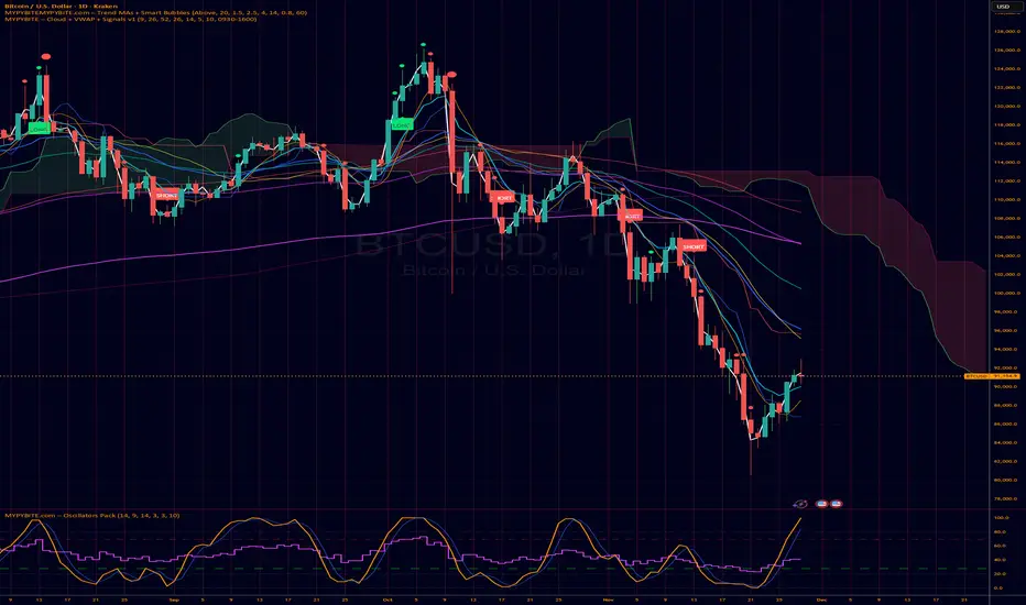
MYPYBiTE.com – Cloud + VWAPFor Bitcoin we found that the 3 day chart consistently indicates a pattern that anyone can back test and determine the trend confirmation is broken. Of course we won't tell you here what it is because you have to do the work or be familiar with the communities I participate in.
We decided to make this available because we realized many folks do not incorporate cloud charting. This is to help noobies and we hope to incorporate other factors in time.