BBBDXY-9 - Intraday/ SwingWhat it is
A chart-grade USD basket that outputs full O/H/L/C candles. It combines nine FX pairs using weighted log-returns and geometric aggregation, then rescales to 100 at an anchor. You can build from 1m, 1H, 4H, or D and analyze it like a normal chart (drawings, structure, bar replay, and a clean Source output for other tools).
Why another USD gauge?
A legacy EUR-heavy USD measure can, at times, behave close to an EURUSD proxy and under-represent moves versus other majors and Asia EM. A diversified basket helps capture USD dynamics beyond EUR-centric effects. This study is independent and does not rely on third-party brands.
Basket (defaults are editable in Inputs)
Pairs used: EURUSD (inverted), USDJPY, USDCAD, GBPUSD (inverted), USDMXN, USDCNH, USDCHF, AUDUSD (inverted), USDSGD.
Inverted means the pair is flipped internally so rising values reflect USD strength. Weights default to a diversified mix and can be customized.
How it works (high level)
Sample each component on the chosen base timeframe.
Compute log-returns versus the anchor, multiply by weights, sum, and exponentiate (geometric combine).
Re-scale so the index equals 100 at the anchor.
Optional: plot an arithmetic comparison line.
Base-TF and aggregation rules
Build from timeframe: 1m, 1H, 4H, D.
If chart TF is greater than base TF, aggregate up from the base TF (no down-mixing).
If chart TF equals base TF, show native base candles.
If chart TF is lower than base TF, sample the base TF (step-like).
For intraday precision and exact wicks, choose 1m as base and view higher TFs by aggregation.
For longer history with fewer requests, choose 1H, 4H, or D as base.
Inputs (overview)
Build-from TF (1m, 1H, 4H, D) and a feed prefix if your broker symbols require one.
Per-pair weights (editable).
Anchor date and time (chart timezone) plus optional auto-rebase to first available bar if the exact anchor is missing.
Arithmetic comparison line (optional).
Source output selector (Open, High, Low, Close) for downstream tools.
Custom candle colors.
How to use
For granular intraday structure and wick accuracy, set base TF to 1m and view higher TFs by aggregation.
For swing and weekly context, set base TF to 1H, 4H, or D.
Keep default weights unless you have a specific reason to alter the basket.
Rising index suggests USD strength versus the basket; falling index suggests USD weakness.
Notes and limitations
Depends on availability and quality of the underlying FX symbols on your data feed.
Indicator only; no financial advice, no alerts, no orders.
No external open-source code reused.
Past behavior does not guarantee future results.
Figure (publication image)
Top: a legacy EUR-heavy USD index on 1H. The horizontal line marks a local swing high; price stalls and rolls over beneath it.
Bottom: this diversified USD basket on 1H. The horizontal line marks the same calendar window; the advance extends differently into that zone before rolling later.
This side-by-side illustrates that a EUR-centric gauge can diverge from a diversified USD basket. Similar divergences appear at other points; the example is illustrative and not a signal.
- riseofatrader
Dollarindex

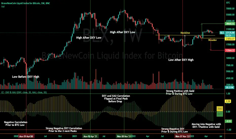
Correlation Coefficient - DXY & XAUPublishing my first indicator on TradingView. Essentially a modification of the Correlation Coefficient indicator, that displays a 2 ticker symbols' correlation coefficient vs, the chart presently loaded.. You can modify the symbols, but the default uses DXY and XAU, which have been displaying strong negative correlation.
As with the built-in CC (Correlation Coefficient) indicator, readings are taken the same way:
Positive Correlation = anything above 0 | stronger as it moves up towards 1 | weaker as it moves back down towards 0
Negative Correlation = anything below 0 | stronger moving down towards -1 | weaker moving back up towards 0
This is primarily created to work with the Bitcoin weekly chart, for comparing DXY and Gold (XAU) price correlations (in advance, when possible). If you change the chart timeframe to something other than weekly, consider playing with the Length input, which is set to 35 by default where I think it best represents correlations with Bitcoin's weekly timeframe for DXY and Gold.
The intention is that you might be able to determine future direction of Bitcoin based on positive or negative correlations of Gold and/or the US Dollar Index. DXY has been making peaks and valleys prior to Bitcoin since after March 2020 black swan event, where it peaked just after instead. In the future, it may flip over again and Bitcoin may hit major highs or lows prior to DXY, again. So, keep an eye on the charts for all 3, as well as the indicator correlations.
Currently, we've moved back into negative correlation between Bitcoin and DXY, and positive correlation with Bitcoin and Gold:
Negative Correlation b/w Bitcoin and DXY - if DXY moves up, Bitcoin likely moves down, or if DXY moves down, Bitcoin likely moves up (or if Bitcoin were to move first before DXY, as it did on March 2020, instead)
Positive Correlation b/w Bitcoin and Gold - Bitcoin and Gold will likely move up or down with each other.
DXY is represented by the green histogram and label, Gold is represented by the yellow histogram and label. Again, you can modify the tickers you want to check against, and you can modify the colors for their histograms / labels.
The inspiration from came from noticing areas of same date or delayed negative correlation between Bitcoin and DXY, here is one of my most recent posts about that:
Please let me know if you have any questions, or would like to see updates to the indicator to make it easier to use or add more useful features to it.
I hope this becomes useful to you in some way. Thank you for your support!
Cheers,
dudebruhwhoa :)
Market Relative Candle Ratio ComparatorIntroducing the Market Relative Candle Ratio Comparator, a visually captivating script that eases the way you compare two financial assets, such as cryptocurrencies and market indices. Leveraging a distinctive calculation method based on percentage changes and their averages, this tool presents a crystal-clear view of how your chosen assets perform in relation to each other, both for individual candles and over a range of previous candles.
Tailoring the script to your preferences is a walk in the park, as it allows you to easily adjust input symbols, moving average lengths, and other parameters to match your analytical approach. The visually arresting column chart it creates employs vivid red and green colors to underscore the differences between the two assets on each candle. Simultaneously, the lower-opacity columns depict the accumulated differences over a specified lookback period. This vibrant blend of colors and opacities results in a dynamic visual experience, enabling you to better grasp market trends relative to each other.
The reverse bool input is a handy feature that lets you invert the effect of the input symbol (DXY by default) in the comparison. When you set the reverse input to true, the script multiplies the calculated DXY percentage change by -1, effectively reversing the comparison. This is particularly useful when examining assets with an inverse relationship or when you'd like to analyze the input symbol's impact in the opposite direction.
For instance, if the input symbol represents a market index that generally moves in the opposite direction of the selected cryptocurrency, enabling the reverse input will help you better visualize and understand the relationship between the two assets by inverting the input symbol's effect on the comparison.
In the accompanying chart, you can observe the comparison of Bitcoin's movement relative to the Dollar, Gold, Bonds, and the S&P 500. The indicator reveals that in the last day, Bitcoin outperformed Bonds, Gold, and the Dollar but not the S&P 500!

Dollar Index (DXY) Candles [Loxx]Dollar Index (DXY) Candles is an educational/experimental indicator that attempts to recreate the Dollar Index DXY: TVC:DXY .This is useful so others traders can see how the DXY is calculated.
The U.S. Dollar Index (USDX, DXY, DX) is an index (or measure) of the value of the United States dollar relative to a basket of foreign currencies, often referred to as a basket of U.S. trade partners' currencies. The Index goes up when the U.S. dollar gains "strength" (value) when compared to other currencies.
The index is maintained and published by ICE (Intercontinental Exchange, Inc.), with the name "U.S. Dollar Index" a registered trademark.
It is a weighted geometric mean of the dollar's value relative to following select currencies:
Euro (EUR), 57.6% weight.
Japanese yen (JPY) 13.6% weight.
Pound sterling (GBP), 11.9% weight.
Canadian dollar (CAD), 9.1% weight.
Swedish krona (SEK), 4.2% weight.
Swiss franc (CHF) 3.6% weight.
USDX = 50.14348112 × EURUSD^-0.576 × USDJPY^0.136 × GBPUSD^-0.119 × USDCAD^0.091 × USDSEK^0.042 × USDCHF^0.036
These candles won't match the ticker DXY dollar for dollar, but it comes very close. Either way, the general trend and volatility of this synthetic recreation is the same as the DXY.
Read more here: en.wikipedia.org
