Prevailing Trend IndicatorOVERVIEW
The Prevailing Trend indicator is a technical indicator that gauges whether the price is currently trending up or down. The purpose of this indicator is to call and/or filter with-trend signals.
CONCEPTS
This indicator assists traders in identifying high-probability trend entries. The upper line (blue line on the indicator) is calculated by taking the average range (high-low) of all bullish candles. The lower line (red line on the indicator) is calculated by taking the average range of all bearish candles. When these two lines intersect and cross each other, a buy and sell signal is generated. For example, if the blue line crosses over the red line, this indicates that the average size of all bullish bars are larger than the average size of all bearish bars. This is a good sign that an uptrend might occur. Vice versa for downtrends.
HOW DO I READ THIS INDICATOR
As an entry indicator:
When the blue line crosses over the red line, go long.
When the red line crosses over the blue line, go short.
As a signal filter:
If the blue line is above the red line, only take long trades.
If the red line is above the blue line, only take short trades.
C1
Braid Filter+OVERVIEW
The Braid Filter indicator was initially made by Robert Hill and published in the Stocks and Commodities Magazine in 2006. This version of the Braid Filter expands upon Hill's original one by adding much more customization and tweaking abilities. Instead of using a simple moving average to calculate the Braid Filter, this version allows you to choose between 43 different moving average calculation types to suit your needs. The original also just used the close price for calculating its moving averages, however, this version allows you to specify different source prices, including the close, median (hl2), typical (hlc3), mean (ohlc4), and weighted (hlcc4) prices. This version also allows you to edit the lookback period for the average true range calculation. It also renamed some arbitrarily named input fields to make them more readable and understandable. Finally, it includes multi-timeframe support and the ability to color bars based on signals.
The Braid Filter calculates 3 average prices:
A short-term average close price
A medium-term average open price
A long-term average close price
It then finds the minimum and maximum of these three average prices. Then it calculates the difference between the highest and lowest average price. This difference is what the histogram shows. Then the filter line is calculated based on the ATR.
CONCEPTS
This indicator can be used to determine the start of trends. It can also be used to determine when the market is consolidating.
When the bar turns green, the average close price is greater than the average open price, indicating bullish momentum. In addition, if the histogram is green, the difference between the highest average price and the lowest average price is high enough to surpass the filter line. This means that not only is there bullish momentum, but there is stronger than average bullish momentum. Therefore, it is safe to assume that the market will trend higher. When the histogram turns red, this situation plays out except in reverse, indicating that the market will trend lower.
If the histogram color is gray, the difference between the highest average price and the lowest average price used to calculate the Braid Filter is meager. Since the highest and lowest average is close together, the price is unlikely to travel far in one direction. Therefore, it is safe to assume that the market is consolidating when this happens.
HOW DO I READ THIS INDICATOR
The signals between the histogram and filter are calculated as follows:
If the histogram is above the filter line and the fast average close price is greater than the average open price, the histogram is colored green, indicating bullish conditions.
If the histogram is above the filter line and the fast average close price is less than the average open price, the histogram is colored red, indicating bearish conditions.
If the histogram is below the filter line, the histogram is colored gray, indicating neutral conditions.

Moving Average Multitool CrossoverAs per request, this is a moving average crossover version of my original moving average multitool script .
It allows you to easily access and switch between different types of moving averages, without having to continuously add and remove different moving averages from your chart. This should make backtesting moving average crossovers much, much more easier. It also has the option to show buy and sell signals for the crossovers of the chosen moving averages.
It contains the following moving averages:
Exponential Moving Average (EMA)
Simple Moving Average (SMA)
Weighted Moving Average (WMA)
Double Exponential Moving Average (DEMA)
Triple Exponential Moving Average (TEMA)
Triangular Moving Average (TMA)
Volume-Weighted Moving Average (VWMA)
Smoothed Moving Average (SMMA)
Hull Moving Average (HMA)
Least Squares Moving Average (LSMA)
Kijun-Sen line from the Ichimoku Kinko-Hyo system (Kijun)
McGinley Dynamic (MD)
Rolling Moving Average (RMA)
Jurik Moving Average (JMA)
Arnaud Legoux Moving Average (ALMA)
Vector Autoregression Moving Average (VAR)
Welles Wilder Moving Average (WWMA)
Sine Weighted Moving Average (SWMA)
Leo Moving Average (LMA)
Variable Index Dynamic Average (VIDYA)
Fractal Adaptive Moving Average (FRAMA)
Variable Moving Average (VAR)
Geometric Mean Moving Average (GMMA)
Corrective Moving Average (CMA)
Moving Median (MM)
Quick Moving Average (QMA)
Kaufman's Adaptive Moving Average (KAMA)
Volatility-Adjusted Moving Average (VAMA)
Modular Filter (MF)

+ Balance of PowerThe Balance of Power is an indicator that measures the strength of buyers versus that of sellers in the market, and needs to be smoothed by a moving average to be of much practical use (come to think of it, most indicators are smoothed by a moving average; this is why the RSI lookback mostly commonly used is 14, and not 1, but I digress...). I suppose it is possible to use it without smoothing, but that would be very difficult I think.
The oscillator pivots around a center line, and as with most indicators like this, above 0 is generally considered bullish in a bullish trend, and vice versa in a downtrend.
It can be good for spotting divergences (moreso with smaller lookback periods than I like).
To wit, you might be wondering why I have the default lookback period set at such a large number. My only answer I can give is that I prefer it that way.
The indicator is quite choppy, even when smoothed. The long period helps me to make beter sense of the data (smooth it with a Hull or Jurik MA and you get a different story, though).
In my version of this indicator I provide a pretty broad selection of moving averages with which one may choose to smooth out the BOP, as well as an EMA provided to use as a sort of signal line for trade entries and/or exits, taking partial profits, scaling into a position, etc.
I've also added the option for a second BOP, which is on by default. I think you might find the results interesting by pairing differently smoothed BOPs together.
Of course, you don't have to use both. In the case of the default settings you might look at the EMA-BOP crossing the JMA-BOP as an opportunity to look into exiting or entering trades.
Candle coloring is, as usual, included. I'd say I kind of overdid it here, but that seems to be my style. I just couldn't deal with the fact that with the indicator set to cumulative modes there is no zero line, therefor the color of the indicator plot and the candle coloring would not match the color swatches for bullish/bearish colors. So, there are selections for cumulative indicator/candle colors, and standard indicator/candle colors. Donchian Channels obviously doesn't matter because the colors of things are based on the channel only.
I've added Donchian channel bands (which I've begun adding to many of my indicators), and all necessary alerts as well.
The Donchian Channels can be a really effective tool for entering and exiting trades. I haven't mentioned it in my other indicators that have it, so I will here:
The outermost edge of the band is that which references the indicator for where it is plotted, and the inner channel is sort of dragged along, creating the band
It's a simple mathematical calculation that TradingView actually provided themselves in their manual for pinescript.
When the BOP (or any other indicator using this) enters the band and then exits that could be an indication that price may be reversing, this the bands themselves act, or rather, show a current area of support/resistance for the BOP plot.
One thing that I did with it that they did not, is give the user the ability to change the width of the band. It can only go so narrow, obviously, but anywhere from three (quite wide) to eight is probably sufficient.
I've also provided the option of plotting the BOP as a cumulative line (like OBV), making it no longer an indicator which oscillates around a central pivot.
Because the balance of power is plotted as an accumulation, you may actually want to set the lookback to 1 (it works because it's not an oscillator then).
If you wish to smooth the noise, I suspect a low number would be acceptable here, but it's not necessary.
Oh, and lastly (almost forgot, as this was a late addition), I've added options for the BOPs calculated with volume as well. Gives a different bit of a perspective on the market, versus the traditional version which does not include volume. Screenshots below.
The above image is the balance of power calculated with volume. You can see the obvious difference versus the traditional indicator, where price is in a downtrend and you'd want to sell the orange.
Cumulative version. Looks a lot like OBV.
Cumulative version with volume.

+ REX OscillatorSo, what is the REX oscillator, you might be asking yourself.
"The Rex oscillator is an indicator that measures market behavior based on the relationship of the close to the open, high and low values of the same bar. A big difference between the high and close on a bar indicates weakness, and wide disparity between the low and close indicates strength. The difference between open and close also indicates market performance."
The True Value of a Bar (TVB) gives an indication of how healthy the market is. A negative close and a positive TVB (or vice versa) is an indication of the market building strength on the opposing side of the trend. The Rex oscillator is a moving average of the TVB value with the specified period.
I first came across this watching one of many No Nonsense Forex videos. Mostly, from comments I've read, it is used as an exit indicator for people who trade with a system similar or identical to the one VP espouses in his NNFX blog. I think it's perfectly apt to use as an entry indicator as well, or even as both, perhaps, depending on the moving average you chose to apply to the TVB.
There are a few other versions of this on tradingview, but I thought I'd make an updated version. Added Donchian Channels because I like the idea of a dynamic sort of overbought/sold area. I left out the basis because the indicator pivots around a center line, and has a signal line as well. A basis line just seemed like too much, and would likely not be very useful.
The additional usual things that I incorporate into my indicators are included here: optional candle coloring, alerts, and probably a too large selection of moving averages.
Credit to Nemozny for the FRAMA calculation. I may add that to other indicators I have.

+ WaveTrend OscillatorI'm guessing most of you are familir with LazyBear's adaptation of the Wavetrend Oscillator; it's one of the most popular indicators on TradingView. I know others have done adaptations of it, but I thought I might as well, because that's kind of a thing I like doing.
In this version I've added a second Wavetrend plot. This is a thing I like to do. The longer plot gives you a longer timeframe momentum bias, and the shorter plot gives you entries and/or exits. Here we have one plot with a lookback period of 55, and another with the default set to 6 (change this to 14 if you think you might prefer something slower and that will plot similarly to the default RSI settings). With the traditional Wavetrend Oscillator there is a simple moving average on the WTO that is to help provide entries and exits. I've done away with this as there are already two plots, and I felt more would just clutter the indicator. Instead of plotting the SMA I've plotted the crosses along the bottom and top of the indicator. Also, as is not the case in LazyBear's version, this SMA length is adjustable. By default it is set to 3, which is the default setting on the original indicator.
I've also plotted background colors for when there is what I call a momentum shift. If one or the other oscillators crosses the centerline a colored bar is plotted. By default it is turned on for both WTOs, though in practice you might only want it on for the longer one.
I would say use of the indicator is similar to the original WTO or many other oscillators. Buying oversold and selling overbought, but being mindful of the momentum of the market. If the longer WTO is above the centerline it's best to be looking for dips to the centerline, or for an overbought signal by the faster WTO, and vice versa if the longer WTO is below the centerline. That said, you can also adjust the length of the SMA on the faster WTO to fine tune entries or exits, which is kind of how you would trade LazyBear's version. In this case you have that additional confirmation of market momentum.
You can set colored candles to either of the WTO plots via a dropdown menu.
There are alerts for overbought and oversold situations, centerline crosses, and Wavetrend crosses.
That's about it. Hope you enjoy this particular implementation of LazyBear's well known indicator.
Ah yes, last thing: Original version the source is set to hlc3. I've given you the opportunity to change that, so if you prefer using close you can, or whatever you want.

+ JMA KDJ with RSI OB/OS SignalsSo, what is the KDJ indicator? If you're familiar with the Stochastic, then you'll know that the two oscillating lines are called the 'K' and 'D' lines. Now you know that this is some sort of implementation of the Stochastic. But, then, what is the J? The 'J' is simply the measure of convergence/divergence of the 'K' and 'D' lines, and the 'J' crossing the 'K' and 'D' lines is representational of the 'K' and 'D' lines themselves crossing. Is this an improvement over simply using the Stochastic as it is? Beats me. I don't use the Stochastic. I stumbled upon the KDJ while surfing around the web, and it sounded cool, so I thought I'd look at it. I do like it a bit more as the 'J' line being far overextended from the other two (usually into overbought/sold territory) does give a clear visual representation of the divergence of the 'K' and 'D' lines, which you might not notice otherwise. So, from that perspective I suppose it is nicer.
But let's get to the good stuff now, shall we? What did I do here?
Well, first thing you're wondering is why there are only two lines when based on my explanation (or your previous experience with the indicator) there should be three. I found this script here on TV, by x4random, who took the 'K' and 'D' lines and made an average of them, so there is only one line instead of the two. So, fewer lines on the indicator, but still the same usefulness. It was in older TV code, so I took it to version4 and cleaned up the code slightly. His indicator included the RSI ob/os plots, and I thought this was neat (even though the RSI being os/ob doesn't tell you much except that the trend is strong, and you should be buying pullback or selling rallies) so I kept them in. His indicator was also the most visually appealing one that I saw on here, so that attracted me too. Credit to x4random for the indicator, though.
Aside from code cleanup and adding the usual bells and whistles (which I will get to) the big thing I did here was change is RMA that he was using for the 'K' and 'D' lines to a Jurik MA's, which smooth a lot of the noise of other moving averages while maintaining responsiveness. This eliminates noise (false signals) while keeping the signals of significance. It took me a while to figure out how to substitute the JMA for the RMA, but thanks to QuantTherapy's "Jurik PPO" indicator I was able to nail down the implementation. One thing you might notice is that there is no input to change signal length. I fiddled with this for a time before sticking to using the period, instead of the signal (thus eliminating the use of the signal input altogether), length to generate the 'K' and 'D' calculations. To make any adjustments other than the period length use the Jurik Power input. You can use the phase input as well, but it has much less of an effect.
Everything else I changed is pretty much cosmetic.
Candle coloring with the option to color candles based on either the 'J' line or the 'KD' line.
color.from_gradients with color inputs to make it beautiful (this is probably my best looking indicator, imo)
plots for when crosses occur (really wish there was a way to plot these over candlesticks! If anyone has any suggestions I'd love to see!)
I think that's about it. Alerts of course.
Enjoy!
Below is a comparison chart of my JMA implementation to the original RMA script.
You can see how much smoother the JMA version is. Both of these had the default period of 55 set, and the JMA version is using the default settings, while the original version is using a length of 3 for the signal line.

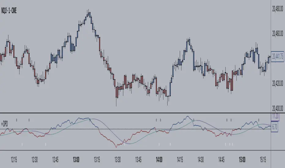
+ Detrended Price OscillatorAccording to TradingView the Detrended Price Oscillator is an oscillator that removes trend from price in order to more clearly show an instrument's cyclical
highs and lows so that an investor or trader may more easily time when to buy or sell the underlying instrument. Accordingly, it is not meant to be used as a way of gauging momentum, however, I find it perfectly suitable for the task (at least when used "un-centered" which is how it comes by default here). If you wish to read up more on the DPO just search for it under indicators. It's built in, so you'll find all the information you need on it there. Or check investopedia.
On to the good stuff. What have I done and how does this work?
As un-centered you can use it just like any other momentum oscillator. Price above the zero line is bullish and below is bearish, generally speaking.
I've added two moving averages that you can turn on or off, and choose amongst various types and lengths. Both of these are colored based on trend.
The DPO is also colored based on trend, with a neutral color based on where the DPO is relative to the primary MA and the zero line.
Candles are colored in the same way that the DPO is.
I've added Bollinger Bands because they could be useful on an indicator like this.
All the alert conditions you could dream of.
With this set to centered you will notice that the DPO is not inline with current price. That is intentional, as it's only designed to look at historical price
data to time highs and lows of price movement. As such, I don't recommend using this when set to centered, at least if you're trading crypto. The price volatility
perhaps makes for inconsistent timing of cyclical highs and lows, or perhaps it's the rather brief amount of time cryptocurrencies have been in existence.
I do not know. Just stick to using it un-centered.
The above image shows the indicator with Bollinger Bands turned on and the MA's turned off. Also, you should note that the candle color and DPO color is based on the primary moving average you are using. If you want consistency, and want to use the Bollinger Bands, then keep your primary moving average set as a 20 SMA, as that is the basis for Bollinger Bands.
Hope this is helpful to you. Definitely pair it with an additional indicator like an RSI, or my +ADP. I like to use something rangebound to compare its signals to.