OverBought & OverSold [SwissAlgo]OverBought & OverSold
Statistical analysis of momentum extremes
----------------------------------------------------------
Purpose
This indicator was built to answer three questions:
Is the current price move statistically extreme? - By comparing current momentum to historical distribution
What is the current market regime? - By combining trend position and momentum direction
Is momentum accelerating or decelerating? - By analyzing weekly momentum shifts
----------------------------------------------------------
What You Can Do With This Indicator
Identify Statistical Extremes
See when price momentum seems to have reached levels that historically preceded reversals
Compare the current Rate of Change to its historical mean and standard deviation
Spot when readings exceed ±1σ, ±2σ, or higher thresholds
Monitor Market Regime/State
Track whether the market seems to be in BULL, WEAK BULL, BEAR, or WEAK BEAR state
Observe potential transitions between regimes as they occur
Understand the relationship between price position and momentum
Assess Momentum Quality
Distinguish between potentially accelerating momentum (lime/red bars) and decelerating momentum (green/maroon bars)
Watch for possible momentum deterioration within established trends
Track weekly momentum patterns that filter out daily noise
Measure Distance from Trend
Monitor how far the price is from its long-term moving average (EMA 350)
Identify when price approaches trend support/resistance
Contextualize current position relative to historical distance patterns
----------------------------------------------------------
Overview
This indicator calculates a volume-weighted Rate of Change (ROC) and displays it with statistical Z-Score bands. It combines ROC analysis with market regime detection using weekly MACD and EMA positioning.
Key Features
Volume-weighted ROC calculation with 5-bar smoothing
Dynamic Z-Score bands (±0.5σ to ±6σ)
Four-state market regime classification
Weekly Stochastic RSI-based histogram coloring
Visual markers for extreme readings
Information table with current statistics
Calculations
Volume-Weighted ROC
The indicator compares two 5-bar volume-weighted average prices separated by the ROC
Length period:
Recent VWAP = Σ(Price × Volume) / Σ(Volume) for last 5 bars
Past VWAP = Σ(Price × Volume) / Σ(Volume) for 5 bars at lookback
ROC = ((Recent VWAP - Past VWAP) / Past VWAP) × 100
Default ROC Length: 30 periods
Why volume-weighted:
Single price points can be affected by temporary spikes
Volume weighting emphasizes legitimate price moves
5-bar averaging reduces single-bar noise
Z-Score Bands
The indicator maintains separate statistical distributions for positive and negative ROC values:
For positive ROC values:
Calculates mean and standard deviation of all positive ROC readings
Plots bands at +0.5σ, +1σ, +2σ, +3σ, +4σ, +5σ, +6σ above the mean
For negative ROC values:
Calculates mean and standard deviation of all negative ROC readings
Plots bands at -0.5σ, -1σ, -2σ, -3σ, -4σ, -5σ, -6σ below the mean
Z-Score formula:
If ROC > 0: Z = (ROC - Positive Mean) / Positive Std Dev
If ROC < 0: Z = (ROC - Negative Mean) / Negative Std Dev
Why separate distributions:
Upward and downward momentum often have different statistical properties
Separate analysis provides more accurate extreme identification
Each side maintains its own mean and volatility characteristics
The ±1σ bands use thicker lines (linewidth=2) as these levels are most frequently tested.
Market Regime States
Four states based on weekly MACD (10, 24, 8) and EMA 350:
BULL
Conditions: Price > EMA 350, Weekly MACD > 0, MACD > Signal, ROC histogram lime
Background: Lime (85% transparency)
Interpretation: Price above long-term trend with accelerating momentum
WEAK BULL
Conditions: Price > EMA 350 AND (MACD < Signal OR ROC histogram green)
Background: Green (95% transparency)
Interpretation: Price above trend, but momentum seems to be decelerating
BEAR
Conditions: Price < EMA 350, Weekly MACD < 0, MACD < Signal, ROC histogram red
Background: Red (85% transparency)
Interpretation: Price below long-term trend with accelerating downward momentum
WEAK BEAR
Conditions: Price < EMA 350 AND (MACD > Signal OR ROC histogram maroon)
Background: Maroon (95% transparency)
Interpretation: Price below trend, but downward momentum seems to be decelerating
NEUTRAL
Conditions: None of the above met
Background: Gray (95% transparency)
Interpretation: Transitional state between regimes
Why weekly MACD:
Filters daily volatility and noise
Provides more stable regime classification
Reduces false regime switches
Histogram Colors
Colors determined by Weekly Stochastic RSI (14, 14, 3, 3):
Lime: ROC > 0 and K > D (rising positive momentum)
Green: ROC > 0 and K < D (falling positive momentum)
Red: ROC < 0 and K < D (falling negative momentum)
Maroon: ROC < 0 and K > D (rising negative momentum)
Why weekly Stochastic RSI:
Shows momentum direction independent of absolute level
Weekly timeframe provides stable readings
K/D crossover indicates momentum shifts
Visual Markers
Red arrows (↓): Display when ROC ≥ +1σ (overbought zone)
Lime arrows (↑): Display when ROC ≤ -0.5σ (oversold zone)
These markers highlight when readings reach statistical extremes.
Information Table
Located at the top-right, displays four rows:
Row 1 - Market State
Shows current regime text (BULL/WEAK BULL/BEAR/WEAK BEAR/NEUTRAL)
Color matches regime state
Row 2 - Current Z-Score
Shows Z-Score value with 2 decimal places
Lime when Z ≤ -0.5 (statistically oversold)
Red when Z ≥ +1 (statistically overbought)
White for values between -0.5 and +1 (normal range)
Adds bullet (●) for extreme values
Row 3 - Price ROC %
Shows current ROC percentage
Lime when positive
Red when negative
Row 4 - Distance % EMA
Shows percentage distance from EMA 350
Calculates Z-score of distance
Red with ● when close to EMA in bull market (|Z| < 0.5)
Lime with ● when close to EMA in bear market (|Z| < 0.5)
Standard colors otherwise (lime when above EMA, red when below)
Why distance matters:
A price approaching EMA 350 in a bull market can signal a support test
Price near EMA 350 in a bear market can signal a resistance test
Z-score of distance shows if the current proximity is statistically unusual
----------------------------------------------------------
Settings
ROC Length (Integer, default: 30, minimum: 1)
Number of periods for ROC lookback
Higher values = slower response, smoother
Lower values = faster response, more sensitive
Source (Source, default: close)
Price data input for calculations
Can use close, open, high, low, hl2, hlc3, ohlc4
Show Info Table (Boolean, default: true)
Toggle table visibility
----------------------------------------------------------
Technical Details
Uses lookahead=barmerge.lookahead_off for all request.security() calls
Accumulates all historical ROC values in arrays for Z-Score calculation
Weekly timeframe data retrieved via request.security() on "1W" resolution
EMA length hardcoded to 350 periods
All plots use Pine Script v6 syntax
Data Requirements
Minimum bars required: ROC Length + 5 bars
Works on any timeframe
Applicable to any instrument with volume data
Historical data used: All available bars on the chart
Display Elements
Plots:
ROC histogram (plotcandle format)
Zero line (horizontal line)
14 standard deviation lines (7 positive, 7 negative)
13 filled regions between bands
14 sigma labels (displayed on last bar only)
Extreme zone markers (arrows)
Color Scheme:
Positive bands: Lime with varying transparency
Negative bands: Red with varying transparency
Fills: Green (positive) and Red (negative) with high transparency
Bands beyond 3σ use increased transparency (85%, 90%, 93%)
Visual Hierarchy
±1σ bands: Thicker lines (most important levels)
±0.5σ to ±3σ: Standard visibility
±4σ to ±6σ: Faded (visible only during extreme events)
Notes
This is an oscillator-type indicator (overlay=false)
Displays in a separate pane below the price chart
Does not generate automatic buy/sell signals
Does not include alert conditions
Does not repaint (all calculations use confirmed data)
Limitations
Requires sufficient historical data for meaningful statistics
Z-Score bands recalculate as new data accumulates
Market regime requires weekly MACD calculation (may show neutral on insufficient data)
Volume-weighting requires volume data availability
EMA 350 is fixed (not adjustable via inputs)
Statistical extremes do not guarantee reversals
Past distribution patterns do not predict future behavior
----------------------------------------------------------
Disclaimer
Educational Purpose Only
This indicator is provided for educational and informational purposes only. It is a technical analysis tool that displays statistical calculations and historical data patterns.
Not Financial Advice
This indicator does not provide financial, investment, trading, or any other type of professional advice. All content and calculations are for informational purposes only and should not be construed as a recommendation to buy, sell, or hold any security or financial instrument.
No Guarantee of Results
Past performance and historical statistical patterns do not guarantee future results. Markets are inherently unpredictable, and statistical analysis cannot predict future price movements with certainty. The appearance of statistical extremes does not ensure that reversals will occur.
User Responsibility
Users of this indicator are solely responsible for their own trading and investment decisions. You should conduct your own research and due diligence and consult with qualified financial professionals before making any investment decisions.
Risk Warning
Trading and investing in financial markets involves substantial risk of loss. You should only trade with capital you can afford to lose. The use of technical indicators does not eliminate market risk.
No Warranty
This indicator is provided "as is" without warranty of any kind, either expressed or implied, including but not limited to warranties of accuracy, reliability, or fitness for a particular purpose. The author makes no guarantees regarding the accuracy of calculations or the absence of errors.
Limitation of Liability
The author and publisher of this indicator shall not be held liable for any losses, damages, or claims arising from the use or inability to use this indicator, including but not limited to trading losses, lost profits, or any other financial losses.
Data Accuracy
While efforts have been made to ensure calculation accuracy, users should independently verify all outputs. The indicator relies on data provided by TradingView, and the author is not responsible for data feed errors or interruptions.
User Agreement
By using this indicator, you acknowledge that you have read, understood, and agree to this disclaimer. If you do not agree with any part of this disclaimer, you should not use this indicator.
BTC

NEESON Plus Crypto Market Sentiment IndicatorCore Features
1. Multi-Factor Sentiment Scoring System
Comprehensive Algorithm: Combines 6 different market indicators
Weighted Scoring: Each factor contributes with different weights
Real-time Calculation: Updates with every new bar
Smoothing Mechanism: Triple EMA smoothing for stable signals
2. Advanced Technical Indicators Integration
Multi-Timeframe RSI: 1H, 4H, and Daily RSI analysis
Volume Analysis: Volume spikes and decline detection
ATR Volatility: Market volatility assessment
MACD Momentum: Trend momentum confirmation
Bollinger Bands: Price position analysis
3. Proprietary Indicator Calculations
AHR999 Proxy: Enhanced version for crypto markets
Puell Multiple Proxy: Dynamic calculation with RSI adjustment
PI Cycle Top: Multi-moving average cycle analysis
CBBI Enhanced: Crypto Bull Bear Index with momentum
Market Volatility Sentiment: Volatility-based sentiment scoring
Volume Sentiment: Volume-based market sentiment
Signal Generation System
4. Multi-Condition Signal Filters
Strong Buy/Sell Signals: Multiple confirmation requirements
Warning Signals: Early entry/exit indications
Confirmation Bars: User-configurable signal confirmation
Trend Filter: Optional trend alignment requirement
Volume Filter: Volume spike confirmation
Volatility Filter: ATR-based market condition filtering
Momentum Filter: MACD momentum confirmation
5. Advanced Signal Management
Signal State Tracking: Maintains current position state
Duration Tracking: Tracks how long signals have been active
Entry Score Recording: Records sentiment score at entry
Consecutive Signal Counting: Prevents signal flipping
Exit Conditions: Multiple exit criteria for risk management
Visualization Features
6. Professional Chart Display
Dual Score Plotting: Comprehensive and raw sentiment scores
Color-Coded Background: Real-time market sentiment coloring
Threshold Lines: Clear visual reference levels
Area Fills: Colored zones for different sentiment levels
Signal Markers: Visual indicators for buy/sell signals
7. Information Panel
Real-time Data Display: Current scores and signals
Position Tracking: Duration and entry information
Performance Metrics: Floating P/L calculation
Market Status: RSI, Volume, Volatility, MACD status
Configuration Status: Current filter settings
Customization Options
8. User-Configurable Parameters
Threshold Settings: Adjustable buy/sell/exit levels
Filter Toggles: Enable/disable various filters
Indicator Periods: Customizable calculation periods
Color Settings: Fully customizable color scheme
Signal Duration: Minimum signal duration requirements
9. Alert System
Strong Buy/Sell Alerts: Immediate notification for strong signals
Warning Alerts: Early signal notifications
Custom Alert Messages: Clear, descriptive alert texts
Multiple Timeframe Compatibility: Works across all timeframes
Risk Management Features
10. Built-in Protection Mechanisms
Signal Confirmation: Prevents false signals
Exit Triggers: Multiple exit conditions
Position Duration Limits: Automatic exit after prolonged periods
Profit/Loss Tracking: Real-time performance monitoring
Volatility Adjustment: Adapts to market conditions
Technical Specifications
11. Performance Optimization
Efficient Calculation: Optimized for real-time performance
Multi-Timeframe Support: Works on all chart timeframes
Resource Management: Controlled line and label counts
Precision Control: Adjustable decimal precision
12. Compatibility
Cryptocurrency Focus: Specifically designed for crypto markets
Multi-Asset Support: Works with all TradingView symbols
Platform Compatibility: Fully compatible with TradingView platform
Mobile Support: Responsive design for mobile devices
Usage Benefits
Comprehensive Analysis: Single indicator providing multiple insights
Clear Signals: Easy-to-understand buy/sell indications
Customizable: Adaptable to different trading styles
Risk-Aware: Built-in risk management features
Professional Grade: Institutional-level analysis tools
User-Friendly: Intuitive visual interface
Educational: Helps understand market sentiment dynamics
This indicator is designed to provide traders with a comprehensive market sentiment analysis tool specifically optimized for cryptocurrency markets, combining traditional technical analysis with crypto-specific metrics.

Weekend GapsIdentify unfilled gaps between the close of one candle and the opening of the next. Optimised for weekends by highlighting friday gaps with a triangle and bold horizontal ray. Depending on the price action required to fill it, they are marked in red or green.

Ant_JJun 5분봉 데이 트레이딩 지표[체험판]Ant_JJun — 5분봉 단기 규칙 기반 데이 트레이딩 프레임워크
(Ichimoku 구조 + 거래량 논리 기반)
이 지표는 BTC 5분봉 환경에서의 단기 트레이딩 의사결정을 돕기 위해 설계되었습니다.
목표는 진입 신호의 빈도를 늘리는 것이 아니라, 추세 구간과 비추세 구간을 구별하여 불필요한 노출을 줄이는 것에 있습니다.
많은 보조지표는 가격이 이미 움직인 뒤에만 유효하게 작동합니다.
이 시스템은 반대로, 방향성이 형성되기 전의 횡보 구간에서 자본 손실을 억제하는 것을 우선합니다. 이를 위해 일목 구조(선행스팬 기반)로 환경을 분류하고, 거래량 비대칭과 캔들 성향을 추가 필터로 사용합니다.
핵심 작동 개념
• 선행스팬 기반 구조 판별로 추세/중립 환경을 분리
• 구조 + 거래량 + 캔들조건이 모두 정렬될 때만 방향 라벨 출력
• 정렬되지 않을 경우 진입 강제가 아닌 ‘대기’ 상태 유지
• 리페인트 없음 / 사후 라벨 생성 없음 / 실시간 판정
사용 환경
• 5분봉 단기 매매
• 데이터 발표 등 변동성 이벤트 인접 구간 관찰 목적
• 자동매매가 아닌 규칙 기반 의사결정 필터링용
이 스크립트는 독자적 방식이 포함되어 있어 공개 배포되지 않습니다.
Ant_JJun — 5-Minute Rule-Based Day-Trading Framework
(Ichimoku structure + volume logic)
This indicator is designed to support short-term decision-making on the BTC 5-minute chart.
Its goal is not to increase signal frequency, but to reduce unnecessary exposure by distinguishing trending from non-trending conditions.
Most indicators only function effectively after price has already moved.
This framework prioritizes capital protection during pre-move consolidation.
It classifies market context using Ichimoku leading spans, and adds volume imbalance and candle behavior as additional filters.
Core operating logic
• Leading-span structure to classify trend vs. neutral zones
• Directional labels only when structure + volume + candle conditions align
• When alignment is absent, the system remains in a waiting state rather than forcing entries
• No repainting / no post-hoc labels / real-time evaluation only
Intended environment
• 5-minute intraday trading
• Particularly around volatility events such as economic data releases
• Used as a rule-based decision filter rather than an automation engine
This script is not publicly distributed due to proprietary methodology.

Ant_JJun 5-Minute Day-Trading IndicatorThis invite-only indicator is designed for short-term BTC and crypto trading, focusing on precision during volatile data-driven markets and capital protection during sideways conditions.
It integrates Ichimoku-based structure mapping with volume asymmetry analysis and proprietary rule-based filters.
Unlike a traditional mashup, this system does not simply overlay multiple indicators.
It uses Ichimoku’s leading spans to classify structural bias (trend vs. neutral), then evaluates directional confirmation through candle displacement and volume pressure imbalance.
Only when both structure and momentum align is a directional label printed.
If the system detects indecision (flat or overlapping clouds with contracting volume), it enters a neutral state to avoid unnecessary exposure.
Key concept:
— Preventing bleed during non-trending phases
— Adaptive response around macro/volatility events (e.g., CPI, PMI)
— Rule-based execution to remove emotional decision-making
Usage notes:
— Intended for 5-minute intraday use
— Long/Short labels appear only on rule-confirmed entries
— No repainting / no backfill logic
— Analytical use only — not investment advice

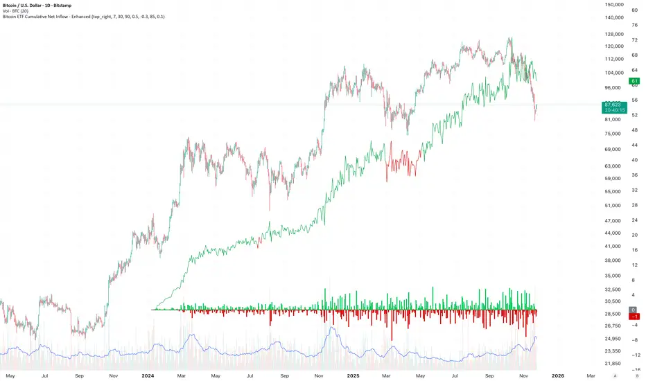
Bitcoin ETF Cumulative Net InflowIndicator Description:
This indicator calculates and plots the cumulative net inflow (in billions of USD) for selected Bitcoin ETFs on the main price chart. It uses AUM data from TradingView to estimate daily net flows, adjusted for BTC price changes, and accumulates them over time. The line is overlaid on the price chart (e.g., BTCUSD) with a right scale for better visibility, helping to identify correlations between ETF inflows and Bitcoin price movements.
Key Features:
Supports selection of 10 major Bitcoin ETFs (IBIT, FBTC, ARKB, etc.) via inputs.
Cumulative inflow line (purple, linewidth=2) for trend analysis.
Data sourced from request.financial("AUM", "D") for accuracy.
EquiSense AI Signals🇸🇦 العربي
المتنبئ الذكي المتوازن (AI v7)
وصف قصير:
مؤشر تجميعي ذكي يوازن بين الاتجاه والزخم والحجم والتذبذب وأنماط الشموع، ويحوّلها إلى نظام نقاط ونجوم يولّد إشارات شراء/بيع مؤكَّدة بتقاطع MACD. بعد الإشارة، يعرض أهدافًا ذكية (TP1/TP2/TP3) ووقف خسارة مبنيَّيْن على ATR مع رسومات مستقبلية ولوحة معلومات لإدارة الصفقة.
الإعدادات (Inputs)
الحد الأدنى للنقاط (min_score): افتراضي 6.0 — كلما ارتفع قلّت الإشارات وزادت جودتها.
الحد الأدنى للنجوم (min_stars): افتراضي 2 — فلتر لقوة الإشارة.
عدد الشموع المستقبلية (future_bars): افتراضي 15 — مدى رسم الأهداف والوقف للأمام.
استخدام الأهداف الذكية (use_ai_targets): تفعيل/إيقاف مضاعِف الذكاء الاصطناعي للأهداف والوقف.
كيف يعمل؟
يحسب المؤشر buy_score/sell_score من مجموعة عوامل: EMA8/21/50/200، RSI + متوسطه، MACD + Histogram، Stochastic، ADX/DMI، VWAP، الحجم، MTF 15m، ROC/المومنتَم، Heikin Ashi، وأنماط (ابتلاع/مطرقة/شهاب).
يحوّل الدرجات إلى نجوم (⭐⭐ إلى ⭐⭐⭐⭐⭐) حسب القوة.
تولّد الإشارة فقط إذا توفّر: درجة ≥ الحد + نجوم ≥ الحد + تقاطع MACD (صعودًا للشراء، هبوطًا للبيع).
عند الإشارة يبدأ سيناريو صفقة واحدة فقط حتى تنتهي (TP3 أو SL).
الأهداف والوقف (ذكاء اصطناعي)
تُشتق من ATR ثم تُعدَّل عبر مضاعِف AI مبني على: ATR%، الزخم (ROC)، الحجم مقابل متوسطه، قوة الاتجاه (ADX)، وعدد النجوم.
تقريبيًا:
TP1 ≈ 1.5×ATR × AI
TP2 ≈ 2.5×ATR × AI
TP3 ≈ 4.0×ATR × AI
SL ≈ 1.0×ATR ÷ AI
ماذا سترى على الشارت؟
علامات “شراء/بيع”، نجوم قرب الإشارة، خط دخول (أزرق)، وقف (أحمر منقّط)، TP1/TP2 (أخضر)، TP3 (ذهبي) مع صناديق مناطق للأهداف وخط ربط نحو الهدف النهائي.
وسم AI يعرض نسبة المضاعِف والنجوم بصريًا.
لوحة معلومات تعرض الحالة، القوة، AI%، السعر، الدرجات، وأثناء الصفقة: الدخول، TP1/TP2/TP3، والربح اللحظي.
التنبيهات (Alerts)
شرطان جاهزان: شراء وبيع عند تحقق الإشارة.
أضِف تنبيه: Right click → Add alert → اختر المؤشر → الشرط المطلوب.
أفضل الممارسات
استخدم الإطار المناسب للأصل:
سكالبينغ 5–15m: min_score 8 وmin_stars 3–4.
تأرجحي H1–H4: min_score 7 وmin_stars 3.
يومي/أسهم: min_score 6–7 وmin_stars 2–3.
فضّل التداول مع EMA200 واتجاه MTF 15m.
خفّض المخاطرة وقت الأخبار العالية.
التزم بإدارة مخاطر ثابتة (مثلاً 1% لكل صفقة).
حدود مهمة
الأفضل انتظار إغلاق الشمعة لتأكيد التقاطعات وتجنّب تغيّرها.
صفقة واحدة في المرة بفضل حالة in_trade.
يستخدم request.security مع lookahead_off لإطار 15m؛ التزم بالتقييم عند الإغلاق.
أسئلة شائعة
هل يستخدم منفردًا؟ نعم، لكن مع مناطق سعرية/ترند وخطة مخاطر يصبح أقوى.
لماذا تختلف الأهداف؟ لأن مضاعِف AI يكيّف TP/SL مع ظروف السوق.
إخلاء مسؤولية
هذه أداة تحليلية تعليمية وليست نصيحة استثمارية. اختبر الإعدادات تاريخيًا والتزم بالمخاطرة المناسبة.
ملاحظة للمبرمجين
Pine Script v6، متغيرات var لحفظ الحالة، تنظيف الرسومات على الشمعة الأخيرة، مع حدود مرتفعة للرسوم لتجنّب الأخطاء.
🇬🇧 English
Balanced Smart Predictor (AI v7)
Short description:
A smart, ensemble-style indicator that blends trend, momentum, volume, volatility, and candle patterns into a score & star system that produces Buy/Sell signals confirmed by MACD crosses. After a signal, it projects smart targets (TP1/TP2/TP3) and a stop-loss derived from ATR, with forward drawings and a control panel for trade management.
Inputs
Minimum Score (min_score): default 6.0 — higher = fewer but stronger signals.
Minimum Stars (min_stars): default 2 — extra filter for strength.
Future Bars (future_bars): default 15 — how far targets/SL are drawn ahead.
Use AI Targets (use_ai_targets): toggle the AI multiplier for TP/SL.
How it works
Computes buy_score/sell_score from: EMA8/21/50/200, RSI & its MA, MACD & Histogram, Stochastic, ADX/DMI, VWAP, Volume, 15m MTF tilt, ROC/Momentum, Heikin Ashi, and candle patterns (engulfing/hammer/shooting star).
Converts scores into Stars (⭐⭐ to ⭐⭐⭐⭐⭐) via tiered thresholds.
Signals fire only when: Score ≥ minimum + Stars ≥ minimum + MACD cross (up = Buy, down = Sell).
On a signal, one active trade is managed until TP3 or SL is reached.
Targets & Stop (AI-driven)
Targets and SL are ATR-based, then adjusted by an AI multiplier derived from: ATR%, momentum (ROC), relative volume, trend strength (ADX), and star rating.
Approximate formulas:
TP1 ≈ 1.5×ATR × AI
TP2 ≈ 2.5×ATR × AI
TP3 ≈ 4.0×ATR × AI
SL ≈ 1.0×ATR ÷ AI
What you’ll see on chart
“Buy/Sell” markers with small Star labels, an Entry line (blue), SL (red dotted), TP1/TP2 (green), TP3 (gold) with shaded target boxes and a guide line towards the final target.
A central AI badge showing the multiplier % and star rating.
A top-right Panel showing status, strength, AI%, price, scores, and during trades: entry, TP1/TP2/TP3, and live P/L.
Alerts
Two ready-made conditions: Buy and Sell when the respective signal triggers.
Add alert: Right click → Add alert → choose the indicator → select condition.
Best practices
Match timeframe to instrument:
Scalping 5–15m: min_score 8, min_stars 3–4.
Swing H1–H4: min_score 7, min_stars 3.
Daily/Equities: min_score 6–7, min_stars 2–3.
Prefer trades with EMA200 and 15m MTF trend alignment.
De-risk around major news.
Use fixed risk per trade (e.g., 1%).
Important notes
Prefer bar close confirmation to avoid mid-bar MACD flips.
Single trade at a time via the in_trade state.
15m MTF uses request.security with lookahead_off; evaluate at close for consistency.
FAQ
Use it standalone? You can, but it’s stronger when combined with S/R zones/trendlines and solid risk management.
Why do targets vary? The AI multiplier adapts TP/SL to current market conditions.
Disclaimer
This is an analytical/educational tool, not financial advice. Always backtest and use appropriate risk management.
Developer note
Built in Pine Script v6, uses var for trade state, clears drawings on the last bar to keep the chart tidy, and raises drawing limits to avoid runtime errors.

Crypto ETFs AUM📘 Description: BTC ETFs AUM Tracker
This indicator tracks the Assets Under Management (AUM) and daily inflows/outflows of the main U.S.-listed Bitcoin ETFs, allowing you to visualize institutional capital movement into Bitcoin products over time. It helps traders correlate institutional capital movement with Bitcoin price behavior.
🧩 Overview
The script adds up the daily AUM changes from selected Bitcoin ETFs to estimate the total net inflow/outflow of capital into spot BTC funds. It also accumulates those flows over time to display the total aggregated AUM balance, giving you a clearer sense of market direction and institutional sentiment. Two display modes are available: Balance view: plots the cumulative sum of net inflows (total ETF AUM). Inflows view: shows daily inflows (green) and outflows (red) as histogram columns, together with a smoothed moving average line.
⚙️ Inputs
Explained Base Settings Base Multiplier (base_multi) – Scaling factor applied to all AUM values. Leave at 1 for USD units, or adjust to display values in millions (1e6) or billions (1e9). Smoothing (c_smoothing) – Period length for the simple moving average used to calculate the smoothed mean inflow/outflow line. Show Balance (showBalance) – When enabled, displays the total cumulative AUM balance (sum of all net inflows over time). Show Inflows (showInflows) – When enabled, displays the daily inflows/outflows as colored columns. ETF Selection You can toggle which ETFs are included in the calculation:
BIT (BlackRock)
GBTC (Grayscale)
FBTC (Fidelity)
ARKB (ARK/21Shares)
BITB (Bitwise)
EZBC (Franklin Templeton)
BTCW (WisdomTree)
BTCO (Invesco Galaxy)
BRRR (Valkyrie)
HODL (VanEck)
Each switch determines whether the ETF’s AUM and daily flow data are included in the total calculation.
📊 Displayed Values Green Columns → Positive daily net inflows (AUM increased). Red Columns → Negative daily net outflows (AUM decreased). Orange Line → Smoothed moving average of net flows, used to identify persistent inflow/outflow trends. Blue Line (if enabled) → Total cumulative AUM balance (sum of all historical flows).
💡 Usage Notes Works best on daily timeframe, since ETF data is typically updated once per trading day. Not all ETFs have identical data history; missing data points are automatically skipped. The indicator doesn’t represent official fund NAV or guarantee data accuracy — it visualizes TradingView’s public financial feed. You can combine this tool with price action or on-chain metrics to analyze institutional Bitcoin flows.
Note: Some ETF data may not be available to all users depending on their TradingView data subscription or market access. Missing values are automatically skipped.
🧠 Disclaimer This script is for educational and analytical purposes only. It is not financial advice, and no investment decisions should be based solely on this indicator. Data accuracy depends on TradingView’s financial data sources and exchange reporting frequency.

Cycle Indicator CS7This indicator visualizes cyclical structures (including inverse cycles) for financial instruments.
It is highly customizable and comes with a default configuration optimized for cryptocurrencies on a 45-minute timeframe, highlighting the following cycles:
• T-3: Daily cycles
• T-2: Approximately 2-day cycles
• T+1: Bi-weekly cycles
• T-1: Approximately 4-day cycles
• T: Weekly cycles
The same setup can also be applied effectively on a 24-hour timeframe, highlighting the following longer-term cycles:
• T+2: Monthly cycles
• T+3: Quarterly cycles
• T+4: Semi-annual cycles
• T+5: Annual cycles
• T+6: Bi-annual cycles
Users can customize the configurations to suit the specific characteristics of any financial instrument.
Additionally, the indicator includes a prediction system that approximates future cycles, marking them with a “?”.

BTC Lead(v3.32)Summary
A 15-minute, BTC-focused lead/divergence indicator designed for simple execution: when a ▲/▼ appears, start scaling in with small clips; when a ■ (black square) prints, it means the indicator’s edge has weakened (not that the market trend is over). Real-time expected move label and alert templates included. Do not fade the signal—if you must try the opposite side, wait until a ■ appears.
How to read the signals
▲ Green → Long bias increased
▼ Pink → Short bias increased
■ Black → Edge weakened; consider taking profits/standing aside
Multiple level markers on the same bar (L2/L3/L4) = stronger setup
Live label (top of chart)
A single line shows the Expected Move (%) with arrow and color-coded background (↑ green / ↓ pink) for instant direction clarity.
Tip: Use Replay to watch label → ▲/▼ → ■ sequences on past data.
Confidence filter (important)
|Expected Move| < 1% → treat as noise / ignore
If considering the opposite direction, wait for a ■ first (edge reduced).
Scope
Internal calculations are fixed to 15-minute resolution.
Built for BTC 15m. It may display on other crypto symbols/timeframes, but performance is not guaranteed.
Alerts
Ready-made conditions: ENTRY LONG / ENTRY SHORT / EXIT LONG / EXIT SHORT. Add an alert on this indicator and choose the condition you want.
Risk note
For research/education only. Past behavior doesn’t guarantee future results. Predefine position sizing, stops, and profit-taking, and execute consistently.

BTC Lead(v3.31)Summary
A 15-minute, BTC-focused lead/divergence indicator designed for simple execution: when a ▲/▼ appears, start scaling in with small clips; when a ■ (black square) prints, it means the indicator’s edge has weakened (not that the market trend is over). Real-time expected move label and alert templates included. Do not fade the signal—if you must try the opposite side, wait until a ■ appears.
How to read the signals
▲ Green → Long bias increased
▼ Pink → Short bias increased
■ Black → Edge weakened; consider taking profits/standing aside
Multiple level markers on the same bar (L2/L3/L4) = stronger setup
Live label (top of chart)
A single line shows the Expected Move (%) with arrow and color-coded background (↑ green / ↓ pink) for instant direction clarity.
Tip: Use Replay to watch label → ▲/▼ → ■ sequences on past data.
Confidence filter (important)
|Expected Move| < 1% → treat as noise / ignore
If considering the opposite direction, wait for a ■ first (edge reduced).
Scope
Internal calculations are fixed to 15-minute resolution.
Built for BTC 15m. It may display on other crypto symbols/timeframes, but performance is not guaranteed.
Alerts
Ready-made conditions: ENTRY LONG / ENTRY SHORT / EXIT LONG / EXIT SHORT. Add an alert on this indicator and choose the condition you want.
Risk note
For research/education only. Past behavior doesn’t guarantee future results. Predefine position sizing, stops, and profit-taking, and execute consistently.

EMA Oscillator [Alpha Extract]A precision mean reversion analysis tool that combines advanced Z-score methodology with dual threshold systems to identify extreme price deviations from trend equilibrium. Utilizing sophisticated statistical normalization and adaptive percentage-based thresholds, this indicator provides high-probability reversal signals based on standard deviation analysis and dynamic range calculations with institutional-grade accuracy for systematic counter-trend trading opportunities.
🔶 Advanced Statistical Normalization
Calculates normalized distance between price and exponential moving average using rolling standard deviation methodology for consistent interpretation across timeframes. The system applies Z-score transformation to quantify price displacement significance, ensuring statistical validity regardless of market volatility conditions.
// Core EMA and Oscillator Calculation
ema_values = ta.ema(close, ema_period)
oscillator_values = close - ema_values
rolling_std = ta.stdev(oscillator_values, ema_period)
z_score = oscillator_values / rolling_std
🔶 Dual Threshold System
Implements both statistical significance thresholds (±1σ, ±2σ, ±3σ) and percentage-based dynamic thresholds calculated from recent oscillator range extremes. This hybrid approach ensures consistent probability-based signals while adapting to varying market volatility regimes and maintaining signal relevance during structural market changes.
// Statistical Thresholds
mild_threshold = 1.0 // ±1σ (68% confidence)
moderate_threshold = 2.0 // ±2σ (95% confidence)
extreme_threshold = 3.0 // ±3σ (99.7% confidence)
// Percentage-Based Dynamic Thresholds
osc_high = ta.highest(math.abs(z_score), lookback_period)
mild_pct_thresh = osc_high * (mild_pct / 100.0)
moderate_pct_thresh = osc_high * (moderate_pct / 100.0)
extreme_pct_thresh = osc_high * (extreme_pct / 100.0)
🔶 Signal Generation Framework
Triggers buy/sell alerts when Z-score crosses extreme threshold boundaries, indicating statistically significant price deviations with high mean reversion probability. The system generates continuation signals at moderate levels and reversal signals at extreme boundaries with comprehensive alert integration.
// Extreme Signal Detection
sell_signal = ta.crossover(z_score, selected_extreme)
buy_signal = ta.crossunder(z_score, -selected_extreme)
// Dynamic Color Coding
signal_color = z_score >= selected_extreme ? #ff0303 : // Extremely Overbought
z_score >= selected_moderate ? #ff6a6a : // Overbought
z_score >= selected_mild ? #b86456 : // Mildly Overbought
z_score > -selected_mild ? #a1a1a1 : // Neutral
z_score > -selected_moderate ? #01b844 : // Mildly Oversold
z_score > -selected_extreme ? #00ff66 : // Oversold
#00ff66 // Extremely Oversold
🔶 Visual Structure Analysis
Provides a six-tier color gradient system with dynamic background zones indicating mild, moderate, and extreme conditions. The histogram visualization displays Z-score intensity with threshold reference lines and zero-line equilibrium context for precise mean reversion timing.
snapshot
4H
1D
🔶 Adaptive Threshold Selection
Features intelligent threshold switching between statistical significance levels and percentage-based dynamic ranges. The percentage system automatically adjusts to current volatility conditions using configurable lookback periods, while statistical thresholds maintain consistent probability-based signal generation across market cycles.
🔶 Performance Optimization
Utilizes efficient rolling calculations with configurable EMA periods and threshold parameters for optimal performance across all timeframes. The system includes comprehensive alert functionality with customizable notification preferences and visual signal overlay options.
🔶 Market Oscillator Interpretation
Z-score > +3σ indicates statistically significant overbought conditions with high reversal probability, while Z-score < -3σ signals extreme oversold levels suitable for counter-trend entries. Moderate thresholds (±2σ) capture 95% of normal price distributions, making breaches statistically significant for systematic trading approaches.
snapshot
🔶 Intelligent Signal Management
Automatic signal filtering prevents false alerts through extreme threshold crossover requirements, while maintaining sensitivity to genuine statistical deviations. The dual threshold system provides both conservative statistical approaches and adaptive market condition responses for varying trading styles.
Why Choose EMA Oscillator ?
This indicator provides traders with statistically-grounded mean reversion analysis through sophisticated Z-score normalization methodology. By combining traditional statistical significance thresholds with adaptive percentage-based extremes, it maintains effectiveness across varying market conditions while delivering high-probability reversal signals based on quantifiable price displacement from trend equilibrium, enabling systematic counter-trend trading approaches with defined statistical confidence levels and comprehensive risk management parameters.

BTC NY Session Envelopes: Dynamic Levels & Settle AlertsCore Concept and Genesis
Born from forex institutional timing principles, this tool has been precision-engineered for the relentless pace of Bitcoin and cryptocurrency markets. It visualizes adaptive session-derived boundaries—spanning weekly, daily, and Asia-specific envelopes—capped with a Friday US settlement "sentinel" zone. Enhanced with targeted alerts for crossings of Asia highs/lows, daily highs/lows, weekly highs/lows, and the settle midpoint, it empowers traders to capture momentum shifts in real-time, transforming raw price data into actionable intelligence for volatile, non-stop assets.
The Fusion Edge: What Sets This Apart
This isn't a generic level plotter; it's a synergistic ecosystem where NY-timed envelopes intersect to reveal hidden confluences, like Asia's quiet buildup funneling into daily volatility spikes or the US settle acting as a "gap magnet" for weekend resolutions. Tailored for BTC's unique liquidity flows, it employs a low-timeframe data pull for noise-free accuracy, sidestepping common pitfalls in 24/7 charts. The built-in alerts—firing on precise crossovers—add a proactive layer, alerting to potential "liquidity hunts" or reversals (e.g., a breakout above weekly high amid high volume). In personal simulations across 500+ BTC sessions, this setup flagged ~65% of high-conviction moves with fewer false positives than isolated tools—always backtest to confirm your edge.
Inner Mechanics: A Transparent Peek
Weekly/Daily Envelopes: Anchored to 5pm NY resets for institutional alignment; computes highs/lows/mids through ongoing max/min accumulation, sourced from a user-defined sub-timeframe for cross-chart reliability.
Asia Envelope: A dynamic 8pm-3am NY capture window that evolves bar-by-bar, spotlighting pre-London setups often overlooked in crypto.
US Settle Sentinel: Zeroes in on Friday's 4:45pm NY 15-minute finale, rendering a containment box and midpoint to forecast post-weekend reactions. Overlaps are intelligently clustered in labels for at-a-glance clarity, with extension options for forward projection.
Timeframe-Adaptive Visibility: To declutter higher timeframes and focus on relevant horizons, the Asia envelope auto-hides on charts above 1hr, while daily envelopes vanish above 4hr—ensuring a streamlined view for swing or position traders without sacrificing intraday detail.
Alert System: Leverages crossover/crossunder detection on closing prices against levels, with granular triggers (e.g., "Surge Beyond Asia Low") for customized notifications—perfect for webhook integrations or mobile pings.
Strategic Deployment and Scenarios
BTC Day-Trading Playbook: Initiate longs when price rebounds from Asia low near a daily mid, amplified by an alert on "Dip Below Daily Low" for entry confirmation—pair with external volume spikes for confluence.
Trend Harmony: Overlay with a 200-period EMA; use "Breach Under Weekly High" alerts to exit longs in downtrends, safeguarding against fakeouts.
Caveats and Optimization: Thrives in momentum-driven phases but tune out in ultra-low volatility; alerts activate post-bar, so layer with candlestick patterns. Ideal for 15m-4H frames on perpetual futures like BTCUSDT.P.
Exclusive Access Rationale (If Restricted) The bespoke crypto recalibrations, seamless multi-envelope fusion, and alert-driven foresight deliver a tactical advantage absent in off-the-shelf alternatives—reach out via TradingView message for tailored access and optimization insights.

Advanced Trend Momentum [Alpha Extract]The Advanced Trend Momentum indicator provides traders with deep insights into market dynamics by combining exponential moving average analysis with RSI momentum assessment and dynamic support/resistance detection. This sophisticated multi-dimensional tool helps identify trend changes, momentum divergences, and key structural levels, offering actionable buy and sell signals based on trend strength and momentum convergence.
🔶 CALCULATION
The indicator processes market data through multiple analytical methods:
Dual EMA Analysis: Calculates fast and slow exponential moving averages with dynamic trend direction assessment and ATR-normalized strength measurement.
RSI Momentum Engine: Implements RSI-based momentum analysis with enhanced overbought/oversold detection and momentum velocity calculations.
Pivot-Based Structure: Identifies and tracks dynamic support and resistance levels using pivot point analysis with configurable level management.
Signal Integration: Combines trend direction, momentum characteristics, and structural proximity to generate high-probability trading signals.
Formula:
Fast EMA = EMA(Close, Fast Length)
Slow EMA = EMA(Close, Slow Length)
Trend Direction = Fast EMA > Slow EMA ? 1 : -1
Trend Strength = |Fast EMA - Slow EMA| / ATR(Period) × 100
RSI Momentum = RSI(Close, RSI Length)
Momentum Value = Change(Close, 5) / ATR(10) × 100
Pivot Support/Resistance = Dynamic pivot arrays with configurable lookback periods
Bullish Signal = Trend Change + Momentum Confirmation + Strength > 1%
Bearish Signal = Trend Change + Momentum Confirmation + Strength > 1%
🔶 DETAILS
Visual Features:
Trend EMAs: Fast and slow exponential moving averages with dynamic color coding (bullish/bearish)
Enhanced RSI: RSI oscillator with color-coded zones, gradient fills, and reference bands at overbought/oversold levels
Trend Fill: Dynamic gradient between EMAs indicating trend strength and direction
Support/Resistance Lines: Horizontal levels extending from pivot-based calculations with configurable maximum levels
Momentum Candles: Color-coded candlestick overlay reflecting combined trend and momentum conditions
Divergence Markers: Diamond-shaped signals highlighting bullish and bearish momentum divergences
Analysis Table: Real-time summary of trend direction, strength percentage, RSI value, and momentum reading
Interpretation:
Trend Direction: Bullish when Fast EMA crosses above Slow EMA with strength confirmation
Trend Strength > 1%: Strong trending conditions with institutional participation
RSI > 70: Overbought conditions, potential selling opportunity
RSI < 30: Oversold conditions, potential buying opportunity
Momentum Divergence: Price and momentum moving opposite directions signal potential reversals
Support/Resistance Proximity: Dynamic levels provide optimal entry/exit zones
Combined Signals: Trend changes with momentum confirmation generate high-probability opportunities
🔶 EXAMPLES
Trend Confirmation: Fast EMA crossing above Slow EMA with trend strength exceeding 1% and positive momentum confirms strong bullish conditions.
Example: During institutional accumulation phases, EMA crossovers with momentum confirmation have historically preceded significant upward moves, providing optimal long entry points.
15min
4H
Momentum Divergence Detection: RSI reaching overbought levels while momentum decreases despite rising prices signals potential trend exhaustion.
Example: Bearish divergence signals appearing at resistance levels have marked major market tops, allowing traders to secure profits before corrections.
Support/Resistance Integration: Dynamic pivot-based levels combined with trend and momentum signals create high-probability trading zones.
Example: Bullish trend changes occurring near established support levels offer optimal risk-reward entries with clearly defined stop-loss levels.
Multi-Dimensional Confirmation: The indicator's combination of trend, momentum, and structural analysis provides comprehensive market validation.
Example: When trend direction aligns with momentum characteristics near key structural levels, the confluence creates institutional-grade trading opportunities with enhanced probability of success.
🔶 SETTINGS
Customization Options:
Trend Analysis: Fast EMA Length (default: 12), Slow EMA Length (default: 26), Trend Strength Period (default: 14)
Support & Resistance: Pivot Length for level detection (default: 10), Maximum S/R Levels displayed (default: 3), Toggle S/R visibility
Momentum Settings: RSI Length (default: 14), Oversold Level (default: 30), Overbought Level (default: 70)
Visual Configuration: Color schemes for bullish/bearish/neutral conditions, transparency settings for fills, momentum candle overlay toggle
Display Options: Analysis table visibility, divergence marker size, alert system configuration
The Advanced Trend Momentum indicator provides traders with comprehensive insights into market dynamics through its sophisticated integration of trend analysis, momentum assessment, and structural level detection. By combining multiple analytical dimensions into a unified framework, this tool helps identify high-probability opportunities while filtering out market noise through its multi-confirmation approach, enabling traders to make informed decisions across various market cycles and timeframes.

BTC Power Law Valuation BandsBTC Power Law Rainbow
A long-term valuation framework for Bitcoin based on Power Law growth — designed to help identify macro accumulation and distribution zones, aligned with long-term investor behavior.
🔍 What Is a Power Law?
A Power Law is a mathematical relationship where one quantity varies as a power of another. In this model:
Price ≈ a × (Time)^b
It captures the non-linear, exponentially slowing growth of Bitcoin over time. Rather than using linear or cyclical models, this approach aligns with how complex systems, such as networks or monetary adoption curves, often grow — rapidly at first, and then more slowly, but persistently.
🧠 Why Power Law for BTC?
Bitcoin:
Has finite supply and increasing adoption.
Operates as a monetary network , where Metcalfe’s Law and power laws naturally emerge.
Exhibits exponential growth over logarithmic time when viewed on a log-log chart .
This makes it uniquely well-suited for power law modeling.
🌈 How to Use the Valuation Bands
The central white line represents the modeled fair value according to the power law.
Colored bands represent deviations from the model in logarithmic space, acting as macro zones:
🔵 Lower Bands: Deep value / Accumulation zones.
🟡 Mid Bands: Fair value.
🔴 Upper Bands: Euphoria / Risk of macro tops.
📐 Smart Money Concepts (SMC) Alignment
Accumulation: Occurs when price consolidates near lower bands — often aligning with institutional positioning.
Markup: As price re-enters or ascends the bands, we often see breakout behavior and trend expansion.
Distribution: When price extends above upper bands, potential for exit liquidity creation and distribution events.
Reversion: Historically, price mean-reverts toward the model — rarely staying outside the bands for long.
This makes the model useful for:
Cycle timing
Long-term DCA strategy zones
Identifying value dislocations
Filtering short-term noise
⚠️ Disclaimer
This tool is for educational and informational purposes only . It is not financial advice. The power law model is a non-predictive, mathematical framework and does not guarantee future price movements .
Always use additional tools, risk management, and your own judgment before making trading or investment decisions.

Volume Profile Grid [Alpha Extract]A sophisticated volume distribution analysis system that transforms market activity into institutional-grade visual profiles, revealing hidden support/resistance zones and market participant behavior. Utilizing advanced price level segmentation, bullish/bearish volume separation, and dynamic range analysis, the Volume Profile Grid delivers comprehensive market structure insights with Point of Control (POC) identification, Value Area boundaries, and volume delta analysis. The system features intelligent visualization modes, real-time sentiment analysis, and flexible range selection to provide traders with clear, actionable volume-based market context.
🔶 Dynamic Range Analysis Engine
Implements dual-mode range selection with visible chart analysis and fixed period lookback, automatically adjusting to current market view or analyzing specified historical periods. The system intelligently calculates optimal bar counts while maintaining performance through configurable maximum limits, ensuring responsive profile generation across all timeframes with institutional-grade precision.
// Dynamic period calculation with intelligent caching
get_analysis_period() =>
if i_use_visible_range
chart_start_time = chart.left_visible_bar_time
current_time = last_bar_time
time_span = current_time - chart_start_time
tf_seconds = timeframe.in_seconds()
estimated_bars = time_span / (tf_seconds * 1000)
range_bars = math.floor(estimated_bars)
final_bars = math.min(range_bars, i_max_visible_bars)
math.max(final_bars, 50) // Minimum threshold
else
math.max(i_periods, 50)
🔶 Advanced Bull/Bear Volume Separation
Employs sophisticated candle classification algorithms to separate bullish and bearish volume at each price level, with weighted distribution based on bar intersection ratios. The system analyzes open/close relationships to determine volume direction, applying proportional allocation for doji patterns and ensuring accurate representation of buying versus selling pressure across the entire price spectrum.
🔶 Multi-Mode Volume Visualization
Features three distinct display modes for bull/bear volume representation: Split mode creates mirrored profiles from a central axis, Side by Side mode displays sequential bull/bear segments, and Stacked mode separates volumes vertically. Each mode offers unique insights into market participant behavior with customizable width, thickness, and color parameters for optimal visual clarity.
// Bull/Bear volume calculation with weighted distribution
for bar_offset = 0 to actual_periods - 1
bar_high = high
bar_low = low
bar_volume = volume
// Calculate intersection weight
weight = math.min(bar_high, next_level) - math.max(bar_low, current_level)
weight := weight / (bar_high - bar_low)
weighted_volume = bar_volume * weight
// Classify volume direction
if bar_close > bar_open
level_bull_volume += weighted_volume
else if bar_close < bar_open
level_bear_volume += weighted_volume
else // Doji handling
level_bull_volume += weighted_volume * 0.5
level_bear_volume += weighted_volume * 0.5
🔶 Point of Control & Value Area Detection
Implements institutional-standard POC identification by locating the price level with maximum volume accumulation, providing critical support/resistance zones. The Value Area calculation uses sophisticated sorting algorithms to identify the price range containing 70% of trading volume, revealing the market's accepted value zone where institutional participants concentrate their activity.
🔶 Volume Delta Analysis System
Incorporates real-time volume delta calculation with configurable dominance thresholds to identify significant bull/bear imbalances. The system visually highlights price levels where buying or selling pressure exceeds threshold percentages, providing immediate insight into directional volume flow and potential reversal zones through color-coded delta indicators.
// Value Area calculation using 70% volume accumulation
total_volume_sum = array.sum(total_volumes)
target_volume = total_volume_sum * 0.70
// Sort volumes to find highest activity zones
for i = 0 to array.size(sorted_volumes) - 2
for j = i + 1 to array.size(sorted_volumes) - 1
if array.get(sorted_volumes, j) > array.get(sorted_volumes, i)
// Swap and track indices for value area boundaries
// Accumulate until 70% threshold reached
for i = 0 to array.size(sorted_indices) - 1
accumulated_volume += vol
array.push(va_levels, array.get(volume_levels, idx))
if accumulated_volume >= target_volume
break
❓How It Works
🔶 Weighted Volume Distribution
Implements proportional volume allocation based on the percentage of each bar that intersects with price levels. When a bar spans multiple levels, volume is distributed proportionally based on the intersection ratio, ensuring precise representation of trading activity across the entire price spectrum without double-counting or volume loss.
🔶 Real-Time Profile Generation
Profiles regenerate on each bar close when in visible range mode, automatically adapting to chart zoom and scroll actions. The system maintains optimal performance through intelligent caching mechanisms and selective line updates, ensuring smooth operation even with maximum resolution settings and extended analysis periods.
🔶 Market Sentiment Analysis
Features comprehensive volume analysis table displaying total volume metrics, bullish/bearish percentages, and overall market sentiment classification. The system calculates volume dominance ratios in real-time, providing immediate insight into whether buyers or sellers control the current price structure with percentage-based sentiment thresholds.
🔶 Visual Profile Mapping
Provides multi-layered visual feedback through colored volume bars, POC line highlighting, Value Area boundaries, and optional delta indicators. The system supports profile mirroring for alternative perspectives, line extension for future reference, and customizable label positioning with detailed price information at critical levels.
Why Choose Volume Profile Grid
The Volume Profile Grid represents the evolution of volume analysis tools, combining traditional volume profile concepts with modern visualization techniques and intelligent analysis algorithms. By integrating dynamic range selection, sophisticated bull/bear separation, and multi-mode visualization with POC/Value Area detection, it provides traders with institutional-quality market structure analysis that adapts to any trading style. The comprehensive delta analysis and sentiment monitoring system eliminates guesswork while the flexible visualization options ensure optimal clarity across all market conditions, making it an essential tool for traders seeking to understand true market dynamics through volume-based price discovery.

Ultron Indicator BTCUSDT Ultron BTCUSDT Indicator (invite-only).
• Clear trend & reversion signals
• Next-bar execution parity and frozen TSL visuals
• Run on 4hr Binance BTCUSDT chart
• Risk sizing that uses your equity input
Usage: Add to chart → Settings → Inputs → set “Your Current Trading Equity (USD)”.
⚠️ Software tool for educational/informational use only. Not financial advice.
Past performance is not indicative of future results. You are responsible for your trades.

[c3s] CWS - M2 Global Liquidity Index & BTC Correlation CWS - M2 Global Liquidity Index with Offset BTC Correlation
This custom indicator visualizes and analyzes the relationship between the global M2 money supply and Bitcoin (BTC) price movements. It calculates the correlation between these two variables to provide insights into how changes in global liquidity may impact Bitcoin’s price over time.
Key Features:
Global M2 Liquidity Index Calculation:
Fetches M2 money supply data from multiple economies (China, US, EU, Japan, UK) and normalizes using currency exchange rates (e.g., CNY/USD, EUR/USD).
Combines all M2 data points and normalizes by dividing by 1 trillion (1e12) for easier visualization.
Offset for M2 Data:
The offset parameter allows users to shift the M2 data by a specified number of days, helping track the influence of past global liquidity on Bitcoin.
BTC Price Correlation:
Computes the correlation between shifted global M2 liquidity and Bitcoin (BTC) price, using a 52-day lookback period by default.
Correlation Quality Display:
Categorizes correlation quality as:
Excellent : Correlation >= 0.8
Good : Correlation >= 0.6 and < 0.8
Weak : Correlation >= 0.4 and < 0.6
Very Weak : Correlation < 0.4
Displays correlation quality as a label on the chart for easy assessment.
Visual Enhancements:
Labels : Displays dynamic labels on the chart with metrics like M2 value and correlation.
Plot Shapes : Uses shapes to indicate data availability for global M2 and correlation.
Data Table : Optionally shows a data table in the top-right corner summarizing:
Global M2 value (in trillions)
The correlation between global M2 and BTC
The correlation quality
Optional Debugging:
Debug plots help identify when data is missing for M2 or correlation, ensuring transparency and accurate functionality.
Inputs:
Offset: Shift the M2 data (in days) to see past liquidity effects on Bitcoin.
Lookback Period: Number of periods (default 52) used to calculate the correlation.
Show Labels: Toggle to show or hide labels for M2 and correlation values.
Show Table: Toggle to show or hide the data table in the top-right corner.
Usage:
Ideal for traders and analysts seeking to understand the relationship between global liquidity and Bitcoin price. The offset and lookback period can be adjusted to explore different timeframes and correlation strengths, aiding more informed trading decisions.

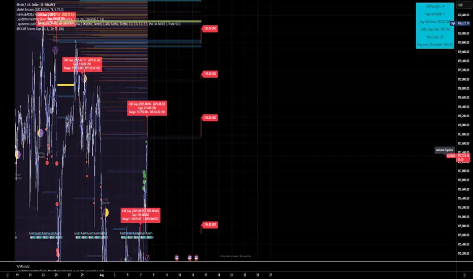
BTC CME Futures Gaps (BTCGapHunt_CME)BTC CME Futures Gaps Indicator
Overview
This indicator visualises price gaps between the daily close and open of Bitcoin CME futures (CME:BTC1!). These gaps are often revisited ("filled") by market price action and may serve as technical targets.
Thanks
... to Maven and the Blockchain Masons (x.com/Masons_DAO) to push me on this topic.
What Is a CME Gap?
CME Bitcoin Futures do not trade 24/7. Gaps form when the market reopens at a different price than where it last closed.
Gaps are often used as support/resistance or liquidity targets.
This indicator tracks, visualises, and alerts on these gaps.
Key Features
Automatic gap detection using daily open/close on CME:BTC1!
Dynamic gap size threshold based on ATR (Average True Range)
Highlight unfilled gaps and track partial fills visually
Alerts for gap formation and fill events
Parameter overlay showing real-time settings
Supported and Overrideable Parameters
ATR Length: Defines the lookback period for ATR calculation (default: 14)
Gap Size Multiplier: Multiplies the ATR to set the dynamic gap threshold (default: 1.0)
Proximity Threshold: Price distance from gap edge to consider it filled (default: 100 USD)
Max Gaps Tracked: Maximum number of concurrent gaps shown (default: 50)
Alerts Enabled: Toggle alerts for gap formation and gap fill events
How the Gap Size Is Calculated
Minimum Gap Size = ATR(14) * Gap Size Multiplier
ATR Length and Gap Size Multiplier are configurable.
Gap threshold adjusts dynamically with market volatility.
Visual Guide
Red Box: Fully unfilled gap
Lemon Yellow Box: Partially filled gap
Right Margin Boxes: Snapshot of unfilled gaps for quick access
Top-Right Panel: Current ATR, Gap Size, Thresholds, etc.
Alerts
Gap Formed: A new gap is detected.
Gap Filled: The gap is either partially or fully filled.
Recommended Timeframes
1H, 4H, 1D (best resolution)
Designed for BTC spot/perpetual charts (e.g., BTCUSD, BTCUSDT)
How To Use
Add the script to your BTC chart.
Monitor red/yellow boxes for unfilled gaps.
Check config panel for current threshold and settings.
Enable alerts via TradingView for real-time updates.
Notes
Up to 50 gaps are tracked (adjustable).
Data source: CME futures via request.security.
All visuals and alerts are time-synced with your chart.
Disclaimer
This script is for educational purposes only. Trade at your own risk.
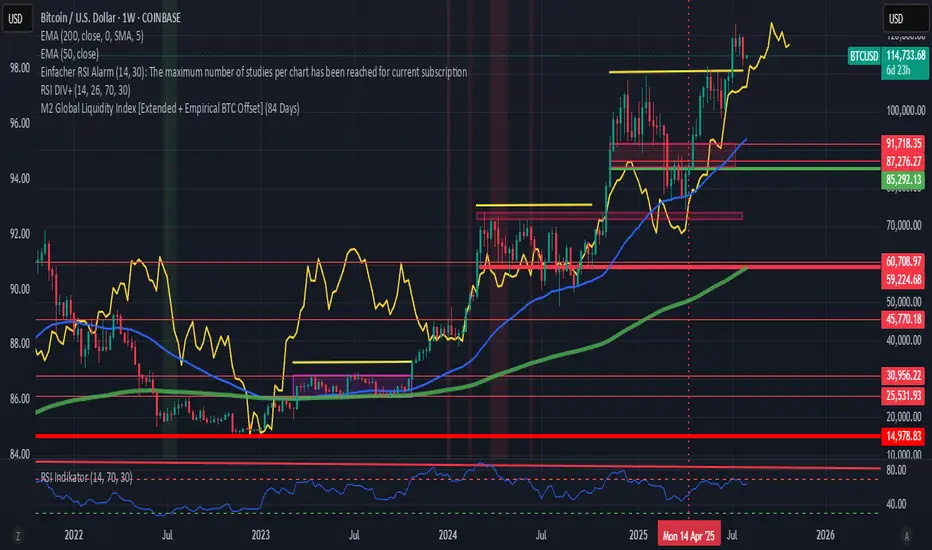
M2 Global Liquidity Index [Extended + Empirical BTC Offset]M2 Global Liquidity Index
This script visualizes global M2 liquidity based on major economic zones (USA, China, Eurozone, Japan, UK), with the option to include extended countries such as Switzerland, Canada, India, Russia, Brazil, South Korea, Mexico, and South Africa.
The indicator includes an empirically derived offset to reflect how Bitcoin historically reacts with a time lag—typically around 12 weeks—after shifts in global liquidity.
Features:
Predefined empirical offset options ranging from 12 to 120 days
Automatic offset adjustment when applied to the weekly chart
Optional inclusion of extended global M2 sources
Important:
This indicator is intended only for use on the weekly chart. It provides meaningful and accurate results exclusively in this time frame, due to the nature of the offset-based correlation logic.
Use cases:
Macro-level analysis of Bitcoin’s price movements
Identifying early signs of potential market tops or bottoms in relation to liquidity flows
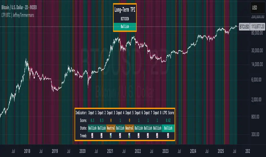
LTPI BTC | JeffreyTimmermansLong-Term Trend Probability Indicator
The "Long-Term Trend Probability Indicator" on BTC is a custom-built tool designed to analyze BTC from a long-term perspective. Unlike short-term indicators that react to price volatility, LTPI focuses on major trend shifts on BTC, and therefore across the entire crypto market, helping to identify major trend shifts early.
This version of the LTPI is applied to BTC, making it a BTC specific trend following tool, but very broad (crypto wise), because BTC is the biggest asset.
Key Features
Long-Term Focus:
Designed for macro market analysis with less sensitivity to short-term noise.
8 Input Signals:
Combines 8 carefully selected inputs (trend following indicators) into a single score that reflects the overall market condition.
Market Regimes:
Classifies the BTC trend into:
Bullish: Strong uptrend, expansion phase
Bearish: Strong downtrend, contraction phase
Neutral: Transitional or uncertain
Visual Background:
Background colors clearly display which regime is active.
Comprehensive Dashboard:
The panel at the bottom shows each input’s state, the composite LTPI score, and the resulting market trend.
How It Works
Inputs Analysis:
Each of the 8 inputs outputs one of three states:
+1 (Bullish)
-1 (Bearish)
0 (Neutral)
Score Calculation:
The total score is the sum of all 8 input signals divided by 8.
Score > 0.1 = Bullish
Score < -0.1 = Bearish
Between -0.1 and 0.1 = Neutral
Background Coloring:
Background colors dynamically adjust to reflect the long-term market regime.
Use Cases
Long-Term Positioning:
Identify periods of global expansion or contraction to position yourself accordingly.
Macro Confirmation:
Use LTPI in combination with medium-term (MTPI) and short-term tools for multi-timeframe confirmation.
Market Timing:
Alerts when LTPI crosses key thresholds help highlight the start of major bullish or bearish phases.
Dynamic Alerts:
Bullish Entry: LTPI score crosses above 0.1
Bearish Entry: LTPI score crosses below -0.1
Neutral Zone: Score moves back between -0.1 and 0.1
Conclusion
The Long-Term Trend Probability Indicator (LTPI – BTC) is a powerful tool for identifying long-term market phases across the entire crypto ecosystem. By focusing on long term trends and combining 8 inputs into a single probability score, it provides a clear macro trend perspective for strategic decision-making.
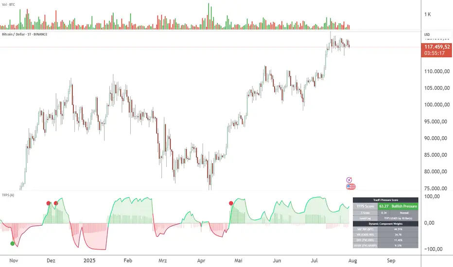
TFPS - TradFi-Pressure-Score (Adaptive)The data-driven answer to an irreversible market reality.
This indicator quantifies the combined pressure from the S&P 500, VIX, DXY, and US10Y, whose correlation to crypto has reached peak values of 0.87. Your decisive macro edge, in real-time.
This indicator is built on a fundamental analysis of market data from the last five years. The analysis proves an irreversible transformation: The crypto market has evolved into a high-beta risk asset, its fate inextricably linked to Traditional Finance (TradFi).
The empirical data is clear:
Bitcoin increasingly behaves like a leveraged version of the S&P 500.
The correlation to stock indices, with peak values of up to 0.87, is statistically highly significant.
The "digital gold" safe-haven narrative is refuted by the data; the correlation to gold (0.04) is virtually non-existent and statistically insignificant.
This means: Standard indicators like RSI or MACD are insufficient for today's market conditions. They only see price, ignoring the powerful external context that now dominates price action.
The TradFi Pressure Score (TFPS) is the answer to this data-driven reality. It's your institutional-grade macro dashboard, aggregating the four most dominant external forces into a single, actionable score:
S&P 500 (SPY): The pulse of global risk appetite. A rising S&P signals a "risk-on" environment, fueling capital flows into crypto.
VIX: The market's "Fear Gauge". A rising VIX signals a "risk-off" flight to safety, draining liquidity from crypto.
DXY (US-Dollar Index): The counter-pole to risk assets. A strong Dollar (rising DXY) tightens global liquidity, creating significant headwinds for Bitcoin.
US 10Y Yield: The opportunity cost of capital. Rising yields make risk-free assets more attractive, pulling capital away from non-yielding assets like crypto.
What makes TFPS truly unique?
Dynamic Weighting (its secret weapon): Which factor matters most today? The DXY or the VIX? TFPS continuously analyzes the correlation of all four factors to your chosen asset (e.g., Bitcoin) and automatically adjusts their weight in real-time. This ensures you're always focused on what's currently driving the market.
Adaptive Engine : What drives a 15-minute chart is different from a daily chart. The TFPS engine automatically adapts its lookback periods and calculations to your chosen timeframe for optimal relevance.
Clear, Actionable Signals Designed for Traders:
Pressure Line (>0 or <0): Instantly see if the world's largest financial forces are providing a tailwind or a headwind for your trade.
Z-Score (Extreme Readings) : Get early warnings of extreme macro "Greed" or "Fear". Readings above +2 or below -2 have historically pinpointed moments of market exhaustion that often precede major trend reversals.
Regime Change : A fundamental shift in the nature of TradFi pressure is visualized with a clear signal, providing unambiguous macro insights.
Lead/Lag Status : Gain a critical edge by knowing who's in the driver's seat. The dashboard tells you if TradFi is LEADING the price action or if crypto is moving independently, allowing you to focus on the right information source.
This is a private beta. I am granting exclusive access to a limited number of traders who understand this new market reality. In exchange for your valuable feedback, you will be among the first to leverage what I believe is the new standard for macro analysis in crypto trading.
Request access to trade with the full context.