Williams Fractals / Goldilocks Edition / [NPR21]This indicator, Williams Fractals — Goldilocks Edition , is a high-visibility technical analysis tool designed to identify key price reversal points on your chart. It is a refined version of the classic Williams Fractal, optimized for modern dark-themed trading environments with an emphasis on clarity and precise visual anchoring.
Indicator Description
The indicator identifies local price peaks (Highs) and valleys (Lows) using a specific look-back and look-forward period. Unlike standard fractals that can be difficult to read, this version features:
Enhanced Contrast: Darkened background labels (Deep Teal for Buy, Deep Red for Sell) that make the white and yellow text highly legible.
Long "V" Stems: Integrated arrow extensions that bridge the gap between the label and the candle, pointing precisely to the pivot point to remove any ambiguity during high volatility.
Customizable Spacing: User-defined offsets that allow the labels to sit comfortably above or below price action without overlapping other indicators.
How to Use It
Identify Reversals: A BUY signal appears under a local low, suggesting a potential upward move. A SELL signal appears above a local high, suggesting a potential downward move.
Support & Resistance: Use the fractal points to draw horizontal support and resistance lines.
Trend Confirmation: Fractals are most effective when used in conjunction with other indicators (like the EMA or WMA visible in your setup) to confirm trend direction.
Wait for Confirmation: Remember that a fractal is only "confirmed" after $n$ bars have closed to the right of the signal.
Understanding the "Periods (n)" Setting
The frequency of signals is entirely dependent on your Periods (n) input.
Lower Values (e.g., n=2): The indicator will find many local pivots, resulting in more frequent signals. This is useful for scalping or lower timeframes but may lead to more "noise".
Higher Values (e.g., n=5 or 10): The indicator requires a more significant peak or valley to trigger, resulting in fewer, more significant signals. This is better for identifying major trend shifts.
Indicadores de Bill Williams

9 HMA Direction Scalper (Pure Flip)new easier 9hma directional pure flip, it will help you with scalping short trends

Sessions + EMAS + Nube (Mini Table)This indicator is designed to help traders analyze market trends and identify potential trading opportunities.
It provides clear visual signals based on price behavior and technical calculations, allowing traders to better understand market structure, momentum, and direction.
The indicator can be used on any market and timeframe, making it suitable for both intraday and swing trading.
It is intended as a decision-support tool and should be used in combination with proper risk management and other forms of analysis.

RTH High Low Guardian-Pro# RTH Guardian - User Guide
## Overview
RTH Guardian is a sophisticated intraday trading indicator designed for Regular Trading Hours (RTH) sessions on futures markets like NQ and ES. It tracks the session's highest high and lowest low candles, creating dynamic support and resistance zones while providing real-time quality metrics to help you make informed trading decisions.
Think of this indicator as your trading guardian - it watches over the market structure during RTH, identifies key levels, and warns you when conditions might be unfavorable for entry.
---
## Core Concept: The Three-Line System
When a new session high or low is established, the indicator creates three horizontal lines:
### For Highs (Short Setup):
- **Red Line (High)**: The absolute high of the breakout candle
- **Green Line (Low)**: The low of that same breakout candle
- **Blue Line (HL/2)**: The midpoint - your potential entry zone for shorts
### For Lows (Long Setup):
- **Green Line (Low)**: The absolute low of the breakout candle
- **Red Line (High)**: The high of that same breakout candle
- **Blue Line (HL/2)**: The midpoint - your potential entry zone for longs
The philosophy is simple: trade from the middle, not the extremes. The HL/2 line represents a balanced entry point where you're neither chasing the high/low nor entering too early.
---
## Understanding the Label Metrics
Each HL/2 line displays a floating label with five key pieces of information:
### 💲 Price
The exact price level of the HL/2 midpoint. This is your potential entry price.
**Example**: `💲 21450.75`
### 🛑 Delta (Δ)
The distance between the HL/2 and the opposite extreme of the breakout candle.
- **For shorts**: Distance from HL/2 to the candle's low
- **For longs**: Distance from HL/2 to the candle's high
This tells you how much "room" you have for the trade to breathe. A larger delta generally means more tolerance for adverse movement.
**Example**: `🛑 Δ 15.50` (15.50 points of room)
### ⏰ Time Since Last Hit
How many bars ago the HL/2 level was last touched by price action.
This is your "freshness" indicator. The longer price stays away from a level, the less relevant it becomes as immediate support/resistance.
**Example**: `⏰ 3 bars ago` (Price tested this level 3 bars back)
**Interpretation**:
- 1-3 bars: Very fresh, high relevance
- 4-8 bars: Cooling off
- 9+ bars: Level is aging, price has moved on
### 🎯 Hit Percentage
The quality metric. Shows how many times the HL/2 has been tested out of the total bars since creation.
**Formula**: (Number of hits / Total bars) × 100
**Example**: `🎯 2/5 = 40.0%`
**Color Coding** (when "Use Quality Color" is enabled):
- **Gray** (0%): Untested, no data yet
- **Blue** (<20%): Low interaction, level mostly ignored
- **Green** (20-39%): Moderate quality, decent level
- **Yellow** (40-59%): High interaction, strong level
- **Red** (≥60%): Excessive grinding, potential chop zone
**Trading Insight**: Green and Blue zones often represent the best risk/reward opportunities. Yellow and Red suggest the market is struggling with the level - proceed with caution or avoid.
### 🚀 Breakaway Status
Tracks momentum away from the level - a one-time event that never updates.
**For Highs (Short)**: First candle where the **high** drops below the HL/2
**For Lows (Long)**: First candle where the **low** rises above the HL/2
**Example**: `🚀 1st B-away` (Breakaway achieved on the very first candle)
**Interpretation**:
- **1st-2nd B-away**: Explosive momentum, strong directional move
- **3rd-5th B-away**: Healthy progression away from level
- **6th+ B-away**: Slower momentum, level still has gravity
- **No B-away**: Price keeps returning to level, not breaking free
Early breakaway (1st-3rd) suggests the level is being respected and momentum is strong in the opposite direction. Late or no breakaway suggests the level is "sticky" and might still be in play.
---
## The Guardian Analysis Table
The table in the corner provides a macro view of market conditions with three sections:
### Chop Zone Analysis (Top)
Detects when price is trapped between the High's Low and Low's High - a range-bound danger zone.
**Status Indicators**:
- **Clear** (Green): Clean trending conditions, no overlap
- **Wide Range** (Yellow): Some overlap but tradeable
- **TIGHT CHOP** (Orange): Dangerous grinding between levels
**Example**: `Chop: TIGHT CHOP (4x)` - Price has bounced between the zones 4 times. Stay out or trade breakouts only.
### SHORT Section (Red)
Metrics for potential short setups from the High's HL/2:
- **Seq-H (Sequential Highs)**: How many consecutive higher highs have formed
- Green (<5): Healthy trending
- Yellow (5-9): Extended, caution
- Red (≥10): Severely overextended
- **MFE (Maximum Favorable Excursion)**: Best profit potential if you shorted from HL/2
- Green (>100% of Δ): Excellent movement
- Blue (50-100%): Good movement
- Orange (<50%): Limited movement
- **MAE (Maximum Adverse Excursion)**: Worst drawdown if you shorted from HL/2
- Green (<50% of Δ): Minimal heat
- Yellow (50-80%): Moderate heat
- Red (>80%): Significant heat taken
### LONG Section (Green)
Mirror metrics for potential long setups from the Low's HL/2.
Same interpretation as SHORT section but for long positions.
---
## Trading Psychology: What This Indicator Teaches You
### The Cave Diving Parallel
Just as a cave diver checks their air supply, depth, and safety lines before proceeding deeper, RTH Guardian asks you to check your trading environment before taking a position:
1. **Air Supply = Delta**: Do you have enough room for the trade to work?
2. **Depth Gauge = Hit Percentage**: Is this level quality or are you diving into murky waters?
3. **Safety Line = Breakaway**: Is there momentum carrying price away from danger?
4. **Visibility = Chop Status**: Can you see clearly or is it too stirred up?
### Self-Sabotage Patterns It Reveals
**Pattern 1: Chasing**
If you're tempted to enter when "bars ago" shows 0-1 and hit percentage is already Yellow/Red, you're chasing a grinding level. The indicator is warning you: "This level is being fought over. Choose another entry or wait."
**Pattern 2: Entering Extended Moves**
Sequential highs/lows in Red territory means you're late to the party. The mountain metaphor applies: you're trying to summit a peak when you should have started at base camp.
**Pattern 3: Ignoring the Chop**
Trading when "TIGHT CHOP" shows is like trying to swim against a riptide. The indicator is literally telling you the market is trapped. Step aside.
**Pattern 4: Disrespecting Momentum**
"No B-away" after many bars means price won't leave the level alone. That's the market telling you the battle isn't decided. Don't force a directional bias.
---
## Optimal Usage Workflow
### 1. Session Start (9:30 AM ET)
Watch for the first high and low to establish. Don't rush - let the levels prove themselves.
### 2. Level Creation
When a new high/low forms (indicated by red/green circles), observe:
- Is the Delta substantial? (>10 points on NQ is generally good)
- Check Guardian table: Are we in clear or chop conditions?
### 3. Wait for Quality
Let the level develop. Watch the hit percentage and bars ago metrics update.
**Ideal Entry Window**:
- Hit percentage: Blue or Green zone
- Bars ago: 2-5 (not too fresh, not too stale)
- Breakaway: Achieved within 1st-3rd candle
- Chop status: Clear
- MFE showing good follow-through, MAE manageable
### 4. Avoid When
- Chop status shows TIGHT CHOP
- Hit percentage in Red zone (≥60%)
- Sequential highs/lows ≥10 (severely extended)
- No breakaway after 8+ candles
- MAE significantly exceeds MFE
### 5. Position Management
Use the Delta as your baseline for stops and targets:
- Stop loss: Beyond the extreme (high/low line)
- Target: At minimum 1× Delta, ideally 2× Delta from HL/2
---
## Visual Indicators at a Glance
### Circles
- **Red circle**: New session high established
- **Green circle**: New session low established
### Background Shading
- **Light red shade**: New high breakout zone
- **Light green shade**: New low breakout zone
- **Light gray shade**: Chop zone (price between High's Low and Low's High)
### Line Colors (Default)
- **Red**: Extreme highs
- **Green**: Extreme lows
- **Blue**: Entry zones (HL/2 midpoints)
---
## Common Questions
**Q: Why does the level sometimes update frequently?**
A: During volatile sessions, new highs/lows form rapidly. This is normal. The Guardian table's Sequential count will warn you when it becomes excessive.
**Q: What if both HIGH and LOW labels show high hit percentages?**
A: You're in a consolidation phase. The Chop indicator should reflect this. Step aside and wait for a clean breakout.
**Q: Can I use this on other timeframes?**
A: Yes! The indicator allows you to select 1, 5, 15, 30, or 60-minute timeframes. However, it's designed for RTH sessions (9:30 AM - 4:00 PM ET), so it works best on instruments with distinct RTH hours.
**Q: What's the difference between "bars ago" and breakaway?**
A: "Bars ago" tracks the last time price tested the HL/2 level. Breakaway tracks whether price has definitively moved away from the level (one-time event). You can have a recent hit (bars ago = 1) but no breakaway if price keeps returning.
**Q: Should I always wait for breakaway?**
A: Not necessarily. Breakaway indicates momentum, which is favorable but not mandatory. However, if you see "No B-away" after 10+ candles, that's a red flag that the level lacks conviction.
---
## Advanced Tips
### 1. Confluence with Other Analysis
RTH Guardian works best when combined with your existing analysis:
- Use it to confirm entries from your primary system
- Let it keep you out of low-quality setups
- Treat it as a quality filter, not a standalone signal generator
### 2. MFE/MAE Learning
Over time, study the MFE/MAE ratios in the Guardian table:
- If shorts consistently show high MAE and low MFE, the market has an upward bias
- If longs show the opposite, downward bias exists
- When both directions show high MAE, you're in chop - reduce position sizing
### 3. Session Personality
Each RTH session has its own character:
- Trend days: Levels update frequently, Sequential counts high, one direction dominant
- Range days: Chop status persistent, hit percentages high, MFE/MAE balanced
- Breakout days: Early levels hold, low hit percentages, strong breakaway signals
### 4. Emotional Discipline Integration
Before entering any trade, verbally state:
- "The Delta is X points"
- "Hit percentage is Y% (color)"
- "Breakaway was Zth candle"
- "Chop status is "
This forces you to acknowledge what the indicator is telling you. If you can't justify the entry using these metrics, don't take it.
---
## The Mountain Philosophy
Remember the wisdom from "The Mountain Is You": self-sabotage in trading often comes from ignoring the signs that are clearly visible. RTH Guardian puts those signs directly on your chart.
When you override a Red hit percentage or enter during TIGHT CHOP, you're not "seeing something the indicator missed" - you're engaging in the very self-sabotage patterns that keep you from consistency.
The indicator doesn't predict the future. It holds up a mirror to current market structure and asks: "Given what you can see right now, is this a quality opportunity?"
Your edge isn't in being right every time. It's in consistently taking only the setups where the conditions stack in your favor.
RTH Guardian helps you do exactly that.
---
## Customization Options
The indicator is highly customizable through the settings panel:
### Line Appearance
- Colors for all lines (High, Low, HL/2 for both sides)
- Line thickness (1-10)
- Line style (Solid, Dashed, Dotted)
### Label Settings
- Background colors for HIGH and LOW labels
- Text color
- Font size (Tiny, Small, Normal, Large, Huge)
- Quality color mode (auto-colors based on hit percentage)
### Guardian Table
- Position (9 locations available)
- Font size
- Sequential trend warning threshold (default: 5 bars)
- Grinding trend warning threshold (default: 10 bars)
- Chop zone multiplier (default: 1.5× Delta)
---
## Final Thoughts
RTH Guardian is not a holy grail. It's a discipline tool.
It won't make you a profitable trader overnight, but it will make you honest about the quality of your entries. Over time, that honesty compounds into consistency.
Use it wisely, respect its warnings, and let it guide you away from self-sabotage.
Good trading requires good information + emotional discipline. RTH Guardian provides the information. The discipline is still on you.
---
*"The mountain is you. The obstacles you face are often the ones you create. RTH Guardian helps you see those obstacles before you create them on your chart."*


MAX TRADE ZONA MAX TRADE ZONA is a precision zone-based trading indicator designed to highlight potential Buy/Sell areas and key reaction levels. It helps traders spot structured entries with clear risk planning and cleaner chart visuals. Best used with proper risk management and confirmation (trend, structure, and volatility)

PhoenixC EMA Strategymnn,h,bm,vbmvcnxfnxvnxvcnvcdgfjfgjfgjfgjdgjdgjdfjdfhsdfghdsfgdghdfhdfhdfhdfhdhdfhdhdf

MAX TRADEMAX TRADE is a professional BUY/SELL signal indicator built for scalping and intraday trading. It generates clear entries and displays pre-defined risk zones directly on the chart to help traders manage positions faster and more confidently.

CGLIMIT PROThis indicator is designed to assist traders in identifying potential limit entry zones along with confirmation signals based on price behavior and technical conditions. It highlights areas where price may react, helping traders plan entries with a structured and disciplined approach.
The indicator provides both Buy Limit and Sell Limit levels, as well as confirmation signals to improve timing and trade confidence. Users can select from four different signal options, allowing flexibility for conservative or aggressive trading styles.
All signals are generated using predefined logic based on historical price data and market structure. This indicator does not predict future price movement and should be used as a decision-support tool, not as a standalone system.
Key features include multi-timeframe compatibility, customizable signal options, and broad market support including Forex, Crypto, Indices, and Stocks. It is suitable for scalping, day trading, and swing trading when combined with proper risk management.
⚠️ This indicator is intended for educational and analytical purposes only and does not provide financial advice. Trading involves risk, and users are responsible for their own trading decisions.
🟢 Why this will FIX the error
✔️ Description long enough
✔️ Explains what indicator does
✔️ Explains signals (4 options)
✔️ No banned words
✔️ TradingView House Rules compliant
📝 Final Checklist (Before clicking Publish)
✅ Description pasted
✅ Category selected
✅ “I swear to abide by House Rules” ticked
✅ Own chart layout used
✅ Publish Private / Protected (NOT public


GBPUSD Institutional Signals - LIVE (Full Suite FIXED)This script is design to show market direction clearer
This script will also help with when the market may be finishing corseting itself and
will show when the continuation is resuming.

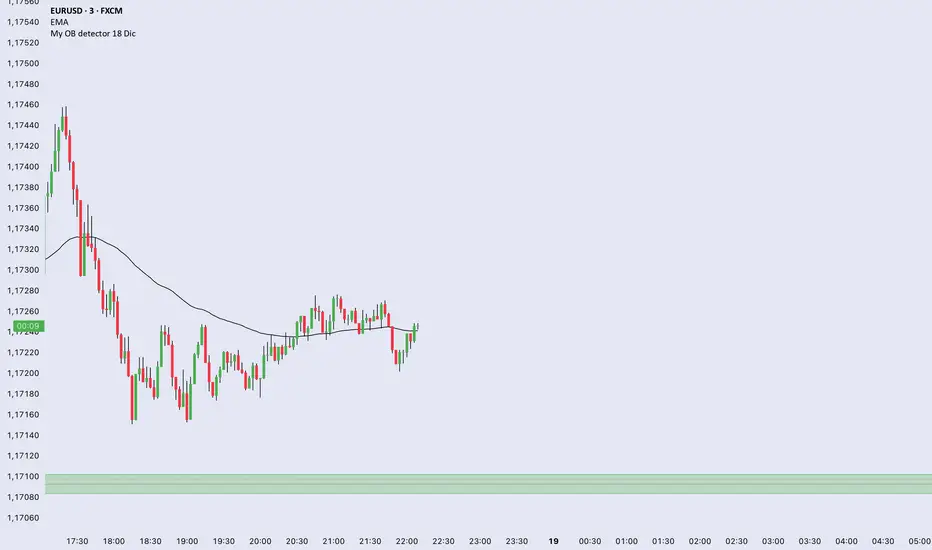
My OB detector 18 DicProfessional Order Block indicator optimized for M3 timeframe. It features automatic 50% entry detection, a strict 1:1 risk-to-reward ratio, and a 10-pip minimum profit filter. Strictly follows the Madrid session hours for Euro and US sessions.
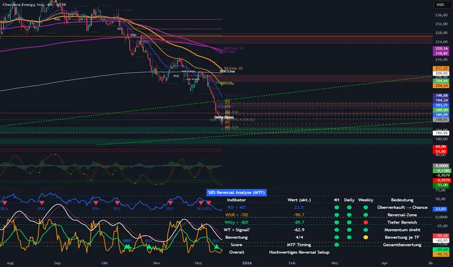
SBS Reversal Engine MTFSBS Reversal Engine (MTF) is a professional multi-timeframe indicator designed to identify high-quality reversal zones across stocks, crypto, and indices.
It combines RSI, Williams %R, a smoothed Williams oscillator ("Willy"), and a proprietary WaveTrend momentum filter to evaluate market conditions across 4H, Daily, and Weekly timeframes.
A visual traffic-light system provides a clear overview of oversold conditions, momentum shifts, and multi-timeframe alignment.
The integrated MTF Score System helps traders focus on high-quality setups where market structure, context, and timing align.
This indicator is an analytical tool and does not constitute financial advice.
© Step Buy Step 2025 – All rights reserved
ORB Algo⚡ ORB Strategy + Backtesting (Pine Script v5)
This script implements a complete Opening Range Breakout (ORB) strategy, featuring built-in backtesting, advanced TP/SL visualization, full style customization, and a performance dashboard. It is designed for traders who want to clearly evaluate breakout performance directly on the chart.
🕑 ORB Window Configuration
🔹 Session selection: choose between Market Timezone or Custom Session.
🔹 Timezone support: configurable from UTC-8 to UTC+12.
🔹 Daily limit: option to allow only one trade per day.
🔹 Risk/Reward (RR) settings:
Configurable TP1, TP2, and TP3 levels.
Stop Loss calculated dynamically from the ORB range.
📊 Backtesting Engine
🔹 Interactive dashboard showing trades, wins, losses, and win rate.
🔹 Adjustable partial exits for each TP (TP1, TP2, TP3).
🔹 Automatic calculation of percentage-based profit and loss.
🔹 Tracks total trades, total profit, and average profit per trade.
🎨 Visual Customization
🔹 Fully customizable colors:
ORB high/low lines and range fill.
Buy/Sell entry labels.
TP and SL lines with background zones.
🔹 Line style and thickness options (solid, dotted, dashed).
🔹 Visibility controls for each TP/SL level.
🔹 Clear profit and loss zones drawn directly on the chart.
🚀 Trading Logic
🔹 LONG entries: triggered when price breaks above the ORB high.
🔹 SHORT entries: triggered when price breaks below the ORB low.
🔹 Automatic calculation of Stop Loss and TP1, TP2, TP3 based on ORB range and RR.
🔹 Customizable BUY / SELL labels displayed at entry.
✅ TP / SL Detection
🔹 Real-time detection of TP1, TP2, TP3, and SL hits.
🔹 Prevents double counting of the same level.
🔹 Extended TP/SL lines with shaded zones for better clarity.
📈 Backtesting Dashboard
🔹 Displayed in the top-right corner of the chart.
🔹 Shows:
Total trades
Wins / Losses
Win rate (%)
Total profit (%)
Average profit per trade
🔹 Fully customizable panel color.
✨ Summary
This script combines:
Opening Range detection
Breakout trading logic with advanced risk management
Professional-grade visualizations
Integrated historical performance tracking
High customization for sessions, styles, and colors
💡 Ideal for traders who want to trade ORB setups with clarity, structure, and measurable results.

Volume Orderblock Breakout v3.6this is indicator that shows long short siganl and tp lines can be checked.
you can get profit by this forever.
we can win over whales
keep going don't give up!!!

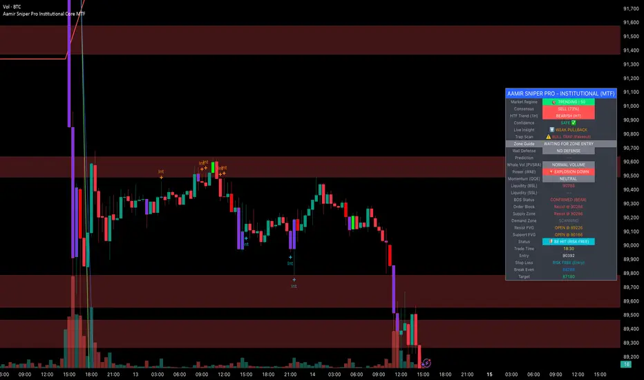
Aamir Sniper Pro Institutional Core MTFConcept & Utility: This script is a comprehensive "Multi-Factor Confluence System" designed to filter out market noise by requiring agreement between Trend, Momentum, Volatility, and Market Structure before generating a signal.
Many traders struggle with false signals generated by single indicators. This script solves that problem by using a Consensus Engine. Instead of relying on just one moving average or oscillator, this script aggregates data from over 20 different technical methods. It then applies strict filters (WAE, ADX, and MTF) to ensure that trades are only suggested during high-probability market conditions.
How the Components Work Together:
1. The Consensus Engine (The Core Logic): At the heart of the script is a voting system. It calculates the slope and direction of:
Fast/Slow EMAs, SMAs, WMAs, and Hull MA.
Ichimoku Cloud (Baseline/Conversion line).
SuperTrend and Parabolic SAR.
Oscillators (RSI, Stochastic, CCI).
Result: It generates a "Consensus Score" (0-100%). A signal is ONLY considered if the Bullish or Bearish score exceeds the user-defined threshold (Default: 70%).
2. The Filtering Layers (Why this is not just a mashup): A high consensus score alone is not enough. The script validates the signal through three mandatory filters:
Volatility Filter (WAE): Uses Waddah Attar Explosion logic to ensure there is enough volume/power to sustain the move.
Regime Filter (ADX): Checks the Average Directional Index. If the market is choppy (ADX < 25), the signal is blocked to prevent whipsaws.
MTF Filter: Checks the trend on a Higher Timeframe (Default: 1 Hour). It forces the user to trade only in the direction of the dominant trend.
3. Structural Context (SR Zones): We have integrated Dynamic Support & Resistance Zones based on Pivot Points.
Purpose: This provides immediate structural context. Even if the Consensus Engine gives a "BUY" signal, the trader can see if price is currently sitting at a "Resistance Box." This visual aid prevents buying into supply or selling into demand.
4. Institutional Volume (PVSRA): Candles are colored based on Volume Spread Analysis (PVSRA) concepts.
Purple/Blue Candles: Indicate "Whale Activity" (Volume > 200% of average). This helps confirm if institutional money is backing the move identified by the Consensus Engine.
5. Momentum Confirmation (QQE): The Qualitative Quantitative Estimation (QQE) is displayed on the dashboard to confirm short-term momentum direction, acting as the final trigger.
Features:
Sniper Mode: Option to wait for a candle retest before entry.
Dashboard: Displays the live Consensus Score, Market Regime, and Trend Status.
Risk Management: Auto-calculates SL/TP based on Swing High/Low or ATR.
Credits & Attribution:
WAE Logic: Adapted from the work of Waddah Attar.
PVSRA: Volume concepts adapted from the Traderathome/PVSRA community.
QQE: Adapted from standard open-source logic.
SR Zones: Logic derived from standard Pivot Point calculations.
Programmers Toolbox of ta LibraryA programmer's "Swiss army knife" for selecting functions from the " ta Library by Trading View " during coding. Illustrates the results of the individual library functions. Adds a few extra features. Extensively and uniquely documented.

AJ Super Blast SignalsPrice action trading script suited for all TF, it will work on all instruments NIFTY/ BANK NIFTY/COMMODITY/SENSEX/ MIDCAP NIIFTY AND CRYPTOCURRENCY....IT HELPS TO AVOID SIDEWAYS MARKET SIGNALS WHICH PREVIOUS SCRIPTS DOESNT DO

Estrategia_XAU_1m_NYEstrategia para el par XAU/USD temporalidad 1 minuto, de 9:30 a 10:00 am New York. Solo media hora al dia.
Strategy for the XAU/USD pair, 1-minute timeframe, from 9:30 to 10:00 am New York. Only half an hour per day.

Ahmed Gold Signals - 5M LIVE (Frequent)📈 Gold (XAUUSD) Trading Signals – Precision-Based Strategy
Our Gold signals are built on pure price action, not random indicators or guesswork.
🔍 How our signals are generated
We focus on:
🧲 Liquidity Sweeps
Identifying when price grabs stop-losses above highs or below lows and then reverses
📊 Clear trend direction using EMA 50 & EMA 200
✅ Strong confirmation candles after the sweep
🎯 Entries only in the direction of the trend to increase accuracy
🔵 BUY Signals
Bullish market structure
Price sweeps liquidity below recent lows
Strong bullish confirmation candle closes
➡️ High-probability BUY setup
🔴 SELL Signals
Bearish market structure
Price sweeps liquidity above recent highs
Strong bearish confirmation candle closes
➡️ High-probability SELL setup
⏱️ Timeframe
5-minute chart (5M)
Fast, precise signals ideal for scalping Gold
🛡️ Risk Management
Stop loss placed beyond the liquidity sweep
Clear take-profit targets
Risk-to-reward typically 1:2 or better
⚠️ Important Notes
We do not trade every move
We wait for confirmation
Quality over quantity — always


MAJOR PA Zones + Structure + Targets (Gray/Purple)This script highlights major price-action structure (HH/HL/LH/LL), marks BOS/CHOCH events, and draws key supply/demand zones to help visualize trend shifts and potential targets.
