HVTC 2HVTC – SMC Market Structure & Trend Indicator
HVTC is a Smart Money Concepts–based tool that helps traders visualize market structure and trend direction with clarity.
Features:
CHoCH & BOS Detection
Automatically identifies structural shifts using true SMC logic and labels them directly on the chart.
Trend Filter
Confirms bullish or bearish conditions using an internal trend system to keep trades aligned with the major direction.
EMA 25 Guide
EMA 25 acts as dynamic support/resistance, helping define momentum and bias.
Alerts (Optional)
Notify traders when CHoCH/BOS or key retests occur—ideal for those who don’t monitor charts continuously.
Use Cases:
Works for Crypto, Forex, Gold, Indices, and Stocks across all timeframes. Helps improve entries, exits, and overall market understanding based on institutional structure.
Not financial advice. Use with proper risk management.
Bandas e Canais

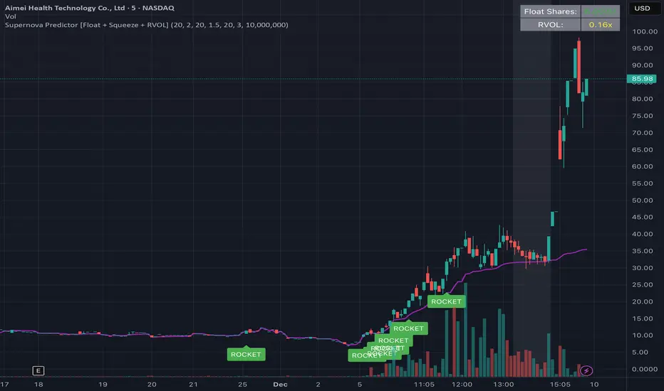
W Alart Supernova Predictor [Float + Squeeze + RVOL]the script will automatically fetch the Float size of the stock you are looking at.
If the Float is Low (< 10M), it will show a "Low Float" label on the chart.
The "ROCKET" alert will ONLY fire if the stock is actually a Low Float stock. This prevents you from getting false signals on heavy stocks like Apple or Tesla.
How to read the signals on your chart
The Grey Background (The Warning):
When you see the background of the chart turn Grey, this indicates a Squeeze.
This matches the left side of your screenshot where the price was flat. It tells you: "Pay attention, energy is building up."
The Purple Line:
This is the VWAP. Generally, you only want to take long trades when the price is above this line.
The "ROCKET" Label:
This label will appear only when three things happen at once:
Price breaks the upper Bollinger Band.
Price is above VWAP.
Volume is 2.5x higher than average (you can change this number in settings).
******A Crucial Note on "False Positives"****
This script is designed to catch the start of the move. However, sometimes a stock will break out and then immediately fail (a "fake out").
To protect yourself, professional traders usually wait for the candle with the "ROCKET" signal to close, and then enter the trade only if the next candle breaks the high of that signal candle.
gelizon ema pack (9 EMA, 21 EMA, 55 EMA, 200 SMA)This indicator plots a set of commonly used moving averages designed for trend identification, momentum confirmation, and multi-timeframe alignment. It includes three exponential moving averages (9, 21, 55) and one long-term simple moving average (200). These moving averages help traders quickly assess short-term momentum, medium-term trend structure, and overall market direction.
Included Moving Averages:
9 EMA – Fast momentum guide; useful for scalping and intraday trend continuation.
21 EMA – Medium-speed EMA that helps identify short-term trend structure.
55 EMA – Smoother trend line offering a broader view of momentum flow.
200 SMA – Widely used long-term trend benchmark for overall market bias.
Features:
Toggle each moving average on or off
Customize colors for all MAs
Clean overlay design for easy chart interpretation
This indicator is ideal for day traders, swing traders, and algorithmic setups that rely on moving-average alignment or crossover behavior to confirm trend direction and identify high-probability entries.

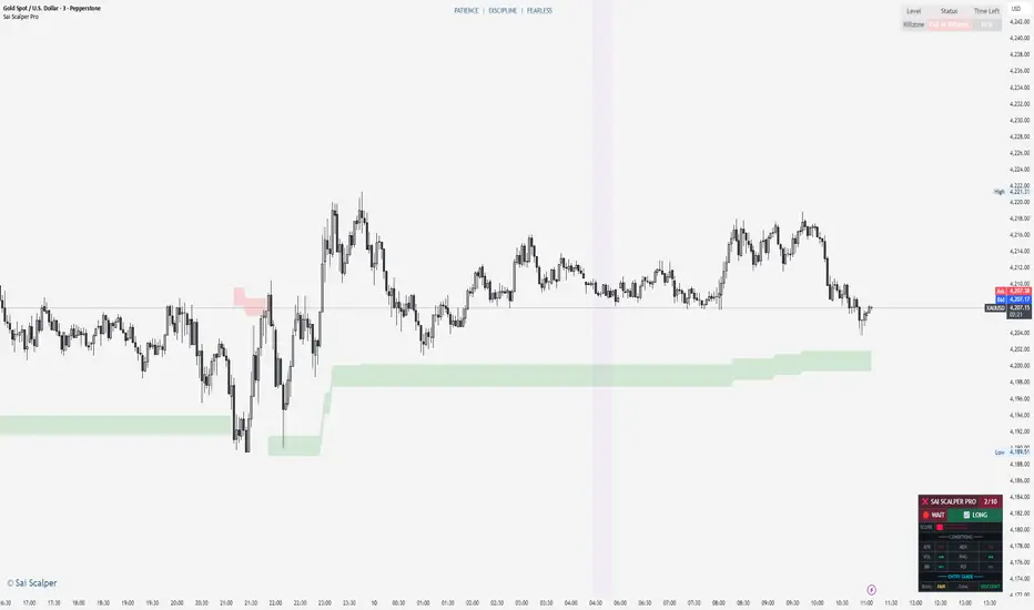
Sai Scalper ProSai Scalper Pro – Feature Summary
Trend Engine
- ATR-based trailing stop with Fibonacci levels (61.8%, 78.6%, 88.6%)
- Auto trend detection with swing point tracking
Scalping Detection (0-10 Score)
- Analyzes 7 factors: ATR compression, ADX, Volume, Range, Consolidation, RSI, BB Squeeze
- Smart state machine with hysteresis to prevent false signals
- Adjustable sensitivity & stability settings
Cloud Modes (7 Options)
- Full Zone, Entry Zone, Premium/Discount, Fib Bands, Upper/Middle/Lower Band
Pro Dashboard
- Real-time scalp score with visual meter
- Entry quality rating & zone display
- Suggested TP/SL based on ATR
- Session detection (Sydney/Tokyo/London/NY) with overlap alerts
- 3 styles (Minimal/Pro/Full) × 4 sizes × 9 positions
Alerts
- Scalp ready, Prime conditions (8+), Optimal entry zone
- Direction-specific (Long/Short bias)
Combines trend-following Fibonacci analysis with intelligent ranging detection for optimal scalping opportunities.

3EMA-8EMA Current Candle Scannerintraday scanner can also be used for short term trades, crossing above the ema high and low with volume gives signal

Price BoundariesThe Price Boundaries indicator plots two dynamic levels above and below the current market price. These levels help traders visualize a custom price band around the instrument, assisting with intraday bias, breakout zones, stop-loss planning, or scalp targets.
You can set the distance between the current price and each boundary using a user-defined input. For example, if the price is 6250 and the distance is set to 25, the indicator will automatically draw lines at 6275 (upper boundary) and 6225 (lower boundary). These levels update every candle based on the closing price.
This tool is useful for:
Marking expected movement ranges
Planning mean-reversion or breakout setups
Creating consistent distance-based zones
Visual reference for volatility compression or expansion
The indicator also optionally shades the area between the boundaries to make the zone easier to spot on the chart.

microwave weeeingThis algorithmic indicator finds trading opportunities. Its principle is simple: it identifies inflection points where trading volume explodes, groups together multiple inflection points near those points, and then retains only those that actually function as support and resistance. It's recommended to monitor the indicator over at least a 15-minute chart.
매물대를 찾아주는 알고리즘 지표. 원리는 간단하게 거래량이 폭발했던 변곡 구간을 찾고, 그 근처에 여러 번 쌓인 변곡구간만 묶어서 박스로 만들고, 그 박스가 실제로 지지·저항 역할을 한 것만 남기는 지표. 최소 15분봉 이상에서 보는걸 추천합니다.

sinyal Bot AlertsThis script is privately licensed and accessible by invitation only.
To access:
• Submit your TradingView username.
• Verification is provided via Telegram. • The license is individual; sharing and copying are prohibited.
Access will be granted to verified accounts within a maximum of 24 hours.

CE Crypto Dow Theory – BTC & ETH # Professional User Guide: Crypto Dow Theory Indicator
## Crypto Exponentials Technical Analysis Suite
---
## 📋 Introduction
Welcome to the Crypto Dow Theory indicator—a professional-grade technical analysis tool designed for sophisticated cryptocurrency market participants. This comprehensive guide will enable you to leverage the full capabilities of the indicator for informed trading decisions.
**Prerequisites**: Basic understanding of technical analysis and Dow Theory principles recommended but not required.
---
## 🚀 Initial Setup Protocol
### Step 1: Adding the Indicator
1. Navigate to **Indicators** menu at the top of your TradingView chart
2. Search for **"Crypto Dow Theory – BTC & ETH"** in your invited/private scripts
3. Click to apply the indicator to your active chart
4. The indicator will overlay directly on the price chart
### Step 2: Optimal Configuration
Access settings via the **gear icon (⚙️)** next to the indicator name:
#### Essential Parameters
**Dow Theory Settings**
- **Min % Move (Pullback Threshold)**: 5.0% (default)
*Recommendation*: 5-7% for standard volatility, 8-10% for high volatility periods
- **Min Days for Secondary Reaction**: 8 days (default)
*Note*: This parameter is currently informational; future versions may incorporate duration filtering
- **Timeframe**: D (Daily) - *Primary recommendation for reliable signals*
**Symbol Configuration**
- **Bitcoin Symbol**: BTCUSD (default)
*Alternatives*: COINBASE:BTCUSD, BINANCE:BTCUSDT, BITSTAMP:BTCUSD
- **Ethereum Symbol**: ETHUSD (default)
*Alternatives*: COINBASE:ETHUSD, BINANCE:ETHUSDT, BITSTAMP:ETHUSD
#### Visual Options (Customizable Display)
**Recommended Professional Setup**:
- ✅ **Show Divergence Alerts**: ON (critical signals)
- ☐ **Show Support/Resistance Lines**: OFF (toggle on for level analysis)
- ☐ **Show Trend Change Arrows**: OFF (toggle on for entry/exit timing)
- ☐ **Show BTC/ETH Price Lines**: OFF (redundant with price chart)
- ✅ **Show Pullback Triangles**: ON (continuous market state monitoring)
- ✅ **Show Info Label**: ON (real-time pullback metrics)
- ☐ **Show Help Panel**: OFF (reference available in this documentation)
#### Alert Configuration
**Alert Threshold Settings**
- **Alert on Pullback Greater Than**: 10.0% (default for significant moves)
*Adjust based on your risk tolerance and trading style*
---
## 📊 Signal Interpretation Framework
### Primary Status Indicator (Top Label)
Located at the top-right of your chart, this label provides instant market condition assessment:
- **✓ BULLISH** → Both assets in confirmed uptrend
*Interpretation*: Favorable conditions for long positioning; primary trend intact
- **⚠️ BTC** → Bitcoin in pullback phase
*Interpretation*: Monitor Ethereum for confirmation; potential isolated correction
- **⚠️ ETH** → Ethereum in pullback phase
*Interpretation*: Monitor Bitcoin for confirmation; assess correlation strength
- **⚠️ BOTH PULLBACK** → Dual-asset correction in progress
*Interpretation*: Market-wide retracement; defensive positioning recommended
### Information Label (Bottom Display)
Positioned at the bottom-right, this label provides quantitative pullback metrics:
**Format Examples**:
- `BTC: 5.2% down | ETH: 3.1% down` → Both assets in measured pullback
- `BTC: Uptrend | ETH: Uptrend` → No corrections detected; trend strength
- `BTC: 8.7% down | ETH: Uptrend` → Single-asset pullback (divergence potential)
- **Additional Flag**: `DIVERGENCE!` → Correlation breakdown detected
### Visual Marker System
#### Continuous Indicators
**Pullback Triangles** (Small, persistent markers)
- 🟠 **Orange Triangles** → Bitcoin in secondary reaction (below candles)
- 🔵 **Blue Triangles** → Ethereum in secondary reaction (below candles)
- **Multiple Consecutive Triangles** → Extended pullback duration
*Professional Use*: Track pullback persistence; extended pullbacks (10+ triangles) often precede strong reversals
#### Event-Based Signals
**Trend Change Arrows** (Optional, toggle in settings)
- 🔴 **Red Arrow Down** → Pullback initiation detected
- 🟢 **Green Arrow Up** → Recovery confirmed; new high established
*Professional Use*: Entry/exit timing markers; green arrows indicate trend resumption
#### Critical Alert Signals
**Divergence Warning**
- ❌ **Red X (Cross)** → Bearish divergence identified
*Scenario*: One asset makes new high while other remains in pullback
*Action*: Exercise caution; consider profit-taking or tightening stops
**Bullish Confirmation**
- 💎 **Green Diamond** → Coordinated recovery signal
*Scenario*: Both assets exit pullbacks simultaneously
*Action*: High-probability long entry zone; strong market agreement
#### Background Visualization
**Red Background Tint**
- Light red overlay when **both assets in pullback**
- Provides at-a-glance market condition awareness
- Signals elevated risk environment
---
## 📈 Professional Trading Strategies
### Strategy 1: Conservative Trend Following
**Risk Profile**: Low | **Recommended For**: Risk-averse participants, capital preservation focus
**Execution Protocol**:
1. **Entry Criteria**: Status displays **"✓ BULLISH"**; both assets trending
2. **Position Management**: Maintain exposure during bullish status
3. **Exit Trigger**: Status changes to **"⚠️ BOTH PULLBACK"**; initiate defensive positioning
4. **Re-Entry Signal**: Green diamond (bullish confirmation) after correction
5. **Risk Management**: Stop-loss below recent swing low
**Expected Characteristics**: Lower frequency trades, higher win rate, reduced drawdowns
---
### Strategy 2: Pullback Accumulation
**Risk Profile**: Medium | **Recommended For**: Swing traders, value-oriented entries
**Execution Protocol**:
1. **Setup Identification**: Single-asset pullback (**"⚠️ BTC"** or **"⚠️ ETH"**)
2. **Entry Zone**: Pullback reaches 5-7% (monitor info label)
3. **Confirmation**: Other asset remains in uptrend (divergence absent)
4. **Stop-Loss Placement**: Below pullback low with 1-2% buffer
5. **Exit Strategy**: Green arrow (recovery) or status returns to bullish
**Expected Characteristics**: Higher frequency, requires active monitoring, medium holding period
---
### Strategy 3: Divergence-Based Risk Management
**Risk Profile**: Medium-High | **Recommended For**: Advanced practitioners, short-term traders
**Execution Protocol**:
1. **Alert Trigger**: Red X (bearish divergence) appears
2. **Assessment**: Verify one asset making new highs while other in pullback
3. **Initial Action**: Reduce position size by 30-50% or tighten trailing stops
4. **Monitoring**: Watch for dual-asset pullback confirmation
5. **Re-Entry**: Green diamond signal after both assets correct and recover
**Expected Characteristics**: Defensive positioning, capital preservation during uncertainty
---
### Strategy 4: Institutional Accumulation
**Risk Profile**: Low (Long-Term) | **Recommended For**: Portfolio managers, HODLers, DCA strategies
**Execution Protocol**:
1. **Trigger**: **"⚠️ BOTH PULLBACK"** status + red background
2. **Accumulation Method**: Scale into position as pullback deepens
- 25% position at 5% pullback
- 25% position at 7% pullback
- 50% position at 10%+ pullback
3. **Confirmation Wait**: Green diamond (coordinated recovery)
4. **Hold Strategy**: Maintain through subsequent minor pullbacks
**Expected Characteristics**: Low frequency, high conviction entries, long holding periods
---
## 🔔 Alert Configuration Best Practices
### Recommended Alert Setup
**Critical Alerts** (Enable immediately):
1. ✅ **"Both in Pullback"** → Market-wide correction notification
2. ✅ **"Bearish Divergence"** → Correlation breakdown warning
3. ✅ **"Bullish Confirmation"** → High-confidence entry signal
4. ✅ **"Deep Pullback Alert"** → Threshold: 10% for significant moves
**Optional Alerts** (Based on trading style):
5. ☐ **"BTC Recovery"** → May generate frequent notifications
6. ☐ **"ETH Recovery"** → May generate frequent notifications
### Alert Configuration Parameters
**TradingView Alert Settings**:
- **Trigger Frequency**: "Once Per Bar Close" (recommended to avoid intrabar noise)
- **Expiration**: "Open-ended" (continuous monitoring)
- **Notification Methods**:
- Mobile push notifications (time-sensitive signals)
- Email (detailed records)
- SMS (critical alerts only due to volume)
---
## ⚙️ Parameter Optimization by Trading Style
### Swing Traders (Recommended Primary Use Case)
**Profile**: Multi-day to multi-week holding periods
**Optimal Settings**:
- **Timeframe**: Daily (1D)
- **Min % Move**: 5-7%
- **Alert Threshold**: 8-10%
- **Check Frequency**: Once daily post-market close
- **Visual Options**: Divergence alerts + Info label (minimal clutter)
---
### Position Traders / Long-Term Investors
**Profile**: Weeks to months holding periods
**Optimal Settings**:
- **Timeframe**: Daily (1D) or Weekly (1W)
- **Min % Move**: 7-10%
- **Alert Threshold**: 12-15%
- **Check Frequency**: 2-3 times weekly
- **Visual Options**: Status label only (macro view)
---
### High-Volatility Environments
**Market Condition**: Elevated realized volatility, choppy price action
**Optimal Settings**:
- **Min % Move**: Increase to 8-10%
- **Alert Threshold**: 12-15%
- **Rationale**: Reduces noise and false signals during turbulent periods
---
### Low-Volatility Environments
**Market Condition**: Consolidation, narrow ranges, low realized volatility
**Optimal Settings**:
- **Min % Move**: Decrease to 3-5%
- **Alert Threshold**: 7-8%
- **Rationale**: Captures smaller structural movements during quiet periods
---
## 🔧 Advanced Configuration
### Custom Symbol Implementation
**Major Exchange Pairs**:
```
Bitcoin Options:
- COINBASE:BTCUSD (US-based, high liquidity)
- BINANCE:BTCUSDT (global volume leader)
- BITSTAMP:BTCUSD (established exchange)
Ethereum Options:
- COINBASE:ETHUSD (US-based, high liquidity)
- BINANCE:ETHUSDT (global volume leader)
- BITSTAMP:ETHUSD (established exchange)
```
**Alternative Cryptocurrency Pairs**:
While designed for BTC/ETH, experimental configurations possible:
- **Large Cap Altcoins**: SOLUSD + ADAUSD (sector analysis)
- **DeFi Leaders**: AVAXUSD + MATICUSD (ecosystem tracking)
⚠️ **Important**: Dow Theory principles work optimally with dominant market leaders (BTC/ETH). Alternative pairs may produce less reliable signals.
---
## 🛠️ Troubleshooting Guide
### Issue: Excessive Signal Generation
**Symptoms**: Constant triangle markers, frequent alerts
**Root Cause**: Threshold too sensitive for current volatility
**Solution**: Increase "Min % Move" to 7-10%
**Verification**: Observe reduction in signal frequency while maintaining major moves
---
### Issue: Missed Significant Moves
**Symptoms**: No triangles during visible corrections
**Root Cause**: Threshold too conservative
**Solution**: Decrease "Min % Move" to 3-5%
**Verification**: Triangles appear during moderate retracements
---
### Issue: Labels Obscured or Invisible
**Symptoms**: Cannot see status or info labels
**Diagnostic Checklist**:
- Zoom level: Zoom out to reveal off-screen labels
- Settings: Verify "Show Info Label" is enabled
- Overlap: Check for other indicators obscuring labels
- Position: Labels placed 3 bars left of current price to prevent cutoff
**Solution**: Adjust chart zoom or disable overlapping indicators
---
### Issue: Persistent Red Background
**Symptoms**: Continuous red tinting despite apparent uptrend
**Root Cause**: One or both assets technically in pullback per threshold
**Solution**: Verify pullback percentages in info label; increase threshold if false positive
**Note**: Red background requires BOTH assets in pullback simultaneously
---
### Issue: No Triangles Displayed
**Diagnostic Checklist**:
- Verify "Show Pullback Triangles" enabled in Visual Options
- Confirm market not in extended uptrend (no pullbacks detected)
- Check threshold isn't too high (increase sensitivity)
---
### Issue: Divergence Signals Absent
**Solution**: Enable "Show Divergence Alerts" in Visual Options
**Note**: Divergence signals relatively rare; indicate significant correlation breakdowns
---
## 💡 Professional Trading Insights
### 1. Volume Confluence Analysis
**Integration Strategy**:
- Overlay volume indicator below price chart
- **Pullback + Low Volume** → Healthy correction within uptrend (bullish)
- **Pullback + High Volume** → Potential distribution or reversal (bearish)
- **Recovery + High Volume** → Strong accumulation confirmation (bullish)
**Application**: Validate indicator signals with volume context for higher-confidence trades
---
### 2. Multi-Timeframe Validation
**Hierarchical Analysis**:
- **Weekly (1W)**: Primary trend direction (strategic bias)
- **Daily (1D)**: Indicator signals (tactical execution)
- **4-Hour (4H)**: Precise entry timing within daily signals
**Protocol**: Ensure daily signals align with weekly trend; use 4H for entry refinement
---
### 3. Risk Management Framework
**Position Sizing Guidelines**:
- **Maximum Risk**: 2% account equity per position
- **Stop-Loss Placement**: Below pullback low + 1-2% buffer
- **Position Scaling**:
- Initial entry: 50% intended size
- Add 25% on confirmation (green arrow)
- Final 25% on bullish confirmation (green diamond)
**Capital Preservation**:
- Reduce exposure 50% on "BOTH PULLBACK" status
- Tighten stops to breakeven on bearish divergence (red X)
- Scale out 30% of position at predetermined profit targets
---
### 4. Macro Context Integration
**External Factors to Monitor**:
- **Total Crypto Market Capitalization**: Validate broad market alignment
- **Bitcoin Dominance**: Rising = BTC outperformance; Falling = altcoin season
- **Macro Events**: FOMC meetings, regulatory announcements, geopolitical developments
- **On-Chain Metrics**: Network activity, exchange flows (advanced)
**Application**: Indicator signals most reliable when macro context supports directional bias
---
### 5. Correlation Dynamics
**Healthy Market Characteristics**:
- ✅ Strong positive correlation (BTC and ETH move together)
- ✅ Coordinated recoveries (green diamond frequent)
- ✅ Simultaneous pullbacks of similar magnitude
**Warning Signs**:
- ⚠️ Frequent divergences (red X signals)
- ⚠️ Opposite directional moves
- ⚠️ One asset perpetually lagging
**Interpretation**: Strong correlation = stable bull market; Weak correlation = uncertainty, choppy conditions
---
## ✅ Best Practices Checklist
### DO:
- ✅ Primarily use daily timeframe for reliable signal generation
- ✅ Wait for confirmation signals (green diamond) before aggressive positioning
- ✅ Adjust threshold parameters based on prevailing volatility regime
- ✅ Configure alerts for critical signals (both pullback, divergence, confirmation)
- ✅ Combine indicator signals with volume analysis and macro context
- ✅ Maintain detailed trading journal to track signal accuracy and performance
- ✅ Backtest historical signals to understand indicator behavior in your market
- ✅ Scale position sizes proportionally to signal strength
### DO NOT:
- ❌ Apply to very short timeframes (<4H) where noise dominates signal
- ❌ Ignore "BOTH PULLBACK" warnings (market-wide risk elevation)
- ❌ Trade counter to primary trend without exceptional confirmation
- ❌ Rely exclusively on this indicator; use as part of comprehensive methodology
- ❌ Overtrade based on every minor signal; exercise discretion
- ❌ Neglect threshold adjustments during volatility regime changes
- ❌ Enter positions during bearish divergence without additional confirmation
- ❌ Exceed predetermined risk parameters based on signal enthusiasm
---
## 📚 Dow Theory Educational Context
### Core Principles Implemented
**1. Trend Persistence Doctrine**
*"The trend is assumed to continue until a definitive reversal signal occurs"*
**Implementation**: Indicator tracks absolute highest high for each asset, maintaining trend assumption until threshold breach (5%+ pullback)
---
**2. Significant Movement Threshold**
*"Minor fluctuations are noise; significant moves indicate structural change"*
**Implementation**: Configurable percentage threshold (default 5%) filters noise, identifying meaningful secondary reactions
---
**3. Confirmation Principle**
*"Market indices must confirm each other for signal validity"*
**Implementation**: Dual-asset tracking; highest confidence signals require BTC and ETH agreement (both bullish or both in pullback)
---
**4. Secondary Reactions Within Primary Trend**
*"Corrections within trends are natural and present opportunity"*
**Implementation**: Pullback detection maintains context of primary trend; triangles mark secondary reactions, not reversals
---
### Dow Theory Concepts Not Directly Implemented
**Volume Confirmation** (Dow's Three Phases)
- *Rationale*: Volume analysis requires separate indicator for comprehensive assessment
- *Recommendation*: Overlay volume indicator alongside this tool
**Three-Phase Market Cycle** (Accumulation-Distribution Framework)
- *Rationale*: Phase identification requires subjective analysis beyond pure price action
- *Recommendation*: Manual identification using indicator signals as supporting evidence
**Line Analysis** (Support/Resistance)
- *Rationale*: Optional in settings; trader discretion preferred for level identification
- *Recommendation*: Enable S/R lines when conducting detailed structural analysis
---
## 📞 Support Resources
### Technical Assistance
**For indicator-specific questions**:
- Platform: TradingView direct messaging
- Response Time: 24-48 hours
- Required Information:
- Chart screenshot
- Settings configuration
- Specific issue description
### Institutional Inquiries
**For enterprise deployment or custom development**:
- Website: (cryptoexponentials.com)
- Services: Custom indicator development, integration support, training
### Community Resources
**For general discussion and shared insights**:
- Test indicator on historical data before live trading
- Document edge cases and unusual behavior
- Share settings optimizations for specific market conditions
---
## 📝 Version Information
### Current Release: v1.0
**Feature Set**:
- Dual-asset (BTC/ETH) tracking with real-time synchronization
- Divergence detection and alert system
- Customizable pullback thresholds (volatility adaptation)
- Six distinct alert conditions
- Comprehensive visual framework with toggleable elements
- Professional interface optimized for minimal chart clutter
**Planned Enhancements** (Future Versions):
- Additional cryptocurrency pair support
- Volume-based signal confirmation
- Advanced divergence pattern library
- Custom alert message templates
- Historical signal performance metrics
- Multi-timeframe coordinated analysis
---
## 🎯 Closing Remarks
### Philosophy
The Crypto Dow Theory indicator is engineered as a **decision support tool**, not an autonomous trading system. Optimal results require:
1. **Comprehensive Market Understanding**: Technical signals within fundamental context
2. **Disciplined Risk Management**: Predetermined rules consistently applied
3. **Patient Signal Selection**: Quality over quantity; await high-probability setups
4. **Continuous Learning**: Document trades, analyze outcomes, refine approach
### Success Factors
**Highest-Probability Trades Exhibit**:
- ✅ Dual-asset confirmation (both agree on direction)
- ✅ Volume supporting the move (separate analysis)
- ✅ Alignment with weekly trend (higher timeframe confluence)
- ✅ Favorable risk/reward ratio (>2:1 minimum)
- ✅ Supportive macro environment (regulatory/economic context)
### Risk Acknowledgment
- This tool provides technical analysis, **not financial advice**
- All trading involves substantial risk of capital loss
- Past signal performance does not guarantee future accuracy
- Users are solely responsible for trading decisions and outcomes
- Always conduct independent research and consult qualified professionals
---
## 📧 Contact & Feedback
Your feedback drives continuous improvement. Please share:
- Feature requests and enhancement ideas
- Bug reports with detailed reproduction steps
- Settings optimizations for specific market conditions
- Success stories and lessons learned
**Thank you for choosing Crypto Exponentials technical analysis tools.**
**Trade with discipline. Manage risk religiously. Compound knowledge consistently.**
---
*© Crypto Exponentials | Professional Technical Analysis Solutions*
*Website: (cryptoexponentials.com)*
---
**Disclaimer**: This indicator is provided for educational and analytical purposes. The creator assumes no liability for financial losses. Cryptocurrency trading involves substantial risk. Never invest more than you can afford to lose. Always perform independent due diligence before making investment decisions.

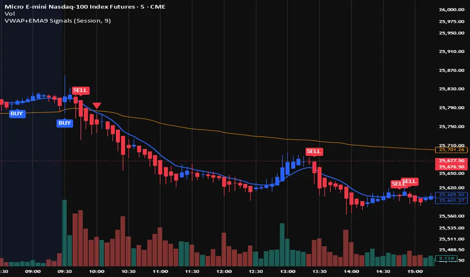
VWAP + EMA9 With SignalsThis script is for scalping on the 5 minute timeframe. It contains signals that indicate intersection of VWAP by the EMA9. It contains Buy signals when a candle closes above both lines indicating a quick continuation of a long position (quick scalp) as well as Sell signals when a candle closes below both lines indicating a quick continuation of a short position (quick scalp). Please note that i do not recommend entries at Buy and Sell signals during Accumulation/Consolidation. Positions should be taken with volume.
Composite Market Momentum Index (CMM)***The Composite Market Momentum Index (CMMI), developed by Alcides Davila, a Miami-based Business Consultant, functions as a specialized momentum oscillator within sophisticated technical frameworks such as the Composite Predictive Index (CPI-IGv5)***. Davila's background in volatile sectors informs CMMI's design, emphasizing resilient, multi-layered analysis to navigate market uncertainties. At its essence, CMMI synthesizes momentum from RSI and momentum indicators, serving as a key input to CPI-(IGv5's)*** probability engine for directional forecasts.
The primary purpose of CMMI is to assess market strength and potential shifts, helping traders identify high-probability opportunities while mitigating risks from isolated metrics. Integrated into CPI-IGv5, it bolsters the "probUp" metric—a probabilistic estimate of upward price action—by fusing complementary factors, yielding a claimed 68-80% trend-prediction accuracy in backtests. Productivity is moderate to high under trending conditions, where multi-indicator redundancy reduces false positives. Still, it may underperform in ranging or highly volatile markets, necessitating user-led backtesting to assess real-world efficacy.
Mathematically, CMMI originates from a 9-period momentum applied to a 14-period RSI, enhanced by a 3-period smoothed short RSI to create the base composite. It undergoes Z-score standardization over a 50-bar window for normalization, followed by a linear weighted sum with other elements (e.g., 0.10 allocation to momentum). Logical enhancements include using the hyperbolic tangent (tanh) for value bounding and cumulative distribution function (CDF) or logistic mappings to derive probabilities, ensuring outputs are statistically rigorous. Threshold logic governs signals: overbought alerts trigger on crossovers above 75 (normalized scale), oversold below 25, with strict pro filters at 0.55 (buy) and 0.45 (sell) on a 0-1 basis, often requiring confirmations from EMA slopes, POC crossovers, or volume deltas. This gated approach adds precision by filtering signals through base, strong, and ultra categories based on probUp thresholds, such as>0.68 for medium-term entries.
Versatility is evident in CMMI's multitimeframe adaptability, supporting modes from scalping (1-minute resolution, short multipliers) to long-term (daily, extended lookbacks up to 500 bars), dynamically adjusting via secure data requests to incorporate live and historical momentum. It accommodates diverse assets, including commodities—Davila's focus—equities, and forex, with customizable weights and manual inputs ( scale) for external variables like news impact (elevated to 0.20 for emphasis) or industry segments (0.05), allowing fine-tuning for macroeconomic or sector-specific contexts. Efficiency is achieved through real-time rolling sums, Z-windows, and resource optimizations (e.g., max 500 bars/lines/labels), minimizing computational overhead while enabling cooldowns to mitigate alert fatigue in high-frequency setups.
For enhanced application, pair with confirmatory indicators such as MACD ratios or VWAP, and use strategy modes to backtest signal viability across horizons. Target investors include day traders and scalpers seeking quick, data-driven entries, institutions focused on commodity analysis, and technically adept retail users, all of whom benefit from its probabilistic framework over rigid rules. While versatile, CMMI's closed-source aspects in Pine Script limit full transparency, underscoring the need for empirical testing.

Price In Motion – Inside Candle Breakout SystemPrice In Motion – Inside Candle Breakout System
Created for traders who want clean, structured inside-bar breakouts without clutter or unnecessary signals.
📌 What This Indicator Does
This tool identifies inside candles and plots simple breakout zones around them.
A breakout arrow only appears when price closes outside the zone, giving a clear, rules-based trigger.
You can choose between two inside-bar detection modes:
🔄 Two Inside-Candle Modes (Toggle)
1️⃣ Standard Mode (default)
Inside candle = current body is contained within the prior candle’s high–low range.
Wicks can be outside — only the body matters.
A clean way to spot compression and continuation setups.
2️⃣ Candle-to-Candle Mode (optional)
Inside candle = current body is fully within the prior candle’s body.
Produces tighter signals and more refined breakout zones.
🧱 Merged Inside Candle Zones
Back-to-back inside candles are automatically merged into one zone:
Zone High = highest high of the cluster
Zone Low = lowest low of the cluster
This keeps the chart clean and maintains a single breakout level until price closes outside of it.
📉📈 Breakout Signals
A breakout arrow prints only when price closes outside the zone:
Green arrow = close above the zone
Red arrow = close below the zone
Arrows can be toggled on/off at any time.
🎯 Why This Helps
Unlike typical inside-bar indicators that only mark the candle, this tool:
Shows clean compression zones
Merges clusters of inside candles
Confirms breakout only on candle close
Removes duplicate or noisy signals
Never repaints
It’s built for traders who value structure, clarity, and repeatable setups.
🛠 Best Used For
Breakout continuation
Pullback structure
Compression analysis
Scalping or intraday execution
Futures, stocks, crypto — any timeframe
Pre-Market + Previous Session High/LowThis script plots the key intraday levels most daytraders watch:
Today’s Pre-Market High & Low
Previous Regular Session High & Low

MS Trades 10/20 indicatorMS Trades 10/20 Indicator is a refined version of the classic 10–20 moving average approach, designed specifically for Index Options traders.
This indicator goes beyond the traditional crossover logic and focuses on the true market structure, trend strength, and momentum confirmation, making it more practical for real intraday execution.
What this indicator helps you identify
Trend stability based on 10/20 dynamic zones
Clean entry confirmation beyond basic crossovers
High-quality trend continuation setups
Early exit warnings during volatility shifts
Clear bias identification for Nifty/BankNifty intraday traders
Why this version is different
Most traders look at 10/20 as a simple crossover strategy…
But MS Trades 10/20 Indicator highlights the real behaviour behind price movement, giving traders clarity on when the market is actually trending vs. when it is just whipsawing.
This makes it one of the most beginner-friendly yet powerful tools for intraday index trading.
Disclaimer
This indicator is for educational purposes only and is not a buy/sell signal provider.
Use this tool as part of your overall price action and risk management framework.

HEMA Trend Levels + MAHEMA Trend Levels + MA
HEMA Trend Levels + MA
HEMA Trend Levels + MA
HEMA Trend Levels + MA

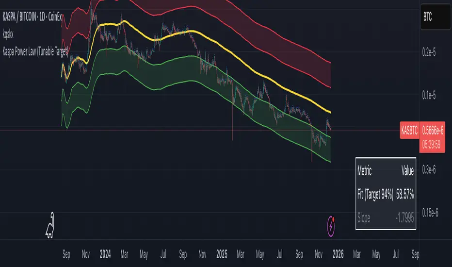
Kaspa Power Law (R=94%)Kaspa Power Law indicatior with 94% regression fit.
i have found that it may be more useful on the kas/btc chart.
Multi SMAOverlay indicator that displays a complete set of Simple Moving Averages in a single script: SMA 5, 10, 15, 20, 25, 30, 35, 40, 45, 50, 100, and 200.
It includes a selectable source (close, hl2, etc.) and two toggles to quickly show/hide short-term SMAs (5–50) and long-term SMAs (100–200). Ideal for analyzing trend direction, moving average alignment, and dynamic support/resistance zones directly on the price chart.

Fekry BB Entry/Exit with EMA FilterThis indicator is based on Bollinger Bands and exponential moving average strategy by Mr Kekry Zain

Ellipse Price Action Indicator v3Successful Trade Setup Using Ellipse Price Action Indicator (EPAI) 🔥
With the help of the Ellipse Price Action Indicator, this bearish trade setup played out perfectly.
EPAI generated a Sell Signal with a red arrow.
According to the EPAI method:
🔹 If price makes a new high on the next candle — add one more unit.
🔹 Every time a new high forms, add one more unit per candle.
🔹 Exit all units at the Moving Average (MA) — this is the core risk-controlled exit rule.
This is why EPAI consistently provides successful trade setups when followed with discipline.
⚠ Important Notice — Last Chance!
The Ellipse Price Action Indicator (EPAI) will soon become PRIVATE.
Access will be restricted only to Premium Members.
✅ First 25 subscribers can use this indicator absolutely FREE.
After that, it will not be available publicly.

KSL-Fullsystem V2.0Trend Following & Reversal Trading System. It combines **Price Action (Market Structure)** with multiple technical indicators to generate high-quality Buy and Sell signals.
---
1. How Signals are Generated (The Core Logic)
The script uses **"Internal Shifts"** (Market Structure Breaks) to find entry points.
* BUY Signal: The price breaks above a previous bearish structure (Higher High) + All enabled filters are Green.
* SELL Signal: The price breaks below a previous bullish structure (Lower Low) + All enabled filters are Red.
When a signal occurs, the script automatically calculates:
* Stop Loss (SL): Based on the recent Swing High/Low.
* Take Profit (TP): Three levels (TP1, TP2, TP3) based on risk-reward ratios (1.5x, 2.0x, 3.0x).
---
2. The Filters (Your Confirmation Checklist)
You can turn these On/Off in the settings. **Note:** If you turn *all* of them on, you might get very few signals because the conditions become too strict.
**A. Bollinger Bands (BB) Filters (Primary Feature)**
This is the main filter for this version.
* Squeeze Filter: Prevents trading when the bands are too narrow (low volatility). If the background turns **Yellow**, it means the market is "Squeezing" – **Do Not Trade.**
* Touch Entry: Looks for price bouncing off the Lower Band (Buy) or Upper Band (Sell).
* Breakout Entry: Looks for price blasting through the bands.
* Mean Reversion: Checks if price is reverting to the middle line (Basis).
**B. Moving Average Filters (Trend)**
The script includes three types of Moving Averages. You can choose which style suits you:
* EMA (Exponential): Fast-reacting. Good for scalping.
* SMA (Simple): Standard trend lines. Good for position trading.
* LWMA (Linear Weighted): Focuses heavily on recent data.
* Configuration: You can select specific setups like "Scalping" (9/21/50 EMA) or "Trend" (50/200 EMA).
**C. Momentum Filters**
* MACD: Checks momentum. You can choose settings for Scalping, Day Trading, or Swing Trading.
* AO (Awesome Oscillator) & AC: Helps confirm if the momentum is strong enough to support the trend.
---
**3. Visual Guide: What You See on the Chart**
* Green Box: A Buy Zone (Demand).
* Red Box: A Sell Zone (Supply).
* Labels (Text): Shows "BUY" or "SELL" with exact prices for TP1, TP2, TP3, and SL.
* Blue Lines: The Bollinger Bands (Upper and Lower).
* Orange Line: The Bollinger Band Basis (Middle).
* Small Triangles:
* Green Triangle (Below Bar): Price touched the Lower Bollinger Band.
* Red Triangle (Above Bar): Price touched the Upper Bollinger Band.
* Yellow Background: **WARNING.** The market has low volume/volatility (BB Squeeze). Wait for a breakout.
---
4. How to Use This Script
1. Select Your Style: Go to the Settings (Inputs).
* If you are a **Scalper**, turn on "Scalping EMA" or "Scalping MACD".
* If you are a **Swing Trader**, turn on "Swing SMA" or "Trend EMA".
2. Configure Bollinger Bands: Keep `Use Bollinger Bands Filter` checked. Decide if you want to trade "Squeezes" (usually safer to avoid them).
3. Wait for the Label: Do not enter blindly. Wait for the script to print a **BUY** or **SELL** label with the TP/SL targets.
4. Check the Background: If the background is **Yellow**, ignore the signal or wait until the color clears.
5. Manage Risk: Place your Stop Loss at the price shown on the label ("SL").

8EMA+BB-SubiProvides the facility to display 8 EMAs along with Bollinger Bands in the same indicator.

QQQ Long - Aggressive Aggressive Entry (Intraday Breakout)
Parameter Details
Entry Zone Break >626.5 on 15m candle close
Entry Condition 1. Reclaim and hold above VWAP. 2. RSI>60. 3. MACD (15min) zero-line cross. 4. ADDQ positive, TICK > +400.
Stop 623.0
Take Profit 630 (first), 635 (second)
Position Size 1R (smaller timeframe, tighter stop)
Time Invalidation Flatten EOD if fails to hold above 625.
Chart Reference 15m VWAP compression; confirms strong thrust signal supported by positive breadth (ADD/TICK).
________________________________________
