Saw a bearish tweet comparing the two assets decided to show my perspective of why they are different. let me know your thoughts.
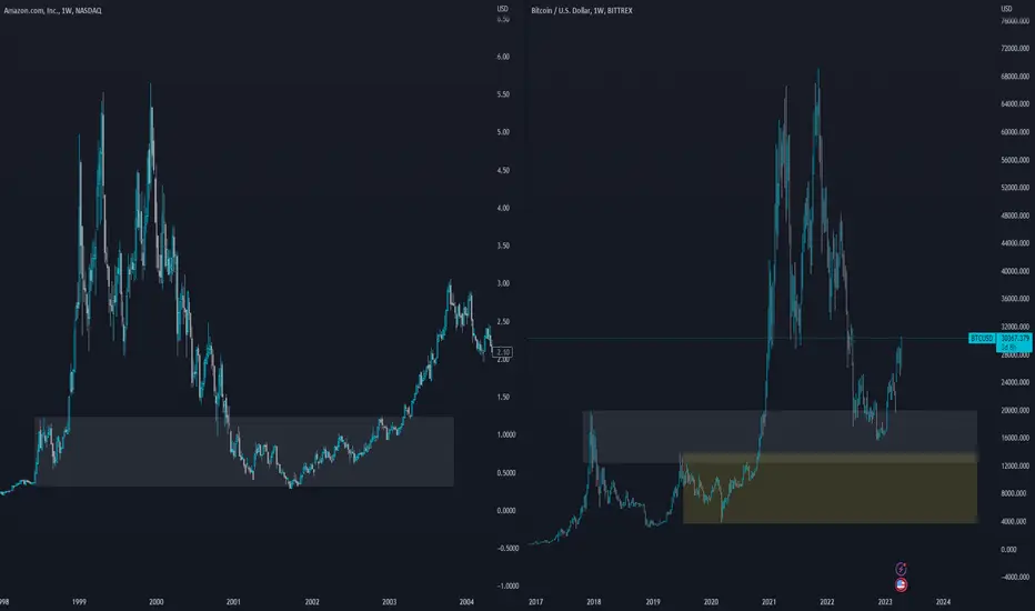
This one is a bit different but fundamentally the wrong area is being highlighted. its tempting to draw the box in yellow on the btc chart however, the amazon chart is highlighting an area where an ATH was formed at the time, to accurately compare this you would draw the same area on BTC using the prev ath at 19k when doing so, you can see the current btc does infect tag the area.
This one is a bit different but fundamentally the wrong area is being highlighted. its tempting to draw the box in yellow on the btc chart however, the amazon chart is highlighting an area where an ATH was formed at the time, to accurately compare this you would draw the same area on BTC using the prev ath at 19k when doing so, you can see the current btc does infect tag the area.
Aviso legal
As informações e publicações não devem ser e não constituem conselhos ou recomendações financeiras, de investimento, de negociação ou de qualquer outro tipo, fornecidas ou endossadas pela TradingView. Leia mais em Termos de uso.
Aviso legal
As informações e publicações não devem ser e não constituem conselhos ou recomendações financeiras, de investimento, de negociação ou de qualquer outro tipo, fornecidas ou endossadas pela TradingView. Leia mais em Termos de uso.